Iron Man 2: Iron Harder

Iron Man 2 (2010)

Directed by Jon Favreau

Starring: Robert Downey, Jr., Don Cheadle, Gwyneth Paltrow, Scarlett Johansson, Mickey Rourke, Samuel L. Jackson, Sam Rockwell


After watching the first Iron Man movie, I was curious as to how the franchise would deal with Iron Man’s lack of memorable villains. I suppose the Mandarin is relatively well-known, but Yellow Peril stereotypes don’t play well in Asian markets. And most of Iron Man’s remaining opponents are just guys in battle-suits, and at least half of them are Cold War commies. So they’re both interchangeable and out-dated.


The filmmakers behind Iron Man 2 addressed this problem by avoiding it as much as possible. Much of Iron Man 2 has nothing to do with Iron Man fighting Whiplash. Instead, the movie spends time on Tony Stark’s conflict with the U.S. government, or a subplot about Tony’s father issues, or a subplot about Tony’s impending death from palladium poisoning (due to the device in his chest), or a subplot about Jim “Rhodey” Rhodes becoming War Machine, or a subplot about Pepper Potts assuming control of Stark Industries, or a subplot about a rival weapons developer who wants to publicly upstage Tony, or a romantic subplot with Pepper Potts, or the introduction of Black Widow, or a couple of scenes that set-up the upcoming Thor movie, and a few scenes with Nick Fury that set-up the inevitable Avengers movie.


The avoidance strategy actually works well for most of the film. Easily the most enjoyable part of Iron Man is not the action but Robert Downey Jr.’s performance as Tony Stark. Downey-as-Stark can invent a new technology, outwit his business rival, and score a threesome with Swedish supermodels at the same time. In other words, he’s an unapologetic male empowerment fantasy, but without the trite moralizing of characters like Superman. And the best scenes in Iron Man 2 are when Robert Downey, Jr. hams it up as a self-aggrandizing (but lovable) jackass. Whether he’s mocking a congressional committee, or getting drunk while wearing the Iron Man suit, or flirting with Pepper Potts, Tony Stark is an entertaining character even without the superheroics. Unfortunately, Tony doesn’t get to have as much fun this time around. The Rules of Hollywood Trilogies demand that the second movie be darker than the first, so Tony has to spend a sizable portion of the film fretting over his mortality, which gets tiresome very quickly (spoiler: he doesn’t die).


And the film eventually has to get around to the external conflict. This is a summer blockbuster after all, so explosions are mandatory. And to be fair, there are a lot of explosions in the climax, and Mickey Rourke tries his hardest to make Whiplash seem like an intimidating character. But at the end of the day, Iron Man is still slumming it with a villain that shouldn’t keep him occupied for more than 15 minutes. As a comparison, imagine a Batman film where the only villain was KGBeast.


As for whether Iron Man 2 is worth your hard-earned money, it depends on your taste for big, dumb action movies. Iron Man 2 isn’t as good as its predecessor and it lacks a strong villain, but it does everything an action movie is expected to do, and in just over two hours.

Hooded Polyp – Superficial Pleasures

I’ll get the obvious out of the way: Asterios Polyp is a trite, boring story with vapid characters. I more or less agreed with Noah’s assessment, so I won’t repeat what’s already been typed. And yet I was impressed by Mazzucchelli’s artistic skill, which Derik Badman discussed in some detail here. Because I’d rather not focus on the things I hate during my three day weekend, I’m going to emphasize the positive and talk about three of my favorite pages from the book.

1.

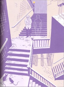
The first thing any reader will notice is the extensive use of purple. Derik interpreted purple to be the color of (false) duality, given that purple is a mix of blue (the color for Asterios) and red (or pink, the color for Hana). Asterios’ obsession with duality was at the root of his sorrows, so it makes sense that purple would be the dominant color at the lowest point in his life (right after his apartment was destroyed).

But purple also works on a literal level: it’s a dark color that nicely substitutes for black in a very noir scene. The rain in the background, the rats in the foreground, even the little details like the cracks in the walls emphasize the bleak state of the protagonist. And while the stairway clearly leads to a subway terminal, the stairs turn at off-kilter angles (reminiscent of early 20th century German expressionism). As Asterios descends into the subway (the beginning of his literal journey) he’s also descending into a strange, unknown existence, the opposite of his orderly life. Is the art heavy-handed? Hell yes, but in this brief scene the art provides the emotional depth (or at least the illusion of it) that’s lacking in the script.

I feel obliged to also note the dotted-outline “ghost.” When I first read the page, the ghost was an interesting visual mystery, especially with regards to how it’s confident posture contrasted with the miserable state of Asterios. And I’ll just leave it there, because I don’t really want to talk about the dead twin subplot.

2.


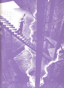
The entire Orpheus sequence is gorgeous, but this is my favorite page. It has many of the same qualities that I appreciated in the previous image: the use of purple, the noir-ish tones, expressionistic stairways. I also like the idea that Hades is defined by contemporary preconceptions. An ancient Greek would see the underworld as a cave, but a modern man imagines subways and sewers.

Mazzucchelli also makes great use of light sources and diminishing illumination. Light, or its absence, is a frequently overlooked element in comics. In most mainstream comics art, panels are either uniformly bright or dark, and few artists put much thought into the sources of light. But in this page, the light is clearly coming from the surface world that Asterios is leaving. This light source only illuminates so far, so most of the descent is partially obscured in smoke and shadows. It’s an evocative page even without the mythological allusion.

3.


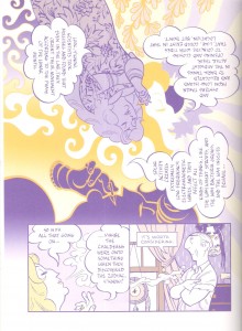
Mazzucchelli is not the first artist to rotate imagery and word balloons, but he does it with an unusually creative design. I especially like how each version of Ursula serves as a locus where patterns emerge or break. The full body Ursula at the top-left is the source of the floral pattern that disappears into the solar rays, and she cools off and extinguishes the fiery pattern that forms from the center-yellow Ursula. The latter Ursula seems to arise out of the solar pattern on the right side of the page and yet her face also serves as that pattern’s end-point. And the purple Ursula face in the lower middle abruptly ends the fiery pattern with a yellow outline atop a purple background, but this color fades rapidly as the reader transitions to the subsequent panels near the bottom of the page.

In addition to being lovely designs, the three Ursulas and the different patterns divide the image into smaller portions and subtly limit the readers’ gaze as they rotate through the word balloons. Thus, they serve as substitutes for gutters and panel frames. While the rotation of the image may be initially disorienting, there are plenty of visual clues that ensure that readers can easily follow along.

And when examined as a whole, the top image looks like an album cover from the 1960’s, which squares with Ursula’s hippie monologue. Of course, none of this is particularly deep on either an emotional or intellectual level, but it’s attractive and fun to look at.

So there you have it. I had three nice things to say about Asterios Polyp. I am overflowing with positivity.


_______________
Update by Noah: You can read the whole Asterios Polyp roundtable here.

Star-Spangled Panties (and some alternatives): A History in Covers

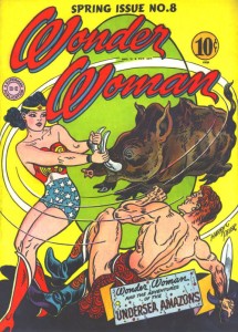
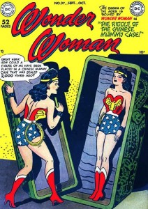
1940s

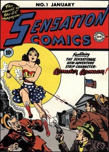
Cover by Harry G. Peter (1942)

Note: Harry Peter was the first artist to draw Wonder Woman.


Cover by Harry G. Peter (1944)

Cover by Harry G. Peter (1949)

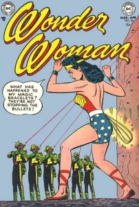
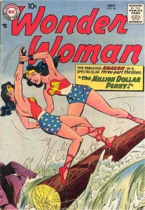
1950s

Cover by Irv Novick (1953)

Cover by Ross Andru and Mike Esposito (1958)

1960s

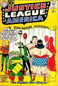
Uncredited Cover (1961)

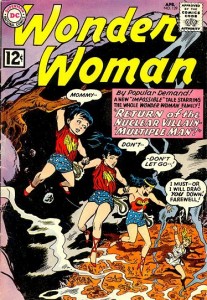
Cover by Ross Andru and Mike Esposito (1962)

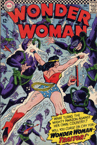
Cover by Ross Andru and Mike Esposito (1966)

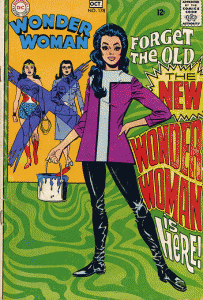
Cover by Mike Sekowsky and Dick Giordano (1968)

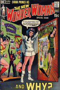
Note: Noah wrote about the new, hip Wonder Woman created by Denny O’Neil and Mike Sekowsky here.

1970s

Cover by Mike Sekowsky and Dick Giordano (1970)

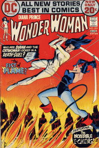
Cover by Dick Giordano (1972)

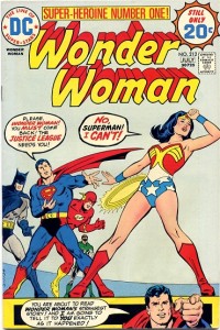
Cover by Bob Oksner (1974)

Note: Wonder Woman returned to the star-spangled panties in 1973.

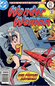
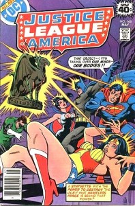
Cover by Jose Garcia-Lopez and Vince Colletta (1977)

Cover by Dick Dillin and Dick Giordano (1979)

1980s

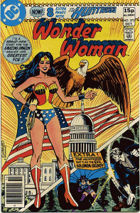
Cover by Dave Cockrum and Dick Giordano (1980)

Cover by Jose Luis Garcia-Lopez (1986)

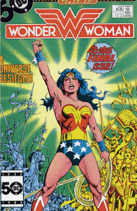
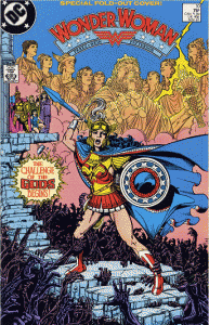
Cover by George Perez (1987)

Note: The Wonder Woman comic was rebooted in 1987.

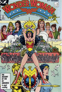
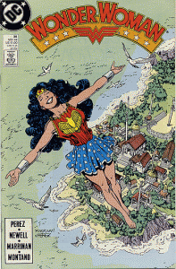
Cover by George Perez (1987)

Cover by George Perez and Chris Marrinan (1989)

1990s

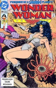
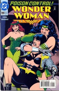
Cover by Brian Bolland (1992)

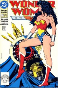
Cover by Brian Bolland (1993)

Cover by Brian Bolland (1995)

Note: Diana briefly lost her position as Wonder Woman in 1994, but continued to fight evil in this get-up.

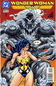
Cover by John Byrne (1996)

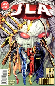
Cover by Howard Porter (1997)

Note: Third volume of Justice League of America.

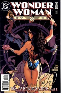
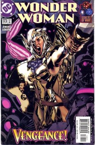
Cover by Adam Hughes (1999)

2000s

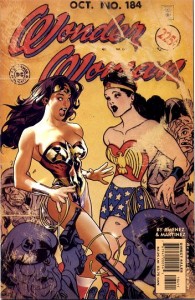
Cover by Adam Hughes (2001)

Note: the “Screaming Chicken” armor was created by Alex Ross in the alternate reality storyline, Kingdom Come (1996).

Cover by Adam Hughes (2002)

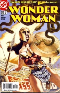
Cover by J.G. Jones (2005)

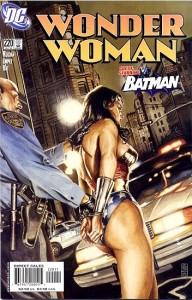
Cover by J.G. Jones (2005)

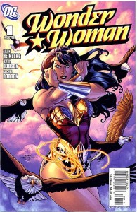
Cover by Terry and Rachel Dodson (2006)

Note: the Wonder Woman comic was rebooted again in 2006.

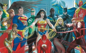
Poster by Alex Ross (2007)

Note: Served as two variant covers for issue 12 of Justice League of America (vol. 4).

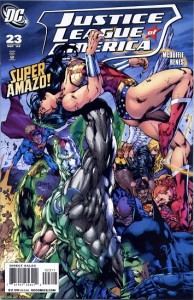
Cover by Ed Benes and Alex Sinclair (2008)

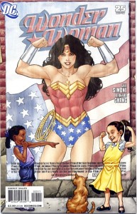
Cover by Aaron Lopresti (2008)

___________________________

All scanning credit (except the Alex Ross poster) belongs to AmazonArchives.com.

And if you’d like to read a (much) longer history on the Wonder Costume, wonder-fan Carol Strickland has one on her website.

2013: Year of the C-List

Unless you’ve been living in a cave, you know that Iron Man 2 premiered this month and made a eleventy billion dollars on its opening weekend. Next summer, Marvel hopes to replicate that success with Thor, followed by Captain America, and then an Avengers movie in 2012. Plus there are rumors that the Spider-man, X-men, and Fantastic Four franchises will all get rebooted within the next two years. But with it’s A-list IP’s already locked up in movie deals, what new ideas can Marvel bring to the big screen in 2013? The only superheroes that Marvel has left are the C-listers: characters that, while not completely obscure,  never quite reached the big leagues. And if you want to sell the C-list to Hollywood executives, you need the right pitch. Speaking of which, here are my pitches for some Marvel’s lesser known characters.


The Immortal Iron Fist
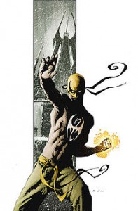
Cover by David Aja

Origin
Wealthy industrialist Danny Rand travels to Asia and discovers the hidden city of K’un L’un. He learns kung fu. He beats up bad guys using kung fu.

The Pitch
Wuxia for the American mainstream.

Demographic Appeal
White males who love everything about kung fu flicks except those pesky, non-white actors.

Main Reason Why This Movie Could Fail
There isn’t exactly a shortage of martial arts movies.

Solution
Lots of stunt casting: Michael Dudikoff will play Danny’s father, Wendell. Chuck Norris is his uncle. Brief cameo by Jackie Chan.

The Savage She-Hulk
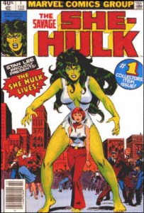
Cover by John Buscema

Origin
Jennifer Walters was a shy, unremarkable attorney in Los Angeles until the day a local crime boss had her shot. Fortunately, she was being visited by her cousin, Bruce Banner (a.k.a. The Hulk), who gave her a blood transfusion that saved her life. But it also transformed her into — The Savage She-Hulk!

The Pitch
So you didn’t care about the last two Hulk films, but this one has a giant, green hottie!

Demographic Appeal
Men who are into tall, green women.
Women who desperately want to watch any movie starring a superheroine, even a Hulk-spinoff.

Main Reason Why This Movie Could Fail
Self-sabotage: Hollywood believes that blockbusters starring women will flop, thereby ensuring that they’ll screw it up.

Solution
When in doubt, just rip off something with a proven track record.
Pander to Sex and the City fans. She-Hulk teams up with Spider-Woman, Ms. Marvel, and the Scarlet Witch to talk about life, love, and shoes, all while saving the Earth from the Skrulls.

Werewolf by Night
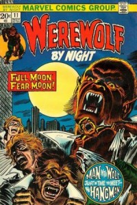

Cover by Gil Kane and John Romita, Sr.

Origin
Jack Russell was a normal teenager until the day he turned 18, when he learned of a terrible curse that afflicted his bloodline. Jack’s parents had emigrated from Eastern European Country hoping to escape the curse, but curses know no borders. Now, in the light of the full moon, Jack Russell becomes a werewolf — by night!

The Pitch
Are you sick of zombies and vampires yet? How about some werewolves?

Demographic Appeal
Fans of superhero/horror hybrids like Hellboy.
Fans of cheesy dog puns.

Main Reason Why This Movie Could Fail
No evidence that a substantial number of people are clamoring to see a werewolf movie.

Solution
This is a tough one. But even Blade ended up as a moderately successful franchise, so the right idea might be to make it rated-R.

Luke Cage: Hero for Hire
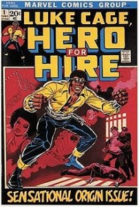
Cover by John Romita, Sr. and George Tuska

Origin
As a teenager, Luke was wrongfully convicted of a crime he didn’t commit and sent to prison. In exchange for an early parole, Luke agreed to be the subject of secret experiments that unexpectedly gave him superpowers. Luke then busted out of prison and decided to clean up his old neighborhood in Harlem — but only after he gets paid.

The Pitch
Shaft with superpowers.

Demographic Appeal
Black males.
White males who fantasize about being black males.

Main Reason Why This Movie Could Fail
Institutionalized racism that pervades the American film industry at every level.

Solution
Will Smith.

X-Men Origins: Cable
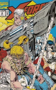
Cover by Rob Liefeld

Origin
Here goes … Cable is Nathan Christopher Summers, the son of Scott Summers (a.k.a. Cyclops of the X-Men) and Madelyne Pryor (a clone of Jean Grey, a.k.a. Phoenix of the X-Men (who was dead at the time), though Scott didn’t know at first that she was a clone) who later became the demonic Goblin Queen. Cable was the product of a secret experiment by Mr. Sinister (an evil, immortal geneticist who I think is also an ancestor to Scott Summers), who wanted to create the ultimate mutant that would defend him from his master, Apocalypse (an immortal mutant who wants to start a race war between humans and mutants). While still a baby, Cable was kidnapped by Apocalypse and infected with the techno-organic virus that turned him half-machine. To save their son, Scott and Jean (Madelyne had died by this time and her essence and memories were absorbed by Jean … it’s a long story) decided to send Nathan to the future with a time-traveling group called the Askani (which was founded by Rachel Summers, the daughter of Scott and Jean from another possible future … actually, it’s not that important) who promised that the technology from their era could halt the spread of the T-O virus. In the distant future, the Askani saved Nathan (but only after they cloned a backup baby, which was stolen by Apocalypse and raised to be the villain Stryfe … which is another long story) and the boy became Cable, leader of the resistance against Apocalypse and a lover of huge guns. To save the future (or something equally vague, I don’t remember), Cable traveled back in time to shoot things and put together a team of young mutants who wouldn’t play by the rules. And after that, things start getting complicated.

The Pitch
X-Men! Guns! Time travel! Guns!

Demographic Appeal
14 year old boys.
X-Men completionists.

Main Reason Why This Movie Could Fail
Cable’s 15 minutes of fame ended two decades ago.

Solution
Guest-starring Wolverine!


The Astonishing Ant-Man
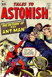
Cover by Jack Kirby and Dick Ayers

Origin
Scientist Henry Pym discovered a new subatomic particle (dubbed Pym Particle) that allowed him to shrink to the size of an ant. He also created a helmet that can telepathically control ants. Along with his girlfriend, The Wasp, Pym fights criminals and Communist spies [replace with Russian Mafia] with the power of being very small. And ants.

The Pitch
There’s trailer for Iron Man 3, but it’s at the end of the movie.

Demographic Appeal
???

Main Reason Why This Movie Could Fail
It’s about Ant-Man.

Solution
Release in February when there’s absolutely no competition.

Tigra: The Motion Picture
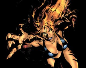
Panel by Mike Deodato

Origin
Greer Grant was just another superhero wannabe until the day she was badly injured in a terrorist attack. Rescued by a long lost race of Cat People from Baja California, Greer was given a second chance at life when they magically transformed her into superhuman hybrid. In a bikini.

The Pitch
Sexy cat-chick in bikini.

Demographic Appeal
Bikini enthusiasts.
Neko-girl enthusiasts.
Furries.

There’s probably a couple fetishes that I’m forgetting…

Main Reason Why This Movie Could Fail
See She-Hulk

Solution
Tigra — in 3-D.


Anything but Capes: More Crime

Bronx Kill
Writer: Peter Milligan
Artist: James Romberger

I learned two things from reading Bronx Kill.

1) In my previous post on crime comics, my definition of the genre was too narrow. Most crime comics tend to be about hard-boiled detectives, vigilantes, or dangerous heists. In other words, they’re typical male adventure stories. But there is another type of crime story: the missing loved one.  Like hard-boiled detective stories, the plot is based around a mystery – what happened to my missing wife/lover/child/etc. – but the mystery is much more personal for the protagonist, and the emotional impact of the crime is far greater. Missing loved one stories can sometimes function as vengeance fantasies, which could be seen as empowering. But more often than not they’re much bleaker stories where death and loss are inescapable, pain is all-consuming, and discovering the truth is actually far worse than not knowing. The most famous example of this sub-genre is The Vanishing, in which a man obsessively searches for his missing wife for three years, only to discover her terrible fate by sharing it.

Bronx Kill faithfully sticks to the missing loved one formula. The plot follows a novelist named Martin Keane, who wakes up one morning to discover that his wife is gone. Her disappearance has a strange connection to the murder of Martin’s grandfather and a rundown section of the Bronx riverfront named, obviously, the Bronx Kill. As the weeks go by, Martin’s sanity begins to slip, and he becomes increasingly irrational and violent until he finally stumbles upon the awful truth. And as these stories tend to go, the truth is far worse than the mystery.

Judged solely on its merits as a missing person mystery, the Bronx Kill is a decent comic. Milligan never strays far from genre conventions, but he knows how to pace a story and arrange the pieces of a plot so that the outcome isn’t obvious from page 1. Romberger’s art is functional and unassuming; it doesn’t add much to the comic but at least it doesn’t distract from the story either.

The one tedious aspect of the mystery is Milligan’s attempt to connect the main plot to a crime novel that Martin Keane is writing. The comic will occasionally be interrupted by a few pages of text about a murder in 19th century Ireland. Unfortunately, the novel is boring, and Milligan’s prose is often a chore to read. Rather than function as a thematic reflection of the main plot, the prose sections simply screw up the pacing.

2)  The other thing I learned from reading Bronx Kill is that writers are not manly. I’ll repeat for emphasis: WRITERS ARE NOT MANLY. Apparently, this is the great tragedy of being a writer. You can create entire worlds and populate them with fascinating characters who enrich people’s lives, but at the end of day you’re still an impotent wimp. Worse, you’re a wimp who has to be saved by your girlfriend after being threatened by a bum.

And then there are the daddy issues. God help the writer who has a father with a manly profession, like law enforcement. 50% of Bronx Kill is just Martin dealing with the fact that he can never live up to the expectations of his old man, a respected New York police detective. And while I’m trying to avoid being spoilerish, I can’t resist noting that Martin is cuckolded in an exceptionally emasculating manner.

To be fair, Milligan seems to know just how ridiculous it is for writers to constantly fret over their masculinity. Martin Keane may not be as tough as his father, but he eventually realizes that his dad is full of shit. And Martin is at least competent enough to solve the mystery of his missing wife (albeit only after a big clue falls conveniently into his lap).

But acknowledging the shortcomings of the masculine ideal isn’t the same thing as coming up with an alternative. And Milligan is still working within the confines of a male genre, so the climax of Bronx Kill is the same as the climax of most crime stories: fists, guns, and screaming. Nor are the wife’s motives of any real importance. This is yet another story that’s all about men dealing with their crappy fathers.

Bronx Kill is an uneven, occasionally engaging entry into an often overlooked sub-genre of crime, though a reader’s enjoyment of the comic is dependent on their tolerance for writers with daddy issues.

Anything but Capes: Crime Time

So many crime comics, so little time. Vertigo alone must publishes half a dozen pulp crime monthlies, and that doesn’t even include the Vertigo Crime imprint. I already reviewed one of the Vertigo Crime graphic novels here, so I’ll limit this post to monthly titles.

Reviews

Choker #1
Writer: Ben McCool (that can’t possibly be his real name)
Artist: Ben Templesmith
Publisher: Image Comics

Crime and horror are an unlikely pairing. They may share an appreciation for violence and brooding scenery, but the primary appeal of the genres are at odds. Crime stories are generally empowerment fantasies, whether the focus is on the criminal (empowerment against authority) or the detective (empowerment in service to authority). Horror is more about powerlessness, and the thrills and scares that come from being vicariously helpless. These are two genres that just don’t mix well. (Now, some of you will argue, “What about Seven? That had detectives and it was scary up until the moment the killer was revealed to be Kevin Spacey.” But Seven wasn’t really a crime story, because the detective scenes with Brad Pitt and Morgan Freeman were not critical to the film’s appeal. They just filled in time between the big gross-out moments). All of this is a roundabout way of explaining why Choker is not a good comic.

Set in the future, the plot follows a lowly private detective named Johnny Jackson. Formerly a cop, he’s given an opportunity to get his old job back if he can capture a drug dealer. About as basic a crime plot as they come, but the story quickly veers towards horror because the drug in question transforms its users into something akin to vampires.

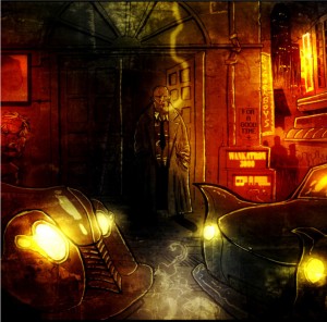
The horror factor is also emphasized by the artwork. Ben Templesmith is best known for his work on several popular horror comics, particularly 30 Days of Night. His art in Choker looks very similar: distorted bodies, the heavy use of black, grimy backgrounds. Though in Choker, he also uses lurid red and orange coloring to highlight the corruption and decadence of the future.

It looks very cool, but the flashy art can’t hide the fact that the comic doesn’t function well as either horror or crime. The horror aspect is undermined by the concepts inherent in a crime story. For example, by focusing the plot on the hard-boiled detective, McCool deflates any anxiety that the reader might have, because we all know that the chain-smoking tough guy isn’t going to die. At the same time, the crime story is diminished by the comic’s awkward attempts at being scary. The vampires in the story are meant to be creepy, but they’re really just super-powered junkies. It’s impossible to take the central conflict seriously. The book has a lot of ideas, but they remain incoherent and poorly executed.

Criminal – The Sinners #1
Writer: Ed Brubaker
Artist: Sean Phillips
Colorist: Val Staples
Publisher: Icon (Marvel)

Criminal is one of the least innovative comics being produced by any mainstream publisher. Ed Brubaker writes stereotypical crime stories: square-jawed protagonists, femme fatales, and endless monologues. Sean Phillips and Val Staples illustrate the comic in the most predictable manner possible: dark colors, thick black lines, a general impression of an overbearing world. We’ve seen this all before.

The plot of this issue is also familiar. Tracy Lawless (a character from an earlier story arc) is stuck working as a hitman for a mob kingpin. He’s offered a chance to walk away, but only if he can figure out who’s murdering the mobster’s lieutenants. It’s a typical anti-hero plot, with the obligatory sub-plot involving the mobster’s sexy wife.

Brubaker and company aren’t doing anything new or original – and that’s okay. So what if they don’t re-invent the wheel? Wheels already do exactly what they’re supposed to do. I suppose I should laud innovation, but to be perfectly honest I’m only interested in innovation when it produces a great story. If creators tell a great story by inventing an entirely new genre of entertainment, then I’m happy. If creators tell a great story by relying on familiar tropes from a well-worn genre, then I’m happy.

Brubaker may not be an innovator, but he’s a reliable craftsman. The characters are all archetypes, but they’re enjoyable archetypes that fit perfectly into the world that Brubaker and Phillips have created. The plot is predictable, but it plods along with the implicit assurance that the payoff will be worth the wait. And while Phillips isn’t a daring artist, his pencils and inks effectively conveys both story and tone.

Criminal is nothing more and nothing less than the work of professionals who are doing exactly what they want to do.

Scalped #36
Writer: Jason Aaron
Artist: Davide Furno
Colorist: Giulia Brusco
Publisher: Vertigo (DC)

I’m not a regular reader of Scalped, but from what I’ve seen of the series I’m pretty sure it’s about Native American gangsters who run a casino. I think I read a review that described it as Sorpranos on an Indian reservation (hopefully without the pretentious dream sequences), or maybe it was Goodfellas on a reservation. But since it involves a casino, perhaps it should be Casino on a reservation. Scalped readers need to help me out here. What is the proper analogy? And is there an Indian Joe Pesci?

The first thing that came to mind as I read this issue: Scalped is a remarkably exploitative comic. A team of white creators produced a story about violent, lusty ethnic minorities who kill and fuck each other for the amusement of the predominantly white audience. And they even throw throw in a nod to Indian spirituality (one character actually narrates from beyond the grave). I suppose I should find all this offensive, but I’m actually impressed that Vertigo published a comic about Indians that didn’t involve Jonah Hex shooting them.

And once you get past the Indian-sploitation, it isn’t half bad. It has all the elements readers would expect from a gangster comic: sleazy casino owners, brutal violence, macho men. And there are a few things readers wouldn’t expect, such as the fact that the macho men enjoy gay sex.

The art is okay, in the way that art in Vertigo comics is always “kind of,” “sort of” okay. Davide Furno deserves some small praise for his character design, because at least Native Americans don’t look like white people with tans. But the art isn’t memorable in any way, which is the harshest thing I can say about it.

So this is a comic about gay, Native American gangsters, and (lackluster art aside) it truly is the best damn comic about gay, Native American gangsters that I’ve ever read.

_____________

State of the Genre: For a genre that was once almost completely absorbed by superheroes, crime has made a massive comeback. In itself, the success of the crime genre is hardly surprising. Stories of crooks and heists and square-jawed detectives have remained popular in every other media for decades.  What is surprising is just how long it took for crime to recover as a prominent genre of American comics. Blame Wertham, the Comics Code, superhero fanboys, etc., etc.

But over the last couple decades the comics market has evolved to the point where it can sustain a significant number of crime comics. And given the size of the genre, it deserves an extra post, which is why I’ll be reviewing Peter Milligan’s Bronx Kill next week.

Muck Encrusted Mockery of a Roundtable: Swamp Fear

(Part 1 of the Swamp Thing roundtable can be found here and Part 2 can be found here).

In addition to being part 3 of the Swamp Thing roundtable, this post is also a follow-up to last week’s post where I questioned whether comics could ever be scary.

To recap, I asserted that horror comics could never incite the intense, visceral fear that horror movies so easily manage. Horror comics would be better off if they had more in common with horror novels, which generally have slow-burn stories that exploit common fears and social anxieties. There were a lot of great comments to the post, and I want to go through a couple of them before I get to Alan Moore’s Swamp Thing.

While I argued that the static nature of the comic page undermined any attempt at being scary, Michael DaForge offered a different take:

“Comics can use their “static-ness” to their advantage, I think.
I’m jumpy and easily manipulated by music or loud noises in
a movie. In Anti Christ, the genital mutilation startled me (or
grossed me out or whatever it was supposed to do?) But it didn’t
stay with me the way the scene with the stillborn fawn did from
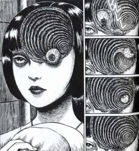
earlier in the film. Or this sequence did from Uzumaki:

… [W]hen it’s 5 am and I’m having a hard time getting to sleep,
I’ll remember stuff like that.”

That’s a good counterpoint, and Uzumaki demonstrates why having the right kind of art is essential for a horror comic. Unfortunately, the art in most mainstream horror comics is simply too indifferent to tone and mood to instill any feelings of fear in the reader.

Aaron Ber commented later that there should be a distinction between “creepy” and “actual fear”. He went on to say:

“Not to keep making this a comics vs. film thing, but horror is one
of the most demonstrable ways I can think of to show how effecting
film can be. People experiencing fear in a film can have physical
reactions on an involuntary level, as if their safety is actually being
threatened. I just don’t think comics can work that directly – to the
point where on some level you are no longer conscious of the fact
that what you are experiencing isn’t actually happening to you.”

I think Aaron Ber is right to the extent we’re discussing heart-racing, hands-over-your-eyes scary. Comics will never be able to provoke that kind of reaction from the reader. However, I don’t think there’s an clear distinction between what people find creepy and what they “actually” fear. Fear encompasses a broad range of emotional responses: sometimes it’s an immediate physical reaction, as when something startles you, but other times it can be a lingering sense of unease or a recurrent anxiety. A comic with a creepy story and disturbing imagery can potentially stay with the reader longer than a movie about a chainsaw-wielding psycho. So perhaps comics can’t be “scary” as the term is commonly understood, but creepy is a good alternative.

And now I’ll finally start discussing the actual topic of this roundtable. Not every issue of Swamp Thing is a gem. Not every issue is creepy (nor were they all intended to be). But Alan Moore could write an unsettling story when he wanted to, and he collaborated with a team of fantastic artists, particularly Stephen Bissette and John Totleben. And one of the best stories during their run on Swamp Thing also happened to be one of the creepiest.

The vampire storyline in issues 38 and 39 was part of a larger arc where Swamp Thing had to run errands for John Constantine (of Hellblazer fame). One such errand took Swamp Thing to Rosewood, Illinois, an entire town submerged beneath a lake. And the only residents of this underwater hamlet were vampires. In Alan Moore lore, running water is lethal to vamps, but the stagnant water of the lake provided the perfect environment to avoid the sun while still hunting dumb teenagers who went for a swim.

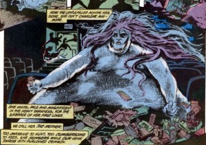
It’s a simple, pulp monster story, but Moore was absolutely committed to making it as creepy as possible. He accomplished this partly through some plot details that were equal parts eerie and gross. The one that immediately springs to mind is the morbidly obese vampire bride.

There’s just something so repulsive about a fat monster that spends her day wallowing in the filth of an abandoned movie theater.

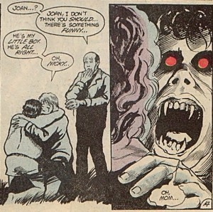
Another way to make a monster story creepy is to be as ruthless as possible. In other words, anyone can die in any number of awful ways. But in an ongoing series like Swamp Thing, it’s nearly impossible to convince readers that the titular character is in any real danger. Moore wisely evaded this problem by introducing lots of supporting characters that could be offed in short order. He had no reservations about killing a teenage boy at the beginning of the story. And it only got worse from there, especially when the undead boy was reunited with his mother.

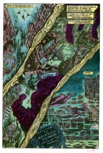
While Moore may be a great pulp writer, in the hands of a different art team his script would have come across as a nothing more than cheesy monster plot with overripe narration. As the above panels make clear, the unsung heroes behind Swamp Thing‘s success are Bissette and Totleben. Along with Stan Woch in issue 38, they gave the comic a brooding tone with their heavy use of hatching and black space. And the colorist, Tatjana Wood, enhanced Bissette’s and Totleben’s work with murky greens and blues for the underwater scenes.

The above page is a great example of how their work set the mood of the comic. Plot-wise, this page is nothing more than the vampires descending into their hidden city, but the depiction of the city is terrific. Readers can recognize the details of any American street, but those details are only partially drawn or deliberately obscured by hatching as well as black and near-black colors. It’s an ugly, lurid mockery of a small town, where light from the surface can only barely penetrate the foul water. And the dead fish designs in the gutters add to the sense of muck and decay. It’s easy to see why young readers in the 80’s found Swamp Thing so affecting.

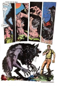
Even when Moore’s scripts aren’t very good, Bissette and Totleben are there to elevate the material. Suat and Noah beat me to the punch with their debate over issue 40, a.k.a. the PMSing-werewolf issue. It’s easily one of the silliest issues in Moore’s run, but it has one of the nastiest werewolf transformations that I’ve ever seen in any media.

To borrow a point from Michael DaForge, the static nature of comics, along with the ability of readers to linger on each panel, actually makes the scene much more effective than a similar transformation in a movie. The intensity and horror of the moment are emphasized by the stillness of each image. And I agree with Noah that Bissette and Totleben draw a great-looking werewolf.

Swamp Thing is never scary in the way a great horror movie is scary, but it doesn’t need to be. Instead, Moore, Bissette, and Totelben created a few short stories with creepy plots and nightmarish imagery. And those stories were, at least for me, far more memorable and affecting than the last few zombie/slasher/haunted house movies that I’ve seen.

______________
Update by Noah: The whole Swamp Thing roundtable is here.