Sex, Violence, Druuna

Trigger Warning: This article talks about sexual assault and rape, at length. In an attempt to reduce inadvertent exposure to the material discussed, I will provide links to specific sequences.
_______

In 1986, Heavy Metal changed their format from monthly to quarterly. As part of this format change, they began to print full stories instead of serializing them. Mostly, these stories were originally printed in Europe – where the Francophone market published 48 page collected editions called albums.

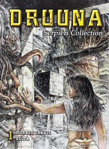
The third full album printed in the new quarterly format was Morbus Gravis (Severe Disease) by Paolo Eleuteri Serpieri, in the Summer 1986 issue. This feature introduced Druuna, a sexually charged woman navigating her way through a nightmarish dystopic society with nothing but her wits and her sexual availability to keep her alive. Over the course of the story, she is forced to expose herself, prostitutes herself for medicine, and is forced to perform fellatio at knifepoint. In retrospect, this was tame.
 

Screen Shot 2016-06-14 at 9.43.31 PM

 
In spite of (or, perhaps, because of) this appalling level of sexual violence, Serpieri (and Druuna, especially) became massively popular among the Heavy Metal readership. So much so that a parody strip was published asking the question “Where is Druuna now?” (Answer: married, with two kids.)

The appeal was not and is not difficult to understand. Serpieri is a master craftsman. From the various sketchbooks that have been published, it is obvious that he enjoys drawing women. Naked women. Sexy women. And because he enjoys drawing them, he has gotten really good at it.

Any casual connoisseur of pornography can tell you that the act of sexual intercourse is not inherently anything – visually sexy, meaningful, or even necessarily pleasurable. It’s the elements that make up the context of the act that add significance. Even something as simple as bad lighting or poor framing can push a visual depiction towards embarrassing or arousing.

Making something look sexy is not an easy feat. Serpieri knows this and the amount of effort he puts into his work is obvious. He is an incredibly talented illustrator who also happens to have a very good grasp of sequential narrative. That he likes to use those talents to draw people having sex would seem like a net positive – until you realize that a lot of the sexual activity is non-consensual. But he has somehow managed to draw the assault as sexy, which makes the realization very uncomfortable when it hits.

Serpieri works best as a pin-up illustrator, creating one off images that are designed to titillate and arouse the viewer. These are, to a one, perfectly suited to do just that. There is no problematic text to distract from the purity of the visual depiction. Which feels like an argument for the platonic ideal of looking at women without talking to them, so as not to spoil the illusion, but there you go.

To be sure, there is a straw-man argument to be made (half-hearted at best – like you’d find from a certain kind of Twitter account holder, one who doesn’t like to be challenged on his enjoyment of problematic entertainment) that the story is set in a dystopic future where survival of the fittest is the rule and depicting sexual violence is both natural and understandable. After all, that’s what happens when society collapses and there is no means of enforcing mores like consent. Sure, but it is really necessary to depict it so much? And if society has to collapse for these kinds of things to be normalized, why does rape still occur in this day and age?

Serpieri himself claims that Druuna’s approach to sexual pleasures is actually a challenge to Judeo-Christian mores on sexuality. Which would be laudable if there wasn’t quite so much rape. And it’s not like Serpieri is unable to depict healthy, consensual sexual situations. He is. He just choses not to, for reasons.

To be clear – Heavy Metal had a long history of problematic stories. Sexual assault and rape are not the sole province of Serpieri. And he was not the first artist to produce beautifully rendered, overly sexualized science fiction that didn’t make much sense (I’m looking in your direction, Fernando Fernandez). However, to the extent that Druuna became emblematic of Heavy Metal as a publication, she also became emblematic of the sexual assault problems at the heart of the most problematic stories published by that magazine.
—————————————
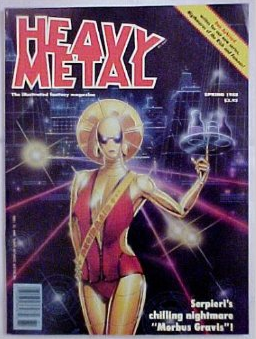
Screen Shot 2016-06-14 at 9.48.03 PMIn the Spring 1988 issue, Heavy Metal published a follow up Druuna story. In this story, Druuna is only raped once – by someone she knows and was actively fooling around with before he brutally and suddenly crossed the line into non-consent (page 42). About the best I can say is that it’s a very realistic example of a date-rape scenario. The sequence to that point is incredibly erotic, but subsequent rereads retroactively taint any potential for arousal.

The real sexual violence in the story is reserved for Hale – a woman that Druuna meets in the wilderness. Shortly after they meet, Hale’s father is killed by a group of soldiers. One of those soldiers immediately rapes Hale and takes her as his possession. The most disturbing part of this is the panel where we see Druuna and one of the soldiers standing by passively while we can read the off-panel dialog of Hale screaming “no” and being ignored (page 23). The page turn shows the actual rape in progress. As a piece of sequential storytelling, it’s very well executed. Both the reaction shot and the actual rape are excellent example of show, don’t tell. But that’s about all it has going for it. That and the heartbreaking shot of Hale wrapped around herself post-trauma.

Druuna’s advice to Hale is to just let it happen (!) because whatever the soldiers can do to them can’t be worse than the monstrous mutants who wander the wastelands could do instead. Survival is the key, and the best advice is to endure. Which is an interesting thing for a young, impressionable young man – a demographic that was reading Heavy Metal at the time – to read. Especially so close to such a graphic sexual assault.

Hale is raped a second time, and the act is used to drive the plot. While the soldier is distracted, a mutant comes out of nowhere and drags him away (page 29). Hale is laughing hysterically at her salvation and near-death experience and the death of the soldier is given a little too much dramatic emphasis, considering that he was mid-rape when he was whisked away. Again, Serpieri is a good enough sequential storyteller that we get to see this occur, from the rape onwards.

Completing Hale’s arc, we are shown a single image of her working as a prostitute in a military barracks and we hear nothing more about her for the entire series.

In the Summer 1988 issue of Heavy Metal, an editorial addressed current events. It seems that copies of the previous issue had been seized at the Canadian border for being in violation of code 9956 – a writ denying the importation of material dealing with sex with violence, bondage, etc. The editorial admits there was “sex with violence” in Druuna.

But there is a side of the strip that seems to have been ignored. Beyond the breasts, beyond the sex, there is an extraordinary power within the story – the horror of a world gone mad. We were not condoning the violence, simply presenting a frightening oftentimes exaggerated look into a future even more violent than the times we live in now.

That very issue, they featured a slew of stories from the Spanish version of the Illustrated Universal Declaration of Human Rights. Because they’d been censored, you see. This was a free speech issue.

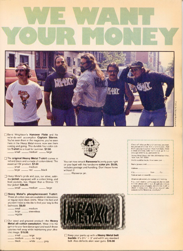
Heavy Metal has always been a commercially-minded magazine. That approach has worked out very well for them and gave the publication a kind of self-aggrandizing swagger. You knew they were going to be over-the-top and merchandise everything, so nothing came as a surprise after the first five or six years.

Heavy Metal in the late 80s was filled with material by Daniel Torres and Peter Kuper – to the point where they felt like house artists. However, no character captured the public attention like Druuna. The two first books were republished as stand-alone hardback editions, as well as a slew of sketchbooks and other art books. Serpieri reprints became big business for Heavy Metal. So much so that these are all still in print, decades later.
 

Screen Shot 2016-06-14 at 9.51.38 PM

 
An interesting side effect from the free-speech editorial board was that Heavy Metal began to censor some scenes of sex and violence. The series The Waters of DeadMoon received the most obvious changes, but Serpieri’s later works were given special attention. A few panels were altered, but mostly word balloons were placed at strategic spots to cover penetration, like a modern day da Volterra. In later years, this got to be almost farcical and a bored archivist could spend hours spotting the unnecessary bowdlerizations. In one later story, an entire six page sex scene disappeared, leaving readers confused.

Ironically, there was a note in May of 1992 (the first issue that Kevin Eastman’s name shows up in the masthead as publisher) that read

We have gotten a lot of flack about censorship in the Raoul Fleetfoot story (January 1992). Those little black bars covering up “casual indiscretions” were part of the story and not our way of screwing around with the First Amendment.

Given previous behavior, it would not have been that unlikely a conclusion to arrive at. I certainly came to the same conclusion when I read the story in question.
———————————–

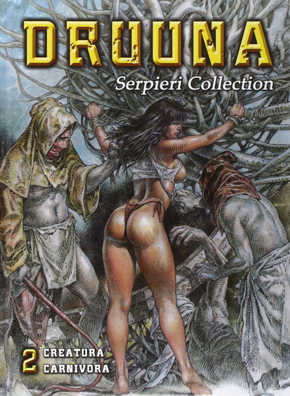
In the November 1992 issue, the third Druuna story, Creatura, was published. Infamously, this story contains a four page sequence (pages 45-48) where Druuna is drugged and gang-raped. On the last page of the sequence, she wakes up and the following internal dialog shows up in a thought balloon.

Forgive me, we might have been able to live together. Your little devils gave me so much pleasure, you know? I don’t know how much those drugs were responsible… But I can reassure you it was a wonderful experience.

Which is, in my opinion, the crux of the problem with these stories. If there were no word balloons, it would be entirely possible to read at least one of the pages of the sequence as just a very well-drawn group sex scene, with attendant pornographic associations. It is drawn sexy. That’s how Serpieri draws these things – he’s very good at what he does and his artistic choices are on the page. With the context added in, the juxtaposition of sexy and horrific makes the mind recoil in realization.

However, the apology that the victim utters (even if it’s only in her mind) seems to absolve the instigator of the assault (a woman) retroactively on the theory that it was fun, once Druuna got into it. I cannot think of a more dangerous sentiment to present to the kinds of people that would find those pages more sexually arousing than horrific; keep in mind that I count myself as one of those individuals.

The first Druuna story was published in 1986, the year I entered high school. Heavy Metal was not news to me – on the contrary, my father had the complete run as I was growing up, so there was not a time when I did not know that Heavy Metal existed. But the perfect bound quarterly issues starting in 1986 did not fit into the official commemorative binders that held the first nine years of the publication. The new issues sat alone and were easier to consume as they came in.
The second story was published when I was still in high school and Creatura came out when I was living at home, having dropped out of college. In those pre-internet days, anything pornographic was a precious item and this one was mailed directly to my house. I’ll spare you the gory details, but I honestly wonder how much those three stories impacted my sexual development.

If you can read Marain, figuring out my FetLife profile shouldn’t be that difficult. I’m not going to make it easy for you, but I will say that enthusiastic consent is a massive turn-on for me. And even the slightest hint of reluctance makes me very uncomfortable. I guess that means I got the right message? It’s difficult to say for sure if I am representative of the average reader reaction or an outlier.

I will say this, though – I tend to be attracted to women with bodies that are similar to Druuna’s and that’s probably not a coincidence.
—————————————

Five additional Druuna stories were published between 1993 and 2003 (fun fact: more Druuna stories were published under Kevin Eastman as publisher than not), but I’m not going to recap them all in nauseating detail. They all are all set in more or less the same technorganic futuristic hellscape, a place full of horny soldiers, brutal authoritarianism, sadistic sexual predators, disease, ravenous mutants, and bewildering recurring characters.

There is a lot of philosophy and soul-searching. Consensual sex is found throughout the series, but usually only in the context of idyllic dream sequences that serve to demonstrate what the world could be like. On the other hand, the constant threat of violence and sexual assault seem to serve as a cautionary element, describing how the world is messed up.

Which works, on an allegorical level. But the stories themselves tend to duck and weave considerably around the outright identification of self-identification as allegories. In fact, Serpieri’s hyper-realistic artwork tends to work against reading these stories as allegorical. These are specific events, happening to specific people.

If Druuna is, indeed, some kind of ur-woman, what do her repeated sexual assaults mean, exactly? Are they meant to imply something about the universal condition of women? That’s pretty bleak, no matter how you turn the interpretation. However, if there is no meaning to these assaults, then the allegory argument falls apart on first principles.

It is entirely possible that I think too much about these things.

—————————————

Screen Shot 2016-06-14 at 9.56.07 PM

 
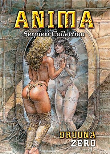
One final story: When I was in a mall outside of Antwerp earlier this year, I was flipping through Anima, the first new Serpieri book in thirteen years, at FNAC. My girlfriend looked over my shoulder and noted that the book was not just “a little rapey” (as I had described his work in Heavy Metal) but depicted actual rape, complete with knives to throats during intercourse. Considering that the book is largely silent, this is both a testament to his sequential art capabilities and his pre-occupation with sexual assault.

Paolo, you’ve still got it!

Heavy Metal Magazine is Not Punk

By now, everyone knows that Grant Morrison is taking on the role of Editor in Chief for Heavy Metal magazine. As someone who is three years into a complete reread of the entire run of the publication, this is of great interest to me.

My first reaction to this announcement was “again?” I’ve seen this kind of stunt casting for Editors before. When I read Grant Morrison’s comment that “[w]e’re trying to bring back some of that 70s punk energy of Heavy Metal,” I had to wonder if he actually, y’know, read the magazine during the 70s and 80s. Of all the labels that could possibly be laid at the feet of Heavy Metal during that period, punk is the only one I wouldn’t use.

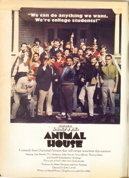
First of all, the magazine was originally published by National Lampoon, a not-inconsiderably-sized company that released movies (Animal House, Vacation) and sold an awful lot of branded merchandise during the 70s and 80s. The pages of early Heavy Metal were packed full of advertisements for National Lampoon stuff. None of that really came across as punk to me at all. As Heavy Metal went on, they became much more obviously commercial, with their own brand of merchandise that was advertised in every issue.
 

tumblr_lxeae05vuM1qjkqk8o1_500

An ad for Animal House from an early issue of Heavy Metal.

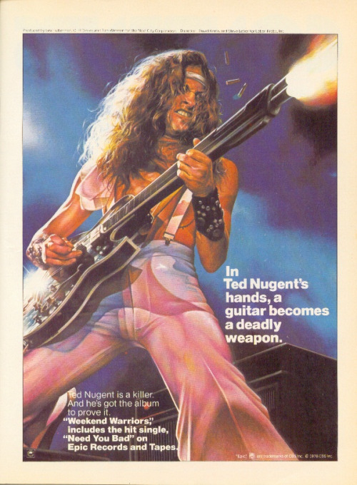
Second, a lot of the early material is very psychedelic and appealed mostly to the aging hippy demographic, which was, if I remember Sid and Nancy correctly, directly antithetical to the ethos of punk. Furthermore, Ted White was a big prog-rock fan and the material that was produced under his guidance leaned very heavily in that direction. If you were an Ultravox fan, Heavy Metal in the early 80s was absolutely the magazine for you.
 

tumblr_m3trgeS18E1qjkqk8o1_500

An ad for a Ted Nugent album, from March of 1979. Tres punk.

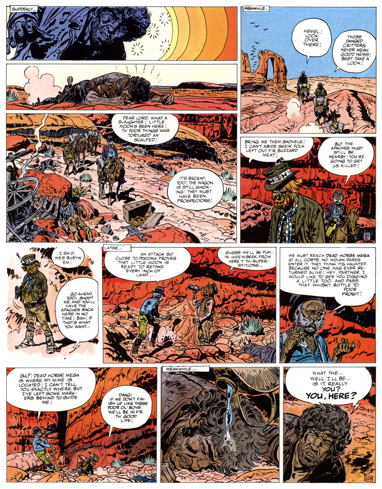
Third, the revolution that really drove Heavy Metal was very distinctly French and had a lot more to do with the format of how French comics were serialized than with any kind of musical aesthetic, something that is largely transparent to Anglophones. Instead of serializing stories 22 pages at a time on a monthly basis, French BD magazines serialize their stories half a page at a time in weekly anthologies and have done since the 50s. It was a technique made popular with Tintin magazine, and perfected by Spirou. By the end of the 60s, Pilote (under the editorial guidance of Rene Goscinny, not coincidentally, the writer of Asterix) was the big boy on the block, largely due to this production methodology.

The collected editions of popular stories and characters would stack half-pages together to create magazine-sized albums. Take a look at any French (or European) BD collection produced before 1970 – Asterix, Valerian, Corto Maltese, Blueberry, Philemon, Spirou – and you will notice a white gutter running horizontally through the middle of almost every page in the book. This is a direct artifact of the serialization methodology, regardless of whether the story was actually serialized or not. There were occasional splash pages in these books, but that’s more of an exception than a rule.
 

lost-dutchmans-mine

A page from Blueberry – note the A and B in the bottom right corners of the half pages.

 
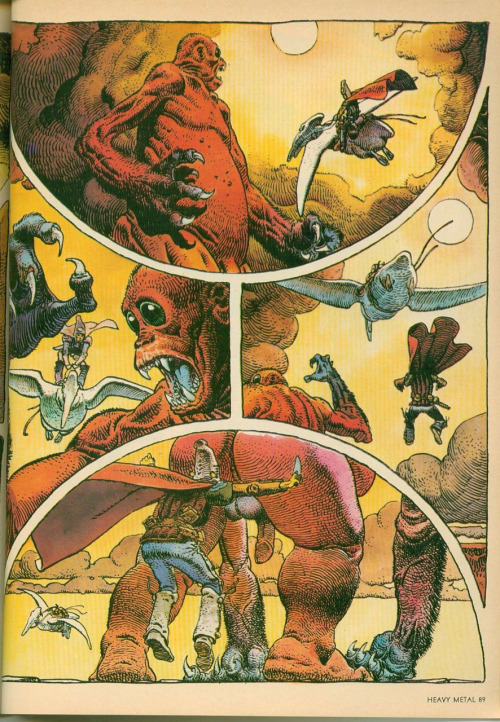
But when you look at the material that Moebius and Druillet were producing in Metal Hurlant, you can really see a massive revolution in format. The pages are not formatted to be chopped in half for serialization – the page layouts are a direct challenge to the old commercial methodology. In addition, the fact that three or four pages were printed at once to present a complete story in a single issue was a major shift.
 

tumblr_ltdw0yqK221qjkqk8o1_500

For contrast, a page from Arzach, also by Moebius

It’s probably not a coincidence that Les Humanoïdes Associés came mostly from the Pilote stable of artists. They pushed against the solid editorial format of the establishment and, when that didn’t get them where they wanted to go, they went out and formed their own magazine – something that just about everyone in the Francophone market did at one point or another. There were many, many anthology magazines on the stands at the time and still are.

The Metal Hurlant revolution can be better understood to an Anglophone comics audience as analogous to the Image revolution – a bunch of artists got together and did their own thing because they wanted more creative control. It’s a shame that this part of the history isn’t better understood, because it would have been more appropriate to compare the Image revolution to the Metal Hurlant revolution because of the order they occurred in. C’est la vie.

After Metal Hurlant proved to be a successful commercial powerhouse, the BD market shifted. Not everything had to be in half-page increments anymore and there were far more experiments in format. By the early 80s, things like Les Cites Obscures by Schuiten and Peeters started showing up in complete albums without serialization and multipage stories by Caza were appearing in Pilote.
When Heavy Metal appeared on American newsstands in 1977, there were already a number of other anthology titles floating around. Not quite part of the underground movement, these were referred to as the “ground level anthologies” (because they were a step above the underground and a step below the mass market) and, to Anglophone eyes, Heavy Metal fit right in.

The granddaddy of these was (in my opinion) witzend, which started in 1966 and was published irregularly through the mid 80s. Star*Reach and Hot Stuf’ were around in the early 70s and provided venues for artists like Howie Chaykin and Rich Corben, who went on to make great material for Heavy Metal.

Interestingly, 2000AD also started in 1977.
By the early 80s, the ground level anthologies business was very popular. Every little (and some not-so-little) publishing house was putting out their own anthology – Eclipse, Epic Illustrated, Warrior, Raw, Weirdo, 1984 (later 1994) all came and went during the heyday of Heavy Metal. There was even a short run of a Scottish anthology in 1980 called Near Myths that featured a strip called Gideon Stargrave by a young up-and-comer named Grant Morrison.

It’s entirely possible that the young Morrison saw Heavy Metal in punk terms because that was what he was immersed in when he was 20, when he was working on an anthology created in clear imitation of Heavy Metal. But that doesn’t mean that Heavy Metal had any kind of real “punk energy” during that period. Maybe we are predisposed to define all future revolutions (including the ones we create) in terms of the first revolution that we live through.

A really revolutionary act would be for Morrison to go back and read those issues with fresh eyes and see what made Heavy Metal distinct (the European material, which none of the other ground level anthologies had in such a high volume). In the Entertainment Weekly article, he is quoted as saying “One of the things I like to do in my job is revamp properties and really get into the aesthetic of something, dig into the roots of what makes it work, then tinker with the engine and play around with it. So for me, it’s an aesthetic thing first and foremost.”

He also plans to write and create original material for the magazine, which doesn’t fill me with a lot of hope that he will, in fact, recapture that original aesthetic – mostly because the most honest way to do that would be to hire revolutionary European creators and give them room to really challenge the status quo. But I don’t see him trawling Angouleme for new creators anytime soon.

One thing is certain: given my commitment to read the entire run of Heavy Metal, I’ll get to his issues eventually. I’m currently on the 1989 issues, so that will be three to four years from now, based on my current reading speed. At this point, though, I really don’t feel a sense of urgency to jump ahead and read them as they are released, based on his remarks.

That Time When Heavy Metal Went Quarterly

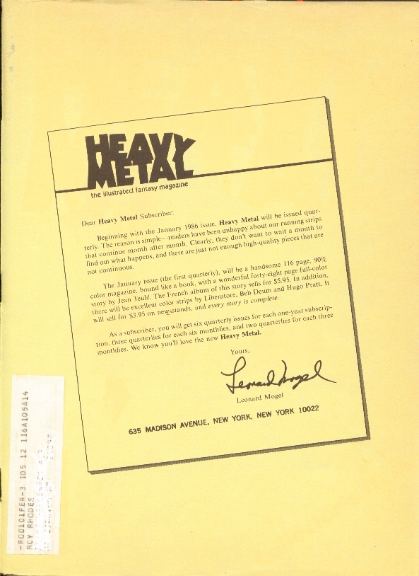
When subscribers received their copy of the December 1985 Heavy Metal in the mail, they were greeted with a letter from publisher Leonard Mogel, printed on the paper mailing wrapper, informing them that with the next issue, Heavy Metal would be moving from a monthly publication schedule to a quarterly schedule. The reason provided was simple: readers were unhappy with the fact that the stories in the monthly version of Heavy Metal continued from one month to another. Quarterly publication allowed the magazine to increase the page count from 96 to 116 pages, add perfect binding and to publish complete stories in each issue. Oh, and the cover price went from $2.50 to $3.95 (the equivalent of jumping from $5.40 to $8.53, adjusting for inflation).

Having read every issue of Heavy Metal through 1986, I’m not entirely convinced that “the audience wants complete stories” was the whole reason for the shift in publication frequency. Looking at the individual magazines that were published in the years before the shift, it’s easy to spot how a combination of cost-cutting measures and behind-the-scenes change in staff might have also contributed. Having said that, “readers want complete stories” was convenient and easy to explain and a lot more audience-friendly than “we’ve had some staff issues.”

And boy, did they have staff issues in 1984 and 1985. But in order to explain the full impact of those staff issues, we have to go all the way back to the January 1978 issue of Heavy Metal, when John Workman became the magazine’s second Art Director. In that January issue, Workman was co-credited as Art Director with Harry Blumfield, who had been working in the position since the first issue. In February, Blumfield was gone and Workman was in.

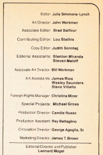
Workman’s influence was not obvious at first, but over the course of the next two years, he built up the quality of the production. When editors Sean Kelly and Valerie Marchant were replaced by Ted White in 1980, Workman survived the transition. He also survived when Ted White left at the end of 1980 and was arguably one of the mainstays holding the staff together during the transition. Throughout this period, Workman’s name lingered near the middle of the credits on the masthead, never getting higher than fourth. This is significant, because I believe where the individual ranked on the masthead was indicative of where they fit into the staff hierarchy; whether or not this is true, it seems clear that members of the staff at the time believed it to be true.

In fact, Leonard Mogel’s name appears at the top of the masthead throughout most of 1981, reflecting a more active involvement in the day-to-day activities at the time. Julie Simmons-Lynch is credited as the editor, but it was obvious that she didn’t have the same kind of hands-on relationship with the production as Kelly/Marchant or White. They needed someone to pitch in and take care of operations.

Accordingly, in the March 1981 issue, a new name appeared on the masthead – Brad Balfour, Contributing Editor. His editorial efforts were largely forgettable, but Balfour was a terrible interviewer and badly botched an interview with Richard Corben which ran in June, July and August of that year. This series precipitated an angry full-page letter from Corben, who demanded that the letter be printed in full, with no edits. This letter appeared in the September 1981 issue, the same issue that was dedicated to the Heavy Metal movie that was released on August 7th of that year. It was not the best use of editorial synergy and was largely reflective of the state of the magazine in 1981.

In addition to the movie, which brought in hordes of new readers, the other major event of 1981 was the release of an entire special issue, dedicated entirely to Moebius. This Moebius special featured (among other things) an introduction by Federico Fellini and the first few chapters of The Incal, a serial written by Alejandro Jodorowsky and drawn by Moebius. Workman and his team did a lot of the heavy lifting for this issue and Workman was given top billing in the masthead. Perhaps coincidentally, Mogel’s name was no longer on the masthead for the December 1981 issue of Heavy Metal and Workman’s name was second, right underneath Simmons-Lynch and above Contributing Editor Balfour. Workman’s name remained in this position on the masthead until he left in 1984.

Workman’s contribution to the magazine was everywhere and, thus, only truly obvious after he left. He contributed a lot to the look and feel of the individual issues, producing spot-art and the occasional one-page story when it was necessary to fill a gap. Although he was never credited as an editor, he was the Art Director in a publication dedicated to art and the magazine was better off having an Art Director in such a prominent role in the leadership.

The February 1982 masthead had some major changes. In addition to Brad Balfour becoming an Associate Editor, there were some new names, most notably Lou Stathis as Contributing Editor and Steven Maloff as Editorial Assistant. Since October 1981, Stathis had been working on Dossier – the spiritual heir to the columns that White had added when he was the editor in 1980. In this incarnation, Dossier was focused largely on music, with healthy digressions on movies, books and video games. There were far more writers than White had in 1980 and the topics bounced all over the place.
 

feb82

February 1982 masthead

 
Balfour was the first real editor of Dossier, but Stathis took over when he was promoted to Associate Editor in May 1982. As for Balfour, he was credited with “Special Projects” and disappeared from the masthead entirely in October 1982. Maloff was promoted to Contributing Editor in July 1982 and not a lot else changed in Heavy Metal leadership for the next two years.
 

dossier NOV 83

Dossier November 1983

 
I would argue that this incarnation of Heavy Metal, with Workman, Stathis and Maloff, was one of the best periods of Heavy Metal, full stop. When Stathis wasn’t busy picking fights on the letters page (sample response: “Yeah, but I’ll bet your dick has to hunt and peck when it types.”), he was turning Dossier into a powerhouse review section that also ran interviews with all kinds of creative types, from Jerry Lewis to Jack Davis and everyone in between.

For his part, Workman was busy turning Heavy Metal’s visual content into something legendary. In addition to long-running series like Rock Opera by Ron Kierkegaard, The Bus by Paul Kirchner, Tex Arcana by John Findley, and I’m Age by Jeffery Jones, Workman also put together a series called June 2050. This featured one-page vaguely science fictional stories by various comics luminaries including Dick Giordano, Chris Browne, Drew Friedman, Rick Veitch, Bill Dubay, Len Wein, Todd Klein, Rick Geary, Howard Cruse and Pepe Moreno.

It’s not clear where Steven Maloff’s influence can be seen during this period.

In 1982, Heavy Metal released a second special issue, their first Best Of. In 1983, they decided that they had enough material to produce a 13th issue, which was branded Even Heavier Metal. Both of these were masterminded by Workman and it’s interesting to note that neither Stathis or Maloff were credited in Even Heavier Metal (I don’t have Best Of #1) – presumably because there was only comics and art-related material on offer. This changed in 1984, when Son of Heavy Metal was released. Here, Maloff was credited as Associate Editor, the only masthead that shows him with this particular title (he was promoted to Managing Editor in July 1984).

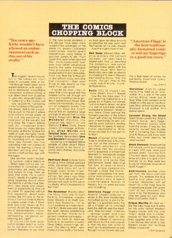
1984 was not a particularly good year for Heavy Metal, production-wise. In January, Bird Dust, a story by Caza was reprinted (a first, for a magazine with so much content that it felt compelled to print 13th issues three years running) – it had originally been printed in the November 1977 issue, two issues before Workman began. In April, the cover price went up to $2.50, the first price hike since February of 1980. The next month, in June, 16 of the 96 pages of the magazine changed from the usual glossy paper to newsprint; this was ameliorated somewhat by printing Dossier and Tex Arcana, a black and white feature, on the lower-quality paper. Coming so close upon the heels of the cover price hike, the lowered paper quality hints strongly at money problems.

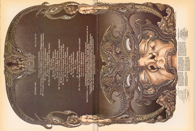
And then John Workman left the magazine. The October 1984 issue was clearly laid out by Workman, although his name does not appear in the masthead and neither does his staff. It’s not entirely clear if the departure was planned or unplanned, but there is a clue in the masthead. Steven Maloff, who had been credited as Managing Editor since July 1984, was temporarily demoted back to Contributing Editor in this masthead, which is almost hidden on the credits page. It’s very subtle, but it’s absolutely a message of some kind in Maloff’s direction.
 

oct84_editorial

October 1984 editorial

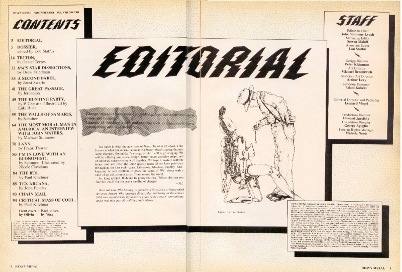
nov84_Editorial

November 1984 editorial

 
Indeed, the very next month, Maloff’s name was now above Stathis in the masthead, where Workman’s name resided since 1981. There was clearly some kind of power struggle and Workman lost. The magazine was not better off without Workman – the production quality of the magazine dropped significantly in that single month and never really recovered. It was Balfour all over again, only this time they didn’t have a movie bringing in new readers or John Workman providing support.

There is no better indication of how bad things got, production-wise, than the 13th issue from 1985 – Bride of Heavy Metal. Workman was long gone by the time this came out and the little details that Workman put into the special issues he produced are not here. And instead of providing distinct credits, the whole issue was “Compiled by the Staff of Heavy Metal magazine,” which is as vague as it gets.

As bad as 1984 was, 1985 was worse. My copy of the February 1985 issue has a major printing error – the registration lines from the red ink don’t quite line up in one of the signatures, an issue that hadn’t been seen in years. In April, Maloff took over editing Dossier from Stathis. In May, the paper quality dropped again, including four bright white pages that were a step up from newsprint, but a step down from the normal glossy paper and tended to let the art from the other side of the page bleed through. In June, the whole magazine had switched to this new paper stock, replacing both the newsprint and the glossy paper. And, in July, Stathis was completely off the masthead. Maloff was now in charge of the magazine, for better or for worse.

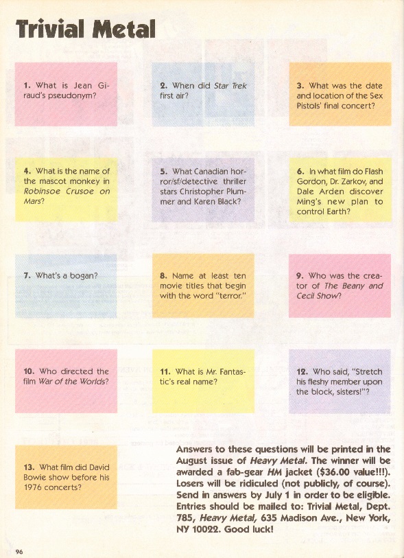
One of the lesser ideas that Maloff introduced in July 1985 was a full page of trivia questions called Trivial Metal. In that issue, the answers were not provided and it was run as a contest – readers were encouraged to send in answers with a chance of winning a sweet satin-like jacket with the Heavy Metal logo printed on the back. The contest aspect of Trivial Metal didn’t last long and, by the next issue, the answers were printed upside down on the same page as the questions. This continued for another issue and, in October, the feature was not there. In November, neither was Maloff.
 

trivia JUN 85

Trivia June 1985

sweet satin-like jacket

 
His position was not filled, exactly. Michela Nonis had been promoted to Production Manager in April 1985 and, absent Maloff, became the default bigwig. It’s difficult to tell if going quarterly was her idea or not, but it was certainly a decision rapidly made. The September 1985 issue has a subscription ad that features a good deal for a three year subscription, which pretty clearly indicates that the staff thought they were going to be publishing a monthly magazine for the foreseeable future. There were no subscription ads in October and, in November, the last installment of Dossier published seven interviews – clearing out the backlog of interviews that they had stocked up over time.

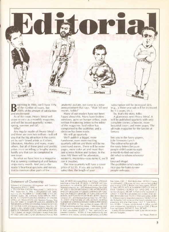
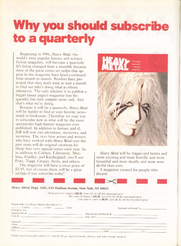
The subscription ads and editorials in the December 1985 issue leaned very heavily on the idea that readers had been clamoring for complete stories in every issue for years and the change in format was completely not a last-minute decision by a staff that had run out of ideas for ways to cut costs. This was clearly propaganda, but propaganda that was easier to promulgate than explaining how they’d lost their star Art Director in a power struggle over whose name got to be on the masthead of the 13th issue a year earlier.
 

editorial DEC 85

December 1985 editorial

subscription DEC 85

December 1985 subscription

wrapper DEC 85

October 1984 subscription

 
I’m convinced that the loss of John Workman led directly to the transition of Heavy Metal from a monthly magazine to a quarterly magazine. True, each of the new issues contained only complete stories, but that was not necessarily a good thing. In January 1983, at the height of the Workman/Stathis years, the magazine boasted fifteen features, not including Dossier. Five of them were short – half-page or single-page comics, but the range and quality of the material was extensive. The first issue of the new format boasted seven full-length features. One featured short, episodic stories and the other offered novellas that were promised to be stand-alone (ie, no sequels).

In addition, there was a certain frisson that came from reading several serialized comics right on top of one another, anthologies being sort of the entertainment equivalent of eating a multi-layer cake or club sandwich. There were a lot of weird, conflicting flavors, true, but the experience was richer for it. Reading two (or more) serials at the same time over the course of several periodical installments creates an associative memory between the two (or more) stories, an effect that can only be achieved through sequential episodic serialization. Complete, non-sequential stories offer a pale echo of the same experience, but cannot (by definition) offer the experience of following a serial across multiple installments.

Publishing quarterly didn’t last. After three years, Heavy Metal changed their publication schedule again in 1989, moving to bimonthly and eventually being sold to Kevin Eastman in 1992. In nearly nine years as a monthly magazine, over a third of all Heavy Metal issues to date were published between 1977 and 1985. It was a strong brand that spawned a movie, innumerable branded clothing options and a number of imitators (the so-called ground level anthologies, most notably Epic Illustrated, which coincidentally folded in 1986). It was a mainstay on the magazine rack, month in and month out. Dropping the frequency of publication really limited its visibility in a big way.

In my opinion, the biggest loss was Dossier, which didn’t fit the new format. The Dossier section turned readers on to any number of great bands, songs, albums, movies, authors and other entertainment options they might not have otherwise been exposed to. Dossier had the potential to become a monthly guide to cool, weird stuff for a certain kind of reader with access to a decent record store. Lou Stathis was a contrary proto-goth with a severe aversion to dickheads, but he had great taste in music.

In 1986, as the publication frequency changed, there was an attempt to spin Dossier off into a weekly newsletter called Heavy Metal Report. I can find no information about this spinoff online (and my father, who I inherited my collection from, was clearly not interested because he had no copies). The loss of this review section remade Heavy Metal into more of a pure comics magazine, significantly disconnected from contemporary pop culture.

At SPX, Joe McCulloch reminded me that the stories published in the quarterly years were actually pretty good. A Corto Maltese story by Hugo Pratt, the introduction of Druuna by Eleuteri Serpieri, an old Moebius story and a new Enki Bilal story were all printed in the first year. In fact, one of the few things that survived both the departure of John Workman and the switch from monthly to quarterly was the overall quality of the comics stories. Not every story was a winner, but when they were good, they were very, very good. Moving forward, there were just fewer of them, complete in every issue.


Other Narrative-Sequential Art Forms

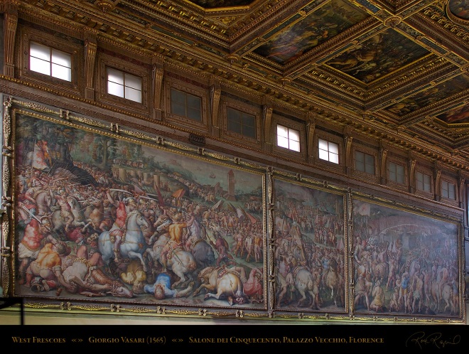
In the heart of the Palazzo Vecchio in Florence is the Salone dei Cinquecento (Hall of the 500), which, as the name implies, was designed to seat the 500 members of the Grand Council. In the 1560s, Giorgio Vasari was commissioned to create a series of frescoes on the walls and oil paintings on the ceiling of this hall.


Vasari_WestFrescoes_Hall_of500_5402

West Frescoes in Salone dei Cinquecento by Vasari 

(Photo by Ron Roznick)

The frescoes depict battles and military victories by Florence over Pisa and Siena (in chronological order, no less). These are massive pieces of art that are designed to impress visitors to the Hall, which functioned as the court of the Medicis. It is interesting that they are presented side by side with what look like extremely ornate panel borders. They are too large for the arrangement to be accidental, which means that Vasari (or his patrons) wanted these pieces to be close enough to create an effect larger than the sum of the parts.

It would be possible for a viewer to spend hours examining every detail in each fresco, but it is clear that the intended effect of the presentation is to impress visitors to the hall with both the military prowess and wealth of the city with the visual immediacy of how it has been successful in the past (and, by implication, could be in the future). It may only be because I read comics that this presentation reads as a three panel strip where the middle panel is less important than the two on the ends.


Ceiling_Hall_of500_5392

A portion of the ceiling of the Salone dei Cinquecento by Vasari 

(Photo by Ron Roznick)


The 39 oil paintings on the ceiling of the same hall represent great episodes from the life of Cosimo I and scenes from the history of Florence. The presentation of these paintings in a massive, ornate grid reminds this modern viewer (and reader of comics) of the carefully arranged panel grids of a comics page – especially since each of the paintings has its own descriptive caption. And there is even an implied order that these are meant to be viewed in; the circular painting in the center, for example, is The Apotheosis of Cosimo I de’ Medici which depicts his coronation by the personification of Florence.

Again, the intended effect is to produce awe at a government that had enough disposable income to commission such a piece. Keeping in mind that thirty feet of open space separates the ceiling and the viewer, the narrative aspect of the arrangement is less obvious on an initial viewing and only becomes evident with time to study the detail. But it is there.

(Better views of these pieces can be found at this site.)

These artworks take advantage of the basic artistic process that enables comics – the implied narrative- sequential connection that comes from placing two pieces of artwork near each other, regardless of whether those pieces are related or not.

The Salone dei Cinquecento is a good example of a narrative-sequential artwork outside of the comics tradition because it contains two distinct examples with very different approaches from the same creative team. It is easy to avoid referring to either work as “comics” because “comics” was not part of the artistic idiom at the time of creation. There are other examples, of course – narrative-sequential artwork is everywhere if you have a broad enough perspective.

And, to be honest, finding examples of narrative-sequential art from before the advent of comics-as-comics is almost too easy. What I find especially interesting are the 20th Century examples of non-comics narrative-sequential art, mostly because they arise outside of an explicitly comic-making tradition but are still contemporaneous with what we think of as modern comics.

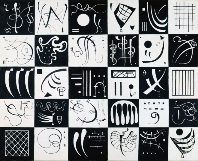
thirty by kandinsky

Wassily Kandinsky, “Thirty” (1937)

Kandinsky was living in Paris when he made Thirty, which means that he would have been aware of bandes desinees (BD) as a general cultural phenomenon. It is possible that he might have encountered it earlier in his travels around Europe, but it would have been impossible to miss it in Paris in the 30s. If he had wanted to make comics, there was ample opportunity for him to do so. He didn’t, but this was as close as he got.

Despite the fact that it is an explicitly abstract piece, Thirty still takes advantage of the implied relational connection that comes with arranging discrete pieces so close together. It is an extremely successful grid and provides an overt narrative framework for the viewer to build an interpretation around. If anything, this grid is closer to the effect generated by the ceiling of the Salone in Florence. It emphasizes the overall effect first and rewards subsequent scrutiny.

Wild Pilgrimage

Lynd Ward Wild Pilgrimage (1932)

There is little evidence that Ward was thinking in terms of comics when he produced his woodcut novels like Wild Pilgrimage. Comics were certainly around at the time, but they were largely regulated to the newspapers and comic books were still in their infancy.

Each page of Ward’s novel only has a single image and there are no captions, so these are comics-like at best. But these absolutely take advantage of the fact that images presented in sequence can be used to tell a story. As allegorical tales, Ward’s novels were tied to the worker’s movements of the times – a very different audience and purpose than American comics of the period.

Milan Duomo 2Milan Duomo 1

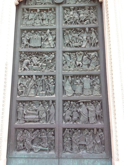
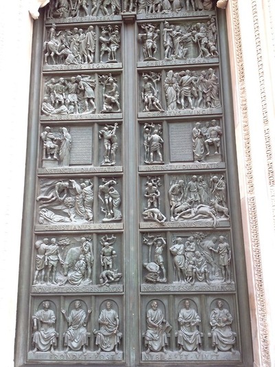
Doors of the Milan Duomo (mid 20th Century)

Because I have taken Frank Santoro’s composition course, these doors remind me of the fixed grids that he teaches in his class. It absolutely makes sense that an artist attempting to produce a narrative in bronze would divide the available space into rectangles of equal size. It is a natural impulse and an obvious design solution. I have no idea who designed these doors or whether that person had a comics background. I’m happy to get more information if someone has it.

Une Semaine

Max Ernst, “Une Semaine de Bonte” (1934)

Like Kandinsky, Ernst was living in Paris when he worked on Une Semaine de Bonte, although he actually completed it in Milan. Like Kandinsky, Ernst would have been aware of the BD culture of the time – even if it was only a cursory cognizance.

Like Ward, Ernst’s novel takes advantage of the narrative aspects of art presented in sequential order to tell a story. Like Ward’s work, each page contains a single image and, unlike Ward’s work, these pages have captions more often than not. Despite the fact that they are contemporaries, there are very few other similarities between Ward and Ernst beyond the fact that they both arrived at the same solution (images in sequence) for the same purpose (to tell a story) from very different (non-comics) directions.

It’s tempting to categorize these kinds of explicitly narrative-sequential art as comics that don’t know that they’re comics. I think it’s safer to say that the idea of presenting artwork in sequence for narrative purpose is such an easy conceptual leap that it should not surprise anyone that it shows up so often in so many disparate places; diptychs, triptychs and other polyptychs have been acknowledged art formats in multiple cultures for centuries, if not longer.

Comics, specifically, are a refinement of the concept for a very specific purpose and medium. Rather than trying to shoehorn everything into the comics tradition because that’s the most obvious context for modern viewers, it would make more sense to think of it the other way around – comics are no more and no less than a distinct subset of the larger grouping of narrative art in sequence.

Having said that, it would not be a bad idea for contemporary comics creators to pay attention to these other examples of how past artists have used this technique to good effect. This is no different from telling creators to study how other artists have used color theory, figure drawing or one point perspective.


Old Icons, New Context

The index to the Indie Comics vs. Context roundtable is here.
____________

As an avowed post-modernist, I have been known to proclaim that “context is everything” on more than one occasion. And because context is everything, one of my favorite things in the world is when a creator takes a property and recontextualizes part of it. Done properly, this can provide an entirely different viewpoint on something that I thought I knew and understood.

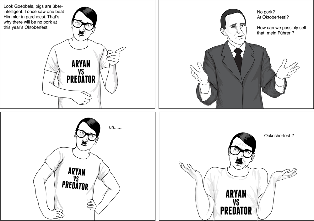
For example: Hipster Hitler by James Carr and Archana Kumar. The high concept is pretty straightforward; in his character bio, the authors write “Failed artist, vegetarian, animal rights activist, asshole – it all just fits.” The concept was originally presented as a webcomic and was subsequently published in book form by Feral House.

(And yes, Hitler was a real person, not a fictional character. However, it could be argued that he has become a larger-than-life caricature of a villain since his death. This is certainly the viewpoint that the comic is written from.)

In Hipster Hitler, the recontextualized Hitler is presented alongside his generals and advisors, who are still in their original context. As you would expect, the interaction between generals and a hipster who happens to be their leader provides the majority of the comic energy in the series. The only other recontextualized character in the series is Joseph Stalin, who is presented as Broseph Stalin, complete with red Solo cups and a popped collar.

What makes the series interesting to me is that a detailed familiarity with both contexts – World War 2 and contemporary hipsters – is required to really understand all of the humor. The best thing about the series are Hitler’s t-shirts, white with a pithy saying. One of the more obscure ones reads “Artschule Macht Frei.” To get the joke, you have to know that Hitler didn’t get into art school and that the phrase “Arbeit Macht Frei” (Work sets you free) was over the gates to Auschwitz – clever, but in poor taste. The joke in another strip turns on the knowledge that Hugo Boss designed the uniforms of the Wehrmacht.

Drawing the parallel between Hitler and hipsters didn’t take a lot of work, but writing an entire book of jokes about the juxtaposition without being too overtly offensive did. To a certain extent, anything that humanizes Hitler has the potential to be offensive just by its very nature. Here, though, the comparison doesn’t cast Hitler or hipsters in a favorable light. And that’s why I think it works.

Mind you, it doesn’t say anything profound about the human condition, World War 2, the Third Reich, Hitler or hipsters. But then again, it’s not trying to. As far as I’m concerned, the whole thing is just a vehicle for some really entertaining t-shirts – “Three Reichs and You’re Out,” “Under Prussia,” “Ardennes State,” “I Control the French Press.”

56_oktoberfest

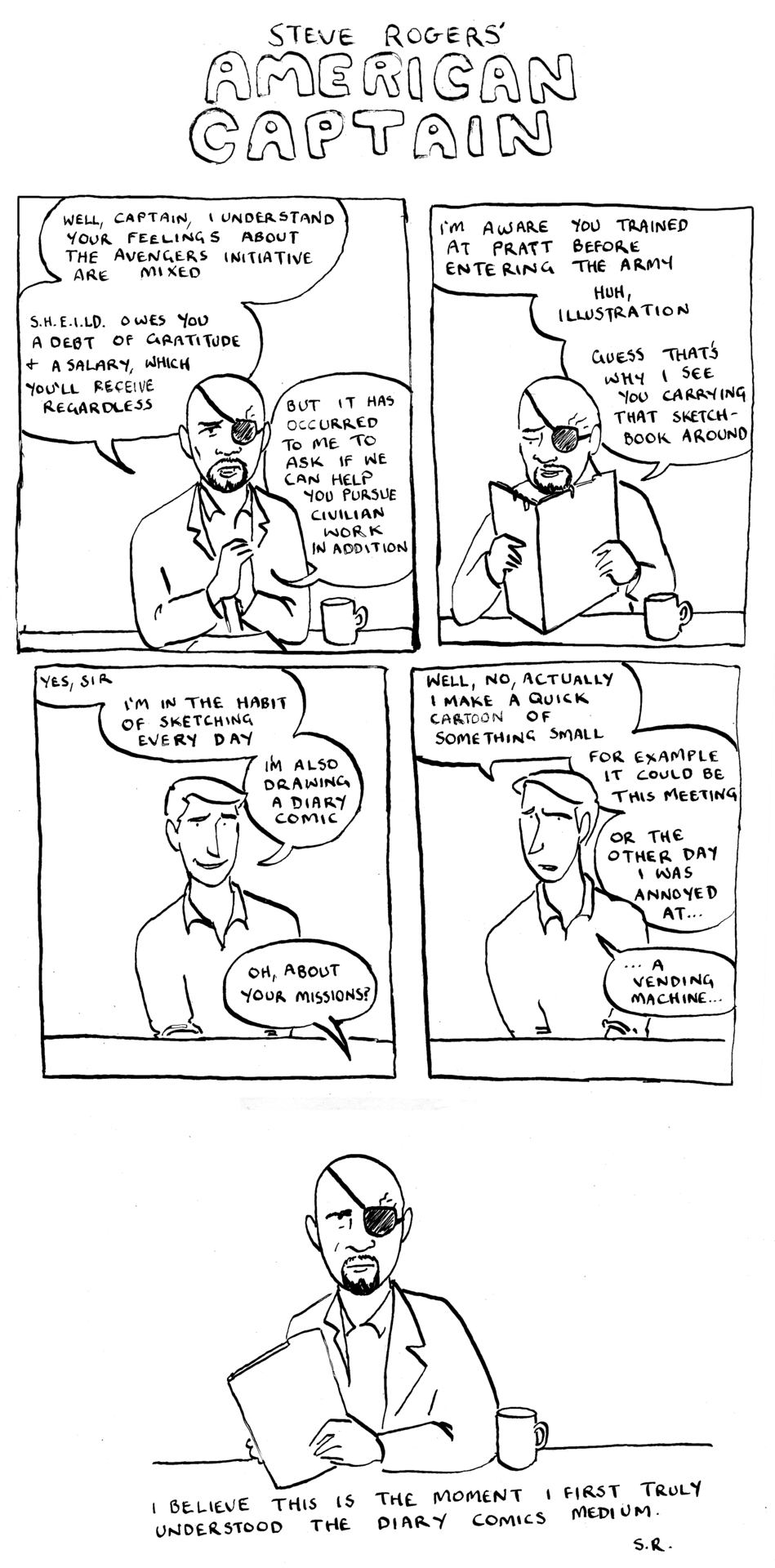
For more profound insights into the human condition I look to American Captain by Robyn. Presented entirely on a dedicated Tumblr, the premise of American Captain is that Captain America (from the movies) is dealing with the culture shock of waking up 40 years later by producing a series of autobiographical comics.

The two contexts are fairly obvious – the universe of the Marvel superhero movies and the world of autobiographical comics, which we get mostly through the art style. There’s a third, less obvious context, however – fandom. The entire point of the series comes directly from the fandom impulse to interrogate the inner lives of characters as revealed in settings and scenarios that are other than the canonical appearances. This comes through in the description of the premise, at the point where I had to specify which Captain America was being presented.

Understanding American Captain does not require nearly as much contextual information as Hipster Hitler does, but it helps if you’ve at least seen The Avengers. Still, a diary comic written by a fictional superhero is a concept that begs to be at least partially unpacked.

captain

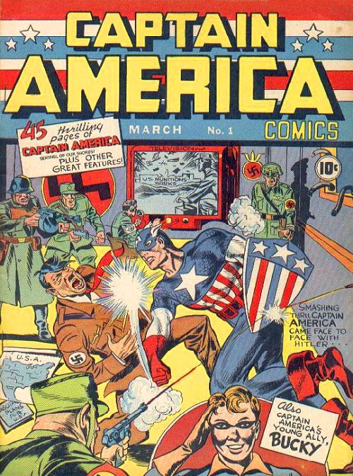
In addition to the understanding that Steve Rogers has an artistic background and would probably gravitate to autobiographical comics as a form of self expression (which has a weird mirror in the canonical comic series in the 1980s, when Mark Gruenwald had Steve Rogers penciling the Captain America comics), the series explores the fish-out-of-water experience of a time traveler from the past. In the comic book, this is old news and Steve Rogers has long since acclimated to the present. But in the movie universe, this is still relatively new information, ripe for exploration.

A few strips capture quiet one-on-one moments among the team and there is an entire series of strips following Pepper Potts, who has taken it upon herself to educate our narrator about recent art history. One of the more profound sequences follows Steve Rogers and his undiagnosed PTSD and the ways he deals with the revelation that he’s not as mentally together as he’d like to believe.

The strength of the strip is in the vulnerability that Rogers reveals in his diary comics. Presumably, nobody is reading them but him. However, we know that isn’t the case because we, the readers, are reading them. By doing so, we get a direct insight into his most personal thoughts and interactions in a format that is utterly private (or so the conceit goes).

The effect is unsettling and deliberately so. A man who wakes up decades after everyone he knows has died is not going to have an easy time adjusting to the modern world. The biggest issues will be the smallest things. In a universe that seems to be focused on blowing stuff up real good, being able to slow down and appreciate the details is a breath of fresh air.

Whereas Hipster Hitler is primarily concerned with from pointing out that certain entitled personality types have been around for much longer than we’d like to believe, American Captain is more subtle and nuanced. Considering that the former is a comedy and the latter is focused on the quiet desperation of Steve Rogers, this makes sense. However, both work because someone noticed that there is more than one way to look at the characters.

By picking the characters up from their original context and shaking off the detritus that has accumulated over time, the original foundation of what makes the characters who they are is revealed. Hitler is a hipster. Steve Rogers is an artist. Context is everything.

Captainamerica1

SPX: Different Shows for Different People

tumblr_inline_mrhtsxZ6Lc1qz4rgp

 
In a comment to my post from last week, R. Maheras wrote:

“I was at SPX today, and almost every complaint about homogenized superhero comics can probably be made about contemporary small press.

There’s a relative sameness pervading contemporary small press that I don’t remember seeing during the small press explosion of the 1980s.

Zombies, cutesy creatures/monsters, or reality-based angst comics seemed to be bulk of what’s available these days.

In the 1980s, I was snapping up dozens of small press comics every month. At SPX, While I spent about $120, I was hard-pressed to find stuff I wanted to sample. One of the more interesting things I found was actually what creator Pat Barrett himself only half-jokingly labeled a screed: “How to Make Comics the Whiner’s Way.” I thought it was actually a pretty good indictment of what appears to be a substantial faction of today’s small-pressers.”

I was also at SPX this weekend. This comment made me want to use my words and Noah was kind enough to put this up as a separate post instead of hiding it in the comments.

I’ve been going to SPX since 2002 – a few years covering the show for a small local magazine here in the DC area, then one year as a volunteer, and this was my sixth year selling my own comics as the man in the purple suit. (Full disclosure: I also maintain the SPX Good Eats Google Map.)

Over the course of the past decade, my wife and I have come up with a game at SPX. She goes off and finds stuff and I go off and find stuff. When we compare our finds, we ask each other “where did you get that?” It’s very obvious that what she finds interesting in comics is very different than what I find interesting in comics and we always spot very different things at the show, so much so that it’s almost like we’re at completely different shows. I tend to regard that as a feature, not a bug.

My wife picked up Pat Barrett’s book for me and she talked to him about it. He told her that it was written in response to people who knew they wanted to make comics but didn’t know what they wanted to create. Mind you, that’s hearsay so it’s impossible to say exactly what his intention was (and I argue that we should look at the primary source instead of the author’s intent anyway). Having read the book last night, I saw a very pointed sendup of “How-To” books, especially those that are aimed at teaching people how to draw. And yes, there was a lot snark aimed at autobiographical comics, which were all the vogue a few years ago.

One of the interesting things about comics these days is the conventional wisdom that if a comic isn’t about superheroes then it’s pretty much automatically not commercially viable. And that lack of concern about whether or not a book is going to sell has opened the floodgates to allow just about every kind of comic under the sun – both in terms of subject matter available, art style and format. And, as far as I’m concerned, the best thing about indie comics is the almost complete lack of homogenization or sameness on offer.

For example, on my row of tables (I was on what Rafer Roberts called “the fifty yard line” of the room) there were Warren Craghead and Simon Moreton’s minimalist comics, a gay porn space opera, my eclectic collection of books, video game inspired books, and a guy selling bad caricatures and an apology for a dollar. There was also a wide range of books available from the DC Conspiracy, Interrobang Studios, Nix Comics and the Spider Forest Webcomics Collective.

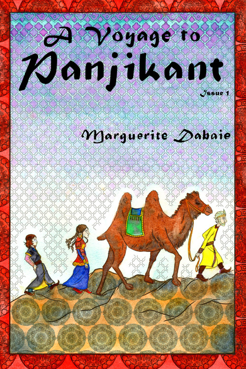
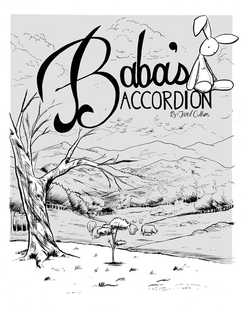
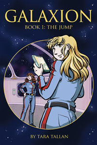
My must-buy book of the show this year was my friend Marguerite Debaie’s A Voyage to Panjikant, a meticulously researched historical fiction about traders living on the Silk Road in the Seventh Century. It’s a beautiful book that’s colored entirely in watercolor. I also picked up a space opera comic called Galaxion by Tara Tallan, simply because it looked interesting. I even went out of my way to pick up the few books from Frank Santoro’s Comics Workbook competition that were at the show – Jared Cullum’s Baba’s Accordion, Alexey Sokolin’s Freefall, and Alexander Rothman’s Vespers.
 

tumblr_mskygiZaat1seviqto1_500
 

Not a one of these are “[z]ombies, cutesy creatures/monsters, or reality-based angst comics,” but it’s easy to understand why it seems like that’s what the room had to offer. With such a large variety of material to choose from, it was impossible for any single individual to wrap their arms around everything that was available. I think a certain amount of confirmation bias does tend to creep into what people tend to see at shows like this when the options are so overwhelming. We see what we expect to see because there is no way to really carefully evaluate everything.
I saw volumes of Shakespeare that contained beautiful handcut paper illustrations. I saw a comic printed on a strip of canvas. I saw comics that were printed at mini comic size, traditional comics size, magazine size, square format, horizontal format, and were massively oversized. I saw comics that were photocopied and hand-stapled. I saw mass-printed books with beautiful production values. I saw parody books that were waiting patiently for cease-and-desist letters and wonderful original concepts.

And yes, I did see some zombie books because zombies are big in pop culture right now. I saw autobiographical comics because most first novels are bildungsromans and it shouldn’t surprise anyone that comics follow the same patterns as novels. And there is always a great deal of cutesy stuff on display because the one thing that always sells at a show of such magnitude is a quick, easy hook that makes you laugh and only costs a few bucks.
And yes, you could make some of the same complaints about the books available at SPX that can be made about superhero comics – some are poorly drawn, some are poorly written and some are not well thought out at all.

But you cannot complain that indie comics have crippling continuity issues that prevent newcomers from picking them up. You cannot complain that indie comics present a straight white male view of the world that is not friendly to women and minorities (in fact, there was a greater preponderance of books with the word “feminist” in the title this year than there has been in years past). You cannot complain that indie comics are dominated by white males (the creator split was about 50/50 gender-wise, not so much racially). You cannot complain that indie comics are mired in endless editor-driven events that force you to buy a dozen books to get the full story. You cannot complain that indie comics have devolved into corporate IP farms whose stewards are more interested in maintaining the long-term viability of characters than they are in character development.

The real joy of attending a show like SPX is that everyone in the room is there because they want to be – because they are desperately, passionately in love with the medium and the possibilities inherent in comics. And yes, the creators would really like to make money. But most of them know that they will probably not break even, but for some weird reason they show up anyway.
Given that half of the people exhibiting at SPX this year were there for their first time, it’s entirely possible that a good portion of them went for the easy options and chose the same basic topics that most newbies choose. But if that’s all you saw then you were not looking very hard because there was a lot of weird, crazy, interesting, creative, exciting stuff available. I had to stop browsing because I went over budget twice – and I intentionally avoided the big publisher tables. I’d even go so far as to say that there was a book in the room for just about anyone from any walk of life. And that’s absolutely not something that you can say about mainstream superhero comics.
 

cover-image-store_page-sm

Can We Have a Different Conversation?

I really don’t understand why people keep trying to tell Marvel and DC how to do business. These are wholly owned subsidiaries of major multi-national entertainment conglomerates with a poor track record of rewarding the contributions of the individual.

Marvel is owned by Disney – a company that has set industry best practices for selling product to little girls. Does anyone honestly believe that if Disney wanted Marvel to sell more product to that demographic that they would be unable to do so? Or is it more likely that Marvel represents Disney’s inroad into a male demographic?

DC just went through a major branding exercise, which is usually an expensive, complex multi-year process. Is it remotely possible that demographic targeting, genre diversity and price point optimization were not considered during the planning stages? Or is it more likely that DC specifically targeted the demographics that it wanted to target?

Not all comic book companies can be all things to all people. And it is increasingly obvious that Marvel and DC do not want to be anything but superhero publishers selling superhero comics to superhero readers through the supply chain that they have spent two plus decades optimizing to do so. And yes, this limits the amount of money they bring in from demographics outside what they consider to be their core target – straight white males.
But it’s not as if Marvel and DC are the only game in town.

It would be refreshing to see an article that started with “Marvel and DC are not producing the kinds of comics that appeal to other demographics” that went on to say “but there are other publishers that do and you should be supporting them” instead of presenting a carefully thought out argument about how Marvel and DC should completely change their business practices.
Corey Blake , for example, wrote an entire article that basically boils down to “Marvel should start acting more like Fantagraphics” without actually mentioning Fantagraphics – presumably because he still thinks that there are only two comic book publishers in existence instead of more than thirty.

If half of the energy spent tilting at the Big Two windmills was spent pointing out that there is already a pretty diverse selection of comics available for purchase, I think there would probably be more comics readers. But that wouldn’t be nearly as satisfying as bitching about the fact that homogenized corporate IP farms are not paying attention to other demographics, would it?

It’s easier to bemoan what could be than it is to celebrate what is because no real action is needed. “I tried to tell them what to do and they chose not to listen. What are you going to do?” Buy comics from someone else maybe?
A very common phrase that I have seen from some very smart people is “they’re leaving money on the table.” Presumably “they” are Marvel and DC, but “they” could very easily refer to anyone publishing comics that has not put together a comprehensive marketing campaign designed to combat the idea that comics is only superheroes aimed at straight white men.

Where most people see a problem on the part of Marvel and DC, I see opportunities for smaller, more agile publishers to sweep in and cater to these demographics who are clamoring for more diversity. After all, these comics already exist and I think it’s time to change the conversation.
 

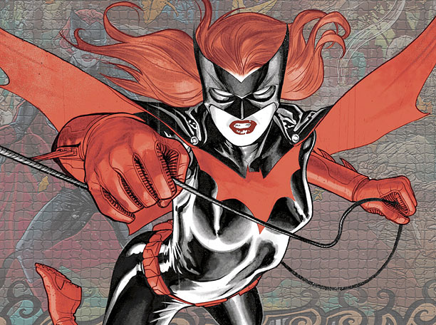
DC Comics Batwoman

J.H. Williams III and W. Haden Blackman, the writers of Batwoman, just left the title after DC editorial refused to allow the character to marry her female fiance.