Comics Tourism: Destination Brussels

IMG_6257

 
If you are at all serious about the comics medium and you have not visited and/or thought about visiting Brussels, you should really start to reconsider your thinking. It’s one thing to read that Belgians regard Bande dessinée (BD) as an important artform and it’s another thing entirely to actually experience a mature, mainstream comics culture firsthand in a European setting that’s more alike than alien to an American visitor.

It doesn’t matter if you don’t speak French and it’s probable that you don’t speak Flemish, either. But because the country is bilingual, most signage is printed in English (and often in German as well) on the theory that it’s just as easy to print things in three or four languages as it is to print in two. English is prevalent because of the sheer variety of international visitors – Brussels is the capital of the EU, the headquarters of NATO and is a major international banking, business and convention center. Still, learning another language because you want to has the net effect of making you look less jingoistic and xenophobic than your peers and it opens up an entire world of comics you probably know less about than you think.

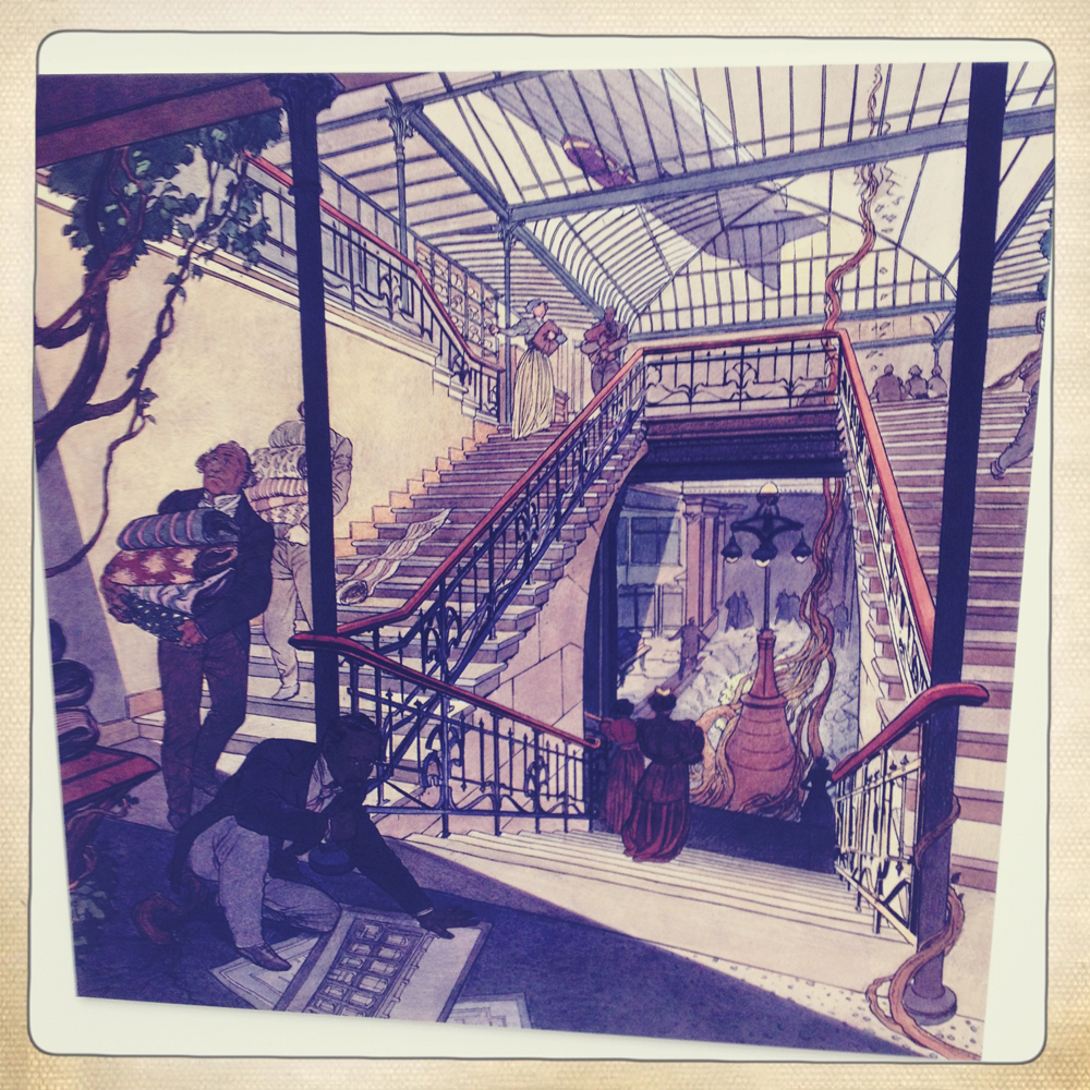
Brussels bills itself as the capital of the ninth art, but it was also the epicenter of the Art Nouveau movement. Several prominent Art Nouveau architects designed buildings in and around the city center that still stand. One of the more famous architects was Victor Horta, who designed a wholesale fabric store that now houses the Belgian Comic Strip Center. Lovingly restored in the 80s and beautifully maintained, the building is a work of art in and of itself.
 

IMG_6260

 
The museum features a permanent exhibition about Herge and Tintin, along with exhibits on other prominent Belgian creators, most notably Peyo and EP Jacobs. The top floor is dedicated space for rotating exhibitions – it’s currently dedicated to a retrospective of Willy Vandersteen and a celebration of the 75th anniversary of Spirou. The reading room contains over 3,000 albums and is open to anyone who has purchased admission to the museum. The museum bookstore is fantastic and has token English, German and Spanish sections. If you only have time to visit one thing in Brussels, this should be it.
 

IMG_6139

 
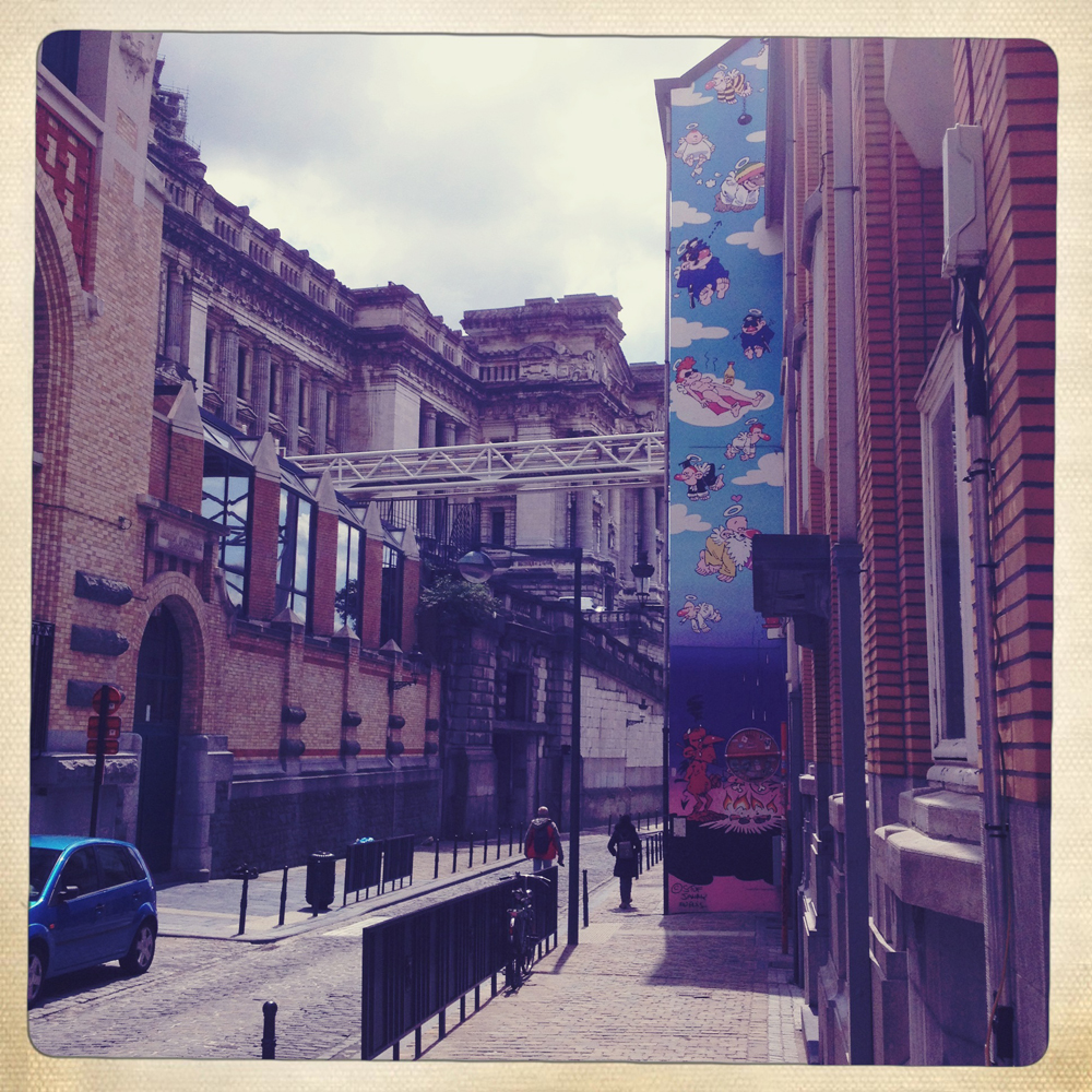
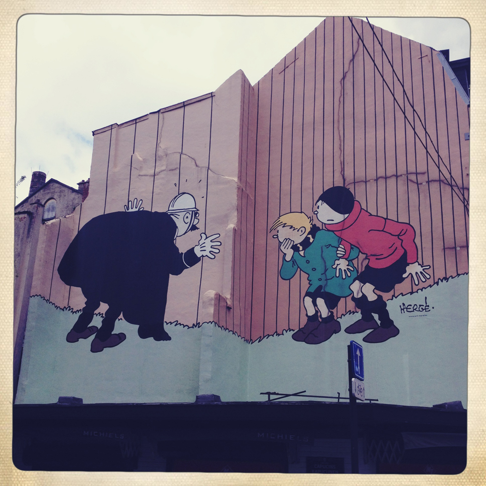
Scattered throughout the city center are a variety of BD-related murals that have been commissioned by the local government, private businesses and associations. These murals are indicated on maps that are handed out by the Brussels tourism board and they are considered to be a major tourist attraction. The city center looks huge on the map, but the blocks are not very big and are very walkable; wandering around looking for murals is a great way to see a large part of it.

Many of the major characters created by Belgian artists are featured in these murals, but Tintin shows up more often than most. Herge is the favorite son of Brussels and is easily one of the city’s biggest claims to fame. There is an entire Herge museum found just outside Brussels, not far from Herge’s house. If you are a Tintin fan, it is very easy to gorge yourself on the character – the Tintin Boutique is just around the corner from the Grand Place de Bruxelles and features every Tintin related piece of merchandise you could ever want, including (but not limited to) towels, dress shirts, figurines, framed prints, stuffed animals, keychains and playsets.
 

IMG_6265

 
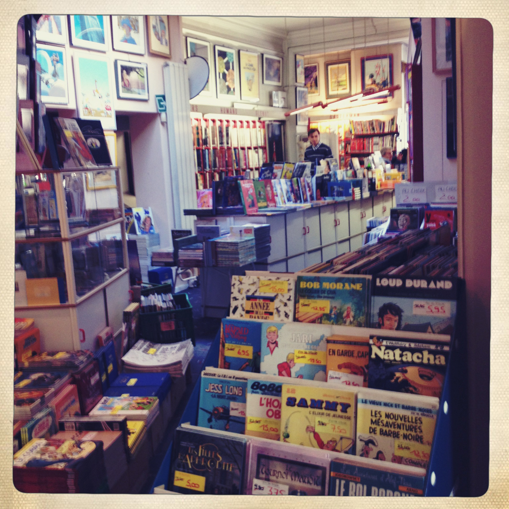
My favorite part of the BD culture in Brussels is the sheer number and variety of stores. From the random boutique book store in the St Hubert Gallery that had Jordan Crane, Alec Longstreth and a translation of Duncan the Wonder Dog to the big stores on the main drag, BD seems to be everywhere. The local FNAC store (sort of like Best Buy, with much less emphasis on household appliances) had more space dedicated to BD than it did to either DVDs or CDs.

The real destination stores, however, are Brüsel and Multi BD. They are obviously aimed at different demographics and approach the sale of BD in completely different ways. Brüsel has a gallery in the basement and top floor and seems to have a much more curatorial approach to what they sell – they don’t try to have everything in stock, just those things that they think are worthwhile to carry. They also have comics in English, Spanish and German as well as the obligatory Flemish.
 

IMG_6390

 
Multi BD is a lot more comprehensive and is your go-to destination if you are looking for book three of that fantasy series from Dargaud that you cannot seem to find anywhere else. Interestingly, Multi BD seems to have a better selection of alternative/small press comics in both English and French than Brüsel does – and places this material right in the front of the shop as the first thing that a customer encounters when they walk in the door.

Neither of these is in the kind of space where you’d find the local Games Workshop franchise – both occupy two fairly large storefront spaces on a major thoroughfare and are within easy walking distance of each other. And neither seems to be hurting for business. More importantly, their primary demographic is not children, but adults of all genders with money. The market is centered around 48 page hardbound albums (although there is a greater flexibility in formats than there used to be) which tend to run about 12 Euros apiece and go up in price relative to the page count.
 

IMG_6364

 
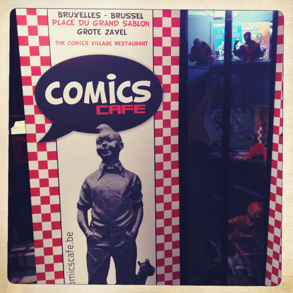
Another shopping destination is the Comics Village on the Grand Sablon, which features a store downstairs and a pretty good restaurant upstairs. If you go here, make sure you buy your books after you eat, to take advantage of the discount. The book selection here overlaps what you can find at Brüsel or Multi BD, but is much less robust and aimed at a much more general audience, as you would expect from a venue that markets itself as a theme restaurant and sidewalk café that happens to have a store. They also have copies of Tintin lying around in the restaurant so that kids have something to read while they are eating lunch.

What I found most interesting about all of these stores is that it’s easier to find manga than it is to find American superhero comics and there is usually a better selection of the former. Manga often gets its own prominent corner while American superheroes generally get an out-of-the way shelf. Other English-language comics are found in translation more prominently – Strangers in Paradise, Prophet, Whiteout and Making Comics – to name only a few titles. It is almost as if these stores considered superheroes to be just another genre instead of the foundation of the market and stocked them accordingly. Also of note: American floppies are almost completely absent, probably because graphic novels fit the local buying patterns better.

The other place to look for BD in Brussels is among the used bookstores along the Rue du Midi – only a few blocks from Multi BD and Brüsel. Most second hand bookstores have a large selection of used BD albums which are worth flipping through, if only to see the sheer volume and variety of material that you have never heard of (often for good reason). Along the same street is Le Dépôt, a used bookstore that is entirely dedicated to BD. Here, more than anywhere else, I got a real sense of the depth of the French BD market and how much of it was completely unknown to me. As with the best stores of this kind, it is entirely possible to spend hours lost in the stacks, constantly surprised by things you had no idea could be considered commercial.

Once you have exhausted all of the obvious options, one of the more off the beaten path attractions is a house that was also designed by Victor Horta called Maison Autrique. This townhouse is now a museum that has hosted a variety of small, comics-related exhibits. The whole endeavor of restoration and curatorship of the townhouse is obviously a labor of love and among those lovers are local creators François Schuiten and Benoît Peeters. Albums from their Obscure Cities BD series is available in the museum’s blink-and-you’’ll-miss-it bookstore and there is a major callout to one of the characters in that series hiding in the attic of the house. Schuiten’s artwork is heavily influenced by Art Nouveau and he has also authored a book with Lonely Planet that suggests possible walking tours of the city’s architecture. It is possible to get a greater appreciation of their work just by wandering around the more beautiful buildings of the city – including this one.
 

Schuiten

François Schuiten, from the Belgian Comic Strip Center

 
More than anything else, what Brussels offers a world-class city that features comics as a foundation of their tourism and local identity year-round and not just for a week a year. What other city does that? Besides, they sell fresh waffles in the streets and have good beer. And make sure you try the mussels.

The Year of Ted White

august1980p96

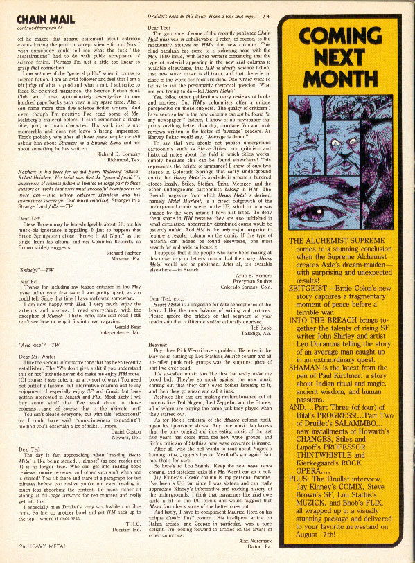
August 1980 – Page 96 Chain Mail

If you ever get the opportunity to look at a copy of the August 1980 issue of Heavy Metal, flip to the letters column on page 96. On the bottom left corner of the page, you will find a letter that I feel perfectly captures the mood of the average Heavy Metal reader during that year. It reads as follows:

Dear Ted,

The day is fast approaching when “reading Heavy Metal stoned is like being stoned… almost” (as one reader put it) is no longer true. Who can get into reading book reviews, movie reviews, and other such stuff when one is stoned? You sit there and stare at a paragraph for ten minutes before you realize you’re not even reading it, much less absorbing the content. I’d much rather sit staring at full-page artwork for ten minutes and really get into that.

I especially miss Druillet’s very worthwhile contributions[1]. So fire up another bowl and get HM back up to the top – where it once was.

T.H.C.

Decatur, Ind.

august1980p53

August 1980 – Page 53 Salammbo by Druillet

If online message boards, forums and/or Usenet had been widely available in the late 70s, the one(s) dedicated to discussing the content of Heavy Metal magazine would have exploded in controversy in 1980. This is obvious from the content of the letter columns during this year. The usual approach was to print a page of positive responses with an equal number of negative responses, followed up in later months by reactions to the responses. The printed responses were obviously just a drop in the mail bucket – I can only imagine what would have happened if it had played out in real time.

So what happened in 1980 to cause so much wailing and gnashing of teeth? Short answer: they got a new editor. Not quite two years after the inception of the magazine, the first editorial team of Sean Kelly and Valerie Marchant was replaced by Ted White, who had spent ten years editing Amazing Stories and Fantastic. At the time, it was felt that his success on those publications made him a good choice to take Heavy Metal in a new direction. It’s also interesting to note that the entirety of his comics-related work to that point was a Captain America novel he wrote in 1968.
 

The biggest (and most controversial) change that White brought to the pages of Heavy Metal were four columnists, each writing about a different topic – Lou Stathis, Jay Kinney, Bhob Stewart and Steve Brown. Original fiction pieces were dropped entirely and the volume of art pages was reduced to make room for column inches. To the editorial staff’s credit, they did play with the layout considerably, often presenting pages that were half text and half comic. Regardless, the huge blocks of text were easy to skip over and doubled the amount of time it took to read each issue.
 

may1980p57

May 1980 – Page 57 Gallery Section: New Books

 
Of the regular columnists, the most controversial was Lou Stathis (who was an editor at Vertigo later in life). He insisted on referring to rok musick, an affectation that looks amusing now, but was probably seen as very progressive at the time. In his first column (January 1980), he starts by claiming that the only two acts that were any good during the 70s were the Sex Pistols and Roxy Music. This probably came as somewhat of a shock to the readers of Heavy Metal, who were mostly in the Led Zeppelin camp (a band that Stathis doesn’t even deign to mention in that first column)[2].

Stathis presented interviews of bands he enjoyed and did a review of a whole slew of debut singles at one point – up-and-comers like The Cure, X, and Gang of Four. Later columns included an homage to Brian Eno and a long examination of Ultravox, which ran next to Ted White’s review of an Ultravox performance written under the pen name of Dr. Progresso – a name that White still uses for his prog rock radio show. White wrote additional articles on occasion and the contrast in approaches is very striking. Stathis wrote from the hip, in his best Lester Bangs sneer while White’s articles were about sharing the love of an artform that he deeply respected.

In hindsight, it’s easy to make the case that Stathis’s attitude and contempt for what he considered to be the mainstream of music had the potential to severely alienate a portion of the existing Heavy Metal readership. Unfortunately, audiences tend to take criticism (real or implied) of the bands they like as criticism of themselves. After all, if you tell me that the music I listen to sucks, aren’t you also insulting my taste in music? As jazzed as he was about The Residents, Stathis was just as scornful of “the tuna fish that you get on your radio” and he constantly read like he was trying to pick a fight.

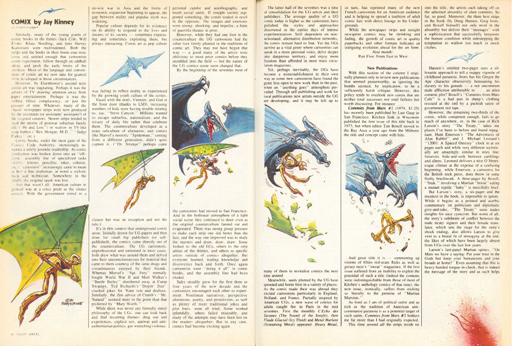
Jay Kinney’s running history of underground comix was nowhere near as controversial as Lou Stathis, but some readers still managed to find time to complain about it. Kinney started with one of the main influences of Crumb and company – EC – and sketched biographies and bibliographies for most of the big names in subsequent months.  He only managed to get as far as 1971 with his history before his column was cancelled along with the rest of them in December 1980. Along the way, he provided a fairly good blow-by-blow account of the various underground cartoonists migrating around the country, looking for more reasonable markets (San Francisco and New York were favorite destinations). It’s a collection of columns that would form the good backbone of a definitive history of the period – as a companion to Dez Skinn’s book, maybe.
 

may1980p5485

May 1980 – Pages 84&85 First Love by Bissette and Perry/Comix by Jay Kinney


Bhob Stewart’s Flix column was dedicated to film. His first three columns featured an extended interview with Stephen King, whose novel The Shining was being made by Stanley Kubrick at the time. Later columns focused on animation festivals, weird films that would now be put into the “psychotronic” bucket and a story about the time he met a background artist from Fantasia. He also did a long write-up of the upcoming Heavy Metal film, which was deep into production at the time.

Steve Brown’s SF column aimed at bringing news of contemporary science fiction and fantasy books to the readers of Heavy Metal. He reviewed David Brin, Samuel Delaney, Ursula K. Le Guin and a slew of other authors. Despite the occasional bully pulpit rant about how the science fiction genre deserved better, it was easily the least controversial of the columns because it was ostensibly aimed at a demographic that liked science fiction. Unfortunately, it was lumped in with the rest of the columns as a waste of space because those column inches could have been used for more art.

There were guest columns as well. Maurice Horn provided a quarterly international comics column. The April issue featured a write-up of Guido Crepax’s Valentina (Crepax’s thank you letter was published in July, alongside photos of a van that was painted with the Heavy Metal logo), August was dedicated to Herge’s Tintin and Tezuka was in November. April saw a hysterically ironic Sidebar column from Norman Spinrad that panned both the first Star Trek motion picture and Disney’s The Black Hole as being more about the special effects than the story – a criticism that has been leveled at Heavy Metal on more than one occasion.

During this period, Heavy Metal also ran interviews with certain key creators – Jeronaton, Enki Bilal, Moebius, Philippe Druillet and Guido Crepax. In most cases, these were the first English-language interviews with these creators and exposed the readers of Heavy Metal to more than just their art. Jeronaton was all over the place, but the Druillet and Bilal interviews are excellent insights into the artistic and creative influences that shaped them and their productions.

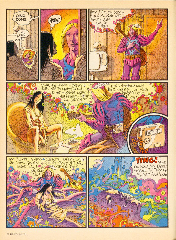
Scattered among the columns were some top-notch comics work. Berni Wrightson, Spain Rodriguez, Joost Swarte, Guido Crepax, Howard Cruse and Matt Howarth showed up in Heavy Metal for the first time during this period and a lot more of Rick Veitch and Steve Bissette’s work was also evident. Several of Caza’s pieces from Pilote appeared, as did a lot of older Moebius material – including a great strip from when he was going by Gir. Ted White even did a few strips with Ernie Colon. Chaykin didn’t show up, but early Corben did – from the period before he discovered the airbrush.
 

may1980p24

May 1980 – Page 24 House Ad

 
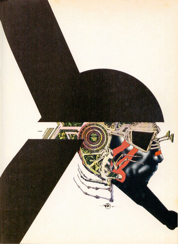
Despite the fact that he oversaw one of the best issues of Heavy Metal ever produced – the Rock Issue, October 1980 – Ted White did not make it to the end of the year. The last issue he edited was November 1980, but the columns made their last appearance in the December issue, which makes me think that his departure was fairly abrupt. Controversy may be good for raising awareness of a publication, but when the self-identified long-term readers[3] start complaining about the format of a magazine that they have grown to love, it’s time to make hard decisions.

After acknowledging that “[s]ome of the ideas worked, others didn’t,” the editorial in the December 1980 issue laid out the new status quo and claimed that White “is now relinquishing his duties as editor to devote his time to two novels and his new record company.” He was scheduled to do a tribute to Will Eisner in an upcoming issue and wrote a few follow-up comics, so the split wasn’t entirely acrimonious.

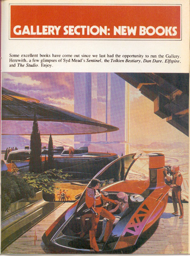
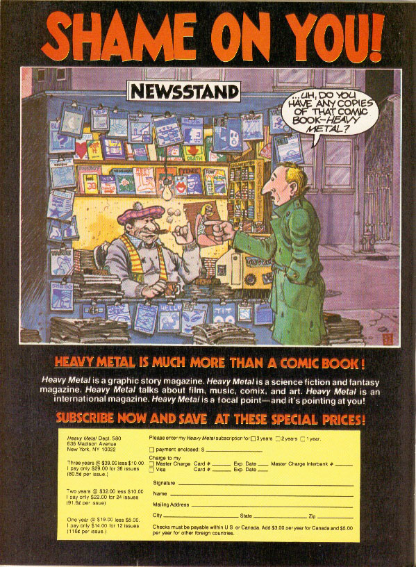
Some of the changes that came out of 1980 were subtle– the overt drug references didn’t go away, but the rolling paper ads were replaced by ads for stereo equipment and science fiction book clubs. Guest editorials and commentary continued in later issues, as did interviews. White introduced a portfolio section, which showed off samples of art books by Syd Mead and HR Giger. This was later resurrected as a general presentation feature called Dossier that ran for years.
 

July1980p22

July 1980 – Page 22 Romance by Caza

 
If you were to cleave the history of Heavy Metal into distinct periods, the Year of Ted White makes a neat dividing line between the fast and loose production values of the early years and the more professional publication that was eventually given to Julie Simmons-Lynch. It’s a shame that it was only a year, though.


[1] Druillet had an excellent piece published in the same issue.

[2] A letter in the May letter column starts by asking the rhetorical question “What is the most useless person in the world?” and answering it with “A rock critic” then goes on to argue that New Wave music is terrible by citing the complete lack of talent exhibited by Devo, Elvis Costello and the Talking Heads.

[3] Of a magazine that’s just over three years old

Grappling With Genre

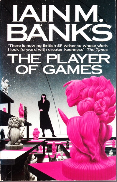
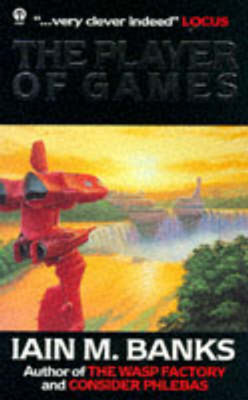
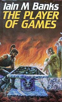
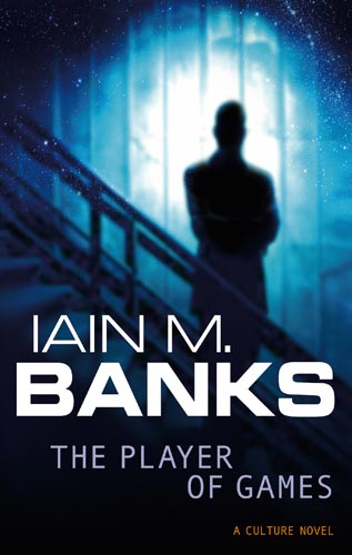
One of my favorite books by one of my favorite authors is The Player of Games by Iain M Banks. It is a Culture book, the vast anarcho-communist utopian space opera setting that Banks has designed from the ground up to be both self-consciously rational and pure wish-fulfillment for those of us who like their escapism with a hefty dollop of moral superiority. The Culture has no money and is made up of an aggregate of alien races and artificial intelligences, include self-aware spaceships with jokey names.


The Player of Games is about a man whose job is to play games (I told you the Culture was a utopia), who is recruited by the Culture’s dirty tricks espionage group Special Circumstances to help them engage with something they’ve never run into before: an empire that is built around a very large, very complex game. The victor of a population-wide tournament becomes the new emperor.


I do not mention this book to praise it, but rather to use it as an example as I discuss the complexity of the abstract concept that we call genre. If genre was a coworker, he’d be that guy at the end of the hall that is absolutely essential to ongoing operations but is also annoyingly pedantic about minor, almost trivial items.

Genre is used in a variety of different ways: as a marketing tool, as a critical tool, as a tool for readers to identify what they want to read next and as a stick that some people use to beat up on other people for their reading tastes. Genre also provides a veritable catalog of generic elements that creators can use when constructing their works.

The Player of Games is a science fiction novel. (If you want to get pedantic and insist that SF stands for speculative fiction, it fits under that rubric as well.) There are genre elements galore: spaceships, aliens, worldbuilding – the author even admits that he stole the primary setting for the first half of the novel from Larry Niven’s Ringworld. On paper, this has all the trappings of a generic novel; after all, the more genre elements that a work contains, the more generic a work becomes.


And if you were marketing The Player of Games, the smart money would be to lean very heavily on the “spaceships and aliens” angle. It’s a book that rewards an educated and opinionated reader, though, so perhaps the marketing could even be tweaked by indicating that it contains “spaceships and aliens, but smarter.” This reveals one of the main weaknessness of the genre concept – it reduces complexity to its lowest common denominator in an effort to attract as many readers as possible. In theory, every iterative step away from the core generic descriptors risks the alienation of readers who are only (dis)interested in the generic elements.

As a consumer, I rely very heavily on genre to help me make intelligent choices. For example: I do not enjoy the adrenal rush that comes from people jumping out from behind things, which happens to be a core element of the horror genre. As a result, I tend to steer away from the horror genre as a general rule, which has probably resulted in me missing out on work that is probably pretty good, despite the inclusion of jumpy-outy bits. And yes, there are plenty of other, non-horror movies that contain jumpy-outy bits – is Alien a horror film or a science fiction film? Why can’t it be both? Oh yeah, because marketing demands that it be given a straightforward handle that can be given to potential consumers.

I also happen to enjoy spaceships and aliens and I recognize that there is a vast gulf of difference between The Player of Games and Star Wars, despite the fact that both can technically be shelved under that particular heading. Because my tastes are broad, a listing of genre elements offers a good starting point. But when tastes are prescriptive (as in my blanket disregard of the horror genre, above), there is a very good chance that marketing by genre is not actually helping bring in customers.

Genre can also be challenging in a critical context. When I read a review that includes some variation of “this novel transcends genre conventions” I immediately read that as “the novel contains generic elements but doesn’t use them generically.” For example: The Player of Games contains spaceships, but those spaceships are self-aware and have names like GCU Of Course I Still Love You, Superlifter Kiss My Ass, GSV Unfortunate Conflict of Evidence and so forth. This is an obvious stab at the inherent conceit in most space operas that ships must have big, imperious names.

Banks also points out [1] that having names that are self-consciously jovial tends to disarm potential opponents because they are less likely to take the ships seriously. The worldbuilding that comes from such a simple inversion of the genre convention really adds to the glamor constructed by the novel, but it may or may not be what the standard genre fan was looking for when he picked up a book about spaceships (and aliens). But it is absolutely the kind of thing that a critic would hold aloft when praising a book for moving past the generic elements that it’s built on.

On the flip side, some critics are known for using genre as a kind of yardstick – separating genres into categories, most often of the “good vs bad” variety. Just as there are any number of essays written by any number of good critics imploring readers to look beyond genre conventions and try something new, there are any number of critics who look down their nose at genres they consider to be somehow less important. This critical shaming doesn’t just stop with critics, though. Margaret Atwood is well known for claiming that she doesn’t write science fiction, even though she clearly does.

Some people revel in this, repurposing labels for their own use: Nobrow and Lowbrow are the two most obvious examples. But for most, genre is a ghetto – a well-populated ghetto, to be sure, but still a ghetto. Part of that has to do with the mainstream culture’s attitude towards genre works and part of that has to do with the consumers of the genre, which is another topic entirely.

Banks, on the other hand, doesn’t shirk from claiming that he writes science fiction. In fact, it’s very obvious that he enjoys spaceships and aliens and is quite happy to continue to be paid to write them, thank you very much. And I’m happy to enjoy what he does with them because the results are interesting and original and not at all what is expected.


Unfortunately, most authors do not have the sheer creative energy that Banks brings to the table. Most use generic elements as a sort of construction set, building weird stories that tend to violate the “could this story be told in an ordinary setting?” rule as a matter of course. And that’s one of those places that genre falls down, in my opinion. Someone writes a good story that introduces a nifty concept and someone else comes along and uses that same concept without doing anything original or interesting with it. The result comes across as, well, generic.

I fully expect an entire cottage industry of Harry Potter and Scott Pilgrim clones to come along in the next generation of creators, the same way that the mid-70s were dominated by Tolkien clones and Black Sabbath knock-offs. In this way, successful creators could be said to become a genre unto themselves, regardless of what parent genre they were marketed under[2].

Given my druthers, I’d prefer that we did away with genre altogether. It’s a useful tool, to be sure, but it’s also a tool that is leaned on far too much, far too often. Unfortunately, it’s not a very versatile tool and, when all you have is a hammer, everything tends to look like a nail. I get that without genre, all of the books would just be in one big section marked “fiction” and that some kind of sorting mechanism is necessary to find what you really want to read (or really don’t want to read, as the case may be).

However, genre doesn’t really do a good job when it is applied to marketing. By virtue of how the two are used in conjunction, the most generic books tend to float to the top. The truly interesting books take a little time to find their niche and fall out of the marketing by genre idea because they don’t exactly fit into the standard genre boxes. Ironically, looking for exceptions to the rules of genre tends to lead to exceptional works.

In the end, genre is a tricky thing that works perfectly at separating works by element, except when it doesn’t. The Player of Games is a great example of this. It contains spaceships and aliens but is in no way the poster child for either generic element and searching for it under those terms would be a fool’s errand. Critics might look down upon it because it is absolutely science fiction (and happy to be so) and they would prove themselves foolish if they did because it is the kind of book that critics hold up to indicate that science fiction and literature are not mutually exclusive. Which is as it should be.


[1] A Few Notes on the Culture by Iain M Banks.

[2] See also: Stephen King

Screaming At Heavy Metal

Somewhere in the last thirty-five years, Heavy Metal has earned a reputation as a legendary magazine that printed the best in trippy[1] Eurocomics (the stoner teens of the 70s were apparently deemed too simple to understand the term BD[2]). Part of that came from canny marketing on the part of the editors; issue #2 had an ad proclaiming issue #1 was a collector’s item. A big part of the legend is that the artists they were publishing were legendary – Moebius, Druillet, Corben, Tardi, Chaland, Voss, et al. Of course, there is no easy way to contradict the legend – early Heavy Metal and Miracleman are two series with almost no available back issues in general circulation, which has had had a similar effect on the reputations of both titles.


February 1978 – page 43 Urm by Druillet

 
When the opportunity arose to reread my father’s collection (he was a subscriber for the first twelve years of publication), I jumped at it. I’d read the run when I was in my early teens and don’t remember a lot of it. My delight soon turned to dust – I was appalled when I waded into the first two issues because the art is beautiful, but the stories are lacking. In fact, the word “stories” is generous. In some places, there is an utter lack of concern – bordering on outright disdain – for comprehensible narrative.


June 1977 – page 50 Den by Corben

 
The cognitive dissonance caused by the collision of the magazine’s reputation (especially the early issues, which are generally mentioned in terms of “when it was good”), and the actual work is jarring. It shouldn’t have come as a surprise – the fact that I’d forgotten a lot of it was a clue. But I had high hopes and the determination to look at each issue on its own merits. After a year of reading, I can say this:  the issues from the 70s[3] are very problematic.

The abundance of breasts in the magazine has become somewhat of a running joke over the years, but the amount of rape (and stories where attempted rape drives the action) that appears in those first three years is something else entirely. I really didn’t keep track of how often it happens, but any number more than “none” is usually a bad sign. Tragically, it’s mostly used as just another plot point, with no mention or indication of the consequences. I’m clearly a bad person because I don’t consider the inclusion of rape themes in an anthology as an absolute show-stopper and kept reading.


June 1977 – page 6 Gail by Druillet

 
To keep myself from screaming at some of the weaker pieces, it was important for me to keep in mind that Heavy Metal is very much a product of its time and had a very specific audience. The ideal reader would put Pink Floyd on the turntable, adjust his headphones, take a few bong hits and settle back into a beanbag chair and stare at the new issue for hours. Drug references abound. One of the early marketing taglines came from a reader’s letter “Heavy Metal is better than being stoned. Almost.” And in 1979, Job rolling papers became a regular advertiser.


September 1979 – page 3 Job rolling paper ad

For their part, the creators were mostly European men with Old World attitudes towards women – the usual reaction towards Feminism was the inclusion of full-frontal male nudity, not to cut down on improbable breast-revealing costumes for queens who all seemed to live in tropical climates. (It is very obvious that Richard Corben and Russ Meyer would have had a lot to talk about.) These were comics by stoners who liked titties for stoners who liked titties.


June 1977 – page 80 Harzak by Moebius

 
If that’s your thing, then this is the magazine for you. But if you are one of those heretics, like me, that wants actual stories with your sequential art, this is very hit or miss, with more many more misses than hits. One of the major issues in contemporary art comics (which arguably takes its aesthetic cues from Heavy Metal or what the creators think Heavy Metal represents, including the sex and drugs) is that the art is engaging and interesting, but has almost no narrative continuity from page to page or even panel to panel. The artists are having fun drawing interesting shit, which is fine. But a comic that is worth looking at once with little to no reread value is questionable at best. Unfortunately, that’s Heavy Metal in spades.

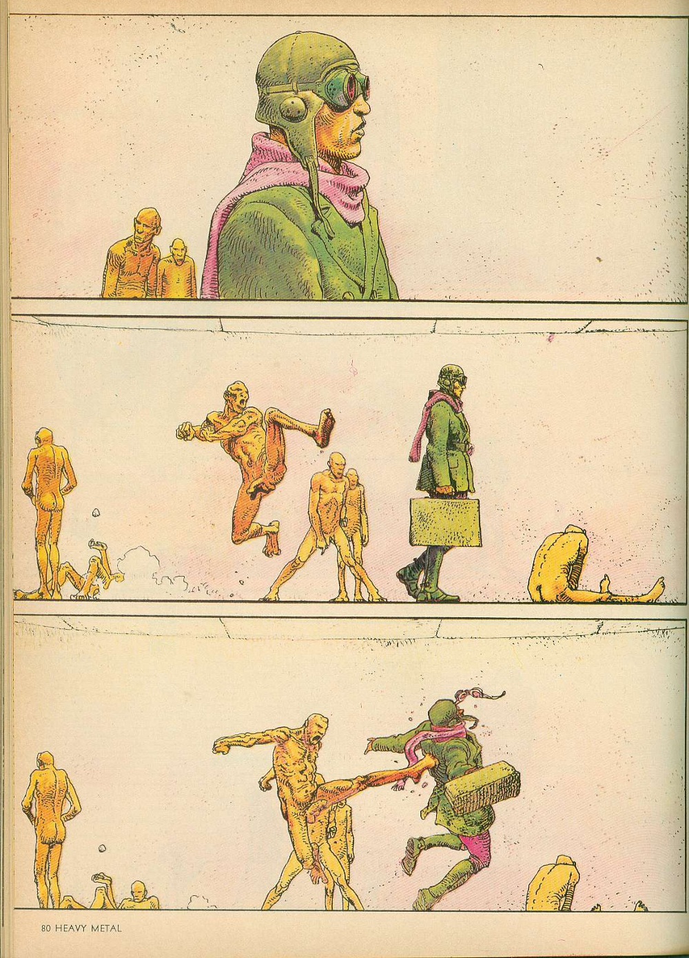
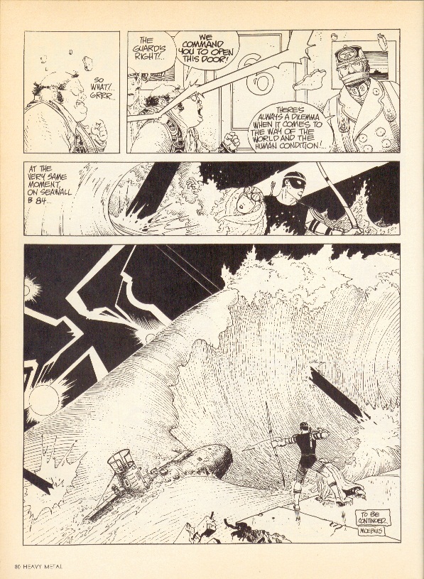
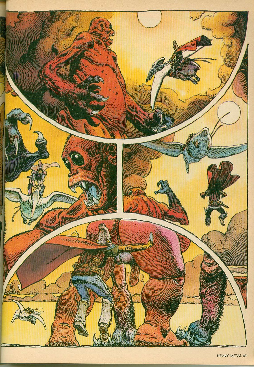
The stories that Moebius was cranking out in these early issues – Arzach[4] and The Airtight Garage – are beautiful works. He was very clearly exploring the limits of his artistic ability and the results speak for themselves. But they make very little sense. Arzach was the first major project that Moebius engaged in after working on Blueberry with Charlier for Pilote, and its wordless pages actually carry some narrative weight, but The Airtight Garage is like a kite without a string.


September 1979 – page 80 The Airtight Garage of Jerry Cornelius by Moebius

 
There are intrigues and airstrikes and assassinations and an entire sequence with an archer getting onto a submarine that look like they should be of some consequence. But the narrative stutters so much that the pieces never really come together and the revelations mean nothing. Moebius acknowledges this – one of the chapters is titled The Uptight Garbage of Moebius and a synopsis for another chapter mocks the narrative flailing. Towards the end, Moebius flat-out ignores any of the story he’s written so far and just goes for broke. The results are visually amazing, but severely flawed.

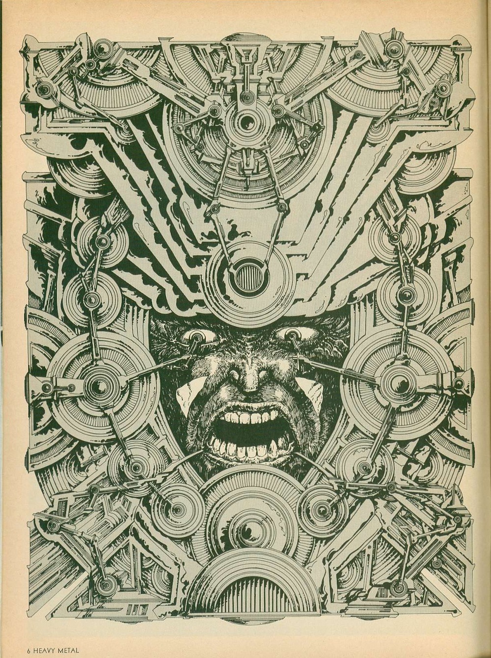
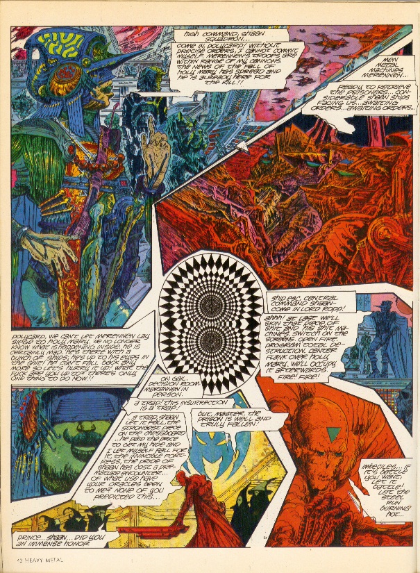
Druillet – one of the original co-Humanoids – is another case in point. His early black and white work is messy, but when he discovered color, it was like he leveled up. The color spreads from Ulm the Mad, Gail and Salammbo are amazing. He did interesting and innovative things with panel borders, incorporating photography into his art and even threw trippy optical illusion pieces into the mix. His design aesthetic owes a lot to Kirby, especially his spaceships and headgear, but it would take someone far more versed in the latter to really do a deep dive on that subject.


November 1978 – page 42 Gail by Druillet

 
One thing that Druillet could have completely left out of his later color work, though, is the words – they just get in the way. In some cases, they are lettered too small to be readable and in others, they just don’t make sense. Either way, they tend to slow down the story unnecessarily – especially the large captions that run to multiple paragraphs. It’s clear from his art that he wanted to produce epic works, but writing is not one of his core skill-sets.

It would be easy to lay the blame for these narrative inadequacies at the feet of poor translation, but the same issues crop up in works by English-speakers as well – Todd Klein, Steve Bissette, Rick Veitch and Charles Vess, I’m looking in your direction. And some of the best stories come from European sources – Jacques Tardi’s work Polonius stands out, as do several of Caza’s allegorical tales. And when these artists are working with honest-to-god writers – Dan O’Bannon/Moebius and Druillet/Picotto are good examples – they actually come out looking very good.


May 1977 – page 89 Arzach by Moebius

 
In the final examination, the art from those early years holds up really, really well. And if that’s what you’re looking for, these are great issues to track down (October of 1979 is probably the best from that period, in my opinion). But if you are one of those people who values actual story with your art, then you are going to be sorely disappointed. Obviously, the disconnect between story and art is something that the contemporary comics reader still has to grapple with and it’s fair to say that Heavy Metal is not where the trend started – it’s just the most obvious, most famous example.

Moebius and Druillet (among others) obviously put a lot of effort into their work. It seems like such a waste that they didn’t take that extra step to find a good writer to really make the work sing. And it’s not like they went out of their way to produce bad stories; they just aren’t good, which was so frustrating that it made me want to scream. As a result, they ended up producing really high-quality art comics at a time when the term didn’t exist.

When Moebius died, Neil Gaiman pointed out that The Airtight Garage was much better in French than it was in English because he had room to imagine how brilliant they were. Accordingly, my advice to young creators who are pining for these works is to go onto amazon.fr[5] and buy them in French, where they are easily available for reasonable prices. You’ll get the best part of the comics without having to put up with the sub-par quality of the writing. Plus, the French archival editions are usually very large, which lets the art breathe. In the unlikely event that these were actually published in English, the current trends tend to indicate that they’ll be shrunk down for some reason that makes no sense – which is another rant entirely.


[1] “I’d like to see an adult magazine that didn’t predominantly feature huge tits, spilled intestines or the sort of brain-damaged acid-casualty gibbering that Heavy Metal is so fond of.” Alan Moore, May 1981

[2] BD is short for Bandes dessinées, which is French for comics. BD:French::Manga:Japanese::Comics:English is the best way to think of it. People who know what to ask for will get much more out of their trips to Brussels and Paris.

[3] The issues from 1977 through 1979 serve as a good scope for this article for two reasons. First, Ted White became the editor in December of 1979, visibly changing the text/art ratio of the individual issues. Second, I’m only halfway through 1980 in my reread and can’t speak definitively about anything past that.

[4] Also spelled Harzak, Arzak, Harzac, Harzakc and Harzack

[5] It’s exactly the same site design as amazon.com, so the language barrier isn’t actually that big of an issue