Editor’s Note: This is part of a series of student papers from Phillip Troutman’s class at George Washington University focusing on comics form in relation to Scott McCloud’s theories. For more information on the assignment, see Phillip’s introduction here.
_______________________
Color remains a question rather than an answer in comics: Some artist’s embrace it, while others continue to ignore it. Whatever its use, color plays an important role in forwarding the message of the artist. Yet such a message is ambiguous. In his analysis Understanding Comics, Scott McCloud notes that color promotes comics by reaching toward reality, making a panel appear to be a much more relatable image to the reader, who lives in a world beyond black and white. Mirroring life itself, which is far from flat, colored images add an extra dimension to the page. But is this the true purpose of color in comics? McCloud suggests otherwise; however, due to the brevity of his designated chapter, he never explains why. Indisputably, comics serve to simplify life, easing the ability to communicate some sort of integral message to the reader. Breaking the fourth wall, color magnifies the author’s claim. Minute tidbits of otherwise unseen details reveal themselves through the additional lens of color.
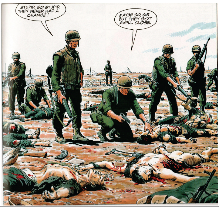
The following image derives from Doug Murray and Russ Heath’s “Hearts and Minds: A Vietnam Love Story.” The panel displays the death and destruction caused by the detonation of a grenade during a battle in the Vietnam War.
Throughout my analysis, I will revisit this image in order to touch upon the overlooked meanings that color specifically reveals.
Color magnifies important details that forward the cartoon’s claim. Though images may appear more realistic, the purpose of color remains for graphics to appear more simplistic. Noting the simplicity of cartoons, McCloud emphasizes that, overall, cartooning is a form of “amplification through simplification” (30). Comics pride themselves in exaggeration, which empowers a point rather than detracts from it. In this sense, color is yet another mouth for exaggeration. Heath’s image exhibits excessive exaggeration due to the use of color. Studying certain features of Heath’s panel, readers must digest uncomfortable truths that the artist is emphasizing. For instance, the two Vietnamese corpses expose gruesome depictions to readers.
In the first image, color contrasts the white bone protruding from the dead man’s neck from the background. Clean and crisp, this bone appears as though it is out of place. Looking as though it were a plastic piece in the board game Operation, the bone could easily slide back into the dead man’s body. Though, in reality, this bone would be muddled with blood and dirt rather than in this immaculate condition. Instead of showcasing visual reality, color emphasizes a statement: Another man’s bullet pierced a bone through another man’s throat. The same argument is displayed in the second image. Here, color bolds the blood that pours from the man’s dislocated torso. Yet this blood is pure red. In reality, such blood would not beam from a corpse; it would be dirtied and dried. Color again simplifies reality, highlighting to readers what happens during war.
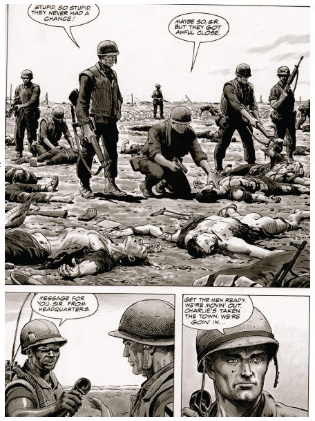
When the same images are displayed in black and white, such an effect is lost. Though readers may understand that the two men are dead, they do not see death’s marks etched in the corpses. The bone is barely visible, and the blood blends with the shading. The colored images are blatant to readers, who inherently understand what each detail represents. Such a technique attests to McCloud’s claim about drawing style: “By stripping down an image to its essential ‘meaning,’ an artist can amplify that meaning in a way that realistic art can’t” (30). Heath’s color truly “strips down” the panel to its bare essentials.
By simplifying a panel to its bare essentials, Heath presents color as an icon. As McCloud defines the term, an icon is an image that represents a person, place, thing, or idea (27). Cartoonists rely on icons to transmit a clear and obvious message to readers. In the case of this panel, the clearest example of an icon is the color red, which represents blood. Readers immediately connect the image of blood with its more powerful meaning: carnage. Heath chooses to depict such carnage through the visual device of an icon, and such an icon is displayed through color.
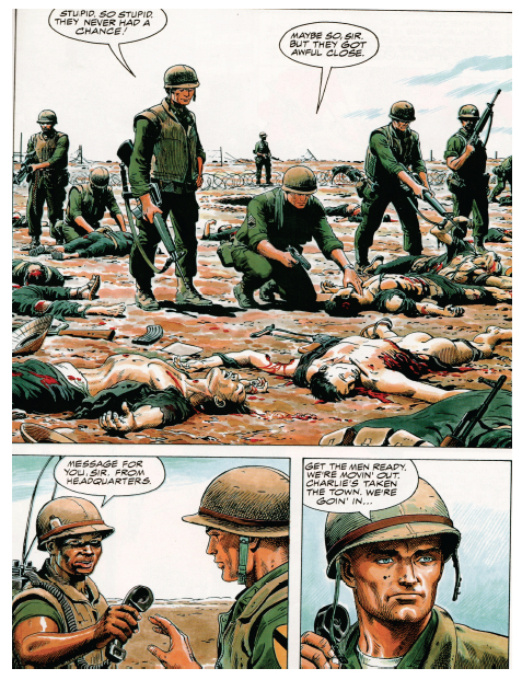
Beyond functioning as an icon, color breaks the flow of sequential art, emphasizing the subject matter of an image rather than the panel transitions on the page. Referring to the purposeful placement of juxtaposed panels, sequential art stresses the movement from one panel to the next, which, in turn, unconsciously forwards the plot. Looked at as an abridged filmstrip, sequential art carries readers from one important scene to the next. Yet, color seemingly cuts this artificial current.
The selected image comes from a page with three separate panels. Despite the wholeness of the story, color slows the sequential flow of these transitions. The first panel encompasses over a half of the page, warranting some sort of inherent importance in its size. Obviously, the artist wants readers to not only look at this image, but to study it in detail. Despite its size, readers may easily browse from one panel to the next. However, Heath installs color to prevent such an easy transition. After reading this page in its entirety, readers are inclined to revisit the first panel due to its colorful graphic content. The secret to such a phenomenon lies in the highlighter-like quality of color.
For example, moving left to right in the first panel, the focus shifts from the line of soldiers to the sprawl of bloodied corpses. Bold outlines of blood and flesh segment each corpse from the next, hinting that each image has a different story to tell. In fact, each body could be a separate panel. In the panel, four separate Vietnamese bodies are macabrely drawn: An American soldier tests the pulse of a clearly lifeless Vietnamese shell; another American soldier picks at a mangled corpse with his gun; and the final two corpses, torn and shattered, lay brutally close to the reader at the front of the panel. Subject-to-subject transitions would individually highlight each corpse and its features; yet, Heath decides to include multiple scenes in one panel, separating them by color. By choosing this method, color simplifies four possible panels (one panel for each corpse) and gift-wraps them for the reader. Realistically, each corpse deserves its own panel in order to communicate its graphic content, but color simplifies such reality into a single cartoonish image.
By segmenting sequential art, color also simplifies the significance of McCloud’s illustrious gutter. McCloud defines the gutter as the space between panels where closure occurs in reader’s minds. Through closure, McCloud suggests that the message of the comic is conveyed to readers. Such a claim raises the possibility that closure could be misconstrued: Reader’s could interpret a different idea than the artist intended from the panels. Color counteracts such discrepancy. Creating its own sense of closure, color illustrates the artist’s message clearly to the reader. Revisiting the panel sequence, I have manipulated the colors to a black and white format.
Reading the page, readers find that it is naturally much easier to follow the storyline in black and white. The first panel describes the recent conflict, and the gutter to the bottom left panel suggests to readers that such a massacre is a daily display for soldiers, as the sergeant plans to move out to another town. But, in color, such a transition is not so smooth. Color isolates the first panel, giving the gutter transition between the first and second panel a much different meaning. Studying the images in color, readers realize that the comic is exposing the absurdity of death through battles in war. The gutter seemingly empowers this statement, as it quickly introduces another future conflict that promises to be just as gruesome. Murray and Heath seem to be showing readers the horrifying realities of war. Graphic imagery, highlighted by color, communicates a “War as Hell” message to readers, who must digest an unnerving panel. Such closure can only be deduced when the panels appear in color. Without the red blood and displaced flesh, which are both only noticeable through color, the comic’s philanthropic message is lost in translation. Clarifying these important details, color simplifies Murray and Heath’s message. Rather than using words to communicate a difficult idea to readers, Murray and Heath rely on the simple but powerful effects of color.
Rather than making comics more realistic, color is highlighting the simple message of the images. Comic artists utilize color to highlight their ideas rather than bring them closer to reality. Magnifying minute details, colors strip down panels to their bare essentials, successfully forwarding the message of the artist. Manipulating the flow of sequential art, color simplifies complex depictions into a single panel. And, transforming the gutter, color clarifies a complex idea through universally understood graphics rather than confusing words. As viewed in a single page of Murray and Heath’s “Hearts and Minds,” a war related comic promises to introduce many ideas to readers. With so many themes floating throughout the comic, some sort of technique should aim to clarify and polish the author’s intended message. With that said, color in comics aims to simplify ideas so that readers better understand the artist’s message. Highlighting death and the absolute brutalities of war, color serves as a trail-marker for the artist, who only hopes to easily communicate some sort of message.
When an artist prepares to finalize his product, he must ask himself the color question: Could color simplify life more so than the comic already does? Heath’s artwork answers such a question. Indeed, even with color, simplification proves to be the root goal of comics. Color thereby is not so much an aesthetic choice to the artist as much as a literary tool.


