Face Down in the Mainstream: Spider-man!

Marvel Adventures Spider-man (ISSN: 1548-5056) #55
Tobin, Camagni, and Sotocolor

Geekery question: The title page lists Jacopo Camagni as pencils, but doesn’t list any further artists besides Sotocolor for color. Does anyone know who does the inks? Is it Camagni?

I admit, I’m a little leery of Spider-man comics. Between the truly terrifying Spider-man lip glosses (who would put lipstick from spider-human mutations on their lips? Marvel, get a grip!) and my short but rage inducing brush with Amazing Spider-man’s innards, I was nervous when I got a suggestion last week from Tucker Stone that I should check out a Spider-man comic.

Now, usually I shop for my comics at the Borders, and thus was the case for this week’s haul. I dutifully pawed over the shelves, looking for the correct iteration of Spidy that was recommended. Fantastic? Awesome? Something-something Spider-man…I’d forgotten my list. Ah! I saw a fetching looking number with old skool inks and a limited pallete cover, and thought: Ah-ha! This must be it. I read the first few pages to check. Cute art: check. Funny: check.

I hauled it home and read it on the porch, with the dog at my feet, and laughed and laughed.

It turned out that I’d bought the wrong comic, but that’s OK. I’ll take my list with me next time.

Now, to re-iterate briefly the purpose of my column, since I haven’t been as clear as I should be. I’m a comic-loving manga addict, who has enjoyed some American comics in the past (Sandman), but who has never found and been addicted to a mainstream, superhero comic, despite knowing about and loving both superheroes and comic art of many types. I’m looking for a comic that stars a woman, that’s currently running, and that is awesome. Manga often run into the double digits or more (a volume is roughly a year’s worth collected) and I’ve hopped into the middle of many a manga, so I’m pretty good at catching on to what happens in a regularly told story. Some American comics are, shall we say, designed to require the person reading to collect all four or whatever, and so sometimes lose me. I think this is dirty pool, especially if the comic isn’t honest about it. I’m looking to fall in love, not have a long run of terrifying blind dates whose only redeeming quality is that I can tell my friends about them at our next bar night. /too long explanation of column digression

But back to Spidy.

This comic is hilarious and awesome. I had no idea who anyone was, besides Peter Parker, but I caught on fast, and had a rollicking good time. This comic has some of the best body language art I’ve ever seen. Check out the first page:
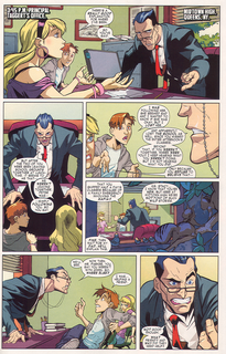
The principal is so menacing and Peter is such a doofus, the way he’s leaning back but still trying to defend himself, and the girl in the background is so sulky teenager. How is this not awesome?

Plus, the squirrels! Hee!

The comic has a great story format, too. It starts at the end, the time that Peter and Gwen are getting into trouble at school. Then it skips to the beginning of the day and tells us how they got there. It’s not new, but it’s clever and fun.

The start of Peter’s day is shown below. One of the things that I love about this comic is how wonderful the art is for all of the characters. It draws me in and makes me suspend my disbelief. It’s a lot easier to believe that Spidy can climb walls when his world looks so real:
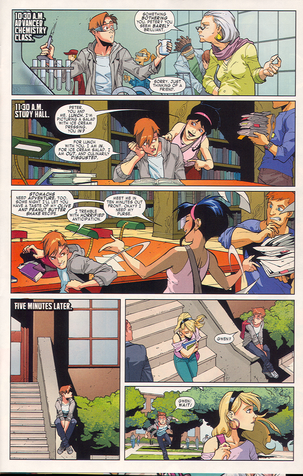
The chemistry teacher is spot-on. She looks like a chemistry teacher I had once. And they really do pay attention, this artistic team, to the way people look and dress. That awful lime green is really in right now and it’s being paired with purple.

Peter’s friend, Chat, isn’t a superhero, but she’s fun and wonderful. She’s the brunette with the terrible taste in salads above.

The plot isn’t all that new: A baddie tries to kidnap Gwen, who is the daughter of a cop, and Spidy has to save her. She’s not completely helpless, though, which I appreciated. She’s the one who suggests climbing the building to get away from the cops who are radioing in their location and also tells Spidy what to do.
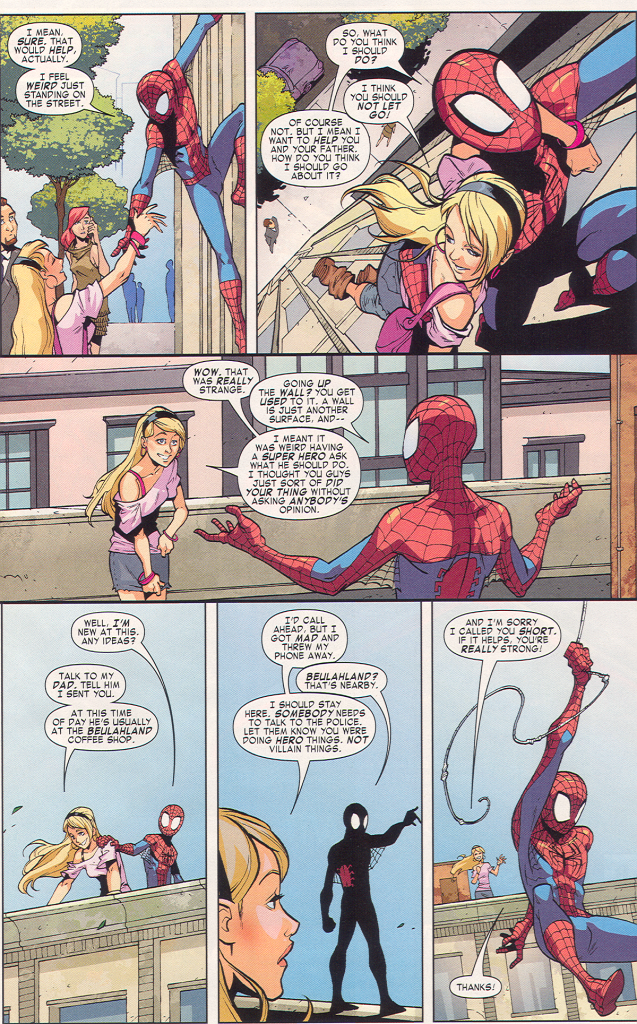
But what I really love about this page? After getting off the building, Gwen pulls down her skirt.

That’s what real girls do. We don’t leave our fannies exposed to the air for random fanboys to gawp at our panties. We pull down our skirts, so we don’t flash anyone and so we’re not cold. I loved this, because it’s so natural and so real. Gwen is a great girl and I really like her. What the realness of the comic allowed me to do is see her as a real person. At one point, when she’s running up some stairs, I thought Hey, cute boots. The chances of me thinking that in most comics I’ve read so far are nil. (Maybe Batwoman, but that would be in a Hey cute fetish boots way, which is not the same.)

Removing the voyeuristic sleaze that I always seem to feel when I read these comics was a great relief. There’s a kind of internal guard that always remains up. When I get together with just women, I relax my guard a bit. Reading this comic was a bit like that. I had some trust that this cool Gwen and this cool Chat wouldn’t suddenly be tied up in weird racy costumes and semi-tortured for the titillation of the reader. No, they’re characters who the writers respect, not objects. I found it relaxing.

The plot goes as plots go: Spidy gets to confront the baddie, with a bit of help, and there’s a cool fight. Then he has to go back to school and face the music. We wind up at the principal’s office at the end, and Spidy is just a kid again, getting in trouble for something the adults don’t understand. It’s fun and funny and great action.

Highly recommended. I will be buying the next issue, and the next after that, and the next after that.

How to Pen and Ink (Comikers) and Inky Inky Ink (Our Blogger Asks For Feedback)

by Yasuhiro Nightow (Author), Oh! great (author), Satoshi Shiki (Author), Comikers (Author)
Currently available here for only seven dollars! It is otherwise sadly out of print in paper.

This is, hands down, my favorite art book. I have two copies, because I’ve worn out one.

If you’re curious about how a mangaka draws, inks, or tones, then this is the book for you. This is a compilation of various Comiker articles, tutorials, interviews, how-to-articles, and surveys. They include, among other things, a long list of responses of what various artists use to ink their manga (type of ink, type of nib, favorite pen, erasers, and so on). I love that kind of detail! It’s extremely useful to know, for instance, that some artists prefer quick drying ink because they draw more freehand and that others like slower drying but waterproof ink.

I solved some of my own difficulties by switching to a ink that worked better for the technique I was trying to use.

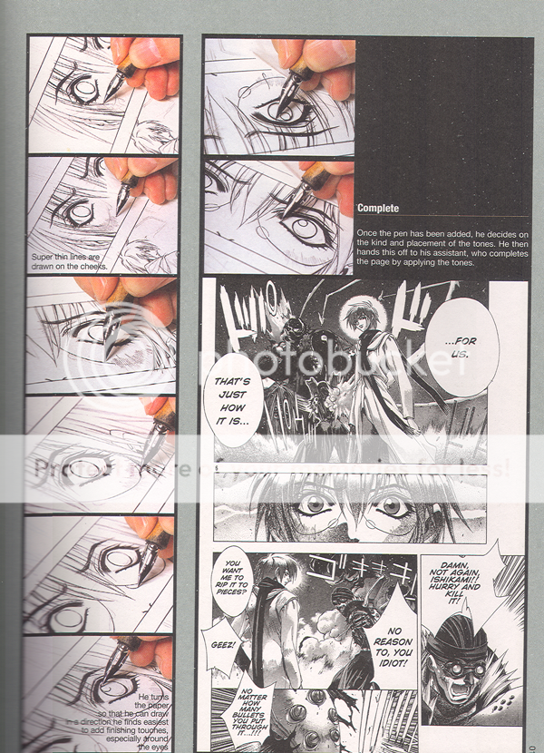
But besides being obsessively wonderful in detail, this book includes some pictures that are just damn cool. Want to see an artist go from basic layout pencil to perfected pencil to inked panels? They do this! And not just Joe Random Mangaka, they get great artists–Oh great, who does the back cover, is shown drawing and inking and toning the image. But it’s Satoshi Shiki’s work which makes my heart sing:


Check out the work on that eye! It’s fucking gorgeous. It just is. The line work! The thin-fat-thin! The eye lashes! The way the focus creates a widening eye effect! *happy sigh*

The previous page, which I didn’t scan but should have, shows him drawing the thing in pencils. *insert second happy sigh* Unfortunately, I cannot find any of his work translated into English and I’m not sure what magazine his current story is being run in. (Should some kind commenter know, I would be grateful for the info….)

Where was I? Oh yes. The purpose of the book and why the heck I’m talking about it.

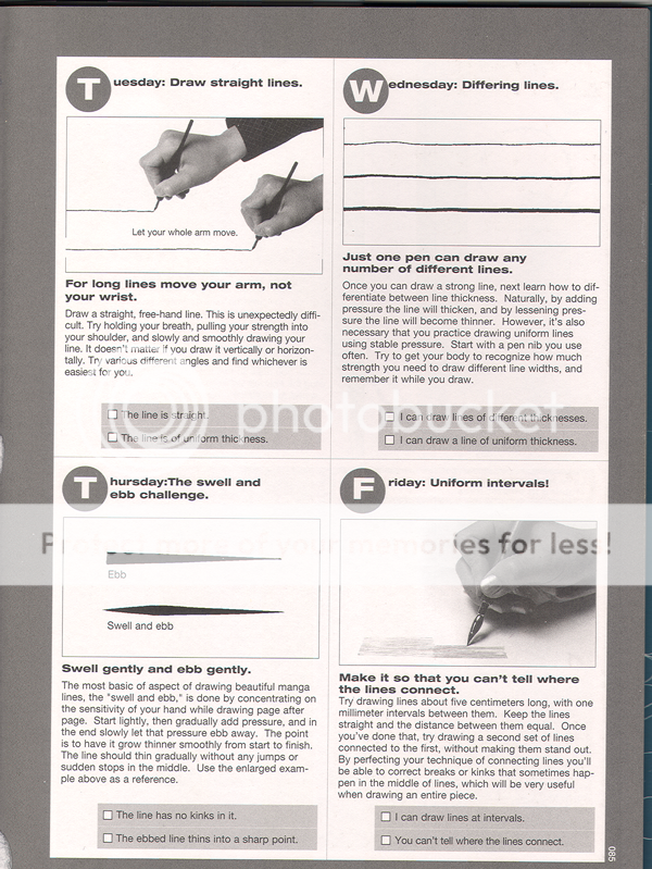
The book focuses on training the artist to use pen and ink skillfully, and furthermore, to use it the way that mangaka use it. A technical college wrote a wonderful tutorial designed to teach these techniques. This mini-school is worth the cover price of the book. It covers thin-fat-thin, using the pens to draw speed lines, creating effect line, varying character emphasis, inking for emotion, and much more.

One thing I love about the Japanese art books that I own is their emphasis on practice and their slow and careful steps. This book, like many other Japanese books, suggests copying the work of your favorite mangaka in order to learn. This is useful because it allows the hands to learn how to compose a page. It is also wonderful because it does not require the budding artist to work on all the techniques (underdawing, composition, placement, plot, character development, and on and on), but instead allows the artist to focus on mastering a single skill, inking. They mention, in their tutorial or the introduction, that they assign student the task of just making long, smooth lines freehand. Page after page of them until the student can do it easily and freely.

That may sound restraining and lacking creativity, but if what you want is to know that you can trust your hand to create the images in your heart, then it is a wonderful way to learn.

So here is an example of the tutorial so you can judge for yourself:

In any case, I feel strongly that this book is AWESOME. Which leads me into the second portion of my topic.

As you might guess, I’m a bit of an ink whore. I love ink. Adore it. Hug it. Collect it.

‘Uh, collect it?’ you may ask warily. Yes! Collect it. You see, in my copious spare time (when I’m not working overtime or going to grad school full time), I like to ink comics. I find it relaxing. I don’t, you know, post it anywhere. I ink and then when I’m done, I set the inked pages in a big box and when the box gets full, I recycle it. Sometimes I send it to friends. But mostly I don’t. Like I said, I just do it to relax. But like any good obsessive little comic addict, I have my preferences and my weird habits. So I have a lot of ink. I have, at last count, something like a dozen kinds of ink. Deleter 1-6 of course, and some Sumi ink, and some Higgins Ink, and my hoarded and beloved Pilot Drawing Ink (only available in Japan), and IC Comic ink, and um, some others that I forget. Windsor Newton and stuff? I don’t know. Not to mention the white ink.

So I’m going to review the inks. My thought was to draw a few panels in each ink, scan at least one page worth, and also draw some strictly technical panels (effect lines, for instance). I’m not sure if any artists read this or would find it useful, but I live in hope. I plan to include the following in each example page:

  • A character close up and one mid-sized
  • Something emotive
  • Place, building, interior
  • Effect lines or background hatching
  • Fine detail (flowers, fine shading)
  • Flowing lines (hair or clothing)

After I’ve reviewed several inks, I thought I’d have some cage matches. You know, put two inks together and draw the same thing with them and let you all vote as to which was better at hatching or speedlines.

What do you all think? Are there any aspects that would be most helpful? I plan to include in each review the strengths and weaknesses of the inks (to me), their waterproofness, their smear level, and how they work (ease of control, etc).

Face Down In The Mainstream: Supergirl

Supergirl #44 October 2009

Gates, Igle, Sibal

In my relentless quest to find interesting and readable mainstream comics that have female characters in plots that don’t make me reel back in horror, I picked up Supergirl. Oddly, I thought that since the comic was named after her, it would feature her character.

Just goes to show that I am ignorant about comics.

The comic begins with no introduction or backstory and focuses on a strange, large, lumpy man in lavender spandex. He’s been captured by someone and he wants out. Eventually, he fights a John McCain lookalike and frees himself:

His eyes glow red and he speaks in Zapf Dingbats, so you know he’s crazy or possessed.

We switch to a scene with the Supe himself, walking with Lois Lane, who is looking dumpy and strange in loose and unattractive eighties style modular knits. There’s talk between various big dogs while Supergirl (I had to guess based on her outfit), looks left out and or pensive. Eventually, they allow her to go talk to her childhood best friend, as long as she is chaperoned by some other guy.

Meanwhile, a female reporter in Frederick’s Of Hollywood hookerwear tries to find some leads.

Supergirl fights her childhood friend and gets possessed, which you can tell by the cover of the comic and the odd overlay of purple glowy light on her face in the last panel.

That’s it, really.

Lumpy men in gross purple bodysuits and a sad, forlorn, actionless and directionless mini-superheroine.

Ugh.

Note to comic writers: Come on. Who thought this was a good idea? The heroine takes no action. She has zero growth. No initiative. Hell, she has no character! And the art sucks.

Sequential Surrender Monkey (Part 2of 5): The Rabbi’s Cat

(or the HU Bande Dessinée Roundtable Part 2)

I admit it. I bought this for the cat. I read this for the cat. And I don’t really care about much except the cat.

The Rabbi’s Cat by Joann Sfar

Color by Brigitte Findakly
Translated by Alexis Siegel and Anjali Singh

This is an odd little book. It’s sort of a parable style story about a talking animal who has adventures and learns things. In the spirit of the parable, perhaps, it doesn’t make a hell of a lot of sense. Or maybe it’s just too French for me.

There’s this cat, drawn with wonderful inky spontaneity and rough enthusiasm, who eats a parrot and thus learns to talk. The cat happens to live with a rabbi and his daughter in Algeria. As soon as he learns to talk, the cat denies killing or eating the parrot, and thus begins the philosophical discussion of the purpose of having speech. Why have speech if all you do is lie? Or, as the cat does later, tell only those truths that cause pain?

Honestly, I didn’t care. I like philosophy just fine. I’ve read Aristotle and Aquinas and the Baghavad Gita and those lot, and I’m sure they would have been improved by the addition of a cranky and silver-shadowy-gray Oriental Shorthair with Views. And yet, to me, the cat was everything and the philosophy was nothing.

The funny and eccentric art kept me reading, for the most part, but I was sometimes bogged down by arguments and parables, much as the cat appeared to be. Sometimes he would weary of the talk and try to get back to his mistress to be petted or convince her to give him a fish, and I confess, I think he had the right approach.

The cat gains speech and loses it, follows the rabbi, learns of people and religion, laws and rules, different religions, reads, and hangs out with the rabbi’s cousin’s lion. I liked the lion. And the cousin, who liked to go around threatening anti-Semitic waiters with his rifle and his lion.

There’s a bit about a guy with plays what seems to be a banjo and another part that’s about shopping on forbidden days, but I just wanted to know if the cat would get his mistress to love him and care for him and feed him milk. I am a shallow creature, I suppose.

The art is delightful for the most part, and the story is strange and puzzling with those sharp turns fairy tales make, and I’m not sorry I read it. But it does feel very French. Or perhaps Italian, in the style of Calvino’s Italian Folktales. Which isn’t bad. At all. I’m sure.

It’s just that I don’t really feel like being enlightened. I want to sprawl around instead. Lazy as the cat. Who is portrayed as pretty wise in the book, so who knows.

Update by Noah: You can see the entire roundtable so far here.

Face Down In The Mainstream: Batwoman Pt. 2

Eyecandy.

I like it. But it’s tough to have nothing but eyecandy. There needs to be a structure, a frame, a skeleton for the flesh to hang upon.

Unfortunately, the skeleton of this week’s Batwoman is sort of wimpy and dull. Which is too bad, because the art continues to be very very nummy.

In this episode (#855, Sept 09), Batwoman fights the loli-goth villainess, Alice. It should be tons of fun, but Alice is just regular old crazy instead of being interestingly batshit insane. The two tussle and Batwoman disarms her and then Alice slashes Batwoman with a razor hidden in her mouth. It’s laced with poison, which is also sort of boring, really, as villainous feints go, but it does give the artist a chance to do this, which makes is worthwhile:

Isn’t that pretty? I love the scrollwork and the design elements and the way everything becomes lush and strange.

So Batwoman has sad but very pretty insane imaginings and then we get to see Alice go back to her minions. Again, there’s some interesting play with the layout:


Then there’s another little tussle. It’s kind of stock and there’s a cliffhanger where what seems to be werewolves and octopus creatures show up. I had hoped that maybe they’d do something with the Alice theme, because I’m bored with stock weird monsters. It would be so much more fun if the werewolves were wearing top hats and vests with pockets and if the octopuses had to wear red and white livery. But oh well. Maybe things will be brought to an exciting climax in the last issue, but I’m not holding my breath.

In short: Beautiful art but boring story.

Face Down In The Mainstream: Batwoman

Batwoman Reborn: Batwoman in Detective Comics; 854 August 2009 (Part One of Three)

Greg Rucka ,writer

J H Williams III, art

This….This is art.

Beautiful, interesting, compelling art.

I picked this comic up because I heard it featured Batwoman, lesbian socialite by day and crime fighter at night, and I figured that I couldn’t go too far wrong there.

The story isn’t that exciting, so far, but I don’t really care. The art is absolutely exquisite. *flails hands around*

The plot is pretty much this: Batwoman is trying to find the person who is leading this religion of crime in Gotham. They’re organized by covens, and sometime in the past they caught her and tried to kill her. The leader is coming into town, and Batwoman plans to be there. Dun dun dun. Or whatever. I don’t even care.

The episode starts with a lovely little fight slash victim interrogation. Just look at this page:

The top panel is especially nice. The body torsion is correct and the leg is right, unlike my last foray into current comics, and the pose works well with the page as a whole. There’s kind of a weird, bat shaped panel thing going on, which is clever, but which I liked rather than hated. The comic takes some odd approaches to panels in general, but I very much like the way the artist moves into and out of the frames, zooming and then pulling back, choosing key bits—like her hand—to focus on.

What I like about this page is the movement. It goes from frenetic, chaotic, to quiet, wham, focus on her hand and his face, and the whole mood changes.

The comic deals with both sides of Batwoman’s identity. Her crime fighter night life, as above, and her daytime self. This is a page where she’s talking to Pop (her father I assume, but haven’t really read far enough to know for certain).

There are several fascinating things about it. One, she’s wearing crummy sweats that make her butt look big. This is not an attractive outfit; it’s the kind of thing a real woman would wear to workout in, though, if she was at home. It’s intimate and real; showing a different and fallible, human, breakable side of her.

The colors are all of a piece in the home scenes: her bright red hair fits in with the rest of the landscape of skin, wood floors and warm walls, sunlight. Very alive.

It’s quite a contrast to the fight scenes where she looks like a fetish dom.

There’s a heavy sexual element to this comic, and so far I’m finding it both sexy and well done, rather than skanky (unlike, say, Amazing Spiderman, which I picked up and would have stomped on except then I would have had to buy it). The villain—but maybe I should talk about the villain next week. No, I’m sorry, I cannot resist talking about her now:

Look at this villain! What a fantastic and fun artistic contrast. The previous pages (which I have resisted scanning, but only barely) often focus on Batwoman’s dark red lips. The villain also has painted lips. And a fetish outfit. White and innocent, very frilly and girly compared to Batwoman’s butch femme dom outfit. The boots, too, are a contrast. These boots are white and tightly laced; Batwoman’s boots are red red red with a bat in the sole.

The villain is a beautiful foil for Batwoman. When they fight—Ah, but that is a tale for next week.

In short, I thoroughly enjoyed this comic and I do not care that it was 3.99 and I do not mind the ads or the weird and badly drawn extra or the fact that I had to drive someplace special to get it. I only hope I can talk lots and lots of you into reading it and discussing it with me. My only real complaint was some truly random bolding in the dialog. Nobody would have emphasized those words in speech, but that’s kind of a quibble.

Morpheus Strip: Revisiting Old Lives

It’s ten years ago, and I’m thousands of miles from home, living in a teeny room with a bed that’s been lopped short to fit and a slanting roof, like some medieval scholar monk. I don’t know anyone and I’m spending my days, and my nights, reading cramped texts in Greek and Latin; so much so that my grasp of English is getting stilted and my voice cracks from lack of speaking. I can’t seem to read for pleasure anymore, the words zip past on the page, too fast to catch.

But I stumble into a comic shop, for reasons I no longer remember, and I buy Sandman, and I take it home. I curl up on my too short bed, where my feet stick off if I stretch out, and I read about Andros climbing up the hill. Aner, I think, genitive, Of Man, and keep reading. The beautifully drawn art slows me down and the stories feel familiar, rich and strange and interwoven with layers of meaning and metaphor, like a country garden’s roses gone wild.

*

Looking back, I’m sure I didn’t read Brief Lives first, despite this picturesque memory. If I rattle my brain, I can remember reading Preludes and Nocturnes, at my small and cramped desk, and being delighted and appalled and pleased, especially by Death. I read all the notes, too, and I’ve always wondered who Cinnamon was.

But let’s return to this me, this depressed and lonely grad student, steeped deep in Greek stories of destruction and desire told in lush rhythm with beats that seem inevitable and Latin tales of debauchery and conquest told in spare and elegant prose. I sat there and read through the book, a chapter a day, reading slowly and carefully, slowed down by the beautiful art and puzzling over each word.

Did you know that the Greeks had a word for ritualistically ripping people apart, limb from limb, and eating them while alive? (sparagmos)

They did. And you know what? It showed up in the Sandman. The Bacchae there were the Bacchae of my beloved Euripides, at least a little. A force of nature that is both benevolent and strange, cruel and violent, and at times nurturing.

Each week, usually on Sundays, I would walk to the comic store, down a long and forested road full of blind curves and no sidewalks but cut granite curbs. It almost always rained, since Pennsylvania rains a good deal, and eventually it snowed. I walked it anyway, buying, slowly and carefully, each volume.

Except that I didn’t buy them all. A friend told me that Dream dies in the Kindly Ones (and I certainly was wary, with a title like that) but this is not how the story ends. I know this in my heart. The story does not end with Dream killing himself. That never happens. And thus I never bought that volume and I haven’t read it and I won’t, because that plotline does not occur. I’m difficult, and stubborn, as, er, some of the readers of this blog have no doubt guessed, and I sometimes make a decision about how a story as itself should go. And that is the story that lives in my head. Thus it was with Sandman. Sometimes authors are wrong about how the story goes and it is better to live with the story’s own ending.

But what, you may ask (quite reasonably), is the point of a long tale about the sad girl who read Sandman except for skipping the end? How is this useful criticism? What the hell?

And so I will tell you.

Well, so you know that Sandman was a good friend to me, back when I needed one. A beautiful and difficult tale that I savored and cherished. And this week, I was, like many of you, afraid to reread this story lest it look dusty and crumpled and turn out to have atrocious art that could only appeal to the few, the proud, the naive.

But no! Due to a flood, I lost my personal library (about thirty boxes worth) and all my Sandman, so I wasn’t able to reread the whole opus. But I picked up a copy of my favoritest favorite of them all, Brief Lives, and I was pleased and cheered to discover that it was just as good, if not better, than I remembered.

Let’s start with the art, because I love art and I read comics for art, more than for words. This volume has Jill Thompson’s pencils and inks by Vince Locke and Dick Giordano, with color by Danny Vozzo.

Check out this page:

I love this. It’s so unabashedly emo Goth. The dark colors! The fuzzy black hair! The despair! It’s touching, but it’s also kind of funny, because who among us hasn’t had a love affair that felt like this?

After this, of course Morpheus stands outside in the rain. Of course he does! I hear a lot of people (here and elsewhere) complain about the art, and it’s true that there’s better art and worse art, but look at this and tell me that it doesn’t make you laugh:

The art is evocative, and speaks more than the words do alone, which is exactly its job. It conveys a feeling that you can’t get with words alone.

I’d like to turn now to a bit of plot. Delirium, one of the Endless and Morpheus’s sister, misses her brother, Destruction. She’s trying to find him, and she’s asking her siblings for help. She asks Desire first. Desire, ahhhh Gaiman’s Desire. What a tricksy character zie is. In this first piece, Desire is portrayed as petty and cruel, sending an adoring fan to a dire fate for no apparent reason and then behaving unpleasantly, if not deliberately maliciously, to hir sister. Desire decorates with a vivisected man grinning in ecstasy, sleeps on a squishy pink heart muscle, and floats in an eyeball. Ew. Desire, of all the Endless, is shown as the most scheming.

In some ways, this always bothered me, because the point of love is to be good and kind, but at the same time, that’s not really what Gaiman is about. This isn’t love, it’s Desire. Shown most explicitly as sexual Desire.

Now, Brief Lives is bracketed by the Greek temple and Orpheus. The Endless echo Greek deities, and those beings are expressly cruel and capricious in their behavior towards mortals. Aphrodite and Artemis, for instance, destroy lives left and right in the Hippolytus for no other reason than a sisterly grudge.

Gaiman’s Desire would have felt right at home.

So Desire behaves much as a Greek deity would do, and Delirium moves on to ask Despair, who is portrayed in beautiful accents and with truly horrific touches, as gray. (I’m not as OK with her being fat, though, because I am very tired of fat being shorthand for sad or evil.) Despair refuses to act, perhaps because she is afraid of Desire. And then Delirium goes to ask Dream, and we come to one of my favoritest pages in the entirety of the Sandman. Look at this art:

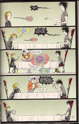
This is the shit. The body language is spot on. That’s a girl trying very very hard to be polite and adult, when upset and worried, and then perking up when the waiter asks her a question. By the end she’s getting confused and impatient, throwing her limbs around in wriggling social discomfort, The brother is absolutely rigid and offended, pretending to be polite while being very cold and insulting. The body language when he orders his meal is so pretentious—and insulting. Sibling slapfight. And the colors! Look at those colors. They’re so clean and reveal so much.

And because everything else is bog standard normal, the waiter is hilarious.

How is this not an awesome visual display of two different and competing siblings? When Morpheus’s body language changes (on the next page), and softens, all the previous panels’ repetition gives that change a huge amount of force.

And his small willingness to change, while he is clearly still despairing over his own heartache and while he is equally still completely embarrassed by his LOUD SHINY COLORFUL WHACKO sister, is endearing. If he thought, as Destruction thinks, that Delirium is fun or comfortable, his actions wouldn’t be nearly as sweet. No, it’s the fact that this trip is going to ruin his already bad day that the character Morpheus is humanized and thus lovable.

There are other fine pieces of art in this volume. The crazy sequences with Delirium turning colors, her jacket turned white, the frowning secretaries who look absolutely like secretaries everywhere, the fluffy and scruffy dog Barnabus, the strange sequence in the nudie bar, there’s a lot to like about this art.

And a beautifully crafted page that is striking with white and blue and a smear of blood blood red.

The pages between Morpheus’s granting of Orpheus’s wish and the page above are always hard to read. Morpheus hides his hands, and his pain, as he apologizes to the small fairy and is polite to his doorkeepers. He’s keeping the horror from others, as best he can.

The impact of killing his son is here in this page, where Morpheus’s despair and exhaustion are real and revealed with no words, just art. I think it’s beautiful and it always stops me in my tracks.

But in any case. I could talk a bit about the coloring (wonderful) or the inking (mediocre) but why? The art does many things well. It’s a whole. And this is a story I am glad to return to. I don’t regret my revisit of this tale. I hope those who haven’t been there in a while can return, too.

Is Morpheus a cypher? Yes and no. His family is rather difficult, let’s admit. Most of them are comfortable with who they are. Death is all-knowing and wise, but that is…not someone I’m going to be. I’m not all knowing and wise, but flawed and emo. Like Morpheus.

Morpheus is interesting because he’s deeply flawed. He’s got all this power and yet he just got dumped. There’s an annoying and embarrassing sister, who bugs him.

Unlike Desire, who is all powerful and using it the way a Greek god would, or Death who uses her power as we’d like the Greek gods to, or Destruction, who decided to leave the game, or Despair, who just isn’t around much, or Delirium, who’s lost it (literally), Morpheus has his powers and still can’t really cope. He does his best, though, and his muddling around is endearing to see and worth reading about. I like him. And he doesn’t die in the end.

_________________________

Edited to add: Since there’s a discussion going on in some of the other comments sections about the art, I thought I should note that I read the most recent printing of the regular trade paperback (ISBN 13: 978-1563891380) available here. That’s where the scans come from as well.
_________________________

Update by Noah: Other posts in the roundtable: Noah’s “Dream Lovers,” Suat’s “Impressions of Sandman,” Tom’s “Post-modern Something,” and, Dream Is Dead (All Hail Dream).