“Dale’s Comic Fanzine Price Guide 2011” Review: It’s Better Than Nothing

After years of false starts and publishing delays, “Dale’s Comic Fanzine Price Guide 2011” was finally published late last year.

I’ve been a comics fanzine aficionado and collector since the early 1970s, and have done quite a bit of research on the subject. I’ve even published a number of complete or partial indexes of key fanzine titles, such as “Star-Studded Comics,” “The Comic Reader,” and “The Buyer’s Guide for Comic Fandom” (now “Comics Buyer’s Guide). And while the TBG index only focused on the first 400 issues, it was a highly comprehensive, three-part, cross-referenced index that included 59 cover scans.

So, more than most, I have a pretty good idea just how difficult an undertaking “Dale’s Comic Fanzine Price Guide 2011” probably was. It speaks volumes that this is the first price guide in the 50-year history of modern-day comics fandom to revolve entirely around comics fanzines. Unlike professional publishers, comics fanzine publishers had highly erratic publishing schedules, frequently changed the names of their publications, sometimes had incredibly low print runs, and sometimes didn’t bother to provide even basic publishing information on the cover or inside of their publications.

That said, overall I was disappointed with this price guide for the simple fact that there is far too much information missing.

Yes, comics-related fanzines is a very tough collecting niche to create a price guide for. Yes, Dale had to make many decisions about what should and should not be included. But even giving him broad discretionary latitude, his price guide seems to have far too many glaring and arbitrary omissions.

For example, when I first started flipping through the book, I quickly noticed about a dozen or so 1970s comics fanzines I had personally contributed artwork to, or was familiar with because they were published by friends, were not listed. Those omissions prompted me to sit down and do a much more detailed cross-check between the “Dale’s Comic Fanzine Price Guide 2011,” and the comics fanzine index data I’ve been gathering on my own since the 1980s. To my surprise, there were literally hundreds of comics fanzines missing from the book – many of which were readily available to contemporary comics fans and well-publicized when they were originally published, and many of which I have in my personal collection.

Here’s just a random sampling of some of the fanzines that one would think should be in such an index, but were not: “Action Illustrated,” “Amazing Science Fantasy,” “APA-Five,” “Armageddon,” “Art & Story,” “Assorted Superlatives,” “Bumbazine,” “Captain George’s Penny Dreadful,” “Collector’s Corner,” “Comet,” “Comic Block,” “Comicaze,” “The Comicist,” “Comic Collector,” “Comic Courier,” “Comicdom,” “Comic Forum,” “Comic Hero,” “Comics Fandom Examiner” (Comics F/X), “Comic Lore,” “Comic Times” (the original version), “Comic Vendor,” Endeavor,” “Epitaph,” “Fandom Annual,” “Fandom Newsletter,” “Fantastic Fan Fiction,” “Fantasy Advertiser,” “Fantasy Fanzine,” “Fanzation,” “Fanzine Illustrated,” “(Irving) Forbush Gazette,” “Forum,” “Fulcrum,” “Funnyworld,” “FVP,” “Graphic Fantasy,” “Graphic Gallery,” “The Harvard Journal of Pictorial Fiction” (yes, this IS a fanzine), “Heroes Unlimited,” “Huh?,” “Marvel Gazette,” “Marvel Main,” “Marvel Mania” (the one that predates the later, slicker version), “Marvel Manor,” “Mask and Cape,” “Mindworks,” “Minotaur,” “Nucleus,” “Nova,” “Paragon Illustrated,” “Poor Richard’s Adzine,” “Qua Brot,” “Sensawunda,” “Spectrum,” “Spidey Fan,” “Stan’s Weekly Express,” “Tetragrammaton Fragments (the United Fanzine Organization club ‘zine regularly published since the 1970s), “Title,” “Touchstone,” “Train of Thought,” “Unpublished,” “Venture,” “What Th…?” and “Woweekazowie,”

Then there’s the seemingly arbitrary decision to list some slick fanzines/prozines such as “Anomaly,” but omit others. When the price guide’s scope is discussed in the introduction, Dale rationalizes his comics fanzine vetting process by stating that “Comics such as ‘Phase,’ ‘Star Reach,’ ‘Infinity’ and so forth are really more of an early independent or alternative comic than a fanzine.”

Really?

“Star Reach,” and unnamed fanzines like “Hot Stuf,” maybe. But “Phase” is as much a fanzine as is “Anomaly” or “Abyss” – both of which are listed in Dale’s price guide. And despite the fact that Dale says he won’t list fanzines like “Infinity,” “Infinity” is, in fact, listed on Page 98 of the guide.

Leaving out fanzines like “Phase,” “Nimbus,” etc., is not at all helpful to comics fanzine collectors simply because it is these fanzines that had larger print runs and might be more readily accessible. Face it, the average fanzine collector will never see a copy of “Xero,” but will pretty likely stumble across copies of “Phase” sooner or later.

There are also many problems in Dale’s price guide with cross-referencing omissions of various fanzines. For example, “Robyn (sic) Snyder’s History of Comics” is listed through volume seven, and at the bottom of the entry, it states that it becomes “The Comics.” Yet, even though the highly informative and respected “The Comics” is still being published today, and is on at least volume 22, there is no entry for the latter version of the title.

Another example of a glaring cross-referencing problem is the listing for “Comic Buyer’s Guide.” It doesn’t directly address the fact that this publication was once “The Buyer’s Guide for Comic Fandom.” It apparently assumes that fact is something everyone buying the price guide already knows. That’s a bad assumption. It also does not address page counts and section counts of the pre-Krause issues – something that is absolutely crucial for any collector or seller to know if they want to be relatively certain they are buying a complete issue. After all, who wants to pay $100 for the 100th issue of TBG, only to find out later that it is supposed to consist of four tabloid-sized sections and 80 pages rather than one section and 24 pages? And if you think that doesn’t happen, think again. I’ve seen eBay auctions of old TBG issues where a single cover section is listed and shown, but I know through my own indexing efforts that the issues being sold actually had two or more sections.

On the plus side, “Dale’s Comic Fanzine Price Guide 2011” lists many of the key classic comics fanzines – including most of the best-known publications – so it should be useful to most collectors in that regards. As for the actual pricing in the guide, I’d say it’s like any other price guide: Some of the prices seem too high, and some seem too low. Still, it does provide a decent baseline for pricing discussions, and one that’s long overdue.

In addition, the price guide contains an added and unexpected bonus: A price guide section for comics-related hardcovers, softcovers and trades. However, like the comics fanzine section that precedes it, what’s included and omitted in the book price guide section is a hit-or-miss proposition.

All-in-all, despite its shortcomings, I’d have to say “Dale’s Comic Fanzine Price Guide 2011” is a must for any comics fanzine collector or dealer – for the simple reason that a “snapshot” view of comics fanzines is better than no view at all.

Semi-Memoir and Stylization in Onward Towards Our Noble Deaths

This review originally appeared in the Comics Journal.

When I was thirteen I spent a week with my grandparents at their house in New Jersey. At the time I was interested in Japanese console role-playing games, and increasingly frustrated with how few games actually made it into English translation. In fact, I told my mild-mannered Catholic grandfather, a man who loved radios and computers and science fiction novels, I was thinking about learning Japanese. “Japanese, huh,” he said quietly, looking away from me. “Only one word I ever learned in Japanese.” He paused. “That was “surrender.””

It is doubtful that 89-year-old cartoonist Shigeru Mizuki will ever forget his war time experiences, either. At the age of 20 he was drafted into the Japanese army and stationed at Rabaul, on New Britain in Papua New Guinea, where he survived several near-collisions with death. His friends were not so fortunate. Possibly his most significant personal loss, though, is one immediately apparent from photographs of the man himself—the loss of his left arm.

Onward Towards Our Noble Deaths (Soin Gyokusai Seyo!) first appeared in 1973, and was inspired by Mizuki’s unintentional reunion with his commanding officer, which led him back to Rabaul after a 26-year absence. It is, according to Mizuki’s afterword, a book of “90 percent fact.” And for that reason, as well as its many strengths and virtues, it is a very difficult book to criticize.

OTOND is an on-the-ground perspective on the inanity and ultimate inhumanity of war, told from the viewpoint of a detachment of soldiers who occupy a portion of New Britain. The soldiers themselves are differentiated mainly by their facial shapes and the unique ways they deal with their hunger and their misery. They pick their noses, build encampments, run fruitless errands for their superior officers who berate and beat them. They dream about women and food, and attempt to satisfy both cravings through talk and pursuit of the latter, including hunting fish with grenades.

The inevitability of death hangs over everything, not just for the reader, but the soldiers as well. As Mizuki said in an interview with the Japan Times, “You feel death already when you receive the call-up papers.” In OTOND, which smartly confines its scope solely to the island on which the soldiers are stationed, the suggestion of the tenuous nature of the lives of these characters comes immediately. Their history- and honor-obsessed (and very green) commander, Lieutenant-Colonel Tadokoro, leads them to claim a bit of new territory south of their current position. When they arrive, bayonets affixed and rifles ready, to find no resistance at all, no people other than themselves, their commander bellows, “WE HAVE TAKEN THIS PLACE WITHOUT BLOODSHED!” “We took this place, he says,” one soldier says to another. “It is almost like heaven, just like you said,” says another as the sun goes down, men silhouetted among the lush palms. And overlapping that sunset, one of the sole instances of narration in the book: “Actually, we were not that far from paradise…”

“Not that far from paradise…”

But death doesn’t need a machine gun and an American flag—death is all around these men. The first to go is crushed by a tree he was carrying, killed in his weakened condition by dengue fever, no doubt made worse by his exhaustion and malnutrition. Another is felled, with no witnesses, by an alligator, another, horrifically, by a fish that he has in his hunger stuffed greedily into his mouth.

And then the enemy arrives.

The early fighting is scatter-shot, furtive, small pockets of men shooting at great distances and then retreating, picking off a few here, a few there. The first truly significant encounter with the enemy is not face-to-face, but with their superior foodstuffs—after driving off a presumably small contingent of American soldiers (presumably, because we as reader haven’t seen them at all at this point), the soldiers find a hut full of provisions, including canned goods and chocolate. “Those bastards are living like kings fighting this war,” says one of the soldiers. “Now that I’ve eaten all of this food I can die a happy man,” says another.

When the fighting finally comes, it comes in bursts of violent punctuation, at a distance, the violence gruesome, inevitable and also somehow impersonal. “Maybe during the Russo-Japanese War you had a chance to ‘see’ the enemy forces,” Mizuki told the Japan Times, “but in the Pacific War, the moment you met the enemy you knew whether you were dead or alive. It was that fast.”

The conflict escalates. Engaging a force superior in numbers and equipment, the specter of annihilation that has so far hovered over the soldiers finally descends. Against the recommendations of his advisers, who plea for strategic retreat, Lieutenant-Colonel Tadokoro orders his men in a suicide charge against the enemy. The men spend their last nights drinking and singing. In the morning Tadokoro instructs his men to turn “towards our beloved homeland and bow in farewell.” “To the RIGHT!” he bellows to the bewildered men. “RIGHT!” They bow, affix their bayonets, and plunge headlong into the enemy.

But not all men are so eager to die as their commander, and some survive the horrific battle. The survivors make their way back to their division base, only to find that their deaths have already been reported to headquarters. The only possible reaction to their cowardice in surviving, they are told, is another charge. Coerced from a new arrival from division HQ, beaten down and demoralized, the eighty-odd remaining men raise their voices to sing and charge the enemy in one last pointless push. The last to die is Maruyama, who earlier we have seen illustrating playing cards for his commanding officers, offering to draw their portraits when they all return home. Now his face is grotesquely distorted, maggots in the fresh hole in his face, a song still on his swollen, bleeding lips. He stands, laughing, among the dead, facing an American tank. His abdomen bursts from artillery fire, and he falls, facing us in closeup. He is the last to die, this artist’s surrogate, the sole character with any interiority, whose thoughts we hear at the moment of death.

His body joins the bodies of his friends, now all texture and value, rendered how one might draw a mass of palm tree logs, felled and scattered. As our view gets closer, the piles of bodies turn to stacks of bone, and, finally, crushed remnants, barely recognizable save a few stray bits; a femur, a portion of a skull.

The decision to stage the book solely on the island neatly side-steps details and potential arguments about cause for the conflict and instead forces the reader to address the situation from the situation of these conscripts—men without hope, trapped in a absurd, grotesque situation in which they have few choices, no individual agency to act.

I said earlier that it’s difficult to criticize a work like this. This difficulty is not just in its subject matter, but also in its status as semi-memoir, a category that allows a work to gain significant power from the story of its creator. Regardless of how someone might feel about OTOND, there’s no doubt that it’s enriched by its proximity to Mizuki’s life story, which is truly remarkable. Mizuki is one of the most popular cartoonists in the world, having with his studio created thousands of pages of comics, and yet he did all of this after having lost his left arm in an air raid. He debuted at age 33, ten years later. His biography is inextricably bound to his war comics. When I reacted emotionally at the conclusion of the book, it was not just for the senselessness of the conflict, nor for the loss of Maruyama, who like most of the other soldiers in the book is very loosely characterized; it’s also for the connection of this character to the man who created him, mulling over all of the complex and contradictory reasons that Mizuki might send his stand-in to a death that he himself escaped.

But this connection is also problematic. Earlier in the book, when a character is killed attempting to eat a large fish alive, I found the sequence, and the explanation for the death, grotesque and unbelievable. But my reaction was quickly tempered by the thought: “This is a sort-of-memoir, right? He wouldn’t add something like that in unless it was true, would he?” And ultimately I have no way of knowing whether people have really asphyxiated from attempting to eat large live fish—but the reader’s likelihood of believing it is much greater because of that semi-memoir status. It’s that “semi” that’s so tricky.

“An unintentional peek inside the process—a paste-up Mizuki head atop a photo-referenced body.”

The visual style of the artwork can also be a stumbling block. The dissonance between the crude but communicative figures and the naturalistic, presumably assistant-drawn and photo-referenced backgrounds can be jarring at first, but soon works fairly well, at least for this reader. What’s problematic, though, is the hand-off—when characters suddenly leap modes, bouncy and expressive one moment, and photo-rendered and flat the next. This isn’t just a visual failing—it’s an opportunity lost. There were moments on my first read-through when I thought these translations of style would prove to be thematic—for instance, maybe the enemy would be rendered naturalistically, in the mode of the backgrounds and the hardware, personality-less, cold, and remote. But then the enemy would appear rendered in Mizuki’s style. Perhaps only the dead could have been rendered in this mode—certainly the transition into death at the end of the book is accompanied by this visual transition—but the power of this potential coherent visual statement is diluted by its use elsewhere. Ultimately I came to the conclusion that the decision to render some panels, and even only certain figures in panels, in this mode was most likely a pragmatic rather than artistic one; either assistants are rendering those figures or Mizuki himself is using photo reference. Either way, it is a major fault of a book that is otherwise very smart and deliberate in its decision-making.

Drawn and Quarterly’s adaptation has problems of its own, not the least of which is the unsympathetic and overly primitive lettering (“font design” is credited to Kevin Huizenga, but no one is credited with the lettering itself, perhaps understandably). Every sound effect in the book is rendered in the same font, which at its largest display sizes looks crude, wobbly and distractingly thick. The translation by Jocelyne Allen is readable, but has its own problems, including anachronism (the word “meh” out of the mouth of a Japanese soldier in 1943?), lack of clarity (a soldier is asked to “draw some cards” for his commanders, without any clarity as to what type of “drawing” might be indicated), and even outright error (the commander’s shifting rank). The translation is especially awkward in the area of the song lyrics that appear at numerous parts of the story.

This might seem like picking at nits, but these aren’t insignificant issues, considering this is in all likelihood the only English-language release this book will ever have. And to my mind, it is a compelling work by a major cartoonist who, like so many of his contemporaries, is woefully underrepresented in English. As for the visual inconsistencies, some would say that’s the price to be paid for volume production, the manga equivalent of television’s pragmatic cinematography, or indifferent musical scoring. Maybe it’s enough, after all, that this story is told, and perhaps it’s petty of people like me to pick at the details.

As for Mizuki himself, he’s long since moved on, his drawing time occupied primarily by manga about y?kai, for which he is widely known. But the past has a way of drawing you back. In 2003 he returned to Rabaul, where he had been held prisoner in the latter days of the war, where, after almost 60 years, he visited the islanders he had befriended during the war, the people that treated him with a humanity so strikingly absent from his commanders.

“We were […] creatures lower than a horse,” Mizuki writes in the afterword. “I wonder if surviving the suicide charge wasn’t, rather than an act of cowardice, one final act of resistance as a human being.”

Robert Binks: More Works by an Unassuming Master ( part 4 )

Hello! We come to the end of our second round of posts devoted to Robert Binks, illustrator and artist extraordinaire. Illustrations will be our focus this week, with a sampling of Mr. Binks’ freelance, private and on-staff work (for the Canadian Broadcasting Corp.).

As always, work done for the CBC is © CBC/Bob Binks, and Mr. Binks’ private works are © Bob Binks. Our previous posts can be found here, and scans of his illustrations for a book of  Ogden Nash’s poetry are here.

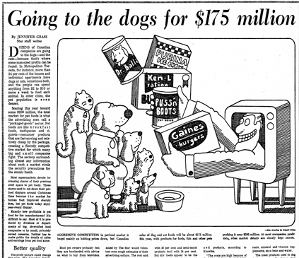
First, an illustration done for the Toronto Star newspaper during the 1970s:


The picture grabs the eye, as a newspaper cartoon has to, but it does the job in a way that’s quite unusual. The drawing is built around two sets of steps — the products rising up from the TV, and the animals making up the audience — that zigzag up from the lower right to the higher left. How often do you see that? And the shapes making up each group tend to get bulkier as the group rises.

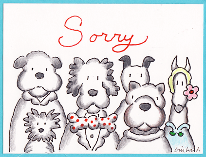
More dogs, this time in a card Mr. Binks made for a friend who had lost a pet:


A pair of subtle, unorthodox touches: the tiny drop of the composition’s central line from left to right, and the spare but warm placement of color among the picture’s gentle grays. The red motto and polka dots are presented front and center, then left on their own until color reappears at the far right of the drawing, just where the gently dropping central line comes to rest.

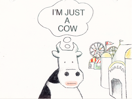
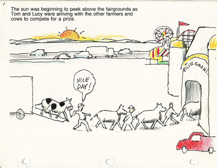
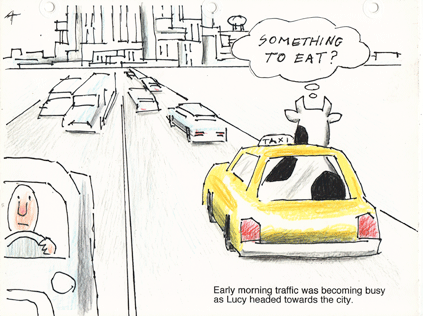
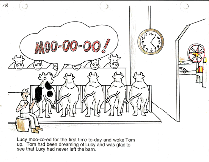
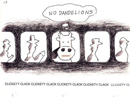
Now for six drawings taken from a group of nineteen. As we have seen before (that is, here, here and, if you scroll down, here), Mr. Binks finds something provocative about cows, and especially cows  juxtaposed with such unexpected settings as the typical modern metropolis. Or, as he puts it less pretentiously, “Recently I felt I just had to write and illustrate a cow story for my grandchildren. Again, the theme is about a cow and the big city.”

Below is a selection of illustrations from his privately made book and its story of one cow’s heroic odyssey:


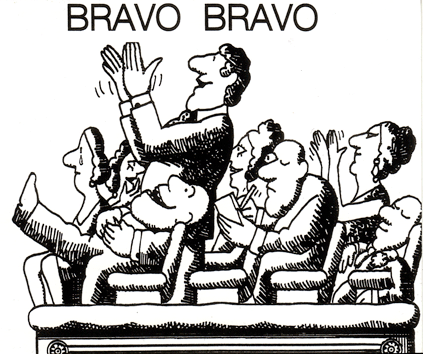
A triumphant sequence! Which brings us to our clean-up pair of pictures. First, from the Toronto Star, a drawing that Mr. Binks has also used for cards congratulating friends on their birthday:

And a studio graphic that the CBC show Take Thirty used for station breaks:

That’s good advice, as we hope to present another Binks sequence a little down the road. In the meantime, enjoy a healthy and prosperous 2012.

Robert Binks: More Works by an Unassuming Master ( part 3 )

The above says it all, or pretty much. Welcome to the Christmas installment of our series on Robert Binks, the Canadian illustrator, painter, sculptor and greeting card designer who has spent more than half a century creating beautiful and playful works of art. His greeting cards, all made privately for friends and family, come in for special but not exclusive attention this go-around.

As always, Mr. Binks’ private works are © Bob Binks, and you can find all our posts to date here and Mr. Binks’ illustrations for the poet Ogden Nash here.

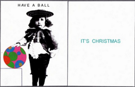
Our opening picture shows the offbeat way Mr. Binks likes to play with old images and contrasting styles in his cards. He says:  “I created this personal Xmas card in 2009. I tried to combine the old with the new — I love that old photograph and I had used it in one of my CBC animations circa 1980 about the history of Toronto.” The CBC is the Canadian Broadcasting Corp., where he worked for most of his career.

The card is a favorite of mine. The whiteness and the giant mod Christmas bulb set off the solemnity of that black-and-white child from long ago.  The combination is vivid and funny at the same time.

Now a pair of sculptures:


The artist calls these the “Goodie Gals.”  Mr. Binks:
“Back in the ’50s, while working as a display designer in Eaton’s Department Store, I created a graphic idea of a woman wearing a large brimmed hat filled with goodies. In 2010 I finally brought this idea to fruition creating these two ceramic heads with removable plates.” Take the plates off and the two women becomes vases for flowers.

Next a very Canadian recipe page:


Mr. Binks drew the illustrations for the Globe and Mail, Canada’s leading newspaper, back in the early 1960s.  Like the “Good Girls,” they show his knack for generating feeling from a few simple lines. The two drawings also reflect his tendency to pile simple geometric shapes into a block, and to fill spaces with dense texture or textures (often ones that show a strong contrast, as with the tree’s bark and the little girl’s blanket).

Another greeting card, this one from 2008:


Santa’s red hat is actually a flap; you lift it up and there’s his party hat for New Year’s Eve. The balancing of the modest script greetings atop Santa Claus’ hat is very Binksian, if I may coin a term.

A trio of  wood statuettes:


Mr. Binks:  “The hot dog man was made for my grandson. In the square base of the Santa is a music box movement that plays ‘Toy Land.’
The piano with the abstract design plays ‘Yesterday.'” I love the hot dog man’s mustache and matching hat-brim shadow, and the piano shows the same sort of splashy but clean-lined color arrangement that shows up in some of Mr. Binks’ paintings.

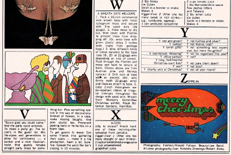
Two holiday-season cartoons with a distinct ’60s flavor:


Mr. Binks:  “This Christmas page was done for Chatelaine magazine circa 1965.” The party cartoon’s elongated shapes crowded together are again very Binksian. But what I like best is how the charm characteristic of Mr. Binks’ work coexists with the Peter Max trimmings.

And now a run of highly inventive Christmas cards. The first is from the mid-1990s:


Mr. Binks:  “The card is received in a flat envelope. When opened, the house and trees pop up and Santa’s hat appears in the chimney. I wrote the poem to support the card.”

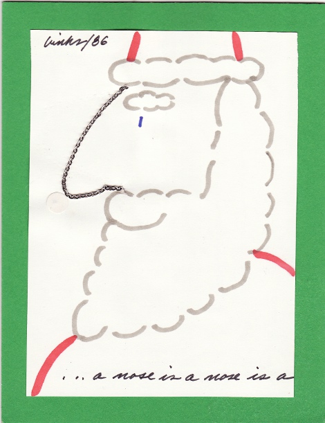
A card from 1986, this one with a uniquely adjustable Santa schnozz:


Nudge the chain and Santa gets a new profile. Caption:  “… a nose is a nose is a”

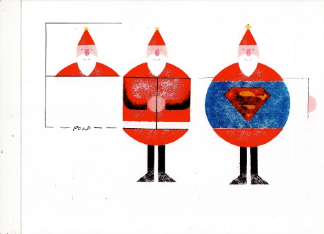
Next, a card from the mid-1980s. Mr. Binks:  “Card flaps open up in stages to reveal a Superman Santa.”


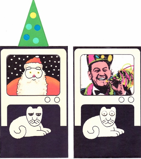
Finally, a combination Christmas and New Year’s card:

It’s from 1976. Mr. Binks: “I just had to do a card with Guy Lombardo ushering in the New Year. This is a multilayered card housing an elastic band to animate the action. When the Christmas tree is pushed down, the TV screen changes from Santa to Guy Lombardo. The cat wakes up to the sound of the New Year festivities.”

I think it’s fantastic: the concept, the drawing and the use of Lombardo’s lividly tinted photo. That poor cat!

And on that note, a Merry Christmas and Happy Hanukkah. Next week we’ll have the last entry in this round of posts. The focus will be dogs and cows — don’t miss it.

One Plus One, or the Ruse of Analogy

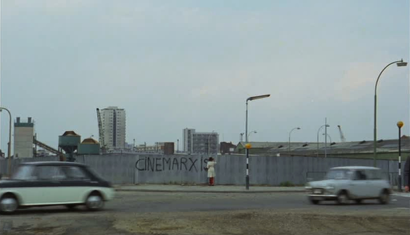
To begin with, a generalization: Godardians really don’t like Quentin Tarantino. But, fear not, this post isn’t going to be about the latter, only the reasons expressed by the Godardians for their contempt. Wasn’t it Jean-Luc Godard himself who argued against a clear distinction between the fictional film and the documentary? For him, being even more opposed to naïve realism than Andre Bazin, the camera always had a perspective, a position, or as Colin MacCabe puts it: “there is not reality and then the camera – there is reality seized at this moment and this way by the camera.” [p. 79] It was this foundational belief that led to Godard’s dismissal of the anti-aesthetic implicit within cinema vérité, that reality comes from letting the film roll. Yet, Jonathan Rosenbaum (and I might as well mention Daniel Mendelsohn and HU’s very own Caroline Small) condemns Inglourious Basterds for “mak[ing] the Holocaust harder, not easier to grasp as a historical reality,” because “anything that makes Fascism unreal is wrong.” Evidently, fascism is just there waiting to have a camera pointed at it. No truth could possibly come out of a fantasy involving Nazism. In One Plus One, Godard films a neo-Nazi pornographic bookseller reading from Mein Kampf as his customers buy lurid novels and magazines — each person who makes a purchase gives a Nazi salute and slaps two captured hippies in the face. Is Godard making fascism easier to understand as a historical reality? More likely, the viewer is confused at this unrealistic scenario, but hopefully intrigued (or entertained) enough to contemplate what all these component images are doing there together in the middle of a rockumentary, e.g..: What does pornography have to do with fascism? What does any of this have to do with The Rolling Stones (the ostensible subject)? Just what the hell is Godard saying?
Rosenbaum refuses to regard Tarantino with any sort of reflection (I suspect too much identification, aka “entertainment,” and not enough distanciation aka “intellectual thought”). Inglourious Basterds is a film about other films, about movie conventions, and for that reason alone, “it loses its historical reality.” However, aren’t all of Godard’s quotations from films, news media, advertising and literature committed to the exact opposite point, that these images do have a historical reality in the way they construct/mediate who we are? If one is going to be derided for his narcissistic cinephilia (filtering everything through film), then the other should be, too. Rosenbaum mockingly quotes from an interview with Tarantino where he relates the 9/11 event to the spectacle of action films – not one of the director’s prouder moments, to be sure. Now consider Godard’s statement from La Chinoise’s press book:
Fifty years after the October Revolution, American cinema dominates world cinema. There’s not much to add to this state of affairs. Only that at our modest level, we must also create two or three Vietnams at the heart of the immense empire, Hollywood-Cinecittà-Mosfilms-Pinewood, etc. as much economic as aesthetic, that’s to say struggling on two fronts, to create national cinemas, free, brotherly, comrades and friends. [p. 182, MacCabe]

Although MacCabe gives this a sympathetic spin, noting how Godard has always been aware that his “oppression” isn’t as “grievous” as what was done to the Vietnamese, there’s not much he can do with the foolhardiness of the director’s feeling “solidarity” with them because “his own experience” is “the very same predicament.” I’m going to assume that the imperialism of having too many theaters showing American movies is quite obviously not the oppression of a napalm bath, as a spectacle or otherwise, and move on.
On the other hand, Godard’s kinocentrism (sounds better than ‘cinecentrism’) also served to make him film’s most indefatigable and important moral critic of the Sixties – at least, regarding his chosen medium (as we’ll see, I’m more skeptical of his role as a social critic). If his films of that period are about any one topic, it’s the relation of cinematic form to reality, how one shapes the other, and the filmmaker’s charge in relating his or her film to an audience. As our reality was becoming increasingly mediated by images, where the representation of life was replacing life and human relations were displaced through commodities (compare Pierrot le fou’s famous dinner party scene in which the guests communicate through ad-speak to Guy Debord’s Society of the Spectacle), Godard radicalized his films in Brechtian fashion by subverting cinema’s conventions, calling attention to their mediating effects (albeit Debord and the Situationists weren’t fans): music pops up arbitrarily, dialogue doesn’t sync with the images, quotes (both visual and textual) are used in abundance but frequently have no logical connection to what little plot is involved, etc. As the title sequence for 1965’s Pierrot le fou fades to just the O’s, Godard, relating to the world through cinema, but ever more distrustful of the reality of images, announced his intent, to return filmmaking to degree zero. His films would become more radical (and more impenetrable to the average filmgoer).

Ever since I first saw it, One Plus One has alternately bored, frustrated and fascinated me in roughly equal measure. Godard called it his last bourgeois film, since it was the last of the period (following Week End) to be financed through conventional means and wasn’t as collaboratively directed as his subsequent efforts with the Maoist Dziga Vertov Group (where the group received auteur credit and they would try to make films via committee). Indeed, other than featuring The Rolling Stones, the film is probably best known by the incident where the director punched his producer, Iain Quarrier (who plays the bookseller), in the nose for having altered the ending to include the completed version of “Sympathy for the Devil” and renaming the film with the song title – that is, Godard hadn’t abandoned all vestiges of his own auteurship. Nevertheless, it was the first of his films to follow the transformative events of the Langlois Affair and May 1968, a transition into what’s typically known as his radical period, where he and his collaborators (particularly Jean-Pierre Gorin) attempted to realize the revolutionary potential of film.
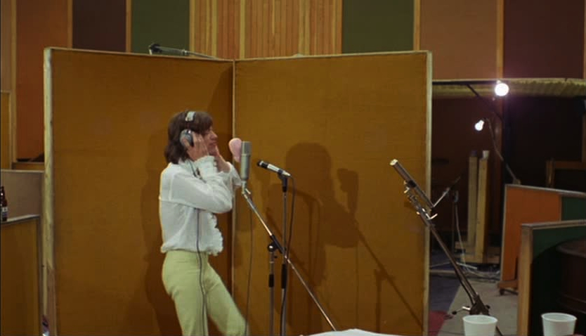
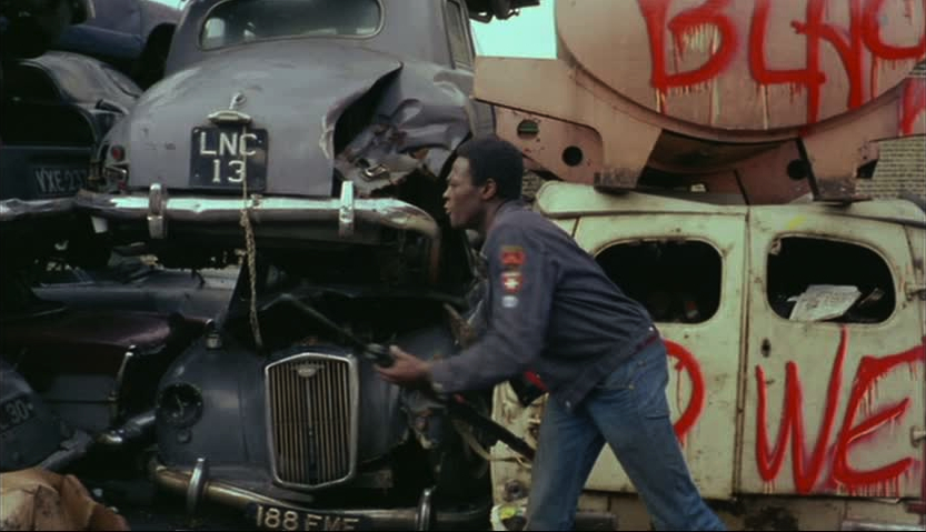
Through long tracking shots between the band members in a recording studio, each often surrounded by soundboards, the film conveys the amount of individual effort and labor time involved, 1 + 1, even in manufacturing something as seemingly disposable as a pop song. By refusing to give the audience the finished version (in the director’s cut), the focus is on the collaboration, rather than the commodity. Likewise, the mise-en-scène is an attempt to not single out any particular member as a star (although, unsurprisingly, Mick Jagger and Keith Richards speak more than the rest while the drug-addled Brian Jones nearly vanishes on camera). Against the visual images, a narrator reads from a smutty political novel (involving, among others, Pope Paul and LBJ in lascivious encounters), which intrudes upon the traditionally diegetic sound, dialectically challenging the notion of a unified film diegesis. And against The Stones in the studio, Godard counterposes other, tenuously related sequences: the media interrogation and eventual demise of Eve Democracy (Anne Wiazemsky, JLG’s second wife); in a junkyard, black militants read Black Power disquisitions, pass guns to each other (within long lateral tracking shots) as they molest and slaughter white women; and there’s the aforementioned bookstore where men and women, old and young, bourgeois and working classes can purchase smut and racist, violent pulp. To quote Mao Zedong (lifted from Slavoj Žižek): “In any given thing, the unity of opposites is conditional, temporary and transitory, and hence relative, whereas the struggle of opposites is absolute.” Godard is quite brilliant in formally instantiating Mao’s “the one divides into the two,” forcing the viewer to engage the filmic elements dialectically, but does the film effect any change outside of cinema, or even demand such a change?

I’m inclined towards Roger Greenspun’s early summation: “Whatever its intentions, One Plus One contemplates rather than advocates revolution.” It’s about the use of revolutionary ideas to make a film, rather than a film serving the revolution. Exploiting The Rolling Stones’ popularity could’ve been advantageous to spreading radical ideas to the masses, but not when it takes something like an intellectual interpretation of Mao to understand those ideas. The film could only fail in its didactic purpose, since it was ultimately aimed at other cinephiles already sympathizing with the ideology – i.e., white bourgeois radicals, the type of person who really gets the joke of juxtaposing a successful blues-based rock band against a black militant reading LeRoi Jones on the white appropriation of black music. But is Godard doing anything differently here? He uses the image of black militancy to lend authenticity to his kinocentric radicalism much like he analogized his own oppression to that of the Vietnamese, as if he’s there with them in the junkyard – the void of Western culture. At least The Stones have a genuine love for the American Blues. I’m not so sure that Godard expresses anything more than a narcissistic interest in the struggle of American blacks (namely, what it might mean to his ideas of a revolutionary cinema). Since I find this representative of a certain navel-gazing self-importance endemic to Godard’s films (what most of his detractors would call ‘boring’), I’m going to focus the rest of the essay on what’s problematic about his use of black representation.

First, consider this more favorable interpretation from Gary Elshaw (providing the most insightful and comprehensive critique of the film that I’ve found):

Godard’s desire to “destroy culture” is illustrated by [Eldridge] Cleaver’s own desire to destroy the dominant culture, a culture that is led in the form of the ‘Omnipotent Administrator’. The ‘Omnipotent Administrator’ represents white male patriarchal power, a power which often manifested itself as governmental and repressive.

Contrariwise, I find a bit of minstrelsy in Godard’s use of black men in that it’s a savage image, regardless of their literary references. Now, I understand that their violence stems from what he surely agrees is white oppression, but their abstracted appearance here is more a metaphor for his own struggle to destroy the Hollywood Empire’s hegemony than to capture the reality of blackness. Black Power is to Godard’s target audience what Leadbelly was to the “open-minded,” left-leaning white audiences of his time. As Hugh Barker and Yuval Taylor put it (in their book Faking It: The Quest for Authenticity in Popular Music): “[B]y the twentieth century, with the influence of Darwin and Freud, it was primarily the Negro who had become idealized, and this time as the primitive – pure id, and therefore profound.” [p. 10] Despite the soft-spoken musician’s preference for suits, his promoter and producer, John Lomax, insisted on the commodified image of the prison-garbed, convicted murderer, selling an idea of authentic repression by reflecting (however well-meaning) white bias. Isn’t this what Godard’s doing with the black militants, by presenting the violent return of the repressed black to white radicals calling – at least, intellectually – for a violent revolution? Solidarity, go primitive, back to zero. Eve Democracy dies while fighting beside blacks on a beach at the end. As the most likely stand-in for the director (espousing many of his views during the interview earlier), that it’s her corpse raised on the Hollywood-sized camera crane (Godard’s “omnipotent administrator”) in the last shot is, I believe, telling.

My triangulation is similar to the scene in Week End where two previously warring parties, an anti-Semitic woman and a communist farmer, are united in their disdain at the self-centeredness of the lead bourgeois couple, Corinne and Roland. As Frank B. Wilderson III argues (in Red, White & Black):

[T]he imaginative labor of White radicalism and White political cinema is animated by the same ensemble of questions and the same structure of feeling that animates White supremacy. Which is to say that while the men and women in blue, with guns and jailers’ keys, appear to be White supremacy’s front line of violence against Blacks, they are merely its reserves, called on only when needed to augment White radicalism’s always already ongoing patrol of a zone more sacred than the streets: the zone of White ethical dilemmas, of civil society at every scale, from the White body, to the White household, through the public sphere on up to the nation. [p. 131; capitalized White and Black refer to structural positions]

By being a reflection of his kinocentrism – cinephilia his “zone of White ethical dilemmas” – Godard’s attempted solidarity with the American Black Power movement becomes aligned with early twentieth century white condescension. On the one hand, there’s the offense at Henri Langlois being unjustly removed from the Cinémathèque Française and, on the other, there’s former Slausons member Kumasi’s memory of the Watts Riots (from the film Crips & Bloods: Made in America):

You cannot woop us. We’re already dead. We’re already beaten down — we’ve been beaten down for 400 years. We already got the wounds inside and outside our bodies; how you gonna hurt us? […] Here’s a dilapidated building; ain’t nobody livin’ there. You didn’t fix it; you didn’t remove it, okay? It ain’t nothing but a pile of bricks, anyhow. That’s comin’ at you. That whole building, brick by brick, is comin’ at yo’ ass. That’s what we’re throwin’ at you: the building, the bullshit, the rubble, the rubbish that we live in. That’s what’s comin’ at yo’ ass. Those are our weapons: the filth, the funk, the shit that you can’t stand — that you defend, that you put a barrier between us and yo’self. That’s comin’ at you.

Wilderson would argue that these two forms of oppression aren’t just different in degree, but in ontological kind. Godard’s attempt to draw a structural parallel (say, between the censoring of films under the de Gaulle regime and the way the black population was cordoned off in Southern Los Angeles) is based on a false analogy. This “ruse,” as Wilderson calls it, hides the ontological violence perpetrated on blacks through slavery, whereby Blackness became defined as fungibility and accumulation – Inhuman, Dead. As for the communist struggle, quoting Wilderson again: “workers labor on the commodity, they are not the commodity itself, their labor power is.” [p. 50] Not that it would be much more plausible, but Godard should’ve kept his analogies of oppression to those of the striking workers in May 1968, since they were struggling with alienation and exploitation, not necessarily their position as Human. It was his solipsism that ensured One Plus One would be best remembered for its formal inventiveness or, most often (for example), as a collection of snazzy clips of The Stones at the beginning of their most inventive period.

REFERENCES (not all of them cited in the text):

Hugh Barker & Yuval Taylor, Faking It: The Quest for Authenticity in Popular Music
Gary Elshaw, “The Depiction of Late 1960s’ Counter Culture in Jean-Luc Godard’s One Plus One/Sympathy for the Devil
Stephen Glynn, “Sympathy for the Devil
Roger Greenspan, “Sympathy for the Devil (1+1)
Colin MacCabe, Godard: A Portrait of the Artist at Seventy
David Sterritt, The Films of Jean-Luc Godard
Donato Totaro, “May 1968 and After: Cinema in France and Beyond
Frank B. Wilderson, III, Red, White & Black: Cinema and the Structure of U.S. Antagonisms
Slavoj Žižek, “Mao Zedong: The Marxist Lord of Misrule
______________
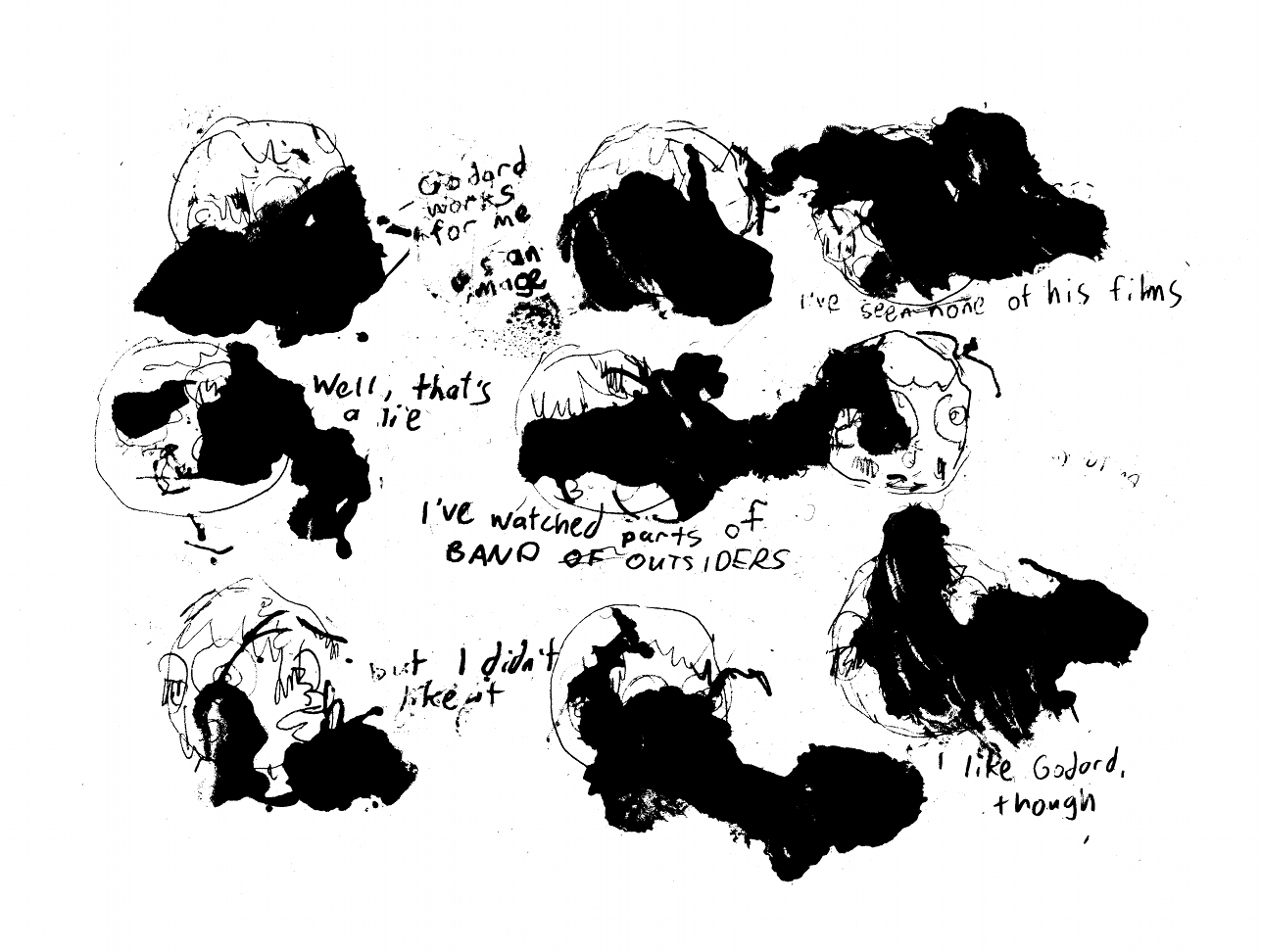
The Godard Roundtable index is here.

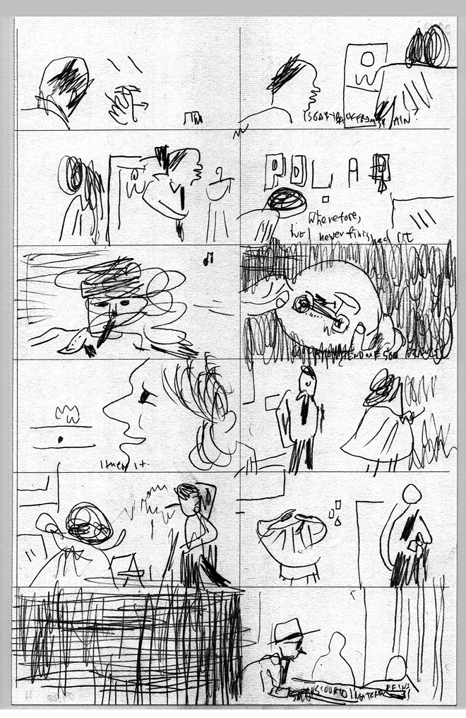
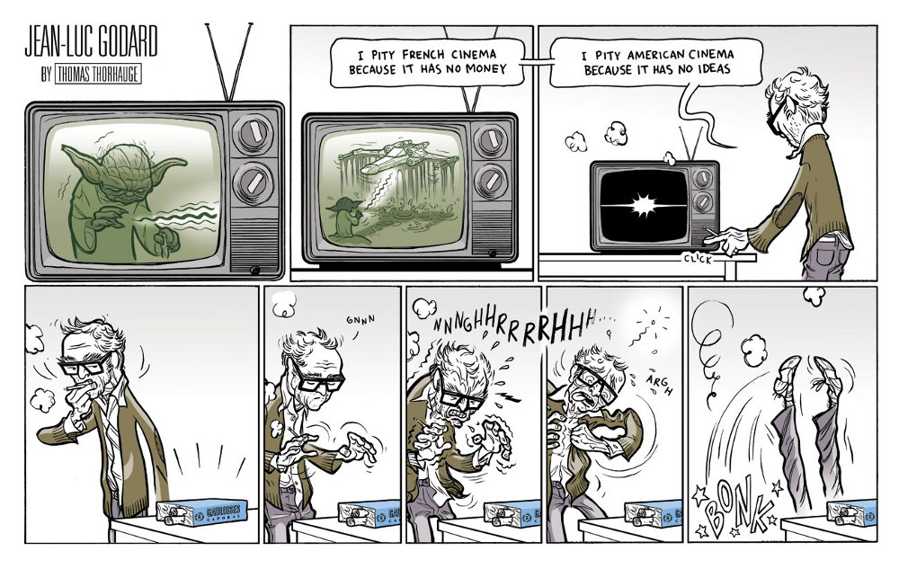
$%$#^% the Cinema!

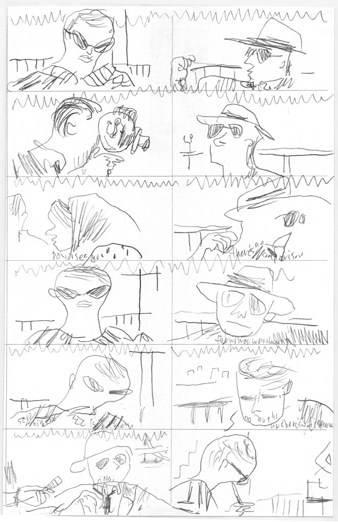
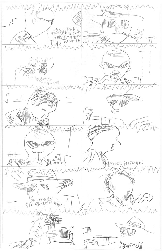
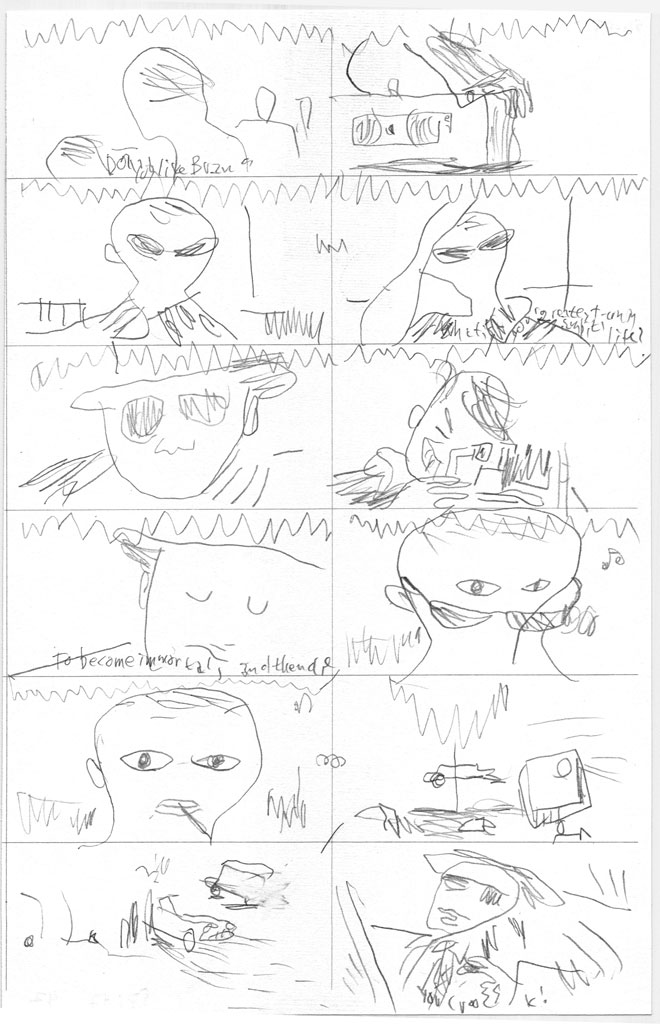
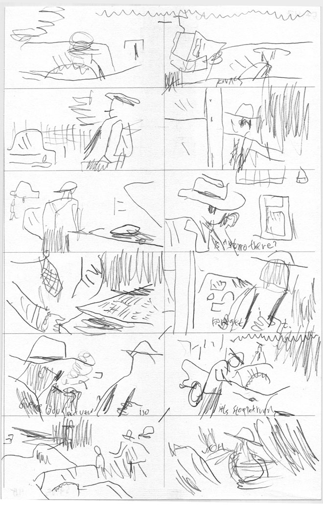
Thomas Thorhauge is a Danish cartoonist. He translated this cartoon into English for this roundtable; the original Danish version was part of his “True Story” strip, which ran last year in the weekly film section of Copenhagen daily Politiken. His concept was to illustrate authentic quotes from film personalities in whatever way he found interesting, funny or resonant.

Please note: the quote included is authentic.
___________
The index to the Godard roundtable is here.