Blues Comics

“You heard her, you ain’t blind.” – Zora Neale Hurston, Their Eyes Were Watching God

In the forward to Phillip R. Ratcliffe’s new biography of Mississippi John Hurt the granddaughter of the country blues guitarist describes what it was like to hear Hurt play for the neighbors in the front yard, sitting in his favorite straw back chair with a warm smile and a pan of roasted peanuts nearby. Again and again, she describes the experience in undeniably transcendent terms and insists that it was his “supernatural spirit that had a far greater effect on people than his music alone” (vii).

I wonder what Mary Frances Hurt Wright might think of her grandfather’s cameo appearance in the graphic novel, Stagger Lee — whether or not Shepherd Hendrix’s solemn illustration of the bluesman, or the narrative in which Derek McCulloch enfolds him, can convey the mythical power that she once felt as a listener. The lyrics to “Stackolee Blues” are printed above Hurt’s head in a word balloon edged with eighth notes; a crowd stands nearby. The scene, itself, is part of a larger, deeply fascinating blending of history and legend. But when it comes to conveying the quality of the sound that the crowd hears or the magnetic force Hurt’s granddaughter describes, even the most vivid representation can feel inadequate. It is hard to compare the silence of words and pictures on a page to the sound of that first plucked string.

Western artists have been enamored with the figure of the black folk musician in public and private moments going back to the nineteenth century. Modern American poets, most notably Langston Hughes, have aspired to an aesthetic in their verse that exemplifies the blues and the social and economic conditions that brought the music into existence. Nevertheless, blues historian Paul Oliver effectively sums up the challenge that awaits any artist or writer influenced by the sounds of Bessie Smith and Muddy Waters: “Blues is for singing. It is not a form of folk song that stands up particularly well when written down” (8).

But can a comic fare any better? Does the form’s interplay of verbal and visual elements provide a more dynamic set of tools for representing blues music and culture? My interest here extends to the distinctive ways in which comics approach auditory signification in particular: how do comics sound? Will Eisner, Scott McCloud and others in comics studies often emphasize comics reading as an active, multisensory encounter, guided not only by what’s on the page, but by what is demanded of the reader’s imagination. Which artistic strategies make for a more satisfying experience when it comes to hearing what we see?

A blues comic, like any blues narrative, is most compelling when it illuminates the suffering, heartache, and wry absurdity that gives the music its meaning, and exploits the dialogic relationship between the singer and the audience, rather than attempting to replicate chord progressions and flattened notes. To be sure, blues figures run the risk of being caricatured and over-romanticized; their lyrics are often used to invoke African American culture without any meaningful engagement. Noah problematizes this approach quite well in his analysis of Robert Crumb’s 1984 comic biography, “Patton” by pointing out how older blues musicians like Charley Patton are deployed in the story as signifiers of authentic blackness.

But blues narratives are just as well known for confronting stereotypes with counter-narratives that resist the easy consumption of the blues as spectacle. (Consider, for instance, how poet Tyehimba Jess imagines the simmering resentment between Lead Belly and folklorist John Lomax.) Comics have their own way of conveying this kind of nuance and dimension, especially when it comes to rendering the intricate rituals of music making. One useful example comes from the three-volume comic series, Bluesman, by writer Rob Vollmar and artist Pablo G. Callejo, published as a single edition in 2008.

Bluesman follows two itinerant African American blues musicians from one juke joint to another in the South during the 1920s. Early in the series — which, like the bars of a blues song, is divided into twelve parts — Lem Taylor and Ironwood Malcott persuade a local bartender to hire them by giving the room of drinkers and gamblers an impromptu performance. Callejo’s loose, heavy lines resemble woodcut illustrations that not only help to establish the mood and rural setting, but also to deepen the intensity of Lem’s expression as he sings, eyes closed, and plays the guitar. Musical notes amble through the gutters between panels until the bustling audience falls silent, begins to pay attention, and gradually moves to the dance floor.

In Bluesman, sound is generated through carefully accumulated layers of image and text that build from the flutter of Ironwood’s fingers on the piano and Lem’s head thrown back in song to the approving smiles and responsive bodies of the crowd. The lyrics are printed at intervals so that the audience (and the implied readers) can react to what is being heard, as indicated by jagged word balloons containing unattributed phrases like “C’mon now!” and “Oooh, baby!”. The juxtapositions of visual, verbal, and audible impressions easily recall the multi-vocal rhythms of Sterling Brown’s 1932 poem, “Ma Rainey.” But I think the sequential pictures allow us to reflect somewhat more satisfyingly on the elements of performance in such a way that our reading becomes a form of listening. Even if we cannot catch the actual pitch of the notes that Lem and Ironwood are playing, we are certainly more attuned to what James Baldwin describes as the “vanishing evocations” of musical sounds that resonate within.

Baldwin, in his short story, “Sonny’s Blues,” also had this to say about musicians:

But the man who creates the music is hearing something else, is dealing with the roar rising from the void and imposing order on it as it hits the air. What is evoked in him, then, is of another order, more terrible because it has no words, and triumphant, too, for that same reason. (73)

I can think of no better way than this to describe what takes place in the first volume of Akira Hiramoto’s manga series, Me and the Devil Blues: The Unreal Life of Robert Johnson (2008). Hiramoto combines the visual iconography commonly associated with Japanese comics together with a historical rendering of the Mississippi Delta and the supernatural tropes of demonic possession that surround Johnson’s legendary talent with a bottleneck slide guitar. When Johnson (or “RJ” as he is called) begins to play, the black and white panels tilt at long, unsteady angles. The guitar’s head and tuning keys are often positioned in the foreground, forcing our eyes to move up and down the long fingerboard as the strings reverberate. In scenes such as RJ’s stand off with Son House, frenetic background motion lines edge into the blurred contours of the musicians’ bodies and convey the searing intensity of the music.

I agree with many reviews of Me and the Devil Blues that the art surpasses the inconsistent narrative, which slips often into caricatures of black southern life. At the same time, the nightmarish premise of the series takes more aesthetic risks that Bluesman and de-emphasizes the collective participation of the listeners in order to transport us into the musician’s psyche. While the audience alternatively delights and recoils at the music being conjured forth, it is the internal workings of Johnson’s spirit that are on display as Hiramoto’s technique forcefully externalizes “the roar rising from the void” — the terrible and triumphant chords that only RJ can hear.

A critical interest in how comics register this supernatural sound need not draw our attention away from larger considerations of black cultural representation and re-appropriation, but more deeply into the social implications of artistic style and practice. Blues is as much a way of seeing in comics as it is for singing.

_______
Works Cited
Baldwin, James. “Sonny’s Blues” [1957]. Vintage Baldwin. New York: Vintage Books, 2004.
Oliver, Paul. “Can’t Even Write: The Blues and Ethnic Literature” MELUS, Vol. 10, No. 1. (Spring, 1983): 7-14.
Ratcliffe, Phillip R. Mississippi John Hurt: His Life, His Times, His Blues. Jackson: University Press of Mississippi, 2011.

Qiana Whitted is Associate Professor of English and African American Studies at the University of South Carolina. She is co-editor of the essay collection, Comics and the U.S. South, with Brannon Costello, forthcoming from University Press of Mississippi in January 2012, and a forthcoming essay on the blues and black folk subjectivity in Stagger Lee.

Comics’ Expanded Field and Other Pet Peeves

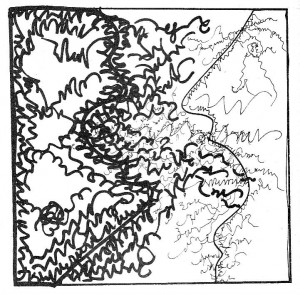
Ana Hatherly, The Writer (1975).

Still in shock after seeing that the comics’ subculture continues as deaf and insular in its aesthetic criteria as ten years ago (since the infamous The Comics Journal’s list) not having moved one iota, I remembered Dwight Macdonald who, in Politics Vol. 2, No. 4 (Whole No. 15), April 1945, wrote:

It would be interesting to know how many of the ten million comic books sold every month are read by adults.[…] We do know that comics are the favorite reading matter of men in the armed forces, and that movie Westerns and radio programs like “The Lone Ranger” and “Captain Midnight” are by no means only enjoyed by children. […] This merging of the child and grown-up audience means [an] infantile regression of the latter unable to cope with the complexities of modern society.

I certainly don’t agree that an infantilization of grown-ups’ cultural habits means that people can’t cope with the complexities of modern society, it may simply mean that comics readers want (for a while) to escape those complexities. Hell, I suppose that they want to escape life itself, or, at least, those parts of life that can’t be depicted by kitsch… Did you notice how death and exploitation are almost completely absent from this top ten’s list (and I don’t mean death of a Daffy Duck kind; Maus and the death of Speedy are an exception)? Have you noticed how lifeless these comics are? (And I mean “lifeless” in the sense of not related to life in any way – Dwight Macdonald also helped me to realize this when he said to Pauline Kael, when they were discussing North-American films: “How did vitality get in there? I mean, crudeness I give you, but vitality? It’s possible to be crude and not vital, you know?”)

I couldn’t agree more with David T. Bazelon, who, also writing in Politics (Vol. 1, No. 4, May 1944), wrote:

“Superman” gives vicarious satisfaction to explicit social frustrations. It cannot be tragic or displeasing, nor can it contain that essential realism which is a quality of all good art. For it has a purpose: this is art in the service of social neuroses. And that service is the meaning of most comic strips… Pearls are produced not by serving but by opposing disease.

Only now did I understand the true meaning of the phrase “comics are not just for kids anymore.” What it really means is that popular comics, even if they continue to be children’s comics, are also enjoyed by adults. With the above phrase and other similar ones people from inside the ghetto of the comics subculture want to sell a false image to the laymen and laywomen (it was now definitely proven to me that the above reading is the right one or they’re lying).

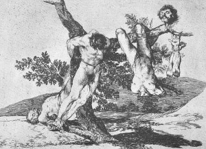
Francisco de Goya, The Disasters of War (published in 1863).

I’m not saying that The Hooded Utilitarian’s top ten list (and beyond) is completely devoid of value. As I put it last May 10 on this very blog: I have nothing against popular entertainment. I also think that a good art vs. bad art kind of black & white view of things isn’t exactly clever or productive. I enjoy a lot of pop pap (Gasoline Alley, for instance) it’s just that I don’t think that it fares well alongside Tsuge’s work or Fabrice Neaud’s work. That’s my whole point, while the pap is canonized meatier work is forgotten.

I suppose that one could say that even meatier work (if that’s possible) is also not included, but there, the infantilization of the reading public is not the only barrier. Essentialism is frontier number two (an even more powerful one this time).

Rosalind Krauss wrote an important essay about how perplexing the concept of sculpture had become at the end of the seventies: Sculpture in the Expanded Field (October, Vol. 8, Spring, 1979). I borrowed her concept of an extended field and applied it to comics.

Rosalind Krauss criticized historicism in her essay. Historicism is also a problem in comics’ expanded field’s case for two reasons: (1) because my field expansion is in great part ahistorical; (2) because some critics view comics as an unchanging art (Alan Gowans) or a posthistorical art (David Carrier).

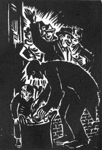
Frans Masereel, From Black to White (1939).

Arriving here I can only go on after an analysis of what I called, the origin’s myth and the problem of a comics definition.

There are, at least, five cultural fields which can help to expand comics as an art form: (1) Medieval (or older art) painting and book illustration; (2) the wordless engraving cycle; (3) Modern and Post-Modern painting; (4) Concrete and Visual Poetry; (5) the cartoon. None of these fields are linked to comics on the gentiles’ heads. For a variety of reasons they all have problems to be accepted by the comics milieu as well. Let’s briefly examine some of these objections:

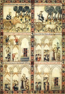
1. Medieval comics (let’s call them that way) weren’t produced for the enjoyment of the people: they weren’t reproduced, they were highly expensive items, they were owned by aristocrats. Since the beginning of fandom comics have been viewed as popular art: a child of the Industrial Revolution and modern visual mass communications (hence: comics were born in America with the publication of a Yellow Kid page in the New York Journal: “The Yellow Kid and His New Phonograph,” October 25, 1896; this is a position that American scholar Bill Blackbeard always defended). Besides this sociological criterion we must add two formal ones in this particular case: the existence of juxtaposed panels and the existence of speech balloons. Denying the latter some European scholars (Thierry Groensteen and Benoît Peeters, for instance) argued that comics started with Rodolphe Töpffer’s first “Histoires en estampes” (Histoire de M. Vieux Bois was drawn in 1827 – Histoire de M. Jabot was published in 1833; Töpfferians who are also print fundamentalists must say that Jabot was the first comic, other Töpfferians will say that Vieux Bois is the real McCoy). In his book The Early Comic Strip (1973) historian David Kunzle argued that the first comics were created shortly after the invention of the mechanical printing press by Johann Gutenberg (Hans Holbein’s Les Simulacres et historiées faces de la mort is among the first books that he cites, but his most famous example is Francis Barlow’s A True Narrative of the Horrid Hellish Popish Plot, c. 1682). David Kunzle later converted to Töpfferism (More recently he published a book titled Father of the Comic Strip: Rodolphe Töpffer (2007). Barlow’s two pages fulfill Bill Blackbeard’s criteria, by the way: they were printed, they have a grid, they even have speech balloons or something similar (Robert S. Petersen called them “emanata scrolls”).

Anon., Canticles of Saint Mary by Alfonso X the Sage (c. 1270).

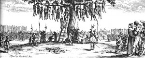
2. Engraving cycles, from Jacques Callot to Eric Drooker, aren’t as difficult to accept (in the comics corpus) by the comics milieu as Medieval illustrations. This happens because they were born from an idea that art should be more democratic: engravings are cheaper than paintings and sculptures. Even so the high / low divide may be a serious objection here. Even if Frans Masereel had a leftist sensibility and his cycles were (are) published in book form, he was a serious painter, he was in the wrong side of this sociological fence. If I defend Picasso as a comics artist the comics milieu calls me a snob and an elitist (doing their usual mind reading they say that I want to include highly regarded gallery artists in the comics canon just to elevate comics’ status). Formal features are a problem also: engraving cycles have no speech balloons or page grids.

Jacques Callot, The Miseries and Misfortunes of War (1633).

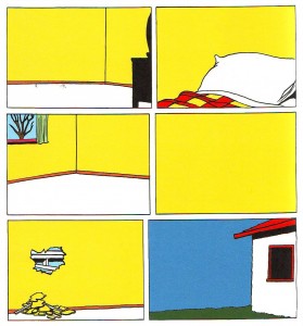
3. To the comics milieu paintings and poems (visual or otherwise) are not comics, period. Original comic art has been exposed in galleries, museums, and comics conventions (a strong tradition in Europe’s comics conventions gives original art an important role as an attraction factor), but I don’t mean that. What I mean is comic art meant to be exposed as unique objects on gallery walls. Most people would call these objects paintings inspired by comics. Don’t take my word for it though, the artists themselves call “gallery comics” to what they’re doing. Sorry to indulge in name-dropping, but I mean: Christian Hill, Mark Staff Brandl, Howie Shia. Andrei Molotiu could also be part of this list, I suppose; ditto Paper Rad: they all have strong links with the comics milieu. As for Brazilian painter Rivane Neuenschwander, American painter Laylah Ali and Swiss painter Niklaus Rüegg, I have no idea, but both Ali and Rüegg are interesting examples because, not only did they paint, their paintings were also original art (in the comics sense) for the publication of comic books (by the MOMA and Fink Editions, respectively).

Niklaus Rüegg, Spuk (2004); a Carl Barks comic without the characters.

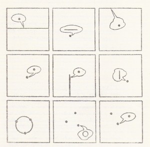
4. During the fifties Brazil was at the avant garde of poetry. Inspired by Stéphane Mallarmé’s Coup de dés, Guillaume Apollinaire’s calligrammes, Dadaism, Ezra Pound’s Imagism, Haroldo and Augusto de Campos, Decio Pignatari, Pedro Xisto and others created Concrete poetry. In a Concrete poem typography and the pages’ space is as important as words. Sounds are more important than meaning (or new meanings are born when words are reorganized on the space of the page and reinvented). Concrete and visual poetry viewed as comics may prove that comics without images may exist in the same way as comics without words.

Álvaro de Sá,  Process-Poem (c. 1967).

If we consider stained glass windows as comics (something that is not as far-fetched as it seems) Medieval comics were also meant to be viewed by “the masses” even if they weren’t printed (David Kunzle opines differently though: “A mass medium is mobile; it travels to man, and does not require man to travel to it.”) As for grids and speech balloons it’s possible to find said features in Medieval comics, believe it or not. Here’s what Thierry Groensteen wrote on the Platinum List (Jan 18, 2000):

Danielle Alexandre-Bidon, a specialist of the Middle-Age, has given a lot of evidence of the fact that comics existed in the medieval manuscripts, during the 11th, 12th and 13th centuries. Hundreds, if not thousands of pages, with speed lines, word balloons, sound effects, etc. The language of comics had already been invented, but these books were not printed. After Gutenberg, text and image were not so intimately linked anymore, and one could say that the secret of comics was lost, until Töpffer rediscovered it.

This is revealing: even the most fervent defender of Töpffer as the “father of the comic strip” says here that he “rediscovered it.” This is something like saying that Columbus rediscovered America (he couldn’t discover it simply because he found people already living there when he arrived).

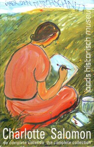
The comics origin’s myth is essentialist: it’s an arbitrary choice that’s based on an equally arbitrary definition (the latter precedes the former). (And I’m sure that I’m not the first one to say this, elsewhere or around here.) The two more common (or so it seems to me) kinds of definitions are based on social (comics must be reproduced and distributed to the masses) and formal premises (essential characteristics of comics are sequentiality, word and image relations, the word balloons, the juxtaposition of the panels, etc…). Social definitions of comics have two problems: (1) The sorites paradox applied to the concept of “masses.” If one grain of wheat doesn’t make a heap two grains of wheat do not; […] if three thousand grains of wheat don’t make a heap three thousand and one grains of wheat do not; etc… When do we stop not having a heap to finally have one? This paradox can be applied to print runs. (2) Social definitions of comics are usually used to deny that Medieval comics are comics (they aren’t reproduced). What I say is that they must have been reproduced at some point because I’ve seen them and I have never seen any original drawings. There’s a third point: how come an original comics page is not a comic, but an exact repro is? Leonardo de Sá cleverly argued this point saying: the original art is not a comic the same way as the repro of a painting is not a painting. Not bad, I would say… but… using Nelson Goodman’s theories about fakeable and not fakeable arts, painting is one-stage autographic while comics are n-stage (my theory) autographic. That’s why a repro of a painting is not a painting while the original art of a comics page is a comic. Formal definitions of comics have problems also; I’ll mention two: (1) Any formal definition arbitrarily chooses some features and forgets others. This means that, if I chose to say something like “the speech balloon is essential to comics” (oops, there goes Prince Valiant) or “word and image relations define comics” (oops there go “mute” comics out the window) no comics exist at all. Why? Because all comics have panels without speech balloons, without words, etc… A comics reading experience would be something like this: now it’s a comic, oops, now it isn’t, etc… (2) All art is based on experiment. More inventive artists are always pushing the limits of their art forms. Comics are no exception, but if we put a formal corset around them what happens is that: (1) we lose some very important artistic achievements (some who defend comics exactly because they’re mass art couldn’t care less, obviously, but I, for one, do) and (2) we seriously limit the creativity of the artists who chose to create comics. Another problem is that we can’t look back to, let’s say, Charlotte Salomon, and view her work as comics (again: some who defend comics…). It seems that all comics have sequentiality, but even this point was argued by Eddie Campbell in a discussion with yours truly many moons ago: he included one panel cartoons in the comics concept. Me?, I have no definition of comics whatsoever. I prefer to say with Saint Augustine: If no one asks me, I know what they are; If I wish to explain them to him who asks, I do not know.

Charlotte Salomon, Life? or Theater, CD-Rom (2002 [1940 – 42]).

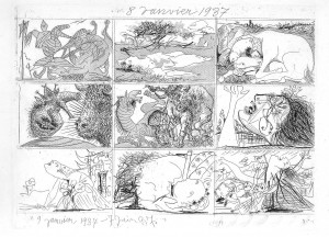
So, denying essentialism we can look back or look around and find great comics. I have no solution for the ahistoricity of the expansion in time or social space. Picasso didn’t view himself as a comics artist (even if he liked comics) and the art world around him didn’t either. However… if older art historians say that Picasso’s Songe et mensonge de Franco (Dream and Lie of Franco) are engravings (which they are, of course) more recent ones (Juan Antonio Ramirez, for one) say that it is a comic. This means that we (even if part of this “we” doesn’t belong to the comics milieu) may look in unexpected places and notice multiple instances that can be considered comics (Frans Masereel is a no brainer by now, for instance; I’m sure that Paleolithic painters didn’t call “painting” in the modern sense to what they were doing). As for comics as an unchanging or posthistorical art it may be true (I have my doubts) if we consider it as low mass art, but aren’t we excluding heaps of alternative artists, then? I’m trying to be reasonable, but, to talk frankly, I’m tempted to say that this is utter nonsense.

I didn’t vote for any artists and work on the expanded field (maybe Martin Vaughn-James’ The Cage counts as part of it; Robert tells me that there were indeed some votes in said field: Cy Twombly, Max Ernst, and a few others), but if I did almost all my ten choices would be in that category, I’m afraid… Who, in the comics’ restrict field can rival Callot, Goya, Hokusai, Picasso? No one, I’m sure… Not even George Herriman and Charles Schulz.

Pablo Picasso, Dream and Lie of Franco (1937).

Note: huge chunks of the above text were previously posted on my blog The Crib Sheet.

Best Comics Poll Index

Manga and the Best Comics Poll

Though manga has been a fixture of the American comics scene since the mid-1980s, it wasn’t until the anime boom of the following decade that publishers began to get savvier about what they were licensing and how they were packaging it. The shift away from manly-man titles towards teen-friendly material, and from floppy to trade paperback, had a big impact on who bought manga; once found only in comic book stores, manga now appeared in big chains like Borders and Walmart where young fans of the Dragonball and Sailor Moon TV shows could find it. By the mid-2000s, manga sales were robust enough to crack the USA Today bestseller list, inspiring more companies to jump into the licensing game.

The manga gold rush came to a crashing halt in 2008. A confluence of forces — economic recession, abundant scanlations, rising paper costs, teen fickleness — forced all but the biggest and best-financed publishers to cease operations.

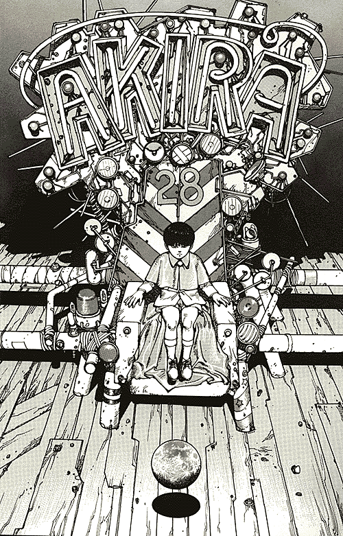
It comes as little surprise, then, that many of the manga on the Best Comics list are ones that outlived the market’s dramatic boom-and-bust cycle. Lone Wolf and Cub, which ranked 48th in the Best Comics Poll, made its Stateside debut in 1987, just one year before Marvel Comics began releasing AKIRA (#40) and VIZ began publishing Nausicaa of the Valley of the Wind (#73). Rumiko Takahashi’s beloved romantic comedy Maison Ikkoku (#73) is another long-lived series, going through three editions since 1993, when VIZ first acquired the North American rights.

Equally important is the role of the American comics establishment in anointing certain manga as masterpieces. AKIRA, Buddha (#71), Lone Wolf and Cub, and 20th Century Boys (#96) are all Eisner winners, while Pluto (#48), A Drunken Dream & Other Stories (#96), The Walking Man (#73), and Yotsuba&! (#73) were past nominees. The American industry hasn’t neglected creators, either; Comic-Con International has bestowed its Inkpot Award on some of the list’s best-known contributors, including Osamu Tezuka, Rumiko Takahashi, and Hayao Miyazaki.

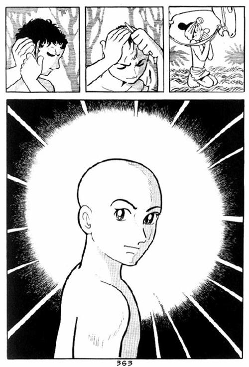
But perhaps the most striking thing about the top vote-getters is how many of their creators embody the Great Man stereotype. Consider Osamu Tezuka, whose Buddha and Phoenix both made the cut. His role in the history of manga is analogous to Beethoven’s in orchestral music. No musicologist would reasonably claim Beethoven to be the first person to write symphonies, or even the first great innovator within the genre, but Beethoven’s distinctive compositional approach — particularly towards motivic development — had a profound impact on the musicians who came after him. Likewise, Tezuka didn’t invent shojo manga — as some critics have claimed — nor was the he the first person to pioneer the use of “cinematic” layouts. But the popularity and artistry of Tezuka’s work, and the uniqueness of his vision, cemented his reputation as one of the medium’s most important creators, someone who cast the same, anxiety-producing shadow over his successors that Beethoven did over his. (Small wonder that Tezuka’s last project was the bio-comic Ludwig B.)

Moto Hagio, author of A Drunken Dream and Other Stories, occupies a similar place in shojo manga history. Along with writers such as Riyoko Ikeda and Keiko Takemiya, Hagio played a pivotal role in transforming comics for girls, drawing on myriad sources — Frances Hodgson Burnett, Shotaro Ishimonori, Ray Bradbury — to create bold, taboo-busting stories that spoke to the concerns of teenage girls. Perhaps her greatest innovation was to apply Tezuka’s “cinematic” techniques to her characters’ interior lives, immersing us in their emotions and memories in the same way that Tezuka thrust readers into the action. Throughout her work, Hagio placed a premium on subjectivity, using fluid layouts, unbound by grids, and employing an elaborate code of visual signifiers to represent the full gamut of emotions — symbols found in contemporary shojo titles such as Fruits Basket (#73).

[An aside: As Shaenon Garrity observed in her essay about “lady comics,” Hagio’s most representative work has yet to be translated into English; A Drunken Dream is an anthology of short stories spanning Hagio’s career, and not fully indicative of her narrative skill. Tezuka, on the other hand, is fortune enough to have had many of his best-regarded works –- Astro Boy, Buddha, Ode to Kirihito, Phoenix –- translated into English, making easier for readers to appreciate the depth of his artistry.]

And no responsible manga critic could overlook the significance of Katsuhiro Otomo, whose AKIRA was one of the most widely admired — and imitated — comics of the 1980s. If Tezuka was the artist who translated Walt Disney from screen to page, Otomo was the one who brought the grittier world of 1970s cinema to Japanese comics. AKIRA owed a visual debt to Star Wars, but Otomo’s storytelling was, at heart, more attuned to the mood of the early 1970s. His story was complex and political, a grand, paranoid fantasy that questioned Japanese enthusiasm for technology and cast a doubtful eye on the government. Otomo’s artwork, too, was peerless; countless manga-ka – Naoki Urasawa included – imitated Otomo’s blocky character designs, sleek vehicles, and meticulously detailed cityscapes. And Otomo wasn’t afraid to cross the line into outright horror, as Kaneda’s grotesque bodily mutations attest.

As with any list, there are some outliers: Yotsuba&!, a slice-of-life comedy about a bachelor who adopts a tot with green pigtails, seems more a sentimental favorite than a classic title. The same could be said for Fruits Basket, which sold like hotcakes in the mid-2000s, but is already beginning to look a little dated. I say this not to diminish either series, but to observe that canon-building is a difficult and fascinating process; works that might seem essential to us now may recede in importance (and vice versa).

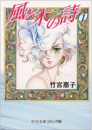
So what do these nominations tell us about the current state of manga in the US? First, that visibility and longevity were key factors in determining which titles made this list, and which ones didn’t. Second, that critics gravitated towards artists whose work could be labeled as “great,” “important,” or “pioneering” –- in short, artists whose work neatly conforms to Western notions of genius, a peculiar standard for a medium that is unabashedly conceived as mainstream entertainment. Third, that readers tended to nominate titles that fell within respectable genres; some of manga’s most distinctive voices –- Kazuo Umezu, Yoshiharu Tsuege, Suehiro Maruo –- are absent from the list. And fourth, that only a tiny amount of manga has been translated for English-speaking audiences; seminal works such as The Rose of Versailles, GeGeGe no Kitaro, The Song of the Wind in the Trees, and Left Hand of God, Right Hand of the Devil have yet to be licensed here, begging the question of what results the next Best Comics Poll might yield.

Best Comics Poll Index

Embalmed Ones, Fabulous Ones, Those That Tremble as if They Were Mad

There are no outrageous surprises on the collated Eurocomics list (though individual choices, of course, are more idiosyncratic). Rather, the critics who participated in the poll chose works which (a) have been translated into English, (b) have been canonically sanctioned as works of influence and merit by important critics, and/or (c) span the major periods of Eurocomics production. Perhaps a good way to discuss such a diverse group of books is to pigeonhole them into chronological periods, like so:

The Origin: The comics of Rodolphe Töpffer (published in Switzerland between 1833 and 1846). Töpffer’s status as the inventor of the comic book, and as the format’s first accomplished artist, was solidified by David Kunzle’s Töpffer biography (2007) and the Kunzle-edited collection Rodolphe Töpffer: The Complete Comic Strips (2007). These resources certainly made it easier for me to teach Töpffer, and learn to appreciate him myself. When I first read The Story of M. Jabot (1833), and noticed how Töpffer repeated words and images every time Jabot was trying to recover from a humiliating incident, I laughed out loud. Not bad for a comic book almost 200 years old.

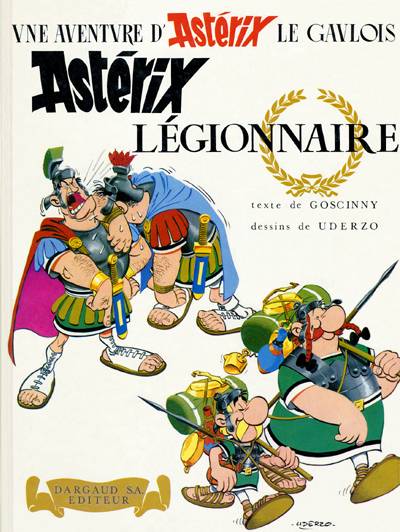
The Classics: The Adventures of Tintin albums by Hergé (published in Belgium and France between 1930 and 2004); Astérix the Gaul by René Goscinny and Albert Uderzo (published in France in 1961); the Moomin books and comic strip by Tove Jansson (published in Finland between 1945 and 1993); and the Corto Maltese albums by Hugo Pratt (published in Italy and France between 1967 and 1992).

Boy reporter Tintin remains amazingly popular, influential enough to spawn both the upcoming Steven Spielberg / Peter Jackson Adventures of Tintin blockbuster film, and such alt-comics emulators of Hergé’s visual style (called la ligne claire, the clear line) as Chris Ware and Jason Lutes. Tintin’s worldwide popularity remains unsullied by Hergé’s own collusion with the Nazi occupiers of World War II Belgium, as discussed in Pierre Assouline’s Hergé: The Man Who Created Tintin (1998; first English-language edition 2009).

Astérix is likewise part of the canon, albeit one drawn in a knockabout bigfoot style rather than in la ligne claire. Readers everywhere recognize Astérix and his sidekick Obelix, and probably learned most of their knowledge about Rome and the Gauls from Goscinny and Uderzo. It’s interesting that the majority of HU critics chose the first Astérix volume, Astérix the Gaul (1961), as their choice; personally, I prefer the albums from the mid-to-late 1960s, like Astérix the Legionary (1967). If you haven’t read any Astérix yet, though, maybe you should start from the beginning — and stop before Astérix and the Great Divide (1980), when Goscinny dies and Uderzo takes over the writing.

Although not as well-known in the United States as Tintin or Astérix, Tove Jansson’s Moomin comic strips and children’s books have been wildly popular during the last 60 years in Finland, Sweden, Europe, and elsewhere. (A far-flung example: New Zealand alt-cartoonist Dylan Horrocks has been a world-class Moomin fan since his early childhood.) Today, North American comics readers have come to love the oddball characters and storybook milieu of Moomin courtesy of Drawn and Quarterly’s translations of the complete run of the Moomin comic strip and several Moomin storybooks (including Who Will Comfort Toffle? [1960]).

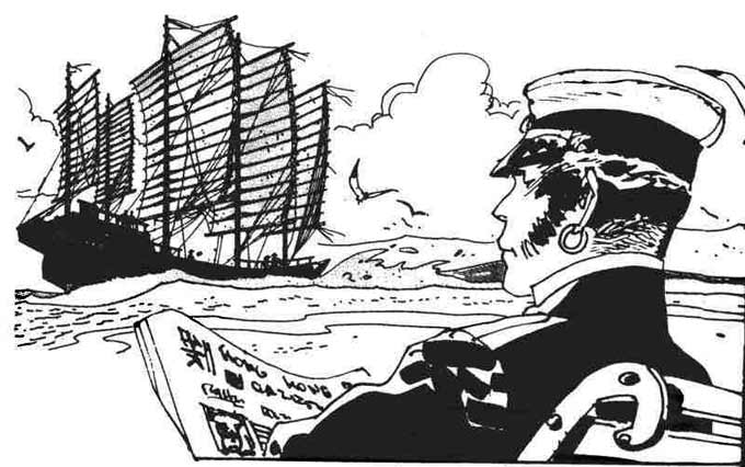
In the case of Corto Maltese, the influence runs in the opposite direction, from America to Europe. Inspired by comic-strip dramatists Noel Sickles (Scorchy Smith) and Milton Caniff (Terry and the Pirates, Steve Canyon), Italian artist Hugo Pratt developed his own realistic style, and his own adventure character, freebooter Corto Maltese. Of all the works in the “Classics” category, Corto Maltese is the hardest to find in English — virtually all the Corto volumes published in America by NBM and others are out of print — but the inky beauty of Pratt’s images is a universal language.

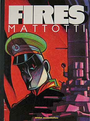
The Revolutionaries: Blueberry by Jean-Michel Charlier and Jean “Moebius” Giraud (1965- ); Alack Sinner by Carlos Sampayo and José Munoz (1975-1988); Arzach by Jean “Moebius” Giraud (1975-76); The Hermetic Garage by Jean “Moebius” Giraud (1976-78); Fires by Lorenzo Mattotti (1986).

Like Corto Maltese, Blueberry and Alack Sinner are European reflections of American genres. Blueberry is Charlier and Giraud’s take on the Western, featuring Mike Blueberry, a cowboy and cavalryman increasingly trapped in post-Civil War political conspiracies, while Alack Sinner is a scarred noir detective who navigates the ideological hotspots (the Vietnam War, the feminist movement, Black Power) of Sampayo and Munoz’s own time. I call Blueberry and Alack Sinner “revolutionary,” however, because both deviate from and deconstruct genre through new techniques in art and storytelling; later Blueberry albums reflects the seismic changes in Giraud’s art when he adopts his “Moebius” persona (about which, more below), while the Alack Sinner story “Life Ain’t a Comic Strip, Baby” (translated in Fantagraphics’ Sinner #5, 1990) self-reflexively inserts Sampayo and Munoz into their fictional noir world.

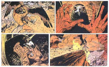
It’s established comics lore how genre cartoonist Jean Giraud ingested hallucinogenic mushrooms, enthusiastically embraced the ‘60s counter-culture, and, under the pseudonym “Moebius,” wrote and drew the trail-blazing story “The Detour” (1973) for the relatively conventional French comics magazine Pilote. What followed was an explosion of creativity from Giraud — he co-founded perhaps the most influential comics magazine in history (Métal Hurlant [1974-2004], which off-shot into various languages, including America’s Heavy Metal [1977- ]) while continuing to explore unsettling, surreal territory in his Moebius-signed art. The four gorgeously-drawn, ferociously colorful, wordless stories that constitute the original Arzach cycle are named after a stone-faced pterodactyl rider who glides through a fantasy world with to its own subterranean cause-effect rules. Even trippier is The Hermetic Garage, which grew from a two-page throwaway in Métal Hurlant into a fully-formed science-fiction universe (and odd tribute to Giraud’s favorite authors, including Samuel Beckett and Michael Moorcock). Moebius’ comics sputter in and out of availability in English, which is a shame, though in the case of Arzach the language barrier isn’t a problem.

Lorenzo Mattotti’s Fires, perhaps the most radical of the “revolutionary” comics, combines Moebius’ subjective storytelling with the themes of Joseph Conrad’s Heart of Darkness, as a naval officer struggles to understand his encounters with a tropical island culture. Most importantly, Mattotti’s painted images are so tactile and vibrant that critic Paul Gravett calls Mattotti “without doubt the most dazzling colourist working in comics today.” While I can point to numerous cartoonists influenced by Munoz and Moebius— Frank Miller is influenced by both — I’m hard-pressed to identify someone who’s followed Mattotti’s repudiation of ink line and explorations into solid blocks of color. Of all the entries on the Eurocomics list, Mattotti’s aesthetic is the closest to sui generis.

The Contemporaries: Epileptic by David B. (1996-2003) and Persepolis by Marjane Satrapi (2000-2003).

Both Epileptic and Persepolis were published by L’Association, the French art-comics publishing collective founded in 1990 by David B. and other prodigiously talented cartoonists (including J.-C. Menu, Lewis Trondheim and Patrice Killoffer). The excellence of the L’Asso backlist ensures the collective’s place in the canon, but other factors contributed to its popularity in the United States, most notably the translation and dissemination of key books via Chip Kidd and Pantheon’s graphic novel division, and Bart Beaty’s celebration of L’Asso in his “Eurocomics for Beginners” column in The Comics Journal and in his scholarly book Unpopular Culture: Transforming the European Comic Book in the 1990s (2007).

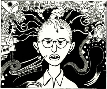
Epileptic is David B.’s searing chronicle of growing up in a family disrupted by a brother with severe epilepsy and depression; the scenes where B(eauchard)’s parents turn to macrobiotic diets and communal living to “cure” his brother’s disabilities are among the most harrowing and truthful I’ve ever read in an autobiographical comic. Paradoxically but effectively, David B. opts to depict his life in Expressionist visuals, depicting his brother’s epilepsy as fluid demonic patterns, and self-help gurus as looming, out-of-proportion golems. Marjane Satrapi adopts some of B.’s strategies—autobiography rendered in stark black-and-white graphics—but she has her own story to tell, about her childhood and young adulthood in post-Islamic Revolution Iran. 9/11 and the rise of Jihad vs. McWorld tensions turned Persepolis into a transatlantic bestseller.

I expect this list of canonical Eurocomics to expand considerably in the coming years. If we repeat this exercise in ten years (as the British Film Institute does with their “Top Ten Poll”), I’m sure that the effects of Fantagraphics’ Jacques Tardi reprint project will place a book like Tardi’s It Was the War of the Trenches (1993) on the list. (Actually, I’m surprised that Trenches didn’t make it this time.) And maybe in a decade new translation projects — A Blake and Mortimer collection? An anthology of Italian underground comics from magazines like Cannibale and Frigidaire? — will lead to a revised Eurocomics canon, though it’s hard to imagine the dethroning of Tintin. But who knows? We didn’t expect the fall of the Berlin Wall either.

Best Comics Poll Index

The HU Lady List

As a lady who frequently rants about lady issues, I have been selected by the Hooded Utilitarian to write a piece about lady cartoonists that will somehow not make all ladies reading it roll their eyes and groan. This is my punishment for all the ranting. I’ve learned my lesson.

Eleven years ago, when The Comics Journal put out its big Top 100 Comics by English-Speaking White Men of All Time Ever Except Dave Sim Because Seriously, Fuck That Guy, five women made the list: Lynda Barry, Julie Doucet, Carol Tyler, Debbie Dreschler, and Françoise Mouly for her work as co-editor of RAW. When the preliminary votes for the HU list were being counted up, it looked like only four women would make that list. Interestingly, it was four completely different women, which led me to suggest that maybe this stuff has nothing to do with talent or recognition; the comics industry simply has room for only four or five women at a time.

By the time all the votes had rolled in and the final tally was made, the HU 115 included a grand total of nine ladies. Is that better? Worse? Essentially the same? I don’t know. Mining the list for observations on which to pontificate, I notice that most of the artists are fairly recent—or, in the cases of Tove Jansson and Moto Hagio, new to U.S. audiences. There seems to be little love for classic old-timey creators like Nell Brinkley, Grace Drayton, Gladys Parker, or Marge Buell. No women from the underground era made the list either: no Trina Robbins, Lee Marrs, Dori Seda, Carol Lay, or Shary Flenniken, whose Trots and Bonnie is currently poised to take over as the Family Feud #1 answer to “Inexplicably Unavailable in a Sweet Reprint Edition” the moment someone finally does a Barnaby book. Autobio pioneer Carol Tyler, one of the four women on TCJ’s list, didn’t make the HU list, despite recently emerging from semi-retirement with the new graphic novel series You’ll Never Know.

On the opposite end of the spectrum, very recent cartoonists were, understandably, also left out; if my brief skim of the list is accurate, the HU 115 includes no webcomics. I can imagine a future list making room for works by Dylan Meconis, Spike Trotman, Jenn Manley Lee, Jess Fink, Dorothy Gambrell, Kate Beaton (of course), and other webcartoonists.

And Carla Speed McNeil. And Lea Hernandez. And Gail Simone. And Fumi Yoshinaga. And Jill Thompson. And Jessica Abel. And Wendy Pini. And Riyoko Ikeda. And Colleen Doran. And Vera Brosgol and Jen Wang and I am going to have to stop before I get in trouble for everyone I’m leaving off.

Alison Bechdel, Fun Home and Dykes to Watch Out For
Eleven years ago, when TCJ’s 100 Comics of the Century came out, I thought Alison Bechdel’s alt-weekly strip Dykes to Watch Out For, one of my favorite comics, was a glaring omission. But then I checked myself. If it didn’t get voted in, I thought, doubtless there was a good reason. It probably wasn’t as good as I thought it was. I just identified too closely with the cast of neurotic, intellectual, painfully liberal East Coast lesbians. I wasn’t a lesbian, but I was a Vassar student, which was about the same thing. At any rate, I figured the guys making the TCJ list knew what they were talking about, and Dykes to Watch Out For was just okay.

Now that I’m older, I realize this was bullshit, comics fans just have terrible taste, and Alison Bechdel had to write a big fat supergenius graphic novel with layered references to Proust and Joyce to get the comics world to realize what an amazing talent she is.

If the HU list is any indication, the critical success of Fun Home has inspired critics to take a second look at Dykes to Watch Out For, which followed its ever-expanding cast for 25 years of hookups, breakups, marriages, kids, desperate efforts to keep Madwimmin Books running, and eye-popping political freakouts. It’s like a For Better or for Worse that never went all weird at the end, and also ranted at you about the Bush administration. It’s also an inspiring work to read from beginning to end, just to see how good Bechdel’s art eventually gets.

Marjane Satrapi, Persepolis
First published in France in 2000, then translated into English as the U.S. mired itself in two Mideast wars like a giant sloth lumbering into a tar pit, Marjane Satrapi’s autobiography Persepolis hit the zeitgeist where it hurt. Satrapi’s experiences as a girl growing up in a family of intellectuals in post-revolutionary Iran, then as a drifting expat in Europe, were the perfect surface upon which literary critics and political pundits alike could project their ideas about the Mideast. There was the wildly excited reception Persepolis enjoyed, in the mainstream media as well as the comics press, when it first appeared in English. Then, when the praise tipped over the top, the inevitable anti-Persepolis backlash. Then a second wind of support when the movie adaptation came out, support that lasted long enough to win the film an Oscar nomination for Best Animated Feature. (It lost to Ratatouille.)

Persepolis is above all a story of contrasts: East and West, ancient and modern, religious and secular, girl and woman, its title describing both the ancient seat of learning and culture and the city where uniformed thugs harass women on the street. Even the art shows two faces to the world, suggesting either fine Persian miniatures or children’s scribbles depending on which reviews you read. It’s a cleverly constructed puzzle box of a narrative, saved from pretentiousness by Satrapi’s fiery storytelling and irreverent sense of humor. Satrapi has gone on to draw more comics inspired by her Iranian upbringing — my favorite is the 2005 graphic novella Embroideries — but none has matched the cultural one-two punch of Persepolis.

Julie Doucet, the Dirty Plotte stories, including My New York Diary
Of all the countless autobiographical indie zinesters of the late 1980s and 1990s, Julie Doucet has best survived the test of time. Is it her big, swaggering art style? Her unique French-Canadian-punk-in-New-York perspective? Her willingness to get gruesomely confessional in stories brimming with sex, shit, and menstrual blood? Or is it just that she left her audience wanting more? After her series Dirty Plotte and the collection My New York Diary, Doucet stopped drawing comics. In interviews at the time, she expressed dissatisfaction with the comics world, interest in being taken seriously as a fine artist, and good old-fashioned lack of money.

Since then, Doucet has focused on fine art and on mixed-media projects like Long Time Relationship and 365 Days: A Diary, projects that employ elements of comic art but skirt the standard definition of “comic book.” The Dirty Plotte stories survive as a snapshot of this particular woman, in that particular time, gleefully kicking down the walls of an art form. Dirty Plotte is as perfect an encapsulation of the ’90s as Peter Bagge’s Hate, but coming from a messier, bloodier, hairier place. Yeah, that place.

Natsuki Takaya, Fruits Basket
By far the most popular shojo manga in the U.S., Fruits Basket almost singlehandedly powered Tokyopop for years, routinely trouncing Viz’s shonen juggernauts Naruto and Bleach on the bestseller lists. And yet it’s such a strange manga. Obviously indebted to Rumiko Takahashi, Natsuki Takaya opens her series with a premise reminiscent of Takahashi’s Ranma 1/2: when members of the cursed Sohma family are hugged by someone of the opposite sex, they transform into animals of the Chinese zodiac. Plucky heroine Tohru learns the Sohmas’ secret and moves in with them, inevitably developing romantic connections with the male members—particularly Kyo, the cat, whose patron animal, according to Chinese folklore, was tricked out of his proper place in the zodiac.

It all sounds like the setup for slapstick romantic comedy, but Fruits Basket develops in an entirely different direction, blossoming into a pensive drama about family battles and emotional scars. The supernatural element moves to the background, becoming less a plot point than a symbol of the unresolved tensions haunting the Sohma household. Takaya’s bright, wide-eyed art is like a ray of sunshine into the surprisingly gloomy corners of the story, reflecting the heroine’s upbeat determination to gather her friends to her breast and squeeze out the darkness.

Rumiko Takahashi, Maison Ikkoku
In Japanese comics, men usually draw boys’ manga and women usually draw girls’ manga, but there are exceptions, and superstar manga-ka Rumiko Takahashi — at one time rumored to be the wealthiest woman in Japan outside the royal family — is the exception that shatters all rules. Takahashi first hit it big by inventing the magical-girlfriend sex comedy with her cheeky 1980s series Urusei Yatsura, sadly out of print in English for over a decade, but she makes the HU list for her second manga, Maison Ikkoku, a gentle romantic comedy that originally ran in the not-so-gentle men’s manga magazine Big Comic Spirits.

Maison Ikkoku is less about love than it is about growing up. Hapless hero Godai begins the series as a student “ronin” whose efforts to cram for his college entrance exams are constantly interrupted by his wacky boarding-house neighbors and his crush on the kindly but distant landlady, Kyoko. As we learn more about Kyoko’s sorrows and Godai’s dreams, we realize that, between the comedy hijinks, we’re watching two young people slowly, awkwardly building the paths that will take them into adulthood. After fifteen volumes of romantic complications, sitcom misunderstandings, soap-opera plot twists, and dogs, it’s disarmingly touching when those two paths merge and continue into the future. If this all sounds too touchy-feely, Takahashi is also one of the world’s best illustrators of cute kids and sexy girls, and her art is at its peak in this series, more confident and polished than Urusei Yatsura but lacking the machine-like, assistant-heavy gloss of recent manga like Inuyasha.

Sure, it’s a formula romance. You know how hard it is to write a good romance? I am not ashamed to admit that I cry at least three times every time I read the final volume: at Godai’s “The woman I love” page, when Godai proposes while carrying Kyoko’s father on his back, and the last page, where life at Maison Ikkoku comes full circle.

Lynda Barry, Ernie Pook’s Comeek & the RAW stories
Remember when the “Masters of American Comics” show came out, and some cranky feminists like me complained that there were no women among the Masters, and other people responded with, “Well, what women would you dare put alongside like likes of Jack Kirby, Will Eisner, and the Hernandez Brothers?”

I’m coming out and saying it here: I’d have dumped one of the modern-day Masters to make room for Lynda Barry. In American comics she comes second only to Charles Schulz, the same way Moto Hagio comes second only to Tezuka. Barry’s simple (but deceptively appealing and well-composed) artwork is the perfect vehicle for her harrowing four-panel reports from the bowels of childhood. Seldom have imagos and logos been so perfectly paired, and never has a cartoonist so perfectly captured the voices of her awkward, bespectacled, scribble-haired characters.

In college I didn’t know there were book collections of Ernie Pook, so I used to photocopy the strips out of back issues of the Village Voice in the campus library and make my own. Some of those strips have never been reprinted, so it turned out to be worth it. And few lines from comics have stuck in my head as persistently as lines from Ernie Pook. A single caption from “The Night We All Got Sick” — My land which was gorgeous and smelled like perfume from France — has haunted my skull for ten years.

Moto Hagio, A Drunken Dream and Other Stories

The short-story collection A Drunken Dream isn’t Moto Hagio’s best work, but it’s the only work currently in print in English, so it’ll have to serve as a placeholder for untranslated series like The Heart of Thomas, Marginal, and Otherworld Barbara. A Drunken Dream does provide a nice overview of Hagio’s career, showcasing her development from a conventional 1960s-style artist of cute little girls and flowers into a creator of experimental, psychological fantasies drawn in a delicate but powerfully assured hand.

Hagio, sometimes called the Osamu Tezuka of shojo manga, is the most celebrated member of the extremely celebrated Year 24 Group, a loose collection of brilliant young women who reshaped girls’ manga in the 1970s. Hagio and her then-roommate Keiko Takemiya (who, together, invented the “Boys’ Love” genre with their respective manga The Heart of Thomas and Song of the Wind and Trees) hosted drawing sessions for shojo artists at their apartment, the “Oizumi Salon.” Was Hagio the most gifted of the group? Probably. Not definitely, but probably.

My own introduction to Hagio was through the sadly out-of-print Viz translation of A,A’, one of the first manga I ever read. I’ve spent the past decade immersed in manga — working as a manga editor, writing manga reviews, accumulating piles of stuff about Gundam — largely in the hopes of finding something as good as A,A’. It doesn’t happen often.

Tove Jansson, Moomin
Tove Jansson is best known as a writer and illustrator of children’s books, particularly the internationally beloved Moomin series, but Drawn & Quarterly’s swanky reprints of the Moomin comic strip, which ran in newspapers through a British syndicate for 20 years, have inspired a reassessment of her work as a cartoonist. And it’s worth reassessing: the most successful Finnish comic strip is also one of the smartest, most inventive, and most charming strips ever drawn.

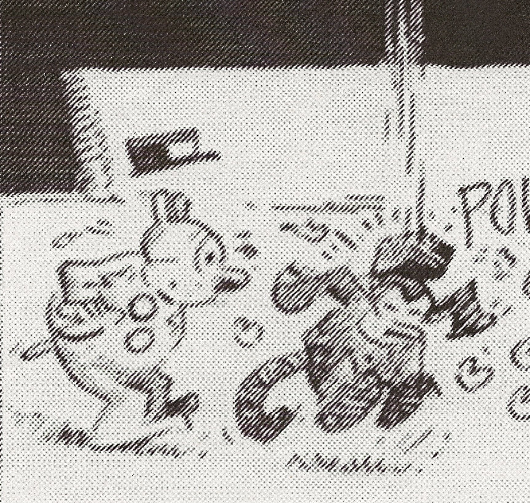
The Moomin characters move through a world that’s both whimsical and hauntingly melancholy. As depicted in the comic strip, it’s also a visual feast, every panel packed with weird flora and fauna. In a touch I can’t recall seeing in any other four-panel strip, Jansson likes to build panel borders out of symbolically relevant objects: knives and forks for a cooking scene, twigs for the outdoors. The plots have the simple profundity of good children’s literature, often revolving around wistful searches for love or identity, and the sequence in which the Moomintroll family sets up a home in a lonely lighthouse strikes me as one of the most beautiful stories I’ve read in a comic. But I always wanted to be a lighthouse keeper.

Pia Guerra (with Brian K. Vaughan), Y: The Last Man
The first sci-fi stories about all-female societies were men’s fantasies: either dystopias where women turned the world into an oversized ant nest or something equally horrific, or else cheesy setups for one-handed Earthman-teach-us-this-thing-called-kissing scenarios. The next batch, in the 1970s, were women’s fantasies: enlightened and rugged lesbian co-ops bristling with sisterhood, like the settings of Joanna Russ’s “When It Changed” and James Tiptree, Jr.’s “Houston, Houston, Do You Read?” (a title that gets name-checked in the first issue of Y: The Last Man).

By the time of Y: The Last Man, arguably the best Vertigo comic of the last ten years, the question of women’s place in society had moved beyond fantasies, beyond ideologies, and into practical concerns. Y is an action story, a story of survival. It’s postfeminism as pulp. And it wouldn’t work without Pia Guerra’s tough, earthy art. Guerra’s work has a classic comic-book action gloss, but with an unusual attention to detail and gift for drawing faces and expressions. She captures both the pulpiness and the human element of Brian K. Vaughan’s story. It’s almost too tidy that the third wave of world-of-women fiction should be represented by the collaboration of a male writer and a female artist, but truth is less subtly written than fiction.

Best Comics Poll Index

Super 8 vs. USAF

If you knew anything at all about me, you’d probably think I’d be the one guy in the world who should have enjoyed something like the new J.J. Abrams and Steven Spielberg film, Super 8.

After all, I’ve been a science fiction fan since at least as far back as 1962, when I scraped together every nickel I could to try and buy enough packs to get a complete set of the original Mars Attacks cards.

I’ve also been an avid comic book fan and illustrator since about 1967, and my wheelhouse is drawing science fiction- and space-related illustrations – particularly of alien life forms and alien monsters.

In addition, I’ve been an avid film buff since 1967, and have seen thousands of films over the years. This includes almost every classic science fiction and horror film – particularly most of the iconic Universal horror films from the 1930s and 1940s. Even more to the point, I’ve been a huge Steven Spielberg fan since his breakout hit Jaws, and I’ve enjoyed a number of J.J. Abrams’ projects over the years, starting with his science fiction blockbuster Armageddon.

I also owned my own super 8 camera during the 1970s, and like many other film buffs back then, I fooled around with it, filmed my friends and myself hamming it up, and experimented with in-camera special effects.

And if all of the above isn’t enough to convince you that I should have been the demographic sweet spot for a film like Super 8, how about the fact that I was actually brimming with child-like excitement and anticipation all the way to the theater to see it?

So what went wrong? Why was I disappointed and angry afterwards?

The answer is simple: I’m also a big fan of the U.S. Air Force, which I’ve voluntarily worked for in one capacity or another, active-duty and civilian, for nearly 30 years.

Super 8 – a period piece set in 1979 – was not at all kind to the USAF, whose make-believe role in the film was massive. America’s youngest service was not just the omnipresent and chief villain, it was portrayed as the thoroughly despicable omnipresent and chief villain.

One could have easily swapped out the olive-drab U.S. Air Force uniforms from that era with the black uniforms of Hitler’s Waffen SS from World War II and it would have made little difference to the plot.

Strong words? Or am I simply too close to the subject matter to be objective? I’ll concede that could be part of it, but I think there are plenty of other non-military folks who have also noticed Hollywood’s trend in recent years of depicting the U.S. military in an almost overwhelmingly heavy-handed fashion.

For example, just a few weeks ago, First Lady Michelle Obama was a featured guest at a Hollywood panel hosted by the industry’s major guilds, and her primary message to the executives and creators in the audience was a plea for them to try and be more fair and realistic in their portrayals of servicemembers and their families.

In Super 8, I assume J.J. Abrams imbued his film’s Airmen, and their ringleader Col. Nelec, with extreme, almost Storm Trooper-like behavior because that’s how he believes real Airmen would act to protect the secrets of a “black program” from being discovered by members of the civilian populace.

But as someone who worked in three black or highly classified programs during my active-duty days (the SR-71, the U-2 and the RC-135), the entire portrayal was not just uncharacteristic, it was totally stupid. The Airmen I saw portrayed on screen bore little resemblance to those real Airmen I’d worked with over the years at the more than 48 military installations where I’ve been stationed, visited, or temporarily worked at while on official duty.

I worked almost daily with classified material for more than a dozen years, had a Top Secret clearance, and worked on three special-access required (SAR) programs that required signed non-disclosure statements. And because of the compartmentalized nature of such SAR programs, I had to be thoroughly familiar with each program’s classification guide so I knew exactly what I could and could not discuss with civilians and other members of the military who did not have the that specific SAR clearance.

So I believe I can say with some authority that real Airmen who work with classified material, regardless of its classification level, are not trained to murder those who accidentally or intentionally obtain unauthorized access. Airmen are trained to report it so the unauthorized individuals can be questioned, detained, or arrested, and, if tried and found guilty, jailed.

As a matter of fact, while it may be more dramatic for Hollywood to show or infer otherwise, in all of my years associated with the Air Force I never saw, or even heard of, anyone ever being killed trying to get into a secure installation or classified area. And believe me, as tight a community as the Air Force can be, such big news would travel faster than an SR-71 in full afterburner. Of course, I’m not saying that historically it has never happened. All I’m saying is that if it did, it had to be a rarity, and it was probably either an accident or it was justified (i.e., the intruder was armed).

I think the reason popular culture creators fantasize about such things is because every base or secure area has signs posted on the fences or doors stating ominously, “Use of Deadly Force Authorized,” so they assume the use of deadly force is routinely used. But in reality, it isn’t.

Every situation I know of where unauthorized people have been detained (or “jacked up,” in Air Force parlance) for stepping into a secure area – intentionally or otherwise – security forces have followed their standard protocol. This does not include mindlessly shooting people on sight.

As a matter of fact, most Airmen who have spent any time at all in aircraft maintenance, or in job specialties involving regular access to secure areas, have either been “jacked up,” or know someone who has. Hell, back when I was part of Strategic Air Command during the 1980s, base security forces themselves would regularly test their guards/response forces by intentionally making random and unannounced attempts to penetrate secure areas in various ways.

Do you really think such things would be the norm if the standard procedure for the Air Force sentries was to shoot first, and ask questions later?

Yet, despite reality, we have major popular culture projects like Super 8’s depicting military servicemembers as cold and ruthless monsters who will do anything to protect a secret. It was this incessant misrepresentative undercurrent throughout Super 8 that kept me from enjoying what was otherwise a fairly entertaining film.

The bash-fest started early on when the teenage film crew the story revolves around witnesses a pick-up truck intentionally ramming and de-railing an Air Force train that’s zooming through the Ohio countryside at night. The kids survive, and as they stumble through the train’s wreckage, they suddenly find the nearly demolished truck. The vehicle’s driver, who just happens to be their science teacher, is badly hurt, but miraculously alive. As flashlights of approaching Air Force search teams flicker in the distance, he ominously warns the kids to run away because if caught, both they and their families would be killed for what they saw.

As we soon find out, the science teacher happens to be an authority on such things, because we’re shown in an old classified film the kids find that he was once one of the scientists who worked on the secret Air Force project being carried by the train: An alien monster who years ago crash-landed on Earth.

And to hammer home how the Air Force will stop at nothing to protect a classified project, J.J. Abrams has the Air Force search teams take the teacher prisoner, stabilize him medically, and strap him to a hospital bed. Then, after a Col. Nelec interrogation squeezes out all useful information, the colonel orders the former scientist executed.

But the Air Force-created mayhem does not stop there. Col. Nelec and his men continue to lie to the townspeople and local cops about what’s really going on, raid the school office and home of the dead teacher, and find other creative ways to trample on his, and everyone else’s, Constitutional rights.

Then, in one final quest to find the alien monster, Col. Nelec decides he needs to clear everyone out of town, so he has his men use flamethrowers to start a massive wildfire all over the surrounding countryside. This blaze gives him the pretext to round up all of the townspeople and bus them off to a nearby Air Force base as detained “refugees.”

There’s more, but I think you get the idea.

In short, Super 8 is just the latest example of a popular culture creator re-hashing popular culture stereotypes (you know, making a copy of a copy of a copy, ad infinitum) because it’s apparently a heckuva lot easier than doing the research necessary to create characters with some sort of realism.

Speaking of realism in film, guess who the moderator was for the First Lady’s aforementioned panel where she exhorted filmmakers to treat military people and their families more realistically on screen? It was none other than J.J. Abrams!

You just can’t make this stuff up!
_____________

Editor’s Note: This is an expanded version of a piece that ran on Russ’ blog.

Krazy as Muse: Walter Darby Bannard and the Comics of George Herriman

Walter Darby Bannard is an abstract painter. He was a longtime friend of the critic Clement Greenberg and the painter Jules Olitski, and you could place him squarely in that camp, however you might label it: modernist, formalist, Abstract Expressionist. Conventional wisdom about this style of art has been rendered worthless for reasons beyond the scope of this essay, but it holds that it is concerned with pure essence of painting, excluding all content, referring only to its heroic self.

As a practitioner, it’s a different story. One doesn’t worry about purity. One casts one’s line in the creative waters and tries not to complain about the species of fish that comes up as long as it’s edible. The process entails more humility than heroism, more idle musing than grand inspiration. Bannard’s work took a significant turn two years ago when his line reeled in Krazy Kat.

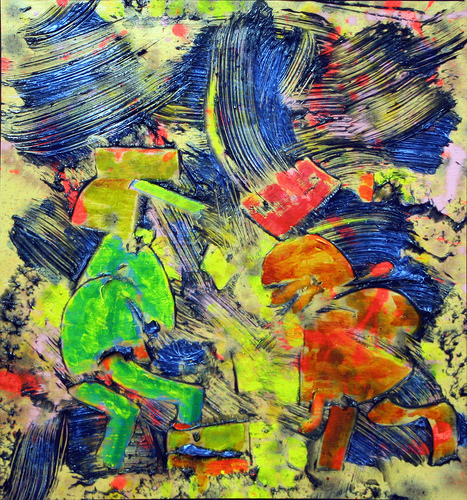
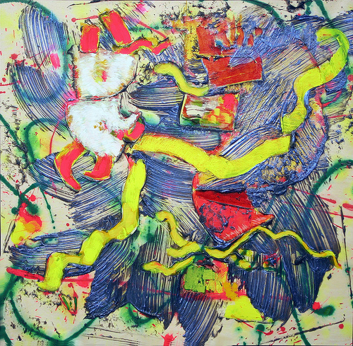
Bannard calls his current painting method “brush/cut/fill.” He begins by stretching canvases on the floor and staining them with thinned acrylics. Next, he applies high volumes of paint dispersed in gel medium using large brushes, even brooms. While the paint is wet, he cuts into it with squeegees, opening spaces and exposing the stained backgrounds. Finally, he fills these spaces with foreground elements by various means, brushing, pouring, or slinging the paint as necessary.

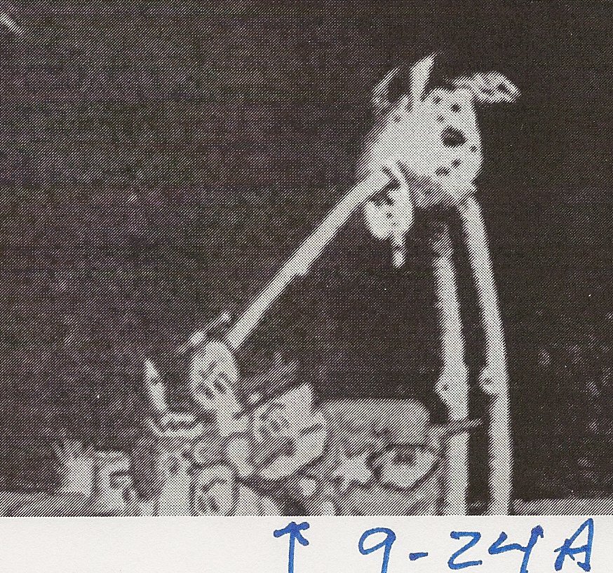
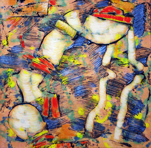
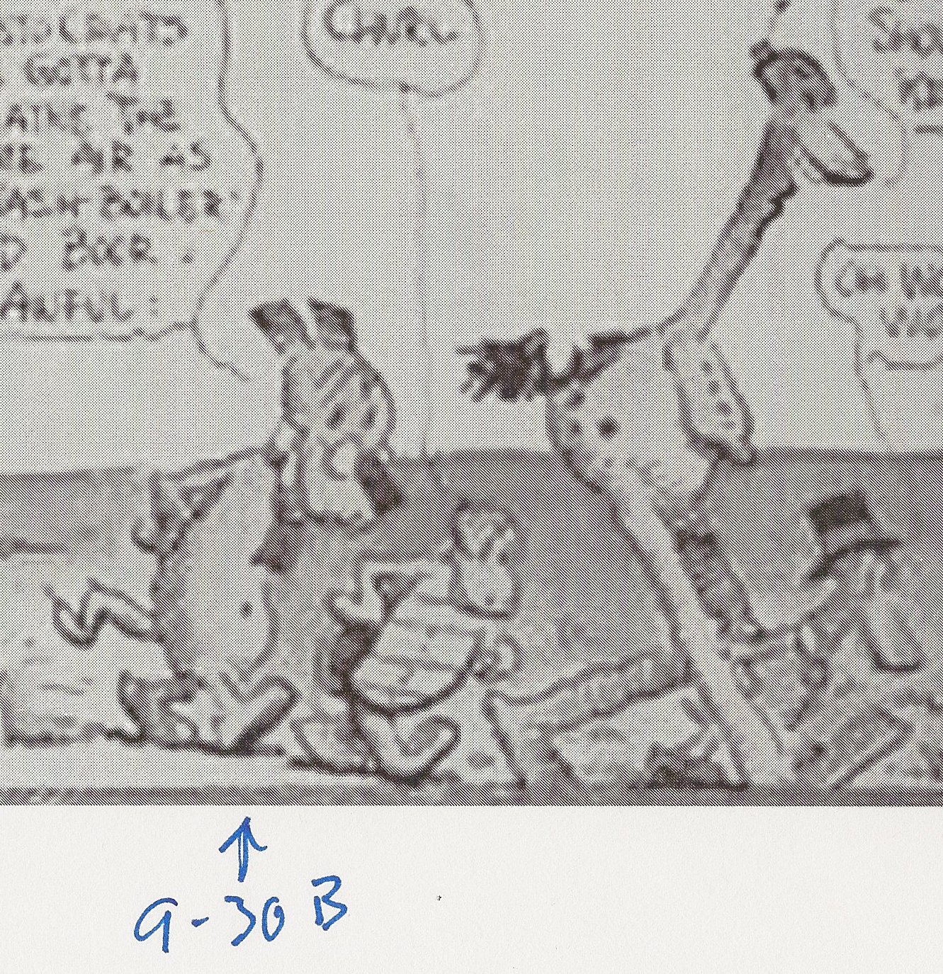
“When I evolved this brush/cut/fill method a couple years ago, the forms started looking organic and figurative because the method just made it so,” says Bannard. “I was not comfortable with this, but I tried to go with it. I began to feel that I needed some kind of centering element, like a landscape painter has landscapes, just to narrow the range of forms. I got the idea to look at Krazy Kat again in the spring of 2009.” Bannard went on the Internet and to the library, printing out and photocopying George Herriman drawings that caught his attention. By June, Krazy Kat characters began to show up in the paintings, albeit in a highly abstracted form.

Why Krazy Kat? “I have loved Krazy Kat since I was a young kid, when it was current in the funnies. I love the drawing, the weird forms and landscapes, and the eccentric color. It was a kind of surrealism that got to me much more than ‘art’ surrealism ever did. In fact, cartoon techniques always interested me more than ‘art’ techniques, aside from heavy stuff like Impressionism, Cubism and some Abstract Expressionism. I love skills and all the drawing tricks and gimmicks and technical things. When I was a cartoonist in college I made a real study of them, when I should have been studying for courses.”

It proved effective. “I struggled somewhat with this new figuration in my painting, and Krazy Kat gave me something I found affecting and could use as a formal reference. There is surrealism that really works and is full of humor in Steinberg and Herriman and Miro and a few others, ‘literary’ without being annoyingly ‘meaningful,’ even in Tanguy, although he was a lousy painter.”

Such inspirations, however useful, have a finite lifespan. Bannard has moved on. “The Krazy Kat references seem to have faded away early last year and now I don’t look at them at all. The paintings have gotten more abstract, through no deliberate process, but once again, just by letting them go where they will go.”

All paintings are 2009,copyright Walter Darby Bannard, acrylic on canvas.