Kirby: Approaching the Threshold

Click on images to enlarge

The status of American comics pioneer and creative fount Jack Kirby slipped badly in the space of  a few short years in the early 1970s. His highly successful resume at Marvel had led DC to promote his defection to them as their greatest triumph, but their support quickly waned. There was  some resentment directed at Kirby by people who were highly placed at DC, that contributed to making his time there uncomfortable. For instance, DC’s  production manager and excellent colorist at the time, Jack Adler, considered Kirby to be an “egotist.” And, the company was struggling to deal with the fact that reader’s tastes were changing, largely due to the revolution that Kirby had created with Stan Lee. DC’s lack of faith was not not solely with Kirby, though. Many DC books were begun, then rapidly canceled at that time. That DC would ask or allow Kirby to waste his talents on Jimmy Olsen is indicative of the level of taste and sensibility they had going on. The audience was more sophisticated, DC was seen as conservative and staid and they were. In addition, Marvel broke away from the distribution deal they had with DC in 1968  and tripled their production by the mid-1970s, from 20 to 60 titles. After Kirby left Marvel, they flooded the market with reprints of his work. So, there was a deluge of old Marvel Kirby on the spinner racks, drowning out his few new DC books.

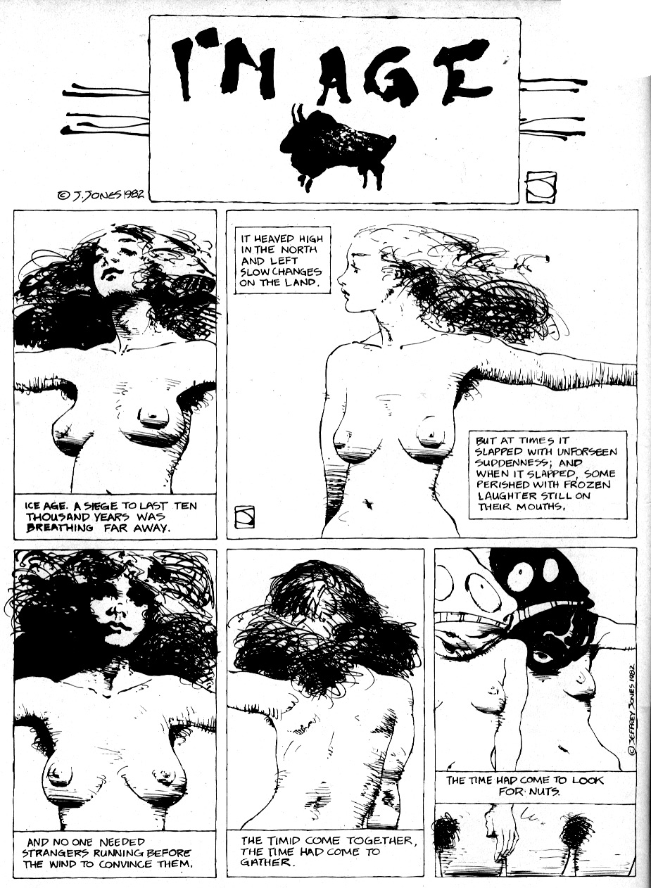
For their part, DC used Kirby as Marvel had. He initiated multiple titles, each full of ideas and characters that could and would be later exploited, but all of his books except for Kamandi were canceled and by the end, DC expected him to invent first issues for series concepts for a title called 1st Issue Special. He did not renew his DC contract, but made an also initially-promoted but ill-supported return to Marvel. By 1978, a dispirited Kirby had retreated from the “snake pit” of Marvel into the television animation industry, where he was well paid for his conceptual efforts and finally got a health plan. However, in making animation presentations, little of what he drew made it to the small screen and in fact few people actually saw his drawings, meaning that neither his storytelling Jones nor his ego were served. So, in 1981 he returned once more to the comic book format, with a pair of titles for the fledgling independent publisher Pacific Comics.

To some, Kirby had fallen far. Captain Victory and Silver Star were the butt of many jokes and disparagements in their time. However, Kirby’s work for Pacific Comics was potent enough to launch the direct market system, which became the predominant structure of comics distribution and began the dissolution of Marvel and DC’s dominance over American comics. He was also concurrently involved in legal battles with Marvel involving his original artwork and it has been alleged that he was the victim of corporate slander and blacklisting. Often cited as evidence of Kirby’s failing powers at the end of his career, the Pacific books are rarely examined, but they can sustain a closer look. They are about freedom, Kirby’s freedom to do comics as he pleases, after a long career of creating to please others. Yes, they are often extreme and inconsistent, but they also offer some awesome pleasures and some of what seems ridiculous is the artist reaching to convey concepts that are beyond his (or perhaps anyone’s) powers of description.

At Pacific, Kirby fully realized his transformation into a proto-alternative comics auteur, as he wrote and drew stories that were free of editorial interference. In Captain Victory, Kirby displays extremes of his personal textual and artistic tics that might not have survived an editor’s scrutiny, for better or worse. His writing and art can be obtuse and is sometimes parodic of his own stylistic tropes and of what became of his prior work, now out of his control. Some of the sloppiest panels he ever drew are in direct proximity to panels as good as  peak work on Thor. Kirby’s writing veers wildly from unbelievable silliness to heartbreaking irony. There is much that it would be deceptive to praise, but there are also moments that offer an unrestrained expression of his magisterial vision. One has the feeling that Kirby owes nothing, but is still giving.

In Jack’s late work a different set of priorities emerge that diverge from the aims of his earlier efforts. Kirby’s drawings often seem to be as much about the nature of his marks on paper as they are about the narrative, which further confounds matters. Marks that denote abstracts like movement and energy take on the same weight as those representing bodies in real space, light becomes patterns which interlock in a dialogue with marks and patterns in other panels. The pages are drawn small, so the work cannot have the sweeping space of his great twice-up original Marvel masterworks. Kirby’s own physicality has diminished and so he does not draw the lithe, bulging, hyperenergized forms that pressed the borders of the pages in his prime, now he makes stressed, compressed figures that sometimes seem to barely hold together, crushed into hermetic tableaux. It is the comic book as an encrypted and encoded personal illumination.

As can be seen throughout Kirby’s career, the ink interpretation of his drawings is largely dependent on the ability of the inker to understand the principles of volume, space and light that are imbedded in his deceptively simple lines and shadings. If an inker does not understand, for instance, that the interior “blobs” on a Kirby figure are meant to represent lighting from multiple sources, they will ink them as arbitrary abstracted marks. Artists like Joe Sinnott, Frank Giacoia, Syd Shores and even Vince Colletta are on solid enough ground in drawing and composition as pencillers themselves to reinforce and even enhance the structural solidity and linear nuance of Kirby’s drawings.The accomplished Mike Royer inked the initial pages of Captain Victory, that had been completed years before as a proposal for what would have been an early graphic novel. These were split between the two first issues. Royer’s own style is essentially flat and cartoony, but he is able to realize Jack’s intent and add a polished, professional sheen. The inking on the newer stories done for the Pacific series is by Kirby’s inexperienced protege, Mike Thibodeaux. All of the inking at Pacific is true to Kirby’s pencils, but Thibodeaux does not have the knowledge and skill of Royer; he traces Kirby’s lines carefully, but often misses the nuance of good drawings or even weakens the structure.

Captain Victory displays furious energy. It is not hard to imagine that Kirby might have seen the contemporaneous work of Gary Panter, that he absorbed some of the structuralism of Art Spiegelman and Françoise Mouly’s Raw. Kirby often reflected the state of the culture around him, borrowing from popular books and films. He would also reabsorb the influence taken from him by another artist, as he was known to have evolved his work to suit the interpretation of his inkers like Joe Sinnott, or as in Kirby’s appreciation for Phillipe Druillet from his sojourns to Richard Kyle’s well-stocked comic shop. Both Mister Miracle #2 and Hunger Dogs reflect the influence of the in-turn Kirby-influenced Druillet’s ornate borders.

Druillet influences Kirby in The Hunger Dogs

Likewise, the heavily and aggressively cartooned and patterned, nearly abstract linear quality of Jack’s Pacific work has an overtly self-aware surface that seems to me to be similar to that of Panter’s Jimbo.

Gary Panter spread from Raw One-shot #1: Jimbo, 1982.
Kirby and Royer spread from Silver Star #3, 1983.

Panter has not only spoken of Kirby’s impact on his work, it is clearly visible. The fierce, slashing, almost punk energy of both Captain Victory and Silver Star drove me to speculate that the influence was reciprocal, that Kirby had been looking at Panter, when I first saw them at the time. Now, I have not found the smoking gun, in that I haven’t yet been able to place that 1982 cardboard-covered Jimbo in Kirby’s hands. But at any rate, the faithful, flat surface of Thibodeaux is not altogether inappropriate on Kirby’s late efforts and regardless, the young inker does manage some very strong pages and passages.

The first six issues of Captain Victory boast some of the most dramatic and effective coloring that Kirby ever got in comics besides his own, by Steve Oliff. Kirby rarely had sympathetic colorists, nor did he often have control of the coloring. When he did, he was brilliant but he rarely had time to do it. The same rules apply: if a colorist comprehends the space and light in Kirby’s art, they can enhance it greatly.

Thibodeaux and Oliff make Jack look pretty good in Captain Victory #4.

Oliff’s color is often inspired, but he was replaced by Janice Cohen, who did a fine if standard job. For the final issues Pacific changed over to fully rendered color while they simultaneously experimented with paper stocks, causing a mutating product which made Tom Luth’s late airbrushed efforts appear garish and inconsistent.

The initial 48 pages of Captain Victory were intended by Kirby as a response to the Steven Spielberg film “Close Encounters of the Third Kind.”  Dogface Pvt. Jack Kirby could not assume that aliens intrepid enough to cross the galaxies would be any less opportunistic that we humans would be in a similar situation.

Not cute: I don’t feel very tasty, from Captain Victory #2
(panels reconfigured for continuity).

He advocated a full defensive mode. He envisioned an attack on Earth by an aggressive species and created Captain Victory as the vanguard of an advanced force that guards the galaxy from such predatory races. Though the lead character resembles two of Kirby’s signature heroes, Thor and Kamandi, he is a less an individual than a soldier tool of an interplanetary governmental body, like Captain Kirk of the Federation but with a harder, dehumanized edge more like the recent series of “Battlestar Galactica.”

“Victory is sacrifice, sacrifice is continuity, continuity is tribulation” is Captain Victory’s mantra. This might relate to the fact that all the characters Kirby created for Marvel Comics were sacrificed by their creator to the corporation to become properties, to be continued by other artists. By making them successful, Kirby was shut out of his creations, time and time again. Kirby places Captain Victory as belonging to the Galactic Rangers, his being is their property. The current version is a clone. He sacrifices himself to the Rangers’ cause by repeat-offending suicide. He dies, but there is no real continuity… when he is killed in combat, his recorded memories are transferred via a “storage unit” to a fresh clone of his body. A new Captain Victory arises, a thing that thinks it is him but is a copy (incidentally, this is also a compelling argument against “Star Trek”-style transport). The moment of the previous incarnation’s death has been erased, so the copy has no memory of suffering, that might give it pause before it re-ups.

A never-ending tour of duty, from Captain Victory #1.

The emphasis on characters as properties that is seen in the most prominent comics publishers is entirely deliberate. Conceptual ownership by way of work-for-hire gives the advantage to the publishing corporation and devalues the unique talents of the individual writers and artists who make the work. The producers of the work are considered to be expendable, other writers and artists might do just as well concocting variations of a given set of ideas and also be more malleable to the corporation’s control. Artists who are kept busy retreading concepts created by others are less invested in the work. They might add new characters within the established parameters (disowned as work-for-hire), but have less time to develop properties of their own that they would be invested in (and the corporation will often stick to safe, proven ground and discourage innovation).

Just good business, from Captain Victory #11.

Thus, a narrow pool of concepts is tightly controlled, harnessed and milked, an endless serial produced through collective effort to become, the corporation hopes, a “new mythology for our times.” A myth is a construct, not a person. The myth is The Silver Surfer, not Jack Kirby. In a corporation, there can be no individuals—no one person can be responsible for success or failure, there are no ethics involved, the overriding consideration is the profit of the collective of stockholders. But, with the last part of the Ranger’s creed, “continuity is tribulation,” Kirby implies empathy with those souls tasked to continue the adventures of the properties he has lost. They must work hard, to have no autonomy. They are clones of himself, who must endure after he is gone. And, Kirby sometimes rejects continuity in these books, he does not seem to care if there are holes in the story or inconsistencies in his drawings from panel to panel—and nor do I. Finally free of micromanagement, Kirby makes some of the most spontaneous comics of his career.

Captain Victory #s 3-13 were drawn in brief bursts, when Kirby could fit them in between his commitments to his animation work, but they still show a high level of  conceptual vigor, there are a lot of ideas put forth. To be sure, there are many weak passages, but there are also killer panels and pages and quite a few double-page spreads that rank with some of the finest Kirby ever did. The first storyline extended from the initial novella. Elaborations of the “Bugs” from the New Gods series that yield many fabulous designs which outshine their previous incarnation, the Insectons come to Earth to exploit its resources. They feed on life energy and the bloated bodies of their human victims are stored in fluid “food-channels,” shown to chilling affect in #5.

A disturbing sequence from Captain Victory #5.

The Rangers waste no time in making a full-on assault on the infestation. Some of the Rangers remind the reader of Kirby’s earlier creations, as in the resemblance of Orca to the Inhuman Triton and Tarin to Kamandi‘s tiger Prince Tuftan, but they are also less individuals than parts of a well-oiled machine, disciplined and equalized in military service. The books are militaristic but it would be a mistake to assume a hardening of Kirby’s humane outlook. Kirby was in the infantry in World War II and did not enjoy the experience. The Rangers’ dialogue is seldom the sort of action patter found in the comics of Marvel and DC, rather Kirby ascribes to them a bizarre mix of poetical expositions of the metaphysical and ethical dilemmas that can be spun from his sci-fi premise, with a sometimes silly and/or anachronistic humor, meant to represent the absurdities that those in dangerous situations indulge to leaven their trauma.

The spread from Captain Victory #6

The Insecton “story arc” culminates in the double-sized and stunningly covered #6, a nearly apocalyptic scenario that sees the good guys win but the Captain first partially blinded, then killed yet again to save our planet, in this case through an overdose of life energy by his operation of a giant “drainer” that sucks the enemy’s essence from their husks. The violence in Captain Victory is more “real” than in other Kirby comics, here he shows the consequences.

In the arcs that follow, the stories begin to take on the quality of tales told late at night by an ancient relative with a thick accent—it’s hard to hear or they don’t quite make sense, but a disquieting enormity is felt, a sense of the weight of millennia and of infinite forces outside one’s control. One cannot understand, but one wants to, because it feels important.

Kirby unstoppers the bottle in Captain Victory #9.

The second,  four-issue storyline deals with the Wonder Warriors, four disparate villains who obey the dictates of a disembodied Voice, that include the cooly armored Bloody Marion and Finarkin the Fearless, Ursan who decomposes matter with his touch and Paranex the Fighting Foetus, an overt reference to then-contemporary challenges to Roe v Wade spurred by right-wing Senator Jesse Helms. The famously liberal Kirby sidesteps the issue of women’s bodily autonomy entirely as the oversized telekinetic embryo inspires moral qualms in the Captain, who says it is not fair to kill something before it officially exists, despite its aggression and that it is independently free-floating, encased in armor and has already been named.

Spread from Captain Victory #10.

The most cryptically magnificent passages in the series take place in #10. In an incredible spread, the sexually indeterminate pre-being Paranex assaults the Ranger’s dreadnaught. Victory’s concern for the criminal Foetus is revealed as a sham intended to draw out the Voice, who the Captain mysteriously knows, and when it does, they proceed to an unclear endgame.

Legerdemain from Captain Victory #10

In language dripping with portent, Kirby has his Captain order his crew to remain passive as he is apparently dragged senseless off into space by the Wonder Warriors. Of course that also is a trick and perhaps an excuse for Kirby to draw more unsettling images of his creations pulled to their doom by floating cubes that have all of the “presence” of Donald Judd’s Specific Objects. They all blow up but Victory is fine, he has sent out a robot of himself and he prepares to explain to his crew his prior knowledge of the Voice.

The final story arc is a flashback spread across three issues; these contain themes seen elsewhere in Kirby’s work: a critique of militarism as evolutionary barometer, as in his extrapolations from Kubrick and Clarke’s “2001”; and the question of “nature versus nurture” that he would later return to for his rejected conclusion to the New Gods, “On the Road to Armagetto.”

Who says Kirby can’t write? From Captain Victory #11
(panels reconfigured for continuity).

Captain Victory #11 shows a literally monstrous side of the hero as he relates with Shakespearean cadence the story of his (original’s) childhood in the court of his cousin Big Ugly, who has horns and multiple mouths. Though Victory is human and so apparently incompatable with his demonic relative, the 8 year old child easily suggests cruelly innovative ways for Big Ugly to conquer the known universe. Ugly and the rest of the royal family are in thrall to the Voice, which is revealed to be that of Victory’s dead grandfather, Blackmass. Victory’s family follow this incorporeal spirit’s foul will and justify their actions to their victims in religious terms. With typical prescience, Kirby makes the kid’s best friend a computer. The child is the instigator of some of Big Ugly’s most heinous actions, yet seems to find it all horrifying/boring. Victory is a precociously talented architect of genocide, but he disassociates and is able to blame his cousin as if the acts are unconnected to him and then has no problem betraying the bond of blood to murder Big Ugly, heralding his coming of age as a soldier.

Cases have been made for possible correspondences of issue #12 with the New Gods saga by John Morrow and other Kirby fans. It depicts the boy as with the aid of his (um, huge) digital pal he destroys his ancestral planet Hellicost (Apokolips) and flees into space, only to crashland on a planet that is home to yet another militant psychopath, Captain Flane, who may or may not be his father.

A favorite page, from Captain Victory #12.

Flane plays God to the indigenous population, forcing their evolutionary development by facilitating their development of military technology, leading to his own death at the hands of his “students.” For Morrow et al, the issue represents Kirby retaking his creations to give them a more fitting end. They believe that Flane represents Orion and Blackmass represents the ghost of Darkseid. Perhaps, but it also seems appropriate to note that Victory’s future state of serial martyrdom is foreshadowed by Flane’s suicidal manipulations. Victory seems to be the carrier of a murderous genetic package, but Kirby also rejects predisposition to violence with the implication that such an ingenious race as the one Flane corrupted might have used their natural curiousity to more constructive ends, had they been influenced by a less aggressive mentor.

The series ends in a distinct affirmation of the creative power of the artist. In CV #13, Victory cannot act on his clumsy love for his fellow Ranger recruit Lieutenant Alaria. In fact, all of his more individualistic impulses are suppressed and superceded by the demands of his duty.

A little awkward, from Captain Victory #13.

Kirby finally allows Victory to meet his maker, the true “Source:” the hub of the Rangers is depicted as a surreal abstraction of the artist, a humongous floating hand which surmounts an eye and is a container for a brain.

Just so we know who’s in charge, from Captain Victory #13.

Victory and Alaria are revealed as easily manipulable pawns, to be split up for dramatic purposes or “reassigned” to be given yet “more complex duties.” Flashes of compressed adventures follow the ambitious yet loveless career soldier to Alaria’s death and his Captaincy, as he “achieves the reason for his existence,” that he is a cog in a wheel and also the starring hero of the last Kirby epic. He will not procreate, but be a copy of a copy of a copy etc. He is pre-genericized,  the comic is self-aware and takes on the aspect of a loop, we are back where we started and Jack Kirby is done. He has given us a look at our own worst impulses and into the far reaches of his mind.

________________________________________________________

SOURCES

Amash, Jim. Interview with Jack Adler. Alter Ego #56.

Brown, Andy. “In Defense of Our Galaxy.”  Monster Island Three. Conundrum Press, 2007.

Lewis, Jeremy. “In Defense of Our Galaxy.” Jack Kirby Quarterly #8.

Taylor, Stan.  “Why Did the Fourth World Fail?” The Jack Kirby Collector #31.

Manga Legends: Just What Are They Selling?

A Japanese company, Manga Legends, claims to sell original artwork by many of Japan’s greatest comic book artists. However, the executive in charge of publishing at Tezuka Productions, a company created by the legendary artist, Osamu Tezuka, has stated that there is a “high possibility” that at least some art sold by Manga Legends is a copy.

Further, Manga Legends claimed in an email that their company was affiliated with Animate, a nationwide anime/manga chain store in Japan. However, an employee at Animate’s customer service center had never heard of the company. Later, after looking at Manga Legends website, the employee notified us that Animate had taken legal action against them.

“It really is incredible to see all this stuff coming out of the woodwork.”

In recent months, on a community website that allows collectors to display pages of original comic book art – including the art used in the production of actual comic books, called Comic Art Fans, known to its members as CAF, various members had begun posting original panel pages from what appeared to be very significant Japanese artists and manga series.

Unlike their American counterparts who often sell their art to fans, manga artists are well known for keeping their art. With a few exceptions (and the occasional known gift), little of it ever makes it into the open market. The little that does tends to be sold at special auctions run by companies such as Mandarake, one of Tokyo’s largest vendors of used anime and manga-related products.

As an example, art from the artist, Rumiko Takahashi, the creator of such successful series as “Ranma ½ “and “Inu Yasha,” is considered to be so rare in Japan that an inked sketch of Lum, a character from her “Urusei Yatsura” series, drawn on letter paper, sold at auction on April 13, 2011 for JPY 3,267,500 (US $40,650 at the current exchange rate).

Sketch of Lum by Rumiko Takahashi.sold at auction in Japan


However, since November 2009, CAF members have posted two published interior pages from the “Urusei Yatsura” series on the Comic Art Fans site. Many Japanese would find this hard to believe.

____

Two Urusei Yatsura pages posted on Comic Art Fans.

Since the initial pieces of manga art started showing up in late 2009, a steady number of key or prime pages have continued to be added to CAF by various, though mostly European, collectors. These have included pages from series such as “Blackjack,” “Tetsuwan Atom” (“Astro Boy”) and “Adolf” by the so-called “God of Manga,” Osamu Tezuka, “Nausicaa in the Valley of Wind” by famed animation director, Hayao Miyazaki, Dragonball by Akira  Toriyama, a “Lone Wolf & Cub” page by Goseki Kojima (a major influence on the American artist, Frank Miller) and many others.


After seeing the “Lone Wolf & Cub” panel page posted to CAF, fan and art collector, Felix Lu, said,  “It really is incredible to see all this stuff coming out of the woodwork. As someone who searched furiously over a six-to-seven-year period for published LWC pages, this latest update is a stunner. My understanding, through multiple sources, was that all the interior pages were held by (series writer, Kazuo) Koike. Given all that – and seeing zero evidence to disprove it, I just came to accept it as fact.”


Two of the most stunning examples posted on CAF come from the same series, Katsuhiro Otomo’s “Akira,” considered by many to be one of the most influential comics ever. These two pages show key scenes from the comic – one shows the story’s main character, Tetsuo, meeting the titular, Akira, while the other shows the shockingly memorable scene where Tetsuo loses his arm to a laser blast from a military satellite.


Comic art collector and Akira fan, Satyajit Chetri, said, “I was really excited about the manga art and tried making inquiries. When I heard some of the numbers being thrown around, my first instinct was to go for them by any means possible – it was Akira, after all, something that I really loved and I thought there would be a limited supply of pages available only for a short period of time. But then more and more pages started popping up, good ones, and suddenly the exclusivity factor seemed to go down a little. (There are) 3000-plus pages of (the) Akira (comic book), and if there were some collectors getting PRIME pages, it was inevitable that more pages would turn up, as would a secondary market.”

At first, the source of this new vein of art seemed to be a secret. When asked by one of the authors by email, one collector stated that he had a relative living in Japan who acquired it for him. The authors also heard from various sources that the Akira pages had been auctioned by Mr. Otomo himself to raise money for Japan’s recovery after a 9.0 magnitude earthquake and tsunami devastated much of northeastern Japan in early March.

“Strangely, Google searches for original Akira pages (from an auction or a store) do not turn up anything,” said Mr. Chetri.

Discovering Manga Legends

Recently, however, the authors received a link to a website called Manga Legends from an art collector living in North America who does not wish to be named. “Please keep it between us,” he wrote.

According to its URL information, the site was created in 2009. However, on its website, the company states:

“Manga Legends will celebrate its 25th anniversary on 2009. Our online shop and members service is celebrating now its 7th anniversary. From the manga store in Koenji-Tokyo to the homepage, a long way has been walked. Our goal is more than ever to be with you to live your passion at the best price end the best service.” (sic)

A URL search on June 5 listed the website as being owned by Alexandre Bodecot and it was located in Fukuoka. As of June 7, “Mita tomoki” (sic) was listed as the owner and the address had been moved to a Tokyo P.O. Box.


Manga Legends’ website advertises that it sells “Collectibles, old editions, signed mangas, original art…,” and listed available services in English, French, Spanish, Italian and German, but not Japanese. Since it is a Japanese company, this appeared odd.


[A screenshot of Manga Legends’ homepage. The colors are similar to that of a Japanese company, Animate, which Manga Legends claimed affiliation with.]

Mr. Chetri, who has participated in public comic art auctions in Japan, noted, “Japanese collectors are willing to pay a LOT for original art, as public auctions show. It seems disingenuous to target a European market when there is an eager fan-following right outside your door, unless you are a seller who is making claims that you do not want cross-verified.”

As part of Manga Legends’ service, the authors learned that the company issues certificates of authenticity with each page that they sell. The company claims that a “sworn expert” issues each COA.

The North American collector, who was in the midst of a deal for an art page drawn by Osamu Tezuka and his studio assistants, wrote an email on June 3, 2011 to Mami. Watanabe, an employee of Manga Legends expressing “concerns about manga-legends.” The collector also wrote in this email that he had already bought one page by Mr. Tezuka, a “Blackjack” panel page that he had bought from an unnamed “French collector,” and asked if the page had previously been sold by Manga Legends.

Ms. Watanabe answered the same day, writing that Manga Legends had indeed sold the page in question:

“Yes, after checking our datas, it happens that this page was sold to one of  our French members last year. To my surprise, it appears that this page was sold with a COA to this member. When you exchanged this page with this  person, he didn’t give it to you ? Please let me know and if necessary, we can  ask to our sworn in expert to reissue a COA for you. The point is, our COA  specifies that our original arts can’t be resell without the written agreement of  the author or it’s agent, through our company. Let me be sure that this person, in France, didn’t sell the page to you but exchanged. ” (sic)

Also, Ms. Watanabe stressed the genuine nature of the art. In an email from June 2, 2011,for instance, she noted that Manga Legends acquires all its original art from “collectors in Japan,” and “agencies such as Kashima Agency, Morita Ippei Inc. …etc.”

Just what is Manga Legends selling?

The authors contacted Ippei Morita through an address provided by Manga Legends and he wrote back in an awkwardly worded Japanese message (one of the authors is a native Japanese speaker), “Your friends from overseas can purchase from us without any suspicion.”

However, Akira Kashima, CEO of Kashima Agency, emphasized that his company is a translation copyright agency for multiple publishers and does not handle art.  On the phone, he was audibly upset to learn that Manga Legends was using his agency’s name as reference.

Mr. Kashima, whom the authors contacted on their own, told us that one of his clients is Tezuka Productions. Mr. Tezuka, who died in 1989, started the company after his animation company, Mushi Pro, went bankrupt. The company continues to publish his works posthumously, to license the many characters he created and to produce animation based on those characters.

The authors asked Mr. Kashima to send officials at Tezuka Productions links to artwork on CAF credited to Mr. Tezuka., including the “Blackjack” page bought by the North American collector that Manga Legends admitted to selling with a COA to another collector.

Tezuka Production’s Chief Publishing Officer (author’s translation) replied that while the company will not authenticate individual pages of art, he said there was a “high possibility” the “Blackjack” page is a forgery. He added that Tezuka Productions has virtually all the art to the “Blackjack” and “Adolf” series making it highly unlikely that any page from either of these series was genuine.

(Tezuka Productions did not release the name of the official who responded to the author’s questions. In Japanese corporate culture, releasing the full names of employees is not recommended unless both parties know each other. In this case, Mr. Kashima could not release the name of the Tezuka Production official because he had not dealt with the authors personally.)

An official from Tezuka Productions reported that there is a “high possibility” this “Blackjack” page, which Manga Legends admits selling, is a copy.

To find out more, one of the authors joined Manga Legends, filling out a membership application and providing a list of Japanese artists in whom he had an interest. Soon afterward, he received an email from Mami Watanabe containing scans of available panel pages from luminaries such as Osamu Tezuka, Katsuhiro Otomo and Go Nagai as well as a splash page by Goseki Kojima along with a set of prices for each page.


___


___

[Scans provided to the authors by Manga Legends of art the company had available for sale. From top left (clockwise), the pages are purported to be from “Adolf” by Tezuka Osamu, “Akira” by Katsuhiro Otomo, an unknown samurai manga by Goseki Kojima and “Devilman” by Go Nagai.]

Getting Animated

Because the company would not provide better scans of the art, the authors asked if it would be possible to visit Manga Legends’ galleries in Tokyo. Ai Oonishi, using Ms. Watanabe’s company email address, replied:

“Of course, our head company’s called Animate, you can find our stores everywhere in Tokyo. I give you the link to our stores maps. Please visit us when you’ll come to Japan.”

The Animate company logo.

The email clearly indicated a relationship with Animate, the largest retailer of anime games and manga in Japan. Unaware that Animate had expanded into the original art market, the authors contacted the company’s customer support center and a telephone operator, who did not release her name, stated that the company only deals in “new, mass-market products,” not “specialized products.”  After requesting a link to Manga Legends’ website, the operator visited it and informed the authors that the site “looked highly suspicious.”

The operator then forwarded the information about Manga Legends to a company official who then sent a warning letter to Manga Legends regarding its use of Animate’s company logo. The logo disappeared from Manga Legends’ website on the following day.  (This information was provided to the authors by the telephone operator at a later date.)

Afterward, the authors gave this information to the North American collector who had provided the original link to the company. He wrote to Manga Legends and asked them to clarify their status with Animate.

He received a reply from Ms. Watanabe that read, “About the company’s affiliation, it’s a little bit complicated and I can’t really explain to you in details, our company is now independent after a long legal ‘fight’ with the original creator of our stores. That’s why we changed our logos and mark color.”  (sic)

This remark appears misleading. According to Animate employees, there was never any relationship to become independent from.

[Manga Legends current homepage after links to the Japanese company, Animate, were removed. Also, the color of the company’s logo, which was similar to Animate’s, has also been changed.]


As we are collectors of original art ourselves, both authors know that one of the reasons we acquire comic art is nostalgic delight, the ability to hold dreams made tangible in our hands. Manga Legends sells dreams and the lure of those dreams is strong.

When informed that Manga Legends had misled him about its affiliation with Animate, the North American collector wrote back that he admitted that he was probably naïve, but he still wanted to believe that the art Manga Legends was selling was genuine. “I still want to believe it is true.”

Update; This is a somewhat altered version of the original article.

Vanishing Point

In a footnote in The Political Unconscious, Frederic Jameson quotes Edmund Husserl on “the constitution of Galilean science as the repression of praxis (italics mine).” Husserl says, “The geometry of idealities was preceded by the practical art of surveying, which knew nothing of idealities.” And thus, a tangible practice of mapping is rendered abstract when applied to the heavens– unclean knowledge is hermetically purified through contact with the infinite. In something of a Galilean move, Alain Badiou has, following Hegel, insisted that the tangible knowledge of science is not merely expressed though but fundamentally rooted in abstract interaction. He has sought to press this point in meditating on set theory mathematics, arguing against the idea of a “dissemination” that would atomistically reduce everything in a certain “world” to autonomous monads or particles, a common core or a higher singularity, any essential element that would point outside the structured relationships between related objects, relationships that resist being collapsed together in any reconciliation.

In reviewing Badiou’s Number and Numbers, John Kadvany quotes Badiou arguing against transcendent unity: “Dissemination, when it is applied to a natural multiple, delivers only a ‘shard’ of that multiple. Nature, stable and homogenous, can never ‘escape’ its proper constituents through dissemination. Or: in nature there is no non-natural ground.” But, by his own logic, Badiou cannot define his system from within that system. Notes Kavadny, “Set theory relies on first-order logic; it isn’t expressed through its own ontological language or other angelic media.” “You can study the higher infinite all you like for aesthetic or intellectual reasons,” states Kavadny, “but it can’t be justified by an ideology of natural scientific need.” The hubris Badiou attributes to reductionist analysis reappears in his own dream of pure autonomous immanent induction.

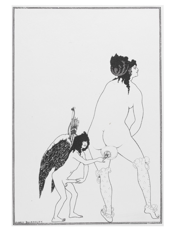
The problem of positing a symbolic system with its own symbols resonates with the distrust many feel in regard to Freud’s fixation (if you will) on castration. This literalizing of abstraction informs Lacan’s critique of the Freudian mother-child dyad of the oral stage (discussed by Lacan in terms of the register he calls Imaginary), and, in turn, of the classic three-part Oedipal disharmony and the Symbolic conflict of the genital drive– mother, child, and father. The point being that there is no pure time without the father, and neither is a pure sublimation offered by the irruptive introduction of the father. Lacan offers the phallus, an abstract signifier divorced from the physical penis, as an element haunting the relationship of mother and child, and as an element that does not disappear with the advent of the paternal Law.

But this pair, the “romantic” dyad and the “comic” triad, still leave out a third term. In Freud’s introductory lectures on psychoanalysis, from 1916-1917, he talks of the fact that not only the penis can fill the symbolic function of the phallus, but so can the breast, as can the baby itself, as can feces. Our first creation, abjectly inhuman, an unclean expression of our interiority, feces define our ability to control our own bodies and thus the bodies of others. In a world that we imagine to be completely of and for material use, shit has become not only that which we create, but that which constitutes our value. In Marx, the paradigmatic anti-individualist, we see the apotheosis of voluntarism: a world in which existence is to be understood exclusively as effort. The modern human ideal is the vitalist worker/innovator endlessly shitting out product/algorithim, much like the character in Chester Brown’s comic book Ed the Happy Clown whose infinitely prolific anus is a portal to another dimension.

Analyzing sodomy in Shakespeare’s sonnets, Richard Halpern connects creativity and sublimation to the obsessive anus via Lacan’s alien yet ideal Thing, the lack which is the motivation of unconscious desire, the fetish to which fixation constantly returns.

Let not my love be called idolatry,
Nor my beloved as an idol show,
Since all alike my songs and praises be
To one, of one, still such, and ever so.
…One thing expressing, leaves out difference.
…And in this change is my invention spent(.) (Sonnet 105)

This singular emptiness is at the center of the Real; the Symbolic, the Imaginary, and the inexpressible Real make up the Lacanian triad that matches up respectively with Freud’s genital, oral, and anal stages. What Halpern terms “Shakespearean homosexuality” is “not identical with sodomy but results, rather, from aestheticizing the theological categories that construct sodomy”– i.e., as an impure act based on an unnatural preoccupation. This occurs in much the way that Paul appropriates official imperial Roman language to talk about the Kingdom of God.

And, as with discussions of the religious or aesthetic ineffable, “(s)odomy subsists as the speaking of the unspeakable, as the topos of the inexpressible or unnameable.” Not just in the sense of the closet, or “the love that dare not speak its name” (although those tropes resonate in the Sonnets), but an act of creation and awe, an intrusion of sublime artifice that Halpern associates with idolatry, but dissociates from the genital. Thus the fascination for and suspicion of artistic or divine creation from nothing:

And for a woman wert thou first created
Till nature as she wrought thee fell a-doting
And by addition me of thee defeated,
By adding one thing to my purpose nothing. (Sonnet 20)

The iconic unspeakable sign is the remainder of purifying alchemical sublimation, the supplement of the phallus or the abjection of feces. Halpern finds an analogous (if arguable) link in the first chapter of Paul’s letter to the Romans, reading idolatry as a punishment for homosexuality among the Greeks. “But,” Halpern says, “this means that homosexuality, as a failure of natural vision, mimics that transcendence of nature which the Greeks otherwise fail to achieve.”

Reminiscent of Julia Kristeva’s abject womb, Halpern returns to passages in Shakespeare that connote decay and perversion. He links the “reeking” breath of the Dark Lady in the later sonnets with the Marquis de Sade’s repulsive misogynist description of Therese, of whose anus “we have proof positive that the shit of her infancy yet clung there.” Halpern goes on to propose a kind of violence and repetition in both the Renaissance and Enlightenment texts that can be linked with an abject negativity that provides new ways of figuring the sphincter-like prison of reality– I would identify in this the collective activity of the drives that Freud termed the “death drive.” In examining this excessive aspect of “doting” nature, we are led to a category of the anal that psychoanalysis has commented upon repeatedly, that of sadism.

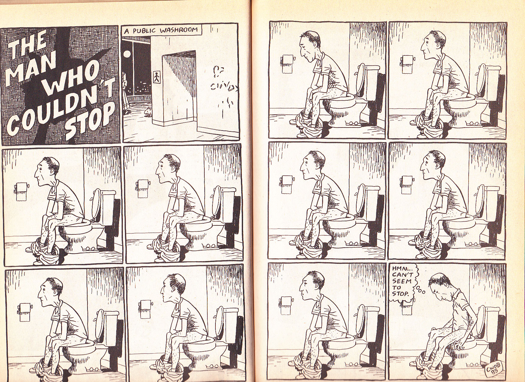
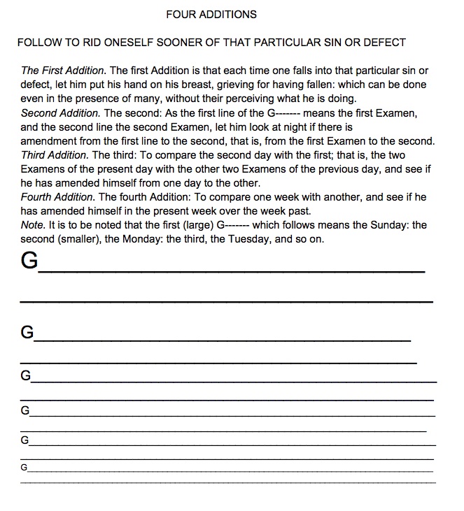
The death drive that returns insistently to the tight spot of unbearable pleasure is the scene of the utopian “languages” described by Roland Barthes in Sade Fourier Loyola, a book about authors whose systems, like Badiou’s, prescribe a discipline rather than a summary. In speaking of the lack of clear images in the Spiritual Exercises, Barthes says that St. Ignatius’ techniques “determine less what has to be imagined than what it is not possible not to imagine– or what is impossible not to imagine.” But the goal is not wordless beatitude. The anal-retentive “totalitarian” articulation of every imagined detail resonates with the immanence of structuralism; for Loyola, “language is his definitive horizon and articulation an operation he can never abandon in favor of indistinct– ineffable– states.” The infinite horizon of mathematical repetition in Loyola is captured well in the very first week, when he literally employs a diminishing character size when proscribing proper purging of a sin from the conscience:

Finally, however, the near-impossibility of achieving perfect purity is not an excuse to dismiss the idea of perfection. This perfection is outside of our world, and must be sought through helplessness. It must remain unknowable. This problem is graphically described by Jesus throughout the Gospels, but perhaps never with such clear anal overtones as when he insists in Matthew 19:24 that “it is easier for a camel to go through the eye of a needle than it is for a rich man to enter the kingdom of God.” Money as feces was one of Freud’s least ambiguous metaphors, the thing you certainly cannot take with you when passing through a needle.

The increasingly abstract market of drives, and the increasingly abstract disciplinary father, for all their dispersed ephemerality, cannot pass into perfection while remaining what they are. The attempt to approach truth without “exhausting oneself,” as Barthes puts it, is the arrogance of attempting to create a perfected, purified immanence: a light without shadow, or an image without an observer, as when Galileo and Badiou forsake transcendence in the name of abstraction. Badiou’s attempt to use the fathomless infinity of set theory as a bedrock of Being is a primal fantasy of anal control that attempts to police boundaries and define differences, not by making them concrete, but by making them untouchable. Grasping this seductive (feminine) Real of jouissance is no more possible by repetition than by reduction. Nature cannot be conceived (of) without an unnatural element, a framework of artifice, but that artifice must emerge from a tiny, empty space beyond.

Race in the Comics Classroom

While it has become something of a cliché to assert that race poses a significant challenge in the classroom, I have long ceased to think of race and teaching in these terms.  Indeed, as a professor of African American literature, I regularly deal with the difficult issue of race and have developed, and help my students develop, tools to grapple with American racial history and persistent racial tensions and conflicts.  Which is why I was caught completely off guard in my comics course when I taught Aaron McGruder’s Boondocks and found myself attempting to discuss race with students completely unprepared to do so.

Students in my comics course are primarily white and male, though the ratio of men to women is significantly better than that of white to non-white students.  The students are primarily not readers of comics.  Out of 45 students, about half of them have read a comic strip or editorial cartoon, but not recently.  7 or 8 of them have read a comic book (usually Maus or Watchmen).  Of that 7 or 8, 2 or 3 are currently regular readers of comics, typically superhero comics, or, on occasion, manga.  My goal in the course is to introduce students to the many kinds of stories creators tell using this form.

I’ve taught Boondocks before, in Introduction to African American literature.  I taught it alongside Toure’s collection of short stories Portable Promised Land.  The two works come at the end of my class, and serve as examples of contemporary African American literature informed by (1) the prevalence of blackness in American popular discourse, (2) a long standing and well-established African American literary tradition, and (3) the shifting and competing definitions of blackness in post-Civil Rights America.  In that course Boondocks works really well because, I realize now, students have been well prepared for a discussion of how McGruder plays with American racial discourse.  Basically, race and blackness are not marginal to the conversation in this course.  It’s the very air we breathe.

In my comics course, on the other hand, there is very little discussion of race.  In fact, the only time race comes up is when we read books where the race of the characters is explicit (like Boondocks as opposed to something like Stitches or Spider-man) and, thus, unavoidable.

Here is what I want my students to get from The Boondocks: Aaron McGruder employs visual racial hyperbole as the foundation of his satire–we are confronted visually with racial stereotypes (the hood rat, the black militant, the Uncle Tom, the ditzy white girl, the confused biracial girl, etc.) that are then used to simultaneously deconstruct white supremacy and lampoon the absurdity of American racial thinking.

Take the above images, for instance.  On the left is Riley Freeman, 8-year old gangsta wanna-be; on the right is rapper 50 Cent. Riley here isn’t simply recognizably black (which he needs to be for the entire premise of The Boondocks to work).  He is stereotypically black–the cornrows, the baggy pants, the bling.  We are meant to call to mind images from pop culture, like 50 Cent, that present very specific, very limited constructions of black masculinity.  Riley is recognizable because we see him everyday.  McGruder’s genius, though, is what he does with this stereotype.  Riley is a child whose aspirations to thug glory are played for laughs.  For instance, to express his outrage at being moved to the suburbs by his grandfather (you can’t have street cred if you come from the suburbs), Riley changes the street sign at the corner from Timid Deer Lane to Notorious B.I.G. Ave.  In an early strip, he tried to get a refund on a toy lightsaber because it didn’t do any actual damage when he used to hit Cindy (the strip’s resident white girl) over the head.

The things Riley aspires to–fame as the result of violence, hot and cold running women, conspicuous wealth, swagger that other boys envy–are all things that 50 Cent (and countless other rappers and professional athletes) is famous for.  Indeed, they are things that we reward rappers for.  In the character of Riley, McGruder not only dismantles this particular stereotype of the black male by showing how much empty performance it is; he also implicates us–the larger culture–in this performance.  50 Cent needs an audience for his gangsta spectacle.  And because we–including the students in the comics course–provide him an audience, McGruder’s satire seems to suggest, kids like Riley have every reason to believe the spectacle pays off.

In my African American literature class students, while missing the vocabulary of comics (encapsulation, gutter, panels, etc), are nonetheless able to talk, in basic ways, about the ways McGruder uses the visual language of race.  But this is only true because the students and I spend 13 or 14 weeks talking about the various ways race is constructed and becoming comfortable having these conversations.  We can have this conversation because it is no different, really, than any of the conversations we have all semester.

In the comics course, though, my students had no context, in general, for McGruder’s racial satire. My comics students don’t recognize the racial markers as markers, as constructions.  Instead they read them as authentic:  Black men really are that angry and paranoid.  Biracial people really are that confused.  Black kids really want to be gangsters.  Again, it’s not that these kids are incapable of untangling and dismantling social constructions.  They are perfectly capable of criticizing constructions of the masculine hero in a superhero comic or recognizing that the childhood represented in Calvin and Hobbes or Peanuts isn’t real, but rather a literary vehicle used to discuss “big ideas.”  They had, of course, spent the semester successfully grappling with other kinds of cultural/literary constructions (the “I” in memoirs, journalistic objectivity), but race seemed to exist in a different category from these. It is highly charged, powerful, and invisible to people like my students who benefit from the stereotypes and privilege engendered by racial constructions.

The fact is, most of us are unprepared to talk about race.  It is a failure of the culture we live in that the only time my students are having substantive conversations about race is in my 15 week literature class.  Despite the fact that, as a society, we talk about race all the time [examples: the racial implications of Strauss-Kahn’s sexual assault of an African maid in his hotel room and Schwarzenegger’s years long affair with his Latina housekeeper; Cornel West’s assertion that the President is scared of free black men; the quickly-pulled Psychology Today article about black women being the least attractive of all human beings; the recent thread on the comics scholars list in which no one, seemingly, knew the definition of womanism], we do it very badly.  We are often speaking ahistorically or speaking as if stereotypes are biological and cultural truths or as if color-blindness is the ultimate goal.  When my students find themselves in a course where the discussion of race begins with the assertion that none of the above things are true (as my comics students do), but without the proper critical tools, it is not surprising that they fail to rise to the occasion.  They are merely replicating failings of the culture they live in.
_________
Conseula Francis is associate professor of English and director of African American studies at the College of Charleston.

Genius, Disempowered

Click on images to enlarge

IDW’s Genius, Isolated is a gorgeous, impressively scaled hardcover with many crisp reproductions from original comic pages. The first of a series of three volumes that are being hailed as the definitive statement on the art of Alexander Toth, it continues the high production standards set by Dean Mullaney and Bruce Canwell’s previous excellent, essential collections of Milton Caniff’s Terry and the Pirates and of Noel Sickles’ work. But I must begin my critique to say that the elegant, conservative design that works beautifully for an artist like Caniff feels a bit staid when applied to the daring, moody angles and croppings of Toth—I hope that his great work of the 1960s and 70s, to be covered in the second volume, will be presented with a somewhat more elliptical, dramatic design, as befits that period of the artist’s work.

I have IDW’s Sickles book and admire it greatly. I just read several of Mullaney and Canwell’s Caniff volumes and was hugely impressed, by the quality and scale of Caniff’s achievement and by the the editors’ presentation of his life and work. In one of these incredible collections, though, a passage disturbs me—in his introduction to Terry Vol. 3, Pete Hamill writes of the strip’s millions of readers: “…almost certainly they were not reading it for the increasingly wonderful drawings. They were reading it because of the characters and what they were doing. That is, for the stories.”

This is a basic misapprehension of the comics form. In comics, the reader “reads” the images as much as the text. The art joins with the text to a common purpose, the story—which might be furthered, for example, by a drawn expression that shows an intent that is hidden by what the character is saying in a dialogue balloon. Caniff’s art is not redundant, it communicates nuances that are not expressed in his text, or it supplements the information provided by the text. Cartoonists make decisions in their orchestration of word and image in the form of a page which greatly inform and affect the reader’s perception of the narrative. Hamill discounts the contribution of Caniff’s exhaustively researched imagery to the success of the work as a whole; the precise way, for instance, that he is able to bring the vital, proactive female characters that propel his storylines to life in his drawings. And unfortunately, a similar misconception seems to be held by the editors in their book on Alex Toth.

Rather than an art book, Genius, Isolated is a biography accompanied by a selection of photographs of the artist, along with many of his original pages and happily, a selection of complete graphic stories. Despite the pleasures of Toth’s art, though, a dispirited tone of unresolved conflict and failure to communicate permeates the book. There is precious little upside or sense of aspiration or inspiration, of a dedicated artist breaking boundaries. The greater part of the text tends toward the exposure of the faultlines in Toth’s professional and personal life. We are informed in depth about Toth’s life-long depression, his inability to compromise, his lack of diplomacy and outright rudeness to all and sundry. The artist’s family and friends provide a lot of personal data and observations, all valid grist for the mill in a biography of a man who was a seriously troubled and problematic individual, I’m sure. Still, long-speculated-about issues regarding his parents are laid out but remain unexplained, the names of his first two wives are not established, we read of the pathetic ending of his third marriage, the fight he had with DC editor Julius Schwartz  is forensically examined…some of this is either too little information or too much and sometimes, it feels like no one’s business but the Toths.

Genius, Isolated disempowers its subject by focusing on his personal life while failing to articulate what it is about his storytelling that made it special. In this volume, the text does not make a case for genius. The art does, with some reservations. The artist did much of his formative work for DC Comics, but they seem to be saving their early Toth holdings for a collection of their own, since there is only one DC story (a good choice, though: “Battle Flag of the Foreign Legion”). The group of Standard stories reproduced from the original art herein have been reclaimed from Pure Imagination’s reservoir of bleached and restored public domain reprints, but there is not such a clear demonstration of Toth’s rapid growth within the space of a few years in the early 1950s, or an analysis of his form and practice as Greg Theakston attempted in his two-volume Toth: Edge of Genius. Here, the work must largely stand on its own virtues, while the text portrays a man with deep psychological problems, who happened to also be blessed with superior drawing and design capabilities and simultaneously cursed with OCD.

Some new insights are offered by several of Toth’s contemporaries such as Irwin Hasen, John Romita Sr., Joe Kubert, Mike Esposito and Jack Katz and the artist’s private correspondence with friends like Jerry De Fucchio is quoted, but a significant portion of the information related to Toth’s artistic sensibility and process is liberally culled from interviews with Toth’s contemporaries that were conducted by the dedicated comics historian Jim Amash for the special Toth issues of Twomorrow’s Comic Book Artist (#11) and Alter Ego (#63). Then, the selected quotes often seem intended to support explications of one or another of the artist’s perceived negative qualities.  Toth speaks for himself occasionally (and not in his own hand, his writings have been typeset), but often his detractors are allowed to qualify the work. Kubert takes the opportunity to defend his allegation that Toth hacked out the “Danny Dreams” story in Tor #3 by drawing it at print size, even though it is plain from virtually the rest of the book that it wasn’t ever in Toth’s nature to take the easy way out. Toth’s efforts to improve the material he worked with are presented as proof that he was “difficult” since he wasn’t able to keep to his assigned place as an illustrator. Yet, the book seeks to define Toth as an illustrator and in this buttresses past misconceptions about his work, and by extension that of all comic artists who work with writers.

The authors’ choices of which of Toth’s influences to highlight are unexpected and seem intended to press a view of him as more of the lineage of illustration than of comics. The “influences” section is comprised of images and capsule biographies of several obscure illustrators. While I don’t begrudge them their renewed visibility, I wish there were images of the works of Robert Fawcett and Albert Dorne, illustrators whose work strongly affected Toth, in a book that means to be definitive.

An elegant illustration by Robert Fawcett

Toth is a cartoonist, but his comic artist heroes are placed outside of the “influences” section. A few Scorchy Smith dailies are shown, despite that the impact of Noel Sickles’ later graphic work on Toth’s drawing techniques is as pronounced, or more so.  The authors do show a clear correspondence of his neophyte efforts to Frank Robbins’ early work, yet Roy Crane, arguably Toth’s most overpowering muse, rates only a single repro of a relatively weak Wash Tubbs daily strip.

Buz Sawyer: a more substantial example of Roy Crane’s talents.

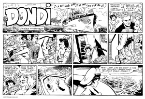
Irwin Hasen was a mentor and friend to Toth and by the artist’s own account, another prime influence on his work. Hasen gave the authors many quotes, but his artwork is not deemed worthy of a reproduction. In an interview with the author/editor team on TCJ.com, Dan Nadel hones in on this omission and asks, “What did Toth see in (Hasen), as opposed to the flashier, more obviously influential Meskin?” Mullaney reponds, “It could very well be that Alex admired Irwin because he was a working professional that Alex wanted to be. Irwin was certainly among the better artists at DC at the time. It’s a question only Alex could answer.” If one actually looks at Hasen’s work, though, a connection can be seen—-his storytelling, his internal “camera” and page compositions are clear and succinct, his brushwork is fluid and expressive.

Mad fresh: Dondi daily strip by Irwin Hasen
Breezy brushwork by Hasen on a Sunday.

From childhood,  I always could see that Hasen drew appealing comics pages. I trust Toth when he said he learned something of value from his friend’s work—I’d guess that the calculated and deliberate Toth admired the light freshness of Hasen’s handling.

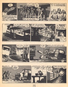
A case is presented that Toth is not much of a writer himself. This is firstly evidenced by an early, incomplete and unseen story, interesting mainly for the rare look at his pencils. Obviously Toth wasn’t happy with it, since he didn’t finish it. He did a later version, “Tibor Miko” from Creepy #77, that wasn’t much better. Then, there is the interminable exposition of his self-written Jon Fury strips for the Army, included here in their entirety or nearly so, although some strips are presented in a badly retouched form (I feel sorry for the production artist who was charged with this task).

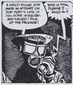
Retouched panel from Jon Fury

In Fury Toth tried to emulate Caniff’s writing but falls flat, most embarrassingly so when he phonetically renders the dialogue of Fury’s Mexican hoax wife in the inexplicably typewritten third storyline. The Jon Fury strips are nearly anomalous in Toth’s corpus in that they are so annoyingly hard to read. Granted, he had a difficult time initiating a script, but usually once he had a script, he was a master at making it work.

In his preface, Mullaney writes that Toth “would accept drawing assignments, ignore the supplied scripts, and unilaterally rewrite at his own discretion.” But—-Toth didn’t ignore scripts and his amendments were never unilateral. Instead, he served the story, he made every effort to find the story’s heart. Any alterations he did on scripts that he accepted were based on his instincts of what the story needed. He did the lettering whenever possible, not only for the aesthetic of his unique hand making the finished page, but for the control lettering gave him to (usually) subtly amend the script and streamline the narrative.  What illustrator has ever taken it upon themselves to alter the text of a story? It isn’t done. But Toth continually proved that he deserved such freedom in interpretation and in his efforts, he certainly shortchanged no one. Ironically, even his least sympathetic editors and writers have been the beneficiaries of Toth’s unpaid improvements—his works are often the jewels of their careers.

The overwhelming majority of the scripts Toth drew would hold no interest today if he had not drawn them. An exception is the transcendent yet faithful enhancement of Harvey Kurtzman’s “Thunderjet” that is reprinted here. However,  Toth was unable to adhere to the writer/editor’s exactingly articulated layouts for their most brilliant collaboration, “F-86 Sabre Jet” from Frontline Combat #12.

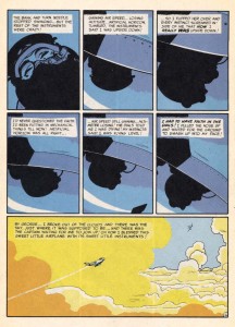
F-86 Sabre Jet: one of the best pieces either man ever did.

As can be seen from the page above, Toth did not alter Kurtzman’s structure. His offense was that he chose to use oblique silhouettes in the upper tiers, a relatively small change but one which greatly augments for the reader the sense of disorientation communicated by the text and experienced by the pilot.  An angry Kurtzman printed the story, but Toth did no more work for E.C.  Joe Kubert’s later outright rejection of Toth’s Enemy Ace story because of the artist’s alterations to the script is atypical—most of Toth’s editors accepted his improvements. However, these anecdotes do “illustrate” precisely why Toth was not an illustrator. He demanded a level of autonomy in interpretation, even if it meant he would get no further work from a company.

Massive popularity in one’s time is not always a barometer of artistic accomplishment. Toth’s avoidance of the repetition and artistic stasis that drawing series or even full issues of the same character require makes his work hard to find, spread out as it is in anthology titles, and he did not make the regular income that series would have given him. Toth’s son Damon explains, “his integrity was way more important to him than dollars and cents, and he lived by that his whole life.” Yet, the editors insist on supporting the emphasis on character/property that constrains the comics industry and marginalizes peripatetic artists like Toth, by focusing the Dell section on Zorro and including an already much-reprinted story. Although he began with high hopes, the artist disliked the scripts, did not consider Zorro to be his best work and it was the source of the conflicts that ended his Dell employment. His fabulous efforts on some of his other rare book-length Dell comics such as Clint and Mac, Paul Revere’s Ride, No Time for Sergeants and The Frogmen are barely mentioned.

Clint and Mac: a particularly beautiful comic book
A memorable panel from The Frogmen #5

Instead, a twenty page story from Toth’s series of 77 Sunset Strip comics is included, one of the few things in this book that I didn’t already have. It is a bizarre choice, drawn in his more humorous style and it has grown on me, although Toth thought the show and characters were idiotic and this informs his disparately absurd panels, any of which might have been an excellent source for Roy Lichtenstein.

77 Sunset Strip: a no-brainer

Maybe Toth was overqualified to work on such disposable children’s entertainment, but he did it because he was driven to use the comics medium as it stood in his time, to experiment with its properties, to our enrichment. He found ways to believe in the scripts enough to transform them, if not into literary masterpieces, certainly into examples of sophisticated comics storytelling. That sophistication most often came from his skills as an interpretive comics storyteller, rather than from an illustrator’s strict adherence and accompaniment to a set-in-stone text. Toth did well-drawn and designed covers and pin-ups up until the time of his death, but what was missed by his disappointed fans for his two final decades was his approach to comics narrative—and that is where his importance lies.

Perhaps some of my problems with Mullaney and Canwell’s approach will be addressed in their future volumes. However, the second book in the series, the one that will represent his greatest comics work, will be titled “Genius, Illustrated,” a title that makes me despair, whatever the editors’ rationale for using it (“it’s about a genius, and it’s illustrated”). I beg them to reconsider that title, even though there would be some effort involved since the book has been solicited. The term “illustration” describes artwork that accompanies a text, but does not impose upon it. An illustrator has a subordinate role to that of the writer and in bibliographic terms is not considered an author, or a co-author along with the writer of a book. Applying this label to the artist’s part of the collaborative process of comics ignores that comics demand many skills not in the job description of an illustrator, such as staging, timing and the emotive acting of “on-model” characters in the sequential representation of shifting vantage points of movement within three-dimensional space.

Toth had a complex skill-set and a consuming dedication to his art that places his work far above that of his contemporaries. If our greatest interpretive cartoonist is saddled with the “illustrator” label, he is denied what he fought for in his many battles with editors, the frustrations of which surely impacted his personal life, conflicts which grew from his efforts to make some of the greatest examples of graphic storytelling to date. If Alex Toth cannot get his due, then all comics artists who do not write their own scripts, but who contribute a great amount of the narrative content of the comics they do within their drawings, are well and truly fucked.

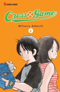
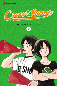
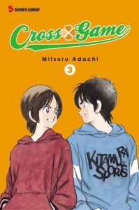
Cross Game– Seven Variations

(this post is a part of this month’s Manga Movable Feast, hosted this round by Derik Badman and the Panelists.)

Cross Game Review Part the First—The Self-Serving Enthusiast

If you haven’t yet purchased and devoured the first three/seven volumes of Cross Game yet, and you have no fear of either sentiment or baseball, then I would that you do so now. Go ahead—I can wait.

Done?

Good.

I’ve tried to avoid writing review-like pieces in my brief spin as a writer, and that’s generally because when I really like something my impulses tend towards a kind of uncritical boosterism, and when I don’t like something, which is, well, most of my life, I seem incapable of having a more moderate reaction to the material that might lead me to being able to even-handedly write about it in a method that would even approximate objectivity. So I haven’t even finished the first full paragraph and already I’ve violated my personal standards for the sake of this series.

So why exactly do I want you personally to buy copies of Cross Game for yourself and all of your friends and relatives? Like most of my motivations, it’s selfish. Adachi is one of my favorite cartoonists, and while I’m pretty damn enthusiastic about Cross Game and his return to baseball, I’m even more thrilled with Touch, his early eighties classic that Cross Game echoes in so many ways. And my ability to one day read Touch in print, in English, depends on you and your deep comics spending. Let’s make this happen, shall we?

Part the Second- Seeing Stars

Punchy plot summary! Adachi Sensei, Oh great flaming star of manga! Four decades of comics! Still alive! Still writing about teenagers! Four stars!!!!

Part the Third, in Which the Reviewer, Failing to Avoid the Worst Aspects of His Own Editorial Impulses, Pens an Overwrought Description of the Book As a Physical Object

For a week this March I slept on a succession of couches, spending the days wandering Seattle with a green duffel filled with a few posessions; my inking supplies, paper, various clothing and toiletries, my spiral notebook, and several books, including the second volume of Cross Game. The fourth day was particularly hard on me—it seemed like there was no where I could just sit and rest for a while without causing a problem for someone else. I kept on thinking about that green-backed volume two, so sleek, compact and inviting, and how it had looked on the night stand next to its partner, back to front, spooning in a little pile, the orange overbalancing the green by its larger size. They seemed so right together at the time, but now they were separated by miles of distance, and by unrelenting necessity.

The cover design is streamline, almost minimalist—painted figures on solid fill, a curly-cue logo and modest indica. It feels slick and modern in one’s fingers, defiantly in opposition to the slightly aged style of the artwork itself. The off-white pages smell of fresh paper and promise that they will stay there, bound together, pressing and yet somehow at rest, until they are one day opened again, held apart by scissored fingers, suspended in the moment of un-touching.

Part the Fourth, In Which the Reviewer Puts Forth a Clever Analogy That, Whilst Possibly Interesting, Won’t Actually Hold Up to Any Scrutiny

Baseball=Making Comics.

No, really. The whole baseball package–the skills building, the isolated mental game of pitcher versus batter, pitcher versus himself, the vast audience waiting to be surprised, entertained, let down, the fate of the game constantly in balance… It’s hard to escape the idea that when Adachi is talking about baseball, he’s also talking about making comics, about the thrill of watching one’s self improve, of pushing, of hitting a barrier only to break through to the challenge previously unseen. Aiming for the top. The sweet satisfaction of an aptitude well-developed, of a lifetime of skill coming to bear on a single moment.

Part the Fifth—Vaguely Related Autobiography

When I was seven I was a member of a coach-pitch little league team called the Pirates. Before each game our coach would give us a mini-pep talk/lecture about how important the day’s game would be, and how we needed to focus and do our best, before sending us off with a team chant: “PIRATES! PIRATES! PIRATES!” I occupied center field, a position which, in most of our games, was more nominal than functional, as seven year olds aren’t generally known for their devastating long drives.

On one particular day, the other team had a flurry of the aforementioned very rare outfield hits, including several that were completely over my head. I did my best to field them, but as the game wore on my failures as an individual had me feeling more and more dejected.

When the game finally, mercifully, came to its punishing conclusion, the coach gathered us all up in the customary circle in front of our Pirates dugout. His face was red and his mustache quivered like a caterpillar beneath his nose. “That was pathetic. You all were pathetic. No, you were pitiful. That wasn’t baseball. That was something… something not baseball.” His shoulders raised and lowered with each breath. “Put your hands in, everyone. Pitiful, on three. Everyone.”

“Pitiful, pitiful, pitiful,” we chanted, some half-heartedly, some through sobs, some shouting as if humiliation were the greatest gift of all.

Part the Sixth, in Which the Reviewer Presents Several Close-ups of the Artwork for the Reader’s Examination


Part the Seventh, in Which the Reviewer Abandons His Conceit for The Pretense of No Pretension

History, and the comics canon, are strange things. What place did Gasoline Alley occupy in critical attentions five years ago? Over the same period of time Yoshihiro Tatsumi has gone from a footnote in manga history to being regarded, to certain English-speaking audiences, as an exemplar of an entire movement.

In both cases, what changed was not the artists themselves, but the availability of their work.

This shifting ground has the potential to drastically change a reader’s reaction to Cross Game. To English-oriented monoglots, who have previously only seen two short story collections by cartoonist Mitsuru Adachi, Cross Game is an assured, uniquely-paced and tempered debut that flicks effortlessly between breezy action and moments of unexpected, intense longing. For Japanese readers, Cross Game is a victory lap. (or, at fifteen 200-page volumes in its original release, perhaps a victory marathon).

Cross Game was initially serialized in Shonen Sunday starting in 2005, when Adachi was 55, thirty-five years and tens of thousands of pages into his career. Adachi has spent most of that career creating clever romantic “comedies” that often feature more than a hint of tragedy and melancholy. More often than not his stories center around young athletes, along with all of the attendant conflicts and triumphs of that world.

Cross Game itself most closely resembles Adachi’s breakout 1983 series Touch, which, following the also-popular Miyuki,  furnished him with his second anime adaptation, as well as his most lasting fame. Several of the elements that make Touch so unusual in the company of other popular entertainments are present, albeit rearranged and realigned. The childhood friends and childhood promises carried into the future. The gently melancholic tone and strangely passive protagonists. The sense of time as a construct of memory, sometimes a fraction of a second in a series of pages, sometimes years in a single frame.

I’ve never read a comic before where both the benefits and potential pitfalls of weekly serialization are so starkly clear. With the aid of his squadron of assistants, Adachi had drawn, at minimum, a thousand pages a year for over thirty five years by the time Cross Game debuted, and the result is some of the most natural, and readable, storytelling I’ve ever seen. Complex actions and coordinated sequences play out effortlessly, several lifetime’s worth of breakdown skills and gesture drawing coming to bear on the trickiest problems. But the solutions themselves never veer into overly-flashy results, instead using a myriad of design solutions to preserve a clear, natural path over the most seemingly-complicated layouts.

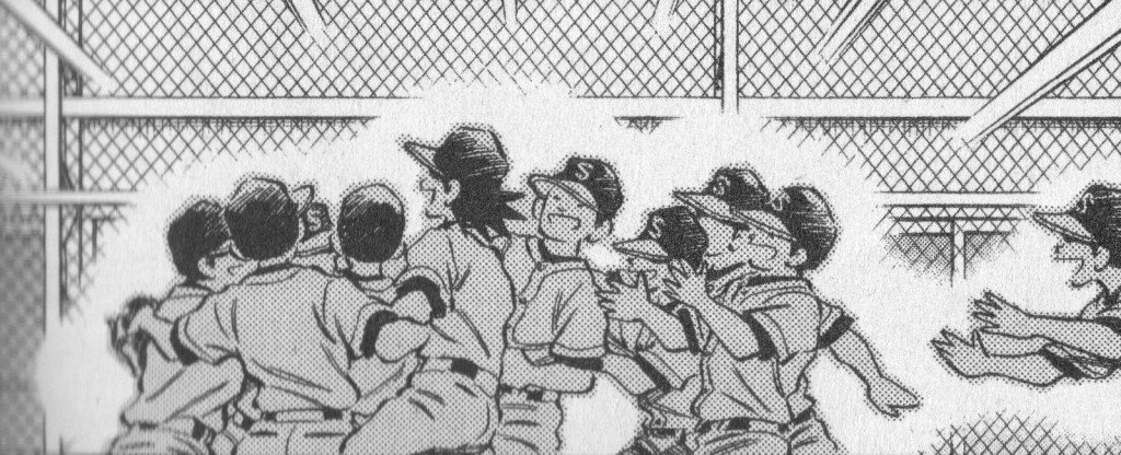
The sheer amount of pages available to him by virtue of his assistants means that Adachi can afford to tell a different kind of story. It’s hard to imagine a better way of depicting baseball sequences than the method that Adachi has arrived at over his thousands of pages of baseball manga. Just like our memories of a real game, we come in and out of the action, the narrative sometimes summarizing, sometimes lingering. In comics, time is a function of space, and Adachi has the space to give us time.

Adachi also uses this space to leisurely unfold the action, giving us quiet moments of reflection between actions, sometimes serving as transitions, and other times acting as a pause, a moment of breath in the midst of so much action and movement.

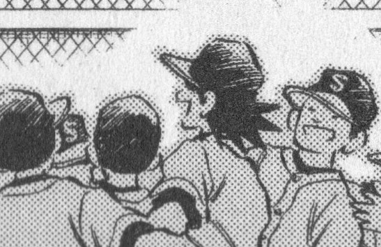
And then there are the downsides to that unrelenting weekly crunch. All those assistants mean professional but at times undistinguished backgrounds, which wouldn’t be as obvious a defect were it not for Adachi’s expressive, calligraphic inking line, which is sometimes at odds with the comparatively dead line weight of the backgrounds. More damning, occasionally a chapter seems to be just marking time until the next main plot movement, and these deviations from the overall arc have the added problem of often veering into genre cliché. (the most egregious example so far is a first volume detour involving beaning a fleeing criminal with a baseball)

The improvisatory nature of the story line sometimes trips Adachi up as well. With certain major plot points it seems impossible that Adachi didn’t plan them well in advance, as the needed elements are in place well before the events themselves. Other times, however, Adachi succumbs to the dreaded serial fiction trick of introducing a new element pages before it will be called into use, drawing attention to the artificiality of plot construction itself. Occasionally Adachi, through his narrator voice, draws attention to this himself, presumably with the intent of diffusing the awkwardness with some humor, but not always to good effect.

Ultimately, though, Adachi’s faults are more Freaks and Geeks than Friends, a result of his ambition rather than a lack of same. His failings, when they arrive, are forgivable, and seeming part and parcel of the weekly manga treadmill. Cross Game is assured, confident and wistful, and if you have some tolerance for genre and overt sentiment, there is much here to admire and, most importantly, to experience and enjoy. When you’re aiming for the Koshien, it’s summer forever.

Jeffrey Catherine Jones: The Good Draftsman

The late Jeffrey Catherine Jones (authorized website
here) was not only one of the best painters in North America, she was one of the best draftsmen of the North American comix scene. Idyl and I’m Age, which appeared in the National Lampoon and Heavy Metal, were high-water marks in the now-ebbing comix cult of beautiful draftsmanship. The modern comix renaissance, at least in North America, still prefers to focus on story instead of art and younger readers might be surprised by the bravura virtuosity of Jones’ work. She demonstrated over and over that Beauty was not a shell to put stories into, it could be the story itself.

Why are so many contemporary comix so ugly to look at? Why is there so little pleasure in drawing anymore? Comix artists take such pains in devising interesting, clever plots but visually they’re often rather … disinterested might be the politest way to put it. Perhaps minimalism is the new baroque and Beauty is passé; perhaps it’s a business decision, drawing with one eye on the clock and not worrying about giving readers full value for their money.

Some of these readers are probably wringing their hands over this insinuation that Beauty can be objective. Doesn’t this author know that self-expression has no rules, that we’ve evolved into a brave new world where you can just do it® and be all that you can be® and have it your way®?

But the Bitch Goddess of Art is sparing with her favors and she accepts only one sort of offering at her infamous altar: the development of talent through endless study and practice. An abundant faith in oneself, by itself, means nothing to her, especially in these times when everyone’s above average. Good draftsmanship requires knowledge, skill and a faith in Beauty. The latter is not as subjective as some think. It’s wired into our genes; our eyes and hands do it instinctively if circumstance lets them. And this is not about merely looking pretty. On the contrary, Beauty in art is always harmonious, even when the subject is grotesque or ugly.

Jeffery Catherine Jones’ comix were few but extraordinarily beautiful. She moved fast around slow shapes, letting the physical happiness of drawing suffuse every mark she made on paper. The contrast of loose gestures atop thoroughly composed panels gave her pages a languid, musical dissonance, the connoisseur’s dissonance of Betty Carter or Leos Janacek in their late prime. And unlike most of us ink-stained wretches, her inking and draftsmanship were seamless and in effect, the same thing. This economy of means is the very essence of good draftsmanship.

Making and recognizing good draftsmanship means possessing what’s called a good eye, the ability to see the universal grammar of the visual world. A good eye is not wholly intuitive, it needs to be nurtured through constant exposure to good art.

And there’s the rub — never before in human history have so many artists been so unrelentingly exposed to so much visual rubbish from childhood onwards. As adults, they’re doomed to making marks on paper which are devoid of visual meaning. This is no accident, it is marketing. If one exposes kids to nothing but crap, they will grow up loving crap, talking fervently about crap and passionately defending its crappy reputation, usually with an obligatory dollop of hipster irony. This pop-culture irony, unlike its literary ancestor, reveals nothing of interest though, for it’s a stance without meaning or history or even relevance.

We are what we look at. If we look at garbage we will make garbage and in time, the cycle will close and become self-perpetuating, an endless karmic hell of breakfast-cereal cartoon super-heroes and high-school yearbook doodlings papering over the abyss of a forgotten, glorious past.

Jones’ comix drew deeply from the heady well of fin de siècle Symbolism, the Salon Pompiers, Art Nouveau and the Golden Age of American illustration. This is what her personality and taste preferred although her eye was above illustrative fashions and gimmicks. Good draftsmanship is most timeless when the draftsman understands their past.

This may seem an odd way to eulogize someone but it’s not, it is the best way to celebrate a great draftsman. Life is short for everyone and for comix artists and illustrators, the money is laughable and the hours dreadful. Doing hack work for money is something we’ve all done but to throw up our hands in cynical despair and make it into the dominant fashion of modern comix — why bother to make art at all then, if it’s all about being practical?

So why not go broke with style? Why not make comix that are fun to look at? Why not make comix that make young people want to draw and read and think, instead of becoming cynical about art and craftsmanship and Beauty?

Why not draw like hell, like you really mean it, as if your life and reputation are on the line? Because they are. That’s the essence of being a good draftsman, of using your good eye: everything counts and everything makes it onto the page. Jeffrey Catherine Jones may be gone but her work is glorious, it is a bravura, draftsman’s performance and her comix still make me feel that drawing is worth doing well.