Salammbo

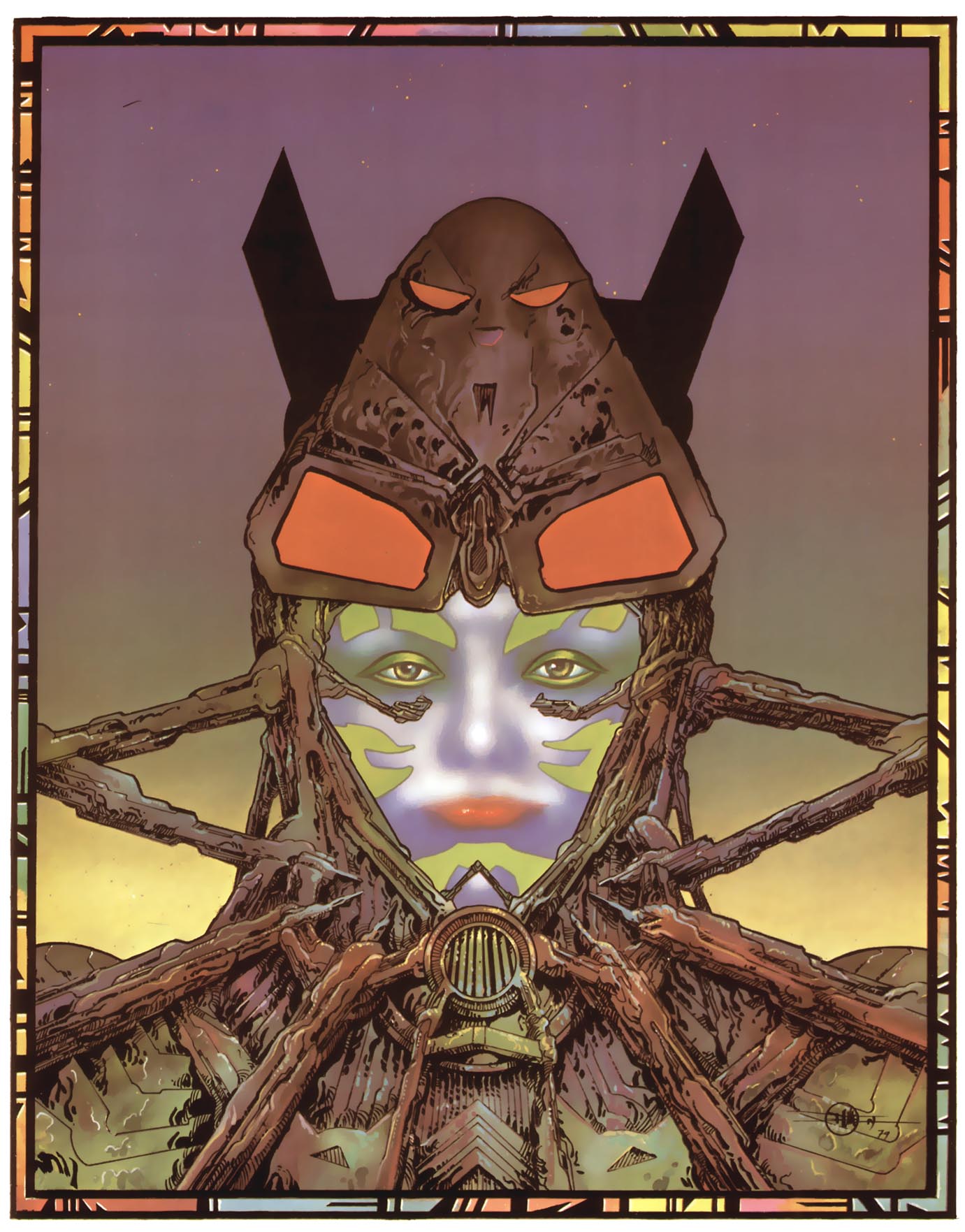
Philippe Druillet is one of those artists, like Moebius, who upon being exposed to his work immediately divides your life into a pre/post situation.  There’s the way you saw comics before Druillet and the way you saw them after.  And like Moebius, he is an artist who despite his work in comics, and hollywood–goes largely ignored by North American audiences above the age of growing up on Heavy Metal magazine.  The only book of his that is easily accessible is the brilliant coda to his Loane Sloane epic, Chaos.  That work sent me down a rabbit hole of works like Vuzz, La Nuit, the Lone Sloane series and others–but through them all there was one work that stood above all of the rest monolithic in it’s splendour.  And that work was his Salammbo trilogy.  Based on the novel by Flaubert which I have not read, written in a language I couldn’t understand–and yet it was the work from which I could not turn away.

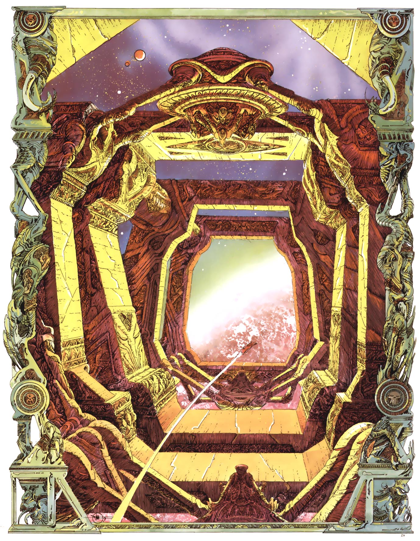
In Salammbo, Druillet combines all of the techniques he had been using to that point in his artistic career to create something finally completely beyond the sum of its parts.  His work here reaches a plane on which a HR Giger or Beksinski painting might sit.  He has created in these ecstatic sublime future primitive tableaus a procession of almost religious holiness.  This is an all A-sides album.  Just banger after banger after banger.  He is so assured in every element of his composition that you can’t help but be held in rapture with his storytelling.  His coloring palette which to this point would at times overtake the images themselves–is now at one with them, without sacrificing any of their garish insanity.  A lot of these pages presage later work by Brendan McCarthy with their neon airbrushed quality.


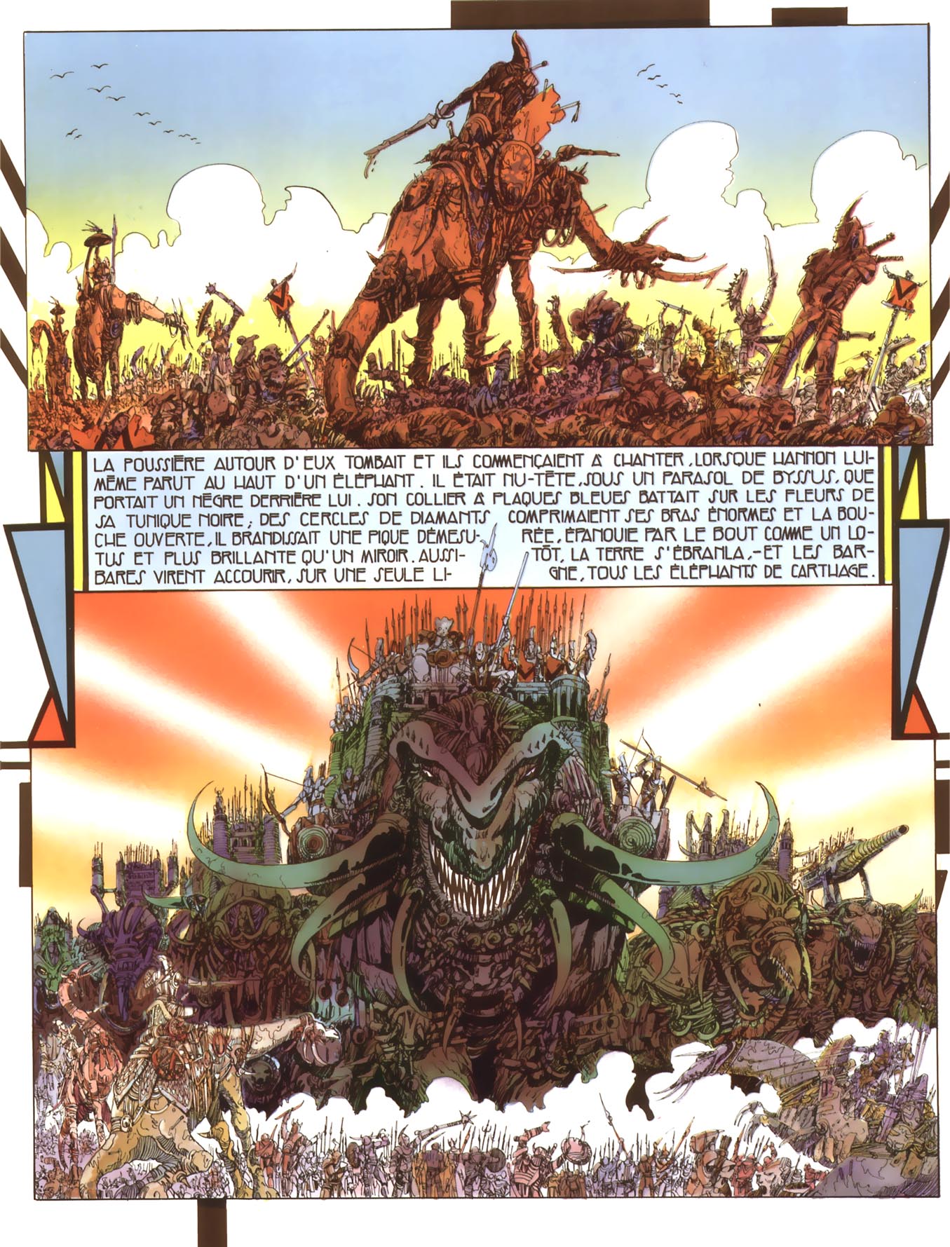
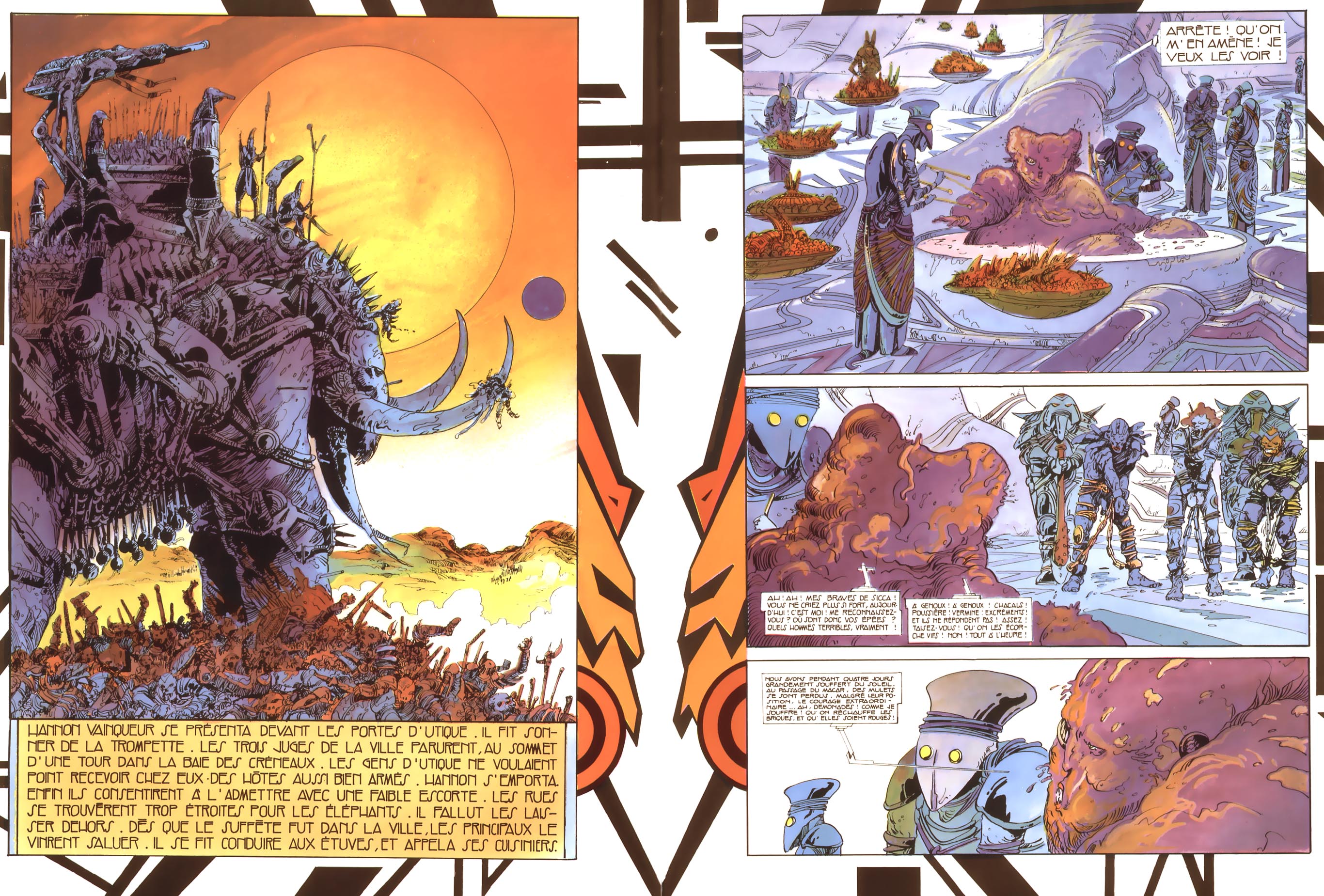
The character designs of even basic background characters in Salammbo are stunning.  There are no cut corners here.    So when you see these epic battle scenes–the scale can only be described as positively apocalyptic.  The only modern comparison there is is James Stokoe’s work on Orc Stain.  But this is a scale even beyond that.  Where in Orc Stain a battle scene might involve hundreds flying around with giant beasts and crumbling buildings–with Druillet it’s hundreds of thousands, filling the page–almost threatening to explode it with their strange alien fashions until they finally fade off into the distance of the horizon.


And the detail is enough to make you want to quit ever trying to create comics.  Pure fuck you pages.  The amount of thought and storytelling Druillet puts into a simple headdress is enough to make you want to just go home.  Every dress, every helmet–seems to have it’s own mini-opera playing itself out in it’s designs.  Stories within stories within stories.  I can’t even imagine how large the originals for these pages had to have been.  Some of these pages hit you like murals, even if you are viewing them on a tiny mobile phone.


This is a comic which transcends its own language.  It is a work that in terms of wild imagination made manifest rivals the greatest universes sci-fi has created in any visual medium.  The cumulative effect of page after page of this is a testament to the insane rarefied air that this medium can exist in.  There is not another medium that can convey more processable information per square inch than the comics medium–and Druillet stretches that maxim to it’s zenith.  You could not hope to duplicate this work in any other medium without lessening it.

And the master here in just the bordering techniques that Druillet has become synonymous for is simply stunning.  Generally speaking when other artists have tried cutesy things with their borders–their achievement at best languishes on the shores of ignorable embellishments–but with Druillet the panel border IS the panel is the story is the image as the whole.  They make the pages mythological to take in.  It’s a technique he’s pulled from religious art practices–but in Salammbo he has finally sublimated that technique into his own language.  In Salammbo we have the revealing of the true Druillet speaking authoritatively in his own voice, beholden to none.  And he does this all…IN AN ADAPTION of someone else’s novel.  Which is kind of just showing off.


And while all of Druillet’s work is terrific and worth finding if you can–Salammbo is the one work that if I had to sell someone on Druillet, as being on par with Moebius in terms of significance in comics, Salammbo would be that comic.  Of course, as with Moebius, I’d take just about anything I can get at this point.  I know the comic industry isn’t like this cosmic juggernaut of making good things happen to good books–but it is hugely embarrassing that works such as this are not more easily accessible in the North American market.  Kevin Eastman and Heavy Metal Magazine seem like the only people who give a damn.  Which is messed up.  We need another Kevin Eastman to come in and push this stuff back into the fold.
 

Spider-Man: Wordless Destiny

There were a lot of great story arcs written during the Silver Age of Comics, which most comics historians agree spanned the years 1956-1970. But the best one, in my opinion, “If This Be My Destiny,” was published as a three-part story in “Amazing Spider-Man” issues 31-33, cover-dated December 1965 through February 1966.

But before we can analyze exactly why the story was so special, we first need to identify who the key player was in its creation, layout, pacing and overall story.

Stan Lee was attributed as the “writer” of the story in the credits, but he, as I discuss below, had nothing to do with the story arc’s creation. For while he wrote the dialogue after the pages were laid out and drawn, he did none of the plotting, and had zero input on the pacing, basic character interaction, mood, and story direction. All of that was done by artist Steve Ditko.

The “Marvel Method” of creating comics during this period was peculiar in that regards, especially for Lee’s top bullpen artists Ditko and Jack Kirby. When the process was first implemented by Lee in the early 1960s – ostensibly to save him the time of writing a full-blown script – he and the artist of a particular comic book would have a story conference, work out a plot, and the artist would go home and draw out the entire issue. The finished pages would then be given to Lee, who proceeded to add the dialogue.

But by the mid-1960s, Kirby and Ditko were so good at creating and plotting stories that Lee himself admitted in a number of interviews that he often had little or no input for story arcs. In fact, he often would have no idea what the story for a particular issue was going to be about until after the pages were delivered by the artist.

Lee himself details this Marvel Method process in an unusually candid interview he did for “Castle of Frankenstein” #12 (1968), a magazine that covered popular culture from that era:

“Some artists, of course, need a more detailed plot than others. Some artists, such as Jack Kirby, need no plot at all. I mean I’ll just say to Jack, ‘Let’s make the next villain be Dr. Doom’… or I may not even say that. He may tell me. And then he goes home and does it. He’s good at plots. I’m sure he’s a thousand times better than I. He just about makes up the plots for these stories. All I do is a little editing… I may tell him he’s gone too far in one direction or another. Of course, occasionally I’ll give him a plot, but we’re practically both the writers on the things.”

This was also true with Ditko and his early Marvel Method process on “Amazing Spider-Man.” He and Lee would have a story discussion, after which Ditko would leave, pencil out the story and then, inside the panels, write in a “panel script” (suggested dialogue and narration). He would then bring the pages back to Lee and they’d discuss the story from start to finish. Ditko would annotate any changes outside of the panels, and then he’d leave the penciled pages with Lee. Lee would then write in the final dialogue and the book would be lettered. Ditko then picked up the lettered pages, and made any of the annotated changes during the inking process.

But Lee really had no long-term vision for Spider-Man. He never thought about what he would do with the characters from one issue to the next. He’d just say, “Let’s make Attuma the villain,” and Ditko would have to talk him out of it. The glue that really held the Spider-Man direction and continuity together in those early days of the character was Ditko.

Over time, Ditko received more and more story autonomy and character development latitude that by about issue #18, he was doing the sole plotting chores with no input from Lee. But it took time for Lee to give Ditko what was then unprecedented plotting credit, beginning with “Amazing Spider-Man” #26 (July 1965), and ending with Ditko’s last issue, #38 (July 1966).

As with many aspects of those murky creative days at Marvel, Ditko’s credits raise questions. For example, why did Lee agree to give Ditko plotting credit, but not Kirby, whose “Fantastic Four” and “Thor” plotting autonomy was apparently quite similar? And why did Lee, when he finally did start giving artist and plotting credit to Ditko, suddenly, after one issue, expand his own credits from “writer” (his standard credit line for the first 26 issues of “Amazing Spider-Man”) to both “editor and writer”?

Around the time Ditko began receiving plotting credit, a rift between the two arose and, according to several Marvel staffers, was so acute, Lee would not speak to Ditko. It was during this year-long communication blackout period that Ditko wrote his Spider-Man magnum opus, “If This Be My Destiny.”

Additional evidence that Lee had no story input during this period can be found in “Amazing Spider-Man” #30, which set the stage for Ditko’s historic three-issue story arc. In that issue, the villain is a thief named The Cat, but Ditko also introduced, in two different parts of the story, henchmen for The Master Planner – the surprise villain for the “Destiny” story arc that was to start in issue #31. Yet because communication between Lee and Ditko had ceased, Lee had no idea who the costumed criminals were and misidentified them as The Cat’s henchmen – which, upon close examination of the story, makes no sense. It’s not until the next issue that the error becomes obvious to Lee and he gets a better grasp of Ditko’s storyline.

So, now that we have a better understanding about who created what for this historic story arc, exactly what is it that makes Ditko’s “Destiny” so great from both a literary and artistic standpoint?

How does one go about measuring greatness? After all, there are no established standards for greatness in comics, or, for that matter, the two creative disciplines that are merged to create them: art and literature.

Some argue that great art or literature is timeless, and that it appeals to our emotions in a compelling and riveting way. Others argue that it is something that breaks new ground.

Ditko’s three-issue story arc easily accomplishes all three, and a lot more.

We can glimpse Ditko’s personal, objective views about what constitutes art from his recorded statements for the 1989 video, “Masters of Comic Book Art.” Ditko said that based on Aristotle’s Law of Identity, “Art is philosophically more important than history. History tells how men did act; art shows how men could, and should act. Art creates a model – an ideal man as a measuring standard. Without a measuring standard, nothing can be identified or judged.”

It’s clear to me that Ditko, through his stories and art in “Amazing Spider-Man,” was striving to do just that: mold Peter Parker/Spider-Man into a positive heroic model.

Throughout his career, Ditko has always been a creative, experimental, thinking-man’s innovator. It was evident in his costume designs, character portrayals, settings, lighting, poses, choreography, etc. – literally every aspect of the comic book creative process. For example, no one before or since has created anything like Ditko’s multi-dimensional worlds for his Doctor Strange character. And his creative depictions of Spider-Man’s costume, devices, movement through space, and overall look set the standard for every single Spider-Man artist who has followed. I’ve been a fan of his work for 45 years, and to this day, I still marvel at how Ditko was able to take the totally fantastic and make it seem like it could actually be real.

Ditko was innovative in other ways as well. Unlike many of his contemporaries back then, Ditko had an eye on continuity, and started meticulously planning story arcs and sub-plots many months or even years in advance. Such was the case with his slow and methodical development of the Green Goblin‘s secret identity over a multi-year period, and his tantalizingly slow introduction of Mary Jane.

Ditko’s development of his “Destiny” story arc in “Amazing Spider-Man” #31-33 was no different. Ditko planted the initial seed for the arc way back in issue #10, when Peter Parker provided blood during a transfusion of his seriously ill Aunt May. As regular readers eventually found out, Parker’s selfless act of kindness turned out to be a ticking time bomb for his frail aunt, who began suffering ominous fainting spells in issue #29, and again in issue #30.

As I mentioned above, the mature, heroic side of Peter Parker and Spider-Man had been building for many months before the “Destiny” story arc kicked in – a steady drumbeat that would soon reach a deafening crescendo. At the same time, Parker was enduring important emotional lows and highs. For example, his long relationship with Betty Brant had been pulled wire taut in the months preceding “Destiny,” and was at the breaking point. Likewise, Parker graduated high school in issue #28, and was about to go off to college and enter what he hoped was a new and exciting chapter of his life. But despite his emotional roller-coaster rides, it was clear to the regular reader that Parker was growing more mature, determined and focused both as a normal person and as Spider-Man. He was no longer the silent doormat for his boss, J. Jonah Jameson, his high school nemesis Flash Thompson, or any other negative influence in his life.

It was at this convergence of events where “Destiny” began, and the reader soon found out just how mature, determined and focused Parker and his alter ego would be under the most harrowing of circumstances – circumstances that would have the highest emotional stakes imaginable for the character.

As the three-issue story arc opened with issue #31, the stage is set for what’s to come when Spider-Man stumbles across the Master Planner’s men fleeing, via helicopter, a location where they have just stolen some radioactive atomic devices. A battle ensues, but they escape. It is during this escape that the Master Planner’s underwater refuge – a key location later in the story – is revealed.

The scene shifts to Peter Parker’s home, where he waves goodbye to his Aunt May before heading off to his first day of college. The reader can see that she is gravely ill, but she’s doing her utmost to hide it from her nephew so he doesn’t worry. When Peter returns later that day, she can hide it no longer and collapses in his arms. Her illness is so serious, their family doctor admits her to a hospital. Peter is by her side until she falls asleep, and heads for home. Here the emotional roller-coaster starts its journey again as Peter tries to juggle college, lack of sleep, mounting bills, and Aunt May’s illness all at the same time. But Aunt May’s illness overshadows everything else and his new classmates find him aloof and distant.

As his money pressures mount, Peter changes to Spider-Man so he can look for news photo opportunities around the city – as taking news photos for “The Daily Bugle” is his only source of income. He gets a tip that a robbery will be taking place at the docks that evening, and when he arrives, he once more finds the Master Planner’s men attempting to steal a ship’s radiation-related cargo. Another battle ensues, and they escape again – this time into the water using scuba gear. As the issue comes to a close, an unseen Master Planner, in his underwater lair, mulls how Spider-Man is thwarting his attempt to use radiation secrets for nefarious purpose. But the final three panels are far more ominous: the doctors caring for Aunt May have finished their tests, and conclude that she is dying.

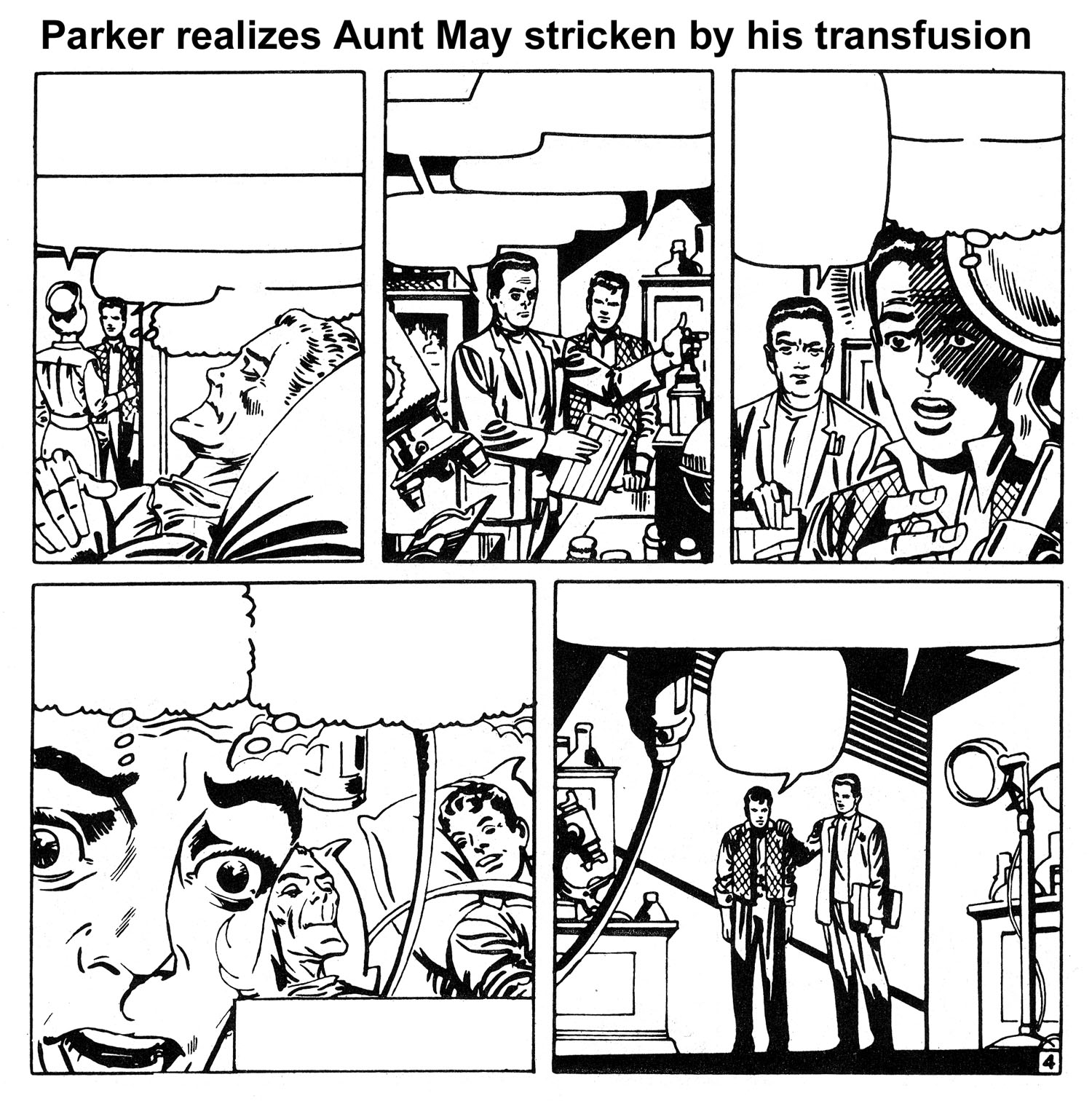
Issue #32, “Man on a Rampage,” opens in the Master Planner’s underwater hideout, and we quickly find out that he is actually none other than Dr. Octopus, one of Spider-Man’s most dangerous foes. The scene then shifts to Peter, whose relationship and money problems keep mounting. But things get even worse when he visits the hospital and the physician attending to Aunt May informs him that her terminal illness is being caused by an unknown source of radioactivity in her blood. Peter immediately realizes that the radioactivity must have come from his contaminated donor blood which Aunt May received during a transfusion many months earlier for a different illness.

And while the radioactivity is harmless to him, it is having a devastating effect on Aunt May. So not only was young Parker responsible for the death of his Uncle Ben when he first became Spider-Man, he may soon be responsible for the death of Aunt May. This emotional realization is perfectly portrayed by Ditko, along with Peter’s vow that he will not fail at saving a loved one again.

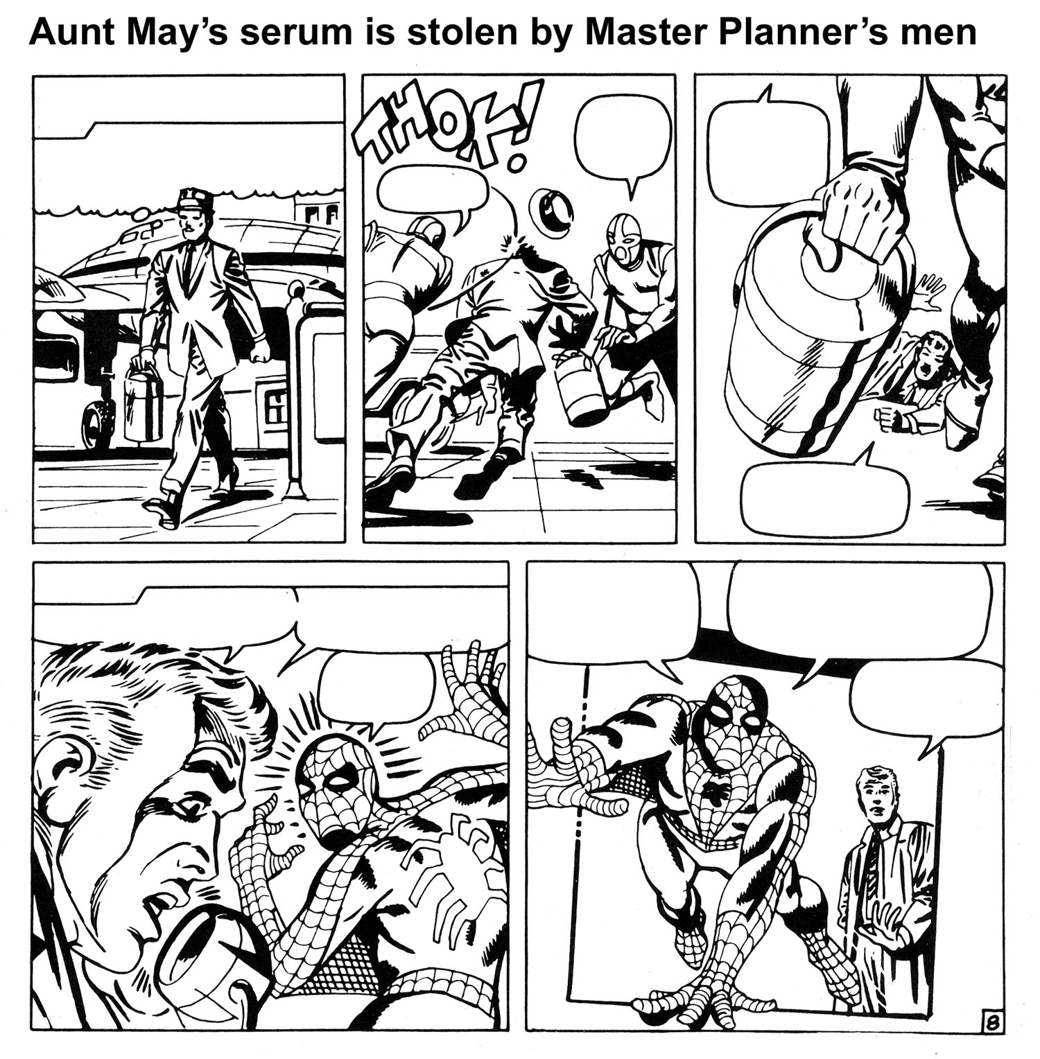
Parker then gets an idea. He tracks down Dr. Curtis Connors (aka The Lizard) – a blood specialist who he hasn’t seen since issue #6 – and, as Spider-Man, gives him a stolen vial of Aunt May’s blood, and begs him to see if he can discover a cure for his “friend.” Connors agrees and after some tests says that an experimental serum called ISO-36 might help – but it will cost money. Parker leaves, hocks all of his personal laboratory equipment, gets the money, and returns to Connors’ lab as Spider-Man. While they wait for every available bit of the rare serum to be express-delivered from across the country, Parker, a budding scientist in his own right, helps Connors with some preliminary lab research. Suddenly, Connors gets a phone call informing him that the ISO-36 was stolen by the Master Planner’s henchmen, and Spider-Man explodes into action.

In an effort to find the precious stolen serum, Spider-Man literally does go on a rampage, snatching up criminals and stoolpigeons, smashing down doors and rooting through every underworld nook and cranny across the city for any possible leads. As the clock ticks, we see Aunt May slip into a coma, Dr. Connors patiently waiting, and a desperate Spider-Man becoming more and more frantic.

Suddenly, after swinging into a blind alley, his Spider-Sense points him to a hidden trapdoor leading to the underground tunnel entrance for the Master Planner’s underwater hideout. Battling through dozens of henchmen, he slips through a sliding doorway into the tunnel. Alerted by one of his men that Spider-Man is searching for the stolen ISO-36, Dr. Octopus decides to use it as bait so he can kill Spider-Man, once and for all.

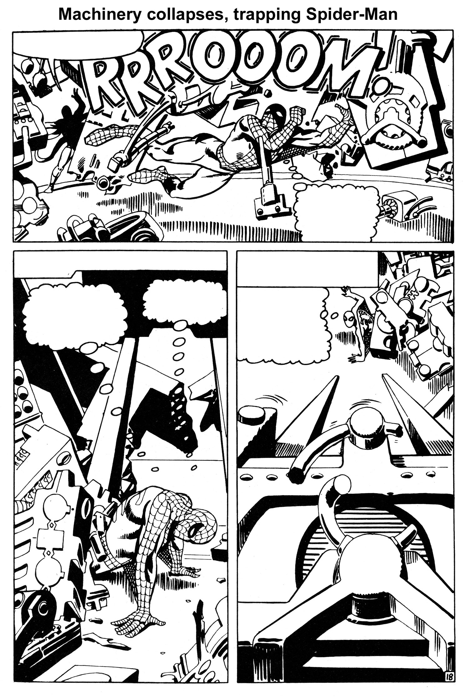
He places the serum in the middle of the cavernous domed main room of his underwater lair, and waits. Spider-Man enters, and despite a last-second warning by his Spider-Sense, the trap is sprung and a raging battle ensues. But Dr. Octopus soon finds out something is different this time, as Spider-Man is fighting like a man possessed. Startled, Dr. Octopus quickly shifts from offense to defense, and within minutes is no longer fighting, but trying to find a way to escape the madman he is facing. A main support beam is shattered during the fight, and as the machinery inside the dome begins collapsing, Dr. Octopus slips away. But Spider-Man is trapped.

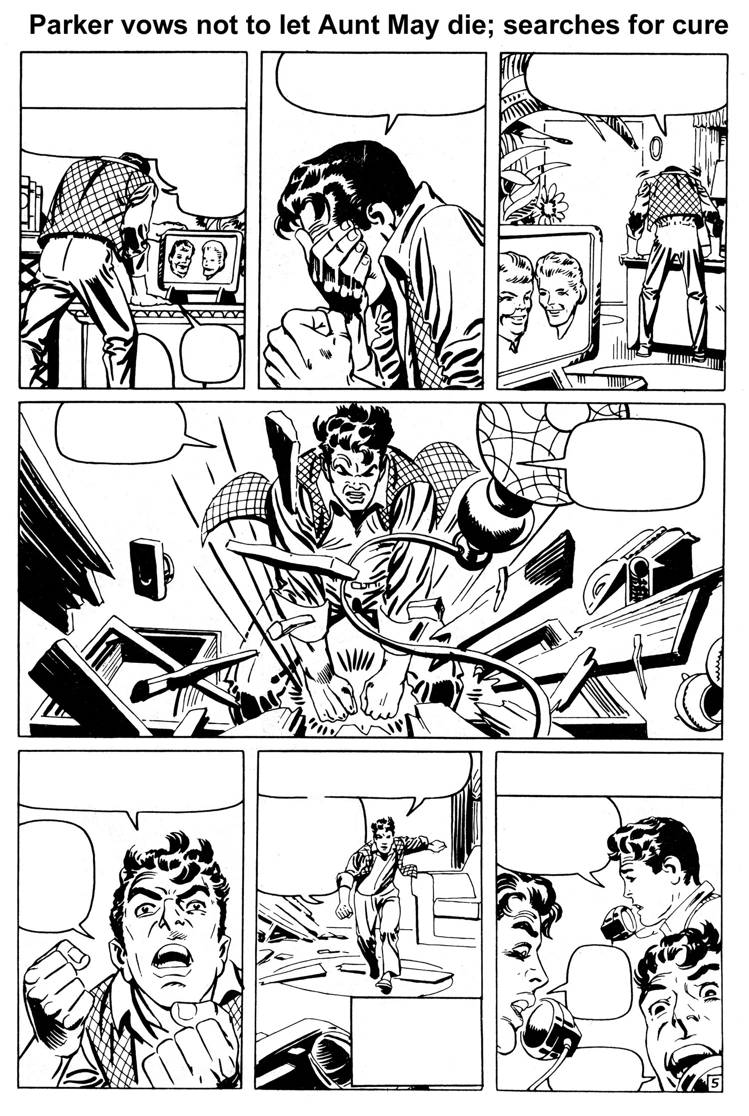
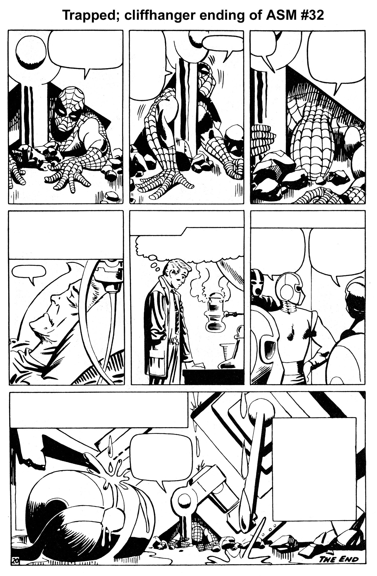
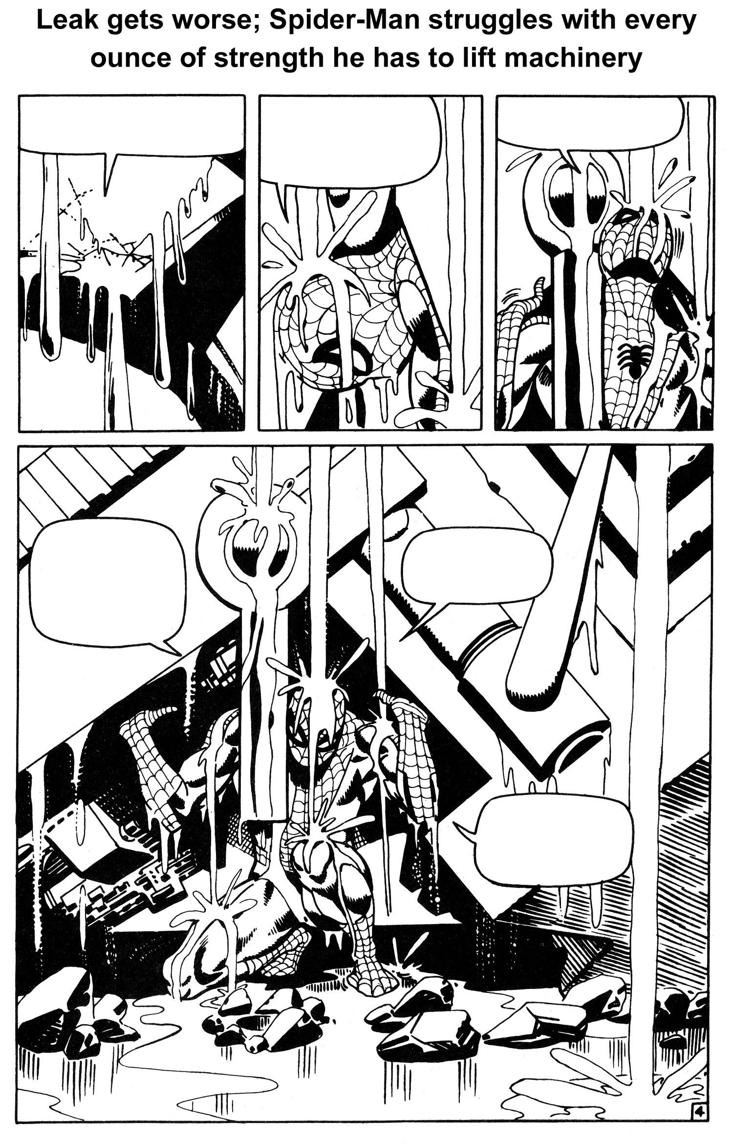
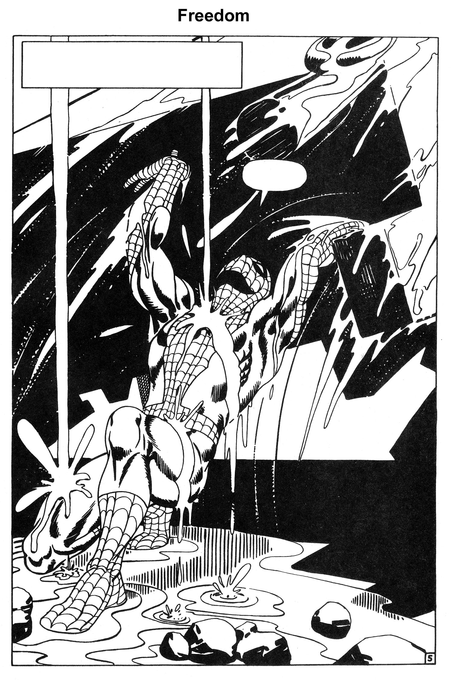
For the last three pages of issue #32 and the first five pages of issue #33, Ditko creates the most masterful bit of sequential art of the Silver Age, and possibly ANY age. It is an artistic tour de force that needs no words to convey the story. The drama, stakes and emotional tension of the main character could not possibly have been wound any higher as issue #32 came to a close. And I don’t think there was a sentient reader alive back then who wasn’t gnawing his/her fingernails to the bone waiting to find out what was going to happen in issue #33.

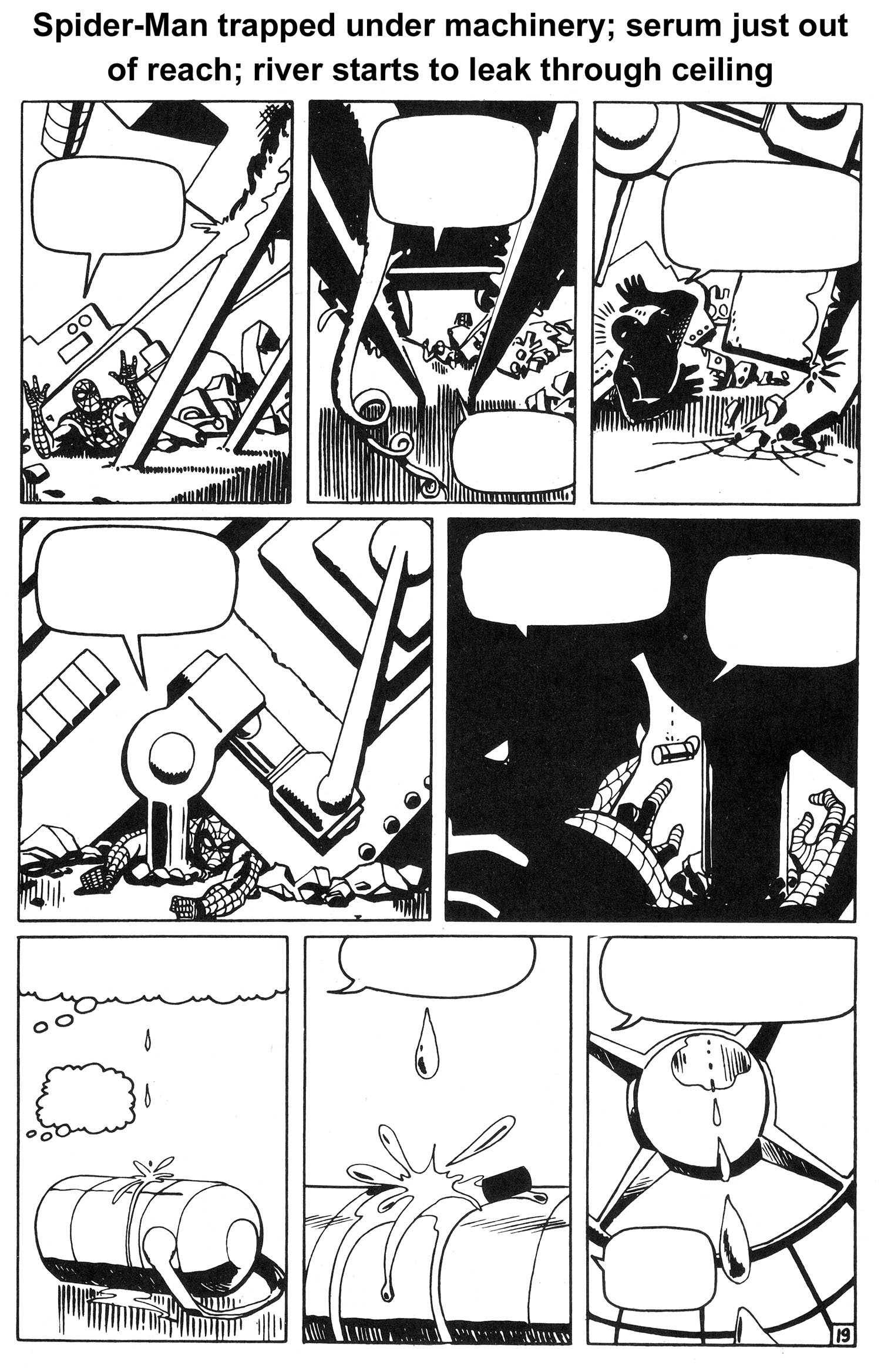
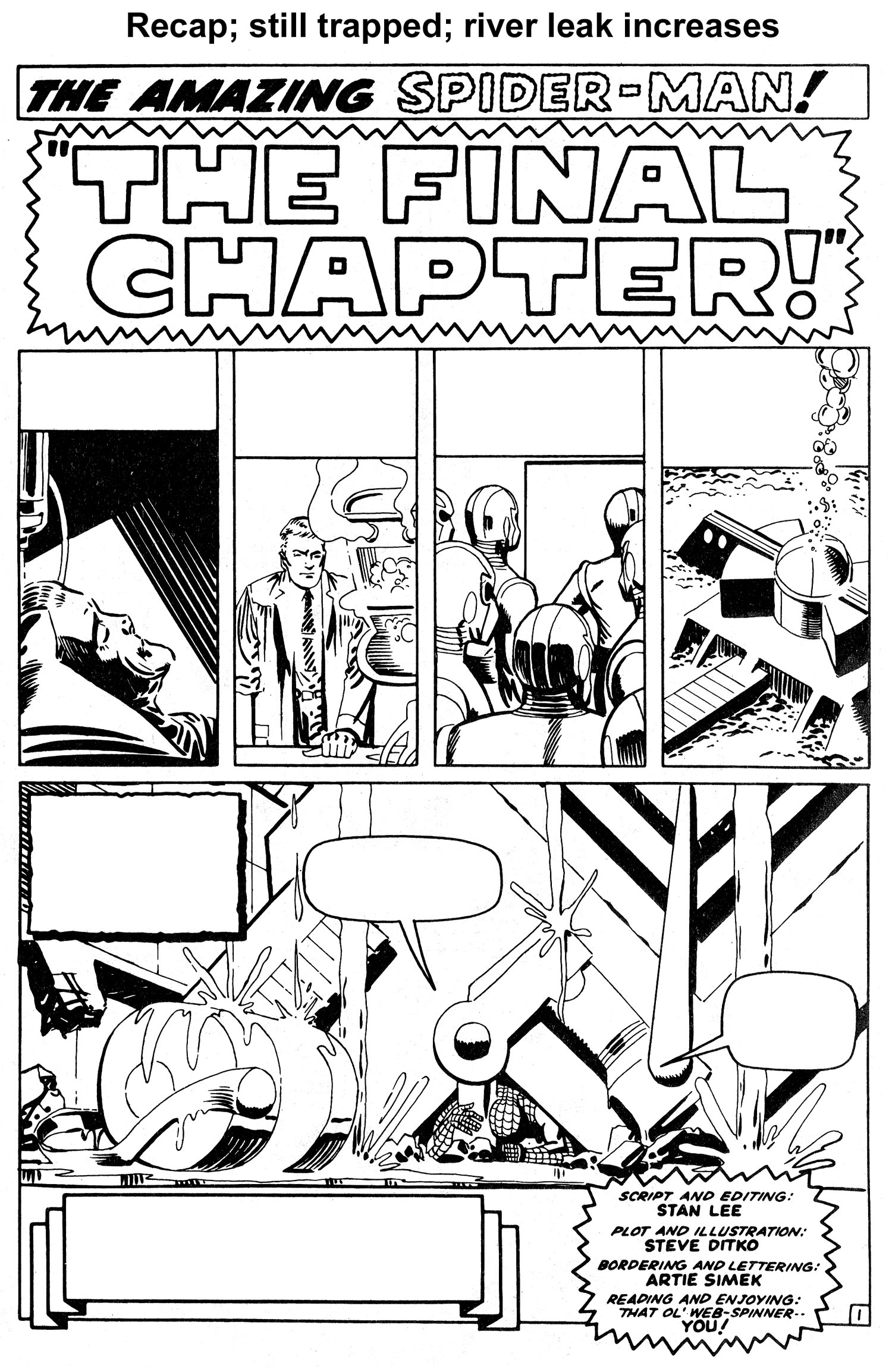
As issue #33, “The Final Chapter,” opens, the powerful visual sequence begun in the previous issue continues. After a four-panel recap, we see a hopelessly-trapped Spider-Man buried under the weight of an enormous mass of machinery as the main room of the underwater hideout of Dr. Octopus begins to flood. Aunt May is dying, and the serum he needs to save her lies on the floor in front of him, just out of reach.

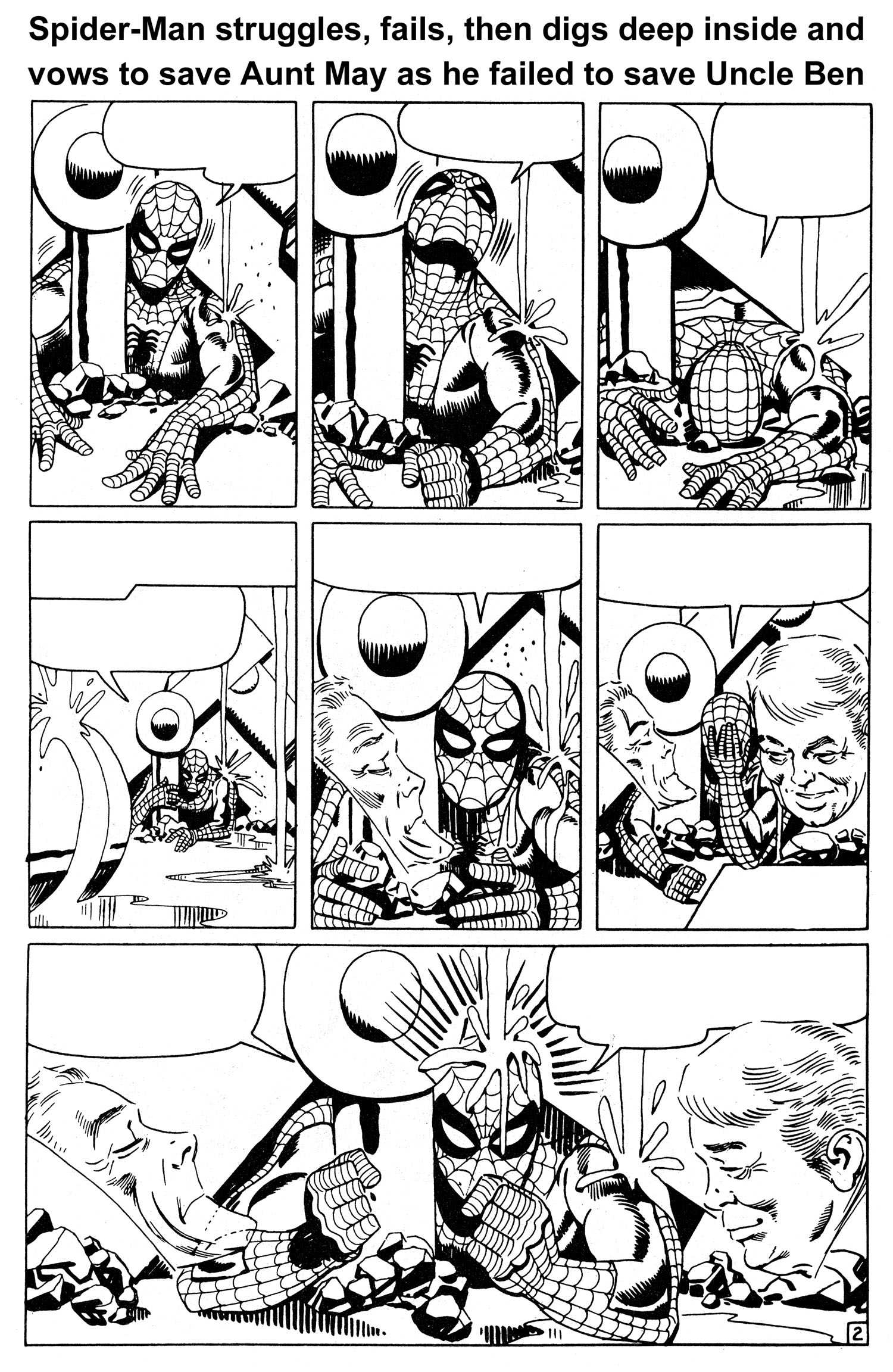
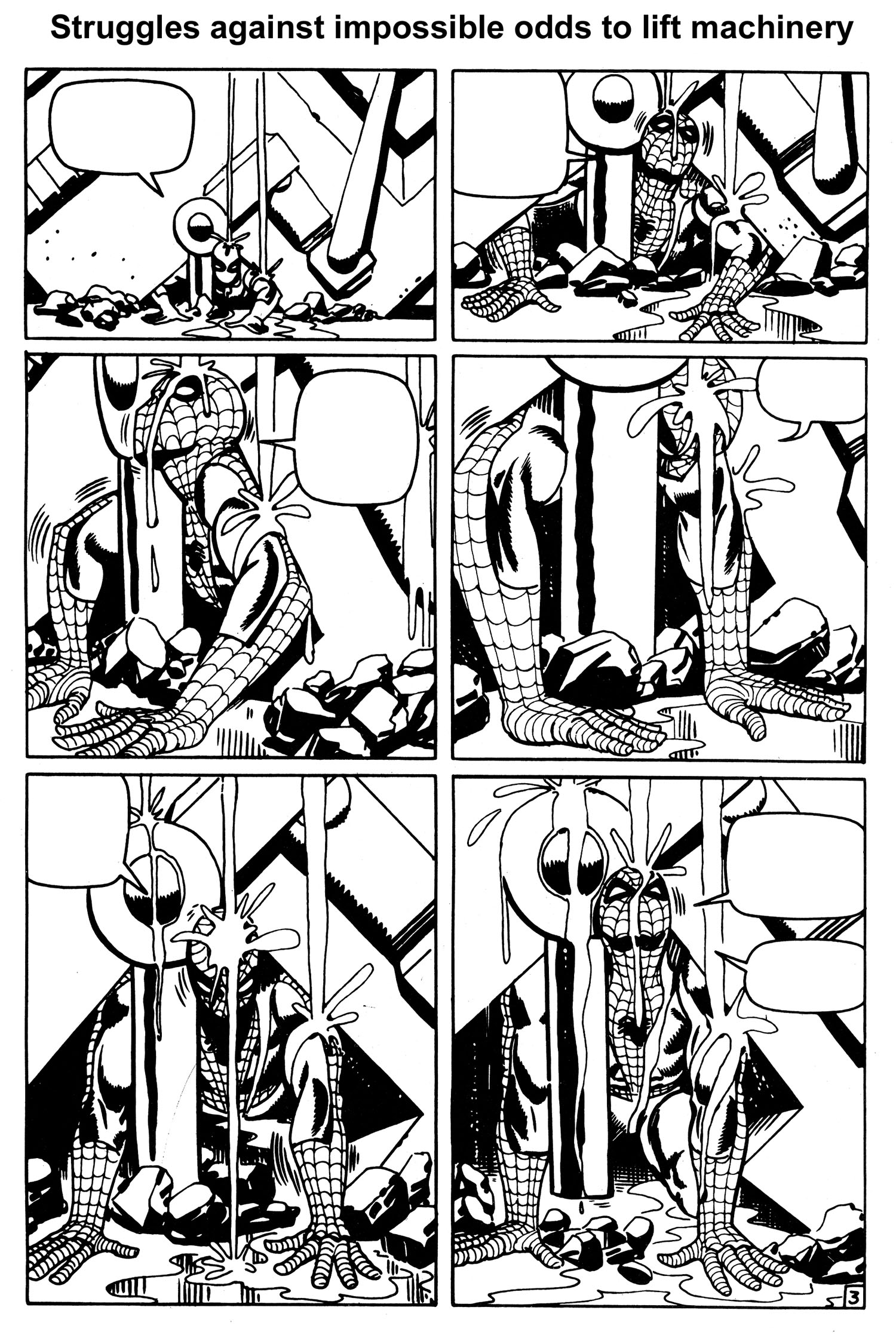
And just when you think it’s over for Spider-Man, and that he’s doomed to die, he once more thinks of Uncle Ben and Aunt May, taps a latent reservoir of sheer will and determination from his innermost being, and attempts one last time to break free. Ditko captures the agonizing struggle pitch perfectly, with sequential pacing that rivals that of the best comic book or film. And with one last mighty heave, he’s free (See Figures 7, 8, 9, 10 and 11).

But Ditko’s not finished. During the next 15 pages, Spider-Man must overcome even more physical and emotional adversity to save his aunt. But I’m not going to spoil the entire story arc. Grab a reprint of issue #33 and finish it yourself. You won’t regret it.

A few final points about the “Destiny” story arc and Ditko’s often underappreciated creativity.

First, the reason I showed wordless versions of the story’s pages was two-fold: to show how visually powerful Ditko’s storytelling abilities were, and to highlight just how crucial artists like Ditko and Kirby were to creating stories using the Marvel Method during the Silver Age.

Second, I want to make sure everyone understands just how much responsibility the artist had back then. In cinematic terms, Ditko not only co-wrote the screenplay, he was the storyboard artist, director, film editor, casting director, cameraman, cinematographer, production designer, costume designer, art director, stunt director, and set designer. Lee, on the other hand, co-wrote the screenplay, and did the “sound” editing.

So, while Lee’s dialogue certainly enhanced the story, Ditko was the creative force behind almost everything else. In that regards, if the story were a Corvette, Lee applied the paint job, pinstripes and some of the detailing, but Ditko designed the car, crafted all the parts, and assembled it.

‘Nuff said!

Return to Sender

This was originally published in Tagesspiegel. It is translated by Marc-Oliver Frisch.
_______________________

Although, as with Abecederia, Blexbolex is once again paying tribute to pulp culture, he remains best known for his children’s books: People, for instance, received a “Most Beautiful Book in the World” award at the Leipzig Book Fair in 2009. But in his works for mature readers, the beauty results from the composition of horrors founded in reality as well as in fantasies produced for a mass audience.

And so, one line tells all about No Man’s Land, Blexbolex’s most recent pulp-culture tour de force: “At the end of the road I see on the top of the highest mountain the ruins of the same temples made of papier mâché that I once saw in a Tarzan book.” An obviously absurd reference to Tarzan’s dime-novel, film and comics incarnations—after all, without knowledge of the pertinent publishing history and the fact that papier mâché is also known as pulp, such references are inscrutable.

On the previous page, Blexbolex—alias Bernard Granger, a Frenchman now living in Leipzig—refers to the “covers of a science-fiction novel by Roy Rockwood.” Rockwood is a collective nom de plume under which adolescent utopian adventure stories by multiple authors were published at the onset of the 20th century, including Bomba the Jungle Boy, the tales of one of Tarzan’s many epigones.

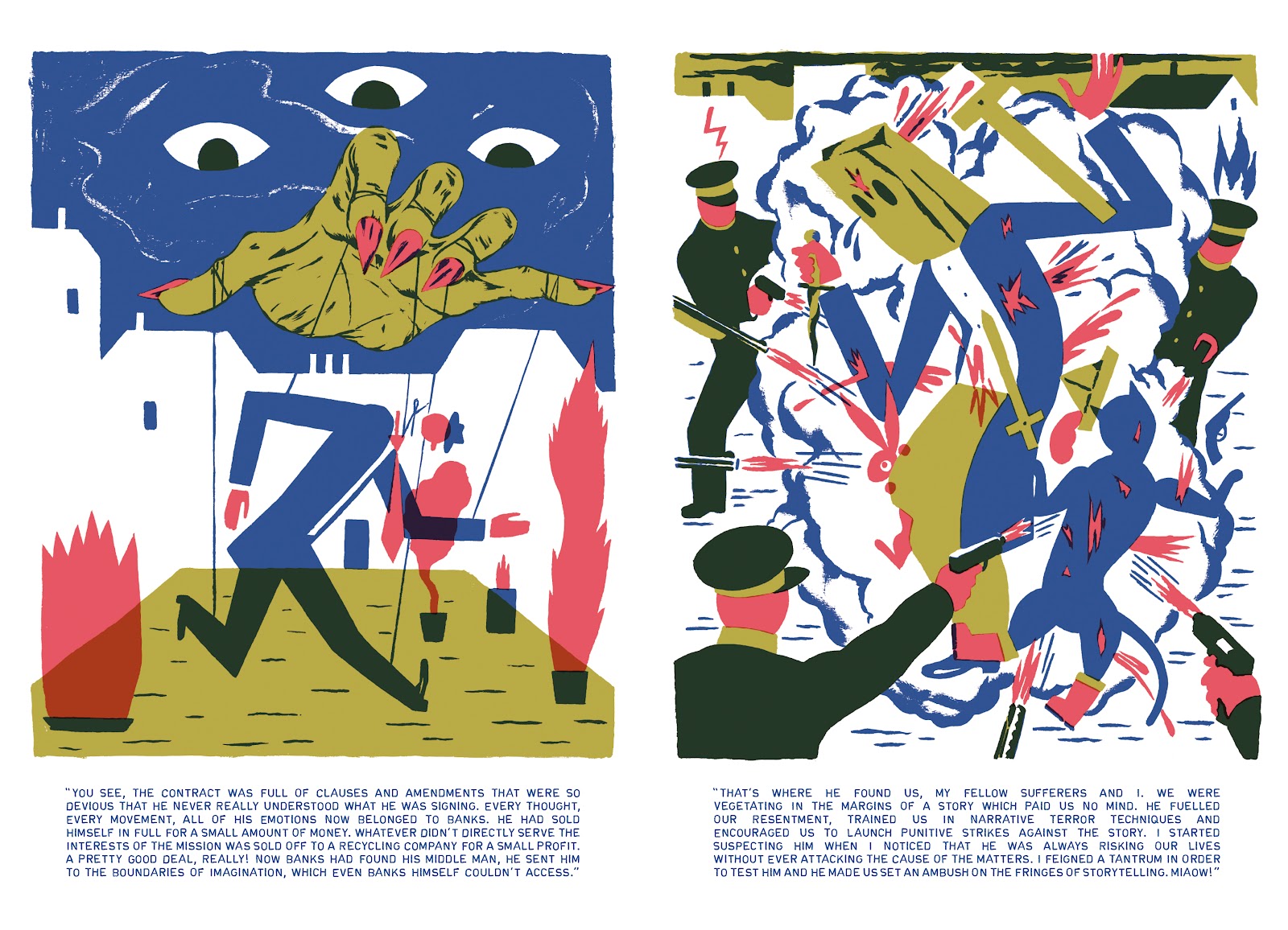
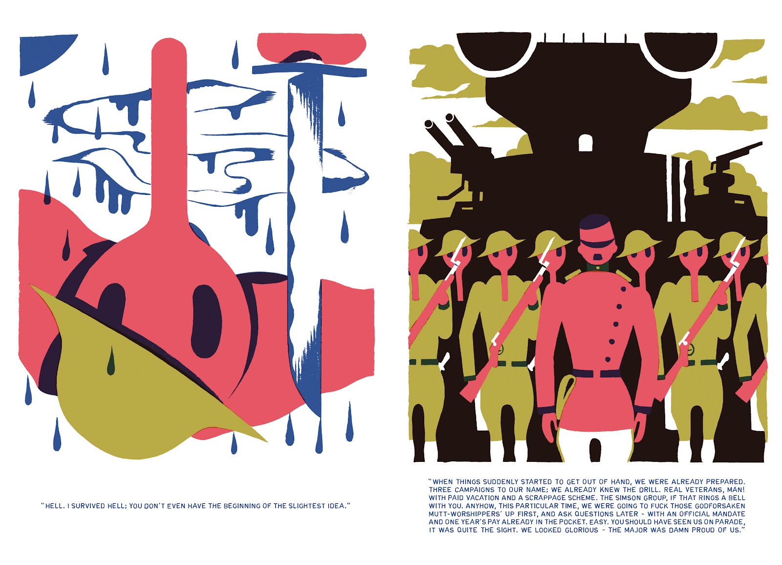
Consequently, the tale of an agent’s attempt at self-discovery in no man’s land, between all fronts, can be difficult to follow. Mainly, this is due to the author’s playful use of meta levels, which involves a nameless narrator visiting classic adventure-genre locations such as submarines, ghost ships or mysterious islands before, finally, returning to his own self. In a recurring motif of this journey, the main character is repeatedly breaking through reflective surfaces, be they windows or mirrors. Thus, the references—in images and words—to the moldering refuse of bygone cultural ages prompt reflections on identity. Blexbolex primarily relies on an associative reception, so institutions with a sense of moral entitlement, such as state and church, may well be depicted here as being circled by instinct-driven sharks. The conflict over the freedom of imagination and, consequently, the future, which is also a struggle over ethics, is illustrated by the character of Banks—a composite monstrosity made of multiple personalities and artificial flesh in whose services the protagonist finds himself—and by the hero’s opponents and intermittent collaborators Gregory Rabbit and Puss in Boots. It is a conflict that is carried out with excessive ruthlessness by both sides, but, at least in moral terms, can be won by neither.

This portrayal of a general lack of orientation is emphasized by references to authors writing under collective pseudonyms, whose interchangeability within the pulp mass-production chain has bred equally interchangeable role models with immutable heroic attributes. Everything seems right and nothing wrong, the means applied degenerate into ends in themselves, and moral boundaries are continually adjusted. Affirmative identification gives way to conceptual randomness. Blexbolex creates wild phantasmagorias of opposites growing ever closer in their approach. He stages them by way of a clear separation of contours made possible through the limited use of colors, as well as deliberately established exceptions from this rule, in which the colors overlap in ways that might seem unintentional.

These graphics, made digitally and sometimes resembling defective screenprints, are influenced by children’s-book illustrations, but also by the covers of science-fiction books. The “Série noir” paperbacks by authors Raymond Chandler, Dashiell Hammett or Jim Thompson published in 1950s France constitute another influence. It is those writers’ style and variety of characterization that resurfaces in the prose below the illustrations. Another influence is “neo-noir” author James Ellroy’s, whom Blexbolex holds in high regard. Blexbolex’s literary approach, on the other hand, evokes William S. Burroughs’ cut-up technique in Nova Express. As a result, readers have to continually reassure themselves of the continuity, taking their cues by turns from graphics and words. Conceptually, at last, there is a kinship with the Fernando Arrabal play And They Put Handcuffs on the Flowers.

True to the aforementioned literary traditions, No Man’s Land provides an opaque type of social criticism in a drug-induced fever haze, delivered with visual three-color precision and predetermined breaking points. Regardless of the debatable timeliness of this vernacular, and despite its consummate delivery, Blexbolex’s wallowing in the beauty of the trivial, which is fully accessible only to adept readers, unfortunately represents a big hurdle when it comes to receiving the message.

Trial By Fire: Mad Max, Rorschach, and the Girl With the Dragon Tattoo

 
Three Scenes
 
In the climactic scene of the Swedish film Män Som Hatar Kvinnor — literally, “Men Who Hate Women”; released in the U.S. as The Girl with the Dragon Tattoo[1] — the serial killer, Martin Vanger, fleeing from the heroine Lisbeth Salandar, runs off the road and flips his car.  Injured and trapped, he pleads for his life as gas leaks from the tank:  “I can’t… I can’t… I can’t move,” he cries piteously.  “I can’t move.  Help me.  Please help me.”  Lisbeth, however, can spare no feeling for the rapist and murderer who is suddenly at her mercy.  She watches silently as the vehicle catches fire, and walks away while Vanger screams.  We see the car explode behind her.

The image is distinctly reminiscent of another, filmed three decades before.  In the final scene of 1979’s Mad Max, the cop — or ex-cop — Max Rockatansky finds himself similarly confronted with an enemy at his mercy.  Here, too, a vehicle is overturned, leaking gas, and the villain pleads with the hero:  “Don’t bring this on me, man.  Don’t do this to me, please.”  And here, too, the hero is unmoved.  Max, in fact, takes a more active role that Lisbeth.  He handcuffs the “Johnny the Boy” to the overturned truck, fashions an ad hoc fuse where the gas is leaking, and hands him a hacksaw, saying:  “The chain in those handcuffs is high-tensile steel.  It will take you ten minutes to hack through it with this.  Now, if you’re lucky, you can hack through your ankle in five minutes.”  As Max drives away, we see the explosion in the background.

The hacksaw shows up again a few years later in Alan Moore’s graphic novel, Watchmen.[2]  In the sixth chapter, Walter Kovacs recounts how he became the masked avenger Rorschach:  “1975. Kidnap case.  Perhaps you remember.  Blaire Roche.  Six years old. . . .  Thought of little child, abused, frightened.  Didn’t like it.  Personal reasons.  Decided to intervene.  Promised parents I’d return her unharmed.”  He does, eventually, find the girl — or rather, her remains. Then Rorschach waits, hiding, for the killer to return home.  When he does, Rorschach handcuffs him to an old stove, leaves him with a saw, and sets the building on fire.  Unlike Lisbeth or Max, Rorschach stays to face what he has done:  “Stood in street.  Watched it burn. . . .  Watched for an hour.  Nobody got out.”

The Moment of Truth

In each of these stories, the incident with the fire — triumphant and horrifying — is treated as a revelation.  It shows us what kind of person the hero really is.

Yet in all three stories, the hero had already been portrayed as ruthless and vengeful.  Lisbeth had previously tortured and then blackmailed a rapist.  Max had hunted down and killed other members of a murderous motorcycle gang, sometimes using torture to do so.  And Rorschach’s methods are so extreme they even frighten other superheroes.  But to kill a person who is helpless is presented as an ultimate transgression, a final forbidden threshold, a border at the outer limits of moral goodness.

All three heroes kill their helpless adversaries, if only by their inaction, but the event signifies different things for each of them.  For Rorschach it is a transformation:  When he sees that the kidnapper had killed the girl and fed her to his dogs, he recalls, “It was Kovacs who closed his eyes.  It was Rorschach who opened them again.”  For Max the crisis is the culmination of a process long underway:  He had previously worried that “any longer out on that road, and I’m one of them. . .  a terminal crazy.”  By the end he has lost everything to the forces of barbarism — his friend, his family, his sense of his own goodness — and he does, finally, become a barbarian himself.  The representative of law becomes an outlaw.

For Lisbeth, however, the revelation is different.  As she watches Vanger burn, she flashes back to a scene of a child deliberately throwing gas on a middle-aged man, and setting him ablaze.  In the second film of the series, The Girl Who Played with Fire, we learn that she was the girl; the man, her father; and she was acting to save her mother from his persistent abuse.  Lisbeth was institutionalized as a result. Thus her character is revealed at the climax, but with reference to a transformation that occurred much earlier.  And yet the two scenes are identified: she is, in some ways, still that little girl.  And, watching Vanger burn, it is as though she is not only remembering, but re-living the first attack.  In that sense, by the film’s identification of these acts, we again see the heroic transgression as both revelatory and transformative.

It is interesting to compare Lisbeth’s back-story and Rorschach’s.  Walter Kovacs, too, saw his mother mistreated by men, and was himself “regularly beaten and exposed to the worst excesses of a prostitutes (sic) lifestyle.”  The critic Katherine Wirick has persuasively pointed to textual evidence that he was sexually abused as well.[3]  Then in one scene, Kovacs — just a little boy — attacks some older children who are threatening him.  Fire is the weapon here, too: he burns one of the bullies, blinding him with a cigarette.  After that he is institutionalized.

But Rorschach’s transformation comes later, like Max’s.  And in both stories, the critical moment when they put themselves beyond the law comes as a kind of revelation, not only about them, but for them.  Max has learned how fragile civilization really is, how easily chaos overtakes order.  Rorschach, likewise, opens his eyes.  As he watched the kidnapper’s house burn, he

looked at sky through smoke heavy with human fat and God was not there.  The cold, suffocating dark goes on forever, and we are alone. . . .  Existence is random.  Has no pattern save what we imagine after staring at it for too long.  No meaning save what we choose to impose. . . . .  Was reborn then, free to scrawl own design on this morally blank world.

Lisbeth, however, experiences the climactic scene not as a revelation, but as a return to painful memories.  She has known for a long time the kind of world she is living in.

So Max abandons civilization for the wasteland, and Rorschach uses violence to impose order where none exists — but Lisbeth’s rejection of order takes the form of resistance.  Martin Vanger is not merely a rapist and serial murderer.  He is also wealthy and powerful, from a prominent family with a Nazi past.  In the context of the story, he is a representative of the social order, and especially its worst aspects — corporate control, lingering fascism, racism, and male dominance.  And Lisbeth’s father, too, (we learn in the sequels) is not only a misogynist and a bully, but a human trafficker operating with the protection of ta secret section of the intelligence services.  It is not chaos, but the forces of order, that Lisbeth fears; and when she attacks her father, and later, when she lets Vanger die, she does so to protect the people she loves.

Redemption Without Forgiveness

Mad Max ends with Max driving into the desert, the explosion behind him, his transformation from law to lawlessness complete.  But the movie’s sequel, The Road Warrior, tells the story of his redemption.  After months, or possibly years, surviving as a kind of scavenger, Max helps to defend a small community against a horde of bandits and regains some of his humanity in the process.  It is a story of redemption, but redemption without forgiveness: The people he has helped to save leave him stranded on the roadway, in the desert, alone.  The future he has fought for, and the community he defended, have no place for him.

Rorschach’s redemption is equally ambivalent.  He alone, among all the superheroes, cannot be blackmailed into silence after discovering that one of their own has attacked New York, killing millions but likely averting nuclear war.  Ozymandias asks, “Will you expose me, undoing the peace millions died for?  Kill me, risking subsequent investigation?  Morally, you’re in checkmate.”

Dr. Manhattan, the Silk Specter, and the Nite Owl, all quickly acquiesce: “Exposing this plot, we destroy any chance of peace, dooming earth to worse destruction”;  “We’re damned if we stay quiet, Earth’s damned if we don’t.”  They soon agree to “say nothing.”

To which Rorschach replies: “Joking, of course.”  He then interrupts further argument:  “No.  Not even in the face of Armageddon.  Never compromise.”

Rorschach’s unwavering position is just what we should have expected — not because he believes in moral absolutes, exactly, but because he believes that we alone are responsible for the world we live in.  As he watched the fire that fatal night, years before, Rorschach realized, “This rudderless world is not shaped by vague metaphysical forces.  It is not God who kills the children.  Not fate that butchers them or destiny that feeds them to the dogs.  It’s us.  Only us.”  Later, in his last entry in his journal, he wrote:  “For my own part, regret nothing.  Have lived life, free from compromise . . .  and step into the shadow now without complaint.”  The only thing that Rorschach can be certain of is his own integrity, and so that becomes his absolute.  He is unbending in his own moral code precisely because he has seen that there are no absolutes.

The other heroes, equally naturally, cannot allow him to reveal what he knows.  The only way to stop him is to kill him, and Rorschach accepts this martyrdom.  But it is significant, I think, that at the end he takes off his mask.  Facing death, he becomes, once again, Walter Kovacks.  In death, Rorschach rejoins humanity.[4]

Lisbeth Salandar fares better.  She walks away from the burning car and returns to Mikael Blomkvist, her investigative partner and occasional lover.  Later, he asks her:

“What happened out there?  He didn’t die in an accident, did he? …”

“He burned to death.”

“Could you have saved him?”

“Yes.”

“But you let him burn.”

“Yes.”

Mikael thinks for a long moment, and lies down, exhausted.  Lisbeth lies next to him.  Struggling to speak, he says: “I would never have done that, Lisbeth.  But I understand why you did it.  I don’t know what you’ve been through.  . . .  Whatever it is you’ve been through — you don’t have to tell me.  I’m just glad you’re here.”

“Thanks,” she says, and takes his hand.

Mikael’s reaction is complex.  He neither idealizes nor judges.  He does not justify her action, or forgive it.  He wants only to understand, though he will not demand that she explain herself.  It is a moment of deep compassion.  Sympathetic understanding is a reaction not usually associated with heroism, but one most appropriate to tragedy.

Heroic Sacrifice

Understanding is not without its risks.  The title of Watchmen’s sixth chapter, “The Abyss Gazes Also,” is taken from a quote of Nietzsche’s: “Battle not with monsters, lest ye become a monster, and if you gaze into the abyss, the abyss gazes also into you.”  In the story this epigram refers, first, to Rorschach’s nihilistic epiphany and the change in character that overtakes him, and then, to the attempts of a prison psychologist to comprehend the workings of Rorschach’s mind.  But the warning might apply to the reader as well:  Our heroic fictions sometimes contain dangerous truths.

It is possible to read these stories — Mad Max, Watchmen, and The Girl With the Dragon Tattoo — as revealing, not only the nature of these heroes, but the dark side of our heroic ideals.  (That is, after all, the entire point of Watchmen.) The transformation of victim into avenger is central to revenge stories, of course, but in each of these three cases that transformation is also treated as a kind of loss.  There may be some symbolism in the fact that both Rorschach and Max offer their victims an improbable and cruel chance for escape.  Are they suggesting, from their own experiences, that the price of survival is severing a part of oneself?

The heroic figure is defined, in large part, by the risks he accepts and the sacrifices he makes.  What these stories show is that, among the things he may risk — and sacrifice, if need be — is not merely his life, but his own moral standing.  This risk, this sacrifice, cannot be understood only in terms of particular actions, but more broadly as such actions help to shape one’s character.  At the end of the ordeal, a hero may well be a worse person.[5]  We often hear of the heroic virtues — qualities such as courage, loyalty, and resilience — but less is said of the heroic vices.  Prolonged exposure to violence may well leave one bitter, vengeful, suspicious, cruel, callous, even cynical and sadistic.  In the revenge fantasy, it is precisely these attributes that motivate the heroic transgression.

Our heroes — Max, Rorschach, Lisbeth — are not just imperfect, they are deeply damaged.  And their actions seem to occupy a space outside of our normal moral judgments.  The deaths they cause cannot rightly be called justice, but neither are they merely murder.  And these killers, whom we may love or admire, are not simply Good Guys, and are not quite villains.  In this sense they might be thought of as monstrous.  The evil they do is the result of their virtues, and the good that they do depends upon their vices.  These two elements cannot be separated, they cannot be reconciled, and they do not cancel each other out.  The heroic ideal subsumes, or surpasses, our moral categories; the heroic figure, however, is sometimes destroyed by the contradiction.  Hence, the sense of tragedy.  Hence, also, the need for redemption — to enter, again, into the moral community, to regain some measure of humanity.


[1] I’m writing specifically of the first film.  The American film, and the original novel, on which the films were based, handle this scene quite differently.

[2] Here, I’m specifically discussing the comic.  The saw is absent from the film version.

[3] Katherine Wirick, “Heroic Proportions,” The Hooded Utilitarian, April 5, 2012.

[4] This reading gives a double meaning to Dr. Manhattan’s earlier prediction: “I am standing in deep snow. . .  I am killing someone.  Their identity is uncertain.”

[5] It is interesting how commonly philosophers have forgotten about the effects on one’s character as a relevant moral consideration.  Thomas Nagel, for example, has written:  “the notion that on might sacrifice one’s moral integrity justifiably, in the service of a sufficiently worthy end, is an incoherent notion.  For if one were justified in making such a sacrifice. . . then one would not be sacrificing one’s moral integrity by adopting that course: one would be preserving it.”  Thomas Nagel, “War and Massacre,” in Mortal Questions (Cambridge: Cambridge University Press, 1980) 63.   Notice that Nagel assumes that the person who embarks on the sacrifice and the one who remains when the sacrifice is over are substantially the same.  One may tell a lie for decent and even justifiable reasons.  If those reasons force one to lie repeatedly over a long enough period, however, it seems at least possible that one will lose the habit of truthfulness, and his estimation of its value may well decline.  The notion that one’s integrity is preserved not only during such a shift in values, but through it, would seem to rob the notion of integrity of any content.

Could there be a worst comic of all time?

No.

*

*

*

*

*

*

Oh, you want to know why? Sheesh.

Part 1: 200 Years of Hate
When Noah first solicited articles for the Hatestravaganza 3000, I was delighted. At last, the Hooded Utilitarian would break its long-standing tradition of Pollyannaism and civil discourse, and vent one big collective spleen. At last, I thought to myself, this was my chance to take some cheap shots at comics like Acme Novelty Library, Love and Rockets and Maus.

Just kidding.

There’s no such thing as a cheap shot at Maus.

But what, I asked myself, would I write about for the Hatepocalypse? The brief was to write about the worst comics of all time, but what, I asked myself, were they? How, I asked myself, would I choose between them? Why, I asked myself, was I waking up in a hotel room next to a dead clown, a jar of petroleum jelly and a rubber chicken; and, while I was at it, whose vomit was that on my underpants, and why was it on the inside?

To choose the worst comic of all time — the triple-headed Lucifer at the heart of Universe Comics — I began to make the mental descent through my own personal hierarchy of comics, which goes something like this:

  • Comics I really like
  • Comics I like
  • Comics I’m neutral about
  • Comics I dislike
  • Comics I hate
  • Comics I hate so much that I want to throw them across the room
  • Comics I hate so much that I actually have thrown them across the room
  • Comics I hate so much that I want a refund
  • Comics I hate so much that I want to hang around in comics stores and give refunds, out of my own pocket, to anyone else who actually buys them, as a kind of Bad Comics Fairy (which is like a thing Joe Queenan once did for people coming out of Bad Movies)
  • Comics that belong to the emperor
  • Comics that, at a distance, resemble flies
  • Comics I hate so much that I want to punch the people that sold them to me in the face
  • Comics I hate so much that I want to punch the author in the face
  • Comics I hate so much that I want to punch the author, the author’s readers, the author’s publisher, the author’s reviewers, the author’s parents, the author’s grandparents, the author’s children, the author’s extended family including that creepy uncle that everyone tries not to think about, the author’s pets, the author’s friends, the author’s enemies, the author’s frenemies, the author’s enemends, the author’s past and present boyfriends and/or girlfriends, the author’s cute guy and/or gal that they have a secret crush on who works at the cafe/pub/bookshop/adult incontinence specialty store, the author’s that one guy and/or gal that they hung out with in college that in hindsight they could have hooked up with or maybe just fingerbanged/jerked off one time after they both got really drunk or at least that’s what they’d like to think even if they’re far off base and the guy and/or gal in question actually had no interest in them as such at least not that way, and, well, fuck it, I might as well punch myself for having read the thing in the first place. In the face.

Once I had mentally reached the very lowest circle, I began to look around. Perhaps the worst comic of all time was, fittingly, Daredevil: Guardian Devil (Joe Quesada, Kevin Smith et al.), a comic of such transcendentally concentrated bad that it creates its own gravity well, from which nothing can escape. (Sometimes I wonder whether I’m still trapped in there, my whole life since then one long hallucination as the black hole of Guardian Devil shittiness stretches out my dying hallucinations into infinity; reader, by the end of this essay you might know the feeling.) Or perhaps the worst comic of all time was that one over there, Nextwave (Stuart Immonen, Warren Ellis et al.) — a pandering insult not just to the reader’s intelligence, but their stupidity as well. Or, there, Jeffrey Brown’s autobio comics, a perfect pairing of style and subject-matter so inept and repulsive that I remain half-convinced that the whole exercise must be some kind of elaborate performance art parody of autobio comics.

You know, just like Marjane Satrapi.

But were these comics actually bad enough to be the worst comic of all time? How bad would they have to be to be the worst comic of all time? As I pondered these questions, there slowly, gradually, coalesced in my mind a fundamental insight:

I needed to bury that rubber chicken out in the woods, and fast.

Also, there couldn’t possibly be a worst comic of all time.

Part 2: The Hatest Show on Earth

Let’s think about what it would take for there to be a worst comic of all time.

In fact, let’s start with an even more general question — what does it take for there to be an X-est Y? For example, the smallest child, the youngest thing I’ve ever stolen candy from, the heaviest thing tied and gagged with electrical tape in the boot of my car, the entirely hypothetical example most likely to get the FBI interested in my recent activities particularly on the night of the 25th and do I recognise this rubber chicken?

At the very least, we need two things: a set of objects which we class together (the Ys) and a property we can rank them on (the X-est). For instance, we take all the children and order them by smallness, and the smallest child is…well, it’s the member of the set Y that has the most of property X.

I mean, duh.

So for there to be a worst comic of all time, we have to have two things: a set of things that we can classify as “comics” and a property we can rank them on — let’s just say it’s “badness” and agree that we’re talking specifically about aesthetic badness (as opposed to other kinds, like moral badness — and let’s also set aside the question of whether these properties are genuinely distinct).

Already several questions arise:

1) What counts as a comic?

2) Does everyone agree on what badness is when it comes to comics?

3) How do we make comparisons of badness between different works?

I will now address these questions in turn.

1) What counts as a comic?

Who cares?

2) Does everyone agree on what badness is?

No, really, who cares?

3) How do we make comparisons of badness between different works?

No, really, I’m not kidding, who cares?

In short, I can’t think of anything more boring than arguing about (1)-(3). Well, maybe re-reading The Black Dossier, but that’s a fate you shouldn’t wish on anyone, not even Jess Nevins. (2) in particular is just dire; discussing it at any length is the surest sign of a dullard and a bore.

In any case, it simply doesn’t matter how we answer (1)-(3). For even if these questions were readily settled, there still couldn’t be a worst comic of all time, for what is really a very simple reason: there is no common measure of badness for comics.

Part 3: But, really, all you need is love

Think about the myriad ways in which a comic can be bad.

It can have clumsy figurework, lazy rendering, too much rendering, no clarity of action from one panel to the next, rely on cliche, be pretentious, be too precious, be too serious, be too glib, be psychologically implausible, show inconsistent characterization, show no characterization to speak of, rely too heavily on plot coincidence, pander to its audience, talk down to its audience, assume too esoteric a knowledge base in its audience, be too cryptic, spell things out too much, be shallow, fail at its attempts to be deep, show too much contempt for its characters, show too little contempt for its characters, be too long, be too short, be unfunny but trying to be funny, be funny when trying to be tragic, wallow in suffering for its own sake, be blind to suffering, have unconvincing dialogue, have boring dialogue, have dialogue where all the characters sound the same, have art where every character looks the same, have gaping plot holes, have a confusing plot, have an internally inconsistent plot, rely on misunderstanding of e.g. science, be smug, be too convinced of its own greatness, be lazy, try too hard, be too bombastic, be too openly manipulative, fail to produce whatever mood it’s trying to achieve like e.g. an unscary horror comic, fail to make its would-be sympathetic characters be actually sympathetic, be nasty without pay off, be not nasty enough in its attempts at parody or satire, be too murky, be too garish, rely too much on swipes, use the font comic sans, no one’s reading this far right, fail to match verbal and visual content, be derivative, be whiney, be sexist, be racist, be otherwise ideologically noxious, be simple-minded, be too generic, be too stilted, rely too heavily on photo reference, rely too heavily on photoshopped effects, be boring, be too hectic, resolve its conflicts too abruptly, have characters and events act thus-and-so only because the plot demands it, be unconvincing, be parochial, be vague, be infuriating, be incompetently puzzling, show a poor understanding of light, ditto for anatomy, human emotion, the range of human body types and faces, fabric texture and everyday objects, i mean really surely everyone has given up by now, fail to direct the reader’s gaze to the relevant parts of a panel, fail to direct the reader’s gaze from one panel to another within the same page, fail to represent spatial relationships clearly, represent inconsistent spatial relationships, ditto for causal relationships, parse action poorly, show poor perspective, show indifferent framing, rely too much on verbal exposition, jesus christ you’re still here huh ten internet points for you, be too cynical, be too naive, impose an arbitrary structure, bury visual clarity beneath artistic tics, be mary-suish wish-fulfilment, be too explicit for the intended age group, be unexciting in action sequences, be stupid, be twee, be sloppy, be visually drab, be overladen with text, be Before Watchmen, have poorly placed word balloons and, uh, so on.

I mean, I’m not a negative guy, you know? But that seems to me like a lot of ways a comic can go wrong.

Part 4: Lo, there shall cometh an Avenger

And I’ve barely even started.

But people probably don’t want to hear all that negativity, yeah? Or, at least, they don’t want to read me blather on about it any more than they wanted to read my epic seventeen-part pitch to expand the Marvel Cinematic Universe franchise with a West Coast Avengers spinoff featuring these guys as villains:
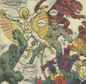
As is well known, Parts One through to Sixteen of this series detail my plans for the solo films building up to The Walt Disney Company’s Marvel Entertainment’s The West Coast Avengers, showcasing the characters with most multi-platform crossover potential, viz. Wonder Man, Tigra and Jumpsuit Doctor Pym. In Part Seventeen, I turn to the main event, my spec script for The Walt Disney Company’s Marvel Entertainment’s The West Coast Avengers: we start with a flashforward to a future after the West Coast Avengers have disbanded!!! Tigra, Wonder Man, Jumpsuit Doctor Pym and new-in-this-film USAgent each finds themselves in a dark place, a place where they need to reconnect with what it means to be a West Coast Avenger. What could have disassembled The West Coast of the North American Continent’s Mightiest Heroes?! Flashback to the present! Big Sur is restless — the region stirs, unsettled by dark rumours of a sinister underground army! The police find a mutilated corpse in the sewers, pincushioned with cactus needles! At a trailer park on the edge of town, a pair of tourists run in from the desert, half-crazed and babbling about a giant monster lizard! Senior citizens start collapsing from heat exhaustion! There’s some sinister happening or other to do with an isolated hill, like someone falls down and breaks their crown or something! The authorities haven’t got a hope of dealing with this new breed of criminal — the only one who can is a brilliant yet devastatingly handsome blogger named Rick Jones, one of the Jones boys, who sends out a message on his ham radio universally beloved blog for anybody who can help defeat the creatures the media have dubbed the Desert Horrors

— but I digress. Suffice it to say: there are lots of ways a comic can go wrong in the “writing”, and a lot of ways in the “art”, and a lot more ways when you put those two things together. SYNERGY!

What I claim is that the ways a comic can be bad are irreducibly plural and literally incommensurable — there is no way to put all these different ways together so that you end up with a single dimension of badness (which, if you recall, is what we need in order to declare something the X-est Y, in this case the worst comic of all time).

Before I discuss this in more detail just what this means, however, it’s first worth considering whether badness is indeed irreducibly plural. The list I rattled off above is some evidence, but perhaps not conclusive; the fact that there are a whole bunch of different phrases in the vicinity doesn’t mean that they don’t all point to, in one way or another, the same property. In much the same way, I could use a whole bunch of different descriptions to refer to the same person, for instance, “former He-Man scripter”, “loathsome“, “hack”, or sociopath” — all of which describe the one man, J. Michael Straczynski.

Interlude: Two Minutes Hate

Now, the last time someone described that guy as a former He-Man scripter, parts of the comicsoblogosphere clutched at their pearls that anyone would have the temerity to to take a “cheap shot” at J. Michael Straczynski, the universally acclaimed and highly respected author of After Marvelman Supreme Power and those two issues of Superman and Wonder Woman before he quit.

To which I say: J. Michael Straczynski deserves every cheap shot you can throw at him. J. Michael Straczynski is so ugly that, when he was born, the doctor slapped his mother. J. Michael Straczynski is so fat that, when he sits around the house, he sits around the house. J. Michael Straczynski is writing some of the prequels to Watchmen.

Actually, that last one is a low blow. I apologise.

But maybe the original author of that quote was actually trying to be nice. Maybe he thought “He-Man scripter” was the nicest thing he could say about J. Michael Straczynski because, let’s face it, that probably is the most charitable reading of the dude’s entire career. Anyway, to chide someone for mentioning J. Michael Straczynski’s early career as He-Man scripter is like chiding someone for mentioning Hitler’s early career as Mein Kampf writer: it’s not that they’re being unkind, it’s that they’re not being unkind enough.

YES INTERNET I JUST COMPARED J. MICHAEL STRACZYNSKI TO HITLER.

YES I AM SAYING THAT WRITING MANY SHITTY COMICS AND BEING A PLAGIARIST AND A SCAB IS EXACTLY AS BAD AS BEING CHIEF ARCHITECT OF GENOCIDE

YES EXACTLY

PLUS I HAVE IT ON GOOD AUTHORITY THAT HE DOESN’T LIKE KITTENS

I know that, by the Official Rules of the Internet, invoking a comparison with Hitler means that I’ve “lost the argument“.

But, on the other hand, I want you to consider this:

Go fuck yourself

(BTW, I’m not hyperbolising about his sociopathy. Take a look at the ICD-10 criteria for sociopathy and, if you’ve followed his career and public statements over the last few years, you’ll see that J. Michael Straczynski scores at least a 5 out of 6)

Part 5: In Which I Run Out Of Jokes And Resort To Straight-Out Philosophy Instead, Or, If You Prefer, “Philosophy”, And, Let’s Be Honest, “Jokes”, Too

As I was saying, the fact that I can use a bunch of different descriptions for what makes a comic bad doesn’t mean that there are that correspondingly many different types of badness. Couldn’t there be fundamentally just one type of badness manifested in different ways? For some of the items on the list are obviously related and can be “reduced” to a more fundamental vice — e.g. relying on cliche and being derivative might be reduced to a more basic lack of originality. So mightn’t we go further and discover a single kind of badness underpinning all the buzzing, blooming confusion of suckitude — and, if so, wouldn’t we then be able to point to the comic with the most of that as being the worst comic of all time?

I’ll consider — and I’m not kidding this time — two candidates for rock-bottom badness. You can skim this if you want; it gets a bit technical in places. I’LL STILL RESPECT YOU.

i) Failure to achieve the effects the creator was aiming for

A first thought might be that what makes an artwork bad is that it fails to do whatever the artist wanted it to do. For instance, Alan Moore wanted the metaphysical discussions in Promethea to be gobbledegood, not gobbledegook, but, well, you know how that turned out (personally, whenever I hear the word “quantum” from anyone but a physicist, I reach for my revolver). Al Capp wanted his Li’l Abner strips to wittily satirise social folly well into the 60s and 70s. Alex Ross wants not to suck. On such an account, then, the worst comic of all time would simply be the one that failed most to achieve the effects the creator was aiming for.

That’s a first thought. A second thought might be that the first thought is stupid. Isn’t it obvious that an artwork can be great even for reasons unintended by its creator? Indeed, isn’t it obvious that sometimes an artwork can be great in spite of the creator’s intentions, can be great precisely to the extent that its creator’s intentions go unfulfilled? One of the things that makes Cerebus such an intriguing work, for instance, is the way it diverges from the stated aims of Dave Sim, often so far as to fulfil the very opposite of those aims; there are large chunks of Cerebus that succeed in spite of what Sim wants them to do. (This is not to slight Gerhard’s important role as co-creator — indeed, if we think about collaborations, we quickly see another reason that aesthetic quality couldn’t depend on fulfilling creators’ intentions, viz. that those intentions might well conflict in a collaborative work).

And there’s an even deeper problem with this suggestion, which is that it leaves entirely mysterious a central fact about how audiences respond to art: the fact that, in general, audiences don’t like bad art, or at least art that they take to be bad by their lights. Add a million caveats to that claim, or as many as you please — but it’s still a truism that, to at least some degree, bad art is, you know, bad. But why should audiences care about whether artists fulfil their intent — and, in particular, why should it be a good thing when they do, and a bad thing when they don’t, and why should our appreciation of the work follow suit?

One last point in passing: to rest our assessment of an artwork on the creator’s intentions is to commit the Intentional Fallacy, which is totally a fallacy for very good reasons and not just because I read on the internet that a couple of literary critics said so in the 40s, but I’m not going to go into the very good reasons here because hey look behind you is that a three-headed monkey?

ii)We just don’t like it

Here’s a different approach. So far we’ve been proceeding as if aesthetic goodness and badness are in some important sense mind-independent, as if there are objective facts of the matter here. But it’s just as plausible — indeed, perhaps even more so — that they are fundamentally based on our reactions to art, that all the different aesthetic failings I briefly listed, and the many others unlisted, are a matter of how we feel about various artworks. We can call this view aesthetic subjectivism.

Aesthetic subjectivism by itself does not entail a common measure of badness, however; it might still be that there are lots and lots of different subjective types of badness (just as there appear to be irreducibly many secondary properties which are each, nonetheless, subjective — and if that read like gibberish to you, don’t worry, it’s not important). So we would need to go further and suppose, not just that aesthetic badness is based on how we react to art, but that it can be simply boiled down to how much we dislike it. On such a theory, the list of vices above would merely be different ways of expressing the fact that we don’t like it.
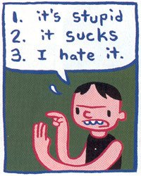
If this were right, then the worst comic of all time would simply be the most disliked comic of all time. But there are problems here, too.

For a start, for all of the terrible, horrible, no good comics we have individually read, there are another hundred comics that are even worse, and another hundred that are even worse than that, and then there’s Paradise X. But, except for lunatics and sex perverts, most people don’t go out of their way to read comics that they think are going to be terrible, so there’s an inbuilt problem with trying to find the most disliked comic of all time: it may well not be the most dislikeable comic of all time.

So, all right, let’s make it dispositional: a bad comic is one that people would dislike, and the worst comic of all time is the one that people would dislike the most.

This does not get us out of trouble, however, for any comic is potentially dislikeable, under the right — or the wrong — circumstances. If you read a comic while distracted, or in a bad mood, or drunk, or sleep-deprived, you may have a worse opinion of it than otherwise; should we therefore call that comic bad, simply because people would dislike it in certain circumstances? Surely not. So we need to rule out those kinds of circumstances somehow, by saying that a bad comic is one that people would dislike under ideal circumstances, and the worst comic of all time is the one that people would dislike the most under ideal circumstances.

Here’s the question: which are the ideal circumstances? Because I’ve already tested everyone’s patience too long, I’m just going to make a bald assertion here (which we can hash out in the comments if anyone really, really, really, really wants to). There is no stable, principled way to specify ideal circumstances that does not beg one question or another — for instance, that has a good reason to discount the distaste of Nazis for “degenerate” art, or to favour dispassionate enjoyment of art over enjoyment in altered states of consciousness.

(Even more technical aside: there is a further, famous problem with aggregating individual preferences into a community-wide ranking, a problem which is known as Arrow’s impossibility theorem. I suspect this theorem scotches any hope of singling out any single comic as the most dislikeable of all time, but I don’t know enough about decision theory to be sure that the theorem is relevant here).

This does seem, I admit, to be the weakest part of my case, but, oh hey look behind you there’s that three-headed monkey again

and so, as I just conclusively proved while you were looking behind you, we can’t “reduce” the worst comic of all time to merely the most disliked comic of all time. Sorry you missed it; it was an awesome proof.

Part 6: The moral of the story
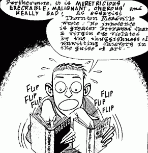
All right. Aesthetic badness is irreducibly plural and incommensurable. So what? So, basically, there is no way to rank all the comics along a single dimension of badness, and thus there is no way to single out any particular comic as the worst of all time.

Here’s an analogy. Suppose you’re in Palomar, and you’re thinking about where other cities and towns are in relation to you — Central City, let’s say, is 4 miles to the east and 3 to the north; and Keystone City is 6 miles to the south and 8 miles to the east. (A less lazy author might have provided a diagram here) . We can represent the locations of these cities, and anywhere else on the surface of the Earth, in a two-dimensional space with Palomar at the origin, one axis for the east-west dimension and the other for north-south. Although these are two different spatial dimensions, they are commensurable — in that one mile along the east-west axis is just as far as one mile along the north-south axis. We can thus construct from these two dimensions a separate single line representing total distance from Palomar. Central City is (if I’ve done my Pythagorean sums right) 5 miles along that line and Keystone City is 10 miles along. Thus Keystone City is further away from Palomar than Central City and, if these were the only cities on the planet, we could say that Keystone is the furthest city from Palomar.

Now imagine aesthetic space as a massively multi-dimensional space, with as many axes as there are different types of aesthetic badness. For instance, we might have one axis representing lack of spatial clarity, another representing implausible characterisation, another representing being written by Brian Michael Bendis, and so on. If I’m right that the different types of aesthetic badness are incommensurable, then there is no way to do anything similar for aesthetic badness.

Suppose we’re comparing just two comics, (say) Judgment Day and Blue Monday. Let’s suppose that we can all agree that Judgement Day is worse than Blue Monday at spatial clarity (i.e. showing where characters are standing in a room, what their sight lines are, and so on). This would mean that Judgment Day was further along the axis for spatial unclarity than Blue Monday. Let’s also make things super-easy and suppose that we had some unproblematic way to quantify this dimension, so that (say) Judgment Day has a spatial unclarity rating of 17, and Blue Monday a rating of 5

So far, so good. It’s easy enough to compare comics along a single dimension. And let’s also suppose that we can say that Blue Monday is more derivative than Judgment Day, which means that Blue Monday is further along the axis of being derivative. Again, so far, so good. And, again, suppose there’s some unproblematic way to quantify derivative-hood, so that Blue Monday has 7 units of derivative-hood and Judgment Day only 1.

Now here’s the kicker: how do we then put those two dimensions together to say which comic is worse overall? Is it worse to be spatially unclear or to be derivative? How many units of derivative-hood are equivalent to one unit of spatial unclarity? And once we consider all other the dimensions of aesthetic badness beyond just these two, the problem explodes in complexity. Is it worse to be politically obnoxious to this degree, or murkily reproduced to that degree? Is it worse to pander this much or be that much reliant on dei ex machina? Is it worse to be a Sal Buscema Marvel comic from the 70s or a random daily episode of Cathy?

It’s crucial to realise that my point here is metaphysical, not epistemological. It’s not just that there’s no way to find out the answer, it’s that there is no answer to find out. There simply is no fact of the matter about how to compare all these different aesthetic dimensions, and so there is no fact of the matter about what is the worst comic of all time. There is no worst comic of all time.

Asking what is the worst comic of all time is like asking what is the worst sentence of all time, or the worst sandwich of all time. Is it a sandwich made from moldy bread and expired meat product? Is a rock the worst sandwich of all time? Is it a sandwich that gives you AIDS? Is it a poop sandwich? Is it a sandwich made by Hitler? Is it a poop sandwich made by Hitler? There is no worst sandwich of all time, because there are too many ways for a sandwich to be bad, and there is no worst comic of all time.

But if there was, J. Michael Straczynski would have written it.

PS: While we’re in the festive spirit, a big fuck-you to all the overrated, shitty comics I’ve ever read in the vain hope that they’d be better than they turned out to be. Fuck you, Guardian Devil, Nextwave and Jeffrey Brown. Fuck you, Kingdom Come. Fuck you, Aqua Leung. Fuck you, League of Extraordinary Gentlemen. Fuck you, Walking Dead. Fuck you, Scalped. Fuck you, Y the Last Man. Fuck you, Transmetropolitan. Fuck you, Invincible Iron Fist. Fuck you,  One Piece. Fuck you, Sin City. Fuck you, Doctor 13 and the Architecture of Mortality. Fuck you, Final Crisis. Fuck you, every Batman story Grant Morrison has written. Fuck you, The Invisibles. Fuck you, New Frontier. Fuck you, A Drifting Life. Fuck you, In the Shadow of No Towers.

Fuck you, Umbrella fucking Academy.

Image attribution: Images of comic critic — Dan Clowes, Eightball #3; Desert Dwellers — Al Milgrom, Joe Sinnott, Ken Feduniewicz, Janice Chiang and Steve Englehart, West Coast Avengers #17 (I think), scan taken from here; “it’s stupid” — James Kochalka, scan taken from here, don’t know where it was originally published.

__________
Click here for the Anniversary Index of Hate.
New Yorker Cartoons – A Legacy of Mediocrity

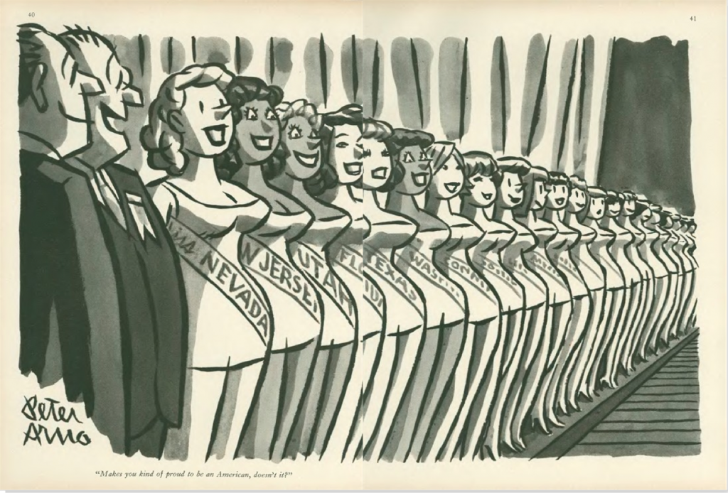
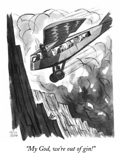
Peter Arno, “Makes you kind of proud to be an American, doesn’t it?”, September 10, 1960

I
The standard line on The New Yorker’s cartoons is that they are the first thing most readers turn to when they get their hands on a new issue. Well, I don’t. I actively try to avoid looking at them, difficult as it is. Peppered through articles of serious journalism, strong criticism, and pieces of often very good fiction, they are meant, I suppose, to induce some kind of alchemical understanding of what it is to be a New Yorker, or — failing that — a New Yorker reader. To me, and I suspect quite a few others, they remain obnoxious non-sequiturs, like tired notch-notch, wink-wink routines insistently dropped into an otherwise lively family conversation by your borderline senile uncle.

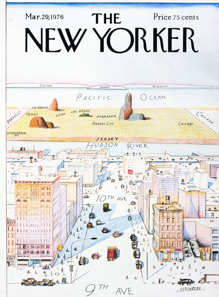
The other oft-repeated line about the New Yorker cartoons is that a lot of people ‘just don’t get them,’ with the frequent corollary that this is part of their point, and once you realize it, you feel ‘in’ with those in an authentic New York state of mind, I suppose — you know, those whose worldview Saul Steinberg summed up so incisively in what remains arguably the most famous New Yorker cover of all time.

Saul Steinberg, cover, March 29, 1976


Thing is, if you actually review a substantial selection of cartoons from the magazine’s octogenarian history, the vast majority of them are totally straightforward. You understand the joke. No Mystery. Only in the last decade-and-a-half or so has editorial showed a preference for a certain brand of light absurdity that at times borders on the impenetrable. Nothing wrong with absurd humor, but the problem in this case is that one of the main strengths of cartooning, clarity, is sacrificed in a vain bid for ingenuity.

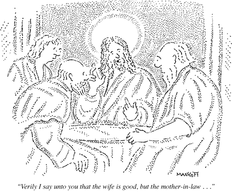
From this week’s issue: Robert Mankoff, October 8, 2012

This more or less corresponds to the period in which hack cartoonist Robert Mankoff has served as cartoon editor. He has been a hugely successful manager of his part of the New Yorker brand, merchandizing the cartoons through the online Condé Nast Cartoon Bank to the tune of millions of dollars a year, as well as editing the monumental Complete Cartoons of The New Yorker (2004), which bundled all 68,647 cartoons thitherto published in the magazine on two CDs. Bonus info: he has had over 800 cartoons published in the magazine.

Mankoff furthermore is the instigator of the popular New Yorker Cartoon Caption Contest. And far be it from me to suggest we deny people their fun, but the concept is revealing of his editorial philosophy, where the visuals become so generic that they accommodate just about any joke. Absurd or not, the naughts have been the nadir of New Yorker cartoons in every respect, from idea to execution. More than ever, one suspects that the notion that they harbor some elusive brilliance available only to the in-crowd really just euphemistically expresses a general puzzlement about how unfunny they are. As in, ‘can they really be that bad?’

More from this week: Tom Cheney, October 8, 2012

We are, after all, talking about the Holy Grail of American cartooning. The one publication countless cartoonists would hack off their non-drawing arm to be published in. The New Yorker, somehow, has managed to convince a wide, generally discerning and highly cultivated readership that their cartoons represent the acme.

Try as I may, I have been unable to assimilate this View from Ninth Avenue. Reading through several thousand of the cartoons assembled by Mankoff in his 2004 book, I cram to understand it. From the very beginning in 1925, the New Yorker cartoons as a rule have been unambitious, unimpressive, and unfunny. Not to mention frequently sexist. As a platform for cartooning, the magazine has (with a few exceptions, to be addressed presently) been a deadening force at the heart of the art form, smothering the field in bourgeois mediocrity.

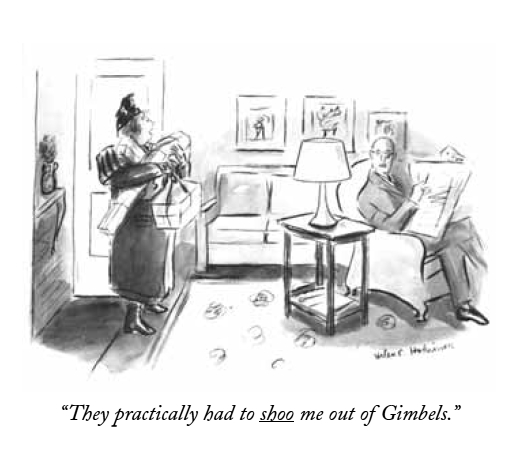
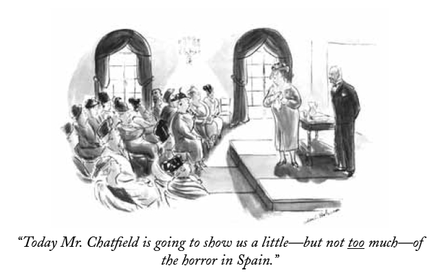
Helen Hokinson, December 11, 1937


II
In a 1937 article in the Partisan Review, The New Yorker’s bête noire of the time Dwight McDonald — later a significant contributor to the magazine — criticized the cartoons for their “Jovian aloofness from the common struggle”, identifying “…something inhuman in [their] deliberate cultivation of the trivial.” This critique was part and parcel of McDonald’s, and the Partisan Review’s, ongoing criticism of the The New Yorker more generally. McDonald concomitantly described the typical writer for the magazine as having “given up the struggle to make sense out of a world which daily grows more complicated. His stock of data is strictly limited to the inconsequential.”

William Galbraith Crawford, October 13, 1934


This is not the place to enter into the long and complex history of The New Yorker and its critics. Suffice it to say that any institution, cultural or otherwise, that achieves this kind of success and influence will be met with criticism — and indeed McDonald’s words are echoed in those of many a critic of the magazine since. But whatever the problems of ‘New Yorker fiction’ as a phenomenon, of the blind spots exhibited by the magazine’s critics, or of its at times timid or problematic treatment of important political issues — most recently perhaps the 2003 invasion of Iraq — it is undeniably one of the publications of record in all three areas.

In other words, McDonald’s critique, however accurate it might be in diagnosing a fundamental aspect of founder Harold Ross’ vision, does not render justice to the ambition and quality of the magazine, then or now. Where it does ring true, however, is in its characterization of the cartoons, then and now.

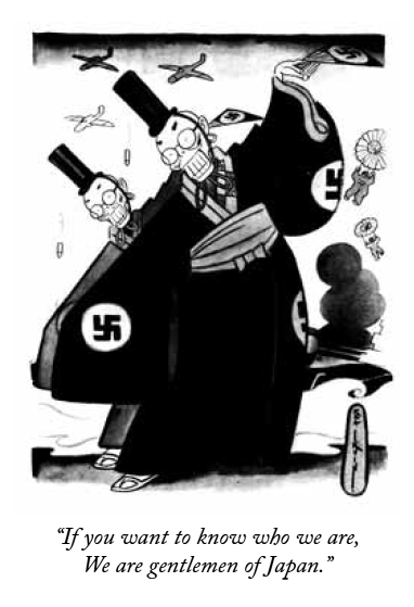
Reaction shot: Rea Irvin, December 20, 1941


Reading the introductions to each decade of The New Yorker’s publication history in Mankoff’s Complete Cartoons, each written by a different author connected with the magazine — from Roger Angell and John Updike to Lillian Ross and Calvin Trillin — one is struck by their apologetic tone. They are forced to acknowledge the obvious: that The New Yorker’s cartoonists almost never managed to comment intelligently — or indeed at all — on the important events of their time, be it the Great Depression or the Second World War, the civil rights movement or Vietnam.

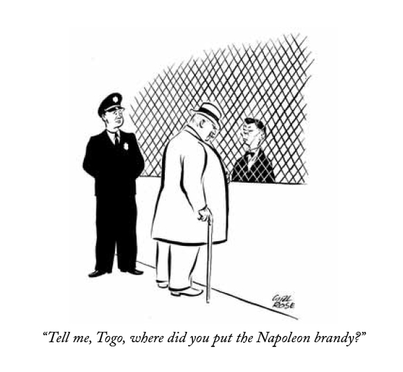
An exception to the rule: Carl Rose, December 20, 1941


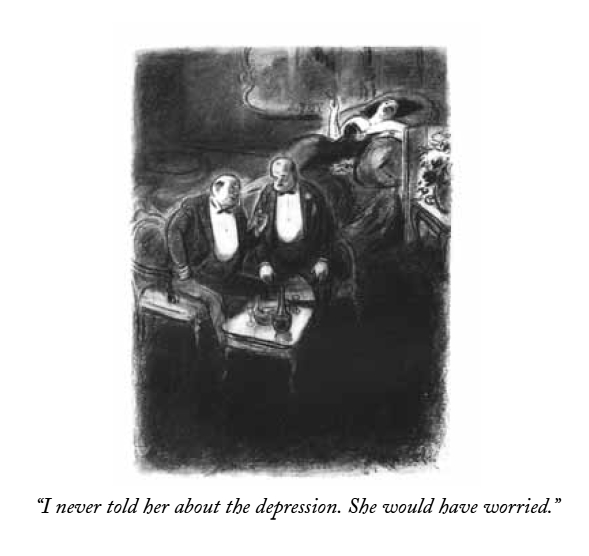
This was all in keeping with Ross’ sensible if not unproblematic vision that The New Yorker would “not be iconoclastic”, marketing it as he did to “intelligent and discriminating men and women who appreciate fine things and can afford them.” While it would be a fair question to ask why the magazine has shied away from political or otherwise editorializing cartoons, especially when their other content is much less hands-off on such matters, this in itself is not the problem. The point is that choosing gags as your calling does not let you off the hook. Major national and world events belong as much to the social sphere (the domain of gag cartoons), as it does the political or economical. The New Yorker, however, was content with serving up endless iterations of two guys in a bar, desert islands, and bosses and their secretaries — a dull superfluity of safe inanity.

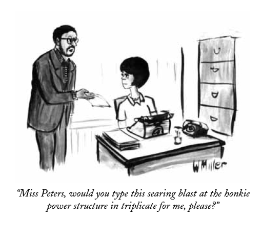
Warren Miller, April 6, 1968

III
The gag cartoon is a difficult discipline. The trick, of course, is to make the reader laugh. The joke’s the thing. And there is no accounting for humor, which makes accessing your own in its purest form the noblest avenue of expression for the cartoonist. Not to mention the funniest. It is not so much that there are not a fair amount of fairly funny jokes in The New Yorker, but rather that they are almost invariably of the generic variety, with cartoonists content to act as warm bodies on the mic stand, interchangeable and disposable. Too few of them present a truly original, unexpected, idiosyncratic, intelligent, or imaginative point of view, and judging from just how consistent the magazine has been in this regard, it seems editorial has rewarded them for thinking inside the box.

Peter Arno, April 12, 1930


Let us forego the banal swill that bulks up the bibliography and focus on some of the canonized artists; the best the magazine has had to offer, according to public opinion. First there is Peter Arno, the quintessential dandy cartoonist, a kind of real-life Eustace Tilley, cuffs stained with india ink.

No doubt, Arno is one of the great visual stylists of American cartooning, and arguably the most effortless major graphic contributor to the magazine. His cartoons are master classes in composition and narrative, at times carrying an almost abstract beauty in their distribution of forms, light, and shade. Yet, his visual characterization, while extremely precise and frequently funny, is invariably trite, serving up conservative stereotypes spritzing the safe clichés of the masculine bourgeoisie — from Martini jokes to silver fox slickers ogling chorus girls. Very little of Baudelaire’s flâneur remains in his and his various gag writers’ myopic, self-sufficient perspective.

Charles Addams, December 21, 1946


Another icon is Charles Addams, possessed of a genuine yen for the absurd yet ultimately toiling it in service of warm reassurance. His earlier cartoons boast some inspired ideas and occasionally reach toward the surreally unsettling, but by the time he had established the Addams Family, those lovable munsters in their plush Halloween mansion, he started descending irrevocably into comfy family camp. Worst is the utter lack of visual ambition — one plump Addams character pretty much substitutes for another, any signs of individuality listlessly muddied up in drab wash.

Helen Hokinson shows some self-awareness: May 1, 1937


Helen Hokinson suffers from similar problems of visual realization. Drawing her characters small and indistinct, it is frequently hard to glean anything significant, relating to the gag or otherwise, from their facial expression or body language. A pity, because her wit (or that of her gag writers) is sharp, if limited in scope — lots of rotund society ladies, lots of hat, dress and jewelry jokes. Her irony cuts a little deeper than that of most of her peers, but dissipates with a dispiriting ‘aw shucks’ fizzle.

Jack Ziegler, November 24, 1980


Of later comers, Jack Ziegler is one of the most prominent, I suppose both for his versatility and consistency in terms of joke content, but also, surely, because he is somehow quintessential. Beyond the shoddiness of his rendering—more complex of course, but essentially no different from the arid cartooning of a Scott Adams — he lacks a core: emotional, personal, what have you. To him a joke is just a joke, and he can be relied upon to makes us laugh and forget, issue after issue.

Roz Chast, December 7, 1998


Then there’s Roz Chast, The New Yorker’s current cartoon fig leaf for artistic respectability. She is to be commended for introducing into the magazine a kind of poetic whimsy previously unknown, and for deprioritizing the punchline in favor of more ineffable humors. Unlike most of her colleagues, she actually has a personal voice, but it is never particularly revealing: a step beyond the imaginative dazzle, it is cute and cosy, keeping anything difficult at arm’s length.

This complacent tone is apparent more than anywhere else in the lazy drawing, which remains unimproved after more than thirty years. The telephone doodle charm only goes so far, because the small, overcrowded, inarticulately composed, and sluggishly washed drawings rarely contribute more than a very general — if persistent — sense of caffeinated giddiness, ending up placeholders for ideas worthy of a more articulate cartoonist. It’s like watching Ted Rall impersonating Lynda Barry.

Bruce Erik Kaplan, September 17, 2012


Next to Chast, Bruce Eric Kaplan is the seeming exception that proves the rule that current New Yorker cartoonists all lack personality. His graphic style is his big draw: everything is drawn as if by etch-a-sketch, centering on a supposedly existential emptiness. It is indeed spectacular in the dull context of the magazine, an easy standout, but it’s a shtick: the cartoons are interchangeable, their links to individual jokes tenuous at best, and the general sense of alienation is unmodulated to fit the content. The same idea executed ad nauseam.

III
I could go on, but the point should be clear. These are highly overrated cartoonists, elevated by their august platform. And keep in mind that they are the wheat to the vastly more abundant chaff. One might argue that gag cartooning is simply not suited to the kind of artistic expression lacking in the pages of The New Yorker, that I’m setting the bar too high here, but besides questioning the wisdom of focusing so one-sidedly on gags at the expense of other forms of cartooning, you could point to Mad Magazine — a publication whose cultural impact, however different, is commensurate — as a much more reliable source of quality humor cartooning, despite its own faults. The critically overlooked Don Martin easily trumps any of the above-mentioned for originality and plain laughs. As do a number of cartoonists working in similar formats never — or rarely — published in The New Yorker, from H. M. Bateman and Virgil Partch to Basil Wolverton and Gary Larson.

William Steig, March 24, 1986


In a way, however, the most damning factor is that The New Yorker harbored a few cartoonists whose example — if it had been internalized instead of merely idolized by editorial — would surely have helped shape a truly innovative cartoon platform. One is William Steig, a cartoonist of fertile imagination, a well-honed instinct for portraying the human animal, and — as he matured — a nervous line crackling with personality. One might argue, however, that he did his best work elsewhere, primarily in children’s books.

George Booth at his best with the early “Ip Gissa Gul”, January 20, 1975


A bright spot in the dim latter half of the William Shawn years was George Booth. Although not the most gifted gag writer, his anarchic humor as manifested in his ratty line, and trademark rat-like dogs, is an unexpected delight in the murk that is any given issue’s cartoon selection. At times, he comes off not a little unhinged, not unlike the aforementioned Don Martin. More of his kind would have been a help, but not enough in itself.

James Thurber, March 16, 1935


The true paragons — of course, I suppose — are James Thurber and Saul Steinberg, however. The half-blind Thurber was a natural cartoonist, possessed of a genuinely original vision that included as acute an eye for human behavior as any of his fully-sighted peers, condensed on the paper in sprightly notation. His treatment of his main theme, gender, may initially seem a little banal until one notices the disturbing irrational undertones pushing at the edges — the ex-wife lurking on top of the bookcase, the seal behind the bed, the sudden fencer’s head-lop. Thurber’s is a cold world, and the gleam in his live eye is humor.

The strange thing is how little his approach came to shape The New Yorker’s cartoons. Of course, few cartoonists can be expected to be as original, but he remains an example of what can happen if one admits and nurtures the personal sensibilities of a gifted cartoonist. Although this was initially Thurber’s good friend E. B. White’s doing, Ross clearly grew to appreciate Thurber, who became one of the magazine’s graphic constituents (and literally part of the architecture by way of his graffiti, a piece of which has been transposed into an oblique corner of the current offices in the Condé Nast building). It is hard not to see it as an editorial failure that his example wasn’t followed.

Saul Steinberg, November 25, 1961


Except with Steinberg, one of the century’s great cartoonists. Although just as unique, he became much more central to the magazine’s graphic identity than Thurber, and his influence on it remains much more pervasive, if in all the wrong ways. A cartoonist of brilliant facility and mind, he unassertively situated himself in the continuum of modernist art, but with a distinctively post-modern sensibility, Steinberg was the quintessential meta-cartoonist. He elevated the discussion of what cartooning is and, by consequence, the significance of The New Yorker to the art form.

Now, I must confess to some reservation vis-à-vis Steinberg. It’s easy to appreciate his cleverness and I do love his line, but I largely agree with Tom Lubbock’s critique that there is something too controlled, too detached, too safe about his cartooning, which is obviously witty and intelligent, but neither really funny nor really troubling. This takes us back to the central problem with The New Yorker’s cartoon tradition and how Steinberg validates its ethos, despite his outsize talent: New Yorker cartoons are often witty, if rarely intelligent; they are occasionally funny, but never troubling. They perpetuate an escapist bourgeois utopia, detached, controlled and safe.

What’s frustrating is that it could have been different. The New Yorker could have exerted the same level of ambitions on the part of their cartoons as they developed with regard to journalism, criticism, and fiction. Ross’ project to endow the magazine with a strong graphic identity was smart and it worked, not the least because of the often excellent illustrations and the famous covers. But the cartoons remain a monument to mediocrity, a would-be canonical example of wasted opportunity, were it not so bafflingly extolled as a high watermark. As it stands, I don’t doubt that The New Yorker would have been better off without them, and in my darker moods I feel as if the art form as a whole would have too.

P. C. Vey from this week’s issue, October 8, 2012

__________
Click here for the Anniversary Index of Hate.
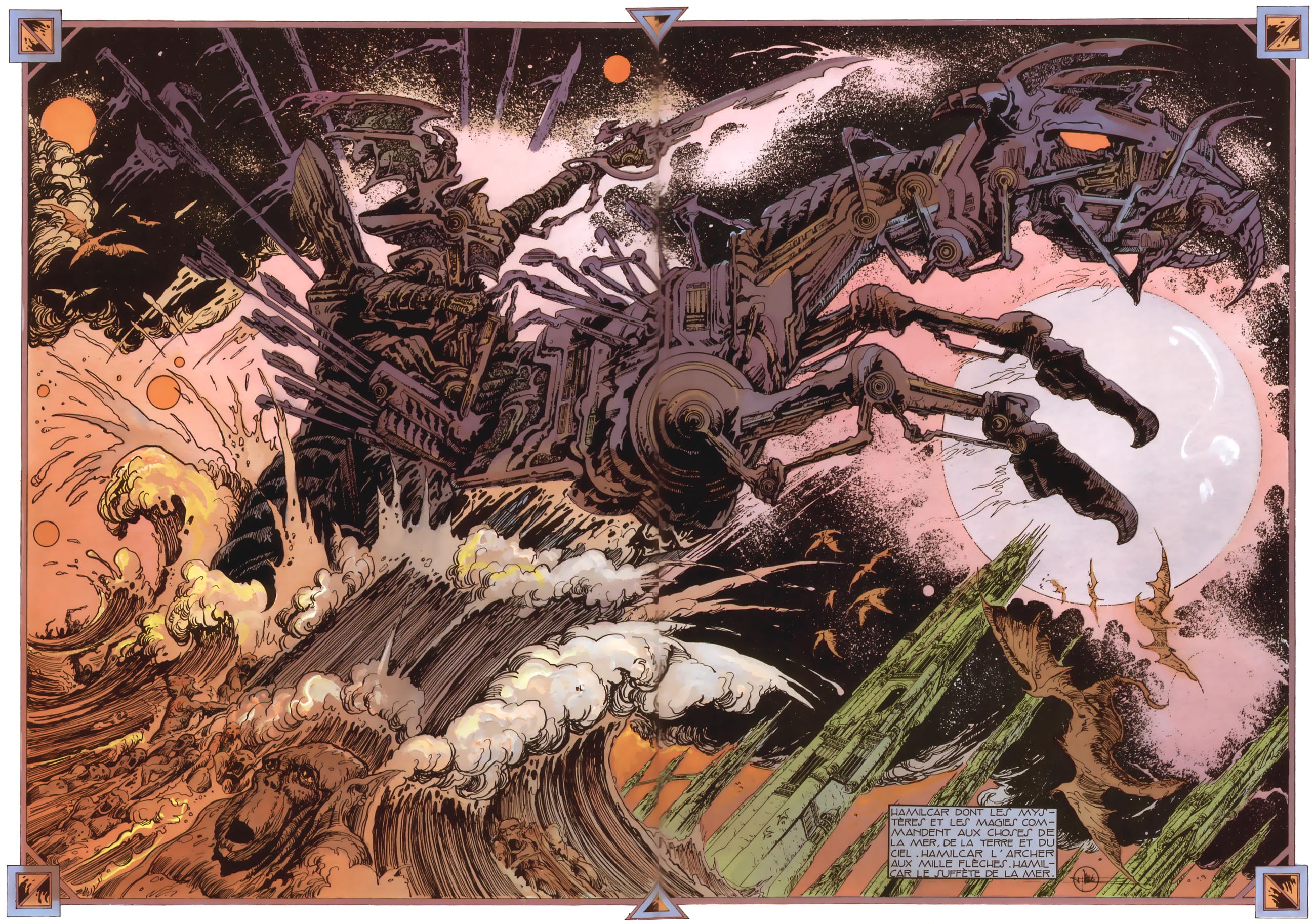
The Collector


“Hate the collection, not the collector.”

It’s informal among the young, with no adult to guide or instruct. Myself, I clipped out pictures of the Space Shuttle, articles about satellites and astronomy, kept wine corks, and acorns of unusual size or beauty. But these gave way to more formalized assemblies—Star Wars figures, Transformers–other excuses for a child to amass plastic, aided by my youthful addiction to weekend garage sale scavenging with my father.

When toys lost their appeal my interests turned to print and all of its little reproductive miracles– at first baseball cards, that boyish gateway into non-functional collection, but later more esoteric items, including, in one frenzied weekend, a mania to obtain as many artist business cards as possible from a craft show I attended with my mother.

Comic books found me.
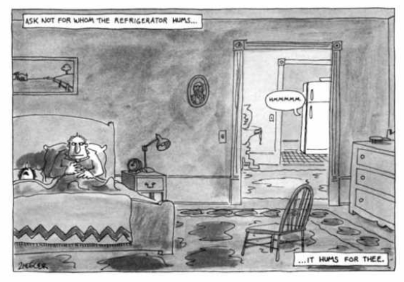
Comic book–such a strange name for such a potent, humorless object. Graceless pulp perfection, a newsprint narcotic, collectible crack cocaine. Numbered, serial, unrelenting, reaching simultaneously into the fictional past and some fictional distant future. The mania I had for them subsumed my own miseries, buried all of those real, flesh and blood problems in a fountain of faded black and Ben Day, in a river of rising action and explanatory narration and hastily-drawn explosions.

Mr. and Mrs. S___ were friend of my parents. Let us consider them now. The husband, Mr. S____, kept his twin passions of science fiction and comics ordered and concealed in long white boxes on the shelves of his closet, away from the judgmental eye of his wife Mrs. S___. Mrs. S___, meanwhile, had her own enthusiasms, that manifested themselves as an explosion of goose and goose-related paraphernalia. Goose paintings, goose-endowed wicker baskets, goose-embossed cut-glass decanters. Gooses everywhere.

It was Mr. S___ that gave me my first comic book, who introduced me to the monthly pleasures of the newsstand, just as my father had initiated me into the rituals of the baseball card years before. (It was a Star Wars comic, appropriately enough, some “reading copies,” as he was hoarding the pristine remainder for his retirement in the distant future, where they would doubtlessly be redeemable for a condo on the beach or health care, just like government bonds or platinum jewelry.)

O Comic Book. When I left home for college I somehow escaped your orbit, was distracted by Bands and Relationships and Suicide by Degree Program, all of the clutter that entered this thin life only to expand and choke you out until there was no room for you at all.

And I thought maybe that’s part of the process of growing up– like breast feeding, or being carried on your father’s back, one of the pleasures of childhood that we are asked to master and cast off, or to transform into a new, more socially-acceptable form.

Or so I thought until I actually entered the adult world, and found the same mentality everywhere. Wanna-be guitar players hoarded gear, writers hoarded books. Some special few hoarded their sexual conquests, collecting names and photos and various details in the same way they might have traded rookie cards and E.R.A. stats as children. My fellow teachers at the high school beat off the tedium of their lives with a bewildering assortment of afflictions—some under the thrall of Disney, their offices stuffed with various pieces of Mouse-related ephemera, others Christmas enthusiasts, still others obsessed with the paraphernalia of their own past, each trophy or jersey or photograph another bid for their younger, better selves to live on beyond the death of history.

And at twenty-five, as I took my first tentative steps towards being a cartoonist, I found that the collecting impulse in myself had returned, justified through my need for always more skills, more progress, more models that I could analyze, or copy outright. I had always been a stylistic mimic, even as a high school journalism student, able to produce copy on demand in a wide variety of voices. Now, as I built up my cartooning chops, the inclination toward pastiche returned, and every new book, every new comic, was another world to be strip-mined for technique. My collecting, I told myself in unsure moments, had utility.

This is the lie at the heart of every collection.

Jamie– Pez dispensers, Hardy Boys hardbacks, CDs and DVDs, Coke paraphernalia and bizarre furniture and costumes.

“I realized the other day that I’m never going to be able to live with you again, because you’ll never be able to afford a place that can fit all of my stuff.”

Michael C___ –CD’s, DVD’s, records, rock music criticism, books and other ephemera.

“I thought about getting rid of it. But the thought didn’t last long. What would I be without my collection?”

Some Guy Who Lived in West Palm Beach- data hoarder

“So, you have any other CDs I can burn? I’ve got a terabyte collection going now. What? Oh, yeah, you know, I listen to them when I paint.”
Woman Who Lives Down the Street From Me– cats, newspapers

“I don’t understand why they set limits to how many pets you’re supposed to have. There are no limits to love.”

It was five years of teaching for me, five long years of emotional exhaustion, of  a can of Coke every lunch, naps in the afternoon, waking up alone and scared and bewildered; grinding my teeth—and always surrounded by more stuff. Books—comics of all stripes, science fiction, YA novels, the objects of my childhood desires suddenly obtainable through the twin miracles of Internet shopping and a steady paycheck.

Until one day I was ready to be done.

It was only the job at first—the collecting continued on after the income passed, more bargain-oriented but not gone. Not until the end.

Arguments, the kind of arguments where no one wins, nothing is better, and there is no way out but death, or separation. And so they both came. Death of pet. Divorce. Foreclosure. Complete reorientation of goals and expectations and desires for life, a bewildering array of choices and chores and shifting ground and uncertainty.

Because they were the most precious to me, they had to be the first to go. Dissembling the shelves was the hardest part. I felt sick and strange and slow, the feeling familiar even as it crept up my sides and down back and into my stomach. It was the feeling of finality, of loss, that same feeling I felt when we sat there together on the dirty carpet and divided up the things on paper, our lives and everything we’d done a series of numbers in blue ballpoint ink on the back of a torn envelope with my name on the front, in her loopy script.

And, like that final argument, the pain was only eased by the leaving. When the man came and brought the dozen-odd boxes of books from the room I felt nothing but relief, a relief that came, in fact, from the first few gone. A handful of books, the acceptance of that loss, and it seemed the spell had been broken.

But like anything that’s been useful to us in the past, the feeling returned. I wasn’t collecting books anymore, or possessions—it was collecting work, collecting attention. Links to my articles and comics, discussion of them. The negative and the positive were remarkably alike, served that same function—something that reminded me that I existed, that I was alive.

Writing. My own drawings. My productivity.

The stack of publications I’ve created or appeared in. Posters I’ve drawn and designed, boxes of albums never sold. Love letters from people I’ve lost and forgotten, old spirals covered with notes and doodles and hundreds of songs half-finished and abandoned. The heavy box in the upper shelf of my closet, underneath that blanket I still need to give back to my ex, heavy with the first 300 pages of a graphic novel that no one will ever read, a book years in the making that I abandoned at the harsh words of a handful of friends.

Everything I’ve made, I cling to.

I need to bury you too.


__________
Click here for the Anniversary Index of Hate.