Peace and Hate

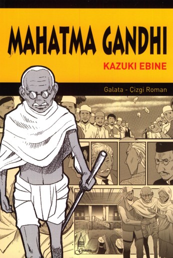
Most of the comics I’ve consigned to the Manga Hall of Shame are there for obvious reasons: a script so hammy you could serve it for Easter dinner, for example, or a female character conjured straight from the pornographer’s imagination. But the manga that earns my greatest scorn isn’t a boob-fest like Eiken or Highschool of the Dead or The Qwaser of Stigmata. No, my least favorite manga looks positively wholesome in comparison, with a nifty cover design and a familiar corporate logo just below the title. Don’t be fooled, however: Gandhi: A Manga Biography is a bad comic.

As I noted in my original review, Gandhi has problems like a dog has fleas. The script is tin-eared, with passages of old-timey formality punctuated by California dudespeak. (One character actually calls another “bro.” No, really — “bro.”) The pacing, too, is uneven, focusing so heavily on Gandhi’s formative experiences in South Africa that his crusade for a sovereign India reads more like an epilogue than a second act. Equally frustrating is author Kazuki Ebine’s tendency to reduce major historical figures such as Jawaharal Nehru to walk-on roles; from the few panels in which Nehru appears, one might reasonably conclude that Nehru was just one more person that admired Gandhi, and not one of Gandhi’s most important proteges — or, for that matter, India’s first prime minister.

The comic’s greatest sin, however, is that it’s boring, transforming the life of a truly brave and complicated human being into a series of artlessly executed tableaux. The script, in particular, labors mightily under the weight of Gandhi’s prose, which is frequently juxtaposed with Ebine’s clumsy attempts to articulate the opposing point of view. Confrontations between Gandhi and Muslim activists, British authorities, and separatist skeptics are presented with all the sophistication of a third-grade school play, treating Gandhi’s adversaries as mustache-twirling villains and Gandhi as an unwavering paragon of virtue, always handy with a sage remark.

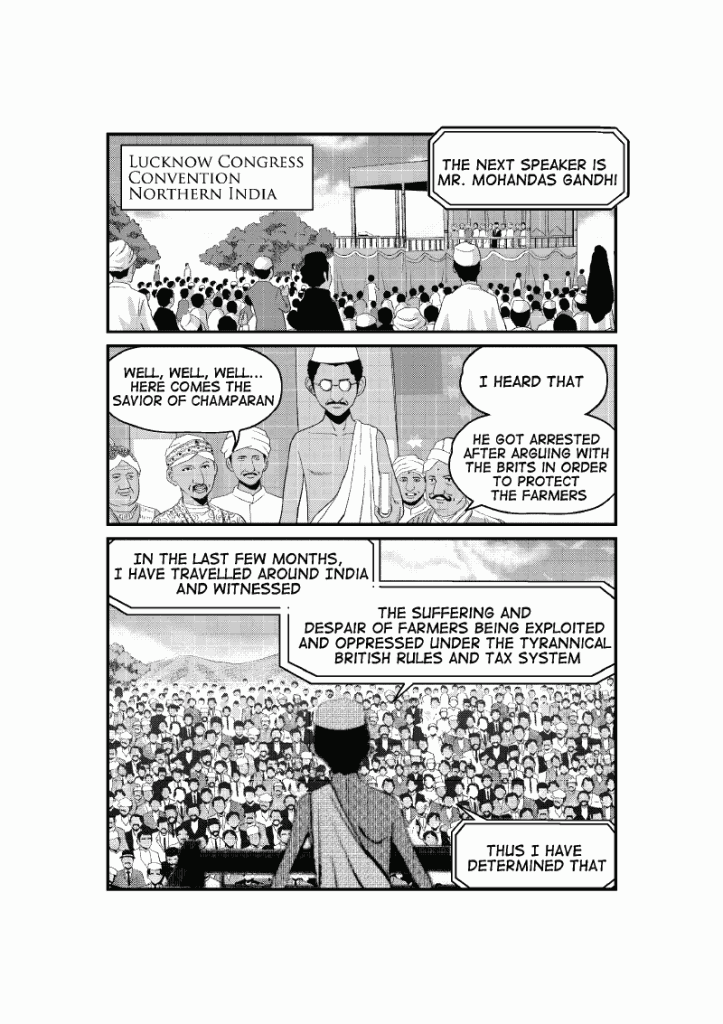
Ebine also struggles to tell Gandhi’s story with a meaningful sense of urgency or coherence; events are presented chronologically in brief, disconnected vignettes that rely excessively on talking heads to create continuity. Consider the following scene: in April 1919, Gandhi organized a national strike to protest the Rowlatt Act, an anti-terrorism measure that granted British authorities the power to imprison, without trial, enemies of the state. Ebine depicts a strike-day confrontation between protestors and soldiers in Amritsar, a village in the Punjab state. That massacre, however, is staged so poorly that it’s difficult to follow what happens. First we see tanks rolling through narrow streets; then we see children playing on the periphery of a demonstration; then the British soldiers begin firing on the crowd; and last, Gandhi stands over victims’ bodies, sadly shaking his head. The disjointed imagery poses more questions than it answers: what triggered the shooting? Where were the soldiers standing in relation to the crowd? How many people were present? What happened to the large number of tanks seen in the very first panel? And when did Gandhi arrive on the scene: moments after the carnage, or a day later? Neither the dialogue nor the illustrations address these basic issues, robbing the scene of its potential dramatic or explanatory value.

Then, too, Ebine does such a poor job of recreating the period and the setting that the reader never feels transported to South Africa or India. Ebine focuses most of his efforts on costumes, recreating hats and military uniforms in just enough detail to suggest the early twentieth century. His backgrounds, however, are so devoid of information that Gandhi could just as easily be taking place in modern-day Texas as in 1920s India. Simplification is a common practice in manga, but in skimping on such elements as buildings and streetscapes, Ebine misses an important opportunity to show us how Gandhi’s environment shaped his thinking, his personality, and his strategies for non-violent engagement with the British.

Contrast the sparseness of Gandhi with a historical work such as The Times of Botchan, and Ebine’s poverty of imagination becomes that much clearer. In The Times of Botchan, Jiro Taniguchi uses period detail to immerse the reader in novelist Natsume Soseki’s world: we see the uneasy mixture of Western fashion with traditional Japanese costume, and the gleaming modernity of trolleys and railway stations contrasted with centuries-old homes. Taniguchi’s drawings do more than tell the reader, “This story takes place during the Taisho period”; they help the reader understand how a writer living in that particular place and time might have produced a satirical novel such as Botchan. Ebine’s illustrations, however, are too perfunctory to convey the squalor in which India’s untouchables lived, or the segregated train cars to which Indians were consigned — details that would have demonstrated the specific social injustices that Indians faced both at home and in South Africa.

To judge from the generally favorable reviews of Gandhi, I have no doubt someone will be offended by my suggestion that Gandhi is a bad comic. But when the basic mechanics of the book are so poor, and its treatment of complex, ugly periods in colonial history so simplistic, it’s impossible to give Gandhi a pass just because the subject matter is high-minded.
__________
Click here for the Anniversary Index of Hate.

Speaking Power to Stupid: The Ever-Dumb Green Lantern Comics of Geoff Johns

Picking on superhero comics for being dumb is like punching a baby for not walking well, but there’s something about the inexplicably popular work of Geoff Johns that invites derision. It might be that his influence has grown by leaps and bounds over the past decade, culminating in his current position as the Chief Creative Officer at DC Comics, with his style of writing now being the shoddy model for the entire company to follow. This style has its proponents, even among people who should really know better, due to its constant hammering on nostalgia buttons, emphasis on “awesome” moments, and constantly-expanding stakes that reassure readers a long-term plan is in place, no matter how idiotic it is. What’s more, regular injections of gruesome violence and attempts at making everyone a badass make Johns’ comics perfect for those developmentally-stunted members of the audience who want to pretend that the kiddie entertainment of their childhood is all grown up now that it’s full of rape and dismemberment. But look at it with any sort of critical eye, and while occasional moments of dumb action-movie enjoyment might surface, they are buried in an overwhelming self-seriousness that makes the whole enterprise laughable.

So, here’s a look at Johns’ signature franchise, Green Lantern, which he revived in the mid-00s through a convoluted resurrection and redemption of a hero who had been turned into a maniacal mass murderer, then turned into the driving force behind much of DC’s line-wide plotlines, culminating in the “Blackest Night” crossover, the ne plus ultra of Johnsian large-scale death and destruction, a clusterfuck of obnoxious zombies, resurrected characters transformed into badasses, and ridiculous plot points treated with the utmost seriousness. But that comes later; let’s start at the beginning, shall we?

Part 1: Back to Basics, But So Much Cooler This Time, Dudes
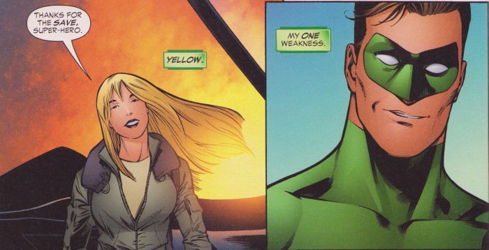
Johns got to make a clean start with Green Lantern with a new series that started in 2005, having just brought Hal Jordan, the most popular version of the character ever since sometime in the 60s, back to life through a complicated retcon (an abbreviation for the comics fan term “retroactive continuity”, in which writers “fix” previously-written stories by telling what “really” happened) that absolved him of the crimes committed when, in an attempt to shake things up, a 90s storyline had him go crazy, kill off all of the fellow members of his army of space cops, try to destroy the universe, and eventually die saving the Earth. But now he’s back, and it turns out he was actually possessed by some sort of fear entity, and…wow, just trying to explain the basic backstory of this comic is numbness-inducing. It’s bad enough that Johns regularly takes a few pages at the beginning of issues to get readers caught up in the ongoing plot. When even superhero comics readers need regular reminders and recaps to be able to keep up with your stories, you might have tangled them up a bit more than is necessary.

So anyway, as the series begins, Hal Jordan is back to being an Earth-bound superhero, and since one of the core aspects of his characters back in the day was that he flew planes, Johns has him join the Air Force as a fighter pilot. Of course, the Air Force is a branch of the military, but Hal is too cool to have to go through any of the rigamarole of recruitment or orders; no, he simply asks a buddy to have a general let him join up and become a pilot, and even though he was kicked out years ago for punching that same general (another bit of fantasy; strike an officer, you just get a ticket home without any other consequences), they let him back in because, hey, he’s Hal Jordan and he’s awesome.

Why Hal needs to fly planes to get his adrenaline kicks should be the main question here, since he has a ring that lets him create anything imaginable and zoom around the universe at presumably faster-than-light speeds (since he’s always traveling to other star systems) anyway, but it’s mostly the nostalgia factor at work; that’s what he did back in the 60s (when planes were futuristic and glamorous), so that’s what he does now, dammit. Johns also seems to be attempting to ground the character and give him real-world concerns, which mostly serves to make things pretty boring whenever Hal isn’t wearing green. Johns must have realized this, since he ended up pretty much completely dropping any attempts at non-Green Lanterning and focusing solely on space-bound action and intrigue.

Many of the early issues are spent establishing the oh-so-tiresome theme of “overcoming fear”, with characters constantly going on about how everyone is fearful, especially those who don’t want to repopulate Hal’s rebuilt hometown of Coast City (the destruction of which, along with the deaths of its populace, being what drove him into villainy), as if it is more susceptible to chaos than anywhere else in the DC universe. But Hal is the man when it comes to combating fear, as he and his fellow Green Lantern John Stewart exposit to the reader when they explain how they’ve overcome their rings’ former weakness against the color yellow (yes, really): “Feel fear. Overcome it. Not a problem.” Yes, this is serious, insightful treatment of battles between colors.

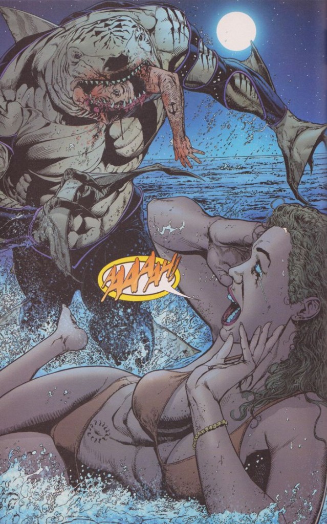
The rest of the time is spent revitalizing old villains in “edgy” new ways. There’s the Shark, a super-evolved, uh, shark that has arms and legs and communicates telepathically in sentence fragments that all have to do with eating brains. He’s a near-mindless beast, but he also wears what appears to be a wetsuit for some reason, and Johns makes him mean and nasty by giving him a scene out of Jaws by way of Herschell Gordon Lewis:
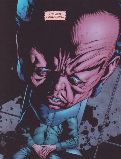
There’s also Hector Hammond, a gross, giant-headed scientist who Johns attempts to turn into a creepy, telepathic riff on Hannibal Lector, sitting in a prison cell and making cryptic comments to Hal, while commenting that Hal is so cool and he’s Hal’s biggest fan in an apparent attempt to replicate the creepiness of Frank Miller’s take on the Joker in The Dark Knight Returns, but without all that icky homoeroticism. He actually provides one of the more morally troubling moments in the series, but not in the intended way; Hal, while trying to get some information out of him, uses his ring to enable the pain centers in his giant brain, and then proceeds to beat him savagely:
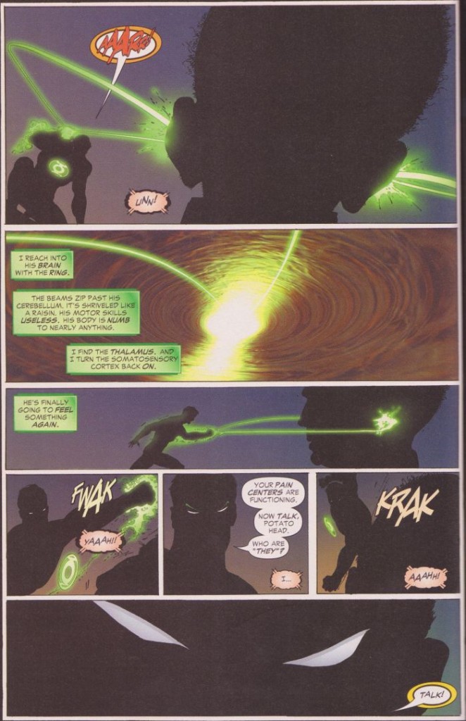
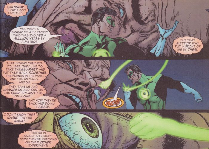
Interrogating prisoners by beating information out of them is a pretty common practice in action movies and detective fiction, but that doesn’t make it any less morally troublesome (especially considering the still-continuing debates in U.S. politics about torturing prisoners), and having a guy dressed in green tights bloodying a giant-headed freak just cheapens the whole issue. It should be embarrassing for everyone involved, if only they had any shame.

Hal also faces some Manhunter robots (who have their own long backstory, but it’s not worth going into), which want to exterminate all life or something. There’s a subplot about the government trying to reverse-engineer alien technology, and these Manhunter guys come calling, giving Hal someone to fight, which leads to an especially silly battle in the sky over Coast City, in which a robot sucks all the power out of Hal’s ring, but he chases it in a fighter jet, and even though he promises to return it to the Air Force without a scratch, he promptly crashes it (he somehow manages to crash pretty much every plane he flies, making him the worst pilot ever), then gets his power back by reciting the Green Lantern Oath (which is how he usually recharges the ring from his own portable lantern; this is a pretty serious design flaw in the Manhunter robot), and the super-powerful machine is defeated when some rubble from the plane it just destroyed hits it on the head.

That’s how most of these plots work themselves out, by taking leaps that really don’t make any sense. In a later story, Hal and a couple of his fellow pilots get shot down over Chechnya and spend a few months in a prison camp, all because he likes to court danger by not wearing his ring when he flies. That’s a dumb way to start a plot, even if it’s already been established that Hal is a thrill-seeker and a doofus, but there are a hell of a lot of super-people who should have rescued them at some point. The Justice League shows up and apologizes, saying that they thought he was off in space, but none of his fellow Green Lanterns (three of whom are also from Earth) thought to check up on him when he went missing? It’s all meant to give him something to angst about (since he could have saved them all in minutes if he was wearing his ring), and maybe to plug some real-world threats into the book, but it takes some serious mental contortions to even attempt to accept.

And then things get dumber when Cowgirl, one of the pilots that got shot down along with Hal (and a sexy blonde chick that immediately falls for Hal, of course), gets the chance to fly a mission and avenge herself on the Chechen terrorists, and is promptly shot down again (the Air Force being rather carefree with their planes). Hal goes back to save her, and he’s not messing around this time:
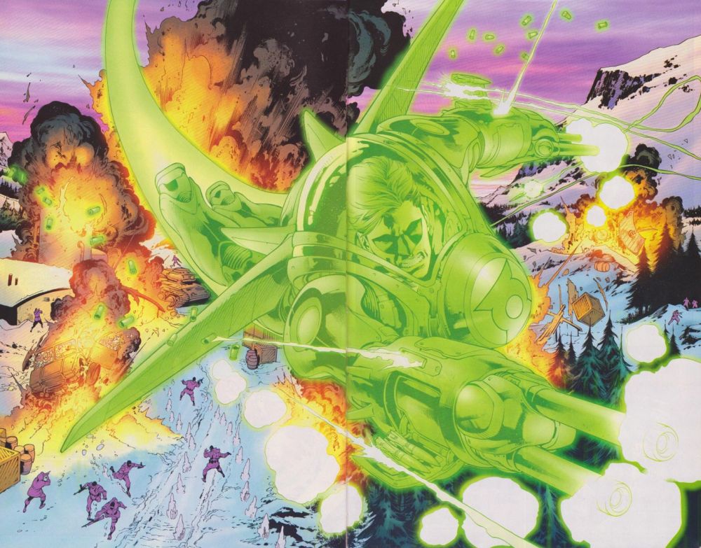
That image is supposed to be awesome and badass, but it makes Hal look like an idiot, since he has already flown over the terrorist camp, but he’s still shooting, presumably into the air. He then gets involved in a tiresome international incident, leading a bunch of brainwashed superheroes and a bunch of Russian soldiers wearing robot armor to attack him, along with some bounty hunters, and even the rest of the Justice League. Amusingly, all these guys get into a big battle, but Hal wanders off to keep looking for Cowgirl, and everyone else apparently decides to just go home, since that’s the last we see of them.

Then it’s time to reintroduce another villain: Star Sapphire, whose redesigned costume has been the target of much ire. This involves Hal’s ex-girlfriend, Carol Ferris, who was possessed by an alien crystal and became a villain, but this time around, the crystal, which is sent by an alien race called the Zamarons, alternates between Carol and Cowgirl, and it wants to mate with Hal, because he’s so awesome, all the ladies want to get with him, even the alien ones (who still have the voluptuous physiques superhero fans crave, making interspecies love cool and sexy instead of weird and creepy). It’s rather embarrassing to see so much love directed at the dumbass hero, as if Johns has a total crush on him and tries to act it out through his sexy lady characters. There’s a bunch of nonsense about the Zamarons being avatars of love, but their version of love involves being very possessive and controlling, and they like to cover entire planets with stasis-inducing crystals, because they love them so much and want to protect them. Geoff Johns obviously has some issues with women.

So now that Johns has reestablished Green Lantern, reintroduced a bunch of the supporting cast, and tried to ground the character in something approximating the real world, he promptly takes off into the stratosphere and shifts the focus to large-scale outer space conflicts.

Part 2: Johns Gets Too Big for His Britches
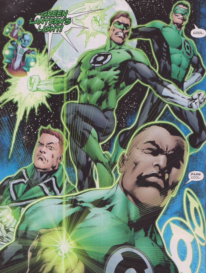
Johns began hinting at ideas like “the emotional spectrum” and “the blackest night” in earlier issues, but he really kicks that stuff into gear in “The Sinestro Corps War”, a long storyline that sees the villainous Sinestro, a former Green Lantern who went bad, start his own lantern corps, tinted yellow and powered by fear. That is, they inflict fear, because they’re a bunch of scary monsters and evil murderers, and they want to kill all the Green Lanterns. This leads to a series of violent fight scenes, with lots of characters on both sides being viciously killed. Johns tries really hard to sell the scale of the threat, with Sinestro recruiting big-time villains like the Cyborg Superman (the villain behind the infamous “Death of Superman” story of the 90s), Superboy Prime (an evil version of Superboy from an alternate universe that was the villain of the Johns-written event crossover Infinite Crisis), and the Anti-Monitor (the reality-destroying villain of the crossover that began them all, Crisis on Infinite Earths), and he has Kyle Rayner, the guy who replaced Hal as Green Lantern when he was evil/dead, get possessed by the fear entity Parallax (the one that turned Hal evil), which gives him a monstrous evil grin/sneer, along with some other especially grotesque (and kind of Freudian) visuals:
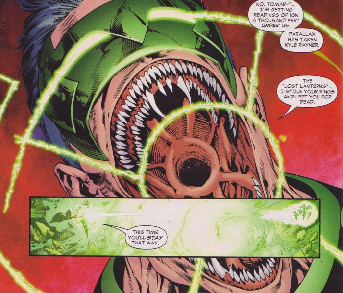
This is actually one of the more innocuous stories in Johns’ tenure on the series, since it’s pretty much non-stop, large-scale action, with the Sinestro Corps attacking Oa (the Green Lanterns’ headquarters), various lanterns attacking the Sinestros’ headquarters (including a scene in which Hal steals a bunch of yellow rings, for little reason other than to recreate the cover of the issue where he went crazy and killed everyone), and everyone converging on Earth for a big smackdown, which the Green Lanterns win when the Guardians (the little blue dwarves who are in charge of all the Green Lanterns) rewrite their laws in order to allow the use of lethal force (which turns out to be Sinestro’s plan, since he just wants to bring fascist order to the universe, and the deployment of lethal force is key to doing so). The relatively straightforward nature of the story doesn’t stop it from including all sorts of idiocy and tastelessness though. For one, Sinestro manages to get Parallax to possess Kyle Rayner by revealing that his (Kyle’s) mother was killed by a member of the Sinestro Corps who is a sentient virus. Why that makes him scared rather than angry is unknown. Dumber still is a scene in which we learn Hal’s greatest fear, which is that he’ll never know what his father’s last words were:
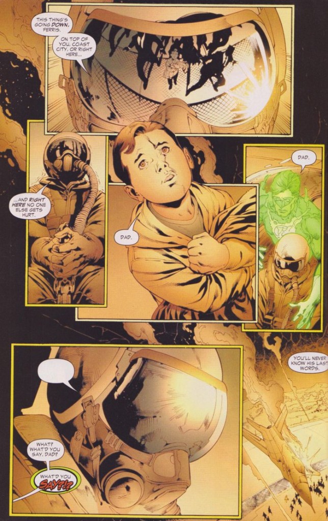
Does that even make sense? What a weird thing to be scared of. That’s pretty typical of Johns though; he tries to work in dramatic moments that fit the themes he tries to write about (in this case, “fear”), while constantly mashing on the buttons labeled “Hal is awesome and everyone loves him” and “Hal wanted to fly just like his father”. The most cringe-worthy moment in this entire story comes when Sinestro and his minions are attacking Coast City, and Hal broadcasts a notice through everyone’s TV to evacuate the city for their own safety, but the people have learned through his example to have no fear, so they all stay and shine green lights through their windows to show their support. Aside from the question of why everyone has green cellophane lying around their houses, they’re just being really fucking stupid, intentionally putting themselves in harm’s way and giving the bad guys targets to use against the Green Lanterns, all as a meaningless gesture.

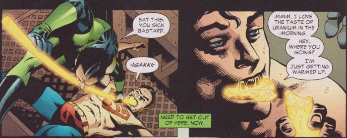
The rest of the battle is all pretty fine, aside from regular bits of ultraviolence and other such ridiculousness thrown in on both sides. It’s a pretty gleeful orgy of killing, with background characters regularly chopping each other’s heads off and tearing each other in half. The cover of one of the issues shows the Statue of Liberty being replaced by a statue of Sinestro, but it’s not meant to be symbolic; one of the first things the bad guys do after attacking Earth is build a big Sinestro statue, since they have weird priorities. The bad sentient virus infects Guy Gardner (another Green Lantern from Earth), but he is saved when a microscopic Green Lantern enters his bloodstream and rescues him. Amusingly, the Cyborg Superman just wants to die, and when it looks like he’s going to get his wish, a single tear emerges from his one human eye and rolls down his cheek. And while this moment isn’t written by Johns, but rather Peter J. Tomasi in the sister Green Lantern Corps title, it’s definitely worthy of inclusion in a tallying of the story’s hilariously awful moments:
There’s also a scene in which Parallax manages to possess both Kyle and Hal at the same time, and they overcome it by looking at a painting that Kyle’s mother bequeathed to him (???) and crawl out of its mouth in a particularly disgusting scene:
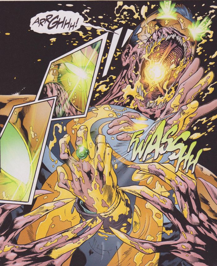
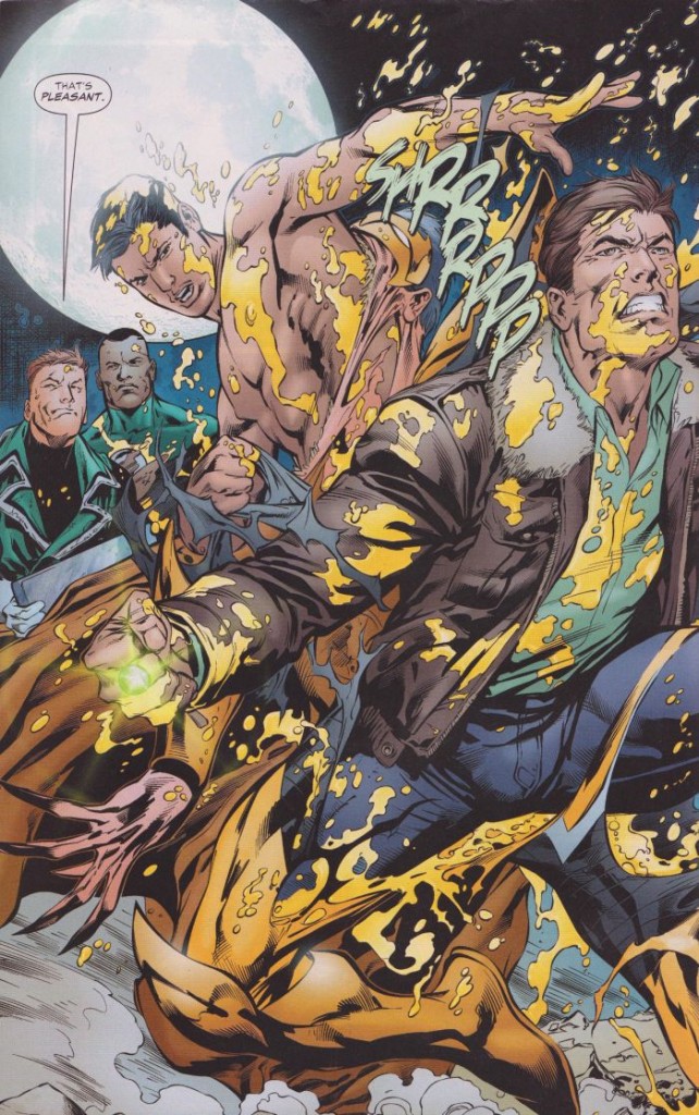
But the big, “important” moment of the story, a revelation that would shape the series from this point forward, is when we learn all about the “emotional spectrum”, a whole series of lantern corps that will emerge, beginning an epic “War of Light”. In addition to green for willpower (which Johns apparently thinks is an emotion), there’s yellow for fear (Sinestro’s corps), red for rage, orange for avarice (green, for envy or greed, would make more sense here, but it was already taken), blue for hope, indigo for compassion, and violet for love (the Star Sapphires). And so begins the simplification of all emotion down into a small number of possibilities (what about happiness, despair, betrayal, regret, or, I dunno, nostalgia?), creating fodder for innumerable stories in which different colors can fight each other with a “my hope shall overcome your rage!” simplicity to their actions. As dumb as this idea is, it’s a concept that could work well enough for kiddie entertainment, like something out of Care Bears or My Little Pony, but wedding it to regular maimings, the constant spilling of blood, ridiculously-proportioned women thrusting their secondary sexual characteristics at the reader, and teeth-gritted angsting about law and justice turns it all into a loud, garish mess.

We also learn that this is all leading up to the zombie-riffic “Blackest Night” story, but we’ve gotta take a break first (lest the constant high-stakes mayhem become more exhausting than it is already), so why not run in place for a bit?

Part 3: Howsabout a Pointless Origin Story?
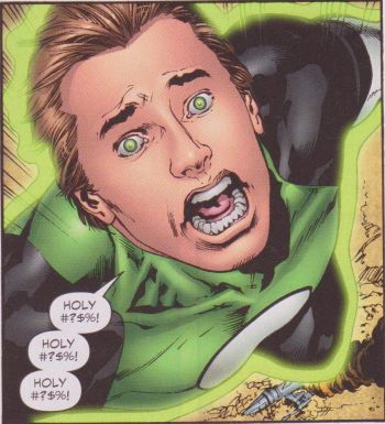
Yes, the main thing that comes in between “The Sinestro Corps War” and “Blackest Night” is “Secret Origin”, a revised retelling of how Hal first became a Green Lantern. It’s pretty much a redo of the story we’ve already heard several times over (since this is superhero comics, it gets recapped every few issues anyway), with changes to make it more directly relevant to the stories Johns is currently telling. For instance, when Abin Sur, the Green Lantern who crashed his spaceship on Earth and gave his ring to Hal Jordan, was flying to Earth, he was bringing along a murderous alien called Atrocitus (yes, that’s really his name; Johns is amazing at coming up with the most obvious names possible for bad guys, including a member of Sinestro’s corps called Arkillo), for no reason other than to insert him into Hal’s origin story. Hal and Sinestro end up hunting him down, which inadvertently leads to the origin of the villain Black Hand when he comes into possession of a “cosmic divining rod” (a device that sucks up Green Lantern powers and then shoots them back out as death rays) that Atrocitus built. For a couple of space cops, Hal and Sinestro do a remarkably poor job of containing stray weapons.

The best (that is, most hilariously ham-fisted) moment of this origin story comes when Hal decides to hunt down Carl Ferris, the man who ran the aeronautics company his father was working for when he crashed his plane and died, because he’s sure that Ferris murdered his father. But it turns out that his father’s death destroyed Ferris, and his guilt and sadness has driven him to get cancer, leaving him on his deathbed. Oh, such misdirected anger! This leads Hal to sit on some remote mountain bluffs and use his ring to create an image of his father in order to have it smile and give his approval:
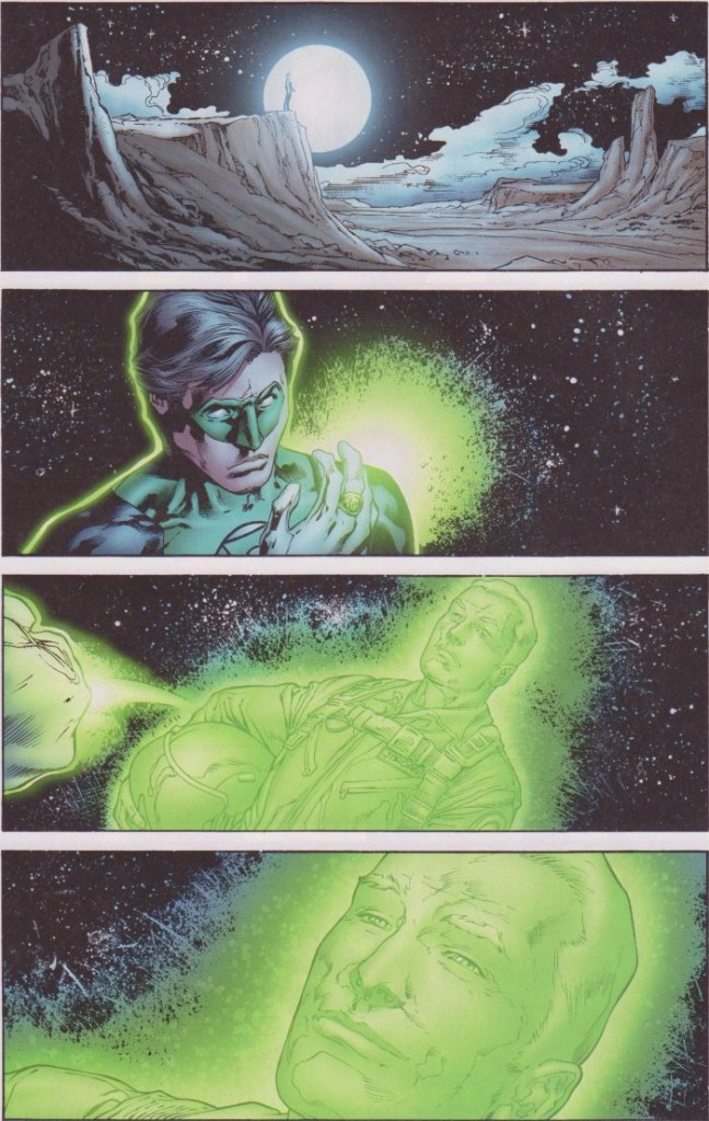
So there’s the real reason for the flashback: dealing with daddy issues. Back in the present, Johns introduces the Red Lanterns, who are led by Atrocitus, who is now boiling over with rage and seeking vengeance on Sinestro. These guys are the ones that gave us several especially atrocious covers, the likes of which keep driving customers from comic book stores, and they’re kind of the point at which Geoff Johns tips over into self-parody. The anger powers of the Red Lanterns manifest themselves as acidic blood that they projectile vomit at their enemies, which is rather disgusting. They’re presented as mindless minions of Atrocitus, barely able to keep themselves in check, and their ranks include a kitty cat for some reason, since I guess cats are known for holding grudges or something. In their introduction story, Sinestro, who was captured by the Green Lanterns at the end of the “Sinestro Corps War” storyline, is scheduled to be executed, but they decide to have it done on his home planet, which is a really stupid idea, since transporting him anywhere makes an easy opening for attack. And sure enough, that’s what happens, with some Sinestro Corps members trying to free their leader, but everyone being overtaken by some Red Lanterns, and Hal being sent to save him, or possibly execute him himself, whichever happens first.

This also necessitates the introduction of the Blue Lanterns, whose emotion is hope, which doesn’t really make much sense. What is hope, anyway? The desire for something good to happen? A belief in some sort of god? Is that even an emotion? And how do Blue Lanterns control this hope? Do they feel it themselves and wish really hard that they can blow shit up, or do they have to channel it from other believers? In fact, there are tons of inconsistencies in these emotional powers; Green Lanters are super-willful, so they channel their mental forcefulness into making big green weapons, and Red Lanterns are so angry that they just boil over with explosive bile, but Yellow Lanterns don’t feel fear, they inflict it. So how do they make all sorts of yellow stuff, by being super-scary? If whoever they are fighting isn’t easily frightened, are their yellow force bubbles completely ineffective? Later, we learn about compassion, its main power being that it is able to channel the other emotions and emulate them. That seems to be taking compassion as synonymous with empathy, but if that’s the case, is it even an emotion? Would anybody describe compassion as the emotion of being able to feel other emotions? And how do the various lantern corps use their powers anyway? Do they love, or hope, or covet so hard that they create objects out of their color-coded energy? What if they’re not feeling especially angry or scary that day? Do they have to be completely single-minded, focusing only on their specific emotion, to be able to do anything? Obviously, thinking too hard about this nonsense is a path to frustration and insanity, but Johns never stops delving into the intricacies of this silly system he set up, which makes the inconsistencies and poorly-thought-out ideas impossible to ignore.

Whatever the case, the Blue Lanterns include an alien named Saint Walker, and an elephant alien who is meant to be a stand-in for the Hindu god Ganesh, demonstrating that hope is meant to stand for religious belief, which Johns simplifies into meaninglessness with their oft-repeated catchphrase, “All will be well”. These guys power Hal’s ring up to 200% capacity and tag along with him to rescue Sinestro, but they get to demonstrate how great they are along the way by cooling down a star about to go supernova, saving all the inhabitants of the planet revolving around it. Interestingly, this is one of the only times in the entire series that any of the Lanterns perform their (or at least the Green shade of the spectrum’s) stated mission to patrol space, fight crime, and help people out. The rest of the series is all about people attacking Hal because they are obsessed with him, or engaging in power struggles between different colors. By including a simple moment like this, the entire premise and conflict of the series is thrown into relief, seeming like petty infighting between the powerful, who ignore the plights of those not worthy of their attention. This wouldn’t be a bad metaphor for modern society, if it was at all intended as such.

So anyway, Hal and pals go fight some Red Lanterns, and it’s really gross, full of vomit and gore, but the big moment comes when Hal gets a red ring stuck on his finger, turning him into a blood-vomiter, and then a blue one, which makes him some sort of Green/Red/Blue Lantern, since he’s so awesome he should get all the rings. There are more silly adventures, but it’s really just setting the stage for the next big crossover, which is about as Johnsian as they come.

Part 4: Geoff Johns Doesn’t Really Understand Zombies
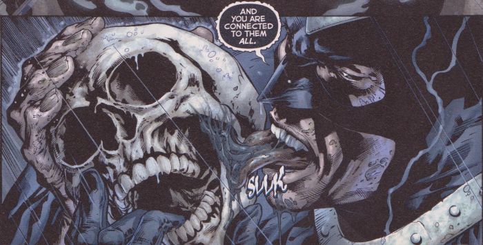
Zombies can be used as a metaphor for any number of things, such as the inevitable approach of death or the assault of conformity, but when Geoff Johns came up with his zombie lantern epic “Blackest Night”, which stretched beyond the Green Lantern series to encompass the entire DC universe, he didn’t appear to put any thought into it other than that undead creatures are cool-looking, and maybe kind of scary because they’re unstoppable. In this form, as a bunch of deceased characters raised from the dead and turned evil when a swarm of black rings spreads throughout the universe and possesses various corpses, they’re kind of a creepy menace almost entirely through sheer numbers, but the menace of the huge, unstoppable army is kind of diluted, since we’ve already seen hordes of Sinestros, Manhunters, Red Lanterns, etc. attack our heroes. What should be effective imagery is already kind of tired, and the obnoxiousness of Johns’ zombies ruins most of the effect anyway. The best thing that can be said about the story is that it’s fairly effective as an example of large-scale action and that Johns seems like he might be attempting to make a statement about the ever-temporary nature of death in superhero comics, but if that’s the intent, it’s as muddled as all hell.

The main crime here though is the zombies themselves, which depart from the silent, brainless monsters of Dawn of the Dead and the like by being downright talkative. Johns is going for an assault on the emotions of the living heroes, having their dead friends and family returning and attacking them both physically and verbally. The thing is, these zombies never shut up. They are the most annoying fucking villains in modern superhero comics (and that’s saying something), trying to provoke the heroes by invoking their failures and assaulting them where it’s really supposed to hurt, then killing them as viciously as possible. Early on, Hawkman and Hawkgirl are attacked by Ralph Dibny (a.k.a. the Elongated Man) and his wife Sue (who, as a former happily married crime-solving team, have been some of the most debased characters of the last decade or so of superhero stories, Sue’s rape and murder being the centerpiece of the much-lamented story Identity Crisis), who taunt them crudely, then viciously murder them and tear their hearts out:
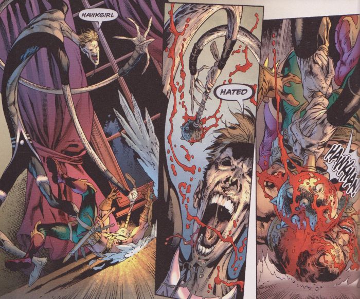
More of this sort of thing follows, with some especially egregious examples including zombie Firestorm attacking his replacement and torturing and murdering his girlfriend while forcing him to watch, or Jean Loring (Atom’s ex-wife, and the murderer of the aforementioned Sue Dibny) showing up to murder some heroes and scream such classic lines as “No one ever believed in him. Not until you came along tonight. And that glimmer of hope you ignited in him tasted so good.” It’s all rather gross and nasty, and while it’s meant to be shocking, it’s really just tiresome. As we learn, it’s all part of the main villain’s scheme, which requires the zombies to provoke emotions, which will then power him up for his attack on Earth. How this makes any sense is beyond me (why does a master of death need to drain emotions? What do emotions have to do with death at all, except as a way to connect this nonsense to Johns’ ongoing color-war plot?), and the scenes of zombie attacks are eye-rollingly dumb, as various characters are seen via zombie-vision to glow with whatever color on the “emotional spectrum” corresponds with whatever single emotion they are currently feeling, thus allowing the zombies to steal those colors when they kill them. It’s sheer stupidity, but while it drives the early chapters of the story, it’s mostly forgotten when Nekron, some sort of death god and the true villain behind the black lanterns, rises and starts his attack, eventually revealing that his real target is “the Entity”, the spirit of life, which was hidden within the Earth billions of years ago.

During all this, Green Lantern goes on a quest across the galaxy to unite all the different color rings as an attack against Nekron. He picks up his old girlfriend Carol, who is now a Star Sapphire wielding the power of love and wearing a skimpy costume; Sinestro; Saint Walker; Atrocitus; Larfleeze, a warthog-like alien who has the orange-tinted power of being greedy and saying “Mine!” a lot (which is supposed to be funny, but is just really annoying); and Indigo-1, the leader of the compassion-shooting Indigo Tribe, who get introduced as a bunch of mysterious, loincloth-wearing, gibberish-talking aliens in the middle of all the zombie chaos. Their attack on Nekron doesn’t work though, because Johns needed to drag the plot out some more, so they spend a few more issues fighting zombies, while Hal ends up getting willingly possessed by Parallax again so he can fight the Spectre, the spirit of God’s vengeance (who takes the form of a giant, pale guy wearing a green cloak and underwear), who was somehow also turned into a zombie, and then Nekron possesses all the heroes who have died and been resurrected at some point, like Superman, Wonder Woman, and Green Arrow. The Barry Allen version of the Flash, who had recently been brought back to life some twenty years after he died in the original Crisis on Infinite Earths, and Hal Jordan manage to escape being possessed though, because they’re Johns’ favorites.

And then, in an especially silly plot point, somebody reveals that all the different rings are based on Oan technology (even though, as we saw in previous stories, some of them apparently manifested spontaneously through accumulated emotion or something), and the “Book of Oa” (a giant book that the Guardians keep around, because that’s how billion-year-old guys with unimaginably complex technology would store a repository of their laws and history) states that during “the blackest night”, which had been prophesied for thousands of years, Green Lanterns can deputize somebody else for twenty-four hours. This is an excuse for all the colored lanterns to recruit another character to their teams, and for the artists to come up with new costume designs for familiar characters. So, Flash becomes a Blue Lantern (he has a lot of hope, I guess), Atom becomes a member of the Indigo Tribe (because Johns established him earlier in the story as being especially compassionate, showing that he didn’t blame his murderous ex-wife for her crimes), Mera (Aquaman’s wife, who Johns has decided is an important character) becomes a Red Lantern, Wonder Woman becomes a Star Sapphire (mostly so she can get a skimpier version of her costume), Batman villain the Scarecrow becomes a Yellow Lantern (his deal is that he gives people a drug that brings their nightmares to life, although Johns makes him a fear-addict here so he can be all crazy with the yellow fear powers), and Superman’s arch-nemesis Lex Luthor becomes a greedy Orange Lantern.

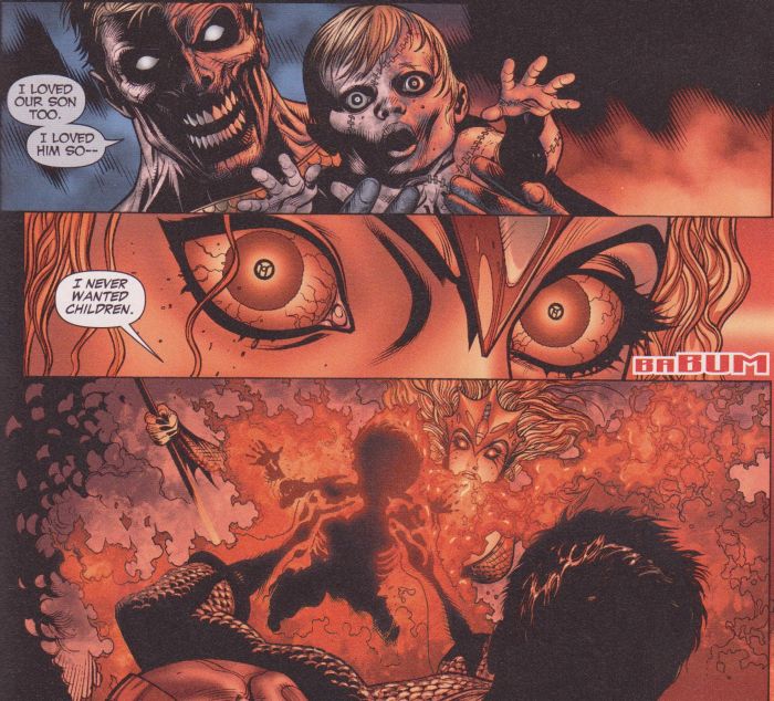
As with most of Johns’ comics (and superhero comics in general, really), this is action figure storytelling, grown men playing with toys and trying to think of cool playsets to build and different childish conflicts for them to get into, but while that sort of thing can have its charms (most Hollywood action movies aren’t much different), Johns turns it into a distasteful exercise in arrested development, trying desperately to make it serious and dark and violent and “adult”. Hence the nasty stuff with the zombies, the constant sexualization of any female characters (even the weird alien ones), or the more ridiculous stuff he comes up with later, like a scene in which zombie Aquaman presents Mera with a reanimated version of their dead baby, and she vomits red blood-acid all over it:
Even dumber is when Johns uses the revelation of the white Entity as a chance to combine his color-coded emotion system with Christian mythology in a retelling of the origin of life that incorporates all the nonsense he created over the course of his years of color-based storytelling, casting the orange power of avarice as the snake that influenced Eve in the Garden of Eden, showing how Cain’s murder of Abel birthed the red power of rage, and so on. It’s so idiotic as to be kind of daringly subversive, or so I might think if I didn’t believe that Johns takes it all very, very seriously.

The good guys win in the end, of course, although there’s at least one hiccup along the way when Sinestro assumes the power of the Entity and becomes a White Lantern. But he can’t control it, and Hal ends up being the one who defeats the power of death by uniting all the other resurrected heroes and then bringing Nekron’s sidekick back to life, causing him to vomit up a bunch of white rings and destroy Nekron. At least, I think that happens; it gets pretty hard to follow, as usually happens with this cast-of-thousands clusterfucks. There’s some business about various dead heroes being resurrected for some mysterious purpose, which led into another series called Brightest Day that I don’t think I can bear to inflict upon myself after this much Johns exposure. I think the big mystery turns out to be the return of Swamp Thing though, but a version of the character that does its best to negate any changes wrought upon the franchise by Alan Moore, since Johns, ever loyal to his employers, knows which side his bread is buttered on.

Part 5: Oh God, This Just Keeps Going
Uniting everyone in the universe to shoot a bunch of colored beams around and defeat death itself is only a stop along the journey for Johns, who just keeps trucking along with his candy-colored epic, doing his best to inflict sensory overload on his readers through more and more battles between feelings. The next phase of the story sees Hal and friends seeking out the “entities” of all the different lanterns, the various spirits that embody the emotions behind the colors, in an attempt to keep them from falling into the wrong hands. It’s as misguided and weird as ever, including at least one perfect example of Johns’ dunderheaded take on what are supposed to be the basic building blocks of the human experience. That would be the fact that the love entity is a vicious monster called the Predator (did I mention that Johns must have had some relationship problems at some point?) who possesses a stalker guy and turns him into a nasty killer. And of course, the male version of a Star Sapphire gets to wear a head-to-toe costume that puts him into pretty striking contrast to the flesh-revealing scraps of fabric(?) that barely cover his female minions:
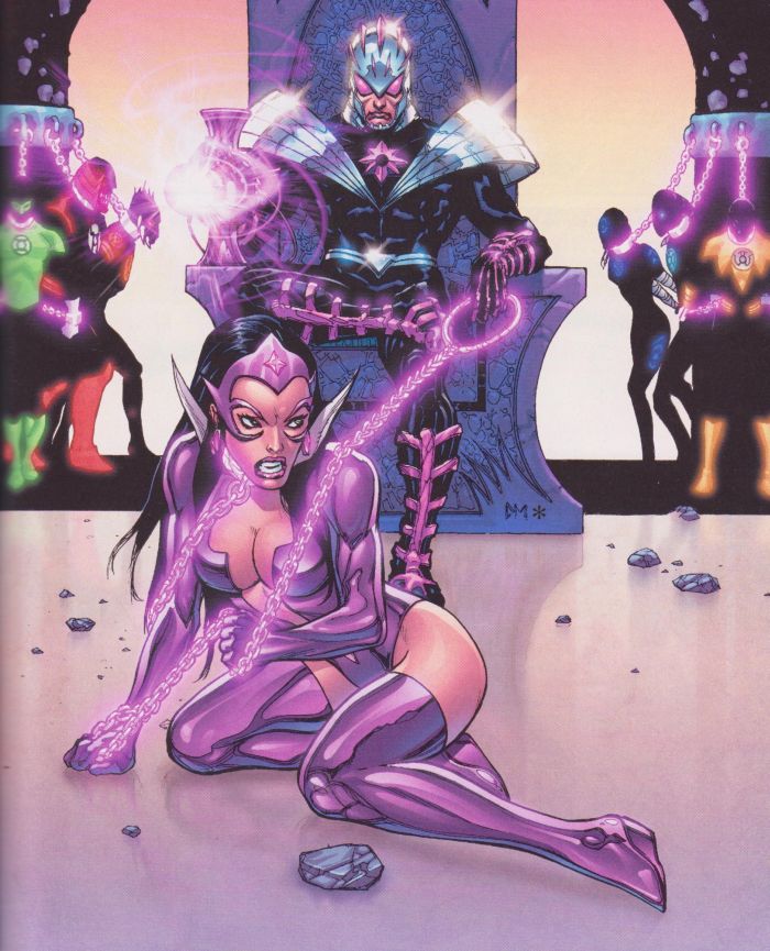
Johns even tries to have his cake and eat it too, by having Carol complain about having to wear a swimsuit while fighting evil across the universe (even though other Star Sapphires are shown as wearing versions of the costume that aren’t as revealing) and including a scene in which she bumps into a guy on the street who spills a drink on her boobs and then leers at her along with his fellow frat boys, as if we’re supposed to frown upon that objectification of women, then ogle the cleavage pushed into our faces a few pages later.

In other nonsense, Atrocitus searches for his own rage entity, which is a giant bull called the Butcher. Let me repeat that: it’s a bull. Called the Butcher. Did nobody notice the irony there? Johns actually tries to make Atrocitus a sympathetic character, with his clumsy attempts at character development being pretty amusing as he comes across a prison full of murderers and just executes them all with his red vomit:
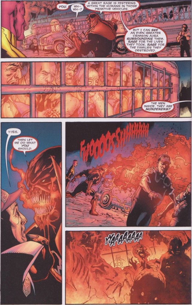
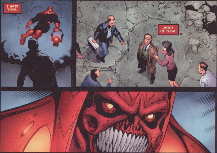
He also fights the Spectre in the middle of an execution, during which the man being electrocuted taunts his victim’s father, then gets all scared and sorry when the father gets possessed by the Butcher and turns into a vengeance-fueled monster. As much as Johns seems to want to use these emotion-colors to tell stories, he’s got nothing interesting to say about them, or any depth to any of his characters. The killer is unrepentant and evil, ready for death, but he still cracks and starts begging for his life when the various scary monster characters attack him. The father is sad and angry, and I guess we’re supposed to feel sorry for him as he cries and screams and turns into a killer himself. But there’s no attempt to address the morality of capital punishment or the effect that violent revenge might have on those who carry it out; it’s all just window dressing for aliens and costumed creatures to fight over who gets to wield power. Johns does seem to be trying to add some depth to Atrocitus’ character, making him a sad, tortured being under his raging exterior, but since he’s designed as a fanged, screaming, blood-puking monster, it ends up being pretty amusing when he tries to actually emote:
In other entity-chasing antics, Hector Hammond escapes from prison and gets possessed by Ophidian, the orange snake-monster of avarice; a girl who was kidnapped by a serial killer becomes the host of Adara, the hope entity that looks like a three-headed eagle for some reason; and a selfless paramedic gets a page or two to argue with a colleague over whether they should treat somebody who doesn’t have insurance before Proselyte, the giant octopus avatar of compassion (since octopi are the most empathetic of all the animals, of course), takes him over. But that gets ignored pretty quickly in favor of the introduction of a mysterious villain that turns out to be Krona, who has his own backstory that is much too tiresome to explain, even though it gets revisited several times over the course of the next bunch of issues. He’s a rebel Guardian, and he wants revenge, or he wants to rule the universe, or he wants to kill everyone, or there’s some other explanation and goal for his villainy, but it really doesn’t matter; he’s just the next big bad guy to fight.

So Hal and his multicolored buddies have to jet around the universe doing more ring-zapping, but not before he has a long, tiresome argument with the Flash about how he’s a jerk and impulsive and doesn’t accept help from his friends and doesn’t follow rules and blah blah blah, and Flash gets possessed by Parallax and they fight, and there’s an especially dumb discussion of H.G. Wells’ The Time Machine that I suspect Johns got from watching the Mel Gibson movie Ransom rather than reading the actual book. Hal turns down help from his friends in the Justice League because he’s too cool for them, and he goes off to space with his colored-ring pals, and they all get sucked into a giant book of forbidden Green Lantern lore, and oh god, this is so stupid, and it just keeps going and going and going.

Actually, at this point, the series has reached a state of sublime stupidity, a childlike “and then this happened, and then this happened” sort of storytelling equilibrium, and while it’s certainly not good, it’s mostly readable, and one almost wants to keep plowing through it just to see what contortions to the rainbow-feelings cosmos Johns will come up with next. Krona takes over the Green Lanterns, cramming the different entities into all the Guardians and revealing some amusingly bizarre designs:
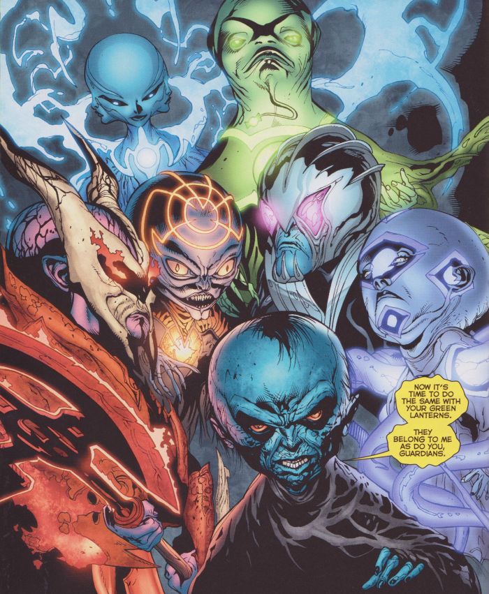
Then he brainwashes all the Green Lanterns, which forces Hal and the other human Green Lanterns to switch to different-colored rings. This necessitates more costume redesigns, including some especially awful purple camouflage fatigues for John Stewart:
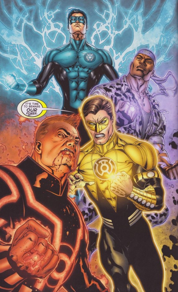
Then Hal and Guy Gardner get captured, and Krona intends for them to get turned into Guardians, but that’s just a cruel tease, because who wouldn’t have wanted to see them as macrocephalic dwarves? Then there’s more fighting, and it all ends kind of suddenly (I suspect the story was compressed a bit in order to reach an end in time for DC’s latest universe-wide reboot) with Hal’s ring being taken away and Sinestro becoming a Green Lantern, and a final panel that I wish was the actual end of the series:
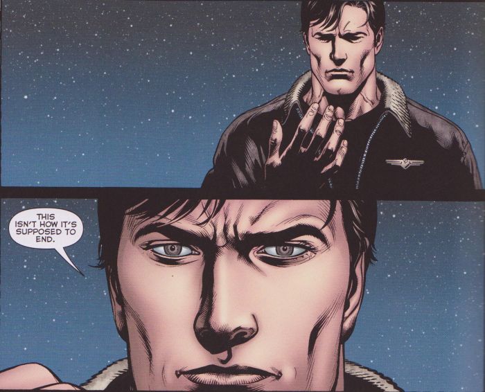
Of course, after the big “New 52” reboot, Johns picked up right where he left off, with more of the same characters zooming around space and arguing over rings and colors and Guardians, but this presents a perfect jumping-off point, enabling me to attempt to keep what’s left of my sanity after immersing myself in this moronic view of the emotional cosmos.

In Conclusion, If Anybody Is Still Reading
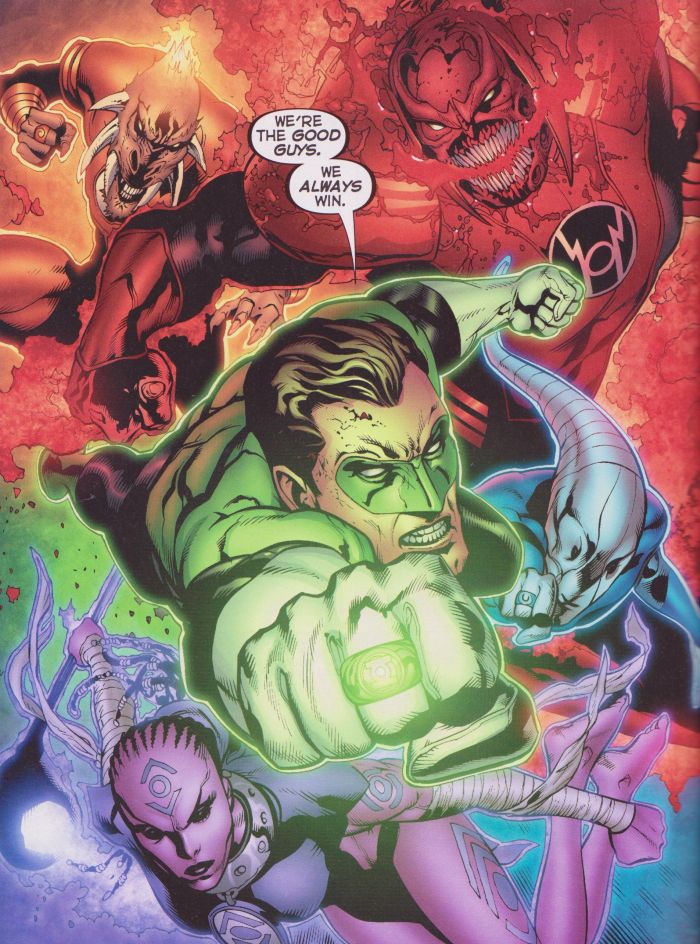
With this apparently being the maximum amount of Geoff Johns comics as I can take, I’m left with a few questions (mostly why I exposed myself to such mental toxicity) and observations. It seems to me that Johns, in an attempt to weave a grand, expansive cosmos around his favorite character, fundamentally misunderstood the basis of the idea behind it, and managed to turn it from sort-of science fiction into dorky fantasy, with an air of “sufficiently advanced technology seems like magic” legitimacy to it. The original concept behind Green Lantern is that the rings can create constructs of energy (or “plasma” or something, for writers who wanted to sound scientific), and mastering their use took a great deal of willpower, even if that’s a nebulous concept in and of itself. But Johns decided that the green energy itself <em>was</em> willpower, which, if he considered it an emotion, opened the gateway to a whole range of other emotions, and he extrapolated outward to a grand vista of colored feelings, a whole spacetime-spanning, multi-front war of shifting alliances, reversals, betrayals, and ever-more-grand-and-violent battles. That sort of massive-scale ambition is kind of commendable, and, sure, it could be a good basis for a kiddie cartoon of some sort, but Johns takes it all so damn seriously. He tries to retell the origin of life and address the nature of death and the afterlife. He has characters confront the horrors of genocide and debate the morality of capital punishment. He attempts to delve into the nature of “pure” emotions themselves and see how they can be manipulated, twisted, or channeled by people. This seems like it’s more than just a big spandex space opera to him; it’s a way of life.

That’s what ultimately sours me on the entire enterprise: the need to turn what could be dumb-but-enjoyable action-adventure stories into some sort of statement, even if that statement is just “look how mature and adult this is!” That’s the nature of superhero comics these days, adding sex (or hints in that direction, mostly consisting of skimpy costumes and cleavage/upskirt viewing angles for female characters) and violence (which is not nearly as coy, usually being front-and-center on the page and as gory as possible) to the children’s entertainment which the creators and the audience have such nostalgia for. Johns’ ambition in revamping and “maturing” the characters and milieus that he loved so much as a kid is obvious, but while he may have stumbled upon some halfway decent ideas and managed to put together some pretty good action sequences, the execution is so blunt and dumb, full of ridiculous nonsense and crammed with tawdry attempts to make the stories “dark”, that anyone in their right mind should just laugh, rather than celebrate him as some sort of master storyteller.

So what’s the big takeaway from this overlong exercise? Are Johns’ comics as terrible as I always thought they were? I’m tempted to say that they’re not, but that would probably be Stockholm Syndrome speaking. Really, they’re pretty awful from top to bottom, full of nonsensical twists and terrible dialogue (seriously, a little bit of wit would go a long way; instead, the stories are full of lines like “This rainbow rodeo’s locked and loaded!” and “I hope it still will be [enjoyable] when my foot’s up your wrinkled blue ass!”).

Some storylines are more palatable than others, with one big reason: the artist. Ivan Reis illustrates the majority of Johns’ tenure on the character, including the Blackest Night crossover, and he approaches the material in much the same way as Johns: seriously and reverently. His characters are all gritted teeth, bulging muscles, and staid heroism, which only exacerbates the pompous and “important” presentation of the whole stupid business. He does cram lots of detail into his pages, although this eventually gets exhausting; Blackest Night has what must be at least a half-dozen spreads of thousands of characters (zombie superheroes, zombie villains, Green Lanterns, more zombies, etc.) charging at the reader, to the point that all impact is lost by the time the story drags to an end. Doug Mahnke, on the other hand, brings a bit of humor and energy to the proceedings that other artists lack, providing enough exaggeration and strangeness as to make things occasionally seem more farcical and less self-conscious. He can’t completely overcome Johns’ stupidity, but he definitely makes it more enjoyable.

But no, some very minor redeeming qualities and backhanded praise aside, this is a collection of modern superhero comics that begs to be ignored and forgotten by anyone with half a brain. It’s certainly not the worst thing out there (just read a few issues of the Green Lantern Corps tie-ins that get packaged along with the main series in the compilation volumes to see stories that are uglier and worse-written), but it surpasses those lesser efforts through sheer influence. Somehow, Johns has determined how to push the nostalgia buttons of man-children like himself who can’t manage to expand the boundaries of their sphere of knowledge beyond stories of muscular behemoths in colorful, skin-tight costumes beating each other into oblivion, and he has shaped the industry to his liking, convincing everyone that this is how superhero stories should be told. It’s an impressive feat, especially considering that he doesn’t have the cleverness of a Joe Casey or Grant Morrison, the cult of personality of a Brian Michael Bendis or Warren Ellis, or the humanity of a Mark Waid or Kurt Busiek. Those writers might not be everyone’s cup of tea, but they’ve all proven themselves to be miles beyond Johns in creativity, style, and just plain comics-writing chops, but as so often happens in the world of commercial art, mediocrity rises to the top. But it doesn’t have to be that way. If, when presented with the chance to read Geoff Johns comics, we can all pledge to at least consider something else, something better, something that might not suck, then maybe, just maybe, this world will be a slightly less stupid place. Join me, if you will, in this goal: to lower the readership of Geoff Johns comics by .01%. We can do it, people!
__________
Click here for the Anniversary Index of Hate.

Flowers for the Smartest Kid on Earth

Excepting perhaps those of Metallica and Ridley Scott, there are few career arcs in recent American popular culture (an association he would despise) whose plummets have felt as sickeningly steep as that of Chris Ware. Ware more so for me, as a proto-budding comics artist at one point in my life, because he is uniquely responsible for dramatically re-enchanting and subsequently de-enchanting my relationship to the comics medium. I am willing to own my sour grapes. But there is only one reasons, in my mind, to direct aesthetic bile, which is that there is a consensus in support of a creation that deserves but has not received critical questioning. A corollary justification, which applies in this case, is when different portions of an artist’s work are not executed at the same standard, with no apparent effect on his popularity or legacy. This kind of brand-deterioration (or “falling-off”) is familiar in its causes and effects, but bears some contemplation nonetheless.

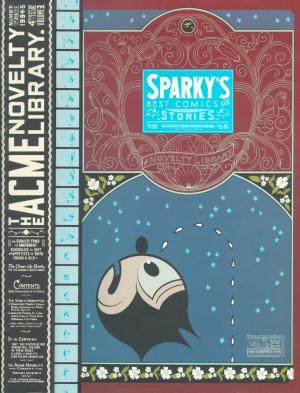
Ware’s Acme Novelty Library #4 was the first comic book I bought in Chicago in 1996, at a justifiably renowned bookstore dubbed “Quimby’s” in honor of Ware’s mouse character. AN #4 had tiny comic strips within massive comic strips, full of morose, bitter gags without punchlines, conveying mute anguish and casual cruelty. It had backwards comics. It had absurd advertisements in absurdly minute print. It had cut-and-fold sculptures. It had microscopic comics that read like animation filmstrips, and big morphing panormas, and everything rendered in a McCay-esque style that, despite its schematic depthlessness, made a flat page seem like a transdimensional portal rather than a surface. A compact exemplar of Kant’s “mathematical sublime,” it seemed to uniquely exploit everything that made comics different from books, art, or moving pictures of any kind, historically as well as formally.
 

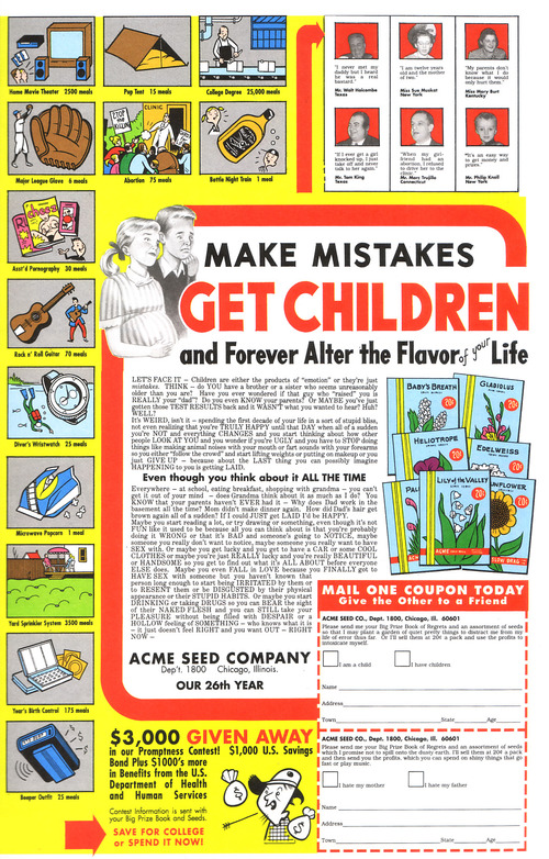
Clearly I love Acme Novelty Library #4 and Ware deserves to be fondly remembered for it, along with pretty much all of his ‘90s output. No one can take that away from him. The advertisements alone: “Make Mistakes, Get Children, And Forever Alter The Flavor of Life!;” “Large Negro Storage Boxes!” (this an advertisement for prisons); “Sexual Partner Sent To You Within Six to Ten Days!”;” “Irony!;” the list of bleak, brutally sharp promotions goes on and on (all exclamation points implied). Allow me to take one excerpt from a bit more detail, from the staggeringly tongue-in-cheek “Popular Television Programs on Cassette!,” describing the tapes’ content as provided by “your own personal video tutor:” “You’ll trace a summary of major themes, characters, plot lines, and the particular qualities that make each show so appealing to the average Amercan dumbfuck.”
 

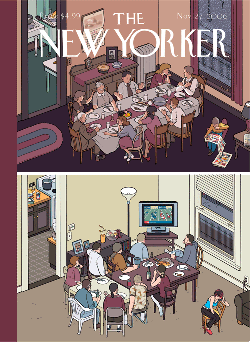
Well put. And it’s not that I only appreciated his work when it was vulgar– it was rarely vulgar. But it was unrelentingly harsh. Compare this with the November 27, 2006 New Yorker cover that featured two Thanksgiving dinner tables in Ware’s trademark orthogonal perspective. One was from America’s temporally-indeterminate innocent past, and featured people having interactions (meaningful ones, to be sure), while, at the contemporary table, everyone was staring at the flatscreen TV. It’s like an edgy version of Norman Rockwell, except that Ware’s blunt nostalgia faithfully emulates Rockwell’s nadirs of treacle and falls short of his occasional glimpses of epic drama. The Thanksgiving scene echoes Ware’s equally drab, generic, competently banal depictions of people staring at cell phones. Instead of, you know, each other. Or, even better, authentically old-timey print media.


The series Ware worked on after the first Acme Novelty books– Jimmy Corrigan the Smartest Kid on Earth, Bramford the Best Bee in the World, Rusty Brown, Building Stories, — have gone from grim to dismal to dull. Originally anchoring his stories in surprising juxtapositions of style and content, forcing the reader’s eye to maneuver through dense, clamorous riots of clean, graphic Constructivism, florid Art Nouveau, and moments from throughout the history of humor and fantasy comics, not to mention experimental animation, his mash-up of high and low culture worked much like Beckett’s interpretation of vaudeville in Waiting for Godot. The snarky pathos fed a battery of nihilistic tension, to be released in the searing vitriol of the avant-garde, a pathway to creative freedom in defiance of convention. How did we end up with lame bubble people barely mustering the strength to rehearse thoroughly unfunny but earnestly poignant tropes of modern literary realism? As one might have once imagined Ware himself saying when comparing sensual Art Deco rococo to arid Miesian modernism, “this is progress?”

Ware wasn’t quite a self-made artist, and may not be entirely to blame for disintegrating; he received an early break in Raw from Art Spiegelman (whose dive is only less impressive because of starting lower), but, at the millennium, Ware began networking in earnest with the insufferably ironically sincere elite of the patronizingly-educated-middlebrow culture industry– Dave Eggers, Ira Glass, and Chip Kidd, for starters. His autistic antics in interviews and panels didn’t flag in their ostentatious displays of repression– and in fact, he may have started becoming more of a performance artist (as all celebrities must be) and less of an unequaled craftsman of sequential art. “Twee” describes a current in vulnerable jangly indie-pop music, first British and then American, but came to stand in for the preciousness of a generation that hit on someone by knitting a cozy for their portable toy record player. I think twee killed Chris Ware.

In twee there is neither humor nor horror, neither conviction nor swagger, just feelings. Feelings and nostalgia for feelings. Chris Ware was sucked into this vortex, streamlining himself into a reliable product for easy digestibility by self-styled “nerds” everywhere, and so we ended up with emo comics garbage overflowing the microcosm of craft-fair entrepreneurship and spilling into Michel Gondry, Death Cab for Cutie, and overdetermined bangs (all much to Chris Ware’s chagrin, if he has any left). True, this infantile regression might have happened anyway. Maybe it was September 11th that whetted the American appetite for saccharine melancholia, but I blame Chris Ware. What twee had to offer that was positive– androgyny, sloppiness, magic– was latent but present in his flamboyant early work. He could have made different choices, But it is lost now, lost irrevocably in the sterile, commercially lubricated navel into which his vision has apparently gone to die.
 

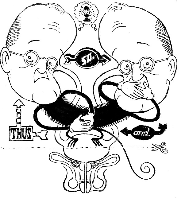
illustration by Bert Stabler

 
Click here for the Anniversary Index of Hate.
Comics Poetry, Poetry Comics, Graphic Poems

There are times I read something on the internet and feel this immediate need to respond. I think we’ve all felt that way about topics we care about. Thus is created the comments thread, the message board, and other forms of abbreviated, often argumentative discussions. For me, I don’t always feel capable of forming my thoughts and reactions into a coherent text, especially in a way that avoids being combative (I really don’t want to be that way). So I save links and texts in hopes of later returning to them and making some grand statement, some coherent argument, some well thought out response. But waiting for that time to come is often counter-productive as sometimes making the incoherent statement and getting feedback is where the real discussion and learning comes from.

Writing about the idea of comics and poetry has been on my to-do list for quite awhile. I’ve a note in Evernote from December of 2008 labelled “Comics as Poetry.” The note is just a bunch of collected links to people like Tom Hart, Bill Randall, and Gary Sullivan, all dating from early in 2008. I also have one paragraph of a started post from April 2011, and a never completed review of Warren Craghead’s How to Be Everywhere from February of 2011.

I feel strongly that there is a line of comics poetry that runs through the history of comics, but I always end up getting stuck on how to delimit such a feeling. What is comics poetry? What is poetry? Similar to asking “what are comics” or “what is literature” this is rarely the most productive place to start… and thus, the not starting.

What started me up again this time were two recent articles on the topic: Steven Surdiacourt’s “Graphic Poetry: An (im)possible form?” at Comics Forum and an interview with Bianca Stone at The Comics Journal from this past week. Both immediately set off my desire to respond.

First off, Surdiacourt’s article starts with the term “graphic poetry” which I find unfortunate. I can see the desire to parallel the “graphic novel,” (which he explicitly uses in one definition: “graphic poetry is to the graphic novel, what poetry is to prose”), but I don’t think it is a good idea to work from an already contentious misnomer of a term. Also, “graphic poetry” sounds like something a person in the 1950s would have used to describe “Howl.” Don’t let the children read that graphic poem.
Surdiacourt’s text itself starts off on good footing, discussing the inspiration for the article: an exhibit that featured paired up collaborations between comics artists and poets. He immediately notes the tendency to have the artists illustrating poems, rather than the two truly collaborating. We’ve seen this before with the work published by the Poetry Foundation (here’s the last one in the series with links at the bottom to the others) under the rubric of “The Poem as Comic Strip” (that title alone tells you something). What we find there is a bunch of comic artists (some, like Ron Regé Jr., whose regular work is often comics poetry) illustrating poems by famous poets. It’s quite reminiscent of that bastion of comics greatness Classics Illustrated and not particularly inspiring (see Bill Randall’s column about the series). Of course, this model works for people in the poetry world because it maintains the integrity and primacy of the original poem/words.

Back to the essay at hand, it draws heavily on an article by Brian McHale about narrativity and segmentivity (I’ve only managed to read sections of it via Google Books which seems to cleverly only skip the pages where the primary analysis is done). McHale starts with poetry but turns to comics, spending the majority of the article discussing Martin Rowson’s adaption of Eliot’s The Wasteland as way to compare the two forms’ use of segmentivity and narrativity. Surdiacourt summarizes McHale’s theory:

…this segmentivity is defined as “the ability to make meaning by selecting, deploying, and combining segments” (Rachel Blau DuPlessis quoted in McHale 2010, 28). It’s not merely their gapped nature that connects poetic texts and graphic narratives, but also their shared capacity to play off “segments of one kind or scale […] against segments of another kind or different in scale” (McHale 2010, 28). The best known example of this kind of poetic configuration is obviously the enjambement, a trope in which the grammatical unit of the sentence (measure) is disrupted by the unit of the verse (countermeasure). A similar textual device is used in comics to create or maintain tension by the interruption of the action (measure) at the end of the end of the right hand page (countermeasure). [DB: Those are his ellipses and references.]

Surdiacourt rightly notes that this single criterion is not enough to compare comics and poetry. So, he also (briefly) brings up poetic rhyme in comparison with visual rhyme, braiding, as well as Barthes’ hermeneutic code. All of these can be gappy aspects of comics. In McHale’s article he also briefly discusses film, comparing filmic cuts to poetic segmentivity and the gaps in comics, noting the tendency of classical Hollywood style films to make cuts/gaps as invisible as possible (though one can argue against that when there is a desire to provoke mystery or suspense) in contrast to an Eisensteinian montage where gaps are introduced to force viewers to “make meaning.” I think the latter use of gaps is one place where comics can foreground their constitutive elements (images in sequence) in a similar way that much poetry foregrounds words and sounds.

Unfortunately Surdiacourt focuses on textual segmentivity, and his only example (from Nicolas Mahler) is primarily about the text. He ends on a strange note: “In the end, what and how graphic poetry can be (if it can be at all) remains to be imagined, and drawn of course.” He seems completely unaware of the existence of work that would fit his category, that would even better fit his category than his or McHale’s examples.

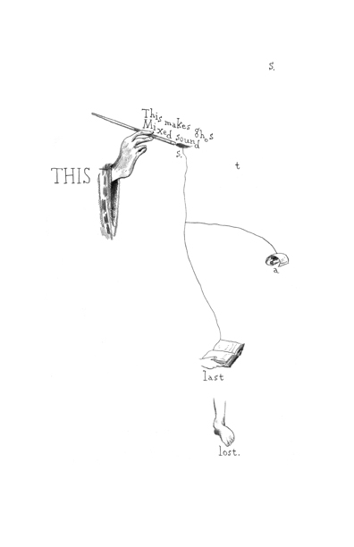
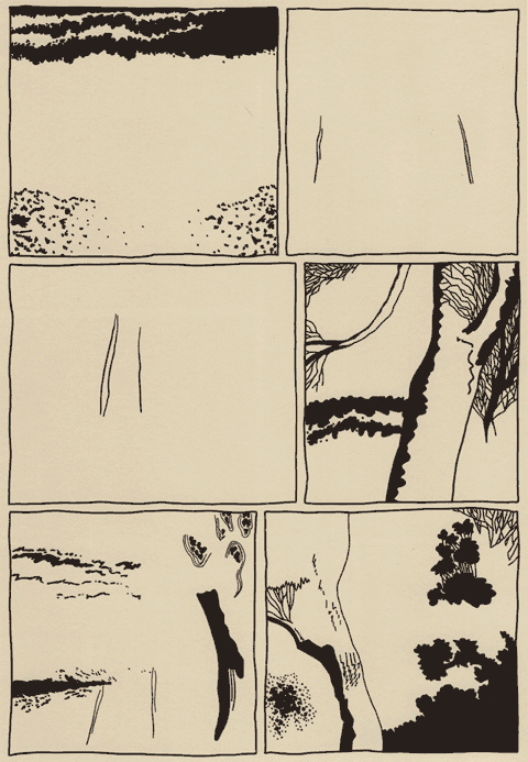
Certainly, looking at any comic by Warren Craghead provides a great example of segmentivity, a gappy aesthetic, and usage of various tactics Surdiacourt mentions. Craghead almost never uses text in the traditional way it is used in comics (balloons, captions), instead he fragments sentences and words into pieces (the word, the letter, respectively) and scatters them across the page. His pages and panels are also visually segmented as he tends to use images that are singular or partial–a single object, part of a larger object or scene–and then connect them visually through composition, lines, and text.

from Warren Craghead’s “This is a Ghost.”

For instance, this page from “This is a Ghost” shows a fragmentation of sentences, words, and imagery. The fragmentation creates a rhythm to the reading as one moves across the page through the multiple sizes and spacing of the text. You can note that the (admittedly out of context) sequence of images is not a “smooth” transition. Also, when read in full (see the references list below for a link to a pdf of the anthology), one finds a use of repetition (both word and image), braiding, and visual rhyme across the comic’s 14 pages. The comic tends to force a different type of reading than a conventional narrative comic that provides a very smooth and transparent reading. Craghead’s comic engenders a closer reading and a tendency to reread nonlinearly as one moves back and forth through the pages trying to decipher its layers (in a sense this echoes the hermeneutic code).

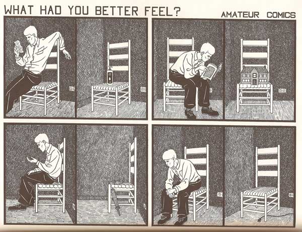
From John Hankiewicz’s “Amateur Comics.”

Much of John Hankiewicz’s work would also fit well as an example for Surdiacourt. For example, his “Amateur Comics” sequence makes use of segmentivity in an unusual way that could mirror McHale’s measure and countermeasure. Each page from the sequence is divided into four groupings of two panels. The groupings’ two panels are divided only by a single line, while the groups are divided by the negative space of the gutter. In most of the pages, the groupings divide up into a panel with a person in the left and one without a person on the right. The left and right also often show different views of the same scene, sharing view across all four groups. In this way, Hankiewicz disrupts one narrative sequence with another, creating a network of potential sequential and spatial readings of the 8 panels on the page. The spatial organization in conjunction with visual content, which at a general level shows alternating imagery, makes use of repetition and creates rhythm within the page and across the sequence of pages. Similarly the two lexias of text across the top of each image (a question beginning with a series of interrogative abverbs and a two word phrase in the form of “[something] Comics”) also form a consistent set of repetitions and variations that can be read across the pages. Without even discussing the specific content of the images, it’s fairly easy to see how one can read “Amateur Comics” as a form of comics poetry.

So, that’s just two artists off the top of my head, and neither are that obscure in the comics world. Both comics provide examples that are considerable more invested in the interaction of text and image in a “poetic” (let’s put my usage of this term aside for now) way than just the text by itself.

I wish that before he decided to posit something that he didn’t think existed, Surdiacourt would have looked for examples of that supposedly nonexistent thing. I’m sure if he looked around a bit he could have found some examples. Certainly, Rob Clough wrote about Hankiewicz’s work as “comics-as-poetry” in The Comics Journal (the online version is easily searchable), and there are often (mostly brief) examples to be found fairly easily.

Bianca Stone, who explicitly calls her work “poetry comics” and edits a poetry comic column at The The, was interviewed in The Comics Journal and shows a similar lack of knowledge of artists working in the comics world. Stone’s foregrounding of “poetry” in her terminology does point to her grounding in the poetry world rather than the comics world, so that could be part of the reason (none of the comics she explicitly mentions are outside the mainstream (be it superheroes or “alternative”)). The interview bears this out as she discusses being in an MFA poetry program and not having much interaction with the comics world. (There are a bunch out us out here, Bianca.)

Even her definition of poetry comics points to a focus on text as poetry: “Sequential art that uses poetry as the text.” I realize she is surely simplifying here to have a quick definition, but the concept makes it seem like the work is “poetry + comics” a kind of addition wherein the comics–the images and the iconography and grammar of comics–is an add-on to the poetry, which is text. Some of the work she’s put in her column has born out this conception. To her credit, Stone’s work in her I Want to Open the Mouth God Gave You Beautiful Mutant doesn’t totally play out that formula, though I think it does come through stronger as a poem via the text.

For this reason, I use the term “comics poetry” as a way to foreground the comics aspect, a more succinct locution than Clough’s “comics-as-poetry”. Comics poetry isn’t poetry as text with comics images; it’s the whole comic as poetry. The images, the words, the structure, the rhythm, the page, all of it is used together to create the poetry, to create comics in a poetic register. But, as I mentioned in the beginning, this gets tricky, since “poetry” and “poetic” can mean a lot of things to different people.

In the end that doesn’t really help us identify or discuss how comics poetry differs from any other comics. So, I’ll take that up in part two (later next month), looking at how a few other people have discussed comics poetry or the poetic in comics, and then I’ll offer my own thoughts on the matter with some more specific examples.

References:

  • Craghead, Warren. “This is a Ghost.” In Ghost Comics, edited by Ed Choy Moorman. Bare Bones Press, 2009. 151-164. Order the volume or read the pdf: http://edsdeadbody.com/barebones.html
  • Dueben, Alex. “A Bianca Stone interview.” The Comics Journal. 24 Aug 2012. http://www.tcj.com/a-bianca-stone-interview/
  • Hankiewicz, John. “Amateur Comics.” In Asthma. Sparkplug, 2006.
  • McHale, Brian. “Narrativity and Segmentivity, or, Poetry in the Gutter.” In Intermediality and Storytelling edited by Marina Grishakova and Marie-Laure Ryan. De Gruyter, 2010. 27-48.
  • Randall, Bill. “Deaf Ears: Poetry, Comics and the Poetry Foundation’s Comics Project.” The Comics Journal #288 (February 2008): 193-5.
  • Stone, Bianca. I Want to Open the Mouth God Gave You Beautiful Mutant. Factory Hollow, 2012.
  • Surdiacourt, Steven. “Image [&] Narrative #5: Graphic Poetry: An (im)possible form?” Comics Forum. 21 Jun 2012. http://comicsforum.org/2012/06/21/image-narrative-5-graphic-poetry-an-impossible-form-by-steven-surdiacourt/

A few more comic artists who might fit in this vein (for at least some of their work):

Julie Delporte, Oliver East, Franklin Einspruch, Allan Haverholm, Aidan Koch, Simon Moreton, Anders Nilsen, Jason Overby, John Porcellino, Alexander Rothman, Frank Santoro, Gary Sullivan, me, and surely others I am obviously forgetting.

Abstract Comics

Note: This review of Abstract Comics was written close to three years ago. It was proposed to Art in America in the fall of 2009 and submitted for publication that November or December. Overbooking in the book reviews department, I was told, delayed its publication. Finally the following summer, sensing its age as a review and the need to jumpstart things before it was too late, I offered to expand the article into a feature length essay on the wider subject of abstraction in recent comics, including figurative and/or narrative ones like Dash Shaw’s Body World, Joshua Cotter’s Driven by Lemons, and Brian Chippendale’s If ‘n Oof. That proposal was likewise accepted, but then the magazine’s head editor was ousted. The new head editor, after another six months’ consideration, finally paid me a kill fee. I thought I might write the expanded version nonetheless and submit it to an academic journal, but then got busy with other things and lost interest.

If I were to write on this topic today, there are many things I would change. It is, however, precisely this thinking that has kept this piece buried inside my computer, where it does no one any good. Thank you to Andrei Molotiu and Derik Badman for pushing me in recent months to publish the review regardless. So here it is, more or less in the state it was three years ago. Keep in my mind it was written for an art world publication. There were also word count restrictions, hence its clipped nature. What you see here, if I remember correctly, was already about 300 words over length. I said I would change many things today, including its tone, but the core opinions and suggestions I still stand by.

*******************
 
Since the 1990s, there has been a rising tide against the word in comics. It has begun to gel into something like a movement, made up of artists, critics, and editors alike, involving both the creation and promotion of new wordless comics in a variety of genres as well as the republishing and anthologizing of related work from the past.

So-called “abstract comics” is one of the more extreme fronts. It names a form of wordless comics that not only dispenses with the word, but also those things traditionally allied with it, like speech, sound, plot, and interiority. Abstract comics has been a fringe genre, disseminated largely through blogs and self-published and small press booklets. With the publication of Abstract Comics: the Anthology (Fantagraphics, 2009), it has gained a more secure foothold in print.

The book collects work from 1968 to the present. It includes comics luminaries like R. Crumb, Gary Panter, and Lewis Trondheim, but is focused on new names from the past decade. Most of the work is deeply indebted to modernist abstraction, from Kandinsky’s dispersions and Cubist papier collé, to the nested squares of Albers and Abstract Expressionist blots and drips – all typically set into narrative motion across a handful of panels or pages.

Museum modernism also weighs heavily on the framing of the anthology. In his introduction, Andrei Molotiu, artist, art historian, and blogmaster of the same-titled Abstract Comics site, describes the genre as a whole in terms derived from a mix of vitalist philosophy and a classical modernist model of reflexive reduction. He writes:

Reduced to the medium’s most basic elements – the panel grid, brushstrokes or penstrokes, and sometimes color – they [abstract comics] highlight the formal mechanisms that underlie all comics, such as the graphic dynamism that leads the eye (and the mind) from panel to panel, or the aesthetically rich interplay between sequentiality and page layout.

In the same vein, Molotiu describes standard narrative structure as an “excuse to string panels together” and abstract comics as a distillation of the medium to the “feeling of sequential drive, the sheer rhythm of narrative or the rise and fall of a story arc.” In the artist profiles at the end of the book, Mark Badger – contributor of a maximalist geometric abstraction in comics form – laments how images in comics are “unable to claim their real power” while subordinated to narrative or representation. “Hopefully,” he continues, “this book will be one shot in claiming back comics from the typists.”

Abstract Comics thus offers itself as a manifesto in the tradition of high modernist art, without the extremism of its historical predecessors, but nonetheless sharing their characteristic denigration of narrative and the verbal sign as well as their calls to power through purification. The anthology, unfortunately, does not make the strongest case for the vigor of the movement it promotes. Much of the collected work is visually weak, and the modernist formalist discourse to which the book is indebted ceased to have any real traction after the socio-political and linguistic turns of art in the 1960s. Molotiu expends much of the introduction excavating precursors for this “genre without a proper tradition” from the oeuvres of art-world masters like Kandinsky, DeKooning, Alechinsky, and Johns, with only passing mention of relevant precedents within the comics medium itself. Trying to legitimize comics vis a vis the art historical canon can sometimes be self-defeating, and here it has the unintended effect of casting abstract comics as little more than a super-belated reworking of formalist painting. Especially considering the online presence of “abstract comics” and the computer-based creation of many of the contributions, it would perhaps have been more fruitful to explore the relationship of the genre to the return of various forms of abstraction in the computer age, beginning with Neo-Geo in the early 80s and then internet art and laptop music after the 90s. Instead, the top two-thirds of each page of Molotiu’s introduction are given over to rows of dingbats, a cute waste of valuable space and another statement of preference for pure aesthetic form over verbal discourse. One is left to dig through the artist profiles of Abstract Comics and the personal webpages cited therein to get any real sense of specificity to individual works and the promise that some do hold.

As is clear to any reader, the dominant trope of abstract comics is metamorphosis. Molotiu heralds work that “tells no stories other than those resulting from the transformation and interaction of shapes across a comic page.” Andy Bleck’s Haring-esque work is typical. Anthropomorphic blobs twist and tangle in goofball dances that are half cartoon tribal mating ritual and half protoplasm on a wet mount microscope slide. The contributions of the two most prominent Europeans in the anthology, Trondheim and Ibn al Rabin, make it clear that the defining figure of metamorphosis is the amoeba. Both of their works are short comedies featuring blobs swallowing nuclei and other blobs. There is a basic vitalist conceit at work here: to boil the comics medium down to pure formal dynamism entails exploring also the most basic forms of animate life.

by Andy Bleck

Most of the works are as entropic as they are dynamic, involving not only the transformation of form and energy, but also their disorganization and dissipation. Molotiu’s own works are a case in point. Produced with the aid of a scanner, “The Panic” begins with compound masses whose biomorphism once again evokes the biology lab. Over the course of a handful of panels, the masses pull apart into small globules.

Chaos, similarly, is a recurring motif. Alexy Sokolin’s “Life, Interwoven” layers ballpoint pen lines until almost the entire page is obliterated. Tim Gaze’s untitled collages are a gore-fest of inky smears and splatter, further mutilated through a technique similar to the cut-ups of William Burroughs and Brion Gysin. Billy Mavreas’ “Border Suite” again evokes the cut-up, now run repeatedly through a copy machine until all that is left is disintegrated borderlines and dispersed dust motes. In Abstract Comics as well as other statements on “sequential dynamism” in comics, Molotiu makes the musical analogy to opera. From these works, however, it is clear that noise and glitch aesthetics would be more apt in some cases.

Other works also manipulate source material. Proprietor of the reliable MadInkBeard blog, Derik A. Badman’s Flying Chief is one of the more intriguing contributions to the anthology. He has redrawn panels from a 1950 Tarzan comic without the characters, words, speech balloons, or captions. More so than abstraction or entropy, this strategy of absenting is highly effective in frustrating the viewer’s desire for an organizing figure. Badman’s image of a world without human agency raises more pointed questions than other contributors’ protozoan land before time and scenes of cosmological chaos.

Derik Badman, “Flying Chief”

Noah Berlatsky also runs a comics blog, The Hooded Utilitarian. His two one-page works are also in this appropriationist vein. He has taken pages from Asterix and X-men and redrawn them in such a mutilated fashion that frames and figure-ground relationships are splayed and then refused into an abstract mesh. There is a strong bit of Kandinsky in the results, but it’s also important to perceive amputated bodies akin to those of early Dali or later Sue Williams.

In these, as in a number of works in the anthology, there is an interest in what might be termed a logic of “vestigiality”: the organ divorced from its original function but still maintained, so that it oftentimes comes to impose upon the organism that had abandoned it. Might this principle also underlie the metamorphic comics? After all, their plasmatic substances have a striking resemblance to the spongy, pneumatic contours of the speech or thought balloon. If so, it seems that the abstraction of comics against the word and its supports is never total, but rather marked with traces of partial amputation. Abstract comics share this feature with many wordless comics, from pantomime works that gesticulate histrionically to make up for the ban on verbal expression, to indie comics around themes of melancholia, speechlessness, and pre-linguistic primitivism.

It is curious that Abstract Comics opens with R. Crumb’s “Abstract Expressionist Ultra Super Modernistic Comics,” first published in Zap Comix no. 1 (1968). First of all, its principle of non-sequitur juxtaposition is quite at odds with the smooth, linear sequentiality or serial modulation that characterizes most other works in the anthology. Secondly and more importantly, Crumb’s work was meant as a derisive parody precisely of the kind of genuflection to high modernism that Abstract Comics represents.

R. Crumb, “Abstract Expressionist Ultra Super Modernist Comics

Crumb is not alone. Burlesque has long served as a kind of prophylactic for comics artists against the perceived obscurantism and puffery of high art. A few years ago, designer Craig Yoe popularized an adequately lowbrow name for this mindset: “arf,” which is Popeye’s laugh, but comes off as a portmanteau of “art” and “barf.” At the very least, Abstract Comics represents a welcome willingness to look upon high art from the perspective of comics without such juvenile anxieties. One hopes that the future of the genre is towards aesthetic paradigms with greater contemporary relevance.

Marie Severin’s Due

Click on images to enlarge

There can be no doubt that Marie Severin deserves a book about her lifelong efforts in comics. More recognition than that would be appropriate even if she wasn’t one of the few well-known female practitioners in the last century. One would think that for her essential role as E.C.’s colorist alone, Severin should at least have previously had an issue of Squa Tront dedicated to her, since a special edition of that beautifully-produced E.C. fanzine is thus far the only significant acknowledgement that her brother the late John Severin has recieved from the American comics industry to which he dedicated decades of consistently high-quality, naturalistic work. But so far, the only publisher to undertake the rightful honoring of Severin is TwoMorrows, the imprint that fan John Morrow grew from the humble beginnings of his first thin issue of The Jack Kirby Collector in 1994.

Not only is coloring a particularly misunderstood aspect of comics, but the efforts of women have been traditionally discouraged in the medium. And though there is now occurring an explosion of comics scholarship, those scholars are often more interested in analyzing printed comics than they are in talking to the humans who made them. Since the higher-end critical forums such as Fantagraphics’ Comics Journal and Todd Hignite’s Comic Art are now published annually or otherwise infrequently, the bulk of in-print documentation and discussion of previous generations of cartoonists has been left to such publishers as J. David Spurlock’s Vanguard Productions and Morrow’s TwoMorrows, which also puts out Roy Thomas’ zine Alter Ego, the primary venue for many elder cartoonists’ only (or final) interviews.

So, TwoMorrows has published a book about Marie Severin and for that I am grateful. Nonetheless, this book, which features interviews by Dewey Cassell and Aaron Sultan with the artist and her contemporaries, shows the best and worst tendencies of the explosion of unapologetically fannish tomes that TwoMorrows has been releasing in the last few decades. The bad is overshadowed by the good, so let me get the few outstanding deficiencies out of the way immediately. The most heinous offense committed here is that the book is subtitled The Mirthful Mistress of Comics.
 

Severin is known for having a clever and cutting sense of humor. However, in utilizing Marvel overlord Stan Lee’s nickname for Severin (“Mirthful Marie”) and adding the usually pejorative feminine descriptive “Mistress,” the artist’s versatility and the essential nature of her many and varied contributions to comics history are diminished, even as images of a sort of cackling floozy ensconced seductively in the predominantly male confines of the bullpen are conjured.

One is relieved that other books about Marvel’s artists don’t all similarly utilize Lee’s corny alliterations; that, for instance, the many books about Jack Kirby have in their titles avoided Lee’s appending of “Jolly” to the artist’s name, since it is an even less appropriate description of Marvel’s founding dynamo than the unbecomingly anti-democratic royalism of the more familiar “King”. Speaking of Kirby, a bizarre prejudice rears up when co-interviewer Sultan asks Marvel mainstay John Romita, “What about Marie and Jack Kirby? Did she ever resent his ego at all?” Romita sets Sultan straight in short order, telling him of Severin’s (and his other contemporaries’) absolute admiration of the humble and accessible Kirby.

The other drawbacks here are lackluster book design and the counterintuitive use of the color section. For an artist known primarily if dismissively as a colorist, the decisions regarding color here are hard to fathom. Of 16 pages allotted for color reproduction, the equivalent of five of those pages are taken up by reproductions of original art, i.e. black and white linework and the other pages do not well represent  Severin’s best work. Her important and exemplary early E.C. coloring is shown in 4 small reproductions on a single page. Perhaps Cassell and TwoMorrows were unable to get the rights to use larger reproductions by those who hold the copyrights to her work for E.C., and so this specific disservice to Severin is not their fault. But as can be seen in the covers below, Severin added significantly to the art of such luminaries as Graham Ingels, Wally Wood and George Evans.

Graham Ingels, cover for Haunt of Fear #14, color by Marie Severin


Wallace Wood, cover for Weird Science-Fantasy #23, color by Marie Severin


George Evans, cover for Piracy #7, color by Marie Severin

The strength of TwoMorrows’ books is usually in the varied interviews and such is the case with Marie Severin: the Mirthful Mistress of Comics. The authors speak to her brother, to her childhood friends and to her surviving co-workers at E.C. and Marvel. I wish that there were comments by more of the now-deceased artists that Severin colored over the years and who respected her efforts such as Kirby and that her employers such as Stan Lee had graced the book with more than perfunctory tribute. However, there are substantial contributions by such reputable sources as Al Feldstein, Jack Davis, Jack Kamen, John Romita, Roy Thomas, Flo Steinberg, Herb Trimpe, Linda Fite, Ramona Fradon, Trina Robbins, David Anthony Kraft and Mark Evanier.
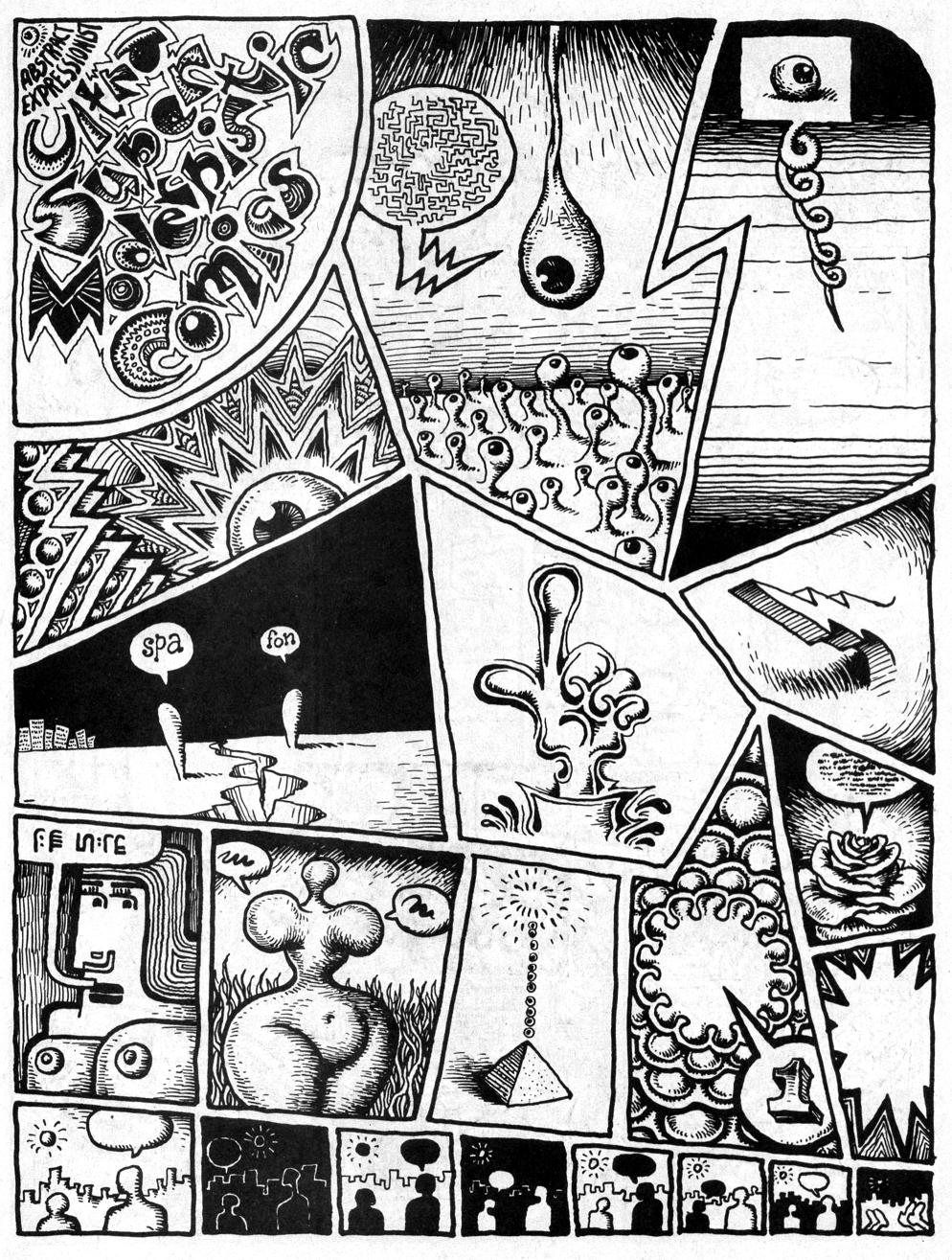
The E.C. section is particularly well done. Severin began coloring for them when editor Harvey Kurtzman wanted to upgrade the look of the books, in Severin’s words “to look more like Prince Valiant in the newspaper.” For the next few years she colored first Kurtzman’s war books, then the entire line, with the exception of some covers and stories colored by the perfectionist Kurtzman, as well as a few stories colored by the similarly autonomously-minded Bernard Krigstein (both of whom Severin typically characterizes as “artsy-fartsy”). When Cassell tells Severin, “you’ve been credited with a lot of the success of EC because of those vibrant covers,” she effaces herself to credit instead the quality of the “content,” but truly, covers are the primary selling factors on the newsstand and the color is the more significant part of the initial impact of the visuals on the reader. And, Severin’s interior coloring is no less sensitive and considered. Still, assisting Kurtzman on his comprehensive research, drawing caricatures on the fly of her co-workers and coloring were the art Severin was able to do at E.C.
She was always capable of more, but it wasn’t until the 1960s and she had been working at Marvel for a while that she was given the opportunity to draw comics herself. It wasn’t the usually canny Stan Lee who realized her talents, either; instead it was Marvel’s publisher Martin Goodman that noticed how good she was when she did some superhero drawings for Esquire and so Severin began to draw sporadically for the company: a few episodes of Dr. Strange here, issues of The Hulk and Sub-Mariner there. Severin understands the comics medium well and her work can be as energetic and muscular as that of any male superhero artist, even on her many strips for the Marvel humor titles Not Brand Echh and Crazy.

Marie Severin’s cover for Not Brand Echh #9.

Marie Severin, from Not Brand Echh #3.

Perhaps her best known Marvel Comics work is her early-seventies tenure on their adaptations of the Robert E. Howard hero Kull the Conqueror; these stories are beautifully inked by her brother John. Their collaborative run is considered to be a classic of adventure comics and both siblings certainly deserve credit, but it is Marie’s great storytelling skills that drive the narratives. And, she is one of the few artists in comics who can match Kirby for compositional thrust, which is why she became the chief cover designer for Marvel for the next few decades.

Marie Severin solo cover for Kull #1.

Splash page for Kull #2 by Marie and John Severin.

The interviews in the book give a remarkable account of Severin’s career and personality, but one gets the sense that Cassell and Sultan don’t truly comprehend how difficult and abusive the workplace was for women in the last century. That may be in part because Severin herself tends to diminish progressive issues that might be seen to be about political correctness, but it is sometimes only by reading between the lines that a fairly full picture of what her life in comics was like emerges. There can be little doubt that the sexual innuendos in the office went beyond simply “forgetting” about the presence of women in the room, that unwelcome comments and physical advances were directed to them. And Severin definitely faced a glass ceiling.

She succeeded John Romita to operate as a virtual art director for Marvel, but the position was unheralded as well as unpaid. In the present volume, Romita actually details how in order to gain points with Goodman, Stan Lee took credit for the substantial extra work that he and Severin did in that capacity. This seems typical of Lee’s manipulative treatment of even his most stalwart workers (and there is even mention here of Lee claiming as his property substantial amounts of original artwork, a questionable provenance at best given the subsequent troubled legal status of those pages). Neither Romita nor Severin hold anything against their “fearless leader”—it seems that Lee casts a sort of magic spell of obvious bullshit to make the people he uses, but never sticks up for, still somehow love him. Later, when Jim Shooter  cut a vicious swath through Marvel’s  elder talent, he also disrespected Severin’s art directorship, calling her instead “head artist” and she had no choice but to endure; as usual, there was no one in upper management to take her side.

Flying against Severin’s conservative nature, Trina Robbins hails her as a true feminist and she surely is an example of a woman excelling in a male-dominated field through sheer perseverance. Severin had a career in comics, but was not facilitated as she should have been; it was with her sense of humor that she was able to shine.

Marvel editor David Anthony Kraft on Marie Severin’s cover for the in-house fanzine FOOM #16: “That is exactly how the office looked….She’s got everyone in character, in the place where they were in the office, doing what they did.”

Severin’s ability to effectively nail her contemporaries is impressive, but these rare skills are unfortunately easy for some to underestimate; in the end she had to take what she was given and put a smiling face to it. Perhaps the most telling testimony to Severin’s skills and the misuse of her talents by the comics companies she worked so faithfully for is provided here by Mark Evanier. Firstly, in reference to MAD magazine, begun under the banner of her first employer E.C. and more recently published by DC Comics:

“People used to always say, ‘Marie belongs in MAD magazine.’ And she did…And I hate to think it’s true, although it possibly is, that the reason that she wasn’t was that she’s a woman. If you noticed, while Bill Gaines was running MAD magazine, they never had a woman artist there…Every so often, they would tap her for a coloring job, or a production job, but they never thought of her as somebody who could actually draw, say, a movie parody. And she would have drawn a better parody than a lot of other people they used. She obviously could do likenesses and at that time, MAD was paying ten times what a Marvel artist was getting paid for a page. It would have been fascinating to have seen her spend two days drawing a page of comics, as opposed to three hours. I would have loved to have seen what she would have done because it would have been amazing…she was considered family up there and they loved her, but she was family for production…I think she should have been drawing for MAD, because she was so good, and if a guy had been doing that same quality of work, probably would have been a regular in MAD. She probably would have had the job that Angelo Torres ended up getting…(doing) movie parodies up there.”

—and at Marvel:

“…I always thought she was an amazingly talented artist. She probably should not have been doing super-hero or adventure comics, but when she did, she always did a very fine job of them. I just thought she had this wonderful sense of humor…it is a shame, to me, that Marvel never really did a project where they let Marie Severin work exclusively on humor material, and develop her style more, and encourage her, and let her be as wonderful as she could be, because she had the skills, obviously, she had the sense of humor, and she had a unique viewpoint.”

Marie Severin by her brother John, detail of a watercolored drawing of Harvey Kurtzman’s E.C. war comics staff, from Squa Tront #9.

Clybourne Park Is Lying To You

Dialogue in a play is not like dialogue in life, with its artless jumbled ums and fits and starts. And it’s not discourse in smooth paragraphs of argument, either. It exists somewhere in the middle ground between those two extremes – crafted, stylized, cleaned up, with the playwright’s ideas and meaning slipped between lines of speech. And it’s not flawless communication. If Harry Potter went to Dumbledore some twenty pages in and was like, Hey I’m hearing snakey voices, do you know what might be up? then there would be no book. Miscommunication is sometimes the engine of action.

But when a play presents itself, to the audience and the world, as being about ideas, as trying to make you think about issues and problems in society, it helps if there is some semblance of discourse, if characters get to really say something. If arguments are also, once in a while, conversations.

The characters may not communicate effectively with each other, but perpendicular to their exchanges on stage, the playwright sends ideas and insights to the audience – the faltering lines back and forth on stage, and ideally something clearer from the stage to the seats.

***

Clybourne Park premiered off-Broadway at Playwrights Horizons in 2010, opening there to nearly universal rave reviews. (Its average score, as measured by the theatre review site StageGrade.com, was an exceptional A-, with barely a negative word to bring the average down.) Reviewers celebrated the play’s wit and humor, and hailed it as a brave and important contribution to difficult (and oft avoided) conversations about gentrification and race. When the play won the 2011 Pulitzer Prize for Drama, the Pulitzer jury called it “a powerful work whose memorable characters speak in witty and perceptive ways to America’s sometimes toxic struggle with race and class consciousness.” It opened on Broadway this past April, a coproduction of Playwrights Horizons and Lincoln Center Theater, with the cast of the 2010 off-Broadway run intact. In June it won the Tony Award for Best Play.

(l-r): Lorna Brown, Lucian Msamati, Martin Freeman and Sophie Thompson in Clybourne Park at the Royal Court. Photograph: Tristram Kenton

Clybourne Park takes an auspicious starting place for its leap into dangerous waters, jumping off from Loraine Hansbery’s classic play, A Raisin in the Sun. In Hansberry’s 1959 drama, the Youngers, a black family, struggle with the decision to move into a white neighborhood (the same Clybourne Park of Norris’ story). A future neighbor of theirs, Karl Linden, pays an ugly visit to the Youngers, attempting to dissuade them from moving, offering to buy them out at a considerable gain. Clybourne Park spends its first act in the 1959 home the Youngers have purchased. (This is signaled only through the presence of a Karl Linden who visits the outgoing homeowners to confront them about the undesirable family to whom their house has been sold. These references aren’t necessary to the play, and aren’t obvious to the average theatre-going adult if she hasn’t seen or read A Raisin in the Sun since it was assigned in tenth grade.) Russ and Bev are packing up to move out; Karl pays a visit (pregnant, deaf wife in tow) to make his case for the neighborhood’s, to his mind, preservation.

The second act takes place in the same house, but jumps to 2010, where we find Clybourne Park, the neighborhood, on the brink of a resurgence or recovery from decades of poverty and crime. This coincides, which is not to say it is a coincidence, with a white family moving into the neighborhood, and the second half of the play presents the contentious meeting between this white couple and the black couple representing the neighborhood Owners Association – the white couple plans to demolish the home from act I, now in disrepair, and build from scratch on the lot. (The same actors are in both acts, as different characters, sometimes in resonance across the act break and intervening years.) In each act, attempts at civil (i.e. coded) conversation falter and fail, tempers rise, and ugly feelings are revealed.

Revelation: ugly feelings exist.

Revelation: people have trouble talking about race.

Here is your Pulitzer for that.

***

Act I of Clybourne Park is funny – the whole play is funny – and moving, and the conversations people have are, for the most part, real. They feel realistic and something of substance is communicated – if the communication between characters is not always efficient, something is at least, most importantly, communicated to the audience. Perhaps the social mores of the Fifties help, the emphasis on civility that, for better or for worse, we’ve nowadays largely lost. Because the characters work so hard to be polite, there are actual conversations: the people involved each want something, and listen to – or at least hear – the other person’s point of view, and these points of view are communicated to the audience through gradual revelation that is tied to who the characters are as people. The dialogue is also artfully written, capturing the circuitous routes real conversations take, the false starts and interruptions. On the page and performed, it strikes the balance of real speech. The human struggle to communicate, and often the pathos of the failure to do so, is there.

Karl: Now, some would say change is inevitable. And I can support that, if it’s change for the

better. But I’ll tell you what I can’t support, and that’s disregarding the needs of the

people who live in a community.

Bev: But don’t they have needs, too?

Karl: Don’t who?

Bev: The family.

Karl: Which family?

Bev: The ones who-

Karl: The purchasers?

Bev: I mean, in, in, in, in principle, don’t we all deserve to – shouldn’t we all have the

opportunity to, to, to –

Karl: (chuckles with amazement, shakes his head) Well, Bev.

Jim: In principle, no question.

Karl: But you can’t live in a principle, can you? Gotta live in a house.

But even in the neighborly politeness of the 1950s, communication is interrupted, thwarted by the playwright’s hand. Bev is asking real, revealing questions that might lead somewhere? Karl says, “Darling, I came to talk to Russ.” And then Albert, the husband of Bev’s black maid, Francine, interrupts. And then Francine loses grip on the large footlocker she and Albert were moving, which falls thudding down the stairs into the living room scene.

Norris builds our anticipation by delaying resolution, but he does bring this conversation back around. With real live black folks in the room, Karl picks up his argument with a different tactic. He asks Francine if she would agree that “in the world, there exist certain differences.” (Polite and in her employer’s home, she demurs.) Karl asks if she would be able to find the foods her family enjoys at the neighborhood grocer’s. Albert shoots back, finally, “Do they carry collards and pig feet?” But no one else wants to confront the issue. (And the audience already knows what the issue is.) Karl goes on, politely, concerned for the family that would be different moving in – differences in worship, in recreation (“Do you ski?”), all rude and racist things to say but not anything I’m shocked to hear from a white man in 1959. Russ asks him to leave, Karl does not listen. Russ says, “Truck’s coming on Monday,” Karl presses on. And on and on and on.

It turns out that Russ and Bev’s backstory, which enables Russ to finally make Karl shut up, dramatically undermines the universality of their story. For all that the scenario follows the outlines of white flight, the specific tragic past that Norris has written for Russ and Bev weakens the connection to the issues he is trying to attack. It also provides a convenient explanation for the lack of a nearby white buyer, and for cheap sale price of the house, cheap enough for an upward-moving black family to be able to afford to move in: Russ and Bev’s son hanged himself in his bedroom, months after his return from fighting in the Korea War. As Michael Feingold wrote in The Village Voice, “the painful drama underlying Clybourne Park, often quite moving, is irrelevant to Norris’s satiric generalization; White families in the 1950s didn’t flee the inner city in large numbers because they were afflicted by tragedy, but because they wanted their kids to grow up in the suburbs. Affluence and a hunger for the new drove them out not their neighbors’ cold hearts.” So when Russ finally drives Kurt out of his home (and drives Bev to hysterical tears) by beginning to read from his son’s suicide note – Kurt, after so much refusal to listen to Russ, leaves because he refuses to listen to this – the emotional impact is powerful, but the ideological conversation has been abandoned altogether.

One would hope that that’s what second acts are for, continuation and further development of themes introduced in first acts, building tension, climax, and resolution. It may be old fashioned, by a factor of several millennia, but Aristotle is still the gold standard, and his gold standard for dramatic plot hinges on Reversal and Recognition. Something changes; something is discovered or revealed – these are the engine of satisfying dramatic action. Aristotle also describes a third aspect of Plot, the Scene of Suffering: “a destructive or painful action.” I don’t think this is the model for the second act of Clybourne Park, but it’s the closest structural analog I can find.

***

If I may pick and choose my Aristotelian conventions, I will not object to the violation of Unity of Time that jumps us, in act II, ahead fifty years to 2009. (That any theatrical principles have proved immutable over 2300 years is extraordinary; to expect all Aristotelian principles to remain equally ageless would be greedy.) It happens that Unity of Time is out the window, but Unity of Place is well preserved – we’re in the same Chicago neighborhood, in the very same house. The years show. There is graffiti under the stairs. The house’s destruction is imminent. (The mention of a koi pond among the new construction plans is meant to signal to us exactly what sort of structure the new building will be. The play communicates with its audience in code, just as the characters do with each other. A Whole Foods will be mentioned later on.)

And so the black community members, represented by a white lawyer, and the white couple represented by another white lawyer, bicker and passive-aggressively dance around issues of history and community and heritage. They go from trying to be polite to abandoning that attempt, but still nothing actually gets said. No substantial feelings or fears or desires are discovered or revealed. No one realizes or learns anything, on stage or in the audience. And then there’s some shouting and the play is over.

Both times I saw this play – in previews at Playwrights Horizons and on Broadway – the audience was with the play the whole way through. But I was angry. I was angry because it is frustrating to watch an hour-long frustrating and unproductive argument. And I was angry because this play had convinced so many people that they had just witnessed – taken part in, by witnessing – a real and important conversation about important and difficult issues. All that is actually said, though, all the audience is made to confront, is along the lines of, How ’bout gentrification? Gets people real riled up.

In a 2011 piece in The Evening Standard, Norris is quoted as saying that he wants audiences to walk into the theatre “and feel that something dangerous is happening,” and Clybourne Park cultivates this effect. People say racially charged things and well-meaning white liberals reveal themselves to be not quite as pure as they’d like to think – in act II, Lindsey employs that well-worn defense from (veiled, veiled) accusations of racism: “Half my friends are black!” But it is all an effect. Audiences feel that something dangerous is happening. But nothing ever is. It’s not that no one ever tries to defend herself with “Some of my best friends are black!” It’s that everyone defends themselves that way, and to put that chestnut on stage reveals nothing about how we think about race. A white man is nudged into telling a racist joke in front of black company; the black woman present responds with an even viler joke that turns the table on white women. The first is too long to relate, but hinges on prison rape and white men’s fear of black men’s sexuality; the second is: “What do a white woman and a tampon have in common? They’re both stuck up cunts.” And so a mostly white audience that has paid $50 or $80 or $110 per ticket hears a black woman say this, and yes, it feels dangerous. But look at the characters’ actual insights on gentrification and changing neighborhood demographics. Lena is one of the black representatives of the Owners Association. (This speech, in the play, is interrupted by several interjections.)

Lena: I have no way of knowing what sort of connection you have to the neighborhood where you grew up in? … And some of our concerns have to do with a particular period in history and the things that people experienced here in this community during that period… both good and bad, and on a personal level? I just have a lot of respect for the people who went through those experiences and still managed to carve out a life for themselves and create a community despite a whole lot of obstacles? Some of which still exist. That’s just a part of my history and my parents’ history – and honoring the connection to that history – and, no one, myself included, likes having to dictate what you can or can’t do with your own home, but there’s just a lot of pride, and a lot of memories in these houses, and for some of us, that connection still has value, if that makes any sense?

This speech not only fails to actually say anything about neighborhoods and their legacies – Norris has skilfully captured a very real way of talking so widely around a subject that even the hinted meanings are lost – but it also reveals nothing about Lena’s objections to a white couple moving into her neighborhood, which, for this play’s purpose, is a point of view the audience should be exposed to, should be made to understand.

Lena’s ends on the history and memory in the houses in the neighborhood. Although she is talking very widely around the topic of gentrification, it turns out to be surprisingly on-point, as the actual issue being debated in this act is how big a house the new residents can build on this lot. The plans have passed the Zoning Board, but the Owners Association has reservations – the house will be, they say, fifteen feet taller than the average height in the neighborhood. There is, of course, racial subtext – these white people coming in and building their big ostentatious house in this inexpensive but desirably located neighborhood, with their koi pond and their Whole Foods down the street. (If the Whole Foods predated the construction, how new can this gentrification be? And please, I call for a moratorium on using Whole Foods as symbol for yuppie gentrification and the butt of associated jokes. It’s just a supermarket.) But these construction plans are not only a pretense for the confrontation of the scene, they’re what the confrontation is actually about. Near the end of the play we get this:

Lindsey: Well, I want to say this: I want to say I feel angry. And I’m basically kind of hurt by the implication that’s been made that, just because we want to live as your neighbors and raise a child alongside yours, that somehow, in the process of doing that, we’ve had our ethics called into question. Because that is hurtful.

Lena: (calmly) No one has questioned your ethics at all.

Lindsey: Well, I wish I could believe you.

Lena: No, what we’re questioning is your taste.

Because it’s actually just about the stupid house.

This play wants us to think its about gentrification, but just as the first act pointed to white flight while really hinging on a particular and unique family tragedy, this act’s entire story and conflict and drama depend on the Owners Association not wanting the new family to build a big, ugly house. In between all that, the characters fight about race, and since a contentious issue is gestured at, well, that must be what this play is all about.

Norris may be trying to hold a mirror up to his audience’s well-meaning liberal hypocrisy but the characters are such huge jerks that it’s too easy to think not, “Oh my god, we do the same thing!” but rather, “Oh my god, look at those awful people!” The conversation feels dangerous, but looking at the people having it and gasping at their awfulness only makes the audience feel even more secure. The broad topic may be dangerous, but this play is entirely, one-hundred percent safe.

***

Clybourne Park has been produced at regional theatres around the country and in London. The New York Times wrote, “Every city has a Clybourne Park,” and this is probably true. Washington, DC has Petworth, London has Brixton, New York has, well, every neighborhood that’s marginally affordable. It has, among them, Inwood, the predominantly Dominican neighborhood at the northern tip of Manhattan that I moved to six years ago. As a single white person with minimal economic power, I am not a force of change. But add another white kid, add another, and when do we start adding up? More importantly, what does that mean? The questions that Clybourne Park fails to handle are questions I want to see discussed, because I am not enough of a conversation by myself.

In Eula Biss’ essay, “No Man’s Land,” the white residents of a “diverse” (i.e. predominantly not white) Chicago neighborhood talk of themselves as pioneers “lifting it up.” Biss and her husband, also white, move there for an inexpensive and spacious apartment near the lake, but they also appreciate (or fetishize) the diverse cultures they find around them. Her husband says, “I hope more white people don’t move here… kids were playing basketball by the school and they had cheerleaders cheering them on, and black men say hello to me on the street, and I love our little fruit market, and I don’t want this place to change.” The problem is that the change he is talking about is more white people moving in. He wants the number of white residents to be exactly enough to include him, but no more.

Biss and her husband, white writers taking advantage (not unfairly) of a neighborhood’s reputation – and perhaps its reality – to have a spacious home near a lakefront beach, want to opt out of the system they are inextricably a part of. I want to pretend that system doesn’t even exist.

I didn’t move to Inwood for culture or to pioneer, but because it was the only neighborhood in New York City where I could afford a one-bedroom and feel safe walking home from the subway at night. (What’s real and what’s imagined in perceptions of late-night safety is a question charged with racial subtext and gender dynamics but comes down to me trusting my probably prejudiced gut.) I am one white girl in a (miraculously rent-stabilized) apartment. Just as characters in Clybourne Park reassure themselves that the neighborhood they are invading was “originally” German and Irish, I try to understand things by reminding myself that, thirty years ago, Inwood was Irish and Jewish. But it isn’t now. I’m just living where I can afford to live. I try not to disturb anyone. I order dinner from the Venezuelan take-out in embarrassed Spanish. I don’t know how to think about it all correctly so for the most part I don’t think about it at all. Perhaps I’m being as unfair to my neighborhood as Biss’ husband is to their white neighbors, as wilfully blind as Lindsey and Steve in the second act of Clybourne Park. Does “I’m just living where I can afford to live” invalidate the community I’ve moved into? I just don’t know where else in the city I was supposed to go.

Biss describes a beautiful summer park full of Spanish-speaking families picnicking, Indian families playing cricket, and black teenagers lounging on benches; her landlord remarks, “The warm weather brings out the riff-raff.” Biss asks her husband to define gentrification. He replies, “It means that an area is generally improved, but in such a way that everything worthwhile about it is destroyed.”

There is a deep paradox in that definition. It is scarier than racist jokes.

There is one moment of real insight in Clybourne Park that is chilling. Toward the end of act I, Karl, the neighbor who is trying to stop a black family from moving to the neighborhood, explains his reasons:

Karl: I’m simply telling you what will happen, and it will happen as follows: First one family will leave, then another, and another, and each time they do, the values of these properties will decline, and once that process begins, once you break that egg, Bev, all the king’s horses, etcetera, and some of us, you see, those who don’t have the opportunity to simply pick up and move at the drop of a hat, then those folks are left holding the bag, and it’s a fairly worthless bag, at that point.

This is the one time in the play that a character expresses an unsavory opinion and cannot simply be laughed away, dismissed as ignorant or racist or nuts. Karl may be racist, he may be ignorant, but he also, if you take his logic as honesty, makes a point. And his prediction does come true. He’s right.

To let a character be insensitive, prejudiced, and right – that would challenge the audience, would force them out of their comfort zone. It would be a truly, wonderfully, dangerous act.
 
_________________
Jaime Green writes about science, food, and theatre, usually one at a time. Once upon a time she worked in new play development; now she is a graduate student in Columbia’s MFA program in nonfiction. Her website is here.