Michael DeForge’s Sketchbook

Michael DeForge destroys his sketches. He finishes his sketchbooks and then throws them away. This is a different approach to art than I am used to. For me, the sketchbook has always been a personal object. The closest approximation to an artist’s brain without telepathy. Personal letters to oneself. Sketchbooks are the work behind The Work. Many artists keep all of their sketchbooks, whether they look at them again or not. DeForge tosses his when he is finished. So I rethink what it is a sketchbook is for.

Michael DeForge publishes a lot of work. He has comic books from Koyama Press and Drawn & Quarterly. He self-publishes minicomics. He has comics in various anthologies. He posts things on his blog. He does commercial illustration. I would imagine that for him, the work itself in its final form is the personal journal of his progress. It could be that the sketchbook is merely practice. Raw, unsentimental practice.

If an artist uses sketchbooks for practice and not as some sort of defacto art project in and of itself, perhaps that artist no longer has use of the preliminary work. After all, we cartoonists think nothing of erasing our pencil lines after the ink is dry. What is the difference, now that I think of it? Why should the bound book of rough drawings be fetishized? When the final project is published, the rough work is… ?????

________________________

My conception of sketchbook use was largely based around the idea of something between a diary and a catalogue of ideas. One problem for me is the struggle between practicing artcraft in a sketchbook and allowing the sketchbook to become the artwork itself.

I had a class in art school called Sketchbook Creation. The course was inspired by Alan Gordon, the professor’s travels across the country in which he made his paintings on the go in a bound book. His idea for the course was to help the students open up their imaginations through particular exercises and controlled free-associations. In the end most of us sort of ended up making work that looked like his. Some of us continued for years after graduation, making finished art in books of heavy paper. Portable, but shackled to a relatively restrained format. Sketchbooks weren’t practice anymore. They were the art itself.

Imagine having a sketchbook for your sketchbook.

Imagine sitting in front of the tool which is designed to be an outlet for experimentation and being unable to experiment because it has been recontextualized as yet another Grand Canvas. Sketchbook Creation was my best class in art school but it also shackled me and ruined me in some ways. I hardly doodled anymore. Every drawing had to be good enough to show people. To be fair to Alan, the film “Crumb” had previously contributed heavily to this tendency for me.

Things got better when I started talking to people who use their sketch books only to practice for projects that they were working on. It took a while to overcome the pressure that I had internalized about making “showpieces” in my sketchbooks but I feel as though I’m turning a new corner now.

________________________

As I get older I have been growing more acclimated to the idea of impermanence. Not simply the idea that things change but more the idea that things are never fixed to begin with. Age gives perspective. We see a larger picture as we get older because events and phenomena take up a smaller percentage of our perspective as our years of existence increase. Six years means “since forever” when you are six years old. Six years means “as long as you’ve lived in this city” when you are thirty. Six years probably means very little when you are eighty-six. Your view cannot help but change as you take in more and more life experience. Things were never as “stable” as I thought they were when I was a child, I just lacked the experience to notice the movements.

In many ways an artist’s work has a life cycle as well. It’s “conceived,” no pun intended, it grows as the artist pours more work into it. The work matures and is sent into the world. At this point, we consider the tangible remnants of an art work’s youth. Do we save it in a drawer as humans do with their children’s baby clothes, perhaps in hopes of some future use? Or do we discard the husk as insects do?

I’m neither seeking nor am I suggesting an answer. Ultimately it’s a personality and lifestyle choice. As I stand amid the chaos of my bedroom, I would do well to cast away my preliminary drawings like a snake’s old skin. Being unsentimental about these things could probably spur me forward into being much more productive, as I tend to clutch things I’ve made, things I own. On the other hand, there are artists such as my old professor for whom “sketches” and cast off ideas are as treasured and valued as gallery paintings. Of course there isn’t a right or a wrong answer. The question itself is rhetorical.
 

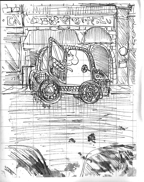
Drawing by Michael DeForge

A Reading, A Rereading, and a Question

About a month ago, I bought a comic book, read it, jotted down my response thoughts and moved on. As it happens I did not publish these thoughts. A little bit ago, I reread my written response. Then I reread the comic book itself. Then I set about crafting a new response. The second attempt at a response was worse than the first. The second reading of the text was less appreciative than the first reading. Time had passed. My opinion of the work had changed.

Since comic books are rooted in a periodical, serial paradigm, many of them are not even designed to be reread too many times. They become outdated the moment that a new installment become available for purchase. Those first impressions become our sole impressions.

________________________

One of my personal short term goals is to read fewer comics. Read fewer things but read them harder. Read deeper. Soak them up and find things that a Wednesday-evening spree-reader might overlook. Perhaps those somethings that I seek simply aren’t present in many comic books. That’s fine too. I need to do fewer things. I need to be less frantic.

I need to relax. In all possible senses of the idea.

But my enthusiasm for sequential art burns bright as always. What I think that I would like to do is attempt to focus my enthusiasm on a handful (or fingerhold) of things rather than attempting to shovel a stack of magazines into my face every Wednesday evening.

____________________

Cartoonists spend enough time making comics, the least we can do as readers is spend some time reading them.

____________________

What is gained? What is lost? What changes for you as you reread comics? Do you reread comics? I don’t mean skimming or flipping to favored scenes. Do you restart a comic book and read it straight through the way you did when you first encountered it?

Here is my prompt for you: which comics have spent the greatest amount of time reading? For academic reasons, for your job, for fun, for nostalgia, to settle arguments–what are the comics that you personally read and reread?

And why?

Into the Inkwell

Mort Meskin: Out of the Shadows, edited by Steven Brower. Fantagraphics Books.

Mort Meskin’s studiomates in the bullpens of mid-20th century comics production remarked that he was a sensitive soul who was known to face a blank sheet with an artist’s block akin to sheer terror, until someone would scribble some random lines on the page, which he could then be sufficiently motivated to transform into his brilliant chiaroscuro images. Meskin’s best work was a powerful formative influence on other great comic book cartoonists such as Jack Kirby, Alex Toth, Steve Ditko and Jim Steranko. As the years passed, though, he became obscured in comics history. I was first made aware of him when he came up as I was interviewing Steranko. To identify the initiator of a comics storytelling technique, we consulted with the late, sorely-missed Dylan Williams, who had built a website about Meskin. Sure enough, MM turned out to have been the first to use the device in question, a Muybridge-like means of depicting rapid movement with multiple figures that Steranko called “strobing”. In more recent years, former Print magazine creative director Steven Brower has championed the artist, first with his 2010 Meskin biography Shadows to Light and now with a  career-spanning collection of complete stories.

Meskin’s drawings seem to emerge from blackness

Some of his greatest early work in Out of the Shadows like Fighting Yank and collaborations with Jerry Robinson such as The Black Terror display particularly dramatic drawing and effective storytelling. In some of the stories, the  color is unusually good; it is all wonderfully restored. Another highlight is that some of Meskin’s linework for Golden Lad is presented in incredibly crisp black and white. Sadly, there are no representations of Meskin’s work for his main client DC Comics on such inventive strips as Johnny Quick or even his later, apparently generic but no less animated and well-rendered short strips for their mystery and sci-fi titles, presumably because DC jealously protects its assets, even to the detriment of the legacies of its most innovative artists like Meskin and Toth. Still, it can be seen from Brower’s thoughtful selections that Meskin was a strong narrative draftsman and an architect of arresting images.

______________________________________________________

The Shark King by R. Kikuo Johnson. Toon Books.

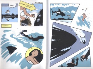
In this graphic novella produced under Francoise Mouly’s Toon imprint, Johnson appears as an heir apparent to Meskin and Toth. Adapted from a Hawaiian mythology, The Shark King reportedly truncates and makes more palatable its source story, but it is a sharply rendered and very effectively colored short children’s book that displays a tremendous amount of kinetic energy. The characters move around the pages in a manner which deliberately facilitates and enhances the reading experience. Johnson is a very clean and controlled artist who gives his book an almost “golden age” feel. His use of black and colors define the forms and spaces with a rare mastery.

Johnson’s color is apparently built from hand drawn separations.

I am a little unclear as to the value of the message the story sends boys regarding their relative relationships with their mothers and their willfully absent fathers, but still, I much prefer this book to Johnson’s earlier adult graphic novel effort, his beautifully brush-drawn but callow coming-of-age tale, The Night Fisher.

______________________________________________________

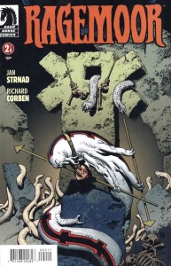
Ragemoor #s 1-4 by Jan Strnad and Richard Corben. Dark Horse.

In an interview on TCJ last week, Rich Corben speaks of his upcoming Edgar Allen Poe adaptations and honestly, I wasn’t overly excited by the news; I have a pile of his previous Poe work and enlarging it seemed to me to be a redundant reworking of relatively quiet, morbid tales that do not show off the artist’s best abilities.  But maybe I should give him the benefit of the doubt. In recent years Corben has been doing a lot of work, some of the best of it in Mike Mignola-written Hellboy comics for Dark Horse. These have offered him ample opportunities to indulge in his trademark over-the-top horrific imagery, as well as the type of  inventively articulated, muscular fight scenes that he excels at. And, although I admit I’d prefer that Corben colors himself, the Hellboys have been very well colored by Dave Stewart. I also admire a few stories that writer Jan Strnad and Corben did together in the past, but as their new miniseries Ragemoor came out over the past few months, it was a little hard to love.

Perhaps the best art in the series, the cover to Ragemoor #2

For one thing, the art is black and white, not color and Corben does his own tones, but my initial impression was that the work here often looks a little awkward and rushed. His blacks are plenty juicy and his digital greys augment the maniacal depression that permeates the pages, but there is a chunkiness to the construction of the forms—a simplification of the drawing that often subverts Strnad’s scenario; it makes it quite difficult, for instance, to buy that the hero is smitten with the female character, who must be one of Corben’s least appealing ever for the pulpiness of her features…and that is saying something. He is known for constructing clay models to draw from, but here she seems smooshed by all thumbs. Yeesh!

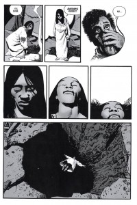
The “splendorous angel” Anoria takes a dive in Ragemoor #3

However, it wasn’t until I had all four issues that I was able to truly appreciate this effort. In the end, Corben doesn’t disappoint….it works much better taken as a whole than it did as a serial. So buy them and read them all in one sitting. There are some genuinely frightening moments, not least what becomes of the hideous heroine.

______________________________________________________

Prophet #22-26 by Brandon Graham, Simon Roy, Farel Dalrymple and Giannis Milonogiannis, with Fil Barlowe, Frank Teran, Emma Rios and others. Image Comics.

I have Brandon Graham’s thick King City book, although I haven’t yet had a moment to read the whole thing. I can say, though, that his solo comics strike me as one of the few times (Damion Scott is another) that I have seen a cartoonist whose work effectively evokes the imagery of Hip Hop,  which through aerosol innovators like Phase 2 evolved from the graphic forms of Vaughn Bodé and Philippe Druillet to become commercially appropriated by corporate America, but criminalized in its public art form.

Graham recently took over the Rob Liefeld vehicle Prophet and is using it as a collaborative engine to work with other artists and in so doing to reinvent the esoteric science fiction promise of France’s Metal Hurlant, that has informed the cinematic science fiction of the past few decades but whose power disintegrated in the comics medium because of the mainstream American banalization of bad translations and airbrushed van-artiness of Heavy Metal.

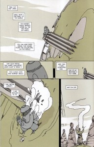
Graham and Dalrymple form a compelling argument for collaboration in Prophet #24

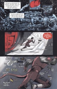
I have no idea what Leifeld did in his earlier issues of this title, but bless him for enabling us to jump in on Graham’s stories for Prophet, which are dark and forbidding but keyed to the unique properties of comics,  written as they are to accommodate many double page spreads depicting far-flung vistas of more than passing strangeness and with odd diagrammatic passages that explain technical details. These disturbing scenarios have been drawn by a range of inventive talent, from several issues of Simon Roy’s fluid linework, to one with Giannis Milanogiannis’ slashing penstrokes, to one with some of the best work I have seen from Farel Dalrymple and then, the most recent issue is sparely drawn by Graham himself with echoes of Kirby and Druillet. All of the issues are beautifully colored. As the series goes on, an unusual sense of excitement, of discovery is engendered, a feeling that I have rarely had since my first exposure to Les Humanoïdes.

Graham draws his own script for Prophet #26

In addition, Graham has solicited some very interesting backup stories: #22 sported a short piece by the Australian Fil Barlowe, whose Zooniverse was a singular exponent of intergalactic multiculturalism in the early 1980s; #s 23 and 25 boast two parts of a Frank Teran strip and #26 has a piece by Emma Rios with an absolutely extraordinary panel configuration.

______________________________________________________

Spotting Deer and Lose #s 2-3 by Michael DeForge. Koyama Press.

I’m very encouraged when I see people such as Graham, Dalrymple and C.F. who seem to be influenced by sci-fi junk as much as anything and who are not afraid to work in genres that were formerly discredited by the alternative. Reality is fine as far as it goes, but comics also have potentials for world-building that aren’t scratched by stories about drinking coffee in cafes whilst bullshitting with one’s peers. Michael DeForge is another of the younger generation of cartoonists who uses sci-fi in his strips and this guy not only draws aliens, he draws LIKE an alien.

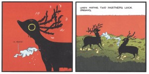
DeForge’s Spotting Deer: freaky deaky

His stuff reminds me a bit of my old friend Steven Cerio—-hmmmm…I wonder what happened to him?—like Steve, the work is bizarrely well-drawn while being frighteningly “othered” in conception. DeForge’s oddly shaped and thin but amazingly colored Spotting Deer book, for example, about a race of slug beings that mimic mammalian deer, is a real mindfuck prize and his erratic but engaging floppy comic Lose rewards examination, as well.

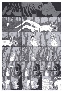
From Lose #3: nowhere to go but up

I don’t get why his main story in Lose #3  features an apocalyptic landscape with flying dogs who interact as if they are in a contemporary technological society, but it hardly matters; what counts is that DeForge uses the freedom of comics to make characters and places that follow his own rules. My favorite strip in this issue is “Manananggal”, a fearsome but indecipherable cinematic progression of otherworldly bioforms.

______________________________________________________

Raw Power Annual by Josh Bayer. Retrofit Books.

It can be difficult to explain to anyone, let alone someone not versed in the language of comics, the appeal of a Meskin, a Corben or a DeForge.  I find it equally hard to describe Josh Bayer’s fierce comic Raw Power. I’ll try, though. I could say his massive figures bring to mind a sort of Kirby on amphetamines (and he milks and remilks a line from Jack’s “Street Code”), that the art seems sometimes as if it is drawn with a stick dipped in mud, but then, it also has some quite delicate passages and the entire thing reads with an invigorating, furious energy that is impossible to ignore. The story veers wildly; a description of Jimmy Carter’s war to suppress punk music  (that I find completely believable and which was apparently imparted to Bayer by Jello Biafra and Ray Pettibone) segues from the origin of Bayer’s ultraviolent superhero Catman to a version of Watergate sociopath G. Gordon Liddy with the aspect of a fiendish motivational speaker and then goes into a revisioning of an issue of one of Marvel’s cheesy 1980s comics, DP7  (a little like Jonathan Lethem and Dalrymple’s reworking of Omega the Unknown), which I am certain is far more interesting than the original comic could have been.

Josh Bayer’s Raw Power: faster, harder, WTF.

Comics like these are why I still love comics—-they are full of the odd things that artists do that are personal tics, that perhaps are mistakes or maybe they are done on purpose, but they are what makes the stuff memorable and make us think that we also could make comics—-and we can! We can make them and print them ourselves! They are why, as I have discovered,  the healthy part of comics is not in the pathetically over-edited and suicidal mainstream, but in the alternative where the artists, writers and readers are in charge. We can make lines coalesce on paper to form worlds in our own image and share them. We don’t have to answer to authority.

______________________________________________________

Boobs Pooter versus Bertie Wooster

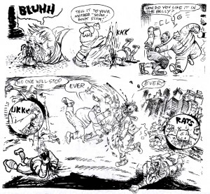
Compare and Contrast Cage-Match to the Death: Joltin’ Johnny Ryan and PG “Wehrmacht” Wodehouse
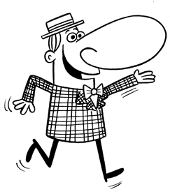
Ten Rounds!

1. Both men are humourists (duh).*

2. Both have mainly made their living from serialising their work, a standard career-path for humourists in their respective times and markets.

3. Although known primarily for their work for adults, both artists have also produced work for children.

Wodehouse started his career writing allegedly comical stories about various misadventures at boys’ schools — specifically, the kind of not-quite-Eton public school that many of the characters in his later grown-up books would have attended, the kind of school where the upper-classmen have “fags” (younger students who perform menial domestic duties for them, like cooking and cleaning), where in summer the students care only about cricket (rugby in winter), where one student is always trying to cadge a fiver off another since he’s already spent his own allowance for the term betting Smythe that he couldn’t balance three copies of Liddell and Scott on his head while singing “I Do Like To Be Beside the Sea-Side”,** and where the Classics Masters have an imperious eye and brook none of the nonsense that inevitably arises. Wodehouse’s early work is for completists only and, even for them, it’s a struggle. He certainly hadn’t developed his wit in those early years; indeed, it would take more than another decade of writing grown-up humour for Wodehouse to start being even routinely amusing, let alone bust-a-gut LOL-worthy. As far as I know, he wrote specifically for children only at the start of his career; his juvenilia being thus being restricted to, well, his own juvenilia.

Ryan, on the other hand: if he’d written that last paragraph, he would have already made a dozen jokes about “fags” that would certainly not be considered suitable for the eyes of children, at least not by any reputable publisher. Nonetheless, Ryan has drawn gags for the now-defunct Nickelodeon Magazine (nearly every single issue, according to Wikipedia), MAD Magazine, and other kid-oriented outlets. It’s not as outlandishly unlikely as you might first think: just take out all the gags about the Holocaust, the KKK, AIDS, hookers — okay, so maybe it is a bit of stretch. But Ryan is first among his peers in plumbing the lower depths of scatological humour, and that sensibility translates well to kids’ humour. You just get rid of any jokes about “adult themes” like the Holocaust, and replace all the references to dicks and pussies and fucking and shit and piss and all that with references to boogers and farts and spew and, well, you’ve just designed yourself the perfect engine for making kids laugh, the very Platonic Form of What Makes Kids Laugh.

Which, I guess, in a way means that Socrates, having escaped from Plato’s Cave to contemplate the Forms themselves, was contemplating not just the Form of Beauty or the Form of the Good, but also the Form of A Unicorn Dressed in Farts Eating A Booger Pizza.

4. Both men work in a more or less blatantly unrealistic fantasy-world.

Wodehouse’s work is not overtly fantastic — there’s no unicorns riding around in Blandings Castle, not even a unicorn dressed in farts. But Wodehouse’s world is almost as far removed from reality: his characters have no more real connection to the greater world than the characters in Seinfeld. When the plot demands it, one character will have to work for a living, but only as the plot demands it. No one dies in Wodehouse, except offstage and generally some time in the past. Bertie Wooster, for instance, is an orphan but his parents appear to be long dead and of little concern to anyone. There are no serious problems for anyone, no real heartbreak or emotional turmoil or physical disability. When, in reading one of his many, many, many books, I came across a character who had not only served in the First World War but whose service was actually a plot-point, my monocle popped out and my wife clutched at her pearls — this sort of thing, essentially, does not happen in the world of Wodehouse. Even if we grant that Wodehouse’s world is, strictly speaking, a realistic one in the sense that there’s no magic qua magic, we can at least say that his world is not a naturalistic one.

Ryan’s world is much more overtly unrealistic, a world with very different physical laws than our own. Boobs Pooter shoots himself and becomes a ghost; he then invades the body of a woman, and fills her mouth with all-too-unghostly cum and then her breasts with shit. Aliens shoot tentacles down from the sky that enact hideous bodily transformations on humans. A missile-rocket visits a normal suburban family to demand a threeway with the pater and materfamilias — which he gets. A nurse makes a rope out of faeces, which she uses to swing around, hanging from the ceiling, like “Spiderman Woman”. Characters die in one strip to reappear in the next one along. Ryan’s world is the world of cartoons, where all the physical laws of our world always apply, except when it’s funnier for them not to.

Ryan, to be sure, does have some strips without Spiderman shit-rope, masturbating ghosts or even farting unicorns — strips which break no laws of nature; but even those tend to be non-naturalistic. For example, there’s a strip where Loady McGee tricks Sinus O’Gynus into thinking that the hot new look for the season is to glue a kid onto the end of your dick

— by the way, federales, please do not arrest me —

but, actually, Loady is just using a midget actor to trick Sinus. Now, nothing there violates the laws of physics, say, so it “could happen” (philosophers would say that it’s nomologically possible) — but, of course, even if the world could work like that, it doesn’t. I can’t think, offhand, of too many Ryan strips that feature people behaving “plausibly”, in a way that someone might actually behave in the real world. Certainly there are some: for instance a bit in the Jokepocalypse where one paramedic laughs at the other one for having hurt feelings, and the all-time classic 100% Anal Rape — where the whole gag is basically Ryan’s deadpan depiction of the victim’s post-event trauma — but this is more the exception than the rule. Ryan isn’t really interested in making a naturalistic or even realistic strip, not when there’s a (if not strictly unrealistic, then at least highly implausible) fart joke to be made.

5. Each has a very different sense of corporeality.

Wodehouse’s characters might as well not have bodies. They like their food, certainly — a particularly skilled chef plays an important role in several of the Wooster novels. And they occasionally get food poisoning, or sunburn, or a cold, or whatnot, and older secondary characters might complain about aches and pains, but only as the plot demands it. They certainly don’t need to shit, and they don’t need to piss, and above all they have no sexual activities whatsoever. Indeed, they appear to have no sexual desires at all, or even sexual organs for that matter. The idea of, say, Lord Emsworth jerking off is almost literally inconceivable. It is as though someone were to try to describe to you the letter “h” having sex with the number 57 — one feels that something must have gone seriously awry somewhere in his understanding, or his grasp of the English language; he has made a sort of category mistake.

Ryan, of course, would quite happily draw the letter “h” having sex with the number 57, but only if he could also draw Hitler licking the resultant creampie.

(Look it up, kids)

(Hey, speaking of not getting myself arrested: if there are any kids reading this, Jesus Christ, go tell your parents not to let you read this post)

6. Both men get a lot of humour from parodying the banality of their contemporary culture, contemporary narrative art in particular.

Wodehouse is nonspecific in his parody, his targets not so much individual artists and their work so much as general styles — the cliche of sentimental novels, mostly, but sometimes mystery novels or Hollywood gangster movies and the like.

Ryan goes personal; indeed, right for the personal jugular. He abridges Craig Thompson’s much-praised Blankets to three panels: boy meets girl, boy is reminded of “awesome piss-fight” with brother, boy breaks up with girl. [NB: this is actually a pretty accurate summary of the book]. Shitzo taunts Ivan Brunetti to just go ahead and kill himself already. Art Spiegelman’s father owns up that he was never in a concentration camp, and the numbers on his arm are just lotto numbers that have never been washed off. R. Crumb narrates a slideshow for his comics adaptation of The Book of Genesis: “uh…and here you see another drawing of Jews with big beards…wearing robes…” [NB: this is also a pretty accurate summary]; scientists fill a rocket with “liquid who gives a shit!” and blow up Crumb and his audience. And so on.

Cartoonists ribbing other cartoonists is nothing new, of course. Witness e.g. Wally Wood’s loving pastiche of newspaper strips in MAD, or Al Capp’s Dick Tracy parody, Fearless Fosdick. There’s probably some cave out there somewhere, as yet undiscovered by archaeology, where some neolithic cartoonist painted bison and hunters in way that totally zinged some other neolithic cartoonist’s painting of bison and hunters.

But Ryan’s parodies, potshots and piss-takes feel different from this. They’re cruel, vicious, bilious — and frequently very, very funny. Perhaps his most vicious swipe at his fellow cartoonists — that is, if you don’t count the already mentioned strip where he encourages the morbidly depressed Brunetti to follow through on the extended suicide note that was Schizo; or his unauthorized sequel to Paying For It, in which Chester Brown dresses up as a “whore” and is beaten, maimed and sexually assaulted, but still comes out of the experience thinking “OMG! Prostitution 4 Life!” — other than these most vicious swipes, and probably a couple of dozen other most vicious swipes, his most most vicious swipe is a strip called The Day The New Yorker Came to Town. In this strip, a take-down of the literary pretensions of art-comix-ers, Art Spiegelman cuts off his own nose to give the New Yorker a blowjob, R. Crumb sticks his adam’s apple up the New Yorker’s arse, Chris Ware gives the New Yorker a “tit-fuck” with his “brain-balls”, Seth (who, earlier in the strip, had pissed his pants at the prospect of a visit from the New Yorker) and Adrian Tomine snack on the New Yorker’s nuts, and poor old Ivan Brunetti, too ugly for the New Yorker, has to settle for sucking off a book of New Yorker dog cartoons.

Now that’s what I call comedy.

8. The main similarity between them is that they were incredibly prolific, with a similar, but not quite identical, effect on the quality of their work.

As it says in the bio at the start of so many of my copies of Wodehouse books, he wrote over 90 books in his life, as well as various plays and musical comedies. I’ve read somewhere between 50 and 60 of them (I’ve lost track, myself).

Ryan has produced hundreds upon hundreds of pages of comics. At times during the 00s, he was simultaneously drawing Blecky Yuckerella — a weekly strip for the “alternative press”, contributing gag cartoons to kids’ magazines, creating his own one-man anthology Angry Youth Comix, and churning out a one-page gag strip on the web each and every week. These last strips seem to have been entirely improvised; they’re often just one non-sequitur after another, as if the result of a game of exquisite corpse played by a gang of toilet-minded imbeciles with Tourette’s syndrome.

Because there’s so damned much of it, a lot of the art created by Johnny Ryan or PG Wodehouse is not very good. Much of it is hackwork. To be sure, due to Ryan’s peculiar sensibilities, his hackwork looks different from what other hacks might produce; but once you’ve seen a dozen vaginas spewing out leprechaun-turds covered in Holocaust-juice, you’ve seen them all. Much of Ryan’s and Wodehouse’s work is not worth reading at all, not even by connoisseurs and devotees.

But, both men, when they’re on, are among the funniest in their chosen medium. I came very close to including Take A Joke, the final collection of Ryan’s Angry Youth Comix (plus miscellanea), in my Top Ten for the Hooded Utilitarian poll — there’s an awful lot of jokes that miss in there, but Ryan has learned the valuable lesson that, if you throw enough of them out there, some of them are bound to hit. And when Ryan hits, he hits hard.

The difference between their prolificity (???) is that Wodehouse is much more consistent. Most of Wodehouse’s books from the mid-1920s on are pretty solid; even when a particular book isn’t hysterically funny, it can be relied on for a couple of amusing bons mots on every page. It’s mostly his early work that is consistently mediocre.

Ryan, on the other hand, is all over the shop. Take A Joke alternates between some of the best humour strips I’ve ever read — e.g. Home Early, The Day the New Yorker Came to Town, 100% Anal Rape, the ending to Graveyard Goofs — and lame button-pushing non sequiturs, like the multi-gag pages originally drawn for Vice.

9. Because they are so prolific, both artists exploit the combinatorial possibilities of rearrangements and variations over just a few basic elements. It would be easy enough to program a random generator to create “new” work by Ryan and Wodehouse by using a handful of variables.

For Wodehouse, the key elements are setting, plot and character. The setting will be [a country manor in a small English village or, much less often, a trans-Atlantic liner/a sea-side resort/New York]; the plot will involve one character who [wants to/doesn’t want to] marry another and who can only do this by stealing [a valuable antique/an incriminating manuscript/a pig], but in their way stands [a jealous suitor/an incognito detective/a rival thief/a hostile prospective father-in-law]; other characters will include [an imperious aunt/a nosy policeman/someone, anyone, in every book, in some kind of disguise/a mischievous but creative interloper who ultimately saves the day with an ingenious scheme].

For Ryan, the variables are: pudenda, impolite bodily functions, non-missionary sex acts, various hot-button topics (9/11, racism, rape…), and a banal or incongruous context. Just throw these together willy-nilly and you’ve got the premise for a Ryan strip, or a one-panel gag, or at least the ending to an improvised strip: a blind date who is half-man/half-shit! Hitler-piss, the only son of Christ! Erotic art-collecting squirrel! Captain America’s juicy pussy, better than Atlantis pussy! Joe Sacco interviewing his own balls about the smell of his farts! God’s giant cock shitting on Louis Riel! Harvey Pekar’s ball cancer running out on him because he and his “fucking friends and […] fucking comics are so boring that [ball cancer] just can’t take it any more!” [NB: this, too, is pretty accurate…] Luba’s haemorrhoid punching a Mexican in the face! A mountaineer riding an off-road tampon! The US President imposing a new tax on baby rim-jobs! A woman so turned on by a passer-by in a shit-wig that she begs him to “do [her] in the butt right now, right here on the sidewalk!!”, but the guy has to go glue his dick back on, at Ye Olde Dick-Glue Shoppe! A giant statue of The Cleveland Steamer! ” Sweet Chubby” Cheeks and Li’l Bloody’s Silly Putty, “made from 100% real homosexual corpse scrotums! So you know it’s good!” A woman indignantly defending her right to breastfeed her beaver as “the most beautiful & natural thing a woman can do!” Martians that love nigger shit, faggot ass and gook splooge (which turn out to be Martian words for, respectively, ice cream, nuts and hot fudge)! Sherlock McRape investigating the strange case of a woman hit in the belly by a jar of jelly while watching Hitler’s robonic testicloids on the TV news! A man on a pogo stick bouncing from vagina to vagina! An “awesome new game” called “Mommy, my faggot has diarrhea!” A Ku-Klux-Klansman stripper jumping out of a wedding cake at a KKK wedding! A man who wakes up married to Retarded Hitler, who in turn goes nuts when offered grape juice because, naturally, he wants to “Exterminate the juice!”. The award ceremony for the 2005 COBBY Funniest Baby-Boner-in-the-Ear Gag of the Year Award! Hopey Glass strumming on Maggie Chascarillo’s electric asshole with her tongue!

You get the picture.

Using a simple structure to generate indefinitely many gags is one thing Wodehouse and Ryan also have in common with another highly-prolific humourist: John Stanley. Stanley created or co-created several thousand pages of Little Lulu and Tubby strips, not to mention hundreds of pages of other comics, and he too worked a million variations off a few basic themes: Lulu tries to join the boys’ gang, Lulu outsmarts Tubby with a dose of his own medicine, Lulu tells Alvin a story about that ol’ Witch Hazel, Tubby tries to impress Gloria and outdo Wilbur van Snobbe… If you want to churn out comedy by the barrel, this is evidently the way to do it.

10. PG Wodehouse is the pinnacle of English-language comedy — his musical dialogue, precision-tuned farce, and above all his inversions and manipulations and play with language and cliche.

But Wodehouse never drew a parody of Marvel Super-Villain Team-Up starring the Red Skull and Art Spiegelman. Advantage: Johnny Ryan.

***

Final Score: Tie

* For this piece, I’ve passed over Ryan’s more recent work, in which he often turns away from humour into straightforward horror or action. To talk about that material would be another post altogether.

** Self-indulgent autobiographical note: the only thing I got out of reading Bryan Talbot’s excruciatingly boring Alice in Sunderland was learning that the Liddell of Liddell and Scott, that faithful companion of my youth, was the father of Alice Liddell aka Alice in Wonderland. Small world.

Image attribution:

Boobs Pooter sketch, Johnny Ryan at Comic Art Collective

Photo of Ian Carmichael as Bertie Wooster, at Hot Guys in Period Costume

Like Language to the Slaughter

Some years ago I was asked about the benefits of working in the comics form, as opposed to writing a novel. Since the subject at hand was a graphic novel, that is, with a fair amount of words thrown in the mix, my argument soon devolved into the classic “language vs. image” duality. It went something like this:

Language is a form of communication we use to convey concrete, unambiguous information about the world. When we say “sheep,” we don’t mean “cow,” or “tree,” and we just have to assume or hope that the person we speak to knows what “sheep” means. That is the basics of language, great civilizations have been built on our mutual understanding of words like “sheep”. Of course, once we have more than one sheep, we need to specify whether it’s a ewe, a ram, or a lamb, so we invent those terms to separate one from the other. And we continue to divide the definitions into still more specific designations, until we all accept that a castrated ram is a “wether,” and the tastiest bit of a lamb is the “chop,” and so on and so forth.

It wasn’t until a thousand years ago that the Japanese language got a word for the colour green, for instance, and it was still considered just a tone of blue until the advance of Crayolas in the early 20th century. Among many examples, vegetables are still called ao-mono; blue things.

Images, on the other hand, are visual recordings of the world; let’s say I took a photo of a sheep. It might be my favourite sheep, we might even be intimate, but the image doesn’t say that. Now, somebody could look at the photo and project their own fear of sheep on it, not for a moment considering the luster of the pictured sheep’s wool, or the shine in its eyes. This person will just recall the trauma of the great sheep stampede of 2003, and the months spent in hospital after that. Damn sheep…! Sending an image out into the world unchecked can be a risky business, you never know how others will perceive it — and I think of the Muhammad cartoons as much as of any given person’s Facebook photos.

It is said that images are worth a thousand words, but nobody said which words those are. Hardly clear-cut textbook definitions, more likely a chattering, discursive debate with itself, weighing multiple views against each other without really deciding on either, but your sister might like this, and should we maybe go for coffee somewhere? Now, that may resemble how many people actually talk, but also the way many read images, or perceive reality for that matter.

So, images are intuitive, rather than specific; ambiguous rather than concrete; meandering rather than direct. They are a roundabout way of communicating, not like the above, bare-boned definition of language. Comparing the two on language’s terms isn’t really fair, images have entirely different strengths, speaking (as it were) to the viewer’s emotions, experience, and senses. More like music than like boring old text. At the same time, stylised images are used to bridge language gaps, such as in internationally standardised road signs.

And sure, it’s not like language doesn’t have its ambiguities and double meanings, such as in poetry where we try to describe abstract, inner-life concepts in real-life, hands-on terms. There’s a fuzzy zone where we read images and feel language; it exists, but for the sake of argument, let’s not go there in this context. There be dragons, and wolves in sheep’s clothing.

Since we’re doing the broad strokes here, I’d like to address the ways we talk about this thing we call “comics,” then. Comics as a form of communication has grown to be incredibly diverse in expression and intent. We don’t even need to go into the (perceived) mainstream just yet, when much more interesting things are happening in the “alternative” parts (ie, “everywhere else”). Gifted creators working in comic memoir, comic medicine, comic reportage, comic poetry, abstract comics, comic music, and other forms that kinda still need to be named. Mind you, in the previous sentence I’m using the word “comic(s)” due only to the sore lack of a better term.

Now, I’m perfectly fine with everything from newspaper dailies to graphic novels being lumped in one category, along with the Bayeux tapestry, IKEA manuals, altarpiece triptychs, early 20th century woodcut novels, Comic Life montages, cartography, and cave paintings. What I would like is to separate the goats from the sheep, so to speak. Not in a qualitative way, as canons tend to be loaded with bias. So is the word “comics,” however, even if we have gotten used to it not being all about smart, cute kids saying adorable things, or grown men falling in banana peels.

Shall I even go on to what comedians like to call themselves? At the core of it, “comics” is a nonsensical, nondescript term, used as if all film were called “talkies” still — but I’m not going to make a fuss about it like those people who recently complained about anachronistic computer interface icons. Because that was just silly, right? The world changes, and things in the world (such as desktop icons, or comics) change faster than our language can keep up.

What kind of broad statement can you even make about “comics”? That they’re sequential in nature – except when they’re not? That they are all printed? Please, that had whiskers on it in the last millennium! Certainly not that they’re comical, that is to a large extent reserved for short-form “strips”, like some webcomics and the newspaper strips of old. The body of “comics” has become so complex and huge that we need to find proper names for its organs and limbs. Take the “graphic novel”. No, please, take it. That poor, abused, disowned appendix of a term.

The graphic novel has been scolded for being a public relation stunt, invented to allow decent, grown-up people to read “comics”, and I couldn’t agree more. There was a time when nobody would be caught dead reading a comic, more or less because the form had been so deeply entangled with its name and the connotations of childhood silliness that went with it (When was that again, you say? Five minutes ago? Oh, how time flies), so comics was in grave need of a facelift. And it seemed to work, until some publicity smartass decided that the latest Punisher or Green Lantern collection qualified as a graphic novel, too. Then the old, trusty-as-they-are-filthy, mechanisms came into play and muddled the waters once again.

We can quibble about semantics for a paragraph if you like: “Yeah, but Watchmen was serialised at first, so it’s not a graphic novel!” So was Dickens’ works. Watchmen was always intended as a finite suite of chapters, not an ongoing smack-down soap opera. Almost like a novel or something. “Even Eddie Campbell disagrees with the graphic novel tag!” Yes, well, if I read his manifesto right, he really just doesn’t accept that “graphic novel” might become a qualitaty mark to raise the price tag, or indicate that graphic novels are “better comics”. They’re not, they’re just different than some other kinds of comics. It’s a matter of intent, rather than shape or binding.

End of quibble. You can see similar discussions happening over manga, or the budding scene of bandes desinees in the English language market. Geographical or cultural nomenclatures that somehow are miscontrued as genres, when they are actually as wide as, or are in fact expanding the art form we currently call, comics. We’re already burdened with the rather idiotic “OEL manga” “genre” which are just western comics influenced by Japanese comics. The fact that Western creators take inspiration from manga is perfectly legitimate, it was about time really. Again, it is the consolidation of either as a genre that raise a hackle or two — and the implication toward and among readers that there is a difference; “I don’t read comics, I only read manga.”

A few examples from day-to-day media consumption: Reading a positivist blog post about a female reader who didn’t think she would be into “comics,” but elaborates how captivated she became by Wonder Woman; any which kind of media going on at length about the success of “comic book movies,” meaning the multi-feature setup for Avengers Assemble, and Nolan’s Batman flicks; academic papers promising to delve into propaganda in comics, yet touching only upon Superman or Captain America kicking Hitler’s ass, or maybe, if the scholar is up to date, that horrible redneck vision that is Holy Terror.

The (US) mainstream, or what is considered as such, is centered around fan worship to the extent that “comics” seem to have become synonymous with “superheroes” and, by implication, anything not superheroes is deemed off-mainstream. But superheroes. Aren’t. Comics. They’re not even a genre, but tucked somewhere within the pulp genre, which, in its heyday, spread from dime novels to radio and cinema periodicals. Pulp settled into pop culture, and devolved into IPs, meaning in this case industrial properties; there is nothing intellectual going on in that department.

Yet I’d hazard that Chris Ware, David Mazzucchelli, Art Spiegelman, Craig Thompson, and Charles Burns really fit as neatly in the mainstream bracket as the the contemporary fantasies of superheroes. Of a different kind, or sphere, certainly, but I’m not going to question the financial or editorial savvy of Big Six publishers like Random House. That “comics” become interchangeable with a cultural meme is just further sign that the already bent and spent term has outstayed, outlived, and out-welcomed its welcome.

Looping back awkwardly to my attempts at definitions from the beginning; while our concept (or image) of “comics” may be well-rounded, diverse, and panoramic, the language we use to talk and even think about them is not a razor-edged vocabulary — rather, it has been dulled down to a blunt instrument by slipshod habits and flock mentality. I don’t claim originality, it’s hardly the first time the subject is brought up, and I don’t offer any solutions. Until somebody has a Eureka experience, and manages to have the new term stick.

Until then we’re stuck with lame old “comics,” but instead of backing away from neologisms like “graphic novel,” we should just embrace them as non-qualitative, metaphoric descriptions that may open up new meanings and interpretations. And qualifying our terminology about different expressions within the form doesn’t do any harm, either. Still, I do think we should get the comedians to call themselves “jokers.” Unless DC has that term trademarked for their Bat-franchise.

Blood in the Gutters

Editor’s Note: This is part of a series of student papers from Phillip Troutman’s class at George Washington University focusing on comics form in relation to Scott McCloud’s theories. For more information on the assignment, see Phillip’s introduction here.
__________________

Scott McCloud is quick to introduce the concept of closure as the defining aspect of comics and is nearly as quick to locate it as existing in “the gutter”, the blank space between the panels in comics.  This is a useful shorthand, but as he further develops these ideas it becomes clear that closure is actually a continuous involuntary act on the part of the reader that does not rely on the panel or gutter at all.  In fact, closure occurs within panels quite frequently and is the result of time being represented, usually implied by sound or motion.  As McCloud explains, in a purely visual medium like comics, time, or the motion and sound that implies time, can only be represented through the space on the page.  In comics, space and time are the same.  This reduces the panel and its negative space, the gutter, to icons that indicate that time and space is being divided.  In effect, the panel and gutter have less to do with the actual process of closure, that is, perceiving the whole from parts, and more to do with indicating what is a part.


So as this image from McCloud’s Understanding Comics demonstrates, closure can occur without the use of intervening gutters to indicate the passage of time.  As McCloud explains, the movement of our eye across the page is enough for us to understand that time is passing and to make sense of what is happening.  Gutters are not necessary.  This leads me to conclude that it is the act of scanning the page that generates closure.  By scanning I mean the almost involuntary movement of our eyes across the page and the unconscious synthesis of the images on the page into a narrative.

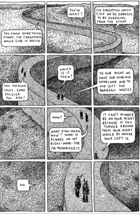
Consider the polyptych, a technique used in Guardians of the Kingdom by Tom Gauld.  A polyptych in the comics world is where “a moving figure or figures is imposed over a continuous background” (McCloud pg 115).  The polyptych provides an example of closure occurring in one setting, likely with one subject or a small group acting or talking (that is, providing sound or motion to imply time and generate closure), but it is a technique that requires the use of panels as an organizational framework, despite the fact that all the closure-generating action of a character occurring within one setting could only logically be explained as a passage of time.  Otherwise it would appear as the sudden multiplication of one character into many copies, something I think it is safe to say could easily be ruled out through context.


For example, this polyptych from Gauld’s aforementioned work uses one scene and only two characters, both moving and speaking and thereby implying the passage of time.  It also has a very basic set of panels dividing the image which helps to emphasize and clarify the passage of time.  The panels help to organize the image on the page, but they are not necessary to understand the image, which is to say, to generate closure.  If there is some doubt about this assertion, imagine the page without the panels.  Although it might be momentarily confusing, reading the whole page would provide the necessary context for closure to occur.  In fact, in this particular instance, even that much probably wouldn’t be necessary, as the reader would be aware that there are only two characters in this book. Nonetheless, the panels do help and McCloud’s characterization of them as icons for the division of time seems to make sense, although they might be more accurately described as indices.  An icon bears a visual similarity to the thing it represents, whereas an index does not necessarily resemble anything, but indicates that what it represents is occurring. As panels and gutters can’t be said to visually resemble the passage of time, but instead indicate that it is happening, they are indices.

Why, if they are not necessary, do we see panels and gutters so often in comics?  The answer is that while they are not necessary for closure, they are necessary for comics as a format.  They help us to organize the page and are the author’s means of steering our scanning of the images.  Imagine, once more, the page above without panels.  But this time imagine that it is huge, far larger than any book would allow, so large that it would take some time to scan the whole image from top to bottom.  In that case, the winding wall and real time needed to scan the page would provide all the indication of the passage
of time necessary.  Closure would certainly occur without the panels.  In essence, panels are not necessary for closure; they are an accident of the format that has been developed by authors as a means of directing the process of closure, thereby shaping the meaning we draw from the comic.

There is further evidence to suggest that while closure doesn’t strictly require panels, comics do.  More broadly, any visual narrative art requires panels and if those panels are not explicitly drawn, they are implied.  The Bayeux tapestry, an 11th century embroidery depicting William the Conqueror’s successful invasion of England, although clearly not a comic in the modern form, works just like one.  It combines images, definitively on the iconic side of the spectrum, and words to tell a story.  It scans from left to right and is
broken down into a number of scenes, although none are explicitly numbered or
otherwise differentiated.  But the fact remains that the panels are implied.  The need for organization in the images was still present and panels, or in this case scenes, are apparently the instinctual way to depict this.

It is my contention that closure occurs constantly through our scanning of the images and the involuntary creation of meaning out of the juxtaposed images on the page.  The panels and their negative space, the gutters, act only as a way of organizing these images for, no doubt according to the author, more meaningful scanning.  Further, I would argue that panels are actually just a formalization of our natural scanning and is due mostly to the physical format that comics take.  The fact that comics generally come in books, that
is on pages read left to right, top to bottom, has necessitated the use of panels. Specifically it solves the problem of moving down the page, something the Bayeux tapestry doesn’t have to deal with and consequently didn’t create a system like explicit panels to direct the reader.  I do not disagree with McCloud that “closure is comics”, indeed any visual narrative must have closure because that’s how we make sense of them. And I would go farther, perhaps, than McCloud by stating that comics are panels, whether those panels are implied or explicit, because the format demands it.  But, as I believe I have shown, there is no transitive property at work here; panels and their gutters are comics, comics is closure, but panels and gutters are not closure.

Comics at Book Expo America 2012

The comics industry, the publishing industry, and the convention industry are all on the cusp of a great change due to shifting priorities, new formats, and new audiences. Can the three use work together to confront these challenges? Based on my attendance at Book Expo America, the country’s leading publishing exhibition, I would say that the answer is “no.”

At the June 6 convention, organizers seemed more concerned with extracting as much money from vendors as possible via exorbitant exhibition fees than in providing a sensible layout. Comic companies, though smartly grouped together for the most part, were located nowhere near the Children’s Pavilion. And yet, the majority of the librarians I’ve encountered outside of larger cities still continue to view graphic novels as a format for children and reserve them for children’s libraries. In bookstores, graphic novels often provide a buffer between the rapidly growing Young Adult section and Science Fiction. Though some comics creators may bristle at the suggestion, wouldn’t it have been best to place comic companies near the Children’s Pavilion—the very place librarians and book buyers would expect them to be? Placing them against the back wall and far from high traffic areas gave the signal that comic companies are not a priority. Why should those comic companies want to spend large sums of money to return? Poor service combined with high fees may hurt BEA in the long run as vendors begin to reconsider the necessity of the event.

Comic companies on the whole—perhaps too familiar with comic conventions–did not seem to fully recognize their status as miniscule fish in a massive pond. Displays were mostly limited to a selection of wares. The lack of a “hard sell” was completely evident. In every instance, I had to approach representatives and speak to them first about products—or even say “Hello.” While this is not an issue in a comic convention full of rabid fans, it very much is one in a convention full of disinterested buyers. One cannot afford to be aloof. However, once approached, many reps were friendly and knowledgeable.

Here’s a brief assessment of the comics booths I visited.

Fantagraphics: This company possessed the best location (strangely nestled in a section full of academic publishers) and the most stylish booth—complete with seating! It also had an extensive set of galleys to peruse and provided free sample books to those who had questions. Eric Reynolds even took the time to help a lapsed reader like me sort through the intricate history of Love and Rockets, which was greatly appreciated! I was highly impressed.

Image: I was also pleased with Image. The booth, though in a lackluster location, was well stocked with a wide array of free comics and had friendly creators behind the booth signing wares. Jennifer De Guzman even took the time with me to help pick out a selection of comics for a coworker’s young son.

BOOM!: Free wares were not available, which I feel was a tremendous mistake. Instead, I was offered a checklist of recent and upcoming graphic novels. While this is very useful to a fan, what would a buyer want with a list of books he is not familiar with? What librarian would take the time to stand and read several comics at a booth?

Marvel: Marvel did not have a separate booth and was inadequately represented by Disney. I was shocked by how poorly staffed and stocked the booth was given the wealth of the company, the bulk of content available, and the amount of exhibition space purchased. I picked up a pamphlet advertising a “Marvel book, magazine, and app program for young readers”—no backlist, no Masterworks, and no material geared toward adults or teens available. The impression was given that Marvel merely produced products for young children featuring traditional icons. The lack of a diversity of titles was disappointing.

DC: DC had no booth available on the exhibition floor; instead it made due with two autograph sessions—one by Scott Snyder, author of Batman Vol. 1: The Court of Owls and another by Peter Tomasi, author of Batman & Robin Vol. 1: Born to Kill. While pushing well-known creators is a wise move at an event now dominated by celebrities, the lack of a booth was a huge misstep. And given that both authors signed books featuring Batman, there was a drastic lack of diversity.

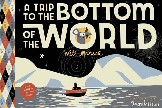
However, comics and graphic novels were not limited to the exhibition floor. I attended Heidi MacDonald’s fabulous panel showcasing monumental works of 2012. Prior to the panel, a small survey sheet was provided to members of the audience, presumably to obtain basic information regarding audience demographics. I am very curious to know who attended the fairly populated event and hope that MacDonald releases that information at a later date. Though light on mass market, heroic fare, MacDonald and her peers seemed to know their audience and cater to it, providing a list   featuring critical darlings and charming children’s books for an educated urban audience. Two popular examples include Alison Bechdel’s Are You My Mother?: A Comic Drama and A Trip to the Bottom of the World with Mouse by Frank Viva. (The list was about quality, not commerce. Still, had I been a book buyer I might have preferred a collection of mainstream books that would sell extremely well to a suburban audience. There is no point in stocking one’s shelves with only Nabokov when customers want Fifty Shades of Gray. Give ‘em the thwip! There’s no shame in a little bit of spandex.

Perhaps even more interesting than the books on display were the rumors swirling about the show floor. Will next year’s exhibition be open to the general public? Will smaller vendors displeased with poor foot traffic avoid next year’s show? I could easily see BEA falling prey to the crass commercialism that consumed SDCC and E3. Though it would mean more money for Reed Exhibitions, it would not necessarily make for a more enjoyable show. Still, a four-day show featuring a renovated floor plan, with Thursday and Friday reserved for those in the industry and the weekend open to the general public, would serve the needs of all via a sizable audience and a variety of exhibitors.