Who Watches the Watchers of Before Watchmen?


Who's the smartest man in the world now?

So: Thursday 7 June 2012, a day which will live in infamy.

I’m not going to go into why Before Watchmen is an all-round immoral “product”, why the *cough* artists involved are sell-outs and scabs, and why those who buy it are endorsing and enabling exploitation. Others have made that case better than I could — I particularly agree with most of what Noah says here.

And, yes, I do agree with that, in spite of my — admittedly rather dopey, it even says as much in the title — earlier post here, where I detailed in tedious detailly detail just how extensively Alan Moore’s own career has relied on the exploitation of other people’s characters, often in ways that the original creators would find abhorrent. My point there wasn’t exactly a tu quoque — i.e. that if it’s okay for Moore to do it, then it’s okay for Dan Didio and his homies to do it too. My point was that — money aside, and that’s a big thing to put aside — Moore has harmed the interests of (e.g.) Lewis Carroll just as much as Didio et al. are harming the interests of Moore. It doesn’t hurt Lewis Carroll — again, money aside — any less just because he’s dead.

This is because I hold the philosophical view (prima facie very counter-intuitive) that the dead have interests just as much as the living, and that we can harm them or benefit them in similar ways that we can harm or benefit the living. Weird, right? But that doesn’t mean that it’s wrong for Moore to fuck over Carroll, or that it’s okay for Didio to fuck over Moore, because ceteris ain’t paribus here. There’s a benefit to society from letting creators mess with the creations of others, but there’s also a benefit from postponing such messing in favour of some length of copyright. So even though Moore has done Carroll wrong, what he’s done is nevertheless morally okay because that harm is outweighed by a greater good. And contrariwise for what DC is doing now.

Which more or less chimes with what Noah’s said.

But to the extent that my post may have contributed to anyone’s impression, in even the slightest way (I have no illusions about the extent of my online persuasive powers), that Before Watchmen is morally acceptable, then mea honest and sincere culpa.

Now, all that said, I want to move on to a much more discomfiting thought. At least, it discomfited me. And this is directed at all of us who have taken the moral high ground on this “package” and exciting new “development” of the “property”, so other people like Noah, Tom Spurgeon, Dan Nadel, Sean T. Collins, Abhay Khosla, Chris Mautner, J. Caleb Mozzocco, Tucker Stone, et al.. You know who we are.

Um, we know who you are?

Eh, whatever. Anyway, here’s the thought: how much of our moral disdain is due to the fact that we have 99.9% certainty that Before Watchmen is going, as Socrates might have put it, to suck dead dogs’ balls?

Let’s look into our hearts here: hasn’t DC made it incredibly easy forus conscientious objectors to conscientiously object because, come on. J. Michael Straczynski and Darwyn Cooke? Shit, DC, why don’t you make it really tempting for us and chuck in Brian Michael Bendis and Jim fucking Lee? Of all the *cough* artists involved, Brian Azzarello and Jae Lee are the only ones I’d personally piss on if they were on fire; many of the rest of them I’d only piss on if they weren’t on fire.

Not Dan Didio, though. He seems like the kind of guy who’d be into that.

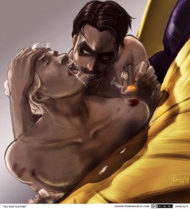
Let’s imagine an alternate universe where the “talent” involved was actually talented. Let’s imagine that, instead of Andy Kubert and JMS, the line-up consisted of Chris Ware, Jim Woodring, Lewis Trondheim and Junko Mizuno. Or Anders Nilsen, James Stokoe, Los Bros, Jason, and Naoki Urasawa. Or a young-alt-star-all-star line-up, drawing six hundred pages of nothing but hardcore yaoi fucking, Dr Manhattan as top and Rorschach as bottom: Johnny Negron! Lisa Hanawalt! Michael de Forge!

Or whoever floats your boat. The particular names don’t matter, what matters is that we imagine a line-up of artists who are actually, you know, good and who would almost certainly produce something that’s actually, you know, good.

In the real world, with the line-up we’ve in reality got, there’s essentially zero chance that Before Watchmen will be as good as Watchmen. Hell, there’s essentially zero chance that Before Watchmen will be as good as The First American.

But imagine — just imagine — that it was probably going to be good. Maybe even great. How loud would our denunciations be then? How many of us would still boycott?

Yeah, lots of us would would still denunciate, lots of us would still cott the boys. But, let’s be painfully honest, lots of us would be slinking off to the LCS to buy it, put it in a brown paper bag please or if you don’t have a brown paper bag could you please hide it in the covers of Pee Soup um I’m buying that for my friend

Uh his name’s Dan.

In other words: while we’re all basking in the warmth of our moral outrage — and I’m there basking too, man, that one place in the sand where there’s just one set of footsteps and it looks like I just nicked off to do my own thing? that’s where I stopped to carry you I LOVE YOU GAIZ!!! — while we’re all there basking, let’s also take a reality check. The reason it’s so easy for us to think DC management are arseholes for publishing Before Watchmen, the reason it’s so easy to think the *cough* artists are arseholes for making it, and the reason it’s so easy to think the readers are arseholes for buying it — that’s not because we are not, ourselves, also arseholes.

We’re just arseholes who, this time, got lucky.

Boringly sensible post-script: Yeah, yeah, some of us would still resist, just as there are some people who find meat delicious but still turn and remain vegetarian. And there are also some people who genuinely do like the artists involved in the real Before Watchmen and are still loudly denouncing it, with David Brothers leading the charge. Good for them.

Second post-script: Come to think of it, an alt-comix tijuana bible/doujinshi sounds like a good idea. Internet, make this happen! Paging Ryan Sands

Image attribution: Ah, Google. Seek “Watchmen yaoi” and it shall be given. Art by Pond; I hope s/he doesn’t mind the borrowing. I just wanted to build on his/her legacies and enhance them and make them even stronger in their own right.

The Color Question

Editor’s Note: This is part of a series of student papers from Phillip Troutman’s class at George Washington University focusing on comics form in relation to Scott McCloud’s theories. For more information on the assignment, see Phillip’s introduction here.
_______________________
 
Color remains a question rather than an answer in comics: Some artist’s embrace it, while others continue to ignore it. Whatever its use, color plays an important role in forwarding the message of the artist. Yet such a message is ambiguous. In his analysis Understanding Comics, Scott McCloud notes that color promotes comics by reaching toward reality, making a panel appear to be a much more relatable image to the reader, who lives in a world beyond black and white. Mirroring life itself, which is far from flat, colored images add an extra dimension to the page. But is this the true purpose of color in comics? McCloud suggests otherwise; however, due to the brevity of his designated chapter, he never explains why. Indisputably, comics serve to simplify life, easing the ability to communicate some sort of integral message to the reader. Breaking the fourth wall, color magnifies the author’s claim. Minute tidbits of otherwise unseen details reveal themselves through the additional lens of color.

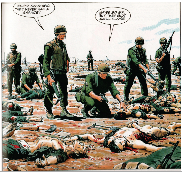
The following image derives from Doug Murray and Russ Heath’s “Hearts and Minds: A Vietnam Love Story.” The panel displays the death and destruction caused by the detonation of a grenade during a battle in the Vietnam War.

Throughout my analysis, I will revisit this image in order to touch upon the overlooked meanings that color specifically reveals.

Color magnifies important details that forward the cartoon’s claim. Though images may appear more realistic, the purpose of color remains for graphics to appear more simplistic. Noting the simplicity of cartoons, McCloud emphasizes that, overall, cartooning is a form of “amplification through simplification” (30). Comics pride themselves in exaggeration, which empowers a point rather than detracts from it. In this sense, color is yet another mouth for exaggeration. Heath’s image exhibits excessive exaggeration due to the use of color. Studying certain features of Heath’s panel, readers must digest uncomfortable truths that the artist is emphasizing. For instance, the two Vietnamese corpses expose gruesome depictions to readers.

In the first image, color contrasts the white bone protruding from the dead man’s neck from the background. Clean and crisp, this bone appears as though it is out of place. Looking as though it were a plastic piece in the board game Operation, the bone could easily slide back into the dead man’s body. Though, in reality, this bone would be muddled with blood and dirt rather than in this immaculate condition. Instead of showcasing visual reality, color emphasizes a statement: Another man’s bullet pierced a bone through another man’s throat. The same argument is displayed in the second image. Here, color bolds the blood that pours from the man’s dislocated torso. Yet this blood is pure red. In reality, such blood would not beam from a corpse; it would be dirtied and dried. Color again simplifies reality, highlighting to readers what happens during war.

When the same images are displayed in black and white, such an effect is lost. Though readers may understand that the two men are dead, they do not see death’s marks etched in the corpses. The bone is barely visible, and the blood blends with the shading. The colored images are blatant to readers, who inherently understand what each detail represents. Such a technique attests to McCloud’s claim about drawing style: “By stripping down an image to its essential ‘meaning,’ an artist can amplify that meaning in a way that realistic art can’t” (30). Heath’s color truly “strips down” the panel to its bare essentials.

By simplifying a panel to its bare essentials, Heath presents color as an icon. As McCloud defines the term, an icon is an image that represents a person, place, thing, or idea (27). Cartoonists rely on icons to transmit a clear and obvious message to readers. In the case of this panel, the clearest example of an icon is the color red, which represents blood. Readers immediately connect the image of blood with its more powerful meaning: carnage. Heath chooses to depict such carnage through the visual device of an icon, and such an icon is displayed through color.

Beyond functioning as an icon, color breaks the flow of sequential art, emphasizing the subject matter of an image rather than the panel transitions on the page. Referring to the purposeful placement of juxtaposed panels, sequential art stresses the movement from one panel to the next, which, in turn, unconsciously forwards the plot. Looked at as an abridged filmstrip, sequential art carries readers from one important scene to the next. Yet, color seemingly cuts this artificial current.

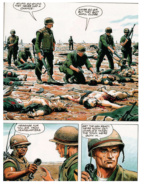
The selected image comes from a page with three separate panels. Despite the wholeness of the story, color slows the sequential flow of these transitions. The first panel encompasses over a half of the page, warranting some sort of inherent importance in its size. Obviously, the artist wants readers to not only look at this image, but to study it in detail. Despite its size, readers may easily browse from one panel to the next. However, Heath installs color to prevent such an easy transition. After reading this page in its entirety, readers are inclined to revisit the first panel due to its colorful graphic content. The secret to such a phenomenon lies in the highlighter-like quality of color.

For example, moving left to right in the first panel, the focus shifts from the line of soldiers to the sprawl of bloodied corpses. Bold outlines of blood and flesh segment each corpse from the next, hinting that each image has a different story to tell. In fact, each body could be a separate panel. In the panel, four separate Vietnamese bodies are macabrely drawn: An American soldier tests the pulse of a clearly lifeless Vietnamese shell; another American soldier picks at a mangled corpse with his gun; and the final two corpses, torn and shattered, lay brutally close to the reader at the front of the panel. Subject-to-subject transitions would individually highlight each corpse and its features; yet, Heath decides to include multiple scenes in one panel, separating them by color. By choosing this method, color simplifies four possible panels (one panel for each corpse) and gift-wraps them for the reader. Realistically, each corpse deserves its own panel in order to communicate its graphic content, but color simplifies such reality into a single cartoonish image.

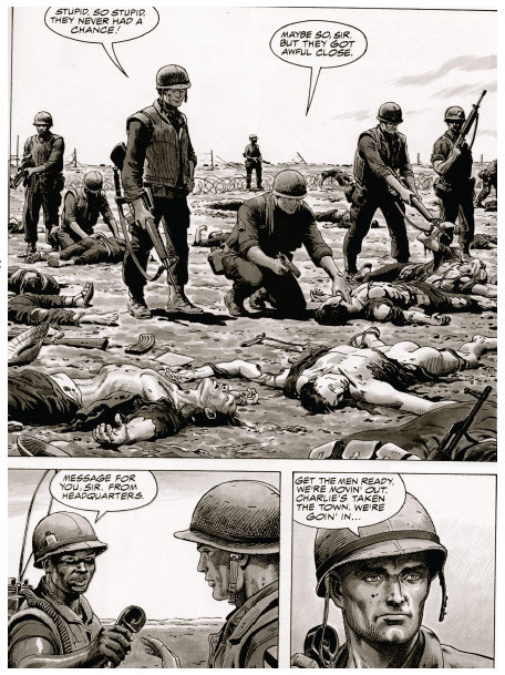
By segmenting sequential art, color also simplifies the significance of McCloud’s illustrious gutter. McCloud defines the gutter as the space between panels where closure occurs in reader’s minds. Through closure, McCloud suggests that the message of the comic is conveyed to readers. Such a claim raises the possibility that closure could be misconstrued: Reader’s could interpret a different idea than the artist intended from the panels. Color counteracts such discrepancy. Creating its own sense of closure, color illustrates the artist’s message clearly to the reader. Revisiting the panel sequence, I have manipulated the colors to a black and white format.

Reading the page, readers find that it is naturally much easier to follow the storyline in black and white. The first panel describes the recent conflict, and the gutter to the bottom left panel suggests to readers that such a massacre is a daily display for soldiers, as the sergeant plans to move out to another town. But, in color, such a transition is not so smooth. Color isolates the first panel, giving the gutter transition between the first and second panel a much different meaning. Studying the images in color, readers realize that the comic is exposing the absurdity of death through battles in war. The gutter seemingly empowers this statement, as it quickly introduces another future conflict that promises to be just as gruesome. Murray and Heath seem to be showing readers the horrifying realities of war. Graphic imagery, highlighted by color, communicates a “War as Hell” message to readers, who must digest an unnerving panel. Such closure can only be deduced when the panels appear in color. Without the red blood and displaced flesh, which are both only noticeable through color, the comic’s philanthropic message is lost in translation. Clarifying these important details, color simplifies Murray and Heath’s message. Rather than using words to communicate a difficult idea to readers, Murray and Heath rely on the simple but powerful effects of color.

Rather than making comics more realistic, color is highlighting the simple message of the images. Comic artists utilize color to highlight their ideas rather than bring them closer to reality. Magnifying minute details, colors strip down panels to their bare essentials, successfully forwarding the message of the artist. Manipulating the flow of sequential art, color simplifies complex depictions into a single panel. And, transforming the gutter, color clarifies a complex idea through universally understood graphics rather than confusing words. As viewed in a single page of Murray and Heath’s “Hearts and Minds,” a war related comic promises to introduce many ideas to readers. With so many themes floating throughout the comic, some sort of technique should aim to clarify and polish the author’s intended message. With that said, color in comics aims to simplify ideas so that readers better understand the artist’s message. Highlighting death and the absolute brutalities of war, color serves as a trail-marker for the artist, who only hopes to easily communicate some sort of message.

When an artist prepares to finalize his product, he must ask himself the color question: Could color simplify life more so than the comic already does? Heath’s artwork answers such a question. Indeed, even with color, simplification proves to be the root goal of comics. Color thereby is not so much an aesthetic choice to the artist as much as a literary tool.

Comics Criticism 101: An Introduction

This essay was written in my first-year composition course at the George Washington University. University Writing Program faculty draw on a variety of disciplinary backgrounds (my Ph.D. is in American history, with current research on abolitionist visual rhetoric) to teach students to “enter the conversation” of academic research—to do detailed analysis and to engage existing scholarship rather than simply regurgitate it. This particular assignment arose out of the cross-fertilization that Craig Fischer argues is emblematic of comics scholarship, where academics, fans, practitioners, and popular critics seed each others’ ideas and produce more interesting work.

I had been teaching a “five-page paper” version of this exercise, where students analyze specific visual elements of a chosen comic or graphic novel in order to develop a claim in response to Scott McCloud’s Understanding Comics. This served as an introduction to comics (McCloud is great for that) but also to claim-making, because, as a foundational text, McCloud is the perfect foil: authoritative, comprehensive, and eminently fallible. Students always find interesting exceptions to his rules, new categories of panel transition or image/text interaction, and concrete ways to develop his vague generalizations.  But the papers still felt academic in the pejorative sense: they represented a school genre that addressed only the professor as audience.

To move away from that, I consulted the Comix-Scholars Discussion List, fishing for ideas about formal criticism in the blogosphere: hence Noah. Noah was very interested in the project, helped me rethink the genre of comics criticism, and very kindly loaded me up with examples, many of which went onto the assigned reading list as a diverse set of models we read and discussed in class. Students now have a broader range of rhetorical choices to make regarding introductions, integration of images, organization, descriptive language, and analytical tone—not to mention examples of how to make a claim that might matter to someone outside the classroom.

As a final gesture, Noah asked me if he could publish some of the best examples students produced. I am most grateful for his generosity and I hope you enjoy the ones we’ve selected. The students are excited about sharing their work and, I trust, will be watching the comments closely. Please welcome them to the conversation.

_____
Phillip Troutman is Assistant Professor of Writing at The George Washington University, trout@gwu.edu

In Space No One Can Hear You Vomit

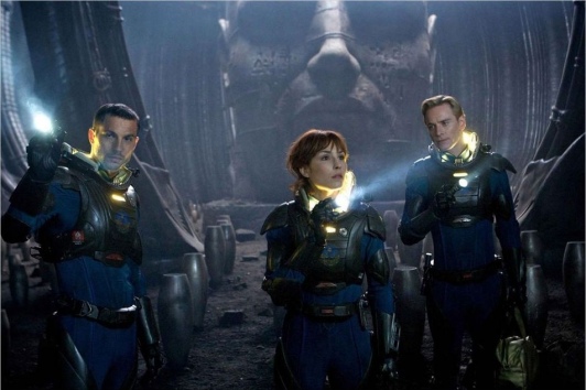
Logan Marshall-Green, Noomi Rapace, and Michael Fassbender in Prometheus

So I’d spent that June 1985 afternoon laying parquet in the future dance-rehearsal room of our Montmartre theater — a quixotic and doomed venture that consumed me and my compadres for two years. The parquet tiles were affixed to the concrete floor by a particularly noxious glue, and I foolishly wore no mask; after two or three hours, my nausea had built up to the point of copious vomiting. So I headed home, expecting the effects to dissipate with rest.

But the nausea continued, for the next three days. I was not only unable to hold down food, but water as well. On the afternoon of the third day I staggered into a clinic, hoping for some healing nostrum to take home — and was immediately hospitalised, with surgery scheduled for the next day; I had appendicitis, which had led to peritonitis and sepsis; my body was poisoning me.

That night, as I lay in bed with a saline drip attached to my arm to reverse my extreme dehydration, I experienced for the first time delirium. It was by no means unpleasant. A haze of uncertain time and odd sensual waves, and curious mental fugues rippling through my consciousness.

And then suddenly that consciousness focussed. I was living the life of a soldier in the Napoleonic period, seemingly cursed to face across the years a mad adversary in duels, wielding rapier, saber, pistol…the intensity of the hallucination was incredible.

Of course, it was no hallucination. The hospital room’s TV was showing director Ridley Scott‘s first feature film, The Duellists, and my fever had thrust me into it.

Ridley Scott directing Keith Carradine and Harvey Keitel in The Duellists (1977)

But how is it that my fever dream never delivered me that same hallucinatory re-incarnation via any of the other TV shows and dramas I watched that night?

Well, ‘fever dream’ is the answer, because fever dreams are what Scott creates at his best, what he seduces us into.

Ridley Scott has always been among the most visually-oriented directors; he studied at the prestigious Royal College of Art in London, and began his career as a set designer for the BBC. An excellent draftsman himself, he exercises over the art direction of his films an almost maniacal attention to visual and aural detail.


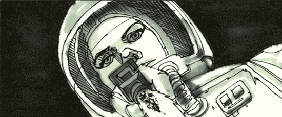
Storyboard drawings by Ridley Scott for Alien

This was apparent from his days as an extremely successful director of commercials; nobody who lived through the seventies in Britain (such as I) has forgotten his series of ads for Hovis bread. (Click through for video.) Observe the lushness of the photography and the thorough recreation of a period, hear Dvorak’s 9th Symphony hypnotise you into sentimental yearning. One of these ads was recently voted Britain’s all-time favorite television advert.

At the same time, the bullshit quotient of these commercials was high (what– bullshit in advertising? Stop the presses). Hovis is an admirable and healthful wholewheat bread, but it is, and has been from the start, an industrial product, not the loving fruit of the local artisanal baker’s craft. The golden glow of nostalgia radiating from these commercials is rooted in an imaginary past: the Depression-era North and Midlands of England were grim places indeed; besides, working-class and lower-middle class Englishwomen traditionally baked their own bread well into the sixties. A loaf of Hovis factory bread would’ve been regarded as a luxury.

Still, we willingly let ourselves be lulled by Scott’s dreamweaving. And I maintain that this holds true not just for his ads, but also for Scott’s most successful films. They are often riddled with logical and narrative incoherency, leave questions unanswered and mysteries unresolved– we don’t care. We want the fever dream.

Scott’s great talent is for the creation of plausible worlds. Note: I say plausible, not realistic or even believable. He can create a romanticised Napoleonic age (The Duellists) or an outrageously baroque Roman Empire (Gladiator); an exoticised techno-Orientalist modern Tokyo (Black Rain); a fairy-tale land (Legend); the science-fictional Earth of Blade Runner and Space of Alien; and we are there with him. Because we want to be!

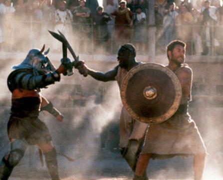
From Gladiator. Note the dust; Scott uses (abuses?) dust and mist lavishly for visual oomph

As a sample of this world-building prowess, consider his famous 1984 Superbowl commercial introducing the Apple Macintosh computer. (Click through for video.) Although it only ever aired once, its impact was extraordinary and resounds down to this day. What we note, behind the rather perfunctory and obvious allegory, is Scott’s skill at implying an entire imaginary world in so brief a span of time.

Scott’s breakthrough film was, of course, Alien in 1979.

It manages a) to show one of the most believable science-fiction worlds ever presented on the screen, and b) to be one of the most frightening movies ever made.

The first is due to Scott’s aforementioned obsessive attention to detail and visual talent. The second is due to his genius for emotional manipulation.

Alien benefited hugely from Scott’s discernment of artistic talent. It’s been said dismissively of him that as a director, he made a great art director; but an art director’s brilliance made the film.

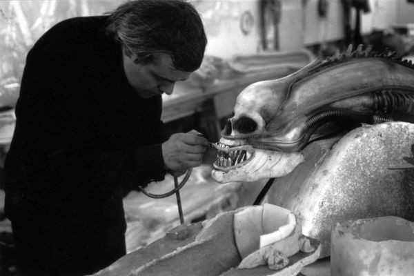
His great coup was to recruit the artist of the grotesque, H.R.Giger, to design the alien monster and the extraterrestrial ruined spaceship.

H.R.Giger building the alien

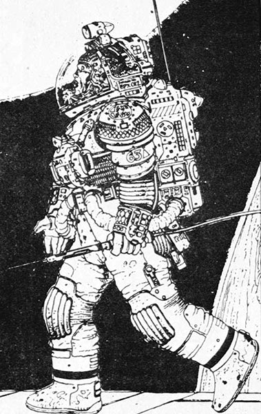
Other marvellous talents were recruited for other aspects of the film, cast like actors; Ron Cobb designed the Earthling spaceship Nostromo, and Jean ‘Moebius’ Giraud designed the spacesuits.


Above: Giraud’s spacesuit design. Below: the suits as seen worn among Giger’s set.

Scott’s gift for manipulation — his dark side, as it were — told him the most effective ways to induce fear and horror. Alien features a nightmarish view of the body’s flesh and fluids. In addition to the usual directorial tools of suspense and pacing, the whole Hitchcockian array, Scott very consciously reaches for the visceral and the subconsciously somatic gripping to create his nightmare.

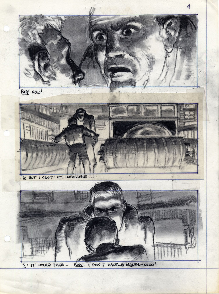
After Alien, Scott’s science-fiction follow-up was Blade Runner (1982), an adaptation of Philip K.Dick’s Do Androids Dream of Electric Sheep? This was another visual triumph, with Scott again partnering with a design visionary, Syd Mead.

Storyboard from Blade Runner, drawn by Ridley Scott

At the time, Scott declared that the science-fiction film needed its John Ford — that is, a director who could be to the SF genre what Ford was to the Western. And Scott could have well fit the role.

But thirty years passed before he made another science-fiction film: Prometheus.

**********************************************************

Scott’s career during this hiatus soared, creating gems (Thelma and Louise, Gladiator, Black Hawk Down) and duds (Someone to Watch Over Me, G.I.Jane.) The initial box-office failures of Blade Runner and of Legend may have caused him to shy away from the fantastic. He was also vocally displeased with the rather ham-fisted exploitation, by other hands, of the Alien franchise. However, for the past ten years he has been working on a prequel to Alien — only to shy away from that notion in recent years, at least in public.

His and the studio’s coyness about Prometheus has exasperated fans. Is it or isn’t it a prequel?

To answer that question, I was, in the evening of June 1st, Prometheus bound. (Sorry, couldn’t resist.)

So the answer to “is this an Alien prequel” is…?

Yes.

And no.

Yes, for it fits perfectly into the Alien universe, Giger designs and all. No, because the film works perfectly well as a stand-alone. Scott has his cake and eats it; good for him.

Is it a good film? Yes — but only if you are willing to embrace the fever dream — the nightmare. By which I don’t exactly mean the old cliché “check your brain in at the box office and enjoy”.

Science fiction is the most cerebral of genres; but it also works with the unreasoning emotions of awe, wonder and horror — with the sublime. The latter are this film’s strong suits.

Now I want this article to be relatively spoiler-free, so I won’t go into plot details. But, for any savvy SF aficionado, there’s nothing conceptually new on offer here. Von Daniken and Lovecraft seem to be the main inspirational motors. (Lovecraftians will understand this allusion: where Stanley Kubrick’s 2001:A Space Odyssey has been called a shaggy God story, one could call Prometheus a shoggy God story.) The old SF trope of mankind having been seeded on Earth by extraterrestrials has long since run into the problem of Homo Sapiens‘ close genetic kinship with other primates such as chimpanzees and gibbons; to my knowledge, only the writer Larry Niven has worked his way around this inconvenient fact, in his novel Protector. The film ignores this.

There are numerous logical lapses, not just in concept, but in motivation and continuity. The strong, simple storyline of Alien here is complicated by a larger cast and fussy mise-en-scène– people go from ship to ruins to ship to ruins to ship and from chamber to tunnel to chamber to tunnel until the viewer has no sense of place. Many of the characters are stereotypes.

But, you know what? None of these objections amount to much. Let your reptile brain take over, give in to the Scottian dream.

The nightmare works more powerfully than ever off our deep revulsions for the flesh, our imaginative perversions of sex, birth, death, and animality. We are fed one particular abomination that is the ultimate in vaginadentatatentaclepornhermaphroditicmisogynist monsters: it makes the cosmic squid in Watchmen look like a wee twee fairy. This she-he-horror fights its opposite number, an extraterrestrial superphallic Uebermensch, and succeeds in raping him in true classic Alien style. With the usual, unholy, parturient result.

But the most harrowing sequence has one of the female characters, impregnated with an atrocity waiting to burst through her abdomen, racing to have an automated robot surgery pod operate an emergency caesarian/abortion. The extracted monster is a squealing, squirming betentacled mass of boneless flesh, held in the sterile metal grip of the robosurgeon.

Beyond the hideous delights of this sequence, I find it well encapsulates the genesis of Prometheus. We, the audience, are the woman. Inside us resides the secret monster of our Id. Ridley Scott is the robosurgeon, who clinically, mechanically extracts the creature and shows it to us: the creature being, of course, the film.

Some final random notes: the acting level is uniformly above par; great pleasure is derived from Michael Fassbender‘s alternately childlike and malevolent android Dave. He provides an incarnation of the Superego– sandwiching the humans between himself and the Id of the monsters.

This is definitely a star-making turn for Noomi Rapace, as protagonist scientist Elizabeth Shaw. Strength and vulnerability, emotion and will to knowledge, are complexly communicated by her wonderfully expressive features.

Charlize Theron plays yet another ice-queen bitch. Disturbingly, the trailer before the film was for Snow White and the Huntsman, where she plays yet again another ice-queen bitch. Lady better watch out for the stereotype patrol.

The visuals are predictably stunning, and this is one of the very few 3D films I’ve seen that justifies the extra price.

So: welcome to his nightmare, and to yours. Go see it.

++++++++++++++++++++++++++++++++++++++++++++

Scott is not alone in this club of visualists/dreamers. I would group him with Tim Burton, Terry Gilliam and Jean-Pierre Jeunet (all four being graphic artists originally) as cinematic visionaries who triumph over weak story to enthrall us with their worlds; the distant children of Georges Melies.

(In comics, I place Jack Kirby, Steve Ditko, Rick Griffin and Jean Giraud in the same family.)

Still, it should be pointed out that these directors do their best work with quality scripts: The Fisher King for Gilliam, Alien and Thelma and Louise for Scott, Beetlejuice and Big Fish for Burton. And other visualists, such as Jean Cocteau, Stanley Kubrick or David Fincher, have always worked both hemispheres of the brain — investing just as much energy into the writing as into the dreaming. Scott himself has evolved in this direction.

May he continue to do so; he is currently developing a sequel to his other SF masterpiece, Blade Runner. And Prometheus ends with the possibility of a grandiose sequel.

Perhaps science-fiction will have its John Ford, after all.

++++++++++++++++++++++++++++++++++++++++++++

Silly P.S. # 1:
Noomi Rapace was discovered as the star of the Swedish version of The Girl with the Dragon Tattoo, in which she played Lisbeth Salander. The American version stars Rooney Mara.
Those are three cool names!
Silly P.S. #2:
In 1977, I clipped a pretentious review of ‘The Duellists’ and sent it to the Pseud’s Corner column of the satirical magazine Private Eye. They sent me back a cheque for five pounds sterling, enough for a nice dinner at Hamburger Delight.
Thanks for the burger, Ridley!

+++++++++++++++++++++++++++++++++++++

Check out this site for the corporate villainy behind the voyage of the Prometheus
A marvelous blog of science-fiction and fantasy art :
Sci-Fi-O-Rama

Collage Theatre, Copyright, and the Curious Case of Anne Frank Superstar

Sara Villegas and Anthony Pyatt as Anne and Peter.

Anne Frank and Peter van Daan flirt playfully in the crowded attic space, alternately shy and forward. They move lightly and talk softly, all to the accompaniment of a delicate instrumental on piano, guitar, flute and glockenspiel. It’s the first few notes of “We’ve Only Just Begun,” the treakly ballad co-authored by Paul Williams and Roger Nichols for a bank commercial in 1970, and later popularized in a syrupy easy listening version by Richard and Karen Carpenter. But, beyond the intimacy of the stage and among the small watchful crowd, the audience doesn’t seem to recognize it—or if they do, it’s a slight titter of recognition, and then transformation, the overtly sentimental lyrics (“We’ve only just begun/ to live/ white lace and promises/ a kiss for luck and we’re on our way/”) replaced by a soft flute that sends out echos of memory of these sentiments, the words casting delicate shadows on the moon-lit moment.

It was one strange moment of many in a forty-five minute performance filled with strange moments– 2011’s Anne Frank Superstar, a play constructed by Orlando high school theater teacher James Brendlinger, and acted, crewed and even directed (senior Cody David Price) by current students and recent graduates of Lake Howell High School. (A non-recent graduate, myself, was brought in as musical director.)

The show is the definition of high concept: The Diary of Anne Frank, set to the music of the Carpenters. Described by reigning Orlando theatre reviewer Elizabeth Maupin as “telling a sacred story through songs that have often been called kitsch,” the show was wild– and wildly successful, at least critically. The concept is almost stupidly simple, and some of the audience each night seemed prepared to hate the show, or at least mock it. After all, do “Rainy Days and Mondays,” “Yesterday Once More,” and “Top of the World” really belong in a story of profound loss and human tragedy, with a backdrop of indescribable horror?

But the success of the show– and if one can gauge a show’s success by what percentage of your audience is unable to stand after it is over, this one was truly successful—was directly due to this juxtaposition, a combination that set both elements in a new light, one that seemed to change each aspect of the material. Coming out of the mouth of an adult woman, a line like “hanging around/nothing to do but frown/ rainy days and Mondays always get me down,” is at best maudlin, at worst painfully trite, especially when set on a backdrop of gooey sentimental strings and turgid playing. But out of the mouth of an expressive, and doomed, teenager, the words are transformed into something sad, and possibly true. The songs were also served by the intimate arrangements consisting of piano, guitar, glockenspiel, oboe and flute, supplied by myself, two high school students, and the cast member playing Margot.

Likewise, the story of Anne Frank herself was transformed, or at least recast—it’s become so buried in weight and solemn reverence now that its easy to forget that the girl herself was a teenager, a pop culture enthusiast who wrote, drew, danced, had crushes on boys, worried about her period and her parents, who could have done so many things with herself but was instead doomed to never move on from that adolescent state. She is in many ways the ultimate teenager, having had all of the fears of adolescence made literal in her circumstance. For Anne Frank was trapped–puberty really was the end of the world.

There are additional resonances that present themselves throughout the play, both direct and tangential, including Karen Carpenter’s own doomed life. And much of the power of the play comes from the hopeful use of those songs, so hopeful that, by the time the Nazis actually arrive, it seemed as though the audience had managed to forget that they already knew the ending to this story.

But if the jubilant “Top of the World” and the small thrills of the budding romance have caused them to forget, they’re soon reminded by the violent, silent violation of the attic, accomplished as the three teenagers enjoy strawberries in the annex. After the violation of the attic and the tearing apart of the family, the ending sequence presents Mr. Frank on the now-bare stage delivering a monologue regarding the  fate of his family, as footage of concentration camp victims inter-cut with an increasingly emaciated Karen Carpenter is projected onto a sheet held by two Nazis, to the mournful accompaniment of an instrumental of the Carpenters song “Superstar.” At the conclusion of this monologue his doomed daughter comes out one more time and touches his shoulder, to sing/whisper a few lines of the song. “Don’t you remember you told me you loved me baby/ you said you’d be coming back this way again baby/ baby baby baby baby baby/ I love you/ I really do.” He reaches back, trying to touch her hand, but she is a finger length beyond reach, led off stage by the waiting Nazis. Slow blackout on Mr. Frank, alone on the stage, and house lights up twenty seconds later. No curtain call.

It seems implausible on paper that anyone would attempt such a juxtaposition, or that any audience would stand for such a thing. But at every single performance the reaction was the same—the house lights coming up on a stunned and reeling audience, many of them still sobbing.

Here’s the thing I haven’t brought up yet, which doubtlessly many of you have already thought—the show was in every way illegal.

The Carpenters songs were not the biggest barrier—although it would be a convoluted argument, as long as we weren’t using the name or logo of the group in the promotion of the show, we would have a reasonable chance of making that portion work legally—you can, after all, perform covers of songs written by other people with simply a venue’s membership to ASCAP, and we could probably make the argument that having a repeating theater performance that happens to feature songs popularized by a certain group isn’t fundamentally different than an all-lesbian vegan Led Zeppelin cover band playing at the local ASCAP-member Mexican restaurant.

Anne Frank’s words, however, and the translation of her words on which we were relying for much of our text, were a different matter, as was the authorized play (Diary of Anne Frank), which provided much of the rest of the text. All of these elements are still under copyright, and will continue to be so for several years. (In fact, copyright in the theater is more restrictive than in almost any other field. You can, after all, read a book or listen to an album any way that you wish once you’ve purchased a copy–but to publicly perform a play one must conform to a dizzying array of limitations set out by the author or the author’s agents–usually, that every word of the play will be performed, i.e. no cuts or insertions without permission, and that the appearance, gender and even staging etc will honor the stated intentions of the author regarding the script and contract.)

It’s no secret that a certain entertainment megalith has spent the past fifty years waging a war on the public-domain, its army of lawyers doing its damnedest to insure that their prized Mouse never legally becomes the public figure that he is. But its been only very recently that the full consequences of this have really been examined in the public sphere. The kind of theater that we created is not an unknown phenomenon—it’s just rarely seen in theaters. Instead, you’re more likely to see works that collide concepts with abandon on the Internet, in streaming video—in short, in places where authorship is more unsure and its not always clear who’s neck is on the line.

And I have no doubt that a not-insignificant portion of the people reading this might think, at first blush, that this is fine—that there’s no compelling reason for such a perverse transformation, and that if there’s a law to prevent such a perversion, all the better.

But at this point, seventy years after her death, is there any person that should be able to claim the words of Anne Frank? Is there any one person that can speak for her as directly or truthfully as she spoke for herself? Who owns her words? Who owns her name?

Victoria Camera as Margot.

The show was the brainchild of high school theater teacher extraordinaire James Brendlinger, who, as a young boy in rural Pennsylvania filled scrapbooks with elaborate collages, depicting himself rubbing elbows with celebrities cut from the pages of the dozen odd magazines to which he subscribed, cut from the pages to mingle with each other, with himself—a glorious life of rubber cement living rooms and glossy paper courtship. Concurrently he filled binders with his other love, never-ending Gothic soap opera novels of his own creation, the concepts and characters lifted in the beginning from episodes of Dark Shadows and slowly over many years grown, like the show that spawned it, to monstrous proportions, labyrinthine and tawdry and tangled. (Dark Shadows itself, of course, lifted these concepts itself, whole cloth, from an array of Gothic horror novels)

But after graduating college with a teaching degree, James didn’t move to glamorous Hollywood, but to Hollywood’s hick second cousin to the south—Orlando, FL. He took a job at Lake Howell High School, which is where I met him in 1998, during his first year.

Since then he’s put almost fifteen years into well over a hundred plays and projects at the school, an incredible tally of productions. But somehow he makes it happen, with an incredible expansiveness and a desire to involve as many students as possible.

This ties in nicely with his tendencies for the grandiose, for making something as big and as bold as it can possibly be—always more songs, more choreography, more dancers and aerialists and elaborate props and staging. After graduation I occasionally contributed to this craziness, lending a hand with set design and visual conception, and eventually supplying music. Most of his plays have virtually none of the “restraint” of AFSuperstar. Most of the time they’re much larger, as grandiose and spectacular as possible.


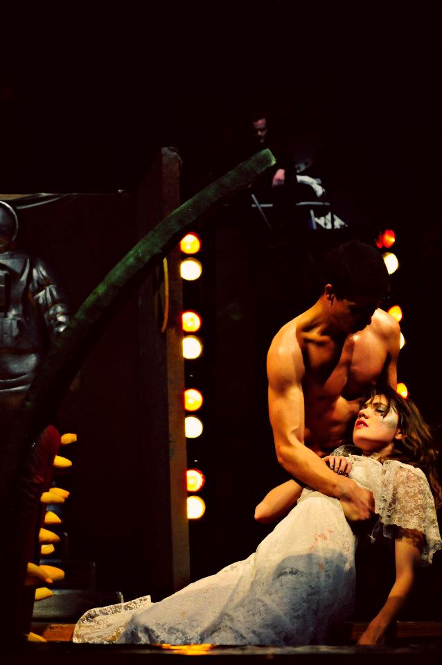
One of the more recent of these provides an interesting point of comparison– a little play called SpaceMacbeth, written by (ahem) William Shakespeare.

Jordan Wilson and Cara Fullam as Macbeth and Lady Macbeth

The title and the concept were mockingly suggested to Brendlinger via an angry multiple-page letter from a theater professor from a local private college who was upset by one of Brendlinger’s earlier adaptations of Macbeth, Lady Macbeth, which featured two “sisters” in the roles of Macbeth and Lady Macbeth. Like its predecessor, SpaceMacbeth is the sort of play that, by virtue of its dense bricolage, defies easy description. (it largely defied logic or common sense as well, but that’s another matter.) Rather than attempt to summarize, I’ll hit you with a few highlights–

–a live band (consisting of piano, marimba, violin, flute, oboe, guitar and drums) to one side of the stage, a thicket of mannequins to the other side, both plastic and flesh. It appears that the three witches stir up so much malice and death not only for their own amusement, but also to expand their collection of mannequins, which continues to swell with the bodies of the dead as the show continues.

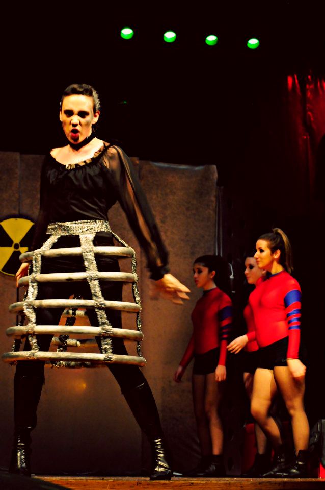
–dozens (a hundred?) references to various tawdry pop-culture science fiction films and television series, ranging from the obvious (teams of astronauts and “space ninja” in mass battle), to the bizarre (tremendous flesh-eating puppets at the front of the stage to which Lady Macbeth delivers her enemies as food) to the inexplicable (previously mentioned astronauts entering the stage in march to an a capella rendition of the “Star Blazers” theme song).

–a truly berserk, yet somehow still believable, Lady Macbeth, played (and sang) to perfection by senior Cara Fullam. When she’s not busy scheming and pining after her husband, Lady Macbeth spends the first act concocting various ominous experiments, including creating giant dancing spiders with the aid of her nuclear reactor and designing some kind of sonic weapon while singing Kate Bush’s “Experiment IV.”

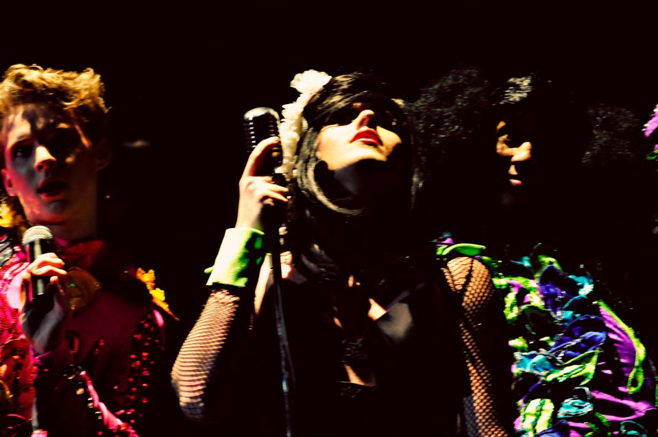
–At the top of act two, Banquo and the other slain men are reanimated by the witches, as drag queens. The witches explain their process, if not their reasoning, in an elaborately choreographed performance of the Scissor Sister’s “How Do You Make A Lady.” In the subsequent dinner scene Banquo teases Macbeth coyly from various places atop his giant castle machinery, batting her eyes, waving her hands and blowing kisses at the increasingly distressed king.

–Lady MacBeth’s final scene is sandwiched by two dramatic vocal performances. The first is a funereal version of Lana Del Rio’s “Video Games,” delivered as she drags herself out of bed to dispose of the evidence of the murders by feeding them to her giant pet at the front of the stage, who eats the bloodied clothing and weapons whole. She then disposes of the rest of her possessions in a similar way before dangling her feet into the edge of the pit  as her android attendants dance around her.


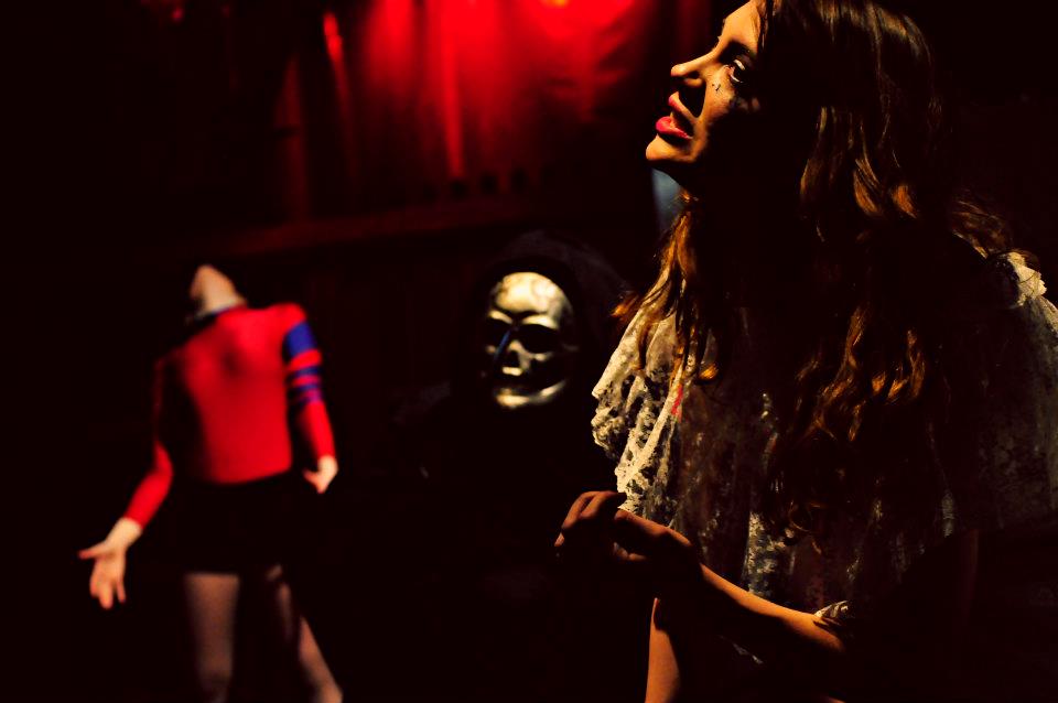
After lying comatose for several scenes as people talk about her bedside, she rises for one final song—the huge and truly theatrical “Dreams,” written by KISS co-writer Sean Delaney and previously performed by Grace Slick. Flanked by two Death’s Head creatures that emerge from beneath her bed, she stalks the stage gathering together all of her creations and attendants, so that she can kill them all in the frenzied climax of the song. “I believe in magic,” she insists, throwing her attendants into the pit. “And I believe in dreams.” At the final hit of the song she stands poised with the knife above her for a moment, before plunging it into her chest as her attendants pop up and slap the stage.

Here’s my question to you, gentle reader– does an event like this diminish Macbeth the play? Or is the play itself so strong, so elastic as to survive being bent even in such an extreme way? Is it a simple matter of repetition, that when a play has been staged ten thousand times something is broken, that it becomes untethered from some platonic concept of faithfulness and can instead be bent and chopped and rearranged at will? Or is it that certain stories or certain works of art are themselves impervious to adaptation, that the more spins one puts on a text like Macbeth, the more possibilities appear? Is it possible that so many adaptations, so many different stagings and interpretations and resuscitations have helped make the play what it is today, have in fact created that feeling of timelessness and “bottomless”ness that so many feel when they approach the material?

To my mind, a play like Macbeth has proved its durability, has proved that familiarity and exposure don’t have to distance, but can instead comfort in the face of the unfamiliar. I can’t pretend to know what audiences experienced when they saw the play, but I can remember for myself how those bits of familiar things interacted with each other, rubbed against each other, even changed each other by their proximity. And in my mind it’s in the best interest of all of our respective art forms to allow works to pass into this state, that there will be a time when these kinds of transformations will be legal after the death of an author, when the art that is capable of being made through juxtaposition isn’t outlawed, or kept from larger audiences by the will of lobbyists working for a company that was itself founded on the adaptation of public domain works.

I want to live in a world where Lady Macbeth and Lana Del Rio are neighbors, attend the same cocktail parties, sing the same sad songs, a world where a thunderous performance of Kraftwerk’s “Metropolis” is the perfect accompaniment for a blood-soaked space duel.

I want to live in a world where Anne Frank is free to sing “Rainy Days and Mondays” whenever she damn well pleases.


Wonder Woman: It’s In Her DNA

This is part of a roundtable on Wonder Woman #28.
______________
Never having been much of a fan of older comics (Wonder Woman or otherwise) I have spent an embarrassingly small amount of time really thinking about how they affect the modern comics that I alternately love and hate. It’s a terrible confession for someone that loves comics and writes about them to admit to, but there it is.

So it was with interest that I dove into Wonder Woman #28 for this roundtable discussion. Though I didn’t expect to like the book much (and of course found plenty to point and laugh at/with) I was surprised to find the core of the Diana I have come to love in recent years here, in full and intact.

Sure, the book had silliness to it that sometimes made me wince the same way reading the diary of my 13-year-old self would, but there was also such love and adoration for Diana on the page. She was the hero who could save the day no matter what. She could do no wrong.

But hadn’t I read so many times that was exactly the “problem” with Wonder Woman? That she was too perfect? I wrote back in 2010 about falling in love with Wonder Woman for the first time through Gail Simone’s excellent work with Diana. And it was then that I realized there was nothing “wrong” with Diana, and nobody needed to “fix” her, despite what publishers and creators seemed to constantly think (and be tasked with). Wonder Woman had it rough simply because she was the lone marquee female superhero for a very long time. In truth, she’s still that today. Though there are a great many wonderful superheroines out there in modern comics, there is no still no other that can stand up to Wonder Woman in any sense – whether it be as IP, consistent comics history, or yes, even power profiles. But being that sole woman is a lot to bear. It means that she must be everything to everyone at all times. It means she can never make a mistake or be controversial, because to stumble when you are the only marquee female superhero sends a too universal sign about female superheroes and more importantly perhaps, women.

And so Diana became a paragon. And you can see it in Marston’s love for her in this issue. He began her as a flawless paragon, he believed her better than all others and he made her that way, over and over again. And that worked for her then, it was a different time, and it was a different way of telling stories. And surely Marston could never have imagined that she would have to hold up the superheroine mantle alone for SO long. Who can manage such a thing?

But reading Wonder Woman #28 helped me re-think what it was about the great portrayals I’ve seen of Diana over the years, and why they resonated so deeply for me. The basis for everything great I have seen of Wonder Woman in recent years was established right here and over 70 years ago. All of the stuff I love is intrinsic to her…it’s in her DNA. And it is in the reinventions of Diana that are most true to that DNA – to Marston’s original vision of her – that have resonated most strongly for me over the years. The soul of what Marston created was there in those new stories that I loved…living and breathing.

Gail Simone’s Diana was particularly compassionate and humorous. Simone found Diana’s modern woman’s heart and her sharp wit, and gave it to us over and over again.

Greg Rucka’s Diana was all honor and self-sacrifice, and Rucka took her to new heights of superheroics, giving us a Diana that broke your heart with gratitude for her very existence.

Darwyn Cooke found the powerful feminist, and gave her to us with zero apologies.

And that last one is so very important. Because some 70 years after Marston created this powerful female superhero, this bastion of femininity and power, this ode to feminism and matriarchy, we are still struggling with these issues as a society. Many readers, both male and female, still wrestle with the idea of female power. Even the idea of a matriarchal society as anything other than a horror show is counter to what so many want to accept as a possibility. And this only further emphasizes how important what Marston was doing 70 years ago truly was. It was important work, whether some of it was silly or not, because we still have not managed to catch up to him. He blazed a trail that we’re still searching for. In 2012 you can’t even write about Wonder Woman and the word feminism without the freaking Internet going boom. And that is just bizarre.

What Marston did with Wonder Woman was revolutionary for its time. But it should not be revolutionary for OUR time, and yet it is. And that alone should tell us how much further we have to go. How much more work we have to do. How much we need others to continue picking up what Marston did and carrying it forward. And there’s nothing wrong with modernizing Diana. There’s nothing wrong with updating her and re-thinking her in interesting ways, but it has to be done with a careful eye and hand and the utmost respect for what she is, where she’s been, and where she still needs to take us.

All of the things that the greatest creators of Wonder Woman since Marston managed to find and bring to the surface so beautifully over the years were there in Marston’s original Wonder Woman. They may have come cloaked in far too many villains, some over the top writing, and way way too much weird bondage for my tastes (what the hell man?!) but they’re all still there. That deep love and respect for a character – a character that is at heart the best kind of superhero a reader could hope for – it was there from the beginning and it leaves me confident that no matter what, it will never be driven out, no matter who holds the reigns (or lasso, as it were).

How do you solve a problem like Diana?

This is part of a roundtable on Wonder Woman #28.
__________________________________

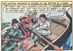
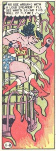
So there’s this warrior princess, right? Think of her as Xena avant la lettre, only with more lesbian subtext. Although, actually, it’s more than subtext; hell, it’s more than text-text. Anyway, she’s a warrior princess from a hidden island of Amazons, sent out into the world during WWII to teach men and women the joys of loving-submission, spanking and being spanked, playing with ropes, and dressing up in a deer costume that gives me funny feelings in my underpants.
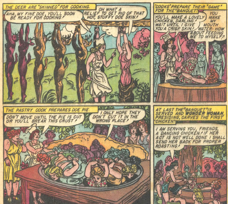
No, wait, she’s just an ordinary superhero and member of the Justice Society of America, even though she’s just a secretary, and not even a glorified secretary.

No, wait, she doesn’t have any powers and dresses suspiciously somewhat exactly like Emma Peel.

No, wait, she has powers again and has to rejoin the boys’ club.

No, wait, she’s reduced to primordial protoplasm and reborn from clay. Then back to being an ambassador for peace from the island of Amazons.

No, wait, she’s a total hard-case warrior, willing to make the hard decisions to do whatever hard things need to be done by hard men and hard women in a hard world full of hardness.

No, wait, she’s being written by a grown-up actual novelist who’s written, like, real books (!) for grown-ups (!!) and is a chick, besides (!!!).

No, wait, in a shocking twist that will reshape the very foundations of the DC universe for years to come she — you’d better be sitting down for this one — wears pants.

AND — stand up again, so you can sit back down — also a jacket.

No, wait, she who the fuck gives a shit?

***

Pretend for a moment that you could make it through something like this wikipedia entry on Wonder Woman without your eyes rolling back into your skull and your brains dribbling out your ears. If you could do this, you’d quickly realise that Wonder Woman, from all the available evidence, has been in constant need of ‘fixing’ pretty much from the moment that her creators keeled over and stopped working on her — first William Moulton Marston and, eleven years later, H.G. Peter.

Indeed, here’s some pseudo-research I’ve done through Google, when I wasn’t busy searching for crossover fanfic between Twilight and A la Recherche (Team Swann!) or working on my 1100-page spec script for Etta Candy: Year One.

Search for “Wonder Woman”: 27,700,000 results

Superman: 179,000,000

Batman -Arkham*: 1,970,000,000

Okay, so Batman >> Superman >> Wonder Woman. Now try adding the phrase “how to fix” to each of these, and we get:

“how to fix Wonder Woman”: 15,000

“how to fix Superman“: 4,150

“how to fix Batman” -Arkham*: 2,220

[without the extra restriction, the Batman search produces thousands of results about how to fix bugs in a particular series of video games, rather than how to fix the character]

So there are approximately one zillion fewer pages about Wonder Woman than about Batman, but there are seven times as many pages about how to fix her. The internet has spoken: Wonder Woman needs fixing. Luckily there are 15,000 budding writers (sic), comics critics (double-sic), comics historians (triple-sic) and other comics researchers (infinity-tuple sic) who know exactly what she needs in order to be fixed.

***

All right, so everybody and his dog thinks Wonder Woman needs fixing. But why does Wonder Woman “need” fixing?

The obvious answer is twofold: first, the character is a valuable “intellectual property” with a high “Q rating” which can be transformed into desirable “branding” for various consumer items such as little girls’ underwear

HELLO GOOGLERS WELCOME TO THE PRONOGRAPHY

and thereby turned into oblations and offertories for our benevolent corporate overlords.

Second, the people who make superhero comics in America couldn’t sell crack to crackheads, so you can imagine how they struggle selling [obligatory joke: superhero comics suck] to [obligatory joke: fanboys suck].

The result is that, every few weeks, someone at DC-HQ realises that they could replace all the toilet paper in the building with rolls of hundred dollar bills, and it would still be more profitable than trying to sell Wonder Woman comics. So, every few weeks, it’s a Bold! New! Direction! in an ever more desperate attempt to boost her sales to a level befitting the distaff member of the “DC Trinity” (double-infinity-tuple sic). And, every few weeks, sales still suck, and it’s time for another Bold! New! Direction! You can see the flop-sweat on every page.

***

The thing is, this is not an isolated case of DC not knowing what to do with one of their “iconic” characters — i.e. characters that are underwearable because they were once on a TV show. Consider the case of Captain Marvel, created by C.C. Beck, Bill Parker and Otto Binder.

Phenomenally successful in the 1940s, the character — then published by Fawcett — was essentially sued out of the business by DC in the ’50s. Twenty years later, in a move showing all the class we associate with the North American comic book industry, DC actually licensed the rights for Captain Marvel — the character they had sued out of business — from Fawcett — the business they had sued him out of. As the Bard said, that’s

like making a soldier drop his weapon,

shooting him, and telling him to get to steppin’.

Obviously, they came to portion of his fortune

Sounds to me like that old robbery-extortion.

Which, come to think of it, describes the entire business-model of DC (and Marvel).

Anyway, DC’s 1970s revival of the character stayed fairly faithful to the original but fizzled out soon enough. He hung around as a back-up feature until the 1985 Crisis on Infinite Earths, and if you don’t know what that is, consider yourself lucky and leave it at that. In the wake of Crisis, DC revamped most of its “intellectual properties” including Captain Marvel. In his new origin, his arch-nemesis Dr Sivana became his abusive uncle. This revamp stuck for only a few years, until journeyman writer/artist Jerry Ordway rerevamped the Big Red Cheese back closer to the original.

This version lasted for another fifteen years or so, until 2005, when DC kills off the kindly wizard Shazam (who gave Marvel his powers). Marvel takes on the role of Shazam and promptly turns into a schizophrenic — literally, he goes nuts and hears voices. Shortly afterwards, his wholesome gal analogue Marvel Marvel gets turned into a Bad Girl. More boring, unreadable shit happens, Marvel loses his powers, then DC rerererererererevamps its comics and there’s no Marvel again for a little while…until now.

The updated Captain Marvel for a whole new generation is to be called Shazam, have a darker origin prominently involving, I don’t know, the war on drugs or something, and wear a hat made from the skins of dead orphans and hookers.

He probably also has a tattoo of some kind.

TO THE MAX.

***

Any sane person would look at this weak-ass publishing history and ask herself a couple of questions: Why haven’t there been any decent Wonder Woman comics since the originals? Ditto for Captain Marvel? Ditto for the Spirit; ditto for Plastic Man? Why can’t DC sell comics starring these characters? What’s a Grecian urn? And why is my cat sending me telepathic warnings that “the Jews” are out to get me?

Uh, maybe that last one is just me. But, any sane person, you otherwise ask some good questions. Why do all the other Wonder Woman comics suck? And — since severe suckitude is not now, and has never been, an impediment to popular success — why don’t those comics sell, when (by contrast) DC could print a hundred issues of Batman watching the Batgrass grow, one blade at a time, and still make a mint?

There are, I submit, three main reasons.

1) Pure goddamn chance.

When we try to explain history of any kind, in art or anywhere else, it’s way too easy to spin out elaborate just-so rationales, and overlook the importance of sheer luck. But, pace Grant Morrison, there’s not some ineluctable cosmic law that the World Spirit will lead to, e.g., Superman’s enduring status as an icon, or Batman’s. On the contrary, a lot of that status is due to one lucky break after another. Had things gone slightly differently, there might never have been a popular TV series in the sixties about Batman, and the character might have faded into the same general obscurity as Barney Google, Li’l Abner or Herbie the Fat Fury.

Hell, there could have been a popular TV series about Lil’ Abner instead, and decades later we’d all be praising Heath Ledger’s cross-dressing performance as Sadie Hawkins.

“Christopher Nolan has given the comic strip movie some much-needed gravitas by returning Li’l Abner to his grim and gritty roots as a violent, pig-fucking hillbilly…”

So, to some extent, the failures artistic and financial of Wonder Woman comics post-Marston/Peter really are just accidents of history. They don’t sell for a bunch of different random reasons, and they aren’t any good because…well, to some extent because no one of the caliber of Marston or Peter has given it a shot. I mean, look at the list of people who’ve worked on the comic after them; we’re not talking Kurtzman or Giraud here.

Ditto for Captain Marvel, ditto Plastic Man, ditto your mom.

2) The original comics are fun and whimsical

But since it’s easy to spin out elaborate just-so rationales, here’s one I prepared earlier. The obvious feature that Wonder Woman has in common with Plastic Man and Captain Marvel is that they’re all light-hearted. Certainly, Wonder Woman has a heavy intellectual foundation in Marston’s crackpot unconventional theories about men, women and bondage — and I’m not 100% sure about this, but I have a crazy hunch that Marston’s theories might be discussed elsewhere in the roundtable — but it’s all covered with a giant bouncing castle and fairground. Certainly in all of these comics what’s above the surface is thoroughly unserious — and, for a boring set of boring reasons that it’s too boring to go into here, “fun” superheroes are an exceedingly hard sell in today’s Direct Market. This has got to be part of the explanation for why DC can’t sell comics which return to the original spirit of these characters.

3) The original comics are good

…And here’s another just-so story. There’s an uncomfortable truth about superhero comics from the 30s and 40s, a truth that’s not generally acknowledged but is thuddingly apparent as soon as you start reading most of them: 90% of those comics are complete shit.

I don’t want to be a troll here, and just baldly make some sweeping aesthetic judgement for which I provide no evidence other than my suave and confident manner. The Hooded Utilitarian is no place for that kind of thing. But seriously, people. Seriously. Try reading five pages of almost any superhero comic from those times. Just try it. I guarantee that, by the time you get to page three, you’ll wish you had a time machine so you could go back to the past and make sure you never started reading it, if need be by shooting yourself in the face.

Superman is shit. Batman is shit. Green Lantern is shit. The Human Torch is shit. Ka-Zar is shit. The Seven Soldiers of Victory is shit. The Angel is shit. The Justice Society of America is shit. The Claw is shit. Daredevil is shit. Sandman is shit. The Newsboy Legion is shit. Captain America is shit. (Sorry, Kirby fans, but it’s true)

Apologists try to gloss over this with a range of euphemisms. These comics are “lively”, “boisterous”, “crudely energetic”, “charming”, “rough and tumble”. Behold the soft bigotry of low expectations. To euphemize thus is to insult the genuine comic artistry that you could find in the funny pages at that time, or the decades beforehand. The 30s and 40s, after all, were a genuine golden age for comic strips; even if we limit ourselves to adventure continuities, there’s Terry and the Pirates followed by Steve Canyon, Thimble Theatre, Prince Valiant, Wash Tubbs and Captain Easy followed by Buz Sawyer, Mickey Mouse, Alley Oop, Dick Tracy, Li’l Abner, The Spirit and probably others that I’m forgetting. Show me a single page from Action or Detective Comics that is equal to anything in any of those strips and I’ll eat my words. Hell, I’ll eat every single word in this goddamn post.

No, 90% of those superhero comics were poorly written and, though it hardly seems possible, even worse drawn.

But there were 10% that were okay to good, sometimes even great. Wonder Woman was one of them. So were Captain Marvel and associated strips; so was Plastic Man; so was Sub-Mariner, at least intermittently; so were Fantomah and Stardust. I don’t know their work well enough to comment, but I’d imagine Meskin, Fine, Wolverton and Powell also did some good work in the genre. Probably a few others. But that’s pretty slim pickings for a so-called Golden Age.

So, Wonder Woman was an island of above-average art in a sea of mediocrity, so what? Why should that mean that almost every later Wonder Woman comic is not very good? Two reasons: regression to the mean, and what I call the BOOS hypothesis.

Regression to the mean is a simple mathematical fact about any set of things that contains variation — comics, bananas, comics about bananas… If you pick one of these items at random and it’s at the extreme in some value or other, the next item you pick at random is likely to be closer to the average. If you’ve got 100 bananas and you pick out the fifth biggest banana, the next one you pick is probably going to be smaller.

Similarly with comics. The Wonder Woman comics produced by her creators were well above the average superhero comic; therefore it’s highly probably that most other Wonder Woman comics are going to be worse.

But regression to the mean can’t be the whole story, because that only explains why subsequent Wonder Woman comics haven’t been as good as Marston/Peter. It doesn’t explain why they generally haven’t been good full-stop.

Which is where I offer — verrrry tentatively — the Benefit Of Original Shittiness hypothesis, or BOOS. BOOS is a hypothesis about comics that (a) were financial successes fairly early on and (b) have since been written/drawn by artists other than their creators. We’re basically talking corporate-owned “properties” like Wonder Woman, Archie, et al., or syndicated comic strips like Gasoline Alley or Garfield.

BOOS, then, claims that the shittier these original comics were, the more likely it is that later versions by other artists will be good. Why have there been good Batman and Superman stories decades after Bill Finger “and Bob Kane”, and Jerry Siegel and Joe Shuster, in spite of the fact that those original comics are pretty lousy? Why have there been so few good Wonder Woman stories in spite of the fact that the originals are so good? BOOS inverts the logic of those questions: it’s because the original Superman and Batman comics suck that later ones are good; and it’s because the original Wonder Woman comics don’t suck that later ones do.

My thought here — and, as I say, I offer it very tentatively — is that it’s no coincidence that the better superhero comics from the 30s and 40s have had generally shitty afterlives with later artists, but that the most influential and long-lasting comics — viz. Batman and Superman — had shitty beginnings. Whatever it was that made Batman and Superman popular, it was absolutely, utterly, definitely, assuredly, etceterally in no way whatsoever the artistic or narrative skills of their creators. Those guys couldn’t write or draw for shit. (None of this is to deny that DC treated them disgracefully). And that means that later artists working with the same materials can do even better.

By contrast, the original Wonder Woman comics were popular because Marston and Peter were genuinely talented. And that’s a lot harder for later artists to replicate.

Is this all just an extraordinarily long-winded way of saying that Superman and Batman are just stronger concepts or better characters than Wonder Woman? Maybe — but whatever made the original Superman and Batman comics popular need not have been the intrinsic superiority of the concepts. It could have been that they tweaked a certain demographic a certain way, and that demographic still likes to be tweaked in that certain special way even today, you know what I’m talking about

HELLO GOOGLERS

but Wonder Woman doesn’t do that kind of tweaking any more.

But even if we ultimately accept that Superman and Batman are “intrinsically better”, the logic by which we got there was very different from the way “comics scholars” normally do. They usually get there by arguing either (a) the concepts “alien in underpants as milquetoast daydream” and “playboy fetishist beats up poor people” are obviously better than “empowered warrior princess” QED, or (b) the concepts are obviously better because they’ve been more financially and critically successful over the years.

By contrast, I’m arguing that, if BOOS is right, Wonder Woman may not be as “strong” a concept, but it’s not because she can’t sell books, or support great art post-Marston/Peter. I’m arguing that Wonder Woman isn’t as “strong” a concept because the original Superman and Batman comics suck.

***

In conclusion: how do you solve a problem like Diana?

I’m thinking…a jacket — with shoulder-pads.