Under The Venusberg: Tannhäuser, Beardsley and I

This is part of the Gay Utopia project, originally published in 2007 . A map of the Gay Utopia is here.
______

As an artist who does erotic artwork for a living, there are certain questions that I inevitably get asked, whether it’s in the context of an online interview, a first-time studio visit or just hanging out at a party. One that I can pretty much count on every time – along with “Have your parents/family seen your books?” (answer: yes) and “Have you tried any of the things you draw in real life?” (answer: yes again) – is “What inspires you to draw this kind of artwork?”
 

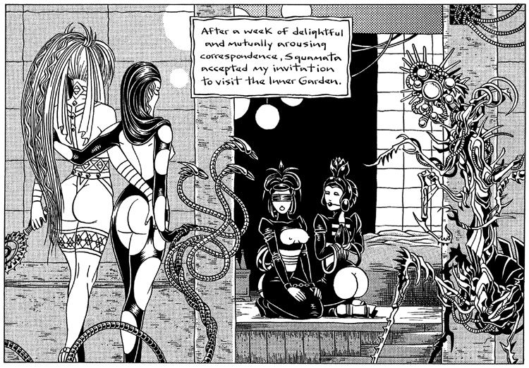
inner_garden II

From In a Metal Web II, ©Michael Manning

 
The first things that come to mind are the usual suspects: life, death, sex, the work of other artists. One influence that isn’t always so obvious is music. I listen to a lot of it, usually while I’m working. I like seeing live music too. A good live show can provide weeks worth of inspiration. For all the styles and sub-genres of music that I like though, I’m aware that there are many many more that I know very little about. Opera, for example. I own a grand total of one disc (excerpts from Puccini’s La Boheme) and am more familiar with the story lines courtesy of P. Craig Russell’s comix adaptations and viewings of Amadeus and Immortal Beloved than I am with the actual music. None of my music collector friends are opera fans. Also, I’ve always had the impression (misguided or not) that opera, like free jazz or death metal, is something best experienced live and the astronomical ticket prices can be very intimidating.
 

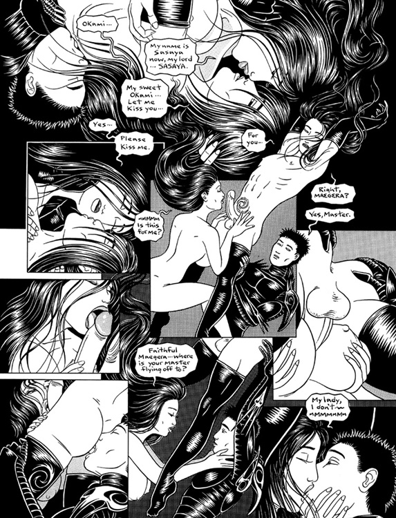
sasaya_dream I

From In A Metal Web I, ©Michael Manning

Last year, two things tipped the balance toward my first opera experience. One was a generous anniversary gift from Lyn’s father that we decided to reserve for something that we couldn’t ordinarily afford to do. The other was a locally-produced version of Wagner’s Tannhäuser — a classic operatic meditation on the struggle between the sacred and profane — which supposedly featured nudity and an big orgy scene. And so one March evening, we found ourselves in the vertigo-inducing cheap seats in the fourth tier of the cavernous Dorothy Chandler Pavilion in downtown Los Angeles. Sure enough, the beginning of act one did consist of a twenty minute long sex party with many lovely toned mostly-nude bodies engaging in various acts of simulated copulation, writhing away on two rotating stage sets, all bathed in the crimson glow of Venus’ underworld. Most of our favorite positions and permutations were featured in a variety of gender combinations with special attention paid to trios, doggy-style fucking, pussy/ass/foot worship and even a bit of flogging. It was all good NC-17 rated fun, but the whole time, I couldn’t help thinking that it wasn’t nearly as naughty as illustrator Aubrey Beardsley’s prose version of Venus and Tannhäuser aka. Under The Hill from 1904.
 

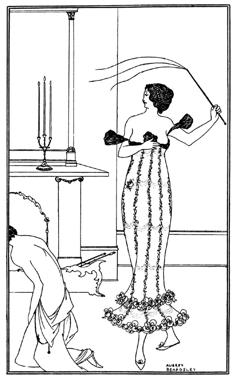
earl_lavender

From Beardsley’s frontispiece to Earl Lavender by John Davidson

 
Now as an artist who does erotic artwork — especially predominantly black & white gender-freaky erotic artwork — it’s difficult to remain ignorant of Beardsley, much less avoid having your work measured against his, even in this day and age when black & white artwork makes most people think of manga or Frank Miller. The o.g. (19th century England, baby) black & white gender-freaky erotic artist, Beardsley was never very well known for his prose yet over one hundred years after its first publication Under The Hill remains one of the dirtiest stories ever told. According to my copy of “Aubrey Beardsley: A Slave To Love”, the text was never completed during Beardley’s life time due to a combination of his ill-health, legal/censorship problems and the scandal resulting from Oscar Wilde’s trial, but hotter heads eventually prevailed, the incomplete manuscript finally saw print and has remained in circulation ever since.

In Wagner’s version of “Tannhäuser”, the first act has barely gotten under way before the titular hero, bored to tears with all this endless carnal pleasure and pining for just one more glimpse of Germany’s apparently unmatchable fields and streams, chooses to spurn the Goddess and gets himself ejected into the outside world. Predictably, he grows to regret his stupid decision and spends two and a half more acts trying to convince the puritanical aristocrats of his aptly named hometown Wartburg that the noblest form of love is the physical (spoiler: he fails miserably). Thankfully, Beardsley’s version chooses to focus on the good stuff; that is, everything that goes down prior to the opera: Tannhäuser’s wooing of the Goddess and Meretrix and their erotic adventures, all told in the most ornate gorgeously overblown prose imaginable.

From the Chapter I – How The Chevalier Tannhäuser Entered Into The Hill of Venus:

It was taper-time; when the tired earth puts on its cloak of mists and shadows, when the enchanted woods are stirred with light footfalls and slender voices of the fairies, when all the air is full of delicate influences, and even the beaux, seated at their dressing-tables, dream a little.

A delicious moment, thought Tannhäuser, to slip into exile.

The place where he stood waved drowsily with strange flowers, heavy with perfume, dripping with odours. Gloomy and nameless weeds not to be found in Mentzelius. Huge moths, so richly winged they must have banqueted upon tapestries and royal stuffs, slept on the pillars that flanked either side of the gateway, and the eyes of all the moths remained open and were burning and bursting with a mesh of veins. The pillars were fashioned in some pale stone and rose up like hymns in the praise of pleasure, for from cap to base, each one was carved with loving sculptures, showing such a cunning invention and such a curious knowledge, that Tannhäuser lingered not a little in reviewing them. They surpassed all that Japan has ever pictured from her maisons vertes, all that was ever painted in the cool bathrooms of Cardinal La Motte, and even outdid the astonishing illustrations to Jones’s Nursery Numbers.

The full version can be read here.

With it’s lavishly decked-out gender-ambiguous aristocrats gamboling in scented baths full of serving boys, bands of satyrs “consummating frantically with women’s bosoms” and unforgettable highlights such as Venus masturbating her well-hung pet unicorn for the enjoyment of her human lover, Under The Hill achieves an unmatched level of camp eroticism and barely-veiled perversity. I wish I could say that it’s playfully unapologetic ultra-baroque polysexuality had some influence on the creation of my Spider Garden books but unfortunately, I wasn’t aware of it’s existence until after I had completed the second Metal Web book.

My first reading of Under The Hill was yet another curve-ball from an artist with whom I’d had an uncertain relationship in the past. Beardsley was one of the few classical artists whose erotic work could be found on library shelves (my post-pubescent pre-internet source for both art and erotica) but like other eventual favorites of mine such as H.R. Giger and Richard Corben, I initially found the air of grotesque decadence in his work to be somewhat sinister and very intimidating.

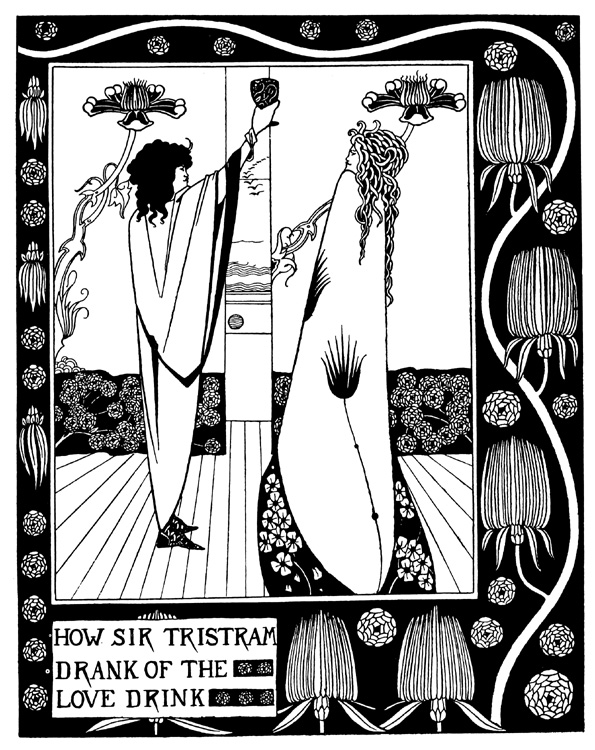
As a teenager, I had discovered the work of 19th century artists such as Edward Burne-Jones, Alphonse Mucha and Beardsley himself by way of comic book artists like Barry Windsor-Smith, Jeff Jones and the afore-mentioned P. Craig Russell. Among the Romantics and Symbolists, Beardsley was the joker in the deck. Laboring under the shadow of his Pre-Raphaelite contemporaries, his interpretation of L’Morte De Arthur had all the trappings of their chaste and higher-minded romantic fantasies but with dark-side twists that always left me both fascinated and vaguely uneasy. In Beardsley’s Arthurian tableau, the sexually-neutral androgyny that characterized Burne-Jones’ work was pushed to the level of parody. Lancelot, Guinevere, Tristram and Isolde were transformed into incestuous hermaphrodites, confronting one another in scenes suffused with a deadly languor or a decidedly unchaste almost vampiric urgency. The starkly ornamental scenes, their borders entangled in coils of spiky flowers, seemed strangely claustrophobic; voyeuristic views of chambers draped with barely-parted curtains and shadowy twilight landscapes filled with gleaming mirror/pools, trees that resemble ornamental tapers and candles that look like sex toys.
 

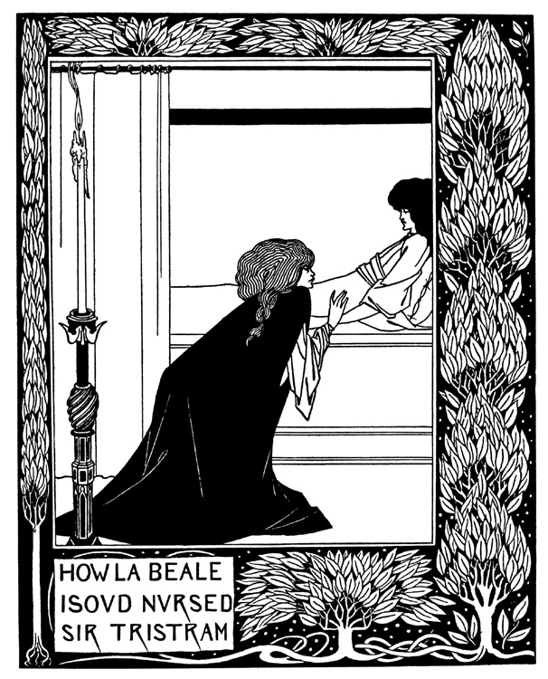
isolde_tristram

love_drink

Two of Beardsley’s illustrations for L’Morte De Arthur.

 
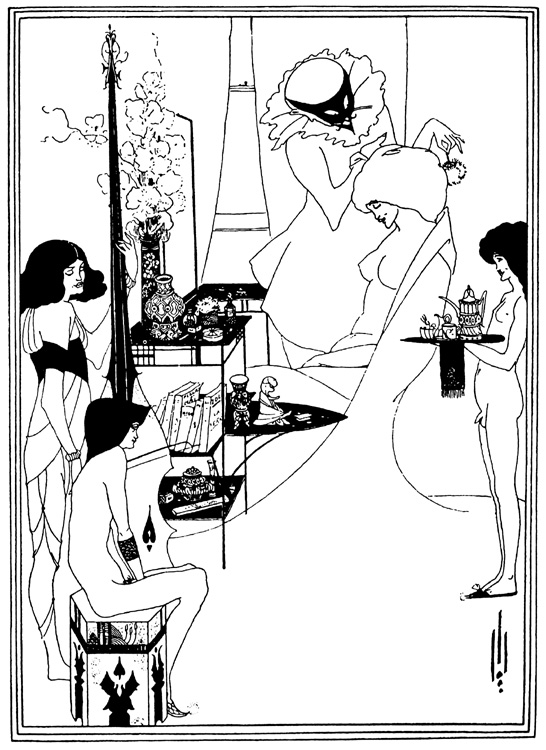
Beardsley’s Salome and the Rape of the Lock were equally daunting; lush studies in pale diaphanous textures and shimmering patterns, peopled by leering hunchbacks, gamboling fetuses and beautiful figures of indeterminate gender, their patrician faces transfixing the viewer with a cool gaze, daring them to look away from the opulent decorations and strangely distorted anatomy.
 

salome_toilette

Beardley illustration from Salome

 
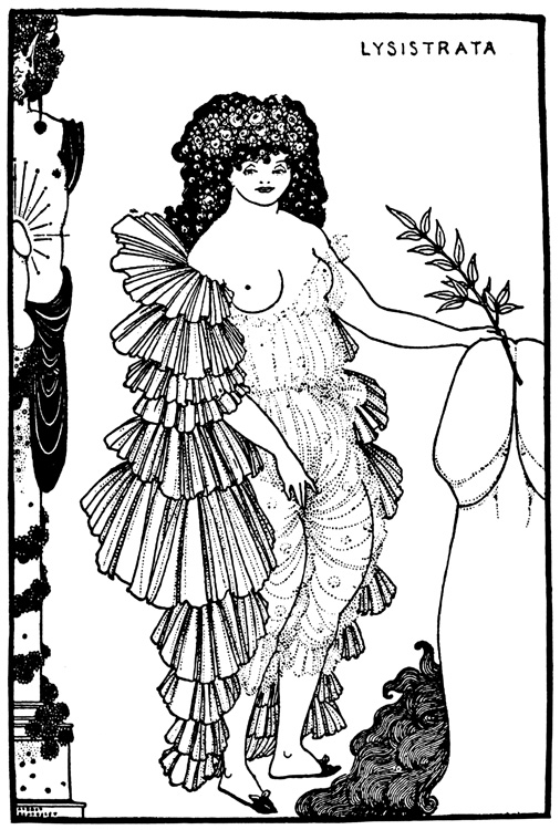
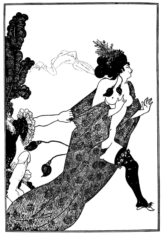
Much of the sexuality in Beardsley’s work is more implied than stated (another source of frustration for my teen-self who was usually looking for the harder stuff) but even his infamously explicit Lysistrata illustrations with their corpulent female bodies and gigantic shunga-inspired penises seemed more grotesque to me than erotic. Yet somehow, I couldn’t look away. Beneath the freakish sinister atmosphere, there was a sense of playfulness and something genuinely sexy — something I would need more life experience to truly appreciate.
 

lysistrata

cinesias_myrrhina

Two of Beardsley’s illustrations for Lysistrata.

A significant event that brought home the true beauty of Beardsley’s work and essentially “humanized” him in my eyes was a retrospective exhibition of his work at the Fogg Museum in the mid-80’s. It was the first time I had ever seen his illustrations in their original form and I was surprised to find that the black areas which on book pages looked like the essence of pure black night were full of texture and brush strokes. In other places, the drawings had been trimmed, pasted over and whited-out. In essence, they looked like modern comic book pages. For most, this would be a minor detail but for me, Beardsley suddenly didn’t seem quite so unapproachable. He wasn’t a sinister satyr with “a face like a silver hatchet” living in a castle surrounded by grotesques; he had been a man like me, an artist/craftsman drawing illustrations to pay the rent — and if the sexuality portrayed in his work still seemed a bit ambiguous — well, I could relate to that too.

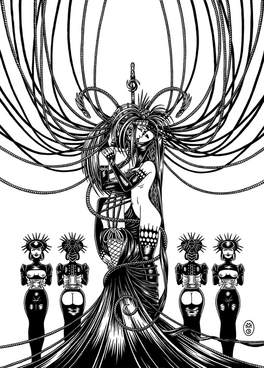
If my work and Beardsley’s can be said to have any similarities beyond the purely technical, it would probably be on the theme of the hermetic environment. Beardsley saw Tannhäuser’s subterranean Venusberg as a jumping off point for the creation of an inner world of total sexual license — an elaborate stage on which deliciously decadent fantasies, repressed by the society of his day, could be played out without regard to social order or gender, safe within the womb of the Goddess.
 

shaalis_maegera II

From In a Metal Web II, ©Michael Manning

 
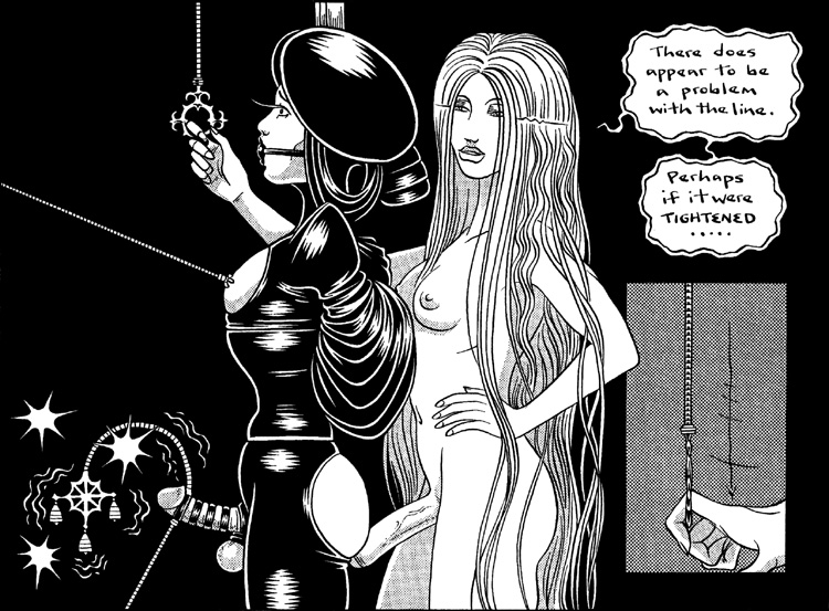
Shaalis the Sacred Androgyne is my Venus, “S/He who delights in that part common to both Hir men and Hir women”, the Goddess incarnate with both cock and cunt who accepts the intimate worship of Hir slaves (beautiful men and women made equal by gender transformation) while dispensing Hir sacrament through blood ritual and sodomy. I took narcissism and the mirror, two other recurrent themes in Beardsley’s work, to an incestuous extreme with Shaalis’ former lover, Squamata Serpentine. She and her sister Lichurna are the ultimate fantasy/cautionary tale of falling in love with your own image.
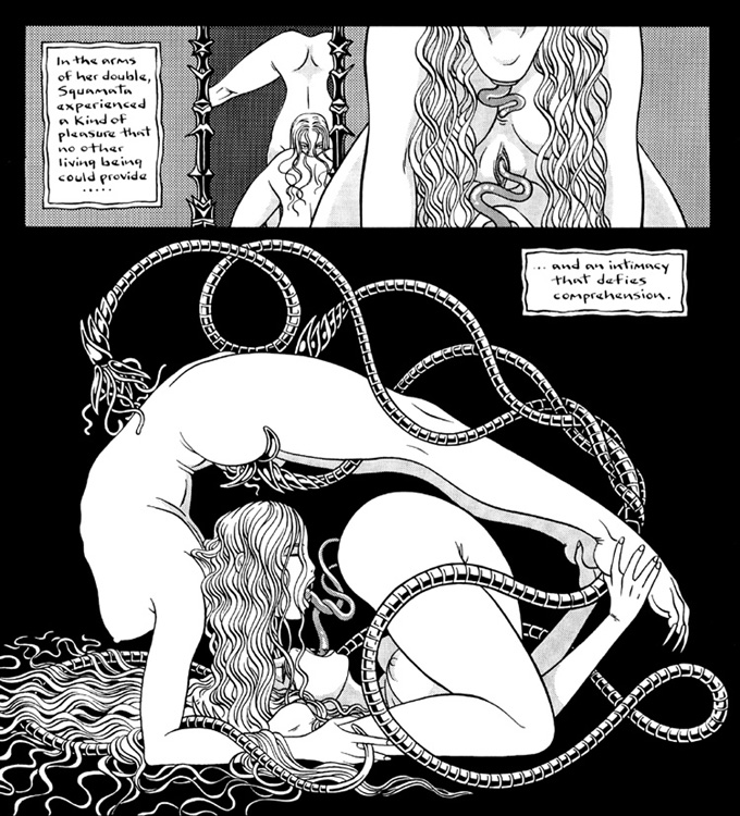
 

serpentine_sisters II

From In a Metal Web II, ©Michael Manning.

 
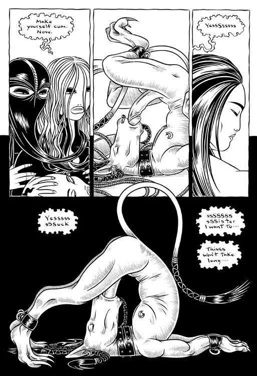
Theirs is a truly hermetic existence, a divided soul locked in a self-devouring embrace while their sex-starved Tengu slave Gion is reduced to sucking himself off for their pleasure. I wasn’t fully conscious of it at the time I first started drawing them (there are versions of Shaalis and Squamata that date back to my high school days) but now when I look at the Sister’s snaky locks and contortions and Shaalis’ regal perversity, I can’t help but see echoes of Beardsley’s Athenian bacchantes from Lysistrata and L’Morte De Arthur‘s witchy androgynes.
 

gion_suck hydro

From Hydrophidian, ©Michael Manning.

 
I realize that the way I’m describing my own work here may sound as off-putting to some as Beardsley’s work initially was to me. One person’s utopia, especially one founded on exploring the limits of carnal desire, can easily seem like another’s person’s dystopia, misinterpretation being one of the many risks we run when we choose to share our dreams with others. Just as the Garden itself is a mirror for the inner workings of the mind of it’s multi-gendered ruler, I suppose the series as a whole could be thought of as a reflection of my own imperfect yearning for a polysexual utopia that real-life sex parties and BD/SM play can tantalizingly approximate but never quite fully achieve. Whether the Spider Garden and the Venusberg can be an ideal to anyone other than myself, Aubrey Beardsley and the characters that live there is ultimately another matter of personal choice. For some, they may just be rest-stops on the way to worlds that none of us has even imagined yet.
 

shaalis_squamata

Print of Shaalis and Squamata, ©Michael Manning.

©2008 Michael Manning

Excerpt from “The Story of Venus and Tannhäuser or Under The Hill” © Aubrey Beardsley

Is Luke Pearson’s Everything we Miss a Requiem for Lost Time? (Part 3 of a 3-part series)

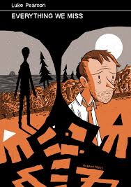
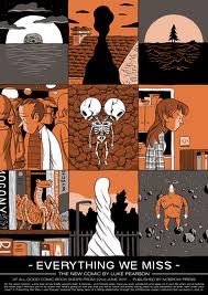
everything we miss cover

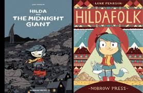
This is the third and final installment of my series of loose musings on time in comics. The February 13, 2014 post looked at graphic representations of different types of time and highlighted Sebastien Conard and Tom Lambeens’s critical piece, “Duration in Comics.” This was followed by some meditation on March 27, 2014 on the depiction of contemplative time via the figure of the flâneur as manifested in Jiro Taniguchi’s The Walking Man. This week, I’ll explore lost time in Luke Pearson’s 38-page graphic novella, Everything we Miss (2011). Pearson is a British comic artist in his 20s (here is Paul Gravett’s fine short review of Pearson’s growing body of work). Pearson is currently making some North American rounds with a stop at NYC’s Strand Bookstore this week, followed by an appearance at TCAF this weekend (May 10-11, 2014), and is best known for his Hilda series for children,
 

Hilda

 
but I am most fond of his comic for adults, Everything We Miss, a gently elegiac exploration of our many blind spots, i.e. all the things we fail to see, fail to enact, fail to imagine, fail to love.

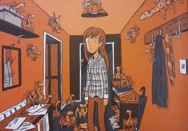
In many ways, Everything we Miss addresses a question other than the one I am exploring here: as the title of this novella suggests, Pearson’s emphasis is on “missing” things – missing an erstwhile lover, narrowly averting catastrophe, missing the unseen creatures that might inhabit our worlds alongside us, such as the “omniscient anurids– the great observers of human kind.” (n.p.)
 

anurids

 
Pearson wants to remind us to look around, to be attentive, to get our heads out of our butts every once in a while, but he also recognizes that there is a temporal issue here: every moment that you fail to see something, fail to recognize its value, influences the next moment and the next, and slowly your lived experience of hours, days, months and years (in short, your lived experience of time) whittles down, reduces, grows impoverished as you let all sorts of things slip away.
 

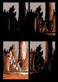
Pearson 9panel

 
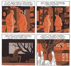
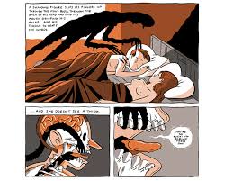
By not grasping these moments when you can, you miss the chance to lay down a memory. All those lost memories stay lost: what you didn’t see at 22 becomes what you do not remember at 43 or 89. Over and over, you lose for having lost:
 

pearson missed youth

 
By narrowing his color palette to shades of gray and black, apricot and white, Pearson allows his panels to self-illuminate in interesting ways: orangey apricot functions to startle us gently, but also to illuminate things nocturnally, as a campfire reduces and concentrates the few elements in its reach and as sunset adds an ethereal quality to atmosphere.
 

Pearson palette

Shades of gray and black work to represent space and background, but also convey psychic trouble, memory and fantasy.
 

Pearson monstrosity

Subjective and objective experience intermingle in Everything we Miss, and so, too, do subjective and objective time. Do you know of other comics that treat lost time and missed experience/absence with similar sensitivity?

If Aggression Is the New Pink, Does That Mean We All Have to Hit Things?

Yesterday, Chris Gavaler wrote about female superheroes, arguing that they’ve been around for a while, that people of all genders love them, and that it’s about time we got to see a film dedicated to watching female superheroes hit things. Chris cited a study by Kaysee Baker and Arthur Raney that showed that, in superhero cartoons, women and men behaved just about the same — they hit things, they saved people, and so forth. Baker and Raney found this a little disturbing; they were worried that heroes of either gender had to be more masculine and aggressive to be heroic. To which Chris responds, well, who says that aggression has to be masculine? “Because if aggression is now gender-neutral, how can being aggressive also be “more masculine”?”

Chris has a point — and that point is a neat summation of empowerment feminism, which is the feminist perspective which says that women should be able to do everything men do, especially if that “everything men do” includes holding and wielding power. The lean in movement is empowerment feminism, and so (as Chris shows) is the enthusiasm for female superhero movies and the desire to see Hawkgirl bash in some baddie with her mace. America is really into power (we’re a superpower, after all) and so it’s not a surprise that empowerment feminism is generally speaking the most popular manifestation of feminism.

It’s so popular, in fact, that it can be easy to forget that it doesn’t necessarily appeal to everyone all the time. But here, at least, is one dissenting voice.

[Wonder Woman’s] creator had…seen straight into my heart and understood the secret fears of violence hidden there. No longer did I have to pretend to like the “Pow!” and “Crunch!” style of Captain Marvel or the Green Hornet. No longer did I have nightmares after reading ghoulish comics filled with torture and mayhem, comics made all the more horrifying by their real-life setting in World War II…. Here was a heroic person who might conquer with force, but only a force that was tempered by love and justice.

That’s Gloria Steinem, describing her relief at discovering the original Marston/Peter Wonder Woman comics, in which, as she intimates, there weren’t a ton of fisticuffs and violence. Instead, Wonder Woman tied the bad guys up with her rope of love — and was tied up by them. Loving submission and bondage games, yes; bashing people’s heads in with maces, not so much.

Chris rightly points out that there isn’t anything essentially masculine about violence; there are plenty of women throughout history who have enjoyed hurting other folks. And yet, at the same time, you don’t just get out from under millenia of culture by having Scarlet Johansson kick somebody. Violence and aggression and war have traditionally been encoded male. Lots of feminists, from Steinem to Virginia Woolf to William Marston, have pointed out that masculinity is wrapped up in an ethos of force and violence — that being a man means, in many respects, being violent. And while one reaction to that can be, with empowerment feminism, to point out that women can be violent too, another approach is to say that the non-violence which has traditionally been associated with women is not an aberration or a failing, but a resource. Women do not have to be embarrassed or ashamed that they don’t like Captain Marvel hitting people; rather, they can point out that hitting people is possibly not such a great way to solve problems, and that equating goodness manliness and heroism with hitting people is, perhaps, a failure of imagination which can, under the right circumstances, get people needlessly killed.

Along those lines, one of the things that I most enjoy about the new Ms. Marvel series by G. Willow Wilson and Adrian Alphona is how uninterested it is in uber-violence. Three issues in, and our teen protagonist, Kamala Khan, has encountered exactly zero supervillains. After she gains her shape-shifting powers, the first thing she does is to turn her hand giant (embiggen!) and fish a damsel in distress out of a lake. The damsell in question fell in the lake after her boyfriend knocked her in — not in the process of a sexual assault, as you’d think if you’d read too many superhero comics, but simply out of stupidity and drunken horsing around. This is a world in which heroes exist and heroism matters, but it’s not a world in which that heroism is necessarily linked to violence.

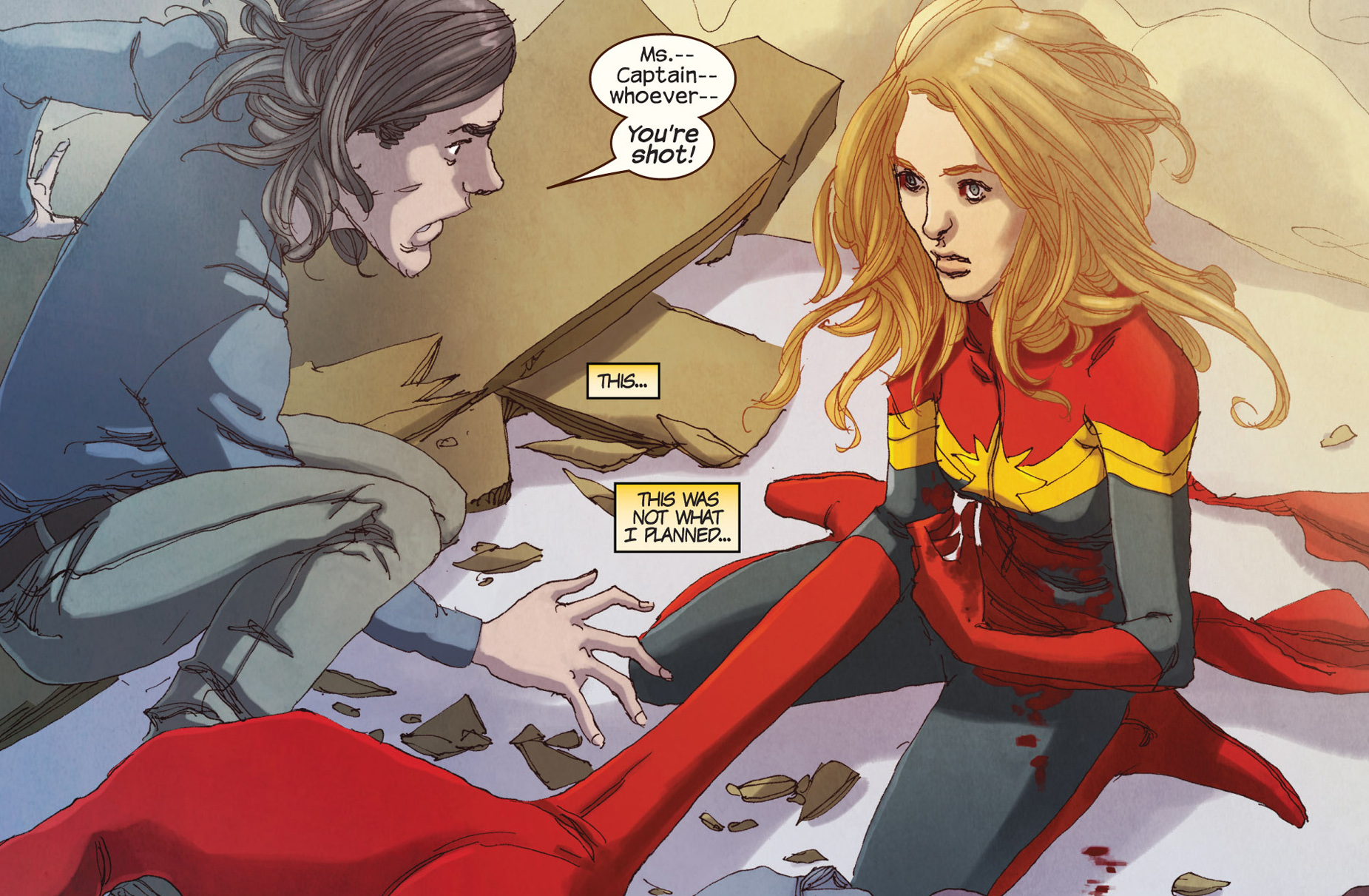
In issue #3, Kamala does have her first fight. She sees her friend/sweetie-in-waiting Bruno getting held up at the convenience store where she works, and (after trying to call for help and discovering her cell phone is out of batteries) she transforms into Ms. Marvel and starts swinging with her giant embiggened fist.

Sort of. The robber is Bruno’s brother, and he’d already given up on the theft before Kamala barged in. She easily defeats him, crushing him in with that fist (“you’re squeezing really hard!”)…but not before she does far more property damage than he ever could have managed by himself. And then, after she lets him go (he’s promised to apologize and never come back) he accidentally shoots her. The last image of the comic is of Ms. Marvel sitting on the ground, her giant hand extended out in front of her, looking shocked and confused, an iconic hero reduced to a confused adolescent girl, as the guy she was saving freaks out and the “villain” sits off to the side looking at the gun in his hand in horror.
 
3768836-ms.+marvel+(2014-)+003-021

My suspicion is that Ms. Marvel is going to discover that her rubbery hide is effectively bullet proof, and hopefully all will end more or less well. But it’s rather nice to have a superhero story where violence ends up being, not a solution, but a complication.

Ms. Marvel, in other words, critiques super-hero violence — and the reason it’s able to do that is absolutely in part because the series is not just a superhero story, but a girl YA coming of age story. The narrative is interested in Kamala having adventures, definitely, but it’s also interested in her figuring out who she is, which means (among other things) working out her relationship with her (shape shifting, sometimes adult Caucasian va-va-voom superhero, sometimes adolescent Muslim girl) body and discovering that her annoying good geeky friend is in love with her. Lee and Ditko couldn’t figure out how to make Spider-Man a man except through violence and trauma and more violence. G. Willow Wilson, though, is drawing on a narrative tradition quite different from boys’ adventure, which means that for her, growing up doesn’t need to mean watching your dad die and beating up his killer.

Ms. Marvel has been exceedingly popular (it keeps selling out at my local comics store) — but, given the low sales of even really popular comics, it seems unlikely that it will be turned into a superhero movie any time soon. Still,it’s worth noting, perhaps, that other superhero stories about women on the big screen — the Hunger Games, say, or Twilight (where Bella gets to be a superhero by the end) are significantly more ambivalent about violence, its effects, and its efficacy than the standard Marvel/DC superhero/supervillain thump-fests tend to be. Maybe that’s because they’re working to appeal to women (and for that matter men) like Gloria Steinem, for whom narratives of violence are alienating rather than empowering.

Aggression is the New Pink

Scarlett-Johansson-Pregnant-What-does-this-mean-for-The-Avenger

If nothing else, at least the Captain America sequel solidified the call for a Black Widow movie. According to Justin Craig at Fox News, Scarlett Johansson “is quickly becoming the smartest, toughest female action star. . . . Forget Captain America 3 or The Avengers 2, it’s time ScarJo gets her very own Marvel franchise.” Slate’s Dana Stevens even thinks Johansson’s “dryly funny Natasha at times comes perilously close to being … a well-developed female character?” That’s high praise in a genre bereft of leading women.

gal gadot ww

Why are Batman and Superman onto their third film incarnations, while Wonder Wonder still wallows in 70s TV? Presumably Warner Brothers’ hiring of actress Gal Gadot for the Man of Steel sequel will change that, but the company is making no promises for a stand-alone venture. When asked about her own movie prospects, Johansson had to writhe her way around Marvel’s non-commitment: “Sure, we talk about it all the time. You know, I think it’s something that, um, again I think Marvel is is certainly, um, listening, and if, you know, working with them for several years now, you kind of see how, ah, they respond to the audience, um, demand I think for something like that.”

Jennifer-Lawrence-in-the-first-Hunger-Games-movie_event_main

You’d think Marvel and Warner never heard of Jennifer Lawrence or the profits Lionsgate is earning from Hunger Games. Not that Lawrence is the leader of a new trend. Her cartoon counterparts changed gender barriers a decade ago. I’m looking at a 2007 study by Kaysee Baker and Arthur Raney, “Equally Super?: Gender-Role Stereotyping of Superheroes in Children’s Animated Programs.” Even though they’d read one 2004 study that found “no significant differences in aggression between male and female characters,” they still predicted that “Male and female character will be portrayed in significantly different and gender-role stereotypical ways.” They were wrong. Yes, men outnumbered women almost two-to-one, but those men were no longer portrayed as more intelligent, brave, dominant, technical, or task-oriented. And those women were no longer portrayed as more dependent, jealous, romantic, affectionate, sensitive, domestic, damsel-prone, follower-minded, or likely to cry. And both groups “were portrayed as virtually equal in terms of physical aggression.”

Hawkgirl_Justice_League2

If you don’t remember what cartoon superheroes were romping around TV in 2007, I do. My son and daughter had recently grown out of Teen Titans and Justice League, but Cartoon Network was keeping both teams alive in reruns. So, yes, I remember Hawkgirl clubbing the shit out of Martian spacecraft with that mace of hers, and Raven could have dropped the Titan Tower on Robin’s head any time she liked. “One way to interpret these findings,” write Baker and Raney, “would be to proclaim that female superheroes are finally breaking down the gender-based stereotypes that have permeated children’s cartoons for decades.” Instead, the authors spin their findings in the opposite direction: “Adding the masculine trait of aggression to a character who is already portrayed as having traditional feminine traits such as being beautiful, emotional, slim, and attractive, while also losing other more prominent feminine stereotypes (i.e., domesticity, passivity), might suggest that to be heroic, one has to be more masculine, regardless of gender.” Although the authors use the term “masculine” (meaning socially determined) rather than “male” (biologically), I still sense a hint of essentialist nostalgia for those good ole days when men were men and women were, you know, not men. Because if aggression is now gender-neutral, how can being aggressive also be “more masculine”?

However Baker and Raney interpret their data, news of their findings hasn’t revolutionized the culture. There’s a hell of lot more than a hint of essentialist nostalgia in the comments section for a Walking Dead review at the movie blog. When Darren Mooney criticized Tony Kirkman for presenting old school gender attitudes as “unquestioned near-universal truth,” a reader responded: “Seems fairly natural that the group would default to the standard lineup, where men protect the women. In case you haven’t noticed, men are far more aggressive and stronger by nature.”

Don’t tell Gal Gadot. Sure, she looks like a skinny little thing, but after winning Miss Israel in 2004 the next Wonder Woman served two years in the Israel Defense Forces. Israel is one of the few countries that requires military service for both genders—and since a 2000 amendment to the law, that’s meant women having an equal right “to serve in any role in the IDF,” including in combat. The new gender norm has made it across the West Bank border too. The Presidential Guards, the most elite Palestinian military force, currently includes 22 female commandos-in-training. They even look like superheroines since their combat fatigues come with headscarves.

The toy industry is catching on too. The New York Times reported in March: “Toy makers have begun marketing a more aggressive line of playthings and weaponry for girls–inspired by a succession of female warrior heroes like Katniss, the Black Widow of The Avengers, Merida of Brave and now Tris of the book and new movie Divergent–even as the industry clings to every shade of pink.” Actually, the Nerf Rebelle Heartbreaker Exclusive Golden Edge Bow looks purple to me, but it still gets child psychologist Sharon Lamb’s approval: “I don’t see this as making girls more aggressive, but instead as letting girls know that their aggressive impulses are acceptable and they should be able to play them out.”

Meanwhile DC and Marvel, those vanguards of radical feminism, continue to dither over the box office viability of any superhero movie starring a woman. Because, you know, women are, uh, not naturally, um, like that.

marvel-superheroines

On Lions and Tigers And Bears And Wine

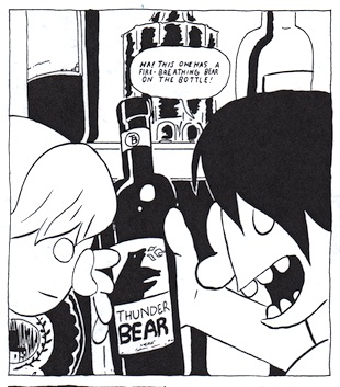
seank_firebreathingbear

Panel from Sean K’s ‘My First Panic Attack,’ 2011

For obvious reasons, American children are not introduced to a ‘canon’ of great wines in school.  Instead, we grow up sifting through culture for cues and shorthands to help us decide what to drink. Some men tend to drink red exclusively, fearing that white is feminine. People stay away from Merlot in part because it was disparaged in the movie Sideways, (despite the fact that the protagonist’s most prized possession is a bottle of a Merlot based wine.) Buyers stick to famous place-names like Bordeaux, Chianti and Napa, while avoiding lesser known regions. At the same time, they’ll call just about any sparkling wine ‘Champagne,’ even if it wasn’t grown and made there. In the end, people prefer to buy by varietal, like ‘Cabernet Sauvignon’ or ‘Pinot Noir,’ rather than the growing region. Most people wouldn’t be able to point to Bordeaux on a map, and if they haven’t been there, they don’t care about it. But they’ve had a ‘Cab’ before, and know they liked it, and hear good things about it, so what the heck.

What does a winery do when they are not from a famous region? Or making wines from lesser known varietals? How do consumers differentiate one Cab from another? The people who have the most money and time to figure out these questions are large, multi-million dollar wine companies. Additionally, they ask, how can a large mass-producer disguise the fact that there is nothing special about their wine? The answer: to market it kind of like a book– or a gimmick at Spencer’s Gifts. Slap a cool sounding name on it, and an appealing image, and send it to market. People will want to buy it, because the name is a hoot, and its stacked in a pyramid, so it must be a big deal. To be honest, most people don’t have a specific reason for getting a Bordeaux, so why not get the one with the crazy label instead?

In 2000, the bulk-bottled Australian import Yellowtail arrived on American store shelves. It was cheap, and had a stylized Kangaroo on the label. Half cartoon, half Aboriginal sketch, the kangaroo was sophisticated enough for a dinner-party, but ridiculous enough to call attention to itself. Yellowtail did not start the ‘critter label’ fad, but it does exemplify it. Little Penguin, Smoking Loon, Dancing Bull and Gato Negro come to mind, as does Tussock Jumper, where every varietal in the line is symbolized by a different animal wearing a red sweater.  Some of the best-known luxury wineries, like Screaming Eagle and Duckhorn and Frogs Leap, preceded this trend, yet profit from and increasingly engage in it.

Critter labels soon drew the ire and exasperation of wine critics, disgusted that so much attention could be drummed up for such mass-produced plonk. The marketing strategy seemed infantile and manipulative: people like animals, and like to purchase things with animals on them. Critter labels are so stupid they’re savvy– they play into our earliest associations with the countries that supply bulk wine, like Australia, South Africa, Spain and Argentina. We may not know much about these countries, but we’ve been watched Bugs Bunny bull-fight from birth, and grew up identifying Australia with kangaroos. France and Italy don’t have signature animals, but they don’t need them either; we associate France with wine, not with roosters. (Yet Le Vielle Ferme displays a prominent rooster on the label, in any case.)

For all that’s been said against critter labels, and for their weird colonial baggage, (Australia= exotic animals!) at least they sort-of, sometimes hint at the provenance of a wine, and insist that this is important information for the consumer. In most industries, this is a laughable anachronism. Who cares where one’s toothpaste or phone come from? Yet with fine wines, the place of origin is the reason it will taste a certain way, and when you smell it, remind you of certain things, and highlight different kinds of memories. The place determines how the wine will be meaningful to you, in and of itself. With bulk wines, not so much. Too many grapes from too many places went into it, and the wine has been stripped of its unique characteristics, so as to ensure shelf life and uniformity. These wines can be good, and are dependable, but not particularly meaningful. Like toothpaste. So its no surprise that the industry has developed another method, where the origin and varietals are incidental, and the brand and concept becomes the only thing that matters. In order for this to work, the brand has to be alluring, a little shocking, and “share-worthy.”

The shamelessly trendy marketing strategy is now the creepy label.


creepylabel_1


The Prisoner might be the king of creepy labels. It was originally created by Orin Swift, who has a whole line of disturbing labels, featuring knives and dismembered mannequins and jarring Dadaist collages.  At Weilands in Columbus, OH, I was pleased to find The Prisoner posed against JC Cellar’s The Impostor– had the store actually sorted them this way? Then I looked around me:


creepylabel2

creepylabel3


What is this, Halloween? Even labels I wouldn’t have found creepy beforehand begin to seem a little nocturnal, and frightening. Slo Down’s Sexual Chocolate suddenly looks like it had been scrawled by a demented person. Sans Liege’s Groundwork appeared to be straight out of a Brothers Quay animation.  Below them sat 19 Crimes, (opportunistically displaying another prisoner on the label,) and the ubiquitous Apothic Red at the bottom of the shelf. Copolla’s Zoetrope recalled a Kara Walker silhouette. Even critter labels like the Coniglio bunny, and Dashe’s monkey, appeared insidious. And look at all those black capsules, lined up together like a row of fascist uniforms.

It’s hard not to see parallels in pop culture at large– like the rise in vampire and zombie properties. There’s the  Golden Age of Television, which often can be reduced to the Golden Age of Gritty Shows About Conflicted Sociopaths. Turn on the TV, and you’re as likely to find a show about a witch coven or serial killer as a sitcom. ‘Witch house‘ is arguably a musical genre, (or at least a style,) and artists like Future Islands and Tyler, the Creator physically menace their audiences. “Epic battle” style orchestrations straight out of Lord of the Rings grind alongside the hours of run-up footage to the Superbowl, and the entirety of the Olympics. Dimly lit, heavily paneled Speakeasy bars are popping up like daisies. Since the mid to late 2000s, everything must have gravitas, roiling drama, tainted love.

Why not wine too? Its not a far leap of the imagination. In movies, wine is most often drunk by cruel, corrupted villains. More positively, a glass of wine denotes sophistication and mastery– which narratively belong to the bad-guy, not the girl or boy-next-door. Creepy labels play into this understanding.

They also make wine fun. Creepy labels are rebellious, because they are not quite classy. Yet more than anything, they are nostalgic. They are just as accessible as critter labels. What is this flood of dark, gritty imagery, if not an appeal to take the things we loved (and feared) as children seriously? No one ever needs to grow up, because ghost stories and Batman and Harry Potter are for adults. And children’s pajamas. At the same time.

Creepy labels are also a way of making wine a little more guy-friendly. Women drink wine alongside villains. For instance, The Drinks Business recently reported “Men Fear Ridicule Over Ordering Wine” as a headline.  Meanwhile, darkness and femininity have been equated for eons. Edgy male characters can appropriate shadowy, ‘feminine’ characteristics while retaining their masculinity. Just like femme fatales, they can seduce, dress well, drink wine, and modulate their voices to be sweet one moment, biting the next, and still remaine masculine. These behaviors are also vaguely aristocratic. While the gap between the rich and poor widens, this is a seductive visage to adopt, even if it is considered less than virtuous.

The safest way for a man to do feminine things is to be diabolical while doing them. Paradoxically, this becomes the most powerful way for a woman to be feminine– to be a woman playing a man playing at being a woman. Rates of wine drinking are rising rapidly amongst young men and women, who in turn re-negotiate what drinking wine ‘means.’ At least with red-blends, the fastest growing category, this re-negotiation confirms Hollywood’s typecasting, while weakening people’s connection to what wine actually is– an expression of a varietal, from a place. How convenient for industrial size producers, who will cloak their wine refineries and tanker trucks with a sexy vampire shroud.

Meanwhile, men and women can be united at last in their choice of blood-red blends with titillating names, leaning aloofly over vintage bars, and decorating the kitchen table with mysterious black bottles. Whoever brings the most sinister wine to the party wins.

———

This piece is an amalgamation of two posts that went up on The Nightly Glass, a wine in culture blog. I’m hoping to make it like The Hooded Utiltiarian equivalent for wine, beer and spirits criticism, and would appreciate it if you check it out!

Photography, Overrated/Underrated

We haven’t done one of these in a bit, but I’ve had so many people tell me that they’re wrong and/or evil that I felt we should revive them. So…since Michael A. Johnson posted about war photography this week, I thought we could bounce off of that. What photographers do you think are overrated, or underrated if such a thing is possible?

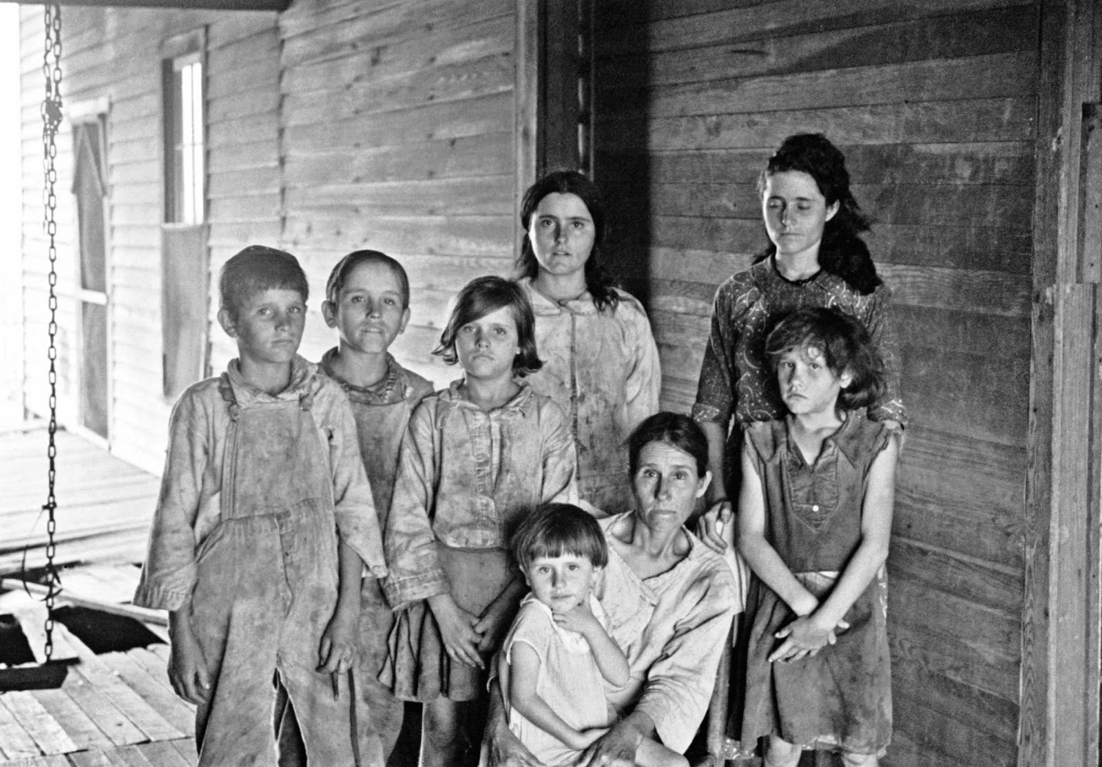
I guess I’d go for Walker Evans as someone who is understandably but still inexcusably lionized for his poverty porn. Underrated…I don’t know if Andres Serrano quite fits since he’s obviously very successful, but as I said yesterday I feel like he’s broadly loathed by both right-wingers and high-art skeptics (including comics folks) who don’t seem to have actually looked at or thought about his work much.

Bert Stabler’s written about why all art photography is overrated, and Thomas O’Shea responded here with a defense of the genre, if you’re looking for more photography discussion.
 

Walker+Evans+-+Frank+Tengle+family,+Hale+County,+Alabama.+Sharecroppers,+1936

Snark Is Thicker Than Urine

This first ran at Comixology.
________
Comics has something of a chip on its shoulder about visual art — a kind of forthright working-nerd philistinism. The snooty, pasty theory-spouting degenerate sticks a flag in a cow turd and gets the grant and the girl while the hard-working illustrator who’s got pen technique like Durer gets a condescending pat on the head and relegation to a cultural backwater. Not only does the emperor have no clothes, but he is actually getting paid to paint his ugly genitals purple.

One of the more infamous art frauds of the last twenty years or so is Andres Serrano’s “Piss Christ.” Like most people, probably, I heard about “Piss Christ” before I saw it. From news accounts, I thought it was a plastic crucifix stuck in a jar of the artist’s urine. Jesse Helms hated it, and I had to admit that it seemed like he might have a point. It was easy to assume that Serrano was a trouble-making, glory-seeking hack, whose work was defensible only on the most extreme free-speech grounds. He seemed like a charlatan, substituting a gimmick, pretension, and contempt for genius.

I did actually see the piece in person many years later —a definite moment of “doh!” “Piss Christ” isn’t actually a plastic crucifix in urine, but a photograph of a plastic crucifix in urine. And the photograph is beautiful — the blurry cross shines with yellows, oranges and reds as mysterious bubbling currents swirl around it. Looking at the image without any background information, there’s no question that it is religious; an evocation of the mystery of Christ, who seems to be falling through space, cast aside and yet radiant. If you didn’t have the title, you wouldn’t even know the liquid was urine.
 

Piss_Christ_by_Serrano_Andres_(1987)

 
But, of course, viewers do have the title, as well as the background information, all of which rather changes things. Placing Christ in a jar of your own urine is an act of deliberate sacrilege. Serrano is pissing on God; humiliating him and mocking his humiliation. If you’re a Christian, it’s literally Satanic; Serrano might as well just affix the crown of thorns himself while sneeringly declaring “Hail, King of the Jews!”

The thing is that, as the crown of thorns itself suggests, mocking Christ is itself scriptural. The Passion is about degradation and defilement. Christ is mocked, brutalized, humiliated — and then redeemed. The sacred can’t exist without the profane; you need the leaking bodily fluids and the rotting husk if you are to have the transubstantiation. Christ must be reduced to the lowest of the low, to an abject thing, to a place where the body is everything, before the body can become nothing at all. If urine squicks you out, it’s worth remembering that Christ embraced the lepers. And as for Jesse Helms…given his stance on AIDS, he would have been much less likely to hug a leper than to piss on one.

Not to be too hard on Helms who is, after all, not the only sinner in the room. If Christianity urges its followers to sympathize with the tortured, it is also quite aware that most people are a good bit more comfortable identifying with the torturer. “Piss Christ” may be sneering at Christ, but it is also, and certainly, sneering at those who profess to follow him. Helms accused Serrano of “taunting the American people,” which is about right. He was, specifically, taunting them for being crassly commercial, spiritual hypocrites — for being sinners. And as long as there are sinners, Christ will be defiled.

Nobody wants to be called a Christ-killer, and it’s little wonder that Serrano’s work has…er… pissed people off. An outraged Helms declared that Serrano “is not an artist. He is a jerk.” While I appreciate the charming forthrightness, I think the sentiment is maybe a little limiting. Why can’t you be an artist and a jerk?

Indeed, there are a lot of artists who make their living by being jerks. They’re called political cartoonists. Like Serrano, they use a combination of words, images and instantly recognizable symbols to make moral points, and like Serrano, they do it in a way designed to irritate as many people as possible. From “Piss Christ” to the Danish Mohammad cartoons just isn’t that big a step (as I am not the first to note: for instance, the ever-helpful Wikipedia even provides a link from the first to the second.)

“Piss Christ” is different in some ways from most editorial cartoons, of course. For one thing, the way it juxtaposes image and text is a lot more thoughtful than you’re likely to see sitting above the op-eds. Most editorial cartoons are visual one-liners with notes — that’s the Democratic Party; this is the Republican party; they don’t like each other! Ha ha. Serrano, on the other hand, uses words to change the way you see the image, and to alter what it’s saying to you. The distance between religious and sacrilegious turns around the title — and it’s not just one turn either. As in any good editorial cartoon, the message is definitely “fuck you,” but who is being fucked with and why is both ambivalent and mysterious. Even the aesthetics of the piece are translated back into a legible text; “Piss Christ” is actually about its own beauty, and about the way that beauty is ironicized by, or transcends, the title.

The point here isn’t “Editorial cartoons should be more like ‘Piss Christ!” For one thing, Jesse Helms is safely dead, and I don’t particularly want him rising from his grave to wreak vengeance. But it does seem to me that dismissing large swaths of the visual arts tradition as irrelevant fakery is an unfortunate and impoverishing road to take. If comics creators are interested in the interaction between words and images, then Andres Serrano surely has something to say to them.