Can The Subaltern Draw?: Waiting For Nabil Fawzi

Welcome to “Can The Subaltern Draw?,” a new monthly column by Nadim Damluji that will explore what comics look like in the in-between space of cultures. Two things: Column title should be pronounced with tongue in your cheek and the author really agrees with Anne McClintock, especially when she writes: “I believe that it can be safely said that no social category should remain invisible with respect to an analysis of empire.”

One of the main reasons I embarked on a year of comics-related travel was to find historical proof that non-Western alternatives to Tintin existed. One of the stops in this journey was Egypt, where I was looking specifically for a regional comic book hero that children from all over the Middle East idolized, learned from, and escaped through. Where was the Syrian version of Astro Boy hiding? Why doesn’t the Arab World have a Superman?

In 1964, an editor at Lebanese publisher Illustrated Publications (IP) seemingly answered this very question in the form of mild-mannered Nabil Fawzi. As catalogued in an excellent 1970 article from ARAMCO Magazine, IP reasoned the Middle East contained a potentially viable market for the same adventure comics that had become popular (and profitable) in the United States; comics like The Adventures of Superman. But instead of creating a Superman-like hero for an Arab audience, IP decided to teach the man of steel himself how to speak Arabic through translating the already abundant English editions of the comic. With these translations we bear witness to the the birth of Nabil Fawzi:

“The first comic strip to be issued in Arabic by IP was Superman. In the guise of Nabil Fawzi, a reporter for ‘Al-Kawkab Al Yawmi’ he swooped into the Middle East from distant Krypton on February 4, 1964, to the instantaneous delight of thousands of young Arab children.”

Translation: Superman IS Nabil Fawzi

Indeed, while it has been exciting to find plenty editions of the Arabic Superman (technically pronounced “Suberman”) in my Egyptian book market excursions, it is very weird to see the well known hero recast with the name Nabil in a presumably Arab Metropolis. I say “weird” because all that has changed is the name. Essentially a big eraser was taken to the English text and the editors at Illustrated Publications (after convincing Western publishers to license the material) retold the story of arguably the most famous American superhero to a captivated Arab audience. In order to give you a sense of what exactly these alterations look like, I’ll pause here for a bit of show and tell. First let’s look at how some covers changed:

English covers via the archive at Cover Browser.

Before I found their English counterparts, I was confounded by these Arabic covers. As you can see, the most noticeable difference is that most of the text — sometimes known as “context” — is removed. I found both scenes so confusing that my best guesses were up top the artists were depicting a Zombie invasion and below they were illustrating that one time Nabil mistook a weeping child’s room for a phone booth. Another noticeable difference is the color palette, which takes on a different shade in the Arabic versions. The blond crying boy turns into a red head, and Superman’s signature “S” gets a less iconic red and pink treatment. Beyond the covers, the “S” on the chest represents the most glaring difference throughout the Arabic translations:

Since Arabic moves right to left, the “S” was inverted along with the rest of the art before being translated. For me that backwards “S” serves as a visual cue throughout the entire translated series of how misplaced “Nabil” is in his Arabic surroundings. In fact, I find the whole translation of Superman to be a somewhat problematic venture, insomuch as it deferred the creation of a uniquely Arab superhero in favor of re-presenting a clearly American icon. You can change his name, place of employment, and hair color hue, but at the end of the day Nabil Fawzi still looks like American-bred Clark Kent. This new idol for Arab children — and a lot of them considering IP publishing  2,600,000 translated copies annually — was identical to the long established idol of American children: a superhero living in a big Chicago-like city but raised and moralized on a small Kansas farm. Ultimately, the name “Nabil Fawzi” does as good a job at disguising this true identity as Clark Kent’s glasses do at obscuring his identity as Superman.

Back in 1964 (especially in 1964), other Arabs shared this concern. As the ARAMCO article recounts, there was a real objection to importing a Western product instead of generating a new superhero out of the rich Arab history and artistic talent. Unfortunately, the article brings up this criticism as steadily as it dismisses it as “impractical” based on the testimony of Leila Shaheen da Cruz, then publisher of Illustrated Publications. As she states in 1970 on the reality of creating an Arab superhero instead of translating an American one:

“That kind of art work, story continuity and long-range planning, is still unfamiliar to most local artists or is too expensive. The adventures of Sinbad, the Sailor, for example, would be a natural out here, and we know that there would be a rich market for an adventure strip based on the exploits of Arab commandos. But so far we haven’t found a local cartoonist who is not either inexperienced or overpriced.”

The main reason I contest Mrs. da Cruz’s assessment is because I have in my possession Arab comics dating back to the 1950s which refute her claim that local cartoonists were “inexperienced,” and bearing in mind the original retail value of these issues I doubt their talent was “overpriced” either. Indeed, creating Nabil may have been a good business decision, but it is deeply unfair to claim that a profitable business choice was creating a cultural product that Arabs could not.

Now for a moment of contrapuntality: I don’t think that translating Superman was a completely deplorable endeavor. For one, his success ushered in a string of other well-known comic book heros. Superman was soon followed by Arabic versions of Batman and Robin (renamed “Sobhi and Zakhour”), Little Lulu, Tarzan, and The Flash. These are comics that I grew up reading in Lebanon, and I concede that on some level a child escaping through comics is a child escaping through comics no matter where that child happens to read them.

In retrospect, Superman’s presence in the Middle East served as an integral chapter in the history of Arab Comics as a whole. One can argue that without Nabil Fawzi fighting evil from the 60s onwards, we wouldn’t have many of the talented regional artists we have creating comics today. In fact, many of the generations who read Nabil as kids later grew up to challenge his faux-Arabness. Take for example The 99, an extremely popular Arab superhero comic created by Dr. Naif Al-Mutawa. These comics feature the same tropes found in issues of Superman, with the chief difference being they are actually Muslim heros (with powers based on the 99 attributes of Allah) for a new generation of children to look up to.  Bringing it full circle in a way, a recent crossover event featured members of The 99 fighting crime alongside DC’s Justice League (of which Superman holds a membership card). In an interview I conducted with Dr. Al-Mutawa in Abu Dhabi, he explained that The 99 was created precisely to form new positive associations with Islam among children globally. Just as Superman was being Arabized in the 1960s, today The 99 is being translated for an English speaking audience. Encouragingly, this time around characters like Dr. Ramzi aren’t being recast as Dr. John in translation.

I’ll leave you with a subversive contemporary take on Nabil Fawzi and his famous friends that was recently spotted in Indonesia — the country with the highest population of Muslims — and subsequently made the blog rounds. Isn’t it strange to see Mr. Fawzi putting his actions where his name is?

—–

Another link to that indispensable ARAMCO Article that this post heavily relies on is here. I also highly recommend checking out these scans of the same article that some kind soul put on the web. Those certainly are some wonderful accompanying graphics.

Speaking of, here is one more cover comparison that I didn’t want to clunk up the body with:

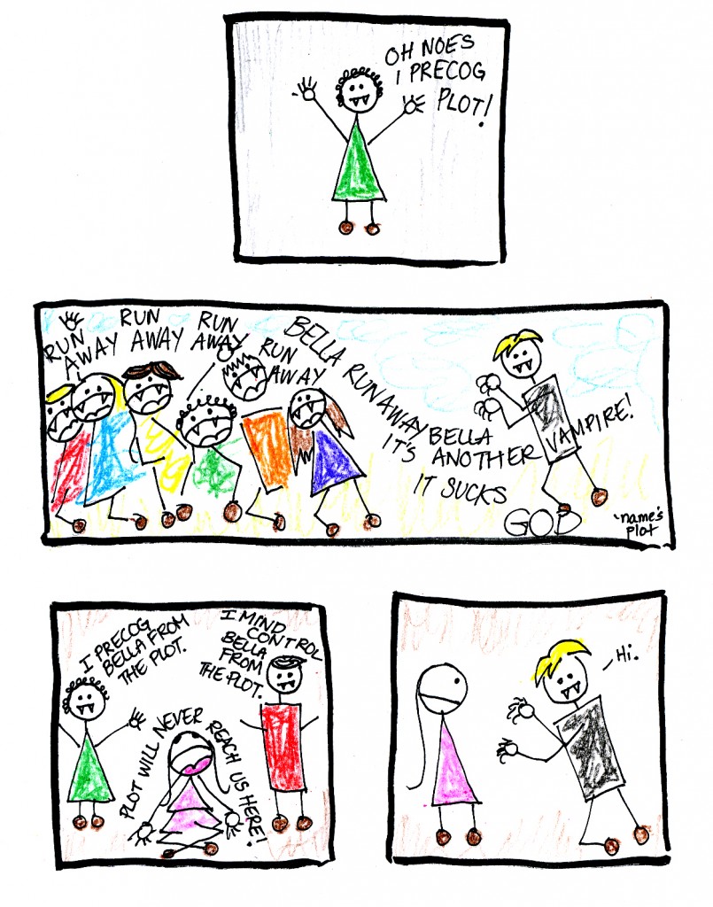
Elfquest Re-Read: Issues 6 and 7

And now we kick off the actual elf quest of Elfquest!  New clothes, new elves, old acquaintances, and a party when you least expect it.

As always, you can read along at elfquest.com.

Issue #6 — “The Quest Begins”

Elfquest starts a new story arc with issue #6, set several years after the close of #5, and the subtitle reveals that #1-5 were just the prologue to the titular quest. It opens with Savah, the Mother of Memory, searching the psychic void and finding … a faint touch from something or someone.

Continue reading

Gluey Tart: So Nice I Read It Twice

No Touching At All, Kou Yoneda, October 2010, June

My attention is scattered. There are so many shiny things, you know, and all the boring and/or dreary things, and also the bus, which certainly isn’t shiny but also isn’t boring or exactly dreary, because there are always weird things going on, on the bus, and also I can read my Kindle. I don’t read yaoi on the bus because I’m not completely shameless. It gets tight on the bus, and not everybody wants to see that ho shit before work. What was I talking about? Oh, right. So many things, so little time. I pretty much never reread anything, no matter how much I like it, because there’s this towering stack of unread manga (actually several towering stacks of unread manga), to say nothing of the towering stacks of unread books (both physical and virtual). I read it and move on – baby, baby, I’ve got to ramble. But when I finished this manga, and went right back to the beginning and started over.

I wasn’t all that excited about No Touching At All based on reading the description on the back cover. “On his very first day at a brand-new job, shy Shima is trapped in the elevator with a hungover mess of a guy… who turns out to be his boss!” If you read yaoi, you now know how this book is going to work. Shima is a shy, nice guy, and also a bottom, and he’s going to fall in love with some drunk, disgusting asshole who’s also his boss. Drama will ensure, but their love will triumph. Yuck. Usually, I’d rather not. Life is too short to saddle yourself with some drunk, disgusting asshole, even for the hour or so it takes to read a comic book. But the front cover – well, the front cover is different.

The story and art in this manga have a gentle quietness to them, a stillness that lets the uncomplicated but poignant details play out and reverberate in a way I found affecting. On the cover, the smaller guy (yes, that would be Shima) is so nicely rendered, folded up into himself, wound up tight, eyes downcast, but holding on to the other man tight, desperation palpable. That’s a lot for one illustration, and nicely drawn, too. The other man is the drunk, the boss, Togawa. Ignore the fact that his back and torso make nonsense of perspective, space, and possibly time. And that something truly unfortunate is going on with his right foot, which looks like a depilated bear paw. Actually, his entire right leg is perplexing. But never mind. The way he’s holding but not quite holding Shima is beautiful. He’s in love, and I am hooked.

The story isn’t icky, either. One might think this comment is damning the thing with faint praise, but not so. I think of these manga as being a bit like noh plays. (I’ll bet you weren’t expecting that.) There’s a finite number of traditional themes. (Also, all the roles are played by men.) (This isn’t meant to be an air-tight comparison, by the way.) There’s a number of stock themes, and the creators change the details (ideally) from manga to manga in ways that might not look exactly original to all comers. They don’t need to be. We don’t necessarily want them to be. A certain amount of the enjoyment comes from exploring all the nuances of your chosen scenario. Fluffy, weepy little fruit loop getting dominated by “rakish” asshole of a boss is not my chosen scenario, thus my initial concern. To be clear, it wasn’t that I was afraid the book wouldn’t be original – I have no expectations that it would be original. I just wanted it to tweak the same old stories well. “Well” can, to a certain degree, be defined as “in ways I like.”

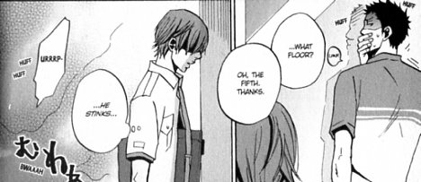
Shima isn’t a fluffy, weepy little fruit loop, though. (Well, yes, maybe he is weepy. It plays all right, though – he has his reasons. I don’t have a generalized problem with male characters crying, but there’s a style of yaoi that has the uke carrying on like John Boehner.) Shima’s character is well-imagined; he feels real, and most of what we know about him is told through the drawing. We see him staring stoically at the elevator doors as he first meets Togawa, who is still drunk at 9 a.m and about to vomit. (“He stinks,” Shima thinks to himself as he stares.)

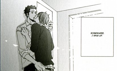
We see him sitting quietly at his desk as he listens intently for information about Togawa, never giving anything away. Shima is quiet and contained. Cautious. When he finally pushes Togawa against a wall and kisses him – this is after they’ve had sex, so it’s an ownership move rather than a “confessing my love” move – it’s believably surprising. And moving. We feel how far Shima has come to allow himself to do this, and how desperate he is.

Shima has the requisite sad backstory, but Togawa’s sad tale of woe is grim in a serious and complete way. And he’s a nice guy, it turns out. Easygoing and considerate. The requisite three-quarters-of-the-way-through-the-book breakup is Shima’s fault, a combination of the usual contrived misunderstanding – probably a seven-ish on the one-to-ten scale of authenticity and plausibility, as these things go – and an odd but perhaps believable reaction to Togawa’s unfortunate background. The contrived misunderstanding is often a problem – it doesn’t have to be utterly believable, since it’s more of a plot device than an integral part of the story, but if it isn’t believable enough, you don’t get the payoff of relief and catharsis or whatever. In this case, the cause of the problem isn’t entirely solid, but what carries it is, as usual, Shima’s small reactions.

The pacing often feels off at this point in the story. After the long, detail-filled lead-in, lovingly chronicling the falling for each other phase, the near-breakup and getting back together part tends to get short shrift, as if we’re three quarters of the way through the run and we have to wrap this up. I often start losing track of plot points right about here, and that happened with this book, too. But in this case, it isn’t that I’m annoyed about suddenly not being sure what the story is about any more; it’s that I feel like I’ve missed out on some good stuff.

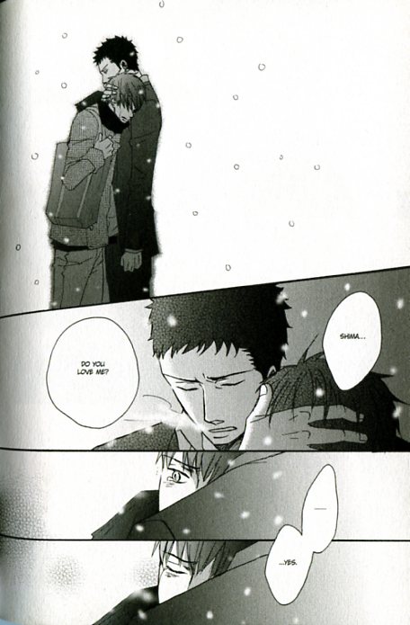
Rushed though the resolution may be, it is romantic. The characters’ movements and reactions to the plot contrivances ring true. Full pay-off for my inner sap (you don’t have to scratch too hard to find it).

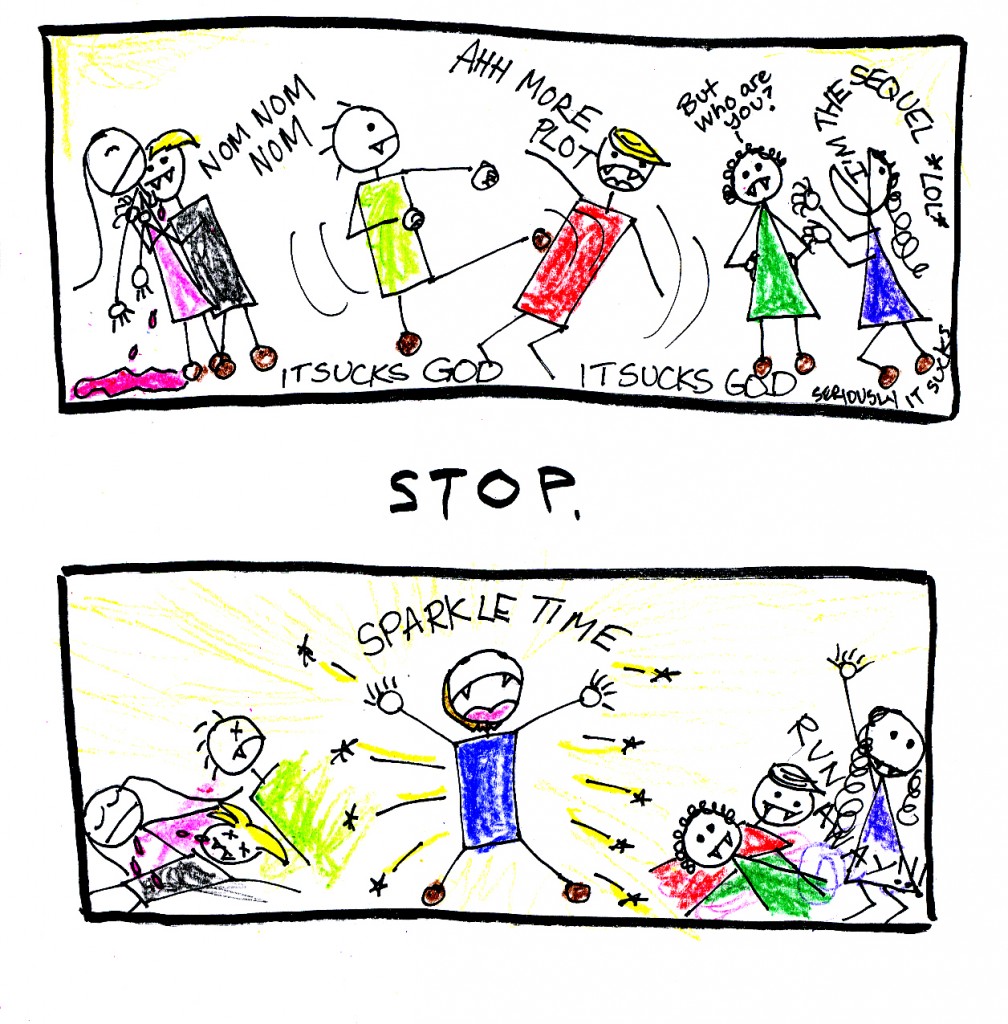
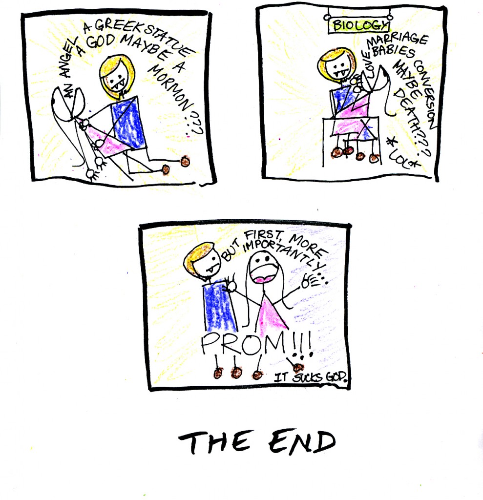
Twilight: the Battle for Legitimate Art

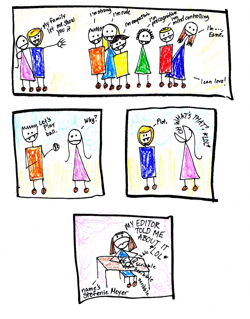
A lot of critical analyses of Twilight, the award-winning series by Stephenie Meyer, focus on legitimacy.  Is Twilight literature?  Is it good literature?  Is it worthy of critique?  These questions reveal the fundamental fallacy rooted deep within our culture: the idea that art should be questioned at all.  Art is art.  It needs no explanation, no analysis, no excuse.  Art is the expression of our inmost psyche, our deeply-rooted desires, our secret yearnings which would otherwise be impossible to express.  Twilight is all of this and more.

Instead of interrogating this text from this perspective, I would like to pay homage to this great work by exploring the characters and plot with the same simple lucidity and attention to detail Meyer paid them.  I want to get inside this work, to live in it, and experience it again.  I want to feel what people feel when they immerse themselves in art such as this; I want to touch nerves in the same plain yet oh-so-effective way.  I want people to be moved, and I want them to be entertained.  Let us cease to critically analyze; let us not merely destroy.  Let us create.

Let us use our hearts, not our minds.

Let’s do art.


TWILIGHT

Art is Beauty

Strange Windows: Monumental

“Seven cities contended for Homer when dead, Where Homer living had to beg his bread.”

At least three towns are contending for Popeye.

Above, this statue of Popeye was erected in Crystal City, Texas, in 1937.
Below, this six-foot-tall bronze statue stands in Segar Memorial Park in Chester, Illinois.

[…] whose frown
And wrinkled lip and sneer of cold command
Tell that its sculptor well those passions read
Which yet survive, stamped on these lifeless things,
The hand that mocked and the heart that fed.

Ozymandias, Shelley
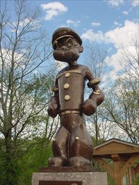
Chester was the birthplace of Popeye creator E.C. Segar, as recorded on the statue’s plaque:

Now, let’s examine another Popeye statue in  Universal Studio’s  Island of Adventure, in Orlando, Florida:

…where Popeye’s arch-foe Bluto is also menacingly present:
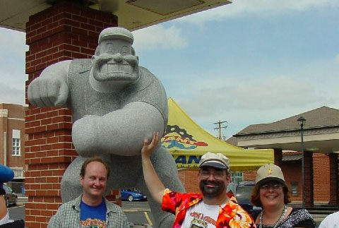
What differentiates these statues from the ones in Crystal City and Chester?

The Florida Popeye is set in an amusement park. It’s a prop, part of the scenery in a hundred-acre show set.

The Texas and Illinois Popeyes aren’t props. They have a weightier function, civically and semiotically. They are monuments.

Chester is obviously honoring a native son, who went forth into the vast world and achieved renown. This tradition goes back millenia; thus the Greeks of Antiquity would perpetuate the glory of a successful warrior, of a victor at the Olympic games, of a winner at the great theater festivals: that glory was also the glory of his city.

What, then, of Crystal City’s statue– considered so important that it stands sentry before City Hall?

Popeye is credited with saving the town.

Crystal City has long billed itself as the World Spinach Capital. The leafy crop dominates the agriculture of the region. But spinach has always been a hard sell, especially to children — it is bitter. Compound this dissatisfaction with the withering effects of the Great Depression, and Crystal City found itself facing disaster.

Along came Popeye, his great strength attributed to his consumption of spinach (less so in the strips, conspicuously so in the animated cartoons.) Kids all over America — over the world– internalized the sailor’s profession of might:

“I’m strong to the finish, ’cause I eat me spinach; I’m Popeye the Sailor Man!” (Toot toot!)

…and they devoured their spinach with gusto. (I, too, fell for the propaganda. In fact, spinach is, of course, no builder of strong bodies– it isn’t even particularly rich in iron, the oft-cited source of its potency.)

The spinach industry was saved. The grateful burghers of Crystal City, thus, put up their statue as a votive thanksgiving– another monumental tradition.

( That statue outside City Hall isn’t, contrary to its plaque’s assertion, the one inaugurated in 1937; it’s a modern copy, while the original is inside the building.

So it’s a simulacrum of a sculpture of an animated cartoon character based on a comic strip character inspired by an acquaintance…I’m getting situationist vertigo, here.)

Crystal City is by no means alone in its gratitude to this cartoon character. Alma, Arkansas, also claims the crown of World Spinach Capital, and celebrates Popeye in bronze:
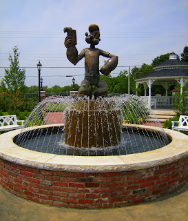
According to one report:

Popeye Park, built in a former vacant lot, is a big part of Alma’s image makeover. It is a place where people can get out and look at things. The centerpiece statue is glorified atop a fountain, and according to Mark the park will soon have two kiosks with flat screen monitors that will relate the history of Alma and Popeye. A large mural is planned for the wall of the adjacent water company building, with hidden Popeyes to engage children (and maybe the tour bus drivers).

This is getting out of hand, some may think. And why Alma, anyway? Because it’s the site of the Allen Canning Company, producers of Popeye Spinach:


…at one point producers of 63% of the world’s canned spinach.

So the livelihood of many Alman households depend on this brand– this cartoon. What’s wrong with a little sculptural homage?

Yet one might find this unsettling.

As the semioticians remind us, we live in a world of signs; some overt and loud, some whispering, some in the dog-whistle domain of the subliminal.

A monument is a bellowing, gigantic voice in this landscape; it aggressively forces its meaning on us; small wonder monuments are the favorite markers of tyrants’ rule.

Prudence, thus, traditionally presides over the choice and placement of public monuments. Commissions debate them, the public is consulted; they are scrutinized for glorification of the unworthy, or for partisan agendas. Often they are isolated from the city proper, as in cemeteries.

The subjects of monumental statuary tended ever to be divine: gods and saints, the Christ; or heroic– gallant soldiers, philanthropists, poets and other writers. One might legitimately question the sculpted exaltation of corporate cartoon characters. In contrast to the Orlando Popeye, those in Crystal City, Alma, and Chester are free of irony– indeed, almost of playfulness.

Perhaps we should judge these statues by their function. This image of Garfield stands just outside a children’s hospital:


Who can object to an attempt to make a sick child smile, or to allay his fears with a familiar old “friend”?

But it’s still troubling when an online search for ‘Garfield statue’ returns more results for the cartoon cat than for the effigies of James A. Garfield (1831– 1881), America’s 20th president, felled by a deranged assassin’s bullet:

We shall later show sculpture inspired by the strip Peanuts.

A different Peanut can be seen below–‘ Mr Peanut’ , the corporate mascot of the company Planter’s.

Such commercial images are already omnipresent in our visual ecology, so it is not over-curmudgeonly to hope their monuments do not proliferate, unless it be with the wit of an Andy Warhol or of a Jeff Koons:
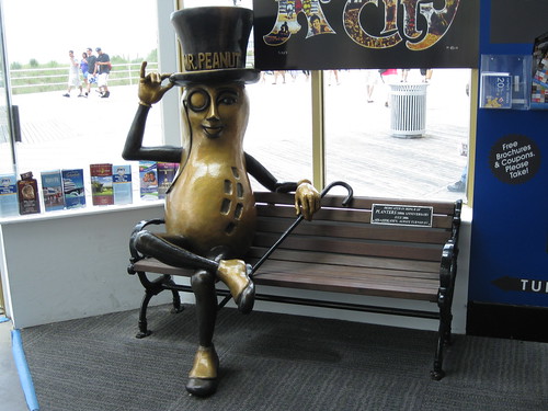
Well, at least he offers you a seat.


Travel to Metropolis, Illinois, and you find monumentalism tipping slightly towards idolatry.

As readers of the Superman comic know, the mighty hero makes his home in Metropolis– a booming city modeled on Cleveland and New York.

Metropolis, Ill., is a far more modest place. But in 1972, D.C. Comics and the state of Illinois officially declared it to be the hometown of Superman. This was a prelude to a titanically hubristic enterprise: The Amazing World of Superman.

Concept Art by Neal Adams. For more, click here

There were to be a museum and an amusement park dedicated to the ur-superhero,  the whole dominated by a 200-foot-tall statue of Superman. The entire venture collapsed.

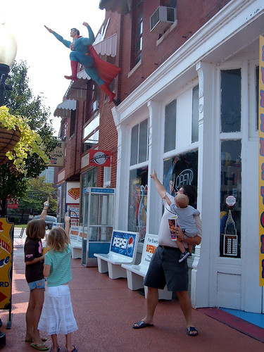
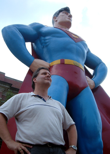
Today, Metropolis’ exploitation of Supes is much more modest, but definitely there… as evidenced by this fifteen-foot bronze polychrome statue:


Metropolis celebrates  the Man of Steel every way it can. The local bank is “home of super financial services.” The town newspaper calls itself The Planet. A sign in the grocery store informs customers: “Just as Superman stands for truth, justice and the American Way, Food World stands for quality, convenience and friendly service.”

Below, Bill Griffith‘s pinhead clown Zippy pays the statue a visit:

It’s a typical absurdist Griffith gag, but he makes a larger point: it’s wrong to invest your hopes in a fake idol. There’s no Santa Claus, no Tooth Fairy, no Superman– even metaphorically.

Metropolis seems to have learned this lesson from the 1972 fiasco. Its exploitation of Superman is mostly limited to photo ops for tourists:
 

…or Supes collector George Hambrich’s ‘Super-Museum’:
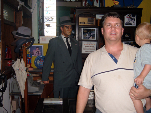
 

… or the annual Superman Celebration:


Special guest star at the 2010 Celebration:

Yep, U.S. President and lifelong comic book fan Barak Obama.

Incidentally, this wasn’t the first Superman statue erected in Metropolis. First came a fiber-glass 7-footer.

Problem was, the locals took to testing the hero’s noted bulletproof powers, resulting in a sorry Swiss cheese of a statue. It was replaced by the current bronze colossus.

Ah, yes, the Colossus. The need to extract awe from sheer size alone, as Emperor Nero did with the giant gold statue of himself in ancient Rome. All over America, you’ll find colossi of another kind: celebrating the folk giant lumberjack, Paul Bunyan:


Bunyan, however, is a prominent example of  ‘fakelore’– artificial modern folklore; in fact, the giant’s tales were all spun by a copywriter for a lumber company. A visual simulacrum (the statue) to represent a conceptual one (the fakelore.)

And the size of the colossus seems to validate this manufactured myth.

In Blue Earth, Minnesota, stands a towering figure drawn from one of our other modern sources of pseudo-icons, advertising:

“Good things from the garden,
Garden in the valley,
Valley of the Jolly Green Giant!
Some are green-snappin’ fresh
Kitchen-sliced to taste the best
Tender beans are comin’ from the valley! (From the valley!)

Good things from the garden,
Garden in the valley,

Valley of the Jolly (‘ho, ho, ho’) Green Giant!”

— Leo Burnett

The Green Giant is the mascot of a vegetable canning company belonging to agribusiness behemoth General Mills.
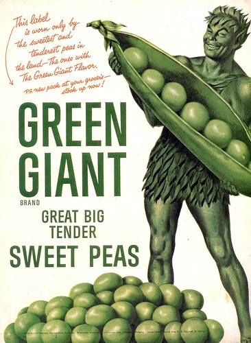
As with Popeye, the locals in Minnesota show pride and gratitude towards a symbol of their livelihood.
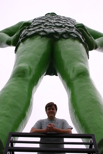
 

Why, man, he doth bestride the narrow world
Like a Colossus; and we petty men
Walk under his huge legs, and peep about
To find ourselves dishonourable graves.

–William Shakespeare, Julius Caesar

Perhaps popular enthusiasm goes too far, though, when the locals adopt the name of a mass-media character. This has happened at the town of Idaho Springs, when the residents of its Squirrel Gulch district renamed it Steve Canyon, after the comic-strip adventurer created by Milton Caniff.

In 1950, they persuaded the federal government to commission a giant limestone sculpture of the cartoon aviator for their town. Its plaque reads, in part,

“The United States Treasury salutes Steve Canyon and through him, all American cartoon characters who serve the Nation.”

Say what?

Ah, well, perhaps I’m merely indulging in cultural snobbery.  It’s true that a lot of the statues above are way cool, after all.

And at least they don’t celebrate tyrants:
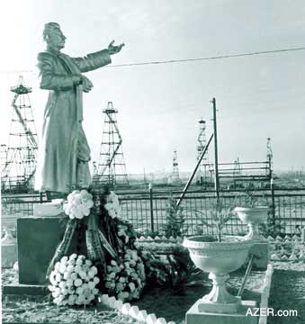
Stalin


Lenin


Kim Il-Sung


Walt Disney

All right, that was a cheap shot… but the juxtaposition of  similar images makes one think.

Disneyland bills itself  “the happiest place on Earth”.  Happiness is mandatory. Well, in what other sort of place is happiness mandatory?  The “workers’ paradises” of Communist countries.

Disneyland also resembles them by its degree of control. The entire park is a panopticon. It even has a ‘secret police’– the security guards are there, but not in uniform.

Disney headquarters, as designed by Michael Graves: the cartoon as slave to the corporation

All four statues show the same gesticulation towards… what?  The glorious future?

Let’s hope Walt and Mickey’s statue doesn’t suffer the same fate as Saddam Hussein’s:

A final farewell to the colossus…with the fearsome effigy of cloud-gathering Zeus in the French ‘Parc Astérix’ amusement park:

;

Yet, pass humbly between his divinely titanic legs and look up:

<

Tch! This is the Underwear of the Gods?    Feh.

Meanwhile, in Philadelphia, we find this effigy of Sylvester Stallone— sorry, of Rocky Balboa:

Bronze, neoclassical pedestal-mounted kitsch or celebration of the human spirit? Celebration of Hollywood, certainly.

And along those lines comes another bad idea.  Detroit will see a statue of Robocop.

What are they thinking over in Motown? The city is depicted in the Robocop films as a hellhole, a behavioral sink rancid with corruption and violence.  (Well, okay, but they don’t have to dwell on it.)

But I suppose such masochism is to be expected. Kneel to our media overlords.

Wow, I’m getting grouchier by the second. Don’t I see any place for public statuary? Actually, I do, as I shall note in my appreciation of the St.Paul Peanuts statues.

St. Paul, Minnesota, is another city that honors a famed native son– Charles Schulz (1922– 2000), creator of the comic strip Peanuts — with a series of bronze sculptures.

But these are anything but monumental: they were specifically designed to be kid-friendly. They exude charm allied with modesty, which was also the case for the strip and its author.


Along these lines, in Hartlepool, England, we find a statue of their own native son Reg Smythe‘s comic strip hero Andy Capp:

The statue was controversial, actually, as Andy was a wife-beater among other things. And note that his ever-present cigarette was censored.

Now, note the proportions of head-to-body in the statue and compare them to those of the drawn Andy:

About three heads tall for the cartoon, about five for the statue.  Why?

So that people can do this:

That’s right– they can hug it, clink glasses with it… interact with it!  People want to be pals with the cartoons!

Note, too, the absence of a pedestal. The character is on the same footing as us.

This is key: people have strong affection for “their” cartoon characters; they literally take them into their homes, with the newspaper or through the tv screen. So the best cartoon sculptures will promote a feeling of affectionate intimacy.

Here, in Dundee, Scotland,  are Desperate Dan and Dawg:

… and Minnie the Minx:

Again in England– in Ipswich– Carl Giles‘  beloved Grandma character:

But my favorite interactive cartoon sculpture is this one of Mort Walker‘s Beetle Bailey: you can actually sit and have a drink with him.


And my favorite non-cartoon interactive public sculpture is in London. A Conversation with Oscar Wilde is designed as a bench; you’re supposed to sit and tell Oscar the latest gossip:

The statue of Tintin in Brussels used to be on a pedestal in a park; when it was moved to a city street, the pedestal was removed, and you can now have a playful chat with the globe-trotting boy reporter:


This more intimate, anti-monumental style seems to be catching on. Here’s James Joyce in Dublin:


As a final example of interactive statuary, consider the much-beloved Alice in Wonderland group in New York’s Central Par, over which I scrambled as a child– a tradition that continues, it would seem:
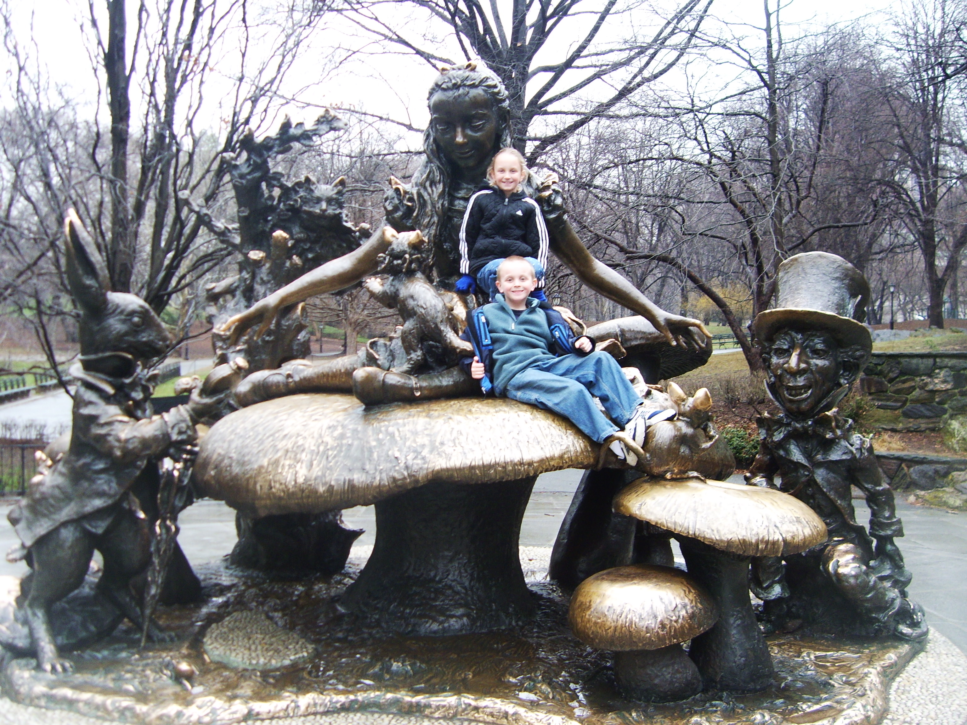

There is more to be said about the curious class of cartoon sculpture; about its polysemic ambiguity, about the colonisation of public space by corporate imagery,about kitsch and irony, about ….
But :

Now its time to say goodbye
To all our company.

Em-eye-cee-

“See you real soon !”

Kay-ee-wy-


“Why? because we like you!”


Em-oh-you-ess-ee
–signoff song for the Mickey Mouse Club

A great guide and source of information about similar curiosities is http://www.roadsideamerica.com/
Overthinking Things 04/03/2011

40 Years of the Same Damn Story, Pt.1

I call it “Story A.”

I wasn’t very clever that day; tired, maybe a little worn to the nub by reading yet *another* story that felt awfully like all the other stories I had read recently.

Sometimes Story A is a genuine delight to read – other times it’s a chore.

“Story A” is the story, the basic setup that defines a genre. Every genre has a Story A. Suspense stories have psychotic serial killers who stalk and kidnap the investigator (if she is a woman) or the female dearest to the investigator (if he is a man.) Fantasy stories have (or at least had for many years) long journey-quests with teams of ill-suited partners. We all know Story A in our genres.

In my chosen area of saturation, Yuri, Story A looks like this:

There is a girl, she likes another girl. The other girl likes her. They like each other. The end.

Sometimes “The end” is signified by a kiss, more often it is signified by holding hands and perhaps looking each other in the eyes. Recognition of mutual affection is as likely to be the final scene as riding off with the Prince to live happily-ever-after is in a fairy tale.

For those of us reading Yuri manga, Story A is the same damn story…and has been for nearly 40 years.

The roots of “Story A” can be traced back at least as far as 1919, with the publication of Yaneura no Nishojo, by Yoshiya Nobuko.

In this book, introverted Akiko meets and falls into passionate, one-sided love with Akitsu. In what was a remarkable ending for its time, the two girls decide to leave school to make a life together, independent of their families or of husbands. In the end, the love was not so one-sided after all, perhaps. (Although some critics have dismissed the idea that they were in love, and instead insisted that Akitsu was leading Akiko into the idea of a politically aware adulthood.) More importantly for our purposes today, this novel has given the manga world any number of tropes that underlie much of “manga for girls” and a whole truckload of Yuri manga tropes, such as life in a Catholic school dorm, intimate piano duet, room in the tower, and others.

Not quite 40 years ago, a manga appeared on the scene which took these themes and wrapped them in a melodramatic love affair…and “Story A” was born.

This prototype “Story A,” Shiroi Heya no Futari, also cemented the idea of a tall “Yamato Nadesico,” a traditional Japanese beauty with long black hair, and a shorter, energetic/cheerful girl with blonde or brown hair as the tropiest of Yuri couples.

In the beginning, “Story A” rarely had a happy ending. This is not because of the same-sex love, very few romance manga in the 70’s had happy endings. The typical couple were doomed to never be together for one reason or another. In the case of “Yuri” couples, the options were mostly one partner died or left to get married. In Shiroi Heya no Futari, we get to enjoy one, with a premonition of the other.

The 1980s were not good years for Yuri. The sexual revolution of the 1970s passed, leaving shoujo manga too tired and commercial to take risks. In the 1990s, however, something happened that changed everything…Sailor Moon. I won’t get into how it revitalized manga and anime for girls, but suffice to say that it left a strong impact on many. And it brought same-sex relationships between girls back as a potential manga topic.

In 1995, Nananan Kiriko drew a very realistic version of “Story A” called Blue, which has been translated into English by Fanfare/ Ponent Mont.

In Blue, we are treated to an alternate version of the “go off to get married” ending, in which Kayako goes “off to Tokyo,” leaving Masami behind.

Blue does not have the Nadesico/cute couple stereotype, but in every other way it fulfills our expectations of “Story A.” If anything, it’s more of a throwback to Yaneura no Nishojo, with a more realistic vision of life in a girls’ school and the resulting drama.

Masami and Kayako meet and find themselves attracted to one another. It’s easy enough to categorize this story as akogare, a Japanese word that means feelings of admiration that are tinged with desire – what we would probably call a schoolgirl crush. Even if one interpreted their feelings as “real,”  we can have no real expectation of a “Happily Every After” ending here.

Shiroi Heya no Futari had a profound impact on many series that came out in later years. Not just manga, but Light Novels were also influenced by the Yuri couple trope.

Maria-sama ga Miteru began in 1998 as a serialized “Light Novel” and it continues to this very day. The couple to the right, Yumi and Sachiko, are instantly recognizable to any fan of Yuri and the series, at least at first, is a set of “Story A”s among the students at a private Catholic girls’ school.

Most of these relationships are platonic romance, but within the initial few volumes at least one story went beyond the confines of “Story A,” to tell what can only be seen as a “lesbian” narrative. However popular that story, Ibara no Mori, was, the bulk of the relationships in Maria-sama ga Miteru sit well within the confines of “Story A.” As much as we might wish for it, Noriko and Shimako, Yumi and Sachiko, Rei and Yoshino, will never go running off  to make a life together, outside the confines of family or husbands.

The meme of “love between girls in private girls’ schools” which was initially set by Yaneura no Nishojo, really gained traction in the late 90’s with the success of Maria-sama ga Miteru and, for the next dozen years, it has been a main component of our definitive genre story. “Story A” was to take place in a girl’s private school. Exhibit 4376, this page from Pieta from 2000.

The school was not “St. Whoever’s”, but the hothouse atmosphere of an all-girl school is still the setting, allowing Rio (boyishly attired here in sweater and tie,) to be a school playgirl, while “good girl”  Sahako is close to the traditional Nadesico type.

Pieta also contained a common trope for its time – that of linking lesbian romance with mental illness. Rio has a history of hysteria and suicide attempts…all of which have a perfectly excellent explanations and have almost nothing to do with her romance with Sahoko. If anything, their feelings for one another are what redeem Rio and pull her back from the brink of insanity. Nonetheless, it was very fashionable for manga of the time period to have unstable lesbian characters.

When male manga artists started to pick up what had mostly been a meme in girls’ manga, a distinct “checklist” of tropes became a common feature of  “Story A.” Absurdly luxurious private school? Check. Nadesico-type with wealth, power, athletic and scholastic prowess? Check. Genki blonde who is poor, but sincere and inexplicably the object of desire for everyone in the series? Check. Breast-highlighting tight uniforms? Check. In the mid-2000s, Kannazuki no Miko created a whole new wave of Yuri fans, with an action riff on the couple from Shiroi Heya no Futari. Instead of 70s melodrama and partying, we were given giant robots and apocalyptic prophecies.

At the same time Kannazuki was recreating “Story A,” another series that was playing with the same key elements fooled a whole generation into thinking it was telling an original story, by stealing from *every* Yuri story that had gone before it. Strawberry Panic! added a new twist to “Story A,” – a pretend glimpse past the gauze boudoir curtains of an all-girls, no-guys-allowed world. This concept quickly became a typical feature of Yuri “Story A”s aimed at men. (Presumably to heighten the sensation of forbidden love they enjoyed in Yuri.) This added thrill has retroactively invaded popular girl’s series, such as Maria-sama ga Miteru. The radio and live shows – the audience of which are mostly men – now begin with a warning that boys are not allowed. And many Yuri anthologies that target a male audience provide that same warning on the cover, just so the audience knows it’s getting a glimpse of some forbidden women’s mystery.

Where Strawberry Panic! really excelled was as an homage to “Story A” through the ages.

The manga riffed on series like Card Captor SakuraHimitsu no Kaidan and Maria-sama ga Miteru, while the anime stole openly from Kannazuki no Miko, the above series and even Western stories such as The Graduate and Wuthering Heights. (Amusingly, it wasn’t even the first Yuri anime to borrow from Wuthering Heights. That honor would probably have to go to Cream Lemon: Escalation.)

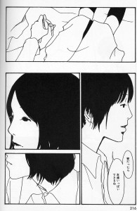
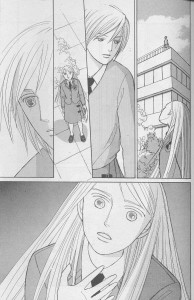
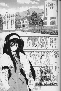
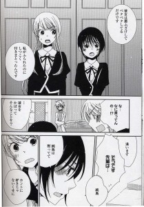
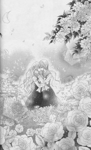
Take a moment to compare this page with the page from Shiroi Heya no Futari. Do not think that this was accidental.

By 2005, the Yuri ball was rolling well. Not coincidentally, in 2005 I held a Yuricon event in Tokyo, and was able to be there at the formation of a new Yuri-focused magazine, Comic Yuri Hime. Now manga was being created explicitly for readers of “Yuri” as opposed to being one fetish in a series for men, or a schoolgirl crush in a story for girls. But, “Story A” was safe space, where no political, social or emotional commitments had to be made, which made it an attractive “space” in which to create a Yuri story.

The emotions might be real, the attraction may or may not be physical, but the implicit understanding of “Story A,” is that this is not forever – it is for now. As long as we are in school, as long as we are protected from the pressures of our duty to family, friends, jobs, society, we can be together.

What Yuri Hime could do – and has, in recent years done – is give us something that, like Akiko and Akitsu in Yaneura no Nishojo, escape the confines of societal pressure, to create a more realistic “Happily Ever After.”

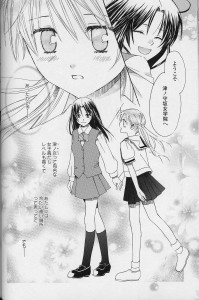
However, many of the initial Yuri manga that ran in Yuri Hime fell solidly under the auspices of “Story A.” Some hit all the  buttons. Hatsukoi Shimai managed to cover exactly “Story A” territory and not too much more. Compare Haruna and Chika here  to Sachiko and Yumi in Maria-sama ga Miteru.

Private girls’ school? Check. Nadesico beauty who is smart? Check. Cute energetic girl who is sincere, but not smart? Check? Impossible to understand feelings? Stupid plot complications that keep us apart for no real reason – including, but not limited to interfering seductive person; poor communications issues, and; horrible secret? Check.

In the late 2000s, Yuri took a major jump from elements in various stories to distinct category of its own. Comic Yuri Hime had split into two magazines, each targeting a specific gender audience with some distinct elements, and other manga magazines began running more Yuri-themed manga, many of which continued to follow previously established “Story A” tropes.

In 2007’s Sasamekikoto, the Nadesico beauty Sumika retains her superiority not by wealth and status (as did Sachiko or Chikane,) but by being an accomplished student and good at sports.

The cheerful, energetic girl, Ushio, now is also the doofus-y, somewhat clueless girl, a quality that we see back in Shiroi Heya no Futari with Resine’s lack of awareness of Simone’s feelings – even after they have been explicitly expressed.

Sasamekikoto is on-going, and thankfully for readers everywhere, Ushio has moved away from cluelessness, as the story itself has shifted out of exploration of Yuri tropes and wallowing in “Story A”-ness to having actual lesbian awareness and identity. (I sometimes define “Yuri” as lesbian content without lesbian identity.) By making the characters aware of the impact of their relationship on the people around them – and how it might affect their future – this story has ceased to be purely “Story A.”

Aoi Hana was another mid-2000’s series that has now become an iconic series for Yuri fans, in part due to stellar writing and characterization and in part due to a not financially successful, but very beautifully made anime in 2009.

As you can see, even in color, Fumi fits the Nadesico type, this time with the added attraction of “shy glasses girl,” and Akira is the by now quite-stereotypical energetic, cheerful pig-tailed girl. Don’t let the fact that it appears to be a typical “Story A” fool you – this is a top-notch manga. It is “Story A.” It just happens to be a best of breed.

Like Sasamekikoto, Aoi Hana has some recognition of  what it might mean to “be lesbian” and how one’s decisions about one’s self can impact the other people in a life. And, while there are more stories being written now with this awareness, Aoi Hana also shows Fumi coming out, which is still extremely rare in “Yuri” manga.

Story A doesn’t always look exactly the same.  In many cases, it looks different…it just feels the same. The characters’ heights may change, their hair color and length may change. Their backgrounds, their previous relationships, their feelings about having these feelings at all. The private school might have a legend of two girls that ran off or attempted suicide together. There may be a tapestry or stained glass under which whispered vows become lifelong committments.

But in the end, there is a girl, she likes another girl. The other girl likes her. They like each other. The end.

And, even though nearly four decades has passed since Shiroi Heya no Futari began, sometimes it just feels like we’re reading the same damn story over and over again.

Sometimes. Every once in a while. We’re not.

But mostly, we are.

The Wire Roundtable: What’s Missing From This Picture?

Others have already pointed out that The Wire isn’t as realistic as it seems. Jimmy McNulty (Dominic West), for instance, is the hero of the American Monomyth. Here’s how the latter is summarized in the link above:

A community in a harmonious paradise is threatened by evil; normal institutions fail to contend with this threat; a selfless superhero emerges to renounce temptations and carry out the redemptive task; aided by fate, his decisive victory restores the community to its paradisiacal condition; the superhero then recedes into obscurity.

The Wire revises the myth thus: a community in hell (Bubbles – Andre Royo: “it’s a thin line between heaven and here.”) is threatened by some of hell’s inhabitants; normal institutions, paralyzed by red tape, political agendas, and business as usual, fail to contend with this threat; a self-aggrandizing supercop emerges to be afflicted by temptations and fails to carry out the redemptive task; bumping his head against the system the supercop recedes into obscurity.

That’s quite good. It revises the myth until it lies there, almost unrecognizable. Here’s my version though: in its mythology of being the only possible system (in the best of all possible worlds as Pangloss would say; at the end of history as Fukuyama would add), and in its sanctification of profit (the market will provide), global capitalism transferred labor to developing countries where the wages are low (Walden Bello):

The extreme international mobility of corporate capital coupled with the largely self-imposed national limits on labor organizing by the Northern labor unions (except when this served Washington’s Cold War political objectives) was a deadly formula that brought organized labor to its knees as corporate capital, virtually unopposed, transferred manufacturing jobs from the North to cheap-labor sites in the Third World.

Under these conditions a parallel economy thrives (mimicking the mainstream economy with its power struggles, cut-throat wars and iron clad hierarchies); those who are unprepared and uneducated, the poor, have no other option than to go underground; everything becomes simulacra in order to keep up appearances.

Hostage to the worlds of finance and economics politics is reduced to being a sport (I love the scene in which Carcetti campaigns in an elderly home: we can hear the crickets chirping because the seniors in there couldn’t care less for this kind of sport); the police are a political tool; the education system is a dead end (and the students know it – Howard “Bunny” Colvin – Robert Wisdom: “I mean, they’re not fools these kids. […] [T]hey see right through us.”). That’s why Marcia Donnelly (Tootsie Duvall), the Assistant Principal of Edward J. Tilghman Middle School says to Bubbles that Sherrod (Rashad Orange) is going to be “socially promoted” after missing school for three years. In the end, everybody knows that it doesn’t matter (those who do matter aren’t in that kind of school). Everybody has some reason to pretend that it does though. I’ll give the last word to David Simon:

Baltimore’s dying port unions, is a meditation on the death of work and the betrayal of the American working class, it is a deliberate argument that unencumbered capitalism is not a substitute for social policy, that on its own, without a social compact, raw capitalism is destined to serve the few at the expense of the many.

My problem with this statement is that David Simon should be saying it about the series as a whole. Why just season two? I hope that there isn’t a hint somewhere suggesting that, given the chance, black people would still prefer the world of the corners instead of being part of the mainstream economy.

Another instance where the creators of the series juggle dangerously with cliché is in season four (my favorite, pardon the personal note). The aforementioned season includes a kind of Teacher Movie. It’s true that, again, the writers do a good job of transcending the pernicious genre (the teacher, Roland “Mr. Prezbo” Pryzbylewski – Jim True-Frost – doesn’t win the trust of his most difficult students completely alone). But he also conveys what I call the flawed Sesame Street Syndrome (or SSS). That is, students can learn while playing. In the link above, the reporter, Nicholas Buglione, wrote:

Dr. Robert Helfenbein, an education professor at Indiana University who specializes in urban education issues, believes these films trivialize the learning process and present an erroneously simple solution to what’s really a far more complex problem: Closing the achievement gap in inner-city schools.

That goal can’t be achieved by any superhero teacher or caped crusader. It can only be achieved by closing the parallel gap between the wealthy and the poor.

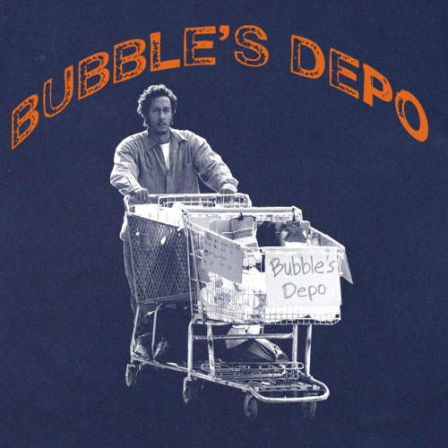
The image above shows Bubbles pushing his peripatetic business. The original is a print on a t-shirt. I chose it because it is semiotically fascinating. On one end it’s the perfect symbol of the parallel economy I talked about above. On the other end it shows the absolute base of the social pyramid, the junkie that is everybody’s victim (I’m aware that Bubbles is a fictional character, mind). And yet… it’s in a t-shirt… for sale! Grammar mistakes and all!… Capitalism appropriates everything by selling everything.

What’s missing above is the real one.

In conclusion, the use of parallel montage gives the impression of a kaleidoscopic and complex view of the city. That’s not untrue, but it just gives us the street level (in today’s world of virtual politics, even the temples of infotainment and city hall are at street level). What really affects these people’s lives is happening elsewhere.