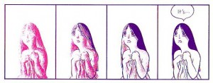
Monthly Stumblings # 2: Frans Masereel

Frans Masereel’s Route des hommes (men’s path)

In my humble opinion the best Belgian comics artist is not Hergé… The best Belgian comics artist is Frans Masereel…

I vaguely remember mentioning this to a couple of Masereel’s fellow countrymen and I’ve got two different answers (I must add that, in my view, of course, I chose my collocutors well): (1) a nod of approval; (2) something like: In Belgium we don’t view Frans Masereel as a comics artist.

(Needless to say that, besides some puzzled expressions asking “who are those?,” most of my possible Belgian interlocutors would react in a third way calling me a lunatic, or worse, depending on the person’s degree of Tintinophily.)

The first reaction was understandable because said person is an artist himself and what he does is akin to Masereeel’s work. The latter one is more interesting to me at this particular moment because it permits me to enter one of the muddiest territories in comics scholarship once again (when will I learn, right?…), the old conundrum: what is a comic?…

I’m not going to answer that question because it can’t be done. All the answers that one can come up with are rigged because they depend on a previous particular view of what’s essential in a comic (and that’s not only prescriptive, that’s also arbitrary). To Bill Blackbeard, for instance, speech balloons and image sequences are essential so (even if there are older examples, namely, here or even, here) comics started with Richard Felton Outcault’s Yellow Kid in 1896.

Saying this though, doesn’t get us very far (my thoughts on the subject, are here, by the way). What interests me right now are two related points: (1) the sociological side of the problem; (2) anachronism. (1) Words have a (social) commonly agreed meaning. The dictionary tries to stabilize it, but significations aren’t fixed. There’s a reason why we call Maus a “comic.” The sense evolved to include serious work while the signifier stood still. Even so I accept that “comics,” to most people, don’t include Frans Masereel’s oeuvre. Perhaps it will, someday… (2) Frans Masereel didn’t view himself as a comics artist. As far as he was concerned he did wood engravings, that’s all… To call his cycles “comics” is an anachronism. Maybe so, but it seems to me that we are guilty of anachronism all the time and nobody cares. To go back to Tintin, the expression “bande dessinée” didn’t exist when Hergé started doing comics. Why do we continue to say that he did comics, then?… Did the Lascaux painters call what they did “painting?” Is that important? How logocentric can we get?…

As you can see in this 1915 illustration above Frans Masereel was a naturalist. But working for the pacifist newspaper La feuille in Geneva as a political cartoonist during WWI Masereel needed a less detailed, more urgent, style. As Josef Herman put it:

Working for La Feuille posed two main problems for [Masereel], both of a technical nature. One was that the drawing had to be done quickly, leaving no time for the careful, detailed draughtsmanship he had practised until then. The other was how to achieve maximum effect using poor quality paper, on which thin lines were simply lost. He solved these two problems with the true instinct of a man of genius. He avoided drawing with a fine pen and took a thick brush, in the process giving up the search for tonal texture. He now used large planes of intense black, drawing lines wherever needed with a brush. The emotional effect he achieved was staggering.

Maybe the times weren’t right for nuanced views of the world (?). I love Frans Masereel’s verve and variety (he did manga in the original sense of roaming drawings), but his ideological views and Expressionist style push him into a less than complex view of the world sometimes (the fat, jeweled, cigar-chomping capitalist, for instance, is a regrettable stereotype). You can see one of Frans Masereel’s political cartoons as published in La feuille below:

Frans Masereel was 75 years old when he published Route des hommes (1964). He did “novels without words” all his life (more than 50, according to David Beronä). Route des hommes is far from being one of his best (that would be Passionate Journey – 1918 – and, my personal favorite, The City – 1925).

Route des hommes is about the horrible and great things that happen to humankind. We find in the book Masereel’s usual topics: war, famine, exploitation, but also progress, team work, joy, etc…

The greatest thing about this edition of the Musée des Arts Contemporains au Grand-Hornu and La Lettre volée (2006) is that it shows both Masereel’s prep drawings and his wood engravings. In this way we have access to the artist’s creative process as never before.

We can see above how Frans Masereel cites another Belgian painter, James Ensor (ditto Jacques Callot at some point). It’s interesting how what seems to be a tree in the foreground of the drawing becomes a sinister figure in the wood engraving (death waits us all at the end). His composition changes (increasing the two background figures’ size) greatly improve his work.

Masereel used allegory a lot. In this drawing the cars represent careless rich people. The city lights aren’t just that, they connote poor people’s acceptance of the status quo: they’re hypnotized, alienated (as Marxists liked to say)…


…But, to tell you the truth, I prefer allegoryless Masereel. He could be very poetic, as we can see above…

DWYCK: Hergé and the Order of Things

We’ve had a fair amount of discussion about how to approach comics critically here at HU lately, and I figured I’d expand a little upon some of the points I’ve made previously regarding cartooning as a visual phenomenon.

From a modernist critical perspective, it seems clear that comics’ artistic achievement through their modern history — i.e. the last 200 years or so — is predominantly visual, and it seems equally uncontroversial to say that the visual aspect of cartooning has generally been given higher priority by cartoonists as well as fans. This has to do with comics’ history as a low culture mass medium produced primarily to entertain and the genre constrictions this has placed upon its development.

The absence of a sophisticated, independent tradition for the appreciation of comics as art — in the broad sense, not just visual — means that critics have to start somewhere else, and given comics’ focus on narrative and their appeal to students of culture, the point of departure has more often than not been literary.

Unsurprisingly, comics have fared badly. Rote humor and trite genre exercises permeated by cliché and unfortunate stereotyping just don’t hold up to critical scrutiny when compared to the achievements of literature of the kind written in just words, no matter how pretty it looks.

To an extent, this is healthy. For comics appreciation — and indeed comics — to evolve, the medium needs to be subjected to the same probing scrutiny under which other artistic media have developed. Comics should be given no condescending breaks. However, they also need to be recognized and valued for what they are, for their particular synthesis of word and image and its fascinating cultural permutations.

Paradoxically for such a visually effective and attractive medium, very little attention is paid by critics to their visual aesthetics, and what little theory we’ve had — from McCloud to Groensteen — has concentrated primarily on their means of making narrative meaning.

Although it would certainly do some good, more criticism from a traditional visual arts perspective wouldn’t be sufficient. It would probably take to comics’ weird mix of simplification and exaggeration only slightly more charitably than has traditional literary criticism (consider the place satirical and gag cartoonists occupy in the art historical canon for reference). What we need is a new way of looking — one that doesn’t start by separating “story” and “art.”

Unsurprisingly, some of the most promising steps in such a direction have been taken by cartoonists, who have always been aware, if often only intuitively, of the special nature of their craft. In his recent foreword to the first volume of his collected Village Voice strips, Explainers, Jules Feiffer writes:

“I thought [the drawings] were stylistically subordinate; words and pictures are what a comic strip is all about, so you can’t say what’s more important or less. They work together. I wanted the focus on the language, and on where I was taking the reader in six or eight panels through this deceptive, inverse logic that I was using. The drawing had to be minimalist. If I used angle shots and complicated artwork, it would deflect the reader. I didn’t want the drawings to be noticed at all. I worked hard making sure that they wouldn’t be noticed.”

This notion is echoed in Chris Ware’s oft-repeated notion of cartooning as a kind of drawing that you read rather than look at, and in the old truism that great cartooning is akin to signature — the cartoonist’s handwriting. Think the inseparable entity that is Schulz and Peanuts and it pops.

Although it doesn’t apply equally to all forms of cartooning, this is an essential insight, not the least in that it connects the art form at a fairly basic level to the origins of the written word in ideograms. But it simultaneously runs the risk of devaluating aspects of comics’ visual life, once again making image subordinate to writing and reducing comics to “texts.”

Let me propose an example. Hergé’s Tintin is one of the most influential comics of the European tradition. It has entertained generations of readers all over the world and pretty much established the blueprint of clear storytelling in long-form comics, much like Schulz did for self-contained comic strips.

And while it is one of the rare comics that has been enshrined in high culture, at least in French-speaking countries, it still provides a good example of how great comics art may suffer in the encounter with traditional high culture criticism. It is very easy to reduce the Tintin stories to fairly unremarkable genre romps leavened with wholesome humor and only occasionally packing a certain and never particularly sophisticated satirical bite, all the while being stirred by troubling — if significantly also troubled — ideology.

The enduring popularity and greatness of Tintin, however, runs deeper, and it is inextricably bound up in the cartooning, not merely as storytelling but as personal handwriting. Peanuts wears Schulz’ emotions on its sleeve and is therefore more immediately appreciable as a work of literature than Tintin, which encrypts those of Hergé in a consciously dispassionate representational vocabulary.

The ligne claire, as it has become known, eschews hatching, downplays contrast, eliminates cast shadows, and maintains a uniformity of line throughout, paying equal attention to every element depicted. In his mature work, Hergé took great care to describe everything accurately, giving the reader a sense of authenticity and place. He did this not through naturalism, but rather through a careful distillation process, rendering every phenomenon in a carefully calibrated visual vocabulary that presents a seemingly egalitarian, ostensibly objective view of the world.

Reflecting his Catholic upbringing and the boy scout ethos which had been so formative to him, his cartooning is about imposing order on the world. His art is a moral endeavor that traces its roots back to the Enlightenment. At the same time, however, it reflects the futility of this endeavor, suggesting more mercurial forces at play.

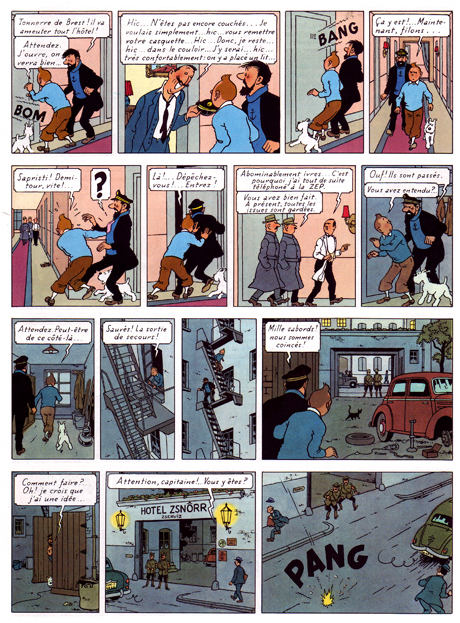
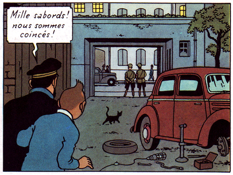
One of his most sophisticated works, The Calculus Affair (1954-56), articulates this tension beautifully. Page 50 is as fine example as any: the story is a fairly straightforward cold war cloak and dagger yarn, with the present sequence concerning Tintin, Haddock and Snowy’s escape from a police-guarded hotel in the Eastern Bloc country of Borduria.

The storytelling is characteristically clear and one might find sufficient an analysis of how the choice of viewpoint supports the action depicted, how the characters’ move from panel and how the space in which they move around is so clearly articulated, etc. But this would primarily be an analysis of how we read the sequence — what I’m interested in here is rather the vision it manifests.

As a comics maker, Hergé was acutely aware that he was speaking through fragments. Much of his art is concerned with this issue and the present book is among his most disciplined and intelligent treatments of this basic condition of comics. Framing clearly is the unsettling factor in his vision.

Most obviously, it occurs in his arrangement, both of the page — where the odd number of panels disrupts slightly its seemingly ordered construction — and in the composition of individual panels. He is an expert at this, keeping each panel interesting without cluttering it unduly: a cropped lamp and picture frame suggest a hotel room interior (panel 2), but also provide surface tension in an image of slight disorder. Tintin’s figure is disrupted by the outheld cap and line defining the wall paneling. Hergé’s is a controlled, subjectively ordering gaze.

The sequence is about movement and liberation by means of a metaphor of illumination. Dividing the page almost evenly between light (interior) and dark (exterior), Hergé (and his team) poignantly extend this concern to the images themselves. Every image is occupied by frame-like constructs — doors, windows, carpeting, gates — through which the characters move, or aspire to move. Diagonals suggest depth, but also deliver avenues of blockage or passage, both for the characters and the reader’s eye as it crosses the rectangular grid of the page. A black cat discretely blocks the path out (panel 12), while an immobile car meet the characters. A disarray of tools are left at their disposal on the ground.

The cable from an unlit lamp — the sixth on their path through the page — snakes its way towards them, literally and metaphorically embodying their ambition, in that it provides Tintin with the idea of using its bulb as a distraction for the guards, to move them away from the twin, (finally) lit lamps that frame his and Haddock’s eventual route of escape. The page ends the way it started, with sound signaling an opening.

Hergé was fascinated by psychoanalysis and worked through these years with an Increasing awareness of the subconscious. In his comics, he attempts to articulate the knowable and the unknowable with equal clarity in a rich world of signs, of meaning. By presenting his subjective choices, he offers us an an avenue by which to make sense of things.

For more thoughts on Hergé by yours truly and cartoonist Thomas Thorhauge, go here.

Update by Noah: I’ve added the Dyspeptic Ouroboros label to make this part of our ongoing series on meta-criticism.

Hooded Polyp: Smart Cardboard?

David Mazzucchelli’s formal innovations in Asterios Polyp are almost sixty years old.

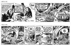
The image above shows two 1953 “Pogo” newspaper comic strips by Walt Kelly (as published in Pogo, volume 10 – Fantagraphics Books). Sarcophagus Macabre, the vulture, “talks” in courier font (June 10) while the Deacon Mushrat speaks in Gothic Blackletter (June 11). Plus: Sarcophagus’ speech balloons have the format of a condolence envelope. You can read a brief, but interesting essay about politics in Pogo, here.

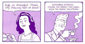
As we can see above David Mazzucchelli also used different speech balloons’ formats and fonts as characterization (see also Derik’s post).

Sarcophagus Macabre’s name, species, and ascribed balloon format are enough to know what he is, but the courier font needs an explanation: he’s an hypocrite because he expresses condolences sending form letters written with a (cold, of course) machine. The Deacon talks in Gothic fonts because he’s a cleric (he reads the Bible and he’s a conservative, not because he’s a Christian, but because he’s defined by Middle Age writing).

In Mazzucchelli’s case Asterios’  mother “talks” in D’Nealian cursive script (an anachronism) indicating candor and childishness while the father talks in pseudo Greek fonts. He was indeed Greek, but since ancient Greece is known, among other things, for its Mathematicians and Philosophers, the fonts also connote a rational man. Notice also the wavy line that defines the mother’s speech balloon and the father’s rectangle (with no edges; he’s a mild-mannered man). 

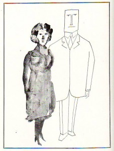
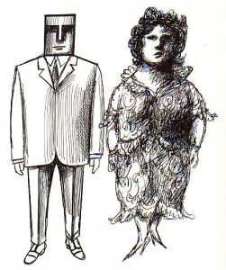
Saul Steinberg drew the two couples above (as published in The Passport, 1954). Do we start to see a pattern… and a problem? Men are “square,” rational beings, women are vague, intuitive, entities.

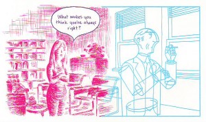
As we can see above (in a panel from Asterios Polyp), adding magenta (hot) for Hana and cyan (cold) for Asterios it’s the same view of men and women, the same stereotyping… Ooops! I used the “s” word!…

In a famous essay art historian E. H. Gombrich mentioned “wit” to describe Saul Steinberg’s drawings. Here’s what he said:

In many of his drawings it is the line of the graphic medium which seems ‘an echo to the sense’. His ‘Family’ […] shows us the father firmly modelled, the mother with undulating lines, the grandmother all but fading away between hesitant pen strokes, and, of course, the child drawn in the style of children’s scribbles.

From here it is but one step to the representation of what are called our synaesthetic reactions, the depiction of one sense modality by another.

The ekphrasis sounds familiar by now… The synaesthesia I frankly don’t see (it lacks that “one step,” I suppose). I will not deny the wit and creativity of Saul Steinberg’s visual solutions (some would say visual writing), but drawing attention (pun intended) to just a singular personality trait is a simplification. It has great applications in political satire, no doubt, but it’s not so great a device in a serious (graphic) novel.   

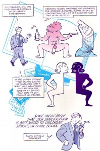
David Mazzucchelli agrees with me (or, his character does, as seen above), but he risked the blunt approach nonetheless as seen below (with a pint of self-irony: comic books, really?!)…

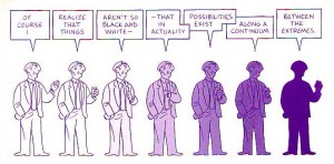
Comics are sequences, so, David Mazzucchelli could explore Saul Steinberg’s ideas in a more complex way: showing mood transformations, for instance (see below).

Hana goes from undefined (painterly, as Heinrich Wölfflin put it) to defined (linear; ditto). Wölfflin’s opposition (inspired by Friedrich Nietzsche’s Apollonian-Dionysian dichotomy) was one of Asterios’ favorite aesthetic theories; the other two being essentialism and Louis Sullivan’s famous diktat “form follows function.” She goes from magenta (irrational, life) to cyan (rational, thinking).

The procedure is welcomed, but were the googly eyes and the Utamaro mouth really necessary?…

If you read ’til here you must be saying by now that I hate Asterios Polyp. Well, I don’t, I like the tour de force, but I must plead guilty of double standard. I’m not the only guilty one though: many critics forgive a cliché and a stereotype (calling it “an archetype”) in adolescent and YA genre comics while vigorously attacking the same flaws in art comics. I did the opposite and I still think that Asterios Polyp is one of the best comics published in 2009. I’m sure that I’m misguided though because I failed to read all those marvels published by the big two…

____________
Update by Noah: The entire Asterios Polyp roundtable is here.

Overthinking Things 6/3/10

True story – I was in Wales with a Welsh friend who said to me, “You wanna learn some Welsh?” I said yes and she replied, “Baaaah.” I said, “That’s only funny if you say it – if I said it, it would have been condescending.”

Last month, my comments about “comics being condescending” were analyzed thoroughly by readers here – and it made me think over what I really meant when I said that. What I mean is this:

When I call dorky guys who obsess over comic art of women with unrealistic body proportions but treat actual women with fear and intolerance, “Loser Fanboys,” I am *absolutely* being condescending.

On the other hand, when I make a joke about lesbian dating and u-hauls, well then that’s tiresome, but acceptable. If *you* make that joke, you are not only being tiresome, you are also being condescending.

To me, condescension is not just talking down to someone, but talking about them in a dismissive, disempowering way. Stereotyping is condescending because it renders an entire group of individuals into a homogenous series of simplistic, often insulting, characteristics.

Erica’s Simple Guide to Condescension:

1) If you are not part of an ethnicity/gender/sexual orientation and you are depicting/referring to that group of people in a way that can be simplified into less than 10 words or one comic panel, you are being condescending.

2) If you are not part of an ethnicity/gender/sexual orientation and you are depicting/referring to that group of people in a sentence that begins with “They,” you are being condescending.

3) If your main character has two adjectives in front of his/her name, you are probably going to be condescending.

This last rule might seem weird, but let me present you with two not-at-all-random examples: Tantric Stripfighter Trina and Executive Assistant Iris. The former is a Tokyopop OEL manga, while the latter is an American comic from Aspen Comics.  (And, yes, I’m going to do that thing that irritates the hell out of everyone – use two examples to make a point and act like they typify an entire industry.  If that is likely to enrage you and you do not enjoy being enraged, you might want to stop here. You have been warned.)

In Trina, we are introduced to a *Tantric Stripfighter,* for pity’s sake, so you just know there’ll be no racial or gender stereotypes there. In a crucial moment (not really, it’s like the only moment I actually remember from the whole volume) Trina touches the one other woman in the series and “stimulates her pleasure centers,” so, the other woman follows her like a puppy for the rest of the volume. Presumably hoping to be “stimulated” once more. Trina is from a super advanced race that has mastered all sorts of mad fighting skills and energy work and all sorts of cool stuff, but is taken completely unaware when some brainless mooks land on their planet and slaughter everyone. And she wears pasties over her nipples which somehow makes the story suitable for teens.

In Executive Assistant Iris, a submissive Asian secretary is in reality a sex ninja assassin. To make it better, she’s the product of prison-like system in which unwanted Asian girls are trained to be assassin sex ninjas. The ringleader is – of course – a fat Chinese gang boss, with a liver-spotty face who smokes cigars.

Iris has a number of “sisters”; other repressed, silently angry, abused Asian women, who nonetheless fight for the organization that mentally, emotionally (and probably physically) raped them during their childhood. Because that’s what they were trained to do.

It’s not just the exhausting racial stereotypes that make both Trina and Iris condescending – although they certainly contribute. The gender politics are so sad, that I can barely find it in myself to comment on them. And it’s not that the teams that create both these masterpieces are comprised of male writer and male artist. Because that’s, like, a given. It’s that these were published at all.

It is everyone’s fault that condescending crap like this is still on the shelves.

It is the publishers’ fault. Publishers – when you put money into a project that condescends like these do, you are saying, “We approve of this. This speaks for us. ” It can be argued that publishers only publish what sells, which is exactly why I chose these two specific series. I can pretty much *guarantee* than neither of them sold all that well, if at all. And, instead of investing in something groundbreaking, or heck, something marginally less sad, the publisher said that they approved of this utter crap. I’m all for having comic company execs walk around with signs that say, “Why yes, we ARE condescending assholes.”

It’s the fans’ fault. I’m reading Trina and I swear I sprained my eyeballs rolling them so often, what with the constipated dialogue and hole-filled “plot.” With Iris, it was my jaw that took the hit, from yawning. The plot was the same as Dark Angel, with an extra helping of racial stereotyping for flavor. Really, fans – this is OKAY for you? You like being treated like eternal, slightly slow on the uptake 12-year olds? Never once do you look at a series and say – wow, this was insulting to my intelligence and to all Asian women? Never? Why not? What is, in fact, wrong with you? Demand better – buy better – and better will be published. When you buy crap like this and say that it’s fun and I’m “just overreacting” (which I am not, I’m just overthinking – there’s a difference) you are saying that racial and gender stereotypes are okay with you – you have no interest in seeing past them. You think that portraying all women with nearly identical, unrealistic body types and no will of their own, presented crotch and breasts first even if that requires a reshaping of their anatomy,  is not only okay – it’s what you want to read. Here, have a “condescending asshole” sign.

It’s the artists’ and writers’ fault. When you draw Asian women with Western body proportions, who serve a fat Chinese triad boss as a sex ninja assassin or are a master of Tantra AND Shaolin martial arts (something I object to because the energy use for these are contrary and you’d probably only make yourself sick trying to do both at once,) you are condescending. Yes, I know you are only making entertainment, not a political statement. And yes, I am very aware that male body types in comics are just as disproportionate and extreme these days.  Still, perpetuating stereotypes is not cool, or cute or clever. It’s trite and exhausting. Here’s your “condescending asshole” sign. Wear it proudly.

I am also very well aware that there are gazillions of comics that don’t fall into any of these potholes – superhero comics, manga, indie comics. I’m picking at a scab, but one that’s large enough that we should address it at least once. (“I got this scar reading comics for nearly 40 years.”)

Women do read comics – I dare say I’ve been reading and collecting them longer than most of you reading this column have been alive. Women are not opposed to sex ninja stories, or women with idealized body types in comics. What we want is to not be condescended to. It’s not that hard.

Publish something worth reading, draw/write something worth reading…read something worth reading. That’s all it takes.

Monthly Stumblings # 1: Pierre Duba

 Racines (roots) by Pierre Duba

Sometimes I mumble an inner “Wow!”… It happens when I stumble upon a book that I find great. It’s quite possible too that, upon rereading, months or years later, I also say to myself: “How could I like this stuff so much?!”

The thing is that we need the right mood, the right brain wave connection to the work in order to truly like it. That, needless to say, is highly subjective and unconveyable. If our past selves can’t agree with our present selves, how can we (the journalist critics and reviewers) agree with people (the readers) whom we have never met?

There’s only one answer for that rhetorical question: the critics are always preaching to the already converted. Critics explain, analyse, synthesize, extrapolate, digress, etc… These are intellectual operations that have nothing whatsoever to do with love. Critics dissect and people (them included, I suppose, even if opinion is divided on the subject) enjoy living, breathing things, not corpses, as it were…

That being said criticism may also be very enjoyable. Conversely to the proof at hand (namely, this foreign’s poor attempt at writing in English) it can be very well written. It can also give the readers some food for thought after their consumers’ experience. (I don’t really like the word “consumer,” but it was too awkward to write: reader/viewer/listener… etc… you get the picture…)

In fact, the critic begins by simply enjoying the work, I suppose… What twisted mind picks up the scalpel after love? That’s what we do folks, but don’t be too harsh passing judgment on the judges: we do it because we are a curious lot (we are like children opening up their favorite toy); plus, we may unbury hidden treasures: discover highly ingenious mechanisms, work with the artist to reflect on the human condition, etc…

The title of this monthly column is too ambitious? Am I expecting to stumble on a comics masterpiece every month? Not really, true greatness (even if perceived in a subjective way) is rare. I will write about some “Hmmms…” instead of some “Wows!” most of the time, I guess… (I will also use the title to excuse myself: what do you expect? I’m stumbling here!)

For my first column I chose an author that I feel, since my TCJ’s messboard days, I’ve unwarrantedly neglected: UK born, French comics artist Pierre Duba. Here’s what I said in my blog’s first post:

It was February 24, 2004, 08:27 AM, on the Comics Journal Messboard. I’m not sure if this was the first time that I listed these comics there (probably not), but that’s what I did in that particular occasion. If I remember correctly (unfortunately I didn’t write a crib sheet at the time) I did previously post what I now call “my canon” because I was fed up with the accusation of not liking comics at all because I found children’s comics (and I do like Carl Barks’ oeuvre) somewhat wanting (melodrama and manichaeism in particular bother me plenty).”

A list followed, but I vaguely remember saying something like: I could add a couple more names and, then, I cited Pierre Duba.
Duba’s last book is titled Racines (6 pieds sous terre, 2010), but instead of trying an interpretation I will follow Susan Sontag’s advice and I will try what I say above is impossible to do (“unconveyable”). As Sontag advices in Against Interpretation I’ll try an erotics of art instead of a hermeneutics.


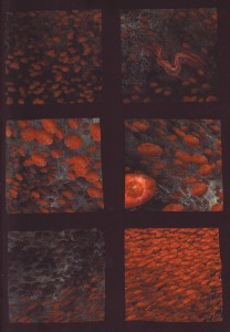
To truly experience the above page we need it to be just that: the original paper page (material aspects are the basis for a sensuous experience). Here, on a screen, it lacks the glossiness of the paper (and it is glossy) . Even touch and smell are an important part of the process (I wonder if the internet and ebooks are going to establish the same relation with books as repros in art books established with real paintings and sculptures: it all comes down to a reduction of experience, substitutions of the real things by simulacra). This page is very appealing because it achieves the feeling which psychoanalyst Marion Milner called a close relationship with objects. It does that using three devices: 1) the black gutters (I miss Chester Brown’s stories, but I also miss his black, large, gutters) which “compress” space and unite as much, if not more, as they divide; 2) the panels lack a clear distinction between background and foreground giving us a closeness with whatever is represented (blood, methinks); 3) moduled forms that tend to be viewed as texture (en masse) rather than as individual shapes. The visual rhythm is also very appealing: we’re going along with the hypnotic movement marvelously and smoothly flowing from panel to panel. The colors’ muted contrast is also an important part of the whole effect.


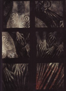
In this page a certain creepiness appears (Racines is a bit creepy, to tell you the truth). The hands morph into the roots of the title. We’re still close, and I don’t need to repeat what I said above, but closeness isn’t always a good feeling.


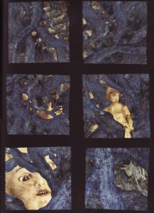
This page is here because of the black and blue contrast. The foreground has holes that let us see a few steps, the doll, and a rabbit. (What’s the deal with Pierre Duba and rabbits, anyway?). But I’m falling into interpretation again. I told you that this was an impossible task…

Pierre Duba’s pages function better as double-page spreads, as you can see here.

Duba explains himself.

Pierre Duba’s site.

Gluey Tart: Worth a What?

mean? I’d always assumed it was some bit of sexual innuendo of which I was unaware. I didn’t think that this time, though, because there is no sexual innuendo of which I am unaware. So I thought more about it. (That’s why I haven’t written a column in months. Kinukitty is very single-minded.) And I thought, well, there’s “drop a deuce,” but that refers to pooping. Everybody poops, yes, but that’s not quite right for sexual innuendo. Well, it is in some circles, but Kinukitty does not do scat. This is not a minority opinion on Kinukitty’s part, so I don’t think that’s what Mr. Simmons intended the song to be about. But there is no actual “he’s worth a deuce” sexual innuendo. One assumes he meant that he’s hot enough to do twice in one night, but he has himself pretty much admitted he had no idea what the hell he was talking about (or so said something I read online while meticulously researching this conundrum). It’s all just kind of overblown and clumsy and stupid. Which is one of the things I like so much about Kiss.

It isn’t just Simmons and Stanley. This is a game everyone in the band could play. (Well, Ace Frehley seemed to have his shit sorted out, as it were; “Parasite,” for instance, is a weirdly very sexy song, with a kick-ass guitar riff to boot.) Not so much the case for “Baby Driver,” by drummer Peter “Yes, I’m to Blame for ‘Beth’” Criss (also on Rock and Roll Over). “Go, baby driver/Been driving on down the road/Oh, what a rider/Carrying such a heavy load/Don’t ever need to know direction/Don’t need no tow, food, gas, no more.” The first question, obviously, is what the hell is he talking about? No, seriously. What the hell? And the second thing is, Jesus Christ, what is going on with this sexual metaphor? It is a sexual metaphor, that much is clear. Even if we leave aside the confusing lyrics (in fact, let’s do that, please), what on earth is going on with “go, baby driver”? There’s a fine tradition in ’70s rock of calling the groupies or what have you “baby,” and presumably that’s what Mr. Criss had in mind, but this strikes me as a sort of terrifying misstep.

And Kiss fans know from missteps. I’m going to limit myself to some of the high points from the first six albums because, frankly, I don’t want to hear any of the other albums again, ever. (Well, that doesn’t include the four solo albums released in 1978, of course. They are troubled, troubled records, but I have a completely indefensible yet persistent sentimental weakness for Paul’s solo album, and I might also argue, if cornered, that there are actually some songs worth listening to on Ace’s. Peter’s album is pretty much crap from end to end, and I’ve never actually listened to Gene’s, and I don’t intend to. If you try to make me, I shall be cross.) Here are some of my favorite flubs:

  • “Flaming Youth” (Destroyer, by Gene, Paul, Ace, and Bob Ezrin – I think Ace was drugged and kidnapped and forced to participate in this one) – “Flaming youth will set the world on fire.” That one doesn’t mean to be sexual, but come on.
  • “Room Service” (Dressed to Kill, by Paul) – “Baby I could use a meal.” Oh, my god.
  • “Goin’ Blind” (Hotter than Hell, by Gene) – “Little lady, can’t you see/You’re so young and so much different than I/I’m 93 and you’re 16/and I think I’m going blind.” This song, in which Larry King tells his girlfriend that they can’t be together any more, has always cracked me up. The premise is supposed to be amusing (and it is), but I’m not sure Mr. Simmons knew what he was doing with the going blind metaphor.
  • “Hotter than Hell” (Hotter than Hell, by Paul, who sounds like Jerry Lewis when he sings “Lady, oh lady,” something that I, not being French, find uniquely repulsive) – “Hot, hot, hotter than hell/You know she’s gonna leave you well done.” Am I the only one who gets unpleasant and not-sexy burn unit images from this? This song also features an earlier and inarguably more successful – if not exactly successful, per se – exploration of the Mr. Speed theme, with “I’ll take you all around this whole wide world before the evening is through.”
  • “Mainline” (Hotter than Hell, by Paul) –“ You needed some loving/I’m hot like an oven.” Ah, the merciless overlord of the exact rhyme. The thing is, Mr. Stanley really wanted a phallic reference here, not a yonic one. I’m sure of this.

Ah, good times. Now, I assume Mr. Simmons’ response to all this would be to unzip, pull out his big old bank ledger, and wave it in my face. Which is part of the fun, probably. I don’t care what he thinks, and he doesn’t care what I think. That’s called détente. Go, baby driver.

DWYCK: Flipping the Script — Cartoons and Classical Art

A perhaps unlikely, but nevertheless useful starting point for discussing cartooning is classical art—not seen as its polar opposite, but rather as its elevated obverse, similarly aspiring toward truth.

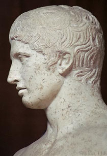
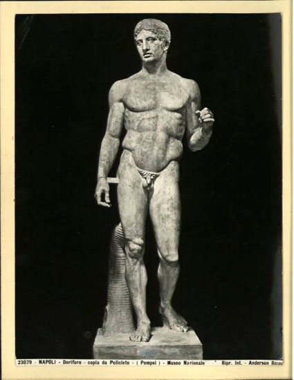
Polykleitos’ famous Doryphoros, or spear-bearer (c. 450-440 BC), as it survives in a Roman copy, is a good example. Acutely aware of the particulars of human anatomy, the sculptor distilled from empirical study a now-lost canon of perfect proportion, which applied mathematical principles to the creation of beautiful form. Neither the body, nor the face of the statue appear to us as an unadorned depiction of a man, but nevertheless convinces us of its truthfulness to nature through the sculptor’s evident, careful attention to the human form. It works as a rational prototype unto which we can easily map ourselves.


We learn from Pliny that the Greek painter Zeuxis (late 5th century BC) had similar concerns. Famously having to paint Helen of Troy, he took from five individual models their most beautiful traits and combined them to render that historic beauty. His painting, then, was an abstraction from nature used to project a recognizable prototype. An approach that has as much to do with Aristotelian cognition as it does with Platonic idea.


In his groundbreaking Essai du physiognomonie of 1845, the cartoonist Rodolphe Töpffer describes cartooning as a way of portraying the soul of the individual through the condensation of traits into archetype. He further noted that it does not require systematic study of nature, but rather works through a system of almost sign-like notation, immediately identifiable to us.

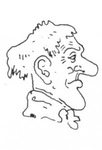
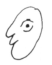
Sound familiar? To be sure, there are important differences between classic and cartoon form, and the latter has indeed been regarded as an irrational mockery of the former through the modern age, but their fundamental endeavor seems to me strikingly similar. One deals with rational prototype, while the other focuses on profane archetype; one necessitates a detailed understanding of nature’s principles, while the other requires a good eye for human physiognomy and behavior.

Essentially, however, they are both idealist endeavors, distilling experience into visual forms, and thus appealing to what is described by neuroscience as our understanding of phenomena through prototypes synthesized in our brain, into which new experiences are integrated and thereby processed.

Töpffer was writing at a time when the cartoon was more pervasive in society than it had ever been, but as a way of drawing it is as old as representational mark-making. In the renaissance, the kind of notational, linear, and exaggerated drawing today associated with it, appears in marginalia, on the backs of canvases, and in other places one would expect to find doodles.

A compelling example is the suite of heads on the back of Titian’s so-called Gozzi Altarpiece in Ancona (c. 1520). Surely drawn by the master, and probably his assistants, when the huge panel was still in the workshop, they run the gamut from naturalistic to grotesque, and in places approximate minimalist abstraction. And several of them, most notably the female profile on the right, recall classical form.

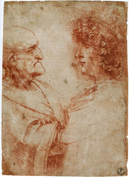
Leonardo, Profiles of an old and a young man, red chalk, Florence, Uffizi


The most famous doodler of the age was, of course, Leonardo, who throughout his life would populate the margins of his manuscripts with a variety of grotesque heads. An outgrowth of investigations into human morphology and the spectrum of human emotions not unlike Töpffer’s, they embody his notion that an artist would invariably express his self, resorting to its subconscious typology if his attention veered from manifest nature.

It is surely no coincidence that Leonardo’s two most repeated heads, the grotesque so-called ‘old warrior’ and the beautiful young ephebe, invoke classical models—the former is adapted from portraits of the Roman Emperor Galba, while the latter clearly reflects the Hellenistic ideal of beauty. As with Titian, it seems a natural impulse on the part of the artist, reminding us of the strategies of simplification integral to classical art, and of the fact that all art, from the exalted to the grotesque, seeks a synthesis of idea and form in its search for truth.