Monthly Stumblings # 10: Alan Dunn

East of Fifth by Alan Dunn

Fredrik Strömberg wrote Black Images in the Comics (Fantagraphics Books, 2003). In the foreword of said book Charles Johnson stated:

[…] while the cartoonist and comics scholar in me coolly and objectively appreciated the impressive archeology of images assembled in Black Images in the Comics, as a black American reader my visceral reaction to this barrage of racist drawings from the 1840s to the 1940s was revulsion and a profound sadness.

Jumping to page 86 we can find the inevitable Ebony White (the family name has to be a joke) accompanied by Will Eisner’s (the character’s creator) comment:

I realize that Ebony was a stereotype because I drew him in caricature – but how else could I have treated a black boy in that era, at that time?

Well… Eisner could have asked East of Fifth ‘s author Alan Dunn

Title page of East of Fifth.

 “Will Eisner’s Almanack of the Year” [December 26, 1948] as published in DC Comics’ Will Eisner’s Spirit Archives Vol. 17 (July 4 to December 26 1948), 2005.

As you can see above both “Will Eisner’s Almanack of the Year” and East of Fifth were published in 1948. Sacred cow defenders usually utter the same excuse that Will Eisner used above. Basically: he’s not to blame, he lived in less enlightened times, etc… On the other hand the Eisner (or McCay or Barks, etc…) critics say something like: that’s true, nevertheless other creators didn’t fall into the trap of racist imagery. The latter’s problem is that they never give any example… Until now: clearly belonging to the second group I believe that great art gives us a complex view of the world, hence: it has no place whatsoever for the simplistic and offensive imagery of racists. See below how Alan Dunn portrayed black people in East of Fifth and compare the depiction with Will Eisner’s pickaninny.

 East of Fifth, page 95.

 As we can see above, it’s not that difficult. Alan Dunn just needed to caricature black people in the same way as he caricatured everybody else. What he couldn’t change was black people’s role in society. In this image, as housemaids in a party. Even so, he didn’t resort to job stereotyping either. In the second image below the fourth character in the background row (counting from the left) is a middle class black person (a poet) attending a white people’s party. In this sequence racism is clearly viewed as embedded in 1940s society (also: on page 92 an employee says: “Cab for Mrs. Eelpuss – white driver”). (Even if they appear here together the two images are 30 pages apart. Braiding is the formal device that links East of Fifth the most with comics. The book is also an example of what I call a locus .)

East of Fifth, page 59.

East of Fifth, page 89.

 Some cartoonists praise stereotypes because, according to them, it’s an immediate way of conveying ideas. Looking at the image above I can see why: not that it really matters, of course, but without the usual short cuts (and forgetting page 59) it’s not immediately obvious that the gentleman depicted is indeed black. My question is: is this offensive immediacy really worth it? I don’t believe that Will Eisner was a racist. As Robert Crumb famously put it on the backcover of his comic book Despair (1970): “It’s just lines on paper, folks!” (before that Crumb depicted a character named Nutsboy tearing apart a woman and saying “it’s only a comic book, so I can do anything I want” – see below).

Robert Crumb, “Nutsboy”, Bogeyman # 2, 1969, as published in The Complete Crumb Comics # 5, Fantagraphics Books, July 1990.

I’m not denying Robert Crumb or any other artist, for that matter, the right to draw “anything [s/he/they] want,” but drawings have consequences as we have seen at the beginning of this post. In the story “Angelfood McSpade” (see below) Robert Crumb shows his camp tendencies exploiting a racist imagery that, I suppose, Crumb sees as his cultural trash heritage. As I see it Angelfood is marijuana (the character is an allegory), but that’s irrelevant for this post. The point is that kitsch or no kitsch, camp or no camp, it’s a racist depiction and I can’t decide who to blame more: Will Eisner who uncritically swallowed his times’ imagery or Robert Crumb who reveled in it.

“Angelfood McSpade”, Zap # 2, June 1968, as published in The Complete Crumb Comics # 5, Fantagraphics Books, July 1990.

John Crosby (1912 – 1991) was a media critic. In one of those happy circumstances that happen once in a blue moon one of his columns “Radio in Review” fell in my hands. It was published in the New York Herald Tribune (July, 1948) and it’s about East of Fifth. Sharp as a knife Crosby understood (with Göethe, looking at Töpffer’s drawings, many years before) that this book had an unnamed form: the graphic novel. Here’s what he said in his column “Radio in Review: East of Fifth, West of Superman” (New York Herald Tribune, July, 1948):

[…] “East of Fifth,” by Alan Dunn, a cartoonist who is also a subtle and polished writer, is the story of twenty-four hours in the life of a large, fashionable Manhattan apartment house and, of course, of its occupants, told in cartoons with an accompanying text.

I bring it up here because Mr. Dunn’s book may well be a brand new art form, a sort of sophisticated, literate extension of the comic books, rather horrifying in its implications to writers unable to draw. This isn’t the first book in which cartoons and text tell a complete story but, to my knowledge, it’s the first time anyone has attempted serious literature in this field. In this unreading age, when all the arts and much of journalism tend towards pictures, Mr. Dunn’s comic book for adults is certainly significant, just a little distressing and thoroughly captivating.

Alan Dunn juggled with three forms: literature, comics, but above all, cartoons (he was a New Yorker cartoonist). While printed words carry the load of the narrative cartoons are lively comments on the little events that occur in the building (see below).

Alan Dunn was an architecture cartoonist. He was as interested in the machinery of the building and the personnel running things as in bourgeois life inside it. The tone is a bit too breezy (it reminds Ben Katchor’s cool and detached, if poetical, remarks, sometimes).  A suicide occurs, in a masterful ellipse, nevertheless. It barely disrupts the hustle and bustle of city life though… and, maybe, that’s the whole point: the book ends with a drawing and a phrase alluding to “the cold metropolis of the north.”

East of Fifth, page 38.

Going back to Will Eisner it seems to me that, at least in the 1970s, he was influenced by Alan Dunn’s work. It’s a shame that, by then, it was too late to avoid Ebony…

East of Fifth, page 5.

Will Eisner, The Building, Kitchen Sink, 1987, as published in The Will Eisner Companion by N. C. Christopher Crouch and Stephen Weiner, DC Comics, 2004. 

I end this post with page 134 of East of Fifth. It’s now the wee hours and someone complained about the noise of a character’s typewriter. He then switches to handwriting in a great visual device that will be used, years later, by Charles Schulz.

East of Fifth, page 134.

__________
Update by Noah: This post inspired a roundtable on R. Crumb and race, all of which can be read here.

Overthinking Things 6/2/2011

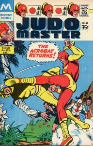
It’s Just a Comic Book, or, Judo Master has friends who are Asian

The date on the inside of Judo Master No. 96, tells me that it’s a Modern Comics (a Topps imprint) 1978 reprint of a 1967 comic.  I probably picked it up in 1978, at the local newspaper/candy/tobacco store, because that was where I got my comics until I became an adult and bought them for inflated prices from skeevy dealers at comics “shows” in the meeting rooms of Holiday Inns or in overfull, slightly tattered comic stores.

I remembered very little about the story, the title just popped into my head one day recently. I had to clean out the office to find it and there it was, looking as fresh as the day I bought it…maybe a little yellower. Judo Master is, along with a few other unfortunate comics, the overlap of two of my passions – comics and martial arts. (The very first book that I paid for by myself out of my allowance was “Teach Yourself Judo.” I was seven years old. I think my little sister has never forgiven me.) I remembered having really enjoyed the translation of each technique Judo Master uses. I remembered very little else, except the casual racism of the superior Caucasian man who not only is better at a Japanese Martial Art than any Japanese, but defeats evil, dismissively titled, Asian foes with their own martial arts.

Judo Master 96, 1978 reprint by Topps

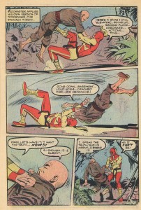
I haven’t the vaguest clue what the story is, I only have this one volume and I have no interest in “doing the research.” I can tell you this, Rip, the manly, western (he causally makes references to football, baseball and other wholesome American activities,) “Judo Master” is allied with a group of anti-Japanese Japanese on an island…somewhere. Joining them is Suzi (short for Suzikawa, but conveniently American-sounding, as “Susie,”)  Rip’s love interest, who wears something similar to a cheongsam, but definitely unrelated to a kimono. Eh, girl’s clothes, who cares what country they are from, it’s all so impenetrable to men, you know.

When they are discovered by The Acrobat and his evil “Jap” henchmen, I couldn’t help but notice that our square-jawed hero is a Master of a Martial Art, while our bad guy is merely an acrobat – clearly no one worth taking seriously. (According to the first page, Rip previously defeated the Red Crusher – guesses as to what country he was from?)

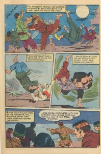
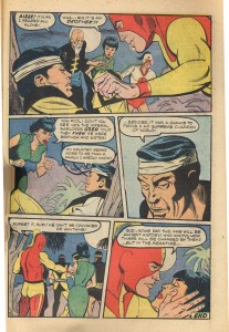
With a masterly series of shimewaza and osotogari, Judo Master defeats his opponent and, in an Arthurian moment, unmasks his opponent with “It’s time we took a peek under that falseface [sic] of yours and see what you really look like!”  The Acrobat turns out to be none other than Suzi’s misguided brother!

After Suzi realizes that her brother (who remains nameless) will never care that he was used by the “Imperial warlords,” Rip ends the chapter by comforting Suzi. “Suzi, someday this war will be ancient history! Who knows how things will be changed by then? …But in the meantime…”

What Rip? What in the meantime? There’ll be more “Japs” to kill in the name of freedom, or was that meant to be an overture to Suzi to celebrate his heroic efforts in their island bedroom? We’ll never know, because the story ends there and I never found another issue.

Now, here’s the thing about  Judo Master. He’s not racist, right? He has a Japanese girlfriend (okay, with Chinese clothes and a vaguely Chinese and vaguely American nickname, but still,) and he fights with a bunch of Japanese guys…so…? And it’s a WWII-era comic, right, so we have to forgive the propaganda, right? Well…no. Remember the dates above. The original book was published in 1967. I was two. This is *in my lifetime.* This is not a relic from a war-era comic. This is a cheesy recreation of a war-era comic feel. (Many of the comics I read as a young person were similar to this. Just post-Vietnam, it was obvious that comics were flailing to get back that good-guy flair. Lots of Nazis were defeated in comics when I was a kid. It was easier then, we were the clearly the good guys.)

Judo Master isn’t racist – look, he’s got friends who are Asian. He’s got a “Jap” girlfriend. He does Judo. He’s not fetishizing elements of Japanese culture and appropriating them for his own use or anything.

But, hey, this is just a comic, right? We shouldn’t take it so seriously. That’s what readers said in Noah’s discussion of racism in The Priest, and what commenters said in Colin’s comments about the exhaustingly awful use of sexual violence by DC in Flashpoint. Oh, and don’t forget Asians are getting all uppity about Akira. But then, I’m told to take Chester Brown’s Paying For It seriously, because it’s a serious work, with a premise worth discussing.

So, readers, is Judo Master racist? Was it racist in 1978? How about in 1967? 1942?

When do we take racism and sexism in comics seriously, because it’s a serious issue, with consequences worth discussing? When do we look at comics writers, artists and publishers and say, enough with the aggressive cluelessness. Enough racism, enough sexism, enough with the “it’s just a comic book.”  If comics are indeed an a form of serious artistic expression, then we have to stop dismissing the bits of it we don’t like, the parts that make us squirmy and uncomfortable. If it’s just entertainment, then let’s stop pretending it’s anything other than pubescent fantasies and utterly banal writing.

“We didn’t mean it that way” Does. Not. Work. If someone is offended at a thing, it is offensive. That feeling cannot be wiped away with “it’s just a….” If anything, that kind of casual denial of offense serves to heighten it.  Words and images have meaning – those meanings have consequences. If we acknowledge the power of words and images, the we have to acknowledge the consequences, too.

When will it be time to stand up and recognize the racism, the sexism, the denial and the pathology embedded in the words and images in comics for what it is?

I’d kind of like that moment to be now.

Can The Subaltern Draw?: Defining Manhua -or- A Translated Marketplace in Contemporary China

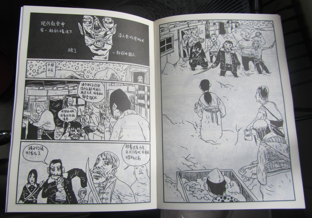
I realized about halfway through a recent interview with Cult Youth founding member Chairman Ca that I was asking the wrong questions. I was nearing the end of my stay in Beijing when I finally got a meeting with Ca, who was seeming more and more like the leader of the only real contemporary comics’ collective in China. In him I sought proof that Chinese comics (or “Manhua”) not only had a present, but a future; a future that would create a discursive political/social space for young critics like it had for so many countries before China. In him I found not the leader of a comics’ revolution, but a very talented dude who likes to make comics about Zombies.

Pages from Chairman Ca’s Zombie Pie

But before we discuss the salience of Cult Youth (CY), it is important to understand the larger comics’ community (or lack thereof) in which they operate. To put it simply, besides CY and a few rare exceptions, there aren’t any contemporary Chinese artists producing comics. However, this doesn’t mean that Chinese people aren’t avidly consuming comics on their iPhones and knock off iPhones alike. You see, the comics that are popular in China aren’t made in China, they’re translated Japanese imports. If you are remotely familiar with the history of China-Japan relations — from The Rape of Nanking all the way to the Diaoyu Islands — hearing that China openly embraces Japanese culture might appear contradictory to popular opinion. And for scholars of Manhua’s history (which you are about to get a primer on!), the reality would seem even stranger. As I’ll explore today, it somehow works that the culture which has youths actively devoting weekends to reading translated Japanese comics is the same culture where you can still read bumper stickers like this:

The history of Manga and Manhua have long been intertwined. The shared heritage should be evident from the name “Manhua” itself, a term adopted by Chinese to approximate the name “Manga” that Japanese caricaturist Hokusai Katsushika famously gave to his depictions of everyday life back in 1814. For a long while after that, Japanese held regional dominance over what was produced under that term, including work like Li De’s strangely Western-like The Rat’s Plaint in 1891. But as Japan-China relations soured under the weight of Japan’s imperial tendencies in the early 1900s, Manhua and Manga saw a clean break.

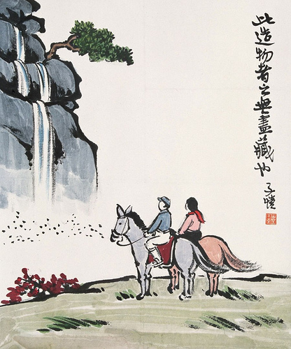
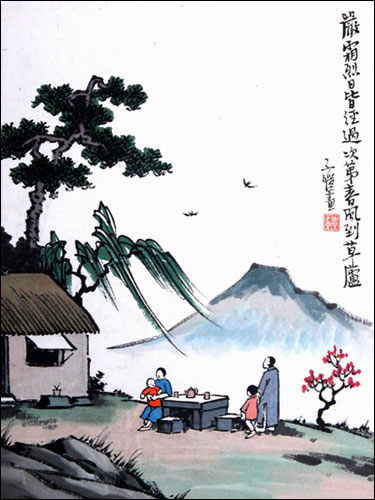
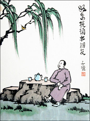
That clean break is perhaps best exemplified in the clear lines of Feng Zikai, who emerged in the early twentieth century as China’s preeminent comics artist. According to the wonderful Hong Kong Comics: A History of Manhua by Wendy Siuyi Wong, it was Zikai’s first published collection of cartoons, Zikai Manhua, in 1925 that better defined “Manhua” as a distinct art form in Chinese society. Through the work of Zikai, Manhua transformed from a loose pan-Asian signifier to describing a specialized Chinese art form with a common aesthetic. I’ll pause here to share some of Zikai’s art, which understandably galvanized a whole nation to define a term around it:

These Feng Zikai’s illustrations come via Cultural China and China Online Museum (where I encourage you to take in many more pieces)

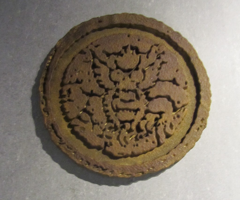
Before long, Manhua became a venue for the political as the nation grew increasingly resentful of Japan’s growing regional dominance. In 1927, the Shanghai Cartoon Association — the first cartoon society of its kind in China — formed as a gathering point for a growing roster of Manhua artist. Founding members included Ding Song, Zhang Guangyu, Lu Zhengei, Wang Dunqing, and, of course, Feng Zikai. “The association helped to solidify the loosely organized network of artists that made up the comics industry,” argues Wong in HK Comics, “and it encouraged efforts to raise the quality of its products.” Indeed, the Chinese artists not only used the organization to better their art, but through it explicitly defined Manhua as an art-form and a nationalistic enterprise. Like most nationalistic enterprises, Manhua came to define itself in opposition to other nations; namely Japan. At the Shanghai Animation and Comics Museum the association’s emblem hangs proudly near the entrance with an explanation:

“The association’s emblem is a Cartoon Dragon, representing a caricatured dragon awakening, taking off, determined to fight for the future of the homeland. Members of the association played a leadership role in the cartoon circle at that time, acted as hardcore force in cartoon creation and initiated many periodicals.” (Text from Display)

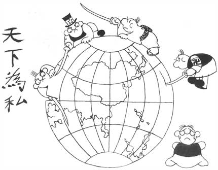
The dragon awakened within the pages of Chinese cartoon magazines and newspapers alike in the 1930s, determined to fight for its homeland at the start of the Sino-Japanese War. In this especially heated time, many artists became popular for creating anti-Japanese characters. One such artist was Huang Yao, who developed the character Niu Bi Zi. Here is perhaps Yao’s most famous cartoon, which depicts Niu Bi Zi (as China) helplessly crying in the wake of the West’s selfish gutting of the world:

Image via Lambiek

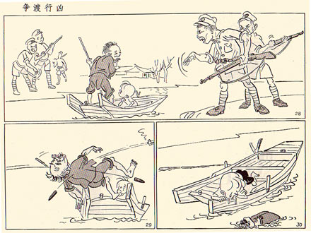
Then there is Zhang Leping, one of the most revered Manhua artists of his generation who is best-known for creating the cartoon character”Sanmao.” For decades the very popular Sanmao represented the struggle of the Chinese people and helped expose the cruelty of occupying Japanese forces. Take for example this typical anti-Japanese Sanmao comic, which shows the Japanese soldiers as senseless and ruthless killers.

Image via Lambiek

The members of the Shanghai Cartoon Association stoked the nationalist flame of China with hatred of Japanese, a fuel source that the PRC has repeatedly used through history when needing to drum up nationalism quickly. The work of these mainland artists from the 1920s until the early 1950s distinguished Manhua from Manga, seemingly putting the two countries in a race for regional dominance in the world of comics.* Today, it takes just one foot inside a Manhua store in any Chinese city to see that the two-way race was won by Japan long ago.

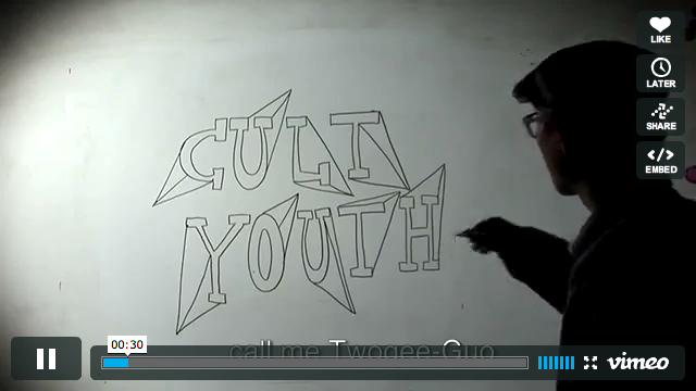
This all leads me back to Cult Youth, an independent Beijing-collective who at first blush looks like a 21st Century incarnation of the Shanghai Cartoon Association. I discovered Cult Youth through this short documentary of them floating around online:

(Click For Video)

Just like the Shanghai Cartoon Association did in the 1920s, Cult Youth have formed a community built around making (and re-defining) Manhua. A productive community at that: since 2007, Cult Youth has self-published three jam-packed collections of work that they sell online. They come across as a rare creative force in an otherwise stagnant market, willing to embrace “DIY” touchstones and break a few rules in the name of putting out relatively provocative comics. “If you were not born in the 80s and couldn’t decode the plots, then give up! This is not for you!,” reads the CY manifesto at the video’s start, “this is a new generation free of the reasons and worries of the past.” In the context of mainland China this bold self-determinative statement feels radical (at least to an outsider like myself). Which is why when I finally met founding member Chairman Ca I was expecting him to embody the language of young revolutionaries, when in reality he was much more modest about his ambitions.

Chairman Ca in his studio.

In my interview with Ca, he politely deflated my suggestions that maybe China was on the verge of a new comics renaissance. Instead, he explained that for him comics are more about a group of friends having fun on the side of their day-jobs, not a potential career path. Ca is an immense talent who has been actively making comics and other art since his days in university, yet he doesn’t keep a portfolio because he doesn’t feel like he needs one. When I asked him about the influence of luminaries like Feng Zikai or where he sees himself in the larger continuum of Manhua he gave me an unexpected answer: “Growing up here we come into contact with more Japanese comics. Only after the Internet became prevalent did we learn about European or North American comics.” Which is to say, the major influences of Ca and Cult Youth’s creative aspirations are not found in the history of Chinese comics, but downloaded copies of R. Crumb and translated Manga. Where the forefathers of Manhua defined themselves in opposition to Japan, Ca represents a generation that defines themselves in collaboration with Japan.

According to Ca the prevalence of translated Japanese comics in today’s market arose because while Manga was establishing itself as an industry in 70s, 80s, and 90s, independent comics were ostensibly made illegal in mainland China. Meanwhile, while the mainland had run dry of original content, Japanese publishers responded to a continued demand for comics in Taiwan and Hong Kong by translating Manga series into Chinese. Hence, Ca and his peers grew up in the mainland with the only new comics available in their language being pirated Manga translations from Taiwan and Hong Kong. Ca’s reference points are then Western reference points: Rockabilly was his first musical love, Zombies are cool, and he identifies philosophically as a Existentialist. For Ca, the fact that Japan is the chief-purveyor of comics in the region isn’t a cultural defeat as older generations would understand it, but simply a reality.

“The industry does well there, it has certain principles and successful cases. It’s easy for young people to turn themselves into that comic industry because it’s an established business,” says Ca of Japan’s Manga market, “For a Chinese person to make a living out of comics it takes a lot of resolute determination to get there. Maybe too much.” Ca’s stance exemplifies a generational shift in Chinese society in the wake of Mao. A generation who now unabashedly embraces Japanese culture through Manga is perhaps the logical extension of Deng Xiaoping’s market-oriented reforms from 1978 onwards: for better or worse, China shifted from a self-contained market to a interdependent player in the world’s economy by opening up. It appears that in the last twenty years the definition of “Manhua” has itself opened up. No longer in a vacuum where it is used as a political tool to encourage nationalism, Manhua is now a term that encompasses a rich history, a translated marketplace, and a few stray youths.

—-

* The 1950s marks the formation of the PRC by Mao, and the point where innovative Manhua fled with many Chinese to Hong Kong. While Manhua continued in the mainland during the twentieth century, it was mainly in a bastardized and government sanctioned-only form unlike its early creative years.

A very special thanks to my friend Alec Sugar who served as my fearless translator during the Chairman Ca interview.

And one more Zikai for the road:

Gluey Tart: Lonesome, Ornery, and Mean

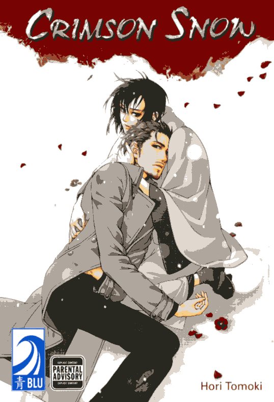
Crimson Snow Hori Tomoki, March 2011, Blu

First of all, Blu. I will miss you more than I can say. Even thinking about it makes me emo and cross and stabby. Fucking economy. Fucking Stuart Levy. The world is now a darker place.

It seems fitting to send Blu off with a column about a release that I kind of love, Crimson Snow. I’ll start with the cover, as I usually do, since that’s how my manga selection process works. It’s a dicey strategy – who among us hasn’t been burned by an intense, brooding stare, a well-drawn mouth, and the promise of more? But I’m a fool for a promising visual. I didn’t just fall for the poignant thug and the kimono-wearing pretty boy (who has on those geta with the fur-lined toe caps – so often I put on my Birkenstocks and sadly ask them, why aren’t you geta with fur-lined toe caps?). I like the design of this one, too, clean and rational in its use of flowers, confident of the drama it creates in juxtaposing not just the crisp, modern lines of the thug’s clothes with the flowing kimono robes, but also the muted colors of the two characters with the blood red of the petals and the gash across the top of the page.

Also, thug. Do I ever have a thing about thugs. I could do without the hipster facial hair, but his expression on the front cover is nice. There’s some of the at the end of his rope feeling his body language conveys so well, but there’s also something challenging, and part of that challenge is protectiveness over the robe-wearing little fruit loop holding him. Said fruit loop has nice hair, but there’s a problem with the perspective – or something – in his face. Not horrible, but not right. I’m giving it a pass because the thug looks so good, but the situation is duly noted. I like him better on the back cover.

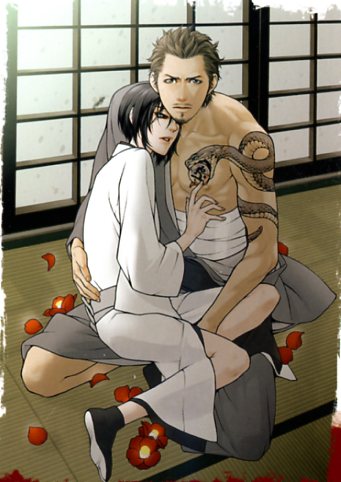
That’s a lot of chin, but worrying about it would be picking nits, given that image, which picks up on the promise of the front cover and runs with it. (Also, the snake with the om disk in its mouth – besides being kind of hot, is this a Kundalini thing? Are we supposed to take a moment to think about the cosmic energy that lies dormant, coiled in the spine? Because I’m willing to make an effort, but I’d sort of just rather not. I was frightened by Kundalini yoga as a child.) (Sort of like this guy.)

(Oh dear, right? One must be made of stern stuff to navigate this yaoi shit. This guy is from the second story, but don’t worry – it’s not that bad.)

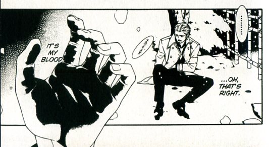
Opening up the book, I was initially somewhat concerned. (I mean separately from the above.) The glorious thug from the cover looks more like a used car salesman fallen on especially hard times.

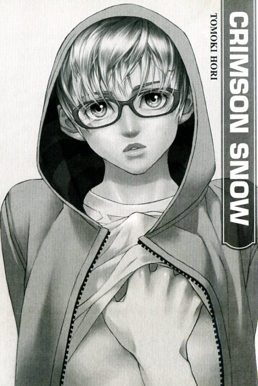
The fruit loop looks like a normal (which is to say, terrifying) high school yearbook photo.

Things get better, though, and not just because I took a bottle of White-Out to that fugly mustache. (I didn’t, really. But I might.) It’s mostly because the situation won me over. A gentle, pure young man quietly falls in love with an obviously dangerous but badly injured stranger, and the stranger falls in love with him. (Spoiler Ho!) The stranger leaves to redeem himself, and the young man is sad. Oh, and they have sex. Sort of peaceful and hot. And eventually the reformed thug returns, in a sweet little short at the end.

I’m torn over the second story, “At First Sight.” Two differently shy boys fall in love. At first sight. Right. The author really puts the metaphor through the ringer. There are things about love at first sight, and glasses, and looking away, and a quote in Latin class, “Love is borne out of the eyes and sinks into the heart.” Stop beating me with your fists of ham, Tomoki, I get it. Geez. On the other hand, the boy who doesn’t look twelve is cute (the boy who looks twelve would be cute, too, except for the whole looking twelve thing), and the shy boys staring longingly at each other cross the quad and finally getting together is a powerful shtick.

The third story, “Cry for the Sun,” is, in a word, freakish. For all of you who have bitterly lamented about your desire for something different by way of yaoi plots, we have here a case of be careful what you wish for. (Spoilers ahead because there’s a big load of WTF I need to unload – sorry, union rules.) The story opens at a funeral. The bereaved son looks across the fresh grave and sees a tearful hottie who seems familiar (“It feels like my mind’s completely blank. But my body remembers something.” Whoa.) In a nutshell, tearful hottie was the father’s best friend when bereaved son was a child, and dead father’s boyfriend before that, and tearful hottie disappeared from their lives after he tried to strangle bereaved son when bereaved son was a tot. Of course, tearful hottie and bereaved son are meant for each other and fall in love. One can’t really read this story without casting a serious side-eye at the likelihood of this plot, and there’s an aftertaste of something nasty besides. Perverse is the word I think I’m looking for. But what the hell – I like it anyway. There’s something beautiful about the friendship between the boy’s father and his almost-murderer that I liked, so let’s not get all judgmental, OK?

And with that, the book, like its publisher, is over. Let us wave good bye to them like Kate Middleton acknowledging the hordes. Blu is dead; long live – well, June, I guess.

DWYCK: True Lies


Dominique Goblet depicts her father as a late medieval Madonna, nurturing his child, right hand in blessing. Drawn on disparate, pasted-together pieces of paper accompanied by shakily calligraphed Gothic handwriting, it is simultaneously a mockery and an illumination.

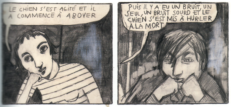
The image is from Goblet’s Faire semblant c’est mentir (‘To Pretend Is to Lie,’ 2007), a work that the author spent more than a decade creating. In it, she recounts episodes in her life to explicate, or at least represent, truthfully parts of its relational structure and emotional involvement. In this scene, Dominique visits her estranged father for the first time in five years. He is a drunken retired fireman and divorcé, now living with a rickety woman, Cécile—prone to hysteria bordering on the paranoid and drawn like Munch’s Screamer—a precarious stack-up of damaged goods. Dominique brings along her young daughter, Nikita, whom she leaves reluctantly in the hands of Cécile to walk the obliviously chipper dog.

The conversation turns serious, and the father starts blaming the daughter and her mother for the family’s misfortune. The icon mock-up marks a crescendo of his self-righteous diatribe: “And when she left, who took care of you? Wasn’t it me, perhaps? Didn’t you have your little packed lunch every day for school?” It is largely a comic image, but crafted as a question rather than a condemnation, because how can she deny the factual accuracy of that statement?

A collage of clips, rips and palimpsests, rendered in nervous, uneven line, the image emphasizes its limitations and shortcomings. While certainly pathetic, the father crucially is basically sympathetic; his soft facial features and mismatched almond eyes reveal an inner vitality, if also a lack of awareness. The child, in contrast, appears shrewd and present. This is her interpretation, ironic and reverent.

On several occasions in the book Goblet risks hyperbole in this way, employing dramatic juxtapositions and symbolic imagery to accentuate expression and enrich observation. It’s a risky strategy, but one she clearly feels is merited by the material, mundane as it might seem. The book is an attempt to engage a set of issues less by narrative and more by perspective. Goblet finds truth in reiteration, approaching her relationships from different angles and extending the focus beyond herself to the people around her, attempting to make sense of their experience: her father, her mother, and her boyfriend, Guy Marc Hinant, who co-wrote two of the chapters. She interweaves fact and fiction to expose the experiential, emotional truths behind the pretense of autobiography, attempting as well as she can to sidestep solipsism and mythologizing—the ophthalmic migraines and temporary blindness she suffers at a point of severe stress unassumingly accrue metafictional connotations.

Her portrait of her father is essentially a loving one. Despite their estrangement, she cracks convulsively when she learns from a friend of the family—after everyone else—that he was hospitalized days ago and is apparently dead. He isn’t, and he ends up comforting her in the hospital waiting room instead of the other way round. She is suffering from crippling anxiety that her budding relationship with Guy Marc is failing before it has even fully started, and given the juxtaposition, it is hard not to interpret this in the light of her familial disjunction.

As we’ve seen concurrently, Guy Marc has left his previous relationship unsolved. He wavers and relapses, wearing thin Dominique’s need to trust. Goblet draws the specter of his ex haunting them as they go about their daily business, lending a sense of sad menace to her portrayal of the beginnings of a relationship. She captures attentively the ambulatory conversations by which we get to know each other and the sense of promise they hold. In this case—perhaps a little too appropriately—it starts with a ghost story told in exacting, captivating detail, and continues with a no less carefully delineated recipe for pasta with tuna. And situations like Dominique tucking in Nikita in the graffiti-covered room of Guy Marc’s teenaged son (he’s with his mother) have an acute sense of reality to it. The book breathes lived experience.


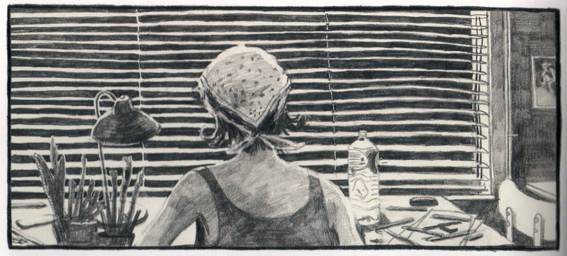
Though basically expressive, relying on externalizing emotion and broadening character to great effect, Goblet’s painterly pencil-and-chalk drawing at times captures more subtly revelatory moments of insight. This is especially true of the chapters involving her relationship with Guy Marc, in which her endeavor to step outside herself is most fully realized. The distracted, slightly troubled gaze with which he looks at her as she is telling him the ghost story beautifully illustrates the sense of displacement from the present tense that unaddressed problems may visit upon us, yet also suggests his dawning infatuation with the remarkable new person in front of him. And later Goblet depicts herself at her drawing table, against the light of the blinds, as seen from Guy Marc’s point of view, his desire and affection for her almost palpably immanent. An extraordinary instance of empathetic projection through drawing.


Goblet generally excels at displacing emotion, by metaphor as seen in the symbolic portrayal of her father, but also, and perhaps more notably, through transposition. Some of her most intense instances of emotional disclosure about both her father and her boyfriend are expressed not in this book, but in Souvenir d’une journée parfaite (‘Recollection of a Perfect Day,’ 2001), which she wrote and drew while work on Faire semblant was ongoing. Her father eventually did die, and Souvenir is in part a way for Goblet to express her feelings and reflect upon his significance to her shortly after it happened.

Instead of addressing her relationship with him directly, as she does in Faire semblant, however, she uses the conceit of looking for his gravestone at a mausoleum in the cemetery of the Brussels suburb of Uccle. Scanning the many names, she happens upon one of them, Mathias Kahn, and creates a fiction of this anonymous person’s life, which she interweaves with places, instances, and emotions from her own—“fiction as an extension of autobiography,” as she calls it in the brief afterword. The book concentrates primarily on thus charting her relationship with her father, but the “perfect day” she imagines for Kahn also contains a particularly moving, indirect declaration of love that simultaneously becomes redemptive of the old fireman’s flawed life and indicative of hers with Guy Marc.

Souvenir is a compelling work even when read without full cognizance of this metalepsis, but it is still a rather distancing conceit with which to engage personal matters. One understands why Goblet moved on to the more risky, and ultimately more difficult, direct form of representation in Faire semblant. Yet, as the title indicates and as the symbology already discussed should make clear, displacement is also central to this book.


The most emotionally fraught scene describes a traumatic instance of abuse inflicted upon the young Dominique by her mother, against which her father failed to intervene. Characteristically, Goblet seeks not to condemn but understand, describing the exasperating childish antics of her young self mostly from the point of view of the mother, making the latter’s momentary loss of control all the more understandable. Only when their full ramifications become apparent do we switch unequivocally to the child herself in a shocking full-page exclamation.

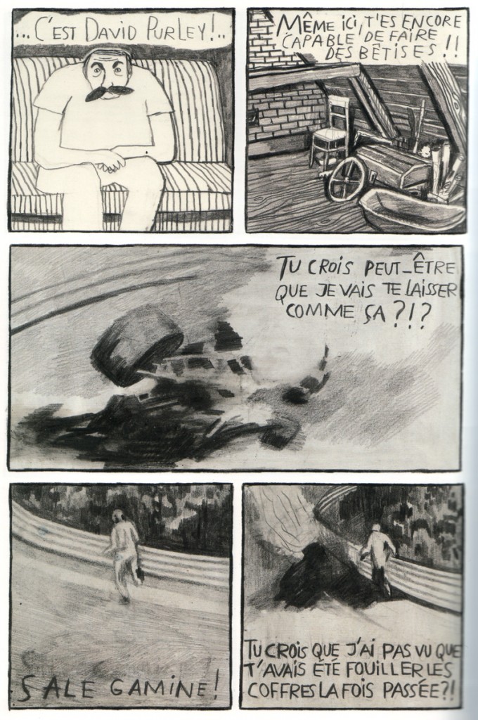
Concurrently with, and extenuatingly of this, we’ve been watching the father watching Formula 1 on TV, drinking beer. It’s the fateful 1973 Dutch Grand Prix, in which the gifted young English driver Roger Williamson perished in a violent crash. This juxtaposition is a fiction, devised by Goblet symbolically to represent her father’s crucial moment of neglect—a moment of which he had no recollection, as we learn from the conversation between Dominique and himself in the book’s diegetic present.

The heartbreaking spectacle of watching Williamson’s colleague David Purley attempt to extract him from the flames, drawn from video stills, becomes a potent placeholder for the author’s inability to address exhaustively this key episode of her childhood. Unfortunately she almost (but only almost) ruins it by ironically having the inebriated father loudly proclaim how he—the professional fireman—would have been able to save Williamson’s life had he been present, oblivious to the familial conflagration that mother and child are still reeling from. It is a didactic explication of an otherwise perfectly pitched, powerfully moving sequence of empathetic exegesis.

But then, Goblet’s strategy of pretense in the service of truth is a fraught one, and whether the individuals implicated—especially the father and the relatively vaguely defined mother—would recognize fully the events as depicted is of course questionable. But it is a noble, involved, and beautifully realized attempt at illuminating the vagaries and ultimately inexplicable realities of the relationships that shape and define our lives.

Dominique Goblet’s website. Souvenir d’une journée parfaite at her publisher FRMK’s site. Domingos Isabelinho on her and her daughter Nikita’s latest book Chronographie here at HU.

Strange Windows: Ha, ha, ha, Moooo…! (Ligne Claire 1)

“Allow me to shelter you under my umbrella!”

France is well-known for its strong comic-strip tradition, la bande dessinée;  deeply linked to this is an equally strong  tradition of children’s books –a wondrous one. Much of this literature has crossed over into English; think of Babar and The Little Prince;  or go back two centuries, to when France gave England Mother Goose  (from Les Contes de ma mère l’Oye, by Charles Perrault.) Many of the most beloved fairy tales in the English-speaking world were translated from  French authors’ versions, either invented or re-told: ‘ Puss in Boots’, ‘Sleeping Beauty’, ‘Bluebeard’, ‘Little Red Riding Hood’, ‘Beauty and the Beast’.

Alongside these books grew an army of fine artists to illuminate them, and today I wish to spotlight perhaps the most successful –and charming– of French illustrators  for children: Benjamin Rabier.

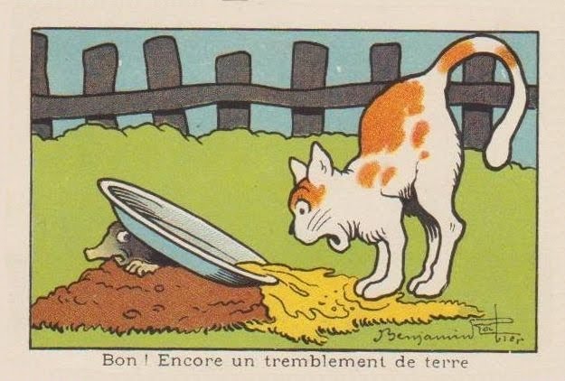
“Well! Another earthquake.”

Rabier (1864-1939) was the author of dozens of children’s books, mostly featuring animals;  he was also an early pioneer of both the comic strip and the animated cartoon; he was a successful playwright; but his greatest claim to international fame derives from a single image of commercial art, as we shall see. Benjamin Rabier: artistic polymath!

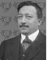
Portrait of Benjamin Rabier

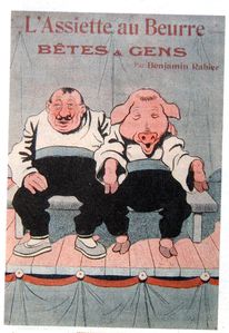
He came up from La Roche-sur-Yonne in 1899 to Paris, where he was employed as an accountant (a job which, despite his vast success as an artist, he kept until 1910, quitting for medical reasons alone.) At the same time, he started contributing to various humorous and satirical magazines such as  La Chronique Amusante , Le Gil Blas Illustré, Le Rire, L’Assiètte au Beurre in France, Scraps in Britain, and Puck in the United States;  in all he’d contribute to over fifty magazines and newspapers over his long career.

However, arguably Rabier’s most important contributions of that time –in light of his subsequent fame– were to the children’s publications of Arthème Fayard (La Jeunesse Illustrée and Les Belles Images). These were weekly anthologies of child-oriented prose and drawings; their success provided the template for the traditional French and Belgian comics magazines. In 1898, he produced his first book, about the adventures of a mischievous boy: Tintin-Lutin:

(If the title seems familiar…wait and see.) It was the first book of many.

In the 1890s, France introduced compulsory free education for all. Thus, millions of children learned how to read– creating a true mass market for children’s literature.

Add to this strong innovations in printing techniques– such as photo–engraving, linotype, and the introduction of cheap, vivid aniline dye-based color inks, and it is obvious that Rabier came along at the ideal time in history for an illustrator: a golden age.

He quickly became sought after for his anthropomorphic depictions of animals; his beasts showed the full range of human passions and emotions, from merriment to sorrow to rage– and yet remained recognisably animals.

He illustrated some of the great classics of animal tales, such as the medieval adventures of the trickster Reynard the Fox– collected in 13th century France under the title Le Roman du Renard:

He also illuminated at length the works of the 18th century father of zoology, Georges-Louis Leclerc de Buffon:

…showing he could be a most competent ‘straight’ animal illustrator, as shown in this scene of a farmyard:

…or this  drawing of an anteater:

Yet even his ‘straight’ illustrations show liveliness and emotion– witness the quiet anger expressed in this show of bearbaiting:

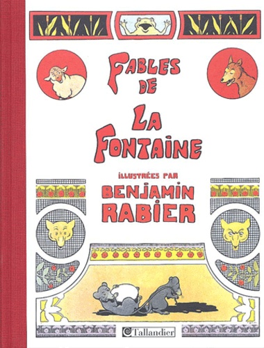
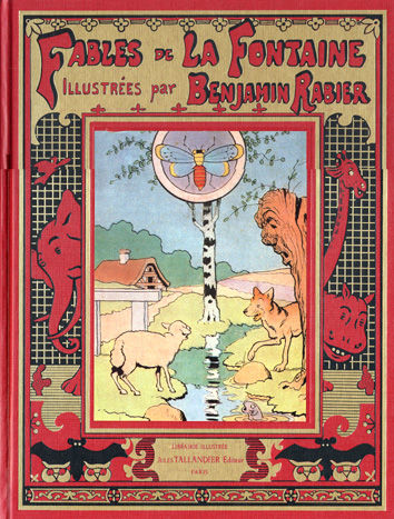
In 1906, he undertook a gigantic new piece of work: He illustrated all 240 of the rhymed fables of Jean de La Fontaine (1621–1695),  perennial classics known and loved by French children for over three centuries:

Some of these he drew in a comics-style sequence, as shown in these “collapsed” examples:

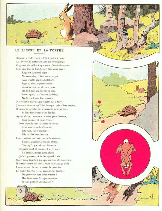
..and others in a ‘picto-fiction’ blend of text and art, such as this version of ‘The Tortoise and the Hare’:

…or of  ‘The Frog that would be as Big as an Ox’: Mark the merry expression on that bovine face: it prefigures Rabier’s most famous creation, to which we’ll turn shortly.

Note that Rabier was also a highly successful advertising artist, as can be seen from the below samples that parody La Fontaine to sell toothpaste, cough medecine, and shotgun shells:

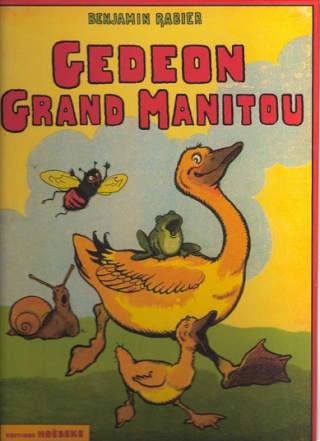
In 1923, Rabier introduced his most enduring creation, Gédeon the Duck, who would go on to star in 16 picture-books and several animated shorts:

As we’ve seen, Rabier was also an early adopter of the new art of the comic strip. This one is titled ‘The Phono-Trap’:

Panel 4: ‘Come, Medor, I’m caught!’ Panel 5: ‘Lunch is served!’

Or consider this oddly touching adventure of a fly: Rabier’s comics begin to take on a familiar look for aficionados of la bande dessinee. With their strong, simple linework trapping flat pastel colors, they seem obvious precursors of the Franco-Belgian school of cartooning known as la ligne claire, the  ‘clear line’, notably exemplified by Hergé, the creator of Tintin.

Hergé freely acknowledged the influence of Rabier:

«His drawings were very simple. Very simple, but sturdy, fresh, joyful and perfectly readable. In a few well-carpentered lines, everything was said: the setting was shown, the actors were in place; the comedy could start (…) And it’s for sure from this encounter that I date my taste for a clear and simple drawing, a drawing to be understood instantaneously. It is, before anything else, this readability that I myself have never ceased to seek”. –Herge, foreword to Rabier’s Fables de La Fontaine (tr:AB)

This influence went as far as stealing gags!

Rabier, 1920: Herge (in Tintin au Congo), 1930:

(Scroll quickly down the Rabier boa cartoon, and you’ll get a great simulation of animation. It demonstrates Rabier’s skill in panel-to-panel design.)

Some say Herge took the name of his hero from Rabier. I suppose it’s possible, though ‘Tintin’ wasn’t that rare a nickname (for ‘Augustin’).


The two Tintins

From 1917, Rabier collaborated with the father of the animated cartoon, Emile Cohl (1857–1938), in a series of cartoon short films. However, animation was to be dominated in the 20th century by a different style:

…a style that would come to dominate “funny animal” comics, as well.  Rabier’s work was to have little influence: another tantalysing possibility shoved aside by the brute force of Hollywood.

Note the smiling cow below. What would you get if, instead of smiling, the cow were laughing?

Why, you’d get a processed-cheese famous the world over, of course!


In 1921, Léon Bel introduced a new melted cheese packaged in individual, foil-wrapped wedges: La Vache qui Rit, ‘The Laughing Cow’. It was, and remains, an international hit product.

Two years later, Rabier designed the definite image of the hilarious bovine, and it remains– with few adjustments– the one used today:

2011

The origins of the laughing cow are obscure; it’s claimed that Bel’s wife coined the word ‘Wachkyrie” as a mockery of Wagner’s ‘Die Walküre‘. (‘W’ is pronounced like ‘V’ in both French and German.) There subsequently came out a successful dance by that name:


Naturally there were many imitators, and Bel fought numerous lawsuits against cheesemakers who introduced ‘the reading cow’, the smiling cow’, and many others: the Serious Cow (below) lasted as late as 1959.

Even Rabier got into the copycat act, with his Crying Cow:

Fun fact: in Indian restaurants, the fillings for cheese nans are almost always Vache qui Rit!

Over a century after Benjamin Rabier started drawing children’s books, not a single one of them has gone out of print.

Isn’t that a precious sort of immortality for an author– making generation after generation of kids laugh and smile?


Ad for Rabier-based toys:


A Gédéon figurine:

A laughing dog pull-scooter:


Rabier-designed cutlery holders:


A video clip in French about Rabier, with extracts from his animated cartoons.

Overthinking Things 05/03/2011

40 Years of the Same Damn Story, Part 2

One of the most popular and enduring Yuri tropes is that of the “Girl Prince.” While it’s probably impossible to fully remove the Girl Prince from the role of “butch” in current Yuri fans’ minds, today we’re going to look at the literary and theatrical roots of the character and see how she has changed over time.
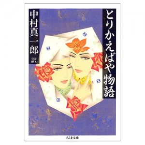
Torikaebaya Monogatari The Girl Prince can be traced back as least as far as the Torikaeabaya, a Heian tale of brother and sister who are naturally more aligned with the roles assigned to the other gender. They switch places at the Heian court and drama ensues. The princess of the story makes a spectacularly good prince until she falls in love and is undone by pregnancy, a theme that is echoed in many a western tale of female cross-dressers.

In the 1920s, a musical theater troupe was formed to bring travelers out to a small town in western Japan. The town, and the troupe are called Takarazuka. The troupe was created as an all-female group, with roles of men being played by Otokoyaku, a term commonly understood to be the popular culture analogy to the Onnagata (men who play female roles) of the high culture Kabuki theater.

Otokoyaku not only play male roles on stage, they are required, to some extent, to play the man 24/7. To these western eyes, the “men” of Takarazuka appear exaggerated, clownish lampoons of men. They stand aggressively, speak harshly, but make love tenderly, like the hyper-masculinized men of romance novels.

James Mitchener’s Sayonara provides a post-WWII male perspective on the cultured elegance and “masculine” mannerisms of the Otokoyaku:

[Her Lt. Pinkerton] was arrogant, ignorant and ill-mannered. Yet at the same time the actress herself seemed more essentially feminine than any of the other girls on stage.

This, Major Gruver instinctively understands, is what makes the Otokoyaku so popular with the women. That, although they wear men’s clothing and are aping masculine attitudes, they are understood to be even better women than the other women around them. After Gruver has fallen in love with, lived with and been forced to give up his relationship with Hana-Ogi, an Otokoyaku, he comes to truly understand and appreciate her abilities. Watching her play the same Lt. Pinkerton role he was disgusted by above, he says:

Now my reaction was different…. She had studied with intimiate care my mannerisms and now reproduced them in burlesque form. When she lit a cigarette she mimicked me, when she propositioned Madame Butterfly it was me trying to kiss her on the Bitch-bashi.

The Otokoyaku is poised, like so many drag kings, between a feminine interpretation of idealized masculinity and a lampoon of “gendered” mannerisms.
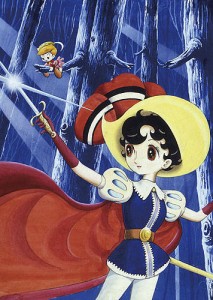
In 1954, God of Manga, Tezuka Osamu combined the Otokoyaku of Takarazuka with the hyper-feminine Snow White of Disney and created a prototype for all Girl Princes that would come later – Safire of Princess Knight/Ribon no Kishi (soon to be published in English by Vertical Publishing.) Safire was a girl, but forced for political reasons to live as a boy. Like the Otokoyaku of Takarazuka, she is an object of desire for other women, but essentially feminine. Although she falls in love with a man, she never loses her own heroic qualities. Safire set the standard very high for all Girl Princes who followed in her footsteps.

Safire is “forced” to pretend to be a boy, and she longs, in quiet moments, to wear frilly dresses and go to a dance or two, but she does not reject the privilege granted to her as a Prince. She cheerfully sets out on quests when it suits her. Safire is the hero many little girls want to be before the stories explain that they are merely meant to be the reward for the Prince. What women want, when we watch Otokoyaku, is to be wooed by a “man” who understands us (because he is a woman.) When we look at the Girl Prince, we simply want to be her.

In 1973, Ryoko Ikeda (if Tezuka is the God of manga, I’m inclined to think of Ikeda as the Goddess,)  took up the challenge Tezuka had laid down with Ribon no Kishi and produced her defining work, Rose of Versailles. (Interestingly Rose of Versailles is one of the favorite productions of the Takarazuka, with countless iterations over the years since Lady Oscar made her debut in Margaret magazine. Ribon no Kishi was made into a musical theatre production, but never by Takarazuka, which is headquartered in the town where Tezuka grew up.) Lady Oscar, like Safire, was a girl raised as a boy and the story is set during the years leading up to the French Revolution  – which is just as fantastic an age as the purely fantasy world in which Safire lives. Also like Safire, Oscar was attractive to other women, but her own heart was taken by her closest friend, Andre. The story comes to an end at the appropriately epic storming of the Bastille. Oscar changed the map for the Girl Prince completely. She does not wish to be girly, she is completely embedded in her Otokoyaku life, and does not reject it, even when love becomes an issue. Oscar’s difficulties accepting Andre are entirely due to their separate stations in life and, even more troublesome to the upright Oscar – the fact that she is his military superior. Gender roles or sexuality are not the issue here. Oscar imbued many of the Girl Princes after her with a fierce sense of duty and honor.

In 1978, Ikeda once again broached the concept of the Girl Prince, this time with the far more obscure manga Claudine. Claudine is notable for its ambiguity about the sexuality and/or gender identification of the lead character. It is never truly clear if Claudine is a man in a woman’s body, or a lesbian who simply desires male privilege and opportunity to love freely. Either interpretation is valid. Ikeda masterfully raises the ante on Tezuka with these two stories, setting the tone for many Girl Princes to come. Now, not only are Girl Princes likely to be attractive to their own sex, they might be attracted to other women. The Girl Prince’s role as “butch” in the relationship has been established.

In 1983, the cool, competent Otokoyaku-type character Shinokita Reiko, from Yajikita Gakuen Douchuuki owned Akita Shoten’s popularity polls for years. Otokoyaku and Girl Princes are sexiest to other women when they don men’s clothing. Kita is the perfect reluctant Otokoyaku; cold, emotionally distant, rejecting the women who want her with disdain and being even more attractive to them for being unattainable. Kita is forced by circumstances to play “host” at a Host club, a role that would forever change the perception of the Otokoyaku in Yuri Manga. “Hosts,” like hostesses, cater to the emotional needs of a club’s clientele, playing on established gender roles in Japanese society, in order to stimulate the club’s business. When Reiko dons a tux to become top host “Rei,” she merges the world of Otokoyaku and Girl Prince in a way that will never quite be separate again.
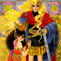
Another master of shoujo manga, Kurimoto Kaoru, took up the cause of the Girl Prince in 1986’s Paros no Ken a romantic tragedy about a Girl Prince, Erminia, who rejects the love of men, including her Andre, her knight and champion, Yurias, for the love of a serving girl, Fiona. The story changes the focus of the Girl Prince’s interests from the political to the personal. Not only does Erminia reject her fate, she leaves her kingdom to a usurper in order to find happiness with her true love.

Which bring us to – and don’t tell me you didn’t expect this – Sailor Moon. Takeuchi Naoko embraces the Otokoyaku as host/Girl Prince role with the creation of Tenoh Haruka who, we are informed, has the heart of both a man and a woman. Like Erminia, Haruka is willing to reject her fate but it is her partner, Kaioh Michiru, who leads her to face and embrace it. Like the other Otokoyaku who had come before her in manga, Haruka looks studly in a suit, has the polished manners of a popular host and is clearly, and unrepentantly, butch. Her former life as a member of the Moon Kingdom court provides many an opportunity to imagine her as the Girl Prince, as indeed, the official art of the series frequently did. Haruka was so incredibly popular that she set the standard for Otokoyaku characters for years to come, and we can see echoes of her even to this day, in characters like Otokoyaku Izumi from Nobara no Mori no Otome-tachi.

Just before the turn of the century, the Girl Prince was reborn in Revolutionary Girl Utena (about to be re-released as remastered DVD by Nozomi Right/Stuff.) Tenjou Utena followed her predecessors by blurring gender lines, adopting boy’s clothes to create her own unique look. In Utena, the concept of masculinity takes second place to the the concept of Princeliness. Like Safire, Utena saves princesses…and princes…and redefines for herself and for the audience what “Being a Prince” means. Because the anime, the manga, the movie and the movie manga each tell slightly different versions of this story, the creators, Saito Chiho and Ikuhara Kunihiko are given the freedom to play “what if?” with Utena. What is the outcome if she loves the Prince? What if she rejects him? What if she loves her rescued Princess? What if the world itself rejects her? Each ending plays with the ideas established by Girl Princes before her and, as anyone who has seen the television anime can attest to, there is overt acknowledgement of literary roots in character and set design. Ikeda Ryouko, and Yoshiya Nobuko are both present as guardian angels in this narrative.

By the early 2000s, the concept of the Takarazuka Otokoyaku has not really been shed from Yuri manga – if anything it had become intrinsic. Where a character was feminine, but has “masculine” qualities – or is simply gay – they are sometimes overtly given the role of Otokoyaku. In Konno Oyuki’s Maria-sama ga Miteru, the protaganist Yumi thinks that Sei looks like a “Takarazuka Top Star” in one of the novels, confirming what we already knew – that she is butchy. And, in Takako Shimura’s Aoi Hana, it’s obvious to us that Sugimoto-sempai is destined for the role of Heathcliff in the school play version of Wuthering Heights. When it came time to create a mascot for my own Yuricon, there was no doubt in my mind that the archetype I sought for our organization was going to be the Girl Prince. Yuriko is both Otokoyaku and the Girl Prince of her own story, translated to a more modern interpretation of “Prince.” Yuriko is a pop idol. Clothes and their assigned gender roles are fluid for her, but there’s no doubt in readers’ minds that she is modern royalty.

Which brings us to one of my favorite subversions of the Girl Prince role, the Queen in Fujieda Miyabi’s fantasy, comedy romance, Iono-sama Fanatics. Iono-sama is actual royalty, the Queen of some small, unnamed western kingdom. Iono-sama is both attractive to and attracted to other women, which leads to a harem story of epic and humorous proportions. A plot point in the second volume is that the various ladies-in-waiting, suffering from Iono-sama’s prolonged absence are waging an civil war. In Iono-sama’s world, royalty hath its privileges and neither gender, nor sexuality, are issues if the Queen chooses to bestow her love upon you.

Whether the Girl Prince is an actual prince, a girl who wants to be a prince, a cross-dresser who is fully invested in being a woman, or is simply the boyish star of the school,  as we read Yuri manga, The Girl Prince and the polished suit-wearing Otokoyaku are fixtures. The role allows us to understand and express our feminine and masculine ideals. We can play the Prince and still get the Princess for our efforts. However we approach the Girl Prince, it can’t be denied that she, and the Otokoyaku and their damn classic timeliness (as witnessed by the current reprints and re-releases) are contributors to it feeling like we’re reading the the Same Damn Story.
Postscript – this post makes 1 year here at Hooded Utilitarian. I’m still excited and pleased to be included among such luminaries in the comics crit scene. I’ll be buying myself a cake, sticking a candle in it and blowing out later today.