Touch and the X-Adolescent

When last we met, dear reader, Uncle Toby had just begun, at long last and after much prefatory hemming and hawing, to describe to the Widow Wadman where exactly he had been wounded in the Siege of Namur. 1 To recap:

Part 1: The centre of superhero comics is the fight scene — a  sequence of events caused by the aggressive and defensive (and other) actions of two or more combatants

Part 2: This constrains the range of all of the possible superpowers into the very limited dimensions we see in most superhero comics — viz. powers of touching and hurting, and not-being-touched and not-being-hurt

Part 3: You’re reading it now. The calls are coming from inside the house.

And so we come, at last, to Jack Kirby and the X-Men.

Source: unpublishedxmen.blogspot.com.au/2014/01/x-men-t-shirt.html. Jack Kirby and Chic Stone

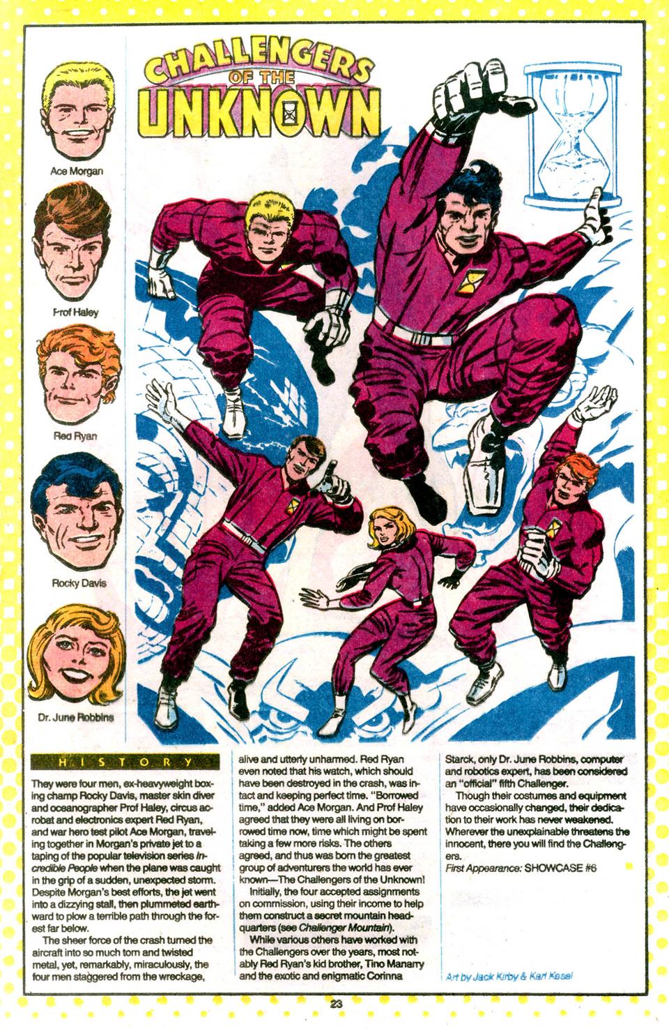
The X-Men were, by my count, the third group of heroes Jack Kirby created or co-created that all wore the same costume — first the Challengers of the Unknown in 1958, then the Fantastic Four in 1961, and the X-Men in 1963. It’s an interesting design decision, and it tends to occur only in groups that are created (as it were) whole cloth.  You don’t generally find team uniforms in groups like the Avengers or the Justice League of America — unlike the X-Men or Fantastic Four, who first appeared as a group, guys like (say) Batman or Thor already have their own costumes from their own previous appearances.


http://grantbridgestreet1.blogspot.com.au/2011/09/who-who-in-dc-universe-jack-kirby.html


http://missionmarvel.tumblr.com/image/60086614702

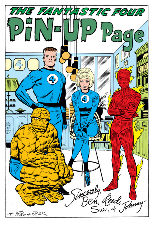
A shared uniform makes things easy for the artist in one sense — there’s just one basic costume to design. But it makes things harder as well, precisely because the artist can’t distinguish one character from another with different costumes. The only way to distinguish characters in uniform — particularly when a mask is part of the uniform, as with the X-Men — is through body-type or minor costume flourishes.

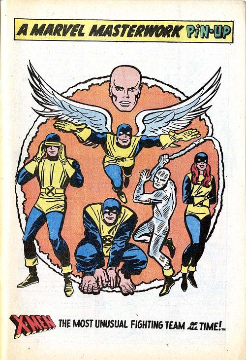
Kirby failed on this front with the Challengers of the Unknown; other than the fact that one of them is a punchy tough guy type, who can remember anything whatsoever about the individual Challengers? But he learned his lesson and made sure to distinguish the Fantastic Four and X-Men more strongly. So in the X-Men, you’ve got: a guy with a visor, a guy who transforms into a kind of snowman, a stocky guy, a guy with wings, and the girl (sic). The designs are simple but effective; you can easily tell at a glance who’s who. (In the decades since, later X-Men artists have variously abandoned and reintroduced the uniforms in one form or another.)

In their shared uniform, then, the X-Men appeared as part of that first wave of Marvel characters from 1961-1965 or so. It’s by now a truism — repeated countless times by Stan Lee, who created every single one of those characters 2 — that what distinguished those dynamic superheroes from their more staid counterparts at DC, was that they had “real problems”. These problems were generally either psychological — the abiding survivor’s guilt of Spider-Man and (once he was reintroduced from the 1950s) Captain America; interpersonal — the Avengers and Fantastic Four were always bickering; or, most relevantly here, physical. Thus Thor’s alter ego was lame (sic), Daredevil was blind, Iron Man needed constant medical care through his armour, the Hulk couldn’t control his transformations, the Thing was trapped in his monstrous form, Dr Strange had his hands mangled in a car accident, and even Nick Fury, in his then-contemporary role as agent of S.H.I.E.L.D 3, wore an eyepatch. 4

So too with the X-Men: Angel’s wings made him unable to “pass” as a regular human (to a lesser extent, Beast suffered the same thing with his oversized hands and feet); Cyclops couldn’t control his laser-beam eyes, so he had to wear either his visor or special glasses at all times; and of course their leader and surrogate father, Professor X, was a paraplegic.

Fittingly for characters with such overtly physical disability, those same disabilities were also balanced by other superhuman ways of moving, touching, and not being touched. And those, of course, are the very same dimensions we saw in Part 2 of this essay, as the necessary foci of a genre devoted above all else to the fight scene (as discussed in Part 1). These foci are not unique to the Marvel comics of that period, of course; certainly at DC there were also characters, at roughly the same time, that were based specifically on ways of moving  — most notably Hawkman and the Flash.

Now, how could moving be a requirement of fight scenes, if fight scenes are all about touching and hurting? Answer: moving is one of the best ways of not being touched — to fly away, or run away, or bounce around to dodge your foe 5. And the ne plus ultra of moving and touching is Kirby’s X-Men.

***

Even though they’d later form the basis for one of Marvel’s biggest cash-cows, these comics are nobody’s favourite Kirby comics 6; the King stopped drawing after just eleven issues (although he continued to provide layouts for other artists to complete), and most of the villains are eminently forgettable. But they do contain Kirby’s most distilled expression of these core elements of moving, not moving, touching and not being touched, hurting and not being hurt.

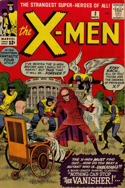
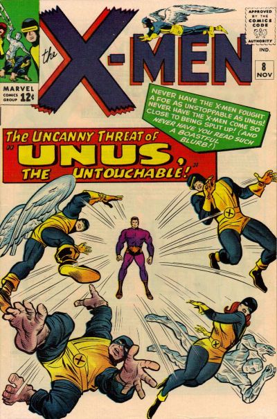
Take a look at the cover of their very first issue:

comics.org

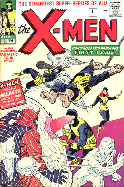
Cyclops and Ice-Man try to touch Magneto through action-at-a-distance; the Beast swings in on what looks like a circus trapeze; and the Angel uses his one and only power, to fly…with a bazooka. Naturally Marvel Girl — being, you know, a girl — can’t do anything except cower in the background.7

And what effect do these attacks have on their target? None, because Magneto uses his powers not to be touched.

Issue 2 sees the X-Men facing this guy:

comics.org

whose one and only power is teleportation. He’s unbeatable, as per the caption, because he can’t be touched — he just moves away by teleporting somewhere else.

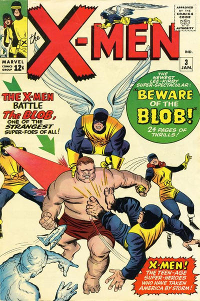
In Issue #3, they face the Blob, whose pudgy flesh absorb all attacks, and who cannot be budged unwillingly. Touching is ineffective and he cannot be moved.

comics.org

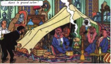
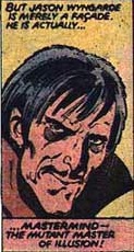
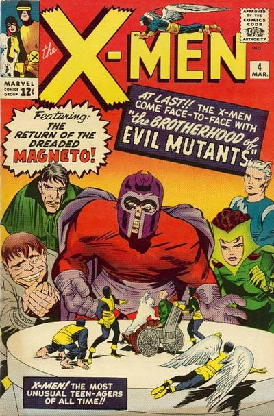
Issue #4 introduces Magneto’s own team, the Brotherhood of Evil Mutants, comprising: head honcho Magneto, a ranting megalomaniac; obsequious sycophant, Toad; siblings and reluctant recruits Quicksilver and the Scarlet Witch; and supreme creep Mastermind — whose costume, incidentally, is basically that he looks like a sex offender. I mean, look at this guy 8:

http://www.reocities.com/x_villains/mastermind/mastermind.html

Of these new characters in the Brother(sic)hood, two are based on ways of moving — Toad, who jumps around like his namesake, and the super-fast Quicksilver.

comics.org

Kirby must have liked drawing the Brotherhood (or else had no better ideas for villains), because they reappear in #5, #6 (allied with Bill Everett’s creation, the Sub-Mariner — a swimmer and flier both)  and #7 (allied this time with the Blob).

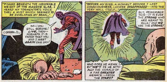
# 8 sees the X-Men facing Unus the Untouchable.

comics.org

‘Nuff said

In #9, we learn how Professor X lost the use of his legs the first time around. (He’s regained and lost their use at least four times since then. 9)

http://www.google.com.au/url?sa=i&source=images&cd=&cad=rja&uact=8&docid=Z0a37b6raW8GbM&tbnid=ypIzazLdRB-OOM:&ved=0CAYQjhw&url=http%3A%2F%2Fthecarouselpodcast.com%2F2011%2F11%2F04%2Fx-men-10-facts-from-1-50%2F&ei=BOh2U427EoeIlAXRx4DICQ&psig=AFQjCNGL-LOanlNG-nBap-19pP25QxoU8A&ust=1400387972352276

#10 and #11 give us a break from the motifs. #10 reintroduces Ka-Zar, a — well, calling him a “character” is probably too generous, but — a character from the musty Marvel vaults of the 1930s, a risibly blatant Tarzan rip-off — actually, make that just plain risible. And #11 gives us the Stranger, an otherwise forgettable antagonist whose only point of interest is as a precursor to Kirby’s many later space gods. 10

#11 was Kirby’s last issue as primary artist, although he continued to contribute layouts, and covers, until #17. But I want to discuss one more of these early issues, indeed, the first issue he didn’t provide the complete art for — #12. Because this issue, with finished art by Alex Toth and Vince Colletta, introduces one of the seminal moving/touching/hurting characters in X-Men, the supervillain called the Juggernaut. 11

comics.org

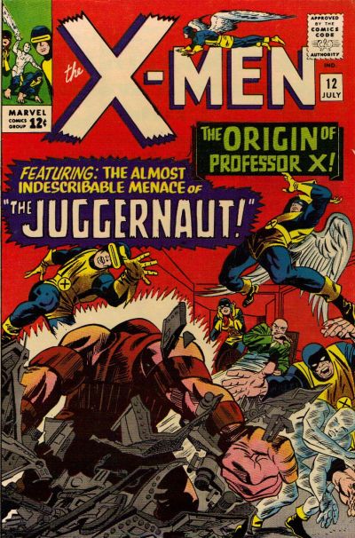
The Juggernaut is the step-brother of Professor X — which fact, all by itself, sets us up to expect some kind of contrast with Xavier’s paraplegia. And the Juggernaut doesn’t disappoint:

http://www.oocities.org/area51/neptune/7060/UXM12.html

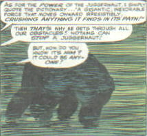
As for the power of the Juggernaut, I simply quote the dictionary…’A gigantic, inexorable force that moves onward irresistibly crushing anything it finds in its path!’

The Juggernaut’s power is unstoppability, in the most literal, kinetic sense. Once set on a path, he cannot be stopped or turned aside. Indeed, #11 itself embodies this concept. The issue starts with the blare of a warning alarm, signalling their “most deadly threat!” Xavier orders the team to fortify the school using their powers; Iceman makes an ice wall, and Cyclops blasts a trench which the others further strengthen. The Professor then talks us through a flashback into his history with the Juggernaut, which is repeatedly interrupted by the sound of the Juggernaut breaking through each of the school’s defences, one by one. All this time, the Juggernaut remains unseen except in fragments or through smoke, until on the final page he breaks through the final defence and appears unobscured in the very last panel.

He moves, he moves, and he moves, and nobody can stop him.

***

Now: I’m not trying to say that any of this is unique, that only the X-Men has this focus on moving/touching/hurting//not-moving/not-being-touched/not-being-hurt. On the contrary, it’s the basis of the whole genre. But I do think that it appears in its purest, most distilled form in those first dozen issues; villains who move, who can’t be stopped, who can’t be touched, they’re the greatest threat to these early X-Men.

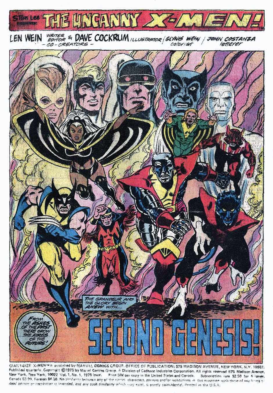
Although Kirby and Lee created the original X-Men, the title was not a hit and struggled to maintain an audience. Sure, sure, it distilled the form, blah blah blah but take another look at those villains up there — hardly Kirby’s finest hour. No, X-Men only grew into success after Len Wein and Dave Cockrum relaunched the series in the mid-70s, replacing almost all of the cast with a slate of new characters; and, almost immediately after that relaunch, Wein was replaced by Chris Claremont, who — along with Cockrum and John Byrne — deserves, essentially, all of the credit for the X-Men’s later, massive popularity. Claremont wrote X-Men (later renamed Uncanny X-Men) for seventeen years, an exceedingly unusually long stretch for that kind of comic (i.e. a superhero comic published and owned by Marvel or DC), especially given that, along the way, he co-created and wrote various spin-offs for several dozen issues.

http://www.google.com.au/url?sa=i&source=images&cd=&cad=rja&uact=8&docid=9hLnNOayKGTe8M&tbnid=XSBMGM0mwdocxM:&ved=0CAYQjhw&url=http%3A%2F%2Fdiversionsofthegroovykind.blogspot.com%2F2011%2F03%2Fmaking-splash-dave-cockrums-x-men-part.html&ei=Iep2U-ClNouXkwXD4oDIDA&psig=AFQjCNFkxgk2nF4Ux_bYbaxIZeX37bYwvA&ust=1400388513964046

The standard reading of Claremont’s (and his successors’) X-Men is as metaphor for civil rights and minority oppression, a reading that’s actively encouraged at times by Claremont himself (e.g. the “graphic novel” God Loves, Man Kills, or the Holocaust backstory he gave to Magneto).

http://www.comicvine.com/articles/why-you-should-read-x-men-god-loves-man-kills/1100-146485/

The main problem with this reading is that it’s stupid. Being (say) African-American, or gay, generally doesn’t mean you can shoot laser beams out of your eyes. (Unless there’s something the NAACP hasn’t been telling the rest of us all these years.)

The real “meaning” of the X-Men comics by Claremont et al. is metaphor for adolescence — or, rather, for the adolescent’s self-mythologizing about the experience of adolescence. Mutants are the “children” of humanity, who “hate and fear” them for being different. The reason mutants are ostracised by society at large, the reason that society considers them freakish and dangerous, is most definitely not because that society considers them inferior, degenerate, sub-human. On the contrary, it’s because of their special, unique powers — which typically emerge only in puberty(!) — that set them above the average human; a conceit of the series is that mutants form a new “species” called Homo superior.12  The X-Men aren’t a symbol for the oppressed, they’re a symbol for teenagers who think they’re oppressed.

On top of this basic metaphoric structure that he gradually engineered for the series, Claremont further added his distinctive emo-avant-la-lettre scripting and histrionics; with the X-Men, just as with every teenager everywhere, it’s always, literally, The End Of The World. No wonder the whole thing became so titanically popular, it’s YA in extra-large capitals.

http://goodcomics.comicbookresources.com/2013/09/25/month-of-avengersx-men-top-fives-top-five-most-heroic-x-men-deaths/

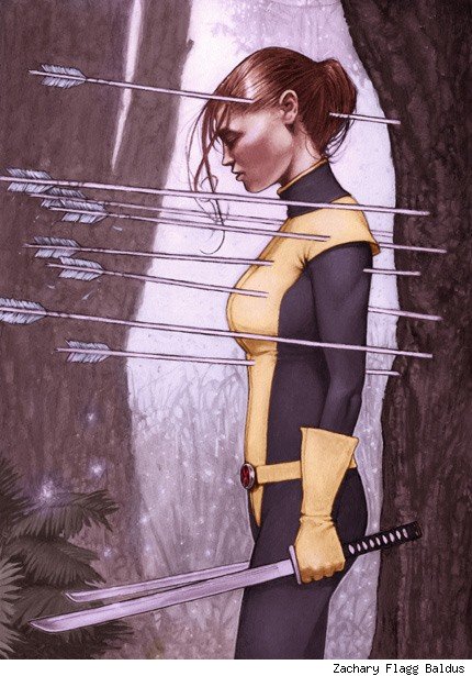
I’ll close, then, by pointing out how well Claremont understood the importance of touching/moving/hurting. For these were things that Claremont would return to, again and again, over his seventeen-year tenure. In particular, the motifs of touching and not-being-touched form the basis for his two most popular co-creations, Kitty Pryde and Rogue. 13

Kitty Pryde’s power is to turn herself into a kind of living ghost — a person with no solidity, who can walk through walls, through whom bullets and punches pass without damage or so much as contact. She cannot be hurt, because she cannot be touched.

http://comicsalliance.com/best-art-ever-this-week-04-05-12/

Rogue, on the other hand, must touch for her powers to work — when she touches anybody, she temporarily absorbs their superpowers and memories, and they (usually) lose consciousness. But, in a twist typical of the Earth’s Angstiest Heroes, her own power is as much curse as blessing; since she cannot control her power, since it works automatically and instantly, she *choke* can never know the touch of another.

http://comicsalliance.com/ask-chris-44-the-worst-couples-in-comics/

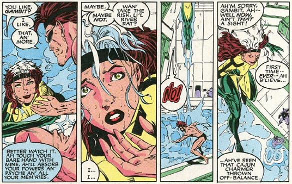
Think about it: two of the most popular characters in the most popular superhero comic book in the 1980s were a girl who couldn’t be touched if she didn’t want to be, and a young woman who couldn’t touch someone, even if she wanted to, without causing them serious harm. This is where the planets aligned for Chris Claremont, Tom Orzechowski, et al. — where the structural necessity of moving/touching/hurting–not-moving/not-being-touched/not-being-hurt lined up perfectly with Claremont’s main themes of adolescent angst and self-mythologizing. For, if these powers exemplify  a way of fighting, they also serve as potent metaphor for the experience of adolescence — at least for a certain kind of adolescent, the kind, say, that might be buying a superhero comic called Uncanny X-Men.

***

There’s a lot more that could be said here about this triad in Kirby, Claremont, or any number of other artists — e.g. Claremont (et al.’s) New Mutants, or Steve Ditko’s ectoplasmic excrudescences — but, really, the poet said it best when he wrote:

It feels good, when you know you’re down
A super dope homeboy from the Oak town
And I’m known as such
And this is a beat, uh, you can’t touch

I told you, homeboy
(You can’t touch this)

Hammer Time!

***

1.SPOILER: It was in Namur.

2.Relax, internet, I’m kidding.

3. Supreme Headquarters International Espionage Law-enforcement Division.

4. It’s suggestive that, alone amongst that first wave, Ant-Man/Giant-Man was beset by no such problems — and has been generally unable to sustain his own comic book for long.

5. That said, this utilitarian function isn’t the whole story; there is also the basic wish-fulfilment aspect of (say) flying, not to mention that it just gives the artist another bunch of cool stuff to draw when the characters can fly, or run really fast, or swing through the air, or whatever. And of course there’s also loads of outlandish vehicles that are used for transport rather than combat — the X-Men’s own Lockheed jet (introduced well after Kirby had left), Wonder Woman’s invisible plane, Thor’s goat-driven chariot, Spider-Man’s Spider-Mobile, the Black Racer’s skis…

6.*sigh* All right, internet, prove me wrong.

7. Like the question “Who tied up Mr Fantastic on Jack Kirby’s cover for Fantastic Four #1?” the question “What is Beast’s swing attached to?” admits of no definite answer. Also — what exactly does Angel think is going to happen to him when he fires that bazooka? Brace yourself, son.

8.  And he would later become pretty a sex offender for real, in the hands of Chris Claremont and John Byrne. The image here is by Byrne and Terry Austin.

9. When he was cloned by the Shi’ar, after he was nearly assassinated by Stryfe, when Xorn healed him, and after House of M. And, no, I haven’t actually read all of the comics in question because jesus christ are you out of your mind?

10. The Stranger can fly and walk through walls, but these are small potatoes compared to his overall cosmic powers

11. There are at least two mind-boggling things about this collaboration — first, Toth pencilling over somebody else’s layouts, and, second, Toth being inked by Colletta. One imagines that Toth did not altogether appreciate the experience — although Colletta might have, since he wouldn’t have to erase as many lines with Toth.

12. This conceit doesn’t make a whole lot of sense; mutants wouldn’t count as a new species on any biological account of what makes a species (or, at least, any account I know of). Superhero comic book uses dubious science — stop the press.

13. As evidence for their popularity, see this 2011 poll at Comics Should Be Good of the Top 100 Marvel Comic Book Characters. CSBG is a generally reliable barometer of superhero fan opinion, and this poll ranked Kitty Pryde as #19 and Rogue as #23. Emma Frost is the only Claremont co-creation to rank higher, at #17, but much of that popularity is due to her reinvention by Grant Morrison, who gave her a new power, to turn into a super-tough, hard-to-hurt diamond form.

CREATOR CREDITS: Part 1 — Superman, Lex Luthor and Metropolis created by Jerry Siegel and Joe Shuster; Brainiac created by Al Plastino and Otto Binder; Thor, Loki and Asgard created by Jack Kirby, Stan Lee and Larry Lieber; Captain America created by Kirby and Joe Simon; the Hulk, Absorbing Man, Odin, the Avengers, Batroc zee Leapair created by Kirby and Lee; the Justice League of America created by Mike Sekowsky and Gardner Fox; Batman created by Bill Finger “and Bob Kane”; the Joker created by Jerry Robinson, Finger, “and Bob Kane”.

Part 2 — Dr Strange and Spider-Man created by Steve Ditko and Lee; Iron Man created by Don Heck, Kirby, Lee and Lieber; the Fantastic Four created by Kirby and Lee; Thulk, Wulk, Fwulk, Cfwulk, Rcfwulk, Rulk, Chulk and Dchulk created by Jones, one of the Jones boys; Doom Patrol created by Bruno Premiani and Arnold Drake; Brotherhood of Dada created by Richard Case and Grant Morrison; Nova created by John Buscema and Marv Wolfman; Captain Marvel created by Gene Colan and Roy Thomas; Superior and Ultimate Spider-Man created by, hell, let’s just say Ditko and Lee; Carnage created by Erik Larsen, Mark Bagley and David Michelinie; Venom created by Randy Schueller, Mike Zeck, Todd McFarlane and Michelinie; Scarlet Spider created by I couldn’t be bothered to decipher the wikipedia page; Morbius and Iron Fist created by Gil Kane and Thomas; Punisher created by Ross Andru, John Romita and Gerry Conway; Daredevil created by Bill Everett, Wally Wood and Stan Lee; Hawkeye created by Heck and Lee; Wolverine created by Romita, Herb Trimpe, and Len Wein; Gambit created by Jim Lee and Chris Claremont; Deadpool “created” by Rob Liefeld and Fabian Nicieza; Kick-Ass created by John Romita Jr and Mark Millar; Pandora created by Andy Kubert and Geoff Johns; Phantom Stranger created by Carmine Infantino and John Broome; John Constantine created by Steve Bissette, John Totleben and Alan Moore; Aquaman created by Paul Norris and Mort Weisinger; Green Arrow created by George Papp and Weisinger; Katana created by Jim Aparo and Mike W. Barr; Vibe created by Chuck Patton and Conway; Flash created by Infantino, Broome and Robert Kanigher; Wonder Woman created by Willam Moulton Marston and Harry Peter; Supergirl created by Curt Swan and Binder; Superboy created by Siegel and Shuster; Batgirl created by Infantino and Fox; Catwoman created by Finger “and Bob Kane”; Talon created by (I think) Greg Capullo and Scott Snyder; Batwing created by Chris Burnham and Morrison; Nightwing created by Robinson, Finger “and Bob Kane”, plus George Perez and Wolfman; Green Lantern created by (Gil) Kane and Broome; Larfleeze created by Ethan van Sciver and  Johns; Jonah Hex created by Tony deZuniga and John Albano; Animal Man created by Infantino and Dave Wood; Swamp Thing created by Bernie Wrightson and Wein; Legion of Super-heroes created by Plastino and Binder; Matter-Eater Lad created by John Forte and Siegel; Metamorpho created by Ramona Fradon and Bob Haney; Conan created by Robert E. Howard; the Atom created by (Gil) Kane and Fox; Adam Strange created by Murphy Anderson and Julius Schwartz; Hawkman created by Dennis Neville and Fox; the Haunted Tank created by Russ Heath and Kanigher; Enemy Ace, Unknown Soldier and Sgt Rock created by Joe Kubert and Kanigher.

Part 3 — Uncle Toby and the Widow Wadman created by Laurence Sterne; Challengers of the Unknown and the Black Racer created by Kirby; Nick Fury, Brotherhood of Evil Mutants, the Vanisher, Unus, Blob, Juggernaut, Stranger, S.H.I.E.L.D. created by Kirby and Lee;  Sub-Mariner created by Bill Everett; Ka-Zar “created” by Bob Byrd; Kitty Pryde and Emma Frost created by John Byrne and Claremont; Rogue created by Michael Golden and Claremont; Ant-Man created by Kirby, Lieber and Lee; the Shi’ar created by Dave Cockrum and Claremont; Stryfe “created” by Liefeld and Louise Simonson; Xorn created by Morrison and Frank Quitely.

Economics in Fantasy Literature, Or, Why Nerds Really Like Stuff


John William Waterhouse The Crystal Ball with the skull  1902

 
There is no rule stating that fantasy literature must involve a pre-industrial setting, but Tolkien’s grip remains strong and the maps included at the beginning of epic fantasy novels illustrate a strong attachment to land rather than economic “development” (or degradation, as per Tolkien’s philosophy on modernity.) Pre-industrialization, by its very definition, eschews mass production and growth. Even in urban fantasy, the modes of production that sustain the magical world don’t usually involve factory processes. There are notable exceptions, of course, like Stephen King’s The Dark Tower series, but I think this description is a fair representation of the genre.

The role of “stuff” in fantasy fiction remains vitally important to fantastical stories and potentially serves to discipline fantasy readers into valuing certain cultural artifacts over others. Wikipedia has a page dedicated to a sizable—and incomplete— list of fictional swords with names. Certain artifacts are imbued with symbolic qualities (eg. King Arthur’s Excalibur and Holy Grail) and some magic systems are reliant upon material things (eg. wands in Harry Potter.) Though economic systems within fantasy literature are usually underdeveloped or neglected by authors, artifacts remain fetishized, used both as a way of adding authenticity to the secondary world (the presence of swords signals to readers that they are situated within a particular genre and provides a pathway for authors to play with certain tropes), and developing the protagonist’s identity. But from where does this economic model originate and how, if at all, does this conceptualization of stuff impact present-day nerd consumerism? Because while the role of economic exchange is left ambiguous in much fantasy literature, the centrality of stuff like wands, crystal balls, amulets, and named swords are not.

J R. R. Tolkien creeps into most discussions of fantasy literature, even when intentions are bent on his exclusion. China Mieville, both highly critical and highly thankful to the man, once called Tolkien “the big Oedipal Daddy” of fantasy literature, a label with which I’m forced to concur. Tolkien was heavily influenced by his academic work as a scholar of Anglo-Saxon literature, a research interest which inevitably shapes this discussion. He began writing The Hobbit shortly after translating the epic poem Beowulf. The dragon in The Hobbit is thought to be directly influenced by the epic poem. Tolkien’s work emulates Beowulf’s vagueness surrounding the production of goods, features similar rural mileus, and focuses more on treasure than merchandise. In his book Honour, Exchange, and Violence in Beowulf, Peter Baker writes:

[T]he world of Beowulf gets along entirely without coinage. The poem mentions land as a reward for valorous deeds, but land seems to lack all practical value: if noble Danes and Greats collect rents in money, food or service, the poet considers the fact too trivial to notice…Indeed, the only category of wealth that interests the poet and his characters is treasure.

The acquisition of treasure was done primarily through looting, and Baker writes that violence in Beowulf was not seen as a sign of social disintegration but as an ‘essential element in the heroic system of exchange (sometimes called the Economy of Honour.)’ In general, the accumulation of goods in fantasy literature is linked with the successful completion of good deeds. Part of the hero’s journey may involve a quest to recover certain items, yet the acquisition of stuff in fantasy literature is not about consumerism but a reflection of the protagonist’s righteousness or destitution. In Beowulf, for example, treasure is used to secure loyalty and ensure the continuation of a just society. Further examples include the destruction of the One Ring, the destruction of the Seven Horcruxes in order to defeat Voldemort and the search for the Deathly Hallows, and The Sword in the Stone– an object which arbitrates rightful inheritance to the throne.

Though not all fantasy settings are rural—and some fantasy authors focus on urban settings as a reaction to Tolkien’s idealization of pre-industrial life. Michael Moorcock, in particular, argued that Tolkien’s fascination with pre-industrialization was nostalgic and “infantile.”

Since the beginnings of the Industrial Revolution, at least, people have been yearning for an ideal rural world they believe to have vanished – yearning for a mythical state of innocence (as Morris did) as heartily as the Israelites yearned for the Garden of Eden. This refusal to face or derive any pleasure from the realities of urban industrial life, this longing to possess, again, the infant’s eye view of the countryside, is a fundamental theme in popular English literature.


john-william-waterhouse-psyche-opening-the-golden-box-1903-1342800590_b

 
Even in fantasy novels that feature urban environments, magical items are not produced through the methods of mass production. There aren’t too many wand-making factories. When large-scale manufacturing operations are displayed, they are usually situated as a site of oppression. Tolkien described the industrial period as “the robotic age,” despite early industrialization’s reliance on cheap sources of labour (women and children). The rejection of the methods of mass production is not unconscious on Tolkien’s part—Sarumon’s destruction of Fangorn Forest to pursue his own mining operation is portrayed as unabashedly evil. More recently, Brandon Sanderson’s excellent Mistborn trilogy features a covert mining operation controlled by an elite class that would like to restrict the use of magic (Sanderson’s magic system is fueled by minerals) and which is the site of class oppression and slavery.

I find the absence of economic preoccupation, which centers contemporary life but is pushed to the periphery in fantasy literature, fascinating. There’s stuff, but no theory about stuff. The acquisition of stuff is not usually related to the accumulation of wealth, but there’s no doubt that items incurred in fantasy novels are in some way special. They are unique snowflakes that arrive at key times in the plot, signaling growth in the character’s identity. (Think of Will, from Philip Pullman’s His Dark Materials trilogy, who grapples with moral challenges because he possesses The Subtle Knife.)

In particular, I wonder if the desire for nerds to own ‘limited edition’ consumer goods is related to the glamorization of items within fantasy worlds. Collecting limited edition ‘stuff’ has always been linked with nerd identity. Think of the cliched stereotype of the dweeb who collects mint-condition-never-removed-from-the-box-limited-edition Star Wars action figures and who can recite, in an encyclopedic fashion, their stats. These toys become a physical manifestation of one’s nerd identity. Similarly, the oohs and aahs towards those who manage to acquire ‘stuff’ from movie sets reveals a longstanding philosophy about authenticity: you got the real one. I’m not immune from the temptation of ‘rare artifacts.’ At last year’s San Diego Comic Con, I braved the Dark Horse line to purchase a limited edition (run of 1200, exclusive to Comic Con) House Stark Shield. And my views on Game of Thrones can, at the best of times, be described as ambivalent.

Of course, instead of monarchs awarding heroes with treasure, the fetishization of ‘rare’ artifacts in the primary world is mediated through private commercial entities. Limited edition consumer items are still products of capitalism–my Stark Shield was produced in a factory. (And so were the fantasy books…) Fantasy literature’s popularity is sustained by the very process it ignores or derides. ‘The capitalists’ (twirling mustache, top hat) have had no difficulty appropriating ‘items’ into the robotic age for nerds who view Comic-Con as a pilgrimage and the acquisition of special edition Lego as a quest.

But there’s anxiety within this relationship, a push-back because consumerism is just too easy. Mass production involves the masses, after all, and some fans argued that the whole-scale embrace of fantasy consumer goods is a form of appropriation rather than adoption. The former term, of course, implies an inauthentic masquerade on the part of the consumer. The latter term implies that the person is not an authentic member of the community. The perception is, perhaps, that these people are role-playing and will remove their nerd-drag once the sub-culture loses its mainstream appeal.??I cannot ignore the intersection of class and gender in this exchange. Anyone can enter a Target store and purchase a Star Wars t-shirt, but the ease of this purchase creates doubt in the wearer’s identity. Is this person really a ‘true nerd?’ Despite repeated calls for folks to quit patrolling the boundaries of nerdom, certain groups (mostly girls and women) are still required to justify their commitment to the community by, at times, being asked to respond to spontaneous pop-quizzes by self-appointed police officers of Kingdom Geek. Money functions as a good way to participate in a sub-culture that has long been defined by its rejection of irony and whole-scale enthusiasm of ‘cool stuff.’ A t-shirt from Target does not necessitate the grueling process (sarcasm—all that’s needed is more money) of purchasing a flight to a comic-con and waiting in line for several hours in hopes of acquiring limited edition whatever—the quest and the story related to the acquisition is removed, but the product is still worn as a symbol of identity, potentially allowing those with lower incomes (like young people and women) to participate in nerd sub-cultures.

Unfortunately, this participation has been met with a certain elitist attitude about what kind of labour or consumerism is good enough to qualify as being part of the community. Limited edition or not, it’s all capitalism. But to elitists, some capitalisms are better than other capitalisms. Consumerism is no longer enough because one must be a discerning consumer. And of course, testing the knowledge of other fans, often directed towards teenage girls, displays a kind of anxiety towards the opening of borders that has resulted from nerdiness’ capitalist expansion. Knowledge becomes another form of currency, the arbitrator between the high-brow collector of art and the dirty prol who can’t tell the difference between a first and second edition something-or-other.

All of which is to say that ‘fantasy economics’ has some serious real-life implications regarding inclusion, exclusion, and the powerful role of stuff/artifacts/things in identity creation. Fantasy has the potential for being highly critical of consumerism and contains the tools to imagine differently. Unfortunately, I do not think that most fantasy literature is currently engaged with these issues. Rather, pre-industrial economic practices provide convenient short-hands to indicate magic and swords—it’s a trope that some writers have confronted but most haven’t.

________
Images: John William Waterhouse, “The Crystal Ball With the Skull” and “Psyche Opening the Golden Box”

About the author: Sarah Shoker is a PhD candidate in political science at McMaster University in Canada. She’s currently completing a fantasy novel that is conspicuously absent of named swords, but she’d love you to publish it anyway. You can follow her on twitter @SarahShoker.


Under The Venusberg: Tannhäuser, Beardsley and I

This is part of the Gay Utopia project, originally published in 2007 . A map of the Gay Utopia is here.
______

As an artist who does erotic artwork for a living, there are certain questions that I inevitably get asked, whether it’s in the context of an online interview, a first-time studio visit or just hanging out at a party. One that I can pretty much count on every time – along with “Have your parents/family seen your books?” (answer: yes) and “Have you tried any of the things you draw in real life?” (answer: yes again) – is “What inspires you to draw this kind of artwork?”
 

inner_garden II

From In a Metal Web II, ©Michael Manning

 
The first things that come to mind are the usual suspects: life, death, sex, the work of other artists. One influence that isn’t always so obvious is music. I listen to a lot of it, usually while I’m working. I like seeing live music too. A good live show can provide weeks worth of inspiration. For all the styles and sub-genres of music that I like though, I’m aware that there are many many more that I know very little about. Opera, for example. I own a grand total of one disc (excerpts from Puccini’s La Boheme) and am more familiar with the story lines courtesy of P. Craig Russell’s comix adaptations and viewings of Amadeus and Immortal Beloved than I am with the actual music. None of my music collector friends are opera fans. Also, I’ve always had the impression (misguided or not) that opera, like free jazz or death metal, is something best experienced live and the astronomical ticket prices can be very intimidating.
 

sasaya_dream I

From In A Metal Web I, ©Michael Manning

Last year, two things tipped the balance toward my first opera experience. One was a generous anniversary gift from Lyn’s father that we decided to reserve for something that we couldn’t ordinarily afford to do. The other was a locally-produced version of Wagner’s Tannhäuser — a classic operatic meditation on the struggle between the sacred and profane — which supposedly featured nudity and an big orgy scene. And so one March evening, we found ourselves in the vertigo-inducing cheap seats in the fourth tier of the cavernous Dorothy Chandler Pavilion in downtown Los Angeles. Sure enough, the beginning of act one did consist of a twenty minute long sex party with many lovely toned mostly-nude bodies engaging in various acts of simulated copulation, writhing away on two rotating stage sets, all bathed in the crimson glow of Venus’ underworld. Most of our favorite positions and permutations were featured in a variety of gender combinations with special attention paid to trios, doggy-style fucking, pussy/ass/foot worship and even a bit of flogging. It was all good NC-17 rated fun, but the whole time, I couldn’t help thinking that it wasn’t nearly as naughty as illustrator Aubrey Beardsley’s prose version of Venus and Tannhäuser aka. Under The Hill from 1904.
 

earl_lavender

From Beardsley’s frontispiece to Earl Lavender by John Davidson

 
Now as an artist who does erotic artwork — especially predominantly black & white gender-freaky erotic artwork — it’s difficult to remain ignorant of Beardsley, much less avoid having your work measured against his, even in this day and age when black & white artwork makes most people think of manga or Frank Miller. The o.g. (19th century England, baby) black & white gender-freaky erotic artist, Beardsley was never very well known for his prose yet over one hundred years after its first publication Under The Hill remains one of the dirtiest stories ever told. According to my copy of “Aubrey Beardsley: A Slave To Love”, the text was never completed during Beardley’s life time due to a combination of his ill-health, legal/censorship problems and the scandal resulting from Oscar Wilde’s trial, but hotter heads eventually prevailed, the incomplete manuscript finally saw print and has remained in circulation ever since.

In Wagner’s version of “Tannhäuser”, the first act has barely gotten under way before the titular hero, bored to tears with all this endless carnal pleasure and pining for just one more glimpse of Germany’s apparently unmatchable fields and streams, chooses to spurn the Goddess and gets himself ejected into the outside world. Predictably, he grows to regret his stupid decision and spends two and a half more acts trying to convince the puritanical aristocrats of his aptly named hometown Wartburg that the noblest form of love is the physical (spoiler: he fails miserably). Thankfully, Beardsley’s version chooses to focus on the good stuff; that is, everything that goes down prior to the opera: Tannhäuser’s wooing of the Goddess and Meretrix and their erotic adventures, all told in the most ornate gorgeously overblown prose imaginable.

From the Chapter I – How The Chevalier Tannhäuser Entered Into The Hill of Venus:

It was taper-time; when the tired earth puts on its cloak of mists and shadows, when the enchanted woods are stirred with light footfalls and slender voices of the fairies, when all the air is full of delicate influences, and even the beaux, seated at their dressing-tables, dream a little.

A delicious moment, thought Tannhäuser, to slip into exile.

The place where he stood waved drowsily with strange flowers, heavy with perfume, dripping with odours. Gloomy and nameless weeds not to be found in Mentzelius. Huge moths, so richly winged they must have banqueted upon tapestries and royal stuffs, slept on the pillars that flanked either side of the gateway, and the eyes of all the moths remained open and were burning and bursting with a mesh of veins. The pillars were fashioned in some pale stone and rose up like hymns in the praise of pleasure, for from cap to base, each one was carved with loving sculptures, showing such a cunning invention and such a curious knowledge, that Tannhäuser lingered not a little in reviewing them. They surpassed all that Japan has ever pictured from her maisons vertes, all that was ever painted in the cool bathrooms of Cardinal La Motte, and even outdid the astonishing illustrations to Jones’s Nursery Numbers.

The full version can be read here.

With it’s lavishly decked-out gender-ambiguous aristocrats gamboling in scented baths full of serving boys, bands of satyrs “consummating frantically with women’s bosoms” and unforgettable highlights such as Venus masturbating her well-hung pet unicorn for the enjoyment of her human lover, Under The Hill achieves an unmatched level of camp eroticism and barely-veiled perversity. I wish I could say that it’s playfully unapologetic ultra-baroque polysexuality had some influence on the creation of my Spider Garden books but unfortunately, I wasn’t aware of it’s existence until after I had completed the second Metal Web book.

My first reading of Under The Hill was yet another curve-ball from an artist with whom I’d had an uncertain relationship in the past. Beardsley was one of the few classical artists whose erotic work could be found on library shelves (my post-pubescent pre-internet source for both art and erotica) but like other eventual favorites of mine such as H.R. Giger and Richard Corben, I initially found the air of grotesque decadence in his work to be somewhat sinister and very intimidating.

As a teenager, I had discovered the work of 19th century artists such as Edward Burne-Jones, Alphonse Mucha and Beardsley himself by way of comic book artists like Barry Windsor-Smith, Jeff Jones and the afore-mentioned P. Craig Russell. Among the Romantics and Symbolists, Beardsley was the joker in the deck. Laboring under the shadow of his Pre-Raphaelite contemporaries, his interpretation of L’Morte De Arthur had all the trappings of their chaste and higher-minded romantic fantasies but with dark-side twists that always left me both fascinated and vaguely uneasy. In Beardsley’s Arthurian tableau, the sexually-neutral androgyny that characterized Burne-Jones’ work was pushed to the level of parody. Lancelot, Guinevere, Tristram and Isolde were transformed into incestuous hermaphrodites, confronting one another in scenes suffused with a deadly languor or a decidedly unchaste almost vampiric urgency. The starkly ornamental scenes, their borders entangled in coils of spiky flowers, seemed strangely claustrophobic; voyeuristic views of chambers draped with barely-parted curtains and shadowy twilight landscapes filled with gleaming mirror/pools, trees that resemble ornamental tapers and candles that look like sex toys.
 

isolde_tristram

love_drink

Two of Beardsley’s illustrations for L’Morte De Arthur.

 
Beardsley’s Salome and the Rape of the Lock were equally daunting; lush studies in pale diaphanous textures and shimmering patterns, peopled by leering hunchbacks, gamboling fetuses and beautiful figures of indeterminate gender, their patrician faces transfixing the viewer with a cool gaze, daring them to look away from the opulent decorations and strangely distorted anatomy.
 

salome_toilette

Beardley illustration from Salome

 
Much of the sexuality in Beardsley’s work is more implied than stated (another source of frustration for my teen-self who was usually looking for the harder stuff) but even his infamously explicit Lysistrata illustrations with their corpulent female bodies and gigantic shunga-inspired penises seemed more grotesque to me than erotic. Yet somehow, I couldn’t look away. Beneath the freakish sinister atmosphere, there was a sense of playfulness and something genuinely sexy — something I would need more life experience to truly appreciate.
 

lysistrata

cinesias_myrrhina

Two of Beardsley’s illustrations for Lysistrata.

A significant event that brought home the true beauty of Beardsley’s work and essentially “humanized” him in my eyes was a retrospective exhibition of his work at the Fogg Museum in the mid-80’s. It was the first time I had ever seen his illustrations in their original form and I was surprised to find that the black areas which on book pages looked like the essence of pure black night were full of texture and brush strokes. In other places, the drawings had been trimmed, pasted over and whited-out. In essence, they looked like modern comic book pages. For most, this would be a minor detail but for me, Beardsley suddenly didn’t seem quite so unapproachable. He wasn’t a sinister satyr with “a face like a silver hatchet” living in a castle surrounded by grotesques; he had been a man like me, an artist/craftsman drawing illustrations to pay the rent — and if the sexuality portrayed in his work still seemed a bit ambiguous — well, I could relate to that too.

If my work and Beardsley’s can be said to have any similarities beyond the purely technical, it would probably be on the theme of the hermetic environment. Beardsley saw Tannhäuser’s subterranean Venusberg as a jumping off point for the creation of an inner world of total sexual license — an elaborate stage on which deliciously decadent fantasies, repressed by the society of his day, could be played out without regard to social order or gender, safe within the womb of the Goddess.
 

shaalis_maegera II

From In a Metal Web II, ©Michael Manning

 
Shaalis the Sacred Androgyne is my Venus, “S/He who delights in that part common to both Hir men and Hir women”, the Goddess incarnate with both cock and cunt who accepts the intimate worship of Hir slaves (beautiful men and women made equal by gender transformation) while dispensing Hir sacrament through blood ritual and sodomy. I took narcissism and the mirror, two other recurrent themes in Beardsley’s work, to an incestuous extreme with Shaalis’ former lover, Squamata Serpentine. She and her sister Lichurna are the ultimate fantasy/cautionary tale of falling in love with your own image.
 

serpentine_sisters II

From In a Metal Web II, ©Michael Manning.

 
Theirs is a truly hermetic existence, a divided soul locked in a self-devouring embrace while their sex-starved Tengu slave Gion is reduced to sucking himself off for their pleasure. I wasn’t fully conscious of it at the time I first started drawing them (there are versions of Shaalis and Squamata that date back to my high school days) but now when I look at the Sister’s snaky locks and contortions and Shaalis’ regal perversity, I can’t help but see echoes of Beardsley’s Athenian bacchantes from Lysistrata and L’Morte De Arthur‘s witchy androgynes.
 

gion_suck hydro

From Hydrophidian, ©Michael Manning.

 
I realize that the way I’m describing my own work here may sound as off-putting to some as Beardsley’s work initially was to me. One person’s utopia, especially one founded on exploring the limits of carnal desire, can easily seem like another’s person’s dystopia, misinterpretation being one of the many risks we run when we choose to share our dreams with others. Just as the Garden itself is a mirror for the inner workings of the mind of it’s multi-gendered ruler, I suppose the series as a whole could be thought of as a reflection of my own imperfect yearning for a polysexual utopia that real-life sex parties and BD/SM play can tantalizingly approximate but never quite fully achieve. Whether the Spider Garden and the Venusberg can be an ideal to anyone other than myself, Aubrey Beardsley and the characters that live there is ultimately another matter of personal choice. For some, they may just be rest-stops on the way to worlds that none of us has even imagined yet.
 

shaalis_squamata

Print of Shaalis and Squamata, ©Michael Manning.

©2008 Michael Manning

Excerpt from “The Story of Venus and Tannhäuser or Under The Hill” © Aubrey Beardsley

On Lions and Tigers And Bears And Wine

seank_firebreathingbear

Panel from Sean K’s ‘My First Panic Attack,’ 2011

For obvious reasons, American children are not introduced to a ‘canon’ of great wines in school.  Instead, we grow up sifting through culture for cues and shorthands to help us decide what to drink. Some men tend to drink red exclusively, fearing that white is feminine. People stay away from Merlot in part because it was disparaged in the movie Sideways, (despite the fact that the protagonist’s most prized possession is a bottle of a Merlot based wine.) Buyers stick to famous place-names like Bordeaux, Chianti and Napa, while avoiding lesser known regions. At the same time, they’ll call just about any sparkling wine ‘Champagne,’ even if it wasn’t grown and made there. In the end, people prefer to buy by varietal, like ‘Cabernet Sauvignon’ or ‘Pinot Noir,’ rather than the growing region. Most people wouldn’t be able to point to Bordeaux on a map, and if they haven’t been there, they don’t care about it. But they’ve had a ‘Cab’ before, and know they liked it, and hear good things about it, so what the heck.

What does a winery do when they are not from a famous region? Or making wines from lesser known varietals? How do consumers differentiate one Cab from another? The people who have the most money and time to figure out these questions are large, multi-million dollar wine companies. Additionally, they ask, how can a large mass-producer disguise the fact that there is nothing special about their wine? The answer: to market it kind of like a book– or a gimmick at Spencer’s Gifts. Slap a cool sounding name on it, and an appealing image, and send it to market. People will want to buy it, because the name is a hoot, and its stacked in a pyramid, so it must be a big deal. To be honest, most people don’t have a specific reason for getting a Bordeaux, so why not get the one with the crazy label instead?

In 2000, the bulk-bottled Australian import Yellowtail arrived on American store shelves. It was cheap, and had a stylized Kangaroo on the label. Half cartoon, half Aboriginal sketch, the kangaroo was sophisticated enough for a dinner-party, but ridiculous enough to call attention to itself. Yellowtail did not start the ‘critter label’ fad, but it does exemplify it. Little Penguin, Smoking Loon, Dancing Bull and Gato Negro come to mind, as does Tussock Jumper, where every varietal in the line is symbolized by a different animal wearing a red sweater.  Some of the best-known luxury wineries, like Screaming Eagle and Duckhorn and Frogs Leap, preceded this trend, yet profit from and increasingly engage in it.

Critter labels soon drew the ire and exasperation of wine critics, disgusted that so much attention could be drummed up for such mass-produced plonk. The marketing strategy seemed infantile and manipulative: people like animals, and like to purchase things with animals on them. Critter labels are so stupid they’re savvy– they play into our earliest associations with the countries that supply bulk wine, like Australia, South Africa, Spain and Argentina. We may not know much about these countries, but we’ve been watched Bugs Bunny bull-fight from birth, and grew up identifying Australia with kangaroos. France and Italy don’t have signature animals, but they don’t need them either; we associate France with wine, not with roosters. (Yet Le Vielle Ferme displays a prominent rooster on the label, in any case.)

For all that’s been said against critter labels, and for their weird colonial baggage, (Australia= exotic animals!) at least they sort-of, sometimes hint at the provenance of a wine, and insist that this is important information for the consumer. In most industries, this is a laughable anachronism. Who cares where one’s toothpaste or phone come from? Yet with fine wines, the place of origin is the reason it will taste a certain way, and when you smell it, remind you of certain things, and highlight different kinds of memories. The place determines how the wine will be meaningful to you, in and of itself. With bulk wines, not so much. Too many grapes from too many places went into it, and the wine has been stripped of its unique characteristics, so as to ensure shelf life and uniformity. These wines can be good, and are dependable, but not particularly meaningful. Like toothpaste. So its no surprise that the industry has developed another method, where the origin and varietals are incidental, and the brand and concept becomes the only thing that matters. In order for this to work, the brand has to be alluring, a little shocking, and “share-worthy.”

The shamelessly trendy marketing strategy is now the creepy label.


creepylabel_1


The Prisoner might be the king of creepy labels. It was originally created by Orin Swift, who has a whole line of disturbing labels, featuring knives and dismembered mannequins and jarring Dadaist collages.  At Weilands in Columbus, OH, I was pleased to find The Prisoner posed against JC Cellar’s The Impostor– had the store actually sorted them this way? Then I looked around me:


creepylabel2

creepylabel3


What is this, Halloween? Even labels I wouldn’t have found creepy beforehand begin to seem a little nocturnal, and frightening. Slo Down’s Sexual Chocolate suddenly looks like it had been scrawled by a demented person. Sans Liege’s Groundwork appeared to be straight out of a Brothers Quay animation.  Below them sat 19 Crimes, (opportunistically displaying another prisoner on the label,) and the ubiquitous Apothic Red at the bottom of the shelf. Copolla’s Zoetrope recalled a Kara Walker silhouette. Even critter labels like the Coniglio bunny, and Dashe’s monkey, appeared insidious. And look at all those black capsules, lined up together like a row of fascist uniforms.

It’s hard not to see parallels in pop culture at large– like the rise in vampire and zombie properties. There’s the  Golden Age of Television, which often can be reduced to the Golden Age of Gritty Shows About Conflicted Sociopaths. Turn on the TV, and you’re as likely to find a show about a witch coven or serial killer as a sitcom. ‘Witch house‘ is arguably a musical genre, (or at least a style,) and artists like Future Islands and Tyler, the Creator physically menace their audiences. “Epic battle” style orchestrations straight out of Lord of the Rings grind alongside the hours of run-up footage to the Superbowl, and the entirety of the Olympics. Dimly lit, heavily paneled Speakeasy bars are popping up like daisies. Since the mid to late 2000s, everything must have gravitas, roiling drama, tainted love.

Why not wine too? Its not a far leap of the imagination. In movies, wine is most often drunk by cruel, corrupted villains. More positively, a glass of wine denotes sophistication and mastery– which narratively belong to the bad-guy, not the girl or boy-next-door. Creepy labels play into this understanding.

They also make wine fun. Creepy labels are rebellious, because they are not quite classy. Yet more than anything, they are nostalgic. They are just as accessible as critter labels. What is this flood of dark, gritty imagery, if not an appeal to take the things we loved (and feared) as children seriously? No one ever needs to grow up, because ghost stories and Batman and Harry Potter are for adults. And children’s pajamas. At the same time.

Creepy labels are also a way of making wine a little more guy-friendly. Women drink wine alongside villains. For instance, The Drinks Business recently reported “Men Fear Ridicule Over Ordering Wine” as a headline.  Meanwhile, darkness and femininity have been equated for eons. Edgy male characters can appropriate shadowy, ‘feminine’ characteristics while retaining their masculinity. Just like femme fatales, they can seduce, dress well, drink wine, and modulate their voices to be sweet one moment, biting the next, and still remaine masculine. These behaviors are also vaguely aristocratic. While the gap between the rich and poor widens, this is a seductive visage to adopt, even if it is considered less than virtuous.

The safest way for a man to do feminine things is to be diabolical while doing them. Paradoxically, this becomes the most powerful way for a woman to be feminine– to be a woman playing a man playing at being a woman. Rates of wine drinking are rising rapidly amongst young men and women, who in turn re-negotiate what drinking wine ‘means.’ At least with red-blends, the fastest growing category, this re-negotiation confirms Hollywood’s typecasting, while weakening people’s connection to what wine actually is– an expression of a varietal, from a place. How convenient for industrial size producers, who will cloak their wine refineries and tanker trucks with a sexy vampire shroud.

Meanwhile, men and women can be united at last in their choice of blood-red blends with titillating names, leaning aloofly over vintage bars, and decorating the kitchen table with mysterious black bottles. Whoever brings the most sinister wine to the party wins.

———

This piece is an amalgamation of two posts that went up on The Nightly Glass, a wine in culture blog. I’m hoping to make it like The Hooded Utiltiarian equivalent for wine, beer and spirits criticism, and would appreciate it if you check it out!

When does medium become an ethical question?

 The Ethics of War Photography in Lefèvre and Guibert’s Le Photographe

[H]arrowing photographs do not inevitably lose their power to shock, but they do not help us much to understand. Narratives can make us understand. Photographs do something else: they haunt us.

~Susan Sontag, “Looking at War: Photography’s View of Devastation and Death”

In the essay from which this epigraph is lifted, Susan Sontag outlines a worrisome paradox associated with wartime photography. Although photographs that depict intense human suffering might often be a necessary means of bearing witness, the range of emotional response such photos arouse once they are made available for consumption in newspapers, magazines, galleries, and so on –– from safe pity to numb bemusement –– always potentially short-circuits the possibility of an ethical response. The war photo should be a call to action but if it doesn’t provide enough information for its beholder to formulate a course of action, as is often the case in Sontag’s view, its haunting effect is more paralyzing than mobilizing. Worse yet, the commodification of wartime photography makes even the most humane, ethically motivated photographers potentially complicit in exploitative and orientalizing rhetorics that either aestheticize wartime suffering or naturalize it as a moral failing of the photographic subjects.

The potential of wartime photography to appropriate suffering as a commodity, always from a safe distance, is the subject of Arthur and Joan Kleinman’s essay, “The Appeal of Experience; The Dismay of Images: Cultural Appropriations of Suffering in Our Times.” As they note, the globalization of suffering is a symptom of late Capitalism in which the highly singular experience of suffering becomes a commodity, and as such, is flattened, thinned out, and distorted.

Watching and reading about suffering, especially suffering that exists somewhere else, has, as we have already noted, become a form of entertainment. Images of trauma are part of our political economy. Papers are sold, television programs gain audience share, careers are advanced, jobs are created, and prizes are awarded through the appropriation of images of suffering. Kevin Carter won the Pulitzer Prize, but his victory, substantial as it was, was won because of the misery (and probable death) of a nameless little girl. That more dubious side of the appropriation of human misery in the globalization of cultural processes is what must be addressed. (Kleinman and Kleinman, 8)

They discuss Kevin Carter’s infamous Sudanese Girl photograph (figure 1) at length, pointing to the ways in which the photo’s journalistic and political value conflict with its aesthetic value, and worrying about the photographer’s implication in the commodification of suffering the photograph’s circulation represents. They also speculate about the relationship between Kevin Carter’s depression, and eventual suicide, and his career as a wartime documentary photographer.

figure1

Figure 1. “Sudanese Girl”

 What strikes me most about Arthur and Joan Kleinman’s discussion of Carter’s depression is the distinct parallel one can draw between the portrait Sontag sketches of Western beholders of wartime photography (who are haunted, and feel pity, but remain paralyzed) and Carter’s own avowed response to the sight of the starving Sudanese girl crawling weakly towards the UN food camp. After taking twenty-some minutes to frame the photo, hoping the vulture might spread its wings, Carter finally took the picture and, after waiting another twenty minutes, eventually chased the bird away. But a number of commentators were critical of Carter for not helping the girl reach the feeding center. Instead, we learn from the BBC biographical sketch of Carter’s life:

 Carter sat under a tree, watched her struggle for a while, smoked a cigarette and ‘talked to God’. He did not help the girl. Utterly depressed, he went back to Silva and explained what had happened, wiping his eyes and saying ‘I see all this, and all I can think of is Megan. I can’t wait to hug her when I get home’. [1]

His response to the direct experience of someone else’s suffering in situ is essentially the same as the response a reader of the New York Times might have had months later when the photograph was finally published: an impotent sense of despair, appreciation for what one has, some fleeting form of oral enjoyment (Carter’s cigarette or the newspaper reader’s morning coffee). But as for the Sudanese girl herself, she is already troped as a synechdoche for the moral failures of her nation. Her dehumanization is both depicted by the picture (as a potential vulture meal) and produced by the picture, which limits the signifying possibilities of the scene in order to make her a synechdoche. Beyond being unnamed and faceless, her emaciated body, nudity, and inhumanly prone position make it near impossible for the viewer of the photo to imagine herself in the girl’s place. As much as one might wish to shoe away the vulture, it is difficult to imagine viewers of the photograph identifying with the girl. I’d like to suggest here, simply, that identification, or its possibility, is what makes the difference between pity and compassion, between dehumanizing and humanizing rhetoric, between paralyzing shock and a program of action. And while I agree to a degree with Sontag’s comment –– haunting in its own right –– that photographs haunt while narrative helps to understand, I don’t see the opposition between photography and narrative as always useful, particularly where the question of identification is concerned.

This set of concerns, specific to wartime photography and particularly that of an ethnographic bent, is dealt with elegantly and self-reflexively in Didier Lefèvre’s and Emmanuel Guibert’s highly successful comics–photography collaboration, Le Photographe. Not only does Guibert’s graphic narrative “add” narrative understanding to Lefèvre’s haunting photographs of victims of the Soviet war in Afghanistan, but the inclusion of drawn images and text alongside richly detailed photographs elicits a wider range of affective responses and a higher degree of identification with the photographic subjects than Guibert’s photographs could possibly elicit on their own. In fact, The Photographer initiates a chain of identifications such that the reader is compelled to identify with Didier, who in turn identifies with his photographic subjects, making their suffering felt by the reader.

At the core of my argument is the assumption that the haunting power and potential ethical danger of wartime photography are answered by complementary strengths and weaknesses of the comics medium, namely its analytic quality and iconicity. We learn through the narrative of Didier’s experience in Afghanistan that the photos call for the mediation of graphic narrative in drawn panels, even before Lefèvre and Guibert decided to collaborate. Photos that might otherwise invite a melancholy or orientalizing reception in spaces such as galleries, newspapers or photo books, become a compelling address once placed within a graphic narrative alongside drawn panels.

1. A Comics–Photography Collaboration

 The story leading to their collaboration is a long one, some of which ends up narrated in Le Photographe itself. In 1986 Lefèvre is commissioned by Doctors Without Borders/Médecin Sans Frontières to document a humanitarian aid mission into the valleys of Yaftal and Teshkan. During his months there, he took over four thousand photos documenting both the harrowing trip to and from the Valley of Yaftal and the operations of the clinic treating the war wounded. As Alexis Siegel explains in his translator’s introduction:

 “We discover Afghanistan through the eyes and camera of photojournalist Didier   Lefèvre, who is admittedly naïve about the geopolitical complexities that he is stumbling into […] As it turns out, Didier’s innocence, openness, and eagerness to learn make him an ideal guide for us as readers. His reportage has a depth of honesty that comes from a passion for service––service to his art, first and foremost, and, second, to the mission that he has agreed to be part of: a humanitarian expedition of Doctors Without Borders.”

The reader of Le Photographe is consistently made aware of the materiality of the photographic process. We see Didier pack his film carefully in Peshawar, we worry as he nearly loses his camera during a mishap crossing a river, and during one of the most critical and moving moments in the book, when the doctors must perform an emergency surgery at night to remove shrapnel from a young woman’s spine, Guibert’s drawn panels take pains to show Didier stopping to put in a new roll of film while the doctors rush around him to do their work (figure 2). And his reckless decision to return early to Pakistan is motivated by the fact that he is running out of film. Finally, in the last two pages depicting Didier’s return to France, we see a picture he took of the camera he used in Afghanistan along with the 130-some rolls of film he took displayed like “hunting trophies” (p. 259) on a table (figure 3).

Figure2

Figure 2. Before shrapnel removal surgery, p. 133

Figure3

Figure 3. Gathered rolls of film upon Lefèvre’s return, p. 259

We learn in the epilogue (pp. 262-7) that only six of the thousands of photos from Levèvre’s time in Afghanistan ended up published in a two-page spread in the French newspaper Libération (December 27, 1986). These six photos (figure 4) were among the first images of the Soviet war in Afghanistan to reach a large French public, somewhat analogously to Steve McCurry’s now iconic Afghanistan photos in the US.

figure4

Figure 4. One of the six photos featured in Libération.

But aside from the six photos that made Lefèvre’s career as a photojournalist in France, several thousand remained in storage, unseen, until his friend, comics artist Emmanuel Guibert suggested that they collaborate on a book about it twelve years later. Guibert had already become known for his unique use of the comics medium as a form of war-time testimonial with La Guerre d’Alan, an intimate first-hand account of American soldier Alan Cope’s experience of the quotidian absurdity of war in WWII. Beginning in 1998, Lefèvre and Guibert began collaborating to produce Le Photographe in three volumes published over the course of four years (2003, 2004, 2006), which sold over 250,000 copies in the French-speaking world. In 2007, Lefèvre died of heart failure caused by health complications related to malnourishment and lack of hygiene during his harrowing return to Peshawar, two years before the English translation of his work was published.

Their collaboration is striking on a number of accounts. Guibert’s use of photos and contact sheets as panels in the narrative creates a sense of rhythm and depth consistent with any “good” graphic novel. One can read quickly for story or linger slowly on visual detail without ever feeling taken out of the diegetical space of the narrative. The drawn panels are often used to link series of photos. For example, in the case of incidents that were photographed in great detail, the addition of just a couple drawn panels allows the event to be presented from multiple perspectives and builds a much fuller sense of a scene than would be possible in a photo-essay. More importantly, Guibert deliberately modified his drawings to reduce the amount of detail in such a way that they never upstage the photographs. The reader moves seamlessly from photographic evidence to fictional reconstruction––carefully kept in scale with the photos––without ever getting the sense that the diegetic “reality” of Lefèvre’s narrative has been violated.

Nancy Pedri describes the seamlessness of this comics-photography collaboration as one that enables the critic to challenge or deconstruct long held idées reçues about the potential and limits of each visual medium. She sees Guibert and Lefèvre as successfully dissolving the opposition of photography and comics that would set Sontag’s concerns that ‘photography haunts but does not help understand’ against the belief that comics in their iconicity (Scott McCloud) are ideal for universal stories but less ideal for witnessing war-time suffering in its detailed singularity. Pedri in fact critiques Bart Beaty for unconsciously reproducing such an opposition in his description of Le Photographe:

Canadian comic critic Bart Beaty distinguishes Guibert’s “stylized and simple” drawings from Lefèvre’s photographs by emphasizing that they are two different types of representations; the first is “stylized,” the second, “realist” (3). To set up an operational distinction between photo-realism (representational) and cartoon symbolism (cryptographic) in Le Photographe, however, is to undermine the way in which to two work together not only to create meaning, but also to challenge long-standing, influential notions informing the understanding of both modes of representation. When photography and cartooning occupy the same narrative space, as they do in Le Photographe, any suggestion of referential hierarchy is mute. In this graphic narrative, each at once copies and expands upon the other.[2]

Although I agree with Pedri’s argument to the extent that Guibert and Lefèvre’s collaboration succeeds in breaking down the opposition between comics and photography, I believe she leaps too quickly to the conclusion that it is therefore erroneous to dwell on the differences between the two mediums. To my mind, the fact that an author successfully dissolves differences between mediums in a particular work does not make those differences suddenly meaningless in every other context. More importantly, however, I believe there were specific ethical stakes behind the use of the two mediums in this particular case, which can only be teased out by spending some time thinking about the differences between them. It also matters that the particular kind of photography being “deconstructed” here is wartime documentary photography in the ethnographic mode, a fact that Pedri ignores. Furthermore, I worry that if we see comics and photography as unopposed, as Pedri advocates, then we might lose sight of the ways in which the aesthetic and humanistic dimensions of wartime photography are at tension with one another. By this, I am referring to the ethical dilemma that tortures Lefèvre throughout the narrative of Le Photographe, the concern that “getting a good shot” means taking a certain aesthetic distance from the immediate and urgent suffering of his photographic subjects. It is thus important to highlight the differences between the mediums in order to understand the sophisticated work that Lefèvre’s and Guibert’s collaboration does, both on the level of politics of representation and ethics of alterity. We must not lose sight of the fact that wartime photography is the trace of a physical, face-to-face, encounter of photographer and subject.

In the next two sections of this post I will consider the two mediums separately from one another in regards to questions of testimony and the ethics of alterity. I will use the terms iconicity (comics) and singularity (photography) to situate the two mediums but I am not especially committed to either term. One could just as easily oppose the terms abstraction and detail, or “reduced visual register” and “rich visual register.” The point is to underline a significant phenomenological difference in the way we experience each visual medium, not to argue that this difference is in any way essential to either medium or should be normative in either case.

2. Photography: Singularity & Witness

There is perhaps no medium more opposed to the iconicity of comics than photography. Although of course, some photos under certain conditions do become iconic. The photograph, in contrast with the drawn panel of a fixed sequential narrative (Groensteen), is utterly singular. And I think it is so on at least a few levels. I am thinking specifically of ethnographically-oriented wartime documentary photography. First, the ethnographic photo is singular in its attention to the minutest details, wrinkles and discolorations of the skin, loose threads of hair, textures and irregularities in fabric, tailoring on clothing. Ethnographic photography evokes a sense of awe in its textural detail, something along the lines of a response to a vast and incomprehensible landscape, which the eye scours almost lasciviously for detail. Here I am thinking specifically of Marc Garanger’s beautiful and haunting, but ethically problematic, series of photographs from the Algerian War, Femmes Algériennes (figure 5). Second, photographic subjects are difficult to abstract from their contexts. They tend to be singularly located, in specific places and times. We see the refugee camps behind them, or more commonly perhaps, the endless rubble framed minimally by concrete walls, bare columns, often bearing marks to remind us of the building’s original purpose: which may once have been a mosque, a general store, a music shop, etc. Here I am thinking specifically of James Whitlow Delano’s haunting photo documenting the effects of the more recent war in Afghanistan, Kabuli Heroin User (figure 6). Third, photographs are singularly frozen in time, both unmediated and immediate in their representations of their subjects. Photography makes an imprint of a moment already past, and in its unmediated stillness, it becomes a sign of absence and loss. This is the aspect of photography that leads theorists such as Roland Barthes and Susan Sontag to associate it with death and aging. Photos of war victims are especially poignant in this regard. The very sight of the photo immediately arouses anxieties concerning the survival of its subject in the photo’s afterlife. Did she survive the war? How has she aged? What impact did this photo have on her life? Here I am thinking specifically of Steve McCurry’s famous portrait of Sharbat Gula, known for years as “Afghan Girl” until National Geographic was finally able to locate her in 2002 (figure 7). And I think it’s important to note, in this particular light, that The Photographer includes a seven-page epilogue that features photos of 26 of the book’s characters beneath which are included brief biographical updates on their lives since the events narrated in the book. I might go as far as to argue that this is a symptom of using photography within a non-fictional sequential narrative. The reader is left with a ghostly sense of loss at the end of the story, which the epilogue works, in a way, to suture.

figure6

Figure 5. Marc Garanger, Femmes Algériennes (1960)

figure7

Figure 6. James Whitlow Delano, Kabuli Heroin User (2008)

figure8

Figure 7. Steve McCurry, Portrait of Sharbat Gula or Afghan Girl (1984 & 2002)

My main point here is that the ethnographic photograph is singular in a way that is largely incommensurable with the iconicity of comics. All of these aspects I just outlined (extreme detail, historical and geographical locatability, ghostly frozeness in time) foreclose the possibility of projective identification, of the reader with the ethnographic subjects. If ethnographic photography is driven by a desire to humanize its subjects, which I believe in most cases it is, it does so in a way that runs counter to the iconic operation Marjane Satrapi describes in her work where the reduction of detail enables readers to project their own dreams and aspirations onto those of the Iranian characters depicted in her story, or to imagine the characters’ dreams as their own.

At best, then, I think ethnographic photography represents an artistic means of staging an ethical (we might call it a Levinasian) encounter with alterity, one in which the eye caresses the image in an exploratory but not appropriative manner. But at worst, ethnographic photography has the potential to become a dangerously orientalizing (or at least exoticizing) practice, which valorizes alterity as an end in itself, and leaves little room for the viewer to identify with the subject of the photo, nor to ascribe political agency to the photographic subject. The singularity of the photograph leaves little room for viewers to imagine any form of action because the suffering of the ethnographic subject is imagined to be an indelible part of that subject’s identity, frozen that way forever in time.

3. Comics: Iconicity & Identification

Comics, on the other hand, are what Scott McCloud has famously dubbed “iconic.” Iconicity involves both a level of abstraction and reduction of detail and a certain striving towards visual “universality.” As McCloud explains, we can identify more quickly and effortlessly with a stick figure “any man” than with a perfectly rendered portrait of “another man.” Marjane Satrapi––who, incidentally, did the Dari Persian lettering for the dialogue in Le Photographe––explains quite beautifully the value of comics iconicity when it comes a politics of representation. As Satrapi explains, one of the great advantages of the comics medium lies in the ease with which readers are able to identify with the characters. The iconicity of comics––both visual and verbal––allows readers to project their own lives more readily onto otherwise culturally alien subjectivities, creating new possibilities for compassion and humanization at a time when compassion seems to be in short supply. In Persepolis, for example, the cultural otherness of Iranians is constantly mitigated through a reduction of the visual to an iconic register, which prevents the reader from dwelling too much on details that might lead her to exoticize the characters. In other words, if comics succeed in humanizing, it’s not through an ethics of alterity, which would emphasize the rich incomprehensible singularity of the other, but rather though processes of reduction and appropriation that are closer in form to the very dehumanizing rhetorics they counter. In an interview recorded during the 2007 New York Film Festival Conference, Marjane Satrapi described Persepolis (in this case, the film adaptation, but her comments apply to the graphic novel as well) as a fundamentally humanist project driven by a desire to humanize Iranians in the eyes of Western readers, who all-too frequently imagine them in two-dimensional terms as religious fanatics, misogynistic, peasants, etc. For her, comics are ideal for such humanistic projects, she explains admirably in her non-native sounding English:

This movie is a very humanistic movie. It’s a movie about, you know, love, about family, about the human being. Because, it’s about time that [the] human being would be in the center of interest. So, if we understand that. If we watch this movie and we say: this is about the human being and this human being could be me. Then, you know, we have reached our goal. And that is exactly also why we made an animation movie and we didn’t make, you know, a real action movie, you know, with people with meat and blood and all of that. Because as soon as you put, you know, the action in a certain geographical place, you know, with [a] certain type of people, et cetera, then again, that will become the story of these people that are far from us, we cannot relate to them, they are not like us. It’s something very abstract, you know, in the drawing that anybody can relate to. And, you know, that’s why, you know, also when you see in the background we didn’t make anything exotic, you know, in the background. It can be Tehran, but it can be Cincinnatti, it can be any big city anywhere. Because, we did that on purpose. Because we wanted everybody to be able to relate to [it]. And whatever Orientalism [there] is, we put it in the Austrian part. You know, you have the Strauss [?] music, the sachertorte, the dog, and you know, the tramway, and, you know, the yodeler. We made all of that on Austria because we wanted the viewer who watch[es] the movie with us at the time they would arrive to Vienna that would be odd for them and Vienna is, you know, is in the Western world. So all of that was made on purpose and that’s why we, really, that was a choice to make in animation and all of that because we wanted the story to be universal. We wanted the people to understand what we were talking about because it’s a humanistic movie.

Or to give a visual example from Satrapi’s own work, we find it much easier to identify with this satrapidepiction of a girl wearing hijab than this one curry.

In other words, if comics succeed in humanizing, it’s not through an ethics of alterity, which would emphasize the rich incomprehensible singularity of the other, but rather though processes of reduction and appropriation that are closer in form to the very dehumanizing rhetorics they counter. And part of what I’d like to argue is that Satrapi’s claim about the humanizing potential of comics, in their iconicity, is more radical that I think anyone has given her credit for… and runs against a whole specifically French strain of thinking about humanism and the ethics of alterity.

Now, of course, comics are not immune to orientalism (figures 8 & 9). In fact, the medium may be more vulnerable to these kinds of exoticizing or racist operations. But allow me to draw a quick contrast: against the sensuous textural detail of the photograph, the iconic figures of the comic strip do not invite the lascivious scouring eye that lingers on the ethnographic photo. We do not read iconic figures in a mode of paralyzed wonderment but rather we project, appropriate, assimilate almost as soon as we see it. Against the historical and geographical locatability of the ethnographic photograph, the comic icon works on a more utopic register; its non-place can easily become any place or every place. The reader, rather than thinking “I want to go there one day” thinks “there could easily be here. Perhaps it is already here. Perhaps I am already there.” Against the photographic punctum, that snap temporality of photography that aligns it with death, the comic icon occupies a thick slice of time, or perhaps no time at all. Icons are, in a word, eternal, which means they can represent any time. The time of the Iranian revolution in Satrapi could easily become our own time, a possibility Margaret Atwood’s dystopian Handsmaid’s Tale explores memorably, for example.

 figure9

Figure 8

figure10

Figure 9

But while comics are more analytic, opposed to the sensuousness of photography, and inspire identification, understanding, an improbable reaching across cultures, iconic comics do bump up against limitations when documentation and testimony of particularly traumatic events are at stake. And comics that serve a documentary function tend, in general, to be on the more realistic end of the iconic-realistic continuum, or to use realism in contrast with iconic drawing to mark moments of particular trauma and to demand witness, etc.

4. Identification and Interpellation

My main argument here is that the particular format of the fixed sequential narrative is especially apt for inviting an identificatory response from readers (iconicity) and for interpellating readers to respond ethically to the images they are seeing (enabled by the gutters, or the play of panels) in a way that is quite different from the paralyzed melancholic response Susan Sontag describes the newspaper reader having to harrowing wartime photos.

I hope I’ve managed to convince you that photography and comics, especially as artistic means of grappling with cultural alterity, are in many respects incommensurable with one another. But, of course, as soon as a photograph is used within a fixed sequential narrative, it is not longer a photograph, at least not quite in the same terms I’ve been using. And of course, not all comics operate iconically. But there is a tension that Guibert and Lefèvre were quite aware of in their photo-comic collaboration. And it’s important to note in this regard that Lefèvre’s photographs were not originally intended to be used in this format. These photos were never intended to be part of a photocomic. His goal with these photos at the outset was explicitly photojournalistic and ethnographic. And we do see frequent material reminders that these photos were salvaged from his personal archive contact sheets in which we sometimes see hole punches, Xs made with the red wax pencil (which marked the photos he intended to print), streaks, scratches, etc. (figures 10, 11, 12).All these could easily have been photoshopped away, so we have to read these marks of archival materiality as signs of the authors’ intentions; a seamless marriage of the two media is not the goal. And in fact, it might be on account of the discordant juxtaposition of the two media that The Photographer succeeds both as a project of humanization and as a project of documentation. Moreover, by placing these ethnographic documentary photos in a comic strip, I believe some of the potentially problematic aspects of ethnographic war photography are able to placed into question. The ethnographic war photo becomes reflexive in a way that it cannot be when printed in a newspaper or framed and hung in an art gallery.

 figure11

Figure 10

figure12

Figure 11

figure13

Figure 12

The authors find a number of ways to avoid exoticizing their subjects, or to reflect critically on the exoticizing potential of ethnographic photography. For one, by placing photos into sequences the reader becomes more aware of the photographer’s presence, which is sometimes intrusive, and often inspires the subjects of Lefevre’s photos to want to pose, etc. In fact, at a few points in his journey Afghan men ask him to photograph them in martial poses. In one case (p. 44) by placing photos in sequence we see Najmudin caught absorbed in a happy group moment, unaware of Lefevre’s presence, but then, with the inclusion of a third panel, we see him look suspiciously back at the camera (figure 13). On similar lines, the authors also include at least one photo taken by one of Lefevre’s photographic subjects, who turns the camera back onto the photographer. The photographer is photographed, the beholder beheld, in a significant reversal. Moving to the drawn comics panels, although Guibert’s drawing is not especially iconic, there are a number of panels in which the Afghans and the Westerners are indistinguishable from one another (figure 14) which is partly the result of the fact that the MSF volunteers wore Afghan clothing, and spoke perfect Pashto, took on Afghan names, etc., but Guibert in his visually reduced thick-line drawings also works deliberately to blur the difference, enabling Western readers to imagine themselves in either subject position, as a war-wounded or as a doctor treating the war-wounded, as a Westerner in Afghan drag, or as an Afghan who speaks French.

figure14

Figure 13

figure15

Figure 14. An Afghan and a Frenchman.

Guibert’s and Lefèvre’s deliberate efforts to blur subject positions reaches an incredibly moving climax in the narrative when Lefèvre hears his Afghan name, Ahmadjan (figure 16) being called out and mistakes it for an interpellation. The woman calling his name, it turns out, is mourning the recent death of her son, who we just saw three pages earlier (figure 15). The boy’s name, we learn in the epilogue, is actually Nazim Jan, which suggests a strong desire on Lefèvre’s part to identify with the subject of his photo, so strong that he hears it as his own Afghan name (figure 17). The scene, which is narrated entirely through drawn panels, echoes and adds a dimension of identification to what is certainly the most ghostly photo in the entire book, the photo we are perhaps least likely to be able to project onto. Through what might be called a retroactive layering effect, the comic strip narrative enables the reader to return to the photo as an interpellation. It may be an intercepted interpellation, as the name Ahmadjad turns out to be, but once experienced as an interpellation, the ethnographic war photograph is endowed with a new power to bear witness in the mode of identification (“that could be me”) as opposed to pity (“those poor people”), which in my view represents a much more powerful and honest form of testimony, one that the marriage of comics and photography makes uniquely effective.

figure16

Figure 16. Nizim Jan just before dying.

figure17

Figure 17. Didier is renamed Ahmadjan.

Untitled

Figure 18. Didier is interpellated by the mourning mother as the dead son.

[1] “Kevin Carter – Photojournalist.” BBC, May 3, 2007. http://www.bbc.co.uk/dna/ptop/A22083301.

[2] Pedri, Nancy. “When Photographs Aren’t Quite Enough: Reflections on Photography and Cartooning in Le Photographe.” ImageTexT: Interdisciplinary Comics Studies. 6.1 (2011): n. pag. Dept of English, University of Florida. 13 September 2012. Web.

Nijigahara Nihilism

A review of Inio Asano’s Nijigahara Holograph. Translated by Matt Thorn.


Nijigahara_0008

“If only the last dozen years were just a dream my younger self was having, how wonderful that would be.”

*     *     *

When the publicist for Inio Asano’s Nijigahara Holograph suggests that the work has “Lynchian” qualities, he probably means to evoke David Foster Wallace’s definition of the word:

“An academic definition of Lynchian might be that the term ‘refers to a particular kind of irony where the very macabre and the very mundane combine in such a way as to reveal the former’s perpetual containment within the latter.’ But like postmodern or pornographic, Lynchian is….ultimately definable only ostensibly— i.e. we know it when we see it.”

There is some of this in Asano’s manga but it never reaches that level of absurdity and distortion which we associate with the films of David Lynch. Far closer is the waking nightmare of a film like Mullholland Drive where the character played by Naomi Watts fantasizes about success and discovers her own dead body even as she festers and decays in a dark apartment. 

The clues to the dream state in Nijigahara Holograph are the butterflies which flit around the panels of the manga, an evocation of Zhuangzi’s butterfly:

“Once upon a time, I, Chuang Chou, dreamt I was a butterfly, fluttering hither and thither, a veritable butterfly, enjoying itself to the full of its bent, and not knowing it was Chuang Chou. Suddenly I awoke, and came to myself, the veritable Chuang Chou. Now I do not know whether it was then I dreamt I was a butterfly, or whether I am now a butterfly dreaming I am a man. Between me and the butterfly there must be a difference. This is an instance of transformation.”

The manga begins with a collage of past events; a god’s eye view of humanity which will be inexplicable to the reader until several chapters in. It seems for all intents and purposes to be the day dream of one of the protagonists, a grown-up Amahiko, who stares fixedly into the distance and down into the open mouthed burbling of his dying, cancerous father. Moments later, he is seen talking about his waking dreams to a complete stranger:

Nijigahara_0001

“These days…I have dreams. It makes me wonder if what I’m seeing now isn’t really just a dream.”

The rest of this short prologue are disconnected vignettes of characters as yet unknown, sometimes barely perceived: a soon to be familiar man eating dinner in front of his television; a couple having sex (or is it rape); a set of notebooks; and a half-seen girl about to divulge her past to a disembodied psychiatrist-interrogator (or so it seems).

A hundred pages on and a teacher (Kyoko Sakaki) is waking from a dream; lying on her futon, staring motionlessly at the ceiling of her room.

Nijigahara

 “Recently I have had dreams. Dreams of my days as a teacher. I recall the happy memories and the painful memories.”

The chapters which have preceded this moments have concerned her past students and just those memories. The page before this shows a student diving into a swimming pool as the same teacher cheers him on—a lucid moment before waking; a past recalled imperfectly.  As Novalis once said:

“We are near awakening when we dream that we dream.”

Kyoko Sakaki is about to awake to the traumas of her past.  The question is whether she will disappear into them.


Nijigahara_0013

“I felt I could swim on forever. But I didn’t even know how to kick my legs or breathe properly.”

This is the essence of Asano’s dream narrative: a foreshadowing of events; a retelling of times past; a sequence of events which moves, without warning, between the past and the future—the induction of a hypnopompic state in the minds of his readers where we can barely distinguish  between dream and reality.

Much of this comic will only make sense on rereading. Discrete scenes within the author’s framework only gain resonance when the manga is taken as a whole—an experience not uncommon to prose works but quite atypical of the manga industry where ease of reading is prized over much else.

Nijigahara_0004

Consider the moment when Kohta meets up with Maki at the latter’s café workplace. They are old schoolmates and Kohta is Maki’s childhood crush. They met the day before after a space of eleven years and have had impulsive but congenial sex. Their meeting in the cafe is intercut with moments from Kohta’s murder of his grocery store employer (a former teacher). His threat of violence to a co-worker (who he has known since childhood) is intercut with his cold, unfeeling embrace of Maki. She agrees to meet with him at the Nijigahara embankment, a place only shown but unnamed up to this point—the monster’s refuge of children’s legend; the place of sacrifice to defer the end of the world; the nexus of all the vicious activities of that school and small community. The entrance to the embankment is an uncovered drainage hole, large enough to fit a childboth Kohta and his friend Kimura Arie are thrown into it earlier in the manga. The exit from this cave is  the gaping underbelly of a bridge which yawns open like Grendel’s lair.

As it happens, Maki was involved in the attempted murder of Arie back in her school days, the latter’s body dumped into the same embankment. She reveals this sometime later in a drunken state to an admirer (her employer, Makoto). This short episode of no more than seven relatively silent pages is a repository of all the tension Asano has presented up to this point—the unexplained murders, the sought for vengeance, the desperate love, and sexual deviation.

The bestiality is everywhere but fragmented and barely broached in buried panels: the elicit love of a father for his pre-pubescent daughter (Arie)…

Nijigahara_0002

…the marks of abuse on an otherwise happy child…

Nijigahara_0007

…a faceless mother (stepmother as revealed later in the book) telling her son (Amahiko) to just die…

Nijigahara_0012

… the corporal punishment meted out by one of the teachers (the future grocery store owner)…

Nijigahara_0009

…and a senseless act of sororicide…

Nijigahara_0010

This last incident where Narumi is murdered off stage by her brother, Makoto,  is both strange and painful in its elliptical denouement.  Narumi might be the only character in this tale without a trace of malice and her death is an extinguishing of hope.

In fact, most of these acts of savagery are silently inflicted off panel save for an instance of rape.

Nijigahara_0011

This latter incident recalling—by means of an upturned umbrella—the previously described murder of Kohta’s employer.

The manga posits a world of existential and moral nihilism. Only the languid pacing and quiet narration prevents these relentless moments of brutality from overwhelming the reader. They seem almost matter of fact—a mother threatening her children with murder becomes no more than a creeping disease, like a father’s erection at the sight of the back of his daughter’s head. Not for these is the distress and despair of common humanity when confronted with “original sin”—like the media circus surrounding the murder of James Bulger for instance.

The appeal to Zhuangzi over the course of the manga suggest a deeper, more metaphysical nihilism if traced to our modern world—the exaltation in meaninglessness. The “monster” of Asano’s tale claims to have lost “something” on the fields of the Nijigahara embankment—perhaps it his conception of any sense of metaphysical values or consequences. As Nietzsche states in On the Genealogy of Morals:

“Nothing is true. Everything is permitted.” . . . Well now, that was spiritual freedom. With that the very belief in truth was cancelled. . . Has a European, a Christian free spirit ever wandered by mistake into this proposition and its labyrinthine consequences? Has he come to know the Minotaur of this cavern from his own experience?” [emphasis mine]

One proffered explanation for this nihilism (within the context of the manga) is that they are the product of Arie’s consumptive dreams. She has lain in a coma since being pushed into a hole in the Nijigahara embankment by her classmates. On visiting her incidentally in the hospital some ten years after her incident, one of her classmates  wonders “what she’s been dreaming about all this time.”

Nijigahara_0015

Prior to her rape and attempted murder (these two events being only tangentially related), Arie had been telling and recording a “fantastic story of a world apart from this world”—a nocturnal land where a beautiful girl foretells a terrible future to seven villagers. Fearful of her, the villagers “cut off her head and [offer] her to the monster. ”It so happens, there are seven heads looking down into the hole where she has been cast right at the start of the manga.

Nijigahara_0005

On a final trip with her family to that embankment, Sakaki explains that the Nijigahara embankment was named for a legend about “Kudan”, a “cow with a human face”  which is known to predict plagues and afflictions for a few days before dying.

“According to legend, whenever a Kudan was sent down the river, twin Kudans would be found at this spot. So “The Plain of Two Children” was its proper name. Someone later changed it to “The Plain of Rainbow.”

As must be obvious, Arie is the “Kudan” of Asano’s narrative.  Or at least one of them, for she has a twin. And as Lafcadio Hearn explains in Glimpses of Unfamiliar Japan:

“…the Kudan always tells the truth.”

It is never made explicitly clear who the original Kudan of the narrative is—perhaps she is hidden in plain sight (see below) under an innocuous name like the illusory embankment of the manga’s title.

In her review of Nijigahara HolographSarah Horrocks submits that it is this suppression of truth which explains all the anguish which follows. Sakaki’s dissolution into a myriad butterflies  (see first image above) at the steps of the embankment suggests an inevitable (and symmetrical) recurrence of abandonment and death. The twins, Amahiko and Arie, are “abandoned” by the death of their mother, just as Sakiko’s twin children are abandoned by her grief and torment.

Nijigahara_0008a

[Spoilers Ahead]

Finding readerly joy in Asano’s manga is not especially difficult, but it is predicated to a certain extent on heavy reconstruction. More than most comics, Nijihgahara Holograph is a web of half-hidden, splintered relationships which need to be pieced together like a jigsaw. The tangled associations of the various characters seem like a kind of inbreeding of cruelty and conception. There is, for instance, the affable pedophile, Makoto, who befriends Arie, encourages her stories of monsters, then rapes her before being stopped by her teacher (Miss Sakaki) who is then assaulted with a cinder block for her pains. Miss Sakaki is seen from the start of the manga with an unexplained patch over her eye and she is the same person who nurses feelings of violence against her own children.

Makoto (the violent pedophile) also happens to be the owner of the café which Maki works at eleven years later, the same café which Sakaki walks into a decade after her initial attack. It is only in retrospect that we recognize a silent panel—with Sakaki shown with her gaze cast downwards—during that fateful meeting as one denoting recognition. On a first reading, the panel in question is entirely unremarkable.

Nijigahara_0006

It only through these short hints and interjections that we realize that Makoto is a psychopath—the “monster” of the play. It is never entirely clear if Arie’s Cassandra-like foretellings are the work of her own imagination or a translation of Makoto’s communications to her. At one point early in the manga, Makoto’s  sister, Narumi, is observed in class by Amahiko (the framing character of the manga and Arie’s twin) and noted to be “always writing something in a notebook.” Do these notebooks foretell a similar fate and is Narumi the original solitary Kudan of our tale?

Nijigahara_0014

The fairy tale of the beautiful girl and the seven villagers is only ever revealed in full by Makoto himself. This uncertainty is brought to the fore when we find out that Makoto has burnt down his parent’s house and (possibly) killed his sister (Narumi) for having discovered his murderous diaries.  This is but one instance of Asano’s careful seeding of narrative and memory; not so much an exercise in mysticism but a fastidiously planned look into the suppurating secrets of a backwater town.

Let us return for a moment to Zhuangzi’s butterfly. In an article at Philosophy Now, Raymond Tallis explains the “radical uncertainty” presented in that Daoist text:

“Wittgenstein…pointed out that

‘The argument ‘I may be dreaming’ is senseless for this reason: if I am dreaming, this remark is being dreamed as well – and it is also being dreamed that these words have any meaning.’

Whether or not this is true, it is certainly the case that I must doubt that there is any audience for the words. Dreams are by definition solitary: they permit only the illusion of ‘we’. As Heraclitus said, “Only the waking share a common cosmos; each sleeps alone.” If there is no way out of the notion that the world is entirely my dream, there cannot be any way into it either, if only because there is an implicit ‘we’ in all language use, and even more so in conversation. I cannot truly share a sincere suspicion that I am at present dreaming…It reminds us that when we engage in philosophical inquiries fueled by radical doubt, we often overlook the very context that is necessary for the inquiry to take place, which has to be untouched by doubt. ” [emphasis mine]

There is no place (or need) for such contextual certainties in the encapsulated world of Asano’s manga which is driven entirely by fantasy. But there is everywhere considerable doubt as to the shared nature of Asano’s narrative of dreams—where do one character’s dreams end and another character’s nightmares begin? The closing passages of the manga both explicate and gently confuse the narrative coherency of everything that has preceded it.

The burst of disjointed imagery which opens the manga is as much a reflection of somnolent reverie as it is a statement of authorial intent; a blurring of reality and wish fulfillment; where past, present and future meet in a deliberate and calculated melding of form and content. The work as whole is a marvel of narrative needlework and one of the best comics to have been translated in recent years.

 *     *     *

Further Reading

(1) Sarah Horrocks on Nijigahara Holograph (Parts 1 and 2)

“Violence is an important theme in Nijigahara, because one of the core aspects of the book is the constant repression by the community of prophecy, and the violent feeding of the monster who lives beneath that said community, in the tunnel at the Nijigahara embankment.”

“Life in Nijigahara Holograph is depicted through the management of trauma and memory. Adults become adults by what precious things they are stripped of as children, and how well they function as adults is down to just how well they can deny those memories….But in actuality, no one in Nijigahara forgets.”

(2)  Matt Thorn on Inio Asano’s gender identity. No doubt someone out there has already linked Asano’s wish “that he could have a sex change” to the stories of the various twins in Nijigahara Holograph.


How Not To Make a Graphic Novel

couch

Every once in a while I’ll get an email from someone who wants to know. “Whatever happened to that graphic novel you were working on? Did you ever finish?”

Discards. I worked on it for four years, completed more than three hundred pages while working full-time as a high school art teacher. And now it sits in a box in my closet, unread by all but a few friends, several of whom largely hated it.

What went wrong?

I’m still a teacher. I look at the pile of effort and time and in the right light I see something that might be useful to another cartoonist. I did after all make it that far. Hundreds of pages of finished comic art is in itself nothing to sneeze at. And there’s no doubt in my mind that those hundreds of pages, along with my high school teaching, brought me the skills that I have today, skills that employ me as a freelance illustrator, even if my cartooning itself isn’t in much demand these days.

I was twenty-six when I started, a high school teacher with an almost fevered desire to work, to make things, to bury myself in the aspects of my life I could control. For several years, making Discards provided me with the focus I needed to forget all the other things in my life that were making me miserable.

sink

But somehow, of all the projects I’ve been involved in, this was the one I was unable to drag across the finish line. What went wrong?

But first —


What Went Right

There are reasons I got as far as I did, things I did that I would recommend to anyone pursing long-form comics. For one, I wrote a script — multiple drafts, in fact. The story started out as prose, a manuscript called The Three Thrift Kings. On second revision it lost its title along with most of the text, and became Discards.

The first draft was a loosely interconnected set of stories largely set at a thrift store in rural Florida. The protagonist Michael (I know, I know) has returned to his childhood home for unspecified reasons and takes a job as a janitor at a thrift store. It’s a sort of Pilgrim’s Progress, in a retail outlet, with drugs and lots of monologues about video games.

As a first draft, the story was a structural mess. I had written it as a receptacle for a series of autobiographical anecdotes about my time as a janitor, back-up man, and finally furniture-electrical pricer at a large thrift store in Casselberry Florida. The smaller nested anecdotes were stories I had refined over a long period of story-telling, but the central plot that linked them all together had been grafted on later in the process. (This too was a “found” element. After talking with a fellow teacher about all the strange things I had encountered working at the store, he told me about one of the strangest jobs he had ever worked — cleaning out evicted properties. His story of finding a stash of drugs, and the subsequent return of the owner of said drugs, would provide the missing through-line necessary to make a coherent story out of first draft.)

The second draft refined the physical environment of the story until it took place in essentially two locations– Michael’s house, the thrift store, and the walk between the two. It also strengthened the main events of the narrative by introducing those strands of plot earlier on. In short, it was structurally sound, something that would have been impossible to do had I tackled the pages graphically directly from the onset.

The setting for the story was visually rich as well, and I knew that my intimate knowledge of the minutia of the environments I would be describing would make for interesting comics.

After completing the second draft of the script, I made my second smart move – I drew layouts for the entire book.

layout

Years of studying page mechanics, and the two or three hundred pages I had drawn in my life so far, meant that the layouts came easily, once I warmed to the task. After some initial slowness, I worked my way up to a speed of about 20 pages of layouts a day, working on sheets of discarded paper folded in half, mainly to discourage myself from feeling too precious about my drawing.

In fact, the faster I worked, the better things seemed to go. If I got bogged down on a page, trying to figure out the spacial mechanics of a scene or movement of the characters or placement of dialogue, I’d just crumple it up and continue on another sheet. After a few days of this my layouts were getting much stronger, even as my drawing itself got looser and looser. By the end of the month I had laid out the entire  400 page book.

Not having a final length in mind led me to expand and contract sections at my own whim, and I brought an almost perverse joy to extending certain sequences that had in the script been only a sentence or two of description. Other scenes were recast dramatically, especially dialogue-heavy scenes, which often had added physical action as my “actors” took over from my writer.

And if this were a happy article about personal fulfillment and artistic success, this might be where I would end, with the satisfied artist and his stack of folded copy paper, a readable story in his hands mere months after first imagining.

But I’m afraid that’s not what happened.

endless pits


What Went Wrong

panels from Discards, by Sean Michael Robinson

What am I looking at, and why do I care? Discards, page 25


A. Millions of Tiny Little Lines/ Working Too Large

When I started Discards, I had some experience in pen and ink, with a wide variety of tools and textures at my command. But I had virtually no experience working for reproduction. By the time I had drawn my first 50 pages, it was clear two things were already very wrong.

For one, I was working at a scale much too large to be useful for me. Specifically, I was working with an active page area of 11” x 15”, i.e. double the size of my folded letter-paper layouts. Huge originals plus a mania for tiny little lines and an initial fear of bold application of blacks equaled pages that seemed anemic and washed-out, no matter how many layers of lines I added.

And all those little lines added precious time to each page. My work sessions took place every day after ten hours of teaching. I timed them. Each page was taking between 10 and 15 hours to complete, the majority of this time spent embellishing. “Well, you’re fearless, aren’t you?” cartoonist Jim Woodring told me once, staring at a page consisting of nothing but shopping carts in a darkened room. I don’t think he meant it as a compliment.

pencils from Discards, Sean Michael Robinson

panels from Discards, by Sean Michael Robinson

B. Shifting Designs

panels from Discards, by Sean Michael Robinson

Even worse than the huge amounts of largely invisible effort was the waste caused by ineffective designs or “off-model” characters.

Somewhere, some when, some genius said it first. “In comics, style is way less important than consistency.” Whomever it was, I’d like to shake their hand, and then ask them to please build a time machine and head over to Seattle circa 2009 so that they can let me know in person.

My initial designs for my characters just weren’t very well-thought out. They weren’t easily distinguished from each other, not by body type, not by facial structure. And as a consequence of that initial failure, I just kept on tweaking even as I produced “finished” pages.

The result of this was a stylistic mishmash, where characters were sometimes only identifiable by the type of screen-tone applied to their hair. Had I applied some basic rules of design to differentiate them from each other at the start, it would have saved me a lot of grief.

scribble

This “design drift” was made even worse by the rudimentary nature of my cartooning. As an observational draftsman, I had some skills to draw upon at the start of the project, but as a cartoonist producing stylized forms from my imagination, I had a lot of work to do. And the better I got at these tasks, the more inadequate the previous pages seemed to my eye.

The crudity of the drawing was made worse by the surface polish of the inking and rendering.

Sylistic drift of this kind would have to be very dramatic to be visible over the time scale of, say, a ten page or even 25 page story. But a graphic novel is one contained unit. You can hold it in your hand, flip through it, stick your fingers between the pages. The first panel exists with the last in perfect simultaneity, no matter how much time passed in the process of creation.

This is not unlike the difficulty of assessing the work of, say, Dave Sim and Gerhard and their 26-year project Cerebus. The early issues of Cerebus, crude as they could be visually, still stood unified stylistically as they appeared, issue by issue. But as collections, the early work reads very differently. Much of this difference is undoubtedly due to this stylistic drift. What was an asset in the serial format (improvement of the artist over a prolonged period of time) becomes a liability when the format is changed.

Had I been publishing or otherwise making these portions of Discards publicly available as I worked, it’s possible that I would have been able to make peace with the early portions of the book. But as it was, unseen by anyone save my fellow Seattle cartoonists, the early pages shortly seemed unbearably crude to my eyes. And the more I developed, the wider the “awkward” phase of the book seemed to be.

“Be like a shark,” cartoonist Jon Morris tried to warn me. “A drawing shark. Don’t stop swimming. Just keep eating stuff.” And had I been working on a series of short stories, something where each unit could be its own contained unit, then I might have persuaded myself he was right. But this was a novel, dammit. Shouldn’t the first page look like the last?


C. Didn’t You Know What A Jerk You Used to Be?

sleep

The real end to all of this wasn’t my frustration with my drawing, or the labor of the large-format pages. I actually managed to correct course on both of these problems mid-way through the book, switching to a much smaller scale, working with more dramatic blacks and incorporating bold brush into some pages, and finally settling in to drawing the characters with an acceptable amount of consistency.

What finally sunk it was this – so much time had passed since the initial idea, I hated the whole story.

It was two cartoonist friends of mine, David Lasky and Helen America, that gave me the bad news that I was making a book about an asshole. He’s completely unlikable, they each told me over tea and cake. Why should we care about him at all?

This was a hard blow. I was, after all, in the process of making a story about someone who possessed many of my memories and experiences, if not always my actions or personality. How could they say something so harsh about him? About me?

And then, with their reactions in mind, I sat down and read what I had made.

I hated him.

Really, I hated me.

a panel from Discards, Sean Michael Robinson

kick

Here was a story about someone who is essentially a tourist in the lives of the people around him, who observes them from the comfortable distance of condescension. Several of the choices I made as a cartoonist reinforced these distances – the facial caricature, the dialect. Here, truly, was a book about a brash young man who is in fact an asshole. Who happened to have been based, at least partially, on myself.

I tried a few fixes, specifically, adding a sequence in the very beginning that gives the character some self-awareness of these deficiencies, letting the audience into his thought process a bit while introducing hints as to the events had shaped him into the person he was.

But it was too little too late. The project was definitively killed a month or two later, when I had my first taste of being paid to make things I was interested in. My labor was done, although Discards never would be.


What’s The Point Here, Anyway?

 high voltage

When I think about my brief time making comics for public consumption, I’m struck by the oddity of it all, that my most widely-read comic written and drawn in a single twenty-four hour period, was not labored over in any way at all. How different would my cartooning have been if I had used all the time I spent on Discards making other short, spontaneous comics instead? How many thousands of pages might I have now had I focused on content rather than the pursuit of some awkward perfection?

Of course, who knows what those comics that never were might have been like, and what kind of things they might have said about who I was at that time. Although the unfinished things in our lives can be painful, in some ways it’s the finished ones that are the worst, in that our failures are so clearly articulated by our own labors.

For me, finally, I’m happy for Discards to finally be what it is, a journeyman work in a box in a closet. A personal example of what can happen when you want too much and know too little. And, maybe, an example of how not to make a graphic novel.


Sean Michael Robinson is a writer, illustrator, and musician. You can contact him at LivingtheLine.com, or at seanmichaelrobinson at gmail dot com.