Baseball as a Metaphor for Certain Industrial Necessities: A Speculative Comment

An earlier version of this essay was posted on May 26, 2011, at The Panelists, a now-defunct group website, at the invitation of Derik Badman. It was conceived as part of a multi-site commentary project, the “Manga Moveable Feast,” devoted at that time to the baseball series Cross Game, created by Mitsuru Adachi.

A million thanks to Andrew White for his invaluable technical assistance.

***

Say there was a manga studio.

CrossStudio

Writer-on-manga Ryan Holmberg recently identified Shinji Nagashima — albeit by the artist’s own assertion — as the first mangaka to utilize the Production (“Pro”) moniker to denote the operation of a studio: Musashino Manga Production, founded in the late ’50s. Nagashima had previously served as an assistant to postwar comics godhead Osamu Tezuka, and would subsequently work for Golgo 13 creator Takao Saito at his Saito Production, the early years of which Holmberg depicts as a transition from the on-page interaction of several artists retaining some individuality of line to the smoothed-out servitude of multitudinous studio hands pursuing a uniform visual goal. Comparisons to modern corporate function were present and pertinent, though Saito was also wont to invoke the filmmaking process, with himself as director – indeed, Holmberg cites Tezuka’s own fascination with American film as influential on a tendency to initially just pretend that he operated a studio, even while drawing many of his early works essentially by himself.

Of course, anyone who’s seen the excellent 1985 television documentary included with Helen McCarthy’s The Art of Osamu Tezuka: God of Manga knows that Tezuka did eventually command a studio of very tired manga assistants, despite retaining a great aptitude for drawing pages, even while in transit, say, from his small hotel workroom to an airport. He would be dead in four years, at the age of 60.

CrossWork

Also a sexagenarian at the moment is Mitsuru Adachi, creator of Cross Game — serialized in Big Three manga publisher Shogakukan’s Weekly Shonen Sunday, 2005-10 — and namesake of the above-cited Adachi Pro. Diligent reader that you are, I needn’t tell you that Cross Game is both a baseball-themed sports manga and a humorous character drama set among young people. The ‘baseball’ parts make for better images.

CrossThrow

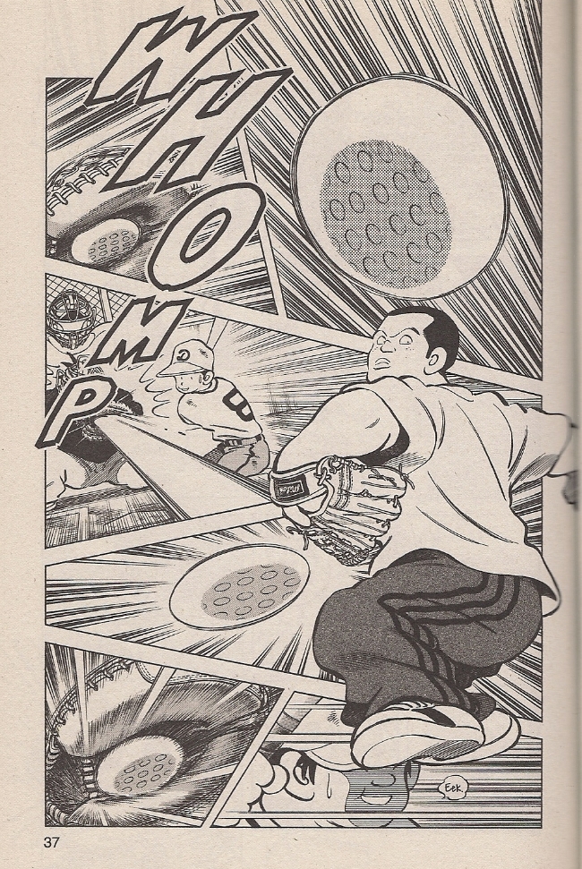
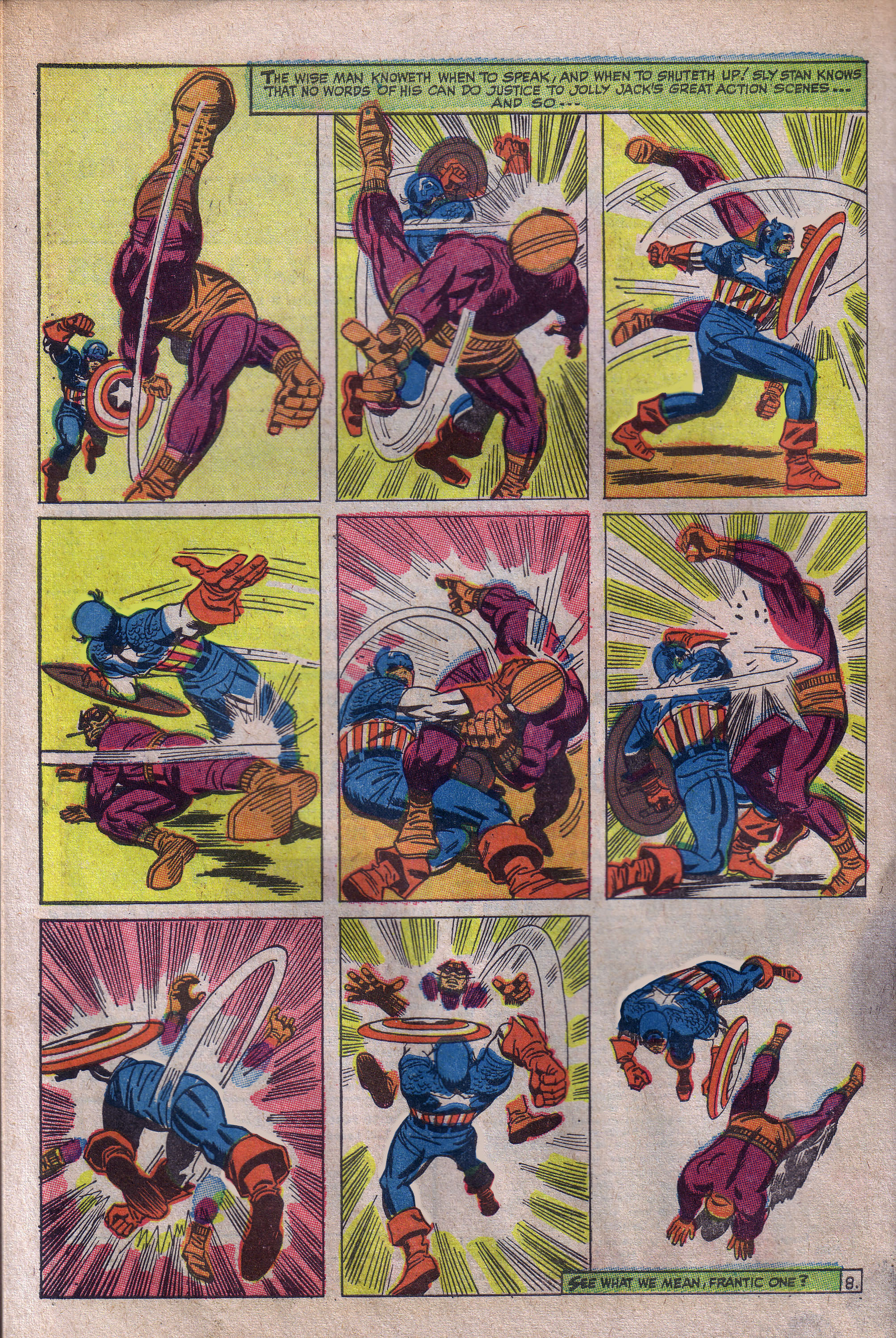
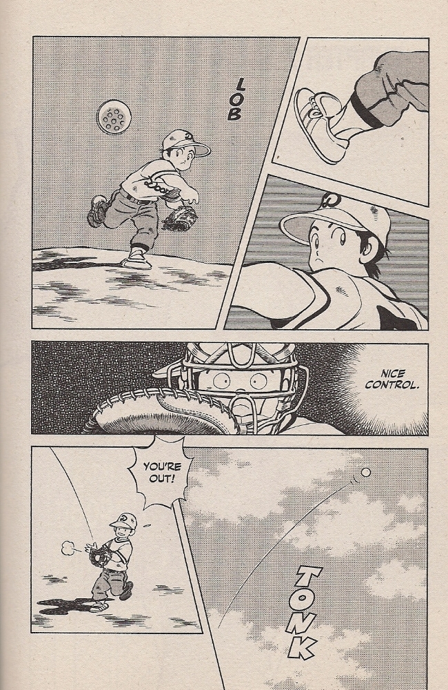
Likewise, though, you’re aware that the speed-lined sports action pictured above is not the essence of Adachi’s comics, though he is nonetheless adept at the stuff; I like how the tense, intent figure to the right dominates the page so as to actually upset the act of reading, his limbs barging into adjoining panels so that they function less as sequence than collage, balls and rays and all manner of expressive fury exploding from his form while the rest of the space depicts time-displaced moments of accordant havoc.

That’s all pretty great, but this is a bit more Adachi’s style:

CrossSpy

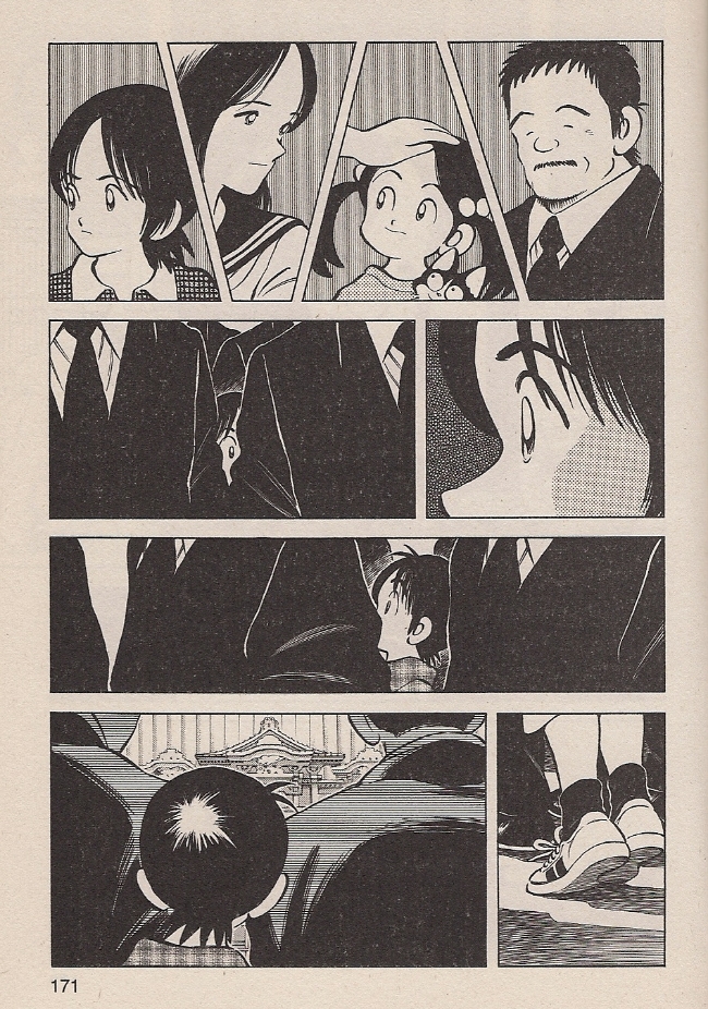
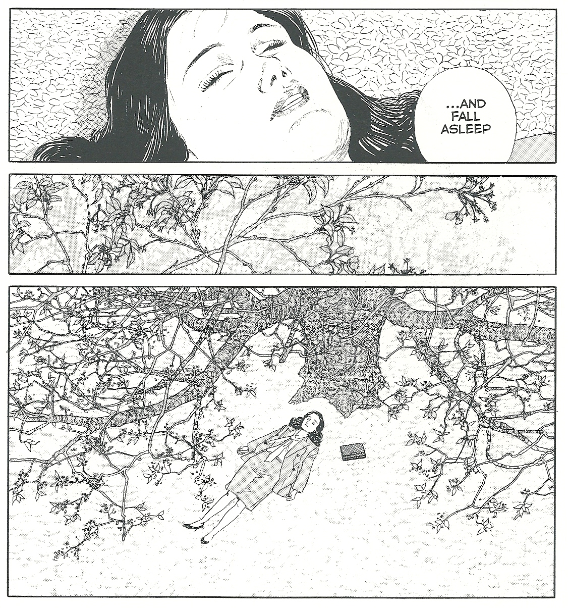
A young girl has drowned unexpectedly. The top tier depicts her immediate family, supporting characters all, their personae summarized deftly through expression and body language. Below, series protagonist Ko, at this point only in fifth grade, searches through a forest of proper adult attire to understand what’s going on: that his dear close friend is gone for good.

One chapter later:

CrossCry

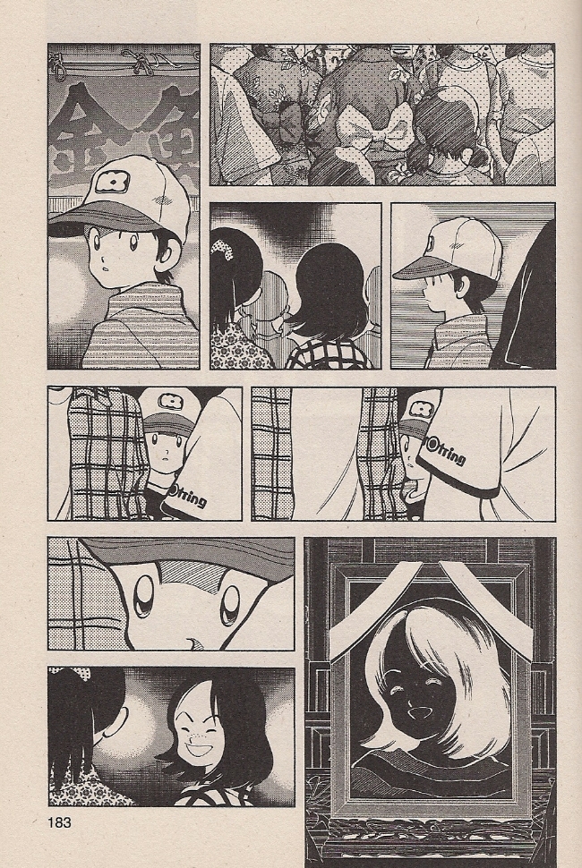
For much of the series up until this point (note the pg. 183), Ko has been depicted as a traditionally callow shonen, undisciplined but unarguably full of guts and determination and raw sporting talent. Now, faced with a serious tragedy, Adachi suddenly and effectively shows how he is also a child, only very slowly comprehending the permanence of death. With expert subtlety, Adachi reprises a visual motif from the previous chapter’s memorial service, again catching Ko peering through adult bodies, mistaking a nearby girl for his friend. It is made plain that she is not coming back, and by this I mean it’s made plain to us; it takes a few more pages for Ko himself to understand what he must do, but narratively, subconsciously, Adachi reveals the hard cosmic facts, through pure cartooning.

That’s nice, huh? I liked that. Here’s another protagonist, the dead girl’s sister:

CrossPants

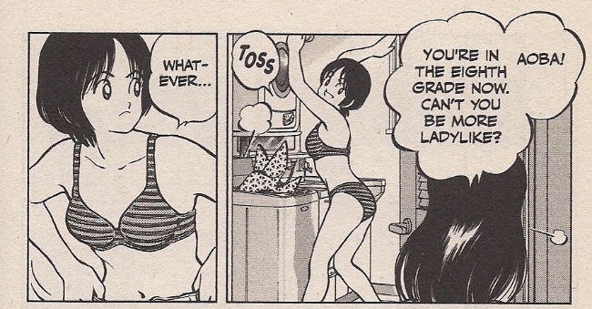
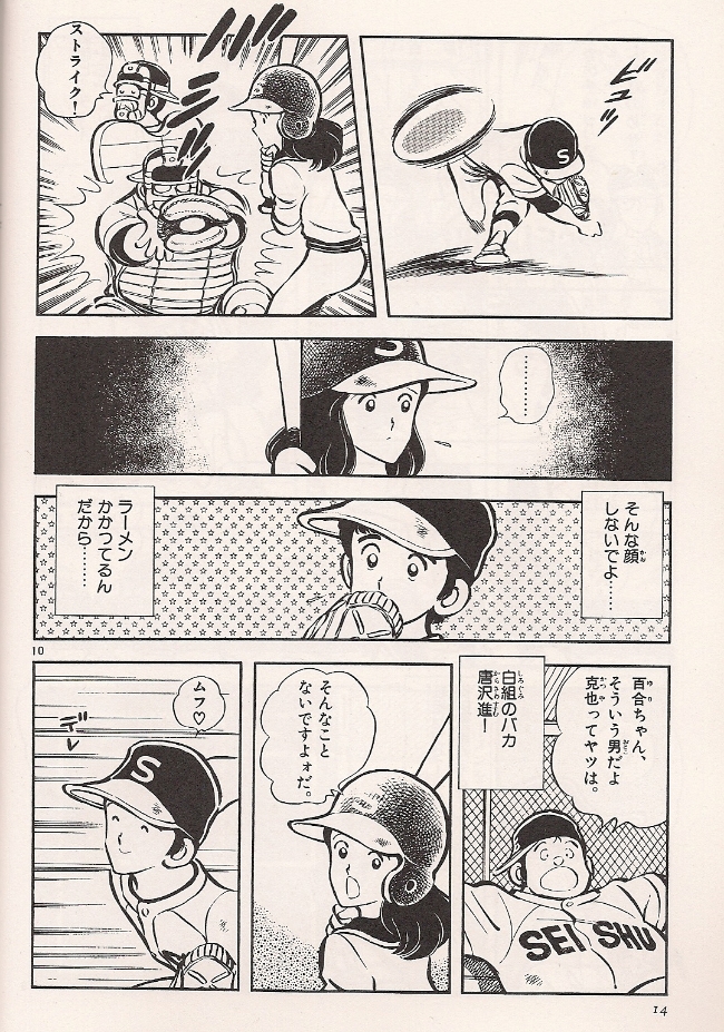
Ha ha, yes, it’s shonen manga: time to focus on the eighth grade panties. And, I know, I know – this is one page, out of context. Adachi has, in fact, set up an entire ongoing theme of curious sexuality for his now-teenaged cast, introducing Older Ko’s less childlike disposition by having him gaze wide-eyed upon schoolgirl thighs from a few escalator steps down. Later there’s a scene where tomboyish Aoba whips a dirty shirt off right in front of him, and, weeell, that’s kind of the issue here, because that would be an entirely separate laundry scene, just one chapter away from the one pictured above, presented with no especial character insight behind it. Then *another* chapter’s title page shows the girl posing in cutoffs and a sports bra, joined two chapters later by a critical panty flash. Again, it’s all basically apropos for the overheated atmosphere of boy-girl interactions at a certain age, but after a while it gets to feel like restatement to the point of inadvertently revealing something else.

My guess? Industry. Adachi is an entertainer, having worked skillfully for a variety of ‘mainstream’ manga publications — generally from Shogakukan — since 1970. He’s worked in shonen, shojo and seinen forums, with Cross Game specifically positioned in a magazine meant to appeal (though not exclusively cater) to male readers around Ko’s age. In this context, underdressed images of a likewise-aged female peer make some economic sense; notorious lolicon progenitor Hideo Azuma, in his autobiographical Disappearance Diary, depicts himself ordered by a Shogakukan editor to insert fan service nudity into his own Weekly Shonen Sunday work circa 1969, roughly around the time Adachi was honing his skills as a studio assistant.

But we don’t need history to sense the finger of industry upon the aesthetic pulse. After all, this is a speculative comment.

CrossRun

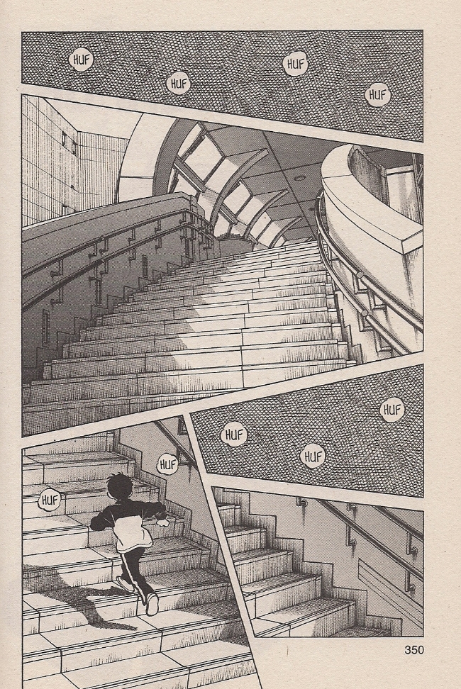
I like this page a lot. The curling stairs bordered by small hits of first-person sensation — crosshatching as the insides of your eyelids — ably convey the disorienting sensation of running unto exhaustion. It reminds me a bit of an establishing image of looming, intimidating competition architecture from Adachi’s Rough, a 1987-89 swimming saga:

CrossRough

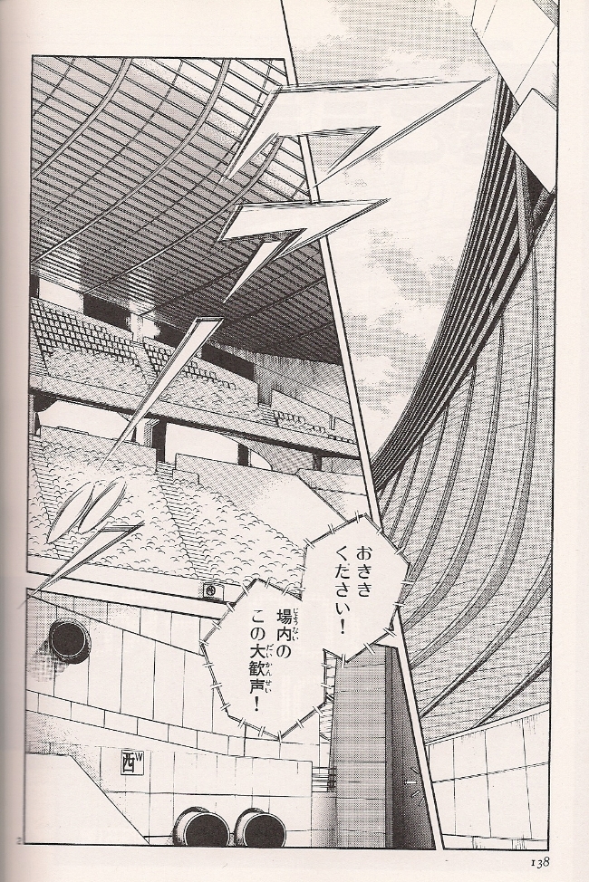
That is a damn scary stadium. And yet, I don’t think I’m alone in looking at pages like these and thinking “well, they’re good, but are they the creator’s pages?” Which is to say, aren’t essentially photographic backgrounds like these generally the province of a studio assistant? Is that even an important distinction to make?

A few years ago, Derik Badman observed that Adachi’s series tend to share common traits, including similar-looking characters. I’d go a bit further and term Adachi’s entire style as remarkably consistent over the past three decades. Here’s a page from Nine, serialized 1978-80, the baseball manga by which the artist made his solo longform debut:

CrossNine

All of the Japanese-language images I’m posting come from a 2010 Shogakukan sampler released in honor of Adachi’s 40th anniversary as a professional mangaka. Admittedly, I think some effort was made to have the art appear more consistent, in that his first eight professional years are omitted entirely and the sample from Nine lacks the ’70s brushiness of some other pages from the series. Still, you can see how the character designs are only slightly thinner and sprightlier.

Now let’s try another baseball series, Adachi’s 1981-86 megahit Touch:

CrossTouch

And hell, we might as well throw in the mighty H2, 1992-99:

CrossH

Again, there is some variation in the character drawings, which are typically the sole province of the series’ creator, even on deadline-tight, assistant-stuffed weekly series like these three, all of them Shonen Sunday. But the crucial difference to me — and I readily admit this isn’t entirely discernible from the small samples I’ve provided, in that the true Adachi experience, to my mind, demands heroic consumption — is how both of the latter pages draw considerably on either blankets of empty space sitting behind the character art or (in H2) photographic-style images lacking any character art whatsoever. This approach is absolutely essential to Adachi’s art.

Getting back to Cross Game, let’s take a series of pages, in sequence.

CrossHit1

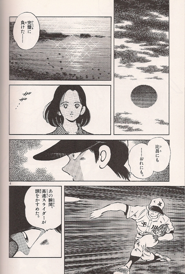
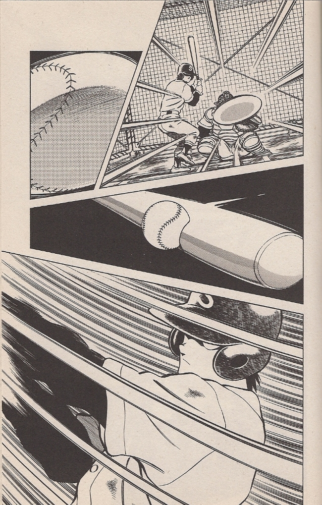
Typically paced windup action, concluding with a startling snap from the distorted speedball in panel #4 to eerie stillness in panel #5, like a bullet paused ripping through an apple. It doesn’t appear to be a photo-drawn image, but it stands in stark contrast to the cartoon stylization just above. It is the point of impact drafted into service as a wholesale shift in tone.

CrossHit2

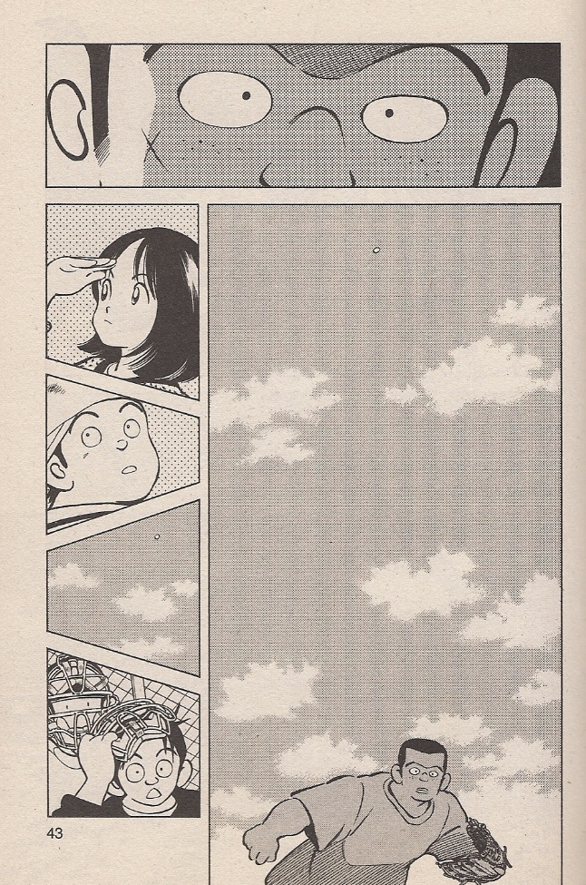
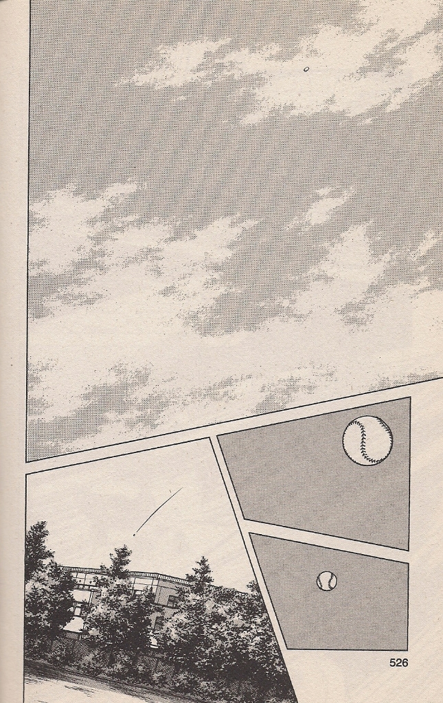
We hear nothing, but the character up top can see it happen. Considerable speed is conveyed by the panel directly below, showing the ball very far away, while the character from panel #1 has hardly moved. Indeed, his arm has yet to relax from the pitch. There is meaning to everything. At the far left, characters look around, actively, bringing us back to mobile action.

CrossHit3

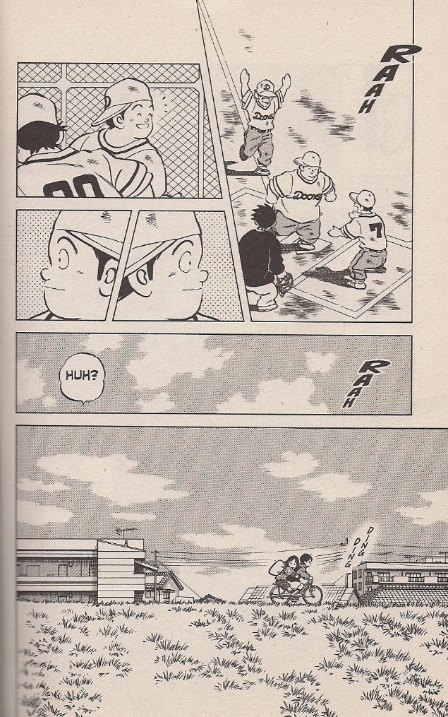
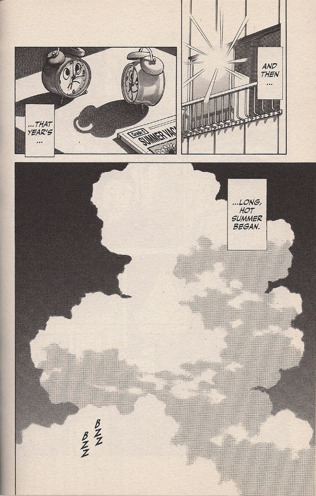
Then, halfway through the third page, the image of the sky repeats to again suggest tremendous speed, this time in a joking manner, as Ko and his not-long-for-this-world sweetheart escape the celebration.

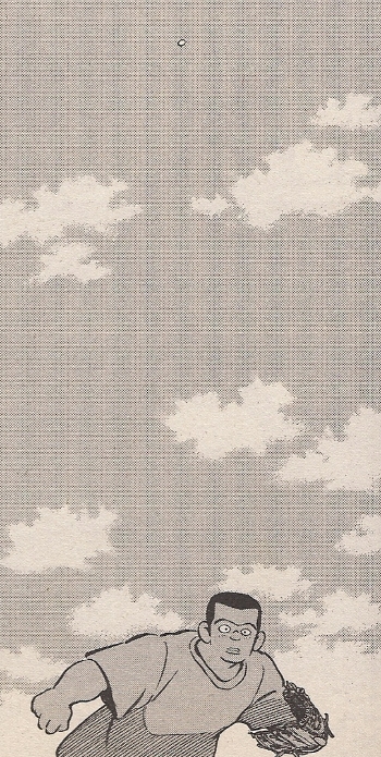
Truth be told, though, I see that big sky as representative of a second kind of speed.

CrossHitClose

They never do scan well, those minute patterns of screentone. Probably digital. The last time I wrote about Adachi, Andrew White, cartoonist and Adachi expert, suggested that the artist’s ‘extraneous’ panels — the sky, nature, laundry, etc. — are “at least in part motivated by practical concerns,” which is to say that space on every page can thus be easily delegated to studio assistants, who would need only training at mechanical tasks to complete their work. This certainly fits in with my understanding of the mechanics of weekly manga production; logically, a man over the age of 50 simply does not produce 17 thick volumes of comics in under five years without considerable backup.

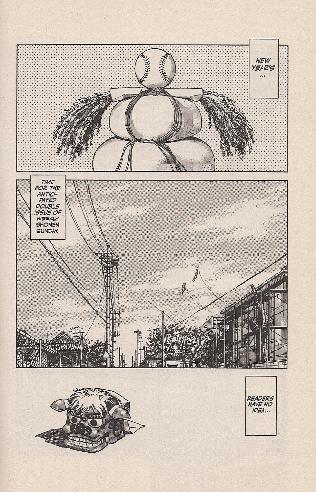
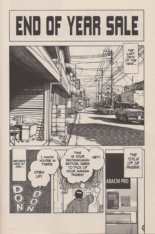
Let’s return to Adachi Pro. I won’t make you scroll up.

CrossStudio

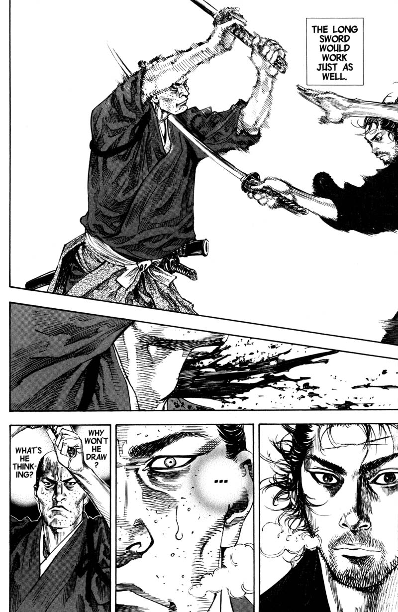
What are we really looking at?

Panel #1 is all letters; I don’t have an untranslated edition handy, but I presume the original was nothing but Japanese characters. Panel #2 is urban scenery, very likely copied from photo reference. Panel #3 is the same, perhaps taken from a shot of the handsome Adachi Pro studio door. Panel #4 is the only area of the page to depict a character, helpfully shown from behind, so as to require nothing but a basic outline of a human form. Panel #5 is a classic: ultra-tight cross-hatching, or maybe a digital pattern or tone, upon which sound effects are plastered. The rest of the page is narrative captions and dialogue bubbles.

In other words, this page — depicting the mad rush of weekly manga serialization — is set up in a way that it could potentially be composed entirely by studio hands, insofar as every piece of it represents some mechanical task that can potentially be delegated so as to allow the artist’s attentions to focus elsewhere. I’m not privy to Adachi’s intent, of course, but it seems in keeping with his sense of humor to keep his own hands largely off the page while complaining about how little time he has to finish his pages. ‘Readers have no idea’ indeed!

This leads the thoughtful (or obsessive-compulsive) critic into a bog of attribution. Why, then, should a page ever be deemed the work of ‘Mitsuru Adachi’ and not ‘miscellaneous Adachi Pro employees,’ when it is realistically more the labor of the latter than the former? I understand, of course, Takao Saito’s analogy of the industrial comics artist-as-movie director, but I think something more fundamental is at work in my American mindset.

CrossAxe

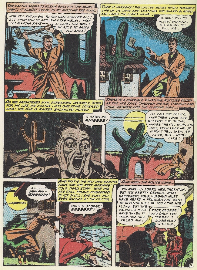
Here is a page from Green Horror, a 1954 horror comic about an axe-throwing cactus that’s in love with its owner. Needless to say, it’s been beloved by generations, panel #3 is probably the apex of the comics medium (“It hates me! AIIIEEEE!”) and the cactus would definitely make for a great baseball pitcher. The story has most recently been presented in lovingly restored form in the Fantagraphics collection Four Color Fear: Forgotten Horror Comics of the 1950s. The editor, Greg Sadowski, has made sure to properly credit the tale to the “Iger studio,” a comics packager of the day, although he and Editorial Consultant John Benson do at least attribute the plot direction (and potentially the script entire) to Ruth Roche, the studio’s script editor.

It’s important to do this, to clarify the roles involved, because the history of North American comics is one of exploitation, of publishers refusing artists benefits, among them sometimes the credit for their labor, and holding perpetual ownership over their creations – indeed, per the work for hire concept, annihilating them as the legal author. As a result, the abuses of the past weigh heavily on the minds of practitioners and critics. The notion of “creator’s rights,” then, became inseparable from the idea for credit. Pencillers are credited, inkers and credited, colorists are credited – arguments rage over credits in billion-dollar superhero movies. Only the most inexperienced of studio hands go without credit, as do friends helping an artist out on a deadline. Moreover, artist substitutions in long-running work-for-hire American comic books do not involve anybody hewing to a foundational visual approach; it is a wholesale substitution of one style for another, because every hand on the page deserves its own spotlight. Pity the historical standing of the damned editor who had Jack Kirby’s Superman heads replaced!

Adachi is more enduringly popular than the biggest of the pop comics artists from North America, though there’s probably been many dozens of hands on his pages. But also, his development for what’s now approaching half a century has been free of the particular abuses that mark the development of American comic books. An editor can’t hire somebody to replace all of his character heads, because he is fundamentally in control. An editor can only reject him and his project. We might suggest a comparison to a popular singer, surrounded with producers, session musicians, stylists, backup singers and other entities orbiting him.

Or, you know – movie directors, corporate heads. Baseball players.

CrossControl

I will now expand on a suggestion made by Sean Michael Robinson at this very website: that baseball analogizes to making comics.

It’s hard to escape the idea that when Adachi is writing about baseball, he’s also writing about making comics – about the thrill of watching one’s self improve, of pushing, of hitting a barrier only to break through to the challenge previously unseen. Aiming for the top. The sweet satisfaction of an aptitude well-developed, of a lifetime of skill coming to bear on a single moment.

A team, though, eight around a star, a draw: the protagonist. Skill and drive and guts and control and rock-ribbed American-style individualism can take you far, but in some games you need a potentially motley assortment of teammates to cover the field. If Adachi’s comic is stocked with self-reference, then it’s fitting that baseball itself matches up with the process by which the comic is made.

CrossSmash1

CrossSmash2

More importantly, though, this deployment of assistance on a breakneck weekly comics schedule has formed the very heart of Adachi’s work on Cross Game, and maybe his art entire. Chapters are typically more like vignettes, tracking a certain incident or revealing some character trait seemingly without concern for suspenseful plotting. It’s a very straightforward story, yes, sentimental and at times distractingly silly, and never especially far away from the genre tropes that inevitably guide the eye of the die-hard populist, if only to know from where to veer away at the right moment. That doesn’t really matter, not to my reading, because Adachi’s art moves so well, pulling the reader gracefully through waves of dialogue and ‘silence,’ interaction and environment, drawings and photographs, intimacy and enormity.

David Welsh is right: the mono no aware all but wafts up from any given spread in a fine mist. The interplay of self-evidently handmade character drawings are so often juxtaposed against realist, photographic, miscellaneous certainty, that it becomes by accident a procedural self-reference: a showcase for the delicacy of humanness before greater and older things. From this, the early chapters of Cross Game, when the characters are little, becomes a striking thing indeed on a second reading, because Adachi so blatantly foreshadows the death of his tiny heroine from the constant interjection of looming skies and big bodies of water – time becoming threatening, the world something that swallows you up exquisitely, horrible and lovely. Summer hits like a mushroom cloud.

CrossBoom

In this way, Adachi has fused pragmatism and aesthetics into something unique, a comics art that seems to belong in the hazardous environment of weekly serialization. Is this the key to his longevity? Eh, that’s probably got something to do with characters, plot, romance, sports – you know.

But to me it’s the unity that attracts. Not the Adachi talking on the page, but communicating through it. Yes! In spite of all the transparencies I’ve so dubiously divined, I do hear Adachi himself in Cross Game, a singular presence speaking from the work of many like an MVP hoisting himself up to the podium. He says Osamu Tezuka is dead, and one day I’ll be the same. If my baseball players look alike, it’s only from being young to grow old. This art will outlive us all, and this architecture is bigger than me, but I know its ins and outs. He’s a pro, Adachi. He’s not doing this for his health.

CrossNew

Best Online Comics Criticism 2012 – The Final List

Late is better than never. Presumably.

The truth is that I almost chucked this whole thing into the trash heap because of a number of last minute exits from the voting process.  I lost 3 judges in the early months of 2013 but, thankfully, Jacob Canfield stepped in at the last minute to give this year’s judging an extra voice and hopefully more diversity in taste. So diverse in fact that there was very little agreement as to which articles should make it to the final list in the initial voting.

The jurors this year were Jacob Canfield, Ken Parille, Caroline Small, and myself.

Looking back on the final list for 2010, I have to say that, in general, I’m happier with the final selection this year.  Part of this is no doubt due to the fact that this is the first year I’m actually participating in the voting (while restricting the number of votes I actually use). The voting process for 2011 was a wash but my personal feeling is that 2012 was a better year for comics criticism than 2010. Perhaps readers here will pipe in with their own thoughts.

As for the final list, let me just remind everyone again that there is nothing less dependable than collective taste.

 walking-man-7

Three Votes Received

Craig Fischer – “Taniguchi Blossoms”

Fischer received a vote each for “The Lives of Insects: On Photography and Comics” and “Devils and Machines: On Jonah Hex and All Star Western” as well. So the final choice here is a bit of a compromise. Of these three articles, I would say that Fischer’s piece on the intersection(s) between photography and comics has the most to say about the art form. It is divided into 3 sections, moving from traditional photo comics, to the synthesis of both art forms and hence to the photo comic as “found” object (hinging on the indefinability of comics). I have little little doubt it was the most poorly received of the three in view of its intellectual content and semi-obscure sources.

“Taniguchi Blossoms” is a close and passionate reading of one of Jiro Taniguchi best comics, The Walking Man. The pleasurable emotions Fischer derived from that manga are communicated with a deft touch, though I will say that I disagree with his concluding comments where he cites Taniguchi’s A Zoo in Winter as another example of “the frisson between the perfection of [Taniguchi’s] diagrammatic art and the pressed by percolating emotion of the characters.” That latter manga has an obviousness and predictability which I associate with pot boiler Japanese romances.

 steinberg-newyorker

Matthias Wivel – “New Yorker Cartoons: A Legacy of Mediocrity”

Wivel also received a vote for his article, “Donald Duck: Lost in the Andes.” The Barks-Donald Duck essay is a detailed run down of the comics being reprinted, giving historical background and story detail, before throwing light on past editorializing and the issue of recoloring.

The New Yorker article seems to be the more interesting selection, not least for the thoroughness of its negative criticism. It probably helps that I personally find The New Yorker to be a bright shining repository of shallow cartooning (with the usual exceptions). The publication targeted is certainly august, pays well, and is seen by many as the holy grail of paid cartooning work. It has attracted very little cogent negativity over the years.  The article is a welcome corrective.


Two Votes Received

Corey Creekmur – “Remembering Locas

This was part of a Locas roundtable in early 2012. The title is self-explanatory and takes in the long tradition of continuity and fan memory in comics with special emphasis on the intricacies of this mechanism in Locas. Creekmur extends this act of remembrance to all aspects of the work: the publisher-gods; the demands on Jaime’s readers; the action of memory and time on the characters; the essence of nostalgia in Locas; the purposeful and inescapable recollections on the part of the artist.


Heather Love – “The Mom Problem”

This is a lengthy article at Public Books about Alison Bechdel’s Are You My Mother?  I think it is safe to say that of the dozens of articles written about that comic in 2012, this is one of the better ones, providing basic background information before moving on to more detailed analysis. The focus here is less on Bechdel’s command of comic language but the Freudian aspects of Bechdel’s relationships and the structural importance Donald Winnicott’s work plays in the comic.

The article is a useful example of the dichotomy between comic criticism written for an intellectually serious site meant for general readers and that for a specialist comics site. While the latter sites often contain a mixture of traditional literary and more comic-based readings, it is only in recent years that more extensive, less technical reviews have appeared in the other type of publication.


Sean Rogers – “Flex Mentallo and the Morrison Problem”

Rogers is one of the best new(-ish) writers that the editors of TCJ.com have decided to employ and his article on Grant Morrison probably his most discussed piece of comics criticism. Bad Morrison (of which there is plenty) is certainly all too easily maligned, but what of the more “canonical” works (Animal Man, Doom Patrol, All-Star Superman etc.) For Rogers, the problems with Flex Mentallo are representative of a much deeper rot and Morrison’s soulless insularity.


Peter Wilkins – “Pluto: Robots and Aesthetic Experience”

This article was cited by Caro as “probably” being her favorite. The title is once again self-explanatory.  The article succinctly ponders the nature of humanity, intelligence, and the aesthetic imperative. It ends with an insoluble question concerning the transaction between violence and art.

_______

A short comment on a notable omission.

2012 was probably the best year on record for TCJ.com in terms of comics criticism so it’s a bit strange that so few pieces managed to get enough votes to pull through to the final list. Part of this has to do with the fact many of the more impressive critical endeavors at TCJ.com this year were the result of accretion and accumulation.  I would say that the best writing on Chris Ware’s Building Stories in 2012 was probably at the roundtable at TCJ.com. There was a more superficial blessing to be had as well. In contrast to many of the mainstream reviewers, most of the writers eschewed boosterism while remaining overwhelmingly positive. For this small mercy, I am grateful.

Articles at TCJ.com which received a single vote include Joshua Glen on “The Pathological Culture of Dal Tokyo“, Glen Gold on the Hand of Fire roundtable, Jeet Heer on Crumb, Ryan Holmberg on Tezuka Osamu, Dan Nadel on Born Again,  Nicole Rudick on Frank Santoro’s Pompeii, and Dash Shaw on Jeffrey Brown’s Cat Comics.

Of these, I would single out Ryan Holmberg’s articles on manga at TCJ.com for special mention. His work follows in the long line of comics historical scholarship which has been the primary mode of engagement for much of the history of comics criticism. The exception in this case being that the subjects being discussed—vintage manga—have never had a “popular voice” in the English language.

Most of the judges won’t have time to write about their choices this year so I’ll list one other writer who was considered during the voting process. Two articles by Nicolas Labarre found favor with one of the judges. One on City of Glass at Comics Forum and the other on Art and Illusion in Blutch’s Mitchum at The Comics Grid.
_____
Update: Judge Jacob Canfield discusses his selections here.


Comics and Music Roundtable — Index

We’re going to be running a roundtable on comics and music over the next couple of weeks. This will serve as an index of posts in chronological order.
 

Bert Stabler, “Re(Dis)Membering Pushead, The Cheerful Blasphemer”

Craig Fischer, “Poster Boy”

Brian Cremins, “Gil Kane, Memory Drawing, and Bob Dylan’s Self-Portrait

Betsy Phillips, “A Theory of Why the Two Iron Men Became One”

Qiana Whitted, “Sound and Silence in the Jim Crow South”

Noah Berlatsky, “The Unheard Peanuts”

Kailyn Kent, “Phantom Music”

Marc Sobel, “A Review of Reinhard Kleist’s Johnny Cash: I See a Darkness

Michael Arthur, “Non-Canonical”

Ng Suat Tong, “Opera As Drama As Comics”

Chris Gavaler, “Top 5 Superman Songs of All Time”

Noah Berlatsky, “Klingklang Drawing”

Ng Suat Tong, “The Freewheelin’ Daredevil”

Subdee, “Phonogram 2: The Breakfast Club”

Russ Maheras, “Gene Simmons and Kiss: Channeling One’s Inner Superhero”

Noah Berlatsky,, “Presence”

Domingos Isabelinho, “Pamplemoussi by Geneviève Castrée”

Sean Michael Robinson, “Music or Comics, or Making a Joyful Noise”
 

591px-Bosch,_Hieronymus_-_The_Garden_of_Earthly_Delights,_right_panel_-_Detail_musical_instruments_(left)


Jack Kirby and the Visual Logic of Superheroes

Stan the Man

Part 1: What Is A Fight Scene?

Fighting is to superhero comics what fucking is to pornography, or singing to musicals: the raison d’etre, the sine qua non, the whole kit and kaboodle. It’s why skeevy guys creep around in trenchcoats with a box of tissues, bottle of lube, and a very special life-sized doll named Candy; or why other people watch porn or musicals.

All three genres demand that character, motivation, theme, incident and conflict be expressed in distinctive forms. In musicals, it’s song; in porn, it’s, well duh; and in superhero comics, intra- and inter-personal conflict above all else must be expressed and resolved through physical conflict. In other words: the fight scene.

Few cartoonists have understood this more than Jack Kirby, whose superhero comics, especially from the 1960s and onwards, are positively drenched with fight scenes. We can see this by comparing Kirby’s 1960s work for Marvel with some roughly contemporaneous superhero comics published by Marvel’s chief competitor, DC. Take, for instance, the Superman comics produced by Curt Swan, Kurt Schaffenberger, Wayne Boring and others, under the tyrannical editorship of Mort Weisinger. There are vanishingly few fight scenes in these comics; Superman himself rarely gets to punch anything, which makes a certain kind of sense — since he is, after all, essentially invulnerable and nearly omnipotent, how could he possibly get into a fight that lasted more than three panels?

Panel one: bank robbers running out of Metropolis First.

Panel two: Superman swooping down to punch them into submission.

Panel three: Metropolis’ streetsweepers and janitors scrubbing splatters of brain and flesh off the street.(1)

It’s surely no coincidence that, of Superman’s cast of recurring villains, only a handful are memorable, and of those, two are defined entirely by their intellect — evil scientist genius Lex Luthor and evil alien genius Brainiac (!).

By contrast, the superpowers of many of Kirby’s chief 1960s characters are  desultory, a thin excuse to motivate fighting, fighting, and more fighting. Consider: Thor is a strong guy with a hammer that he uses to beat the crap out of people. Captain America is just a normal guy (more or less), with a shield that he uses to beat the crap out of people (2). The Hulk is a strong guy with a, well, he just uses his own fists to beat the crap out of people. The  Hulk’s whole power just is beating the crap out of people.

But we can say a little more about the visual logic of superhero comics than just “there is one”, and we can do so by thinking about the structure of a fight scene as abstractly and generally as possible. For what, exactly, is a fight scene? A scene with a fight, of course, but what does that actually mean? At the most abstract level, we can conceptualise a fight scene — in the narrow genre of superheroes, or any other kind of comic — as a sequence of aggressive or defensive actions and their effects — more precisely, a fight scene is

a sequence of events caused by the aggressive and defensive (and other) actions of two or more combatants

This needs some unpacking, so I’ll take you through it, in reverse order.

of two or more combatants

250px-Brave_bold_28

the Justice League battle Starro the giant starfish, from Brave and Bold #28 by Mike Sekowsky


The participants in a fight scene can be people, but they can also be animals, robots, zombies or anything else that can act — that can take action of one kind or another. In the simplest case, we have just two participants fighting, but superhero fight scenes — particularly so-called “team books” like The Avengers or Justice League of America — routinely feature three or more combatants. Where there are more than two participants, they can be distributed in any number of ways; that is to say, it could be one versus two, one versus three, two versus two, two versus one versus one… In principle there is no upper limit to how many combatants can participate in a fight scene, but in practice there are vague limits imposed by constraints like the size of a page, the quality of reproduction in printing, and the reader’s (and the artist’s!) patience.

events caused by the aggressive and defensive (and other) actions

In a fight scene, at least one participant is trying to damage, somehow or other, at least one other participant, who may be trying to damage the other in turn, or to flee, or merely to avoid damage, or to do any number of other things (but usually one of those three — fight back, flee, or avoid damage). At each stage, what happens depends on the actions of both combatants — what each of them is doing.

When somebody is trying to damage somebody else, let’s label the respective parties Attacker and Victim. In a fight scene, the Attacker makes an attack on the Victim — that is, Attacker takes some kind of aggressive action against Victim, such as throwing a punch, shooting a gun, firing a laser… The Victim also does something — dodges, projects a force-field, just stands there… What happens to Victim depends both on what Attacker has tried to do and what Victim tries to do (where doing nothing counts as a kind of doing something).

If Victim tries to dodge, then Attacker’s kick might miss. If Victim throws up her shield in time, Attacker’s laser might bounce off. If Victim does nothing to defend himself (perhaps he doesn’t know he is under attack, or perhaps he tries to retaliate without trying to avoid Attacker’s attack), then the attack might make contact. But even when an attack “lands”, what  that actually means will depend, again, on the nature of Attacker’s attack and on what Victim is like. If Attacker has fired a bullet that hits Victim, it will have very different effects depending on whether or not Victim is wearing, say, a Kevlar vest.

a sequence

Fight scenes typically involve more than one thing happening — Batman punches the Joker, who then squirts back with acid from his trick flower, which Batman dodges while kicking out at the Joker, who topples… This is the prototypical kind of fight scene, in which two participants alternate between the roles of Attacker and Victim. First A attacks B, then B attacks A, then…

In principle, each action taken by Attacker and Victim could be depicted in their own panel, but usually an artist will collapse the panels (3) to one of four patterns:

1) Attack-Effect Dyad. Two panels, the first showing Attacker’s attack, and the second showing Victim’s action and the attack’s effect on him — e.g. panel one shows Attacker firing a gun at Victim, and panel two shows Victim successfully jumping out of the way so that the bullet whizzes past.

2) Attack Monad. One panel showing Attacker’s attack, with the resulting effect left off-panel, to be inferred by the reader as following this panel  — e.g. we see Attacker firing a gun at Victim, who may or may not be shown (as yet unaffected by the attack) in the same panel.

3) Effect Monad. One panel showing the effect on Victim, with the initiating attack by the Attacker left off-panel, to be inferred by the reader as occurring before this panel — e.g. we see the Victim successfully dodging the bullet, which we infer to have been fired by Attacker immediately beforehand.

4) Attack-Effect Monad. One panel showing both Attacker’s and Victim’s actions, and the resulting effect on Victim — e.g. we see Attacker’s punch making contact with Victim within a single panel.

Naturally, an artist can use any combination of these patterns over the course of a fight scene, sometimes using one pattern and sometimes another. I’d guess — but I don’t have any figures to back this up — that the most common pattern, at least in American comics, is the Attack-Effect Monad, especially with fight scenes involving direct melee between combatants. Most fight scenes simply don’t parse action finely enough to differentiate between the moment when Attacker throws (say) her fist out in front of her at Victim and the moment when her fist actually makes contact with Victim. Instead, the easiest solution for most fight scenes is just to show everything all together.

As with the number of participants, there is no upper limit to how long a fight scene can take. The Cerebus volume Reads has a remarkable fight sequence lasting for dozens of pages; Takehiko Inoue’s samurai manga Vagabond notoriously teases fight scenes out for hundreds of pages (although, to be fair, much of that does not involve actual fighting so much as flashbacks or other representations of the combatants’ streams of thought).

vagabond-04

Kirby’s fight scenes can sprawl as long as an entire issue of twenty pages or more, although usually there will be some interruptions, such as a crosscut to a separate scene elsewhere. A fine example is the fight between Thor and the Absorbing Man in the main stories of  Journey Into Mystery #121-#123. The entire sixteen pages of #121’s main story is given over to the fight, with a brief interruption in panels 3-6 on page 5 and panels 1-2 on page 6, in which we cut to Asgard and Loki (who has orchestrated the fight). The fight then continues in #122 from page 1 to the second-last panel of page 3, where we cut again to Loki who magically transports the Absorbing Man to Asgard. There the Absorbing Man fights basically the whole of Asgard, and eventually Thor again, until roughly page 10 of #123 (4).

JIM122_AbsorbingMan

As an illustration of this formal structure, let’s do a quick close-read of another Kirby fight scene, and specifically a single, famous page from Tales of Suspense #85, inked by Frank Giacoia and lettered by Sam Rosen, with two captions by Stan Lee. (The comic doesn’t credit a colourist, and the listing at comics.org leaves it unknown). In this sequence we see a fight scene between Captain America and Batroc the Leaper (or, to give him the pantomime-French title favoured by Stan Lee and his later epigones, Batroc zee Leapair), which breaks down as follows:

cap v batroc

Panel 1: First panel in an Attack-Effect Dyad. Batroc and Captain America are, each of them, both Attacker and Victim.

Panel 2: Second panel in the Attack-Effect Dyad, showing the effects of their respective attacks in panel 1. Again, each character is playing the role of both Attacker and Victim.

Panel 3: Attack-Effect Monad. Captain America is still Attacker but no longer Victim, while Batroc is now just Victim. We see Captain America’s attack and its effect on Batroc.

Panel 4: Attack-Effect Monad. Roles are reversed, with Batroc now Attacker and Captain America Victim.

Panel 5: Attack-Effect Monad. Roles reversed again, Captain America attacking and striking Batroc.

Panels 6-8: As with panel 5.

Panel 9: A breather — no attacks.

So I think this is a helpful way to think about the formal structure of a fight scene, in any genre: it’s a sequence of events caused by the aggressive and defensive (and other) actions of two or more combatants. But  I really don’t know anything about proper comics theory, so please let me know in comments whether I’ve reinvented the wheel with my formal description of a fight scene above. If anything, I’ve probably reinvented the wheel, only this time it’s square and doesn’t turn very well…

In Part 2 of this essay, I’m going to talk about how this structure constrains the imaginative space of superhero comics, using Kirby’s The X-Men as an especially vivid case-study. So, come back next time, true believer, for more hot fucking action the Marvel Way. Excelsior!

ENDNOTES

(1) Although this scene doesn’t occur in any actual Superman comic, it does occur in roughly 98% of post-Watchmen superhero revisionist comics.

(2) Well, Captain America was actually created by Kirby and Joe Simon in 1941. But the 1960s revival was Kirby’s third-longest work in that decade, after Fantastic Four and Thor, so he certainly counts as one of Kirby’s chief characters of that decade.

(3) Just for the sake of convenience, I’m assuming that fight scenes are drawn in a standard panel lay-out, with one moment per panel. Things are a little more complicated when you have panels showing more than one moment in the same space, or ill-defined panels, but the basic idea is the same.

(4) I say “roughly” because it’s debatable whether the fight proper ends there, or three pages later when we see the final result of Odin’s magically expelling both Loki and the Absorbing Man into space. Debatable, but not really debate-worthy, you know?

IMAGE ATTRIBUTION: Stan Lee centerfold from Sean Howe’s tumblr for his book on Marvel. Captain America v. Batroc, credits as above; I took the image from Eddie Quixote’s Campbell’s post “The Literaries”. [Other images grabbed by Noah, who is less careful about documenting these things — so blame him, not Jones.]

Attempting to Answer the Questions Darkest America Doesn’t


images
Bert Williams in blackface.

 
Let me say up front that I really liked Darkest America: Black Minstrelsy from Slavery to Hip-Hop by Yuval Taylor and Jake Austen. It does one very important things you don’t often find in books about American minstrelsy (I’m looking at you, Love & Theft)—it describes what a minstrel show was like in clear and engaging language that conveys some of the charm of the art form without making you feel like you’re drowning in boring overly-academic prose. For that alone, it’s worth reading.

There’s also this really, really nice moment where Taylor and Austen describe Flournoy Miller and Johnny Lee, both black comedians, doing a blackface comedy routine in the movie Stormy Weather. Then they give a whole paragraph to the history of the routine, which Miller had been doing since at least the Twenties. And then the paragraph ends in this: “By the estimation of black comedy historian Mel Watkins, it was as familiar to black audiences as Abbot and Costello’s ‘Who’s on First?’ was to white audiences.” (p. 292) This bit of contextualizing is so amazing—you get the bit (or a bit of the bit), the bit’s history, and then a sense of the bit’s reach.

But I don’t think that Taylor and Austen ever quite satisfactorily address why blackface minstrelsy was so popular among black people—both performers and audiences. They brush up against it in the chapter on the Zulu parade in New Orleans, when they say, “Zulu history has been largely whitewashed, scrubbed clean of its origins in caricature, parody, and stereotype. Instead, blacks paint their faces out of respect for a tradition that, like the rest of the black minstrel tradition, has always been focused on entertaining its audience. For the Zulus, as for many black and white minstrels in the nineteenth century and earlier, blackface simply stands for a very good time.” (p. 106-107).

Tradition and pleasure are strong motivating factors and I wish Taylor and Austen had wrestled more with the implications of this insight. We like a lot of things because they’re familiar and because we find their familiarity pleasurable. I kept waiting for them to make this explicit—black people didn’t/don’t enjoy black blackface minstrelsy or its popular culture descendants because (or only because) they recognize some truth of who they are on stage; it’s pleasurable because they recognize the performance.

Or let’s look at it it from a slightly different angle. In 1993, Alan Jackson took “Mercury Blues” to Number 2 on Billboard’s country chart. It’s a cover of K. C. Douglas’s 1949 song, which is sometimes called “Mercury Blues” and sometimes called “Mercury Boogie.” “Mercury Blues” contains a line, which, in Alan Jackson’s version goes, “gal I love, stole her from a friend, he got lucky stole her back again” and in Douglas’s version goes, “girl I love I stole from a friend, the fool got lucky stole her back again.” But the line also lives in other songs. In Robert Johnson’s “Come on in My Kitchen” (1936) it goes, “the woman I love, took from my best friend, some joker got lucky, stole her back again.” Back in ’31, Skip James, in “Devil Got My Woman,” sings “The woman I love took off for my best friend, but he got lucky, stole her back again.” But it goes back further to at least Ida Cox’s “Worried Mama Blues” back in 1923—“I stole my man from my best friend, I stole my man from my best friend. But she got lucky and stole him back again.”

There’s a real power in recognition. When I learned about this repeated verse, I felt as if some great secret history of America had been revealed to me in a lightning flash, as if I had learned a way pop culture connects through time. It pleases me to recognize those same words in all those very different songs and I trust that at least some of you will be delighted to recognize them too. And it’s not because all of us have experience passing a loved one back and forth with our best friend. We take pleasure in recognizing the familiar bits. Of course, this kind of recognition of familiar bits can also be disturbing. When you know Walt Disney took inspiration from The Jazz Singer when he made “Steamboat Willie,” how do you ever look at Mickey Mouse’s white gloves the same way again?

So, when J.J. Walker makes his entrance, or later, Flavor Flav, isn’t there a delight in recognition—not of that type in the community, but of that type in entertainment?

Which brings me to the thing that I think Taylor and Austen fundamentally misunderstand. It’s up there in the Zulu quote, but they also state it explicitly on the third page of the book, “The minstrel tradition, as practice by whites in blackface, was a fundamentally racist undertaking, neutering a race’s identity by limiting it to a demeaning stereotype. But what Chappelle and other contemporary performers draw upon is the more complicated history of black minstrelsy.”All this is true. But, it misses an important and complicating component of white minstrelsy—a lot of white minstrel performers thought they loved black culture (I say “thought they” because any kind of black culture white men could have observed in the 1800s would have been carefully performed by those black men, because of the incredible danger the black men would have been in had it been misinterpreted).

In Love & Theft: Blackface Minstrelsy and the American Working Class, Eric Lott says that, for these white minstrels, “To wear or even enjoy blackface was literally, for a time, to become black, to inherit the cool, virility, humility, abandon or gaité de coeur that were the prime components of white ideologies of black manhood.” (p. 52) (I don’t want to get sidetracked from my point, but I also feel like it’s important to state explicitly how terrible this belief of white men—that they could know black men through mimicking them—was for black men. It is at the heart of why white men could justify all the terrible things they did to black men. White men believed they knew the secret motivations of black men, because some of the white men, white men believed, had literally been black men briefly through imitation.) And this is the hard thing to accept, but the only thing that makes sense of minstrelsy, both black and white: it is racist and demeaning AND it is about a deep fantasy of how awesome it is to be black. Those things are both true, and, in fact, in a racist society like ours, you rarely have an admission of the latter without the former firmly in play.

Once you get that, the power and attraction of blackface minstrelsy—not just the components of the minstrels show, but the actual wearing of blackface makeup—for black people is obvious. If every single thing in the broader popular culture is either explicitly racist or does not mention black people at all (and is therefore implicitly racist), of course the racist art form premised on white people finding so much value in black culture (even if the value they find is not what black people would have called valuable themselves) is going to be incredibly popular with black people. And is it so hard to imagine the appeal of standing on a stage dressed as the object of desire of people who systemically hate you?

But as easy as it is to see the appeal, it’s also then easy to understand why the most egregiously racist components of black minstrelsy fell out of favor as black people gained control of their own representations in popular culture. After all, it is racist and relies on demeaning stereotypes. Of course, when other, less problematic, representations of black people became available, people preferred them.

Still, for a time, it was incredibly popular, both because the bits were funny, the songs beloved, and the insult of blackface muted by the twisted confession of envy that it represented. Yes, it was racist, but what popular culture wasn’t? Blackface was demeaning, but in the hands of black artists, it was also more than that. Black performers in blackface recognized that the culture portrayed by performers in blackface was black culture (or a fantasy of it)—which meant that culture had value, was something worth looking at, even to the very white people who, when they weren’t sitting in the audience, were denying that black people had any worth.

It’s little wonder, then, that its remnants linger on. Blackface minstrelsy was the popular culture for most people for at least half our country’s existence —where our comedy came from, where we heard and learned our favorite songs, and where a type of fundamental “American” sound in music was codified (including banjos and later the Blues)—and there’s still a lot of cultural resonance. And it’s little wonder that those remnants continue to be a source of controversy and pain—because it was racist and demeaning. That’s the legacy of blackface minstrelsy—a source of great pleasure that still resonates in our time AND a source of great pain, which we are still grappling with.

Monthly Stumblings # 20: Jochen Gerner

Panorama du feu (a view of fire) by Jochen Gerner

Jochen Gerner was a founding member of the OuBaPo (Ouvroir de Bande Dessinée Potentiele – or, the Workshop for Potential Comics, best represented in the US by Matt Madden, Jason Little and Tom Hart). Modeled after the OuLiPo (Ouvroir de Literature Potentielle – workshop for potential literature) created by Raymond Queneau, the OuBaPo aimed to explore new ground for comics using, paradoxically, constraints as a creative motor. The OuBaPo published four books to date (the last one in 2004) all by the dominating force behind the project, Jean-Christophe Menu and L’Association publishing house. Even if engaged in other projects the work of Jochen Gerner is never very far from OuBaPian creative processes.

1


Les Vacances de l’OuBaPo (the vacations of the OuBaPo), Oupus 3, L’Association, October 2000, illustration by Jochen Gerner.

Jochen Gerner views himself as a draftsman who does comics among other things. Represented in France by Anne Barrault Panorama du Feu was part of Jochen Gerner’s second exhibition at said art gallery in 2009 (the first one happened in 2006). The theme of the exhibition was the four elements: earth, air, water, fire. A year later L’Association published Panorama du feu (the “fire” part of the exhibition, of course) in a cardboard box, surrounded by a paper ribbon with the word “Guerre” (war) written on it, containing fifty-one booklets numbered from zero to fifty. Each booklet is the reworking of what’s called in France the “petits formats” (the little formats), cheap, mass art comics imported mainly from the UK (published there by Fleetway) and sold in newsstands from the 1950s (or even earlier) until their decline in sales during the 1980s and disappearance in the early 1990s. The genres included in Panorama du feu are War, of course, but also Western, Espionage, and even a Tarzan look-alike produced in Italy, Akim. In each of these eight page booklets (cover and back cover included; booklet number zero has twelve pages with an introduction by Antoine Sausverd) Jochen Gerner used two creative strategies: (1) the cover was blacked-out with India ink leaving a title formed by expressions found in the book and the name of the collection plus explosions and signs (circles, crosses) in (not so) negative space; (2) the interior retained some didactic essays, advertisements and other paratexts published in the original comic books, plus what Thierry Groensteen called “reduction” in Oupus 1 (L’Association, January 1997): the stories were reduced to four, five or six panels (one per page).

In Panorama du feu Jochen Gerner chose visual rhymes (airplanes or trucks in all the panels, for instance). He also favored more abstract images and close-ups.

1b


Airplanes (in perfect order and in chaos) in booklet # 40 of Panorama du feu, L’Association, September 2010: visual rhymes.

Besides being a non-conceptual reflexion (as Jochen Gerner stressed, saying that his is not a theoretical approach) on violent representations in petit format comics during the Cold War, what I find fascinating in the comic book reductions performed by Jochen Gerner is the contrast between said supposedly entertaining violence and a clear intention to be didactic including in the books many scientific essays. Below there’s an unexpected encounter between something as frivolous as Bettie and Veronica (Archie is here called Robert, by the way) and yet another image of violence. By mixing didacticism and comicality with the violence of war, the violent message was somewhat undermined or, at least, balanced by a variety of things, advertisements included.

Given the fact that Jochen Gerner reduced whole stories to a few panels it’s no surprise that many make little sense letting the reader with the strange sensation that something incomprehensible is going on (cf. below: infra-narrativity).

1c


Betty and Veronica run to join the French war effort during WWII? booklet # 33 of Panorama du feu, L’Association, September 2010: comicality undermines seriousness.

2


Page 38 of TNT en Amérique by Jochen Gerner, L’Ampoule, 2002.

The blacking-out of covers and interior pages (as seen above: a détournement of Hergé’s Tintin en Amérique Tintin in America -, 1946 version) has its roots seven years before. In the above page the word “feu” (fire) appears (twice) and pictographs representing flames and smoke (plus a car and the words “poursuite” – “chase” -, and “route” – “road”) are similar to the covers in Panorama du feu. A look below at Hergé’s page blacked-out by Jochen Gerner in TNT en Amérique helps us to reach interesting conclusions:

3


Page 38 of Tintin in America as published in 1973 by Methuen (originally published in black and white in 1931 /32 and reworked by Hergé in 1946).

Diegetically two things happen in this Tintin page: Tintin escapes a persecution and flees a fire. In the tradition of creating suspense at the end of every odd page Tintin is almost caught by the flames in the last panel. The persecution (by the baddies) is represented in TNT en Amérique by a car and the words “chase” and “road.” In spite of Tintin riding a horse (the stereotype of the American cowboy imposes itself to a formulaic narrative) Jochen Gerner used a car pictogram to update the story. The animals on tiers two and three are almost ignored (the “almost” goes to the star pictograph, a symbol of trouble – emanata would have been more effective, maybe, but who am I to question Jochen Gerner’s choices?, maybe he sees emanata as too blunt a sign?). Most of the attention goes to the fire with an ironic devil chasing the hero: can he be a villain destined to burn in hell’s eternal flames in spite of his virtuous persona?

The general conclusion that we may extract from the TNT en Amérique example is that the two creative tactics described above (blacking-out and reduction) have the exact same result of reducing the deturned story to a skeleton.

4


On the left: page from Courts-circuits géographiques (geographical short-circuits), L’Association, 1997; on the right, the same page as reworked for XX/MMX, L’Association, 2010.

The image above shows, on the left, a page of Jochen Gerner’s autobiographical book Courts-circuits géographiques; the image on the right shows the same page reworked for publication in XX/MMX (an anthology commemorating L’Association’s 20th anniversary). As Jean-Christophe Menu noticed in his thesis La bande dessinée et son double (comics and their double, L’Association, 2011), the evolution from representational (even if caricatural) to ideographical is clear, but even the older page shows a tendency to what Thierry Groensteen called, in Bande dessinée récit et modernité (comics, narrative and modernity, Futuropolis, 1988) “the inventory” (a subset of his concept of the infra-narrative).

5


Malus by Jochen Gerner, Drozophile, 2002. A boon to a Ben-Day fetishist like me.

In Malus, as seen above, a silk-screened comic, Jochen Gerner illustrated real traffic disasters reported in newspapers. A creative tension is caused by the caricatural and schematic drawings depicting tragic events. A distance is created by the inadequate relation between form and content, or, to be more precise, the content isn’t exactly what one would expect given the source material. An ironic Dadaistic distance pervades all of Jochen Gerner’s work, but Malus is the height of this propensity. It shows Gerner’s tendency to explore – and short-circuit; cf. the Betty and Veronica example above – violent undercurrents in the mediasphere. TNT en Amérique lays bare, by reduction, how violent Hergé’s stories really are (TNT being, obviously, a reduction of Tintin’s name and an explosive). The same happens in Panorama du feu.

6


Left: Buck John # 105 (Buck Jones, I guess), Imperia, February, 1958; right: a deturned by black-out Buck John comic (not necessarily # 105, of course), Panorama du feu, L’Association, September 2010.

As we can see below Panorama du feu is a dual object corresponding to its two lives in 2009 (in an art gallery) and 2010 (as a series of fifty one comic books):

7


Up: Panorama du feu as exhibited in Anne Barrault’s gallery, September 2009; down: Panorama du feu as a box containing fifty one booklets, L’Association, September 2010.

In 2009 the fifty books were, as Jochen Gerner put it, like a giant battle ground as seen on a big control panel. Seeing the deturned covers behind glass encased comics come to mind. The act of reading is out of the question. On the other hand L’Association’s edition does almost the opposite, readers have access to the booklets’ content, but the ensemble is lost. Can these two forms of presentation be reconciled? I don’t think so, but one of the best solutions, I think, involved Jochen Gerner. I’m talking about Salons de lecture (Reading Rooms), an exhibition at the La Kunsthalle in Mulhouse:

8


Salons de lecture, La Kunsthalle, Mulhouse, February 3 – April 3, 2011.

In Salons de lecture readers /viewers were invited to sit and read, as we can see above. As I said, reading and viewing can’t be reconciled, but I like this Duchampian solution: it’s a visual arts exhibition because the La Kunsthalle is a place where contemporary art is shown. Plus: there’s the design with different colors for the six rooms available.

Here’s Jochen Gerner’s opinion:

Simply to place the boards adjacent to each other in a linear fashion is like trying to reproduce the phenomenon of reading a book. This can’t be right. But the exhibition Reading Rooms plays effectively with the principle of the book on a flat surface. The effect in this exhibition is almost that of a wall placed horizontally on trestles. The exhibition design and the graphic systems used to mark the placement of the books, plus the captions printed on the table propel these books into another dimension.