Objective, Subjective, Narrative, Clock, and Real: What of Time in Comics?

Inspired by Frank Bramlett’s satisfyingly rich 1/23/14 PencilPanelPage post, “How do Comics Artists use Speech Balloons?” (which is the first in Frank’s promised and promising series on the representation of talk in comics), I, too, have decided to embark on a two- or three-part exploration of a discrete comics element utilizing a theoretical framework with some application to particular comics. My focus is time, and I will use this first part to sketch some of the concepts I will be drawing from, and invite readers to share their insights into how time works in comics that have caught their eye. Five weeks from now, part two will explore a few select panels and pages that—in my opinion—do interesting things with the representation of time.

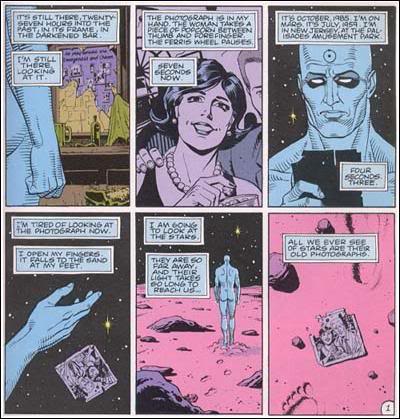
Never yet having engaged in sustained exploration of the representation of time, it has nevertheless often been a component of what I explore when I think about comics. Sometimes it is simply the nifty nature of dual time possible in a panel; consider, for example, a graphic memoir like Fun Home, in which the speech balloons emerge from the drawn child while a narrative voiceover in the captions presents an adult “take” on the scene below. There is also the type of narrative time that gets built as a comics reader moves around a comic, returning to panels on previous pages, picking up threads that were dropped and resumed, or making connections between and amongst instances of action, events, characters (Scott McCloud does justice to this movement in Understanding Comics, of course, as he also brings the gutter into this consideration, reminding us that we continue playing out the scene via imagination each time we hit a gutter, and thus extend narrative time in interesting and highly subjective ways).

Thierry Groensteen’s exploration, in his System of Comics, of reader actions with non-contiguous panels and the work s/he does to connect disparate moments spread through a full-length comic, adds an additional dimension to this expansion of time (yes, and space, which is hard to decouple from time). Via what he terms a system of “arthrology” (the anatomical reference here is to joints and jointedness), the reader collects information from across the comic, interweaving (he uses the term “braiding”) elements large and small to make meaning, and though he does not discuss this primarily in terms of time, can we not see it as a novel challenge to the linear nature of narrative time? If we generally think of readers pulled from first page to last in a linear progression from start of text to end of text, it is both refreshing and liberating to think of the comics reader becoming adroit at stopping and starting time at will, hitting the pause button in a sense, and then rewinding and fast forwarding in a very individual search for meaning and alternate forms of continuity. This can be quite literal: think of the moments you held your finger on a page in anything by Chris Ware, and returned back to an earlier page to tease out a connection…then toggled between them to establish an artificially created, but viable, contiguity between panels that are (no longer) separated by page distance?

In “Duration in Comics,” an engaging article published in the Winter, 2012 (Volume 5, Number 2) issue of European Comic Art, Sebastien Conard and Tom Lambeens bring several concepts of narrative time to comics, attempting to find language to talk about the layering of multiple types of time in both single panels and works as a whole. Conard and Lambeens plumb philosophical concepts of time, such as Henri Bergson’s notion of duration, which refers not to clock time, but rather “…time as felt or experienced, not time as thought or measured.” (96) They consider other forms of subjective time, including Gilles Deleuze’s exploration of how memory alters time (and time memory) (97)—you can apply this both to a character or narrator’s memory as its shapes the showing and telling of events, experiences, etc. as well as to the reader’s memories and their impact on such things as “reading” time, i.e. how long it takes to make one’s way through a given work. Ultimately, Conard and Lambeens are interested in the multiplicity of time in comics—that there are often many different kinds of time operating both objectively (in the panels, pages and words of a comic), and subjectively (in the mind of a reader).

Can you offer a particularly deft representation or enactment of time in a comic, or do you have some thoughts – general or specific—on the topic of time in sequential narrative? I’ll be continuing this thread in part two, and will provide some provocative examples, but I’m eager to hear from others on the subject while I gather this evidence for you.
 

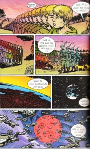
Watchmen1Medium

from Alan Moore and Dave Gibbons’ Watchmen

Is the medieval danse macabre a proto comic book?

Last November I posted the first of what I hoped would be the first of a series on what might be called comics medievalism here on PPP. This post represents the second of the series.

A number of connections can be made between comics and medieval culture, both through analogy and homology, though it is often difficult to establish whether the parallels we spot between comics and medieval culture are the result of coincidental similarity or a traceable historical relationship. Either way, it is certain that comics are a form of cultural production in which traces of medieval cultural forms (heroic masculinity, arming rituals, millennialism, magic, etc.) survive in the present.

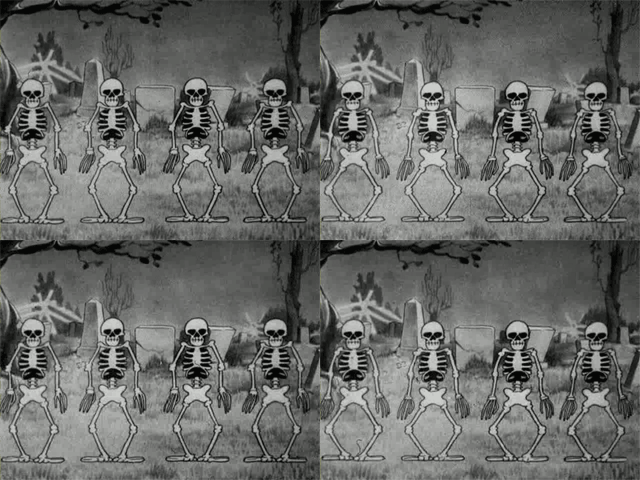
Skeleton2

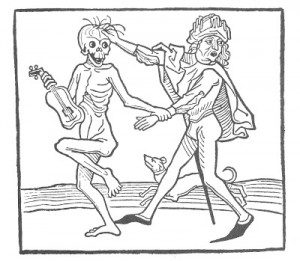
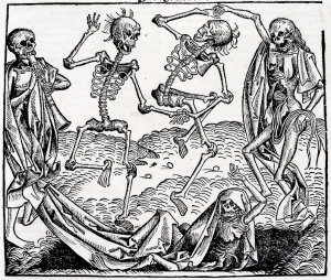
Lately, I have been thinking of the medieval reference at work in Disney’s 1929 Silly Symphony animated short, The Skeleton Dance. The film shows four human skeletons dancing in what is unmistakably an adaptation of the late medieval tradition of the danse macabre. It would be easy to dismiss these Disney skeletons as comic modernization of the medieval tradition with its slapstick physical comedy and goofy music. But this would be to forget the fact that slapstick was an integral part of the medieval danse macabre tradition itself, which used the comic register as a way to level social class difference through the trope of death-the-great-equalizer. Allow me to share a few examples. I mean, who could deny the slapstick dimension of the following woodcut of death and the gentleman from the Der Totentanz  series printed by Heinrich Koblochtzler in 1490?

Dance Macabre_0001

Death’s gleeful pose, along with the gentleman’s comic expression of almost casual surprise, are directly at odds with the grimness of the subject. The style of presentation –death as a campy cabaret act and his victim’s mock expression of surprise– conflicts jarringly but comically with its subject matter.

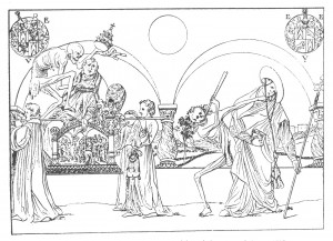
Less slapstick, but still operating on a carnavalesque (or even a Frank Miller-esque) inversion of hierarchies of high and low, sacred and profane, the following print by Nikolaus Manuel dated 1515 shows the pope and cardinal being ambushed and beaten down by dancing dead. The humor resides in the contrast between the dignity of the holy men and the awkward and naked physicality of the attacking skeletons.

Dance Macabre_0006

Or to cite yet another, more famous, example, Holbein’s 1526 woodcut of the Totentanz shows four skeletons reveling in a danse macabre while a fifth skeleton struggles to escape or return to its shroud. The sloppiness of the skeletons who still bear traces of hair and flesh and viscera reads as both comic and macabre as if to suggest that death is an undignified affair that should be faced with laughter and some disgust rather than piety and reverence.


Holbein-death

 
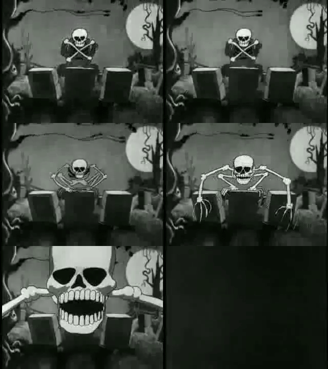
One thing that all of the late medieval representations of the danse macabre have in common is a sense of address to the viewer, that he or she might be next in the line-dance of the dead. This dimension is definitely present in the Silly Symphonies Skeleton Dance where the dancing skeletons lurch at the viewer in what must have been a frightening sequence for a 1929 audience. In one sequence, the medieval skeleton “eats” the viewer (see the gif below), bringing us into its dance of death and making us part of European history’s unending pile of skeletons.
 

skeleton

 
What I like about this particular moment in the Skeleton Dance is that it demonstrates how drawn animation could create a visual experience for its viewers that no live action film would be able to produce for decades. Moreover, it does so in order to confront its viewer with death in a way that is nearly identical to the address made by danse macabre imagery in 15th and 16th century Europe. The Disney cartoon danse macabre innovates formally in order to produce an effect that harks to a late medieval mode of confronting death.

It’s also tempting to look at the formal parallels that exist between medieval representations of the danse macabre and modern comics. Both share a similar “kinetic” quality and both tend to prefer stretched horizontal band formats as in the following danse macabre mural by Bernt Notke found in the St. Nicholas’s Church in Tallinn. An even more striking parallel with comics resides in the fact that this representation of the danse macabre has captions, a short dialogue attached to each victim in which Death summons him or her to dance while they moan about their impending death. What’s more, this horizontal configuration with captioned dialogue was apparently a fairly common visual format in the late medieval danses macabres. Would it be a stretch to say that these visual representations of the danse macabre are themselves a kind of proto comic book?

Bernt_Notke_Danse_Macabre

In either case, I like the unseemly crossing of the medieval and the modern we see in the 1929 Skeleton Dance and I like even more the campiness with which a subject so serious as death is domesticated without being banished from the imagination in both the medieval and  modern examples I’ve discussed. Where does the danse macabre make its way into your comics reading and in what other ways might we think of the danse macabre as a form of proto comic book?

Totentanz_LübeckR


What is an African American Comic?

all-negro-comics

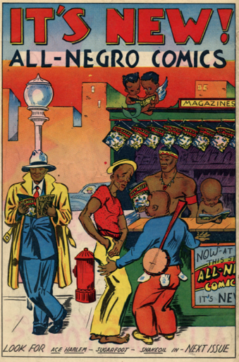
When Philadelphia journalist Orrin C. Evans published what would become the first and only issue of All-Negro Comics in 1947, he boasted that the comic book showcased original stories about black life and adventure with African and African American characters in positions of authority, strength, and trendy style. The comic’s commitment to wholesome, affirming images of black people was underscored by the fact that its artists, too, were African American. Evans even included a photograph of himself inside the cover, thereby confirming the extent to which the comic earned the “all” Negro distinction.

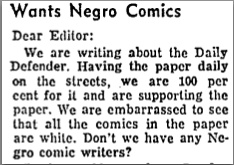
By the mid-1950s, readers of black-owned newspapers had become accustomed to seeing the work of black comics creators like Chester Commodore and Jackie Ormes included among the reprints of syndicated comics. When the daily edition of the Chicago Defender failed to include black comic strips, readers wrote to complain:

clip_defender

This question, posed in March 1956, may sound all too familiar. Nevertheless, much has changed since the 1950s. So much so that “African American Comics” could easily constitute a category of its own (and not just as a display during Black History Month). But exactly what kinds of comics would fall under this designation? Would it only include publications that follow the All-Negro Comics model where black writers, artists, and editors can claim “every brush stroke and pen line” of the final product, or should the term be expanded to any comic about African Americans? Should the stories reflect particular ideological investments? Be recognized by a specialized community of readers and critics?

I also struggle with these questions in my research and teaching in African American literature, where the relationship between naming, visibility, and power is much more pronounced and deeply connected to the exclusionary politics of literary canons. In the classroom, I’ve had to step away from the anthologies that track a narrow, reactionary path from the New Negro to the Black Arts aesthetic. I try to emphasize instead how each successive wave of redefinition attracts new possibilities along with new intersectional silences and contradictions, or as the late Amiri Baraka put it in his 1966 poem, “Black Art”: “Fuck poems/and they are useful.”

The history of African Americans in comics reflects many of these same cultural tensions, but the narrative unfolds much differently. I recently taught a course on “African American Comics” that began with examples of 19th century racial caricature. We studied George Herriman’s comics, discussed All-Negro Comics, as well as genre comics from the 1950s-1970s before moving to more recent graphic novels. I did not begin each new comic identifying the racial identity of its creators, unless one of them made it an issue, for instance, as Christopher Priest did in his terrific introduction to the trade paperback of Black Panther Vol 1. The Client (reprinted here.) The class went very well, but by the end I knew that my title had been inadequate – if not inaccurate, since I also included Aya: Life in Yop City (African, but not American).

So I’m genuinely interested in what people think. What is an African American comic? Is there a way that this term might be useful? Is it too reductive or so broad that it loses all meaning? With Milestone Comics recently celebrating its 20th anniversary, these concerns seem more relevant than ever. We could even extend the question to other social groups – women’s comics? LGBT comics? And remember, Black History Month is upon us. So refusing the question doesn’t mean that someone else won’t try to define it for you.

How do comics artists use speech balloons?

This post is the first in a series on how comics artists represent talk in comics. I’ll be writing about speech balloons and how the discipline of conversation analysis (CA) helps us understand how creative these artists can be when they try to show the intricacies of everyday talk.

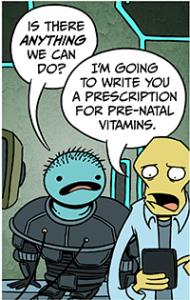
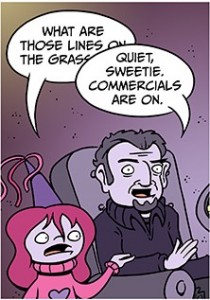
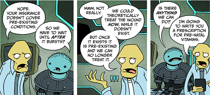
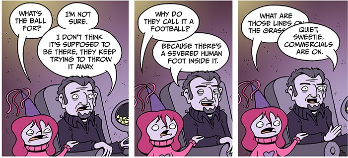
Consider the following two panels. These are from the webcomic Scenes from a Multiverse by Jon Rosenberg.  (Click on each of the titles to see the full comic.)

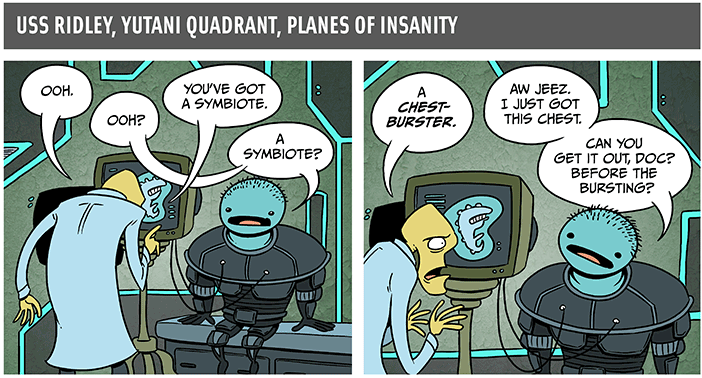
The Symbiote
(February 1, 2013)
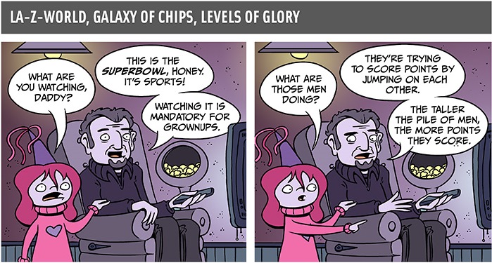
The Superbowl (sic)
(February 4, 2013)


2013-02-01-The-Symbiote c2013-02-04-The-Superbowl c


Both of these are the final panel in the comic. Specifically, each one is panel 5 of a 5 panel comic. Understanding the speech and the speech balloons in these two panels will depend on the sequencing of balloons in previous panels and, to some extent, the social context of the conversation.

In most kinds of comics, speech balloons show conversations in relatively uncontroversial ways. In smaller panels, there may be one, two, or three characters producing speech, while larger panels and full-page panels may contain a dozen or more characters talking at the same time. In conversation analysis (CA), the approach to studying talk is to keep track of the number of turns, how long the turns are, how many speakers there are, and how much silence there is, among others. This post is the first in a series about speech balloons and conversation sequence. In particular, I will focus on how comics artists draw two or more characters talking at the same time.

When two or more speakers produce speech at exactly the same time, then this is called simultaneous talk. (Sometimes it is called interruption, and sometimes it is overlap, but this depends on interpretation.) When listening to conversations, it is relatively easy to identify moments when participants are talking ‘on top of each other.’ And in transcribing the speech, there is a small set of typographical symbols that scholars typically use to do this. Consider the following excerpt, taken from an article by Emanuel Schegloff (2000) on simultaneous talk (p. 26). The two speakers, Anne and Dick, are an elderly couple who have been married for a long time. In this short excerpt, we see a good bit of simultaneous talk. Anne and Dick are having a conversation with their daughter, and it takes a funny turn in that Dick gives Anne a hard time about spending money on shoes and her claim about how many pairs of shoes she owned.

schegloff 2000 overlapping talk

SOURCE: Schegloff, E. (2000). Overlapping talk and the organization of turn-taking for conversation. Language in Society, 29 (1): 1–63.

Lines 52 and 53 are clear examples. According to this transcription, at exactly the same time that Dick begins the word ‘six,’ Anne begins her utterance with ‘WHY’. The effect is that while Dick already has the conversational floor, Anne joins in, and the listeners have to keep track of what both of them are saying. At the end of Dick’s word ‘shoes’, he stops speaking but Anne continues her turn through line 54. The use of all capital letters indicates that Anne is using a LOUD volume.

It’s one thing to listen to speech and write it down in a transcription. But in comics, it seems to me that it’s a creative challenge to represent simultaneous speech using speech balloons. In other words, how does an artist use visual cues (putting one balloon on top of another) to signal a certain kind of verbal cue (two or more speakers talking at the same time)?

The question I have is whether the visual difference in the balloons has a material impact on the way readers ‘hear’ the speech. Does the doctor’s turn ‘sound the same’ as the dad’s turn? If there is a difference, is it a difference of kind or a difference of degree? To answer the questions, we should examine each of the comics in terms of conversation and speech balloons.

The Symbiote

2013-02-01-The-Symbiote a

The first two panels of ‘The Symbiote’ show very traditional strategies for representing turns and turn-taking. The doctor in panel 1 begins the sequence, with the patient taking the second turn, and the two trading off in panel 2 as well. Even though the tails cross in panel 1, I think readers would perceive these turns as more or less separate, perhaps with no simultaneous speech at all. In panel 2, the visual separation of the balloons is even clearer, indicating that the two speakers are being careful to take turns without ‘stepping on each other’s toes.’

The Superbowl (sic)

2013-02-04-The-Superbowl a

In panels 1 and 2 of ‘The Superbowl,’ the speech turns proceed much like those in ‘The Symbiote.’ I think the visual separation of speech turns here is crisp, with the tails of the balloons never crossing. The content of the balloons indicates that the daughter takes the first turn by asking a question and the dad takes the second turn by answering the question. This is true for both panels.

If we consider the sequence of panels 3-4-5 in both comics, we may be able to discern more readily whether the speech in the final panels are indeed different kinds of simultaneous speech.

The Symbiote
Panel 3 Panel 4 Panel 5


2013-02-01-The-Symbiote b


The Superbowl
Panel 3 Panel 4 Panel 5


2013-02-04-The-Superbowl b

In both comics, panel three is composed very similarly. The speech balloons of speakers 1 and 2 are touching, and in fact the balloon of speaker 2 is ever so slightly overlaid onto the balloon of speaker 1. Panel 4 in ‘The Symbiote’ has just one speaker, the doctor, but Panel 4 in ‘The Superbowl’ shows the two speakers producing some measure of simultaneous talk.

As we saw at the beginning of this post, panel 5 for both comics shows that one balloon is overlaid on top of the other. It is more than likely that readers are supposed to ‘hear’ simultaneous talk. In other words, the doctor talks at the same time as the patient, and the dad talks at the same time as the daughter.

What interests me about them is that in both panels, one speech balloon overlaps the other. There are some slight differences, however. In ‘The Symbiote,’ the doctor’s speech balloon overlaps the patient’s speech balloon, but all the words are visible. On the other hand, in ‘The Superbowl,’ the dad’s balloon overlaps the daughter’s but also partially obscures two words (on and grass). What is not clear is whether the balloon obscures additional words or other symbols in the balloon, symbols like ellipses (…).  But is the amount of simultaneous talk the same? If we hear the panels differently, what elements of each comic are we meant to consider when we decide how they sound?

When you read these two comics, how do you ‘hear’ the turns playing out? What might Rosenberg be trying to accomplish by drawing one speech balloon on top of another?  How much does the turn-taking sequence affect our perception of the balloons? And how much of an impact does the social context or the identity of the speakers have?

In part 2 of this series, I’ll talk about simultaneous discourse in Grant Morrison’s The Invisibles.

When Are Two Comics the Same Comic? (Part IV)

InvisiblesV3#2Cover

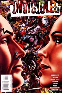
At the ‘old’ Pencilpanelpage location I began my contribution to our reign of comic scholar awesomeness with three posts about when distinct versions of a comic are, or are not, really the same comic in the relevant aesthetic/interpretational/etc. sense (see When Are Two Comics the Same Comic Part I, Part II, and Part III, which focus on rearrangement of panels, recoloring, and redrawing ‘lost’ portions of old comics, respectively). Those posts focused on issues having to do with ontology – determining whether or not we have one work of art, or many – with an eye towards how these issues affect our reception of, and overall assessment of, these comics (and comics like them) as works of narrative art. This post is a continuation, of sorts, to that investigation.

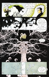
InvisiblesRedoHere, however, I would like to take a slightly different approach to the general question, but one which is motivated by the same phenomenon: multiple, aesthetically distinct versions of the same comic. The instance in question is well-known – Issue #2 of The Invisibles Volume 3, “The Moment of the Blitz” (which is actually the 11th, and second-to-last, issue in this volume – the numbering counts down from 12 to 1). In the original comic, pages 12 – 14 are drawn by Ashley Wood. These (especially page 14) are critical pages, summing up major metaphysical themes underlying The Invisibles in little more than a dozen panels. In the tradepaperback collection, however, Ashley Wood’s pages are jettisoned in favor of a re-drawing of this critical passage by Cameron Stewart, who had also drawn a number of pages of this issue in the original floppy version. I have included scans of the critical page 14 here – first the Wood version, then the Stewart version.

Now, the reason the pages were redrawn is simple enough, and well-known: Morrison felt that Wood had not properly captured his ideas on the page, and Stewart was asked to ‘do it right’ for the trade paperback version. Patrick Meaney described the Stewart pages as follows:

Cameron Stewart deserves credit for redrawing pages originally illustrated by Ashley Wood for the trade paperback version. Those original pages can be quite confusing, obscuring thematic points that Morrison had been building toward throughout the series (Our Sentence is Up: Seeing Grant Morrison’s The Invisibles, 2011, p. 250)

and an entry on comicvine.com described the situation as follows:

The Cameron Stewart pages are considered the true version since they were redone for the Trade. Ashley Wood’s pages are interesting because they were a different interpretation of the same script.

InvisibleOrigThese sorts of descriptions, however, pose a serious issue for comic scholars (and for anyone who wants to understand how comics work as an art form, and anyone who thinks such an understanding might enrich our experiences with structurally rich comics like The Invisibles). Comics scholars like to talk about comics (at least, mainstream comics, as opposed to single-creator auteur works) as a medium of genuine collaboration – the thought is that the distinct artistic visions of writer and artist ‘blend’ somehow into something greater than the sum of the invididual contributions. Regardless of how, exactly, the details of this work, the central idea – that comics are a collaboration between writer and artist (and perhaps others) is almost a truism of work on comics, if anything is.

The redrawn pages of The Invisibles Volume 3, however, suggest that comics is not a collaborative endeavor – at least, it isn’t a collaboration between two creators whose endeavors are equally valued and whose endeavors contribute equally to the identity of the work. Instead, the picture we obtain from this incident is that artists are merely journeymen (or journeywomen) of a sort who toil away in service to someone else’s artistic vision (and whose work can be thrown away, and replaced by the work of another, if it does not fit that vision).

In short: There seem to be two accounts regarding how writer-artist interaction might (and more importantly, should) be viewed. On the first account, writers and artists are equal collaborators on a single artistic work whose final characteristics are determined in roughly equal part by each. The second account of writer-artist interaction is suggested by the use of the word ‘interpretation’ in the quote from comicvine.com. This view has it that the artist is not an equal collaborator, but is instead interpreting the writer’s story (in much the same way that a performing musician might interpret a piece of composed music). Note that we would not usually call a performer interpreting a composed piece of music an instance of collaboration!

Now, on the one hand this seems to be merely a question of how the business of comics works, and in this particular case it is not surprising that a creator of Morrison’s caliber would be allowed so much control over ‘his’ work (the scarequotes are very important, since the appropriateness of this term, rather than ‘their’, is exactly what is at issue). But there are also deep theoretical issues lurking hereabouts – ones deeply connected to the title of this post. If Morrison and Stewart (and hence Morrison and Wood) are genuine collaborators, then replacing Wood’s pages with Stewart’s amounts to replacing one collaborative work with another one entirely. If, however, Stewart and Wood are not creators of the artwork, but are merely interpreters of it, then the situation amounts to replacing one interpretation of the work with another interpretation of that same work.

So the question really is this: Do we have two distinct works here, or merely two different interpretations of a single work of art? Or, alternatively, are artists more like composers, or more like performers interpreting composed music?

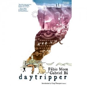
Moon and Bá’s Daytripper: Meditation on Mortality or Plethora of Platitudes?

51cH7qoDyjL._SS500_
I’ve just finished reading the Vertigo (DC Comics) compilation of Fábio Moon and Gabriel Bá’s Daytripper, originally published in Brazil in 2010 as a 10-issue comic series. It is visually lush—expertly drawn and featuring a sensuous color palette by Dave Stewart (lettering by Sean Konot) — and attempts to ask good questions about the different routes a life can take, including the potential termination of these routes via depictions of the death of the protagonist, Brás, at key points in his life (page 28, 32, 41…). This conceit allows Moon and Bá to explore the “killing off” of a character’s development, without killing off the character himself, and it raises compelling questions about the places we do or do not find ourselves, the people we choose to embrace or dismiss, the work we choose to pursue or abandon.

My issue with the work, beautiful and promising as it is, concerns the textual, not the visual, elements. Since I actually weight the visual more heavily in graphic works, I try to avoid treating comics as standard text narratives, since this is nearly always a reduction of the comic. For this post, however, I am going to set the images aside, as I find the panels visually expressive, dense (in the best sense), and superior to that of many other comic works. This excellence, however, sharpens my disappointment in the verbal elements of Daytripper, which had the potential to be a complex and clever meditation on mortality, agency, and human interconnectivity. If the assertions of the narrator and the characters were as arresting as the images, we’d have a remarkable work here.

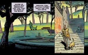
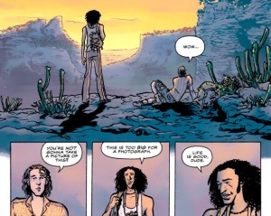
dayt_1-4-copy-456  daytrip02

My chief complaint is this: if you want to take on that ever-present, usually repressed, incessantly itchy problem that we carry with us at all times –I am going to die. I am going to die? I am going to die!—then it seems important to explore it with something more than just seize-the-day, marry-the-girl-already platitudes. Okay, yes, I’m feeling an extra dose of crotchetiness about the marriage and reproduction imperative—really, must everyone partner for life and procreate? Must everyone dutifully replicate himself/herself and augment our bloated population? More pointedly, do those of us who resist or fail to tick these life boxes (married w/children) have no essential purpose in life? Is mating and reproducing essential to being alive, being an adult, creating a life of value? I’m not really sure what’s compelling this fierce trend, but it seems like this basic aspect of our animal life has become the telos of every recent essay, film, and narrative and advertisement I come across (okay, being a little hyperbolic here, but still), and can even be seen in odd ways, for example, the overwhelmingly large number of (sub)genres in the “movies about marriage” Netflix category, which is more than double the total of the second-largest category, “movies about royalty” (see Alexis Madrigal’s fascinating recent article in The Atlantic, “How Netflix Reverse Engineered Hollywood”).

Daytripper purports to be “deep.” It reveals—effectively, I’d add—nuances about its protagonist’s Oedipal struggles against a famous father, the melancholia of youth, the attractiveness of risk, the pull of desire, yet when it opines on life or on death, it offers nothing more than received ideas. Here’s an early example: “Then Brás woke up and realized that when you turn that corner, that future you have written and wished for is not always there waiting for you. In fact, it usually isn’t at all what you expected…. Around the corner there is just another big annoying question mark. It’s called life (35).” A little while later, Brás—in love—calls up a nugget of his father’s wisdom: “…[H]e remembers what his father had been saying all these years—and it all made sense (78).” Ahh, splendid. This ought to be good. Brás’ father is a writer, a major novelist who is feted, annually, at a literary gala held in his honor. Brás is also a writer, albeit one of lengthy obituaries at the moment. A writer reflecting on a writing father’s wisdom: certainly, there will be pith. Here’s what follows: “The moment that won’t fade. The moment we all search for. The moment that he found or that found him. Inside he knew. It felt right, and he knew. She was the woman he was going to spend the rest of his life with (78).” Thump.

As Brás dies in various dead-ends, he also ages, coming ever closer to a fulfilling existence—yep, as a husband, and a father—culminating in a clever time-out-of-time depiction of father-son rapprochement: a letter written by his dying father on the eve of Brás’ child’s birth is not received at its intended time, but, instead, years later when Brás himself is an old man diagnosed with a terminal condition (reminding me vaguely of Lacan’s conclusion in his seminar on Poe’s “The Purloined Letter” that a letter always reaches its destination).So, the circumstances are interesting: Brás is now old, it has been many years since the letter was written. What will it say? What does the great man say to the son? This:

Dear Son,

You’re holding this letter now because this is the most important day of your life. You’re about to have your first child. That means the life you’ve built with such effort, that you’ve conquered, that you’ve earned, has finally reached the point where it no longer belongs to you. This baby is the new master of your life. He is the sole reason for your existence…. You’ll surrender your life to him, give him your heart and soul because you want him to be strong…to be brave enough to make all his decisions without you. So when he finally grows older, he won’t need you. That’s becauseyou know one day you won’t be there for him anymore. Only when youaccept that one day you’ll die can you let go…and make the best out of life. And that’s the big secret. That’s the miracle. (242-243)

Sigh. So he writes, unknowingly confirming the life Brás has chosen to lead. All is well, we’re made to believe; Brás has extended his existence properly, and though ever flirting with death (self-inflicted or not), has managed not to succumb. I’m simplifying a bit; the text as a whole challenges some of these platitudes, even—if I am generous—twisting them ironically at points. But it all seems to add up to the usual counsel: young man, put away your toys, your dreams, your wishes for an exciting “future,” and accept the natural order of things. Take up your proper position as an adult (who will die, and knows he will die), a father whose child, whose son, no longer needs him. This is definitely coded male, but is as restrictive as any discourse that casts woman as limited to her reproductive function. Is this the message of the old to the young? Join us, become like us, young men and women, as soon as possible. We have given over our lives to the next generation, and you must do the same. Even if I step out of my nulliparous state and imagine myself a parent hearing this message, I am equally chagrined. Are we solely here to continue the species?

If Moon and Bá want to explore the question of death and our business here in life, it seems to me that they should push harder, tunnel further, scrape away the expected aspects of life (you will find a career, you will find a life mate, you will engender more life) and source their unique individual essences – the mind each has been given (and the fact that they are twins makes this an even more interesting potential gleaning), the one time combination of genes, experience, thoughts, sensations and feelings that animate Fábio and Gabriel and could imbue characters created by them (I know, I know; I’m nearly committing the intentional fallacy). There are millions of husbands and fathers out there; I don’t want to hear their general resumes distilled down to Brás as everyman. I want Brás to startle me with his insights, as the eponymous protagonist of David Mazzucchelli’s Asterios Polyp does when reflecting on memory, or as Mark C. Taylor does in his recent philosophical meditation on mortality, Field Notes from Elsewhere: Reflections on Dying and Living (Columbia UP, 2009).

Is Otto Binder and Joe Orlando’s “I, Robot” a Protest Novel?

cremins1

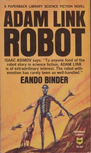
The cover of the 1965 Paperback Library novel Adam Link—Robot,
which collects Otto Binder’s Adam Link stories from the late 1930s and 1940s.

As I watched and enjoyed the new Spike Jonze science fiction film Her, I began to wonder, What would Otto Binder think of this? Although best known to comic book readers and scholars as the writer of Captain Marvel and Superman, Binder began his career as a science fiction writer, first in collaboration with his older brother Earl. The pair began publishing under the pen name Eando Binder (Earl and Otto) in the early 1930s. By the time “I, Robot,” the first in a popular series of adventures featuring the artificial man Adam Link, appeared in the January 1939 issue of Amazing Stories, Otto was writing on his own, but retained the Eando Binder byline.

In science fiction circles, Otto Binder’s best-known work remains the Adam Link series, which served as the inspiration for Isaac Asimov and for countless other writers exploring the idea of artificial intelligence. Over the course of his comic book career, Binder adapted some of the Adam Link stories for EC Comics in the 1950s and again for Warren Publishing’s Creepy in the 1960s. When Qiana invited me to contribute another guest post for Pencil Panel Page, I began to think again about her December 2011 essay “Can an EC Comic Make ‘You’ Black?” and what it might tell us about Otto Binder and Joe Orlando’s adaptation of “I, Robot” from Weird Science-Fantasy Number 27 (dated Jan.-Feb. 1955). In the EC version of “I, Robot,” Binder’s use of the second-person you places the reader in a complex position: as we read the story, do we identify with the hero, Adam Link, or with the violent mob threatening to destroy him?
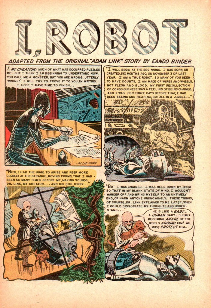
 cremins2

The first page of Otto Binder and Joe Orlando’s adaptation
of “I, Robot” for EC’s Weird Science-Fantasy Number 27 (Jan.-Feb. 1955). Colors by Marie Severin.

In a letter to science fiction fan and editor Sam Moskowitz dated October 4, 1952, Binder discusses the scripts he’s been producing for EC Comics. He explains that he’s “gotten into the groove on thinking of [science fiction] plots for them, even if they are more simplified and corny than what would go into a pulp.” Binder then appears to reconsider his summary of EC’s science fiction and fantasy comics and adds the following parenthetical comment:

(But a suggestion….pick up a copy of WEIRD FANTASY or WEIRD SCIENCE comics sometime and read them….the comics are not too far behind the pulps in well-plotted stories, believe it or not!)

In the early 1950s, after over a decade as a prolific comic book scripter, Binder was hoping to return to the science fiction market and was looking to Moskowitz, to whom he later left the bulk of his personal and professional correspondence, for advice and support. As Bill Schelly notes in his excellent biography Words of Wonder: The Life and Times of Otto Binder, the writer had to make some adjustments to his style when he began working for EC: “Binder’s job, as he saw it, was to emulate the writing style of Al Feldstein, who always put lots of lengthy captions into the scripts. This wasn’t Binder’s normal inclination, but he did his best.” As a freelance writer, Binder survived by adapting himself and his style to suit the requirements of his publisher and of his audience. As he explained in the letter to Moskowitz, “Now I have no prima-donna qualms about accepting ideas from an editor….it doesn’t violate my lone-wolf sensibilities. In fact, in the comics, editor and writer often whip up ideas between them.”

While in both the EC adaptation of “I, Robot” and in the 1939 original, Binder employs first person point-of-view as Adam Link tells the story of his creation, by the end of the Weird Science-Fantasy version, Binder shifts to the second-person as the robot addresses his tormentors—and, by extension, those of us reading the story. On the final page of the 1955 “I, Robot,” Adam Link, wrongly accused of murdering his creator and surrounded by an angry mob, exclaims, “Beware that you do not make me the monster you call me!” In his journal, he writes, “As I finish writing this, here among blasted memories, I know that there is no hope for me. You have me surrounded…cut off. I can see the flares of your torches between the trees. Your hatred lust is aroused. It will be sated only by my death…”
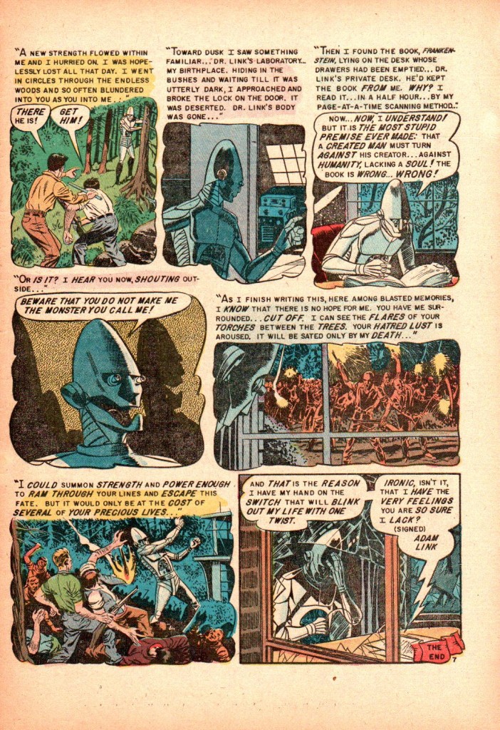
cremins3

The final page of the 1955 EC Comics adaptation of “I, Robot.”

Those two panels in the center of the page pose an interesting challenge for the reader: first, Orlando and colorist Marie Severin ask us to identify with Adam Link, whose long, cylindrical forehead and mechanical jaw cast distorted shadows on the yellow wall behind him. He is, for a moment, almost human, as he makes a plea not to be turned into a monster by humanity’s hatred and violence. The text that appears over the panel, however, tells us, “I hear you now, shouting outside…” While we might sympathize with the protagonist, especially after the loss of his dog Terry on the previous page (in the original story, as the mob fires on Adam, a stray bullet kills the dog), we also, for a moment, inhabit the role of the aggressor.

The next panel is even more fascinating. We share Adam Link’s point-of-view as we stare out a window at the men, most of them carrying a rifle or a torch or both. Just two panels earlier, we saw Adam Link before that same window, reading his creator’s copy of Frankenstein. Now, however, the scene has changed, and we stare with horror at the grotesque figures that approach Dr. Link’s laboratory. Again, the text box disrupts our sense of identification with the robot: he addresses us directly. We are part of the mob. As we stare out the window, we are looking not at a display of “hatred lust” and impending “death” but at ourselves, and our petty hatreds and small-minded prejudices.

“I, Robot” inverts Qiana’s original question and seems to ask, Can this EC comic transform you, the reader, into a lustful, bloodthirsty, bigoted villain? Or have Otto Binder and Joe Orlando merely held a mirror up to EC’s audience, one they hope will challenge readers to reflect more deeply on issues beyond the fantastic realm of the comic itself?

Binder addresses these issues in another EC adaptation of one of his earlier science fiction stories, “The Teacher from Mars,” also drawn by Joe Orlando and colored by Marie Severin for Weird Science-Fantasy Number 24 (dated June 1954). As Schelly points out in Words of Wonder, Binder selected “The Teacher from Mars,” first published in Thrilling Wonder Stories in 1941, for Leo Margulies and Oscar J. Friend’s 1949 collection My Best Science Fiction Story, which includes stories from Isaac Asimov, Robert Bloch, and Harry Kuttner. In his introduction, Binder explains that “the story,” in which human students abuse and terrorize their Martian teacher, “was a good medium for showing the evils of discrimination and intolerance. Sadly enough,” he continues,

we have not yet eliminated those degrading influences on our world. The Martian in this story is the symbol of all such reasonless antagonism between “races.” Not that I wrote the story solely for that reason. It just happened to strike me as the best “human interest” approach. The “moral” was incidental.

In most of his work, from the Captain Marvel stories of the 1940s through his Superman narratives in the 1950s and even his scripts for Gold Key’s Mighty Samson in the 1960s, Binder again and again sought to explore what he refers to as the “‘human interest’ approach.” As Bill Schelly has argued in his comments on “The Teacher from Mars,” “Though Binder denied that the anti-discrimination sentiments in the story were his main reason for writing it, they are there nonetheless.” Therefore, is the “moral” really “incidental” in “I, Robot” or “The Teacher from Mars”? And what does Joe Orlando’s work bring to these comic book versions of Binder’s original short stories?
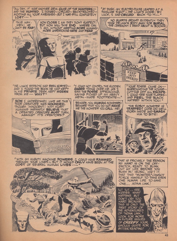
cremins4

The final page of Binder and Orlando’s adaptation of “I, Robot” for Warren Publishing’s Creepy
No. 2, 1965 (page 43).

 
The EC version of “I, Robot” raises interesting questions, not only about adaptions of prose works into comic book form, but also about the moral imagination of creators like Binder and artist Joe Orlando. The complexity of the point-of-view in Adam Link’s narrative might be read in light of a passage from James Baldwin’s essay “Everybody’s Protest Novel”:

The failure of the protest novel lies in its rejection of life, the human being, the denial of his beauty, dread, power, in its insistence that it is his categorization alone which is real and which cannot be transcended.

How might Baldwin’s critique of Uncle Tom’s Cabin and the “protest novel”—a work of fiction that sets out to raise consciousness and fight social injustices—help us to read the many versions of Binder’s “I, Robot”?

One possible answer is this: because the story of Adam Link is a very obvious fiction, one built, as Binder himself admitted in the January 1939 issue of Amazing Stories, on Mary Shelley’s Frankenstein, it makes clear its status as a work of the imagination—that is, as a text (you can read more of Binder’s introduction to the original “I, Robot” in Schelly’s biography). “I, Robot” makes no claims to realism or verisimilitude. It might be read simply as an engaging adventure, or as a moral lesson on our jealousy, hatred, and ignorance. But we might also place the multiple versions of Binder’s story in dialogue with each other as well as with other texts from the era in which they first appeared. The January, 1939 issue of Amazing Stories, for example, appeared just a few months before the first publication of James Thurber’s “The Secret Life of Walter Mitty,” another relic of the period that continues to fascinate American audiences in the form of Ben Stiller’s new film. As we explore the shape and the dimension of the society in which Binder lived, we have an opportunity to investigate how his America shaped our own. And as we read this comic book from 1955, Adam Link continues to address us, even now, as, in the closing lines, he remarks, “Ironic, isn’t it, that I have the very feelings you are so sure I lack?”

Last week, after we saw Her at the Landmark on the corner of Clark and Diversey in Otto Binder’s old hometown of Chicago, I wondered, What would Binder have thought of this 21st-century story of the love between a middle-aged man and his operating system? And what does Binder’s “I, Robot” in all its forms—from the original story to the later EC Comics and Creepy versions to the novel Adam Link—Robot Binder published in 1965—ask of us as modern readers and as comics scholars?


References and Further Reading

Baldwin, James. “Everybody’s Protest Novel” in Notes of a Native Son. Boston: Beacon Press, 1984.

Binder, Eando. Adam Link—Robot. New York: Paperback Library, Inc. 1965.

Binder, Otto. Letter to Sam Moskowitz. October 4, 1952. Courtesy of the Otto Binder Collection, Cushing Library, Texas A&M University.

Binder, Otto. “The Teacher from Mars” in Leo Margulies and Oscar J. Friend, My Best Science Fiction Story. New York: Pocket Books, 1954. 18-36.

Schelly, Bill. Words of Wonder: The Life and Times of Otto Binder. Seattle: Hamster Press, 2003.

You can also read Noah’s discussion of Her and its relationship to Philip K. Dick’s Do Androids Dream of Electric Sheep? at Salon. Qiana’s paper at the 2013 Dartmouth College Illustration, Comics, and Animation Conference, “Science Fictions of Race in EC’s ‘Judgment Day,’” was another inspiration for this post.