The index to the Comics and Music roundtable is here.
_____________________
There are two musics (at least so I have always thought): the music one listens to, the music one plays.
–Roland Barthes, “Musica Practica,” 1970I just write ’em ’cause nobody says you can’t write ’em.
–Bob Dylan on his songwriting process, 1987
My dad is not convinced we saw Bob Dylan at Lake Compounce in Bristol, Connecticut on July 16, 1989. It was my first concert and it rained for most of the evening, from the start of Steve Earle’s loud, abrasive opening set to Dylan’s final encore of “All Along the Watchtower.” Earle was promoting his 1988 album Copperhead Road and Dylan was in the early stages of the Never Ending Tour, which continues this month as Dylan and his band visit the Northeast and the Midwest. On that rainy night in the summer of 1989, Bob Dylan, wearing a grey hooded sweatshirt and sunglasses, performed some of his most familiar songs: “Shelter from the Storm,” “A Hard Rain’s A-Gonna Fall,” “Like a Rolling Stone,” “Blowin’ in the Wind.” The audience cheered the first note of his harmonica solo on “Subterranean Homesick Blues.” But Dylan never spoke to the audience and he never took off the hood or the sunglasses. It could have been anybody up there.
So, almost twenty-five years later, my dad still wonders who we saw that night. Are we sure we saw Dylan? he’ll ask. He’s kidding, I think, and I guess the answer to that question depends on the Bob Dylan the two of us were looking to find.
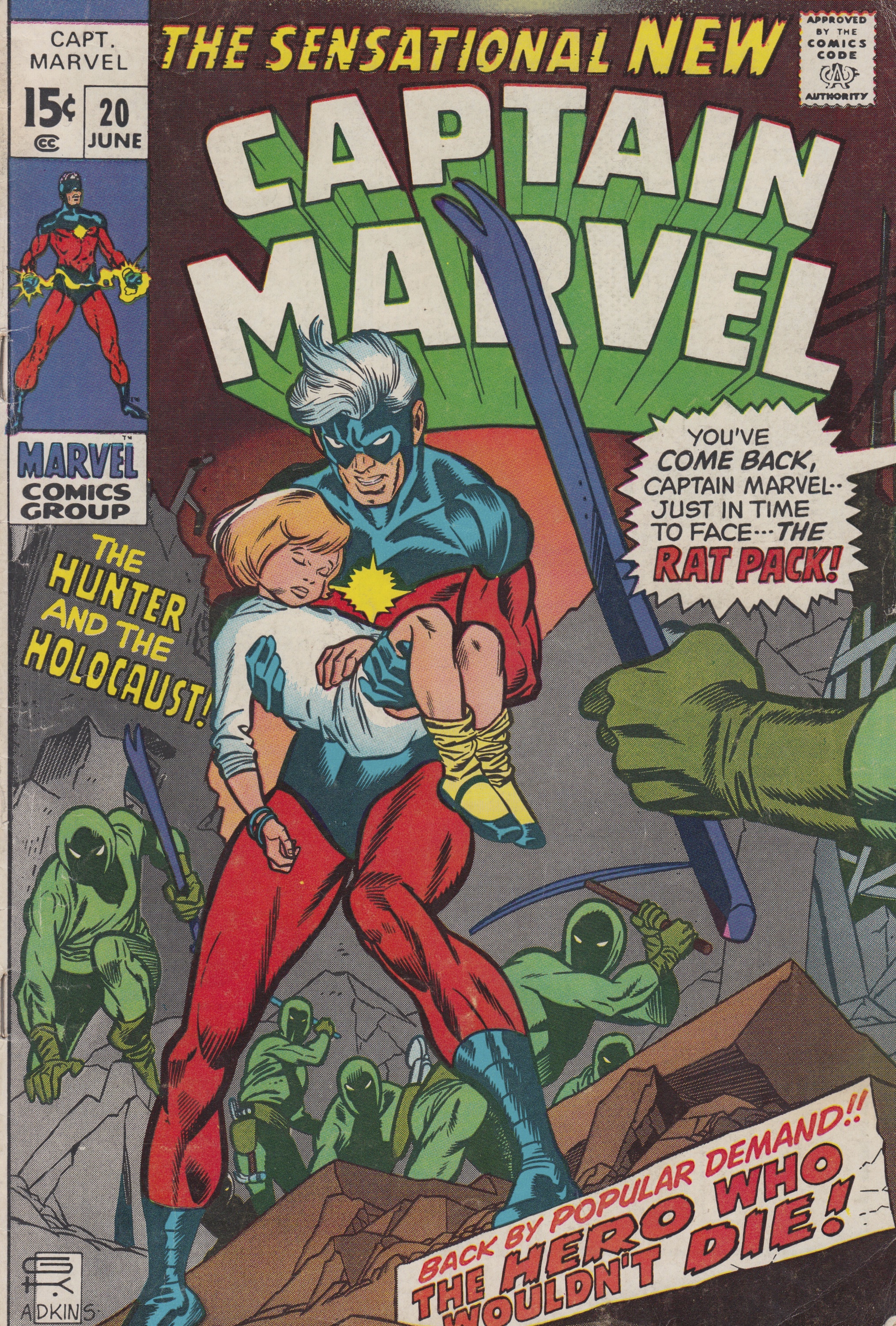
I thought again about that July concert as I read Captain Marvel #20 (Marvel Comics, dated July 1970) to write this essay for the music and comics roundtable. “The Hunter and the Holocaust” opens with Captain Marvel’s alter ego Rick Jones performing for an ecstatic audience at a Greenwich Village folk club. The story, written by Roy Thomas with pencils by Gil Kane, inks by Dan Adkins, and letters by Artie Simek, spends most of its time exploring the relationship between Jones and the alien warrior Captain Mar-Vell, two heroes who, as we learn on the splash page, struggle with their dual identity: “What’s it like to be two different people??” asks Thomas in the first line of the issue.
In the next twenty pages, Rick Jones and his alien counterpart fight a pack of thieves, save a little girl from the wreckage caused by a tornado, confront a team of “hardened looters” called “The Rat Pack!” (see page 13) and, in the issue’s closing panels, finally come face to face with the Hulk. Only two pages of Captain Marvel #20, then, are about music, but I find myself thinking about Rick Jones’s folk song and what it might tell us about Gil Kane’s visual strategies and Roy Thomas’s nostalgia for early Dylan.
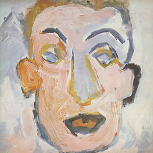
Thomas and Kane, I discovered, were also searching for Bob Dylan and, in the summer of 1970, they had plenty of company, as the singer had just released Self Portrait, a double album that shocked, disappointed, and divided his fans and his critics.
Captain Marvel #20 (Marvel Comics, June 1970)
Rick Jones’s performance also challenged me: what do I hear when I read a comic book page? In the coffee house sequence that opens the issue, Thomas and Kane are inevitably working with memory. For Thomas, Rick Jones is the embodiment of the excitement of hearing Highway 61 Revisited or Blonde on Blonde for the first time. For Kane, as we shall see, drawing a page about a musical performance is an exercise in technique: how does an artist design a page about music, either the act of playing or the enjoyment of listening? In order to hear the music of Kane’s Captain Marvel page, the reader must interpret the words and images just as a musician reads a score. The visual soundtrack of Captain Marvel #20, however, depends on the reader’s familiarity with Bob Dylan—or, more specifically, on the reader’s familiarity with the myth of Bob Dylan.
Greil Marcus, Ellen Willis and, later, Dylan’s biographer Robert Shelton all heard Self Portrait as Dylan’s rejection of his iconic status.
Bob Dylan’s Self Portrait (1970)
An easy-listening Dylan record featuring songs written by Gordon Lightfoot, Paul Simon, and Rodgers and Hart? Greil Marcus’s review of Self Portrait begins with one of the most infamous lines in the history of rock criticism: “What is this shit?” (Marcus 7). Marcus heard the double album as Dylan’s willful retreat from the myth of being Bob Dylan and, therefore, as a kind of abdication. Early in his 1970 Rolling Stone review of the record, Marcus admits, “We are dealing with myth, after all, and the more Dylan stays away the greater the weight attached to anything he’s done” (Marcus 12).
Although no less puzzled by the record, Marcus’s friend and colleague Ellen Willis was more measured in her assessment. After she’d lived with the album for a few months, she wrote about it in the context of Dylan’s New Morning, the quick follow-up to Self Portrait released in the fall of 1970. Willis, whose essay on The Velvet Underground should be required reading for all young writers learning the craft of music criticism, argues that, despite its weaknesses, Self Portrait “proved that no matter what is put on a Dylan record—and ‘Blue Moon” is about as absurd as anything this side of a reading of the phone book—it ends up a self-portrait, because Dylan himself is so much more important than any record of his could ever be” (Willis 31-32). At the end of the review, after listening to Arlo Guthrie’s version of “Percy’s Song,” Willis longs for the “crude impact” of Dylan’s early work. Dylan’s new records are a reminder of the passage of time, of age and experience. By the summer of 1970, the days of “Blowin’ in the Wind” and The Times They Are a-Changin’ must have seemed very distant and strange.
Read in this historical context, “The Hunter and the Holocaust” might also be understood as belonging to the wave of “relevant” comics ushered in by Denny O’Neil and Neal Adams with Green Lantern/Green Arrow #76 (DC Comics, dated April 1970). This new wave of comics addressed a variety of social, political, and cultural issues. O’Neil and Adams even include their own Bob Dylan tribute in the form of a character named Johnny Walden in Green Lantern/Green Arrow #77 (also dated June 1970). According to one of the miners in the story, Walden is a young man who “taught hisself to play on the guitar” and “started singin’ songs ’bout us an’ our troubles,” songs that helped inspire “self-respect” and “a whole lotta discontent with the way we been treated…” (see O’Neil and Adams 38-39).
Critics associate the “relevance fad” in American superhero comics of the early 1970s most often with the socially and politically engaged work of writers such as Denny O’Neil and Steve Englehart. Will Jacobs and Gerard Jones describe relevance as a “passing trend” which “nevertheless helped expand the field of comics” by “loosening the outdated rules of the Comics Code Authority, broadening characterization, increasing the power of writers and artists, and drawing the aims of Marvel and DC closer together” (Jacobs and Jones 161). However, “relevance,” at least as defined by this issue of Captain Marvel, is also an acknowledgement of the fact that a comic book, like other cultural products, circulates in a much larger political and social context. The opening pages of this Captain Marvel story, then, are as much about a sense of loss as they are about music. The folk singing Rick Jones fills the empty space left behind by Bob Dylan after the release of Self Portrait.
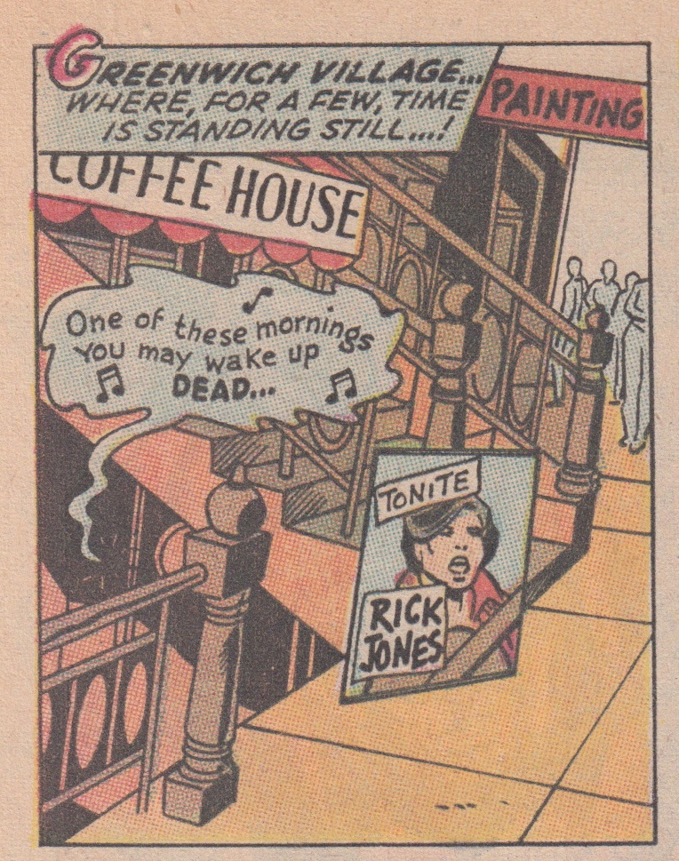
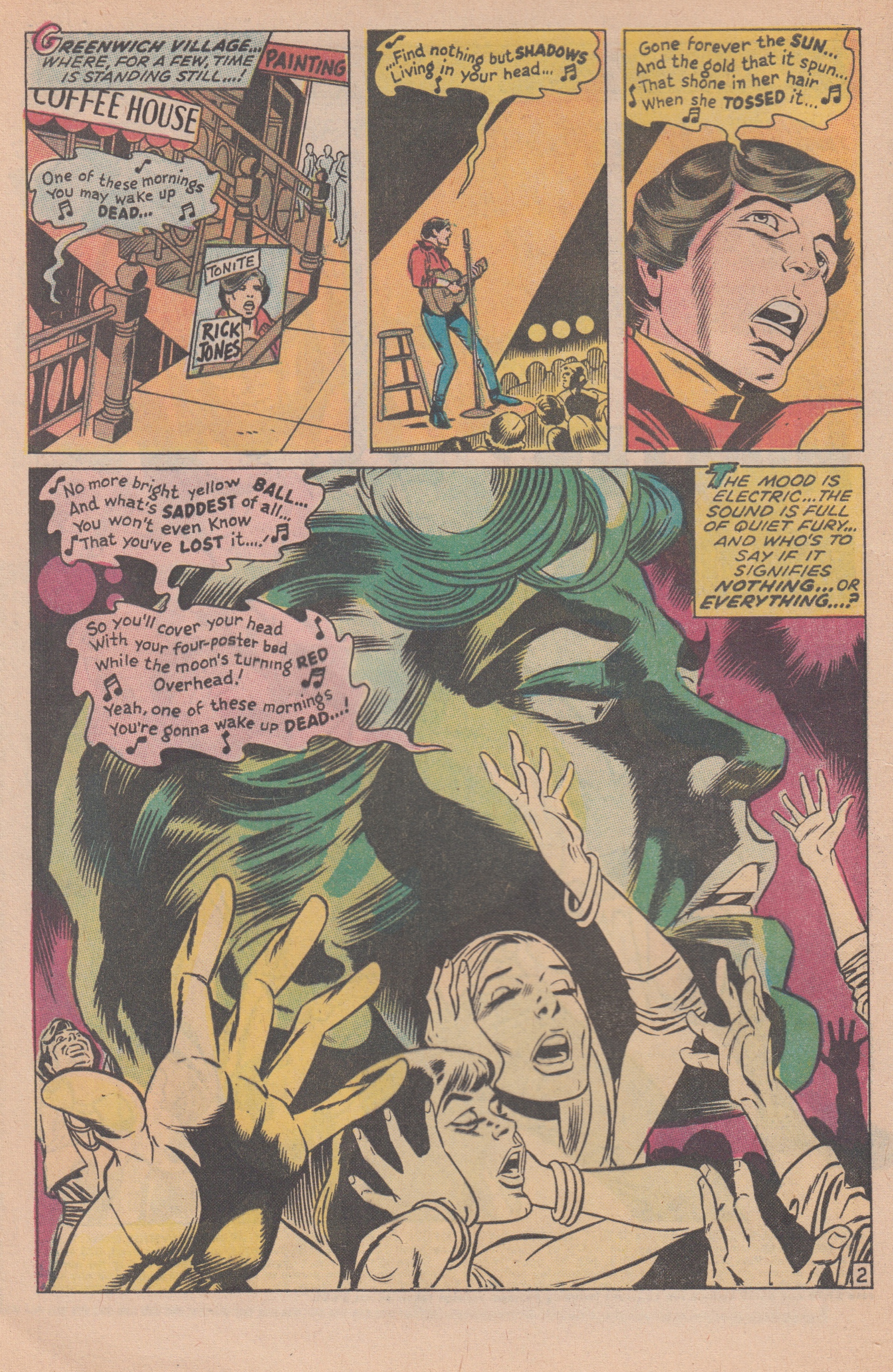
On the second page of “The Hunter and the Holocaust,” in the magic world of a costumed superhero, Thomas and Kane set out to slow the passage of time which has eroded the promise of the 1960s. Rick Jones performs at a coffee house “where,” the text box that introduces page 2 tells us, “for a few, time is standing still…!” In the first panel, we see a sidewalk, a staircase, and a word balloon filled with lyrics and eighth notes: “One of these mornings / You may wake up dead…” The word balloon is colored blue and drifts like a cloud from the basement club:
Panel 1 of Captain Marvel #20, page 2
We can read the words, but we cannot hear the music, nor can we read these musical notations. Rick Jones’s lyrics, Thomas explained in a recent email, were based in part on a poem by his friend Linda Rahm: “In my mind’s eyes I saw/heard them being sung in a rather Dylanesque manner.” Kane’s panel compositions and character designs assist us in imagining the melody, the chord structure, and—to borrow a term from Roland Barthes—the “grain” of the singer’s voice.
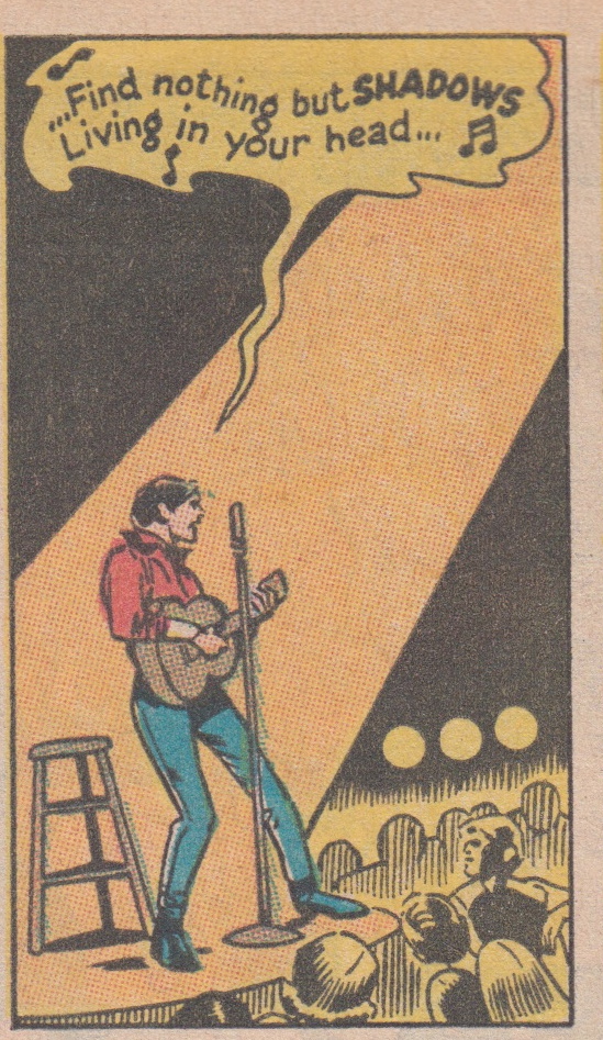
In order to hear the music, the reader must identify the cultural signifiers Thomas and Kane include in this opening panel. The reader is asked to remember the young Bob Dylan. “Coffee House” and “Greenwich Village, ” for example, are synonymous with the folk movement of the early 1960s. Standing with an acoustic guitar in a beam of orange light in the second panel of the page, Rick Jones resembles the Bob Dylan of D.A. Pennebaker’s documentary Don’t Look Back (1967).
Panel 2 of Captain Marvel #20, page 2
Jones, however, was also, according to Thomas, “colored so that he reflected both Billy Batson—and James Dean in ‘Rebel without a Cause,’ except with a yellow shirt/t-shirt instead of a white one like Dean had…the yellow [was] the Billy Batson add-on.” Rick Jones, then, is a figure who embodies a nostalgia for these heroes from the past—the orphan whose magic word transformed him into the World’s Mightiest Mortal (and, as a result, into one of the most popular and lucrative comic book heroes of the 1940s and early 1950s); the iconic Hollywood rebel who, along with Jack Kerouac’s Dean Moriarty, inspired the counter-culture of the 1960s; and the folk rock legend who, by the summer of 1970, and as a result of Self Portrait, had come to symbolize the lost promise of the 1960s.
Gil Kane’s compositional choices are essential in hearing Rick Jones’s “Dylanesque” music. As in most of Kane’s work, the placement and movement of figures in space creates meaning between and within panels. Kane was fascinated by figures in motion. Given his often blunt criticism of comic book narratives, why did Kane spend so much of his career drawing superheroes? In the 1969 Alter Ego interview, John Benson asks if Kane’s attraction to costumed heroes was a simple matter of proficiency: “I take it from your earlier comments that the main reason why you are illustrating super-heroes,” Benson comments, “is that you feel that this is the area in which you are most proficient. Is that correct?” (Benson 164-165). “Yes and no,” Kane explains. Drawing superheroes—idealized bodies in motion—allowed Kane the opportunity to invent and analyze forms:
It’s a comfortable area for me to operate in, since it depends to a great extent on action, and it also coincides with my interest at the moment, which is learning to design anatomical structure. I’m busy solving technical problems for myself, and sometimes it’s very convenient when the idiom that I am involved in happens to be sympathetic to the technical problems that I am solving. (Kane qtd. in Benson 165)
On page 2 of Captain Marvel #20, Kane sets out to solve a number of significant problems regarding music, words, and images.*
Page 2 of Captain Marvel #20
Kane has designed a page that analyzes the relationship between the performer and his audience. After a close-up of Rick Jones in the page’s third panel, Kane devotes the fourth and final panel to the singer’s profile. Jones, his eyes closed, sings for us and for his coffee house audience. In the foreground of the image, Kane has superimposed a series of figures over Jones’s profile. As a result, we witness the performance and the response of the audience simultaneously, but not with a split-screen image as, for example, in Michael Wadleigh’s Woodstock, which was also released in the spring of 1970. Rather, Kane employs a kind of montage in which the singer, the song, and the audience share a singular moment that, all too quickly, will recede into memory.
Rather than cutting from an image of Rick Jones to figures from the audience and back again, Kane offers readers a portrait of the social function of music—how it works as a means of collaboration and, in this example, as a form of ecstatic communion between the performer and the audience. The effectiveness of the panel, however, depends on the memory and imagination of the reader. The reader must recognize the allusions to Bob Dylan embedded in Thomas’s text in order for Kane’s images to resonate. In other words, Thomas and Kane are inviting the reader to remember the myth of Dylan and the utopianism he inspired.
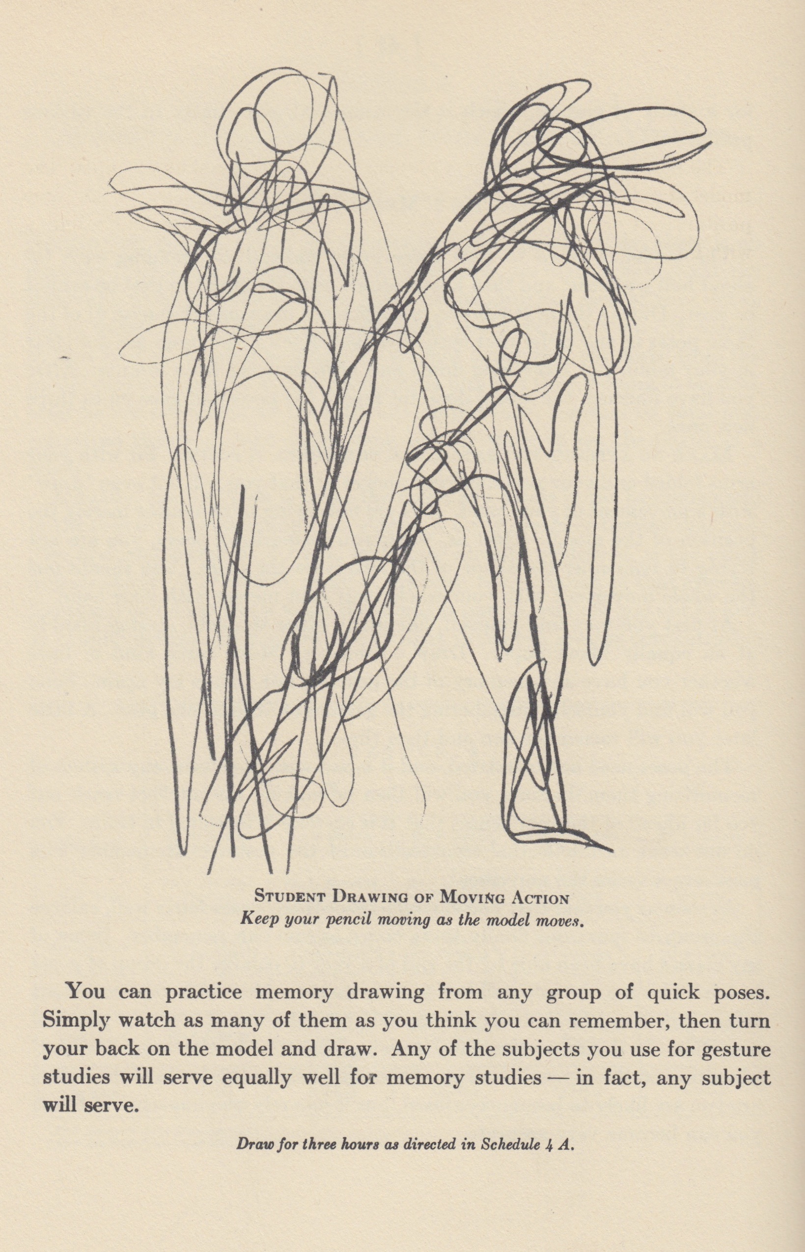
In Section 4 of The Natural Way to Draw (1941), Kimon Nicolaïdes argues that all drawing is an act of memory. He also suggests various exercises in “memory drawing”:
With the exception of the contour study, there is no drawing that is not a memory drawing because, no matter how slight the interval is from the time you look at the model until you look at your drawing or painting, you are memorizing what you have just seen. Of course, in that kind of drawing in which the student looks back and forth from the model continuously, he is memorizing little bits at a time, hoping to be able, after he has assembled all the little bits, to put them together by some preconceived theory or plan or by some belated effort to see the model as a whole. (41)
Comics are ideal archives of memory and motion. Kane, always an innovator, circumvents the limits of the form by depicting music’s role in the building of a community. More specifically, he brings to life what has been lost, that yearning for a return to what Bob Dylan signified during the 1960s. The ecstasy of these figures in the final panel of page 2—the two women with their eyes closed, the hands raised in exultation—is the ecstasy of a lost moment, of a memory, or of a forgotten ideal.
From “Memory Drawing and Other Quick Studies,” Section 4 of Kimon Nicolaïdes’ The Natural Way to Draw (1941)
Despite the ecstatic, communal celebration of Jones’s performance, there is also something terribly lonely about it. The figures, despite Kane’s best efforts, remain locked in time and motion. There is no substitute for the visceral power of music heard live and loud in a small room.
Words and pictures are at their best when memorializing what was or imagining what might come. Even music that evokes memories of the past remains powerfully and persuasively present. A melody or lyric might trigger images from the past, but we have no choice but to hear the music itself here in the present, note by note, moment by moment. The longing and loneliness I sometimes associate with words and pictures might explain why for so many years I saw music as an escape from the world of comics. As I once told one of my guitar students, music requires some sort of audience, or at the very least a collaboration between the performer and the listener (unless the performer and listener are one). A year after I saw Dylan for the first time, I got a guitar. Three years later, I joined a band.
I’ve neglected to mention that Dylan himself is a visual artist. The cover of Self Portrait features one of his paintings, and over the years he’s written songs from the perspective of painters and other artists. Dylan’s 1997 album Time Out of Mind ends with “Highlands,” a slow, deadpan narrative of over 16 minutes (you can listen to a somewhat shorter but inspired live version from 1999 here). In the middle of the song, after several stanzas in which he drifts between the “rat race” of his life and his dreams of the Scottish highlands, the singer finds himself in a Boston restaurant where he orders a plate of hard-boiled eggs. The waitress makes an unexpected request:
Then she says, “I know you’re an artist, draw a picture of me!”
I say, “I would if I could, but
I don’t do sketches from memory”
But, as Gil Kane has shown us, the singer has no choice. Every sketch is a sketch from memory, and each line and gesture offers another shot at recollection.
Meanwhile, I’m not sure how to answer my dad when he asks if we saw Bob Dylan that summer and, really, it doesn’t matter. We stood there together, and that memory is more important to me than the music itself. Besides, Dylan and his band played most of our favorites, except for “Boots of Spanish Leather.” I can’t imagine a place I would rather have been on the rainy evening of July 16, 1989, a date that, without my dad and without Dylan, would have been an otherwise meaningless set of coordinates in time and space.
__________
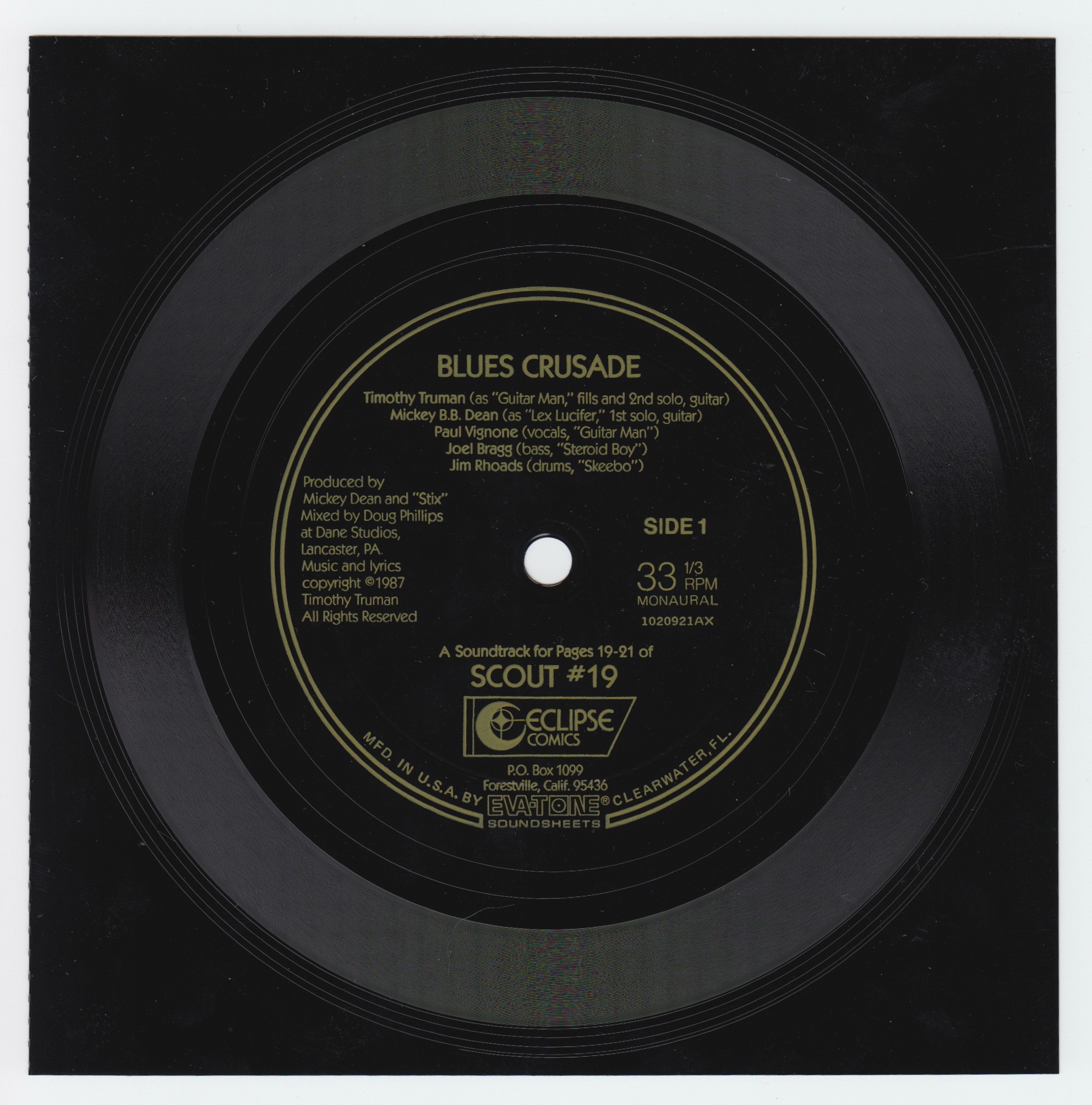
*Of course, one simple solution to this dilemma—how to create a page a reader can hear—is to include the melody of the lyrics in some form of musical notation. A reader familiar with notation, itself a series of symbols invented to record and document sounds, would then be able to read the score and hear Rick Jones’s song. Or, why not include a soundtrack with the comic itself? This, of course, is a viable option today in the age of web comics, and even by the early 1980s some writers and artists began exploring forms of multimedia. Issue #3 of Mike Baron and Steve Rude’s Nexus (Capital Comics, 1981), for example, included a flexi disc. “Comics in Stereo!” declares the black and white magazine’s colorful cover. Tim Truman also included a flexi disc in issue #19 of Scout (Eclipse Comics, May 1987) with songs recorded by his band The Dixie Pistols. Eclipse then released a full-length album by The Dixie Pistols in 1987. The record included a Scout minicomic.
An image of the flexi disc included with Tim Truman’s Scout No. 19 (Eclipse Comics, May 1987)
___________
References
Barthes, Roland. Image—Music—Text. Trans. Stephen Heath. New York: Hill and Wang, 1977.
Benson, John. “A/E Interview: Gil Kane” in Roy Thomas and Bill Schelly (Eds), Alter Ego: The Best of the Legendary Comics Fanzine. Raleigh: TwoMorrows Publishing, 2008. 156-168.
Marcus, Greil. “Self Portrait No. 25” in Bob Dylan by Greil Marcus: Writings 1968-2010. New York: PublicAffairs, 2010. 7-27.
Jacobs, Will and Gerard Jones. The Comic Book Heroes from the Silver Age to the Present. New York: Crown Publishers, Inc. 1985.
Nicolaïdes, Kimon. The Natural Way to Draw: A Working Plan for Art Study. Boston: Houghton Mifflin Company, 1941.
O’Neil, Dennis and Neal Adams. The Green Lantern/Green Arrow Collection. New York: DC Comics, 2004.
Shelton, Robert. No Direction Home: The Life and Music of Bob Dylan. Milwaukee: Backbeat Books, 2010. (e-version)
Thomas, Roy. E-mail to author. April 7, 2013. 8:15 pm.
Thomas, Roy (w), Gil Kane, (p), Dan Adkins (i), Artie Simek (l). “The Hunter and the Holocaust” in Captain Marvel No. 20 (Marvel Comics, June 1970).
Truman, Tim. “Houserockers” in Scout No. 19 (Eclipse Comics, May 1987).
Willis, Ellen. “New Morning: Dylan Revisited” in Nona Willis Aronowitz (Ed.), Out of the Vinyl Deeps: Ellen Willis on Rock Music. Minneapolis: U of Minnesota Press, 2011. 30-33.

