Conseula Francis and Qiana Whitted on the End of Truth

I wrote a post on the Robert Morales/Kyle Baker “Truth” a little bit back, and both Conseula Francis and Qiana Whitted felt my take on the story’s ending was too positive. I thought I’d highlight their comments here.
 
Conseula Francis:

I don’t know if I buy that America is being assimilated into Bradley. White Cap, as a symbol and as an individual white guy, is being salvaged in those last images. Because Steve Rogers, in uniform, continues to be such a decent guy and is innocent of all the bad shit that happened to Isaiah, and because the threat of Isaiah ever competing to wear the uniform is removed, all can be well at the end of this book. I think the first six issues of this book are Isaiah’s and the last issue is Steve’s. This is a happy ending for Steve, for whiteness, for America–“we acknowledge the sin, so we are absolved of it” this conclusion seems to be saying. And that’s because in 616 continuity Steve matters, not Isaiah. Whiteness matters, is central. Blackness is something we can acknowledge as long as it doesn’t contaminate. Imagine where this story might go in continuity if it got connected to the jailhouse experiments that gave Luke Cage is powers, or to the European colonizing efforts that Wakanda managed to fight off, if Miles Morales got to explain how being a super-powered mutant is not, in fact, just like being black.

Reading back over this, it sounds like I don’t like this book, which is not true at all. I like it a lot. The ending, though, feels like such a betrayal of the rest of the story.
 
Qiana Whitted:

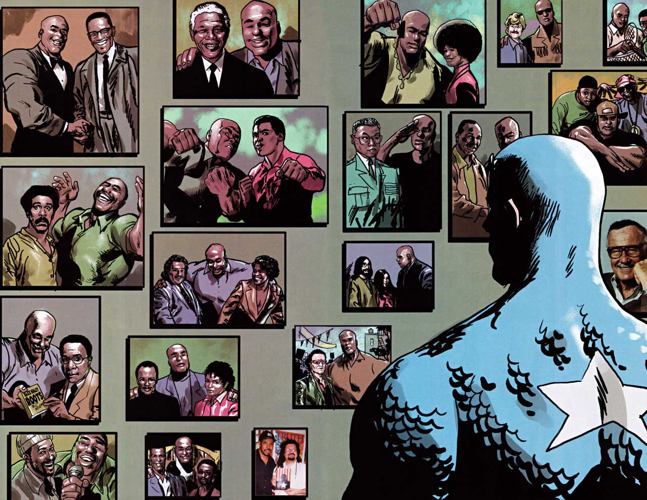
Much like Conseula, I felt like the ending was a betrayal of the rest of the story. I remember reading it when it came out and turning back at the cover page of the last issue because I wasn’t even sure it was the same writer. I also thought that part of the story’s value and potential had a lot to do with the way Bradley’s experience encouraged us to re-read the silences in the early Golden Age superhero comics. The idea that people like Bradley and his fellow soldiers – whether they existed in the official continuity or not – had always been there and never acknowledged was in itself quite powerful. I think I would have even been okay with symbolic resonance of Bradley’s state of mind in the conclusion if Rogers had not appeared to “set things right.” And I mean, I can appreciate the warm fuzzies of the wall of photos, but wouldn’t it have been awesome to see Bradley pictured alongside his fictional peers? Other superheroes? (Not just Rogers?) Would that have been a even bigger risk? That’s why I see this as a missed opportunity.


isiah-bradley17

America’s True Colors

Can a black man stand for America?

Barack Obama is one answer to that question — and a somewhat complicated one given the conspiracy theory birther nonsense that has been belched up in the wake of his presidency. Another answer is the upcoming Captain America arc, in which Sam Wilson, formerly the Falcon, is going to don the Cap uniform.

We don’t know yet how Marvel will approach the issue of a Black man as an icon of Americanness. But we do know how they addressed it once before, in the 2003 mini-series Truth: Red, White, and Black — a mini-series written by the late Robert Morales and drawn by Kyle Baker. Morales and Baker have very specific, very complicated thoughts on what it means for a black man to be America — and most of those thoughts are really, really depressing.

To understand what Morales and Baker are doing in Truth, you have to recognize that not just Captain America, but superheroes more broadly, have from their inception been obsessed with Americanness — and with assimilation. The Jewish creators Jerry Siegel and Joe Shuster inaugurated the genre with an immigrant from another planet who is adopted by friendly middle-Americans, and becomes the perfect, iconic personification of American strength and the American way. The Clark Kent identity can be seen as a kind of buried Jewish self, uneasily replicating stereotypes about emasculated, nerdy Semites. That’s true for Captain America too, to some degree. Created by Joe Simon and Jack Kirby, both Jews, the weak, spindly non-manly Steve Rogers takes the magic super-soldier formula and becomes the ur-American. More recently, G. Willow Wilson has played with this in Ms. Marvel, creating a young Muslim girl who (at least in the first few issues) transforms into a blonde-haired white-skinned Caucasian when she goes superheroing. Gene Luen Yang and Sonny Liew take a related tack in The Shadow Hero, drawing parallels between their Chinese-American hero’s embrace of superheroics and his embrace of Americanness.

Assimilation fantasies can work for Jews and, arguably for Asian-Americans and Muslims. But they don’t necessarily work for black people. Black folks came to America long before my Jewish family did — but me and Stan Lee (neé Stanley Lieber) are white now, and black people are still black. A superhero fantasy about gaining powers and becoming Ameican which acknowledges the black experience, then, is going to be more difficult, and potentially more bitter, than superhero fantasies that are focused on the experiences of other immigrant groups.

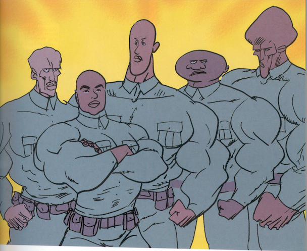
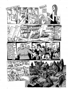
Truth is both difficult and bitter. The story is set in Marvel continuity after Steve Rogers has become Captain America, and after the creator of the super-soldier formula has been shot. The U.S. Army is experimenting with trying to recreate the formula — and, in a nod to the horrific Tuskegee syphilis experiments, the subjects it chooses to experiment on are black soldiers. Without anything like informed consent, the soldiers are injected with versions of the formula. Most of them die, literally exploding. Most who survive are deformed and twisted, as Kyle Baker makes full disturbing use of his talent for plastic, exaggerated cartooning. These twisted supersoldiers are used as cannon fodder, or destroy themselves because of the emotional instability caused by the drug.
 

Screen Shot 2014-08-28 at 8.21.37 PM

 
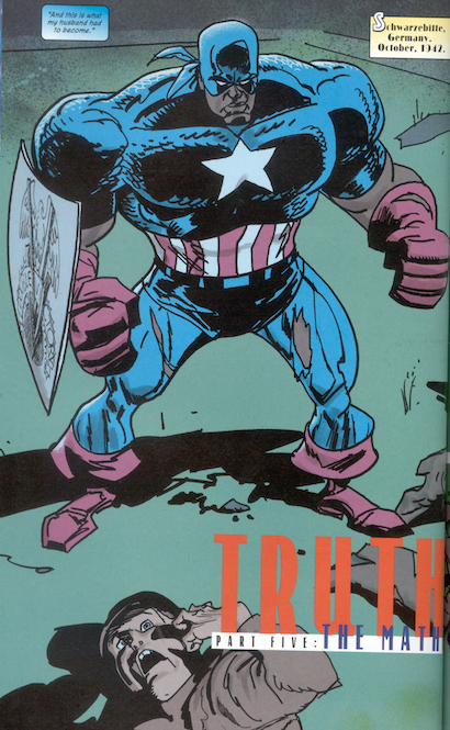
Eventually only one man is left, Isaiah Bradley. He goes on a suicide mission to disrupt the Nazis own supersoldier formula — wearing an extra Captain America uniform he stole. After succeeding in his mission, he is captured, and miraculously escapes, at which point the U.S. military arrests him for taking the costume and puts him in solitary confinement for over a decade. The supersoldier formula damages his brain; the government refuses to treat him, and he ends up with the mind of a child. End of heroic parable.
 

Screen Shot 2014-08-28 at 8.25.20 PM

 
In a lot of ways, this is an assimilation narrative. A black person, like the (somewhat but not all that subtextual) Jewish person before him, takes the supersoldier formula, and gets to become that icon of the United States, Captain America. But that story of triumph and belonging is tragically warped — and the name of that warping is racism. Black men are seen by the army and the United States as disposable, inferior subhumans. Becoming American, for them, means being enslaved, tortured, and killed. Isaiah Bradley can claim his Americanness by putting on the Cap uniform, but America is too dumb to be honored. Instead, it does to Bradley what it has done to thousands of its black citizens; it puts him in prison.

The story, then, is about the way that black people are not allowed to assimilate, and not allowed to become American heroes. But it’s also, and at the same time, an indictment of what is being assimilated to, and of assimilation itself. James Baldwin famously asked, “Do I really want to be integrated into a burning house?” and Truth poses the same pointed question. The U.S. is in many ways shown to be little different from Nazi Germany. Like the Nazis, the U.S. performs hideous medical experiments on what it considers to be inferior races. Like the Nazis, the U.S. engages in mass slaughter; the armed forces are shown indiscriminately murdering black soldiers because it perceives them as a security risk — and though this is based on a probably untrue apocryphal incident, it stands in easily, and accusingly, for long-term American mass violence against black people from slavery through Jim Crow and beyond. An American seen through the eyes of the black experience is an America steeped in racial bigotry and violence. It’s not a heroic America, nor one that deserves either loyalty or respect. From this perspective, the Superman and the Nazi Ubermensch are two sides of the same spandex — both champions of racism and evil. Assimilating to that doesn’t make you a hero. It makes you a monster.

Morales is quite direct about the parallels between the United States and Nazi Germany; he talks about America’s pre-war embrace of eugenics, and notes that U.S. racist immigration policies were an inspiration for Hitler’s own state-sponsored racism. Ultimately, though, at its end the comic rejects its more radical stance, and re-embraces both superheroes and assimilation. Steve Rogers shows up in the present (fresh from suspended animation) to track down and punish a couple of racist military personnel who are presented as being responsible for the experiments. The institutional critique of the earlier part of the book is shuffled out in favor of revenge on individual bad guys.

On the one hand this seems like a compromise or a capitulation to the superhero narrative, with Captain America as the superhero ex machina who swoops in to save, not Bradley, but the idea of America’s goodness and strength. Bradley, childlike, seems overjoyed when Cap hands him his old torn costume, as if it’s his fondest wish to become part of the country that’s systematically, brutally, for decades, spit on him and ruined his life.
 

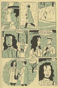
isiah-bradley17

 
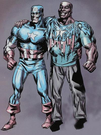
It’s also possible, though, to see the ending not as Bradley assimilating to America, but as America assimilating to Bradley. “I wish I could undo all the suffering you’ve gone through. If I could’ve taken your place…” Cap says to Bradley’s blank stare. That’s impossible, of course. Cap can’t be black. But the point of the comic, too, is that Cap can be black — and that he is black. The final image of the series, with the two Captain Americas photographed together, might be seen as Bradley finally being allowed into America. But it also recalls an image from a few pages earlier. There Cap stopped to look at a wall of images of Bradley photographed with Malcolm X, Nelson Mandela, Angela Davis, Richard Pryor, Muhammad Ali— a who’s who of black America. In seeking Bradley out, and honoring him, Cap is placing himself on that wall, with those pictures. Rather than Bradley becoming American, Captain America is becoming, or joining, black America. Justice, truth, and heroism come not through assimilating to white America, but through accepting and honoring the experiences of the marginalized.
 

truth-red-white-and-black-black-history-month

 
Is that an insight, or an approach, that Marvel is likely to pick up for its new Captain America run? We’ll have to wait and see. In the meantime, it would be nice if Marvel would reprint Truth — one of those rare superhero comics that sees clearly what’s wrong with the genre, and what could, maybe, be right.

An Erotics of Page Layout?

This is the fourth in a five-part roundtable on page layout in comics. I recommend reading the first three here if you haven’t already. And be sure to scroll down to the comments where you’ll find some good discussion about the merits of various approaches (neutral vs. baroque, artificial vs. natural, narratively-driven vs. dream-rebus-like) to layout. It seems the terminology we use to describe different layouts (“rhetorical,” “neutral,” “regular,” etc.) poses some problems, as does the assumption that there is such a thing as “natural” or “easy” reading. This is perhaps the result of the fact that we tend to experience our ingrained reading habits as natural even though they are shaped by the reading culture we were raised in. But there is no such thing as a layout that is not “rhetorical” (i.e. “motivated”) or “artificial” in this sense. The most challenging layouts force readers to confront the cultural constructedness of their reading habits in ways that can feel discomfiting. Comics scholars and artists, in trying to identify an underlying grammar or semiotics of comics, do often conflate pure description with prescription. And we should be suspicious of “pure” description since there cannot be such a thing, rigorously speaking.

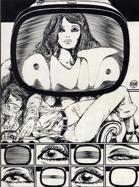
In any case, I don’t have much more to add to the debate(s). But, picking up on Adrielle Mitchell’s discussion of rhetorical panel layout experimentation, I thought it might be fun to reflect on the example of Guido Crepax, the Italian comics artist known specifically for his erotic narratives and his surreal McCay-esque experimentations with page layout.

tumblr_mjk2o90FBw1qi7w1po3_500

 
As phallocentric and macho as he appears to readers today, Crepax was a great innovator of narrative and visual techniques meant to delay the reader’s erotic gratification. His experimentation with page layout seems to have been intended to slow time down, to break the erotic moment and the body into endless fragments. Belgian comics scholar and Tintin specialist, Pierre Sterckx, describes Crepax’s work in these terms:

Commençons notre analyse en nous intéressant au retardement par le dessin : Crepax faisait son dessin en noir et blanc, ce qui produit un retardement du plaisir par rapport à un dessin colorisé et en volumes. Faites un dessin en couleurs et en volumes et ça devient du porno. Crepax a un trait extraordinaire, qui oscille entre la caresse et la flagellation.

Il existe un très beau texte de Roland Barthes consacré à l’œuvre de Crepax et dans lequel il dit qu’en parlant, les personnages retardaient leurs actes. Il y a une sorte de contrat qui s’installe entre ses personnages : entre la femme et son bourreau ou entre le maître et l’esclave. Dans ce contrat entre les deux, il y a la parole. C’est une autre manière de retarder l’action, qui est une méthode scénaristique chez Crepax. C’est quelque chose d’assez rare dans la BD. Ainsi, Crepax exalte le masochisme car il sépare le désir du plaisir et il place la douleur entre les deux.

Let’s begin our analysis [of Crepax] by paying attention to the delay [of gratification] through drawing: Crepax drew in black and white, which brings about a delay in pleasure compared to a colored drawing with depth. If you draw something in color and with depth, it becomes pornography. Crepax has an extraordinary line that wavers between a caress and a whipping. 

There’s a lovely text by Roland Barthes devoted to Crepax’s work and in which he say that the characters delay their [sexual] acts by speaking. A sort of contract emerges between these characters: between the woman and her executioner or between master and slave. In this contract between the two there is speech. This is [yet] another way of delaying action; it is a plotting method for Crepax. And this is quite rare in comics. In this way Crepax exalts masochism because he separates desire from pleasure and places pain between the two. 


2_Emmanuelle

 
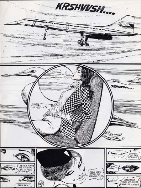
His page layouts are superb and often disturbing. I love how the round panel superposed on the rectangular panel, where a Concord jet is foregrounded by a heron-like bird in flight, suggests an organic erotics of acceleration. The gravity of the page layout centers on Emmanuelle’s pelvis where the reader is compelled to share in her erotic enjoyment of the Concord’s takeoff. More than just delaying gratification, the page layout here mirrors the reader’s body, directs the reader’s corporeal response down to the pelvis. Meanwhile, the bottom of the page opposes three sets of eyes and three sets of lips in two columns of three panels between which we see a single panel that frames the flight attendant’s face as an erotic object caught incommensurably between the scopic and oral drives.
 

tumblr_lu3forNv8Q1qzekceo1_500


Valentina-by-Guido-Crepax

 
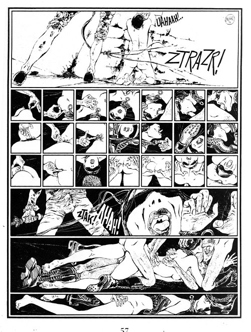
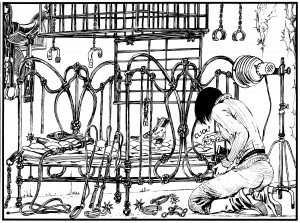
The panel above juxtaposed with the page layout above it (where the proliferation of panels slows the apprehension of even a highly explicit BDSM scene) suggests an interesting rapport between the constraints of panel arrangement and the techniques of BDSM. The cages and intersecting lines in the above panel echo comic book page layouts of various sorts, ranging from the geometrical to the organic. The vegetal art nouveau lines of the bed seem to refer visually to some of the page layouts we see in Windsor McCay’s work while the superposed grids as cages (or decoration?) seem much more autoreferential.
 

maurymoore-2010073131656-021-original

 
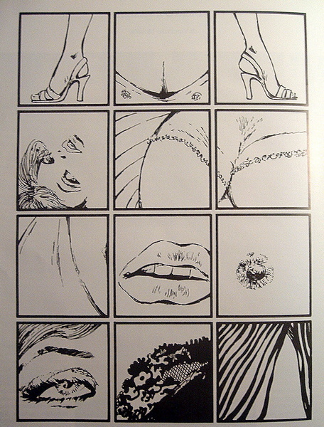
I wanted to conclude with at least one (rare) example of a regular waffle iron type layout in Crepax’s work. The above page layout, composed of twelve evenly spaced cube-shaped panels, is far from neutral. If anything, the geometric regularity of this page layout points to the synechdotal/fetishistic violence of (masculine?) desire and links that violence to the comics art form. More specifically, it links the representational violence of the medium to cadrage, or framing. The top three panels of the above page layout present what looks at first to be a relatively spatially coherent presentation of Valentina’s body (two outwardly pointing high-heel clad feet framing her bust) but the rest of the panels flit from erotic liminal zone to erotic liminal zone, from parted lips to a single erect nipple, from the edge of a lace bra to a hairline. The overall effect is one of scopic violence, as erotically compelling as it is disturbing, but it also reads as experimental and “rhetorical” (or “motivated”) in its imposition of a fetishistic erotic gaze onto a regular grid layout.

When is a Grid Not Just a Grid? (Groensteen and Page Layout Roundtable)

pekar

The previous contributions to our roundtable have raised important questions about Thierry Groensteen’s approach to page layout in Comics and Narration. While a rich array of images in Adrielle Mitchell’s post encouraged us to consider how frame irregularities produce meaning, Roy Cook set the stage for an important conversation about the values comics readers attribute to different panel arrangements. Roy’s post really got me thinking about the way Groensteen privileges the layout pattern of the “waffle-iron” by identifying stability, simplicity, and transparency as fundamental attributes of the orthogonal shapes. Groensteen further conceptualizes the grid in the narrative rhythm of comics as the “basic beat” against which the visual and verbal elements of comics can improvise.

From this perspective, it’s not difficult to see how one might characterize the grid as “regular” or “neutral” or “invisible,” but I remain troubled by the relative nature of these terms, who defines them and in what context. To complicate the issue, my first instinct was to seek out comics that delight in the wildly experimental layouts that Groensteen might find “more sophisticated (or more hysterical),” but Adrielle’s post provides several excellent examples already. So I thought I would ask instead about comics that use the grid, but in unexpected ways: how do comics adapt the basic panel layout in order to stray from what Roy described as Groensteen’s “waffle-iron way of truth”? When is a grid not just a grid?

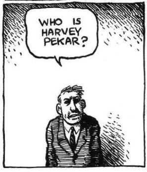
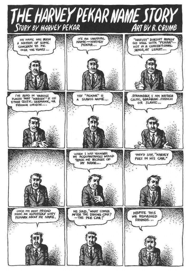
I wonder, for example, how a comic like “The Harvey Pekar Name Story” fits into our understanding of frame regularity and rhythm. Though we may be inclined to make assumptions about its uniformity at first glance, R. Crumb has not simply drawn 48 identical copies of the same man in the squares of this four-page comic about the different Harvey Pekars listed in the phonebook.


PekarNameStory

The text varies and so too do the hand-drawn panels that reveal each frame’s scratchy imperfections. The careful reader’s eye becomes attune to the nuances of Harvey’s expression and posture. It is a “basic layout pattern” and yet it has “irregularity as a common feature” (43) — a fitting contradiction for a story about Harvey Pekar’s search for his own unique identity. It seems to me that a comic like this one actually exposes the illusion of neutrality by calling attention to the grid’s own constructedness.

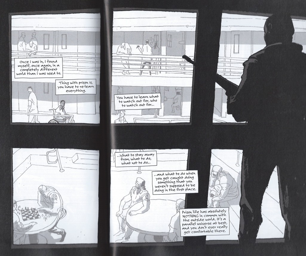
Another example that comes to mind for me is a two-page spread from Percy Carey’s graphic novel memoir Sentences: The Life of M.F. Grimm with art by Ron Wimberly. During Carey’s time in prison on a drug conviction, Wimberly uses the bars of the jail cell to structure the layout of the page, building barriers between us and the detained bodies, the narrative boxes, and the armed guards

sentences

Groensteen describes the thick borders that Chris Ware uses in Jimmy Corrigan as having “an almost carceral appearance” (48) and given the emotional constrictions of multiple generations of the Corrigan family, Ware’s panel choices aid in the production of that meaning. Alternatively, Sentences is a comic that has an unpredictably fluid design with layered panels and splash pages to convey the early days of hip-hop and Carey’s experience with music, drugs, and violence during the 1990s. The waffle-iron pattern is not the norm by any means; when the grid above appears, it actually disrupts a narrative rhythm that the writer and artist have already established. The uniformity of the panels might also be said to reflect the carceral lens that would continue to follow Carey after being released from prison.

Is this frame neutral or invisible? How might the perspectives of these two comics help us to reconsider the notion of the “basic panel layout” in other comics?

Are Some Panel Layouts Inherently Superior to Others? (Groensteen and Page Layout Roundtable)

This is the second installment in the PencilPanelPage roundtable on panel layout and Theirry Groensteen’s work (The System of Comics, Comics and Narration). Check out Adrielle Mitchell’s first installement in the series here!
 
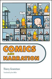
ComicsNarrationIn Comics and Narration Thierry Groensteen introduces a four-part taxonomy by which we (or at least he) categorizes comics in terms of the nature and structure of panel layout. The taxonomy consists of different ways in which the payout of the panels might be more or less regular:

  1. Do all pages have the same panel layout (or are they all variations on a single such template, etc.)?
  2. Are all the tiers of panels on a particular page (or all the tiers in the comic, etc.) the same height?
  3. Are all the panels within a single tier (or all the panels on a page, or all the panels in the comic, etc.) the same width?
  4. What is the number of panels placed on each page (i.e. what is the density of the page)?

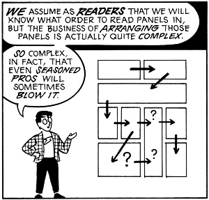
A page for which the answer to (2) and (3) is affirmative is a waffle-iron grid. Further, the more variation with respect to (2) and (3) found on a page, the more irregular the page. Factoring in (1), we also have a criterion for measuring (roughly) the regularity of the panel layout of an entire comic.

WaffleThe density of panels on a particular page – i.e. criterion (4) – while discussed at the same time as the first three criteria, is somewhat orthogonal to measuring the regularity of a page although variation in density from page to page obviously increases the irregularity of the comic in the relevant sense. Clearly, however, if the number of panels on a page varies from page to page, then as a matter of geometrical fact their layout must as well – thus, with regard to measuring regularity criterion (4) is redundant, subsumed under criterion (1).

This taxonomy is interesting, and allows us to categorize comics in terms of three distinct (although not completely independent) dimensions: the regularity of panel height (on a page), the regularity of panel width (in a tier or on a page), and the uniformity of these when considered page-to-page. Taxonomy is, of course, a wonderful tool for analysis and explanation, but a taxonomy is only as good as the explanation of, and analysis of, the relevant phenomena that it provides.

McCloudLayoutDigression: One pet peeve of mine is the tendency of scholar in the humanities – comics scholars definitely included – who propose taxonomies as if a system of categories is an intellectual end in and of itself (and as if they are following a more ‘scientific’ methodology). A taxonomy is a tool, however, not a result.

So, the obvious question is this: Are there any theoretical questions that can be answered by attending to the complex geometrical framework for analyzing comics panel layout provided by Groensteen? Groensteen seems to think so: he argues that, in general, the more regular the panel layout, the better the comic and its narrative (all else being equal). His argument for this claim is somewhat indirect – he identifies a regularity-eschewing ‘movement’ in comics, which he calls the neo-baroque and characterizes as preferring:

… the destructuring of the hyperframe by images that bleed off the edge of the page and intrusions into the gutter, the use of multiple insets, the maximization of the contrast between large background images and the inset panels, the vertical or horizontal elongation of panels (as if to achieve a shape as far removed from the square as possible!), and the frequent stacking of very narrow horizontal panels… (Comics and Narration p. 47).

Groensteen stridently disapproves of such strayings from the waffle-iron way of truth:

It is as if the simple succession of panels was no longer deemed sufficient to ensure the production of meaning: the apparatus must become more sophisticated (or more hysterical) by piling special effect upon special effect (Comics and Narration, p. 47).

It is worth noting that Groensteen’s complaints have a bit of a Euro-elitist tone to them: He explicitly blames the neo-baroque movement on the pernicious influence of manga (pp. 47, 61) and 1980s American superhero comics (p. 47, fn. 17, p. 61).

Setting this aside, however, it is worth asking whether Groensteen could be right: Are some panel layouts (and maximally regular waffle-iron grids in particular) better suited for effective narratives than others? There are two possible questions one could ask here:

  • In general, are comics better the more regular their panel layout?
  • If comics had to restrict itself to a single layout, would a more regular layout be better than a less regular one?

WareLayoutGroensteen seems to think the answer to the first question is affirmative, but I just can’t see how this could be the case. As many scholars have argued (and see the predecessor to this post by Adrielle for some evidence) panel layout can be carefully attuned to the type of story being told and the way in which the teller is telling it, resulting in narrative effects that are both theoretically interesting and likely unachievable by other, more ‘traditional’ means. Chris Ware’s work, for example, would be far less compelling had it been produced in a regular 3×3 grid (interestingly, Ware somehow gets a pass from Groensteen, despite his vast deviations from panel regularity in Groensteen’s sense.)

More promising, perhaps, is the second question (although it is not, I think, what Groensteen himself has in mind): If all comics had to be produced with the exact same panel layout, would a regular one be preferable? The answer here might be affirmative – it might be the case that a regular waffle-grid is neutral in a certain formal sense, so that it is amenable to functioning in all sorts of different narrative environments in a non-interfering manner (although the positive contributions of panel layout of the sort mentioned in the previous paragraph would be ruled out). Of course, certain metafictional comics that make direct use of panel layout would be impossible. But the second weaker claim regarding super-regular waffle grids does not seem immediately absurd in the way the first does.

So, are some panel layouts inherently superior to others?
 

Can Rhetorical Layout Modulate Narrative Momentum? (Groensteen and Page Layout Roundtable 1)

The entire Groensteen and Page Layout roundtable is here/


lp everything2


“…[T]he experience of reading a comic is a function not only of what is contained within each panel, but also of the size, shape, and design of the panels themselves as well as the spatial relations among them.” (Joseph Witek, “The Arrow and the Grid,” in Heer and Worcester’s A Comics Studies Reader, 155)

 
I have a foundational question to ask before heading into the first of our five Pencil Panel Page posts responding to Thierry Groensteen’s exploration of page layout and rhythm in his recently translated work, Comics and Narration (Mississippi UP, 2013, trans. Ann Miller), especially Chapter Two, “On a Few Theories of Page Layout.” Are we selling traditional (i.e. non-abstract) comics short by foregrounding them as “sequential narratives” first and foremost? I wonder if, by privileging narrative momentum, that forward-thrusting gesture of story that we are so wired to detect and to favor, we have occluded the equally compelling possibility of nonlinear composition and meaning-making on the comics page. So many discussions of page layout, including Groensteen’s to a great extent, are predicated on propulsion, i.e. asking how the reader’s eye is drawn from panel to panel to make sense of the narrative. This narrative accretes; if the layout is effective, the story is built up (Ware allusion intentional, yes) from its component parts (the panels), and the reader is drawn across the pages, actively cooperating in its construction: “The multiframe lures the reader ever onwards, it designates in advance the images still to come; the reader therefore feels summoned by them and rushes headlong after the forthcoming narrative segments, as if running down a flight of stairs.” (“The Rhythms of Comics,” Comics and Narration, 136)

This underlying metaphor is seductive. Why wouldn’t we favor a formal model that upholds comics as a vigorous, agentic medium that grabs readers visually and verbally and carries them into the story? Why wouldn’t we favor a formal model that applauds the skilled comics reader for his/her ability to catch the wave and move in rhythm with the text? Kinda sexy, no?

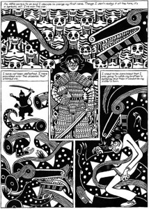
‘Cept maybe it’s not the only game in town. Groensteen’s exploration of the multiframe (the page; in System of Comics, this was sometimes translated as “hyperframe”) in Chapter Two relies on the privileging of narrative thrust, but it does gesture at another possibility, even if it doesn’t explore it fully. This possibility is not limited to abstract or wordless comics, which in a later chapter (Chapter 7) are offered as the [only?] comics forms that escape the regular “beat” of linear progression (“In narrative comic art, rhythm is no longer part of the content itself [as it may be on some pages of abstract comic art] but merely a mode of narration.” 135). The possibility that intrigues me is the page composed of “rhetorical” panels: “the technique that molds the shape or size of the panel to the action that it encloses.” (46). Groensteen attributes this term and concept to Benoît Peeters (Lire la bande dessinée [Reading Comics]) and suggests (too briefly) that interesting tensions can be created when regular patterns are interrupted to visually echo diegetic material (e.g. dialogue that extends beyond a panel border or the occasional use of symbolic panel shapes). Joseph (Rusty) Witek, in his important essay, “The Arrow and the Grid,” (in Heer and Worcester’s A Comics Studies Reader, Mississippi UP, 2009), offers another term–“gestalt” — for such panels, defining this layout process as one in which the “overall shapes of the panels take on narrative or thematic significance” (154). Witek offers early Jack Kirby Captain America pages as an example, and here’s a simple example from David B.’s Epileptic:
 

epileptic_page

 
(Incidentally, these two pieces of criticism work beautifully in conversation with each other, though neither references the theory of the other; perhaps this is one answer to a question posed for the forthcoming Comics/Graphic Narratives Discussion Group MLA 2015 roundtable on comics theory: “Now that many Franco-Belgian works of comics criticism are available in translation—The System of Comics, Comics and Narration by Groensteen, to name two—are we beginning to see a blending of Anglo and French comics theories, or do these seem to be two separate lines of thought?”)

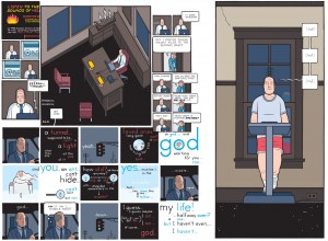
Both Groensteen and Witek see the regular pattern of layout as the basic structure of the comics page (for Witek, it’s a “grid,” for Groensteen it is the “waffle-iron”) and both discern relative degrees of complexity in any disruptions offered by comics creators, beginning with the “easiest,” which is based on the simple “elimination” of vertical or horizontal borders to create larger panels that still adhere to the basic structure, and in a modular form, insert smaller or larger panels into the given space of the grid. Groensteen conceives of this as “nested regularity,” and offers Chris Ware’s work as the quintessential example:
 

U_21_390066527146_ACME_20_sample

 
Interestingly, there is a bit of tension here: on one hand, Ware is acknowledged as tightly controlling the rhythm by disciplining the reader to recognize the basic pattern and then follow it as it shrinks Fibonacci-style, yet readers can and do fight this highly controlled regularity, as Orion Martin did in his June 6, 2014 Hooded Utilitarian post, “I’m Lost: Path-Finding in Comics“:

“Recently, while reading Chris Ware’s Building Stories, I found myself completely ignoring the path that he had imagined. Instead of a narrative progression, I read the pages as clouds of remembered moments, letting each fall into place in due time.”

(Here, Martin has hinted at exactly what I’m hoping for: perhaps we don’t have to stay narratively inclined while reading narratives!)

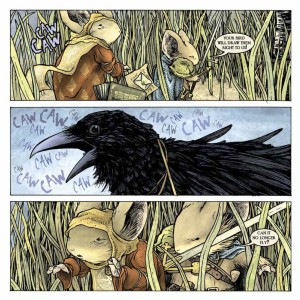
More sophisticated versions of experimental layout that still do not reach the gestalt/rhetorical stage are other types of play on the regular grid; for example, occasionally altering the expected number of panels (“density”) in an otherwise regular album (book)–splash pages, landscape panels, etc.–, changing the very shape of the page from the usual rectangle to another shape,
 

mouse-guard-v3-the-black-axe-preview-pg11

 
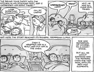
(see David Petersen’s enlightening discussion of why he believes the square page works best for his Mouse Guard), or making the grid slightly irregular– an “offset grid,” offers Witek—as Alison Bechdel uses here:
 

alison-bechdel_fun-home_oven

 
Or how about combining bordered and borderless panels, while also varying the number of panels per line, as Seth does here:
 

scan0011

Here’s Joe Sacco doing even more clever things with the offset grid:
 

footnotes_in_gaza_

 
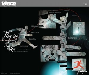
Finally, we approach rhetorical panel layout, which not only takes into account what is happening diegetically, but also assists the reader in exploring thematic and tangential meaning on the page (i.e. keeps us on the page, and perhaps beyond the page/beyond the comic, rather than simply propelled forward in the narrative), as in this fine example from Jason Smith’s The Jumper:
 

20130205-OnTheVerge-TheJumper-38

“…I mean what happens when the story actually calls for some kind of different layout?” Smith wonders in his meditation on the layout choices he made for The Jumper.

“The layout actually gets the reader to do two things that most comics don’t normally ask you to do: 1. read up the page from top to bottom [sic; I think he meant bottom to top], and 2. read from right-to-left.”

Though he doesn’t explore this gesture fully in his blog post, Smith does show how it is possible to significantly break with the grid in order to exemplify something fundamental to the story. I’ll be interested to see what Barbara Postema has to say about this in her chapter, “Concerning the In-Between: Layout in Frames and Gutters,” in the promising Narrative Structure in Comics: Making Sense of Fragments (RIT Press, 2013), which I’m hoping to get to before (*#$^!) the fall semester crashes into me.

Want to hear a comic artist think about rhetorical panel layout experimentation in a complex, legible way, without even once mentioning Groensteen? Read the creator of Dresden Codak, Aaron Diaz’s post, “Advanced Layouts: Paneling Outside the Box,” on his blog, Indistinguishable from Magic. Diaz offers us clear and compelling examples of nontraditional layout in order of difficulty. It’s a far less turgid exploration of the topic than the post you are currently reading, and well worth the jump. Go now.

Is Survival Always the Best Option? Pessimism, Anti-Natalism and Bloodchildren

This is part of a roundtable on the work of Octavia Butler. The index to the roundtable is here.
__________

If we count not only the unusually severe harms that anybody could endure, but also the quite routine ones of ordinary human life, then we find that matters are still worse for cheery procreators. It shows that they play Russian roulette with a fully loaded gun — aimed, of course, not at their own heads, but at those of their future offspring. – David Benatar, Better Never to Have Been, p. 92

Benatar’s anti-natalism is not likely to capture the popular imagination any time, soon; probably never, I’d wager. What kind of person accepts that it would be for the best should humanity stop reproducing? But a few metaphysical defeatists do indeed take some solace in it, at least by discovering a comrade in bleakness who attempts rational arguments for our shared existential plight – justifications that aren’t reducible to some mere psychological fracture. The psychologistic dismissals of pessimism are widespread, most recently and disappointingly exemplified by writer Nic Pizzolatto in his TV series, True Detective. Disappointing, because Pizzolatto clearly shares my love for the most ontologically downtrodden horror author working today, Thomas Ligotti. Nevertheless, after 7 hours of episodes that dismantle straight guy Marty Hart’s ideas of family, hard work and law as delusional distractions which keep him from confronting the abysmal punchlines consistently delivered by pessimistic funny man Rust Cohle, and despite having the latter nearly quote Ligotti verbatim at times, Pizzolatto betrays all of this with a denouement that makes the show into little more than religious propaganda hidden in a blighted form. Rust has a metaphysical conversion in the finale after a near death visitation by his dead daughter and father: he begins to see little rays of hope peeking out of the darkness of the nighttime sky. Turns out it was the trauma of losing a child and of not having reconciled with his father – genetically, a future deadend and an unresolved past – that lead to those previously expressed dark thoughts, and not, say, facing the objective ramifications of the eternal perspective, or sub specie aeternitatis, which can only reveal an end to humanity, its concerns and all its artifacts. Rust and the audience need no longer worry about such ramifications with the hope of continuing as an immortal soul. Ligotti refers to such pessimistic flimflam as a “façade of ruins, a trompe l’oeil of bleakness.” (Ligotti, p. 147)
children-men-poster

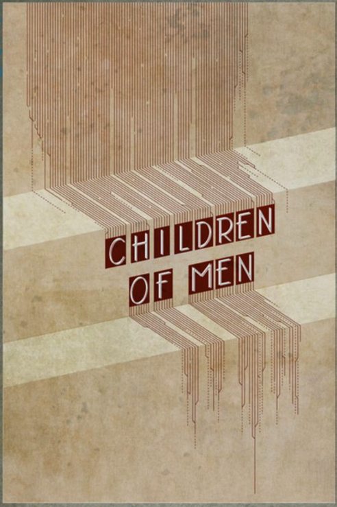
Another shell game with hope is played out in Alfonso Cuarón’s Children of Men where an inexplicable apocalyptic plague has resulted in universal infertility. Regarding anti-natalism, Peter Singer naïvely wonders, “If we would all agree to have ourselves sterilized then no sacrifices would be required — we could party our way into extinction!” Instead, the film offers a more psychologically plausible scenario: With humanity facing its true endgame, the last generation behaves like a coyote chewing through its ensnared limb, only to realize that each of its limbs is equally trapped. There’s no shared hedonistic spirit, where the world turns into one big Burning Man festival, rather the state (England) erects more barriers, whereby the more privileged, based on the same old fears of class and race, try desperately to reduce the possibilities of the less fortunate ruining whatever pleasures are left in the one thing everyone is forced to share, a moribund genetic fate. Shit never stops running down hill. What the film suggests is that thanatopobia is part of our psychological foundation. “To subdue our death anxiety, we have trumped up a world to deceive ourselves into believing that we will persist – if only symbolically – beyond the breakdown of our bodies.” (Ligotti, p. 159) When we can no longer postpone reflecting on the nothingness of the final true death to some future progeny, we can no longer rely on the comforts of a symbolic immortality. The film suggests we would behave like caged animals. But, then, one of those rays of hope shows up in the form of a pregnant woman, suggesting the human race isn’t finished yet. After which, the story becomes one of a formerly defeatist protagonist making sacrifices for the benefit of some future society that he hopes (with his re-discovered faith) will be better than the current one. The ending is ambivalent enough that the materially inclined need not feel betrayed like we were with True Detective, but it still gives the viewer an emotional escape hatch (unsurprising, I suppose, if you already knew that the book on which the movie was based is by a devout Anglican).

Likewise, thanatophobia – the maternal instinct being the relevant strain here – is the structuring motivation running through Octavia Butler’s tale of survival at any cost, Xenogenesis (aka Lilith’s Brood). After a nutwing contingent of ideologues wipes out most of the life on Earth with nuclear bombs, the few remaining humans are “rescued” by the Oankali, a parasitical species of date-raping colonialists with grotesque worm-like sensors all over their bodies who solve most of their problems with the evolved ability of genetic manipulation, a biologically inherited eugenics. Their means of survival is, like capitalism or the culture industry, to consume qua incorporation all the different beings and materials they find across the universe into their own genetic history, making the new more of the same.

What’s particularly interesting about Butler’s take on the alien invasion trope is that she focuses on a human collaborator, Lilith, and not the heroic figure of the resistance fighter. Not that there’s much possibility for resistance once Lilith is awakened from her stasis, hundreds of years after the nuclear winter. The aliens have rebuilt much of the Earth’s topography and restructured the humans to suit their expansionist goals, which amount to serving the Earth as food to their massive living spaceships and propagating a new strain of the Oankali species using the human gene pool as a reproduction machine. Use it all up and move on. The only two forms of rebellion left to the humans are bitching a lot among themselves and a noncompliance that will result in an eventual death that’s not much more than long-form suicide. Lilith chooses the symbolic immortality of humanity by helping her fellow Terrans accept the idea of humanity becoming one more admixture to the collective genetic memory of the Oankali.

xenogenesis-cover

But I doubt Butler would agree with my negative description of the Oankali, since she rationalizes most of their oppressive behavior as the story progresses.  However objectionable they may at first seem, they look much more like a perfectly harmonic anarchy of superheroes by the end of the series. Thus, what begins as the subjugation of humanity turns out to be its salvation. The Oankali understand each other, other living beings and the world around them on precognitive levels, genetically and materially. They don’t need the muddying mediation of language, since they can objectively tell if no means yes. Humans might be cognitively confused, but the Oankali can see the essential truth underneath. Butler is clearly sympathetic to their collectivism, setting it up as a utopian vantage point, her sub specie aeternitatis, from which to critique what she considers humanity’s defining problem, the human contradiction. That is, humans have a biological characteristic for being hierarchical, which is seen in many other animals, too, but it results in stuff like nuclear warfare when reinforced – rather than, as Jdahya explains, “guided” – by the other major human feature, intelligence. (p. 41, Xenogenesis)

There’s a good bit of Jean-Jacques Rousseau’s early pessimism in how the Oankali (and Butler, evidently) perceive humans. His version of our fall from grace: When humans were closest to our animalistic predecessors, as natural man, lacking reflection, we simply existed in the present, moment to moment, like all animals. Even though there was a natural hierarchy, some serving as food for others, all animals, including early man, remained in a satisfied state of blissful ignorance. Worms don’t think about how awful their lives under the domination of birds; both simply do what they do. But once self-consciousness set in with the development of language, humans were capable of considering whether we’re better off now than previously and of making plans. This is time consciousness, which meant that we began to think about what things were like and what they may be like in the future, providing us with the faculty of perfectibility. Perfectibility relies on a perpetual dissatisfaction with our present situation based on comparisons to our past and imagined future selves and to other humans. This alienation from the present is what led, on the one hand, to the development of, say, moral thought or imagining a better polity, and, on the other, to the fear of death, or “our subjugation to the opinion of others [that] paves the way for direct political subjugation.” (p. 69, Dienstag, whose interpretation of Rousseau I follow here)

Rousseau mused about utopian arrangements that would help shelter modern man from time consciousness, where we might rediscover the authenticity of natural man, no longer feeling enslaved to the opinions of others. But, because we can’t forget all the knowledge that’s been acquired over our history, nor can we rid ourselves of temporality, he was highly doubtful that that we could ever return to primeval happiness. But aren’t the Oankali just such a fantasy of an advanced civilization that lives in an animalistic present? Their genetic telepathy makes language otiose while giving them a complete awareness of everything around them. Because of that link, they exist in a natural collective state that is inherently cooperative and anti-competitive. They don’t use tools, but they’ve plenty of organic technology, which is capable of the most advanced scientific feats, such as space travel. And because of their genetic memory across generations as well as a control of aging, they have no anxiety about death. Perfectibility is a matter of adapting to and merging with the surrounding organic forms – of tuning into their present environment, not being alienated from it.
bloodchild-cover

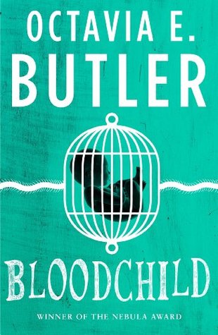
Using the Oankali as an impossible fantasy for perfecting humanity seems to me at odds with the story’s other major theme, moral responsibility for the subjugated. This is why the trilogy begins to lose ideological steam as Butler becomes increasingly interested in the alien culture itself (focusing on Lilith’s brood and Oankali politics) in lieu of how the humans behave under its dominion. Making substantive points about collaboration becomes difficult when human survivors ultimately should be thanking Lilith for being their Moses to an eternal Oankali paradise. Consequently, I prefer the short story, “Bloodchild,” which Butler wrote while doing research for the trilogy. It explores many of the same themes without the wish fulfilling distractions: The Tlic, an intelligent insect-reptile hybrid with scorpion tails bond with human boys early in their life as a way of preparing them to be symbiotic incubators for the alien species’ vein-munching larvae. (Males are used as hosts, because females are needed to birth enough males to meet Tlic demand.) Humans have once again fucked up everything sometime in the past – this time, by making Earth into some slave-based dystopia. So some refugees found their way to the Tlic’s planet, where the master-slave relation proved more agreeable than back home. As in Xenogenesis, the humans survived only through a diminishment of their humanity. However, there is no potential for perfectibility by becoming part of the Tlic’s reproductive process. They have pretty much the same contradiction that we do.

It’s a coming of age story in which the adolescent Gan is getting ready to have T’Gatoi, an important Tlic bureaucrat and longterm family friend, implant her larval eggs into his bloodstream. His mother, Lien, agreed to this long ago, his father was a host before him (he carried T’Gatoi), and Gan has been raised to accept it as his purpose. The family gets plenty of food and privileges through their relation with T’Gatoi. Gan only begins to question his fate after witnessing the way the little Tlic grubs, ready to be delivered, begin to feed on their host until they can be moved to the corpse of an indigenous beast. This bloody act of physically substituting one body for another helps him realize that his existence is reduced to being a host animal. He seriously considers suicide to prevent himself from being either a mere means for T’Gatoi or the living dead existence of his brother, Qui, who’s resigned to wandering about the preserve on which they live, high on the narcotic egg juice that the Tlic supply to keep the humans living long and pacified lives. But if he doesn’t serve as host, his sister Hoa will; in fact, she even wants to. To save his sister from such a fate, he recommits himself to the task. However, he doesn’t explain it (in first person) as a mere sacrifice on his part, but as a personal desire: “[T’Gatoi:] ‘But you came to me … to save Hoa.’ [Gan:] ‘Yes.’ I leaned my forehead against her. She was cool velvet, deceptively soft. ‘And to keep you for myself.’” (Loc 340) Despite Butler’s insistence in the afterword (Loc 364) that this is a story about love, not slavery, the differential power involved makes her interpretation about as reasonable as a non-ideological romance between Sally Hemings and Thomas Jefferson.

Similarly, when Lien shows signs of depression at having provided her children for Tlic reproduction, T’Gatoi responds by drugging her, using a sting of the Tlic’s tail and insisting that she drink more egg juice. No matter that T’Gatoi and Lien grew up together, the friendship, just like all forms of love between the two species, is corrupt and not to be completely trusted, regardless of how either side might interpret the relation. The dominating to dominated class hierarchy won’t allow anything more. Hardly limited to a slave economy, Butler makes a much better case against hierarchical discrepancies in this short story than she manages in the entire trilogy that followed. That’s because without a utopian interpretation of the alien superiors here, subjugated choice (qua love) is potently problematized, and the effects of domination are critiqued.

Although “Bloodchild” is a perfectly miserable gem that encourages a properly depressive reaction, it still focuses, just like every other example discussed so far, on the will to survive through a high sacrificial cost of some sort (in the case of Gan’s family, basic human dignity). When it comes to sowing the seeds for the future of humanity, our moral options, in fiction and for most people, are limited by a perverse optimism, which Ligotti (p. 154) summarizes as Frankenstein’s Oath: “We, as licensed protectors of the species and members in good standing of the master-class of the race, by the power invested in us by those who wish to survive and reproduce, vow to enforce the fiction that life is worth having and worth living come hell or irreparable brain damage.” As the aforementioned Benatar suggests, this Pollyannaism is justified by the low expectations of humans, sub specie humanitatis. We’re quite good at adapting to suffering and, like Gan, accommodating oppressive beliefs as our own when we have so little real choice. As he puts it, “we would not take slaves’ endorsement of their enslavement as a justification for their enslavement, particularly if we could point to some rationally questionable psychological phenomenon that explained the slaves’ contentment.” (p. 100, Benatar) He argues for another moral possibility, which should come as no surprise if you read the epigraph.
benatar-table

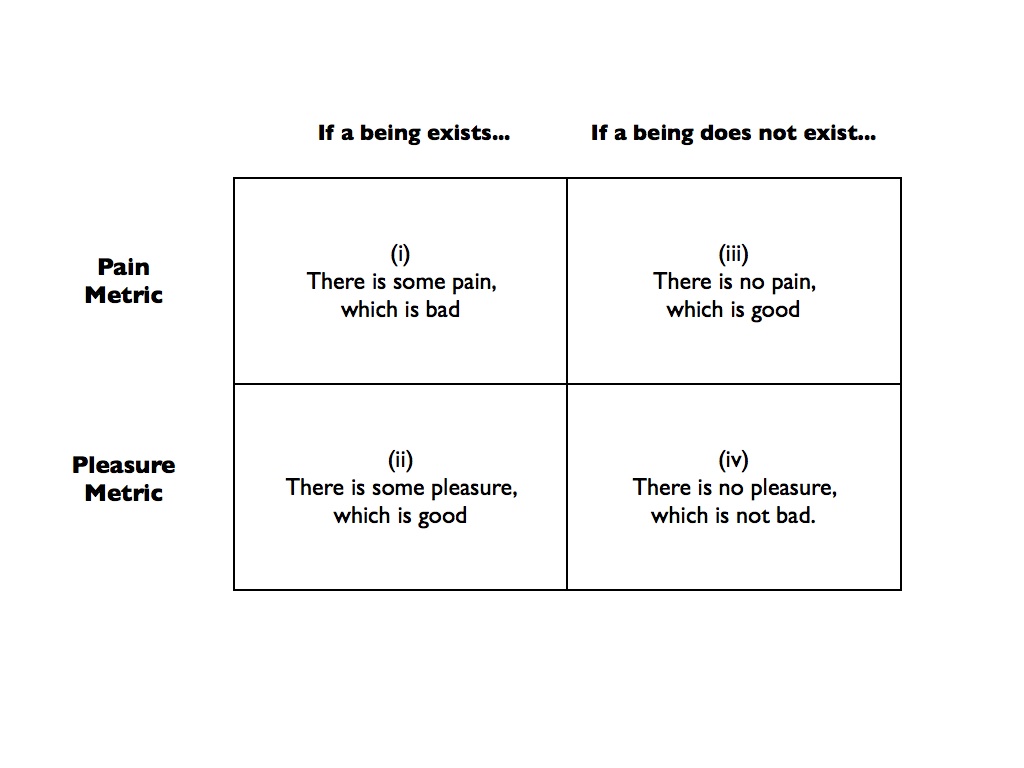
Regarding future-life cases 1 – i.e., the potential lives of people yet to be born and who are presently non-existent – Benatar makes the case for a fundamental asymmetry in how we evaluate whether it’s good or bad to bring them into existence such that the moral view is that we never should. In one scenario, Lilith brings X into existence, in which case we would say that X experiencing pain is bad and X’s experiencing pleasure is good. That’s agreeable enough, I think, but the problem comes in when we consider what happens should Lilith choose to not bring X into existence. The absence of pain is good even without X to enjoy it. That is, independently of any pleasure, it’s better to not have X than to have X in pain. However, pleasure doesn’t work out in an equally symmetrical fashion. The absence of pleasure isn’t bad unless X exists to be deprived of it. And since X doesn’t exist in this scenario, there’s nothing bad (but nothing good, either) about non-X not experiencing pleasure (since no one’s missing anything). It would be neither better nor worse to not have X who will experience no pleasure than to have X will experience some pleasure. Because it’s good to avoid bringing into the world whatever inevitable amount of suffering that will befall X by not having X, and nothing bad (nor good) would occur should Lilith not have X, she shouldn’t have X, nor should she ever have an X or Y or Z. The same goes for all of us humans, as well as the Tlic, but probably not for the Oankali, since pain isn’t really such a bad thing for them. Therefore, the collaborators in Xenogenesis and “Bloodchild” are not doing humanity any favors by doing whatever’s necessary to survive. They’re actually bringing unnecessary harm into the world, particularly since humanity continues only under the “thumb”/tentacle/tarsus of alien oppressors.

Benatar’s argument isn’t likely to convince the optimistic majority as it leads to some really uncomfortable positions, such as a pro-death view of abortion (women shouldn’t just have a legal right to choose, but should always use that right to abort) and that we should let the species die out even in the absence of extraterrestrial domination. And it has received some stiff philosophical challenges. However, he does offer intuitive support for his asymmetry by showing how it provides a basis for other more commonly accepted asymmetries. For example, most people probably share the view that we have a duty to not bring babies into the world that we know will greatly suffer (such as a fetus that tests positive with an incurable degenerative disease), but not the inverse duty to bring happy people into the world (there’s certainly nothing immoral about a kind and caring couple deciding to not have children). Benatar’s asymmetry provides a possible reason: It’s good not to have children with incurably painful diseases, but neither bad, nor good for children who don’t exist to not experience happiness – i.e., the couple who decides to not have a child isn’t depriving a non-entity of happiness. But, even if that doesn’t sound plausible, the argument is refreshing just because it runs counter to the popular temptation to justify whatever moral position one has with a just-so story from evolutionary psychology. Could there be an ethical view less biologically adaptive than anti-natalism? If for no other reason, I appreciate the effort.
we-who-are-about-to-cover

Showing sympathy for Benatar’s conclusion is Joanna Russ’ heroine, Elaine, in the relentlessly anti-utopian We Who Are About To …. With no hope of being rescued, she lets her fellow castaways know what she thinks about their plan to rebuild civilization on the planet where they’ve crashed:

All right, so you think you have the chance of a snowball in hell. Maybe you do. But I think that some kinds of survival are damned idiotic. Do you want your children to live in the Old Stone Age? Do you want them to forget how to read? Do you want to lose your teeth? Do you want your great-grandchildren to die at thirty? That’s obscene. (p. 14)

Taking a poke at stories like “Bloodchild” where humans fleeing from Earth always manage to discover advanced alien civilizations on other planets, this new planet is a barely hospitable environment with no signs of mental life, civilized or otherwise. There are so few women and men that all the others are not going to allow Elaine (or anyone else) to opt out of reproduction. The central struggle in the book is, as Samuel Delany discusses in his introduction, whether quality of life or reproduction provides purpose to our existence. Insisting on a right to die, she’s forced to kill all but two of the group, because they chose suicide. Elaine isn’t just skeptical like Rousseau that we could revert back to the state of natural man, she has no desire to do such a thing, fearing what a return to a natural hierarchy would likely mean:

You must understand that the patriarchy is coming back, has returned (in fact) in two days. By no design. You must understand that I have no music, no books, no friends, no love. No civilization without industrialization! I’m very much afraid of death. But I must. I must. I must. Deliver me from the body of this. This body. This damned life. (p. 21)

Once alone, Elaine records her final thoughts into a recorder (the narrative conceit of the book) as she starves in a cave, waiting for the proper moment to use a poison capsule. In place of the thanatophobic maternal instinct or Stockholm syndrome as love or a utopian dream that justifies a suffering existence, this is a violent stand for human and, more specifically, female dignity.

~~~~~~~~~~~~~~~~~~~~~~~~~~~~~~~~~~~~~~~~~~~~~~~~~

Footnotes:

1. Present-life cases involve the continuance of a life, the cessation of which involves a different threshold for suffering from the one regarding whether a life should never be started.

References:

Benatar, David (2008), Better Never to Have Been: The Harm of Coming into Existence. Oxford University Press.

Butler, Octavia (1996), Bloodchild and Other Stories. Open Road Integrated Media.

Butler, Octavia (1987, 1988, 1989), Xenogenesis. Guild America Books.

Dienstag, Joshua Foa (2006), Pessimism: Philosophy, Ethic, Spirit , Chapter 2. Princeton University Press.

Ligotti, Thomas (2010), “Sick to Death” in The Conspiracy against the Human Race, p. 147-167. Hippocampus Press.

Russ, Joanna (1976), We Who Are About To …. Wesleyan University Press.

Other Notes:

Children of Men poster is by Noah Hornstein.

Benatar diagram was borrowed from here, which also has a summary of the argument should mine not be sufficiently clear.

Finally, ‘Loc’ refers to the location in a an ebook edition I have of Bloodchild. This is different from the page numbers.