Re(Dis)membering Pushead, The Cheerful Blasphemer

The index to the Comics and Music roundtable is here.
_____________________
 
The album cover for Funeral Mist’s 2009 album Maranatha featured a dark chiaroscuro drawing of a cherub blowing his trumpet in the ear of a naked old woman, her eyes rolling back on her head as she masturbates for the apparent titillation of the viewer. Among the images within the liner is a very young girl, rendered in a similar style, holding a small, smooth stone delicately engraved with the word “Whore.” Really, no matter what you make of the message, it certainly qualifies as an attempt at humor, rendered with attention to traditional Western visual aesthetics.
 

funeral-mist-maranatha-2009-cvr

 
This cover was created by Funeral Mist’s only remaining original member, Mortuus, (nee Arioch), not by Brian Schroeder, a.k.a. Pushead, known best for his ‘80s and ‘90s illustration work for Thrasher magazine, Zorlac skateboards, Metallica and the Misfits. But the Maranatha art represents a revival of a Pushead-like appreciation of handicraft and fun that has been absent from Juxtapoz-style graphics for far too long. Despite his narrow range of subject matter (bones, skulls, bits of cloth or meat), Pushead’s work resonates with allegorical death tableaux from the northern European Renaissance, “ukiyo-e” Japan, revolutionary Mexico, and modern Symbolism, Expressionism, and Art Nouveau, realized in monochromatic tattoo-ready vignettes of sublime line and texture variation. Adorned with scarves, bandages, hair, wires, etc., Pushead’s skulls wink, leer, and grimace, eye sockets full of sparkly miasma and undead mirth.
 

pushead
 

pushead-neighborhood-211

 
I don’t know if there was any conscious influence, but when I first saw the work of German printmaker Horst Janssen, shortly after his death in 1996, I could not help but be overwhelmed by the formal similarities. Thorny tangles emerging from shadowy recesses, suffused in a particulate cloud of decay, to resolve into a mass that may have once been alive, always rendered with a delicate sense of slightly sadistic absurdity.
 

Horst Janssen

 
The other artist that Janssen, and perhaps by extension Pushead, recalled, was that other grotesque light of my teenage rendering pantheon, comics illustrator Bill Sienkiewicz. Which helps to make the point that this artwork is, at least at this point in history, “low” art. Not because it is in any way ignorant, but simply because it values craft over concept and fantasy over empiricism.
 

sienkiewicz_spideyvslizard

 
At least that’s what “low” art should value, according to me. The fact that so many design-based artists since the millenium want to cash in on their lack of craft or taste by painting a skateboard deck and hanging it in a gallery, and that the kind of trained, elegant modeling Pushead epitomized has been turned into pointless jungles of calligraphy screenprinted on to wraparound T-shirts at Kohl’s, is neither a judgment on “high” or “low,” fine art or illustration, but their troubled relationship. It’s a two-way sellout, much like the deliquescence of Metallica, post-Cliff-Burton, into therapy-empowered stadium-ready flight-simulator music, and the simultaneous aspirational decline of underground comics into faux-cinematic narratives of tortured magical-realist sincerity. The race for seriousness has done a lot of harm.

For years the door to my room sported a Thrasher page featuring Pushead’s Zorlac logo, a one-eyed pirate’s skull in which not only two locked cutlasses are embedded, but also a Christian cross formed by two bandage-bedecked bones.
 

zorlac1

 
It was (and is) a provocatively ridiculous image, but was never an issue for my churchgoing mother. This was years before black metal band members had to cut their bodies and smear themselves with entrails onstage in order to achieve cred– although Gwar had been using roughly similar tactics, equal parts Gallagher and G.G. Allin, for quite some time. This was when Slayer sang songs gleefully extolling murder and hellfire, but was fronted by a faithful Catholic, and Deicide was soon to take off, untroubled by its majority Christian lineup. Anti-racist skinheads were beating up Nazis, but thy weren’t jumping random people coming out of a bar. It was a less extreme time for extreme culture posturing.

This may have been partially because the censorious culture warriors were far more militant in the ‘80s. You could get in real trouble just for drawing a comic called “Boiled Angel.” Insofar as the retreat of assholes like Jerry Falwell, Tipper Gore, Jesse Helms, and Ed Meese means, say, more freedom for gay teenagers to come out and not kill themselves, we are in a far better place. But, in a way, Pushead had a kinship with the politically and viscerally confrontational artwork of the 1993 Whitney Biennial, when a sense of humor and detachment did not reduce the ferocity of a statement, but saved it from the pious, solipsistic irrelevance that has dogged visual culture since shortly after that time.
 

new-museum-family

“Family Romance” by Charles Ray from the 1993 Whitney Biennieal

 
Looking at Pushead again makes me think that it may be time to safety-pin a bloody banner to our genitalia and get back out in the street. I find hope in the fact that Mortuus from Funeral Mist, despite his grand statements about devil worship, obsessively quotes the Bible in his lyrics, thereby emphasizing in-between space over mere fidelity. Sometimes a stance is just an attitude, which may be far better than an ideology.
 

pusTheHammerSlaveMalletHS

Comics and Music Roundtable — Index

We’re going to be running a roundtable on comics and music over the next couple of weeks. This will serve as an index of posts in chronological order.
 

Bert Stabler, “Re(Dis)Membering Pushead, The Cheerful Blasphemer”

Craig Fischer, “Poster Boy”

Brian Cremins, “Gil Kane, Memory Drawing, and Bob Dylan’s Self-Portrait

Betsy Phillips, “A Theory of Why the Two Iron Men Became One”

Qiana Whitted, “Sound and Silence in the Jim Crow South”

Noah Berlatsky, “The Unheard Peanuts”

Kailyn Kent, “Phantom Music”

Marc Sobel, “A Review of Reinhard Kleist’s Johnny Cash: I See a Darkness

Michael Arthur, “Non-Canonical”

Ng Suat Tong, “Opera As Drama As Comics”

Chris Gavaler, “Top 5 Superman Songs of All Time”

Noah Berlatsky, “Klingklang Drawing”

Ng Suat Tong, “The Freewheelin’ Daredevil”

Subdee, “Phonogram 2: The Breakfast Club”

Russ Maheras, “Gene Simmons and Kiss: Channeling One’s Inner Superhero”

Noah Berlatsky,, “Presence”

Domingos Isabelinho, “Pamplemoussi by Geneviève Castrée”

Sean Michael Robinson, “Music or Comics, or Making a Joyful Noise”
 

591px-Bosch,_Hieronymus_-_The_Garden_of_Earthly_Delights,_right_panel_-_Detail_musical_instruments_(left)


The Blind Men and the Elephant

1

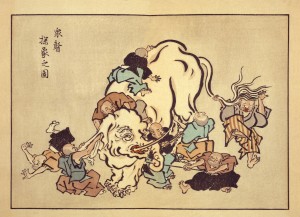
Hanabusa Itcho, Blind Monks Examining an Elephant. Itcho, by the way, not Hokusai, contrarily to popular myth, coined the word “manga.”

Speaking of stories… you know the parable: the blind men feel different parts of an elephant’s body and, afterwards, they disagree on what an elephant looks like. Such is the nature of truth; knowing only part of it we can’t grasp… speaking of pictures, the whole picture. In another version the men and the elephant are in a dark room, so, as the great Mevlana Rumi put it in this version: “If each had a candle and they went in together/ The differences would disappear[.]” If you didn’t get it already, and there are absolutely no reasons for you to know where I’m heading, I’m referring to the Eddie Campbell vs. Suat Tong or the “picturaries” (as I called them) vs. “literaries” controversy. I guess that the differences of opinion can be extended in an “us vs. them” kind of way to The Hooded Utilitarian (the non-essentialists) vs. The Comics Journal (the former Comics Comics – a great name to describe their philosophy echoing Eugeni Dors’ “painting-painting”). As I see it there are really two disputes, not just one: the aforementioned “various ways to look at an elephant” (Eddie vs. Suat) and the essentialist debate (THU vs. TCJ). I’ll try to address the two.

I’m worlds apart from Rumi’s greatness and I don’t believe that the differences will be solved by my saintly intervention, but, in a true meta-critical stance, I’ll try to do my best. I’ll state from the start that, obviously, I’m an interested part in this debate. Coming from a “picturaries” background, I graduated in Studio Art, I pass as one of the literaries. I don’t see myself as one, though. To explain why let me examine the core (as I see it, of course) of the text that started the whole thing: Eddie Campbell’s “The Literaries” at TCJ’s website:

What appears at first to be taking a more stringent view is in fact applying irrelevant criteria. It dismantles the idea of a comic and leaves the parts hopelessly undone.

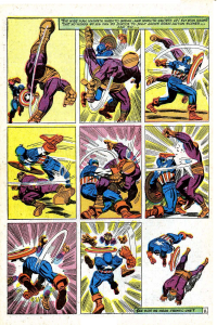
See that elephant over there? Besides, this is where the two debates converge: essentialist Eddie views literary criteria applied to comics as misguided because the true applicable criteria must be about pictures. And yet, what does Eddie consider to be literary specifically? The story or, the plot. The only problem is that in comics the drawings are the story too. To prove it I don’t need to go any further than Lee and Kirby’s (et al.) case in point below, given to us as an example of non-literary excellency in the aforementioned “The Literaries” blog post:

2

 Stan Lee (w), Jack Kirby (p), Frank Giacoia (i), Sam Rosen (l), anon. (c), “The Blitzkrieg of Batroc!,” Tales of Suspense #85, January 1967 (page # 8).

Curiously enough in the above example it’s the words that are self-referential and non-diegetic while the images tell the whole story: two characters beat the crap out of each other. If story equals literature who’s a literary now? Eddie Campbell himself inadvertently acknowledges this when he says:

Now, I am cognizant of the fact that the multitude of kids reading that Captain America were just thinking about what Cap and Batroc were doing to each other.

Exactly so because they were reading a story (the use of the word “reading” is, if you ask me, a co-option by the literary field because those putative kids were interpreting images). Why did this co-option of everything narrative by literature occur? Eddie Campbell didn’t invent it. It’s one of the dogmas of Modernist art of the Greenbergian kind. But Clement Greenberg didn’t invent it either. Here’s what Paul Cézanne said according to Joachim Gasquet, writing in 1912/13 (not exactly a reliable source, but still…):

I don’t like literary painting. […] [T]o want to force the expression of nature, to twist the trees, to make the stones grimace like Gustave Doré, or even to refine like da Vinci, that’s all still literature.

And yet Eddie Campbell doesn’t go that far. What he likes in the above page is clearly the expression (here’s what he says about a performance by Billie Holiday; we can’t compare comics with literature, but, apparently, it is OK to compare comics with literature if in a song; Eddie isn’t much of an essentialist, after all, even if he used the very word “essence” below):

I’m not talking here about technique, a set of applications that can be learned, or about an aesthetic aspect of the work that can be separated from the work’s primary purpose. The performer’s story is the essence of jazz music. The question should not be whether the ostensible “story,” the plot and all its detail, is worth our time; stories tend to all go one way or another. The question should be whether the person or persons performing the story, whether in pictures or speech or dance or song, or all of the above, have made it their own and have made it worthy.

So, Eddie Campbell wants us to pay attention to the artist’s expression (Cézanne/Gasquet would call him a literary I’m afraid). That’s one blind man feeling the elephant and I don’t deny his importance and value. But what about the other blind men? Don’t they feel equally important parts of the beast? Why this rage against the story?

I can’t talk for others, but what I value in a comic isn’t the story per se. What I really value is the meaning. This may be clichéd, but so be it: I believe that great artists reach some kind of truth. (They may be as blind as Itcho’s monks, but they’re very good feeling the little part of reality that interests them.) Doing so I considered already that the technical skills of the artists and writers, their ability to convey feelings (their expression or lack thereof because an artist may choose to convey ideas mainly) were capably handled. This isn’t an either or kind of situation. That’s why the claim that we literaries value Fun Home over Cliff Sterrett doesn’t make any sense (it’s an obvious straw man). Besides, meaning can be found in every mark that the artists and writers create on the page. I don’t see why meaning has to be associated with story and why story has to be associated with literature. By claiming meaning for my main criterion am I calling it the whole elephant? Maybe I am, but I’m as biased as the next guy. Why choose this elephant instead of that one is my next question? 

That leads us to the essentialist problem (counseled reading: Leonardo da Vinci’s Paragone): why can I compare a comic with another art artifact? Because meaning is something that we can find in every work of art. Exalting the comicness of comics to us non-essentialists doesn’t make much sense: yes, a comic is not a piece of music, but can’t we find cadences, internal rhythms in a comic? Again, why do we accept that those qualities are in music alone and not everywhere? Yes a drawing in a comic may be read in a narrative context (so, now the story is important again?; Eddie goes in and out of his philosophies as it suits his arguments), but aren’t these drawings lines and textures and compositions as all other drawings?

I could go on, but I prefer to analyze Lee and Kirby’s (et al.) page above from my point of view. I must acknowledge first the fact that it is a segment of a larger story (ten pages). I never write about stories that I’ve never read or are in progress, so I’m breaking one of my rules here… for now… This is wrong because, I don’t know?, judging a comic by one of its pages is the same thing as judging a book by its cover, isn’t it (that’s what Eddie kind of did in Kurtzman’s case)? Also, doing so, it seems to me, dismantles the idea of a comic and leaves the parts hopelessly undone, right? Gérard Genette said that there are two readings in a comics page:

in [visual] forms of narrative expression, such as the [fumetti] or the comic strip (or a pictorialstrip, like the pre-della of Urbino, or an embroidered strip, like the “tapestry” of Queen Matilda), which, while making up sequences of images and thus requiring a successive or diachronic reading, also lend themselves to, and even invite, a kind of global and synchronic look—or at least a look whose direction is no longer determined by the sequence of images.

(As a side note: it’s interesting to realize that the great critic and theorist, one of the literaries if I ever saw one, acknowledges the existence of visual narratives while Eddie doesn’t or tactically avoids acknowledging them.) The successive diacronic reading (what Pierre Fresnault-Deruelle called the linear reading) of words and images gives the reader the succession of events, the narrative. The global synchronic look (what Fresnault-Deruelle called the tabular reading) gives the viewer more of an aesthetic feeling. Both readings exist in all comics and the latter is what Eddie and Noah are talking about when they speak of “something else” and “ab ex.” I doubt that many will read the above page in a linear way (what’s the point: it’s just two guys in funny costumes fighting), but I will do just that:

What we have here is a nine panel grid, a static page layout if there ever was one, which isn’t bad for the intended purpose: the page layout contrasts with the action going on inside the panels. The first panel shows Batroc in one of Kirby’s famous foreshortenings. Another of Kirby’s tropes is the character invading the gutter as seen subtly here. What’s interesting in these three panels is Batroc’s leg in the air pointing up. In the second strip what’s pointing up are Captain America’s hand (when he receives a blow) and, again, Batroc’s arm and hands. Those who have limbs pointing up are losing balance and, hence, are losing the fight. The last strip is pretty much the consummation of the scene with Batroc falling on his back. The last panel depicts post-action fatigue and domination if you know what I mean. The guy who fell into the passive role in the missionary position was feminized and lost the fight. Also interesting is the back of Batroc in the second panel mirroring Cap’s back in the 7th, but with opposite meanings: powerlessness in Batroc’s case and absolute power for Cap. So, not only do these images tell a story, maybe it’s not exactly the story intended for the frantic one (i. e. the infant reader). 

What does the global synchronic look tell us, then? First of all there’s a rhythm of circular speed lines and straight shock lines (notice how Cap’s are a lot more powerful than Batroc’s sissified ones) constructing a texture that gave Noah the ab ex aspect that he mentioned. These are there to underline the violence and speed of the actions, but, more than that, to unify and create a relentless cadence in the page design. Here, again, the page functions differently in the three strips: a vertical thin speed line is counteracted in the next panel by a more powerful also vertical one. Things begin to change in that very panel though because the rhythm becomes horizontal until, at the end, returning to vertical completing a full circle with Cap’s might (in crescendo) replacing Batroc’s frailty. The full shot is consistently applied, but the feet deny that on panels one, two, five, six, seven, eight (it’s a device used by Kirby frequently: the characters don’t fit – as a curio see here the same effect used in 1109!). Cap starts on the viewer/reader’s opposite side to end up near his/her standpoint inverting positions with Batroc, in a kind of dance, as we have seen above. The 180 degree rule is broken from panel two to three. The point of view changes around the fighters. There’s a curious symmetry in the page with a kind of knot at the center. The last panel has no gutter (or has a virtual gutter) to show that something changed: the positions are now the same as those in the first panel, but Cap circles his prey in triumph (the symbolic order was restored; citizens may calmly eat their freedom fries again – Batroc, if you don’t know, is French and speaks with a heavy French accent – notice also the stereotypical pencil moustache and beard; I know that Europe was a female, so, it’s only natural that Batroc had to lose in combat against a macho American hero). The colors are loud and out of sync at some places. The background colors divide the page in, more or less, a dynamic diagonal. (If you allow me a personal note I always liked the imperfections of the old coloring.) Cap is garbed in white and primary colors (red and blue), Batroc is secondary colored (orange and purple). Looking at their colors alone no one can deny who will win. All this may seem exhilarating to Eddie, but I suspect that nostalgia plays a role also: “for me this page, and others of a similar stripe, opened up a whole new different way of thinking about comics (I was nine; I’d been thinking about them for quite a few years).”

Who are these people though? From now on Eddie will call me a literary, I’m afraid, but I insist, how come?, I analyzed drawings until now, nothing else! When Eddie asks and answers quite absurdly “how does that Marvel comic stand up if you take away the pictures? It doesn’t.” I say it does, a bit, but not that page above and why is that? That’s right: because if the pictures disappear the story disappears too. Storywise it’s interesting to note the micro-use of the known formula of popular tales (identified by Propp) “win-lose-win.”  

“The Blitzkrieg of Batroc!” is a superhero ten-pager with the usual macho boasting, dick waving contest and misogyny of old comics. The plot (oops!) is simple enough: Cap fights Batroc to save Agent 13 of Shield (aka Sharon Carter). After a plot twist Batroc and Cap team up against agents of Hydra to save the mam’selle who, obviously, has an infatuation for the gallant Nationalist hero. How many times do we need to read another damsel in distress kind of story? I want my time back! See how those nine pages did lack for a full appreciation of the comic?

Am I denying all the good compositional things that I said above about page 8? Of course not, but why should I forget everything else either? And isn’t the final product more important than just an aspect of the whole thing? What’s the meaning of this comic according to your truly? Woman, even if they’re agents of Shield, are frail little creatures who need the strong Nationalist hero to save them from the bad bad guys (that Manicheism again! Jeez!). Jack Kirby may have made the superhero genre his own, but he certainly didn’t make it worthy.

Even worse: the apparently good things said above about page 8 aren’t ultimately in the service of a formula as noted already? (As I said elsewhere, the game is rigged: the dashing Nationalist hero always wins.) And how about the innocuous violence? Isn’t it going to give the impression to the frantic ones that it’s OK to beat the crap out of the bad guys (violence is an abstraction, after all)? Are the frantic ones, or their modern day descendents, doing it right now somewhere, on this poor planet Earth, in the holy name of the plutocracy?

Charles Schulz vs. Thomas Hardy…Bonk!

As regular readers know, over the last month and a half or so the blog has been engaged in a sporadic roundtable on the place of the literary in comics. I was recently reading the 1983-84 volume of Fantagraphics Peanuts collection, and came across a strip that seemed like it had interesting things to contribute to the discussion. Here it is:
 

Hardy_Peanuts

 
So what does this have to say about the literary in comics? Well, several things, I’d argue.

First, and perhaps most straightforwardly, the strip can be seen as an enthusiastic endorsement of literariness. Schroeder — the strip’s most ardent proponent of high art — quotes Thomas Hardy. The second panel is given over almost entirely to Hardy’s words, which take up so much weight and space that they almost overwhelm Schroeder’s earnestly declaiming face. Lucy — Schulz’s go-to philistine — expresses indifference and self-righteous ignorance — for which she is duly and gratifyingly punished by Schroeder, who pulls the piano (marker of the high art she’s rejected) out from under her. Bonk!

In terms of the debate we’ve been having on this blog, you could easily see this as a pointed refutation of Eddie Campbell’s rejection of literary standards and literary comparisons. Campbell’s argument that literariness is not relevant to comics seems to fit nicely with Lucy’s “Who cares?” — while Ng SuatTong’s ill-tempered riposte seems quite similar to Schroeder’s.

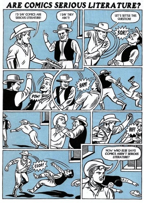
On second thought, though, Schulz’s attitude towards literariness can be seen as a little more ambiguous. It’s true that Schroeder, the advocate for high art, gets the last word. But the last word he gets is not precisely high art. On the contrary, it’s slapstick. The point of the strip, you could argue, isn’t the Hardy quote, which ends up essentially being little more than an elaborate set-up — it’s literariness there not for its high-art meaningfulness, but simply to signal “high art meaningfulness.” The real pleasure, or energy, of the strip, is in that last image, where Schroeder pulls out the piano — almost throwing it over his head and off panel, as if to toss aside the very possibility of including high art in a comic strip. From this perspective, the strip might be seen as being in the vein of Michael Kupperman’s “Are Comics Serious Literature?” (HT: Matthias.)
 

SeriousLiterature-500x705

 
The point isn’t so much to advocate for literature as it is to use comics to giggle at the idea of advocating for literature in comics — a position that Eddie Campbell would probably find congenial.

One last, perhaps less schematic,possibility is to think about the strip in terms of gender. It’s interesting in this context that, while Schroeder is generally the advocate for high art, he’s also generally uninterested in, or immune to, the appeal of romance — he’s one of the few characters in the strip who (as far as I’ve seen) never has an unrequited crush. Lucy, of course, has a crush on him, and it’s usually she who brings up images of marriage or love or domestic bliss, only to have Schroeder disgustedly reject them.

This strip is different, though. Hardy’s words are not just a default marker of high art; they’re in particular a paen to a woman’s (or a particular kind of woman’s) “marvelous beauty,” and a speculation — with more than a little longing — on who such beautiful people marry. It sounds more like something Charlie Brown would say about the little red-headed girl than like something Schroeder would say to Lucy.

Lucy’s lack of interest, then, can be seen as not (or not merely) philistine, but as tragic — Schroeder is finally, finally talking to her about love, and she can’t process it or understand it.

You could attribute this to her soullessness, I suppose — she is blind and doesn’t deserve love. But you could attribute it to Schroeder’s soullessness. Certainly there’s a cruelty in babbling about the beauty of random unobtainable women to someone who you know is head-over-heels in love with you. For that matter, the Hardy quote itself seems to exhibit some of his most maudlin and least appealing tendencies; it’s pretty easy to read it as a self-pitying lament for the fact that beautiful women are human beings, rather than simple objects to be collected by men who admire them in the street. The high-artist idealizes Woman and ignores the woman sitting in front of him. Lucy’s utter indifference could then read as a recognition that Hardy is indifferent to her — and Schroeder’s violence as a tragi-comic extension of Hardy’s violence. In this case, the literary is neither defended nor ridiculed, but is instead a kind of doppelganger — a shadow of meaning cast by the comic, the meaning of which is in turn cast by it.

Literature, then, appears for Schulz in this strip as an ideal, a butt, and a fraught double. As I’ve said on numerous occasions, I don’t really have any problem comparing comics and other forms (Charles Schulz is a greater artist than Thomas Hardy, damn it.) But I do feel like the anxiety around those comparisons, in every direction, sometimes ends up drowning out potentially more interesting conversations about how, and where, intentionally and despite themselves, comics and literature can meet.

DWYCK: What’s the Story?

celimene_street_t

The discussion fostered by cartoonist Eddie Campbell’s essay on comics and how they work, entitled “The Literaries,” published last month at TCJ.com, has been alternately fascinating and frustrating. Characteristically for the comics community, blogosphere reactions were divided roughly into two camps: fanboys cheering him for tracing a line in the sand against the naysayers who would hold comics to higher standards, and those same naysayers, saying, well, nay to the most superficial parts of his piece without noticing the beam in their own eye.

Campbell’s polemic was voiced in part against Ng Suat Tong’s touchstone essay “EC Comics and the Chimera of Memory” published in The Comics Journal in 2003, and recently republished here. At the time, the essay was a brilliant corrective to fanboy orthodoxy, helping usher in a more mature approach to comics criticism that refused to isolate comics from the wider cultural field, but rather attempted to judge an acknowledged comics classic by the yardstick of major achievements in other media. Unsurprisingly, the work of Kurtzman, Feldstein, Craig, Krigstein, Wood, Ingels, Williamson, Davis, Elder, et. al. seemed less than great when compared to Aristophanes, Anne Frank, Goya, Giotto, Citizen Kane, Van Gogh, The Romance of Three Kingdoms, Catch-22, and La Grande Illusion.

Suat’s essay, which followed in the tradition staked out by Gary Groth at The Comics Journal through the previous decade-and-half, was a highly illuminating exercise, and a prophetic one in that a large part of serious comics criticism since then has been preoccupied to the point of obsession with making similar comparisons. For obvious historical reasons, comics aficionados have been affected by status anxiety since at least Gilbert Seldes, and comics fandom has been plagued by it to the point of insularity. And the particular tendency at play here has been on the rise in the last decade as comics have experienced increased cultural and institutional acceptance.

Let us leave the fanboys aside and concentrate on the critics. I will forego discussing Suat’s querulous and ungenerous riposte, which only does his original piece disservice and focus on Robert Stanley Martin’s trenchant critique instead. Denying Campbell almost the entirety of his argument, Robert insists that he and others writing from similar perspectives do indeed take comics seriously as a visual medium, calling Campbell’s assertion of a literary bias a “straw man.” He further unapologetically insists upon focusing primarily on story in any comic that tells one, taking into consideration visuals only “as a means to an end which happens to be that story’s realization.” In Robert’s caricature of Campbell, the latter considers story “irrelevant”, preferring to focus instead on details of design, execution, or detail—on “flash.” He understandably asserts that this straw man (sorry Robert, but it is what it is) should not “be taken the least bit seriously.”

OK, Campbell’s piece is not rigorously argued and one can point to inconsistencies, but Robert nevertheless seems to be missing the point. Campbell does not dismiss ‘story’ (as I will forthwith call it, for reasons about to become clear) as an integral element to comics, but rather extends the concept of story to the images themselves:
 

…the art is to be found in the story the cartoonist tells in his graphic strokes, his deployment of the whole panoply of cartoon effects and ways of seeing and representing. In the work of an exceptional artist there can be a whole other story happening.

 
celimene_shop_t

Campbell’s point is not just basic to criticism of visual art, but also reflects a perspective so commonplace that it has become a truism, namely that the value of a story lies as much in how it is told as what it tells. Leaving aside the problematic discussion of form and content and the eagerness with which many comics critics want to separate them, this is at the crux of Campbell’s argument and is exemplified well in his Billie Holiday analogy: it is her performance of a song like “Who Wants Love”, rather than the words themselves that make it a great song when she sings it.

In his response to Campbell, Noah Berlatsky seems to agree with this basic premise, but uses that song as an example of how Campbell is so overeager to separate comics from literature that he overlooks the ways in which her performance is precisely that. This is not a discussion I want to engage at length here—Robert and Noah are clearly right that comics can be seen as a form of literature, and especially that attempting to segregate the form leads to insularity, but I do not see how such an endeavor is implied by Campbell’s argument. He merely warns against insisting too assiduously that comics be measured against, and according to the logic of, whatever standard one might posit from a wider cultural field. If you ask for The Romance of Three Kingdoms when reading Two-Fisted Tales you are bound to be disappointed, as Suat rightly pointed out in his original piece, but more importantly you are liable to miss out on whatever genuine artistic value is offered by Kurtzman and his collaborators, whether their efforts compare favorably to those of Luo Guanzhong in the final tally or not.

A great work of literature, or other work of art, might be a fine aesthetic ideal to keep in mind when criticizing comics, but formally and conceptually it can blinker you to how comics work if you insist on its priority. Of course you can compare comics with works in other media, but hopefully we can all agree that they work in the distinct ways and in the distinct tradition that make them comics, and that paying attention to these help us understand and appreciate them better than if we apply the logic of a different art form to them more or less wholesale. Campbell oversells his argument when he calls comparisons with other media ‘irrelevant criteria’, but his basic point—that we should try paying closer attention to how comics work and what they do—is a good one.

celimene_attic_t

But is it one we need to be reminded of? As we have seen, Robert insists that Campbell’s identification of a literary bias is wrong, but is it? Let us take a look at Suat’s EC piece: in more than 5,000 words discussing plot, character, theme, and ideology—i.e. ‘story’—comments on the visuals of the EC comics are relegated to a few laudatory adjectives. They never really become part of the argument, even as they pertain to ‘story’ elements. More confusingly, Suat argues in one place (discussing Krigstein and Feldstein’s “Master Race”) that form and content can and should be separated: “a feeble story, no matter how masterfully executed, should not be excused on the basis of mere thematic maturity”, but almost immediately follows this by saying it can not: “style and content cannot be divorced in what is clearly a narrative story.” Which one is it?

Or we could look at Robert’s extended body of comics reviews. One understands why he so emphatically describes the visual aspects of comics as “means to an end.” While perceptive and often expansive when it comes to the ‘story’ aspects of the comics, he generally relegates visuals to a few, adjective-laden sentences, good on declaration but less on explanation or analysis. His critique of E. C. Segar is particularly telling: Popeye’s high points for him are the anomalous moments of satire in certain stories, which as I have discussed elsewhere seems to me a perfect illustration of how evaluating cartooning by its literary ‘content’ may blind one to its more obvious qualities—in Segar’s case the kinetic humor, absurdist wit, and visual originality of his cartooning.

Noah, for his part, is less wedded to high culture frameworks of evaluation. Nevertheless, his response to Campbell carries intimations of the literary bias at issue here. Despite his attentive visual analysis, his final take on the Kirby-Lee Captain America page is a classic example of reading rather than looking. To him, the page is a self-reflexive performance by the authors—its anti-literary turn a celebration of Kirby’s ‘Ab-Ex’ flexing of drawing chops. Where does Noah get this idea? Well, the obvious place would be the caption at the top of the page, written by Lee, which presents it as such.

This is a misunderstanding of Kirby’s work. Reading the story in question attentively, or really reading any of the prime sixties Marvel material, it should be clear that there is a tension between image and text, a tension that precisely has to do with Kirby and Lee’s working method, as Campbell also notes. Lee is indeed a self-reflexive writer who is all about performance (sometimes delightfully so), but such terms hardly describe Kirby’s artistic sensibility. Invariably earnest, he was never a showoff and the Campbellian story he tells, beyond the ‘story’ of Captain America versus Batroc, is one of pain and perseverance, of the human condition. Literary or not, it is a story very much at odds with Lee’s writing and one that reveals itself only if one pays attention to his cartooning instead of reading its labeling.

Similarly revealing is Noah’s analysis of Holiday’s performance of “Who Needs Love.” He describes it as great because of her ironic distance to the banal lyrics, which enables her to imbue them with greater meaning that their hack writer ever imagined. This might be right in a sense, but the process seems to me much simpler: Holiday recognizes that clichés contain truth and is able to bring out this truth in a performance that is necessarily unironic. The anxiety of academically schooled critics around cliché tends to lead them into contorted and unnecessary arguments such as Noah’s when faced with it. This seems to a major reason why those products of popular culture that have genuine aesthetic value—in casu certain comics—tend to fare badly when subjected to the kind of scrutiny taught at the academy. In this context Campbell’s fairly straightforward point is worth listening to.

But how can one deny the precedence of more straightforwardly literary ‘story’ told in these comics, as Campbell is accused of doing here? And should one do so? Not necessarily, but on the other hand I see no reason to give it absolute priority. The ‘story’ is obviously an important part of the vast majority of comics and critical engagement with it can yield important insights, as it indeed often does in the writings of Suat, Robert, and Noah. My problem with the discourse as presented, however, is with the apparent—and in Robert’s case outright—denial that other approaches might be equally fruitful. That the drawings are always a means to an end, that the non-literary parts of these comics are outweighed in importance by the literary ones.

This appears generally to be less of a problem with criticism of comics of obvious literary ambition, such as those by Campbell himself,* and more with traditional genre comics. The context of these works is mass culture and as such tends toward the sub-literary. There is no question that a lot of this material is disposable, but fastidious comparison with works predominantly understood in terms of high art seems to me a blunt instrument remarkably unsuited to understanding what qualities some of it might possess. It also encourages a bizarre hierarchy of comics genres in which an unobjectionably well-crafted comic created in a high literary context, such as Fun Home, is automatically better than one created to entertain young readers, such as Astérix. Where Persepolis by its very conception is superior to Polly and Her Pals. A prescriptive and unenlightening view of art stuck in the elitist framework of high modernism. It has long since been shown how dogmatically elitist approaches to genre literature are problematic, so there is little reason to import them directly into comics criticism.

celimene_night_t

Ultimately modernist elitism is unable to explain why certain comics (or works in other media) telling simplistic ‘stories’ and offering cheap thrills endure while most others do not, in any way other than by referring to their level of craft or (*shudder*) their pandering. Some might find this adequate, and it is doubtless true in many cases, but it still fails to explain adequately why certain comics despite their flimsy premise present so powerful, original, and enduring a vision.

Robert very perceptively associates efforts to identify such qualities in genre comics with auteur theory. His take on it is negative, and auteur theory has of course been deconstructed as often happens to theories without strict methodologies, but it might yet prove useful in the present context. It seems to me that Robert’s characterization of at least its American iteration is biased and reductive: if the ideal indeed was to eschew ‘story’ at all costs, its usefulness would obviously be limited. I am willing to be corrected, but that is not how auteur theory was taught to me. In any case, it seems to me absurd to suggest that the filmmakers championed by the French auteur critics—from Vigo and Renoir to Hawks and Hitchcock—worked to subvert their screenplays, as Robert suggests. The majority of them were expert storytellers.

As I understand it, auteur theory rather emphasizes how a sufficiently original or otherwise powerful creative vision inexorably emerges in any work that the creator is involved in, regardless of the constraints, commercial or otherwise, under which it is created. Such a perspective seems to me eminently suited to comics, perhaps even more so than to film because comics are created by fewer people, often a single person. Of course there is the danger of lazy criticism of the kind Robert berates, where Jack Kirby is compared to Homer, but such dangers abound with every method.

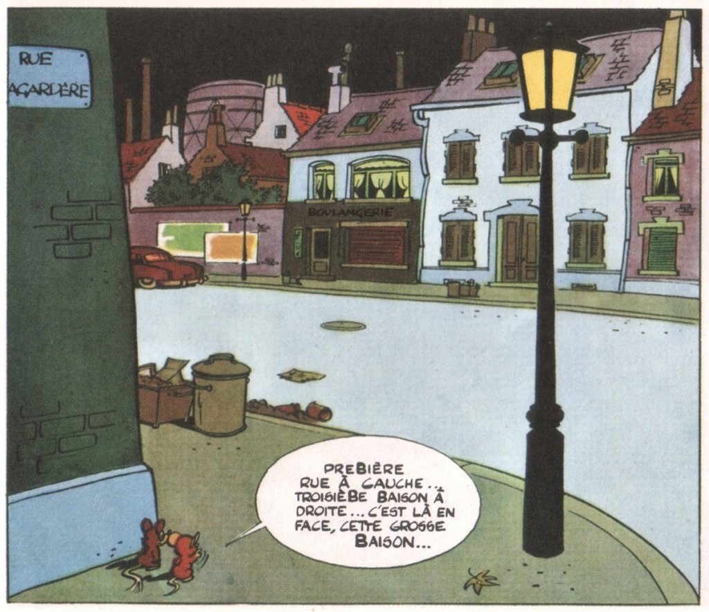
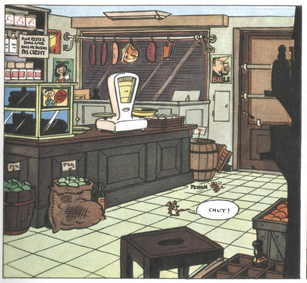
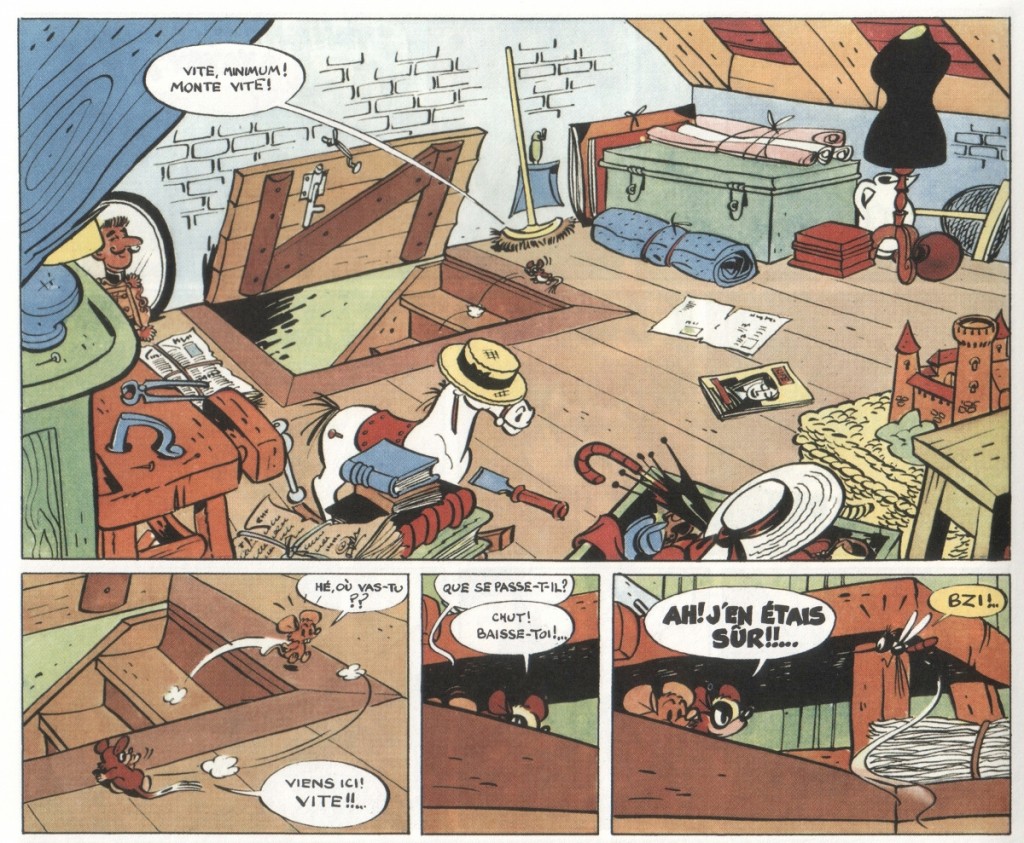
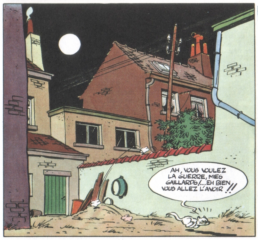
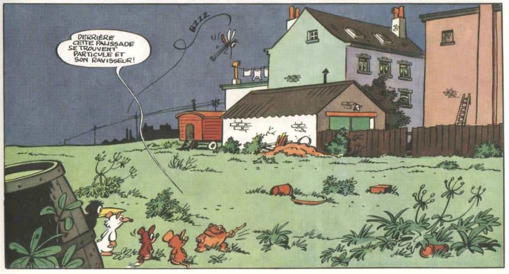
I realize now that I was probably working on principles akin to auteur theory in my attempts on this site to explain why I find Tintin and Popeye to be fascinating works of art. But let me offer another example, and get to the images you have been looking at while reading. As this whole ‘literaries’ debacle was unfolding last month, I was reading for the first time since childhood Raymond Macherot’s third Chlorophylle story, Pas de Salami pour Célimène (‘No Salami for Célimène’, 1955). For those unfamiliar with it, Chlorophylle was a funny animal series aimed at kids originally published in Le Journal de Tintin. Basically an adventure series, it situates its protagonists, the Dormouse Chlorophylle and his friend Minimum (whom I suppose is a field vole), in scenarios fraught with danger and mystery. Macherot was an environmentalist before the fact and all-round progressive who incorporated into his comics elements of social and political satire, but he generally kept things fairly simple, if always entertaining.

Where the first two Chlorophylle books take place in the countryside and feature the struggle by a ragtag group of small animals against an incursion of rats—a clear parallel to the Nazis—Pas de Salami substitutes an urban setting to tell what is basically a detective story. Chlorophylle and Minimum are Holmes and Watson investigating the disappearance of salami from the local butcher shop, as well as the connected disappearance of a mouse child. Their primary antagonist is a femme fatale-type cat, the Célimène of the title (appropriately named after the elusive love interest of Alceste in Molière’s Le Misanthrope). It turns out that she runs an extortion racket, kidnapping mice to force their loved ones to steal food for her. But it also becomes evident that the culprit our heroes seek is not her, but somebody in their own ranks.

I remembered nothing of this plot, and even less of the supporting cast, when I sat down to reread the book. What I did remember from childhood readings was the mood and setting of the story. The deserted streets and interiors of the city at night, against which the story plays out; the empty shop floors and dusty attics; the dimly lit sidewalks and overgrown back lots. While the ‘story’ as such is fine and carries several surprises as well as interesting character moments, it is to me in the evocation of this environment, this city belonging to somebody else (the humans), that the true power and beauty of the comic resides. It is what had stayed with me since childhood and it is what resonated upon reacquainting myself with it.

I am not talking about just world-building here, although that can be an important element, but rather the kind of story told in ‘graphic strokes and by deployment of the whole panoply of cartoon effects and ways of seeing and representing’ that Campbell talks about. It is a story that only resonates further when one learns that Macherot drew it just after moving for work reasons from the countryside to Brussels, where he never felt at ease. Such behind the scenes knowledge is unnecessary, however, to experience its poetry of detail and sense of alienation. Other comics could give you much the same ‘story’, but only this one could give you that. It may not be Proust, but it is certainly a worthy work of art.

The critic R. Fiore calls such an understanding ‘the experience of comics.’ Campbell references Fiore’s capsule summation of the idea in a comments thread somewhere, but the Fiore himself clarifies it further in a recent comics review:

The Experience of Comics is a notion I half-baked some time ago to account for why comics strips can have a far greater aesthetic impact than their subject matter would imply. For example, at least five of those ten greatest newspaper comics strips cited above [in the review] hardly ever expressed an idea that wasn’t trite, absurd or patently false. The outlandish coincidences of Dick Tracy, the utter escapism of Wash Tubbs, the cracker barrel philosophy of Little Orphan Annie, these are elements that in prose would not have gotten past the lowliest hack pulp editor. What sustains this substance is the experience of inhabiting the subjective world the cartoonist creates. The writer of poetry or prose however vivid his imagery must depend on the reader’s internal image of the things he describes. The cartoonist doesn’t merely describe a tree, he determines what trees look like. And so with every person and object in the cartoonist’s world. While a painter also creates a subjective world, a painting or drawing is not a narrative. Where a painting or drawing begins and ends in one image, by implication one comic strip panel could follow another into infinity. If the cartoonist’s subjective world is vivid enough all the narrative really has to do is be engaging enough to draw the reader into it. This is why bad writing will defeat even the most accomplished comic art. Rather than drawing you into the comic strip, bad writing pushes you out.

As Fiore implies, all handcrafted images do this to a certain extent—albeit not always sequentially—so there is really little reason to give it a separate name. And the logic can be extended to photographic and digital images too, albeit with modifications. When you have images, there are non-literary forces at play and ignoring them or regarding them merely as a means to a literary end is reductive. And even though fandom has long fetishized drawing, it remains a critical blind spot.

celimene_lot_t

* An example is Robert’s excellent essay on Eddie Campbell’s work, in which he integrates a perceptive analysis of Campbell’s narrative drawing. I may be wrong, but reading it seems to me as if the questions elicited by Campbell’s literary ambition prompted similar questions of the visuals. His discussion of Campbell’s debt to Henry Miller for example, for example, explains how Campbell’s drawings visualize the associative nature of Miller’s prose. Since we’re in critical mode here, I suppose I would argue that Robert takes less notice of how Campbell’s impressionistic tenor roots his meandering wit as a writer in cognitive realism, evoking like few cartoonists the visuality of memory. But that’s just building on an stimulating analysis.

Did You Steal Your Eyes, I Wonder?

We’re all drunkards here. Harlots.
Joylessly we’re stuck together.
On the walls, scarlet
Flowers, birds of a feather

Pine for clouds. Your black pipe
Makes strange shapes rise.
I wear my skirt tight
To my slim thighs.

Windows tightly shut.
What’s that? Frost? Thunder?
Did you steal your eyes, I wonder,
From a cautious cat?

O my heart, how you yearn
For your dying hour…
And that woman dancing there
Will eternally burn.
— Anna Akhmatova, 1913, trans. from the Russian by D.M. Thomas

The meaning in words is hard to find, and some say the meaning’s not the art. So watch the images, I guess. Flat concupiscence on the page — scarlet openings. The sin in your head you can’t wash out; a thought bubble scribbled around the edge gets you off like a child. Put that smoke in the pipe, father, and up it goes — a border for those thighs. Tight together the windows like panels squeeze; one furry cat for a close up, cute marketing genius. And then the picture that moves and doesn’t move; time’s a space — a sequence in hell or melodrama.

I’m not sure how not to think of harlots, nor the drunkards staggering and never saying “drunk”. Stay in the lines, words, and we’ll look over here, at the icon that sings and will save us if only we gouge out our eyes.
 
_________
The entire roundtable Attack of the Literaries is here.
 

Voices From the Archive: Steven Grant on Comics Writing and Fletcher Hanks

This seemed like a nice, non-confrontational way to finish off our Eddie Campbell inspired roundtable on comics and literariness. Below is a comment Steven Grant left on one of his own posts.

I would suggest the approach I describe is the unromantic one. The romantic notion is there are a million hidden geniuses out there who would’ve outflowered Shakespeare if only someone had given them a kind word. I’m not suggesting needless cruelty, & I am possibly romanticizing by assuming the critic in question knows the difference between bad writing & a radical but fruitful shift in approach, but there really is a difference between people who want to write & people who want to be writers. The latter are the ones who stop. It’s not that hard to tell bad writing, & even good writers are more than capable of it. Everyone gets feedback, & the only feedback that’s any good for you is honest feedback, positive or negative. You’re not under any obligation to accept any of it, but a writer doing something really wrong (by which I don’t mean wrong in a “mainstream writing” sense, but wrong in that it undercuts their purpose) will not be helped by someone being “nice” about the work. Being negative & being cruel are not the same thing, but if you can’t take being negative you’re probably better off doing something else anyway, because negative is largely what the world at large rains down on writers. Unless they happen to be at the rarefied heights where the slightest criticism unleashes a torrent of virulent defenders. And y’know what? That’s often not that good for one’s writing either.

It’s a strange, strange business.

Frankly, no matter how good your writing is, approbation is usually so hard to come by that anyone who writes for approbation is an idiot.

imagesAs for Hanks, Noah, we began this discussion on email. Leaving aside reservations about “outsider art” (having watched its inception/invention contemporaneously, it always struck me as more politically than artistically motivation, since it played on many political themes of the day) I question whether Hanks fits the category. Just because he was largely unknown to our generations doesn’t make him an outsider. A guy who worked steadily for several years (I’ve no idea of the circumstances of his departure from the field) at a circulation considerably larger than any I’ve ever enjoyed, in framework (artistically his style isn’t even all that different, though I’m more than happy to accept his art is better – prettier, certainly – than many of his contemporaries) essentially identical to what surrounded him. But it’s never been his art I quibbled with. It’s his writing that’s the house of cards. Yes, I understand the auteurial approach to Hanks’ work, & that’s fine, but imagine Hanks’ stories if they were drawn by, say, Paul Reinman. How fascinating would you find the writing then?