Funky Flashman

DC Comics’ “Himon!” by Jack Kirby (Mister Miracle # 9, Jul.-Aug. 1972) is not the comics story that I hate the most. That dubious honor, if I remember correctly, goes to Pedro and Me (2000) by Judd Winick, but since there’re 100 miles between yours truly and my copy of said “graphic novel,” “Himon!” will have to do as a target for my participation in the 5th Anniversary Hooded Utilitarian Hate Roundtable. “Himon!” isn’t even the worst Jack Kirby story… on the contrary, Charles Hatfield, in his book about Kirby Hand of Fire (2012, 206), included it among “the most deeply personal comics Kirby ever made.” Since Charles did such a good job analyzing “Himon!” I must agree with him that said story has its merits. This is good because I don’t want to incur in the same fault I accuse superhero comics artists and writers of (i. e.: of being Manichean). Then again is it fair to judge an artist for a really small amount of his input while most of it is big corporation owned dreck produced in a work-for-hire situation? In any case I’ll use other aspects of Boy Commandos, New Gods, The Eternals and the aptly titled Mister Miracle Super Escape Artist series to illustrate my points.

1 – Manicheism:

“Mystivac!,” Mister Miracle # 12, Jan.-Feb. 1973.

Jack Kirby’s superhero comics are Manichean. Reality is seen in black and white in these primary colored comics. From a purely visual point of view this means that the baddies are ugly (as seen above) and the goodies are mostly good looking. We can find the roots of this line of thinking in the ancient pseudoscience of physiognomy: the absurd idea that one’s outer appearance is a mirror image of our personality. To further examine how Jack Kirby used physiognomy we just need to compare Mister Miracle and Big Barda…

“Apokolips Trap!!,” Mister Miracle # 7, Mar.-Apr. 1972.

…two young athletes owning handsome physical appearances… with Granny Goodness and Darkseid below…

“The Pact!,” New Gods # 7, Feb.-Mar. 1972  (as reprinted in Jack Kirby’s New Gods # 4, Sept. 1984). Scott Free (Mister Miracle) arrives in Apokolips. (Stupid! Stupid! Garish colors! Give me old Benday Dots anytime! And yet, need I say it?, this is still thousands of times better than today’s gradient-ridden computer coloring.)

The former is an old woman and the latter is a stony faced Neanderthal. The baddies’ mugs are more masks than proper faces; their facial expression (it’s mainly one) shows that they’re always in a bad mood. In a Manichean war of good vs. evil Jack Kirby equated good with youth and good looks and evil with old age and other species or subspecies. We can’t also forget that young people were the reading target for these comics (Kirby’s clients) and our shallow hedonistic media revere youth and good physical appearances. Instead of choosing racist stereotypes like Ming in Flash Gordon (fortunately Jack Kirby may be accused of many things, but not of being a racist – Mister Miracle # 15, for instance, is there to prove it), Jack Kirby, as I mentioned above, advocated speciesism. His bad guys were surely insect-like and reptilian (with the occasional furious cat, mad dog, and devilish goat thrown in for good measure).

Insecto-Sapiens! Untitled, Mister Miracle # 16, Oct.-Nov. 1973.

(Below is an intelligent attack on physiognomy – I know, it’s an easy target, but still…)

James Gillray, “Doublures of Characters or striking Resemblances in Phisiognomy. “If you would know Men’s Hearts, look in their Faces.”,”  Anti-Jacobin Review and Magazine, November 1, 1798. On an unrelated note: look at the hand-coloring and weep!

Manicheism, of course, is part of an us vs. them ideology in which we, obviously, are always the good guys. Listen to Jack Kirby himself (in “Kirby on Survival,” Jack Kirby’s New Gods # 6, 1984):

They are evil, we are good. They are plotters and traitors, we are loyal and clever.

In “Himon!” Manicheism is still a problem, but at least it is aptly used to show how, in a dictatorship, almost everyone (Auralie, for instance, is an exception) is infected by the ugliness of the leader.

To paraphrase Charles Hatfield in Hand of Fire (219), everyone’s infected… “Himon!,” Mister Miracle # 9, July-Aug. 1972.

2 – Formula:

It’s no secret: superhero comics are formulaic. If you let me indulge in a personal note for a sec. I must say that this is reason enough to stop me from enjoying these stories: if the comic is Manichean and it’s just an endless row of fights why should I bother reading it if I know beforehand who will win? This is exactly what happens in most of the boring issues of the Mister Miracle Super Escape Artist series: Mister Miracle vs. Steel Hand; Mister Miracle vs. Overlord and Granny Goodness; Mister Miracle vs. Doctor Bedlam; etc… etc… ad nauseam… Trying to understand why people like these comics and films I suppose (and I use the word advisedly because this is no scientific conclusion) that readers and spectators like to feel the epinephrine of violent action (without the consequences produced by violence in the real world, of course). They also like to root for the righteous good guys… It’s kind of a sports thing, I guess…

Joe Simon and Jack Kirby in self-referential mode. Boy Commandos # 1, Winter 1942 – 43 (as reprinted in Mister Miracle # 6, Jan.-Feb. 1972).

In the image above two characters that stand for Joe Simon and Jack Kirby explain how “[They]’ve been getting [their] characters in and out of jams.” That pretty much sums it all up: in these formulaic comics the heroes get in a jam and, then, they get out of it. In Mister Miracle # 5 the baddie, Virman Vundabar, says to Mister Miracle, after he got out of yet another jam (to quote the fanboys when talking about art comics: “yawn!”):

I know! A mother box! [everything is emphatic in these stories] With the aid of a mother-box, you thinned your atomic structure and transferred yourself out of the coffer!!

To which the latter answers:

Not so! […] I play it fair — and you know it!!!

Mister Miracle won by three exclamation marks to two. On the other hand I reckon that he was wrong and the baddie was half right: it wasn’t the mother box that saved Mister Miracle, but he was far from playing it fair. He escaped because of the formula imposed by the author, Jack Kirby. The game is definitely rigged. In “Himon!” the same thing happens to ruin my enjoyment of the story. The dei ex machina are an easy solution to every problem: Scott Free (Mister Miracle) is blinded by the ideology imparted in Granny Goodness’ school?, no matter, Metron and Himon will put him out of his wrong ways; Himon is killed by an angry mob?, of course not, he has the ability to replicate himself (it was one of those replicas that seemed to be assassinated); Scott Free fights some of Darkseid’s minions?, piece of cake… he easily wins… etc… In conclusion: Everything is too easy for yours truly’s taste.

“Himon!,” Mister Miracle # 9, July-Aug. 1972: you bet that’s not him.

3 – Cardboard Characters:

These characters are as thin as the paper they were printed on. Mister Miracle barely exists. At the beginning he’s just a strange being who came from another world. We know nothing about him except that he’s a super Houdini. From Mister Miracle # 4 (Nov.-Dec. 1971) until Mister Miracle # 7 (Mar.-Apr. 1972) a series of short stories (two and four pages) give us some feedback to understand Scott Free a little better, but is that enough? He was born in Goodiesland (aka New Genesis), but because of some kind of pact between Darkseid and Highfather (a kind of Moses) he was transferred to Baddiesland (Apokolips) where he grew up in Granny Goodness’ orphanage to become part of Darkseid’s military elite. The truth is that no real characterization exists. If the hero (the main character) is flat what can we expect for the other characters? Nothing at all…

At the end of “Himon!” we find the melodramatic panel below:

“Himon!,” Mister Miracle # 9, July-Aug. 1972. Is that eye leaving stage left? 

That’s OK, by me, but… who are you exactly? How can one find something that doesn’t exist?

These cyphers can only be used as personifications in allegories, but we all know how heavy handed that can be. Plus: a Manichean one can only achieve kitchy results… Certainly not the status of great art that some claim for Kirby’s work…

4 – Glorification, Glamorizing, Sanitation of Violence:

This is the part in which my love/hate relationship with Jack Kirby’s art reveals itself. Not being completely blind I can see how (see above when I guess why people like action comics and films) the drawings are powerful. That’s exactly the problem: they’re too powerful. So much so that Art Spiegelman put the topic in the following terms (in The Comics Journal # 181, Oct. 1995, 106):

[…] the triumph of the will, the celebration of the physicality of the human body at the expense of the intellect, is very much an impulse in Fascist art. It has a lot to do with the motor for Kirby’s work, even though I understand that his work is filled with characters who fought the Fascists.

Kirby’s double-page spreads are particularly good examples of the above. With them Kirby aimed to grab the reader by the guts from the beginning. To do so he knew that he needed to create the most spectacular images that he could muster. This meant huge battle scenes with lots of what Charles Hatfield called Kirby’s technological sublime and the clash of titans. 

“Earth — The Doomed Dominion,” New Gods # 10, Aug.-Sept. 1972 (as reprinted in Jack Kirby’s New Gods # 5, Oct. 1984). The mannerist composition dividing the realm of the gods from the realm of the humans (or… whatever they are) is quite interesting.

We have seen that there are a few problems with Jack Kirby’s superhero stories, but enlightened readers tend to value the drawings and the drawing style instead of the narratives. As if the former can be, in comics, totally separated from the latter. It can’t: both the iconical content of the drawings and the lines as such are a unit, a meaning generator. The Manichean content, for instance, is in the text, but it is also in the narrative drawings, as we have already seen. Plus: it’s the lines, colors, and textures that convey the physicality and the powerfulness of the images; marks have meanings. Kirby’s graphic style is a cubo-futurism that underlines and glorifies, technology, youth and violence. In the above panel, for instance, extreme violence is given to us in awesome spectacle. Being a children’s comic the nasty consequences of such a shock are spared to us because these are super beings and nothing can really harm them. What escapes my reckoning is why do they attack each other if there are no consequences of the attack? Logic doesn’t matter though, what really matters is that the kinetic and colorful show must go on.

Czech writer Milan Kundera wrote the following about kitsch (in The Unbearable Lightness of Being, 1984, 248):

Kitsch is the absolute denial of shit, in both the literal and figurative sense of the word; kitsch excludes everything from its purview which is essentially unacceptable in human existence.

Also (253):

Kitsch is a folding screen set up to curtain off death.

Giving us not only a fascistic glorification and aestheticization, but also a sanitized version of violence Jack Kirby’s work is the perfect embodiment of kitsch.

Again, “Himon!” is a bit different. In the below panel we don’t see them exactly, but innocent people die (my question is: aren’t Jack Kirby’s readers so inured to violence that they couldn’t care less? Besides, who cares about cyphers?):

“Himon!,” Mister Miracle # 9, July-Aug. 1972. 

5 – Feminism?

Of course not. Even if Big Barda is a physically empowered woman (as we have seen, there’s no intellect in Jack Kirby’s comics) look below to see who the only scantily clad character is:

“The Closing Jaws of Death!,” Mister Miracle # 4, Sept.-Oct. 1971.

On the other hand the panel below could be a poster to announce a SlutWalk, so, I may be wrong…


“Mystivac!,” Mister Miracle # 12, Jan.-Feb. 1973.

In conclusion (a):

(After probing into a small part of a huge corpus):

On the mass culture side of things Jack Kirby not only contributed enormously to the superhero mythos, he also inspired ideas for films like Star WarsMan in Black, or Pure Steel (more than dubious feathers to wear in one’s cap, but anyway…).

Jack Kirby’s superhero stories are Manichean formulaic romps performed by cardboard characters. His drawing style and visual imagery are an emphatic cubo-futurist fascistic glorification and glamorizing of violence, youth and technology. On the positive side he was particularly good creating complex panel layouts and used the comics medium to great effect sometimes; for instance (note the sequence of the archers’ movements from left to right):

“Apokolips Trap!!,” Mister Miracle # 7, Mar.-Apr. 1972.

Jack Kirby could also surprise the reader from time to time breaking, for example, the dichotomy handsome/good vs. ugly/bad:

“Mother!,” The Eternals # 10, Apr. 1977.

Other times he committed crass mistakes. Probably because of an excess of work and deadline pressure:

The final sequence of “Paranoid Pill!,” Mister Miracle # 3, July.-Aug. 1971.

The continuation of the sequence above in “The Closing Jaws of Death!,” Mister Miracle # 4, Sept.-Oct. 1971. Where did those ropes come from?

Being such a loud comics artist Jack Kirby’s work seems to have been created by his character Funky Flashman. Even if said character is a caricature of Kirby’s, by then, rival Stan Lee…

Conclusion (b):

What about “Himon!,” then? It’s as simplistic and Manichean as all the other stories, but, at least, Kirby used Manicheism to show how the dictator’s ideology infects the people (the “lowlies”). The narrative formula is also there (the use and abuse of the dei ex machina, Metron and Himon, is too facile a device; on top of that Scott Free can’t lose a fight and he can’t be killed – even if “in a jam” we know that he will end up all right). The characters are flat, but, at least, there’s some internal conflict in Scott Free (that’s a slight improvement over other, more pedestrian, stories). Apart from the above there are some pursuits, fights, and explosions (yawn!) and the usual glamorizing followed by sanitation of violence. The sequence in which Willik orders the burning of the “lowlies” may go against the grain (up to a point, as we’ve seen above), but that’s one exception, not the rule. So is the story “Himon!” in Jack Kirby’s oeuvre.

__________
Click here for the Anniversary Index of Hate.

The Purest Hate of All

A little background…

This started as a comment on the Benjamin Marra interview over at The TCJ Website, but I wanted to make sure it didn’t get buried under the contract negotiations with Dave Sim. The danger of posting it here is that it’s going to get mixed in with the whole “Hate Week” thing, and I don’t want people reading this as inspired by hate. (That said, by the end you’ll see some self-hate in action, so if you’re here for hate you can just skip to the last paragraph or two.)

In actuality, two decidedly non-hateful things inspired the comment. The first was an aside made by Joe McCulloch some time ago, I think during one of his “This Week’s Comics” features over at TCJ. Bascially, he wondered why there wasn’t much controversy over Marra’s work given the content. The other inspiration was Darryl Ayo’s thoughtful post about Marra on his blog. Ayo’s piece moved me to read the interview, which in turn led me to write this post.

If I have these story ideas, I can’t censor myself or else I won’t do them, because I won’t think that it serves the artwork in the end if I try to water it down based on this illusion of how I think people will react. That’s not a viable gauge to base decisions on, because it’s not real. It’s only real after.

Benjamin Marra, from the tcj.com interview

Here’s the thing, when a person writes and draws a comic they have to make choices. They make choices about what to put into a panel and what to leave out. They make choices about how to present information within a panel. Marra understands this. At one point he says that a profile-shot at eye level is a good way to convey action. He’s basing this assertion on the imagined reaction of an audience. Yet later he says that anticipating reaction is not a “viable gauge” for making decisions about whether or not what goes in might come across as racist. Contradictions like these suggest intellectual laziness, and this laziness is particularly problematic when the goal is satire. It is problematic because the difference between effective satire and just playing stereotypes for shits and giggles largely comes down to careful consideration and execution. Based on this interview, Marra is committed to the execution but not to the consideration. However, he also realizes that for his work to come off as anything other than racist, it needs to come off as satirical:

“Gangsta Rap Posse is underground comics, it’s not on a lot of people’s radar, but the things is, I’ve never gotten anything but a positive reaction to it. I’m sure if it was distributed to a much wider audience it would get a really negative response, if people took it seriously — not as satire, not as a comment on myself as a white suburban artist making a comment on black urban culture from a specific time period. I think people might react negatively.

Note that Marra explicitly calls Gangsta Rap Posse a work of satire. It is, by his account, a self-referential commentary on commentary. This might very well be Marra’s intention, but it doesn’t really show up in the work itself.  This is because Marra’s stated goal of making comics that read as though they were created by someone who didn’t know what he was doing is at odds with the meta-commentary he’s after. Put another way, if you strive to make your work look earnest, then you can’t expect people to see it as self-reflexive commentary.

And Marra seems to recognize this tension, hence his over-the-top author photos designed to convey a “Hey, I’m only sort of serious about all this” attitude. However, even he seems to think that this sort of paratextual gesture might fall short of the goal. Note that in the same quote he imagines that given wider distribution Gangsta Rap Posse would get more negative responses. I think he’s right about this, and I think that this should be a red flag for us.

What Marra is saying is that we’ve failed as readers of and writers about comics. We’ve completely passed on the opportunity to discuss his comics from the perspective of race, gender, or any other political or ethical lens. Instead, we’ve decided to discuss them from the perspective of other comics. We’ve skipped over the tough questions about representation to play facile games of spot the influence. As a result, we’re missing out on some good conversation, something that gets beyond the usual “you’re so great, you’re so cool” stuff that gets passed off on us as a long form interview. Aren’t we bored of that by now?  That we don’t seem to be bored suggests a certain intellectual laziness on our part. Ah, self hate, the purest hate there is.
 
__________
Click here for the Anniversary Index of Hate.

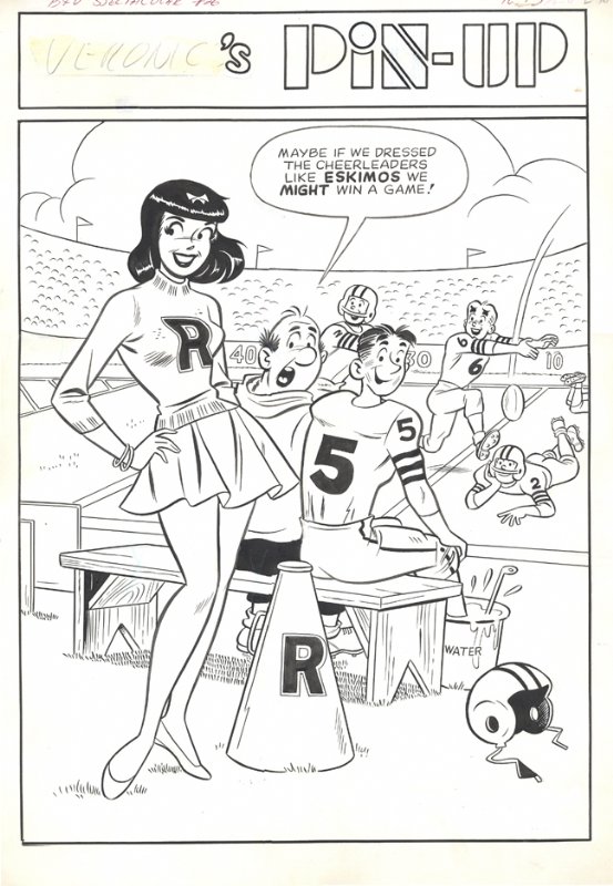
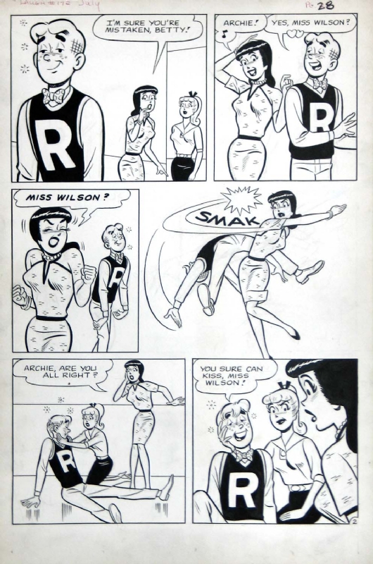
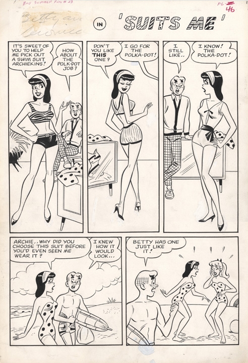
Why I Dislike Betty and Veronica to the Utmost of My Abilities

Growing up, I wasn’t allowed to use the word “hate.”  I was thus forced to create an alternative phrase and came up with  “I dislike [it] to the utmost of my abilities.”  So let me say this clearly: I dislike Betty and Veronica to the utmost of my abilities.  I feel guilty admitting it; Archie and the gang are just so wholesome, so American, and in recent years I’ve even heard that Archie has developed a decidedly liberal bent, but when I was a child Archie’s main girls Betty and Veronica were the bane of my existence.  I think most of us have guilty pleasures—embarrassing pastimes or pursuits that give us a tingly, happy feeling, but reading about the catfights and hijinks of Betty and Veronica was a guilty obsession that brought me no pleasure; instead these “best friends, worst enemies” only made this girl feel much, much worse.  This is, of course, a very personal reaction, and I’m looking forward to reading Craig Yoe’s upcoming The Art of Betty and Veronica after abandoning the comic in high school.  Perhaps I will be able to gain some distance and a better perspective on the iconic role the pair has played in American culture.

However, when leafing through some old issues of Betty and Veronica from the 1980s, I was immediately overcome with that same strong, repellent feeling from the past as I remembered that, in fact, Betty and Veronica are horrible.  In saying this I mean no disrespect to Dan DeCarlo, an artist long associated with updating the look of Betty and Veronica, and well known for his stylized, sexy, and strangely wholesome female characters.  Rather, it is the stories, the lives, and the characters of B & V that cause immediate distress.  While others might praise the fact that Betty and Veronica remain best friends despite fighting over Archie continuously, I cannot help despising the triangle and the participants in the first place.

Teen magazines frequently asked the question: Are you a Betty or a Veronica?  It was a question that I imagine led many girls to despair.  I, myself, was certainly no Veronica.   Oh yes, she’s gained a cult-like status as a take-charge, empowered female radiating self-confidence and verve, and the comic got a great deal of mileage gently mocking Veronica’s exorbitant wealth and privilege and her lack of real-world knowledge, yet in this playful teasing the stories also served to affirm the great gifts and pleasures of privilege.  I had little of Veronica’s sass and grew up in a distinctly middle-class household, examining the riches of the Lodge mansion with a critical eye, all while feeling a sickening jealousy for the girl who had everything, well, except for the feckless Archie.  Over and over, Veronica’s slapstick romantic battles with Betty brought out the worst in both, and I couldn’t help but wonder—this is all over Archie?  The goofy redhead with the curious, pockmark freckles and crosshatched hair? 

If Veronica represented the unattainable dream of confidence, poise, and affluence, Betty acted as I knew I should.  As a fellow helpful tomboy who got good grades and tried to please my parents, Betty was more relatable to me.  Still (and this likely says something about me), I disliked Betty even more than Veronica: her namby pambiness, her awful subservience, her generic prettiness, and that relentless good cheer.  In her upbeat, serviceable wardrobe, Betty was unceasing resourceful, always lending a hand when Archie’s car broke down or Veronica needed help covering for one of her misdeeds.  Yuck.

Veronica was downright mean, and Betty, well, she was a doormat.  What was there for a little girl to emulate?  What kept me dissecting the pages?  I believe, if anything, it was Dan DeCarlo’s artistic style that kept me returning to the comic throughout my tween years, despite the queasy feeling the comics gave me.  I scrutinized the two female leads intently, studying the perfect hourglass figures, the cutting edge fashions, the upturned noses and wide, perennially surprised eyes as templates for perfection in dark and light.  Yet as time went on I slowly gave up the “realistic” teens, gravitating to the superheroes that seemed somehow more real than Betty and Veronica.  Spiderman, Batman, Rogue, and Wolverine lived with fear and pain and shame, and yet there was a spark of greatness within them.  Somehow, watching these troubled characters make their way, swinging and clawing and punching, felt much more comforting than viewing Betty and Veronica lounge and play on the manicured lawns of Riverdale.  Thanks anyway, Archie, but I’ll take the X-Men any day.  I guess I really do hate Betty and Veronica.
 
__________
Click here for the Anniversary Index of Hate.

John Hennings on Hiding the Geoff Johns Comics From the Children

John Hennings, an occasional visitor here at HU, had a comment on Matthew Brady’s post that I wanted to highlight.

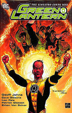
Like others in this chain, I appreciate what Matt did here. I read Sinestro Corps War, then dropped out, then looked back at Sinestro Corps War and was genuinely ashamed I’d read as much of it as I did. I gave away the comics years ago because I knew I’d never read them again. I also wanted to make sure my children would never find them, because I didn’t want them to think less of me. So by articulating what was bad about these comics, Matt gave voice to something that was important to me.

All that said, Johns is not an awful writer. He’s written other stories I enjoyed, because I’m precisely the middle-aged nostalgic fan he is targeting. I loved the Alan Moore stories these were based on, and still do. Hal Jordan and the Green Lantern Corps are not my all-time favorite superheros in the vast sea of spandex, but they’re definitely first tier. The whole concept of the Guardians and the Corps has proven itself fertile ground in which to raise an incredible variety of enjoyable, imaginative science fiction stories. I like heroism and hope and weird planets and time travel and parallel dimension versions of characters I know well. I like individual variations on a good costume theme and buddies banding together to save the day. If you can’t get me to open my wallet for your Green Lantern story, you need to examine your work — and I haven’t spent a dime on Green lantern in years.

__________
Click here for the Anniversary Index of Hate.

Il Dolce Libro

A brief satire on Appuntamento fatale (Ballata in si bemolle) (Rendezvous in B-Flat, aka Fatal Rendezvous), a 1997 album by Milo Manara, as most recently translated in Manara Erotica Volume One (Dark Horse, 2012), one segment of a prospective ten-volume endeavor compiling 2,000+ pages of Manara’s comics under various titles.

***

Brother, what I write to you now will reveal more about myself than the book I describe. But still, you have asked for the apex of degradation, and what better venue than this?
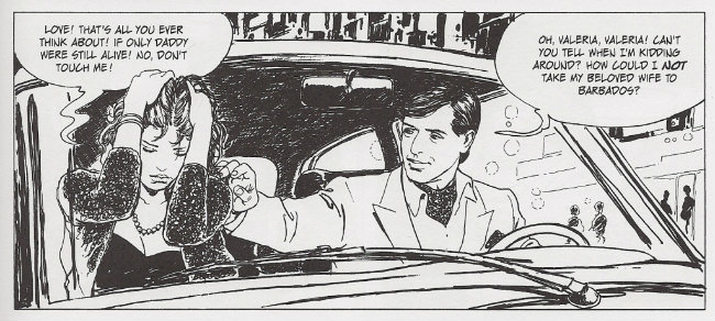
Il maestro is summarized most adequately by the woman on the left. Yes, ha ha – it must be a woman! She must be aloof, of course; inscrutable! Unknowable! Nearly an alien race are the females of this species, litters of pups sired from a closely-kept line, all related, no doubt, from the similarities of their faces, their expressions; sisters who blossomed together in that kennel of warm latex flesh. You can’t turn me on with your Japanese PVC dolls, dear friend, for I have women readily sculpted right here on the page. See how she bristles at the thought of “love,” arms thrown up in defense, cringing at the touch of a man!

This, fundamentally, is the feminine disposition under Manara’s pen and brush. He is a great lover of the female form, it is said, but his devotions are such that even the most Roman of Catholics comes to understand some nauseous puritan appetite for denunciation of idolatry. His women can be chipped into particular shapes for the purposes of dramaturgy, yes, but you cannot imagine them as itchy beings any more than you might expect the Pietà to fart.

They are, in a word, perfect, and therefore a most fitting vehicle for the perfection of rape, as you have urged me to detail.
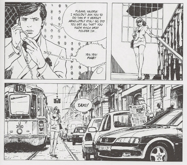
Valeria is a materialist and something of a bitch, which allows the shallow reader to presume she deserves it. We can disregard these lower minds, brother, but a fundament is always necessary to il maestro. Recall how he establishes the book’s relationship dynamics in its opening panel, its subtleties are only discernible in retrospect:
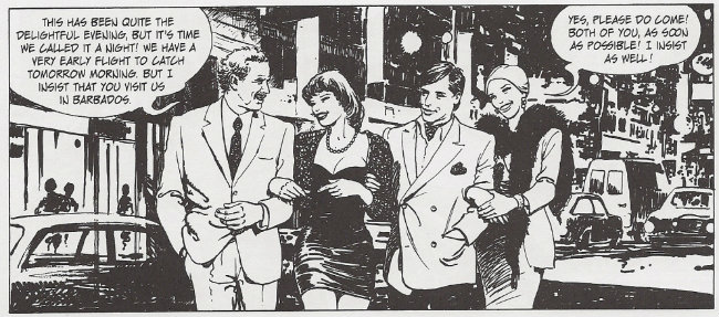
Valeria is not a speaking character. Instead, at the far left, we see the words of the Senator, the reader’s surrogate, to whom the story is ostensibly being narrated, though the fact of narration is not apparent until later; in this way, the confident, virile, powerful man — a happy flattery! — can command the opening of the drama. His arm is locked around Valeria, directly to his right; she touches him gladly, her head bowing toward him, the finger on her rightmost hand pointing toward him, her posture set entirely away from Silvio, her ineffectual husband, whose eyes are either trained on her or the Senator. Such ambiguity is necessary.

As the plot will eventually reveal, Silvio, the eunuch, whose wife withdraws from his touch, whose torpid marital relations are consigned to off-panel oblivion after an abridged bit of early foreplay — cock-blocked, one might say, by authorial fiat — is the “bagman” for the Senator’s dirty kickbacks, though in some ill-advised gesture toward agency he has begun skimming the take. This cannot do. The Senator is aware of this transgression, and seeks to punish the man through emasculation; he will arrange Valeria’s rape, and, moreover, arrange so that Silvio consents to and encourages such. It is a cocksure bit of comeuppance between men, a sexual fantasy of the lusty Senator, put into being and then, ingeniously, detailed back to him by trusting, narrating Valeria.

See again how only the Senator’s eyes follow the eyesight of the reader: toward the right, brother! See how every other character pushes against the flow, staring left, gazing upon the Man, the reader, yes, and the author! The creator of the story, assessing his cast, all the way back to his nameless date at far right, her face identical to Valeria’s – neither the first, nor the last is she.

All desirable women are the same, in the mind’s eye. They are all perfect.
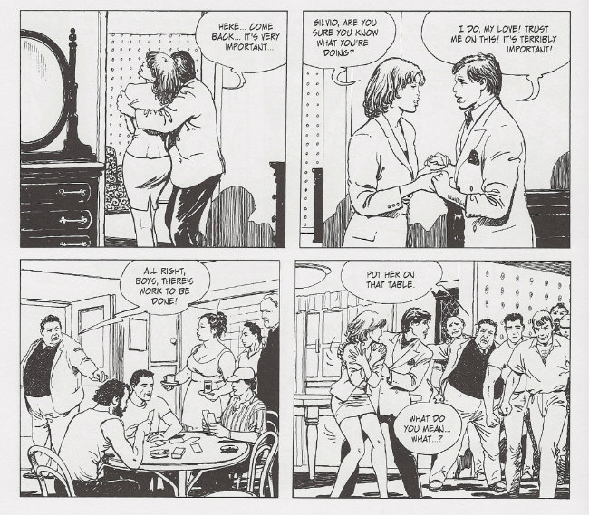
I will not waste time with any detailed synopsis. Suffice to say, the Senator has arranged for Silvio’s financial ruin, which has thrust him into the clutches of a lecherous, corpulent loan shark, who determines that payment of interest will best be taken from Valeria’s body. Silvio is the one who persuades his wife into this peril, thinking, perhaps, that the fat man wants only some quid pro quo. But it’s instant gratification the usurer demands.
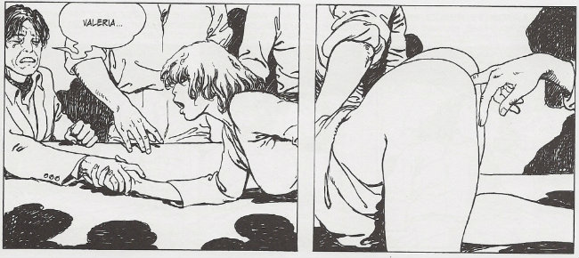
When we see then — here, above — is the genius of Milo Manara. His draftsmanship is beyond reproach, but to only study figuration is to value illustration over sequence, diminishing the function of comics art. Similarly, to only appreciate images of sexual acts is to insult the character of Erotica, which rightly encompasses the psychological textures of the sex act: the anticipation; the anxiety; the flight from one’s senses; afterglow.

By this tradition, il maestro luxuriates in the effect of rape. See how the above diptych appears on first glance to depict one continuous image, though on closer examination it instead shows, in panel one, Valeria gazing in abject horror at the weeping face of the man who betrayed her trust, worthless and weak, unable to meet her gaze, his hand laughable in hers, as panel two closes in, at dead center of the image, on the debutante instance of unwanted penetration, Valeria’s hindquarters enlarged and raised, beckoning to the accorded silent moment of a ritualized insertion.

In panel one she is not raped, and in panel two she has been raped, and will always thereafter have been raped. It is consummate comics.
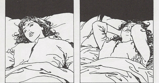
Lest you suspect I am projecting, on the page thereafter the narration starts. Yes, it is only after the first legitimate exploit that the story can truly begin to be told! “I couldn’t fall asleep that night…” Valeria recounts — again, I remind you, to the Senator, who has set these antics in motion — “I felt humiliated… sullied… I’d been defiled… I had suffered a wound that would never heal…

Here, the journeyman might either stop the tale entirely or embark on some risibly generic revenge scenario. But Manara realizes that Erotica is both peaks and valleys, and best enjoyed through the glaze of verisimilitude. So Valeria seeks to return to her old life.
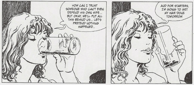
She is raped again at the salon. Not immediately – for a while, il maestro delicately applies some genuine psychology of the rape victim: “Everything seemed somehow far away… as if I were now in another world! The world of the defeated, the losers…” Such dissociation and self-loathing is typical, and adds fine coloration to the rising action.

After she is raped in the salon, Valeria retreats into her own bedroom, locking Silvio out while he attempts to explain that he can’t go to the police because they too are corrupt. The gang then invades the woman’s last bastion of retreat and rapes her on her own bed, though only after she learns that Silvio had apparently struck a deal with the usurer that his debts would be excused — and his political career preserved — day by day, with his wife being raped every single day: the Appuntamento of the work’s title.

This concept, I confess, borders on silly. It is not unlike Johnny Ryan’s Sherlock McRape, who exchanges his crime-solving prowess for, say, 50 rapes, half up front. The gradual build of the sites of Valeria’s assaults from (1) an unknown location to (2) a beloved merchant to (3) her own home offers some lively and gradual build of excitement, but something more would have to be introduced to keep the comic from becoming monotonous.

Ah, brother! But I have forgotten the story’s hero!
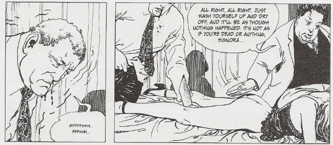
You see, specifically, Valeria is not gang-raped. She is only ever raped by one member of the gang: a silent, hulking man named Ursus, which is Latin for bear. As always, Manara’s symbolgy is deliciously complex – by his ancient designation, Ursus evokes the same Roman milieu as the ‘Senator,’ positioning them both as figures from antiquity, divorced from the weak and the fat of modernity. Yet they are opposites, the Senator all calculation and stratagem, while Ursus is inarticulate and passionate: a real brute!

Mercilessly, invisibly — almost supernaturally — he pursues her, even after she packs her bags and hits the road in the dead of night. Yet as the clock strikes six, the appointed hour, Ursus’ car zooms out of the roadside woodwork to block Valeria’s retreat. Withstanding the woman’s blows, he chases her on foot to “a battered old van” manned by proletarian type in overalls. Ursus beats the man furiously, then bends the woman over. She claws at the worker’s leg, but her rescuer does nothing. She maneuvers upward as she is sodomized, her face pressing up toward the impotent man’s crotch, his head lowered in utter shame, in total defeat, he watches the entire process, this woman’s public rape, unwitting vehicles zooming by in the background, her head pressed against his body as she screams and screams.
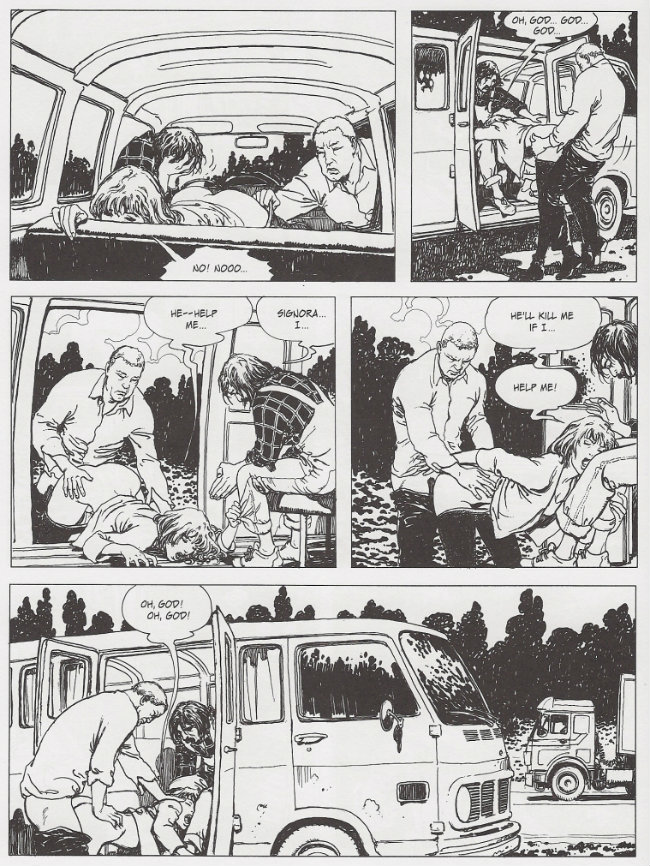
At this point, you are no doubt detecting a political subtext to the action. In fact, il maestro previously added an element of social critique to the encounter in the salon, as an ignorant woman clucks over how handicapped people would do better to stay at home than expect accommodation from a hotel. Such insensitivity from those unaccustomed to pain! Yet because this is not a bathetic work, a representative of the loan shark’s gang offers his own declaration upon entering the scene: “If you want to enjoy the good life, my dear signora, the piper must be paid!” If you’ll recall once more the work’s first panel, and what immediately followed, you’ll know that bourgeois Valeria herself was very much interested in joining the Senator, the reader, “in Barbados,” nudging her lover further toward the pit of misery into which she now herself is cast.

Turnabout, truly, is fair play. In this way, Manara evokes an earlier Italian parable of class warfare, Lina Wertmüller’s 1974 film Swept Away, though his intensity better matches what I’ve read of an inaccessible pinku eiga by the great Japanese subversive Masao Adachi, 1969’s Sex Play (Seiyûgi), in which leftist students reject the timidity of ‘non-consensual’ role-play with girlfriends to commit actual rape: a metaphoric embrace of direct action politics, and a challenge to the moralistic paradigm necessary to accomplish the revolutionary project.

Manara thus begins to intercut Valeria’s continuing dalliances with images from her narration aboard the Senator’s yacht in the Caribbees. “It is simply unacceptable for the rabble to rape our women!” the powerful man muses, arms folded, assuring the woman that Darwinism accords the elite a natural right to command the public. But Ursus too is a worker, and the peerless accomplishment of his set task, day after day, begins to impress the woman:
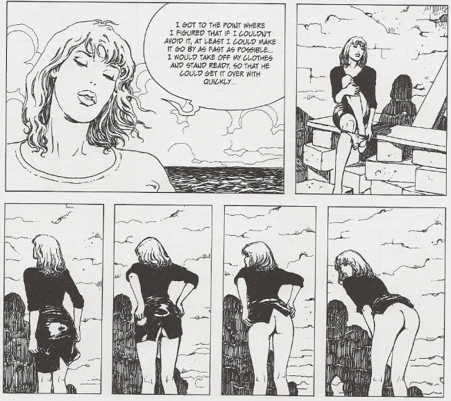
There! There it is, brother! The face! The Manara face, in the final panel! Ooh, the lady doth protest too much! Another one:
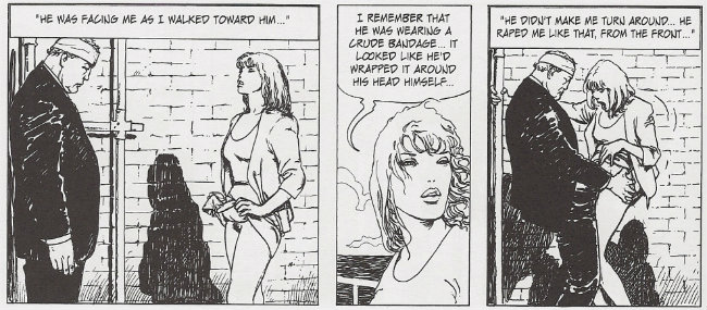
This moment marks a major turning point in the story; prior to this, we are told, Ursus had only ever entered Valeria through the anus. As we will eventually learn, the bandage on his head is due to his covert efforts at paying off ridiculous Silvio’s debts through his own industry. The symbolism is powerful – anal sex is immoral and unnatural, per the Catholic outlook of Manara’s work, so vaginal intercourse can thus mark a sea change in Ursus’ affections: bringing the woman food, tending to her shell-shocked state all holed up in a boarding house. He continues to fuck her at six, of course — a working man has his duties — but unlike the limp grotesques previously seen as challenges to the prevailing social order, Ursus is physically inspired. The last romantic hero.

But forgive my sentimentality. These comics are about women.

Il maestro knows. In all of these beautiful images, there is not a hint of the ugly male anatomy: the leering prick; the dangling, imbecilic pouch. I am not the sort of man who is so insecure that he cannot stand the sight of a woman being goodly fucked, brother, but need I be perpetually confronted with the wan issue of coughing rods at the conclusion of every episode on the erotic midlist? Goddamn it, this is better. There is no emanation from Valeria. She does not drool or sweat. Her eyes do not water. We are spared the potential of her scent. She is the quintessence of the Manara woman. She is perfect, perfect, flaxen glow perfect, tawny sunbake perfect, ceramic milk white perfect, every color of perfect, perfect, perfect.

Until! Until!
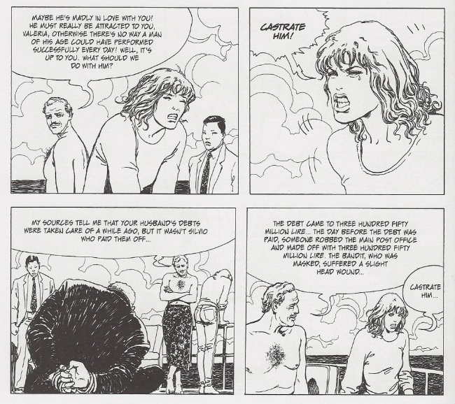
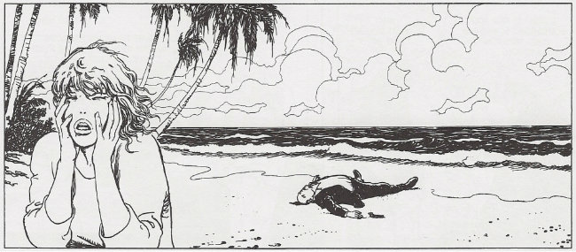
The second panel above depicts the only instance of fluid definitively seen to escape Valeria’s body over the course of the story. It is a single tear. Ursus has somehow made his way to the coast of Barbados, again in pursuit of his departed love. He has blown his deadline, and is in a bad state. Sneering, the Senator/reader/author spells out what’s happened to Valeria, but she will hear none of it. The rapist must be punished. From this, most readers conclude that Appuntamento fatale (Ballata in si bemolle) is a sad story of perverted, frustrated love, ruined by circumstance.

Pity their lack of vision, brother. A masterpiece must have more.

The great manga artist Toshio Maeda once remarked, “[m]es titres s’adressent aux hommes, adolescents et adultes. Ils veulent y voir des filles violées ou des scènes lesbiennes.” What is crucial is that des scènes lesbiennes are in parity with des filles violées. They are fantasies, yes, but also safe spaces for male desire, for the admiration of women.

Yet non-consensual scenarios are not a purely male space, alas. You need only look to kink.com, or yaoi manga, or any number of places to know that the certainty presumed of these ideas are increasingly, viscerally feminized, beyond the old romance novel and soap opera tropes. God, it is confusing. Can’t anything be exclusive? What, pray tell, is the gossamer boundary between a fantasy of male domination and a fantasy of female submission?

It is, I argue, the subtle presence of the feminine perspective. The suggestion of exchange – of secret, implied consent. Of knowing.

And a Milo Manara woman can never know you. And you can never know her. It is the metaphysics of his line. The locked sameness of his luscious designs. The alien poise of his beauty, god. Always, there is potential with him, and here, with Ursus standing on the beach, castrated, summarizing the plot to a disbelieving Valeria, we finally, totally know praxis, so that the rape of a woman can inevitably be no less than the furied trauma of an ultimate man.
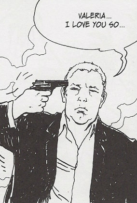
Beauty without tears.
__________
Click here for the Anniversary Index of Hate.

Midnight of the Roundtable

When Noah asked me if I would contribute to Hooded Utilitarian’s Anniversary of Hate, I didn’t have too much difficulty coming up with a list of personal candidates.  Despite my normal preference for setting aside entertainment I’m not enjoying on the grounds that life’s just too short, over the years, I’ve still managed to amass an artistic shitlist — a list of things I hate so much I’m still angry I read them.  So I ran through the list, and thought about writing about how John Ney Rieber’s using The Books of Magic as some kind of writing therapy for his intense self-loathing destroyed one of the most refreshing new characters Neil Gaiman had created for DC.  Or about how the increasingly unsubtle and didactic right-wing politics of Bill Willingham in Fables is almost a case study in how not to integrate your personal politics into your work.  Man-oh-man, was I ever tempted to pull out my copy of The Best American Comics 2006, and eviscerate a particularly horrible anti-Muslim short story that offended me so much when I read it that I actually gave in to the desire to hurl the book at the wall. (I wanted to pull it out and look up the title of the story, but I recently moved, and it’s in a box. I think. It might be in Massachusetts. I really have no way of knowing.)

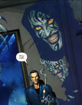
But in the end, I decided to go with an old un-favorite, J. Michael Straczynski’s weirdly personal opus Midnight NationMidnight Nation is a twelve-issue limited series that I read a few years ago in hardback, about David, a cynical cop with a heart of blah blah, whose investigation into a gory murder is curtailed when his soul is unexpectedly ripped out by ghoulish monsters.  He wakes up and walks right out of his body, essentially a ghost–a soulless ghost; what precisely David is, when he is neither body nor soul, is never discussed–and spends the next year walking cross-country with a mysterious, cranky, half-naked guide named Laurel, trying to reclaim his soul before he himself turns into one of the monsters that removed it in the first place.

Why did I say weirdly personal?  The hardback edition I originally read a few years ago was accompanied by an essay penned by Straczynski (which, alas, I have not been able to put my hands on again to refresh my memory), relating a terrifying experience in his youth that he claimed was the direct inspiration for the series.  He was walking along a beach one night, and had some kind of near-miss with a gang of violent thugs that apparently opened up to him all the deep secrets of the universe and the perilous balance of humanity.

It does sound a titch traumatic.  But the work this encounter supposedly inspired features long speeches about the wretchedness of the human experience manifest in, among many other things:

1) People who talk in theaters
2) Christopher Reeve being confined to a wheelchair
3) Permissible counts of rat droppings in hot dogs
4) War

I’m open to the possibility that the ironic juxtaposition of petty annoyances and profound evils was meant to be witty, but it didn’t read that way.  It read stupid; a list of pet peeves someone tried to elevate into profundity. Here are the revelations that come on the heels of a death narrowly dodged: people talking in the theater are just the worst.  It’s so sad when bad things happen to people we like.  War.  What is it good for? Nothing.

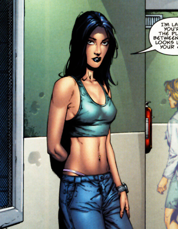
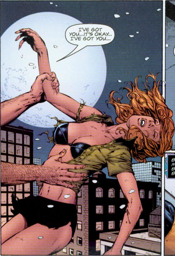
I’m tempted just to list all the absurd little details of the speechifying, but I really should mention the terrible art, since it goes a long way towards making the book as bad as it is.  The art is terrible!  I don’t know what went wrong–I liked Gary Frank, the penciler, just fine when he worked on the 1990s Supergirl title (that’d be one with a heavy emphasis on Linda Danvers and angels), and he’s a competent artist, but his work on Midnight Nation is characterized by dead-eyed stares, stiff bodies and faces, and character designs that alternate between boring, exploitative, or flat-out stupid-looking.  (I’ve never been able to figure out why Laurel spends the first few issues wandering around in an exercise bra, low-rise jeans, and a thong. ((SPOILERS: the best theory I’ve ever come up with is that it’s supposed to be an inversion of angel iconography, an angel being what Laurel is eventually revealed as. But if you can’t manage to undercut religious iconography without making your main character look like a refugee from Victoria’s Secret–well, bite me.)) Or why David’s ghoulish attackers, the Walkers, are green and bald with black tattoos, and wear crazy cultist robes–a colorful aesthetic jarringly out of place with the everyday look of the rest of the book.)  Could it have been the inker?  The colorist?  Maybe Gary Frank had a bad cold that year.  Maybe he phoned it in because he hated the script.  (Probably not.  But I wouldn’t blame him.)

(I tried to describe this comic to my sister, and she said, “I think I’m getting a feel for it– the sort of 90s’ extra-gritty slasher softcore that’s basically an excuse for the author to express his inner teenager.” I told her it’s not all that gritty. “That’s even worse, somehow,” she said.)

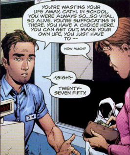
The first time I read Midnight Nation, I just thought it was bad and pretentious and boring.  The second time, what mostly occupied my mind was the thought that there is a great dissonance between what I think Straczynski wanted to do, and what he did.  I think he wanted to write about the margins of society, the way human beings fall through the cracks of the world and vanish, and where they go, metaphorically, when that happens.  It’s the kind of metaphor story Joss Whedon (who I think Straczynski is often compared to, based on some superficial similarities in dialogue) used to pull off so well on Buffy the Vampire Slayer, the kind of interplay of reality and story that made Sandman sublime.  But the script is not sublime.  It’s awkward and forced.  A dead-eyed grocery cashier launches into a moralistic lecture to a dead-eyed customer about how she shouldn’t waste her life, speaking of a lost vitality completely absent from the flashbacks to her childhood.  The characters refer to the out-of-phase dimension they inhabit as the metaphor side of things, but the relationship of the metaphor to their reality goes unexplored; it’s simply a setting.  Moments that were perhaps meant to convey warmth or wit or fear are left dry and emotionless by the stiff, lifeless art.

I can’t attribute the book’s failures just to the lousy art, though.  Straczynski is, after all, responsible for the plot, the pacing, the characterization, the development of relationships, and of course, the dialogue.  When Laurel and David first meet, Laurel is intensely hostile to David, refusing to answer his questions, making snide asides, and complaining about being stuck shepherding someone so annoying.  When they meet her acquaintances, they also treat David like an idiot, and sympathize with Laurel for being stuck with him.  But David’s not that annoying–all of his questions are the obvious ones you’d ask, if you’d been savaged by bald, green cultists with claws and zig-zag tattoos, and started having an out-of-body experience with someone who told you your soul was missing.  They’re such obvious questions that they don’t even do anything to establish David’s personality; they’re the rote questions of exposition.  What’s Laurel so annoyed about?  David’s not irritating, he’s just boring.  There’s supposed to be some kind of zesty, push-pull relationship between the weary-and-wise traveler, and the bewildered-yet-spirited greenhorn, but it’s more like watching a confused dog being dragged along by its ill-tempered owner.

The whole book is characterized by this tension between what Straczynski wanted to do, and what actually came out on the page. That shouldn’t be hateworthy–there’s nothing wrong with ambition, and there probably isn’t an artist on earth who hasn’t had a project that failed to live up to their dream.

But I was already dubious about Straczynski when I first picked up Midnight Nation.  In fact, the only reason I read Midnight Nation was because of an argument I had with a friend.  My friend was a huge fan of Straczynski, but my only encounter with him at that point was in his awful “Sins Past” stint on The Amazing Spider-Man (for those fortunate enough to have forgotten, that’s the one where Gwen Stacy has Norman Osborn’s love babies), which I’d hated.  The bad faith of Straczynski’s legendary feud with the writers of Star Trek: Deep Space Nine (in which he encouraged his Babylon 5 fanbase to make accusations of plagiarism on his behalf) had put me off ever getting into the TV show that made his name. But my friend hoped I might change my mind on Straczynski if I got a chance to see what kind of material he could produce when his work wasn’t bound by editorial dictate or hampered by lousy special effects, if I could experience his writing in a context and a medium that didn’t undermine him.  This was supposed to be the superlative Straczynski work that turned me around, something where I could see the genius that justified the ego and the dedicated fanbase.

I’m still looking for it.

And that is the thing that has really kept me from simply forgetting all about a comic that is, ultimately, more forgettable than hateable. I’m not a fan of Straczynski.  I’m an un-fan.  I become less of a fan with every passing year. He’s an arrogant person, someone who starts petty feuds with his peers, writes the shittiest storylines editorial can dream up, and is cheerfully complicit in fucking over a fellow artist because eh, bad contracts happen.

If you’re going to be that big of an asshole, you need to be a goddamn genius.  A goddamn genius ought — when paired with a halfway competent artist and given the chance to write a twelve-issue miniseries whose concept was inspired by what he claims was a profoundly life-changing personal experience — to be able to produce something beautiful, something memorable, something that tells a truth so undeniable that I retire from it shaken, drained, wondering and muttering its wisdom; the trick, William Potter, is not minding that it hurts. Something that doesn’t feature cheap titty shots and does not weigh tainted hot dogs equally as heavy as the hell of war.  It’s become impossible to untangle my disdain for the work and my loathing of the creator.  I can’t read the arrogant “let me whisper the dark secrets of the universe, so that you may comprehend and choose” speeches of Midnight Nation‘s villain without thinking that’s Straczynski’s voice, so smug and sure that he’s got it all figured out. Every time I hear about some dickish thing Straczynski has said or done with regards to one of his fellow writers, I think to myself, “Where does he get off?  His book was terrible.”  I can’t even figure out why this guy gets work, much less how he’s managed to attract a rabid fanbase.

__________
Click here for the Anniversary Index of Hate.
The Devil You Thought You Knew, The Devil You Wish You Didn’t

Hating comics is a strage business for me. I’m not against it – I’m not a Team Comics guy, worried about hurting Brian Bendis’ feelings. I’m a big Comics of the Weak fan, and I’m writing for the Hooded Utilitarian. I’m down with hate. But I find it unexpectedly difficult to hate comics.

Most comics, even some corporate ones, are the product of one or two idiosyncratic minds putting pen directly to paper. Even if I don’t particularly care for them, they tend to fascinate me as art objects. And the truly focus-grouped editorially-driven corporate comics? I’m frankly not invested enough in most of them to care if they’re all that bad. A bad comic of that sort is far more likely to inspire mere apathy. It takes something more than poor quality to drive me to hate.

To hate a work of art, I have to feel trapped or confronted by it in some way. Popularity will do it, sometimes. I almost wrote this essay about 100 Bullets, and then almost again about The Walking Dead. Neither of those books are the worst things I’ve ever read, but I also don’t find much to value in them, and their various levels of critical and commercial success serve to turn my general distinterest into a sneer of disgust. (You might think that sounds petty, and at one point I would have agreed with you. But I’m more inclined these days to see the general public reaction to a work as a legitimate part of that work’s existence, and worth reacting to in its own right. Plus, frankly, it’s just sickening to hear constant praise of work you consider undeserving.)

But most comics aren’t really that popular or that talked about. And unlike a movie, for which you sit passively in a dark room for a predetermined amount of time with nothing to focus on but Bradley Cooper’s “punch me” face, reading a comic at all requires active participation. If I’m not enjoying a comic, my energy for that participation just slides away, and I toss the book aside. I’m not trapped in it.

I can’t even fall back on old, reliable superhero nerd rage. Up until embarrassingly recently, I could become greatly offended by terrible superhero comics that violated my vague platonic ideal of what a superhero comic should be. A few years ago, I might have found it in me to write this entire essay on Identity Crisis, or a Mark Millar comic. But now, I try, but it fizzles. Superhero comics were never the most relevant things to begin with, and for me they’ve now spiralled off into utter inconsequence.  (Superhero movies, on the other hand, are a constant presence in the cultural conversation, as well as being formally dominating experiences, and I have little to no problem hating THOSE. I hate that new Batman movie and I haven’t even seen it yet.)

So to write about a comic that I truly hate, I have to pick one that affected me on a personal level. I’ve picked a comic that, although it isn’t particularly important, let me down tremendously, and that I came to hate through sheer disappointment. That comic is Matt Wagner’s Batman/Grendel II.

I wonder for how many people Matt Wagner’s name still resonates. Briefly glancing over a chronology of his work, most of his output over the last decade-and-a-half seems to be scattered projects from DC or Dynamite, mostly writing franchised characters like Zorro or Madame Xanadu; some short work writing his own characters, some work drawing Batman. But nothing much to suggest that, for a time in the late eighties and early nineties, Wagner was one of the most consistently interesting and experimental of mainstream-minded American cartoonists. His was a mixture of complex but balanced geometric page layouts, high fashion and art deco-influenced design, a deliciously cartoonish line embellished with painterly colors, all mixed with a strong, semi-modernist writing style.

His earliest major work, Mage, a traditional fantasy quest recast to then-current ’80s urban America and strained through a cheeseclotch of comic book iconography, was the kind of thrilling learn-on-the-job opus that only a young cartoonist can deliver – from page to page and chapter to chapter you can see Wagner gaining confidence and competence in equal measure, his skill rapidly catching up to his ambition. In the middle of Mage, Wagner began his other major early work, Grendel: Devil by the Deed, a re-make of his first comics series, a crude but vibrant entry into the ’80s black-and-white boom called Grendel, about a young, wealthy sociopath named Hunter Rose who becomes the world’s greatest criminal mastermind out of want for a challenge. Foregoing the previous work’s lightly-manga-influenced adventure comics style, and having substantially improved as a draughstman, Wagner re-told (and expanded) the entire Grendel story in a series of tableaus and captions, the panels of the comics page divided up to somewhat resemble the composition of a stained-glass window. It was an experiment that earned high praise from then-fresh superstar Alan Moore in his introduction to the collected edition, and arriving as it did simultaneously with the virtuoso final issues of Mage, together they announced Wagner as most definitely someone to watch.

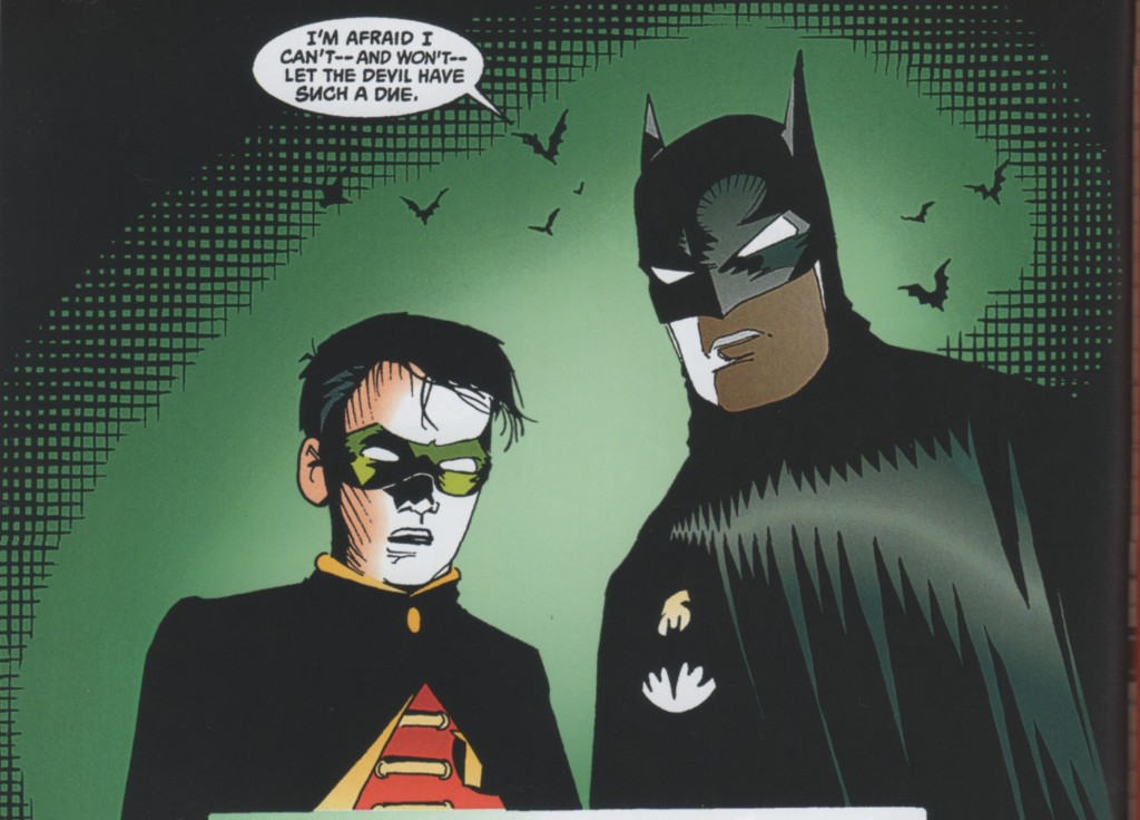
Wagner’s career post-arrival followed what now seems like something of a familiar path for eye-catching independent artists working in a mainstream idiom. He only occasionally drew his own characters again in comics form, instead making the likely economically expedient (as well as, admittedly, often aesthetically interesting) choice of writing a long run of Grendel stories for other artists to interpret, and plying his drawing skills on various franchise characters (including a Terminator comic that was actually fairly excellent, if memory serves) and many, many cover art jobs. Through the ’90s he did draw several short Grendel stories (the character of Grendel long-since transformed into a sort of freefloating symbol of the evils of mankind, with many different characters through time and space taking on the persona of the devil), and delivered a long-awaited sequel to his Mage series. The latter, though, is best discussed through the prism of the twin projects that are my true, belated subject today: 1993’s Batman/Grendel and 1996’s Batman/Grendel II, or rather, the aesthetic distance between these two works, both written and drawn by Wagner himself.


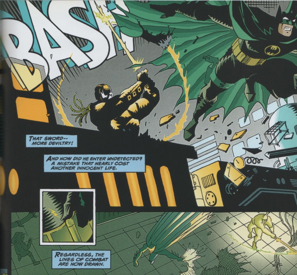
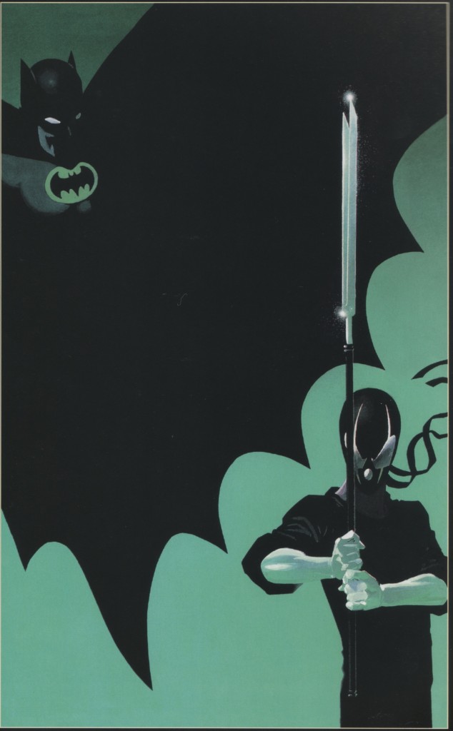
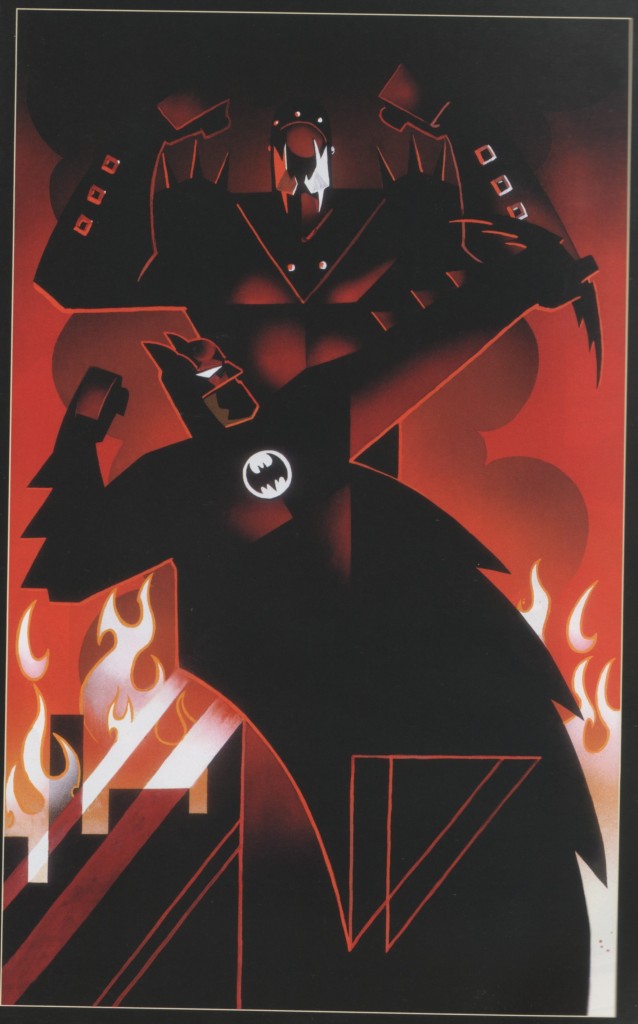
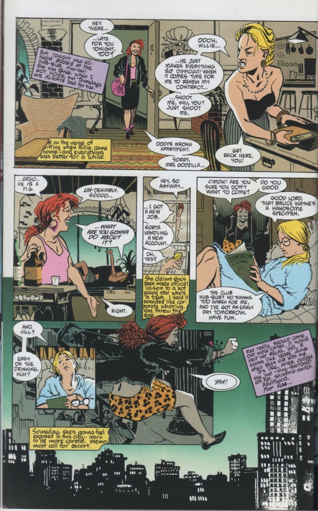
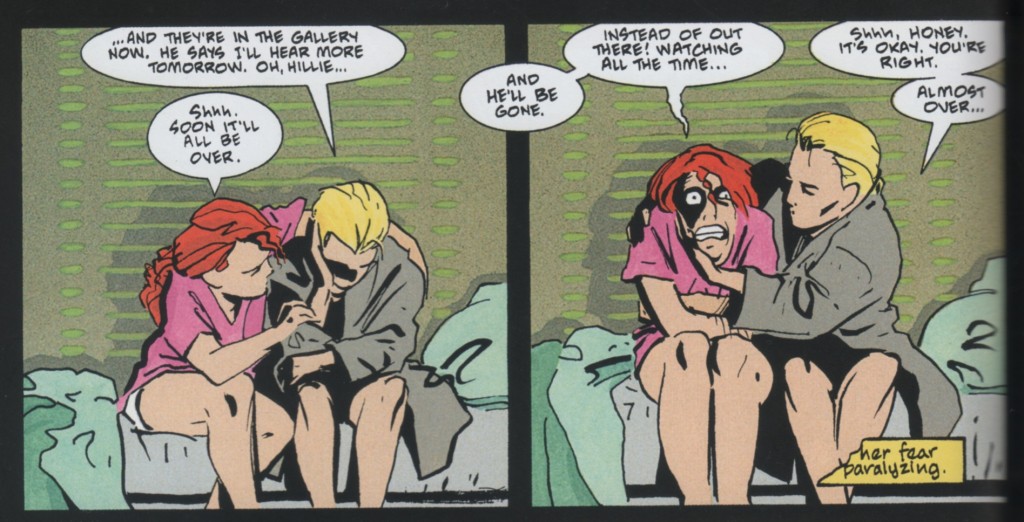
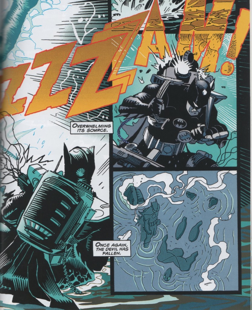
The Aesthetic Distance.  (Left, Batman/Grendel.  Right, Batman/Grendel II.) 


Batman/Grendel is far from the best comic ever made, but it does happen to be one of my personal favorites. Wagner, operating at his most formally innovative — with page layouts to die for, and the most elegant linework of his career (not to mention beautiful coloring by Joe Matt) — delivers a comic that on the surface purports to be about an epic battle between two wealthy playboys who enjoy violence on rooftops while wearing masks, Wagner’s own perverted inverse of Bruce Wayne versus the genuine article. The heart of the comic is actually, however, the story of two women, Hillary Ferrington and Rachel King.

The narrative consistently paints both Grendel and Batman as obsessive, destructive, meticulous, and both more than a little inhuman, both callous to the emotional realities of human life, the only difference being that one is callous out of sadism and the other out of expediency. And in the vein of the best of Will Eisner’s work on The Spirit, their entire superheroic clash of wills is constructed largely as backdrop to the story of Hillie and Rachel’s friendship, their tortured pasts, and their struggles against an increasingly hostile world filled with terrors such as wealthy playboys who enjoy violence on rooftops while wearing masks.


Wagner still fulfills the genre demands of a Batman story – there’s plenty of Batman puzzling things out at a computer, or thinking terse caption thoughts about how the weights in his cape are perfectly suited for urban combat – but he structures the big emotional beats of the story all around Hillie and Rachel. It’s a comic that uses the superhero setting to tell a human story, and unlike 99 percent of the stories that try that trick, it unembarrasingly succeeds.

Again, it’s still a Batman comic, still an inter-company superhero crossover, and still indebted to genre and melodrama in ways that could be argued to work to its detriment as a piece of art for the ages. It isn’t the best comic ever made. But I think that its formal mastery, compelling story, and welcome attention to gender politics and genre critique make it something kind of special. I love it a lot.

Batman/Grendel II, released three years later, takes a huge shit on everything that made Batman/Grendel even a little bit special.


The sequel finds Wagner in a different mode of storytelling. Gone are the tightly constructed and narratively functional layouts. In their place are splash pages crowded with unmoored smaller panels that often lead your eye in the wrong direction, to no good aesthetic effect. The most functional visual device is a re-hash of Frank Miller’s already decade-old television narration from The Dark Knight Returns. Gone, too, is the elegant linework. In 1996, Wagner had begun to loosen up his art, freeing himself from his devotion to the angles and fashions of 1980s illustration. The result is art that may very well have been more fun and personally fulfilling for Wagner to draw, but which looks clumsy and ugly on the page when compared to his previous style.

Most importantly, gone is any thematic or narrative resemblance to what made Batman/Grendel a minor miracle. This is not a story about any kind of human experience. This is a story about Batman fighting a cyborg from the future. Overwrought captions describe in agonizing detail how each of them feel about every moment of the story, endless verbiage that unironically calls Batman “The Dark Knight” and Grendel “The Devil” as it painstakingly narrates their utterly pointless and generally uninteresting fight to a stalemate that Wagner pompously postures as enigmatic and ambiguous in a desperate attempt for any kind of meaningful resonance.

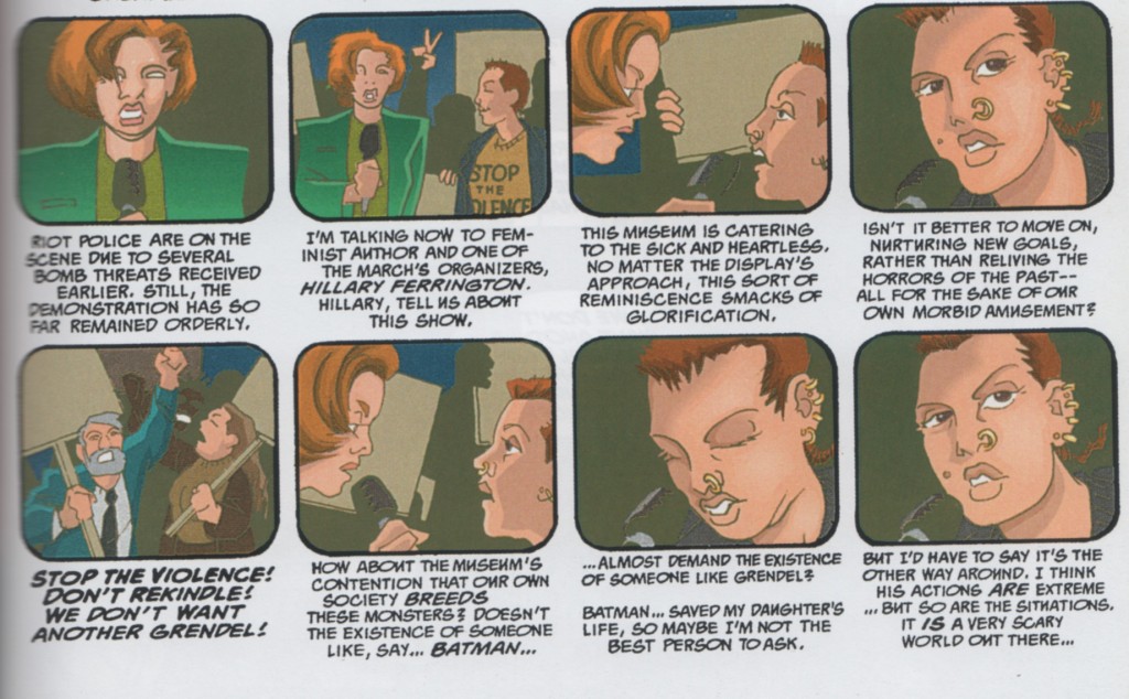
Batman/Grendel II‘s thorough betrayal of everything Batman/Grendel did right can be summed up by its very first page, in which Hillary Ferrington, the narrative and emotional heart of the former work, makes a cameo appearance that is used for exactly three purposes: (1) to display via her close-shaved head and multiple piercings that Wagner has ditched the elegant art deco stylings of old, (2) to lay exposition regarding the book’s fatuous internal free speech debate, and (3) to talk about how awesome Batman is. That Wagner is seemingly fine with disrespecting one of his best characters in this way speaks to the loss of something in him. And it is a loss that can be seen in his work through to the present.

After Batman/Grendel II, Wagner delivered his aforementioned Mage sequel, which displayed a similarly loose pencil and disinterest in the formal rigors of his previous work. It also, like Batman/Grendel II, displayed a much less nuanced sense of irony in regards to its straight-ahead mythic-adventure story. Where once Wagner used fantasy tropes to explore human situations, now the tropes themselves had become the focus. The same can be said of his post-’96 corporate superhero work (which makes up the bulk of his post-’96 work, in toto), at least that which I’ve read. Even the latter-day Grendel stories that he still occasionally writes for other artists are laden down with all the self-importance and forced darkness of a goth teen. Where once he used genre trappings as a delivery system for something bigger, he seems dedicated now to wallowing in those trappings for their own sake.

There’s a large degree of unfairness to what I’m saying. A perfectly valid view of all of this would be that I’ve merely gotten older, and my tastes have changed, while Wagner too has matured, and his art has shifted gears, just in a different direction. In some ways, his looser artwork may speak to Wagner achieving a more direct and free form of expression on the page. That I’m frustrated at the lack of particular thematic or formal tics in his current work is perhaps as much to do with my own nostalgia as any artistic lack on Wagner’s part. And like I said up top, Batman/Grendel II isn’t the worst comic in the world. If what you want is Batman fighting a murderous cyborg from the future, it might even be a pretty good one. But I can’t tell. I’m too sad at the loss of a cartooning voice I cherished, and too angry at the imposter that strolled in and tried to take his place. It’s an irrational feeling, but then again, so is hate.
__________
Click here for the Anniversary Index of Hate.