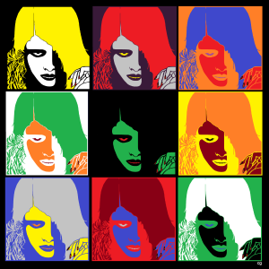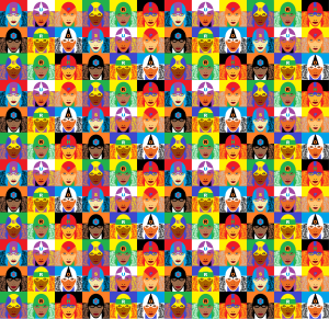
I’ve been obsessed with Andy Warhol’s Marilyn Monroe series lately. When I found out the poster art for Night of the Living Dead isn’t copyrighted, I made this Warhol-inspired knock-off:

Warhol painted his series in 1962, as a kind of requiem for Monroe after her August death. Because it is a grid of nine squares–a classic 3×3 comics panel layout–it looks a lot like a comic strip to me. And so a part of me wants to say it is a comic strip. Consider Scott McCloud’s definition: “Juxtaposed pictorial and other images in deliberate sequence, intended to convey information and/or produce an aesthetic response in the viewer.”
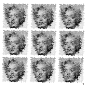
Clearly the nine images are “juxtaposed.” And that would be true even if the images were all identical, as in my variation on Warhol’s source photo (like I said, obsessed):

But it’s the “deliberate sequence” part that gives me pause. I’m not exactly sure what “deliberate” means here (can a sequence be non-deliberate? even if the process of composition is random, the resulting arrangement becomes deliberate once finalized by the artist), but “sequence” is fairly clear. Most dictionary definitions include the phrase “a specific order.”
So the individual images form a specific path for the viewer to follow. That implies there are wrong paths–or at least paths that don’t produce the aesthetic result that following the intended sequence will produce. I don’t think that’s true of Warhol’s painting or my two variants though. Their arrangements are aesthetically deliberate, but your eye needn’t begin, for example, in the top right corner and proceed to the right in a Z-pattern in order to best appreciate all those juxtaposed Marilylns and Zombie Girls. If you instead focused first on the center square and then scanned up and to the left or any other direction, the aesthetic content doesn’t change. If order doesn’t matter, then the arrangement must not be a sequence. And if comics are sequences, Warhol’s painting isn’t one.
The term “image” is a problem too. Comics have to have more than one. As I mentioned in a previous blog, that’s why the French flag is not a comic. Though it is composed of three parts (a blue rectangle, a white rectangle, and a red rectangle), we read it as a single, unified image:

So is Warhol’s Marilyn Monroe a sequence of images or just a single, flag-like image? Is it made of nine juxtaposed images (and so then possibly a comic), or is it one image made up of nine parts (and so definitely not a comic). It’s hard to say since there’s not always a clear distinction between a visual element that is an “image” and a visual element that is “part of an image.”
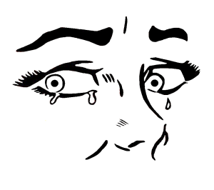
This variation on Roy Lichtenstein’s “Crying Girl” is, I think, clearly a single image–even though it is made of the identical component image flipped and juxtaposed four times:

Would it be a comic if I divided the four quarters with frames and gutters? I doubt it. What about images that don’t repeat any of their parts? Consider this entirely abstract composition I’ve ingeniously titled “39 Lines”:

It consists of thirty-nine visual elements, but I would say it is only one image. No individual lines or clusters of lines produce a response that’s separate from the composition as a whole. Now consider this:

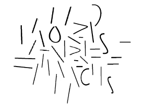
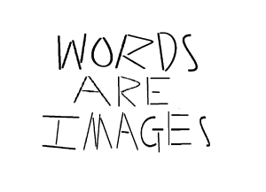
It is also composed of thirty-nine visual elements–the same thirty-nine that make up its sibling image. But it is also a sentence, one quoted from comics artists Will Eisner. Unlike “39 Lines,” “WORDS ARE IMAGES” also has linguistic meaning. It is composed of three, separable linguistic units. The first eleven lines form the word “WORDS,” not because of some intrinsic qualities of the lines themselves, but because of an English-reading viewer perceiving that particular conceptual unit. That linguistic property is so obvious that it’s easy to forget that words are also always rendered images–which was Eisner’s point.
But, unlike the French flag or the Warhols, sequence does matter. The lines that compose the sentence “WORDS ARE IMAGES” must be perceived in a very specific order for the linguistic meaning to occur. That’s why McCloud includes the adjective “pictorial” in his definition, to distinguish comics from sequences of lines that produce only letters, words, sentences, etc.
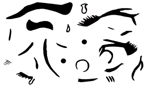
“39 Lines,” in contrast, has no specific order for taking in its constituent visual elements. Your eye is free to enter the image at any spot and then wander at will. There’s no sequence that produces additional meaning. The same is true of “26 Parts”:

It’s just lines arranged to form an abstract image. But consider those same twenty-six visual elements in this arrangement:

Your eye is still free to enter and wander freely, but the arrangement of the same ink (or pixels) now conveys an additional meaning. It represents a face. That’s another kind of conceptual unit. The arrangement produces a meaning that is not an intrinsic quality of its individual parts. Like “39 Lines” and “26 Parts,” it’s a single, unified image made of individual parts, but, like “WORDS ARE IMAGES,” the face-lines produce an additional aesthetic response, one that’s pictorial rather than linguistic. The difference is that linguistic images must be perceived in a specific order, and pictorial images do not.
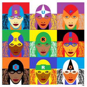
So pictorially, my next Warhol variation isn’t a sequence either:

Your eye is once again free to wander through the nine faces in any order. But this time, some of the visual elements are letters, and if you read them in the right order, they spell “SUPERHERO.” That’s a sequence. Since those letters are also part of juxtaposed pictorial images, this 3×3 grid fits McCloud’s definition of a comic, while all of the previous examples do not.
But is “SUPERHERO” a comic when expanded with wallpaper-like repetition?

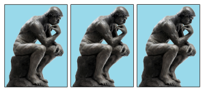
The repetition isn’t itself the problem. I could create a wallpaper-like expansion of this three-panel arrangement of Rodin’s “The Thinker” and still produce sequential meaning:

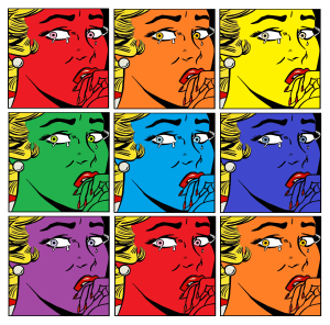
Unlike my earlier layout of the identically distorted Monroe photo, the left-to-right repetition of this identical image can suggest a continuation of behavior through increments of time. It’s ambiguous how much time is passing (seconds, hours, months, etc.), but the figure can be understood as a living figure who is holding a pose as he sits and thinks. That’s not the case with this next Warhol-esque variation on “Crying Girl.”

Like the repeating Thinker figure, the repeating Crying Girl figure doesn’t change her pose. But because the pose is transitory and unmotivated (why and for how long would someone look askance like that, and the laws of physics would have something to say about those suspended teardrops), time does not seem to be passing. The face, like Warhol’s Monroe, does change colors–but those seem to be changes to the image of the woman, not the woman herself. This is not a left-to-right sequential representation of time passing. It is a sequence though. Unlike Warhol’s Monroe, the changes follow a specific order: ROYGBIV. Which produces a pun: “ROY” and “Roy.” So is that sequential element enough to call that 3×3 grid a comic?
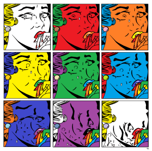
What about this one?

Here, finally, is something that strikes me unequivocally as a comic. It’s a sequence of an incrementally changing image. In addition to color changes, twenty-six parts of “Crying Girl” move from their face-signifying positions to a non-pictorial clump in the bottom half of the final frame. It tells a kind of story. Which I think is what McCloud means by “deliberate sequence.” He wants comics to be narratives.
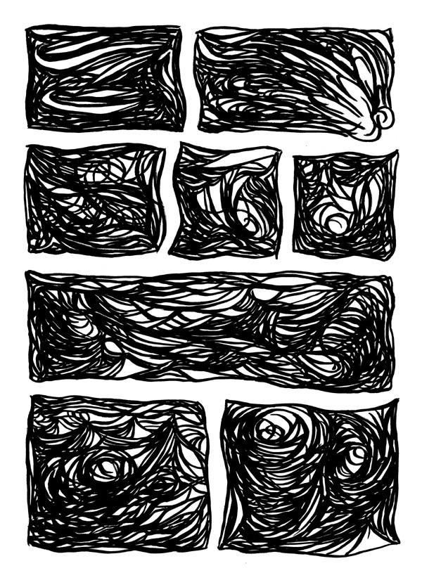
That produces another problem. While the vast majority of comics are narratives, some are not. Check out Andrei Molotiu’s Abstract Comics and you’ll find meaningfully juxtaposed images that include no words, no people, nothing but non-pictorial lines:


Some of the pages in Abstract Comics, however, appear no more sequential than Warhol. Which could mean some of them aren’t actually comics. They might just be subdivided images. Many are even subdivided into panels and gutters, but do they use those visual elements as panels and gutters? Do they produce a sequence?
Part of the confusion is the non-pictorial content. Visual storytelling typically involves drawings of settings and characters. But it doesn’t have to. Consider this four-image sequence:

There’s no setting but a white background, and there’s no character in any traditional sense. But it does tell a kind of “story.” The first abstract image appears to change into each of the subsequent abstract images. Even though the image doesn’t represent anything else, it does represent itself. According to Bill Blackbeard’s definition, comics are “about recurrent, identified characters, told in successive drawings.” The cluster of black shapes is both identifiable and recurrent. That makes it a kind of “character,” one able even to undergo a change or “character arc.”
I can apply the same narrative to Monroe:

In this case, the first image, because it’s a photo of Monroe, does represent something other than itself. But that’s not true of the rest of the sequence. Each change is a change to the photo only. They don’t represent changes to Monroe herself. She’s not the character of this abstract, four-panel comic. Her photo is. The same is true of my previous “Crying Girl” variations. Even though they’re representative images of a woman, the woman is not the character of the narrative. Her representation is.
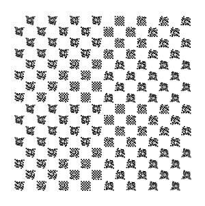
Incremental changes to a repeated visual element, however, don’t guarantee a story. These chessboard permutations strike me as a single image made up of many, evolving but ultimately dependent parts:

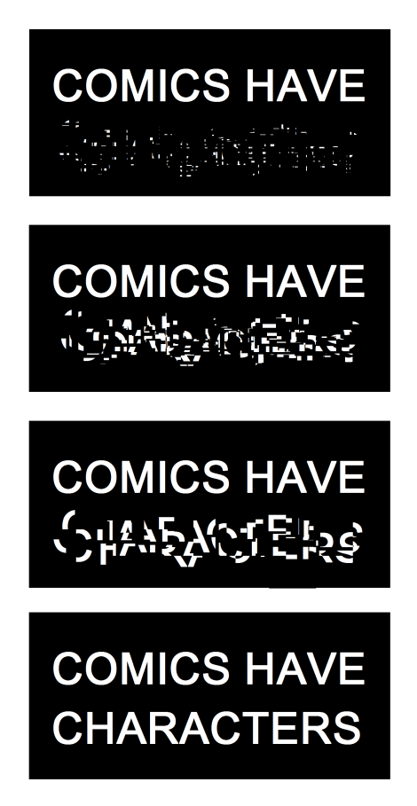
There’s no specific order to the parts, and so there’s no story, and so it’s not a comic. Characters, especially abstract characters, need a sequence in order to become characters. That’s true of images that have linguistic rather than pictorial meaning too. Even words, because they’re images, can be visual characters in their own abstract but sequential plots:

So is the Monroe image in Warhol’s painting a “character” too? It undergoes similarly abstract changes, but those changes still aren’t sequential. Neither Monroe nor the repeated representations of Monroe are segments in a visual story.
Which is all a very long way of saying: No, Warhol’s painting is not a comic.
It just looks like one.


