Monthly Stumblings # 5: Bruno Lecigne

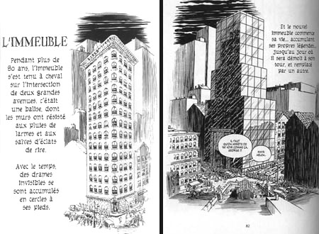
Bruno Lecigne’s “De la confusion des languages” (on the mixing up of the languages)

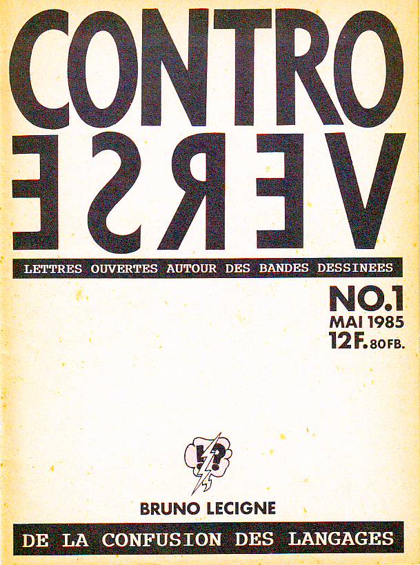
My monthly stumblings are, sometimes, restumblings, really… This past weeks I restumbled at least twice: on Otto Dix’s Der Krieg (the war) and Bruno Lecigne’s “De la confusion des languages”  (Controverse – controversy -, May 1985). In “De la confusion…” Bruno Lecigne presented eight chapters about comics criticism. I will summarize them trying to avoid misrepresentation:

(I) After being a subculture designed to amuse children comics reached adult readers and achieved official recognition in France. This meant that, after being devalued in their totality, comics started to be valued also in toto. It’s the amalgam: “there’s a distortion between the genre’s reality, which is multiple, and its image, which is assembled.” This means that a comics auteur is just a comics professional. It doesn’t matter if s/he does stereotyped products for children (normalized distractions for everyday consumption) or ambitious, personal work: “there’s confusion between the “auteur” as a professional (social status) and/or as a creator (artistic status)[.]” This means that institutional prizes and grants are given both to innovative, personal, work and commercial successes without any creativity. It also means that critics value everything, without any criteria.

(II)  Comics in France started by being an infraculture rejected by the official instances. Academia either ignored or denigrated them. In the latter case academics based their attacks on three major points: comics are morally corrupt; comics are culturally harmful because they deturn from the real culture (particularly from literature); comics are aesthetic junk. Facing this rejection and suffering from a lack of legitimization the comics fans are going to organize a milieu in which a parallel legitimization is going to appear (through magazines, fanzines, conventions, collectors, specialized critics; everything in closed-circuit):  a paraculture was born (the word “subculture” could also be used, I suppose). This subculture is not completely watertight though: some intellectuals will function as ambassadors to the mainstream media and academia. They will defend comics as: 1) just another art form; 2) unpretentious and fun; 3) ultraculture (the underground).

(III) There’s no objective reality of artistic creation. Concepts like “auteur” or “producer” are historically determined. They’re part of a mentality, of an ideology. Denouncing the mixing up of the criteria means denouncing a cultural manipulation: “a morality of consumption can’t be, without deception, credited to an ideal of creation.” The social status of the artist varied through history: “archaic phase: the wizard; classical phase: the craftsperson; Romantic phase: the artist; modern phase: the creator.” These categories are sociological, not artistic. These historically determined concepts may be seen as “values” and used retrospectively (e. g.: the work of Alfred Hitchcock or Howard Hawks seen as auteur creations). “All speech about art presupposes an implied or confessed ideology which supports economical strategies within the field, new to comics, of the institutionalized culture. The brand of creation is bandied about indiscriminately by certain editorial policies [.] […] The propaganda of cultural activities, for instance, dissimulates a real practice of commercial criteria – these contradictions […] are stifled by the amalgam though.”

(IV) The reviews are the privileged place of the mixing up of the languages: two examples: an anti-intellectual review in (A Suivre) (comics are fun and intelligent means boring) and a review in L’Année de la bande dessinée 84 – 85 in which the writer (Thierry Groensteen) praises François Bourgeon as a craftsman to claim his status as an auteur afterwards. He bases his claim in nothing: “Bourgeon is an auteur because he is an auteur.”

(V) In this day and age we view creation as a detachment from commercial constraints. In the comics milieu it’s rarely the case: even Tardi (with Adéle Blanc-Sec) and Chantal Montellier (with Andy Gang) must submit themselves sometimes to the restrictions of the series. Auteurs should also be free from editorial policies, but, again, that doesn’t happen a lot. The point isn’t that commercial and editorial constraints lead to an inevitable lack of quality. “What’s questionable is a speech based on the freedom of creation which cannot be valid because it hides “industrial” constraints and imposed rules – self-imposed or not.” An autor like Tardi (or Guido Buzzelli, sez I), is in a schizoid position: his personal work coexists with his alimentary production. “[A] dynamism art/commerce is, as everywhere else, sustainable, but its ambivalence, if doctored by a speech, is a falsification.”

(VI) New approaches to art creation include the viewer as “producer of meaning” and stress art’s polysemy. As Revault d’Allones put it: “The abuse that constitutes calling  works of art productions may allow an ideological manipulation in reverse: mistaking industrial products for works of art, veiling, in this way, the nakedness of the profit under the patched vest of beauty.” […] “The problem is not to determine which doctrine of creation is the “true one,” or the more adequate to comics (where all strata coincide: production / mass consumption, innovative or avant-garde explorations, fetichization, etc.), but to dispute the mixing up of the languages, namely the absurd support that a global positive cultural image  gives to production conditions that are just commercial. The “vest of beauty” may not fit on everybody, that’s normal; but the universal acceptance of clichés may dress everybody and that is a pity, or it is indeed sinister.”

(VII) If real comics criticism doesn’t exist what passes for comics criticism in the media does have a strong presence. It privileges the adventure series for children: “escapist comics guided by the stereotypes of the heroic fantasy where the image is in the service of the anecdote, without an aesthetical surplus. Being an easily digestible product it implies a consumer’s reading: at the first degree of the narrative’s transparent content, evaluating the images by their effectiveness and their “prettiness.” These rules of the readers are also, quite often, those of the critics who are going not to distance themselves, but to reiterate these principles fixing them in a speech.” The escapist series becomes the epitome of comics greatness. “Integrating has their sensitive model the laws of the series, critics are in accordance with commercial recipes, to which they give the legitimation of the “artistic” speech and the “cultural” value judgment: here’s the language of the mixing up.” Comics critics are also archivists and hagiographers.

(VIII) After a feminist manifesto by four French comics artists (Nicole Claveloux, Florence Cestac, Chantal Montellier, Jeanne Puchol) published in the mainstream newspaper Le Monde (1985) anti intellectual attacks followed (feminists lack humor and comics are fun, as we already know!): “[the manifesto] rubbed the wrong way  a certain mantra of self-satisfaction; instead of linking filled box-offices with creative qualities, variety of style, contemporary inspiration, the Monde‘s page links it to clichés, uniformity, poor imagination or complete absence of imagination in favor of a cocktail of formulas.”

To fully understand the above we need to go back 25 years and understand its social and historical context. It’s a controversial text, almost like a manifesto, because Bruno Lecigne felt during the eighties that the revolution which started a decade earlier was being stifled by the temple sellers. In his interview with Jean-Christophe Menu (L’éprouvette # 3, January 2007) he calls the eighties “les années fric” (the dough years). On the other hand I will not underline enough the fact that this is my selection, my reading of Bruno Lecigne’s text, not the text itself, obviously.

Is the divide between art and commerce that wide? Bruno Lecigne himself says that it isn’t. He wanted to attack comics’ pseudo-critics and their blindness, not any artists (he even says that commercial and editorial constraints may lead to quality books). The problem is that citing Hitchcock and Hawks, as he does, without questioning (or not) the Cahiers du Cinéma‘s legitimacy to call auteurs to these directors (or, at least, to write briefly about the subject) undermines a bit, in my opinion, Lecigne’s points. These are painfully difficult questions and things seem (even if they aren’t) too clear cut in “De la confusion…”

That said I’m fully with Bruno Lecigne, as all of you who are still reading know perfectly well. I think that the movie industry didn’t impose as many stereotypes and  formulas to Hawks and Hitch as the comics industry does to their hired hands (as Lecigne also says: enforced from outside or self-imposed doesn’t really matter).

Did things improve during the last twenty five years? I don’t think so. Amalgamation is still being practiced and a lot more pseudo auteurs are being lauded than the real ones (as the year 2000 lists painfully proved to me; I don’t know if comics critics are viewing things differently ten years later, but I doubt it). The best though is to listen to Bruno Lecigne himself because Jean-Christophe Menu asked him just that in 2007: “There was, back then, a clear cut frontier between what was “culture” and what was not. That line doesn’t exist anymore. […] Everything that was minor or subculture […] lives perfectly well, in a general way, in a global production and consumer system of “cultural goods” and “cultural contents.” […] There’s an openness which is the one we fought for, but the other side of the coin, that we didn’t predict, is that everything is equal to everything. […] There’s a generalized softness, everything floats with its bellies up, without determination, without any definition. The great antagonisms ceased to exist. Since comics won the economical combat in France (it’s a profitable part of the book industry), it won its cultural combat as well at a moment in which it doesn’t matter anymore.”

Can you find a more pathetic irony?

Utilitarian Review 9/25/10

On HU

To start out the week kinukitty reviewed the yaoi manga Hiro Madarame’s Scarlet.

Ng Suat Tong discussed Jacques Tardi’s It Was the War of the Trenches in comparison to other war narratives.

Richard Cook looked at the DC comics that came out in the month he was born, September 1980.

Alex Buchet continued his series on comics and architecture with a discussion of comics creators who also did architectural projects.

Sean Michael Robinson wrote a lengthy article on the Choose Your Own Adventure series.

I explained why I didn’t like the first four stories in Moto Hagio’s Drunken Dream.

And for your download, a collection of torch songs.

Utilitarians Everywhere

At Splice Today I review Justin Townes Earle’s latest album.

At Madeloud I have a review up with Jake Austen about his work producing Chic-a-go-go, Chicago’s all-ages public access dance show.

On tcj.com, Matthias Wivel reviews Ulli Lust’s “Heute ist der letzte Tag vom Rest deines Lebens.

Other Links

Matt Seneca talks about a Gary Panter panel and the ways of realism.

Karen Green has a thoughtful article about what is and is not propaganda in comics.

Groovy Age of Horror is the best there is at what it does.

Die, Little Girls! Die!

I plan to do a number of posts blogging my way through n Moto Hagio’s Drunken Dream, released recently by our kind hosts at Fantagraphics. I’m a fan of Hagio’s work…or of as much of it as I’ve seen. (See my review of AA’.) And I have great, great respect for translator and editor Matt Thorn, (who was kind enough to facilitate the inclusion of this piece in an online project I did some years back.)

So basically I was hoping to be wowed by this book. And I don’t think that that’s entirely impossible even still — I skimmed ahead to reread “Hanshin: Half-God,” the one story here that was reprinted in TCJ #269, and that’s still awfully, awfully good (and I’ll discuss it in order in the next post or so.)

However, the first four stories do not live up to expectations. Because they kind of suck. And not just “suck in comparison to what I was hoping for.” They’re out and out crap — presuming you drew little hearts and flowers on your crap and maybe put a little schoolgirl dress on it, and then nailed it to a tree and sang to it odes about the transcendent power of art as it oozed with limpid bonelessness down the trunk to finally crunch ineffably on the leaf-strewn forest-soul.

Anyway. We’ll take them in order. (There are lots of spoilers here, if that concerns you. In fact, I pretty much spoil everything. Fair warning.)

Bianca

This is framed as a conversation between some guy with an aggressively patterned suit and the great painter Clara Heimer. Aggressive suit guy asks Heimer who that little girl is in all her paintings and she says it’s her lovely inner-child/nature spirit and then she looks up meaningfully as an infinite number of self-help books fall from the sky and crush her and the guy dead, leaving only the empty and aggressive suit to dance wildly, desperately, transcendently upon their moldering corpses.

I wish. Actually she says the girl in the pictures is the titular Bianca, a young ten-year old cousin Heimer met for the first time when she was 12. Said cousin is a free spirit who cannot be contained, which translated means that she likes to run outside and dance in the forest “like some kind of dryad” as aggressive suit guy says. Clara doesn’t understand her free-souled cousin and makes fun of her dreams, causing said cousin to lash out and go dance in the forest some more. But, hark! Free-souled cousin also has a Dark Secret, which is that her parents are breaking up. The final news of their divorce sends free-soul (you guessed it) back out into the forest, where she is so distracted that she falls off a convenient cliff, taking herself mercifully out of the story. But she has, alas, inspired Clara forever. Or as Clara says, “I saw the wind. I saw a dancer. I saw the world of a girl who became one with the forest.” So Clara goes on to spend the rest of her life drawing trite dryad pictures about the wounded child inside all of us and how the trembling spirits need to be free and how you shouldn’t make fun of people’s dreams no matter how clichéd and irritating they are. Let’s…let’s save all the children. Save the babies…save the babies…

Here, look. Save this, damn it!

The light and trees criss-crossing; Bianca in the center with the airy thin lines of her dress — it’s impressively designed. But it also seems too perfect, with those trees at the side conveniently framing the imge, and Bianca herself stuck dead center. Her pose even makes her look like she’s a decoration on a cake. Hagio’s style is delicate and pretty; layered on this delicate and pretty narrative, it just makes the whole thing so precious it’s hard not to gag.

Girl on Porch with Puppy

The opening visual here, on the other hand, uses pretty to contrast with creepy — which only makes the whole thing more disturbing.

I wish those weird, semi-faceless ghosts hung around for the whole story. Unfortunately they don’t. Instead, as far as narratives go, this is basically more “Bianca”, except worse. Like the title says, a sweet little girl sits on the porch and communes with her sweet little lap dog. Various adults (doctor, mother, father, etc.) wander past and wonder what’s up with her and/or express disapproval because she likes to sit outside in the rain. She muses self-consciously about vapidly trite saccharine hallmark card drivel and about how much more wonderful she is than boring old adults (“I don’t know what the doctor’s thinking either. But I don’t think it’s about the sky or windows or flower buds or the fairies behind the leaves”).

So the boring old adults get together and decide “we can’t have one person thinking differently from everyone else like that.” Then they point at her and she explodes. Admittedly, it would have been better if they did that on the first page rather than the twelfth. But beggars can’t be choosers: it’s an unexpected but welcome happy ending as far as I’m concerned.

Autumn Journey

A young boy named Johann sets off to meet his favorite author, Meister Klein. He ends up hanging out with Klein’s daughter, and there’s some romantic tension, until…she discovers Johann is Klein’s son, from a family Klein abandoned. Johann isn’t mad at Klein, though, because he read one of Klein’s books and realized that “He had lived so much longer than I, known so much sorrow, and yet he told his stoires with such warmth, such sincerity.” You can tell he’s sincere because…flowers!

In short, if you’re a great artist, you can’t be a complete asshole and moral failure — an insight flagrantly contradicted by everyone from Pablo Picasso to Ezra Pound to Kanye, but what the hell. Johann’s enormous eyes leave little room in the skull for grey matter, so I guess he can’t really be held responsible for lapses in logic. Anyway, at the end his father runs after him as he rides away on a train. That’s redemption, kiddies.

Perhaps it’s not fair, but I’ll admit this is kind of a pet peeve of mine. Maybe it’s because I have a number of friends whose fathers walked out on them; maybe it’s because I’m a dad myself. In any case, leaving your kid flat in order to go start a new life strikes me as one of the most contemptibly loathsome things a person can do, definitively worse than any number of minor felonies. The idea that all is well if you write good novels and shed a few tears a bunch of years down the road — that’s just not okay. I mean, is this guy going to start coming through with child support or what? I know, I know — Hagio doesn’t actually care about such mundane issues, or, for that matter, about the characters or the moral issues as long as she can have her final tear-stained moment of sentiment and reconciliation. And you know what? That’s not okay, either.

Marie, Ten Years Later

This is a classic love triangle; nerdy guy loves girl; hot guy loves girl; hot guy gets girl; girl dies mysteriously and conveniently; hot guy and nerdy guy get together and dance around the fact that they actually love each other and never really cared all that much about the dead girl; cue reminiscences about how happy they all were when they were young; fade out.

If this were by a guy, I’d definitely be pissed off by the way that the girl in question is reduced to a cipher for male (heterosexual and homosexual). But you know, since it’s by a woman — I’m still kind of pissed off actually. I guess maybe what saves it is the fact that the two guys are also utterly uninteresting, so even though we learn nothing about the girl except that the guys desire her, it doesn’t really feel like Hagio shortchanged her all that much. The insistent nostalgia by vapid characters for a vapid ill-defined past is irritating, but so empty it’s hard to get worked up about it. The first three stories really made me angry; this was just boring. So maybe that means this was my favorite of the four?
__________________

I’d like to think these were all juvenelia, but that doesn’t seem to be the case. The first three were from 1977 and the last from 1985 — Hagio wrote them in her late 20s and early 30s, by which time she was already an established and lauded mangaka. I’m forced, therefore, to conclude that Hagio is capable of producing dreck, at least some of the time. [Update: JR Brown in comments points out that the stories were actually printed earlier, before Hagio was established.]

Still, the kind and heft of the dreck are interesting. Sometimes you can get more insight into an artist from her failures than from her successes. Reading these stories it became clearer to me than it had before how much of Hagio’s work (or at least what I’ve read) seems to be about not just repression, but displacement. She’s obviously obsessed with themes of child brutalization and abandonment, the pressures of social conformity, and illicit love. But she explores these ideas through deliberate misdirection and metaphor, cutting the core of the stories loose from the material that inspired them so that the emotions suffuse the material, breaking through at unexpected moments or in odd ways.

For instance, in that first story, “Bianca,” the tragic dryad cousin who dies when her parents are breaking up — it seems likely that the break up problem stands in other problems, specifically physical abuse (which is much more likely than divorce to lead to a child’s death.) And, as I suggested above, Bianca is clearly meant to be the artist’s own traumatized childhood; a childhood linked, through the artist’s powerful feelings for Bianca, to repressed same-sex emotions. And love the can’t quite speak its name surfaces as a trope in virtually all the stories; the girl in the second is reprimanded for kissing her dog; in the third Johann is linked, teasingly but still, to a girl who is his foster sister; in the last, as I said, there are intimations of homoeroticism between men.

The point, for Hagio, then, are the buried meanings and how they resonate. This worked well in AA’, where the vague sci-fi setting turned everything into a metaphor; the world didn’t need to hold together since the world wasn’t real in any case. In contrast, the stories here are all too specfic; she doesn’t seem to have room to move around in them. “Bianca” and “Girl on Porch With Puppy” make their metaphors too straightforward, trilling “Flower Power!” over and over in piercingly crystalline tones. “Autumn Journey” and “Marie”, on the other hand, exist too firmly in the real world — they demand some sort of actual psychological insight on the level of character, while all Hagio wants to do is get to the darned emotional catharsis. Hagio is an artist who thrives on spaces and emptiness — she goes astray when, as in these stories, she tries to say what she means.

Strange Windows: Draw Buildings, Build Drawings (part 3)

In the two previous parts of this essay, we surveyed the intersection of comics and architecture in a one-sided way: showing how comics draw on architecture.

But what do comics have to offer architecture in return?

In conjunction with the Archi et BD exhibition reviewed in part 1, several architects were asked about their relationship to comics.

Francis Rambert and Jean-Marc Thevenet , curators of the exhibition

David Trottin, co-founder of the Peripheriques architectural collective:

“Many are the architects who have been marked by Gotham City and all those American cities you’d see in Strange [a French superhero reprint mag] and other comics. More recently, I’ve been attracted by the strips of Charles Burns or Daniel Clowes (…) I like this vision of the city, cleaving to reality while leaving the door open to the supernatural. These authors create a sideways banality (“un banal decalé”).

The city, anyway, is never so beautiful as when it is the medium of a story.

We architects are not supposed to tell stories.

And at the same time, our role is to imagine places for living. This debate about the ‘scripting’ of life in the architect’s work is extremely interesting.”

So it would seem that comics provide a source of inspiration, but also of reflection.

As Trottin indicates, narrative is inherent to architecture yet secretive, difficult to articulate; one can, however, follow possible architectural narratives in comics. Comics can serve as a sort of test lab for the liveability of a space. It is always a challenge, in an architectural drawing, to show how human beings will occupy and inhabit a space.

But if there’s one thing comics characters do well with architecture, it’s to inhabit it– and architects are very much aware of this.

Reza Azard, from the Projectiles studio that designed the Archi & BD exhibition:

“For architects, drawing is primordial, it even represents a great part of our work. Before construction, there’s the project that must be drawn and, in order to convince, the drawing must express life, emotions, things one finds in films and in comics, which are media that place man in his context. Many architects are inspired by films and comics.”

As a parodic, playful witness to this inspiration, this tribute to Winsor McCay’s Little Nemo by cartoonist Marc-Antoine Mathieu:

(Comics certainly are also useful for presenting the architects’ work: Trottin’s Peripheriques agency produced its 2003 catalogue in the form of a comic book. The same goes for the Danish agency BIG, which has sponsored a travelling exhibit of its work– ‘Yes is More’, a parody of Mies Van der Rohe’s dictum ‘Less is More’ — jointly with a comics-formatted catalogue; see the result here)

And architects also revel in the sheer invention and vitality of comics. Here’s the cover of a manifesto by the 1960s British architectural agency Archigram:

Yes, this draws on the Pop Art and Camp vibe of the times, but I prefer to think the Archigram crew was attracted by the brashness, the childishness, the sense of play of comics — of illicit creativity.

They certainly proposed fantastical projects that could, indeed, have come straight from the comics, such as their Walking City:

Norman Foster has done more than any other architect to bring to life some of the spirit, and even the fabric, of the optimistic, technologically underpinned world celebrated in the futuristic British strip Dan Dare by cartoonist Frank Hampson.

Foster is in no doubt that Dan Dare has been a genuine influence on his work. In 1983, he even commissioned John Batchelor, a former Eagle artist, to draw the new Renault Distribution Centre in Swindon as a pullout poster for the Architectural Review, which ran a feature on Foster’s approach under the headline: The Eagle has landed. (The Eagle was the comic magazine in which the strip ran.)

“I loved the coloured, cross-sectional, technical drawings that appeared in the middle of the Eagle after Dan Dare,” says Foster.

One Dan Dare episode features Big Ben housed in a Perspex sheath, shaped exactly like Foster’s famous Swiss Re building in the City of London, the so-called ‘gherkin’ (pictured above).

Laurie Chetwood, born in 1957, is one of Britain’s leading architects. His most recent proposal is a $300m space-age sanctuary for world leaders in the Nevada desert. It looks exactly like something Dan Dare would manoeuvre his rocket around.  Says Chetwood:

Architects don’t often seem to have had childhoods. Or at least, they pretend they can’t remember them, in case they appear to be less than earnest. My cousins handed me down their Eagle annuals, and I became a Dan Dare fan. I drew loads of space rockets and strange machines.

The draftsmanship skills required of a cartoonist and those required of an architect are similar– rigor, clarity, mastery of perspective and space, a controlled line, a good sense of measure and proportion.

(These skills, however, may seem less and less relevant to young architects in this age of computer-aided design; I once had a book entitled Perspective for Architects — incidentally the most useful book on drawing I have ever owned– in which the author scolds architects for their poor draftsmanship, comparing them unfavorably with illustrators and cartoonists.)

Many cartoonists have had training in architectural or technical drawing. Dave Gibbons, of Watchman fame, trained as an engineer ( he points out that not only could he draw a window, he could also build one), as did Jacques Martin, the author of the Alix series set in ancient Rome:

Jacques Martin, Alix

The late Marshall Rogers trained as an architectural draftsman, a fact readily apparent from his city backgrounds:

Marshall Rogers and Terry Austin, Detective Comics

Some cartoonists, however, go beyond depictions of buildings and get involved in building design and decoration.

The most basic way is the painting of exterior murals. And, indeed, the city of Brussels — one of the historic capitals of comics creativity — has commissioned 32 of them to adorn its streets with the works of popular cartoonists:

Le Chat, by Phil Geluck

Cory Moussaillon, by Bob De Moor

However charming these be, for the most part the murals don’t integrate well with the buildings — merely adding an illustrative layer on the facades– sometimes to add a gag:

Gaston Lagaffe, by Franquin

Here is a complete series of photos of this delightful urban phenomenon

But one in the series does seem to dialogue with its support:

… and this doesn’t come as a surprise, for the comics artist who designed it has thought much about architecture over his three-decade- plus career’s span: François Schuiten.

A typical architectural fantasia by Schuiten

And another one

His most renowned series in that vein is Les Cités Obscures, written by Benoit Peeters.

Francois Schuiten and Benoit Peeters

These stand-alone but thematically connected works deal in an often fantastic or metaphoric mode with humanity’s relationship with the city and with buildings.

In Les murailles de Samaris (the Great Walls of Samaris) a mysterious city seems to be in a perpetual state of flux, with shifting walls and morphing buildings:


From Les Murailles de Samaris

In La Fièvre d’Urbicande (Fever in Urbicand) two cities that have always been separate are joined by a strange grid that starts out as a desktop toy and grows slowly to immense size, overlaying the cities:

La Tour (The Tower) is Schuiten’s take on the Tower of Babel legend, with a nod to Borgès, featuring a Medieval-style tower of seemingly infinite height and depth.

All in all, there are nine Cités Obscures albums so far; several are available in English from NBM.

And another urban landscape…these are addictive

It comes as no surprise that an artist of his accomplishments should be solicited to realise those architectural “dressings” known as scenographies. And, indeed, Schuiten has done several; most spectacularly, a platform on the Paris Metro’s ‘Arts et Métiers’ subway station:

Schuiten’s preliminary sketch

The finished station

You step into a dream of “steampunk”, a Jules Verne setting made real, a way station in the Cités Obscures.

In walls of copper sheathing, portholes worthy of Captain Nemo’s Nautilus display models of marvellous inventions from the Arts et Métiers museum.

In the tunnel’s ceiling, we see the ominous edges of gigantic gearwheels…for what obscure purpose?

Schuiten has also designed scenographies for the Pavilion of the Grand Duchy of Luxemburg at the Seville World’s fair, and the Pavillon des Utopies (A Planet of Visions) at the Hanover World’s Fair.

World’s Fairs? How appropriate for a designer of architectural utopias.

Schuiten comments:

“The risk in drawing utopia, is that it isn’t incarnate, it distances itself from reality, that it is complacent in its own invention and detaches itself from the roughness of reality. So, when one works on worlds, one wishes to test them> my drift into scenography allowed me this, and in exchange has modified my draftsman’s gaze. This back-and-forth between the two forms of expression creates a new awareness of what drawing can bring and what reality cannot.”

What the heck, I can’t resist… Schuiten adapts Jules Verne’s ‘Paris au XXeme Siecle’

François’ brother and erstwhile collaborator, Luc Schuiten, has abandoned comics altogether and become an architect full-time.

His projects, though, show definite comics influences in their utopian designs:

Jean-Claude Mézières, the artist on the noted science-fiction series Valérian, was commissioned by the city of Lille, France — the European Capital of Culture for 2004 — to transform a boulevard into a spaceport landing strip: ‘ Le Chemin des Etoiles’ (The Way of the Stars):

The Dutch illustrator and cartoonist Joost Swarte is also known for the strong architectural presence in his drawings; he is yet another artist with training in industrial design:

Joost Swarte


Swarte has collaborated with architects to actually design and realise buildings.

His first major project was the Toneelschuur Theater in Haarlem, in partnership with the Mecanoo agency:

Swarte:

“Architecture projects are big puzzles to be solved… An architect friend pointed out that a wall is a pen-line on paper, while it has thickness in the real world. I’d forgotten that when I had started organising the different spaces in the theater. But walls make up about 15% of a building’s area! Comics also have this advantage over architecture that you can launch a project with zero budget…”

The Swarte/Mecanoo design for the Toneelschuur Theater in Haarlem

The director of the Hergé foundation, Nick Rodwell, then asked Swarte to design the Herge Museum in Louvain-la Neuve; with Thierry Groensteen — a man possessing great experience as a comics curator — and Philippe Godin, the foremost Herge scholar, as consultants, he came up with a design for the building that was completed by architect Christian de Portzamparc.

The Musée Hergé under construction

Front approach to the museum

The main hall


Footbridges link the four main exhibit rooms; Pontzamparc compares them to the gutters between panels


Note how the spaces reserve surprises and summon the spirit of exploration and adventure of a Tintin album:

Side view; note the colors, all carefully matched to those in the Tintin albums.


Swarte:

“It’s bizarre, but when I’m working on an architecture project, I think about the comic I could make of it. And on the other hand, when I’m doing a drawing, I start drawing facades, and imagine what I can put behind them. I can’t fight it! It’s natural.”

The Musée at dusk

Christian de Portzamparc:

“The Musee Hergé is perhaps the only example of a comic transformed into architecture. At least, it has materialised in three dimensions”.

Joost Swarte also designs for other media. Here he presents his tapestries at the Stadhuis (City Hall) of Haarlem

Hob-nobbing with architects is all very well, but why shouldn’t the guys who actually build the building inspire cartoonists? Why this snobbery towards the hard-hats? Cartoons may lead to construction, but can’t construction — with your own two hands — lead to cartoons?

The cartoonist Alan Weiss spent a summer on a construction site; it got him thinking about the lack of real proletarian heroes in mainstream American comics.

Thus was born Steelgrip Starkey, a genuine blue-collar fusion of Li’l Abner, Edison, and Doc Savage: a superhero who disdains violence for the kicks of building huge wicked cool projects the world over! Check out this quirky but good-natured series from Marvel Epic.

Yes, I know — the full title sounds like a porno movie. So sue me already.

***********************************************************************************

There is a final, compromised but creative way for cartoonists to “realise” their architectural ambitions, through a third artform: the cinema.

Directors and designers have not been slow to call on the creativity of comics artists. Ron Cobb designed the ship Nostromo’s interiors for Ridley Scott’s Alien; Mike Ploog designed for films such as Tomb Raider.

Two of France’s top science-fiction comics artists were the chief designers of director Luc Besson’s The Fifth Element, and that film’s futuristic New York: Jean ‘Moebius’ Giraud and Jean-Claude Mezieres. Here are a few of Mezieres’ preliminary sketches:

And here’s Meziere’s designs come to life:

Mèzière’s city comes to cinematic life in this clip.

Enki Bilal has gone further, directing as well as designing Immortel (Ad Vitam), an adaptation of his Nicopol series of albums:

A trailer for the film.

Another option for cartoonists who wish to concretise — if only virtually — their designs is video games. Such was the path chosen by Benoit Sokal, the creator of the anthropomorphic noir series Inspecteur Canardo.

Inspecteur Canardo, the police duck, in an introspective moment

Sokal was the designer behind the games Amerzone and Syberia.

From Amerzone

From Syberia

This concludes my essay on comics and architecture; as a valediction, this advice:

Architects, draw more; cartoonists, build more.

****************************************************************************

“Concludes”? I wish! this is too vast a subject.

Where, for example, have I mentioned Alan Moore’s and Eddie Campbell’s From Hell, in which architecture is used narratively in such an innovative way?

What of the Japanese comics masters?

In other words, I can’t exhaust this subject, and follow-up columns on it will appear from time to time; as ever, your suggestions are welcome.

********************************************************************************

This is part 3 of a 3-part series. Click here for part 2 and part 1

Utilitarian Review 9/18/10

Submit to the Hooded Utilitarian!

As regular readers have probably noticed, HU has been taking tentative steps away from group-blogness and towards kind-of-sort-of-magazineness. I don’t think we’ll ever abandon having a regular roster of bloggers, but I do hope to continue to get more guest writers.

Which is where you come in. I would love to hear from new writers. If you have an idea for an article, please contact me at noahberlatsky at gmail. The best way to get a sense of what sorts of things we write about is to look back through the archives…but if you don’t see the kind of thing you want to write about there, don’t let that discourage you. We probably just haven’t gotten to it yet!

Also, this seems like a good time to announce that we are planning to debut several new columnists over the next couple of months.

Sean Michael Robinson, a cartoonist and art teacher (who you may remember from this article) will start with a new monthly column next week.

Stephanie Folse (aka Telophase), a former columnist for Tokyopop (and author of this article) will also be joining us as a monthly columnist starting in October.

Artist and critic Derik Badman will also be joining us. Derik is going to be organizing a feature where we reprint academic articles or (if we’re lucky) excerpts from academic books that focus on comics. We hope to run this feature once a month, if we can find willing academics (if you are such an academic, and would like to see an article of your reprinted on HU, please contact Derik Badman: first name . last name AT gmail dot com (no spaces, all lower-case)).

In addition, Domingos Isabelinho, Derik Badman and possibly Alex Buchet are working on some translations of French comic criticism, which we should be publishing over the next few months.

And we’ve also got several interesting guest posts lined up, as well as some roundtables and, of course, our regular bloggers will keep doing our thing. Thank you all for reading and commenting!

On to your regularly scheduled Utilitarian Review….

On HU

We started off the week with a long post by Matthias Wivel about the great mangaka Yoshiharu Tsuge.

Ng Suat Tong followed up with a post focusing on Tsuge’s manga Red Flowers.

Richard Cook discussed his experience at SPX.

Alex Buchet continued his series on comics and architecture, including a gallery and a half of examples.

Vom Marlowe discussed an anatomy book from ImagineFX.

I wrote about Alex Toth, minimalism, and realism, inspired by a post by Matt Seneca.

And death, sludge, doom, and some mud in your weekly music download.

Utilitarians Everywhere

At Splice Today I got paid to write poetry! Only five haikus, but still. This is the best one:

Drat. I have no pants.
The days are cold; the nights, cold.
Here I sit. Help me.

At Madeloud I reviewed the new album by the electronica outfit Dead Fader.

At the Chicago Reader I recommended an exhibit of Chinese Buddhist cave art at the Smart Museum.

Other Links

Robot 6 talked to Dirk Deppey about what he read last week.

Melinda Beasi continued the discussion of gender and shojo manga.

I enjoyed Tom Spurgeon’s review of the latest complete Peanuts volume.

And I thought Nicole Ruddick’s review of A Drunken Dream at Comics Comics raised some interesting issues.

Strange Windows: Draw Buildings, Build Drawings (part 2)

What are the links between comics and architecture?

At first thought, not many, other than the banal facts that cartoonists draw a lot of buildings, and that a few modern buildings look like something whacky or sci-fi-like that could’ve come from a comic book.

I believe there are deeper connections.

A strip cartoonist ‘builds’ a complex structure, manipulating space to organise time and impose a narrative.

An architect does much the same thing.

Consider a museum, a cathedral, an airport terminal: there is an implicit narrative in each, with the visitor “reading” the constructed space.

These resemblances even show up in technical vocabulary.

We speak of the “construction” of a script; both a building’s floor plan and the roughs for a comics story show a “layout“.

(Speaking of floor plans, cartoonist John Romita Sr revealed that the first thing he did before blocking out a scene was to draw a floor plan, prelude to his mise-en-scène of characters; doesn’t an architect do the same with regard to a building’s users?).

The Pritzker prize-winning architect Christian de Potzamparc (who collaborated with the cartoonist Joost Swarte on the Hergé museum) said:

“When I made the lodgings of the rue des Hautes-Formes in Paris, in the ’70s, I created a dozen successive perspectives. Like a film. […] It happens that this subjective vision is also the perception of the cinema but above all of comics.”

Rue des Hautes formes: lodgings designed by Portzamparc

Let’s now hear the thoughts of François Schuiten, a cartoonist who over his career has gained renown for his architecture- centred tales:

” [Between architecture and comics] there are identifiable meeting points. For example, one of the primordial things in comics is to bring the eye into the picture, and for this, architecture is a good tool, for it allows one to guide, to orient the gaze through the play of materials and light. What equally interests me is composition. The comics page — it resembles a topography, it plays on the relation between positive and negative space.

One can therefore compare the writing and composition of a page with an architect’s preoccupations.”

Lithograph by Francois Schuiten

“There are,” Schuiten goes on, ” in my stories, practically no drawings without a human character. I don’t get so much pleasure from drawing buildings for themselves. I like them to the extent that they can help me set a scale, tell a story, nurture fields of tension.”

Another Francois Schuiten cityscape

Schuiten often characterizes the city and comics as comparable systems:

“That’s what interests me. Benoit Peeters [Schuiten’s longtime scripter] and I track that: the character caught in a system. How an environment builds us, reveals us or destroys us. What organic links the city weaves to us. Those fractal links that arise between very small and very large things. Comics and architecture are good tools for discussing that. […] Small things must reflect the dimension of the system, detail becomes synecdoche, a carrier of meaning.

For me, there too, it’s possible to establish a link, if one wishes, between architecture and comics. Comics are the art of the sign, and through the staging of a building’s details, a lot can be expressed.”

(quoted from an interview with Stephane Beaujean; tr. from the French by A.B.)

Cover by Schuiten

Schuiten is articulate about architecture and comics for good reason; that has been his theme for over three decades. We shall return in detail to him in a later installment.

Architecture and architects are not that uncommon a theme in comics.

1983 saw the debut of Dean Motter’s comic book Mr X: the eponymous hero being the architect of a utopian metropolis, Radiant City, gone wrong; besides Motter, notable artists to draw it include Jaime Hernandez, Paul Rivoche, and Seth.

Mr X by Paul Rivoche

This dystopian approach didn’t prevent the artists from reveling in retro-futurist stylings; indeed, that seems to have been largely the raison d’être of the comic, whose real hero was the city itself.

Mr X art by Jaime Hernandez

In Hermann Huppen‘s Babette, we follow in great detail the building of a medieval cathedral:

click to enlarge

Jean-Marc Thévenet (script) and Frederic Rebena (art) have crafted a comics biography of Le Corbusier, the great Swiss architect:

The album delves seriously into the process of creating architecture, and avoids hagiography:

Andreas appropriates the buildings of Frank Lloyd Wright for his 1995 Le Triangle Rouge, a strangely oneiric multi-layered tale not unlike this year’s film Inception; Wright’s buildings seem the only sure anchor for the reader’s understanding.

The architect as savior from chaos?

2009 saw David Mazzuchelli‘s Asterios Polyp, the story of a “paper architect”– one who never actually builds anything– who has lost his way in art as in life:

(Asterios Polyp was extensively discussed in a roundtable on this blog)

But for a devastating critique of architecture, of urbanism, and indeed of modern civilisation– nothing surpasses Robert Crumb‘s brief, wordless, building-haunted masterpiece, A Short History of America:

I find most admirable in Crumb, here and elsewhere, his unflinching observation of the ugly, the banal, the quotidian of the city that we erase unconsciously from our perception.

There is a telling scene in Terry Zwigoff’s documentary film Crumb where the artist shows an album of photos he’d commissioned, showing freeway intersections, clusters of lampposts, concrete islands… all the most boring and brutalist “invisible” patches of our urban environment. Crumb pointed out that there was no reference accessible for these despised spaces, so he had to have them documented himself.

This is a true artist: one who sees what we don’t want to see, and opens our eyes to it.

Sofia, Bulgaria, 1966, by R.Crumb

Crumb was far from the only artist from the ’60s–’70s underground comics movement to show an interest in architecture. Bill Griffith, in his Griffith Observatory and Zippy strips evinced a fascination with the bizarre and often garish building vernacular that characterises so much of America’s urban landscape — showing affection for the trashy and banal:

Griffith organised a campaign to have the ‘doggie head” sign that so inspires Zippy be landmarked…and lo! It was. Click image to enlarge.


Architecture, then, can be the subject of a strip or cartoon…but obviously,the great majority of comics do not deal directly with architecture.

How, then, do comics and architecture interface? How do comics use architecture?

The prime use is functional. Architecture and landscape are the setting wherein the cartoonist will stage the actions of his characters.

Many cartoonists will keep the architectural features spare, to the point of minimalism; this stems from a valid aesthetic that heightens the narrative in contrast to its context. ( Others will do so out of laziness or hackery).

Look at the buildings in these panels from Ernie Bushmiller’s Nancy:

They are reduced to their barest essence: just enough to convey the idea of “building”.

Consider the economy shown in this depiction of a shopping mall in Archie:


Click to enlarge

Just enough graphic information conveyed, and no more, to advance the story.

This aesthetic became a house style at Fawcett Comics’ Captain Marvel in the ’40s, as defined by C.C. Beck and encoded by the Jack Binder sweatshop; this page was drawn by Kurt Schaffenberger:


click to enlarge

In Europe, too, this stripped-down approach had many adherents. The ‘ligne claire’ (‘clear line) school of Belgium is famous for the detailed backgrounds of Hergé, E.P.Jacobs, or Jacques Martin; but it also featured more humdrum strips such as Chick Bill, by Gilbert “Tibet” Gascard that kept the architecture fairly spare and functional, though accurate:


click to enlarge

Beyond the purely functional, architecture in comics is illustrative. It complements and augments the story; it creates an ambience; it reinforces a fiction’s believability.

This is key for comics of historical fiction.


Renaissance Paris; fromLes sept Vies de l’Epervier‘, drawn by Juillard.


Prince Valiant, by Hal Foster. .


The above strip is a curious case; it combines scrupulous accuracy in depiction with heedless anachronism in setting. For example, the above drawing shows a typical 12th century castle and contemporary knight; but the action is supposed to take place in the 4th century!


Architecture is a capital component of science-fiction and fantasy comics, essential for establishing credibility.

Jean ‘Moebius’ Giraud: The Long Tomorrow

The veteran fantasy artist Mike Kaluta notes that the believability of drawn architecture depends on the artist being able to visualise the invisible parts of a building– its hallways, pipes, rooms– even if none of them are shown the reader.

Carson of Venus; art by Mike Kaluta

Sometimes past and future collide, as in Gene Ha’s richly imagined The Forty-Niners:

…where early 20th century architecture is augmented by futuristic buildings; a design approach reminiscent of that of Syd Mead on the seminal science-fiction film Blade Runner.

But Mead was anticipated in this by Enki Bilal, who perfected the “mash-up” of futuristic, contemporary, and past architecture:

Besides the historical past or the fantasised future, of course, architecture establishes the verisimilitude of the present. Certain cartoonists have so excelled at this that they have become indelibly associated with a particular city.

Jacques Tardi is the cartoonist laureate of Paris:

Jacques Tardi, ‘Nestor Burma’: Paris in the 1940’s

Jacques Tardi, ‘La Position du Tireur Couché’: Paris in the 1970’s

London arguably belongs to Carl Giles:

For New York, my choice would be Will Eisner.

I was born in New York and lived there for the first 14 years of my life. I can attest that Eisner’s rendition of the crusty, crumbly, fire escape-festooned tenements and elegant stooped brownstone townhouses of the Big Apple are the real deal.

New York view, by Will Eisner

Eisner’s yenta mom substitute bawling out the Eisner stand-in (en Français in this translation). From ‘A Contract with God’.

The cartoonist Chris Brunner notes about the above image:

“Worth mentioning is the way architecture can be used as a graphic device to create panels within panels. A couple of the images here touch on this (…) the Eisner fire escape shot- the man part of the outdoor environment, the woman framed by the window in a way that suggests its own panel.”

Mark also how New Yorkers appropriate the fire escape as a mixed private/public space.

Eisner again, in French again.. a lucid look at the impermanence of New York edifices. From ‘The Building‘.

There is, of course, a quicker and lazier way to identify a city: landmarks, such as the Statue of Liberty:

The Gift, by Alfredo Alcala

…or the Empire State Building:

A mean ol’ monster emerging from the Empire State Building, as sketched on the spot by Herb Trimpe (The Incredible Hulk), inked by Sal Buscema
… or the Eiffel Tower:

Star Trek, art by Alberto Giolitti & Giovanni Ticci

(This use of famed monuments has been thoroughly sent up by Scott McCloud in his Destroy!, where two rampaging superheroes demolish every famous landmark in New York:)

I call this use of architecture in narrative emblematic.

These landmarks can fulfil a metonymic function:

From Doonesbury, by Gary Trudeau.

The manor of Moulinsart (Tintin) by Hergé. Click image to enlarge.

The Batcave (Batman).


Snoopy’s Doghouse, from Peanuts (art by Carl Shulz)


The Daily Planet building (Superman) as rendered by Paul Rivoche.
Click image to enlarge.

The bard’s house (Astérix) by Uderzo

The Baxter Building (Fantastic Four) by Jack Kirby

(Compare with the Batcave: a staple of the ’60s superhero comic, the cutaway view of the hero/villain’s headquarters is but a memory now. You kids today…I just don’t know…)

The Money Bin (Uncle Scrooge) by Carl Barks

Pop’s Chocolate Shoppe (Archie).

The above location also functions as what T.V. sitcom writers call a “crossover set” — a place where any of the characters can meet, and any plotlines intersect.

The Marsupilami’s nest (Spirou), by André Franquin

Superman’s Fortress of Solitude; art by Ross Andru and Dick Giordano

These recurring landmarks serve as touchstones for the regular reader, offering the reassurance of familiarity; much for the same reason that Donald Duck always wears a sailor suit, or that Superman wears tights, a cape, and his underpants on the outside.

Sometimes architecture is used to signal a genre.

Arcane’s castle (Swamp Thing) by Berni Wrightson
Big spooky castle = horror comic

Nick Fury, agent of S.H.I.E.L.D. by Jim Steranko

Gratuitously futuristic décor = cool spy thriller.

The next function of architecture in comics I call expressive. The cartoonist uses architecture and landscape to evoke specific emotions in the reader.

See the expressionistically twisted yet realistic world of Alack Sinner, by Muñoz and Sampayo:

The harsh streetscape mirrors the sense of doom and injustice that pervades this noir series.

Less baneful, but as subjectively gritty and urban: Will Eisner’sThe Spirit :

Even the buildings are bent to the story– to the very logo:

Or consider Jack Kirby’s stunning imaginary cityscapes, such as Asgard:

click  image to enlarge

…or his Great Refuge:

…or his New Genesis:

Now, note that many, if not most, of the buildings in the above Kirby panels have no discernable function. Or, rather, their function is emotional– to instill awe.

It’s far different emotions that are invoked by the quotidian landscapes of Jiro Taniguchi: peace, melancholy, mixed with a quiet joy.

The last use of architecture in comics celebrates the quiddity of the artist’s vision; for want of a better term, I call this use poetic.

How else to describe the quirky lunacy of George Herriman‘s ever-shifting buildings:

click image to enlarge…or the baroque hallucinations that Jim Woodring conjures up for dwellings?

Five categories, quite subjectively and idiosyncratically arrived at: functional, illustrative, emblematic, emotive,poetic. Of course, most comics architecture features more than one of these aspects, often all of them.

And this is nowhere truer than in Trondheim and Sfar’s Le Donjon series, where the titular dungeon, a seemingly infinite Gormenghastian source of terror and desire, dominates the actions of every inhabitant of its world.

It’s also obvious, merely from all the examples shown above, that architecture in comics can’t be considered in isolation: it relates to design, to landscape, to scenography, to narrative.

In this installment, we surveyed what architecture brings to comics.

But do comics have anything to bring to architecture?
We’ll examine that puzzle in part 3.

—————————————————————————————

This is part 2 of a three-part series. Click here for part 1 and part 3.

Here’s a link to a great recent post on notable comics places.
If you wish to see the work of one of last century’s true masters, this site collects a stunningly huge, searchable database of Giles cartoons. The “random cartoon” function is addictive!

Utilitarian Review 9/11/10

On HU

Erica Friedman started off the week by interviewing Comic Fusion’s Stacey Korn about Wonder Woman Day.

We then had a series of posts on comics and architecture, of all things.

Alex Buchet began with the first of a multi-part look running through the month on a comics and architecture exhibit at the French national museum of architecture.

Ng Suat Tong followed up with a look at the role of architecture in Josh Simmons’ House.

Caroline Small wrote about Morris Lapidus, postmodern curves, and the boxy modernism of comics.

I wrote about Alan Davis’ The Nail and why superheroes hate the Amish.

And I disputed R. C. Harvey’s assertion that criticism and art are about making you happy.

Twilight, Shojo, Genre and Gender

Melinda Beasi’s post from last month on Twilight and the contempt for female fans has sparked a bunch of discussion this week.

David Welsh explains why he agrees with Melinda and Melinda adds some thoughts about why it’s wrong to group all shojo titles together. Brigid Alverson argues that the issue is that genre isn’t that good, not that women are held in contempt. And finally Erin Ptah says she dislikes Twilight for lots of reasons that have nothing to do with female fans.

Murder, Misogyny, Multimedia

I’ve got an article about murder ballads up on Madeloud.

And to celebrate, I’ve uploaded a murder ballad playlist including all the songs I mention in the article. Revel in bloodshed!

Utilitarians Everywhere

At Splice Today I review the boring George Clooney vehicle The American.

Shortly thereafter, though, I began to have suspicions. So, as I do when such suspicions occur, I leaned over to my wife and whispered low, “He’s going to be redeemed, isn’t he?”

She looked at me over her glasses with mingled disgust and horror. “If he gets redeemed,” she said sternly, “I’m going to be upset.”

At Madeloud I review Wovenhand’s latest record.

Other Links

I enjoyed this essay by Rachel Manija about why it’s okay to write negative criticism.

And R.C. Harvey has a fun article about Wonder Woman’s costume changes over the years. I love the eagle cartoon.

I don’t know anything about Ke$ha, but this is really funny.

Oh, and Caroline Small is going to be on the critic’s panel at SPX today at 3:00 PM eastern time. If you’re attending the convention, go say hi to her!