“He asked himself what is a woman standing on the stairs in the shadow, listening to distant music, a symbol of. If he were a painter he would paint her in that attitude.”
-James Joyce, The Dead
Director John Huston’s 1987 film adaptation of “The Dead,” the final short story of James Joyce’s collection Dubliners, adds to and alters the text of Joyce’s original story, to both good and bad effect. There are several possible reasons for the alterations. Certainly some are added to support the filmmakers’ interpretation of Joyce’s story, but more pragmatically Huston may have expanded Joyce’s story because a feature film is expected to take up at least ninety minutes. The text of “The Dead” can be read in less time than that and so for the purpose of commercial cinema distribution, incidents were added and scenes were extended. Others have speculated that Huston’s son Tony Huston, while writing the screenplay according to his father’s wishes, still further distorted the text to reflect the personal marital conflict in his, Tony’s, life. However, whatever the causes for these modifications and insertions, they are equally designed to foreshadow Gretta Conroy’s actions at the end of the story; the additions justify a view of Gretta’s character as selfish and thoughtless of her husband Gabriel’s feelings.
Through a close analysis of the text of “The Dead” and of Huston’s film also entitled The Dead, together with an examination of the critical responses to the narrative, I will show how Huston imposes his distorting interpretation on Joyce’s text. Though some might claim that like many of my pieces for this site, I’m again applying “P.C.” views anachronistically to older works, I will demonstrate how Huston creates a negative view of Gretta that is not found in the text, a negative view that is nonetheless reiterated time and again by the (most often male) critics of this film. I will show that Huston’s interpretation of the short story is not singular, since literary critics of Joyce’s original story have also overlooked aspects of the narrative to impose their heteronormative and male-centric reading of the relations between Gretta and Gabriel Conroy.
John Huston said of Joyce’s Ulysses that it was “probably the greatest experience that any book has ever given me. Doors fell open” (Huston, 48). Perhaps for that reason, Huston chose to adapt “The Dead” into the final film of his lifetime, working on it as he was dying of lung disease. While Huston often makes good choices in his decisions in the processes of his frequent adaptations from literary sources such as in The Maltese Falcon and The Treasure of the Sierra Madre, in the case of The Dead, for all Huston’s reverence for Joyce, the director felt that he should elaborate, clarify or impose his own interpretation on points that Joyce had deliberately left ambiguous. Yet, it would be a mistake to assume Joyce’s irresolution is an oversight on the author’s part. If there are open-ended threads in Joyce’s text, they are there to support the complexity of the protagonists’ behavior. However, Huston attempts to resolve these unresolved narrative passages and he tries to clarify the text in cinematic terms in the only ways he and his son were able within their medium. Unfortunately, the alterations and additions corrupt Joyce’s perfectly orchestrated whole.
Noting the profound influence that Joyce had on Huston’s work throughout his life, Weiland Schulz-Kiel distills the complexity seen in works by both artists: “Joyce and Huston show us views of life as they emerge in their stories’ characters. These interpretations can be discerned in the thoughts of the characters, their consciousness, and in a more concealed form in their words and actions” (Cooper, 213). Shultz –Kiel correctly notes a common strategy employed by both the author and filmmaker to reveal their vison of the world though their artistic productions. However, the depiction of Gabriel, for whom Joyce writes interior thought is complicated because of the nature of film, which relies on direct dialogue and on screen action. Huston resolves the problem of revealing internal dialogue, particularly in the final climatic scene, by using a voice-over.
However, neither version offers any of Gretta’s interior motivation. Her consciousness must be inferred. The reader/viewer only has her spoken words and actions to determine her interior world. Readers are not privy to her point of view in the way that they are to Gabriel’s. It is clearly in the different presentation of the male and female protagonists that Huston sensed an area of flexibility or malleability where he could impose his own interpretation. In fact, the text tracks Gabriel’s position, whereas Gretta is largely revealed to the reader through either Gabriel’s view of her, or from the point of view of the omniscient voice of the narrative. Cinematically, Huston also brings her to life through her interactions with Gabriel. The viewer only sees her when he is present.
Indeed, in Joyce’s story all the descriptions of Gretta’s appearance come through Gabriel’s voice. The most denigrating of these is a recollection of his mother’s comment that Gretta was “country cute,” and the most flattering from a highly romanticized version of Gabriel himself as an artist when he explains how he would like to paint her (127) . He says “there was a grace and mystery in her attitude as if she were a symbol of something…he would show of the bronze of her hair…” (143). In the first case, Gabriel’s memory comes from annoyance about his mother’s criticism of his choice of a spouse, in the second instance, it is similarly a description filtered through the articulation of his self-image. It is all about him; almost nothing about Gretta is actually revealed to the reader.
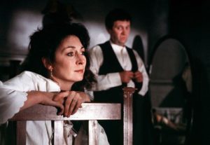
In the film, the director’s daughter Anjelica Huston is cast to play the role of Gretta, she is an actress whose strong on-screen physicality and elegance is hard to underestimate.

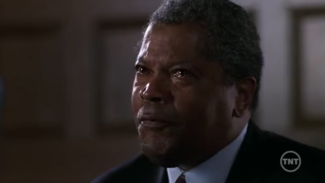
Donal McCann not getting Anjelica Huston
Many critics and academics have seen Gabriel in a positive light. However, Joyce himself clearly saw Gabriel as flawed. In “The Dead”, the main protagonists, Gabriel and his wife Gretta, attend a dinner party held by the elderly Morkan sisters, Kate and Julia. Gabriel and Gretta are late to arrive at the party, which Gabriel immediately upon entering claims “my wife here takes three mortal hours to dress herself” to place the blame on Gretta for their tardiness (Joyce, 120). At this point he goes off with the young maid Lily to remove his winter clothes, but his very second line in the story is to direct Gretta (without addressing her by name) to go upstairs without him, and they are thus separated by his design for most of the earlier portion of the story.
Gabriel has a moment with Lily, who he has watched grow up and who is removing his galoshes where he makes it clear that he has observed her growing maturity—“I suppose we’ll be going to your wedding one of these fine days with your young man, eh?” and she responds, “the men that is now is only all palaver and what they can get out of you,” a bitter assessment of male duplicity that apparently includes him, which causes him to blush (121). This short episode shows him to be a man who has a sexual appetite, even though he would prefer to think of himself otherwise.
Luke Gibbons notes that Huston uses Lily’s appearance both to emphasize Gabriel’s erotic nature by “projecting a displaced eroticism” onto her and to draw a comparison to Gretta’s younger self (Gibbons, 114). He further notes that after a poem added by Huston that was not in the original text, a point to which I shall return, Lily and Gretta are visually conflated, “as Huston frames this shot, the profiles of both Gretta and Lily mirror one another, as if Lily were a flashback to Gretta in her youthful days” (140). Lily reappears in Huston’s version for example to put on Gabriel’s galoshes to reiterate how he sees his wife through a similarly sexual lens.
Once at the party, Gabriel spends his time in anticipation of a speech that he will make at the culmination of the expensive, elaborate meal that will be served, nervously rehearsing and questioning his concepts—condescendingly, he worries that the people comprising the gathering are not as intelligent as he, that any poetry he might choose to quote might be something which “they could not understand” and that he might be perceived as “airing his superior education” (Joyce 122). He does end up making quite a pompous and meandering speech, which goes over well enough, but in the course of the story, the view of its gestation serves to reveal Gabriel as an arrogant, self-important and often thoughtless individual. He never notices that his wife is actually listening to him, as he says “there are always in gatherings such as this sadder thoughts that will recur to our minds: thoughts of the past, of youth, of changes, of absent faces that we miss here tonight” (Joyce 139). Her later reverie about her young dead admirer is perhaps sparked at this moment. Again, neither the text nor the film gives any insight into her interior reaction, yet it seems that he did not really seek to incite such thoughtfulness. His speechifying is insincere.
Throughout the party Gabriel is inattentive, leaving Gretta to fend for herself in the socially charged landscape for most of the duration and when he is partnered for “Lancers” (a quadrilles) with another younger, unmarried woman who is a working colleague of his at his teaching position, a Miss Molly Ivors, he has a tense and protracted argument with her, which continues through the various crossings and is visible to the rest of the guests, including his wife.
Miss Ivors’ disagreement with Gabriel escalates after she notes a series of nearly anonymous reviews he writes for a paper she sees as unpatriotic and calls him a “West Briton” as an insult (127). She suggests that he is out of touch with his Irishness and that to remedy that, he should visit the western part of Ireland that his wife actually hails from. This resonates oddly to Gabriel and he becomes angered, not least because it is an indicator that his wife’s roots are humbler than his own. He goes so far as to repudiate his Irishness entirely: “I’m sick of my own country, sick of it!” (129). Later, Gretta encounters Gabriel and lets him know that she has noticed his interaction with Miss Ivors as being “a row” (130). By way of explanation, Gabriel tells Gretta of Miss Ivor’s suggestion about him travelling to the west. She is enthusiastic about the idea, and tells him so, only to be verbally rebuffed by her husband: she is “coldly” told by Gabriel, “You can go if you like” (130). Still later, Gabriel approaches as Gretta is standing with Miss Ivors who is preparing to leave and it can be plainly seen that Gabriel and Miss Ivors’ behavior is obviously tension-filled, before the younger woman takes her leave, declining Gabriel’s offer to see her home. Something has occurred between Gabriel and Miss Ivors; to an outside observer it is clear that Miss Ivors’ anger is the result of a frustrated infatuation with Gabriel, but he is too self-absorbed to notice. Gretta however, detects the other woman’s interest in her husband. His gnomic behavior leads her to infer that he is hiding a more invidious relationship with Miss Ivors.
As Anelise Reich Corseuil writes:
…Throughout the film, in the scenes in which Gabriel functions as a filter, he is not shown as a sympathetic character. He is an aloof figure who is only concerned with his own speech, as he is shown as being completely insensible to the characters surrounding him. There is basically no integration between Gabriel and the other characters, as the camera is constantly showing him in his attempt to glance at his speech (73).
Reich Corseuil is correct in her observation of the self-interested depiction present in the film; she points to Gabriel’s lack of empathy. However, she describes his reaction to his wife’s revelations about the dead youth whom she believes has died from her unrequited love by explaining that “in the film a disintegrated narrative allows his consciousness to ‘explode’ just in the end, as a mind divorced from the rest of the film”(77). However, this eruption of empathy comes rather from Gretta’s denial of his sexual passion. He becomes frustrated by her falling asleep. He romanticizes his feelings, yet again turning his emotional state into an artistic/ romantic opportunity to write his own eulogy. In the final scenes in the book, his reaction to his wife’s tragic revelations might be more clearly read as the disappointment of her failure to recognize his poetic, erotic self-projections. Once again he becomes his own audience. Joyce writes, “Generous tears filled Gabriel’s eyes. He had never felt like that himself towards any woman, but he knew that such a feeling must be love” (Joyce 152). His “generous” weeping may be seen as either plentiful, or as a gift for his wife, or perhaps from himself to himself, certainly his interior monologue is overly literary and as he references the newspaper’s weather report, Joyce exposes the shallowness of his thinking.
However, as Huston reworks the final scene, he loses much of the irony in Joyce’s telling to reframe Gabriel as a softer and sympathetic man. Huston changes certain pivotal lines from the original, such as in the original: “He did not like to say even to himself that her face was no longer beautiful, but he knew that it was no longer the face for which Michael Furey had braved death,” whereas in the film the line becomes “To me her face is still beautiful, but I know that it is no longer the face for which Michael Furey had braved death” (151). The cruelty of his thought in the book belies any true expression of love and indeed he has declared that he has never known love, but the film version appears to buttress his new found feelings for his wife and also relegate her youthful person into the past, as this is now the face that belongs to her relationship with him. It demonstrates a wiser and kinder Gabriel.
As the party ends and the guests are all leaving, Gabriel notices a woman hesitating in the shadows on the stairs, and his thoughts, as the epigraph of this paper indicates, appropriate this as yet unknown woman’s experience and objectify her: “what is a woman…listening to distant music, a symbol of. If he were a painter he would paint her in that attitude” (143). But he soon realizes that she is his wife and that she is listening to one of the guests, a tenor, singing a song which evidently plunges her into a state of reverie. On the way home, Gabriel makes a feeble attempt at humor and when Gretta doesn’t respond to his liking, lost as she seems to be in her own thoughts, he seethes with resentment. He eventually gets past that, only to then condescend to her enough to see her as a sex object, as both in the carriage and at their room, his whole focus shifts to a desire to have sex with her and he is greatly distressed when it becomes clear that this isn’t going to happen.
Instead, Gretta surprises him completely by explaining her distraction by an account of how in her youth she toyed with the heart of a young man named Michael Furey, who eventually died, perhaps as Gabriel guesses of consumption but according to Gretta, “I think he died for me.” She then cries herself to sleep, after which Gabriel thinks on what he has been told.
It is clear from the final passages that Gabriel sees only that Gretta had loved someone else in her past. He ignores the indications given by Gretta that Michael Furey’s feelings were not reciprocated by her and that it was precisely that unrequited love that was the reason for his death, and her subsequent feelings of guilt; instead he jealously assumes that although the man has died, Gretta’s love for him has endured intact and that he himself is and always will be secondary in her affections. He underestimates her greatly in assuming that her vows of love and fidelity for him are less binding than his for her. Additionally, it seems that in his mind, she, the lower-class and less-educated woman, is much more ruled by her passions than he, the cool male intellectual. It does not occur to him that after observing his inexplicable misbehavior at the party, his wife might have told him what she did to wake him to the idea that she was (and is) a woman who has feelings of her own, a person of independent consciousness and a life experience that does not simply revolve around him. She is telling him that she might be desirable to other men that felt she was important also, for instance a young man who withered and died of ill health, but even so cared above all for her…and that her aim in recounting such a personal remembrance to him might be intended to make him treat her with more care and affection in future. But in fact, Gabriel’s entire reaction to Gretta’s story about Michael Furey forms only in relation to himself and his feelings about it, not out of any genuine concern for her.
Gabriel’s behavior is obnoxious throughout the story: he delivers a bad and condescending speech, he objectifies the maid, he has a fight with another woman and he ignores and disrespects his wife. My impression is that Gretta has seen all of this and that her story about Michael Furey is a deliberate attempt to put Gabriel in his place. And Joyce makes it clear that Gabriel does not absorb the lesson, but still remains self-oriented, in sympathy only with himself. This is his greatest failing. It is indicative to me of Joyce’s great understanding of human nature and the interactions between the sexes that Gretta’s efforts are wasted on a fool—and one who is, unfortunately, representative of his gender. However, I seem to be alone in this opinion. As far as I know, all of the literature about Joyce (and the filmed The Dead) disagrees with my assessment, if such an interpretation even occurred to the writers; in truth, I have no evidence and can offer no citations that it ever has.
The Huston film’s newly invented character Mr. Grace is one that confounds Joyce’s intent. Peter Dulgar notes Huston’s addition of Mr. Grace as a “major element in the narrative through his recitation of an Irish poem” and that his
…presence has additional meaning and relevance through Huston’s connection of his poem to Gretta and her memories of Michael Furey. This…is important because it presents the viewer with visible evidence that her thoughts are troubled and reminiscent long before the short fiction introduces that idea through Mr. D’Arcy’s song. In the film, Greta is plagued by her memories of the past from this midway point in the narrative, much earlier than the short fiction’s revelation in the third part (Dulgar 95).
Grace recites the poem “Broken Vows” (actually the poem is entitled “The Grief of a Young Girl’s Heart”). This poem is of uncertain authorship, but its translation is by Lady Gregory, “a writer Joyce particularly disliked” (Cooper, 199) and it speaks from the viewpoint of a girl whose lover betrays her. The poem includes the lines:
You have taken the east from me; You have taken the west from me
You have taken what is before me and what is behind me;
You have taken the moon, you have taken the sun from me,
And my fear is great that you have taken God from me! (Pederson, 70).
The overwrought quality of all this aside, the last line also adds a religious element which isn’t present in Joyce’s story, in spite of the fact that both Joyce and Huston were avowed agnostics. But for some reason (perhaps a newfound piety sparked by his own approaching end), Huston imposed religiosity on “The Dead” in this way, and others. According to Ann Pederson, who also believes that the poem “offers us…a more tangible account of Gretta’s as yet unspoken experience” (Pederson, 69), it is presented as an early catalyst for her remembrance of the late Michael Furey. Pederson (and other critics) ignore that Greta never claimed to have been abandoned by Michael Furey, and it does not occur to them that the poem might reflect on what Gretta is feeling about the way her husband is behaving at the party. For her part Pederson feels that the poem somehow works to justify Gabriel by the end of the film to believe that “everything including God has been taken from him” (70). So, in this way, Huston’s film is seen to transpose the wounded party from the female to the male. In Gabriel’s mind, everything is all about him. This despite the evidence in the story and the film that it would seem likely that Gabriel is having an affair with Molly Ivors and so, it is Gabriel who abandons Gretta! Or at least, she might need to consider the possibility.
Pederson observes that in any film adaptation from a text source, “thoughts and feelings on the written page must now be expressed by action or vocalization” and so, she says, the foreshadowing created by the poetry reading “is…a powerful elaboration which builds towards Gretta’s final declaration” and overall, the film’s alterations to the original story “add empathy and literary depth which do not detract from but enhance the whole” (70). The usually perceptive James Naremore claims that the added poem “is entirely in keeping with the themes and milieu of Joyce’s story” and Naremore also observes that Huston has rendered Gretta as “constantly and visibly preoccupied by distant music”—he doesn’t delve too deeply into the narrative consequence of these alterations though, other than to say that now by these additions “characters, whom Joyce presented in much more ambiguous terms, are as ‘readable’ as the actors in a good melodrama. Meanwhile, things that Joyce left unsaid or open to conjecture are fully explained” (Cooper, 199). Roger Ebert adds his own Christian-centric twist: “The key emotional moment in ‘The Dead’ does not belong to Gretta, who still mourns for her dead young lover. It belongs to Gabriel, who weeps for the man his wife once loved, a man he never met or even heard of before tonight. To cry for a stranger is to shed tears for the human condition, to weep because in giving us consciousness, God also gave us the ability to know loss and mourn it” (Ebert). The critics of the story and film take it as a given that Joyce intended for the focus of the story to be on the epiphany of Gabriel, who as Linda Costanzo Cahir put it “moves from a state of egotism and isolation to one of empathy” (Cahir 210) and Huston’s film supports a focus on Gabriel rather than Gretta, inflating his significance while diminishing hers. The false note of reverence that also taints the proceedings is, again, of Huston’s invention.
Writing critically only on Joyce’s text story, Anthony Burgess also mistakes the significance of Gretta’s self-recrimination, perhaps because he sees her as “a girl of inferior education” in relation to her husband, who despite this unfortunate clash of classes “does not despise her” (!), which would seem to paint him as generous in his affections even as it diminishes her agency (Burgess, 43). No, she should be grateful that he marries her and in this way brings her so far above her rightful station, even if she does have to suffer such condescension as her mother-in-law calling her “country-cute”—Burgess believes that her telling to Gabriel about Michael Furey comes about merely because she is “distracted,” as one presumes is the wont of stupid peasant women (43). Burgess locates the specific catalyst of her distraction in the tenor’s belated recital. In addition, Burgess equates Gabriel’s disproportionate resentment regarding Gretta’s account, with Joyce’s creation Bloom’s reaction to the “adultery” of his wife with “multiple …fellow-sinners,” as well as with a cuckolding supposedly suffered by Joyce in reality, among other absurdly judgmental comparisons of what is by all indications a chaste relationship that Gretta had, long before she met her husband (44).
But Huston and son seem to have aligned their adaptation with Burgess’s analysis and taken it yet further.
According to the family’s biographer Lawrence Grobel, Tony Huston was invested in tailoring the film’s script to suit a personal angle:
“The Dead” meant so much to him; he still hadn’t gotten over the shock of hearing his wife (Margot) tell him in September he wasn’t welcome in their house anymore–the irony wasn’t lost on him that as he worked on a script about a man discovering that his wife never loved him as passionately as he would have liked, his own wife was telling him the same thing. Didn’t his father once comment that Margot reminded him of Gretta in Joyce’s story—years before they considered making the movie? (Grobel, 15).
In fact, whether the additions are of John Huston’s doing, or Tony’s, or both, their harsh view of Gretta’s unanticipated revelations to her husband are forced on the viewer by the additions to the film, as elucidated by Michael Patrick Gillespie: “self-absorption stands as only the kindest interpretation of a gesture that, if it were at all calculated, could only be seen as profoundly cruel” (Gillespie, 158). Further, Gretta’s claim that her young man “died for the love of me” is dismissed as “unapologetic egotism” and her tearful falling off to sleep after recounting her tale is described as resembling a “post-coital slumber, oblivious to the presence of her wounded husband and presumably no longer engaged by recollections of her former lover” (158). If one does not comprehend Gabriel’s earlier actions as appearing to indicate, or outright reflecting, infidelity, and/or degrees of public disrespect to his wife, then I suppose one might assume she is needlessly cruel. But the fact is, his behavior is highly questionable. Or perhaps, one thinks Joyce wrote the earlier scenes for no reason other than to set up aspects of Gabriel’s character and the petty, selfish Gretta is only present in the story to persecute her poor sensitive husband.
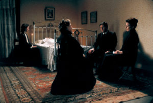
It should also be said that not every one of the Hustons’ additions abuses the source text. There is a substantial and effective digression that occurs in the scene when the aged Aunt Julia sings with the bemused indulgence of the assembled partygoers: the camera wanders away from the primary action to pass among an assortment of objects around the house, a handheld travelling shot that as Jeffrey Meyers details, goes “upstairs to an empty room, focuses on the cherished doll house, embroidery, old photographs, glass slippers, rosary and crucifix…the camera was like a ghost going through this world…this intensely lyrical moment creates subtle tension and gives visual clues to the dominant theme: the enduring influence of the dead on the living” (Meyers, 405). The passage avoids the visual redundancy of simply focusing on the singer and the varying reactions of her audience, which would have echoed scenes elsewhere in the film, instead thoughtfully rendering an intangible feeling engendered by the music in specifically cinematic terms. In its nature, this is a positive addition, one quite in keeping with the feeling of Joyce’s story, but that fully utilizes the medium of the adaptation. Another worthy cinematic digression occurs at the end of the film, when Gabriel is ruminating after his wife has gone to sleep, about the eventual death of his Aunt Julia. At that juncture we are shown in a flash-forward vignette Julia dead in a room of her house with the rest of the family attending.

This scene not only concretely visualizes a passage of the original story, but it also brings in the subject of the very first story in Dubliners, “The Sisters” which describes a very similar scene of bereavement, a corpse arranged in a home for viewing by family members. “The Sisters” initiates some of the themes brought together and in effect bookended by Joyce in the final story, “The Dead” and incorporates it into the film in an elegant way.
__________________________________________________
Thanks to Marguerite Van Cook and William Boddy.
__________________________________________________
Primary Sources
Joyce, James. “The Dead” in Dubliners. New York: Dover Publications, 1991. Print.
The Dead. Dir. John Huston. Perf. Anjelica Huston, Donal McCann. Vestron Pictures et al, 1987. DVD: Lion’s Gate, 2009.
Secondary Sources
Burgess, Anthony. Re Joyce. New York/London: W.W. Norton & Co., 2000. Print.
Cahir, Linda Costanzo. Literature into Film: theory and practical approaches. Jefferson NC: MacFarland, 2006. 210-214. Print.
Cooper, Steven (Ed.). Perspectives on John Huston. New York: G.K. Hall & Co./Macmillan, 1994. Print.
Corseuil, Anelise Reich. “John Huston’s Adaptation of James Joyce’s ‘The Dead’: The Interrelationship Between Description and Focalization.” Web: Dialnet. December 1 2015. <dialnet.unirioja.es/descarga/articulo/4925255.pdf>
Dulgar, Peter. “The Dead and the dead: Adaptation of temporal structure from short fiction to film.” Australasian Journal of Irish Studies, Vol. 12, 2012: 86-103. Print.
Ebert, Roger. “The Dead.” The Chicago Sun-Times, December 18 1987. Print.
Gibbons, Luke. “The Cracked Looking Glass of Cinema: James Joyce, John Huston and the Memory of ‘The Dead.'” The Yale Journal of Criticism, V 15 #1 Spring 2002. 127-148. Print.
Gillespie, Michael Patrick. “The Irish Accent of The Dead,” in John Huston: Essays on a Restless Director. Ed. Tony Tracy. Jefferson, NC: McFarland and Company Inc, 2010. Print.
Grobel, Lawrence. The Hustons. New York: Charles Scribner’s Sons, 1989. Print.
Huston, John. An Open Book. Cambridge: Da Capo Press, 1994. Print.
Meyers, Jeffrey. “Raising The Dead.” in John Huston: Courage and Art. New York: Crown Archetype, 2011. Print.
Pederson, Ann. “Uncovering the Dead: A Study of Adaptation,” Literature/Film Index 21:1 (1993): 69-70. Print.
