Words and Pictures: A Conversation

“What are the elements that make a comic book a comic book?”

That was artist Carolyn Capps’ first question when we started emailing about creating a graphic novel together. It was the perfect place to begin a conversation about not just our collaboration but the nature and norms of the comics form in general.

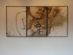
CHRIS: The technical term is ‘sequential art,’ because the key is the gutter, the space between the panels, and what conceptually is happening in that space. Usually some movement in time occurs, but not always, and it would be interesting to analyze any triptych as a comic strip, like yours from a few years back with the baby–maybe partly why I like it so much, it fires the comic book neurons in my head.

6bd04683c4e50a92474b91fde86e071e

CAROLYN: Would we each work on something independently first then give it to the other. Would you write something and I would illustrate?

CHRIS: I’m thinking a back and forth process, especially in the preliminary stages. My interest is in narrative and genre tropes, but I don’t want to create something that makes complete conventional sense. Something between dream logic and conventional comic strip sequences.

CAROLYN: I am considering whether the work should be large and messy and then photographed and digitally manipulated or if they should be small pencil pieces and then photographed and perhaps digitally manipulated. Maybe the content will determine the choices.

CHRIS: I think both, especially if the different approaches coincide with a repeated element; for instance, location “A” might always be drawn small and then expanded, and “B: starts large and is shrunk. Any medium element (pencil vs. pastel vs. paint, etc) could be part of the identifying elements of locations and characters. So if you want to experiment with imagery, email me anything that strikes your own interest. Then, after we can decide together what a given character will consistently look like, we can see what directions they and locations suggest about potential story movement.

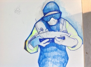
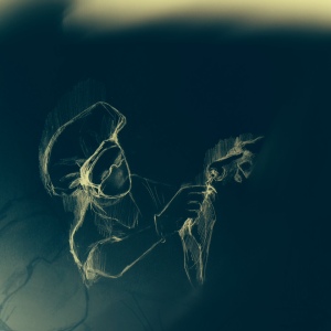
CAROLYN: Toying with the idea of a medical superhero.

photo (3)

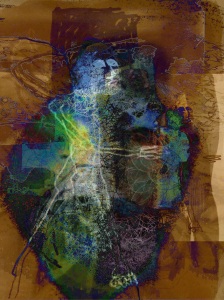
CAROLYN: I also kind of like the idea of a fractal/chaotic superhero.

A

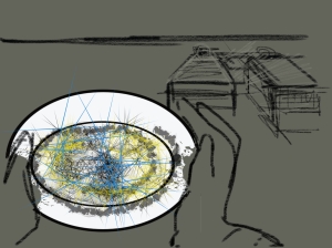
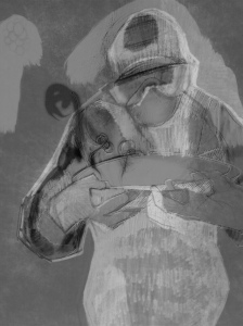
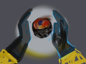
CHRIS: I love how skeletal the body is, and how that stripped away form is offset by the explosive energy of the space around it. And how the face of the medical figure is “masked” without using stereotypical superhero imagery, and how all of the body is covered and perhaps contained, which implies some other quality/identity inside. I’ve been analyzing the figure of the superhero as the product of two worlds, an idea I think your art is already exploring. The medical figure also suggests some immediate narrative possibilities. For example, I’m suddenly picturing a three panel sequence:

  1. aerial view looking straight down at the bowl so the rim is a full flat circle.
  2. pulled-back and slightly angled view so the bowl has three dimension as the figure’s hands (those are really cool hands by the way) enter the frame, about to pick up the bowl.
  3. the image you already created, straight on view, the mouth of the bowl angled so its content is obscured now.

So what’s inside the bowl? Something rendered in a different style maybe, something not of the same stylistic world as the rest of the panel, the fractal energy of the other images perhaps? Here’s a possible treatment:

The medical incarnation is always covered and masked. Underneath is her swirling fractal form that has to be contained or the character will disintegrate and/or release fractal havoc on the orderly world. I think stylistically she lives in a gray tone universe with sharply defined panels. Literally behind that world is the unframed fractal chaos background that she keeps contained under her medical covering. She is the literal opening into that world. Perhaps fractal elements can be glimpsed through her glasses, or in gaps in her clothes and mask. The fractals allow her to combat threats by combining with them.

CAROLYN: So you might want to read the article I read. Just google New York Times Nurse and see a crying woman. There were also descriptions of young men who have stepped forward to dispose of the bodies. They are being ostracized by their families and communities for doing it. They can’t find places to live and sometimes they are not paid at all but do it because it has to be done.

sierraleone-burial-boys-videoSixteenByNine540

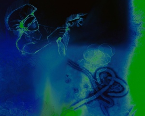
CHRIS: I can see how that would inspire you. And I understand that first image better. The trick is how to encapsulate the action, providing just the right number of panels. Too many and it’s redundant, not enough and the sequence is confusing. Plus the action is surreal, so more challenging to communicate clearly. Consider this sequence:

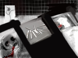
  1. a corpse dead from Ebola, represented with the superimposed Ebola cell
  2. a sick patient, also literally marked with Ebola
  3. medical figure enters carrying an empty bowl
  4. close-up revealing fractal elements through her goggles
  5. she removes a glove, exposing a fractal hand
  6. she lowers her hand into the bowl
  7. the bowl fills with fractals

CAROLYN:

1

CHRIS: “Oh man. That is creepy cool.

CAROLYN:

2

CHRIS: It’s interesting experimenting with how these could be sequenced on a page. It could be a layout with only three panels, or it could be the first three-panel row. Even the order leaves some possibilities, because all three images could be interpreted as aspects of the same simultaneous moment, with the gutter marking point of view changes. And yet there’s also an implication of time sequence as if the figure is moving toward the beds.

CAROLYN: So I will continue to play and then try to gradually get more serious about how they will fit together.

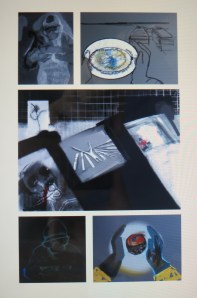
CHRIS: The fitting together part is something I know a little about, so I can be more helpful at that stage, while the insides of the panels is really all you anyway. So, yes, keep playing. I’m also still toying around with page layouts. This is my favorite so far:

layout 1

CAROLYN: That layout looks great. Wow, I felt like These were just kind of preliminary get started pieces but they look pretty good. I am also interested by the way you have spliced them together to create a general story line.

CHRIS: “Yeah, narrative sort of happens by itself just through sequential juxtaposition. The preliminary quality of the images adds a narrative difficulty because baseline setting isn’t always consistent between panels, but that also adds something cool, and neither Les nor Mad had any trouble “reading” it and both come up with the same basic narrative. Here’s how Mad summed up the page one layout:

Scientist with bacteria in Petri dish, surgery gone wrong, scientist made something out of bacteria and a dead body, something not good, I don’t like him.

And Lesley agreed with the sinister quality:

A scientist is in a lab performing some sort of experiment in a Petri dish that involves some kind of nasty human experimentation and results in a magic orb thing.

So this looks like a bad guy up to something bad.

CAROLYN:

new

CHRIS: Totally different tone, and beautifully rendered. Because it combines a more realistic (is that the right term?) style with compassionate content, those two qualities are now associatively connected in contrast to the page one layout images which are more abstract and disturbing: abstract Dr. Frankenstein vs. realistic Nurse Healer.

CAROLYN: So if I am understanding you correctly this combination serves the same purpose as sinister music? Not really indicative of anything concrete but of something that is felt and alerts us to possible danger? So we need a real world situation colored by association with these images.

CHRIS: I like your connection to soundtrack. Yes, the sound of the imagery evokes as much meaning as the overt content.

CAROLYN:

new 2

Utilitarian Review 4/8/16

merle-haggard

 
On HU

Trina Robbins on why Azzarello’s Wonder Woman is no good.

Chris Gavaler on why comics shouldn’t have words.

A review of the mediocre Laotian drama The Rocket.

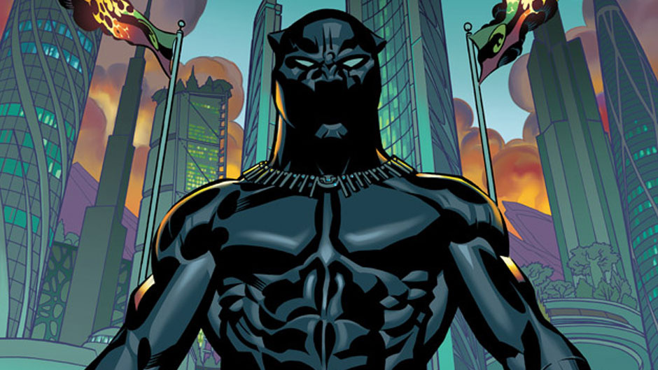
Me on Coates’ Black Panther, which isn’t very good.

Me on race in Hamilton.
&nbsp:
Utilitarians Everywhere

At the Guardian I wrote about my favorite Merle Haggard album.

At the Establishment I wrote about how cutting edged sci-fi is often written by marginalized writers.

At Quartz I wrote about how the Rock and Roll Hall of Fame keeps not inducting women (and a list of women who they should induct.)

At Random Nerds I wrote about the Sparks Conversation defense. (You know, that thing where you say, Harry Potter is awful, and your interlocutor says, “well, we’re talking about it, it can’t be that bad.)

Oh, also at Random Nerds I got a chance to recommend a looked at possible election results in the next Congress.

At Splice Today I wrote about

—how Superman in BvS is not a Muslim immigrant.

—a great indie pop R&B album by obscure indie artist Claire Keepers.
 
Other Links

Mistress Matisse Melissa Gira Grant, ethics and reporting on sex work

How Mickey Mouse evades the Public Domain.

Is Hamilton Racist?

solomon_hamilton_otu

 
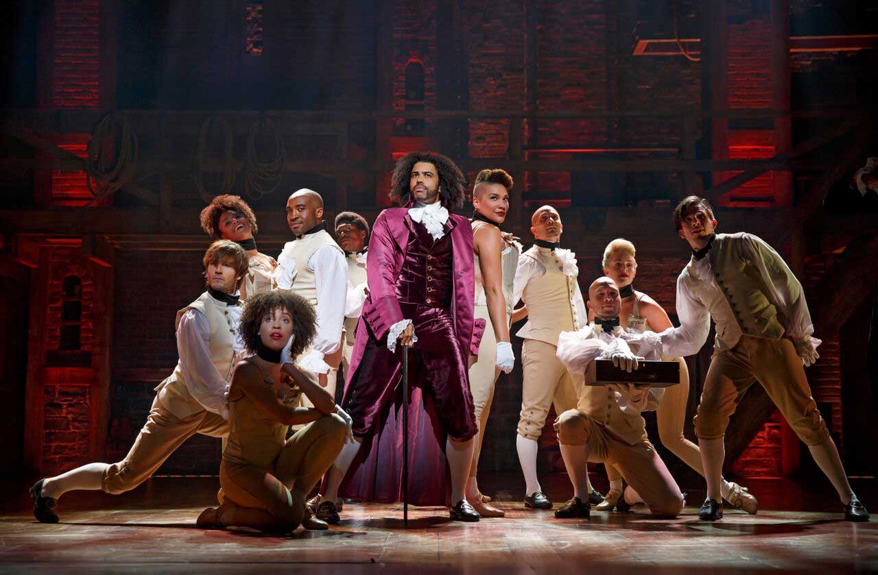
Of course Hamilton the founding father was racist; the question is whether the musical is. Historian Lyra Monteiro makes the case for thinking so. She argues that casting back actors in the role of the white founding fathers is a way to erase said founding fathers racism, as well as the narratives of actual black people who lived at the time.

I don’t have a strong opinion one way or the other…mainly because I still haven’t seen the musical. I did read the Ron Chernow Hamilton biography on which the musical is based, though. So when a friend posted the link on Facebook and asked for comment I weighed in. I thought I’d reprint my thoughts here (with a little editing and tweaking), in case readers were interested.
_________

It sounds like Monteiro makes good points; the biography pushes pretty hard on the idea that Hamilton was anti-slavery. he seems to have been in abolitionist societies, and didn’t own slaves himself. It wasn’t at the center of his politics though, probably.

I don’t know if the musical talks about this, and Monteiro doesn’t, but Hamilton was racialized himself, at least sometimes. We don’t really know who his father was, and given his childhood in the Caribbean, there’s a non-negligible chance that he was part black. His enemies certainly made much of the fact that he might be part black; he was referred to as a Creole on more than one occasion, and attacked as a foreigner, which I think then (as now) had some racial overtones.

So you could see Hamilton’s story as being about the possibility of black assimilation, which is in part what it sounds like the musical’s about too—black people claiming the Founding Father’s story as their own. The problem is that of course black people haven’t been allowed to assimilate, really, and that Hamilton’s assimilation is contingent on him not having been black (he certainly didn’t live as a black man in America.) And similarly the assimilation of the cast to the Hamilton story means losing blackness as a historical phenomenon, at least to some great degree.

So…the politics of it sort of depend on the politics of assimilation, which seem like they’re fairly complicated. On the one hand, racism in the US is in large part about black people not being allowed to assimilate. On the other hand, assimilating to whiteness means identifying with the oppressor, which is arguably also racist. The alternative would be telling a story about the oppressed—but of course many black commenters have talked about how sick they are of seeing black people only in the role of the oppressed, because it’s dreary and disempowering to constantly be portrayed as dreary and disempowered.

To me, overall, it seems like Hamilton the musical offers a kind of representation that isn’t often seen in the media—that is, black performers explicitly playing white people, rather than playing roles in which their blackness isn’t supposed to be recognized or acknowledged (which happens quite often.) Monteiro makes a good case that this representation isn’t perfect, but no one representation is going to be perfect, and more representations, more kinds of representations, and more jobs for black actors all seem like good things.

Marvel vs. Coates. Marvel wins.

112114-full

 
Ta-Nehisi Coates’ run on Black Panther has been the most anticipated comics event in at least a decade. Coates is known far beyond the tiny world of comicdom; he’s a bona fide literary celebrity, of the sort that writes comics only very rarely. I’m hard-pressed to think of a writer of equal stature who has come up outside comics and entered the field. Neil Gaiman, who started in comics and left when he got big enough, is the counter-example that proves the rule.

On top of that, Coates is a black writer, entering comics at a time when there have been increasing calls for more representation of POC and women in both Marvel’s film properties and the comics themselves. By putting Coates and Brian Stelfreeze on Black Panther, Marvel is directly addressing its own often monochromatic history.

Black Panther, then, promises to be a new kind of flagship Marvel title—different in quality, different in publicity, different in importance, different in its thoughtfulness about, and approach to, issues of race. It’s an exciting promise—and issues were leaping off the rack like hotcakes at my own little comics shop on Chicago’s South Side.

So—many hopes. Were any of them met?

The answer to that is: no. Black Panther #1 is, unfortunately, not a good comic.

It’s not a terrible comic, either; I’ve read plenty worse. It’s simply a mediocre Marvel comic in the usual mediocre Marvel comic ways.

The main weakness, as ever, is continuity porn. The issue starts with a page of exposition detailing several previous preposterous storylines: there was some stupid plot by Dr. Doom; there was some other stupid plot by Thanos. But even that exposition dump isn’t sufficient; much of the rest of the comic paddles around haplessly in convoluted, tedious backstory. We learn about Black Panther’s female bodyguards, there are flashback dream sequences, there’s Black Panther moping around and brooding. There are some brief glimpses of potentially interesting characters, including two lesbian bodyguards who stage a jail break. But there isn’t enough development to make them, or anyone, engaging.

The hope is that after the first issue we’ll get up to speed. But this is a new introduction to the character for a, by comics standards, gigantic new readership. The failure to recognize the need for a streamlined story, and the inability to provide one, is ominous. You’ve got the biggest comic event in years; comics reboot every 15 months anyway. Why not just forget Thanos and Doom and whatever and let Coates, and all those new comics readers he’s attracted, start from scratch? This isn’t rocket science; it’s basic common sense. The fact that nobody involved in the project realized that this was the way to go doesn’t fill one with confidence.

There are other unsettling signs as well. Coates’ nonfiction style is heavy, but it’s a heaviness of thought and consideration; you can feel his mind moving deliberately, and that gives the moments of fire more power. That weight doesn’t translate particularly well to the comic book world, though. The story feels portentous and burdened with its own seriousness. The dialogue in particular reads as if the characters are writing essays in a parody of Coates’ style. “Does he even care, Aneka? Did he ever care?” Dora asks. “Does it even matter? Has it ever mattered?” Aneka replies. Do people really talk like that? Have they ever talked like that? Could someone make them stop talking like that?

Brian Stelfreeze’s art is…okay. There are certainly lots of worse mainstream artists, but there’s nothing especially distinctive about his style or composition. Action sequences are stiff, and often visually confusing. Again, this is all pretty standard for mainstream superhero comics, which impose both tight deadline pressure and fairly strict limits on artist style. It’s professional. It’s just not anything more than that.

From his other writing, and from the ending letters page column here, it’s clear that Coates is a Marvel comics fan. It shouldn’t really be a surprise, then, that he’s delivered a bog standard Marvel comic, complete with unfocused storytelling, impenetrable continuity, and art that is there. The comic is notable for having a main cast that is entirely black, and for its inclusion of a respectfully treated lesbian couple as primary protagonists. But that’s about the only thing that distinguishes Black Panther from many of its peer titles, at this point. It certainly doesn’t have the distinctive vision of G. Willow Wilson’s YA Ms. Marvel, with its deft, witty characterization, and its exploration of such unusual superhero themes as ethnic assimilation and nonviolence. Nor does it feel as focused and individual as Christopher Priest’s Black Panther run did, from the very beginning.

Maybe Coates and Stelfreeze will find their stride as the series goes on. But there’s an uncomfortable feeling here that they’ve made just exactly the uninspired comic that they, and Marvel, wanted to.

Maudlin Dreck, Worldwide

fullwidth.c2f03cef

This first appeared on The Dissolve.
_______

The Rocket is a fill-in-the-blank exercise in feel-good exotica. It features not one, but two wounded and spunky kids; a couple of colorful, albeit flawed adults; and careful dollops of tragedy and joy all tied together by the deeply human story of marginalized people—in this case, Laotians whose village is in the flood zone for a dam project. (The film is an Australian production, though filmed in Laos with Laotian actors.) Hardships are carefully calibrated to be worrisome and tear-jerking, but not so overwhelming as to put the happy ending out of reach, or for that matter, to mar the protagonists’ photogenic qualities.

The film has its merits: Writer-director Kim Mordaunt knows his genre; he lines the tropes up in order, and dispatches them with facility. He’s helped by generally high-quality acting. Alice Keohavong sparkles with charisma as the loving, stubborn mother Mali; her removal from the film comes with a brutal wrench, orchestrated with a virtuoso timing worthy of Spielberg. Character actors Bunsri Yindi (as cantankerous grandma Taitok) and Thep Phongam (as the unconventional, James Brown-obsessed Uncle Purple) mug effectively, while the child actors (Sitthiphon Disamoe as Ahlo and Loungnam Kaosainam as Kia) turn in professionally adorable performances. The plot flows smoothly but eventfully from tragedy and dispossession through salvation, achieved by a combination of personal achievement and cinematic pixie dust. Sumrit Warin as Toma has the range of a damp fish, but Mordaunt has cleverly cast him in a role in which that’s exactly what is called for.

In short, Mordaunt is a canny, intelligent filmmaker. He shows this not only by fulfilling genre expectations, but in his treatment of his material. A story about people forced off their land by a dam could easily turn into a rant against progress, but Mordaunt dodges that pitfall. Tradition in The Rocket has its virtues, but also its downsides. Ahlo was born with a stillborn baby sibling, and has to struggle for much of the film under traditional prejudices against twins. The problem with the dam isn’t so much that it’s “progress,” but rather that the corrupt, uncaring government doesn’t share its benefits (electricity, money) with the people it displaces. Ahlo gets money and food by robbing shrines, which suggests his rootlessness, but also raises questions about traditions that privilege the needs of the dead over those of the living. And Ahlo’s final, inevitable triumph involves mastering rockets, an old yet still up-to-date technology. Moreover, he relies for his success on the knowledge that Uncle Purple gained while fighting with American forces.

Ultimately, though, Mordaunt’s obvious intelligence, and the cast’s talent, just make The Rocket more frustrating. Difficult ambiguities are brought up only to be drowned by the remorseless imperative for Hollywood joy, showered upon the characters from above like the concluding miraculous rainfall, or like the waters that swamp their abandoned village. The Rocket is a well-constructed delivery system for sparkly cheer, but it lacks a more substantial payload.

Tell Me What This Says

bignumbersp9_thumb

“I don’t think there’s any need to use language.”

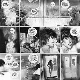
That’s my favorite line from one of my favorite comics, Alan Moore and Bill Sienkiewicz’s 1990 Big Numbers No. 1. The sentence appears on page 9, breaking a 57-panel sequence of wordless narration. Actually the shout, “AAA! Shit!” breaks the silence, after a rock breaks a window on a moving train. The shattering glass receives its own one-panel page, but Sienkiewicz doesn’t draw and presumably Moore didn’t script any sound bubble BOOM! or CRASH! over the image. It doesn’t need it. We get the picture.

bignumbersp8_thumb

The speaker is an old man upset by the main character’s profanity, but Moore is talking to us. This is two years after he and David Lloyd completed their V for Vendetta. When they started the project in the early 80s, Lloyd told Moore he didn’t want any thought bubbles. This was a radical idea at the time, and possibly the biggest moment in Moore’s growth as a writer, because he went further and cut captions too. If no one was speaking, the panel would be wordless.

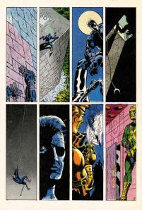
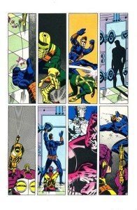
I think at the time, the record for longest silent sequence was still held by Jim Steranko, for the opening three pages of the 1968 Nick Fury: Agent of S.H.E.I.L.D. No. 1, for which, Steranko claims, Marvel didn’t want to pay his writing fee because he didn’t “write” anything.

SHIELD1

SHIELD2

SHIELD3

Moore took Steranko’s experiment and turned it into his M.O. The first Watchmen script he gave Dave Gibbons included a four-page, 31-panel sequence, wordless but for Rorschach’s inarticulate grunts. Flipping through my copy of From Hell, I see Eddie Campbell draws as many as 7 consecutive pages of word-free narration. It’s a paradoxical approach for Moore, since his scripts are some of the most verbose imaginable—almost literalizing the a-picture-is-worth-a-thousand-words exchange rate.

So when I started talking with my friend Carolyn Capps—a painter and former next door neighbor—about collaborating on a comic book, I had Moore in mind. Is his old man right? Is there any need to use language? I recently finished revising a 71,338-word novel and drafting a 93,935-word non-fiction book, so I may be suffering from some of Moore’s perversity. But I just don’t like words in my comic books.

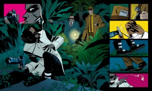
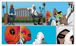
I’d suspected this for a while, but I proved it to myself when I looked at Brian K. Vaughan and Marcos Martín’s webcomic, The Private Eye. The publisher, PanelSyndicate.com, offers previews, three pages of each 32-page issue. I opened the first and was struck by the absence of words. No captions, no thought bubbles, no dialogue balloons. Just unimpeded visual storytelling. I loved it. I strained over an occasional panel, uncertain what exact information was being implied, but the story was all there, its effect all the more visceral by the effort required to follow it, the bursts of action followed by extended moments of minimal movement made more evocative by their lingering silence.

Issue01.03pre

Issue01.13pre

And then I purchased the first issue.

Turns out PanelSyndicate deletes talk bubbles for previews. When I purchased and “read” the same pages again, I was annoyed by the redundancies. Yes, I gained lots of new information, but none of it was worth the trade-off. Following the words from panel to panel means I was no longer primarily focused on the panels themselves. The images were serving the language. (Though, for the record, The Private Eye is still quite a good comic—it’s the industry’s words-first norms I’m annoyed about.)

When Carolyn and I started exchanging brainstorming emails, and then preliminary sketches and sample treatments, I wanted our story to evolve visually. Instead of her illustrating my script, I wanted her images to dictate the characters, situation, and plot. Carolyn’s first drawings were unsequenced, each a separate experiment, a testing of style and content. So I started experimenting too, testing out the rhythms of visual logic, the what-does-it-mean-if-this-goes-here grammar of panel language.

The results were pleasantly chaotic at times, the intended meanings subservient to the connotations of the actual images. Without explanatory captions or guiding dialogue, the pictures were the sole source of meaning, their tonal nuances more important than the scaffolding of the original script. No language also makes the reader a more active participant. Below is a six-panel sequence I cut and pasted from some of Carolyn’s earliest sketches. I knew what I wanted them to mean, but when I dragged my wife and daughter over to my laptop screen, they read them in their own ways.

Now you can decide what they say too:

3

2

1

6

4 (2)

Utilitarian Review 4/2/16

Screen Shot 2016-04-01 at 8.55.02 PM

 
On HU

Featured Archive Post: Craig Fischer on why Stitches is the worst comic ever.

Jimmy Johnson on borders, imperialism, and Criminal Minds: Beyond Borders.

Chris Gavaler on creating a comic book page for his novel (drawing by Sean Michael Robinson.)

Me on Jose Antonio Vargas’ Documented, about his experience as an undocumented immigrant.

Me on Daredevil’s blind male gaze.

Kate Skow on how all fiction is fan fiction.
 
Utilitarians Everywhere

At Quartz I wrote about how superheroes don’t kill! in an excuse for killing.

At the Establishment I wrote about Superman vs. Batman, homoeroticism, and misogyny.

At the LA Times I wrote about hulk pooping, Kierkegaard, and fan fiction for all.

At Random Nerds I wrote about Superman 1978 and choosing supergood over superangst.

At the Week I wrote that everyone hates Congresspeople but still reelect their own Congresspeople.

At Splice Today I wrote about Steve Harvey’s dreadful dating advice book.

At the Chicago Reader I did a little review of the retro-retro-sixties band Quilt.
 
Other Links

CT May on Madonna and charges of sexism.

Kaleem Aftab on how BvS is an allegory of the Muslim experience.