Santorum, the Last Time

fullwidth.687fd24d

Since Rick Santorum just dropped out, it seemed like a good moment to reup this review, which first ran on the lamented Dissolve.
__________

“Game on,” Rick Santorum declares, as REO Speedwagon’s rock-schlock uplift blares earnestly from the soundtrack. That’s the end of Caucus, a documentary about the 2012 Iowa Republican caucuses that frames the political competition in the grand tradition of underdogs overcoming adversity; it’s Hoosiers with tour buses, pro-life rallies, and sweater vests. Santorum ran a scrappy campaign, with one guy and one car crisscrossing the state. Candidate after candidate surged ahead of him before he came roaring back in the last two days of the race, finally beating Mitt Romney by 34 votes. For this, REO Speedwagon signals, viewers are supposed to cheer.

Some of those cheers are no doubt intended to be ironic. On the one hand, Caucus is interested in the horse race. On the other hand, though, it’s dedicated to the painful and fairly humiliating spectacle of candidates dragging themselves across the cornfields from house party to rec center. In one scene, Michele Bachmann and the crowd around her stands silent in front of a television camera, waiting for a network cue, until eventually she asks the poor kid serving as her television prop if he’d like to talk to Wolf Blitzer. In another, a not especially enthusiastic Romney gamely tries to eat a vegetarian corn dog. In a third, Ron Paul struggles haplessly to close a van door.

Not all the candidates are laughable. Bachmann and Romney are consistently repulsive, but Herman Cain is charming, and has an amazing singing voice. Santorum is likable, especially when talking about his family—as in one emotional discussion of how he tried to keep from loving his very ill infant daughter, because he was afraid she would die. The guy even has the decency to look uncomfortable when voters on the trail start spouting bizarre, offensive anti-immigrant paranoia. He comes across as committed and decent enough that it’s hard to begrudge him his moment of triumph at the end, especially since it was fleeting, and didn’t actually lead to him imposing his particular style of intrusive morality on the rest of the country.

The difficulty is that that’s all the documentary really seems to have to say. The underdog won. Some candidates are likable, and some less so. When cameras follow people around all day, every day, they often catch them looking silly and stupid. Who out there doesn’t know all this already? Director AJ Schnack resolutely avoids voiceovers, expert talking heads, or anything that might be considered analysis or a point of view. Presumably this is meant to let the material speak for itself, to show the full, unfiltered strangeness, hilarity, and profundity of the campaign trail. Instead, it feels like 100 minutes of arch nudges, a highlight reel from Politicians Say The Darndest Things. Political junkies may find that appealing, but for more general viewers, the film—like Rick Santorum’s campaign—feels largely irrelevant.

Words ‘n Pictures

That title means both “words and pictures” and “words in pictures,” because both phrases describe comic books. Although not all comics include words, essentially all superhero comics do. (A near exception, the five-page “Young Miracleman” story in the back of Miracleman #6 includes two talk balloons each containing the transformation-triggering word “Miracleman!” and a range of sound effects, newspaper headlines, and signage.) How images and text work together is one of the most complex and distinctive qualities of the form.

Words in comics have their traditional linguistic meanings, but they are also drawn images that must be understood differently than words in prose-only works. Their line qualities and surroundings influence their meanings. Dialogue and narration are traditionally rendered at a later stage of production by a separate letterer, after the penciler and inker have completed their work. The size, shape, and color of lettering can denote volume, tone, or intensity, especially when representing speech. Bolding is especially common, typically multiple words per sentence. Sound effects, however, are drawn by primary artists as part of the images. These are onomatopoeic words or letters that represent sounds in the story world. Often the lettering style is so expressive it communicates more than the letters’ linguistic meaning.

Words are typically framed within a panel. Spoken dialogue appears in talk balloons (traditionally an oval frame with a white interior), internal monologues in thought balloons (traditionally a cloud-like frame with a white interior), and unspoken narration in caption boxes (traditionally rectangular and colored, though sometimes narration appears in separate caption panels or in white gutters). Adding a pointer to a word container and directing it at an image of a character turns the words into sound representations or, if a thought balloon, into representations of an unspoken but linguistic mental process, both linked to the specific place and time of the depiction.

The absence of a pointer on a caption box indicates that the words originate from outside of the depicted scene. First-person narration with no pointer may be linked to a remote setting if the words are composed by a character from some other, implied moment and location that is not visually depicted. Though the words in talk balloons are understood to be audible to characters, the drawn words and containers are not visible within the story world even when drawn blocking story elements. As with lettering, the size, shape, and color of containers communicate additional meanings about the words. For talk balloons, the graphic quality of the balloon edges denotes how the words are thought, spoken, whispered, shouted, etc. Finally, the containers create semantic units similar to line breaks or stanzas in poetry.

Words also influence and are influenced by surrounding images that are part of the subject content. Pioneering comics artist Will Eisner identifies two kinds of images: a “visual” is a “sequence of images that replace a descriptive passage told only in words,” and an “illustration” is an image that “reinforces (or decorates) a descriptive passage. It simply repeats the text” (132). Scott McCloud goes further, identifying seven “distinct categories for word/picture combinations” (). Two of McCloud’s categories, “word-specific” and “duo-specific,” correspond with Eisner’s “illustration,” while the other five (picture-specific, intersecting, parallel, independent, montage) fall under Eisner’s “visual,” which “seeks to employ a mix of letters and images as a language in dealing with narration” (139).

To indicate the level of image-text integration, we combine and arrange McCloud’s and Eisner’s categories in a spectrum, beginning with the highest level integration.

Montage visual: images include words as part of the depicted subject matter. This is the only instance in comics in which words are part of the story world. All other words are discourse only.

Interdependent visual: images and words communicate different information that combines.

Intersecting visual: images and words communicate some of the same information, while also communicating some information separately.

Image-specific visual: images communicate all information, while words repeat selected aspects.

Word-specific illustration: words communicate all information, while images repeat selected aspects.

McCloud also includes two categories that are not integrated, and we add two more.

Duo-specific illustration: images and words communicate the same information. Although this might appear to be the most integrated category, there is no integration if each element only duplicates the other so that no information is lost if either element is ignored. Words and images are independent.

Image-only visual: isolated images communicate all information. Since comics do not require words, this is the most fundamental aspect of the form.

Word-only text: isolated words communicate all information. This requires the highest level of reader visualization, an approach at odds with graphic narratives as a form.

Parallel visual: images and words communicate different information that do not combine. This requires the same level of reader visualization as word-only texts, but the presence of images complicates and potentially interferes with that visualization.

With the exception of the most integrated category, montage visuals, all combinations of words and pictures produce some level of image-text tension because words, unlike images, exist only as discourse. Though drawn on the page, words are not visually perceptible to the characters in the story. Images, however, depict content that is perceptible to characters, so drawn objects and actions appear as both discourse (ink on paper) and diegesis (the world of the story). A drawing of a superhero flying (discourse) communicates the fact that the superhero is flying in the story (diegesis). The words “the superhero is flying” communicate the same diegetic fact, but the ink-formed letterforms bear no resemblance to their subject matter. There is no overlap between diegesis and discourse. Since both words and images are made of ink lines on paper (because printed words are images), some lines in a comic exist only in the reader’s world and some appear to exist in both the reader’s and the characters’ worlds.

Graphic novels create further image-text tension by highlighting the potential gap between text-narration and image-narration. In graphic memoirs such as Art Spiegelman’s 1980-1991 Maus, Marjane Satrapi’s 2003 Persepolis, and Alison Bechdel’s 2006 Fun Home, the text-narrator and the image-narrator are understood to be the same person, the actual author. When a character in a graphic novel controls the first-person text-narration in caption boxes, it is not necessarily clear whether that character is also controlling the image-narration in panels. If the words are generated by an omniscient third-person text-narrator, does that same narrator generate the images, or are the images generated by a separate narrator?

Unintegrated image-texts imply a separate text-narrator and image-narrator. In the case of a duo-specific image-text, the two modes of narration duplicate information without any integration, as if two narrators are unaware of each other. Integrated image-texts, however, imply a single narrator controlling both words and images in order to combine them for a unified effect. At the center of the spectrum, a word-specific illustration implies an image-narrator aware of text but a text-narrator unaware of image. Similarly, an image-specific visual implies a text-narrator aware of images but an image-narrator unaware of text.

Parallel visuals are more complex; although the two narrations are independent and so seemingly unaware of each other at the level of the panel, the overarching effect is integrated. In such cases, the separate text- and image-narrations may create a double image-text referent, in which a word has one meaning according to its linguistic context but, when read in the context of the image, acquires a second meaning. Alan Moore is best known for this approach, having perfected it with Dave Gibbons in Watchmen.

 Image result for watchmen comic panels

Not Quite Ready to Die in the Anthropocene

87286100064510L

 
The recent Paris Climate Conference has been called the last best chance for the leaders of the world, nations and multinational corporations, to agree upon a framework that can somewhat mitigate and limit the compounding effects of climate change. Some have commented that a best-case scenario for such an agreement would still not prevent a future of unbearable heat and widespread famine, drought, war, and mass migrations; a total failure to reach a feasible agreement, like the previous iteration in Copenhagen in 2009, would mean much, much worse: no less than the end of human civilization as we know it and the extinction of huge numbers of plant and animal species, possibly including homo sapiens. Roy Scranton, in his new book Learning to Die in the Anthropocene: Reflections on the End of a Civilization, cleaves to the latter option as the most likely scenario, and this slim volume is dense with big history, scientific nitty-gritty, and philosophical reflections.

Scranton opens the book by invoking his experience as a soldier in the Iraq War, driving and patrolling through Baghdad and pondering the collapse of a once-bustling ancient city into chaos and violence. Back home in the States and safe once again, he witnessed the similar breakdown of order and imposition of martial law in New Orleans after Hurricane Katrina. Scranton connects these localized disaster zones of social breakdown with the future fate of the planet and the human race when climate change accelerates and worsens. He cites a litany of military planners, economists, and scientists to draw his indisputable and alarming conclusion: “Global warming is not the latest version of a hoary fable of annihilation. It is not hysteria. It is a fact. And we have likely already passed the point where we could have done anything about it.” Sobering words.

Over the next four chapters, we are treated to a God’s eye view, in the style of Spinoza’s sub specie aeternitatis, of geological eras, the rise of homo sapiens, the evolution of energy and industry, the seemingly intractable conundrum of the greenhouse gas effect, the near impossibility that the nations and leaders of the world will come to a working solution that will fix things, and the universality of violence in our primate species. Scranton presents well-researched and argued points on an impressive range of topics with a concise and continually compelling sense of conviction.

The fifth and final chapter, entitled “A New Enlightenment”, is the most original, interesting, challenging, and vexing part of the book. Scranton opens with an epigram from the Epic of Gilgamesh, one of the oldest pieces of literature on earth which was rediscovered by chance only 150 years ago. The epic tells of the adventures of the powerful king Gilgamesh and his wild companion, Enkidu, as they unite their opposing forces against the gods themselves, forcing the gods to strike down Enkidu. Gilgamesh becomes distraught over the death of his friend and wanders the earth seeking a way to conquer death. Frustrated in the end, Gilgamesh curses the futility of existence. His experience lives on, though, and offers, as Scranton says, “a lesson in the importance of sustaining and recuperating cultural heritage in the wake of climate change.” It also represents “not only the fragility of our deep cultural heritage, but its persistence.” For the author, the specter of climate change is such a monumental problem that we have no hope of solving it; rather, we should focus on maintaining and deepening our humanism and protecting our rich cultural legacy in order that we will both have a softer descent into the envisioned post-apocalyptic future, and that this rich heritage painstakingly accrued over millenia may be rediscovered one day by our survivors in order to rebuild a new civilization. Our study of philosophy, the ancient classics, and Shakespeare, as rewarding as it may be, creates something of a non sequitur when used as a transition to the idea that our unfortunate inheritors will be fighting for resources and survival in a post-apocalyptic world where life will revert to that pre-state existence invoked by Hobbes: “No arts; no letters; no society; and which is worst of all, continual fear and danger of violent death; and the life of man solitary, poor, nasty, brutish, and short.”

Learning to Die in the Anthropocene is a far-reaching, erudite, and cultured book with a bleak view of humanity and its future. The author draws upon a wide variety of philosophical ideas to make his point, from Heraclitus (“Life, whether for a mosquito, a person, or a civilization, is a constant process of becoming…Life is a flow.”), to Hegel (“The human being is this Night, this empty nothingness which contains everything in its simplicity.”), to Heidegger (“We fall into the world caught between two necessities, compelled to live, born to die, and reconciling them has forever been one of our most challenging puzzles.”). More than any schools of thought, though, it seems like the author subscribes on some level to the Stoicism of Epictetus, Seneca, and Marcus Aurelius when he says “Learning to die means learning to let go of the ego, the idea of the self, the future, certainty, attachment, the pursuit of pleasure, permanence, and stability. Learning to let go of salvation. Learning to let go of hope. Learning to let go of death.” This echoes once again the oft-repeated quote by Montaigne that “to philosophize is to learn how to die.” In both the title of this book and the many references to “learning to die”, I think we could easily substitute the phrase “philosophizing” without losing any significance; for Scranton envisions a dying world in which we will all need to become philosophers if we are to hold onto our humanity.

Fear of death is universal among humans and many of the higher mammals. It likely spawned our myths as well as our art. It is only the philosophers who do not avoid it or fear it, but look it clearly in the face. This is true of Democritus, Socrates, Epicurus, the Zen Masters, the Bodhisattvas, Hume, Schopenhauer, Wittgenstein, and many others who have spent their lives contemplating death not as a morbid fascination but as a means to improving and perfecting their own lives. If it is difficult for most people to attain such peacefulness of mind even after a lifetime of meditation, it is even more unfathomable to find any comfort in the inconvenient truth that the Earth will be rendered uninhabitable in a few million years, and that the cold death of the universe will follow in its wake a few billion years later. The cycle of life and death does not occur on an individual level, or even that of an entire species; it includes planets, stars, and the universe itself. Numerous other books, films, and stories, including Learning to Die in the Anthropocene, discuss this tragic reality in one way or another; Alan Weisman’s The World Without Us, Asimov’s “The Last Question”, Ingmar Bergman’s The Seventh Seal, Lars Trier’s Melancholia, Lucretius’ On the Nature of Things, and the Samurai manual Hagakure, which Scranton read in Iraq as a way of dealing with the pervasive and daily dance of death.

Everything in the book springs from the idea that global warming is a problem too big for humans to deal with based on the total lack of realistic and practical alternatives we have to stop it. On this point, I fully understand the enormity of the problem, the almost complete lack of political and corporate will to change our entire world economic system and sacrifice short-term profit, and the bleakness of the future we therefore guarantee for ourselves; but I do not, and cannot, fully endorse the complete resignation of the search and struggle for solutions that the author advocates. On the merits, I have no issue with any of his conclusions except for his certainty of failure in the face of global warming. I am by no means hopeful about the state of the climate and the geopolitical effects that my children will witness, but I think that is exactly why pervading pessimism must give way to de rigueur active optimism for the sake of our survival. The current Paris Climate Conference will be not the last best chance, but the first great step to further increase momentum towards a global solution to the extremely daunting but not impossible crisis we face. If that means a change away from neoliberal capitalism towards a more sustainable future, as Scranton alludes to, so be it.

Overall, the book is exceedingly ambitious and almost too wide-ranging for its own good, and it feels like the solution offered by the author in the face of a crisis he goes to great lengths to explain renders the conclusion relatively feeble and unconvincing. It is not really a work of philosophy as much as a cri de coeur over the indispensability of philosophy and the humanities as a way of securing “the fate of humanity itself.” I do believe, along with the author, that a deep sense of compassion and humanism are necessary to continued civilization, but so are collective action. My grasp of philosophy helps me cope with the thought of my and the world’s eventual annihilation, but my appreciation of human craft, art, technology, and collective potential to solve problems tells me that we will not go gently into that good night.
_____
David James did two tours in Afghanistan with the 173rd Airborne Brigade, and he now teaches English in Italy. He co-edits a website with other veterans at www.wrath-bearingtree.com and maintains a personal blog at www.tigerpapers.net.

The Glorious Maple Vanilla of We Stand On Guard

A review of We Stand On Guard by Brian K. Vaughan and Steve Skroce

we-stand-on-guard-01

O Canada, we stand on guard for thee.
God keep our land glorious and free!
O Canada, we stand on guard for thee.

Apparently, We Stand On Guard is the best selling Image comic of 2015, and it’s by Brian K. Vaughan (BKV)—the one time wunderkind of comics, now settled into the title of most popular American comics writer of the 21st century.

Vaughan is fast and influential. Everyone wants to produce a BKV comic—the high concept comic script meshed to an acceptable art style; the artist’s aesthetic instincts harnessed to the singular vanilla purpose of the Vaughan except for some finessing of details. The artists are duly constrained by their schedules and perhaps the overriding understanding that BKV is the overlord. You don’t mess with a vapid script-layout that works and most importantly sells bucket loads.

One BKV comic reads like every other BKV comic. If you’ve read Y the Last Man or say, Saga, then you know what to expect from We Stand On Guard—uncluttered, peppered with generic dialogue, and bland. The now regulation BKV tic is typified by those ridiculous splash page “reveals;” the tiresome “Hey, look at me” pages which instruct readers to yawn with delight; like someone who produces an exclamation point every 5 sentences.

We Stand On Guard (like virtually all BKV product) is like an overly sweet milkshake which wants to be 50 proof whisky. Someone gets tortured for an eternity; another gets threatened with rape by father; yet another gets his guts sliced open; a whole family gets blasted to hell—and your eyes glaze over. Violence without emotion is the order of the day; the Holocaust as a footnote.

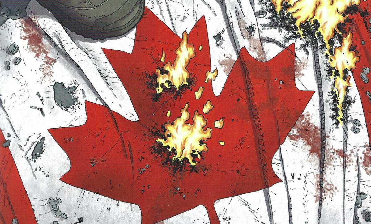
At this point, everyone knows that BKV is the master of the high concept pot boiler. Y was about the last man, Under The Dome was about a dome which prevented people from getting out, Saga is a violent comedic Star Wars-like space opera, and We Stand on Guard is about the U.S. invading Canada. Fun right? It’s all preceded by a terrorist attack on the White House which is either interpreted as a false flag operation or a pre-emptive strike by a wayward Canadian general. I mean who gives a shit about motivation, it’s called the Fog of War. The Americans proceed to bomb Ottawa starting with Parliament Hill.

The standard BKV comic tends to start with an intriguing premise, the kind of sales pitch you can sell in a boardroom. Y the Last Man has a sort of beguiling premise but then it starts to flail. Or maybe Vaughan just can’t be arsed after a while. You can just imagine him scribbling into his dream journal every night—and waking up just before the end. And the ending to We Stand On Guard is pretty terrible even by BKV standards (spoilers ahead!). The Canadian resistance poison the Great Slave Lake with arsenic thus chasing away the greedy American water sucking flying-supertankers hoping to steal its maple syrup (or maybe its mineral water or salmon?). Our beautiful, determined suicide bombing heroine wins the day by blowing up the American flagship. Cue dreamy flashback to happier times with her family.

And I guess – sequel!

we-stand-on-guard-02

The popular media likes to tells us that Muslim martyrs dream of the houri awaiting them in paradise, I guess the lily white Canucks only dream of their moms and dads. Now it’s entirely possible that BKV had his finger firmly planted in his cheek and ass during the writing of We Stand On Guard. It’s entirely possible that We Stand On Guard is one gigantic, methane rich fart like Noah’s fantasy on a theme by the sociopathic Tom Cruise in Mission Impossible. The Yanks are your regulation militaristic nihilists with conquering armies.  The entire comic is a sort of Red-White-Blue Dawn (a la Red Dawn). The invasion of Canada is the natural extension of the Monroe doctrine—get those dastardly Americans angry by shining a light on their real world nefarious actions. White suicide bombers! The Quebecois resistance babbling in that irritating French! The Thermopylae-like resistance against the barbaric American hordes with their fascist attack dogs! See how you like it when other people name their comics after their national anthems! I don’t care if you vomit! I get it! I get it! I suppose it’s all very noble in purpose and who are the Canadians to complain if BKV wants to give them a nice back rub in the vein of a Michael Bay aliens attack movie.

All apologies to Bay on this last point since the action scenes in We Stand On Guard are probably more dumb and generic than those in the Transformers movies. I would like to say that Skroce’s giant mecha and flying ships are well designed but they suffer greatly when compared to the all enveloping imagination of works like Bryan Talbot’s The Adventures of Luther Arkwright.  There’s certainly lots of blame to spread around. Vaughan is just churning it out at this point. And who can blame him? The shit sells and he needs to spurt it out as often as possible. He’s just constipated with the dreck, and now even the Canadians won’t stop him.

Utilitarian Review 1/30/16

jackie-brown

 
On HU

Me on Moto Hagio’s short story A Drunken Dream.

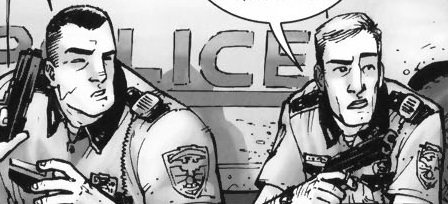
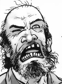
Chris Gavealer on closure, framing, and the Walking Dead.

Me on As Good As It Gets, love, healing, and bullshit.

Me on Jen Kirkman and condescending to mothers.

mouse on furries invading the mainstream on the cover of Island.

Robert Stanley Martin with on sale dates for comics from Jan/Feb 1952.
 
Utilitarians Everywhere

At Quartz I made the case for disarming the police.

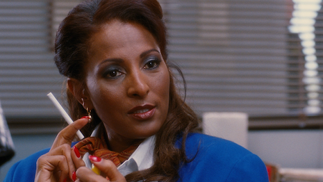
At the Guardian I talked about Oscarssowhite and how Pam Griet, not Helen Hunt, should have won the 1998 Oscar for Best Actress.

At Random Nerds I wrote about male victims and female rapists in Jessica Jones.

At the Establishment I wrote about

Alexander Hamilton and the history of immigrants bashing immigrants.

—why using hackers to disrupt sex trafficking is a bad idea.

At Splice Today I wrote about:

—how Bernie Sanders thinks socialism will address racism, and why it won’t necessarily

—Patrick Breen’s Nat Turner biography and how his story doesn’t fit into Hollywood tropes.

At the Chicago Reader I wrote about retro thrash band Warhead.

Other Links

This is a thoroughly depressing story about a woman who was trafficked, “rescued” by police, and then ended up being arrested and put on a sex offender registry.

Island of Misfit Furries

Screen Shot 2016-01-27 at 5.14.00 PM

ISLAND #6 / IMAGE COMICS / BRANDON GRAHAM & EMMA RIOS / COVER ART BY ONTA

 
I would like to talk about the cover of this comic book anthology.  Your furry media critic wants to cheer herself up for a change.  I’ve accepted reluctantly that furries will continue to be indiscriminately horny online in perpetuity, regardless of context or consequense.  And outside media will continue in turn to find in us an opportunity for inspirational tourism or, depending on how the wind is blowing, a convenient excuse to say “look at these fags, lol” without saying exactly that.  In my writing about this landscape, my attempts to reply to these prying eyes with the same condescension and derision from the other side of the glass haven’t really made me feel happier or smarter or more secure in my own voice.  The tea of bitterness in which I steep has not proven exactly nourishing.  So I’m writing about something that makes me happy.  The thing is the cover of this comic book anthology, called Island #6.  It is published by Image and compiled by comics auteurs Brandon Graham and Emma Rios.

There are many artists that the curators of Island could have lead this issue with.  F Choo bookends the issue with her cleverly composed, sherbert colored wordless story about ominous parcels reoccurring in separate settings.  Her elusive, eye-catching design style should be on the covers of more books, and inside the pages of them.  Gael Bertrand contributes a dazzling, psychedelic training montage of sorts that reads like a tribute to both Moebius’ and Osama Tezuka’s embrace of imagination for its own sake.  Katie Skelly draws a striking fashion magazine insert in her instantly-recognizable, elegant and economical style.  Sarah Horrocks, one of the smartest writers in comics delivers a dense and challenging essay about the work of Kyoko Okazaki, her use of bodily violence and gore, human anxiety, the closet.

What I saw peeking behind the other new issues this week at my shop, Time Warp in Boulder, featured four furry friends in various states of intimate contact. A disgruntled anonymous tumblr user asked Graham “Why did you decide to have all the covers for island be very sci-fi and artsy then suddenly have one look like a cover for a gay furry comic?”  I imagine Brandon has many fans of his turn at the wheel of Rob Liefeld’s science fiction comic Prophet who are happy to gloss over his omnivorous taste in media.  But it’s not exactly a secret that he’s been our man on the inside of a comics culture after furry became more of a discreet identity and thus more insular and separate from the original communities that it gestated in.  The cover for Island #6 looks like a cover for a gay furry comic because it is drawn by a gay furry pornographer.  Again, the satisfaction I get from the thought that some independent comix fellows who may think… I dunno… R Crumb drawing Woody Allen cutting a lady’s head off with his penis is the height of wit, spitting out their coffee upon seeing some luscious purple skunk hips is fleeting and illusory.  What really makes me happy about this cover is the implicit message that Graham and Rios know what furries are, listen to us, treat our art seriously, and pay us.

Onta’s story in this issue of the anthology is bland, altered in its tone for a mainstream audience.  The cast of characters from the gay anthology Cocktails and comics on his site Hardblush (Link NSFW) go out for coffee after attending a pride parade. There is no real exploration of pride in the context of the thornier issues surrounding it; mainstream assimilation, corporate creep, the why and how of the centering of some queer experiences over others. We instead follow the thoughts of each character as they relate to the concept of organized gay pride.  Jesse is resentful and urgent to soothe his masculine-centered perspective on loving men. Marty deals with insecurity with his femininity and whether his man will be there for him when it really counts, in ordinary moments and uncomfortable ones. Mu is there to cruise. Taylor dances and flirts and deflects homophobic venom with comfortable aplomb. This story is an exercise of taking characters originally designed for jerk material and writing them into more developed people. It’s a quality I love in many furry smut authors’ work, like Mike Vega’s, or in iconic furry coimcs like Omaha the Cat Dancer and Associated Student Bodies that leaves me still a little cold with Onta’s pretty furry boys. “Are these folk more than dicks for jumping onto?” is a question I think many furries with sexually-centered stories ask ourselves regularly.

Onta and I don’t run in the same circles, and we likely have different vantage points from which we see ourselves as furry pornographers. There are tons of exceptionally talented furry artists who could have been picked for a gig like this, and I hope there are more opportunities for them in the future. But some elements of this story, and that spectacular cover, are thrilling to me. The gay sensuality, that tail-tugging, the physical closeness these characters have in a book that mostly has showcased the intimacy between men as starting at the tip of a blade. A fantasy story that asks a presumably majority straight readership to derive as much pleasure from imagining being fucked in the ass by a problematic lion as imagining cutting someone else’s throat. It’s nice to get attention from publishers and editors who let furries tell their stories more or less as they are accustomed to telling them, but in a major publication.  

This almost certainly not the case with the upcoming film Zootopia, which is squeezing seventeen metric tons of condensed furry horniness into a children’s movie about cops.  This issue of Island is to me (obviously) the most interesting application of Graham’s professed editorial philosophy of doing whatever the heck he wants.  I hope the risk pays off and publishers can see themselves getting behind more of the audacious talent in the fandom.

Love and Healing and Bullshit

as-good-as-it-gets-41-4

At its core, Hollywood is an engine for turning pain, hardship, and trauma into shallow inspiration porn. From paralysis to the Holocaust, slavery to cancer; Hollywood cheerfully takes these blood soaked lemons and makes you drink blood soaked lemonade, albeit with lots of sweetener.

As Good As It Gets is firmly in the tradition, though the cocktail in question is perhaps more repulsive than most. Part of that is thanks to Jack Nicholson, whose smug self-regard can barely be contained in his constantly arching eyebrows. Most of the blame, though, rests squarely on the script.

For those lucky enough to have avoided the film since its release in 1997, I’ll briefly recap what I suppose I’ll have to refer to as the plot. Nicholson plays Melvin Udall, a fabulously wealthy romance novelist who suffers from some undefined form of OCD; he won’t step on cracks in the sidewalk, he locks the door five times every time he walks into his apartment; he opens a new bar of soap every time he washes his hands; he’s germphobic. Oh, and he’s also homophobic, racist, and deliberately abusive and cruel to everyone. But then he gets a dog, and a woman who looks like Helen Hunt and is 20 years younger than him decides inexplicably that he’s the guy for her. He gives her money to help her asthmatic son, life lessons and becomes a better person. The end.

There’s basically nothing to like in this film, but the bit that sticks out as particularly, drearily awful is the treatment of Melvin’s disability. At the Dissolve a while back, a commenter with OCD named Chapman Baxter argued that the film was correct in that people with OCD can engage in assholish behavior; “Although I’m not proud to admit it, I know from experience how a constant compulsion to do methodical rituals and the perpetual anxiety of intrusive thoughts can make one behave in quite an irritable and anti-social manner.” That seems reasonable…but I think it misses the main problem with what the film is doing.

The movie doesn’t just suggest that Melvin is a jerk because he has OCD. It suggests that the OCD and the jerkishness are essentially one and the same. When Melvin calls his gay neighbor a “fag”, it’s a sign of his quirky woundedness, just like his nervousness about stepping on cracks. And, similarly, when Melvin needs to eat at the same table in the same diner every day, that’s a character flaw on par with insulting a Jewish couple for having big noses. Melvin’s cruelty and his illness merge together, he’s at one and the same time responsible for both and for neither.

Because Melvin’s awfulness is an illness, he gets a pass; he can be spectacularly horrible, but still basically a good person underneath it all, since his behavior is essentially a medical condition, outside of his control. And because his illness is a character flaw, it is curable via the all-purpose nostrum of true love. Mixing flaws and sickness allows Hollywood to blend two of its favorite genres—the rom com and disability inspiration porn. The love of Carol, the waitress played by Hunt, makes Melvin want to become a better, less bigoted man—and that love simultaneously and spontaneously causes him to overcome his germphobia and other manifestations of his OCD. Mental illness and racism both evaporate with a kiss. Fall in love, and you can step on a crack.

This is supposed to be a happy ending for both Carol and Melvin, in theory. In fact, it’s impossible to imagine that this is a good long term choice for Carol, who, understandably, protests against her narrative fate, tearfully demanding to know why she has to settle for this decades older bigot who has just barely learned to form casual friendships, much less a serious romantic partnership. Carol’s mother is wheeled out on cue to tell her that nobody ever gets a perfect boyfriend—the uplifting message of the film being, you might as well settle, girl. We know you’re desperate.

Nor is this in any sense a happy ending for Melvin. Yes, Carol unaccountably decides to date him. But her love is precisely predicated on him becoming a better man–not just by being less of an asshole, but by being less mentally ill. There’s no sense that Carol is willing, able, or interested in dealing with Melvin’s illness; instead her love, the film assures us, will make that illness go away. What if it doesn’t, though? What happens to their relationship then?

As Good As It Gets, in short, is blandly contemptuous of both of its protagonists. Carol, with her asthmatic son, mentally ill boyfriend, and heart of gold, is a human mop, admirable by virtue of the selfless sopping up of her loved ones messes. When she suggests she might deserve more, her mother (presented as a moral voice of truth) tells her to quit kidding herself. Melvin, for his part, is presented as only worthy of love to the extent that love is a miraculous cure. Women are nurses who exist to make men normal. And if the woman doesn’t want to be a nurse, or the man isn’t instantly cured? Sorry, no rom com for you.

The forced happy ending is supposed to be inspiring; an unlikely boon to two wounded people. But instead it feels like an act of cynical, manipulative loathing. A working-class waitress with a sick kid; an aging man with OCD—without Hollywood pixie dust, no one gives a shit about you, the movie taunts. Follow the script for your gender and your illness, and all the normal people will maybe deign to sympathize. Romance! Cure! Come on kids; this is as good as it gets.