The Naked Tragedy

Podcasting is a fairly new form of media. It has precursors in the twentieth century, but has only existed in its current form over the last fifteen years. It resembles radio. Indeed, many professional podcasters work, or formerly worked, in radio and many podcasts are re-edits of radio broadcasts. Podcasts are quite different, though – many are financed through listener donations in addition to advertising, they exist in perpetuity, allowing for ‘binge’ listening, and their independent format means that they can feature content which would not be suitable for public radio. Perhaps most importantly, podcasts do not need to adhere to a set time limit, allowing for greater freedom in terms of broadcast length. By far the most noteworthy podcast of recent years has been Serial. I found Serial utterly compelling and, with the first episode of the new series having dropped, I want to unpack why.

In its most simple description, the first season of Serial was a true crime story. It is, in fact, two narratives – the story of a murder and ensuing trial, and the story of Sarah Koenig exploring that story. The very first words of Serial series one were ‘For the last year, I’ve spent every working day trying to figure out where a high school kid was for an hour after school one day in 1999– or if you want to get technical about it, and apparently I do, where a high school kid was for 21 minutes after school one day in 1999.’ She begins, in other words, not with her subject, but her own narrative. Accordingly, she begins not by interviewing the people involved but people from her own life. Koenig’s presence in the story as a substitute for the audience works wonderfully because she often voices the same thoughts as the listener and, unlike the author of fiction, the resolution of the story is equally unavailable to her as to the listener.

In some ways the story which unfolds resembles fiction; Koenig asserts of the first season ‘on paper, the case was like a Shakespearean mashup– young lovers from different worlds thwarting their families, secret assignations, jealousy, suspicion, and honor besmirched, the villain not a Moor exactly, but a Muslim all the same, and a final act of murderous revenge.’ In other ways, however, Serial is compelling because it captures the way in which real life stubbornly refuses to resemble fiction. In Arden of Faversham, another Elizabethan play, this time presenting a version of a real murder, the following is asserted;

Gentlemen, we hope you’ll pardon this naked tragedy,
Wherein no fil’d points are foisted in
To make it gracious to the ear or eye ;
For simple truth is gracious enough,
And needs no other points of glosing stuff.

True crime, in other words, is not beautiful. Serial bears out this assertion. In the new season Koenig begins by explaining (not apologizing for) the presence of microwave ‘bing’s, the sound of a dog scratching, and other intrusions of life in all of its imperfection. Often the voices are distorted, as is the case over Skype or other media. These signs of authenticity make the podcast all the more engrossing because we have a sense that what we are listening to has its own life beyond the narrative.

What ultimately made the first season of Serial work is that Koenig, brilliantly, presented within the murder story, two narratives. One where Adnan killed Hae Min Lee, and one where he did not. Both narratives involve versions of the same characters, and both narratives are entirely plausible, but only one can be true. Here, again, the refusal of life to work the same way as fiction is present – both narratives are flawed and subject to mistakes and lies. Facts are presented which contradict one another. As the story grows, like a good detective story, the possibility of resolution apparently becomes more remote, except, in this version, when we reach the final chapter all we have is a fascinating mess, because, as we know from Arden of Faversham, a true naked tragedy is not beautiful.

Utilitarian Review 12/11/15

Screen Shot 2015-12-11 at 4.54.07 PM

On HU

Featured Archive Post: Mahendra Singh on the draftsmanship of Jeffrey Catherine Jones.

Chris Gavaler on analyzing comics layout.

Me on why writing for hire isn’t spiritual debasement.

Me on Robocop 2 and the joy of hating children.

Roy T. Cook tries to tell Indiana Jones from Harrison Ford.

Robert Stanley Martin with on sale dates of comics from the end of 1950, including the first graphic novel ever.
 
Utilitarians Everywhere

At the Guardian I :

interviewed William Richards on his new book about psychedlics and spiritual experience.

—wrote about Lex Luthor, Jr, and corporate fan fiction.

At the Establishment I wrote about my son’s acting career and the myth of meritocracy.

At Splice Today I wrote about

—Project Runway and how people suck and friends don’t win.

—why Trump is not the future.
 
Other Links

Mistress Matisse on the James Deen accusations and how the law doesn’t care about sex workers.

Ta-Nehisi Coates on hope, or lack thereof.

Neil Drumming on diversity on Project Runway.

Two Puzzles About Photographic Fiction

IndyIntoBy a photographic fiction I mean any work of fiction where at least part of the narrative is communicated to the audience via photography of some sort. The most obvious example of photographic fiction is live action cinema, although photocomics are another kind of photographic fiction that will be of great interest to typical PencilPanelPage readers.

Now, one natural thought we might have about photographic fictions, as opposed to non-photographic fictions, is that the characters in these stories appear exactly as they are depicted in the photographs that partially or completely make up the fiction. As a result, we might be tempted to accept the following two claims:

  • In A New Hope, Han Solo’s fictional appearance (e.g. what he looks like when other characters see him, and how we are to imagine him appearing when we are experiencing the fiction) is the same as Harrison Ford’s actual appearance.
  • In Raiders of the Lost Ark, Indiana Jones’ fictional appearance (e.g. what he looks like when other characters see him, and how we are to imagine him appearing when we are experiencing the fiction) is the same as Harrison Ford’s actual appearance.

HanIntoBut now consider the ten-page comic titled “Into the Great Unknown”. “Into the Great Unknown” appears in issue #19 of the anthology comic Star Wars Tales. In this story Han Solo and Chewbacca crash the Millenium Falcon in a forest on an unknown planet after a blind hyperspace jump. The Falcon is irreparable, and Han is eventually killed by the locals (who turn out to be late 18th century inhabitants of the Portland area). More than a century later the wreckage of the Falcon is discovered by – wait for it – Indiana Jones, with Chewbacca, who is now also Sasquatch, observing from afar.

Now, even though the stories in Star Wars Tales are explicitly non-canonical (in virtue of a framing story we need not get into), it still seems that the following are plausible constraints on a proper interpretation of this story:

  • Everything fictionally true of Han Solo in the canonical Star Wars fiction is also true of Han Solo in the imaginary/non-canonical story “Into the Great Unknown”.
  • Everything fictionally true of Indiana Jones in the canonical Raiders of the Lost Ark fiction is also true of Indiana Jones in the imaginary/non-canonical story “Into the Great Unknown”.

Note that we don’t, of course, want to accept the converses of these statements – that’s the upshot of the story being non-canonical.

But if all of this is right, then it would seem to follow that, when interpreting “Into the Great Unknown”, we should accept the following:

  • In “Into the Great Unknown”, Han Solo’s fictional appearance is the same as Harrison Ford’s actual appearance.
  • In “Into the Great Unknown”, Indian Jones’ fictional appearance is the same as Harrison Ford’s actual appearance.

But these, in turn, imply:

  • In “Into the Great Unknown”, Han Solo and Indiana Jones are identical in appearance.

And surely this is not something we are meant to imagine to be true in the story. Of course, the story is in some sense meant to make us metafictionally ponder the role that appearance and actor identity plays in the nature of fiction. But it would be a mistake to assume, within the fictional world portrayed by this ten page comic, that Chewbacca is immensely confused when Indiana Jones appears on the scene, since Indy looks exactly like his old, now dead friend Han Solo. Wouldn’t it?

HarrisonIntoActually, things are even a bit more complicated than this. The above discussion assumed that the photographs that provide much of the content of A New Hope (or Raiders of the Lost Ark) provide us with accurate, objective, reliable information regarding Han Solo’s appearance (or Indiana Jones’ appearance) in virtue of providing us with accurate, objective, reliable information about Harrison Ford’s appearance. But this is too simple. Even if we accept the controversial claim that, when viewing a photograph, we genuinely see the objects depicted in the photograph, this does not mean that we see such objects as they truly are in the world. This point is nicely emphasized by Susan Sontag in her influential On Photography:

But despite the presumption of veracity that gives all photographs authority, interest, seductiveness, the work that photographers do is no generic exception to the usually shady commerce between art and truth. Even when photographers are most concerned with mirroring reality, they are still haunted by tacit imperatives of taste and conscience… In deciding how a picture should look, in preferring one exposure to another, photographers are always imposing standards on their subjects. Although there is a sense in which the camera does indeed capture reality, not just interpret it, photographs are as much an interpretation of the world as paintings or drawings are. (1971: 6-7)

In other words, when we look at a photograph of Harrison Ford, we don’t see Harrison Ford as he actually appeared when photographed, but instead see Harrison Ford as mediated through the stylistic, technical, and aesthetics choices of the photographer.

Nevertheless, it does seem like we are meant to take the photographs that appear in photographic fictions to be unmediated and (all else being equal) accurate depictions of the fictional characters being depicted. Thus, when viewing Star Wars, we are being shown Harrison Ford’s appearance as mediated by the aesthetic/technical/stylistic choices of Gilbert Taylor (A New Hope‘s cinematographer) and others, but we are being shown Han Solo as he really appears within the fiction. In other words, the various interpretational choices made by Taylor and others interfere with our direct access to what Harrison Ford looked like at the exact moment he was photographed, but those same choices are partially constitutive of what Han Solo looks like during the fictional events depicted by those same photographs. In short, the information these photographs provide regarding the appearance of the fictional characters depicted in the films is more reliable than the information the same photographs provide regarding the appearance of the actors who play those characters.

But this makes the situation even more puzzling than before. First off, it seems like we still ought to accept:

  • In “Into the Great Unknown”, Han Solo and Indiana Jones are identical (or nearly identical) in appearance.

since the photographs that provide us with canonical information regarding the appearance of both of these characters do depict these characters as having identical, or nearly identical, appearances. But we need not accept that:

  • In “Into the Great Unknown”, Han Solo looks exactly like Harrison Ford.
  • In “Into the Great Unknown”, Indiana Jones looks exactly like Harrison Ford.

We’ve already seen the reason: Our information regarding the fictional appearance of Harrison Ford is always mediated via the choices made by the photographer. In short, Han Solo looks just like Indiana Jones, but this is compatible with it turning out that neither of them looks very much like Harrison Ford (although they will both look very much like the relevant photographs of Harrison Ford). And this is just plain weird.


Robocop vs. Your Offspring

This post is one of my Twisted Mass of Heterotopia columns, supported by my Patreon subscribers. If you think it’s the sort of thing you’d like me to write more of, consider contributing (and thank you!)
________
 

Screen Shot 2015-12-09 at 7.17.52 AM

 
Robocop 2 was mostly, and not wrongly, ignored when it came out in 1990, but it did manage to spark a smidgen of controversy. One of its major villains was Hob, played by Gabriel Damon, who would have been 13 during filming and looked like he could easily have been a year or two younger. Hob curses foully, dispenses narcotics, attempts murder, and watched vicious bloodletting while barely blinking an eye. Then he dies in a sentimental, tearful scene clutching Robocops hand.

Critics were appalled. “The use of that killer child is beneath contempt,” Roger Ebert declared. David Nusair added, “That the film asks us to swallow a moment late in the story that features Robo taking pity on an injured Hob is heavy-handed and ridiculous (we should probably be thankful the screenwriters didn’t have Robocop say something like, “look at what these vile drugs have done to this innocent boy”).”

Ebert and Nusair aren’t exactly wrong. Robocop 2’s use of Hob is both gratuitous and cynical. Hob doesn’t need to be a child; everything he does could just as easily been given to an adult actor. There’s no effort to explain what a 13 year old is doing in the drug business, either. As far as the script is concerned, Hob is played by a 13 year old purely because it’s shocking to have him played by a 13 year old. It’s pure exploitation of a minor. Who can blame the critics for recoiling?

Still…I love Hob. I love him precisely because his presence in the film is so utterly, bracingly cynical. For most of the film, he embodies our hyperbolic fear and hatred of children; the preposterous inflated fear of a new generation of cynical pre-teen superpredators, the jaded youth terrifyingly familiar with vice. And then, in his death scene, when he’s no longer a threat, he becomes the perfect, heart-tugging victim. The film’s view of Hob turns on a needle from paranoia to pathos; from loathing to sentimental catharsis. There’s no attempt at connective tissue; no effort to make Hob a character beyond the tropes. He’s just Childhood Monster or Childhood Victim. There’s not even a pretense that he’s anything else.

I don’t know whether Hob is intentional satire, gleeful hyperbole, or sincere fever dream. Probably a little of all of those, if the scene with the pre-teen Little League team and their coach robbing a store is any indication. But whatever the motivation, the result comes across like a sardonic, giggling sneer at every Hollywood film that has ever whipped up moral panic about teens, or dropped a dead child onto its protagonist in the name of Real Emotion. From the bad news kids breaking jazz records in Blackboard Jungle to the kidnapped youngster motivating a tearful Tom Cruise in Minority Report, all the children on screen, everywhere, start to look like Hob. And suddenly you wonder, do we even care about these kids? Or do we just get our kicks by pretending that they’re nightmare demons, innocent angels, and/or both at once?

Roger Ebert adored Minority Report, dead kid and all, and Millenial think pieces continue to dot the Internet. If you use racial or gendered or homopohobic stereotypes, there’s at least a decent chance someone will point them out. But kids aren’t seen as a marginalized group, and tropes around them aren’t seen as invidious, or just aren’t seen at all. Kids really are innocent victims, right? Or else they really are dead-souled thugs in training who need to get off my lawn.

Robocop 2, though, takes up the difficult task of exploiting childhood so blatantly that you can’t look past it, even if you’re determined to set your eyeline a foot over Hob’s head. Robocop 2 presents a dystopic future in which we hate and fear and condescend to children, just like we do now, just with a little less hypocrisy.

Writing for Hire Is Not Spiritual Debasement

This first ran on Splice Today.
___________

Writing gets demystified pretty quickly when you do it for a living. All the stuff you hear in creative writing programs about cultivating your own voice or writing what you know or making the familiar strange — pretty much nobody who will pay you actually gives a shit. Instead, the kind of things your clients are likely to focus on are, can you meet a deadline? Can you be just as entertaining and accessible as we’ve decided the audience would like you to be, without being so entertaining and accessible that someone gets offended? Can you figure out something to say about dietary supplements without instantly revealing that neither you, nor we, nor really anybody cares about dietary supplements? In short, can you competently jump through the hoops at your boring day job the way that everybody else has to jump through the boring hoops at their boring day jobs? And can you do it without too many glaring grammatical errors?

Like I said, you figure all this out fairly quick. Or, at least, it seems like you would. Not Anna Davies, though. Davies is, she tells us right at the beginning of her essay a “real writer” — and as proof, she says she’s ghost-written a massively popular YA series. She clearly intends for us to be impressed — and, hey, I can oblige happily enough. I was impressed. Ghost-writing a massively popular YA series— that sounds like a great, relatively enjoyable source of steady income. I’d do it if I had the chance.

Anna, though, doesn’ t present it as an enjoyable source of steady income. Instead, she makes it sound like some sort of Faustian bargain, in which she sold her inner glittery snowflake for ugly, mundane cash. She’d wanted to be a famous YA writer herself, but all she did was write other people’s series. She buried her muse so thoroughly that even her editor tells her, “You write well, but nothing has heart.” To which she replies, in a transcendent psalm of self-pity:

“Of course nothing did. I’d given it to them. I’d given them my time, my talent, my 20s. And that was the lesson that had somehow gotten buried as I learned to create characters, set scenes and turn around a revise in three days: Never give more than you’re prepared to lose. In the course of five years and approximately 600,000 words, I’d become so good at mimicking the voice of another author that I’d lost my own, and I’d failed to nurture my own career, not to mention well-being, as carefully as I had the lives of the characters that had never belonged to me.”

Davies has written for the New York Times and Marie Claire, and is making her declaration of failure from Salon. Clearly, she spent some time in there nurturing her career. But putting that aside, what exactly is she complaining about here? That all her dreams didn’t come true? That she had to work at a job that was occasionally unpleasant and felt like work? That after five years she’s only a quite remarkably successful writer rather than being J.K. Rowling? I don’t mean to be cruel, but, jeez, buck the fuck up.

To be fair, when you read the whole essay, you get the impression that there is more going on with Davies than she is quite willing or able to explain. She talks about her mother’s death; she talks about drinking too much; she talks about relationship failures. It doesn’t exactly add up, but for whatever reason, she’s obviously quite unhappy. I don’t think she’s lying about that, and I certainly don’t blame her for it.

Still, for a working writer, it is kind of irritating to see my profession presented as some sort of catastrophic self-betrayal, and/or as leading inevitably to a dark night of the soul. Reading it, I felt (presumptuously, but still) like I’d gotten a little glimpse of how sex workers feel when they have to sit through yet another documentary about how debased and miserable they are. Work for hire can be exploitive and depressing just like any other job, of course, and sometimes folks will treat you badly (or in the worst case not pay you.) But there’s nothing about it that’s inherently demeaning, or no more so than any other kind of employment.

Davies though, thinks there is. Work for hire function in her essay as a weight and a corruption, the thing that has prevented her from becoming a real writer, or even a real person. It’s like being a ghost writer has made her a real ghost; as if writing for someone else has turned her into no one. She seems, in other words, to have confused her job with her soul, and to have lost perspective in a catastrophic manner on the fact that being a ghost is just a gig. It’s not a sign that you are dying.

Analyzing Comics 101 (Layout)

The downside to teaching a course on comics is discovering that no textbook quite matches the way you want to teach the material. The upside is writing that textbook yourself. And so here’s the first draft of an intended series of “Analyzing Comics 101” blogs. My actual course is called “Superhero Comics,” but I’m hoping this will be useful to other students, teachers, fans, etc.

So here goes . . .
ANALYZING LAYOUT

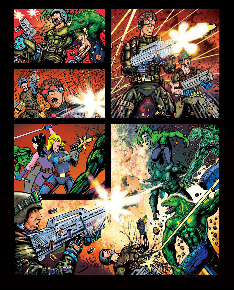
Layout: the arrangement of images on a page, usually in discrete panels (frames of any shape, though typically rectangular) with gutters (white space) between them, though images may also be insets or interpenetrating  images. Page layouts influence the way images interact by controlling their number, shapes, sizes, and arrangement on the page, giving more meaning to the images than they would have if viewed individually. Layouts are the most distinctive and defining element of graphic narratives.

Layouts tend to be designed and read in one of two ways, in rows or in columns.

Rows: panels are read horizontally (and from left to right for Anglophone comics, but right to left for Manga). Types of row layouts include:

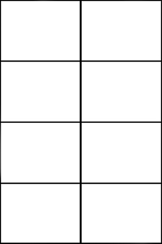
Regular 2×2, 2×3, etc.; 3×2, 3×3, etc.; 4×2, 4×3, etc.: vertical panel edges line-up, creating uniform panels in all rows. 3×3, 3×2 and 4×2 are the most common regular  layouts.

3×3:


3×2:


Regular 4×2:


2×3:


2×4:

4×3:

3×4:

4×4:

Irregular 2-row, 3-row, 4-row, etc.: vertical panel edges do not line-up, creating a different number of or differently sized panels in one or more rows. The irregularity may include a full-width panel, which extends horizontally across the whole page, or rows divided into 2, 3, 4 or more panels. Irregular 3-row layouts are among the most common layouts in comics, followed by 4-row and 2-row.

3-row:


4-row:


2-row:


 Image result for comic book pages

Columns: panels are read vertically, from top to bottom. Because of the Anglophone tendency to read horizontally before vertically, columns are less common in Anglophone comics.  Column layouts include:

Regular 1×2, 1×3, 1×4, etc.; 2×2, 2×3, 2×4, etc.; 3×2, 3×3, 3×4, etc.: horizontal panel edges line-up, creating uniform panels in all columns. To counter horizontal reading norms, columns often use one or more full-height panels, which extends vertically down the whole page. The absence of segmented panels within a full-height panel column reduces establishes the column layout, preventing a horizontal reading path.

1×4:

1×3:

1×2:

Irregular 2-column, 3-column, 4-column, etc.: horizontal panel edges do not line-up, creating a different number of or differently sized panels in one or more columns. Because horizontal reading is an accepted default, segmented columns tend to be irregular, with one or more taller panels breaking the left to right norm. Often a single, full-height panel establishes an irregular 2-column layout, with the second column divided into multiple panels. Irregular 2-column are the most common column layouts.

2-column (with establishing full-height panel):


Row and column patterns, however, are indistinguishable without content to determine reading direction. A 4×2 layout, for example, may be read as four rows divided into two panels each, or it may be read as two columns divided into four panels each. However, because Z-path reading (first right then down) is the norm for Anglophone comics, 4×2 is typically read as a 4-row layout not a 2-column.

Rows and columns can also be merged by including only full-width panels within a single column. These are irregular 3×1, 4×1, 5×1, and 6×1:


     Image result for comic book pages

Image result for comic book pages

Combinations: panels must be read both horizontally and vertically, combining rows and columns on a single page. In practice, combinational layouts are always irregular. Common combinational layouts feature one or more paired sub-columns (one sub-column divided into two panels, the other the height of those two panels combined, with the two sub-columns sequenced in either order) or a single, full-height column in an otherwise row-patterned layout. 


Image result for comic book pages'

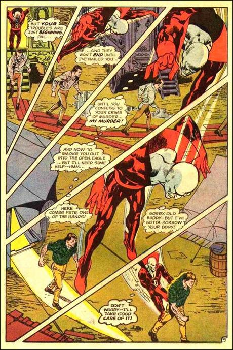
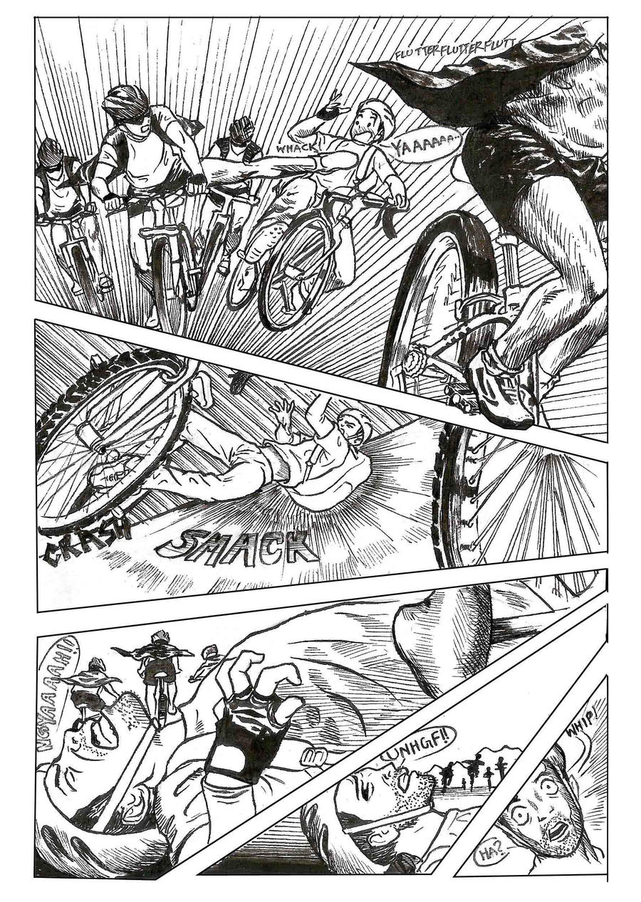
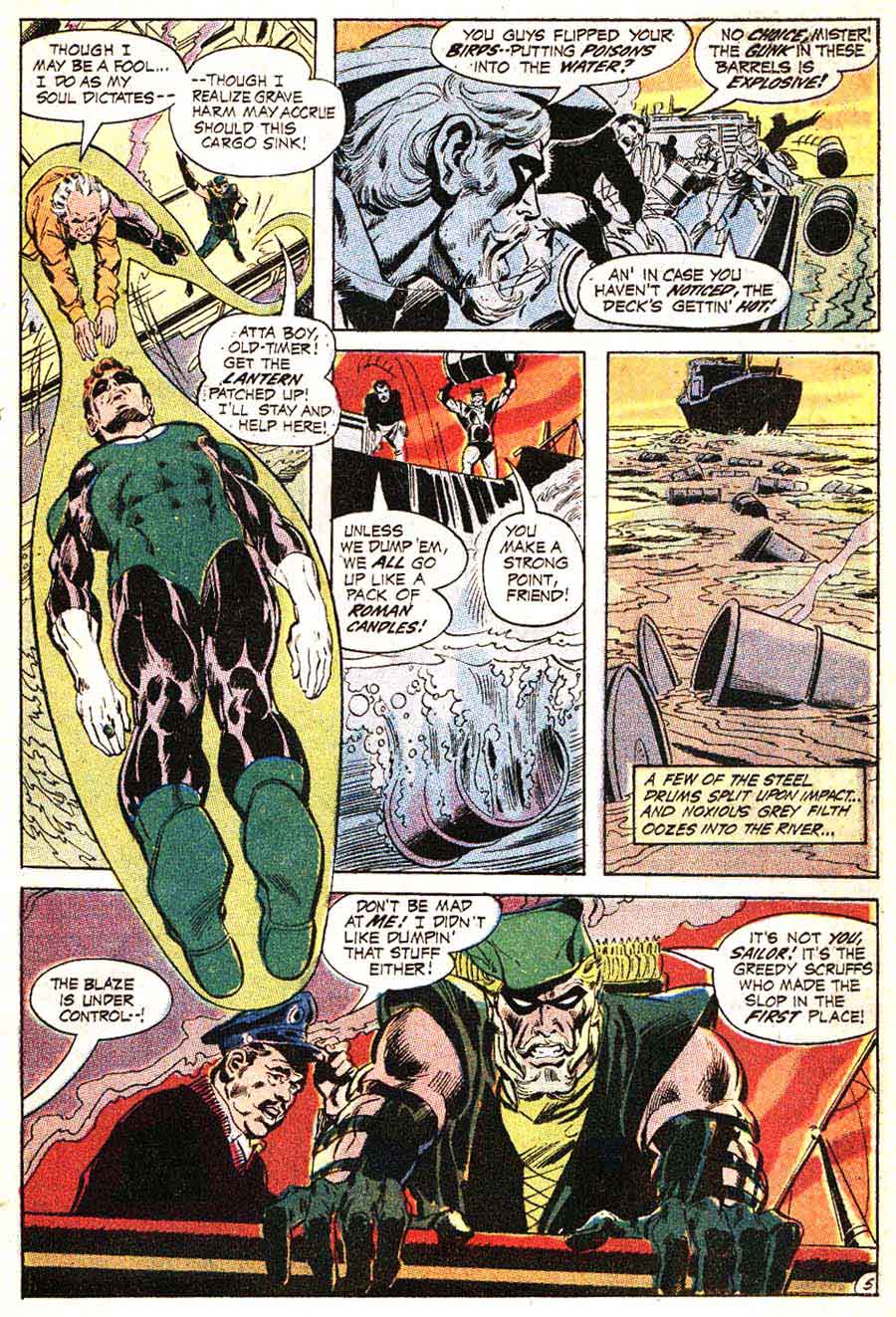
Diagonal layouts: panels do not follow vertical or horizontal divisions, and so are neither clearly rows nor columns:


Caption panel: a panel that contains only words.  These tend to be smaller, subdivided panels.

Inset: a panel surrounded entirely by another image.


Overlapping panels: a framed panel edge appears to intrude into or to be placed over top another framed panel, with not gutter dividing them.


Broken Frames: image elements of one panel extend beyond its frame into the gutter and/or into the frame of an adjacent panel.


    Image result for comic book pages'

Insets, overlapping panels, and broken frames are often combined:


Interpenetrating images: two or more unframed images with no distinct gutters or borders so that elements of separate images appear to overlap.


Page panel: A page-sized panel, typically visible in the gutters between smaller panels. When white, black, or otherwise uniform, the page panel appears as the page itself and so as a neutral space outside of the actions and events of the drawn images. All other panels are insets superimposed over the page panel. If the page panel includes drawn images, those images should be understood as the underlying and so in some way dominating background element to all other images on the page. If one panel is unframed, its content may be understood as part of the larger page panel.


A page panel with no insets and a single unified image is a full-page panel:

A full-page panel with author credits is a splash page.

Two-page panel: two facing pages designed to be read as a unit. A two-page spread are two facing pages not designed as a unit.

Panel accentuation: a panel may be formally differentiated and therefore given greater importance by its size, frame (including shape, thickness, and color, and by being unframed) or position on the page (first, center, and last panels tend to dominate).

Panels accentuated by border shapes:


Base Layout Pattern: a panel arrangement repeated on multiple pages.

Strict: repetitions from page to page contain no variations in a base pattern.

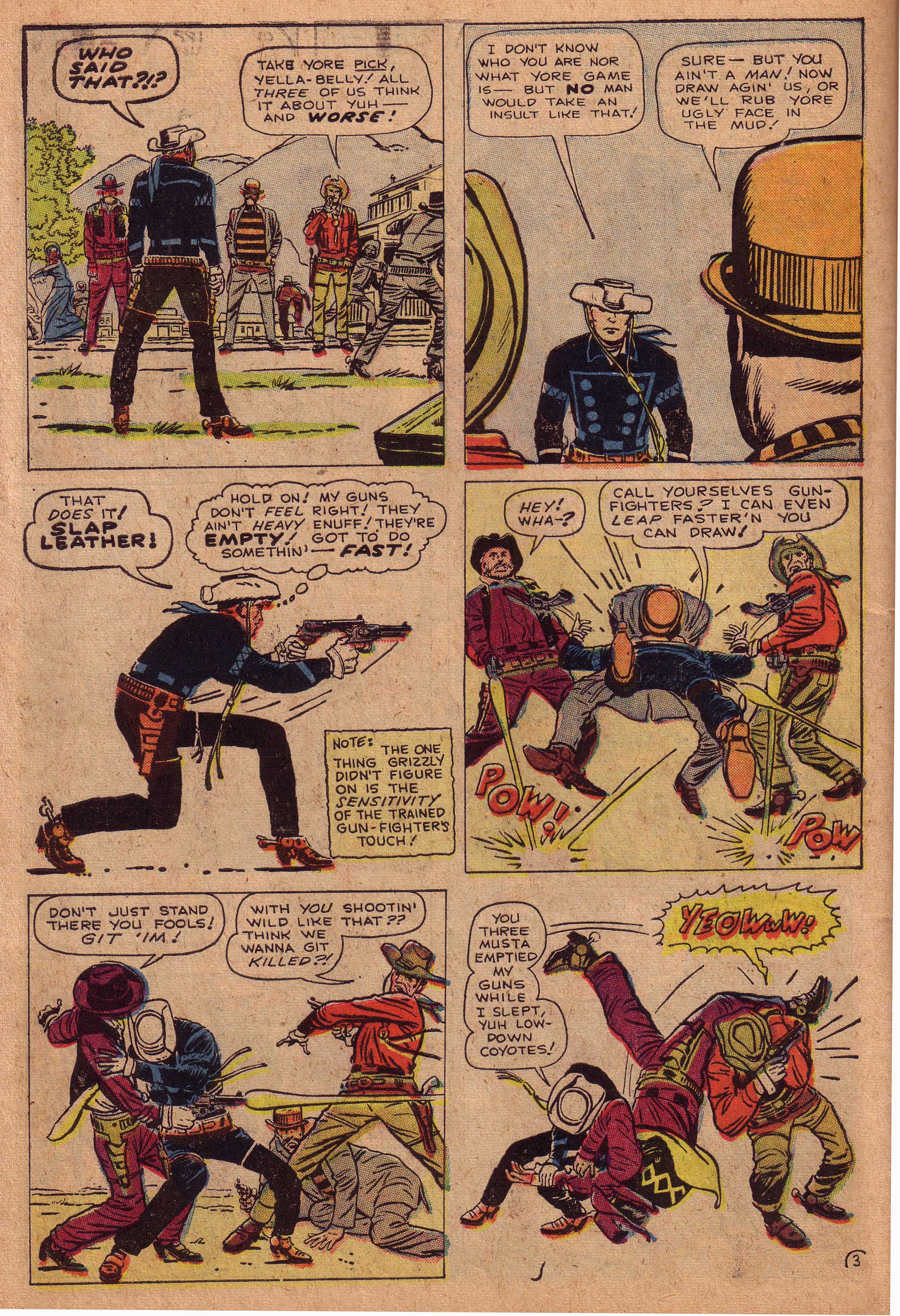
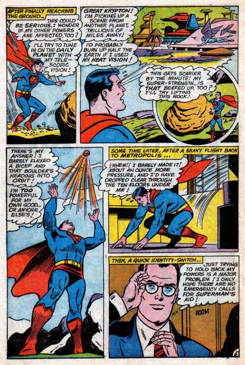
For the Superman episode of Action Comics #10, Joe Shuster uses a strict 4×2, as does Fletcher Hanks for “Stardust the Super Wizard” in Fantastic Comics #12:


Flexible: some variations, especially through combined panels and divided panels. Often the base pattern is only implied.

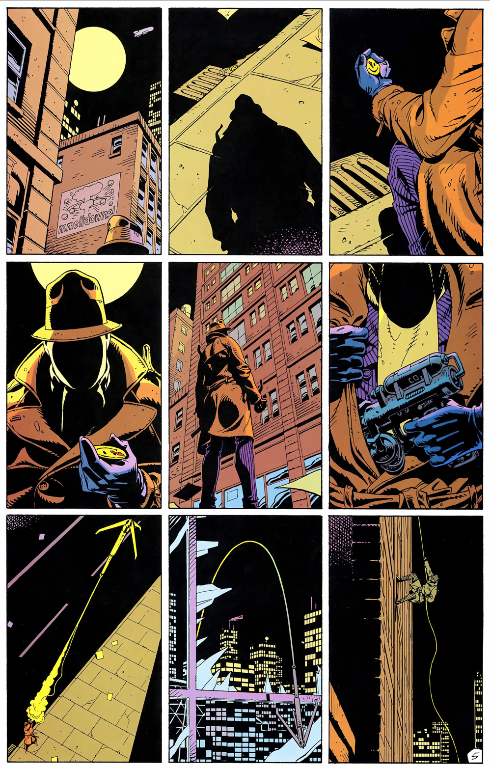
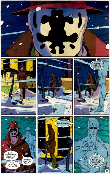
Watchmen is the best known example of a flexible 3×3 base pattern:


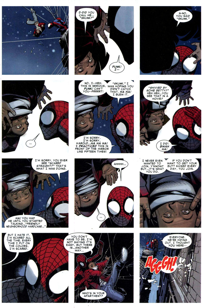
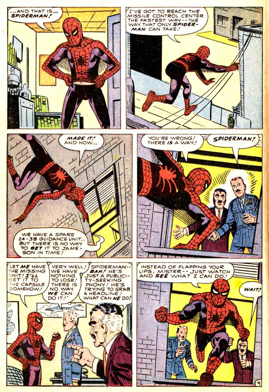
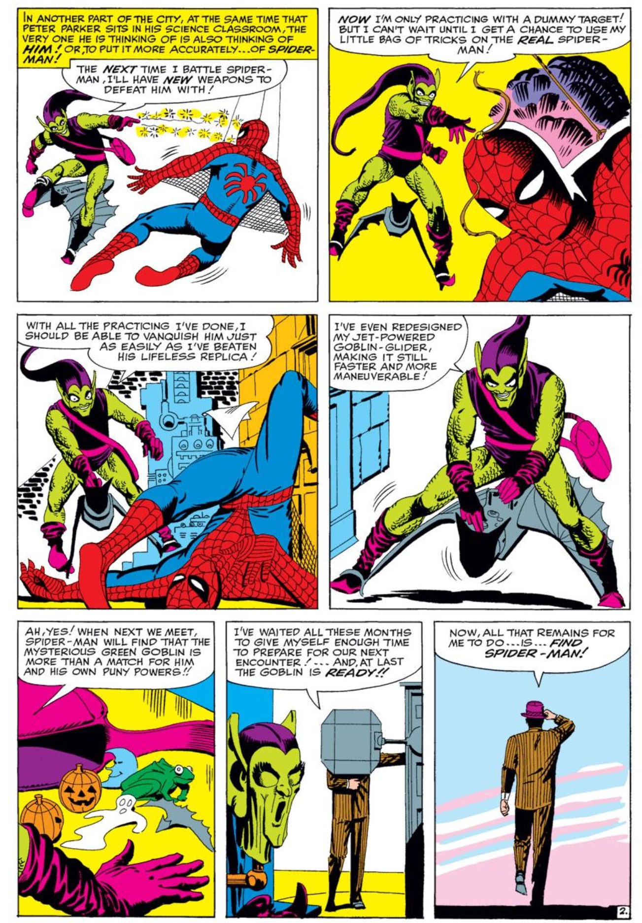
Comics more often use a flexible 3-row base pattern. Steve Ditko fluctuates between rows of three panels and rows of two panels in Amazing Spider-Man:

      .


Irregular: no base pattern.

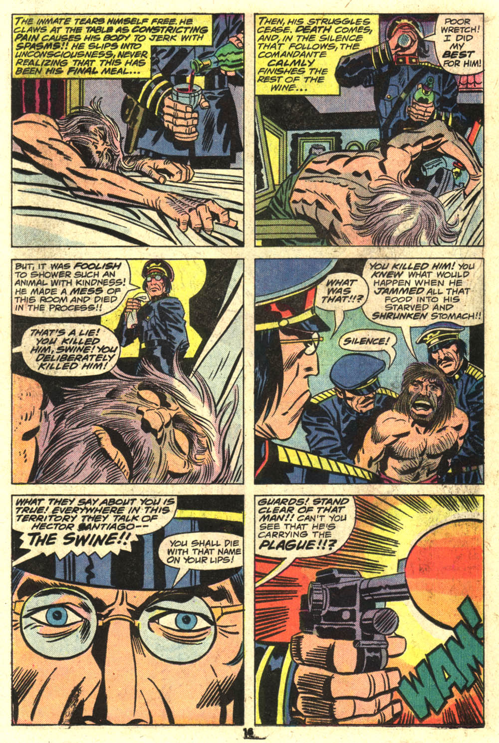
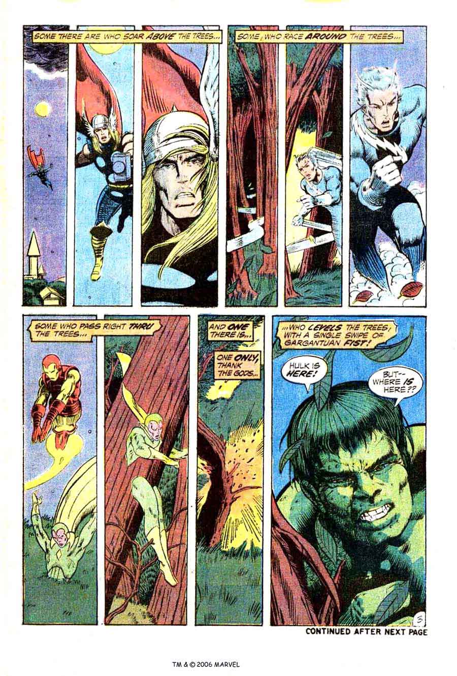
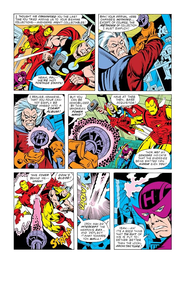
The Avengers #174 fluctuates between 3-row and 4-row layouts:


If more than one arrangement repeats, each pattern may be distinguished descriptively (3×3, irregular 2-column, etc.) or by chronological appearance (layout A, B, C, etc.). Pages that repeat earlier layouts may be said to rhyme.  A comic book’s page scheme may be analyzed for layout repetitions, creating a page scheme. But let’s save that topic for later . . .

Utilitarian Review 12/4/15

On HU

Featured Archive Post: Jaime Green on how Clybourne Park is lying to you.

Chris Gavaler with a bibliography of superman before Superman.

Ng Suat Tong on why Jessica Jones is a poorly thought out mess.

Me on how Rogue Nation makes sense if you just hate Tom Cruise.

Me on Wonder Woman, the stranger in the new Batman vs. Superman trailer.

Robert Stanley Martin with on sale dates of comics from fall 1950—lots of EC, plus Gasoline Alley.
 
Utilitarians Everyhwere

For Slates’ annual overlooked book list I got to recommend Kathleen Gilles Seidel’s Again.

At Quartz I wrote about

Jessica Jones vs. the patriarchy.

how conservatives police speech by don’t get called out for political correctness.

At Playboy I wrote about white paranoia and fear of crime.

At the Guardian I wrote about the Hunger Games’s dislike of femininity.

At the Establishment, I wrote about

prejudice against young male Syrian refugees.

the anti-gun control movement and apocalyptic fantasies of violence.

At Splice Today I wrote about

free speech and my experiences with the editors at the Atlantic.

why Project Runway is better than quality television.
 
Other Links

Joanna Angel describes her abusive relationship with porn star and accused rapist James Deen.

From a bit back, Alyssa Rosenberg on The Voice and LGBT contestants.

Lee Drutman with an excellent article on why gun control is so hard to past (and no, it’s not because the NRA bribes Congress.)
 

1406438617_9-Anya-Ayoung-Chee