Island of Misfit Furries

Screen Shot 2016-01-27 at 5.14.00 PM

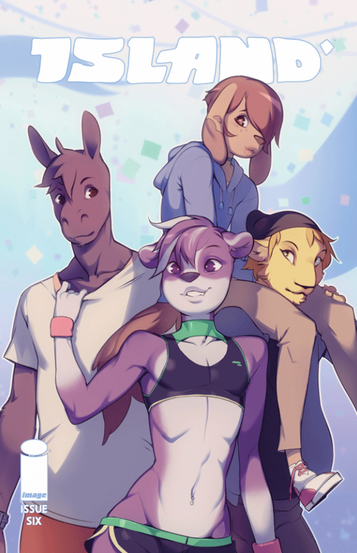
ISLAND #6 / IMAGE COMICS / BRANDON GRAHAM & EMMA RIOS / COVER ART BY ONTA

 
I would like to talk about the cover of this comic book anthology.  Your furry media critic wants to cheer herself up for a change.  I’ve accepted reluctantly that furries will continue to be indiscriminately horny online in perpetuity, regardless of context or consequense.  And outside media will continue in turn to find in us an opportunity for inspirational tourism or, depending on how the wind is blowing, a convenient excuse to say “look at these fags, lol” without saying exactly that.  In my writing about this landscape, my attempts to reply to these prying eyes with the same condescension and derision from the other side of the glass haven’t really made me feel happier or smarter or more secure in my own voice.  The tea of bitterness in which I steep has not proven exactly nourishing.  So I’m writing about something that makes me happy.  The thing is the cover of this comic book anthology, called Island #6.  It is published by Image and compiled by comics auteurs Brandon Graham and Emma Rios.

There are many artists that the curators of Island could have lead this issue with.  F Choo bookends the issue with her cleverly composed, sherbert colored wordless story about ominous parcels reoccurring in separate settings.  Her elusive, eye-catching design style should be on the covers of more books, and inside the pages of them.  Gael Bertrand contributes a dazzling, psychedelic training montage of sorts that reads like a tribute to both Moebius’ and Osama Tezuka’s embrace of imagination for its own sake.  Katie Skelly draws a striking fashion magazine insert in her instantly-recognizable, elegant and economical style.  Sarah Horrocks, one of the smartest writers in comics delivers a dense and challenging essay about the work of Kyoko Okazaki, her use of bodily violence and gore, human anxiety, the closet.

What I saw peeking behind the other new issues this week at my shop, Time Warp in Boulder, featured four furry friends in various states of intimate contact. A disgruntled anonymous tumblr user asked Graham “Why did you decide to have all the covers for island be very sci-fi and artsy then suddenly have one look like a cover for a gay furry comic?”  I imagine Brandon has many fans of his turn at the wheel of Rob Liefeld’s science fiction comic Prophet who are happy to gloss over his omnivorous taste in media.  But it’s not exactly a secret that he’s been our man on the inside of a comics culture after furry became more of a discreet identity and thus more insular and separate from the original communities that it gestated in.  The cover for Island #6 looks like a cover for a gay furry comic because it is drawn by a gay furry pornographer.  Again, the satisfaction I get from the thought that some independent comix fellows who may think… I dunno… R Crumb drawing Woody Allen cutting a lady’s head off with his penis is the height of wit, spitting out their coffee upon seeing some luscious purple skunk hips is fleeting and illusory.  What really makes me happy about this cover is the implicit message that Graham and Rios know what furries are, listen to us, treat our art seriously, and pay us.

Onta’s story in this issue of the anthology is bland, altered in its tone for a mainstream audience.  The cast of characters from the gay anthology Cocktails and comics on his site Hardblush (Link NSFW) go out for coffee after attending a pride parade. There is no real exploration of pride in the context of the thornier issues surrounding it; mainstream assimilation, corporate creep, the why and how of the centering of some queer experiences over others. We instead follow the thoughts of each character as they relate to the concept of organized gay pride.  Jesse is resentful and urgent to soothe his masculine-centered perspective on loving men. Marty deals with insecurity with his femininity and whether his man will be there for him when it really counts, in ordinary moments and uncomfortable ones. Mu is there to cruise. Taylor dances and flirts and deflects homophobic venom with comfortable aplomb. This story is an exercise of taking characters originally designed for jerk material and writing them into more developed people. It’s a quality I love in many furry smut authors’ work, like Mike Vega’s, or in iconic furry coimcs like Omaha the Cat Dancer and Associated Student Bodies that leaves me still a little cold with Onta’s pretty furry boys. “Are these folk more than dicks for jumping onto?” is a question I think many furries with sexually-centered stories ask ourselves regularly.

Onta and I don’t run in the same circles, and we likely have different vantage points from which we see ourselves as furry pornographers. There are tons of exceptionally talented furry artists who could have been picked for a gig like this, and I hope there are more opportunities for them in the future. But some elements of this story, and that spectacular cover, are thrilling to me. The gay sensuality, that tail-tugging, the physical closeness these characters have in a book that mostly has showcased the intimacy between men as starting at the tip of a blade. A fantasy story that asks a presumably majority straight readership to derive as much pleasure from imagining being fucked in the ass by a problematic lion as imagining cutting someone else’s throat. It’s nice to get attention from publishers and editors who let furries tell their stories more or less as they are accustomed to telling them, but in a major publication.  

This almost certainly not the case with the upcoming film Zootopia, which is squeezing seventeen metric tons of condensed furry horniness into a children’s movie about cops.  This issue of Island is to me (obviously) the most interesting application of Graham’s professed editorial philosophy of doing whatever the heck he wants.  I hope the risk pays off and publishers can see themselves getting behind more of the audacious talent in the fandom.

Condescending to Mothers

Jen-Kirkman-Book-Cover-ICBTCOM

 
This first ran on Splice Today.
________

In a recent post on the Atlantic, Jen Kirkman stated that she did not want to be a mother. Further, she didn’t want people to tell her that she’d be a great mom. To tell a childless woman that she’d be good at mothering, Kirkman said, “is at best condescending and at worst, patently false and potentially dangerous.”

Which left me with one question when I had finished the article. Would Kirkman think it was condescending if someone told her she’d be a great dad?

Obviously, women aren’t usually referred to as fathers. My point, though, is that “Dad” and “Mom” aren’t just equal and neutral descriptors for the same role. They carry a lot of connotations. And it seems like in her piece, Kirkman is resisting not so much the idea of being a parent, per se, as the idea of being, specifically, a mom.

The post (an excerpt from Kirkman’s forthcoming book) doesn’t delve too deeply into specifics about motherhood. It doesn’t need to, though, because — in the long tradition of her stand-up comic forbears — Kirkman simply relies on rule-of-thumb gender stereotypes

I have memories of my grandfather Kirkman making mashed potatoes that were so good because they tasted like a bowl of butter. I love my mom’s brownies. My favorite thing about both of those recipes is that someone else made them for me. Occasionally I feel an urge to whip up some mashed potatoes and brownies but I don’t ever feel an urge to scrape the crust from the baking pan, or to squeeze out some progeny so he or she can remember that while mommy was out of town often doing stand-up comedy, she baked a mean banana bread to try to make up for her flagrant neglect.

It’s true she’s talking about her grandfather as well as her mother. But both are being used as examples of mothering, and that mothering is defined mainly through food preparation, and secondarily (at the conclusion of the paragraph) through spending lots of time at home.

I’m sure this isn’t Kirkman’s intent, but in her effort to distance herself from mothering, she ends up having to essentially tell lots of people who are mothers that they’re not very good at it. My son’s mother, for example, pretty much never cooks. Does that make her a bad mother? Lots of women with children have demanding jobs that require them to travel extensively. Does that make them guilty of “flagrant neglect”?

Again, and tellingly, Kirkman’s description of bad motherhood would almost certainly not be an example of bad fatherhood. Expectations for fathers have changed a lot, it’s true. Still, when people think “being a dad” they don’t immediately leap to “cooking banana bread.” Similarly, I know numerous dads who travel a great deal for work. It’s true that I, personally, would rather undergo minor elective surgery than do that. But no one — not me, not society, not anyone — thinks that those fathers are bad or neglectful parents just because they often have to be away from home.

The condescension Kirkman’s hearing, then, seems like a condescension that is tied up in her own condescending notions of motherhood. When someone says to Kirkman “you’d be a good mother”, she appears to hear “you’d be a good 50s TV sitcom housewife,” and, relatedly, “you should quit your job.”

The insult, then, is in Kirkman’s head. It’s her issue. But it’s not just in Kirkman’s head, and it’s not just her issue. She didn’t make up the stereotype of 50s TV sitcom housewife, after all. She didn’t invent the connection between mothers and banana bread. “Mother” can mean a lot of things, but one of the things it still means, whether we want it to or not, is June Cleaver. Mothers have been condescended to for centuries. They’ve been linked to the infantile and the instinctive, to emotionalism, passive-aggressiveness, dependence, smothering neediness and triviality. In fact, a big part of the way that women are condescended to is through the use of tropes and stereotypes derived from condescending ideas about motherhood. This is why radical feminist Shulamith Firestone wanted to get rid of biological motherhood altogether, and why child care and mothering issues have often been fraught for the feminist movement. Turning women into mothers first and everything else a distant second is one of the main ways that sexism has historically been articulated and enforced.

So it makes sense that Kirkman’s should feel distrust and anger when she’s told “You would make a great mother!” But even if it is understandable, it’s also unfortunate. Because, in distancing herself from mothering, Kirkman helplessly reproduces the condescension she repudiates. Why can’t she be a good mother? Because she doesn’t cook, she has a demanding job, and she finds children terrifying. Good mothers, then, cook, and don’t work, and are somehow naturally, magically free from anxiety about making major, terrifying life changes which involve, in the majority of cases, nine months of sharing your body with another life form. Followed by labor. Which, my wife tells me, hurts a lot.

If Kirkman does not want to have kids, she absolutely should not have kids. I wish she could find a way to talk about her decision, though, which didn’t involve turning the word “mother” into an insult. There are as many ways to be a mother as there are to be childless. Recognizing that seems like it would be a boon for mothers and single women and maybe even for men like me, sitting at home with my sick son while writing, and thinking that getting called a mom now and again wouldn’t be such a bad thing.

Love and Healing and Bullshit

as-good-as-it-gets-41-4

At its core, Hollywood is an engine for turning pain, hardship, and trauma into shallow inspiration porn. From paralysis to the Holocaust, slavery to cancer; Hollywood cheerfully takes these blood soaked lemons and makes you drink blood soaked lemonade, albeit with lots of sweetener.

As Good As It Gets is firmly in the tradition, though the cocktail in question is perhaps more repulsive than most. Part of that is thanks to Jack Nicholson, whose smug self-regard can barely be contained in his constantly arching eyebrows. Most of the blame, though, rests squarely on the script.

For those lucky enough to have avoided the film since its release in 1997, I’ll briefly recap what I suppose I’ll have to refer to as the plot. Nicholson plays Melvin Udall, a fabulously wealthy romance novelist who suffers from some undefined form of OCD; he won’t step on cracks in the sidewalk, he locks the door five times every time he walks into his apartment; he opens a new bar of soap every time he washes his hands; he’s germphobic. Oh, and he’s also homophobic, racist, and deliberately abusive and cruel to everyone. But then he gets a dog, and a woman who looks like Helen Hunt and is 20 years younger than him decides inexplicably that he’s the guy for her. He gives her money to help her asthmatic son, life lessons and becomes a better person. The end.

There’s basically nothing to like in this film, but the bit that sticks out as particularly, drearily awful is the treatment of Melvin’s disability. At the Dissolve a while back, a commenter with OCD named Chapman Baxter argued that the film was correct in that people with OCD can engage in assholish behavior; “Although I’m not proud to admit it, I know from experience how a constant compulsion to do methodical rituals and the perpetual anxiety of intrusive thoughts can make one behave in quite an irritable and anti-social manner.” That seems reasonable…but I think it misses the main problem with what the film is doing.

The movie doesn’t just suggest that Melvin is a jerk because he has OCD. It suggests that the OCD and the jerkishness are essentially one and the same. When Melvin calls his gay neighbor a “fag”, it’s a sign of his quirky woundedness, just like his nervousness about stepping on cracks. And, similarly, when Melvin needs to eat at the same table in the same diner every day, that’s a character flaw on par with insulting a Jewish couple for having big noses. Melvin’s cruelty and his illness merge together, he’s at one and the same time responsible for both and for neither.

Because Melvin’s awfulness is an illness, he gets a pass; he can be spectacularly horrible, but still basically a good person underneath it all, since his behavior is essentially a medical condition, outside of his control. And because his illness is a character flaw, it is curable via the all-purpose nostrum of true love. Mixing flaws and sickness allows Hollywood to blend two of its favorite genres—the rom com and disability inspiration porn. The love of Carol, the waitress played by Hunt, makes Melvin want to become a better, less bigoted man—and that love simultaneously and spontaneously causes him to overcome his germphobia and other manifestations of his OCD. Mental illness and racism both evaporate with a kiss. Fall in love, and you can step on a crack.

This is supposed to be a happy ending for both Carol and Melvin, in theory. In fact, it’s impossible to imagine that this is a good long term choice for Carol, who, understandably, protests against her narrative fate, tearfully demanding to know why she has to settle for this decades older bigot who has just barely learned to form casual friendships, much less a serious romantic partnership. Carol’s mother is wheeled out on cue to tell her that nobody ever gets a perfect boyfriend—the uplifting message of the film being, you might as well settle, girl. We know you’re desperate.

Nor is this in any sense a happy ending for Melvin. Yes, Carol unaccountably decides to date him. But her love is precisely predicated on him becoming a better man–not just by being less of an asshole, but by being less mentally ill. There’s no sense that Carol is willing, able, or interested in dealing with Melvin’s illness; instead her love, the film assures us, will make that illness go away. What if it doesn’t, though? What happens to their relationship then?

As Good As It Gets, in short, is blandly contemptuous of both of its protagonists. Carol, with her asthmatic son, mentally ill boyfriend, and heart of gold, is a human mop, admirable by virtue of the selfless sopping up of her loved ones messes. When she suggests she might deserve more, her mother (presented as a moral voice of truth) tells her to quit kidding herself. Melvin, for his part, is presented as only worthy of love to the extent that love is a miraculous cure. Women are nurses who exist to make men normal. And if the woman doesn’t want to be a nurse, or the man isn’t instantly cured? Sorry, no rom com for you.

The forced happy ending is supposed to be inspiring; an unlikely boon to two wounded people. But instead it feels like an act of cynical, manipulative loathing. A working-class waitress with a sick kid; an aging man with OCD—without Hollywood pixie dust, no one gives a shit about you, the movie taunts. Follow the script for your gender and your illness, and all the normal people will maybe deign to sympathize. Romance! Cure! Come on kids; this is as good as it gets.

Framing the Dead

Actually, this post should be titled “Framing, Abstracting, and Closuring the Walking Dead,” but that’s way too many verbs, plus closuring isn’t a word. Or at least it wasn’t. Maybe it is now. This post is also a follow-up on three previous “Analyzing Comics 101” posts on, you guessed it, framing, abstraction, and closure.

I’m once again picking apart the corpse of Tony Moore and Robert Kirkman’s The Walking Dead #1 to show how these concepts can come together. This time, just the first two pages will do the trick.

http://s13.postimage.org/q0zzzhedz/image.jpg

So framing first. The top full-width panel is symmetrical and misaligned, so the right side includes more than the primary subjects of Rick, Shane, and their police car which appear cropped in the foreground, plus the escaped convict and his truck in the middleground. The rectangular panel could include all of the rectangular police car, but instead provides surrounding detail, including a horse (the first hint at the Western motif), a Rotary Club sign (suggesting a small community theme?), and distant mountains in the background (further establishing the rural setting).

However, it’s the bottom panel that gives the initial framing its biggest meaning, since the open foreground space of that first panel parallels the page’s most important image in the bottom panel: Rick being shot. The bottom frame is symmetrical and proportionate, making the first misaligned framing a form of spatial foreshadowing. Moore also shifts the parallel angle of perspective, effectively rotating the shooter to the background, Shane to the middleground, and Rick to the foreground, the most significant visual space. Note also that Rick occupies the right side of the image, gaining further significance since as Anglophone readers we conclude the panel on right. We read top to bottom too, so Rick being shot occupies the concluding space of the overall page too (it’s also the peak image in an implied 4×2 grid, but we covered visual sentences and layouts elsewhere).

Rick is also emphasized because our perspective moves with him, beginning in panel five. These four middle framings are symmetrical while vacillating between proportionate and abridged, because the figures are sometimes cropped mid-chest, adding to the sense of Rick and Shane being trapped in a cramped space. Though drawn smaller than Shane in panels one and two, when Rick stands in panel three, he encompasses more space: his action literally makes him larger. Because the angle of perspective is the same in panels two and four, Shane remains the same.

Closure between the images is minimal. The first panel establishes the overall area, and the following five panels work within it, demanding little spatial closure. Though the time span of each panel and the gaps between them is inherently inexact, the first four transitions suggest no significant gaps, and so they imply a steady movement forward in time, requiring only basic temporal closure. The fifth transition, however, implies a gap in which Rick turns around to face the shooter. So in addition to temporal closure, the panel transition requires causal closure because the action of Rick turning is undrawn; we infer it in order to explain why Rick’s back is no longer turned to the shooter as it was in the previous image.

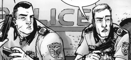
Finally, Tony Moore’s drawing style is roughly 3-3 on the abstraction grid, so it shows both a moderate amount of detail (translucent) and a moderate amount of contour warping (idealization). Arguably, the figures show a level of 3-4 abstraction, with intensified contours. In the second panel, Shane is impossibly wide and Rick impossibly thin, with Rick’s head roughly half the width of Shane’s shoulder.

shane and rick abstraction

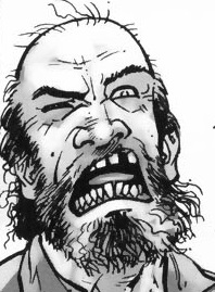
The effect characterizes each through visual exaggeration and further establishes them as foils. Meanwhile, the shooter’s head contrasts the straight lines that compose Rick and Shane’s bodies with frenetic lines and lopsided features.

crazy guy

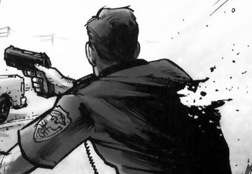
Though the effect is more striking, the shooter’s lines contours remain within an idealized range. Rick’s bullet wound, however, is intensified or even hyperbolic.

rick's wound

Since no human being could survive a wound that extreme, the image creates higher closure demand after the page turn because we retroactively understand the image to be exaggerated. There’s an overt abstraction gap between what is drawn and how it is drawn. And because a literal understanding of the image contradicts the story, we ignore it (diegetic erasure).

http://s13.postimage.org/9r9twl3pz/image.jpg

The leap to page two is major in other ways too. The image requires a great deal of temporal closure with details that also require a range of casual closure. After being shot, Rick was taken to a hospital–perhaps by paramedics in an ambulance, though most of the casual facts go unconfirmed. He is in a bed in a bedroom, not a critical ward or operating room, so presumably his wounds were successfully treated and he was left to recuperate. The time gap is ambiguous, but his beard growth suggest several days.

The framing marks a major change too. Though still symmetrical, the full-page panel is also expansive. Rick’s figure is the subject, but a great deal of the surrounding room is drawn for a spacious effect unlike the previous page’s variously proportionate and abridge panels. The angle of perspective shifts from parallel to downward, so we are no longer viewing the image as a character would but as if from a more omniscient vantage.

The style of abstraction has shifted too. While Rick remains at 3-3 (translucent idealization), the room is closer to 2-2 (semi-translucent generalization). The level of detail is much greater than on the previous page and the line contours are only warped slightly below the level of photorealism. Notice the line quality of the shadows and reflected chair legs on the floor.

The 2-2 image is also a full-page panel, giving it further significance. When the first zombie later appears on page six, we retroactively fill in additional closure into the temporal gap: the zombie apocalypse occurred while Rick was unconscious and safe behind his bedroom door. Page two is the most significant image in the issue, because it is 1) the most detailed and least abstracted image in a stylistic context of less detail and higher abstraction, 2) the first of only two full-page panels, 3) the most expansively framed image, and 4) the image demanding the highest amount and range of closure.

There’s plenty more visual analysis available on these two pages (haven’t even started to talk about the difference in Moore’s rendering of sound effects and speech yet), but you get the picture.

Utilitarian Review 1/23/16

08981131bf34f1a21ff4300ba7509be5.920x926x1

 
On HU

Featured Archive Post: Brannon Costello on Christopher Priest and Jack Kirby’s Black Panther.

Subir Dey discusses some of the most important publications in the history of Indian comics.

Chris Gavaler looks at Bill Sienkiewicz’s various levels of abstraction.

Me on Valerie June and better american music.

Me on progressives shaming people for their labor.

Robert Stanley Martin with on sale dates of comics for nov/dec 1951, including lots of EC.
 
Utilitarians Everywhere

At the New Republic I wrote about how the biggest threat to minors who trade sex is the police.

At the Establishment I wrote about how nobody appreciates me enough.

At Splice Today I wrote

—about Freddie deBoer and the virtues of performing progressivisim.

the last David Bowie think piece.

At the Reader I reviewed the britpoppy Chicago band Kerosene Stars.
 
Other Links

Great Pitchfork interview with Dawn Richard, in which she name drops Shakespeare, Klimt, and Aphex Twin.

Kevin Drum on the problem with the NRO anti-Trump issue.

Charlotte Issyvoo on why as a trafficking survivor she found academia to be horrible.

Better American Music


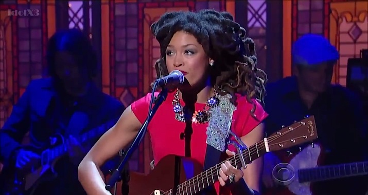
valerie-june-live-letterman-lead

 
This first ran on Splice Today.
_______

At the dawn of mass-market commercial recordings in the 1920s, record companies divided race records from hillbilly music. The first were intended to target blacks; the second were marketed to rural whites. In many ways, this division was arbitrary; rural black and white music was not that distinct. Recent scholarship has, for example, shown that black musicians played on many hillbilly recordings, suggesting that integrated sessions were not that uncommon. Black and white collaboration has continued throughout American music — and yet, at the same time, that race/hillbilly distinction has become a self-fulfilling prophecy. R&B today is a ton different from country, in no small part because the marketing insistence that the two musics had to be different helped create two different, segregated traditions. What could have been one became two.

Valerie June’s album from earlier this year, Pushin’ Against A Stone, presents a possible version of what might have happened if that split had never happened. The first song, “Workin’ Woman Blues” is a barreling, bizarre, perfect mash-up of styles; June starts with a folk-blues percussive strum and then launches into a shattering nasal vocal that would do Sara Carter proud. “I ain’t fit to be no mother/I ain’t fit to be no wife/I been workin’ like a man/I been workin’ all my life,” she declares, as the music cockily struts towards, of all things, swinging funk — and then, right after she multitracks herself for a line, we get a full on Memphis horn line, which veer into jazz. That’s 90 odd years of music condensed into 3 minutes of seamlessly awkward awesomeness. The song is a Frankenstein monster of backwoods cool.

The rest of the album is somewhat lower key, but it’s never less than great. “Somebody To Love” finds the sonic link between doo wop backing “ooo”s and bare country fiddle while June plays ukulele and lets her vocals lean into Booker T. Jones’ (!) dreamy organ backing with those paint-stripping vocals, exquisite pain and pleasure. “The Hour” is straight up girl-group sung so hillbilly it makes you wish Hank Williams had done a session or two backed by the Shirrelles. “Tennessee Time” is slow-tempo hippie folk, complete with exquisite mandolin and a buddy good time chorus where June’s keening vocals jump ahead and soar above her male duet partner, raggedly perfect.   “Pushin’ Against a Stone” has a distorted wailing pyschedlic guitar set against a Stax rhythm backing while June does old school $&B that is actually old school — none of this neo crap. On “Shotgun” she sings a bloody minded blues country death song, her voice keening and wailing besides her remarkable slide guitar work. And then, improbably, the album closer, “On My Way,” lifts the tune from “Friend of the Devil” — which is, as it turns out, a great song if you can find a great singer to sing it.

You could argue that the inspirations here aren’t as diverse as I’m suggesting; the nasal Hank Williams vocals could come from Shirley of Shiley and Lee instead; the acoustic gospel of “Trials, Troubles and Tribulations” could derive from singing preachers like Washington Phillips rather than from the Carter Family. You listen to the tough blues of “You Can’t Be Told,” and June’s nasal voice seems to derive more from Howlin’ Wolf than Bill Monroe. But that’s what’s so glorious about the album; black/white, rural/urban — it all sounds like a single tradition. It’s almost as if Howlin’ Wolf and Bill Monroe both loved Jimmie Rodgers, as if the Carter Family and rural black singers shared a love of the same spirituals, as if poor rural whites played R&B instead of country. Pushin’ Against the Stone is just like the music we’ve got, only better.