Analyzing Comics 101: Visual Sentence vs. Page Layout

Having taught my spring term seminar Superheroes a half dozen times now, I’m converting it to one of the gateway courses for Washington and Lee students entering the English major. The overhaul means jettisoning the pre-history of the genre (I love that stuff, but I could just hand my students On the Origin of Superheroes and be done with it) and focusing much more on comics as an art medium. So I’m trying to boil down the basics, the must-know criteria for analyzing a comic book.

So now it’s time to invite Neil Cohn to the lectern. If you haven’t read his The Visual Language of Comics, please do. Meanwhile, here’s my boiling down of his visual language grammar.

Narrative panel types: images may be categorized according to the kinds of narrative information they contain and how that information creates a visual sentence when read in sequence:

Orienter: introduces context for a later interaction (no tension).

Establisher: introduces elements that later interact (no tension).

Initial: begins the interactive tension.

Prolongation: continues the interactive tension.

Peak: high point of interactive tension.

Release: aftermath of interactive tension.

Cohn only looks at comic strips, which typically express a single sentence in a linear arrangement of three or four panels, but longer graphic narratives can express multiple sentences on a single page or extend a single visual sentence over multiple pages.  To analyze the different ways that can work, I’m adding some terminology to Cohn’s.

Closed sentences: two sentences that begin and end without sharing panels.

Overlapping sentences: sentences that share panels.

Interrupted sentence: an overlapping sentence that does not complete or initiate its tension before another sentence replaces it; sentences might share an Orienter, or an Establisher may introduce two elements that do not interact until later as a form foreshadowing.

Dual-function panel: in overlapping sentences, one panel performs two narrative functions. A panel may, for example, serve as the Release of one sentence and also the Orienter, Establisher, or Initial of the next. Or an Orienter may  serve as the Establisher of an interrupted sentence that initializes tension later.

Sentence Layout: the relationship of visual sentences to pages.

Page sentence: a sentence that begins with the page’s first panel and ends with the page’s final panel.

Multipage sentence: a sentence that extends beyond one page.

End stop: a page and a visual sentence end simultaneously.

Enjambed: a page ends before the visual sentence ends, also called a visual cliff-hanger.

This is all awfully abstract, so let me give specific examples from The Walking Dead again.

Robert Kirkman and Tony Moore like enjambment. Their first issue includes several cliff-hangers. The bottom row of page five begins with an Establisher (introducing the door to the already established figure of Rick), is followed by an Initial panel (Rick removes the piece of wood holding the door closed), and ends with a Peak (Rick is opening the door).

http://s13.postimage.org/5yqbguo7r/image.jpg

But the Release only appears after turning to page six. That full-page panel is also a dual-function panel because it serves as the Establisher (introducing the zombies to the already established Rick) for the next, overlapping sentence.

http://s13.postimage.org/osc4dumfr/image.jpg

The turn from page nine to ten is similar. The first panel in the bottom row of page nine is an Establisher (Rick and the bicycle), followed by the page-ending Peak of Rick’s shocked reaction. The top of page ten provides the Release (we finally see what he sees).

http://s13.postimage.org/5sh7ri4gn/image.jpg

 http://s13.postimage.org/548d8k5qv/image.jpg

A similar grammatical pattern repeats on pages thirteen and fourteen. The first panel in the bottom row of thirteen is an Orienter. The second is an Establisher (Rick’s face seems to be reacting to something, a sound presumably), and the last panel is an Initial. Turn the page, and there’s the Peak.

http://s9.postimage.org/5ejovcyn3/image.jpg

http://s9.postimage.org/aeh53b49r/image.jpg

The visual grammar also shows that cliff-hangers only work on the final panel of a two-page spread, in order to prevent a reader’s eye from skimming to the critical image prematurely (which happens in my arrangements above).

Also, Moore and Kirkman don’t always enjamb their visual sentences. Page one, for instance, ends on a Peak. The page also begins with an Initial, followed by four Prolongation panels. Page one is a complete page sentence, both beginning and ending on a single page.  

http://s13.postimage.org/q0zzzhedz/image.jpg

Instead of a Release, the next page begins with an Orienter (Rick in his hospital room) for the next visual sentence, which does not overlap.

http://s13.postimage.org/9r9twl3pz/image.jpg

In terms of interrupted sentences, page ten begins a new visual sentence with the top Establisher (introducing the bicycle zombie to the already established Rick), followed by two Initials (Rick and the zombie interact) in the second. The bottom row begins with two Prolongations, followed by a Peak (Rick’s tear) and a Release (the zombie closes its mouth).

http://s13.postimage.org/548d8k5qv/image.jpg

The visual sentence appears to have ended when the next page begins a new sentence with no further interaction between Rick and the zombie. So page ten reads as a complete page sentence, until the bottom of page twenty-three continues the interaction with a Prolongation panel, retroactively showing that the visual sentence was interrupted.

http://s9.postimage.org/5fy82ipun/image.jpg

Page twenty-four provides a new Peak (Rick shoots the zombie), followed by two Release panels (Rick looking down, the zombie with a bullet hole in its forehead).

http://s9.postimage.org/54grpr9en/image.jpg

Rick’s tear is also a Prolongation of his tear on page ten, an additional overlapping sentence that reaches its Peak in the next panel when Rick wipes the tear away. The final three panels are Releases. They’re also their own overlapping, three-panel sentence: Initial (Rick and the car), Peak (Rick gets into the car), and Release (car has driven off).


Paul Klee Misplaces an Aircraft

Klee_1922_Senecio_PLZ-167

 
I first encountered Donald Barthleme by way of The New Yorker Fiction podcast where I heard an excellent reading of his story “I Bought a Little City”. I consequently set about devouring everything of his I could find. He now holds a secure place in my pantheon of favourite writers, wedged somewhere between Richard McGuire and P. G. Woodehouse.

One has the sense when reading Barthleme’s work of the empirical and the insane being held in tight proximity to one another. In his handling of form Barthleme can be highly precise on both the sentence and story level. He had a background in architecture, which perhaps lent him a drive toward the empirical. At the same time, within and around this precisely measured prose, Barthelme’s writing is often experimental, and chaotic. One of his stories, for example, is a single perfectly correct sentence which runs for several pages. His protagonists, similarly, in perfectly rational terms contained within a perfectly rational structure, display extremes of emotional instability and indulge in behavior which borders upon insanity.

One of my favourite Barthleme stories (of which there are many) is “Engineer-Private Paul Klee Misplaces an Aircraft between Milbertshofen and Cambrai, March 1916”. The story is a meager two and a half pages of prose which detail, as the title suggests, the disappearance of an aircraft. Exactly how or why the aircraft in question has come to be misplaced is never explained. This, for me, epitomizes Barthleme’s brilliance – for an aircraft to vanish is implausible (they are large and thus hard to misplace), and yet the fact of not seeing the thing one expects to see – the thing one could have sworn was there a moment ago, the rising panic as one realises that one will be tasked with providing an explanation for an error which remains beyond one’s own understanding – feels very familiar.

The disappearance of the plane is described alternately by the eponymous Paul Klee, and by the Secret Police, who have been watching him. The title and the style of the prose suggests the exacting empiricism of an inquest. The Secret Police prove to be equally baffled by the aircraft’s disappearance as Klee, however. Indeed, the Secret Police are less concerned about the missing aircraft or apportioning blame and far more concerned about their own loneliness, which borders upon existential dread. ‘There is a secret sigh that we sigh, secretly’ The Secret Police say. ‘We yearn to be known, acknowledged, admired even.’ When Paul Klee decides to alter the manifest, thereby hiding his error, the Secret Police applaud this decision, adding ‘[w]e would like to embrace him as a comrade and brother but unfortunately we are not embraceable.’

Barthleme speaks to me because he has little truck with power. His sympathy is not with those who demand explanations, but with the poor souls caught in the business of being human. He embraces the ways in which rational structures, be they literary, legal, or political, can contain and even exacerbate those volatile and emotionally-charged elements which would appear to be their antitheses. We often view madness and marginalisation as connected – that madness disqualifies one from holding any kind of power. Indeed, it is many a lazy writer who makes an antagonist or clown ‘crazy’ in order to discourage examination or viewer empathy. Barthleme shows us, however, that those individuals who have apparent power – soldiers protecting nuclear missiles, teachers, billionaires, the secret service – are just as ‘mad’ as the powerless. Indeed, Paul Klee seems to suffer far less than the individuals who police him – he likes to draw, he eats chocolate, he has a romantic partner, whereas the ‘omniscient’ Secret Police just want to be loved.

Barthleme also appeals to me because he realises that human beings are ridiculous. For Barthleme, above and within the humdrum of the everyday is a palpable turmoil, where the decisions made by the hegemony seem to be founded upon eminently non-empirical motivations. What separates Barthleme from the Kafkas of the world is his pathos. All of his characters, even the most unhinged and dangerous, seem to be palpably human, and Barthleme, if he does not love them for it, at least allows them to exist as they are without judgment. The Secret Police, like so many of Barthleme’s characters, stagger under the weight of a power they are utterly unsuited to wield. They do not realise it, but their power and their sorrow are deeply imbricated. Barthelme does not hate the Secret Police – he wants to throw a blanket over their shoulders and tell them that everything is going to be okay. Their ridiculousness is protected and even facilitated by the unbending structures which surround them. Humanity, perfectly broken as it is, endures through chaos in Barthleme’s works. Aircraft vanish, careers come under peril, nuclear warheads are guarded by maniacs, cities are purchased by love-sick tyrants, and yet, as Paul Klee says ‘drawings and chocolate go on forever.’

Utilitarian Review 12/26/15

the-hateful-eight-samuel-l-jackson

 
On HU

Short week this time out because of the holiday.

Featured Archive Post: Richard Cook with a history of Storm in covers.

Me on Charles Dickens fan fiction and how fan fic and criticism and art are all the same.

Chris Gavaler looks at panels and framing in comics.

Robert Stanley Martin with on sales dates of comics from March and April 1951.
 
Utilitarians Everywhere

At Playboy

— I ranked every character in Quentin Tarantino’s movies. 16000+ words for 183 characters.

—I had a list of this year’s biggest whitewashing casting controversies.

At the Guardian I wrote about

—erasing the lesbian origins of the Bechdel test.

casting a black Hermione and the confused racial themes of Harry Potter.

At Quartz I wrote about race in Hateful Eight.

At Random Nerds I wrote about the Last Days of Ms. Marvel and apocalypse from the margins.

At the Los Angeles Times I wrote about this year in outrage.

At Splice Today I wrote about

—the three best country albums of 2015.

best of lists and the marketing machine.

Analyzing Comics 101: Rhetorical Framing

I’m stealing an idea from Thierry Groensteen, from his 2013 book Comics and Narration. After discussing “regular page layout” (pages with rigid panel grids), Groensteen describes “rhetorical layout, where the size (and sometimes the shape) of each frame is adapted to the content, to the subject matter of the panel.” Groensteen then goes on to talk about the relationships of panels to each other, especially “irregular” layouts that have “no basic structure,” but he doesn’t talk much about subject matter. So his “rhetorical” layout may be the same as any “irregular” layout, in which case the term is superfluous.

Except his definition, “the size (and sometimes the shape) of each frame is adapted to the content,” is really useful. But it doesn’t define a type of layout. It defines a type of framing. In fact, it defines all types of framing, since a frame always has some sort of relationship to its subject matter. And this is true whether panels follow a rigid grid or if the layout is irregular, because the rhetoric has to be analyzed one panel at a time.

So let me offer additions to Groensteen’s term.

Framing rhetoric: the size and shape relationships between frame and subject.

Symmetrical framing: the subject and frame are similar shapes.

Symmetrical and proportionate: the subject and frame are similar shapes, and the subject fits inside the frame; because content and frame are balanced in both size and shape, the effect draws no attention to their relationship and so appears neutral.

Symmetrical and expansive: the subject and frame are similar shapes, but the subject matter is smaller than the frame, so the panel includes surrounding content. The effect is spacious.

 Symmetrical and abridged: the subject and frame are similar shapes, but the subject is larger, so the frame appears to crop out some of the subject. The effect is cramped, as if the subject has been sized too small.

Symmetrical and broken: the subject and frame are similar shapes, but the subject is larger, with elements of the subject extending beyond the frame. The frame-breaking elements are often in movement or otherwise expressing energy, implying that the subject is more powerful or significant than the frame.

Symmetrical and off-centered: although the subject and frame are similar shapes and the subject appears as if it could fit the frame, the frame appears to crop out some of the subject while also including surrounding content. The effect is of a misaimed camera.

Asymmetrical framing: the subject and the frame are dissimilar shapes.

Asymmetrical and proportionate: although the subject fits inside the frame, because of their dissimilar shapes the panel includes surrounding content.

Asymmetrical and expansive: because the subject is smaller than the frame, the panel includes surrounding content, and because of their dissimilar shapes, the panel also includes additional surrounding content.

Asymmetrical and abridged: the subject is larger than the frame in one dimension, creating the impression of the frame cropping out content, and because of their dissimilar shapes, the panel also includes surrounding content. The effect is an image placed in the wrong shaped panel.

Asymmetrical and broken: the subject is larger than the frame, with elements of the subject extending beyond the frame edge; because of their dissimilar shapes, the frame-breaking elements further emphasize imbalance.

Asymmetrical and off-centered: although the subject appears as if it could fit inside the frame, the frame appears to crop out some of the subject while including some surrounding content; and because of their dissimilar shapes, the panel also includes additional surrounding content. The effect is of a misaimed camera.

Unframed image: an image with no frame. (Duh!)

Secondary frame: surrounding panel frames border an unframed panel.

Implied frame: an unframed image implies a symmetrical and proportionate frame, while usually remaining inside its undrawn borders.

Interpenetrating images: adjacent unframed images and their implied frames overlap.

Secondary frames, implied frames, and interpenetrating images may be analyzed in the same rhetorical relationships of size and shape as framed images.

That’s all really abstract, so check out some examples:

Nick Fury’s body fits inside the full-height column but intrudes into the second column. The unframed panel is symmetrical and broken.

With the exception of the top right close-up, each panel shows Beast’s whole (or nearly whole) body, which is drawn to fill the shape of the panel, and so is symmetrical and proportionate. 

Wolverine’s body, however, does not entirely fit; his feet, part of his arm, and the top of his head are cropped. The column panel is symmetrical and abridged.

The top panel is symmetrical and proportionate. The second panel crops the face (part of the lower lip and both eyebrows are missing) but includes a lot of surrounding space. The panel is asymmetrical and abridged, as is the third. The last is symmetrical and proportionate again.

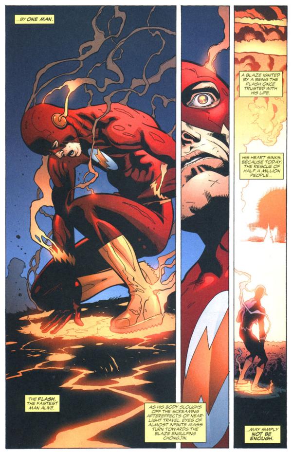
The first panel is asymmetrical and proportionate (or off-centered depending on whether you consider his elbow primary content). The second column is drawn as if too thin to contain all of Flash’s face, so the panel is asymmetrical and abridged. The last is asymmetrical and expansive.

The top panel is asymmetrical and expansive, with detailed elements of the wall in the foreground.  The bottom left panel contains Spider-Man, but with ample additional space around the figure, so that non-essential elements of the city landscape are included in the frame. The panel is symmetrical and expansive.

The bottom, page-width panel includes its two primary subjects, Batman and Alfred on the balcony behind him, but the angle and distance includes additional content, including the entire moon, distant buildings, and the wall below the balcony. The panel is symmetrical and expansive.

The second row includes a face with a corner of an eye and mouth cut off. The panel, however, is large enough to include those complete features, but the subject has been drawn off-center to produce the cropping effect. The panel is symmetrical and off-center.

The face in the bottom left panel is cut off at the mouth, even though the subject matter could be drawn higher in the panel to include the entire mouth. The panel is symmetrical and off-centered.

The top right panel content could be composed to include Cyclops’ face, but instead his head is more than half out of frame. The panel is symmetrical and off-centered.

The top panel is wide like the subject matter of the street and so is symmetrical and proportionate. The subject matter of the second frame (the heads of the passenger and the driver visible through the car window) fit the frame, but the frame shape extends to the left to include the reflection of a building in a backseat window, so the panel is asymmetrical and proportionate.

,

The width of the second panel of “Avengers Mansion” also includes several distant buildings, the front yard, and fence–elements included as if the wide panel shape requires a view of more than the primary subject of the mansion front. The panel is asymmetrical and proportionate.

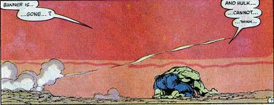
Not only is the subject of the Hulk much smaller than the frame, the frame itself is shaped so that it must include more than the subject. The panel is asymmetrical and expansive.

Image result for comic book pages

The shape of the full-width panels of  the second and third rows extend beyond the subject of the two figures. The panels are asymmetrical and expansive.

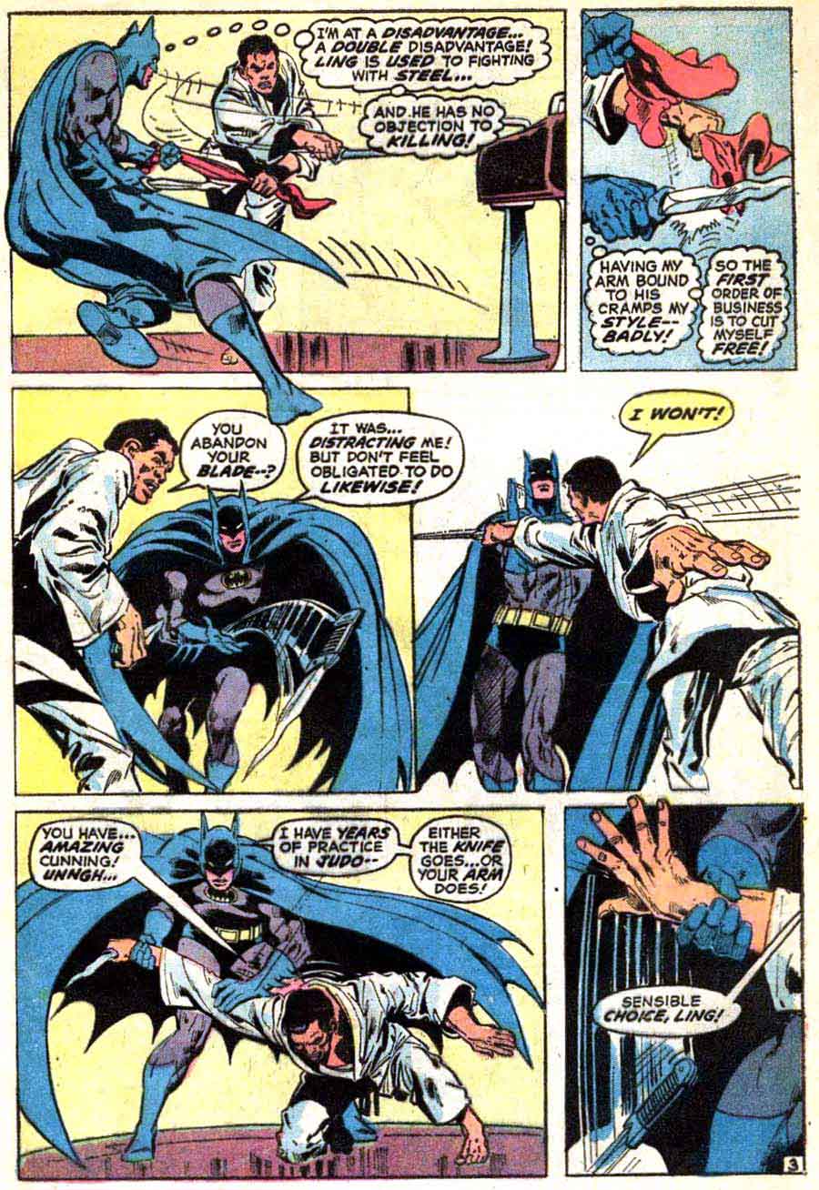
Batman’s leg extends beyond the frame, as if his movement was too fast for the frame to capture. The hand in the final frame also breaks the panel border, again emphasizing action. The panel is asymmetrical and broken.

Every panel of the fight scene but the last is symmetrical and broken. The last is symmetrical and off-centered, cutting off Bucky’s chin while leaving space above his head.

The second row begins with a symmetrical and expansive panel; the second panel is symmetrical and proportionate; and the third symmetrical and abridged. The sequence suggests physical and psychological intensification, but exclusively through framing since the Hulk’s expression remains essentially unchanged.

The first panel of a figure stepping through a door is symmetrical and proportionate. The next symmetrical but expansive panel includes its subject matter (the individuals in the classroom and the classroom itself) but also the darkened top of (presumably) a bookshelf. The spaciousness contrasts the cramped effect of the subsequent panels which are mostly asymmetrical and abridged, except for the second which is symmetrical and abridged.

And, on a last note, I intend to use framing rhetoric instead of film terms for camera distance (close-up, medium shot, etc.), because the film terms don’t account for frame shape (in film the frame shape typically does not change). Also, “camera distance” doesn’t suit a drawn image because there is no camera and so no distance between it and the subject; there’s just the subject and the frame.

Fan Fiction Is Criticism Is Art

This was one of those pieces where I said to myself as I was writing it, “I can’t believe a mainstream magazine is going to print this! That’s so cool!”

And as ever when I say that to myself, the editor who had accepted the pitch looked at it and didn’t get it. So, I thought I’d run it here for my patrons. This is my third Twisted Mass of Heterotopia column; if you like it, please consider donating to my Patreon so I can write more pieces like this.
______________________

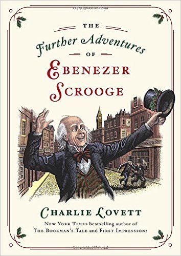
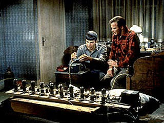
51xPgshGb8L._SX352_BO1,204,203,200_Fan fiction is despised. Criticism is despised. And both are despised for the same broad reason; they’re seen as parasitic. If a critic was a real artist, the critic would make a film rather than just writing about how superhero films are crap. If a fan fiction writer were truly creative, that fan fiction writer would develop their own characters and plots, rather than having Spock pour his heart out to Kirk for the gazillionth time. Great artists are originals; fan fiction writers and critics are derivative copyists, battened, like great aesthetic mosquitoes, upon the blood of their betters.

Charlie Lovett’s The Further Adventures of Ebenezer Scrooge must be doubly derivative, then, since it is both fan fiction and literary criticism. Lovett is best known for his best-selling book-centered mystery, The Bookman’s Tale. But in The Further Adventures he moves from broad bibliphilia to individual homage—or individual theft, if you’d prefer.

The short novella picks up twenty years after the end of Dickens’ famous A Christmas Carol. The formerly miserly Scrooge is now as renowned for his manic generosity and good will as he once was for his ill temper. “A generous, charitable, jolly, gleeful, munificent old fool, yielding as a feather pillow that welcomed the weariest soul to its downy breast,” as Lovett describes him in solid faux Dickensian prose. Determined to do even more good, Scrooge calls upon the Christmas spirits to work their nighttime magic on others: his newphew, his former-assistant-now-partner Bob Cratchitt, and his bankers. The result (spoilers!) is additional joy on earth for all.

The story is mostly an excuse to visit with Scrooge again, and for Lovett to splice in various passages from Dickens (the description of the the London slums from Bleak House, for example) with his own pastiche. But while the book is mostly tribute, it also functions as a criticism of the original novel. Early on, it mildly tweaks Dickens’ sentimentalism; Scrooge’s unfailing good cheer is, it turns out, as irritating as his former dyspepsia. Over twenty years, in fact, Scrooge’s “constant kindnesses had grown wearisome from years of use.” Is Scrooge generous, or is he, in his single-minded effort to store up treasures in heaven, really as selfish and unconcerned with others as he was in his single-minded miserliness? Maybe the ghosts didn’t change him all that much after all.

The main critique though, comes in the second half of the novella, when the ghosts lead Scrooge’s nephew to run for Parliament, and inspire his bankers to set up a permanent charity. Dickens’ Christmas Carol presents personal transformation as the route to social good; God reaches down and makes the world a better place by changing Scrooge’s heart. Lovett, though, suggests that ghost Marley’s chains can never really be taken from him through individual acts of kindness. Real change, and really helping people, requires political power and institutional investment.

Lovett’s combination of fan fiction and criticism isn’t an aberration. On the contrary, literary fan fiction like The Further Adventures of Ebenezer Scrooge frequently includes, or is based upon, a critical reading of the original work. Jo Baker’s marvelous Longbourn (2013), for instance, is a reworking of Pride and Prejudice from the point of view of the servants. As such, it functions as a counter-intuitive, but powerful reading of the original novel. Suddenly, the Bennett household is built, not on the goodness and wisdom of Jane and Elizabeth, but on the raw hands and constant toil of the women below stairs who wash the sheets and make the dinner. And Elizabeth’s story is not so much about true love, as it is about the power and privilege which enable true love. “What it is to be young and lovely and very well aware of it,” the servant Mrs. Hill thinks while looking at Elizabeth. “What it is to know that you will only settle for the keenest love, the most perfect match.” Mrs. Hill could not settle for the perfect match; she fell in love with Mr. Bennett, had his child, then had to give the boy (Elizabeth’s half brother) away to avoid scandal. Austen’s vision of respectable, respectful love is only possible because she’s in a family, and a class, where they can afford respectable, respectful love. Other people aren’t so lucky.

Again, criticism is often seen as parasitic on original art. But in Longbourn, this is turned around. Jo Baker’s novel is essentially parasitic on critical insight. The kernel of the novel is the critical question, how is class erased in Pride and Prejudice? “The main characters in Longbourn are ghostly presences in Pride and Prejudice, they exist to serve the family and the story,” Baker says in an author’s note. “But they are—at least in my head—people too.” The commentary on, and critical reading, of Pride and Prejudice becomes a work of art of its own.

Jo Baker isn’t the only writer who builds her art on criticism. Jane Austen, famously, did the same in Northanger Abbey, a book which is a parody, or reworking, of the Gothic novels of Austen’s day. Just as Lovett questions the presuppositions of Dickens, and Baker questions the presuppositions of Austen, so Austen’s novel is an extended critique of the tropes of the Gothic. “No one who had ever seen Catherine Morland in her infancy would have supposed her born to be an heroine,” is Austen’s opening line—pointing not forward into the story, but backwards towards all those other Gothic narratives with extraordinary heroines. “She had a thin awkward figure, a sallow skin without colour, dark lank hair, and strong features—so much for her person; and not less unpropitious for heroism seemed her mind. She was fond of all boy’s plays, and greatly preferred cricket not merely to dolls, but to the more heroic enjoyments of infancy, nursing a dormouse, feeding a canary-bird, or watering a rose-bush.” Austen is criticizing, and questioning those perfect, feminine, marked-for-destiny Gothic heroines, just as Baker criticized and questioned Austen’s own sprightly, self-confident, self-determining ones. If Baker is parasitic on Austen, then Austen is parasitic on those Gothic novels — or, more directly, on a critical analysis of those Gothic novels. If Baker is Austen fan-fic, why isn’t Austen Gothic fan-fic?

Dickens’ Christmas Carol is not a direct parody or reworking of another story. But still, Lovett’s fan fiction seems so much in the spirit of the original in part because A Christmas Carol functions in a lot of ways as a criticism, or fan fiction retelling, of itself. Scrooge starts out as a “tight-fisted hand at the grindstone…a squeezing, wreching, grasping, scraping, clutching, covetous, old sinner!” That’s the iconic Scrooge…and then the rest of the book shows us what’s left out of the portrait, just as Jo Baker shows us what’s left out of Austen, and Austen shows us what’s left out of the Gothic. The ghosts don’t just transform Scrooge; they transform that original vision of Scrooge. We see his childhood; his love for his sister; his fiancé; we see, in other words, that the hard-hearted, miser Scrooge is not the whole story. Dickens could be seen as writing his own fan-fiction, creating an Elseworlds version of his own character. What if Superman had landed in Russia? What if Scully and Mulder had a passionate fling? What if Scrooge were a good man? That last is the premise of The Further Adventures of Ebenezer Scrooge — but it’s also the premise of A Christmas Carol.

Criticism, fan fiction, and original art seem like easily separable categories; Mark Twain’s works goes in the library, your online Twilight story about Edward and Jacob and all the things they do goes in the online forum, this essay you’re reading right here is in the TNR books section. But Mark Twain wrote Arthurian fan fic (and criticism) in Connecticut Yankee in King Arthur’s Court. E.L. James’ Twilight fan fic went to the best-sellers list. This essay is, admittedly, not likely to enter the western canon, but still, I contend that it’s inspired by the same impulse as Baker’s Longbourn, or Northanger Abbey or those further adventures of Ebenezer Scrooge. For art, for criticism, or for fan fiction, the question is always the same. How might this story be changed? Questioning the world, playing with the world, and creating the world — those things aren’t so different. We can maybe even write a story, or an essay, if we’d like, and imagine a place, much like this one, where they’re all the same.

Utilitarian Review 12/19/15

320x240

 
On HU

Featured Archive Post: Caroline Small on Ivan Bilibin’s Russian Folktale illustrations.

Philip Smith on the thoughtful messiness of Serial.

Chris Gavaler on Darth Vader, superhero.

Chris Gavaler analyzes page layout and character in the Walking Dead #1.

Links to all my Star Wars articles.

Robert Stanley Martin with on sale dates of comics from early 1951.
 
Utilitarians Everywhere

At Quartz I wrote about prosecutorial overreach, mass imprisonment, and the campaign against Anita Alvarez.

At Playboy I got to list the best albums of the year (that no one else puts on their best of lists.)

At Pacific Standard I argued that children should have the right to vote.

At the Establishment I wrote about:

The City on the Edge of Forever and how everyone wants to kill baby Hitler.

my giant insane smelly greyhound.

At Splice Today I wrote about

Cruz temporarily forever.

—how the Force Awakens probably isn’t so great.

At the Chicago Reader I reviewed the classic Chicago death metal of Usurper.
 
Other Links

Angus Johnston on why college protest isn’t a threat to free speech, and isn’t always civil.

Daniel Larison on our support for the awful war in Yemen, and how no one even mentions it.