Bad As It Wants To Be

A version of this review of the Catwoman movie ran several years back in the Chicago Reader.

Bad As It Wants To Be

Some of the earliest sexual fantasies I can remember involve Catwoman. Specifically, they center around a Batman audio recording I listened to when I was eight or younger. I can’t remember where I was at the time, and I’m pretty sure I heard the tape only once. Nonetheless, I remember the plot clearly; Catwoman had developed a kind of super-catnip, and she used it to control Bruce Wayne’s mind and force him to help her steal jewels. I could go on in detail; the story’s extremely muted eroticism was seared into my pre-adolescent brain, even though — or perhaps because — I didn’t know exactly what catnip was. From context, I vaguely assumed it involved needles, a misunderstanding that it took me at least another ten years to clear up.

The specific details of my, um, relationship with Catwoman are idiosyncratic, of course, but the fact that I have a relationship isn’t. She may not be Mickey Mouse, but it’s safe to say that a large number of people have thought about Catwoman in the 60-plus years since she was first invented by Bob Kane. She’s a firmly established part of what comic-book writer Alan Moore calls the “fictional planet — the place we have with us ever since we started listening to stories.”

Moore adds that “We spend a lot of time in these imaginary worlds, and we get to know them better than the real locations we pass on the street every day.” This is why making a movie about Catwoman — or Spider-Man, or King Arthur, for that matter — is such good business; the audience already knows and loves the people in the film. It’s almost like watching a friends’ home movies. Critics forced to sit through uninspired sequel after uninspired sequel often start moaning about late capitalism, or marketing machinery, or Hollywood’s general lack of daring. But the truth is that the public has always liked to hear about the same damn people doing the same damn things over and over and over. Today, we call these pulp stories; they used to be called myths.

The argument that super-heroes are somehow the latest incarnation of a universal, Joseph-Campbell-approved Bildungsroman is frankly preposterous, no matter how often it’s wheeled out by desperate comic-book fans. Superman is not Zeus, and the Elongated Man is not the holy lingam. But while the content of pulp and myth may be different, the way they are produced has some similarities. Myths had no single creator; they were group productions; lots of poets and singers and just ordinary folks told each other stories about the gods, adding to them as they went. But nobody owned them — they belonged to everyone. In pulp stories, of course, we generally do know the actual originator; we can point to Edgar Rice Burroughs and say, there’s the guy who made up Tarzan. Nonetheless, the creation often looms so much larger than the creator that it eclipses him or her altogether. Today Tarzan is as much a creature of Johnny Weissmuller as of Burroughs, and perhaps even more a product of the people who worked on that animated cartoon, whoever they were. He’s a composite creation, cut off from Burroughs in a way that Hamlet, for instance, will never be cut off from Shakespeare.

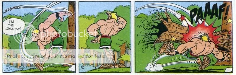
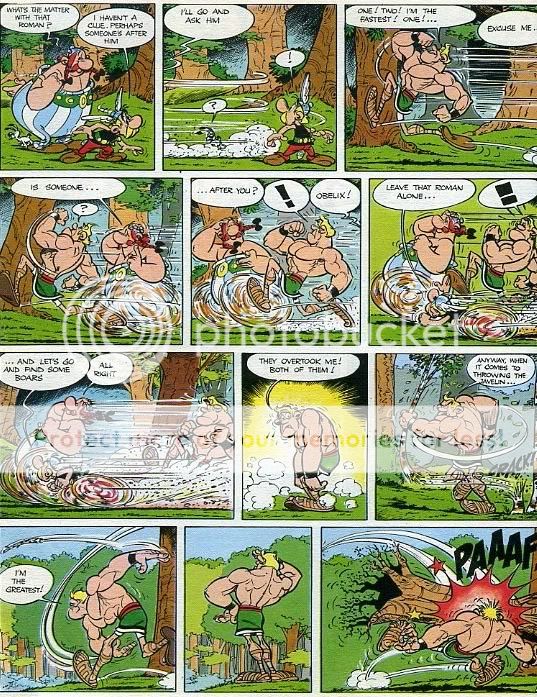
Super-heroes may be our cultures’ most communal possessions for the paradoxical reason that comic-books are so little read. For most people, if a movie or television character originated in a comic-book, he might as well just have sprung full-formed out of nowhere. This gives super-heroes a certain fluidity, which is, again, similar to mythological figures. Just as Argus had anywhere from four to a hundred eyes, so a single super-hero may change radically from story to story, depending on who’s doing the telling. In the first Superman comics, for example, our hero could only jump, not fly; in the Christopher Reeve movie, he can make time run backwards by reversing the direction of the earth’s rotation, a preposterous idea that I’ve never seen utilized in a comic-book. Sometimes Superman is married to Lois Lane, sometimes he isn’t. And what about the “alternate-universe” story where the infant child rocketed from Krypton is found, not by the Kents, but by an Amish family, and so becomes a pacifist, with tragic consequences for all?

If a major figure like Superman is treated with such freedom, a minor one like Catwoman must count herself lucky if she’s even vaguely consistent from appearance to appearance. In fact, as the excellent fan-produced Feline Fatale website amply documents, most aspects of the Catwoman character have been up for grabs over the years. Her origin has varied widely; at first she was an amnesiac stewardess (yes, that’s right, a stewardess), then an abused housewife, and now, thanks to writer Frank Miller, she’s a hard-boiled ex-S&M hooker who snaps out lines like “You know why I hate men?….Never met one.” Her powers, too, have come and gone; sometimes she has a whip, sometimes she has cats trained to do her bidding, sometimes she knows martial arts, and sometimes, of course, she has super-catnip. Even her costume has been reworked; early on she wore a full, furry cat-head replica; later she changed to a more manageable eye-mask and a purple knee-length dress with a green cape. Her most recognizable outfit — the catsuit — didn’t become de rigeur until Julie Newmar’s shiny, form-fitting debut on TV’s Batman series. In Batman Returns, Michelle Pfeiffer moved the franchise more firmly towards fetish gear, with a notoriously uncomfortable latex get-up; Pfeiffer had to use powder to slide it on. More recently, the comic-book Catwoman has been wearing goggles, of all things.

But though one has a lot of leeway when telling a Catwoman story, the character still has to be recognizable. That’s the challenge of writing about pulp icons; you have to come up with a way to make the story your own while making sure it remains everyone else’s too. A current success is the WB’s popular Smallville. The show is about Superman as a teenager, before he got his costume and all his powers. The series works as decent melodrama, and it gains much of the weight it has from the audience’s familiarity with the details of the Superman narrative — heat vision, Lex Luthor, Lana Lang, Krypton. In other words, its creators reference a shared body of knowledge, and by doing so, demonstrate their respect for both their material and their audience.

The same cannot be said of the people responsible for the new Catwoman movie. As an experience, the film is familiar enough, but it’s the familiarity of cliché, not archetype. One-named director Pitof’s visuals are relentlessly, anonymously stylish — one sequence on a basketball court could be mistaken for an exceptionally long and pointless soft-drink commercial, while another where cubicle workers speed up to show the passage of time looks like an ad for telecommunications software. The actors appear to be as non-plussed by the visuals as the audience; Sharon Stone is especially peevish, but everybody looks as if they wished they were someplace else. The plot, such as it is, involves toxic beauty cream and many, many shots of Halle Berry’s rear end. Among men, the financial success of the enterprise will clearly rest on the second of these; for straight women, the only possible attraction is the kitty cats. Be warned, however: there are many fewer cute feline reactions shots in the movie than you would have a right to expect from the previews.

Obviously, no one involved in this disaster cares anything at all about Catwoman. Even so, the script ignores the character’s legacy in a manner that can only be described as gratuitous For example, in all her previous incarnations, Catwoman’s alter-ego was named Selina Kyle. Now some secret identities — Dick Grayson, for example, or Oliver Queen — have aged poorly. But what on earth is wrong with Selina Kyle? Nonetheless, it’s gone; in the movie, Catwoman’s alter ego is…Patience Phillips. If that sounds a bit too much like Peter Parker, it’s no accident; Berry’s Catwoman has a lot more in common with Spider-Man than she does with the Batman villain. Just as Parker gains the proportionate strength and speed of a spider, Patience’s mystical cat benefactor grants her “fierce independence, total confidence, and inhuman reflexes.” With her super-self-esteem, Patience becomes Oprah Winfrey in a Mexican wrestling outfit, telling off all those who need telling off and boldly owning her consumer preferences. As an extra bonus, she gains many of the attributes of cats, such as fear of rain and — in a scene reminiscent of Splash — an unseemly appetite for raw fish. On the subject of litterboxes, however, the film is mercifully silent.

The one aspect of the traditional Catwoman character that the movie *does* seem interested in retaining is her moral ambiguity. In the comics, Catwoman began her costumed career as a burglar, and though she’s been reformed at various times and in various incarnations, she’s usually been kept at least a little villainous. Patience Phillips does, in fact, have a first-rate motive for turning to crime: she has just lost her job. Luckily, though, she is not the sort of girl who thinks like that or, indeed, who thinks much at all. When Catwoman does rather dutifully steal some jewels, it’s only because, you know, cats like bright, shiny things. In any case, Patience’s heart doesn’t seem to be in it — she almost instantly returns most of them in a bag marked “Sorry.”

Berry’s Catwoman, then, isn’t selfish or greedy or even especially angry. She just has poor impulse control. This neatly inverts the whole raison d’etre of the character. The old Catwoman was sexy because she was dangerous, skillful, and unattainable; Batman was attracted to her at least in part because she was a worthy foe. Berry’s version, on the other hand, is supposed to be appealing because she’s animalistic — i.e., sexually aggressive, spontaneous, and fun to be around. Most of all, she’s available: when a bartender leers at her, she doesn’t hand him his head, but instead almost purrs with appreciation. Berry’s up there to be eye-candy, and her desperate desire to be ingratiating makes all the tight leather and exposed collar-bones seem more than a bit pitiful. When Catwoman dumps Tom Lone (Benjamin Bratt) because she’s just gotta ramble, baby, it’s hard not to think that he’s well out of it.

At the film’s close, Berry’s Catwoman mews that she’s “bad as I want to be,” which is a little misleading In truth, Catwoman is as bad as *Warner Brothers* wants it to be; they’re the ones who made the movie and, moreover, the ones who own the rights to the character. That’s because even though Catwoman’s been around for more than half a century, and even though her creator is dead, she’s still under copyright. So are most super-heroes, which is a shame. At one time, tales involving communally created characters were told by whoever remembered and could best repeat them; nowadays they’re told by whoever happens to have the ear of a media oligarch. This produces some lame art, and it also keeps a lot of good art off the shelves; the excellent live-action Batman TV-show, featuring Julie Newmar and Eartha Kitt as Catwoman, has still not been released on DVD because of licensing disputes. More importantly, though, granting corporations the rights to ideas that have for all intents and purposes entered the public domain turns people into passive observers of their own culture, and of the insides of their own skulls. I don’t know about you, but I don’t particularly want Time Warner claiming ownership of any part of my psychic space. It makes me feel a bit like Patience Phillips/Catwoman: torn between two identities, each one stupider than the other.

Asterix and the Abstract Formalisms

As I’ve mentioned on the blog, I’m working on a series of abstract drawings based on comics pages from my youth. The most recent one I’ve worked on is a page from Asterix and the Olympic Games.

Copying the page has been a real eye-opener (semi-literally.) I first read Asterix when I was living in England during the third grade (my dad was on sabbatical at the time.) At that time, I probably liked Uderzo’s art well enough, but is was Goscinny’s (translated) stories — the manic, over-heated dialogue, the slapstick, the goofy puns, the running gags — which really appealed. For that reason, some of the later volumes, when Goscinny had died and Uderzo was doing the writing as well as the art — were especially unsettling. Everything looked right, but the writing was completely wrong: it was like seeing a corpse walking. The form was there, but the soul was gone.

Looking at the comic again, the writing is still marvelous, but I’m also amazed at the quality of the art. This sequence in particlar floored me:

The way the movement lines are incorporated as a composition element is lovely. The character occupying the left side of the panel is neatly balanced by the intersecting lines showing the circle of the hand and the flight of the sapling/javelin. Uderzo also narrows and twists the main big arc; looking at the lines, you can actually see the moment when the throwing hand turns over. The little puff and jump by the foot is eloquent — you can actually feel him hopping forward as he releases the javelin. Everywhere you look in the panel there’s movement, and your eye arcs from one path to the next. The position of the body is also amazingly well done, especially considering that this is a very cartoony figure. The twist of the torso, the slightly separated fingers of that left hand, the jaw lifted to watch the flight, and (again) that amazing little jump with the foot.

The body language in the second panel is perfect too. It’s narrower, so the figure is more centered, and it’s the first panel on the page with no movement lines, emphasizing that it’s a moment of stillness. The curve of the back and the cocky turned-out hand on the hip suggests the outthrust chest and the smirk that we can’t see. It’s a great pause for comic timing —followed by the climax, with all the comic tropes trotted out — stars, giant sound effect, stars, and impact effect. Again, the little detail of the puff of smoke and the movmeent lines by the feet kill me (and him!) The tightened hands are perfect, and I love the way that the left hand and foot are drawn on top of each other, so that at first it looks like his fingers are a blur. That roots on that tree he’s been bashed with are also really nice. And, of course, the movement lines showing the path of the tree mirror the ones in the first panel, as does the whole composition. Throw left-pause-bashed right: it’s a stream-lined, efficient comedic delivery system, professional in absolutely the best sense — as elegant as Bushmiller’s Nancy with, to my mind at least, a lot more energy and panache. After looking at it, I wonder if I should go back to those Uderzo-written volumes just for the art.

So, yeah, there’s nothing like trying to copy somone’s art to give you an appreciation of their craft (and the limitations of your own.) For those interested, here is the whole page, copyright Goscinny and Uderzo.

And here’s my version:

There’s a quote from my son in the bottom corner of mine: it says, “I am not married because I do not have a watch.”

Are Boys Safer?

Poking around the Internet I found this article by J.D. Ho on The Horn Book website which attempts to answer the age-old question why do girls love boys’ love manga. I think the question is a little overdetermined — why is any genre popular, after all? Super-heroes? Sci-fi? Isn’t it a little random that so many people are obsessed with tales about detectives hunting down a murderer? Any genre looks fairly arbitrary once you take a step back from it. As Ho does indicate, shonen-ai stories are extremely well-told and the art is excellent. Does there need to be another reason for people to read them?

In any case, the answer Ho comes up with, like the question, is familiar:

And herein lies the real appeal of boys’ love manga. It postulates that gender fluidity and change are ways we can identify with those who are different from us, experience new things, and, most importantly, achieve things that were impossible before. Just as in As You Like It, changing gender is liberating, an escape from parental strictures, and a means of getting the things one wants. We all need a safe place, a Forest of Arden, where we can try on different identities without consequence, a place where we can resolve our problems and face our fears — and boys’ love manga provides exactly that.

In other words, the appeal is that the reader can pretend to be something she is not, and so transcend her own boundaries and limitations in a safe space. Girls like to imagine boys because boys aren’t girls, and so the identification is safer and more fantastic. I think this line is especially telling:

If female readers are empowered by reading stories in which men are the romantic principals, they may derive the same feeling from stories in which gender is completely irrelevant in other ways.

So for Ho, the point of boys’ love stories and (as the essay goes on to argue) cross-dressing stories is that gender doesn’t matter, or is made irrelevant — it’s a way out of male/female binaries.

That position seems awfully questionable to me. Surely a large part of the appeal of boys’ love manga is that, you know, girls like boys. And if you like boys, why wouldn’t two boys be better than one? The fact that shonen-ai often blends into, or looks towards, the steamy sex in yaoi isn’t an accident these books are erotic. Girls like them because they’re romantic and sexy. If guys like to watch girls having sex (and they do), why wouldn’t girls like to watch guys having romance, followed by sex?

And ditto, for the gender-bending. Yes, experimenting with possibilities is liberating and exciting for the young girl coming of age etc. and so forth. But that liberation and excitement *are* liberating and exciting in large part because they carry a polymorphous sensual charge.

Boys’ difference isn’t safe — it’s sexy. Ho is writing on a site dedicated to children’s books, and I guess it’s understandable that they don’t want to tell the parents that little Sally reads these comics because she gets off on them. But I think she probably does.

Not sure if this is the illustrator or not, but I got this image from here.


Are You Token To Me?

As long as I’m obsessively blogging about gender issues, I thought I might weigh on the conversation Valerie Dorazo and Dirk Deppey are engaged in. Dorazo argues that more gay characters in comics would be a good thing and that someday gay characters will be (or at least should be) as well, um, integrated into mainstream titles as black characters now are. Deppey responds by saying, eh, who cares?

What strikes others as semi-homophobic callousness still strikes me as the mere inability of semi-competent commercial writers to cope with subjects outside their narrow capes-and-tights comfort zones. It either winds up in cheesy “Kid Flash lectures” or in determined attempts to write characters that are Just Like Everybody Else, which invariably ends in stories that downplay what make gay characters genuinely different from others and howls of half-cocked outrage when they get kicked around the same way that everybody else gets kicked around in these things. This goes beyond gay-related issues and speaks more to the limits of both genre and its practitioners in general: Did Brian K. Vaughan turn into an instant homophobe by putting gay Marvel characters briefly in danger, or was that week’s outrage just another example of how ludicrous the standards of online discussion have become? I’d have objected to that “I Am Curious Black” issue of Lois Lane, too — not because I object to women’s equality before the law but because it’s difficult to advance the concept before readers who are too busy with giggling fits to ponder the question.”

I think this is basically an argument about tokenism, which makes it also an argument, to some degree, about segregation and isolationism. Dorazo believes that, overall, any more or less positive representation is good. It combats prejudice, normalizes marginalized groups, and leads to greater peace, equality, and happiness for all. And if I got a little sardonic there…well, it’s hard to take it entirely seriously when the model for success in comics is black folks, who remain massively underrepresented as characters, and even more underrepresented as creators. In fact, its hard to think of another segment of the entertaiment industry other than country music in which people of color are so thoroughly absent and marginalized — and this despite the fact that mainstream comics has been engaging in various forms of tokenism for the last what? 40 years or so?

Dirk’s essay, on the other hand, reminded me of a speech I saw by Aaron McGruder at the University of Chicago. McGruder was answering a question about why he had cut all the female characters out of his comic. He said that he had done so because he knew more about male characters. He also said that he didn’t think it made sense to insist that every creator represent or talk about every demographic. He added that in general he would just as soon not have clueless white people trying to write blacks. As an example, he pointed to Smallville, in which Superman’s best friend is black. “What on earth is a brother doing in Smallville?” he sneered.

It’s a pretty funny point, but also a big more double-edged than McGruder may have intended. It’s true that black people are more likely to live in cities than in small towns — but that’s not an accident. Nor is it due to the fact that African-Americans like cities better than do Caucasians or Jews. Rather, black people live in cities because of a history of segregation and racism. As James Loewen quite conclusively argues in “Sundown Towns,” blacks in the north used to be fairly evenly distributed in urban and rural areas. Then in the post-Reconstrution era, race relations became much worse, and blacks in a huge number of small towns were forced out by threats, lynchings, race riots, and other forms of violence. In defense, blacks congregated in cities, where the more anonymous nature of urban living and their relatively large numbers made them impossible to dislodge (though some cities did try.)

In other words, McGruder is mocking the idea of enforced integration, and using as his argument an example which points back to a history of enforced segregation. I think Dirk is doing something similar when he defends super-heteroness on the grounds that, hey, who wants to hear clueless straight dudes talk about gayness anyway? On the one hand, of course, he’s absolutely, and clearly, right. But why are comics writers so especially clueless about this issue? After all, there are a lot of super-hero comics about, say, environmental concerns which, while not especially or necessarily great, aren’t noticeably dumb by the genre’s standards of story-telling.

It seems to me that super-hero comics — in their content and demographics — are especially ill-suited to deal with gender and sexuality. Masculine bonding and masculine fantasy are at the core of what super-hero comics are about. I think that’s why tokenism is going to generally feel like tokenism. To deal with gay issues, you’d really have to work against genre expectations in some fairly conscious and intelligent ways.

So I guess I think that Dorazo is right in suggesting that the exclusion of gays in super-hero comics is telling and kind of icky. And I think Dirk is right in saying that tokenism is not likely to help matters much.

Further natterings on these issues:

Cerebus is gay
super-heroes are gay
if super-heroes embroidered, would it be gay art?

Man and Super-sweater

I’ve been writing a bit about super-heroes and masculinity, so I thought I’d unearth this piece I wrote about the subject, which ran in a somwhat altered form in the Chicago Reader several years back. The essay is a review of an art exhibit by Mark Newport; you can find some examples of his art here and here.

Man and Super-Sweater

Super-heroes, comics, and boys go together like sugar, spice, and girls — that is, they don’t, particularly, but people keep repeating it anyway. Today comics have largely cast off their younger audience; the average reader these days isn’t a boy, but an adult male in his 30s. Super-heroes, meanwhile, are all over both television and film. It’s true that the majority of high-profile American comics still feature super-heroes, but even that may be changing with the recent manga explosion. Yet in popular perception, “comic-book”. still means “super-hero,” “super-hero” still means “comic-book,” and both conjure up images of little Jimmy going to the corner drugstore to pick up the latest issue of “The Mighty Thor” or “Captain Carrot and His Amazing Zoo Crew.”

One unfortunate example of this ongoing pop-culture blind spot is provided by Mark Newport’s current exhibit at the Chicago Cultural Center. On display are nine knitted super-hero costumes, and seven found comic-book covers, to which Newport has added his own embroidery. Newport explained his raison d’etre in an interview with the Sun-Times: “Knitting, beading and embroidery are traditionally thought of as somehow being female. Superheroes are [predominantly] male. In combining the two, I’m playing with gender expectations.”

This is straightforward enough — and therein lies the problem. Many super-hero comics do, of course, involve manly men doing manly things with rippling muscles, preposterously proportioned females, and high-tech weaponry — take anything by Frank Miller, for example. But the genre has been around for seventy years now, and it has produced many other kinds of stories as well. For instance, many of the classic DC super-hero tales from the ‘50s, ‘60s, and ‘70s are fantasies of *dis*empowerment and *im*perfect physiques. A well-known issue of the Flash features our speedster (the victim of a sinister ray) rapidly putting on pounds until he’s simply too fat to run. One of the greatest Mike Sekowsky Justice League covers shows Green Arrow turned into a hideous dwarf and Green Lantern stretched out like Gumby. Better known than these, perhaps, are the great early Spider-Man stories. Borrowing from his experience on romance titles, Stan Lee made Peter Parker an icon of hopeless yearning, frustrated in love, despised at school, misunderstood, alienated, and miserable in both his identities. Steve Ditko’s art was moody, his figures hunched and skinny. All in all, Spider-Man was about as emblematic of virile maleness as Jimmy Corrigan.

Newport doesn’t completely ignore the varied history of masculinity in comic-books. Several of the covers he embroiders were clearly chosen because they presented slightly off-kilter takes on gender: for instance, a 1983 Captain America cover shows an unconscious Cap being rescued by “Bernie America” — his girlfriend in a super-suit. But Newport doesn’t really engage this image in any meaningful way: he simply embroiders over the featured super-heroes’ costume and adds a few touches of color to the design. According to the gallery blurb, the “’preciousness’” of the needle-work is meant to “undermine…the grandeur of super-hero lore” while at the same time emphasizing the themes of protection and love. Whatever the intention, though, his approach is unvaried and simplistic. He might have attempted a dialogue with the pictures, altering them or interpolating new images of his own. Even redoing the entire cover as a pillowcase would have made more of a statement. Instead, unfortunately, Newport takes the art he’s working on and the context in which it was created far too much for granted.

As a result, the covers that Newport is working on overwhelm his artwork. Catwoman #27, for example, shows Batman touching his lips to Catwoman’s forehead. Newport has embroidered Batman’s suit, which is clearly meant to contrast against the sexy Catwoman outfit. The effect is completely spoiled by the utter shittiness of the cover art, however. Mainstream comic drawing has fallen off disastrously since the industry imploded in the ‘80s, and this is a prime example. Catwoman’s anatomy and position make her appear oddly bloated; the texture of her costume is nothing like leather, and her expression is simply bizarre; all in all, she looks like a mildly confused and over-inflated blow-up doll. Similarly, the cover of the fourth issue of Rawhide Kid (a little-read, much-panned Marvel series starring a stereotypically gay cowboy) features the smirking title character straddling a rearing, embroidered horse. What one notices first upon looking at it, though, is not the embroidery or the smirk, but rather that the illustrator appears to have accidentally left out the hero’s skeletal structure.

Newport’s one-size-fits-all method actually seems to work best when the cover art is mediocre; embroidery adds a touch of expressionist mystery to the workmanlike cover of Batman #402, for instance. When the cover art is good, on the other hand, Newport’s additions become downright annoying. Thus, the cover of Batman #329 shows Batman kneeling dramatically in chains, his face twisted in pain. The musculature is well rendered, and the despairing, strained pose looks like something out of Greek statuary. Jim Aparo, the penciller and probably the inker as well, was one of the unsung stalwarts at DC in the ‘70s and ‘80s, and he has put a good deal more imagination into this cover than Newport, who has — you guessed it — added embroidery to Batman’s costume. At this point, Newport’s obliviousness starts to shade into condescension. He seems barely aware that he’s interacting with another artist. His work functions as a monologue, in which he points out the same couple of points again and again, rather than a dialogue with the work he’s cannibalizing. In short, he doesn’t seem to have thought about the craft of the covers he works on, which makes me wonder why I should bother thinking about his.

But while Newport’s embroidered pieces seem half-hearted and presumptuous, his knitted super-hero suits are much more successful. The costumes manage to strike a perfect balance: they’re detailed and accurate enough to almost be intended for real super-heroes, and yet they also seem like they could be intended for real children. Many of the suits end in footies, and most are fastened with large, comfy-looking buttons. Batman’s mask is practically a winter hat with decorative fluffy ears; the Rawhide Kid’s gloves are attached to his sleeves with string, so he won’t lose them. Mr. Fantastic’s costume is ten feet tall, to accommodate his ability to stretch; the arms are normal-sized, however, and against the enormous torso they look like they belong on a toddler’s sweater. While Newport has made some effort to accommodate Reed Richards’ abilities, however, Aquaman is not so lucky; his outfit is clearly not going to be of any use in the water. Iron Man’s woolen armor is even more impractical, though the control knobs on his chest are faithfully represented by two puffs of yarn.

There are a couple of false notes. The Patriot, a character Newport invented himself, is a bit too obvious — the costume is red, white, and blue, and the mask has a mouth hole but no eyes. Similarly, there’s nothing particularly interesting about the costume of the Escapist, a character invented by Michael Chabon for his novel The Adventures of Kavalier and Clay. Like his efforts to alter comic art, Newport’s forays into political commentary and literary hipness fall flat.

The truth is, as a cultural commentator, Newport is a fine designer of super-hero merchandise. The guard at the cultural center said that kids called the show a “Halloween exhibit,” and that’s exactly what it looks like. The familiar uniforms should clearly be on sale to children of all ages — and in the Sun-Times interview Newport notes that he is, in fact, frequently asked to create personalized costumes. Newport always has to decline these commissions, since it takes him two months to make each suit. But the ease with which his work is mistaken for mass-produced consumer schlock suggests that his art is less about undermining cultural expectations than it is about fulfilling them. In the realm of marketing, super-heroes are kind of like dinosaurs — icons of power, largely devoid of any other significance, which are especially popular with children. It’s worth noting, too, that when worn by a child, a hyper-masculine (or hyper-feminine) image is often viewed as cute. Newport’s super-suits are charming for the same reason that it’s charming to see a child dressed as the Incredible Hulk ask you for candy. They’re the greatest underoos ever made. That doesn’t mean they’re worthless — I enjoyed the exhibit and if you have any affection for super-heroes, knitting, or costumes, I’d encourage you to go and take your kids. Whether the show has anything insightful to say about our society’s conception of masculinity, though, is another question entirely.
*********

This review prompted one letter:

In Noah Berlatsky’s review of the Mark Newport exhibition, in making reference to Mark Newport’s alterations on the cover art of Catwoman, vol.3, #27, he writes this comment: “But what I noticed before any of that was the utter shittiness of the illustrator’s draftsmanship. Mainstream comics drawing has fallen off disastrously since the industry imploded in the 80’s,..”
Well, sharp-eyed readers with some knowledge of the comic book industry will notice that the artist responsible for the cover of this issue of Catwoman is Paul Gulacy, who made his industry debut in the 70’s, and is known for his meticulous design and composition. Perhaps Mr. Berlatsky is like the man who has been in the audience of the magic show for too many performances, and now the tricks are beginning to bore him?
Michael Reese
*********

This is embarrassing for me, of course, in that I didn’t recognize Paul Gulacy’s work…but also kind of embarrassing for Paul Gulacy, whose work on that one cover, at least, was not up to his earlier standards. Ah well….