Art by Nicolas de Crecy
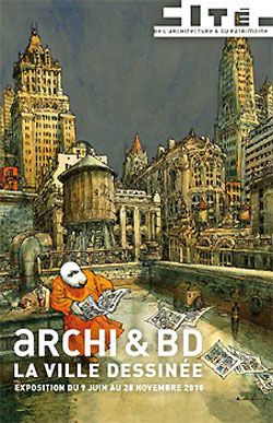
Until January 2 2011, the official French museum of architecture — La Cité de l’Architecture et du Patrimoine — is hosting an exhibition on comics and architecture, Archi et BD: La Ville Dessinée in the Palais de Chaillot, Paris.
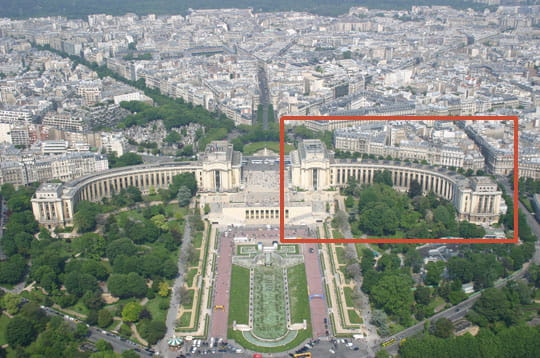
The museum, in the red square, as seen from the Eiffel Tower
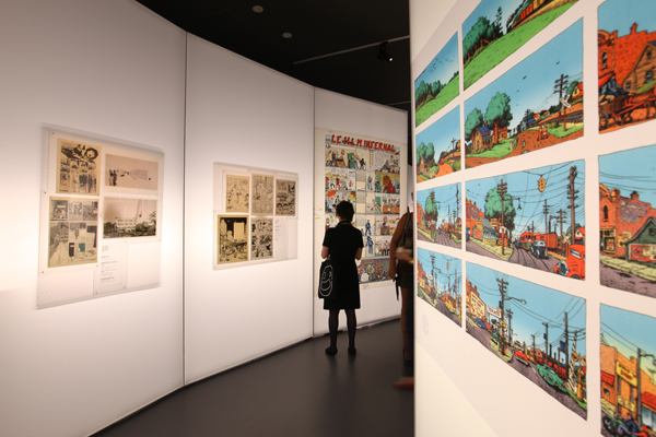
The exhibition, curated by comics scholar Jean-Marc Thévenet and architect Francis Rambert, showcases over 360 items in a witty scenography by the Projectiles agency that evokes the nature of a comic strip– the visitor being its hero. The works are hung on rippling walls of translucid, backlit PVC.
I found this not altogether satisfactory, as the backlighting of original art tended to render it also translucent, hindering its readability.
Floorplan for the exhibition (click to enlarge)
The exhibition kicks off with Il était une fois Winsor McCay (Once upon a time, there was Winsor McCay). McCay (1869 – 1934) and his marvelous work, from the turn of the last century, is a fitting chronological start; few cartoonists indeed have matched his astounding architectural inventiveness:
Winsor McCay et ses héritiers (Winsor McCay and his heirs) highlights the work of such contemporaries of McCay as George McManus and Frederick Opper, all pioneers of the comic strip– which had very strong urban overtones from the start. No wonder: the explosive growth of the great American cities coincided with the appearance of the comic strip in a mass circulation urban press.
New York, première icone (New York, the first icon) is the next subsection, and the array of depictions of the Jewel of the Hudson is dazzling.

Broadway’s lights, from the strip ‘Mary Perkins: On Stage’, by Leonard Starr

New York street scene by R.Crumb
Aside from the American cartoonists, it was a surprise to see how much New York had inspired European ones.
-

- From Hermann’s “Bernard Prince à New York”

-
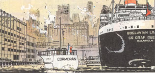
- From “Bernard Prince à New-York”

-

- From “Blacksad”, by Juanjo Guardino


Art by Janry. Note the racism of the caricatures– the interior is even worse!
Les Superhéros des mégapoles américaines (The superheroes of the American megalopolises) continues the theme, with art by Jack Kirby, Gene Colan and Will Eisner, among others.
-

- `Daredevil`, by Gene Colan

The notes point out to the European visitor how varied and dramatic the p.o.v. shots are in superhero comics, the better to inject melodrama into the story — something, as an American, I was so used to that it took a European to underline how unusual this was in the broader context of world comics.
This sub-section is marred by the looped projection of a 1940s Fleischer Superman cartoon; its theme music blares continually down the gallery.
The next major section, L’esprit moderne (The modern spirit), starts out with l’Exposition Universelle de 1958 et l’Ecole belge (The 1958 World’s Fair and the Belgian School). The aforesaid World’s Fair took place in Brussels, and coincided with a post-war generation of young Belgian cartoonists such as André Franquin and Will: both showcased the new, futuristic modernism, as expressed in gadgets, vehicles– and buildings.

From ‘Tif et Tondu’, by Will
This style has since come to be called the ‘style Atome’, lovingly re-created by younger cartoonists such as the late Yves Chaland:

La Ligne Claire (The Clear Line) showcases major exponents of the eponymous school of comics drawing, with examples from heavyweights like Hergé (Tintin), but also such modern practitioners as Ted Benoit and Theo Van den Boogaard; it’s a style that, as architect Christian de Pontzamparc points out, is ideal for depicting buildings– and is partly inspired by architect and engineers’ concept drawings:
-

- Van den Boogaard: “Léon la Terreur”

I confess that my affection for the ‘ligne claire’ comics is tempered by a distaste for their excessive cleanliness– like a Swiss housewife’s–, their blueprint-like precision, in a word their coldness: frigidity is one of the most insidious and damning sins of art. After the neat streets of Hergé one may long for the scuzzy Harlem of R.Crumb‘s sketches. This coldness, of course, is entirely appropriate for the sardonic irony of a Swarte, or the retro stylings of a Benoit.
Pontzamparc joined the most celebrated contemporary practitioner of the Clear Line style, the Dutch cartoonist and illustrator Joost Swarte, to design the Hergé Museum (which is represented at the exhibition by a model).
-

- The Musée Hergé

-
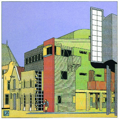
- Theater designed by by Joost Swarte

The third section is Itinerances de la bande dessinee (Wanderings of the comic strip). This heading is a bit of a catchall, covering the notion of travel both literally (as in Joe Sacco‘s trips to Palestine, or Loustal‘s Carnets de Voyage) and figuratively (Chris Ware‘s psychological explorations).

Village from Loustal’s `Carnets de Voyage`
Here, too, is a genuine weak spot of the exhibition– the relative paucity of strips from Japan, despite the claim that Tokyo is the new capital of comics.
Jiro Taniguchi‘s lovely Walker is presented, though:

I was charmed to discover examples of modern Chinese comics, such as those of Zou Jian-Le chronicling the transformation of Beijing:

This is also the section for Utopies (Utopias), the wild urban landscapes of fantasy and science fiction, such as those of Jack Kirby or of Jean-Claude Mézières:
New York in the 23d century, by Mézières

Another Mézières city view
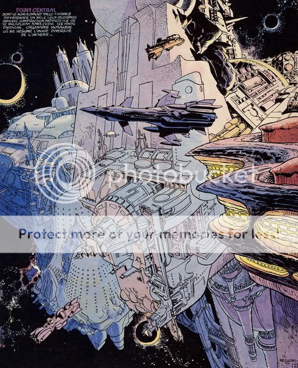
A stunning space city by Mézières…if I show so much of this artist, it`s probably because he was once my cartooning teacher!

A futuristic city by Jean ‘Moebius’ Giraud
This is also the domain of the future catastrophe, allowing strange visual depictions of current cityscapes, as in Nicolas de Crecy’s Période Glaciaire:
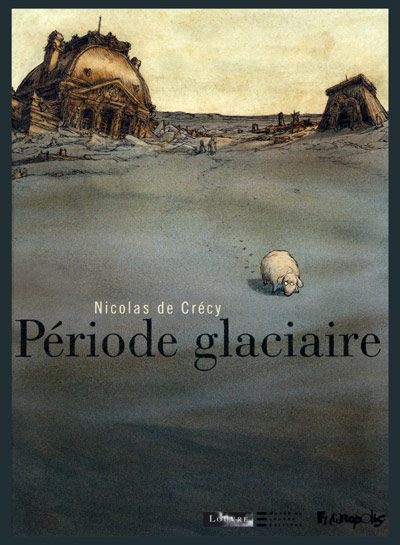
or in Jack Kirby‘s Kamandi:

Or consider the nightmare urban fantasias of Schuiten, as in his La Fièvre d’Urbicande:

Here, too, are exhibited some of the more “sci-fi-ish” projects of architects; always fascinating to see, though I am unconvinced of any links to comics:
-

- Project by Yona Friedman, 1962

-

- Undersea habitat project, Jacques Rougerie, 1973


Deepwater undersea lab by Rougerie, 1974
The final section, Regards Croisés (Crossed Viewpoints), is basically a mishmash of installations of various sorts and the nowadays-obligatory bank of computers for a set of boring interactive exercises.
Overall, a stunning experience. Here is surfeit for lovers of comics as well as of architecture; and matter for thought on the interaction of the two artforms, which we’ll explore in part 2.
—————————————————————————————————————
This is part 1 of a 3-part series. Click here for part 2 and part 3
Until January 2 2011, at the Cité de l’Architecture et du Patrimoine (1 place du Trocadero, Paris). Tickets: 8 euros — a steal. The museum is also well worth visiting for its stunning permanent collections, particularly its many architectural models.
PDF of the press release (French and English)
The museum’s website


Ah, glad to see this. Were the Schuiten bros. in the exhibit? I ran across Luc Schuiten’s Vegetal City in a book and confused him with his non-architect brother. Mainly because they draw alike.
Also related: “Yes Is More: An Archicomic on Architectural Evolution,” a comic showcasing work by Copenhagen-based architectural firm BIG. It uses that one font, so unreadable I can’t get to the buildings!
Hey, Bill.
Yep, the Schuitens were well-represented. I included only one example of their artwork because I intend to devote most of part 3 of this article to them…
btw Although they’ve gone in different directions they collaborated on their earliest strips.
PS Thanks for those links!
Any Martin Vaughn-James in the show? “La Cage” would be a natural.
Funny, my piece “Ruins,” on which I’m working currently, deals a lot with architecture too.
BIG is definitely worth a look — a fine example of explication through comics, very impressive in fact, and really infectious in tone, if also self-impressed.
There’s quite a detailed online English press kit for the exhibit at Dean Motter’s site. I presume it’s on the main French site as well but that’s a direct link to it.
@ Andrei: didn’t see any Martin Vaughn-James.
@ Suat: thanks for the press kit. I encourage evryone to check it out.
I can’t help but notice that the examples here mostly deal with architectural representation in comics. I guess I’m curious about a slightly different aspect of architecture and comics; did the exhibit address the similarities between the way we “read” a set of architectural drawings and the way we read cartoons? Both generally deal with a grid of frames with borders and gutters, typically read in a particular order. What about the differences? An architectural plan is like a choose-your-own-adventure that points you to key parts of the set for more information, while a comic is read in a sequence that usually is intended to construct a narrative. I suppose that the key ingredient here is time, so when you are reading a comic laid out this way (ie. “Rabbit Head”, “Big Tex”), you can still plainly see the narrative progression. Maybe McGuire’s “Here” is the closest analogue to the non-linearity of architectural drawings, as it is a variety of disparate moments that make up the whole. I’ve been thinking about this quite a bit recently, and I was hoping that others were as well.
And finally, was there a catalogue? I’d certainly be interested in reading more than the press kit, if possible.
Note that that Gene Colan Daredevil cover is inked by Jim Steranko.
@ Aaron: no, the exhibit didn’t address those similarities/differences except by silent example.
Yes, there is a beautiful catalogue, but you’ll have to cough up 38 euros– about 55 dollars — for it.
@ James, that’s a surprise! But Steranko did do the odd inking chore– sometimes to help out his buddy Dan Adkins with a deadline.
I wouldn’t say that Tome&Janry’s “Spirou and Fantasio in NY” is racist. Actually, I think that it’s all a satyre on “clichés” and ethnic stereotypes. I wouldn’t take it as anything but mockery of these.
Within those very aethetics, there’s a nice mixture of comics and city done by an architect-cartoonist: http://klaustoon.wordpress.com/2010/11/23/the-new-city-reader-unreal-estate/
I disagree, Mac. I think it’s really a classic “yellow peril” story.
But thank you for the link!
Well, I guess it’s a matter of different sensibilities at play here. To me, the comic book is just playing with the conventions of these genres. The portrait of the Italians is equally poking fun at the cliché, and the other arch-villain of the book is Vito Cortizone, who would become a recurring character in the subsequent albums by T&J. Also, the villains all throughout the series are overwhelmingly Caucasian.
Of course, all this is an opinion that comes from an European perspective (as it was the artists’ context), and for obvious reasons, we’re not so concerned with the connotations attached to racial representation; moreso in the 80s, when this story was first published.
Mac:
“Of course, all this is an opinion that comes from an European perspective (as it was the artists’ context), and for obvious reasons, we’re not so concerned with the connotations attached to racial representation; moreso in the 80s, when this story was first published.”
Non, mais– tu te fous de ma gueule, Mac? C’est ça?
Don’t you dare lecture me on ‘European perspectives’. I AM FRENCH. I’m a fucking French citizen who votes, has done his military service, pays his taxes,has taught at the Sorbonne, and has lived in Paris for the last 37 years!
Who has visited over 30 European countries!
I goddam know what was and what wasn’t acceptable in the ’80s, and this piece of racist crap was NOT acceptable. It was very controversial at the time.
And its depiction of Chinese-Americans is odious: basically, they are shown to be wily Oriental infiltrators of all that is decent. Chinese-American police officers, in particular, are singled out for paranoid bigotry.
Mac, I wonder what your agenda here is. Why are you defending the indefensible?
Well, that was an unexpected one. I read this when it came out (in French) and later (in English translation) and I didn’t find anything unacceptable; nothing that took me deeper than the pure adventure level, anyway. I wasn’t aware of any racist undertone.
So, no intention to lecture (or to offend, for that matter) anybody. I wasn’t trying to create polemics -not to mention open Pandora’s box.
Now I’m curious about this controversy you mention. It did not travel overseas. Were the authors panned for this album?
Cheers,
Well, Ian, what do you mean by “overseas”?
Are you saying that you were in the USA or Canada the whole time you claimed a superior “European perspective” on this album?
I’m not looking for a fight, honestly…but I really think you should think your attitude over.
Jeez Alex, calm down a little,huh? I don’t think Mac’s trying to offend or to deny your European bona fides. I get where you’re coming from, but maybe just go a little easy….
Yeah, you’re right…sorry, Mac.
Pingback: The Architecture in Comics by Renata Rafaela Pascoal | Comics Forum