Is This a Story?

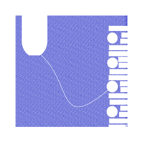
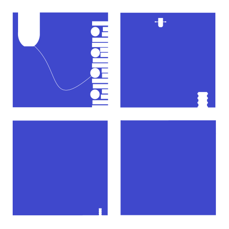
I rowed my father's boat 4 panels square

 
I’m going to say yes. And not just because the four-panel comic strip is titled “I rowed my father’s boat to sea.” The sequence tells a visual story whether those words are included or not. And the best way I know of discussing wordless storytelling is Neil Cohn’s visual grammar, which includes five types of narrative panels.

My first panel is an Establisher, which “sets up an interaction without acting upon it.” I’m not entirely clear what Cohn means (how is a set-up interaction not itself an interaction? if the panel content is the interaction, then how does the panel content also act upon the interaction?), but the panel does establish the two main visual elements: the boat and the dock. There’s also minimal tension between them. The panel by itself would not imply a story. If instead the rope were taut and the boat were pointed away from the dock, then there would be a plot.

My second panel is an Initial, which “initiates the tension of the narrative arc.” I’m not sure an awareness of the  future arc  is technically possible, but the panel has tension. The boat and the dock are now much further apart–presumably because someone in the boat is rowing it away. A lot of narrative information occurs between panels: the rower climbed into the boat, untethered it, and began rowing. All of that could be a visual sentence too, using the same panel one as an Orienter, which “provides subordinate information, such as a setting.” Instead, the rower is undrawn, and so the visual sentence is only between the boat and the dock.  This second panel might instead be a Prolongation, which depicts a “medial state of extension.” If so, the Initial is implied as the sequence leaps to a later a moment in which the tension is already extended.

My third panel is either a Peak, the “height of narrative tension,” or it is the Release, which of course “releases the tension of the interaction.” Personally, I think the Peak, like the Initial, occurs in the gutter. The boat has already rowed out of sight, and so the tension is over. Alternatively, the boat and the dock are still interacting, because we project the existence of the still moving boat beyond the panel frame. Either way, the story is basically over.

My fourth panel is more clearly a Release, either of the third panel’s Peak or as a secondary Release which extends the third panel’s Release further. The blue is ambiguous. Has our perspective continued to move higher and so now the dock is so small it is effectively invisible? Regardless, the boat and now the dock are out of the image and so there is no tension.

That’s all pretty straightforward. But notice that it all works on the assumption that pictures are pictorial. They picture something. While they are actually pixels on a screen, they are also representations of objects that are not pixels on a screen. So the story is about something that’s not actually present. The images are a little like words that way. Although, unlike words, pictures do to some extent resemble what they represent, they are also dissimilar to them. Even radically dissimilar. The “sea” is a blue square. The “boat” is an outline in negative space. The “dock” in panel two and three are recognizable only because they vaguely resemble the dock in panel one.

But what happens if there are no representational elements? If I replace the “boat,” the “dock,” and the “rope” with different visuals, do the four panels still tell a story?

panel one B

The content of the revised panel one is now entirely abstract. Does Cohn’s Establisher panel type still apply? I want to say yes. The diamond in the upper left area and the random shapes along the right edge are still “set up,” and the overlapping circle between them suggests little or no compositional tension. The image is roughly balanced.

panel two B

The second panel shrinks the first two elements, adding a few shapes to the diamond cluster, and doubling by mirroring and then simplifying and shrinking the second cluster of shapes. Are the two clusters interacting? Again, I want to say yes. The compositional tension is still low–but this was true in the representational version too. Although abstract, the tension is prolonged but waning.

panel three B

The third panel is still either a Peak or Release–though now the diamond cluster can not be understood as having traveled out of frame. It simply does not appear. Also the former “dock” is not shrinking because our perspective is higher. There is no perspective. The shape is simply reduced in size.

panel four

The final panel again is all Release–no visual elements but the solid blue square and the white surrounding it. There is no tension. The image is perfectly balanced.

So the two versions of the four-panel sequence both follow the same visual grammar. Does that mean they tell the same “story”? Probably not. The first visual sentence is about a boat and a dock and someone rowing the boat out to sea. Things happen in time and space. The second visual sentence is about clusters of pixels. The only space is the space of the screen, and the only time is the time experienced by the viewer.

I’m not certain a “story” is possible without some kind of representation of time and spatial subject matter, but if it is, the second story is not the first story. They do, however, overlap. The abstract sequence and the representational sequence have the same arc. Is this inevitable? Since all representational images are also abstract marks (ink or pixels), do the two visual sentences always overlap?

Maybe. Unlike the above example, there would only be one set of images–whether analyzed abstractly or representationally. But that’s true of “I rowed my father’s boat to sea” too.  The second just illustrates the innately abstract qualities of the first. Delete the second, and the first sequence is still open to both readings.

In both, blue dominates each successive panel until all white elements stop repeating. If blue is “water,” then the water dominates as the white of the “boat” and “dock” decrease in presence. In representational terms, this is because the boat rows out of frame as the viewer’s perspective grows higher until the dock is too small to see too. That’s not how I originally summarized the story though.

Using the grammar of the visuals as abstractions, blue has overwhelmed everything else. Not only has the boat moved far from the dock, the dock has shrunk away too. Since both decrease in size and then vanish, both are in visual tension with the water. I think Cohn would call the water “subordinate information, such as a setting,” but it actually serves as the sequence’s most dominant visual element. If this were a superhero comic, we might say the blue vanquishes the white. And since we begin the sequence identifying with the only human character, the implied rower of the boat, the blue is the villain. It destroys everything. 

This reading occurs mostly at the abstract level. If we rely only on the representational qualities of the images, the water’s increase is primarily a side effect of the perspective and framing of the boat and dock. We are more prone to dismiss the blue as mere setting. Read abstractly, the blue is the story. The two visual sentences are not the same.

Does this mean that the meaning of any comic is incomplete if its content is read entirely or primarily in representational terms?

dock with word texture 2

Abstract Comics

Note: This review of Abstract Comics was written close to three years ago. It was proposed to Art in America in the fall of 2009 and submitted for publication that November or December. Overbooking in the book reviews department, I was told, delayed its publication. Finally the following summer, sensing its age as a review and the need to jumpstart things before it was too late, I offered to expand the article into a feature length essay on the wider subject of abstraction in recent comics, including figurative and/or narrative ones like Dash Shaw’s Body World, Joshua Cotter’s Driven by Lemons, and Brian Chippendale’s If ‘n Oof. That proposal was likewise accepted, but then the magazine’s head editor was ousted. The new head editor, after another six months’ consideration, finally paid me a kill fee. I thought I might write the expanded version nonetheless and submit it to an academic journal, but then got busy with other things and lost interest.

If I were to write on this topic today, there are many things I would change. It is, however, precisely this thinking that has kept this piece buried inside my computer, where it does no one any good. Thank you to Andrei Molotiu and Derik Badman for pushing me in recent months to publish the review regardless. So here it is, more or less in the state it was three years ago. Keep in my mind it was written for an art world publication. There were also word count restrictions, hence its clipped nature. What you see here, if I remember correctly, was already about 300 words over length. I said I would change many things today, including its tone, but the core opinions and suggestions I still stand by.

*******************
 
Since the 1990s, there has been a rising tide against the word in comics. It has begun to gel into something like a movement, made up of artists, critics, and editors alike, involving both the creation and promotion of new wordless comics in a variety of genres as well as the republishing and anthologizing of related work from the past.

So-called “abstract comics” is one of the more extreme fronts. It names a form of wordless comics that not only dispenses with the word, but also those things traditionally allied with it, like speech, sound, plot, and interiority. Abstract comics has been a fringe genre, disseminated largely through blogs and self-published and small press booklets. With the publication of Abstract Comics: the Anthology (Fantagraphics, 2009), it has gained a more secure foothold in print.

The book collects work from 1968 to the present. It includes comics luminaries like R. Crumb, Gary Panter, and Lewis Trondheim, but is focused on new names from the past decade. Most of the work is deeply indebted to modernist abstraction, from Kandinsky’s dispersions and Cubist papier collé, to the nested squares of Albers and Abstract Expressionist blots and drips – all typically set into narrative motion across a handful of panels or pages.

Museum modernism also weighs heavily on the framing of the anthology. In his introduction, Andrei Molotiu, artist, art historian, and blogmaster of the same-titled Abstract Comics site, describes the genre as a whole in terms derived from a mix of vitalist philosophy and a classical modernist model of reflexive reduction. He writes:

Reduced to the medium’s most basic elements – the panel grid, brushstrokes or penstrokes, and sometimes color – they [abstract comics] highlight the formal mechanisms that underlie all comics, such as the graphic dynamism that leads the eye (and the mind) from panel to panel, or the aesthetically rich interplay between sequentiality and page layout.

In the same vein, Molotiu describes standard narrative structure as an “excuse to string panels together” and abstract comics as a distillation of the medium to the “feeling of sequential drive, the sheer rhythm of narrative or the rise and fall of a story arc.” In the artist profiles at the end of the book, Mark Badger – contributor of a maximalist geometric abstraction in comics form – laments how images in comics are “unable to claim their real power” while subordinated to narrative or representation. “Hopefully,” he continues, “this book will be one shot in claiming back comics from the typists.”

Abstract Comics thus offers itself as a manifesto in the tradition of high modernist art, without the extremism of its historical predecessors, but nonetheless sharing their characteristic denigration of narrative and the verbal sign as well as their calls to power through purification. The anthology, unfortunately, does not make the strongest case for the vigor of the movement it promotes. Much of the collected work is visually weak, and the modernist formalist discourse to which the book is indebted ceased to have any real traction after the socio-political and linguistic turns of art in the 1960s. Molotiu expends much of the introduction excavating precursors for this “genre without a proper tradition” from the oeuvres of art-world masters like Kandinsky, DeKooning, Alechinsky, and Johns, with only passing mention of relevant precedents within the comics medium itself. Trying to legitimize comics vis a vis the art historical canon can sometimes be self-defeating, and here it has the unintended effect of casting abstract comics as little more than a super-belated reworking of formalist painting. Especially considering the online presence of “abstract comics” and the computer-based creation of many of the contributions, it would perhaps have been more fruitful to explore the relationship of the genre to the return of various forms of abstraction in the computer age, beginning with Neo-Geo in the early 80s and then internet art and laptop music after the 90s. Instead, the top two-thirds of each page of Molotiu’s introduction are given over to rows of dingbats, a cute waste of valuable space and another statement of preference for pure aesthetic form over verbal discourse. One is left to dig through the artist profiles of Abstract Comics and the personal webpages cited therein to get any real sense of specificity to individual works and the promise that some do hold.

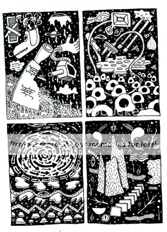
As is clear to any reader, the dominant trope of abstract comics is metamorphosis. Molotiu heralds work that “tells no stories other than those resulting from the transformation and interaction of shapes across a comic page.” Andy Bleck’s Haring-esque work is typical. Anthropomorphic blobs twist and tangle in goofball dances that are half cartoon tribal mating ritual and half protoplasm on a wet mount microscope slide. The contributions of the two most prominent Europeans in the anthology, Trondheim and Ibn al Rabin, make it clear that the defining figure of metamorphosis is the amoeba. Both of their works are short comedies featuring blobs swallowing nuclei and other blobs. There is a basic vitalist conceit at work here: to boil the comics medium down to pure formal dynamism entails exploring also the most basic forms of animate life.

by Andy Bleck

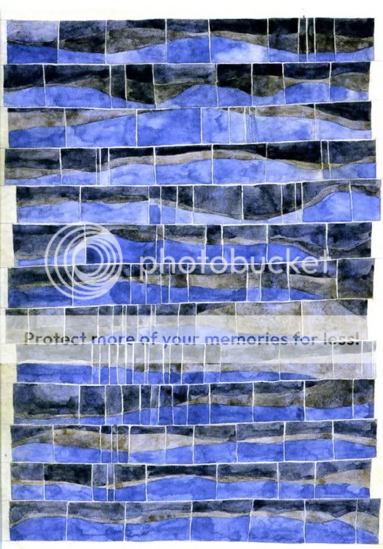
Most of the works are as entropic as they are dynamic, involving not only the transformation of form and energy, but also their disorganization and dissipation. Molotiu’s own works are a case in point. Produced with the aid of a scanner, “The Panic” begins with compound masses whose biomorphism once again evokes the biology lab. Over the course of a handful of panels, the masses pull apart into small globules.

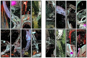
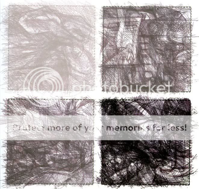
Chaos, similarly, is a recurring motif. Alexy Sokolin’s “Life, Interwoven” layers ballpoint pen lines until almost the entire page is obliterated. Tim Gaze’s untitled collages are a gore-fest of inky smears and splatter, further mutilated through a technique similar to the cut-ups of William Burroughs and Brion Gysin. Billy Mavreas’ “Border Suite” again evokes the cut-up, now run repeatedly through a copy machine until all that is left is disintegrated borderlines and dispersed dust motes. In Abstract Comics as well as other statements on “sequential dynamism” in comics, Molotiu makes the musical analogy to opera. From these works, however, it is clear that noise and glitch aesthetics would be more apt in some cases.

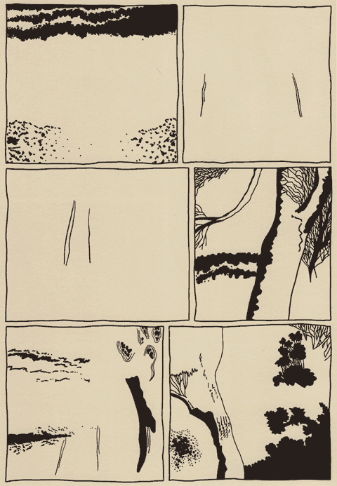
Other works also manipulate source material. Proprietor of the reliable MadInkBeard blog, Derik A. Badman’s Flying Chief is one of the more intriguing contributions to the anthology. He has redrawn panels from a 1950 Tarzan comic without the characters, words, speech balloons, or captions. More so than abstraction or entropy, this strategy of absenting is highly effective in frustrating the viewer’s desire for an organizing figure. Badman’s image of a world without human agency raises more pointed questions than other contributors’ protozoan land before time and scenes of cosmological chaos.

Derik Badman, “Flying Chief”

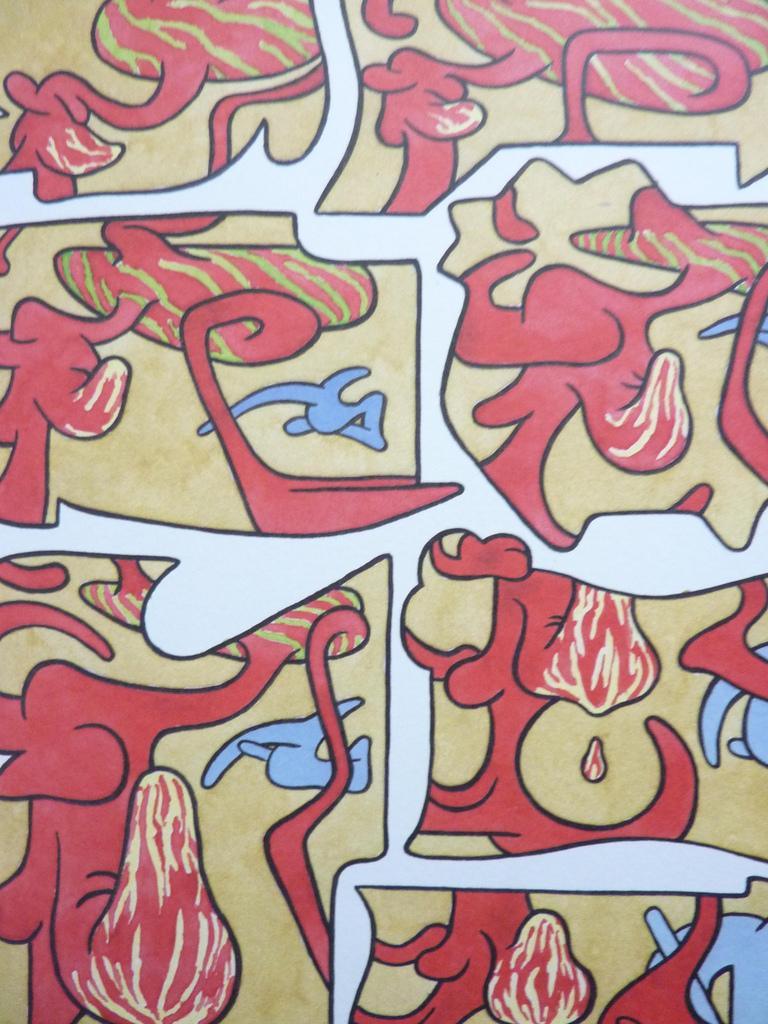
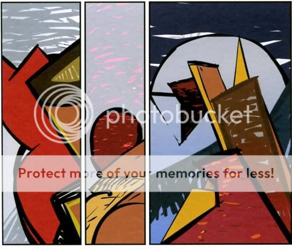
Noah Berlatsky also runs a comics blog, The Hooded Utilitarian. His two one-page works are also in this appropriationist vein. He has taken pages from Asterix and X-men and redrawn them in such a mutilated fashion that frames and figure-ground relationships are splayed and then refused into an abstract mesh. There is a strong bit of Kandinsky in the results, but it’s also important to perceive amputated bodies akin to those of early Dali or later Sue Williams.

In these, as in a number of works in the anthology, there is an interest in what might be termed a logic of “vestigiality”: the organ divorced from its original function but still maintained, so that it oftentimes comes to impose upon the organism that had abandoned it. Might this principle also underlie the metamorphic comics? After all, their plasmatic substances have a striking resemblance to the spongy, pneumatic contours of the speech or thought balloon. If so, it seems that the abstraction of comics against the word and its supports is never total, but rather marked with traces of partial amputation. Abstract comics share this feature with many wordless comics, from pantomime works that gesticulate histrionically to make up for the ban on verbal expression, to indie comics around themes of melancholia, speechlessness, and pre-linguistic primitivism.

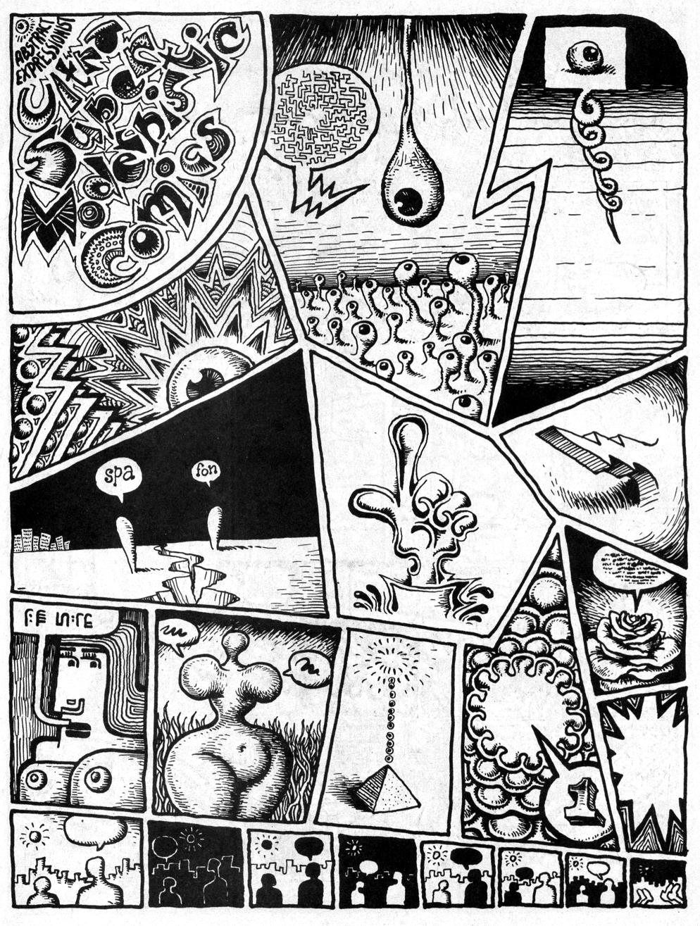
It is curious that Abstract Comics opens with R. Crumb’s “Abstract Expressionist Ultra Super Modernistic Comics,” first published in Zap Comix no. 1 (1968). First of all, its principle of non-sequitur juxtaposition is quite at odds with the smooth, linear sequentiality or serial modulation that characterizes most other works in the anthology. Secondly and more importantly, Crumb’s work was meant as a derisive parody precisely of the kind of genuflection to high modernism that Abstract Comics represents.

R. Crumb, “Abstract Expressionist Ultra Super Modernist Comics

Crumb is not alone. Burlesque has long served as a kind of prophylactic for comics artists against the perceived obscurantism and puffery of high art. A few years ago, designer Craig Yoe popularized an adequately lowbrow name for this mindset: “arf,” which is Popeye’s laugh, but comes off as a portmanteau of “art” and “barf.” At the very least, Abstract Comics represents a welcome willingness to look upon high art from the perspective of comics without such juvenile anxieties. One hopes that the future of the genre is towards aesthetic paradigms with greater contemporary relevance.

Monthly Stumblings # 14: Tim Gaze

100 Scenes, a graphic novel by Tim Gaze

With Tim’s permission: to Antoni Tàpies in memoriam

Comics writer and historian Alfredo Castelli said that, even if, for the best of his knowledge, the first newspaper Sunday Comic Section in the U.S.A. to regularly adopt  the title “Comics” in short was published by the St Louis Globe Democrat in 1902, the word “comics” was well established to refer to the art form by the 1910s only. I don’t know who, at the turn of the 19th to the 20th century (I suppose) first applied the already existing word “comics” to fulfil this new function…

On the other hand German art historian Wilhelm Worringer used the already existing word “abstraction” to apply it to the visual arts in the title of his book Abstraktion und Einfühlung (Abstraction and Empathy), published in 1908. The concept predated the actual invention of abstract high art by some Russian painter (probably Wassily Kandinsky, but Mikhail Larionov is also a possibility – and how about Kasimir Malevich and Czech painter František Kupka?).

I’m saying the above because I joined the two concepts and coined the expression “abstract comics” (I wouldn’t be surprised if someone in the below comments proves me wrong though…). Andrei Molotiu reminisces:

I first began thinking of abstract comics as a concrete possibility during a discussion with Domingos Isabelinho on the TCJ board in the summer of 2002, on a thread with the rather awkward title, “Is there a Hemingway or Faulkner of comics?”– or something of the kind.

I don’t remember any of this to tell you the truth. In fact, I didn’t pay any attention to my “discovery” (so much so that I saved a few TCJ‘s messboard threads, but not this one). Abstract art was, to me, such a natural thing that I mentioned abstract comics without giving it a second thought. Here’s the only thing that I remember (or misremember, but I hope not…): at some point in the thread the two possible readings of a comics page came about. It’s possible that I mentioned French comics scholar Pierre-Fresnault Deruelle and “his” theory of the linear (a vectorial succession of panels – what I call “a reading”) and the tabular (the page as a random visual whole – what I call “roaming”). (I didn’t know it at the time, but said analysis is not by Deruelle who published it in 1976. Said theory’s author is Gérard Genette who published it in 1972 – he called the former a “successive or diachronic reading” and the latter a “global and synchronic look[.]”) to illustrate these two readings I posted the image below by Lettrist writer, filmmaker and draftsman, Isidore Isou:

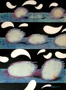
Isidore Isou, 1964.

I said at the time that the page could be read/viewed in two ways: (1) as a drawing (the global look), (2) as an abstract comic (the successive reading). (I don’t remember my exact words back then, but I don’t want to imply now that the former isn’t part of a comics reading proper.) Anyway, this took too much space already and, in the doubtful chance that you, dear readers, are still interested, too much of your patience and time. Sorry for the self-indulgence!…

Contrariwise to what happened with Wilhelm Worringer the expression “abstract comics” didn’t predate abstract comics. Looking back we may found many examples in other fields. The one below is by Portuguese visual poet Abílio:

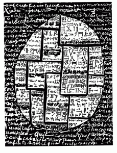
“Humor” by Abílio, 1972.

My favorite example comes from the comics field though. I mean the following example from Cuba:

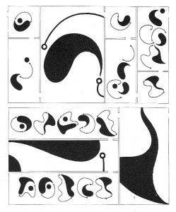
The Amorphous and Disheartening of Vacuous Dialog by Chago Armada, 1968.

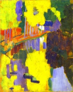
One of the roots of abstract art is Symbolism, the Gauguin inspired Nabis especially as we can see below:

The Talisman, the Aven River at the Bois d’Amour by Paul Sérusier, 1888.

It was fellow Sérusier Nabi painter Maurice Denis who said:

Remember that a painting, before being a battle horse, a nude woman or any anecdote, is essentially a plane surface covered with colors assembled in a certain order.

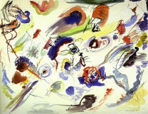
Kandinsky’s abstract art was born in an atmosphere similar to the Pont Aven one, in Munich this time. I mean the Blaue Reiter (the blue rider) lyrical Expressionist group, of course. Around 1912, when his book Concerning the Spiritual in Art was published, Kandinsky was interested in Theosophy and Symbolism (he admired Belgian poet Maurice Maeterlinck). In fact, when he seemed to be occupied mainly by formal problems he stressed the importance of his work’s content (1925):

I would really like the spectators to go beyond the fact that I chose triangles and circles. I would like them to see what’s behind my paintings because that’s the only thing that interests me. I always viewed the problems of form as secondary… I know that the future belongs to abstract art and I’m dismayed when other abstract painters don’t go any further than form…

First Abstract Watercolor by Wassily Kandinsky, 1910.

 Other wings of abstract art starting with Malevich and the Constructivists will be more formalist, but we’ll have to jump a few years in order to arrive at Tim Gaze’s book 100 Scenes, a graphic novel. Before leaving Kandinsky, for now, I want to stress what’s in common between the two: they both had/have an interest in music (in Tim’s case it’s Dubstep). Following Lithuanian painter and musician Mikalojus Ciurlionis Kandinsky believed in a synesthetic relation between colors and sounds (1912):

Yellow is disquieting to the spectator, pricking him, revealing the nature of the power expressed in this color, which has an effect on our sensibilities at once impudent and importunate. This property of yellow affects us like the shrill sound of a trumpet played louder and louder, or the sound of a high pitched fanfare. Black has an inner sound of an eternal silence without future, without hope. Black is externally the most toneless color, against which all other colors sound stronger and more precise.

It’s easy to know where Tim Gaze is coming from because he tells us so in his Notes. He cites three main references: Andrei Molotiu’s abstract comics and “ground-breaking volume Abstract Comics: The Anthology (2009)[;]” Surrealist art and techniques (collage books and decalcomania paintings by Max Ernst); Henri Michaux’s Tachiste (Pierre Guéguen, 1954) sequential work. One may say that, briefly, Surrealists and Tachists (Informal Art, Art Autre – Art of Another Kind -, as Michel Tapié put it in 1951, 52) advocated a spontaneous, irrational, kind of art. Both groups were fascinated by drug use, magic, popular art and, sorry for using an expression that I don’t like much, outsider art (Jean Dubuffet’s Art Brut)… Informal artists are the European equivalent of the Abstract Expressionists in the U.S.A..

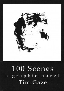
100 Scenes, A graphic Novel by Tim Gaze, 2010. 

Tim Gaze says that his graphic novel “touches upon two emerging areas: abstract comics […]  and asemic writing.” I’m with Kandinsky when he said that “[t]here is no form, there is nothing in the world which says nothing.” Writing may be asemic as writing, but a sign is a visual entity signifying with visual means (as Tim put it: “[t]hese areas transcend languages, and offer the possibility of inter-cultural communication without words.” (Just like music, right?…) As Tim puts it, polysemy is high in his book:

This is an open novel, for you to project your mind into.

Every page is a stimulating field for your imagination.

So, there’s no predetermined meaning here, entropy is at its fullest, we have achieved maximum energy.

We may start with the cover of 100 Scenes above. I asked Tim if the book had anything to do with Katshushika Hokusai’s One hundred views of Mt. Fuji. He answered me that “only the title has any connotation of Hokusai.” So, false clue there, I would say… First of all: is this a novel as the cover claims? How can it be if there are no characters or plot? Isn’t the concept of “graphic novel” stretched to the breaking point? I would answer yes to the first question and no to the last one. We don’t even need to go further than the cover to understand these answers. There are at least two reasons to explain them:
(1) The cover of a book is what Kandinsky called, the basic plan. Without the title (without the words) the basic plan would be a square (as we can see above). So, it’s the book’s format that limits the basic plans’ choice.

(2) A drawing on a gallery wall (or a comics original panel) has a materiality (white pentimenti, irregular intensities of black, the paper texture, etc…) lacking here. What we have above is an image of an image of an image (a copy of a monoprint): i. e.: in McLuhan’s terms the hot drawing cooled down creating a distance that, in Benjaminian terms, provoked the loss of its aura. Hence: there’s a movement from the visual arts to literature: the graphic novel…

Having established that we may now answer the second question: the comics people co-opted the word “novel,” but graphic novels have their own specificity being nothing like novels.

The drawings in 100 Scenes result from various tensions, then (to use another Kandinskyan word): human made / machine reproduced; line / texture; black / white; positive space / negative space; centered / decentered; stillness (the basic plane) / movement (the drawings); chaos / order; regular rhythms / irregular shapes; etc… From page to page we witness a restless, lively world. It’s like a godless theogony (another tension?) in which trial and error coexist. I’m on the verge of denying the abstract nature of this graphic novel, so, I’ll stop now…

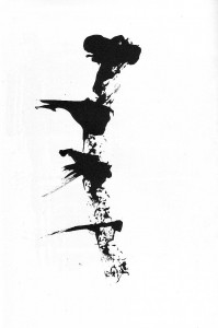
Page from 100 Scenes: the regular rhythm, the irregular shapes, in ascension.

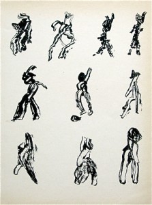
I’ll finish with part of Henri Michaux’s postface to Movements, 1951:

Whoever, having perused my signs, is led by my example to create signs himself according to his being and his needs will, unless I am very much mistaken, discover a source of exhilaration, a release such as he has never known, a disencrustation, a new life open to him, a writing unhoped for, affording relief, in which he will be able at last to express himself far from words, words, the words of others.

Page from Movements by Henri Michaux, 1951.

The Eyes Have It: The Sublime & the Precognitive Graze.


For certain of us, the thrill of opening a comic book cannot be overstated. Particularly if the page is crammed with dynamic lines, swirls of motion, color and a plethora of panels. Instantly, our pulses race. Immediately, synapses begin to fire. We are overwhelmed by the scope and variety of the material before us and we savor the moment before our rational, superior divided-self checks the terror of confusion and steps over the direct and unarticulated response to the material to communicate the simultaneously terrifying and exciting instant of speechlessness. We perhaps articulate that moment with “Cool” as we hover between pain and pleasure. We experience the sublime.

Edmund Burke, a clever man, thought at length about the sublime[1] and developed certain theories about how humans take in visual stimuli:

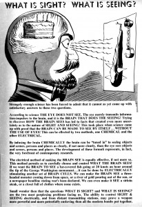
VISION is performed by having a picture, formed by the rays of light which are reflected from the object, painted in one piece, instantaneously, on the retina, or last nervous part of the eye. Or, according to others, there is but one point of any object painted on the eye in such a manner as to be perceived at once; but by moving the eye, we gather up, with great celerity, the several parts of the object, so as to form one uniform piece.

The unknown writer of Bernard Krigstein’s final comics work 87th Precinct thought about this too and produced the following intersecting and bizarrely Saussurean  commentary :

But to return to Edmund Burke for the moment, he wants to think about a painting, and more importantly for us, a single object and how its representation would be taken into the eye:

If the former opinion be allowed, it will be considered, that though all the light reflected from a large body should strike the eye in one instant; yet we must suppose that the body itself is formed of a vast number of distinct points, every one of which, or the ray from every one, makes an impression on the retina. So that, though the image of one point should cause but a small tension of this membrane, another and another, and another stroke, must in their progress cause a very great one, until it arrives at last to the highest degree; and the whole capacity of the eye, vibrating in all its parts, must approach near to the nature of what causes pain, and consequently must produce an idea of the sublime.

Today Burke’s ideas on the function of the eye in apprehension seem amusing, but he raises interesting points that touch the optic nerves of many comic book artists and readers.

There is some theoretical talk out “there,” in the sublimity of discourse concerning how the comic page is perceived, but I find that like our eighteenth century predecessors who made admirable attempts to codify or to supply language to visual experiences, there remains a dearth of language available with which to tackle certain experiences. I remain unable to find any language that addresses the moment before we begin the instinctive work of decoding what we see. That it is a form of the sublime I am sure, but this does not give language to the effect. After the first consumption of the page in its entirety comes a focus to determine the form of the page, a first step in the decoding. Yet, it seems there is not diction for these interstitial movements and this will become a greater problem, because it will affect how we understand comics and the relationship of the image to text into the far-foreseeable future. It will limit how we are able to articulate the seminal first moment.

Our inability to express how we see text and image in relation to each other still requires work. I am not suggesting that this necessitates an infinitude of new expressions; we do not need to find a thousand ways to say white, although perhaps the Alaskan Inuit were onto something. (In previous posts, I have shown white panels, and there are many examples from which to choose, whether empty or filled with white.)

In considering this issue, I recalled the use of Flash cards, which became an annoying part of my life when my son was in Pre K, inasmuch as other parents felt free to flash them at random during any conversation. Here, the act of offering an image to symbolize text is described by flash, but the action of the child upon whom this ocular violence was enacted was given no particular name for their reception of the image. So that from early childhood we are left without words to accommodate that primary moment, before assimilation. The next step of what was meant to happen, “learning,” found linguistic form, but again the first step in the process has no particular vocabulary to describe it. One does not hear: “when I thrust my flash card into the range of sight for my child he or she immediately perceived the textual, spatial, object relations to supply language.” It would be silly since it would be out of place, but where it would be helpful in the discourse of comics, when we avail ourselves of the pleasure of the first flash, our response remains unnamed.

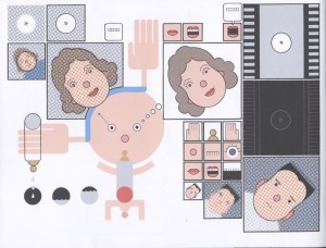
Chris Ware’s Lint: a diagnostic of the acquisition of language: in the startled / blank eyes of the infant can we register prelinguistic sublimity?

“Apprehend” might be close to what is required, but still it seems too much tied to the first stage of interpretation of the material. Andrei Molotiu produces some interesting abstract comics that extend that moment of apprehension, since the mind is unable to rest, or find comfort in the ciphers that it makes. There is a suspended moment that recalls the sublime in certain respects. The work at the very least challenges the limits of reception and formal responses to comics. Douglas Wolk [2]writes of the anthology of Abstract Comics compiled by Molotiu that “it’s a fascinating book to stare at, and as with other kinds of abstract art, half the fun is observing your own reactions: anyone who’s used to reading more conventional sorts of comics is likely to reflexively impose narrative on these abstractions, to figure out just what each panel has to do with the next.” Wolk’s observation is helpful  as he grapples with the first response and the challenge that abstract comics present. His use of the word “stare” both signals a stalled but receptive state, yet it allows one to return to the way that we experience a page before we enter into its complexities. The moment that presages the “stare,” whether in abstraction or narrative comics does not yet differentiate between the two. We have not had time to seek faces, identify text, or to participate in the experience of the page on any level than that of its visual inter-kinetic.

Andrei Molotiu provides a space in which we can linger on the verge of  another mental state of apprehension.

Part 2. Focus on the Eye.
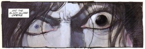
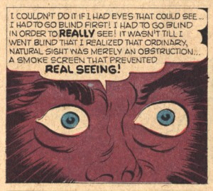
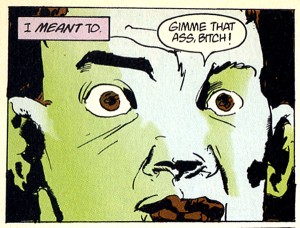
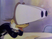
Edmund Burke’s insistence upon the physical response to visual stimuli in the outside world has remained more entrenched than one might suppose, particularly within the realm of cartoonists and artists. Artists whose work relates singularly to representation of objects seen or imagined, frequently draw upon, or just draw images of the eye to connect their characters with their constructed outside world. Perhaps for artists there is a deep-rooted fear in any trauma to the eye, which informs their identity as their livelihood requires that they “look” and “see,” which I understand as separate actions. This is not solely my distinction, it is a Miltonic reference, in that man must look and see his world, the second part, see, meaning comprehend, or internalize the meaning of what man is shown by higher powers. We expose ourselves to the pleasure of the page in anticipation of that experience of catharsis. And here I will diverge from any more highly aesthetic or spiritual understandings of what is happening, to suggest instead that we are animalistic in this pursuit. We act primarily to satisfy the limbic brain; to fulfill the impulse of the deep primitive brain. This brain causes us to pre-cognitively, visually graze for stimulus so that we can trigger the pleasure response. Comics are part of our system of desire. Animators apparently made this link and described the anatomy of the active “graze” that prefigures the “gaze” to hilarious effect. In Tex Avery’s brilliant depiction of the wolf looking at the songstress there is a pause before the wolf gathers the import of what he is seeing. There is a pause before his eyeballs pop out of his head. Sex and comics…well, both are sometimes both painful and pleasurable.


Avery’s wolf scans the female form as some of us do the page; hungrily before we can calm down to think rationally about what we are seeing.

Doselle Young/ Tony Salmons/ Sherilyn Van Valkenburgh,  Jericho, HeartThrobs :

Out of control: Already consumed in the pleasure of reception.

Elsewhere, the tension of sight and meta-engagements in depictions of eyes as signals of human responses litter the pages of comics with a startling degree of anxiety. Recall my earlier quotation of Burke’s:

So that, though the image of one point should cause but a small tension of this membrane, another and another, and another stroke, must in their progress cause a very great one, until it arrives at last to the highest degree; and the whole capacity of the eye, vibrating in all its parts, must approach near to the nature of what causes pain…

Archie Goodwin/Steve Ditko, Collectors Edition, Creepy #10 famously demonstrates anxiety about the eye’s pain sensitivity .

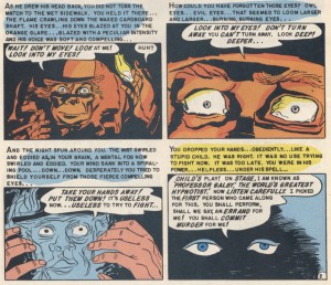
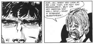
Al Feldstien/B Krigstein/Marie Severin, You, Murderer,  Shock Suspenstories #14 offers a representation of the ineluctable power of the eye and its ability to penetrate the human body and mind and to override our deeper impulses and will.

Hugo Pratt’s Banana Conga allows us to perceive how much of own volition and active consciousness is accessible to us in respect to the gaze.

Perhaps, finally, one must consider the agreement of the reader to the contract between himself and the comic artist; a relationship much desired by the artist who craves the interchange. The many demonstrations of ocular distress in comics perhaps reveal how deeply the artist is aware of the commitment of this particular form of intimacy, or the risk of abandonment.  Conversely, for readers there is an agreement to relinquish part of our civilized nature when we agree to look at a comic.  The anticipation of pleasure that precedes the viewer’s acquiescence to employ his powerful sensory aperture, the eye, is a self-revelatory act. Every time we open a comic, we stand before it in our savage nakedness. As readers, we too risk disappointment; that the pages might fail to deliver. Let us not forget that in comics we want the words as well as the pictures; we want it all. We want the whole package.

[1] Burke, Edmund. A Philosophical Enquiry. Part IV. section 9. UK : Oxford University Press, 1990.

[2] Douglas Wolk, New York Times Book Review, Holiday Books edition, December 6, 2009

Biting the Hand That Obscurely Vshzibmph, part 2

I’ve mentioned this a time or two on the blog, but for those of you who missed it, I have a couple of pieces included in the new Abstract Comics anthology out from fantagraphics, edited by Andrei Molotiu.

Though I got the honking tome a little while ago, I haven’t actually read it until this week. Part of that’s because it’s just big, and I had other stuff going on. Part of it, though, was a fear that I wouldn’t enjoy it very much. Though I do abstract drawings myself, I’m a bit leery of the idea of abstract *comics*. I talked about this on the blog a while ago:

In fact, I have a lot of doubts about “abstract comics”, both as a meaningful category and as an aesthetic project. It seems to me that when comics become abstract, they really cease to be comics and become, for all effective purposes, simply abstract art. One can argue back and forth about whether “sequential art” is the best possible definition of comics, but it’s certainly true that comics relies for its existence on relationships — between image and image and/or between image and text. Abstraction is based on removing relationships and referents — you can no longer tell how you got from panel A to panel B; in fact, in many cases, you can’t even separate panel A from panel B. But when you remove the relationships, you remove the comics. You’re left with a drawing, which exists most comfortably within the visual art tradition, rather than within the tradition of comics.

In addition…well, Tucker’s review was pretty devastating:

Abstract Comics is a tremendously random (as opposed to “diverse”) collection of graphic design pieces and black and white sketches, only a few of which might conceivably have a place in Kramer’s Ergot or one of those other anthologies people look at but don’t read. The rest are in the same category as the Buddha Machine, or Rafael Toral’s Space series–a specific, niche creation for a specific, niche audience. The only real difference is that the guys who make the Buddha Machine don’t start calling people idiots when they say they’d prefer a little more music with their purchase of sound.

That pretty much summed up my worst fears for the anthology: half-assed and pretentious. I figured I had to read it (My artwork doesn’t get published every day, let’s face it) but I wasn’t exactly looking forward to it.

And reading through the book: well, Tucker’s not completely off base.. There is definitely a certain amount of gratuitous pretension floating about here; Andrei decided to number the pages using a series of abstract symbols rather than, you know, numbers — as a result, there’s no table of contents, and navigating through the book is a needlessly giant pain in the whatever-that-is. And the author bios are a minefield — “Comics are perhaps the most complex act in the arts.” “On the macro level, here is the universal story of existence.” “There’s something about the chunks of space and time that comics are boken into, and there’s something about the way those chunks of space and time expand in the mind when read by the viewer, that really mimic the experience of actually living life, at least for me.” Less discussion of the aesthetic meaningfullness of it all, and more dry nuts and bolts explanations of process (pen and ink? paint? computer?) would definitely have been welcome.

Tucker also has a point about the semi-randomness of the collection. Andrei more or less admits as much himself in the introduction; he points out that abstract comics is more an incipient form than an actual movement. I’m not really in a position to kick at this myself though. If the anthology were more focused, or less willing to hoover up whatever was available, you can bet your squiggly bits that my work would be one of those that didn’t make the cut. (Not that I dislike my own art or anything. But I don’t think even my most ardent admirer (which would probably be me, actually) would argue that my work up to this point has been influential or important — or, indeed, even noticed.)

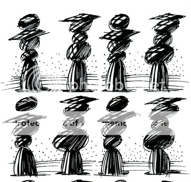
Stil…I have to say that, what with my low expectations, I was overall quite pleasantly surprised. In fact, what maybe most took me aback was how easy the volume was to read as comics. As I noted above, the combination of comics tropes and abstractions initially seemed to me like a bad and even unworkable idea. In fact, though, several of the strongest entries here are effective more or less for exactly the same reasons that a representational comic would be effective —because the creators are skilled cartoonists. For example, here’s one of a two page spread by Victor Moscoso:

The amorphous nature of the action is part of the cartoony humor and the fascination of the drawing. It’s almost like one of those “find the differences between these two pictures” games, except there are an infinite number of differences…and there’s also a sense of sequence and movement. The rock piles/graduating seniors expand and contract and puff out from one instant to the next…or else bits of them pop up in surprise, as if some sort of gravity-defying secret is being whispered from one to the other. The figures are also, just in themselves, nice to look at — and again, that aesthetic pleasure (the inky scribbles, the humorous suggestions of motion ) suggests, or is linked to, the image’s status as comics.

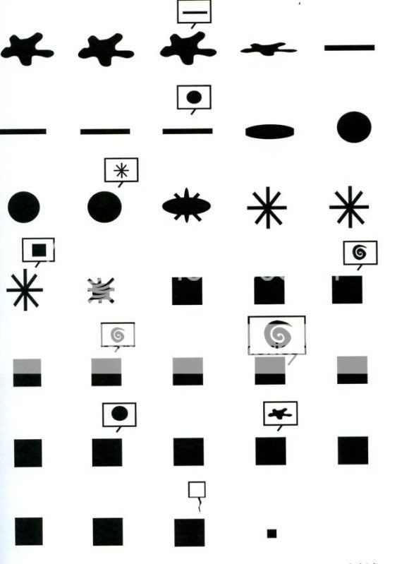
Lewis Trondheim’s efforts are make the point even more forcefully — he strips out the vast majority of representational or symbolic elements from his comics, and yet, somehow, retains all the features of his own style:

You look at that and say, “yep, that’s the same guy who did Little Santa” or whatever representational Trondheim comic you’ve seen. The amazing facility, the absolute mastery of comic pacing, even the insistent preciousness — it’s all there. The one difference is that these abstract efforts are, if anything, even more impressive than his regular comics. Anyone can make a cute story involving a penguin and an Abominable Snowman, but try doing it with just ink blots and shapes. Take that, Bushmiller.

That sense of wonder — how can you take away everything and still have so much left? — is a big part of the enjoyment of the book. Mark Badger’s “Kung Fu,” for example, turns a two page action sequence (I presume) into a bunch of what looks like copulating blocks. Yet somehow you still get the sense of motion and sequence — even of close-ups and long shots.

Richard Hahn’s pages of tiny panels, each with similar color blobs, are more clearly in a tradition of visual art…but, at the same time, they make sense in this collection, drawing a line between cubist experiments on the one hand and a series of stills on the other, so that comics ends up being a kind of intersection between visual art and animation.

Even the less successful pieces are revealing:when they don’t work, they don’t work in the same way that bad, representational comics don’t work. One of my least favorite efforts was Jeff Zenick’s *Because. An excerpt is below:

Eight pages of that and I’m both bored and irritated. And the reason I’m bored and irritated is pretty much the reason I’d be bored and irritated in a more standard art comic. Namely…there’s just nothing going on here, either conceptually or formally. You’ve got your basic four panel grid on every page, and each panel is treated as a discrete unit; nothing is done to unify the page. Nor is there any progression from panel to panel. It’s just a bunch of doodles, randomly divided up, without any attention to composition or to much of anything else. I can imagine Jeff Brown doing something like this; it has that sense of pride in its own irrelevant dumpiness.

Another piece I wasn’t too taken with was Alexey Sokolin’s “Life, Interwoven.” This starts as a pale square with pale scribbly lines, and progresses with six pages to a giant dramatic image of black and white squiggles.

The penwork is actually lovely and fun to look at…but the progression seems overdetermined and melodramatic…bargain basement Anselm Keifer. On the other hand, Patrick McDonnell’s dramatic blank squares with pinkish shading and circles off to the side seem to sum up the worst bastardizations of Japanese design, from toothless impressionism to clueless mainstream comics.

In short, I think I have to retract. I said, “It seems to me that when comics become abstract, they really cease to be comics and become, for all effective purposes, simply abstract art.” But this anthology, in its best work as well as in its not-best, shows that that’s not true. Comics really are a coherent enough medium to support their own tradition of abstraction. That tradition doesn’t quite exist yet. But, in this anthology, Andrei shows conclusively that it could. That’s a pretty impressive achievement, and I feel lucky to have been a part of it.

_____________________

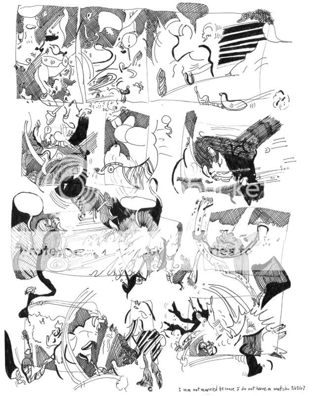
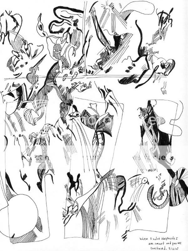
For the curious, here are my own drawings from the anthology

And, it seems only fair, all things considered, to add Dave Johnson’s acidic take on my art.

To be honest, most, if not all of your stuff I’ve seen so far looks like the work of someone sitting in boring business meeting with a blank sheet of paper and a ball point pen. Is it art? Sure, I guess. But I would put it the category of doodles as opposed to art. But I also feel that most of the art in Modern Art in galleries if, reduced down to 8″x11″ in size would feel the same way to me. Maybe you should move up to giant sized canvases. Added some paint splashes. Then, maybe I could look at it and say “well at least he put some effort into it.”