Somewhere in the last thirty-five years, Heavy Metal has earned a reputation as a legendary magazine that printed the best in trippy[1] Eurocomics (the stoner teens of the 70s were apparently deemed too simple to understand the term BD[2]). Part of that came from canny marketing on the part of the editors; issue #2 had an ad proclaiming issue #1 was a collector’s item. A big part of the legend is that the artists they were publishing were legendary – Moebius, Druillet, Corben, Tardi, Chaland, Voss, et al. Of course, there is no easy way to contradict the legend – early Heavy Metal and Miracleman are two series with almost no available back issues in general circulation, which has had had a similar effect on the reputations of both titles.
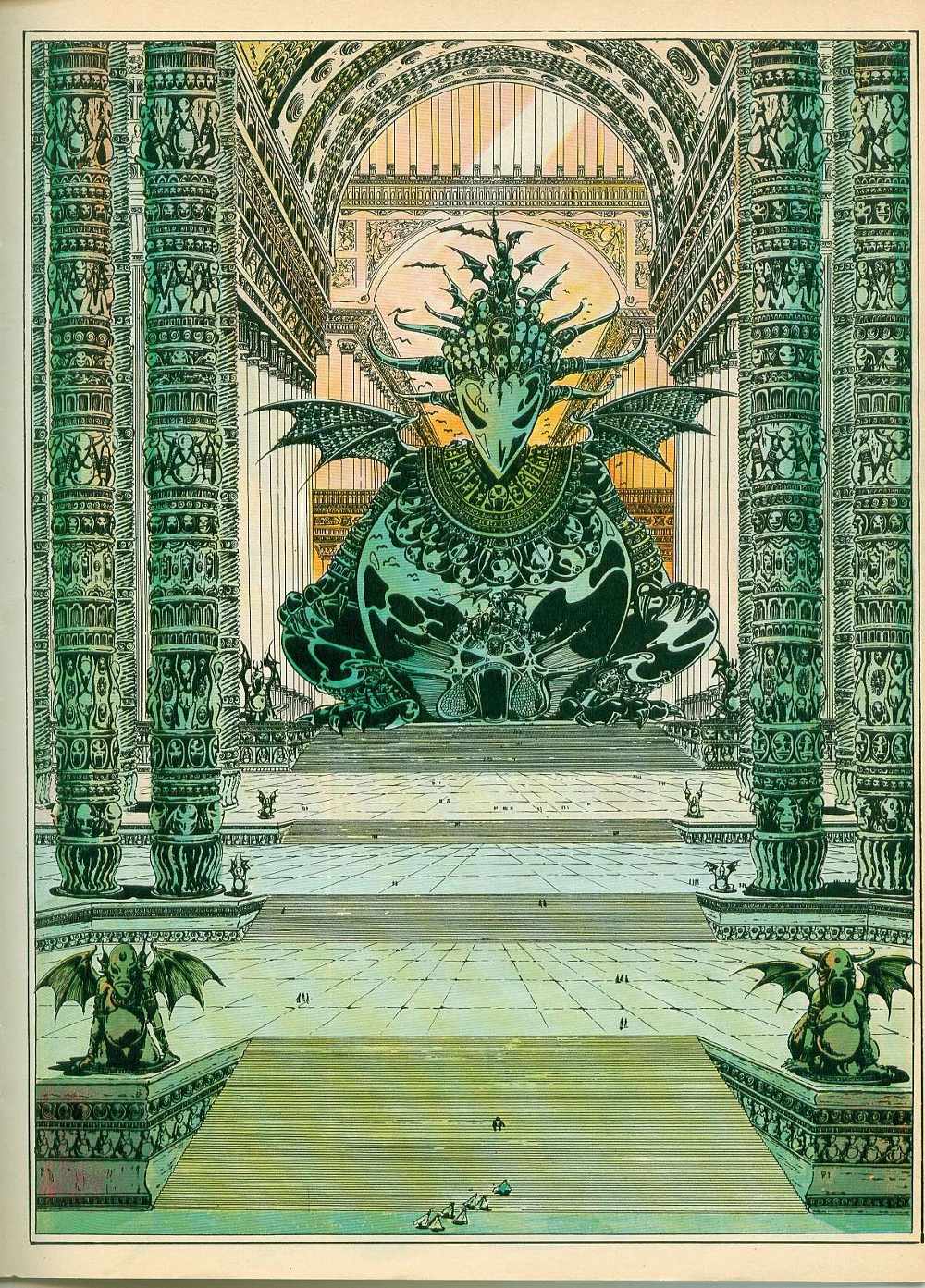
February 1978 – page 43 Urm by Druillet
When the opportunity arose to reread my father’s collection (he was a subscriber for the first twelve years of publication), I jumped at it. I’d read the run when I was in my early teens and don’t remember a lot of it. My delight soon turned to dust – I was appalled when I waded into the first two issues because the art is beautiful, but the stories are lacking. In fact, the word “stories” is generous. In some places, there is an utter lack of concern – bordering on outright disdain – for comprehensible narrative.
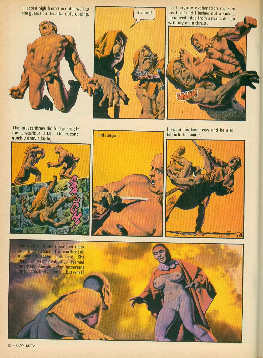
June 1977 – page 50 Den by Corben
The cognitive dissonance caused by the collision of the magazine’s reputation (especially the early issues, which are generally mentioned in terms of “when it was good”), and the actual work is jarring. It shouldn’t have come as a surprise – the fact that I’d forgotten a lot of it was a clue. But I had high hopes and the determination to look at each issue on its own merits. After a year of reading, I can say this: the issues from the 70s[3] are very problematic.
The abundance of breasts in the magazine has become somewhat of a running joke over the years, but the amount of rape (and stories where attempted rape drives the action) that appears in those first three years is something else entirely. I really didn’t keep track of how often it happens, but any number more than “none” is usually a bad sign. Tragically, it’s mostly used as just another plot point, with no mention or indication of the consequences. I’m clearly a bad person because I don’t consider the inclusion of rape themes in an anthology as an absolute show-stopper and kept reading.
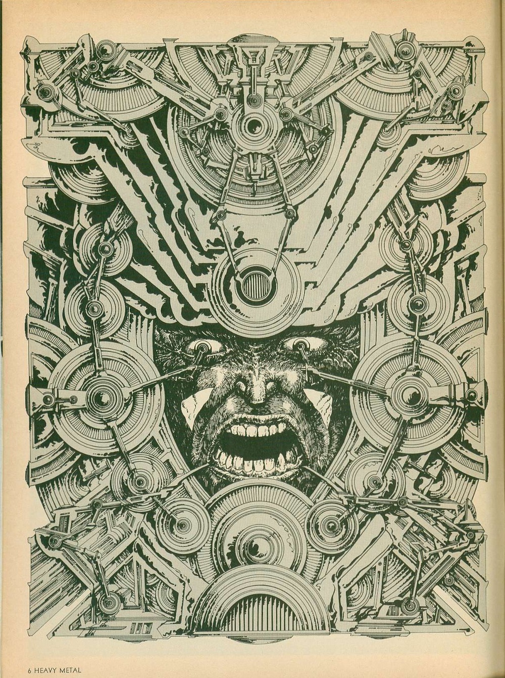
To keep myself from screaming at some of the weaker pieces, it was important for me to keep in mind that Heavy Metal is very much a product of its time and had a very specific audience. The ideal reader would put Pink Floyd on the turntable, adjust his headphones, take a few bong hits and settle back into a beanbag chair and stare at the new issue for hours. Drug references abound. One of the early marketing taglines came from a reader’s letter “Heavy Metal is better than being stoned. Almost.” And in 1979, Job rolling papers became a regular advertiser.
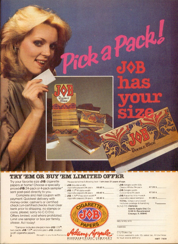
September 1979 – page 3 Job rolling paper ad
For their part, the creators were mostly European men with Old World attitudes towards women – the usual reaction towards Feminism was the inclusion of full-frontal male nudity, not to cut down on improbable breast-revealing costumes for queens who all seemed to live in tropical climates. (It is very obvious that Richard Corben and Russ Meyer would have had a lot to talk about.) These were comics by stoners who liked titties for stoners who liked titties.
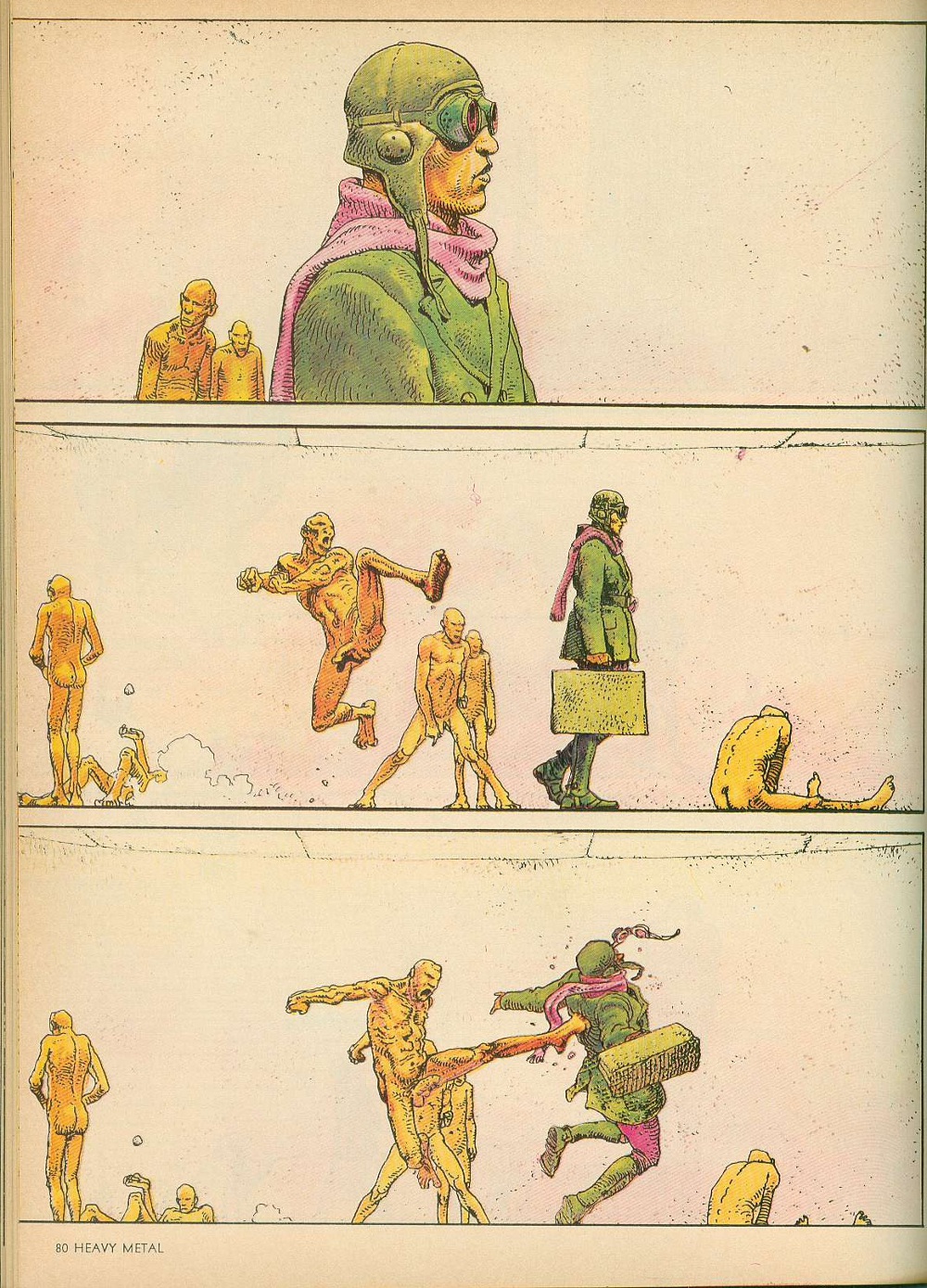
June 1977 – page 80 Harzak by Moebius
If that’s your thing, then this is the magazine for you. But if you are one of those heretics, like me, that wants actual stories with your sequential art, this is very hit or miss, with more many more misses than hits. One of the major issues in contemporary art comics (which arguably takes its aesthetic cues from Heavy Metal or what the creators think Heavy Metal represents, including the sex and drugs) is that the art is engaging and interesting, but has almost no narrative continuity from page to page or even panel to panel. The artists are having fun drawing interesting shit, which is fine. But a comic that is worth looking at once with little to no reread value is questionable at best. Unfortunately, that’s Heavy Metal in spades.
The stories that Moebius was cranking out in these early issues – Arzach[4] and The Airtight Garage – are beautiful works. He was very clearly exploring the limits of his artistic ability and the results speak for themselves. But they make very little sense. Arzach was the first major project that Moebius engaged in after working on Blueberry with Charlier for Pilote, and its wordless pages actually carry some narrative weight, but The Airtight Garage is like a kite without a string.
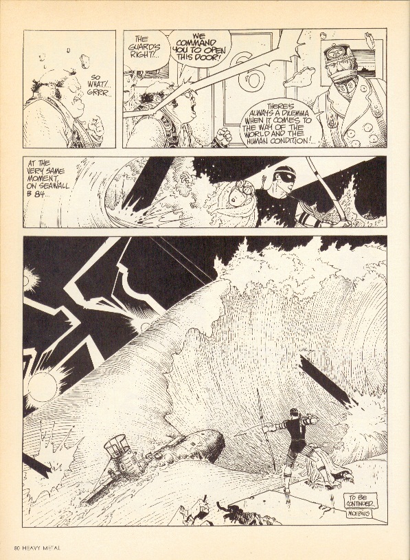
September 1979 – page 80 The Airtight Garage of Jerry Cornelius by Moebius
There are intrigues and airstrikes and assassinations and an entire sequence with an archer getting onto a submarine that look like they should be of some consequence. But the narrative stutters so much that the pieces never really come together and the revelations mean nothing. Moebius acknowledges this – one of the chapters is titled The Uptight Garbage of Moebius and a synopsis for another chapter mocks the narrative flailing. Towards the end, Moebius flat-out ignores any of the story he’s written so far and just goes for broke. The results are visually amazing, but severely flawed.
Druillet – one of the original co-Humanoids – is another case in point. His early black and white work is messy, but when he discovered color, it was like he leveled up. The color spreads from Ulm the Mad, Gail and Salammbo are amazing. He did interesting and innovative things with panel borders, incorporating photography into his art and even threw trippy optical illusion pieces into the mix. His design aesthetic owes a lot to Kirby, especially his spaceships and headgear, but it would take someone far more versed in the latter to really do a deep dive on that subject.
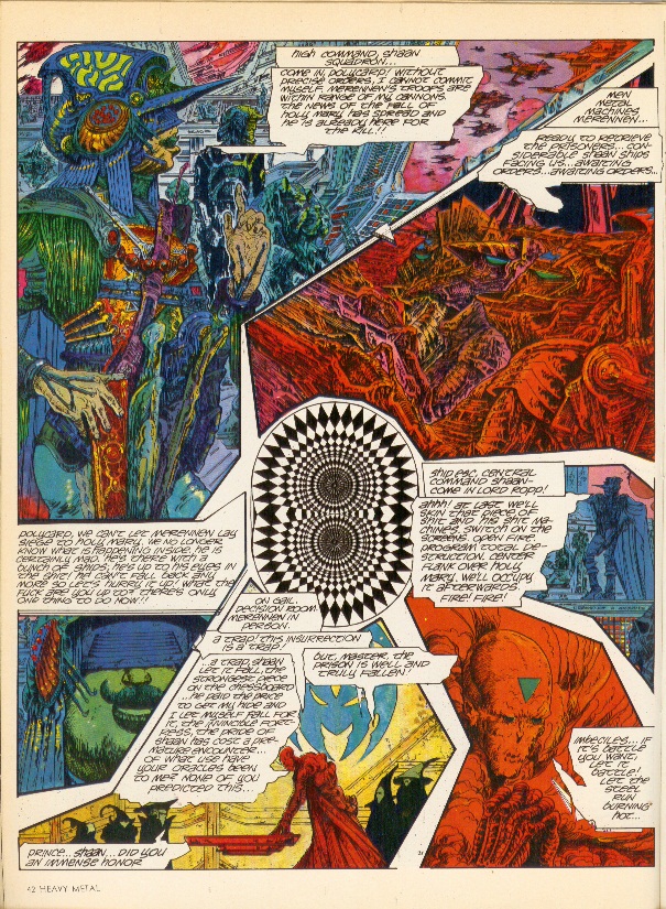
November 1978 – page 42 Gail by Druillet
One thing that Druillet could have completely left out of his later color work, though, is the words – they just get in the way. In some cases, they are lettered too small to be readable and in others, they just don’t make sense. Either way, they tend to slow down the story unnecessarily – especially the large captions that run to multiple paragraphs. It’s clear from his art that he wanted to produce epic works, but writing is not one of his core skill-sets.
It would be easy to lay the blame for these narrative inadequacies at the feet of poor translation, but the same issues crop up in works by English-speakers as well – Todd Klein, Steve Bissette, Rick Veitch and Charles Vess, I’m looking in your direction. And some of the best stories come from European sources – Jacques Tardi’s work Polonius stands out, as do several of Caza’s allegorical tales. And when these artists are working with honest-to-god writers – Dan O’Bannon/Moebius and Druillet/Picotto are good examples – they actually come out looking very good.
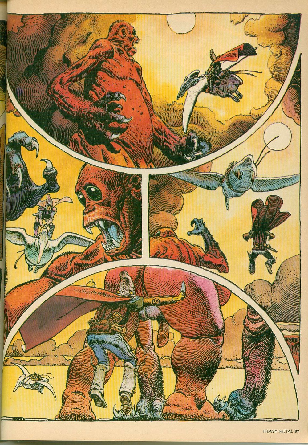
May 1977 – page 89 Arzach by Moebius
In the final examination, the art from those early years holds up really, really well. And if that’s what you’re looking for, these are great issues to track down (October of 1979 is probably the best from that period, in my opinion). But if you are one of those people who values actual story with your art, then you are going to be sorely disappointed. Obviously, the disconnect between story and art is something that the contemporary comics reader still has to grapple with and it’s fair to say that Heavy Metal is not where the trend started – it’s just the most obvious, most famous example.
Moebius and Druillet (among others) obviously put a lot of effort into their work. It seems like such a waste that they didn’t take that extra step to find a good writer to really make the work sing. And it’s not like they went out of their way to produce bad stories; they just aren’t good, which was so frustrating that it made me want to scream. As a result, they ended up producing really high-quality art comics at a time when the term didn’t exist.
When Moebius died, Neil Gaiman pointed out that The Airtight Garage was much better in French than it was in English because he had room to imagine how brilliant they were. Accordingly, my advice to young creators who are pining for these works is to go onto amazon.fr[5] and buy them in French, where they are easily available for reasonable prices. You’ll get the best part of the comics without having to put up with the sub-par quality of the writing. Plus, the French archival editions are usually very large, which lets the art breathe. In the unlikely event that these were actually published in English, the current trends tend to indicate that they’ll be shrunk down for some reason that makes no sense – which is another rant entirely.
[1] “I’d like to see an adult magazine that didn’t predominantly feature huge tits, spilled intestines or the sort of brain-damaged acid-casualty gibbering that Heavy Metal is so fond of.” Alan Moore, May 1981
[2] BD is short for Bandes dessinées, which is French for comics. BD:French::Manga:Japanese::Comics:English is the best way to think of it. People who know what to ask for will get much more out of their trips to Brussels and Paris.
[3] The issues from 1977 through 1979 serve as a good scope for this article for two reasons. First, Ted White became the editor in December of 1979, visibly changing the text/art ratio of the individual issues. Second, I’m only halfway through 1980 in my reread and can’t speak definitively about anything past that.
[4] Also spelled Harzak, Arzak, Harzac, Harzakc and Harzack
[5] It’s exactly the same site design as amazon.com, so the language barrier isn’t actually that big of an issue
