Forgetting Bakshi

baskshi1

 
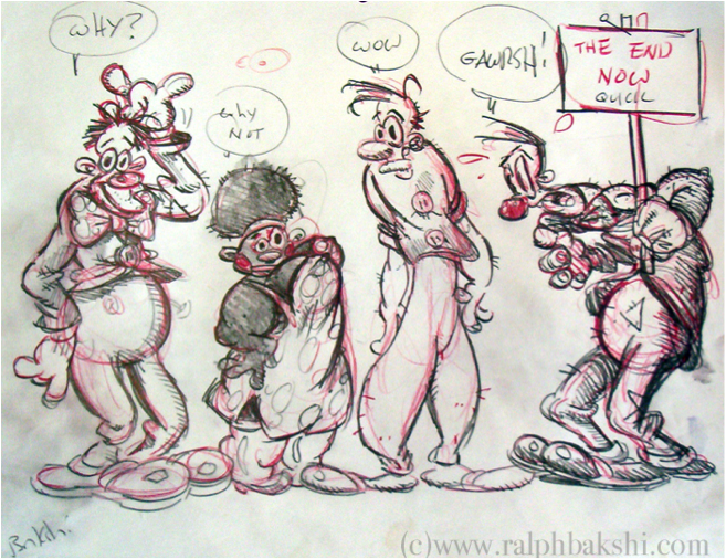
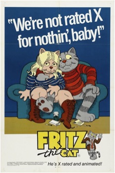
Perhaps against all odds, Ralph Bakshi’s recent success in getting his latest project funded via Kickstarter attests, if not to his current relevancy, then at least to his tenacity. Working in a medium monopolized by Disney and its copycats, Bakshi has been a figure in the American animation scene for decades, producing controversial, if not altogether attractive, animated films that have on occasion gone head to head with the Big Mouse itself. Throughout his career, Bakshi has never tried to make films that are palatable; his breakthrough film, Fritz the Cat, was the first X-rated animated film to get a wide release and was described by no less than Underground Comix grandfather R. Crumb as “repressed”, “fascistic” and “twisted in some kind of weird, unfunny way.” As if trying to live up to such harsh criticism, Bakshi’s films are often raw, angry creations, full of a manic energy that ambles frantically from acerbic subversion to a desultory, formless racism and misogyny that would drive away nearly anyone within the first half hour. Bakshi, especially in his earlier films, works from a paradigm of art popular during the 60s and 70s in the Underground Comix scene which states that anything that makes your mother and government cringe is gold, a philosophy that validates all manner of perversion and political protest as well as any racism, misogyny, or homophobia that happens to creep up on part of the part of the usually white, straight and male artist. Despite, or perhaps because of, the frantic and vitriolic nature of his work, Bakshi remains one of the only artists who has ever locked horns with the animation industry and come out clean; with Fritz and the subsequent film Heavy Traffic, Bakshi became the first animator since Disney to produce two back to back commercially successfully films. But alongside his penchant for controversy and money making ability, Bakshi had, and perhaps still has, something exceedingly rare in the world of American animation; a political drive, an ideology, a statement he wanted to shove in the face of The Man with nothing but his cartoons.
 

bakshi3

 
The paradox of Bakshi lies in the disparity between the movement of his work and its actual content; even taking his greatest failings into account, his impact on animation as an artistic medium in the United States cannot be questioned.  Taking inspiration from the Underground Comix movement of the time, Bakshi suggested that animation, like any medium of expression, had a social obligation to rearticulate complex social and political issues in new and subversive ways, a line of thought far removed from either mainstream Disney logic or the more mischievous ideology embodied in its counterparts, Warner Bros, Hannah-Barbera, and currently Dreamworks. Speaking to the Los Angeles Times in 1971, a year before Fritz was released, he famously said “The idea of grown men sitting in cubicles drawing butterflies floating over a field of flowers, while American planes are dropping bombs in Vietnam and kids are marching in the streets, is ludicrous.” Alongside this, Bakshi’s animation studio, Bakshi Productions, gave unprecedented opportunities to female and PoC animators at a time when they were virtually nonexistent in the industry. In this respect, Bakshi is unique. Even as animation has matured in the Umited States, developing if not a sense of moral obligation than at least a sly self-awareness, no past or contemporary animator has made a claim as bold nor attempted to follow through on it as Bakshi has.

This drive, towards a redefinition of animation and a shifting of its central paradigms, constitutes the movement of Bakshi’s oeuvre; the content of it, however, falls significantly short. Bakshi once said R. Crumb hated his adaptation of Fritz the Cat because of the added social commentary; Crumb himself said it was because the film was “repressed” and “fascistic”, especially when its climax ended as a condemnation of the radical left. Among the highlights of Fritz are graphic cartoon rape, the depiction of African-Americans as lusty, atavistic crows who only gain a modicum of revolutionary spirit when Fritz wills it into them and an endless parade of women as nags, sex toys and brainless groupies that would make Jack Kerouac uncomfortable. Fritz delights in sex — angry, ubiquitous and in your face sex that feels less revolutionary than it does a big middle finger to mom and dad. That isn’t to say that sexuality shouldn’t have a place at the table, or even that it shouldn’t make the viewer uncomfortable, but watching the endless repetition of cartoon humping carries all the pointed commentary of a Bansky cartoon where the villain is a McDonalds logo wearing a Mickey Mouse hat and carting an M16 Carbine. An idea is present, perhaps, but its execution is so muddled and caught up in its own cleverness it might as well start railing about “the man.” And the main character, Fritz, is a walking, humping manifestation of everything bad on a college campus; a navel-gazing, whiny, misogynistic pseudo-philosopher whose endless drive for “meaning” in a cruel and empty world where he occasionally has to go to classes and gets rejected for sex is supposed to make him a sympathetic character in the viewers’ eyes. Had the movie, perhaps, decided to cast Fritz as a completely unsympathetic character, someone who plainly isn’t fit to run a lemonade stand, let alone a revolution, the tone of the film would be different and its content more palatable. As it stands, however, Fritz remains an almost unwatchable film, and not for the reasons either Bakshi or his right-wing critics would attest.
 

baskshi1

 
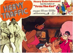
After the tempest that was Fritz the Cat (and box office success, in no small part due to its notoriety) Bakshi’s films seemed turned towards the personal rather than the heavy-handedly political. Heavy Traffic, the film immediately succeeding Fritz the Cat, sought to latch on to the latter’s momentum in what Michael Barrier described in his seminal Hollywood Cartoons as an effort “to push beyond what was done in the old cartoons, even while building on their strengths.” Bakshi, a Palestinian native who grew up in working-class Brooklyn digging through the trash for comics, used the film to channel an aesthetic vision of American urbanity at once instantly recognizable and deeply personal; an America dominated by pinball machines, wafting cigarette smoke, one-word ethnic caricatures and, in the words of the trailer, an amalgamation of “hoods, hustlers, freaks, creeps, cops, crazies, weirdos, rhinos, hardhats, lowlives,” and most interestingly, “god.”
 

bakshi4

 
The Brooklyn Heavy Traffic shows us is one of juxtaposed creations; diseased streets filled with tender hearts, crude ethnic caricatures concealing complex interpersonal relationships, slapstick violence masquerading the very real blood shed on the very real streets. It is a crude, violent and raw film, like the best of Bakshi’s oeuvre, and it brims with hazy meditations on the intersections between race, class, gender, and faith in god that defined urban life in this country for generations. What Bakshi lacks in finesse, he makes up for in passion; the film seems at times cobbled together, its live-action, psychedelic, crudely sketched and improvised bits seemingly held together with popsicle sticks and glue. And yet, it holds; the film’s heterogeneous composition only further its vision of animation and of America, both of which position themselves as feel-good, moralistic, and patriotic creations of a master spirit. Bakshi, conversely, seeks out their contradictions, their concealed violence and sex and malice, and creates a pulsing, poetic landscape dominated by the raw beauty of sex and violence, poverty and anger, a contraction of everything America stands for and a declaration of what America truly is.

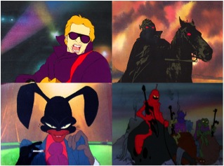
Following the success of Heavy Traffic, Bakshi’s works over the next two decades divide into three categories; meditations on American life, angry slapstick comedies that are at times, like Fritz, completely unwatchable, and fantasy/sci-fi works that draw as much on pulp-fiction magazines as the traditions of Tolkien. In the span of 10 years, Bakshi had released the quasi-blaxpoitation film Coonskin, the fantasy film Wizards, an adaptation of The Lord of the Rings, and the more Heavy Traffic-esque American Pop and Hey Good Lookin’. Despite being markedly different on the surface, a consistent palette of themes emerge from them; an artistic occupation with bricolage and cut-up techniques, a gritty and purposefully unpleasant aesthetic that often delves into pure surrealism, and the subversion of traditional cartooning techniques to create caricatures of ethnic groups, organized crime, violence and sex, and what it means to have an identity in America. He never, however, fully escaped his prejudices, and the constant stream of misogyny and racism that colors his already hard to watch films is always apparent (Coonskin in particular was a cause célèbre in its time; while Bakshi considered it his masterpiece, its premiere was protested by the Congress of Racial Equality). His fantasy films forcefully attempted to redefine the scope of animation as a narrative device, but often hit walls with recalcitrant producers unwilling to provide funding and had to cut corners; the battle sequences in The Lord of the Rings, achieved through a combination of rotoscoping and tracing animation cels onto live action sequences, look almost embarrassingly amateurish. The animation industry was, and remains, a pathetically timid creature, and even the most successful of directors have had to fight tooth and nail to get any semblance of funding for works not focus-grouped to hell and back. Since Bakshi’s heyday, this has only gotten worse; a proliferation of “self-aware” cartoons, led in part by Bakshi protégé John Kricfalusi’s Ren and Stimpy, fall far short of the in your face fuck you bravura of Bakshi’s works, but manage to slip in a few “adult” references as if to assure themselves they’re not just kid’s cartoons. But the discomfort that Bakshi’s work stirs up is meant to be explicit; it is a calculated political gambit, the kind that the masters of the Underground Comix specialized in. By splattering shocking and perverse imagery throughout their works, Bakshi takes the viewer’s preconceived and carefully crafted notions of cartoons and comics as kid friendly creations and smashes it in their face.
 

bakshi5

Bakshi’s later films, from upper-left; American Pop, Lord of the Rings, Coonskin, and Wizards

 
The comic and cartoon, in many ways, has historically functioned as a visual representation of the American political consciousness; it is a sterilized mask behind which imperial machinations thrive, the visual signifier of a moral cosmology that delineates two forces, the strong and just Mickey Mouse/Superman archetype on one hand and the dark, formless evils of communists, fascists, and everyone else on the other. The comics and animation industry, with their blacklists and their codes authorities, were more than happy to play the role of arbiter of American hegemony to children worldwide, and through their influence, a whitewashed, always-smiling artifice of pop culture that took root from Texas to Tokyo. By contesting these novel art forms, the Underground Comix movement hoped to breathe new life into them, to free them from their moralistic restraints and utilize them for methods of individual, political, and sexual expression. But while comics have continued to thrive since the 70s in this aspect, any underground animation movement remains moribund. Bakshi remains perhaps the only exception to the rule; throughout his career, he went head to head with major animation companies and even managed to on occasion break into the mainstream, albeit for reasons he might not have wanted.

But even in the most positive light, Bakshi falls into the traps of so many artists of the time; in attempting to establish a counter-hegemonic force to the mainstream corporate forces they opposed, Underground Comix developed an antagonistic strategy that lamented “political correctness” as much as it did corporate authority, creating a space unwelcoming to anyone who were the victims of systems of oppression those so called “subversive” artists never perceived, i.e., anyone not white, straight and male. Bakshi’s racism and misogyny, no matter how embedded in irony he may have thought they were, are still racism and misogyny at their core, and this remain critical to understanding the shortcomings of Bakshi’s political goals. Also critical to understanding Bakshi’s limitations is examining the direction his work has taken since the 80s; rather than boldly confronting new social and political issues in the aftermath of the Cold War, like globalization, ecological threats to the planet, heightening tensions with the Israeli-Palestinian conflict, or 9/11 and its aftermath, Bakshi seems almost rooted in his own nostalgia, producing little more than the film Cool World, which animation historian Jerry Beck called a “pointless rehash of many of Ralph’s favorite themes,” and a slightly more risqué remake of Mighty Mouse, the cartoon that gave Bakshi his start as an animator in the 60’s.
 

bakshi6
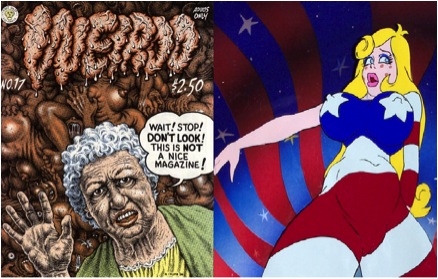
The mix of race, sexuality and culture in Underground Comix and Animation was rarely a comfortable one.

 
And what of his most recent film, you may ask, the one mentioned at the beginning of the article? Its title is Last Days of Coney Island, and it promises to have everything you’ve come to know and love from Bakshi; the underside of New York, prostitutes, gangsters, seedy character designs that younger audiences might mistake for Ren and Stimpy characters, and more. There’s something almost tragic to see the man who once produced more bombast (and on occasion, genuine artistry) than any other cartoonist this side of the Pacific working with a set of motifs that haven’t been relevant since the 80s. But such an assessment is enormously unfair to Bakshi; at 74 years old, he’s earned the right to work on personal projects, to conceptualize and illustrate his experiences as an individual rather than as an artistic rabble-rouser. But where Bakshi himself may not have succeeded, the need for a Bakshi-like manifesto remains for animation, for the fact remains that there simply isn’t anyone in contemporary American animation that is doing the type of political bomb throwing he did. That’s not to say that there isn’t excellent work being done by underground artists and animators in the United States, for their certainly is, but little of it has had the scope and reach of movies like Fritz and Heavy Traffic in their heyday. This can partially be attributed to changes in the animation industry in the whole as well as to changes in the political composition of underground artists that have made it refreshingly more queer, PoC and female-friendly, but any attempt at synthesizing the techniques, outlooks and technologies developed since the ‘70s has been minimal.

Ultimately, I would predict many of Bakshi’s films as individual works will be forgotten. Their racism, their misogyny, their formless anger and hatred makes them politically “incorrect” but more importantly politically conservative, reactionary and morally reprehensible. Aesthetically, they have not aged well with time, and their ultimate artistic value for many may simply be as relics of a long-forgotten counterculture movement and its sensibilities. But the need for a political Bakshism, and for the opportunities Bakshi’s animation studio created, will remain. In the years since Bakshi’s semi-retirement, animation has become increasingly complacent, animators increasingly maligned and mistreated by their production companies, and with the exception of more amateur creations produced through online collaboration, the medium itself has been increasingly displaced by more technologically advanced live-action works. In order to develop critically as a medium and retain clout in the way comics, and increasingly video games, have, animation needs more Bakshism, more rabble-rousing and anger and impetuses to collaborate, to subvert, and to pursue “adult” themes and narratives without needing to dress them up in kid-friendly formats. What it does not need is Bakshi’s racism, sexism or the general immaturity that colored so much of the Underground Comix movement of the time. Even if we forget Bakshi, we cannot, and should not, forget the movement that he struggled for, a movement both towards subverting American culture and media and redefining the parameters, depth, and meaning of animation itself.


Strange Windows: Ha, ha, ha, Moooo…! (Ligne Claire 1)

“Allow me to shelter you under my umbrella!”

France is well-known for its strong comic-strip tradition, la bande dessinée;  deeply linked to this is an equally strong  tradition of children’s books –a wondrous one. Much of this literature has crossed over into English; think of Babar and The Little Prince;  or go back two centuries, to when France gave England Mother Goose  (from Les Contes de ma mère l’Oye, by Charles Perrault.) Many of the most beloved fairy tales in the English-speaking world were translated from  French authors’ versions, either invented or re-told: ‘ Puss in Boots’, ‘Sleeping Beauty’, ‘Bluebeard’, ‘Little Red Riding Hood’, ‘Beauty and the Beast’.

Alongside these books grew an army of fine artists to illuminate them, and today I wish to spotlight perhaps the most successful –and charming– of French illustrators  for children: Benjamin Rabier.

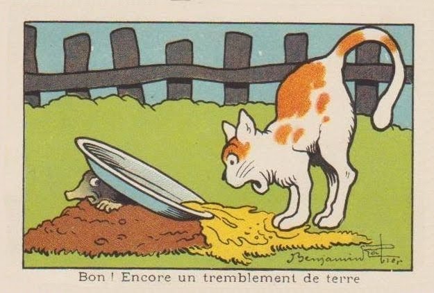
“Well! Another earthquake.”

Rabier (1864-1939) was the author of dozens of children’s books, mostly featuring animals;  he was also an early pioneer of both the comic strip and the animated cartoon; he was a successful playwright; but his greatest claim to international fame derives from a single image of commercial art, as we shall see. Benjamin Rabier: artistic polymath!

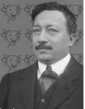
Portrait of Benjamin Rabier

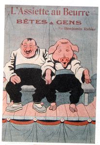
He came up from La Roche-sur-Yonne in 1899 to Paris, where he was employed as an accountant (a job which, despite his vast success as an artist, he kept until 1910, quitting for medical reasons alone.) At the same time, he started contributing to various humorous and satirical magazines such as  La Chronique Amusante , Le Gil Blas Illustré, Le Rire, L’Assiètte au Beurre in France, Scraps in Britain, and Puck in the United States;  in all he’d contribute to over fifty magazines and newspapers over his long career.

However, arguably Rabier’s most important contributions of that time –in light of his subsequent fame– were to the children’s publications of Arthème Fayard (La Jeunesse Illustrée and Les Belles Images). These were weekly anthologies of child-oriented prose and drawings; their success provided the template for the traditional French and Belgian comics magazines. In 1898, he produced his first book, about the adventures of a mischievous boy: Tintin-Lutin:

(If the title seems familiar…wait and see.) It was the first book of many.

In the 1890s, France introduced compulsory free education for all. Thus, millions of children learned how to read– creating a true mass market for children’s literature.

Add to this strong innovations in printing techniques– such as photo–engraving, linotype, and the introduction of cheap, vivid aniline dye-based color inks, and it is obvious that Rabier came along at the ideal time in history for an illustrator: a golden age.

He quickly became sought after for his anthropomorphic depictions of animals; his beasts showed the full range of human passions and emotions, from merriment to sorrow to rage– and yet remained recognisably animals.

He illustrated some of the great classics of animal tales, such as the medieval adventures of the trickster Reynard the Fox– collected in 13th century France under the title Le Roman du Renard:

He also illuminated at length the works of the 18th century father of zoology, Georges-Louis Leclerc de Buffon:

…showing he could be a most competent ‘straight’ animal illustrator, as shown in this scene of a farmyard:

…or this  drawing of an anteater:

Yet even his ‘straight’ illustrations show liveliness and emotion– witness the quiet anger expressed in this show of bearbaiting:

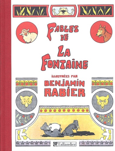
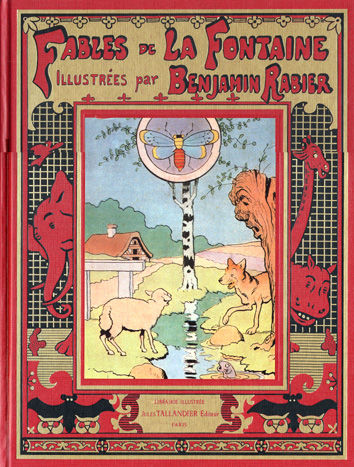
In 1906, he undertook a gigantic new piece of work: He illustrated all 240 of the rhymed fables of Jean de La Fontaine (1621–1695),  perennial classics known and loved by French children for over three centuries:

Some of these he drew in a comics-style sequence, as shown in these “collapsed” examples:

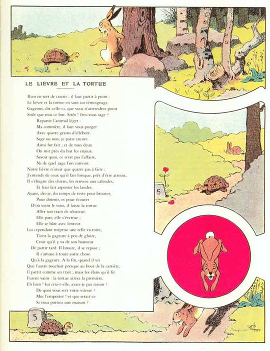
..and others in a ‘picto-fiction’ blend of text and art, such as this version of ‘The Tortoise and the Hare’:

…or of  ‘The Frog that would be as Big as an Ox’: Mark the merry expression on that bovine face: it prefigures Rabier’s most famous creation, to which we’ll turn shortly.

Note that Rabier was also a highly successful advertising artist, as can be seen from the below samples that parody La Fontaine to sell toothpaste, cough medecine, and shotgun shells:

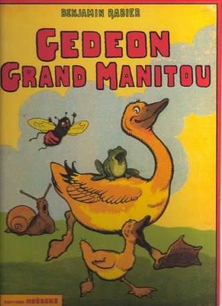
In 1923, Rabier introduced his most enduring creation, Gédeon the Duck, who would go on to star in 16 picture-books and several animated shorts:

As we’ve seen, Rabier was also an early adopter of the new art of the comic strip. This one is titled ‘The Phono-Trap’:

Panel 4: ‘Come, Medor, I’m caught!’ Panel 5: ‘Lunch is served!’

Or consider this oddly touching adventure of a fly: Rabier’s comics begin to take on a familiar look for aficionados of la bande dessinee. With their strong, simple linework trapping flat pastel colors, they seem obvious precursors of the Franco-Belgian school of cartooning known as la ligne claire, the  ‘clear line’, notably exemplified by Hergé, the creator of Tintin.

Hergé freely acknowledged the influence of Rabier:

«His drawings were very simple. Very simple, but sturdy, fresh, joyful and perfectly readable. In a few well-carpentered lines, everything was said: the setting was shown, the actors were in place; the comedy could start (…) And it’s for sure from this encounter that I date my taste for a clear and simple drawing, a drawing to be understood instantaneously. It is, before anything else, this readability that I myself have never ceased to seek”. –Herge, foreword to Rabier’s Fables de La Fontaine (tr:AB)

This influence went as far as stealing gags!

Rabier, 1920: Herge (in Tintin au Congo), 1930:

(Scroll quickly down the Rabier boa cartoon, and you’ll get a great simulation of animation. It demonstrates Rabier’s skill in panel-to-panel design.)

Some say Herge took the name of his hero from Rabier. I suppose it’s possible, though ‘Tintin’ wasn’t that rare a nickname (for ‘Augustin’).


The two Tintins

From 1917, Rabier collaborated with the father of the animated cartoon, Emile Cohl (1857–1938), in a series of cartoon short films. However, animation was to be dominated in the 20th century by a different style:

…a style that would come to dominate “funny animal” comics, as well.  Rabier’s work was to have little influence: another tantalysing possibility shoved aside by the brute force of Hollywood.

Note the smiling cow below. What would you get if, instead of smiling, the cow were laughing?

Why, you’d get a processed-cheese famous the world over, of course!


In 1921, Léon Bel introduced a new melted cheese packaged in individual, foil-wrapped wedges: La Vache qui Rit, ‘The Laughing Cow’. It was, and remains, an international hit product.

Two years later, Rabier designed the definite image of the hilarious bovine, and it remains– with few adjustments– the one used today:

2011

The origins of the laughing cow are obscure; it’s claimed that Bel’s wife coined the word ‘Wachkyrie” as a mockery of Wagner’s ‘Die Walküre‘. (‘W’ is pronounced like ‘V’ in both French and German.) There subsequently came out a successful dance by that name:


Naturally there were many imitators, and Bel fought numerous lawsuits against cheesemakers who introduced ‘the reading cow’, the smiling cow’, and many others: the Serious Cow (below) lasted as late as 1959.

Even Rabier got into the copycat act, with his Crying Cow:

Fun fact: in Indian restaurants, the fillings for cheese nans are almost always Vache qui Rit!

Over a century after Benjamin Rabier started drawing children’s books, not a single one of them has gone out of print.

Isn’t that a precious sort of immortality for an author– making generation after generation of kids laugh and smile?


Ad for Rabier-based toys:


A Gédéon figurine:

A laughing dog pull-scooter:


Rabier-designed cutlery holders:


A video clip in French about Rabier, with extracts from his animated cartoons.

Doubly Good

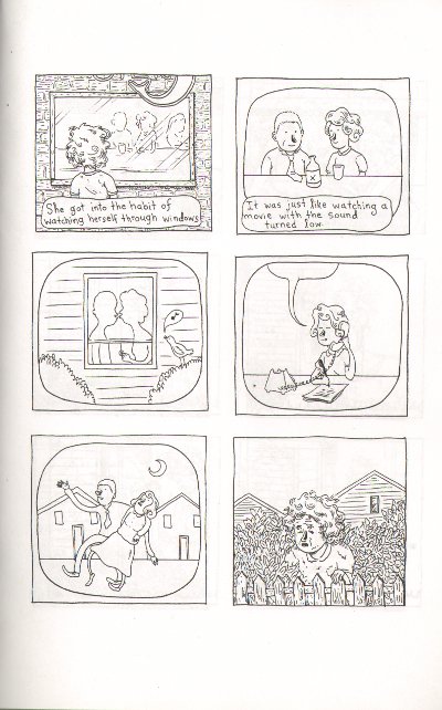
There’s a moment in Lilli Carré’s minicomic “The Thing about Madeline” where you really get that you’re reading a real story and not another installment in the Saga of the Mundane. It’s a little later than the point where that story actually begins: not where Madeline meets her doppelganger/self for the first time – that’s just a plot twist – but when Madeline the First gets “into the habit of watching herself through windows”:

Robert Stanley Martin correctly identified this moment as the place where the story’s main narrative idea slips from metaphor into dramatic irony, as the doppelganger is able to find the happiness in her life that Madeline could not. His review is so spot on I’m just going to link to it rather than trying to cover those aspects of the narrative myself.

But those panels also mark the place where the visuals take over doing that metaphorical work that the narrative leaves behind: the images of double Madeline continue to manifest the theme of alienation from oneself and one’s life while the plot (and facial expressions) hold up the ironic narrative.

What’s particularly beautiful and satisfying about this is not just that the visuals effortlessly carry significations that would become increasingly labored in prose. It’s also that the comic itself is now doubled right along with Madeline: the themes of alienation and happiness continue side-by-side formally in the same way that Alienated Madeline and her Happy Doppelganger populate the narrative. What this allows, then, is two separate story arcs: a literal one about Madeline and the Doppelganger, and a sustained metaphorical one about the relationship between alienation and happiness. Toward the end of the book, when Happy Madeline is visited by her own Alienated Doppelganger, the scenes from the beginning are recast – on a second read or in retrospect, it’s possible to see Happy Doppelganger and Happy Madeline as the same “character.” In that reading, self-alienation is always lurking and, as Robert points out, the easy moralizing criticisms of Alienated Madeline are much harder to make. The powers of circumstance and perspective get attention in a way they could not if the story had stayed more personal, eschewing that metaphorical strand.

Carré’s work always balances very deftly on the line between ironic detachment and literary self-awareness, both traditional dramatic irony as well as the more formalist kind. Her characters often have these very distinctive noses that are a mashup of Mary Poppins and Raggedy Ann, and they alone are sufficient to make her drawing style immediately recognizable. In the case of The Thing about Madeline, this stylistic quirk works as support for the formal edifice: they mark the characters as “drawn,” and the effect of this signature is to anchor those characters to the visual plane of the comic. They restrict the universality of the characters and contribute to our sense of detachment from them.

That signature nose is absent from Carré’s most recent animated film, Head Garden, one of the selections for the 2010 SPX Animation Showcase.

Head Garden from Lilli Carré on Vimeo.

Instead, the face carries the metaphor, more directly. The facial features are less “cartoony” and more influenced by “art” faces like the ones discussed here and in comments. For me, the loss of this creative “signature” lets the animation breathe and allows the critical, slighly neurotic self-awareness of ironic detachment to mutate into the genuine double entendre that marks the best literary characterizations. The physical marker of style is less overt, but there is no loss of metaphorical sophistication (relatively at least; the animation’s metaphors are less ambitious than the mini-comic’s). The characters have become less “self-conscious”, although less well-developed in this less narrative piece, and I think because of this, the seams between the form and its significance are better hidden. I don’t think that’s just an effect of the film as opposed to comics. Identification with these characters is less detached even in still frames, despite the much more distant narrative characterization.

It seems to be a one-off, though; Nine Ways to Disappear maintains the signature style, as do Carré’s previous animations. (The nose is put to exceptional effect in What Hits the Moon; watch the way it sustains the character’s identity as her face ages around it.) But I think the comparison illustrates some of the limitations of too much “handwriting”: after awhile, it begins to feel like deliberate self-citation. Unless the handwriting is used in some meaningful way, it can interfere with other effects. Head Garden is still discernably Lilli Carré, but in the absence of that distinctively marked facial feature, her graceful but slightly awkward lines — like the talented too-tall girl in ballet class — get to take center stage. I hope to see a sustained story from her in the style of Head Garden sometime soon.

=========================================================

This review is based on the black-and-white mini-comic version of The Thing about Madeline. More information on the SPX Animation Showcase is available here.

Interview with Nina Paley, Part 1

This is part of a roundtable on copyright and free culture issues. You can read the whole Cuckoo for Copyright roundtable here.

=================================

Nina Paley’s adventures have taken her from Urbana, Illinois across the US and around the world to her current location in New York City, where I had the chance this past weekend to visit and talk with her about cartooning and copyright.

Paley worked as a cartoonist from the late 1980s through the mid-1990s, writing comic books and then newspaper strips before switching to animation. If you aren’t familiar with her work, check out her website and blog as well as my recent post about the copyright controversy surrounding her film Sita Sings the Blues. Or search for her cartoons on Archive.org.

I was lucky enough to have a copy of a printed collection from 1987 of her very early work, from high school and college, which she hadn’t seen in years. That’s what we’re looking at during the start of this interview.
=================================

I’m looking at these political cartoons, and they’re really disparate. It looks like someone said “we’ve got this article on this thing; draw something.”

Yes, that’s exactly how the political cartoons in the Daily Illini worked. I was just an illustrator, I was just drawing. I developed my drawing skills long before I developed my voice. So I was happy to illustrate anything.

Did they tell you the position to take in the cartoon? Did you have to agree with what was in the article?

I don’t even think I was paying attention. [Stops and points to a particular cartoon.] God, what an idiot I was! This is such bullshit. I was developing my politics according to people around me, ‘cause I was in college. So I was just sort of – if anyone I knew was outraged about something, I would say “what are you outraged by?” and they’re my friends, so I was like, “that’s outrageous!” Now that I’m a grown-up, I’m thinking, “what the hell?” [laughter] All these — what the hell, these are all opposite to what I think now. Apparently this one was calling for more parking on campus, and I hate cars now, and there’s way too much parking and paving, screw that. And here: “the US isn’t doing enough about terrorism.” But I was so dumb then, “oh, these people are doing bad things to other people and we should do something.”

But you did come from a political family, sort of. Your dad was the mayor of Urbana…

He was the mayor between my ages of 4-8, something like that. It was all very traumatic. Not his being mayor, but the crap I got at school from other students. My thing was, I was drawing very early, and I had my own needs for attention and stuff, and every time I drew something well, the other kids would say “you’re just showing off ‘cause you’re the mayor’s daughter.” And I would be [crying] “That has nothing to do with my art!”

I was going to ask you when you started drawing; so it was really early. You mention (in the intro to the 1987 collection) that you did a couple of comic strips with a history professor at Uni High (University High School in Urbana). Were you cartooning before that?

Not much, I mean, I didn’t get into cartooning. I thought cartooning was not art. I aspired to draw “real art” when I was a kid, when I was below 10, I thought the goal was to draw as realistically as possible and that cartooning was some sort of weird cheating thing, or not cheating but just, it wasn’t the same. But then as I got a little older, got into my early teens, I realized that cartooning was powerful. It had a powerful affect on people that just drawing pretty pictures did not have.

Were you reading things that made you see it that way, or what caused the epiphany?

The epiphany was when I started drawing them and I got all this attention. I gotta be honest about attention. I’m thinking a lot about attention and the attention economy, and I am remembering attention is sort of a dirty word from my childhood, to say “yes, I wanted attention”, you’re not supposed to say that. You’re supposed to say that you have higher motives or something, but wanting attention is really bad. And of course it was always way more than wanting attention, but attention is an essential component of communication, you know? [laughs] There’s expression and then there’s reception, and reception or attention are sort of synonymous in that respect. So when I said things, I wanted to be heard. When I drew things, I wanted them to be seen, and I just found that if I drew cartoons, lots of people were interested in looking at the cartoons, and not so many people with drawing pretty. People would say, “oh, that’s very well drawn,” but cartooning actually had an effect on people; they would actually be engaged.

It’s intimate in a way that fine art is distancing?

I don’t know! I don’t think it has to be. It’s not like the drawings of a 13-year-old explored all the aspects of fine art [laughs] or anything like that. But even when I was into the realistic drawing, I was always interested in mass media art, like books, newspapers, illustrations. And I didn’t even realize – it wasn’t until I was almost 20 that someone distinguished illustration from art. I would make these drawings and someone said “oh, those are illustrations”, and I was “oh, there’s a difference? This is some category of art? I just thought they were art.” But apparently everything I was thinking was art when I was young was actually illustration; I just didn’t know that. I thought it was art.

That was when you were in college? Were you studying art?

I think I was about 19, and it was actually a cousin. A cousin of mine, Debbie, who is a really great artist and designer who now lives in Chicago. [Editor’s note: Debbie’s website is here.] She paints objects, like shoes – I mean she paints on them – shoes and chairs and things like that. She was a designer for a shoe company and they lived in Toronto, and I had drawn these ink drawings of iguanas and showed them to her and asked “What do you think of these? Can I be an artist? I want to be an artist!” and she said “oh, I think you’re an illustrator.” So apparently I must have been fascinated and influenced by books, comics, newspapers. Scholastic books, those books you order in school and they come like Christmas every month? They had all these great things that you can’t find online because they’re under copyright and whomever owned them would never release them that way.

I remember I had a book called Captain Ecology, a cartoon by Tom Eaton. There’s another cartoonist named Tom Eaton but this is a different one. It was a comic strip book thing and I liked the drawings. And there was Escaped from the Zoo in the Daily Illini; this would have been in the early 80s.

I always drew, everybody drew when we were young. Other people stopped drawing and I didn’t. It’s really true, everybody drew.

When did they stop?

I don’t know because I wasn’t paying attention! It was just like I looked up [laugh] and “what happened to everyone? When did this start?” I don’t know what age people start really getting into shame, like feeling ashamed of themselves.

[flipping through book] PLATO! (Editor’s note: PLATO was the first computerized instruction system, built around 1960 by the University of Illinois and used by the university and local schools.)

There are lots of computers, and engineering stories and space stories in this early work. Was that the influence of the people who were writing for you?

That was my group. My father’s a mathematician, and my brother was studying math and computer science; I went to Uni High after my hellish three years at Urbana Junior High. I used the PLATO computers all the time. I was an early computer addict before most people had that opportunity; those were my friends, that was my life. When I was in college, I met other people, but I didn’t befriend other people. I always thought that the cooler people were the engineers and stuff, I did study art and I dropped out after 2 years. socially going into the art department: it was like a wasteland.

So the transition to doing Flash animation on the Mac was very natural.

Yes! Definitely.

It sounds like you were very interested in expression, in getting your drawings out.

Initially, I was just interested in developing my skills. I didn’t really learn how to really speak with my own voice until I was 20 and moved to Santa Cruz and started doing Nina’s Adventures in Santa Cruz. Up until that point, I was just interested in illustration and illustrating other people’s ideas. It just didn’t occur to me that I had that kind of voice. And I just wanted to draw. I think I was aware of the power of drawing; I didn’t know how to use it but I liked it. I was developing it. I couldn’t imagine writing my own comic strip.

And I look back on it, and I had no self-esteem, so I was continually anxious about doing this comic strip that was written by someone who wasn’t a student, (Joyride, originally written by David Gehrig), because there were these really explicit rules: Student Work Only in the paper. So I had to keep it a terrible secret that I was using an outside writer – David is writing it and he’s not a student! I gotta write this myself, ‘cause I can’t have that!

You mention (also in the introduction to the 1987 volume) that you thought you weren’t a writer. How did you figure out that you could write them yourself? At some point you must have come to terms with yourself as a writer; can you tell a little bit about how you got there?

I just started! [laughs] OK, that’s not entirely true.

When I was 17–18, I started writing a journal. I was doing a lot of very necessary self-searching because I was depressed. I was quite out about being very depressed as a kid, and basically depressive as an adult also although I take medication; I’ve been taking medication for 20 years.

And it works?

Yeah, fuck yeah. Which is not to say that I don’t still have episodes, but they’re spaced much farther apart. Devastating when they happen, but at least it’s not every day all the time. So, I was desperate, because that kind of mental illness, the older you get the worse it gets. So I was desperate for anything to help myself, and at some point I started writing this journal, this illustrated journal-y thing, where I was writing about real things that were actually going on. Things that I was feeling terrible about, and things that I was ashamed of, I would actually write them. I got better and better at looking at the hidden part of myself, and getting them out.

…externalizing them through both writing and pictures.

Yes.

Were those experiences of writing and drawing similar for you?

I wrote and drew.

Just seamless.

Yes. I wrote and drew pictures [laugh] of the inside of my head, punching people, killing myself, all those things. And they were funny, man, they were really funny. So I’d be writing these things and laughing.

And I saw shortly before I left Urbana, I saw Life in Hell for the first time, the Matt Groening books and I saw Lynda Barry’s older books. I mean, obviously they had to be older books because – that is what is now her early works. And both of them were actually doing comics about real things. They weren’t just doing fluff entertainment. They were doing psycho comics, and they were just so real. They were brilliant, and those were the first things, the first time I ever realized, oh wow, you can really discuss real stuff and deep stuff and profound stuff in comics, and be funny. So they showed me it was possible, and then I moved to Santa Cruz, when I was 20, which was a whole other world of trauma that I wasn’t prepared for.

Were you going to school?

Nope, I wanted to be a new-age crystal-wielding hippie. My friends in Urbana were hippies. In Urbana, the smart non-conformist people were hippies. And so I went to Santa Cruz, young and naïve, and was like, “oh, it’s all full of hippies; these are my people.” And I actually lived there, and then it was “no wait, in Santa Cruz, the dumb conformists are hippies and the smart non-conformists are something else.” [laugh]

So there I was – increasingly disillusioned, young, dumb, mentally ill, [laugh] and I’d just moved away from home, and I guess that was enough stress that it finally found an outlet with my Nina’s Adventures strips, which were taken from my journals, and so it began. Thus began my real life as an artist.

I was in Santa Cruz for 3 years, and then in 1991 I moved to Austin, Texas for 3 months, and it didn’t work out [laughter]. I had one hell of a depressive episode there. I kept moving away from anyone I had contact with. I didn’t realize that I actually had connections with people. I think that was a real problem with being depressed. There were people in my life but I felt like I was all alone, and nobody loved me and like that, so I thought I had nothing to lose, but you move away from it and it’s like, “oh wait, wait a minute, I did have friends, and [laugh] I’m calling them all long-distance now!”

Back before there was cheap long distance included with your cell phone.

Exactly. So then I moved to San Francisco because when I lived in Santa Cruz I’d met people who lived in San Francisco and I thought, “I’m just gonna try to live in a real city.” I was scared of real cities. I always wanted to live in college towns like Urbana. So I thought I’ll just try living in this horrible big city, and of course I took to the city like a duck to water and realized I always should have – I’m very well suited to cities.

So while we’re on the subject of how you became a cartoonist, I wanted to ask you about comments I’ve heard more than once from women who are interested in comics that they feel like cartooning is not an available profession for a woman, that they thought it was very hard to be a woman cartoonist. Did you have any particularly gendered experiences?

Cartooning is not a fucking profession. I certainly did have gendered experiences, but I do want to just say that this whole approach to cartooning and art like it’s a profession, as though it’s people with jobs, and “they’re not recruiting women, the cartoon jobs aren’t recruiting women at the job fair.” It doesn’t work like that. But yes, I had extremely gendered experiences in my youth. And I am happy to say that the last time I went to a comics event which was the Alternative Press Expo here in New York (put on by the Museum of Cartoon and Comic Art), there are so many more women doing alt comics. It was not like that at all in the early ‘90s. It was horrible in alternative comics, just horrid.

It’s not just that I was female: I had a lot of other “social handicaps.” Being a woman was a social handicap. I was so bitter, so fucking angry. And, for good reason, being angry did not help my career, and in fact, I did the right thing, which was just to get out of it, stop pounding on that particular door.

Is the reason you left comics tied to this frustrating set of experiences?

Well, I got into newspaper comics. Newspapers were much more friendly to me than alternative comics. It was a cultural thing. Alternative comics were newer, smaller, very male dominated, and for whatever reason, things happened because of socializing. Now, I’m pretty sure that with my other social handicaps – my other social handicaps are that I don’t drink, I don’t take drugs, I don’t smoke, I don’t like bars. They were all really into all of those things, so people would go to parties and drink and that’s where everything happened. So it wasn’t just that I was a woman. However, I am certain that had I not been a woman, and had everything else about me been the same, I would have gotten much further. It was also this whole thing where — the alternatives grew out of the underground comics, and there were a lot of underground comics that were overtly misogynistic. And the few women cartoonists would say, “this is misogynistic; we don’t like this” and then the response to that, and this is strange, is that people would respond to that as though they were being censored, not criticized. So they were just not able to process that this would criticism. They would immediately get into this anti-censorship stuff. Maybe that’s related to stuff in Canada, because Canada was and still is censoring anything that could be considered porn, which includes a lot of comics. So the threat of censorship in Canada was very real.

I think that might be giving them too much credit.

I’m trying! But you know I wasn’t out to censor anybody – a, how could we and b, why would we want to. We were criticizing it and then suddenly we were accused of being a censor, and they were not into that. I did notice that the few women who were relatively successful underground cartoonists were either married or having sex with successful men cartoonists. So I did sort of go, hmm. Now, I’m not going to name any of them, but that was the case. And there would be depressed or even autistic male underground cartoonists and they would be fine. They didn’t have to go to the bars and do all this stuff. They didn’t have to sleep with the other cartoonists [laugh]. They didn’t have to be cute and bouncy; they were fine. But if you were a woman and you were like that, that was nowhere. And to be honest…I don’t know. I don’t really fucking know. I’m glad it’s over. I’m glad I got out of it, and I’m really glad that when I went last, there were lots of women there and these issues seemed to be just infinitely smaller now.

But it was still happening when you got out?

Oh yeah, it was a nightmare, still, when I stopped going to any comic conventions in the mid-1990s. I remember the last gig, I don’t remember what year my last Diego con was, but I was just like, I can’t ever do this again. [laugh] This is self-abuse. I guess it was shortly before I started doing Fluff. I reached a point where, “ok, I’m not going to do comics. Newspaper comics are different from comic book comics. They have nothing in common, and I am pursuing the newspapers.” That was probably 1995; I don’t remember when I started Fluff.

So I did this syndicated strip at the Universal Press – thank you Universal Press for the glorious opportunity, which I am eternally grateful for – but I did burn out. It just wasn’t fun at all anymore.

Was it the routine deadlines and the need for consistency?

Yes, the routine deadlines and the need for consistency, and also just the volume of it, every damn day. I guess that’s the consistency. The same format every single day, and so I only had this vague memory of when art was fun, and I was like “how did this happen; how did I get here?” I was just thinking I gotta have fun again.

Do you think it affected the quality of you work near the end of the strip, or was it just that it wasn’t meaningful to you at that point?

No, I’m competent. I’m always competent. By the end though, I couldn’t bear to write it, so thank god, I got my friend Ian Akin to write it, so you’ll see at the end the later Fluff’s say “Akin/Paley” or “Paley/Akin”; he did a really good job.

That makes sense though with the way you were saying: you built your chops as an artist so the drawing was always fine.

Yeah, I call that craft, now. I can do the craft, although I can’t do that stuff anymore. My soul just rebels. And obviously I couldn’t really keep doing it then ‘cause I quit. But the quality didn’t suffer. I remembered the joy I felt when I was 13 and making Super8 animation, and I had also just started dating “Dave” (Editor’s Note: Dave is the character name she uses for her ex-husband in Sita Sings the Blues), who was a professional animator, and he had an animation table, which I’d never used before.

I did Super8 animation when I was a kid in Central Illinois with no real support. There were no animators there. If there were any, they weren’t going to help a 13-year-old girl, so I had books, and that’s it. But I never had any equipment for it. An animation table is like a light box, and there’s paper with pegs, and he had this animation table, and I was “wow, I wanna do this again,” so I did. I also borrowed a friend’s Super8 camera and just picked up where I left off when I was 13 or 14 – and sure enough it was fun. My joke is that I found something that took more work and paid less than comics. That’s what I needed to have fun.

Did you work as an animator, or was this something you just did for love?

No, I wanted to keep it pure, the love of the craft. When I was quitting Fluff, I said “make art not money, make art not money. Remember that.” And of course I forget periodically and get confused and think that I should be making money and not art. They’re not mutually exclusive, not at all; but you’ve got to remember: don’t do stuff that’s bad for your soul in order to make money.

One of the things that people do leverage against copyleft is that you don’t get the quality you get with traditional methods.

You just get more of everything: you get more crap and more quality. I’m also really excited about more voices getting to be heard. What’s so different for me now is that my work can reach an audience, and it was so frustrating in the age of gatekeepers. I am so fucking sick of gatekeepers, who just defined everything that happened to my art for so long.

Out of completely cost benefit analysis motivations?

No, no, it was just their own taste. These are human beings, they are extremely fallible. A lot of them are really fucked up people, and they have these jobs where they’re supposed to make decisions about what their audience wants, and they’re frequently wrong. Even really smart really nice people in those jobs are frequently wrong. Those are not jobs anyone should have.

It should be collective.

Right, let people see it and let people decide whether they like something. I’m freeing all of my old strips under copyleft licenses [Editor’s note: many are already available on archive.org; hyperlinked names of comics in this article point to the archive.org page where you can download them.] And I would so love a publisher to publish a book of them, or some of them – anything they want. And the fact is any publisher could do that. But whomever does it first will have the competitive advantage. People tend to buy copies that are available and accessible rather than putting together their own. I have a volunteer effort to put all my old strips on WordPress blogs so that all of them are accessible. I have an enormous amount of this stuff. I was really hoping it would be up and running sooner than it has been because I’m trying to set an example and I’m trying to get my work seen again. I’ve got all these great old comics, and my work is obscure. All my newspaper strips are on archive.org. They’re apparently not accessible enough for them to be easily shareable; they’re still too difficult to find, even though they’re free. I want people to build on them.

The only publishers doing open-licensed works are tech publishers. Pop culture publishers – it is anathema to them. And the tech publishers don’t do pop culture. I actually asked O’Reilly, but physically a lot of work needs to be done. I’ve done the work of making the comics and I’ve done some work to make them accessible, and if a publisher could put it together, then people could see it online and say “is there a book of this?” And then buy that publisher’s books!

So you can have niche audiences, which scares people. It’s true when you have lots of niche audiences it’s a lot harder to control the masses, because if you just have limited information from just a few centralized points of distribution, it’s much easier to control everyone and we’re getting a situation where all kinds of niches can get the kind of culture that they want and people are saying things like, oh, and this means they’re not going to be exposed to things that they don’t like and that’s terrible, and look, these people with politics that we abhor are forming their own little communities and saying these things that we don’t like to each other, and yeah, I don’t like it either. I realize that there will be little communities of people that say terrible things that I would never want to hear, and I don’t have to. But there’s so much fantastic art that never would have made it through a gatekeeper system.

The more gatekeeping there is, the more culture is funneled. It just gets funneled more and more and more. I understand the point that not having gatekeepers means you get a lot of niche audiences, but it seems like if you don’t have niche audiences you have niche culture.

Yes! One culture fits all – but it sure didn’t fit me, and mine didn’t fit it. Didn’t fit that niche, and so the gatekeepers were like, “No. I don’t think this is the lowest common denominator and we’re only looking for the lowest common denominator.” And mine wasn’t that. So if it’s out there, the right audience finds my stuff, and there’s plenty of people that appreciate my stuff.

Read Part 2.Sita-Still-2

Copyright Kills Culture: Lethem and Paley sing the blues

In 2007, Jonathan Lethem published an extended essay in Harper’s on the nature of creative inspiration and the ways in which all creativity draws on a cultural wellspring of ideas and representations. Called “The Ecstasy of Influence: A Plagiarism” it contains the following passage describing the “open source” culture behind the origins of the Muddy Waters song “Country Blues”:

“I made it on about the eighth of October ’38,” Waters said, “It was fixin’ a puncture on a car. I had been mistreated by a girl. I just felt blue, and the song fell into my mind and it come to me just like that and I started singing.” Then Lomax, who knew of the Robert Johnson recording called “Walkin’ Blues,” asked Waters if there were any other songs that used the same tune. “There’s been some blues played like that,” Waters replied. “This song comes from the cotton field and a boy once put a record out – Robert Johnson. He put it out as named “Walkin’ Blues. I heard the tune before I heard it on the record. I learned it from Son House.”  In nearly one breath, Waters offers five accounts [of the song’s authorship]…

Lethem’s essay is, as the title suggests, entirely composed of plagiarized fragments of text, knitted together into a new whole. Whether due to his fame, to Harper’s influence as a literary publication, or to some resistance to commodification inherent to natural language, nobody objected too vociferously to the use of his or her words, although Lethem’s strategy did prompt some commentary (all of which is behind subscription locks.)

Around the same time that Lethem’s article was hitting the newsstands, cartoonist Nina Paley was hitting a brick wall in the production and distribution of her blues-inflected animated full-length feature film, Sita Sings the Blues. Made by Paley single-handedly in her Manhattan apartment, Sita brings together an embarrassment of source-material richness: Paley’s own humor-filled story of breakup-by-email, the ancient Indian epic Ramayana, and the blues songs of ‘20s American songstress Annette Hanshaw.

Despite the “open source” culture of indigenous blues, it’s those Hanshaw recordings that led her to the brick wall: the recordings’ are restricted by copyrights held by large corporations like Sony and EMI. The cost of licensing the music used in Sita would have cost her more than it cost to make the entire film. She explains the copyright obstacles facing the film and its soundtrack on her blog.

Paley’s imaginative solution to the problem has been to give the film away for free, and the result has been a firestorm of enthusiasm for all things Sita. Paley says that her new “free culture” lifestyle has eradicated her cynicism and made her even more creative than before. A lot of that creativity at the moment is going into promoting the idea of free culture: her Facebook page boasts a charming jingle and accompanying animation clip promoting the idea that “copying isn’t theft”:

(The “draft needs your audio” refers to Paley’s request that musicians make their own versions of the ditty she sings in this vid.)

You can watch Sita online (click through rather than watching the embedding ’cause the right side is cut off):


or download it from its homepage.

Lethem explains in his essay that the surrealists felt our experience of life is “dulled by everyday use and utility,” and understood cinema and photography as art forms that “reanimate the dormant intensity” of the “matter that made up the world.” Paley’s animated film accomplishes a similar “reanimation”, but it’s not corporeal material that’s made more relevant and compelling through her representation, it’s the “primal stories” of the source material. In her own words:

Sita’s story has been told a million times, not just in India, not just through the Ramayana, but also through American blues. Hers is a story so primal, so basic to human experience, it has been told by people who never heard of the Ramayana. The Hanshaw songs deal with exactly the same themes as the epic, but they emerged completely independent of it. Their sound is distinctly ‘20s American, and therein lies their power: the listener/viewer knows I didn’t make them up. They are authentic. They are historical evidence supporting the film’s central point: the story of the Ramayana transcends time, place, and culture.

Lethem probably wouldn’t use the language of timelessness to describe this effect – his essay observes that “serious fiction” is “liberally strewn with innately topical, commercial, and timebound references,” pretty much like everything else. But Paley’s point is really more about primacy than timelessness – things common to human experience, things not transcendent to culture but merely so common among cultures that they seem universal.

But it’s not just that juxtaposition of those common elements from several cultures that animates Sita: it’s also the mark of the artist’s hand. At the risk of tautology, the animator re-animates. But not just in the literal sense: for culture to remain alive and to become mature, to learn from accumulated experience and insight, artists have to be able to take it into their hands and renew, revitalize, and re-animate it. The more locked down it is behind copyright, the harder it is for artists to do that, and the less alive the culture is.

Listen to Paley talk about free culture to the non-profit Public Knowledge:

Or if you’re interested in the business model, here’s her presentation to the National Film Board of Canada:

I Smash … Planet Hulk

Over the past couple months my comics reading has mostly consisted of manga with a handful of American titles that have nothing to do with superheroes. I stopped following mainstream superhero comics some time ago, on account of the bad art, endless crossovers, etc., etc. But there is a part of me (the foolish, masochistic part) that would like nothing better than to sit back and read a truly enjoyable superhero story.

That’s why I’m returning to first principles. And by first principles, I mean Hulk smash. Originally, I planned to read the popular Planet Hulk storyline by writer Greg Pak and artist Carlo Pagulayan. But then Marvel did me a favor by adapting the story into a cartoon, so now I don’t have to read anything!

For those not familiar with the story, it begins with the heroes of Earth, led by Iron Man, deciding that they’ve had enough of the Hulk and his smashing. So the heroes come up with a perfectly sensible, if not exactly heroic, plan: they load the Hulk onto a rocket and shoot him into space. To be fair, the heroes intended for Hulk to land on a verdant paradise uninhabited by intelligent beings. Of course, things don’t go as planned and Hulk crashes on a barren world called Sakaar. He’s immediately captured by slavers and forced to fight as a gladiator for the amusement of the evil Red King. After some success as a gladiator, the Hulk reluctantly takes charge of a rag-tag team of slaves and rebels struggling to overthrow the tyrant. It’s basically Gladiator with the Hulk instead of Russell Crowe, which I consider an improvement. The plot is predictable, but that’s not necessarily a terrible thing in an action flick.

But there are problems with adapting a fairly long comic storyline into an 80 minute movie. First, there’s a painful amount of expository dialogue, and yet most of it seems unnecessary given the simplicity of the plot. Another problem is that there are at least half a dozen major supporting characters that need to be introduced, and several of them get substantial flashbacks. But the characters still feel like strangers by the end of the movie because there simply isn’t enough time to show viewers why anyone besides the Hulk matters. The 80 minute runtime produces a movie that is, at once, too long for its simple story and yet too short to effectively establish its universe and characters.

The time crunch is further exacerbated by some incredibly misguided fan-service. One of the flashbacks consists of aliens fighting Thor for what feels like half an hour. To call it tangential to the plot would be generous. Now, I’m sure there are plenty of Marvel fanboys who squeal whenever Thor shows up, but the scene wasted precious time that should have been devoted to the Hulk. But at least a fair number of non-fanboys actually know who Thor is. In an even stranger decision, the movie includes a lengthy fight sequence with Beta Ray Bill of all people. Again, I’m sure there are a couple fanboys out there who think that everything is better with Beta Ray Bill. They are wrong. His appearance feels awkward and the Hulk come across as a guest star in his own movie.

Also, the dialogue is really bad. Obviously, this is a Hulk movie, and I wasn’t expecting Hamlet. But there’s no reason why all the characters have to speak in the same insufferably earnest manner. There’s no humor, no enthusiasm, no personality, not even the little character ticks that Stan Lee would throw in.

The animation is better than the writing, though it has its share of flaws. Rather than attempting a highly detailed style, Planet Hulk rips off the character design style introduced by Bruce Timm and used extensively in DC animation. This is actually a good thing; if you’re going to steal, steal from the best. The characters have a sleek, minimalist look that works well in action-driven animation. The backgrounds are given more detail, though they’re rather generic sci-fi.

But the animators can’t hide the fact that they’re working on a tight (direct-to-video) budget. During the action scenes, it often seemed like “frames” were missing from the film. The animators probably didn’t have enough time or resources to draw a sufficient number of cells so that the movements would appear quick and fluid. Instead, The action is often choppy, characters move sluggishly, and frequent edits are used to hide these faults. The cumulative effect is that the fights feel small and disconnected from their environment. The action sequences are presumably the main selling point of the movie, but they’re not much of a selling point, unfortunately.

Despite my panning, I know some people might still want to watch Planet Hulk with their kids, so I’ll comment on the age-appropriateness. Way back in the good-old-days, Noah criticized the Wonder Woman animated feature for being too violent for young kids and yet limiting that violence in rather obvious and cowardly ways (probably so that the movie wouldn’t be completely inappropriate for younger viewers). Planet Hulk is also too violent for young kids, but it doesn’t half-ass it. There’s a stunning amount of graphic violence for a PG-13 movie, and it’s far more gory than either Wonder Woman or the live-action Incredible Hulk (I’m not exaggerating, if you don’t like blood, this isn’t the movie for you). So it’s probably not appropriate for the youngest viewers, but teenage boys will love it.

If I were to rank Planet Hulk in comparison to  recent DC animated features, I’d say it’s better than the profoundly stupid Superman/Batman, but it lacks the technical polish of Wonder Woman (flawed as the story was, it had great animation) or Green Lantern: First Flight.