A couple days back I wrote a post in which I argued that the story in Hellboy: Wake the Devil was thoroughly mediocre, and wondered why the series has garnered such praise. A couple folks responded in various venues that the series gets better (which it well may.) And several folks said that what I really needed to do was look at the art, not the narrative.
I’d sort of suspected as much, but hadn’t really thought about the art because it made little if any impression on me. But, what the hey, I thought I’d go back and see if looking closer changed my mind.
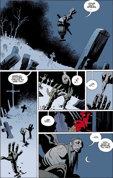
So here’s a page from Mignola’s Baba Yaga story, included in the third Hellboy collection.
I like this page as much as I like any of the art in Hellboy I think, more or less. It’s fairly stylish; the top panel has a nice use of negative space for example. Baba Yaga floating in the air there is a weird image; the pestle streaming out behind her looks like smoke made out of rock; I had to look at it a few times to figure out what it was, which I think adds a nice sense of wrongness to the image. The color palette is good too; different shades of grey and black, the coffins fading out into nothing over at left. The hands reaching up like crosses is a good conceit; the little patches of dirt around them arranged in a kind of Kirby krackle, a nod to one of the most obvious influences on Mignola’s style. Counting the corpses fingers is goofily macabre as well — maybe the single best idea in the issues of Hellboy I’ve read, and that panel of her reaching down to touch the fingers reaching up glances towards abstraction in a way I can appreciate, her claw a twisted organic thing, detached from the rest of her by the panel borders.
So that’s the good. The not so good is the last two panels. The image of Hellboy there seems pointless. It looks like a default pulp tough guy lift from a Frank Miller comic; there’s nothing particularly interesting about the pose or the image, and it just jettisons all the spooky tension or weirdness. Even the color pallet is fucked up; your grooving on all these washed out greys and bleak blacks, and suddenly there’s that red. After that odd image of the hand touching the hand, you cut back to your hero, so the destabilized severed uncertainty doesn’t freak anybody out too much.
And finally, the last panel of Baba Yaga is just not all that. This is the first time we really get a look at her, and she’s a big disappointment. Yellow eyes, check; big nose and mouth, check. Mostly she looks like a not very intricate or interesting gargoyle.
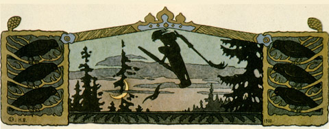
The Baba Yaga reveal is especially underwhelming because there’s no shortage of superior takes on that character. For instance:
That’s an image by Ivan Bilibin, and it manages to do just about everything that Mignola is reaching for and missing. Even though this Baba Yaga is distant and only in silhouette, you can feel the tension in her posture, the sweep of hair away from her head and her bent knee above the pestle turning her into a bird of prey about to launch. The use of negative space and the positioning of the moon is superior too. In Mignola’s image, the moon sits just off to the side of Baba Yaga’s head; there’s no real feeling of motion — it’s just a marker to tell you she’s in the sky. In Bilibin’s, on the other hand, the moon’s set far below and under Baba Yaga, and the angle of her pestle makes it seem like she’s just about ready to tip over it in a vertiginous rush, flying up into space.
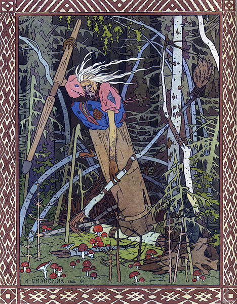
There’s no shortage of other Baba Yaga versions. Here’s another amazing one by Bilibin.
That’s the expression Baba Yaga should have, damn it; a look that could curdle milk and dry up your testicles.
Here’s one by an artist named Rima Staines.
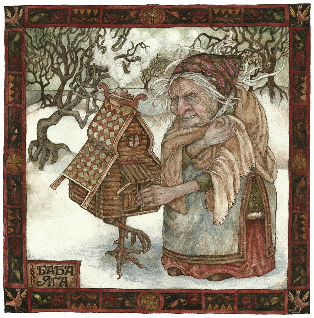
Again, that seems not just technically superior, but much more powerfully imagined. Her expression looks almost nice-old-woman friendly till you look closely and see the sneer and those teeth. And I do believe she’s feeding that cute little house — though what she’s feeding it I wouldn’t want to speculate.
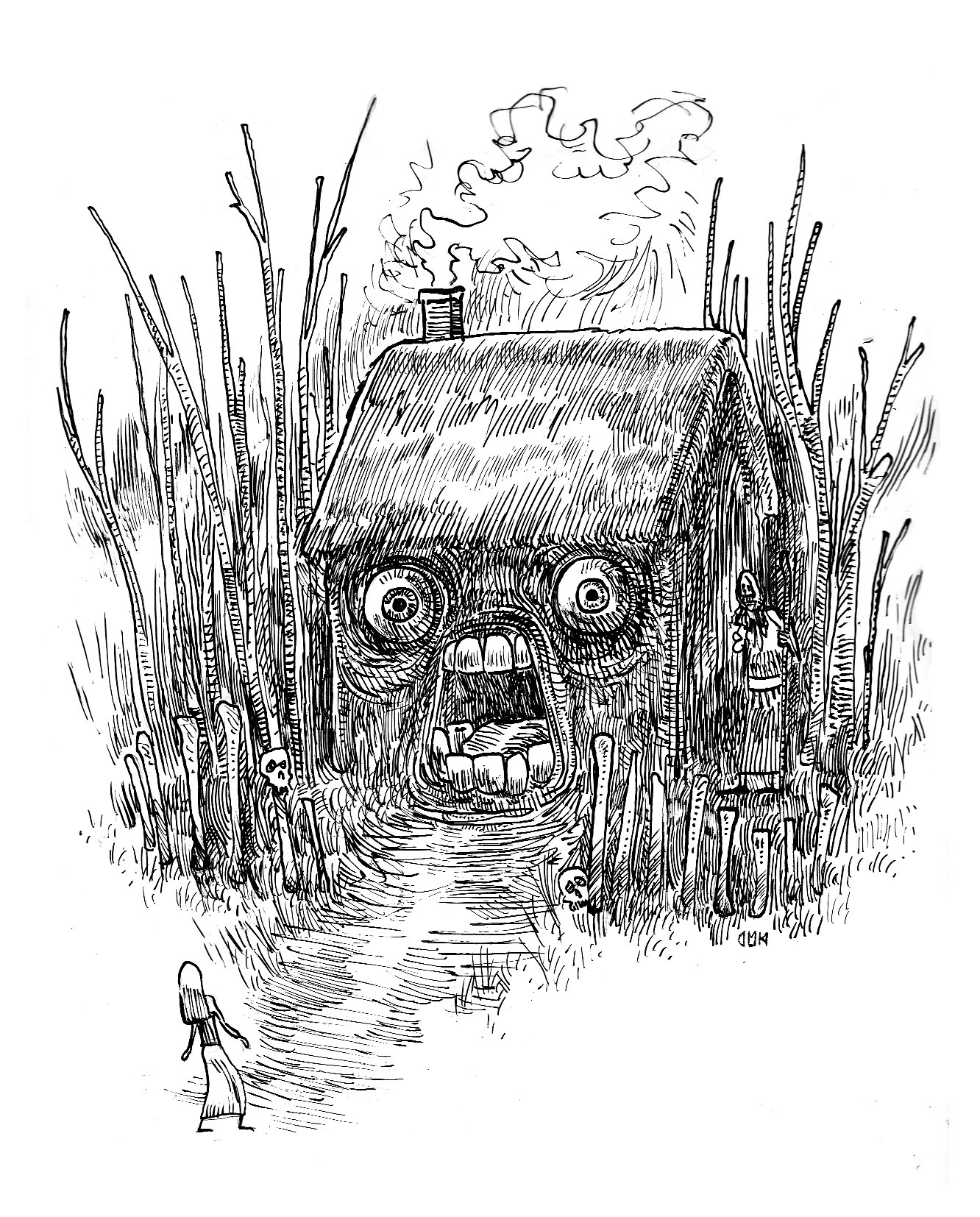
One more maybe; this is by Dario Mekler.
That’s a more cartoony take, but it’s got a ton of energy. I love the scribbled smoke coming out of the roof, the way the moire patterns in the hut seem to make the eyes vibrate, the simple, stick-figure lines of the girl, so that she looks fragile and just about ready to snap apart…and Baba Yaga herself, barely visible, meshing with the lines of her hut, like another one of those twisted trees, waiting.
Bilibin’s drawings of Baba Yaga are famed classics; Staines and Mekler both seem to be significantly less famous than Mignola. But their versions are all much more imaginative, inventive, and engaging than the one in Hellboy. They all also, I think, have more narrative tension or interest. “What is Baba Yaga feeding the house?” and “What is going to happen to that girl?” are both significantly more intriguing, and more energized, questions in the art than the banal pulp violence that one image of Hellboy promises.
Again, I don’t think the Mignola art is horrible. It’s certainly better than most mainstream comic book illustration. It’s clear, it has some flair to it. But with a subject like Baba Yaga, and a reputation like Mignola has…well, it seems weak. Why would I want to look at this when my browser can take me to an infinite number of more interesting Baba Yaga’s? I’m just having trouble seeing how mediocre to bad pulp writing and decent but nothing special pulp art add up to a great comic.

