The Ethics of War Photography in Lefèvre and Guibert’s Le Photographe
[H]arrowing photographs do not inevitably lose their power to shock, but they do not help us much to understand. Narratives can make us understand. Photographs do something else: they haunt us.
~Susan Sontag, “Looking at War: Photography’s View of Devastation and Death”
In the essay from which this epigraph is lifted, Susan Sontag outlines a worrisome paradox associated with wartime photography. Although photographs that depict intense human suffering might often be a necessary means of bearing witness, the range of emotional response such photos arouse once they are made available for consumption in newspapers, magazines, galleries, and so on –– from safe pity to numb bemusement –– always potentially short-circuits the possibility of an ethical response. The war photo should be a call to action but if it doesn’t provide enough information for its beholder to formulate a course of action, as is often the case in Sontag’s view, its haunting effect is more paralyzing than mobilizing. Worse yet, the commodification of wartime photography makes even the most humane, ethically motivated photographers potentially complicit in exploitative and orientalizing rhetorics that either aestheticize wartime suffering or naturalize it as a moral failing of the photographic subjects.
The potential of wartime photography to appropriate suffering as a commodity, always from a safe distance, is the subject of Arthur and Joan Kleinman’s essay, “The Appeal of Experience; The Dismay of Images: Cultural Appropriations of Suffering in Our Times.” As they note, the globalization of suffering is a symptom of late Capitalism in which the highly singular experience of suffering becomes a commodity, and as such, is flattened, thinned out, and distorted.
Watching and reading about suffering, especially suffering that exists somewhere else, has, as we have already noted, become a form of entertainment. Images of trauma are part of our political economy. Papers are sold, television programs gain audience share, careers are advanced, jobs are created, and prizes are awarded through the appropriation of images of suffering. Kevin Carter won the Pulitzer Prize, but his victory, substantial as it was, was won because of the misery (and probable death) of a nameless little girl. That more dubious side of the appropriation of human misery in the globalization of cultural processes is what must be addressed. (Kleinman and Kleinman, 8)
They discuss Kevin Carter’s infamous Sudanese Girl photograph (figure 1) at length, pointing to the ways in which the photo’s journalistic and political value conflict with its aesthetic value, and worrying about the photographer’s implication in the commodification of suffering the photograph’s circulation represents. They also speculate about the relationship between Kevin Carter’s depression, and eventual suicide, and his career as a wartime documentary photographer.

Figure 1. “Sudanese Girl”
What strikes me most about Arthur and Joan Kleinman’s discussion of Carter’s depression is the distinct parallel one can draw between the portrait Sontag sketches of Western beholders of wartime photography (who are haunted, and feel pity, but remain paralyzed) and Carter’s own avowed response to the sight of the starving Sudanese girl crawling weakly towards the UN food camp. After taking twenty-some minutes to frame the photo, hoping the vulture might spread its wings, Carter finally took the picture and, after waiting another twenty minutes, eventually chased the bird away. But a number of commentators were critical of Carter for not helping the girl reach the feeding center. Instead, we learn from the BBC biographical sketch of Carter’s life:
Carter sat under a tree, watched her struggle for a while, smoked a cigarette and ‘talked to God’. He did not help the girl. Utterly depressed, he went back to Silva and explained what had happened, wiping his eyes and saying ‘I see all this, and all I can think of is Megan. I can’t wait to hug her when I get home’. [1]
His response to the direct experience of someone else’s suffering in situ is essentially the same as the response a reader of the New York Times might have had months later when the photograph was finally published: an impotent sense of despair, appreciation for what one has, some fleeting form of oral enjoyment (Carter’s cigarette or the newspaper reader’s morning coffee). But as for the Sudanese girl herself, she is already troped as a synechdoche for the moral failures of her nation. Her dehumanization is both depicted by the picture (as a potential vulture meal) and produced by the picture, which limits the signifying possibilities of the scene in order to make her a synechdoche. Beyond being unnamed and faceless, her emaciated body, nudity, and inhumanly prone position make it near impossible for the viewer of the photo to imagine herself in the girl’s place. As much as one might wish to shoe away the vulture, it is difficult to imagine viewers of the photograph identifying with the girl. I’d like to suggest here, simply, that identification, or its possibility, is what makes the difference between pity and compassion, between dehumanizing and humanizing rhetoric, between paralyzing shock and a program of action. And while I agree to a degree with Sontag’s comment –– haunting in its own right –– that photographs haunt while narrative helps to understand, I don’t see the opposition between photography and narrative as always useful, particularly where the question of identification is concerned.
This set of concerns, specific to wartime photography and particularly that of an ethnographic bent, is dealt with elegantly and self-reflexively in Didier Lefèvre’s and Emmanuel Guibert’s highly successful comics–photography collaboration, Le Photographe. Not only does Guibert’s graphic narrative “add” narrative understanding to Lefèvre’s haunting photographs of victims of the Soviet war in Afghanistan, but the inclusion of drawn images and text alongside richly detailed photographs elicits a wider range of affective responses and a higher degree of identification with the photographic subjects than Guibert’s photographs could possibly elicit on their own. In fact, The Photographer initiates a chain of identifications such that the reader is compelled to identify with Didier, who in turn identifies with his photographic subjects, making their suffering felt by the reader.
At the core of my argument is the assumption that the haunting power and potential ethical danger of wartime photography are answered by complementary strengths and weaknesses of the comics medium, namely its analytic quality and iconicity. We learn through the narrative of Didier’s experience in Afghanistan that the photos call for the mediation of graphic narrative in drawn panels, even before Lefèvre and Guibert decided to collaborate. Photos that might otherwise invite a melancholy or orientalizing reception in spaces such as galleries, newspapers or photo books, become a compelling address once placed within a graphic narrative alongside drawn panels.
1. A Comics–Photography Collaboration
The story leading to their collaboration is a long one, some of which ends up narrated in Le Photographe itself. In 1986 Lefèvre is commissioned by Doctors Without Borders/Médecin Sans Frontières to document a humanitarian aid mission into the valleys of Yaftal and Teshkan. During his months there, he took over four thousand photos documenting both the harrowing trip to and from the Valley of Yaftal and the operations of the clinic treating the war wounded. As Alexis Siegel explains in his translator’s introduction:
“We discover Afghanistan through the eyes and camera of photojournalist Didier Lefèvre, who is admittedly naïve about the geopolitical complexities that he is stumbling into […] As it turns out, Didier’s innocence, openness, and eagerness to learn make him an ideal guide for us as readers. His reportage has a depth of honesty that comes from a passion for service––service to his art, first and foremost, and, second, to the mission that he has agreed to be part of: a humanitarian expedition of Doctors Without Borders.”
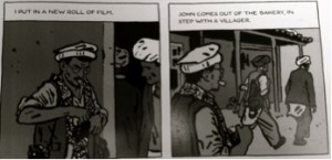
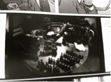
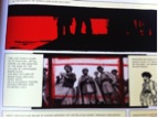
The reader of Le Photographe is consistently made aware of the materiality of the photographic process. We see Didier pack his film carefully in Peshawar, we worry as he nearly loses his camera during a mishap crossing a river, and during one of the most critical and moving moments in the book, when the doctors must perform an emergency surgery at night to remove shrapnel from a young woman’s spine, Guibert’s drawn panels take pains to show Didier stopping to put in a new roll of film while the doctors rush around him to do their work (figure 2). And his reckless decision to return early to Pakistan is motivated by the fact that he is running out of film. Finally, in the last two pages depicting Didier’s return to France, we see a picture he took of the camera he used in Afghanistan along with the 130-some rolls of film he took displayed like “hunting trophies” (p. 259) on a table (figure 3).

Figure 2. Before shrapnel removal surgery, p. 133

Figure 3. Gathered rolls of film upon Lefèvre’s return, p. 259
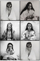
We learn in the epilogue (pp. 262-7) that only six of the thousands of photos from Levèvre’s time in Afghanistan ended up published in a two-page spread in the French newspaper Libération (December 27, 1986). These six photos (figure 4) were among the first images of the Soviet war in Afghanistan to reach a large French public, somewhat analogously to Steve McCurry’s now iconic Afghanistan photos in the US.

Figure 4. One of the six photos featured in Libération.
But aside from the six photos that made Lefèvre’s career as a photojournalist in France, several thousand remained in storage, unseen, until his friend, comics artist Emmanuel Guibert suggested that they collaborate on a book about it twelve years later. Guibert had already become known for his unique use of the comics medium as a form of war-time testimonial with La Guerre d’Alan, an intimate first-hand account of American soldier Alan Cope’s experience of the quotidian absurdity of war in WWII. Beginning in 1998, Lefèvre and Guibert began collaborating to produce Le Photographe in three volumes published over the course of four years (2003, 2004, 2006), which sold over 250,000 copies in the French-speaking world. In 2007, Lefèvre died of heart failure caused by health complications related to malnourishment and lack of hygiene during his harrowing return to Peshawar, two years before the English translation of his work was published.
Their collaboration is striking on a number of accounts. Guibert’s use of photos and contact sheets as panels in the narrative creates a sense of rhythm and depth consistent with any “good” graphic novel. One can read quickly for story or linger slowly on visual detail without ever feeling taken out of the diegetical space of the narrative. The drawn panels are often used to link series of photos. For example, in the case of incidents that were photographed in great detail, the addition of just a couple drawn panels allows the event to be presented from multiple perspectives and builds a much fuller sense of a scene than would be possible in a photo-essay. More importantly, Guibert deliberately modified his drawings to reduce the amount of detail in such a way that they never upstage the photographs. The reader moves seamlessly from photographic evidence to fictional reconstruction––carefully kept in scale with the photos––without ever getting the sense that the diegetic “reality” of Lefèvre’s narrative has been violated.
Nancy Pedri describes the seamlessness of this comics-photography collaboration as one that enables the critic to challenge or deconstruct long held idées reçues about the potential and limits of each visual medium. She sees Guibert and Lefèvre as successfully dissolving the opposition of photography and comics that would set Sontag’s concerns that ‘photography haunts but does not help understand’ against the belief that comics in their iconicity (Scott McCloud) are ideal for universal stories but less ideal for witnessing war-time suffering in its detailed singularity. Pedri in fact critiques Bart Beaty for unconsciously reproducing such an opposition in his description of Le Photographe:
Canadian comic critic Bart Beaty distinguishes Guibert’s “stylized and simple” drawings from Lefèvre’s photographs by emphasizing that they are two different types of representations; the first is “stylized,” the second, “realist” (3). To set up an operational distinction between photo-realism (representational) and cartoon symbolism (cryptographic) in Le Photographe, however, is to undermine the way in which to two work together not only to create meaning, but also to challenge long-standing, influential notions informing the understanding of both modes of representation. When photography and cartooning occupy the same narrative space, as they do in Le Photographe, any suggestion of referential hierarchy is mute. In this graphic narrative, each at once copies and expands upon the other.[2]
Although I agree with Pedri’s argument to the extent that Guibert and Lefèvre’s collaboration succeeds in breaking down the opposition between comics and photography, I believe she leaps too quickly to the conclusion that it is therefore erroneous to dwell on the differences between the two mediums. To my mind, the fact that an author successfully dissolves differences between mediums in a particular work does not make those differences suddenly meaningless in every other context. More importantly, however, I believe there were specific ethical stakes behind the use of the two mediums in this particular case, which can only be teased out by spending some time thinking about the differences between them. It also matters that the particular kind of photography being “deconstructed” here is wartime documentary photography in the ethnographic mode, a fact that Pedri ignores. Furthermore, I worry that if we see comics and photography as unopposed, as Pedri advocates, then we might lose sight of the ways in which the aesthetic and humanistic dimensions of wartime photography are at tension with one another. By this, I am referring to the ethical dilemma that tortures Lefèvre throughout the narrative of Le Photographe, the concern that “getting a good shot” means taking a certain aesthetic distance from the immediate and urgent suffering of his photographic subjects. It is thus important to highlight the differences between the mediums in order to understand the sophisticated work that Lefèvre’s and Guibert’s collaboration does, both on the level of politics of representation and ethics of alterity. We must not lose sight of the fact that wartime photography is the trace of a physical, face-to-face, encounter of photographer and subject.
In the next two sections of this post I will consider the two mediums separately from one another in regards to questions of testimony and the ethics of alterity. I will use the terms iconicity (comics) and singularity (photography) to situate the two mediums but I am not especially committed to either term. One could just as easily oppose the terms abstraction and detail, or “reduced visual register” and “rich visual register.” The point is to underline a significant phenomenological difference in the way we experience each visual medium, not to argue that this difference is in any way essential to either medium or should be normative in either case.
2. Photography: Singularity & Witness
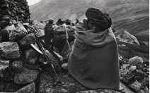
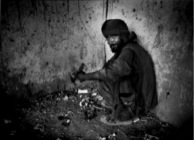
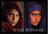
There is perhaps no medium more opposed to the iconicity of comics than photography. Although of course, some photos under certain conditions do become iconic. The photograph, in contrast with the drawn panel of a fixed sequential narrative (Groensteen), is utterly singular. And I think it is so on at least a few levels. I am thinking specifically of ethnographically-oriented wartime documentary photography. First, the ethnographic photo is singular in its attention to the minutest details, wrinkles and discolorations of the skin, loose threads of hair, textures and irregularities in fabric, tailoring on clothing. Ethnographic photography evokes a sense of awe in its textural detail, something along the lines of a response to a vast and incomprehensible landscape, which the eye scours almost lasciviously for detail. Here I am thinking specifically of Marc Garanger’s beautiful and haunting, but ethically problematic, series of photographs from the Algerian War, Femmes Algériennes (figure 5). Second, photographic subjects are difficult to abstract from their contexts. They tend to be singularly located, in specific places and times. We see the refugee camps behind them, or more commonly perhaps, the endless rubble framed minimally by concrete walls, bare columns, often bearing marks to remind us of the building’s original purpose: which may once have been a mosque, a general store, a music shop, etc. Here I am thinking specifically of James Whitlow Delano’s haunting photo documenting the effects of the more recent war in Afghanistan, Kabuli Heroin User (figure 6). Third, photographs are singularly frozen in time, both unmediated and immediate in their representations of their subjects. Photography makes an imprint of a moment already past, and in its unmediated stillness, it becomes a sign of absence and loss. This is the aspect of photography that leads theorists such as Roland Barthes and Susan Sontag to associate it with death and aging. Photos of war victims are especially poignant in this regard. The very sight of the photo immediately arouses anxieties concerning the survival of its subject in the photo’s afterlife. Did she survive the war? How has she aged? What impact did this photo have on her life? Here I am thinking specifically of Steve McCurry’s famous portrait of Sharbat Gula, known for years as “Afghan Girl” until National Geographic was finally able to locate her in 2002 (figure 7). And I think it’s important to note, in this particular light, that The Photographer includes a seven-page epilogue that features photos of 26 of the book’s characters beneath which are included brief biographical updates on their lives since the events narrated in the book. I might go as far as to argue that this is a symptom of using photography within a non-fictional sequential narrative. The reader is left with a ghostly sense of loss at the end of the story, which the epilogue works, in a way, to suture.

Figure 5. Marc Garanger, Femmes Algériennes (1960)

Figure 6. James Whitlow Delano, Kabuli Heroin User (2008)

Figure 7. Steve McCurry, Portrait of Sharbat Gula or Afghan Girl (1984 & 2002)
My main point here is that the ethnographic photograph is singular in a way that is largely incommensurable with the iconicity of comics. All of these aspects I just outlined (extreme detail, historical and geographical locatability, ghostly frozeness in time) foreclose the possibility of projective identification, of the reader with the ethnographic subjects. If ethnographic photography is driven by a desire to humanize its subjects, which I believe in most cases it is, it does so in a way that runs counter to the iconic operation Marjane Satrapi describes in her work where the reduction of detail enables readers to project their own dreams and aspirations onto those of the Iranian characters depicted in her story, or to imagine the characters’ dreams as their own.
At best, then, I think ethnographic photography represents an artistic means of staging an ethical (we might call it a Levinasian) encounter with alterity, one in which the eye caresses the image in an exploratory but not appropriative manner. But at worst, ethnographic photography has the potential to become a dangerously orientalizing (or at least exoticizing) practice, which valorizes alterity as an end in itself, and leaves little room for the viewer to identify with the subject of the photo, nor to ascribe political agency to the photographic subject. The singularity of the photograph leaves little room for viewers to imagine any form of action because the suffering of the ethnographic subject is imagined to be an indelible part of that subject’s identity, frozen that way forever in time.
3. Comics: Iconicity & Identification
Comics, on the other hand, are what Scott McCloud has famously dubbed “iconic.” Iconicity involves both a level of abstraction and reduction of detail and a certain striving towards visual “universality.” As McCloud explains, we can identify more quickly and effortlessly with a stick figure “any man” than with a perfectly rendered portrait of “another man.” Marjane Satrapi––who, incidentally, did the Dari Persian lettering for the dialogue in Le Photographe––explains quite beautifully the value of comics iconicity when it comes a politics of representation. As Satrapi explains, one of the great advantages of the comics medium lies in the ease with which readers are able to identify with the characters. The iconicity of comics––both visual and verbal––allows readers to project their own lives more readily onto otherwise culturally alien subjectivities, creating new possibilities for compassion and humanization at a time when compassion seems to be in short supply. In Persepolis, for example, the cultural otherness of Iranians is constantly mitigated through a reduction of the visual to an iconic register, which prevents the reader from dwelling too much on details that might lead her to exoticize the characters. In other words, if comics succeed in humanizing, it’s not through an ethics of alterity, which would emphasize the rich incomprehensible singularity of the other, but rather though processes of reduction and appropriation that are closer in form to the very dehumanizing rhetorics they counter. In an interview recorded during the 2007 New York Film Festival Conference, Marjane Satrapi described Persepolis (in this case, the film adaptation, but her comments apply to the graphic novel as well) as a fundamentally humanist project driven by a desire to humanize Iranians in the eyes of Western readers, who all-too frequently imagine them in two-dimensional terms as religious fanatics, misogynistic, peasants, etc. For her, comics are ideal for such humanistic projects, she explains admirably in her non-native sounding English:
This movie is a very humanistic movie. It’s a movie about, you know, love, about family, about the human being. Because, it’s about time that [the] human being would be in the center of interest. So, if we understand that. If we watch this movie and we say: this is about the human being and this human being could be me. Then, you know, we have reached our goal. And that is exactly also why we made an animation movie and we didn’t make, you know, a real action movie, you know, with people with meat and blood and all of that. Because as soon as you put, you know, the action in a certain geographical place, you know, with [a] certain type of people, et cetera, then again, that will become the story of these people that are far from us, we cannot relate to them, they are not like us. It’s something very abstract, you know, in the drawing that anybody can relate to. And, you know, that’s why, you know, also when you see in the background we didn’t make anything exotic, you know, in the background. It can be Tehran, but it can be Cincinnatti, it can be any big city anywhere. Because, we did that on purpose. Because we wanted everybody to be able to relate to [it]. And whatever Orientalism [there] is, we put it in the Austrian part. You know, you have the Strauss [?] music, the sachertorte, the dog, and you know, the tramway, and, you know, the yodeler. We made all of that on Austria because we wanted the viewer who watch[es] the movie with us at the time they would arrive to Vienna that would be odd for them and Vienna is, you know, is in the Western world. So all of that was made on purpose and that’s why we, really, that was a choice to make in animation and all of that because we wanted the story to be universal. We wanted the people to understand what we were talking about because it’s a humanistic movie.
Or to give a visual example from Satrapi’s own work, we find it much easier to identify with this  depiction of a girl wearing hijab than this one
  .
.
In other words, if comics succeed in humanizing, it’s not through an ethics of alterity, which would emphasize the rich incomprehensible singularity of the other, but rather though processes of reduction and appropriation that are closer in form to the very dehumanizing rhetorics they counter. And part of what I’d like to argue is that Satrapi’s claim about the humanizing potential of comics, in their iconicity, is more radical that I think anyone has given her credit for… and runs against a whole specifically French strain of thinking about humanism and the ethics of alterity.
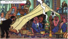
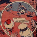
Now, of course, comics are not immune to orientalism (figures 8 & 9). In fact, the medium may be more vulnerable to these kinds of exoticizing or racist operations. But allow me to draw a quick contrast: against the sensuous textural detail of the photograph, the iconic figures of the comic strip do not invite the lascivious scouring eye that lingers on the ethnographic photo. We do not read iconic figures in a mode of paralyzed wonderment but rather we project, appropriate, assimilate almost as soon as we see it. Against the historical and geographical locatability of the ethnographic photograph, the comic icon works on a more utopic register; its non-place can easily become any place or every place. The reader, rather than thinking “I want to go there one day” thinks “there could easily be here. Perhaps it is already here. Perhaps I am already there.” Against the photographic punctum, that snap temporality of photography that aligns it with death, the comic icon occupies a thick slice of time, or perhaps no time at all. Icons are, in a word, eternal, which means they can represent any time. The time of the Iranian revolution in Satrapi could easily become our own time, a possibility Margaret Atwood’s dystopian Handsmaid’s Tale explores memorably, for example.

Figure 8

Figure 9
But while comics are more analytic, opposed to the sensuousness of photography, and inspire identification, understanding, an improbable reaching across cultures, iconic comics do bump up against limitations when documentation and testimony of particularly traumatic events are at stake. And comics that serve a documentary function tend, in general, to be on the more realistic end of the iconic-realistic continuum, or to use realism in contrast with iconic drawing to mark moments of particular trauma and to demand witness, etc.
4. Identification and Interpellation
My main argument here is that the particular format of the fixed sequential narrative is especially apt for inviting an identificatory response from readers (iconicity) and for interpellating readers to respond ethically to the images they are seeing (enabled by the gutters, or the play of panels) in a way that is quite different from the paralyzed melancholic response Susan Sontag describes the newspaper reader having to harrowing wartime photos.
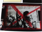
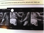
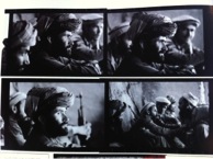
I hope I’ve managed to convince you that photography and comics, especially as artistic means of grappling with cultural alterity, are in many respects incommensurable with one another. But, of course, as soon as a photograph is used within a fixed sequential narrative, it is not longer a photograph, at least not quite in the same terms I’ve been using. And of course, not all comics operate iconically. But there is a tension that Guibert and Lefèvre were quite aware of in their photo-comic collaboration. And it’s important to note in this regard that Lefèvre’s photographs were not originally intended to be used in this format. These photos were never intended to be part of a photocomic. His goal with these photos at the outset was explicitly photojournalistic and ethnographic. And we do see frequent material reminders that these photos were salvaged from his personal archive contact sheets in which we sometimes see hole punches, Xs made with the red wax pencil (which marked the photos he intended to print), streaks, scratches, etc. (figures 10, 11, 12).All these could easily have been photoshopped away, so we have to read these marks of archival materiality as signs of the authors’ intentions; a seamless marriage of the two media is not the goal. And in fact, it might be on account of the discordant juxtaposition of the two media that The Photographer succeeds both as a project of humanization and as a project of documentation. Moreover, by placing these ethnographic documentary photos in a comic strip, I believe some of the potentially problematic aspects of ethnographic war photography are able to placed into question. The ethnographic war photo becomes reflexive in a way that it cannot be when printed in a newspaper or framed and hung in an art gallery.

Figure 10

Figure 11

Figure 12
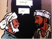
The authors find a number of ways to avoid exoticizing their subjects, or to reflect critically on the exoticizing potential of ethnographic photography. For one, by placing photos into sequences the reader becomes more aware of the photographer’s presence, which is sometimes intrusive, and often inspires the subjects of Lefevre’s photos to want to pose, etc. In fact, at a few points in his journey Afghan men ask him to photograph them in martial poses. In one case (p. 44) by placing photos in sequence we see Najmudin caught absorbed in a happy group moment, unaware of Lefevre’s presence, but then, with the inclusion of a third panel, we see him look suspiciously back at the camera (figure 13). On similar lines, the authors also include at least one photo taken by one of Lefevre’s photographic subjects, who turns the camera back onto the photographer. The photographer is photographed, the beholder beheld, in a significant reversal. Moving to the drawn comics panels, although Guibert’s drawing is not especially iconic, there are a number of panels in which the Afghans and the Westerners are indistinguishable from one another (figure 14) which is partly the result of the fact that the MSF volunteers wore Afghan clothing, and spoke perfect Pashto, took on Afghan names, etc., but Guibert in his visually reduced thick-line drawings also works deliberately to blur the difference, enabling Western readers to imagine themselves in either subject position, as a war-wounded or as a doctor treating the war-wounded, as a Westerner in Afghan drag, or as an Afghan who speaks French.

Figure 13

Figure 14. An Afghan and a Frenchman.
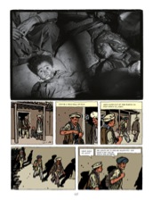
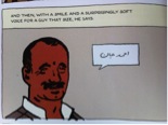
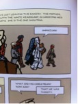
Guibert’s and Lefèvre’s deliberate efforts to blur subject positions reaches an incredibly moving climax in the narrative when Lefèvre hears his Afghan name, Ahmadjan (figure 16) being called out and mistakes it for an interpellation. The woman calling his name, it turns out, is mourning the recent death of her son, who we just saw three pages earlier (figure 15). The boy’s name, we learn in the epilogue, is actually Nazim Jan, which suggests a strong desire on Lefèvre’s part to identify with the subject of his photo, so strong that he hears it as his own Afghan name (figure 17). The scene, which is narrated entirely through drawn panels, echoes and adds a dimension of identification to what is certainly the most ghostly photo in the entire book, the photo we are perhaps least likely to be able to project onto. Through what might be called a retroactive layering effect, the comic strip narrative enables the reader to return to the photo as an interpellation. It may be an intercepted interpellation, as the name Ahmadjad turns out to be, but once experienced as an interpellation, the ethnographic war photograph is endowed with a new power to bear witness in the mode of identification (“that could be me”) as opposed to pity (“those poor people”), which in my view represents a much more powerful and honest form of testimony, one that the marriage of comics and photography makes uniquely effective.

Figure 16. Nizim Jan just before dying.

Figure 17. Didier is renamed Ahmadjan.

Figure 18. Didier is interpellated by the mourning mother as the dead son.
[1] “Kevin Carter – Photojournalist.” BBC, May 3, 2007. http://www.bbc.co.uk/dna/ptop/A22083301.
[2] Pedri, Nancy. “When Photographs Aren’t Quite Enough: Reflections on Photography and Cartooning in Le Photographe.” ImageTexT: Interdisciplinary Comics Studies. 6.1 (2011): n. pag. Dept of English, University of Florida. 13 September 2012. Web.
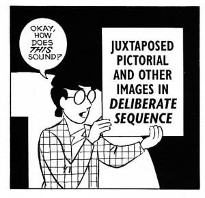 First, we have formal, aesthetic, and/or moral definitions of comics roughly paralleling traditional, pre-twentieth century definitions of art. Nontable examples include David Kunzle (The Early Comic Strip: Narrative Strips and Picture Stories in the European Broadsheet from c. 1450 to 1825, 1973), Will Eisner (Comics and Sequential Art, 1985), Scott McCloud (Understanding Comics: The Invisible Art, 1993), David Carrier (The Aesthetics of Comics, 2000), and Thierry Groensteen (The System of Comics, 1999/2007). Comparisons are easily made to Plato, Kant, and even John Dewey’s accounts of the nature of art. But, just as the second-half of the twentieth century saw a widespread rejection of any such account of the nature of art that entails that an object is an artwork solely in terms of some properties (whether formal, aesthetic, or moral) that inhere in the object itself, during the early twenty-first century comic studies has seen a similar turn away from formal definitions in favor of other approaches. Interestingly, the three main alternative approaches to defining comics match almost exactly the three main approaches found in earlier, twentieth century work on defining art.
 First, there is the outright rejection of either the necessity of, or even the possibility of, a definition of the concept at all. Notable examples of such an approach in comic studies include Samuel Delaney (“The Politics of Paraliterary Criticism”, 1996), Douglas Wolk (Reading Comics: How Graphic Novels Work and What They Mean, 2007), and Charles Hatfield (“Defining Comics in the Classroom, or the Pros and Cons of Unfixability”, 2009). The connection to Morris Weitz’s (and others’) Wittgensteinian rejection of definitions of art, and his embrace of the “open-endedness” of art, is obvious.
 Next we have historical definitions – those accounts that locate the “comicness” of comics in the historical role played by particular comics, and in the history that led to their production (and, perhaps, in intentions, on the part of either creators or consumers, that a particular object play a historically appropriate role). One notable example of an historically-oriented approach to the definition of comics is to be found in Aaron Meskin’s work (in particular, in the concluding remarks to “Defining Comics” 2007, which is otherwise rather hostile to the definitional project). Meskin’s comments (and likely any other account along these lines, although this seems to be the least developed of the options) owes much to Jerrold Levinson’s historical definition of art, whereby an object is an artwork if and only if its creator intends it to be appreciated in ways previous (actual) artworks have been appreciated.
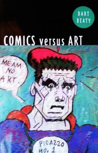 Finally, we have institutional definitions, which take something to be an comic if it is taken to be such by the comics world. The primary proponent of something like an institutional view within comic studies is Bart Beaty (Comics versus Art, 2012). Such views obviously owe much to similar, earlier approaches to the nature of art due to Arthur Danto, George Dickie, and others. Of course, one of the primary challenges here is to determine what counts as the “comics world” in a way that is informative and not viciously circular (i.e., an account where the comics world is not defined merely as those of us who take comics seriously).
 Thus, the work on defining comics has closely mimicked earlier debates about the definition of, and nature of, the larger category of art (presumably, all, most, or at least typical comics are artworks – even if possibly bad artworks – solely in virtue of being comics). This much seems undeniable, but it also seems somewhat problematic. After all, sticking solely to approaches and strategies that appeared plausible when used to define art is only a wise strategy if we have some sort of prior conviction that the properties and relations that make an object an artwork (i.e. that explain the artwork/non-artwork distinction) are the same properties and relations (or at the very least, the same kind of properties and relations) that make an object a comic (i.e. that explain the comic/non-comic distinction). And to my knowledge no argument has been given that this is the case. As a result, it behooves us to ask if comic studies has been too traditional, and too unimaginative, in this regard. Isn’t it possible that we could be convinced that there is an adequate definition of comics, but also convinced that such a definition should look very different from extant attempts at defining art (i.e. it would take very different kinds of factors into consideration)? And, more to the point, isn’t it possible that such an attitude could be correct? If so, then the close parallel between work on the definition of comics and work on the definition of art seems unfortunate, since it seems to ignore this possibility in favor of recapitulation of past history.

