CLICK ON IMAGES TO ENLARGE
In the seventies, Neal Adams’ realism, comprehensive draftsmanship, hyperkinetic storytelling and page design, sophisticated coloring and in addition his efforts on behalf of creators’ rights marked him as a potent force in American comics. He seemed poised to do something substantial in comics, something that would pull all of his skills together in a complete and meaningful statement. But instead, he has dedicated his energies to running his studio/publishing house Continuity for many years.
I’ve not been to Continuity and cannot speak to their effectiveness in the world of advertising, and it should be considered that through it Adams has given a lot of artists work, but the comics they have published are literally a bargain bin explosion of histrionic superhero titles. In a reflection of the old comic book studio system, the books are drawn by various often highly competent artists who apparently must all work within Adams’ stylistic parameters. The boss is to my mind too eager to redraw his artists’ drawings. The result is Neal Adams-ish product that is debatably unified in a visual sense, but that is difficult to read and has an aura that can be described as luridly aggressive.
I do respect Adams’ abilities though, and anyone working within mainstream comics can thank him in some part for the much more creator-friendly contracts that are standard now. And so, I have made repeated efforts to talk to the artist when I saw him at conventions in New York. He doesn’t make it easy. For years it seemed he only wanted to talk about a sort of anti-visual comic he was doing about “two guys in a bar” discoursing on theoretical geology. The book still hasn’t come out, but on his site he has posted pages with lots of dense ballooning, big heads with earnest expressions and gnashing teeth, and some dinosaurs. I heard about it first-hand from him several times, but it felt like he didn’t talk to me but through me to a space somewhere behind me. Now, he owes me nothing, he’s more than paid his dues…and maybe it was just me, or perhaps I caught him at a few odd moments, or maybe it is a sort of canned spiel he does at cons just to deal with all the people who approach him.
Adams has more recently emerged with an assortment of covers and then a series of stories: “Blood,” serialized in the new incarnation of Dark Horse Presents and the bewildering DC miniseries Batman: Odyssey. He’s obviously putting a lot of effort into this work, it is all elaborately drawn, but also, much of this recent work has ultraviolent depictions of over-the-top violations of bodily surface and splattering blood.
Flipping through a few of his recent efforts, I see heroes spitting blood from between teeth so clenched that they might shatter from the pressure, muscles and veins popping, threatening imminent cardiac arrest. I see men tied to chairs and tortured gleefully, bullets ripping through flesh and exploding heads. The images are linked to superheroes, a genre still considered to be in the realm of children, in that the majority of the population would think that a superhero comic would be okay for a child to look at. In that context and even if considered as adult entertainment, Adams’ images are disturbing.
So, at the New York ComicCon this last weekend, I talked to Adams about his explicit handling of violence. I asked him if, in his position as the premiere uber-American superhero artist, he felt that he was representing the Guantanamoid, Saw franchise mentality so prevalent in America now. Torture has become normalized by being disseminated through the media to the point that people have become inured to such behavior, because “that’s how we roll now,” after “everything changed.” Adams’ Batman has bullets gouging through his arm, his heroes strangle each other or shoot people with guns or squirt streams of blood as they are beaten to a pulp. The basic question was what is he trying to say, or does he think he is saying anything?
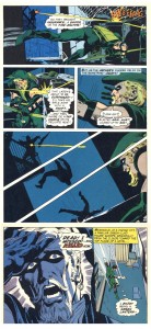
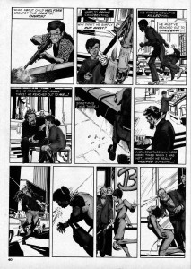
He proceeded to the most considered response I have gotten from him. It wasn’t a formal interview, I didn’t have a recorder, so I’m going on memory for my account of the conversation. In essence, he said that much of his work was about the repercussions of violence. He pointed first to two of his stories involving the superhero Green Arrow. In the first, Adams and writer Denny O’Neil portray GA mugged by young drug addicts, who shoot him with one of his own arrows that they have gotten from his charge Speedy, who has become a junkie. Adams drew the justly famous sequence below where the wounded hero takes himself to the hospital, that well represents the artist’s ability to achieve cinematic realism on paper:
In the second, GA mistakenly kills a perp with an arrow and in horror and guilt forsakes his crime-fighting identity to join an ashram:
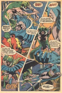
Until Adams reminded me, I had forgotten that his body of work does display a consistent theme of showing violence in as real a light as possible. From his earliest handling of Batman, he gave the action a substance that had a visceral impact on the reader:
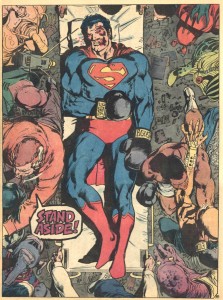
By sheer force of will, Adams defined the look that allowed DC to update their staid image and compete with Marvel. He had to fight every inch of the way, as far as I can tell. He ran the heroes through the wringer visually, but the work then often had a humanistic edge. This became less apparent as time passed. It should be said that the mainstream comics industry itself resists taste and significance. For whatever reason, his comics output dwindled. In an interview Adams said with what seemed like some chagrin that he considers Superman vs. Muhammed Ali to be his finest effort:
There’s a world of potential content that doesn’t involve superheroes and Adams did on occasion make stabs in those directions, also on point with his stated theme. In a potent solo story for the fanzine Phase One in 1971 (reprinted in Marvel’s b&w magazine Unknown Worlds of Science Fiction #1 in 1975), “A View From Without,” the reader is brought very close to the last moments in the life of a napalmed Vietnamese baby:
It was a singular gesture for its time from a major American cartoonist.
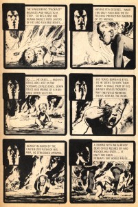
Another strong piece was “Thrillkill,” written by Jim Stenstrum, about a sniper who kills randomly from atop a tall building, based on a then-recent true event. Adams drew explicitly rendered gunshot wounds specific to the elevation of the shooter:
It remains one of the most immediate and horrific pieces Warren ever printed. I felt the same discomfort when I first saw Thrillkill as I do with Adams’ current work.
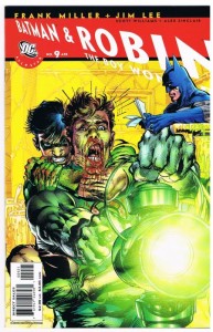
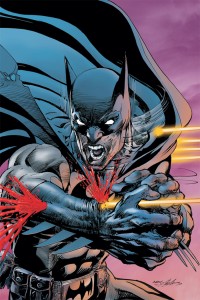
Adams didn’t want to discuss that story, I think because here he is doing superheroes again and that’s what he wants to talk about. He’s pushing them even farther than he had previously. He had a convincing rationale for the cover I mentioned where Batman is shot through the arm:
Adams said that when his father was in the military he had been shot in the arm in exactly that way. Okay, the image was based on a memory that was impressed upon him by his dad, that he felt strongly.
He then explicated on the sequence below, where as I had noted to him, Robin gets a fetishistic pleasure from holding a gun. Adams acknowledged that creepiness, but emphasized Batman’s explanation of why it is best to be the only unarmed man in a room full of trigger-happy thugs:
Okay again. Adams does make statements about gun control and against violence by graphically showing what happens to someone when they are beaten or shot. It’s about consequences. He cited the old “knock-out” that in comics one recovers from spontaneously, would actually put one in the emergency room. Showing the repercussions of violence is an antidote to harmless fake violence.
I had taken up enough of his time and other people were waiting for him, so I thanked him and moved on, but I looked at the works in question again later. The sequence with Batman and Robin at least makes sense to me now, but I still have a few problems. Such as, any intended examination of gun control in Batman is counteracted by the prevalence of typical comics imagery of cool money shots of dudes, including Batman, shooting guns. At best, the comic is sending a mixed message.
One could say, who am I to talk, since my first commissioned work for Vertigo was also Brian Azzarello’s first DC story, “Ares” in Weird War #1. But in my more recent books for them I made every effort to deglamorize the violence, to make it look as pathetic as possible. It is not easy because cool money shots of dudes with guns are a longstanding meme in comics, they’re written into the scripts.
What about readers becoming inured to all sorts of extremes by overexposure? On the one hand, brutal images are suppressed; our press is imbedded and we allow limitations to be placed on war imagery, the lack of violent imagery enables a population to think their wars are bloodless. On the other hand, what we did get was the pictures from Abu Ghraib and torture images have been exponentially spreading through pop culture. Even if they are intended in a cautionary way, does the audience actually get off on ultraviolent images? Adams’ grisly covers are the most problematic in this regard, because as covers they are the primary images being used to sell comic magazines. Oh hell, it’s Gaines and the severed head in court again. But I’d like to see the sales figures on those covers—do we, the audience, desire such representations? Do they represent for us the secret violence of the wars fought in our name, or are they a sort of violence pornography, like old Midnight tabloids and wrestling mags full of pictures of bloody bitten foreheads?
My reading of Batman Odyssey is complicated by the overload of visual information caused by the techniques that Adams and his studio use. As comics, the pages strike me as counterintuitive, but I could say that about many mainstream comics. The writing is, well, unclear, but I can’t even read it properly because the design is so hyperactive. The characters seem to be operating at fever pitch constantly and the drawings slide around in full bleeds everywhere, running the pages together in the gutters and off of the pages and all elements are brought to a uniformly overworked plastic finish. Bloody hell!
What I responded to in Adams’ art in the seventies is how far he pushed the limitations of newsprint in four colors…his moody color was one of the best things about his work. He can also watercolor very effectively, although I have not seen him do a finished story in that medium. Here, the color destroys the realism of the drawings and thus the reader’s ability to fall into the story. It’s roughly the same type of pulp material that Adams brought to life in the seventies on newsprint for 12 cents or a quarter, but now the colors on the shiny, expensive paper lack texture, or such texture as there is looks photographic. It is a cold, resistant surface that repels the reader. The suspension of belief due to the surface plasticity undermines the narrative and so the artist’s message.
Adams didn’t do the color but I can’t even fault the no doubt painstaking efforts of the digital colorist—it is a sterling example of a look that is everywhere in mainstream comics now. It occurs to me that perhaps these types of comics are not selling so well nowadays because only a relatively small audience can relate to the machined wall of digital coloring and the inertia of font lettering. These techniques negate the intimate, hand-done, illuminated quality of comics.
A reason why comic art is not illustration is that a illustration supplements a text which is complete on its own. The text can be read independently from the illustration and I can enjoy my Noel Sickles book without reading the stories he illustrated. In comics, the art cannot stand on it’s own, nor can the text. If they could, then my collection would have a lot more French albums. In comics, art and text are interwoven; the art shows you how to read the text, it forces you to read the text in order to comprehend the story. Likewise, the text cannot read apart from the art since so much of the narrative is comprised of what is depicted in the art. The overly busy design and cold surface of Adams’ recent work actually goes against the medium by resisting reading, so what comes across is the splatter and the cool money shots of dudes with guns.
Adams did an impressive widescreen drawing in Batman Odyssey #1 of the character on top of a speeding train, so I know he hasn’t lost his chops. However, and leaving aside myriad other issues that emerge when one actually deciphers the comic, what the work gains in flash and bombast, it loses in clarity. The trumpets can be made more resonant by allowing for some quieter passages. Whatever substance he’s putting in there is not coming through, because everything is playing at top volume all of the time. I don’t have the other issues in the series, but arrrgh. I’m thinking they should come with an Advil.


