In an attempt to get through the first 20 issues of Elfquest in less than a year and a half, I’ll be tackling issues #3 and #4 today. As always, you can read along at elfquest.com if you don’t have the paper issues.
Tag Archives: Browsing the Stacks
Elfquest Re-read: Issue #2 Trust and Betrayal
I am writing this column on a borrowed iPad whose keyboard I am not used to. Please excuse any errors, typos, and bizarre auto-suggestions that may survive editing.
If you don’t have your own copies of Elfquest, you can follow along at http://www.elfquest.com.
Continue reading
Elfquest Re-read: Issue #1 and Youthful Fannishness
I was introduced to Elfquest about 1980 in Bobbie’s Books, the local used bookstore which doubled as Bryan, TX’s only comic store at the time. I wandered over to the wall racks holding comics near the register, and started poking through them. I owned all of three comics at the time, purchased as some sort of three-pack from a local bookstore that had recently folded. There was one Disney comic, a forgettable superhero comic, and one science fiction horror comic sandwiched between them that weirded me the hell out. All I remember is one panel of some sort of bubbly goo, found on a distant planet by the protagonists. It unsettled me enough that I hid the comic underneath a pile of stuff in my room, and would occasionally pull it out to look at it when I’d screwed my courage up–I remember a distinct feeling of nausea when reading it. Why it was packaged with a Disney comic, I’ll never know.
Anyway, it’s a wonder that I was looking at the comics rack at all. I remember even then not really liking the mainstream superhero art styles of the 1970s (still don’t!). But the owner of the store noticed me, handed me Elfquest #1, and said, “You want to read this.”
New Tricks
Hello! You may remember me from such insightful posts as Visual Languages of Manga and Comics and, er, well, just that one, really. You shall all be subject to me on a regular basis for a while, as Noah has asked me to be a monthly columnist. At the moment, I’m not sure what direction I’m going to go with this, but I’ll play it by ear.
This month, as I’ve just come back from a vacation to the UK and am still jet-lagged, I’m going to just blather on a bit about a current favorite TV show of mine and why I think one of the main characters is the most fantastic female character I’ve seen in a long, long time.
Visual Languages of Manga and Comics
Hello! I’m known as Telophase in various places online, and when I dropped a couple of comments about the visual language of manga on a post a couple of weeks month or so back, Noah asked me to make a guest post (originally during the time that HU was down, and rescheduled for today). So here I am! My day job is an academic librarian, but I wrote a few posts on manga layout back in 2005-2006, when I was trying to figure out how to improve my own comics, and served as Tokyopop’s manga columnist for a while back in the day.
As a convenience, I’m going to use the shorthand of “comics” to refer to American comics, and “manga” to refer to Japanese comics, although there’s a strong argument to be made that “comics” is just “manga” in English translation. (What do Japanese call Spider-Man? Manga!) It just means fewer chances for me to typo “American” and “Japanese.”
I also want to stress that I don’t consider either of the trends I’m going to discuss to be better or worse than the other – they’re both effective ways of telling a story, depending on the needs of the story, the audience, and the industry.
Usually when discussing the visual language differences between manga and comics, manga is discussed in terms of higgledy-piggledy shoujo panels, speedline overload, sweatdrops, and nosebleeds, and nobody pays attention to the way the art elements and speech balloons are structured to steer your gaze through the page, but I think this may be a more defining characteristic of manga than all the sweatdrops and nosebleeds in the world.
Comics appear to have a much less obvious push through the page, often relying on American readers’ style of reading left to right first, then, if needed, secondarily directing the reader’s gaze through the page by use of action lines and other cues in the art.
I think these differences, more than the art styles, form the core of the two visual languages of manga and comics.
Let me see if I can simplify these to some guidelines:
Japan: First, follow where the art and speech balloons are pointing you. If that fails, read right to left, then up to down.
U.S. First, read left to right and then up to down. If that fails, follow where the art and speech bubbles are pointing you.
This is not to say that these guidelines are slavishly adhered to! There are many examples of the rules being broken, but I think they represent a general trend (and, perhaps, fundamental difference) in each industry.
How did this come about? I think the structure of the manga industry is a major factor. Many of the most popular (and thus influential) manga are published weekly in chapters of 15-30 pages, collected with other manga into phone book-sized anthologies called tankoubon. (Edit: I misremembered – tankoubon are the books the chapters get collected into later. Zasshi are the magazines.) Shounen Jump is one you’ve probably heard of if you’ve paid any attention to manga being translated and published in the States. The publishers of tankoubon have an economic motive to get you to consume as much manga as possible as fast as possible, because they want you invested enough in the stories to purchase next week’s tankoubon. Because of this, there’s often strong editorial control over each manga, leading to more uniform layout techniques (and possibly even house styles, although I haven’t done any comparison between publishers).
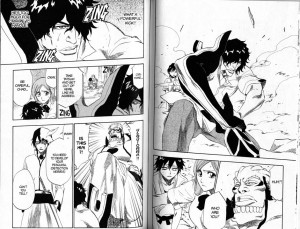
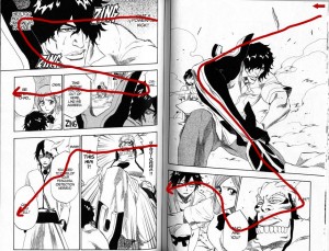
Here’s an example, a spread from Bleach, one of the Shounen Jump properties and one of the most popular manga in Japan. The first image has the spread itself, while the second traces the action lines through the page, the path your eyes take as you read. Note how every important facial expression and image is included in that line.
Bi-weekly and monthly manga are not as subject to this editorial control, and the mangaka have a greater degree of freedom to diverge from the standard and to experiment. I still see similarity to the weekly manga layouts, though – the biggest of which is that the main action lines through a page tend to steer your gaze across characters’ faces, or across important items or spaces in the art.
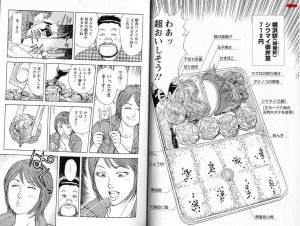
You can see this in the following spreads from a manga about ekiben otaku (ekiben = regional specialty bento [boxed meals] you can get in train stations; otaku = obsessive fans). I’m not sure of the title because I don’t read Japanese, but a friend thinks it translates to The Solitary Love of Ekiben. I want you to note how the speech balloons often frame the character who’s speaking, or the piece of food being discussed. (Also note the speedlines of AWESOME surrounding the bento in the second spread. The entire manga is nothing but ekiben porn, train porn, and landscape porn. It is the geekiest and yet best thing ever. And there are four volumes of it!)
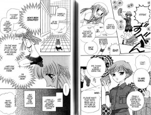
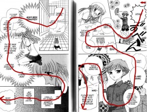
Something in manga layout that I have yet to find in comics is the action line forcing you to read backwards through part of a page. Note this spread from Fruits Basket. At first glance it’s chaotic and if you’re not well-versed in the visual language required to read this, you may get lost.
But if you look carefully, you’ll notice that not only are the speech balloons positioned to pull you through the page, often the characters themselves are pointing you at the next stop on the journey through the page. The characters’ bodies and speech balloons break panel boundaries deliberately, not randomly, and drag your eye across the portions of the art that emphasize the characters’ emotions or tell you what is going on. In the third panel of both pages, you even read backwards – left to right – through the panel.
(As an aside: now that more and more Japanese are reading manga on their phones, I expect the layouts are changing to fit the new medium. I visited Japan in 2007 and a Japanese woman showed me a yaoi manga she had on her phone. When you paged to the bondage scene, the phone vibrated.)
In the U.S., until the recent Graphic Novel Revolution the most common way to get comics was by purchasing individual monthly chapters (I am not familiar enough with older comic practices to know what the usual release schedule was before the 1970s and 1980s). There’s no economic motive to push the reader through the book as fast as possible, so the layout doesn’t need to focus on reader speed and the artist can do other things with page composition and action lines. I might even be able to make an argument that there’s a motive to slow reading down a bit, so that the reader feels she got her money’s worth. (That would be one reason I cut down my comics reading when I had to start paying my student loans back after grad school – I couldn’t justify $2.99 for ten minutes’ entertainment!)
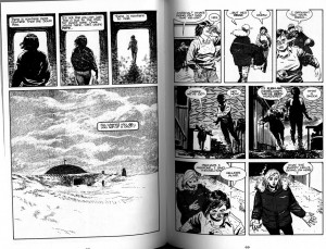
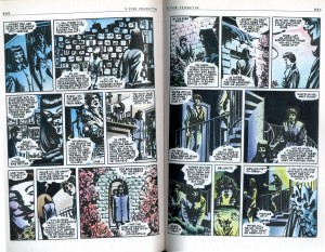
Here’s a couple of examples from Whiteout and V For Vendetta. I acknowledge that these aren’t quite comparable to Bleach – I should be using a current bestselling comic for a true comparison, but I’m stuck with what’s on our shelves at the moment. I think the general idea will hold, though.
In Whiteout, the speech balloons tend to float to the top of the panels as if they’re filled with helium. In most of them, the reader is expected to read the narration or dialogue and then look at the art in the panel before going on to the next panel. It reads in a more staccato way than the easy flow through Bleach, or even the less-easy but still flowing line through the panels in The Solitary Love of Ekiben. V For Vendetta bookends many of the panels with speech balloons, but the action lines that draw your attention to the important bits in the art are subtle, and the pages as a whole are subsumed to the rhythm of the grid that the panels are based on. In neither of the comics are the faces of the characters or specific pieces of the action deliberately highlighted in the way speech balloons frame characters and items in the manga examples I’ve shown you (forgive my wonky scanning: I’d rather not break the spines of the books).
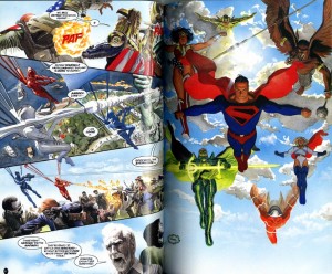
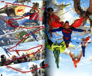
This isn’t to say that comics don’t use dynamic action lines at all! Witness this spread in Kingdom Come:
There’s a strong zig-zag action line in the artwork on the left-hand page that swings your gaze across and up directly into the splash-page layout of the right-hand page. The only sour note I detect is the placement of the tiny “Indeed,” speech balloon on the right-hand page. I believe it’s supposed to be right in your path as you read through the bottom panel on the left and scan over the faces, but the superhero splash page is so strong that you tend to skip it. (I didn’t even notice it was there until I drew the redline!)
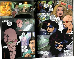
In Transmetropolitan, I often find that cigarette smoke is used to highlight action lines or characters’ faces and emotions, as in this spread. There’s an action line anchored by speech balloons, smoke, and white highlights that drags your view across Spider’s face several times in the left-hand page, but the action line through the right-hand page is not as active, even causing confusion in the transition from panel 1 to panel 2, because the figures in panel 3 are pasted on top of panels 1 and 2. This is a perfect example of “read from left to right first, then read following the cues in the art,” because if you followed the cues in the art, you’d read panel 1, then panel 3, then panel 2. (I like how Spider’s and Yelena’s smoke trails flow off the page. If you look closely, your mind connects them into one flowing line off-page.)
I think that’s a reasonably good illustration of what I see as the core of the different visual languages of manga and comics, and how if a reader is used to one language, it may take a little bit to get into the mindset of the other.
Thanks for letting me blather here!

