Comments Become Posts – Yesterday’s Thoughts on Literary Comics

Long-time and frequent readers of HU will recognize the ongoing friendly disagreement I have with Matthias Wivel about the degree to which literary things — literary theory and its literary lessons, literary experimentation and its literary insights — are important for comics. I almost said for “literary” comics, but that of course would have begged Matthias’ question, which is in part why comics need to be literary at all.

Toward the end of the lengthy theoretical discussion that erupted in the comments section to his remarkably rich interview with Eddie Campbell (much of which we unjustly ignored in the comments!), Matthias wrote:

I don’t dislike Krauss; in fact I think some of her work is pretty great, but yes, I have at times found her unneccessarily laborious, caught up in linguistic issues that may have been relevant at the time, but now just get in the way of her otherwise good observations.

Is there a way of applying her method to less obviously linguistic insights in visual art? Probably, but my point all along has been: why is that so important?

Caro, you have a real preference for whatever theoretical insights any given work of art may give you, and I am not at all opposed to that — I find that stuff as fascinating as the next man, BUT there are so many other equally valid and compelling ways of experiencing and talking about art, ways that you can frame in exact theoretical terms, but which to my mind don’t necessarily benefit from it.

Art isn’t theory.

In the question about the importance of literary methods and insights to comics (I’ll limit myself here to the discussion of comics, rather than art in general, which Krauss herself has addressed quite often!), there’s more at stake than theoretical answers to ontological/epistemological questions, as interesting as they are. There are practical issues of the artistic scope that comics can and has engaged with as well — and scope not only has implications for understanding — and imagining — the potential of the art form but also for appealing to broad audiences with diverse artistic tastes. I wrote a lengthy response to Matthias about the importance of engagement between comics and literature/literary theory, and Noah asked me to move it from a comment to a post. So here it is (with only minor edits from the comment version).


Matthias, I remember that you’ve made this same basic argument before with regards to literature itself — in the same way that art isn’t theory, comics aren’t literature, and so on and so forth. It’s a sort of medium-specificity that insists on boundaries — and while I GET it, I think those boundaries may be more limiting than they are valuable, for any purposes other than pedagogical.

For my own purposes, as you say, there’s certainly an aesthetic preference at work here — but there’s also an aesthetic agenda for those boundaries to become more permeable. Not permeable so that there’s no possibility of ever deploying the distinction to good effect, but permeable so that there’s more possibility of deploying the mixture to good effect.

It’s partly, as I think we’ve discussed, the fact that theory isn’t a “way of experiencing and talking about art” it’s a way of experiencing and talking about the world — one to which visual art has yet to make its fully evolved contribution. I believe that’s a contribution that needs to be made, considering the impact and reach of theoretical vantage points not only for “talking about art” but also for talking about all kinds of other things, including politics, and identity, and the politics of identity. If the vantage point of art is insufficiently represented there, that is an exclusion — even if it is one that’s largely self-inflicted. Participating in that conversation should in no way prevent all the other ways from experiencing and thinking about art from continuing on apace, as not everybody will be inspired by theory in the same way that not everybody is inspired by aesthetics. Surely there’s room for all of the above?

But it’s also that such an engagement with language/linguistics/literature in particular is more important for comics and important in a different way than it is for visual art. It becomes, to me, a question of broadening the field of comics sub-genres — in English-language comics, at least, currently there are a) a couple of unique genres, the fully visual-narrative and visual-metaphorical ones; b) the comics versions of genre fiction, SF, romance and heroic stories; c) plenty of autobiography and memoir; d) biography; e) journalism; f) children’s stories. Then, there are those few cases that qualify as literary short stories (although those trend toward the visual-narrative and visual-metaphorical genres, for various reasons many of which, I think, are subcultural). There are also a handful of experimental comics (which, as you know, I’m extremely fond of, but that is a very new and nascent genre.)

But there’s very little in comics that’s comparable to — let’s call it “Booker fiction,” the kind of fiction that gets nominated for and wins the Booker prize. (Although Booker books are not really homogeneous and my bias against current American letters is showing; “Pulitzer fiction” just suggests a somewhat different scope and approach to me.) Booker fiction is very engaged with theory — not just contemporary theory but traditional poetics. It also tends to care deeply about literary aesthetics and a range of pleasures that come from prose.

You’ll probably come back with the argument — as you have before — that Booker fiction is a literary genre and that comics doesn’t need to model itself on something so outside. But the question “why shouldn’t it take that genre as a model?” is equally valid. There’s no consistent argument that Booker fiction shouldn’t serve as a model for comics — unless comics is also going to reject all the other literary genres right along with it: popular genre fiction, the literary short story, biography, memoir…

I find the possibility of comics engagement with fiction at the Booker level especially compelling considering that Booker fiction’s engagement with theory and form — both questions and the mechanisms for getting at those questions — is at a point where it needs fertile new terrain, and “the illustrated book” is extraordinarily fertile. Books like Fate of the Artist point in that direction for me, and I think it’s tremendously inspiring. It’s a different direction from the one folks like Warren Craghead and Jason Overby are exploring, and — as marginal as experimental comics is — truly ambitious, truly literary comics are vastly more rare.

At this point, though, I generally have the sense that there are several pressures working against comics producing a work that’s really truly comparable in scope and ambition to a Booker novel. The biggest obstacle is auteurism and the DIY insistence on self-expression, which lead people who don’t have a lot of literary background to resist collaborations drawing on varied expertise (the kind of fecund collaboration, for example, that Anke F. has with Katrin de Vries). Hipster ennui — that classic mix of self-importance with complete and utter lack of seriousness — saturates art comics culture and generates a contempt for complexity and intensity that works against any meaningful engagement with literature. (The hipster problem also severely damages American prose letters and is to some extent at fault in the problem Elif Batuman identified in the LRoB essay we talked about here.) Hipster-fic generally ends up being either irony or what Mike called “me-comics”.

But I also don’t think we should discount the role of disciplinary distinctions here. Art education plays into this as I’ve mentioned before: because English is more valued at the middle and high school level than art, literary people often have much less drawing training than art people have in writing. But this can also lead to a lack of understanding among art people about the differences in the way a trained literary reader will approach, say “The Fortress of Solitude” from the way that same reader will approach “Midnight’s Children”, or the fiction of, say, Umberto Eco. It’s a failure of American education that we don’t equip our students to read those books the way they’re meant to be read before the time when students have to specialize, so that those reading protocols are such specialized protocols. But it nonetheless remains true that those books do demand reading protocols that only highly trained readers have — most people writing comics and writing about comics, even the best writers in comics, aren’t highly trained readers. There are precious few people in art comics who are palpably sophisticated readers by the standards of fiction readers — because a lot of those protocols just aren’t mastered, if they’re even taught, until graduate-level study in literature.

Similarly, the academic art world sometimes seems hermetically sealed: unlike literature departments which (at the graduate level) embraced their “cultural studies” sister departments to the point that traditional literature almost vanished entirely, the “department of art” is very separate — methodologically and institutionally — from departments of visual culture (which tend to be, really, part of that greater diaspora of literature).

But this separation of the disciplines becomes a problem for comics which draws on the media and discourses specific to both. One response has been to claim comics exceptionalism — the only discipline you need to know anything about is comics themselves. But that’s obviously bullshit: comics scholars tend to know art or they tend to know literature, and each enriches their insights in different ways. This is why I brought up Noah’s oft-expressed annoyance at the banal content of many comics: it’s just exasperating to hear people make “literary” claims for a book like Asterios Polyp. It’s a perfectly good pedagogical tool and an interesting experiment in visual device, but by even the middlin’ standards applied to literature, it’s pretty run-of-the-mill as fiction. It’s equally exasperating to read comics criticism that examines a really pedestrian, obvious narrative, something that’s probably intended for diversion and fun, in lofty formalist, new critical terms — the type of review that explicates literary devices which are completely on the surface of the work. It’s like someone writing a piece of student criticism about a student essay. This doesn’t happen nearly as often in professional and semi-professional reviews of prose books. The expectation is that people who read Bookforum understand literature and there’s no need to spell out, or often even point out, the formal devices at work in a book. (And of course, here I’m talking about the semi-professional comics critics, not random people writing about books they love or hate on their personal blogs.)

A great deal of the writing in (and about) comics is — at its absolute best — BFA-level writing. And I’m not talking about prose-craft — I’m talking about the sophistication of the engagement with ideas.

So when claims are made about comics-as-literature, the impression is often that comics people don’t know very much about literature, let alone theory. But the bias against theory seems to be part and parcel of this dual belief that literature and literary structure basically work the same way that art does but just in a different medium, and that what you learned in college is all there is to know about literature. That’s a misperception due almost entirely to these overly-strict boundaries. I do think it’s extremely important for comics that those walls come down.

The Roundtable has Pants: The Pants Are Prose

Preface.

So by way of a preface, you need to know that even though people talk a lot about all the comics references and history, in-jokes or savvy interpretation of the comic medium’s trajectory, Alec: How to Be an Artist works as a narrative even if you don’t really know what and who all those comics and comics people are.

Not that I think there’s anything wrong with the comics references and in-jokes. I just don’t get most of them more than cursorily. They don’t carry the weight of familiarity for me that I’m sure they do for most of you. I acknowledge that this surely means I’m missing something…

But I absolutely don’t feel that the book is some cliquish thing that nobody but a card-carrying life-long comics geek is allowed to read and appreciate. There’s a lot here for a reader like me – a reader whose aesthetic commitments have always been to prose fiction. Much of what’s here is close to the delights of prose narrative: evocative descriptions of environments and social interactions, ordinary familiar emotions, a strong sense of voice and narrator identity. Artistic enjoyment, and even ambition, aren’t only found in tightly managed formalist perfection. But that’s not to suggest, though, that there’s nothing of formal interest. There’s very sophisticated structure here. More on all that in a bit.

Not knowing those comics references particularly well just lets them fade a little into the background, even in this very comics-centric section, and makes all the other things that are happening more prominent. And those other things are very satisfying. And this post is about the other things.


A little more preface.

Well, ok, not all of the other things. There’s so much. There’s a lot of doubling, starting with the second person but perhaps most interestingly the use of quotation (mostly visual). There’s a lot about attachment and alienation. The identity of the artist is intentionally faceted and slippery (“You”, Alec, Campbell). I’ll come back to this, but this is one reason why I disagree with the notion that the narrative is solipsistic: the impracticality, even pointlessness, of solipsism is one of the book’s themes. Solipsism is alluring, but impossible. Art comes from other people, and other art, and from experiences in the world. That’s why peer groups – historical predecessors and colleagues — and the artistic culture and industry are so important to this narrative.

For me, the central theme of How to Be an Artist was this question of influence, the in-betweenness of autonomy and beholdenness: at the crossroads,
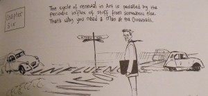
on the turnpike.
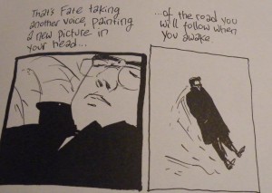
What do you buy when you sell your soul to the devil? You buy knowledge of the world. What is the price? The possibility of believing that nobody else matters.

What it means to be an artist is balancing on the knife edge of solipsism and selling out: perspective has to come from inside your head, but it must be meaningful to those outside. This book doesn’t ignore that — it’s about that. It may not be about how to be a successful artist, but it’s certainly about how to be a wise one. And it manages to be all those things, all the thematic sophistication and formal sophistication, while still being really atmospheric and descriptive and just plain pleasurable.

But I’m not going to talk about most of that though. Ok, a little bit about the pleasure. Maybe somebody will discuss the theme of influence. Maybe I’ll write another post.

But right now I’m going to talk about grammar, because with most comics there’s nothing to talk about. And Campbell’s prose is gorgeous.


Part 1.

Second person singular. Future perfect tense.
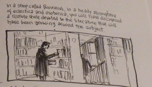
So he says, but he doesn’t actually stick with it throughout, despite the intro: it’s in plain old future most of the time. But the instincts are better than the rule: the shifts between future and present and the occasional actual past are vastly more effective than rigid future perfect would be. The use of the future perfect in the places he does use it, though, is sufficient to establish the bizarre temporality that that tense suggests, and that bizarre temporality saturates the rest of the section.

Lacan once noted that crazy people cannot think in the future perfect tense (the exact quote is that the emergence of identity is “a retroversion effect by which the subject becomes at each stage what he was before and announces himself — he will have been — only in the future perfect tense.”) Perhaps it’s due only to the power of suggestion, but I found the perspective of this book incredible sane.

The future perfect tense is powerful for its active assertion of inevitability and its blurring of passive and active. Technically, it suggests a point in the future prior to which a given action will have been completed: “I will have washed all my clothes by the time you get here.”

But in Campbell’s hands here, it refers to actions that have already been completed in the past, so the “present” tense of the grammar is the past tense for the reader. The result is a doubling of the vantage point and of the time of the narrative: the future perfect tense conveys the author’s narrative awareness of history while leaving intact the position of the character who has not yet experienced that history.
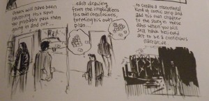
There is the time of the “you” – asserting and anticipating the future events. There is the time of the author, who knows what those events will be because he is already in the future that they point to. In other words, there is the time of the main character of the prose, and the time of the authorial voice.

But because this is comics, there is also the time of the pictures, which is (generally) the literary present. Not just because, often, the dialogue within a panel is in the present tense, but also because the time of an image, from the perspective of the image itself, is always the present, the moment present in the space that it represents.

This is a comic where both image and prose are fully active, fully explored. The full range of temporality from images, the full range of temporality from prose. That allows the time experienced by the narrative subject to be not just doubled but tripled: past, future, and present, all together, all represented simultaneously and equally.

Not only do I find this temporal pluralism quite satisfyingly nuanced – there’s something comfortingly unblinkered about such a temporal panopticon – as a formal structure it’s so much more ontologically fascinating and narratively flexible than the more mechanistic notion of sequential panels representing time as space. When prose is left behind, or replaced by “comics dialogue” that does not make full use of the toolkit of prose, images enforce a hegemony of the present. This causes a formal insistence on the presence of the panels that makes those kind of comics very insistently material and, I think, makes the immersive qualities of great literature harder to achieve. Comics are often Baroque, but they don’t have to be.

Much of the conceptual sophistication here comes from this recognition of how present to itself visual representation is. By choosing a verbal tense that essentially puts brackets around the present tense (the future perfect is both future and past), the time of the prose wraps the time of the images and breaks the hegemony of the visual present – you get all the immediacy of the visual present, but without its temporal solipsism. (Meaning “the time of the image is all that exists to the image,” not the psychological solipsism Vom and Noah mentioned.) The narrative vantage point is that of all possible times at the same time.

This is something comics can do that neither visual art nor prose can do alone. Because grammar is linear, it’s nearly impossible to get all possible times at the same time. You can grammatically nest the tenses, but you can’t get them all simultaneous, and if you’re not careful, tense shifts can become grammatical errors. But because images are always present to themselves, visual art always conveys a strong sense of the moment. In comics that emphasize sequentiality, you always have traces of what Heidegger called a “succession of nows.” When the prose and the images are more equal, each helps the other out of the ontological double bind, allowing for the native temporalities of both modes of representation to operate in concert.

(I rush to say, in the midst of all this grammar that’s about to become philosophy, that Campbell, unlike your present critic, gets all this ontological niftiness into his book effortlessly, leisurely, without sacrificing the liveliness and flow of the narrative or the believability of the characterization or the visual pleasure to the formal device. This is masterful. I’m sure I’ll get the criticism that none of what I’m talking about is the point of this book, and it doesn’t have to be. But the fact that it happens makes the book even more pleasurable for me.)

Heidegger in fact rejected the notion that time is an “uninterrupted succession of nows,” calling that notion “vulgar.” Instead he posited that the past, present, and future are unified, and that that unity is “ecstatic” – the ecstasy of the “potentiality of being.”

It makes sense that autobiography should be concerned with the ecstasy of the potentiality of being. There’s no question that the narrative arc of How to Be an Artist follows the typical frustrations that accompany putting artistic creativity in the service of earning a living: including the necessity of spending a lot of time in your own head, as other commenters here have noted. Being an artist is about being yourself too much and not enough. But I don’t think Campbell is unaware of this. I think it’s an intentional representation of those aspects of the creative life.

And perhaps that’s what comes across more when the comics references fade into the background. Campbell’s relationship to comics feels like my relationship to prose books. It’s affection, not fetish — but it’s also his job. He can’t exactly stop thinking about them. To be an artist you have to inhabit doubled worlds — the beloved world of books and the much less beloved world outside of books. Although someone who loves art but does not want to make it can escape into fictional worlds, and we can expect people who have no need for creativity to be utterly pragmatic and realist in their dealings with others, inhabiting both interior and exterior worlds is essential if you want to make art rather than consume it.

My favorite panel in How to Be an Artist gets at this directly.
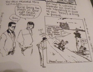
Not sure I would have chosen to visit a place inhabited by a crazed brick-throwing rodent, but the image of “knocking on the door” of a fictional reality is utterly charming. There’s a difference between a self-aware introversion — one that has full access to the imagination — and solipsism, and for me at least, the formal structure and perspective of this work undercuts the notion that the introversion slips into solipsism. It’s hard to imagine a meaningful “life of the mind” that doesn’t happen inside the mind. After that panel is this extraordinary passage, which I’ll transcribe in prose to let how well-wrought it is come across more directly, although it’s more effective with the images (which among other things, change the rhythm):

But hey! to cultivate a separate life from the one happening in front of you. There’s a thing to pursue.
An inside life, where Fate talks to you, sometimes in the charming tones of a girl singer with old Jazz bands.
Othertimes in a naive wee voice in which all things are still possible.
Conceit is no criticism here in the realm of the spirit as it is in real time where your heroes are long gone.
On an airfield in China, Terry Lee is still kissing Jane Allen goodbye
In Gasoline Alley, Skeezix is having his midlife crisis
In a vast silent Arizona desert, a Coconino moon pours out molten silver…
It drips on Alec MacGarry, asleep at the turnpike
That’s Fate taking another voice, painting a new picture in your head
of the road you will follow when awake.

“Your heroes are long gone” — in the past.
“Still kissing Jane Allen goodbye” — in an eternal present.
“The road you will follow” — in the future.

This is the “potentiality of being” specific to the artistic mindset: “to cultivate a separate life from the one happening in front of you.” That describes an ecstasy of art, and part of the brilliance of this book is the recognition of how you find that ecstatic potential in the mundane life story. But the wisdom of that temporal panopticon is the point that being a successful artist requires saturating the life story with that ecstasy, so that the experience of the present is constantly imbued with the past and future, the “Picture in your head of the road you will follow when awake.” That ecstasy is something Campbell does extraordinarily well.


Part 2.

Art comics culture encourages a certain fetish of the image, especially the semiotically loaded image – or rather the related idea that pictures can take over the functions of narrative normally carried by words, that you can “read” images to construct narrative. Many of the most lauded art comics are works that pack the images with parsability – visual metaphor, visual narrative, symbolism. Inattentiveness to this often gets treated like a failure of literacy and images that aren’t packed to the semiotic breaking point become tainted as “mere illustration” (to quote from here).

But practically speaking, the result of this emphasis is a reduction of narrative to the barest bones of signification, because one of the things you lose when the images are as tightly meaningful as they generally are in the School of Heightened Visual Signification is the lushness of leisurely atmospheric description, which is a tremendously pleasurable part of fiction.

Witness this particularly visual segment from a book by a particularly visual prose writer, Don Delillo, (from Part 5 of Underworld), which I’m going to quote at its full lengthy length:

We were about thirty miles below the Canadian border in a rambling encampment that was mostly barracks and other frame structures, a harking back, maybe, to the missionary roots of the order — except the natives, in this case, were us. Poor city kids who showed promise; some frail-bodied types with photographic memories and a certain uncleanness about them; those who were bright but unstable; those who could not adjust; the ones whose adjustment was ordained by the state; a cluster of Latins from some Jesuit center in Venezuela, smart young men with a cosmopolitan style, freezing their weenies off; and a few farmboys from not so far away, shyer than borrowed suits.

“Sometimes I think the education we dispense is better suited to a fifty-year-old who feels he missed the point the first time around. Too many abstract ideas. Eternal verities left and right. You’d be better served looking at your shoe and naming the parts. You in particular, Shay, coming from the place you come from.”

This seemed to animate him. He leaned across the desk and gazed, is the word, at my wet boots.
“Those are ugly things, aren’t they?”
“Yes they are.”
“Name the parts. Go ahead. We’re not so chi chi here, we’re not so intellectually chic that we can’t test a student face-to-face.”
“Name the parts,” I said. “All right. Laces.”
“Laces. One to each shoe. Proceed.”
I lifted one foot and turned it awkwardly.
“Sole and heel.”
“Yes, go on.”
I set my foot back down and stared at the boot, which seemed about as blank as a closed brown box.
“Proceed, boy.”
“There’s not much to name, is there? A front and a top.”
“A front and a top. You make me want to weep.”
“The rounded part at the front.”
“You’re so eloquent I may have to pause to regain my composure. You’ve named the lace. What’s the flap under the lace?”
“The tongue.”
“Well?”
“I knew the name. I just didn’t see the thing.”
He made a show of draping himself across the desk, writhing slightly as if in the midst of some dire distress.
“You didn’t see the thing because you don’t know how to look. And you don’t know how to look because you don’t know the names.”
He tilted his chin in high rebuke, mostly theatrical, and withdrew his body from the surface of the desk, dropping his bottom into the swivel chair and looking at me again and then doing a decisive quarter turn and raising his right leg sufficiently so that the foot, the shoe, was posted upright at the edge of the desk.
A plain black everyday clerical shoe.
“Okay,” he said. “We know about the sole and heel.”
“Yes.”
“And we’ve identified the tongue and lace.”
“Yes,” I said.
With his finger he traced a strip of leather that went across the top edge of the shoe and dipped down under the lace.
“What is it?” I said.
“You tell me. What is it?”
“I don’t know.”
“It’s the cuff.”
“The cuff.”
“The cuff. And this stiff section over the heel. That’s the counter.”
“That’s the counter.”
“And this piece amidships between the cuff and the strip above the sole. That’s the quarter.”
“The quarter,” I said.
“And the strip above the sole. That’s the welt. Say it, boy.”
“The welt.”
“How everyday things lie hidden. Because we don’t know what they’re called. What’s the frontal area that covers the instep?”
“I don’t know.”
“You don’t know. It’s called the vamp.”
“The vamp.”
“Say it.”
“The vamp. The frontal area that covers the instep. I thought I wasn’t supposed to memorize.”
“Don’t memorize ideas. And don’t take us too seriously when we turn up our noses at rote learning. Rote helps build the man. You stick the lace through the what?”
“This I should know.”
“Of course you know. The perforations at either side of, and above, the tongue.”
“I can’t think of the word. Eyelet.”
“Maybe I’ll let you live after all.”
“The eyelets.”
“Yes. And the metal sheath at each end of the lace.”
He flicked the thing with his middle finger.
“This I don’t know in a million years.”
“The aglet.”
“Not in a million years.”
“The tag or aglet.”
“And the little metal ring that reinforces the rim of the eyelet through which the aglet passes. We’re doing the physics of language, Shay.”
“The little ring.”
“You see it?”
“Yes.”
“This is the grommet,” he said.
“Oh man.”
“The grommet. Learn it, know it and love it.”
“I’m going out of my mind.”
“This is the final arcane knowledge. And when I take my shoe to the shoemaker and he places it on a form to make repairs — a block shaped like a foot. This is called a what?”
“I don’t know.”
“A last.”
“My head is breaking apart.”
“Everyday things represent the most overlooked knowledge. These names are vital to your progress. Quotidian things. If they weren’t important, we wouldn’t use such a gorgeous Latinate word. Say it,” he said.
“Quotidian.”
“An extraordinary word that suggests the depth and reach of the commonplace.”
His white collar hung loose below his adam’s apple and the skin at his throat was going slack and ropy and it seemed to be catching him unprepared, old age, coming late but fast.
I put on my jacket.
“I meant to bring along a book for you,” he said.

Now, imagine a version of that passage in comics. First imagine it drawn by Chris Ware – and then imagine it drawn by Eddie Campbell. In my imagination, Ware’s version would undoubtedly involve a quite detailed technical diagram of a shoe, as arcane knowledge is a bit of his bailiwick, and he would surely be able to capture the intensity of the thematic point, the buildup to the “gorgeous Latinate word.” It would probably, in fact, be an even more pointed buildup.

But much of the realism and atmosphere of that scene come from the rhythm of the speech and the texture and atmosphere of the descriptions. And that’s separate from the metaphors. Even though visuals are suggested, the visuals aren’t the point. The narrative trajectory is only part of the passage’s impact: that’s its significance, not its effect. Campbell’s grasp of and appreciation for prose makes me believe he could capture the visceral tactility — the awareness of how things feel and look, as well as the description of how they feel and look — and the dialogic humor of the passage as well. Prose literary narrative doesn’t just convey emotion and story; it also suggests imagery and demarcates space and evokes setting and represents the mental experience of having experiences — and it accomplishes those things in ways that are quite different from the ways they’re accomplished in primarily visual narrative. Since comics in fact has a quite native place for prose writing to occur, letting cartoonists off the hook for doing it well it is significant critical failure in my book. Campbell does write prose extraordinarily well, and it makes all the difference.

By not rejecting real honest-to-God prose (as opposed to “comics dialogue”), by letting his pictures sometimes just be about gesture or mood or setting and the parts of literary meaning that traffic in images and visuals, Campbell gets to something that feels so much more like visual literature than many other cartoonists, who are doing something closer to “literary art.” His drawings are atmospheric, suggestive, not illustration but illustrative. And great literature is all of those things.

That’s why “mere illustration” is so terribly wrong, and why the hegemony of symbolic and metaphorical and even narrative images as a substitute for really outstanding prose writing does so much violence to the potential of the form.

It seems like atmosphere and illustration are broadly associated with the pulpier genres of comics, with genre comics rather than art comics. But there are literary ways to handle atmosphere and description too, and it matters that comics can do this, can be literary in this particular way. It’s an achievement, and it doesn’t matter that it’s not pushing the envelope of visual semiotics. It’s literature. It’s doing interesting literary things. It’s allowing visual imagery and literary imagery to overlap and converse.

I hesitated before writing this, because after a year of writing here I feel like a lot of people will take this as my selling Campbell short, not paying attention to the art or the potential of art or giving the art enough autonomy. I’ve been chastised so often for wanting comics to be ambitious in ways that are familiar and beloved to me from prose literature, an ambition that does not require a baroque disjointed reading but allows immersion, sophisticated and subtle and smart without getting tangled up in so many formalist visual tricks that they feel stiff and micromanaged. The more packed with significance a picture is, the less those things can come to the fore. This argument is often made by saying that comics should do something unique, that they don’t need to be like literature because they can be their own unique thing. But for me, the experience of reading Campbell’s writing — and I strongly prefer the ones where he’s the writer although I like his art when he’s not — is unique: it’s just a unique form of literature, rather than a unique form of something else that really isn’t literature at all.

Comics at their best are a tightened and compacted form: the classic example is always Peanuts, with its ability to cull away all the chaff and leave only the essential bits. Many comics where images carry the narrative tighten by reduction, because you just can’t pack as much into an image as you can into an extended prose passage, and you can only repeat the image so often for subtle effect before you’ve got a flip book instead of a comic. Comics that use that strategy reduce the narrative to the most essential elements, and then convey those elements through the images. There can be extraordinary power in that approach.

But Campbell’s stories, because he doesn’t cast aside prose, can condense without reducing. The description and atmosphere and even rhythm that takes so much room to establish in prose can easily be encapsulated into a single evocative frame. I don’t mean that this is all Campbell’s panels do; sometimes they are packed with signification, but sometimes they aren’t, and because they’re working with prose rather than instead of prose, it becomes an artistic choice rather than a requirement for the narrative flow. The shape of the narrative is changed from prose to comics: the form is compacted, but the narrative itself is as big and rich and full as a full-fledged novel. Campbell’s books are bigger on the inside than the outside. And I think that’s what art is all about.


Finale.

By way of a postscript, my friend Chris, whom regular readers may remember as my interlocutor in the Swamp Thing Roundtable, once got a letter published in The Comics Journal back in April of 1997. I’ve reprinted it below.

“I was extremely saddened to learn of Stan Drake’s passing. He was truly one of comics’ finest craftsmen, as clearly shown by the panel you folks ran with his obit. Who could forget The Heart of Juliet Jones, that great schizophrenic-vigilante strip he collaborated on with scripter Doug Moench and inker Klaus Janson during the early ’80s?

“I only regret that you couldn’t find the space to run a panel or two of his later, more mature work on titles such as Elektra: Assassin and Stray Toasters. Ah, well…”

The Comics Journal titled it “Ouch.”

________
Update by Noah: The entire Campbell roundtable is here.

Nostalgic History: Pascal Blanchet’s White Rapids

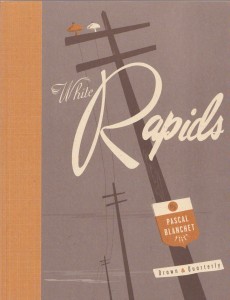
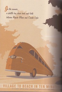
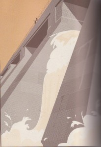
When it was released in English translation in 2007, critical interest in Pascal Blanchet’s White Rapids was appropriately complimentary of the book’s glorious visual style: shape-driven vector art and a shifting perspective reminiscent of mid-century travel posters and advertising, washed in a (slightly anachronistic) sepia-hue.

The novel sketches the broad outlines of the history of the town of Rapide Blanc, Quebec from its establishment as a company town supporting a power plant in the 1920s to its demise in the 1970s due to automation of the plant and improved transportation. According to Blanchet, the town itself is the central character – the human characters are rarely identified by name, and their stories play out in the broad strokes of collective experience.
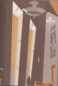
Blanchet synthesizes a number of visual reference points from the town’s lifespan: the angles of Art Deco

the curves of Streamline Moderne and the romance of travel posters

the grandeur of landscape naturalism (with a little social realist flair)

the graphical shapes of Googie and UPA

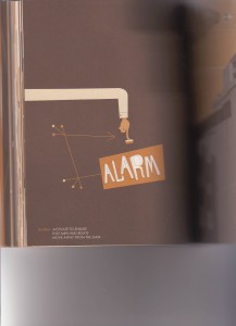
including technical diagrams

and the commercialism of advertising and interior design

The combination of these elements and Blanchet’s terrific choice to eschew a paneled grid in favor of a layout inspired by the period’s commercial art and illustration give the comic extraordinary atmosphere. It’s a delight.

Reading it, though, I experienced a tug-of-war between my immense enjoyment of these visual reference points, which I have particular affection for and which I was overjoyed to see utilized so effectively in this comic, and an ultimate dissatisfaction at Blanchet’s unwillingness to represent more directly the tensions among them. The mid-century here becomes a nostalgia-laced gestalt – viewed through his sepia lens, all its visual touchpoints, no matter what they signified historically, smash together into a signifier for A Good Life.

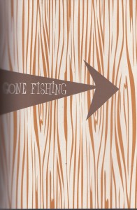
In Blanchet’s defense, that is to small extent what actually happened in the mid-century – especially in the 1950s in the US, space age design was indiscriminately combined with early American elements, so that in kitschy tract houses from the period you find atomic-styled doorknob backplates and round plastic buttons for light switches right next to heavy wrought iron chandeliers and patterned curtains depicting Minutemen. Proper Googie deliberately mixed futuristic pylons and cantilevers and glossy interiors with rustic flagcrete and natural wood and interior gardens – part of convincing the public that Modernity was indeed stuff of a Good Life.

Blanchet captures this mixing of styles. But the tension of their juxtaposition gets smoothed out in his take. In actual images from the period, the tension remains. It is no accident that when we think of popular mid-century cartoons, two of the first to pop up are The Flintstones and the Jetsons, which kept the aesthetics separate. Mid-century people did not purify the categories – that jumble of styles WAS the aesthetic. But the individual elements of the aesthetic did not surrender their native ideologies: the warmth of rustic materials did not tame the technotopian ideal of futuristic design. And especially in retrospect, the environmental consequences of the mid-century’s technological dreams saturate that style to the point that it appears almost dystopian.

A particularly illustrative case in point is Philip Johnson’s Tent of Tomorrow, the New York State Pavilion at the 1964 World’s Fair.

Now in ruins, Johnson’s futuristic towers in decay symbolize not the promise of “peace through understanding” or the world-uniting potential of atomic power that was the theme of the related “Atoms for Peace” program during the previous decade, but the death of that utopian dream against the realities of world politics and economics and the seemingly intractable environmental costs of progress.

The narrative arc of Blanchet’s story is concerned with progress – the mighty power company (represented in streamline Deco) builds the plant. Then they build the comfortable town for the people to live in. The people live the good life in the town, socializing and fishing and raising their children and putting in an honest day’s work. Then the plant is socialized! And automated! And the roads are improved. And the town is shut down. Reasons are given:

First is the continuous improvement of communication networks and road transportation. Today, one can easily drive from Shawinigan to Rapide Blanc, hold a meeting, and drive back all in the same day. When the village was founded in 1928, travel from Shawinigan to Rapide Blanc was a major expedition.

Second, improvements in the standard of living in Quebec mean that employees, regardless of their position, want to work near commercial centers, schools, and hosptials. In other words, they want access to urban facilities. In a town like Rapide Blanc, providing residents with all the comforts of modern living is simply not financially viable.

That text, quoted in the book, was from 1971, and makes explicit that the plant was shut down due to the culture’s preference for technology and modernity over the idealized small-town life. No matter how Populuxe the small town was, it couldn’t compete.

Blanchet’s images accurately represent the contradiction in the dream of mid-century modernism – nature and technology – but it mostly pins the ominousness of progress to the Deco aesthetic and lets Populuxe off the hook. Saturating that small-town life with nostalgia ends up eliding the actual historical and ideological connections between Streamline Moderne and Populuxe, and thus de-emphasizes the fact that the mid-century dream had within it the kernel of its own destruction: the technological advancement that made mid-century rural life so comfortable would eventually make mid-century rural life economically unfeasible. The taste for modernity reflected in Populuxe design ultimately became unsatisfyable within Popluluxe’s uneasy hybrid of past and future.

I want to point out that nothing in Blanchet’s book outright contradicts these historical tensions. He washes them with nostalgia but he doesn’t actively misrepresent them. I can find them, and with effort I can sustain a more historically sensitive reading. But his narrative focuses almost entirely on the human emotional experience – the sad older couple looking forlornly at their empty house and the gentleman throwing his key into the river — yet it’s a narrative of broad strokes. We don’t really know who these couples are, so their human stories don’t pack a particular emotional punch. I would have been more excited about the book had the broad historical strokes implicated in the design elements also been represented more directly, as well as the history of the town itself. That would have felt better balanced to me. The book is a great pleasure, but the pleasure doesn’t stop me from being cynical about the effect of this nostalgic frame on the book’s achievement overall.

Drawn and Quarterly’s blurb on the back of the book is particularly egregious in promoting the nostalgia over the more nuanced historical story:

Blanchet’s unique, streamlined, retro-inspired aesthetic draws on Art Deco and fifties Modernist design to vividly conjure up idyllic scenes of lazy summer days and crisp winter nights in Rapide Blanc, transporting the reader back to a more innocent time.

There was very little innocent about Deco or Populuxe, and when the two are so baldly collapsed together, as they are especially here in this prose, then put in the service of nostalgic myth making, that does give a bad taste. In the final scene of the book, the mythic “General” – a giant Pike who lived in the river and shook the bridge but could never be caught – swallows the key the 195 Crescent St., which a resident has thrown into the river on his way out of town. The General can signify a couple of things: the romantic nostalgic view of mid-century life — or the reality that mid-century life was always a myth. If it signifies the latter, then it is an elegant ending, signifying the passage of the real “mythic” life into pure myth. But if it signifies the former, as Drawn and Quarterly’s blurb suggests, if the technological tensions of the Populuxe aesthetic are really meant to signify “idyllic scenes of a more innocent time,” with no tension at all, then the General becomes the hero of the story: nostalgia itself, myth itself, is the only thing left.

Practically, though, the nostalgic fantasy that the General represents isn’t the fantasy that won – it isn’t what’s left. The world of technology, the dream of progress, is what we have now. We are left with the reality of the Populuxe dream – dystopian though may be. Nostalgia and myth, no matter how comfortable, don’t change that reality.

Of course, this is not a realistic book, and mid-century life indeed has passed into myth. Perhaps (having grown up in a town about the size of Rapide Blanc) I am just more sympathetic to the technological dream than Blanchet is, and more sensitive to how much the myth of mid-century life was a conservative, highly nostalgic construct from the very beginning, related more to the traumas of the 1960s than the reality of the 1960s (traumas which are hinted at in the book only in the representation of nationalized industry and not explored.) Nonetheless, the choice to allow nostalgia to shape the contours of the visual narrative, rather than providing the visual components and allowing them to shape a nostalgic response in the reader, takes the choice to emphasize the subtleties of the period away from me. I’m forced to engage with Blanchet’s (and Drawn and Quarterly’s) sepia-toned mid-century, a mid-century that just isn’t recognizable against the far more vivid Technicolor clashing percussive ‘50s in my head – a compromise engagement that’s ultimately unsatisfying, no matter how gorgeous this book looks.

======================================================================================
Update, February 11, 2011

Warren Bernard, the polymath collector and political cartoons expert who turned me on to this book (Thank you, Warren!), commented rightly that there’s a lot of tension in the narrative, between technology and the small town. And he’s right that Blanchet represents that very directly, and that the visual aesthetics he references — Deco, Streamline Modern, and Populuxe — are ones strongly are associated with technological advancement.

I don’t want to give the impression that there’s no tension at all within this book — it’s definitely there in the narrative arc. But the visuals follow the binary between technology and the small town in a way that doesn’t acknowledge how much the Populuxe aesthetic itself embodies the myth that technology and small town domesticity are endlessly compatible. But Populuxe doesn’t actually signify either technology or the small town — it signifies the same thing that the town itself signifies, the characteristically mid-century myth that technology and progress will lead to more of the conventional “Good Life.” As the book points out, the result of that technology and progress has in fact been the near destruction of rural and small town life.

Because the town is treated in this book as a character, one who is the victim of technology, it’s resonance as a symbol in its own right is muted. The symbolic texture is put in the service, primarily, of the narrative arc rather than a bigger metaphorical or symbolic point. But the Populuxe-dressed ’50s small town is in fact a pretty vital symbol for the more abstract tensions between technology and humanity or between technology and the environment. There is a sense of romanticizing the time and the Populuxe aesthetic right along with the small town lifestyle. It’s that romanticization that’s too broad of a sweep, because it catches Populuxe in its net, and when Populuxe is romanticized, the tensions inherent to the aesthetic are erased. Blanchet’s novel suggests all of these tensions, abstract and aesthetic, absolutely; he does nothing to shut them down and his sensitivity to the history is sufficient that if you’re paying attention to them, you can see them there. But he also doesn’t bring them out, emphasize them, build on them, to the point that D&Q would instantly realize that their back blurb is nostalgic nonsense.

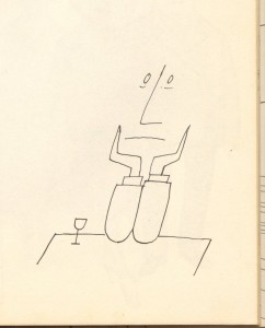
In praise of Saul Steinberg

(Please click on all images — they’re much easier to see in the big versions.)

Over at The Panelists, in the comments to Derik’s really terrific post on Blaise Larmee’s Magic Forest, I’ve been harassing Charles Hatfield a bit about the theoretical status of “sequence” in comics studies. For me, the importance of sequence is always overstated in a way that I think limits what the term “comics” can be appropriately applied to and, even worse, emphasizes one subset of elements within comics – the sequential, narrative ones – at the expense of the metaphorical and structural aspects I find more interesting.

Continue reading

Form, Fetish, and Diastrophism

In our blog roundtable on Charles Hatfield’s Alternative Comics there was much discussion of Gilbert Hernandez’s Human Diastrophism. At the time of the roundtable, neither Caroline Small nor I had read the entire work. So we decided to do so, and then talk about it. Page references are to the 2007 Fantagraphics edition.
_______________________________________

Noah: So one of the discussions we had in the roundtable with Charles Hatfield was about the use of fetishization in Hernandez’s work. And after reading this book, I have to say that I”m more than ever convinced that fetishization is just absolutely central to his comics in a way which I often find both ugly and hypocritical.

As I said before, the fetishization is sometimes worked through in terms of pin-up art; the Dan DeCarlo zaftig curves on Luba, or Pipo or Tonantzin’s perfect proportions. But I think it touches all of his female characters. The cornucopia of body types he presents (tiny Carmen, body-builder Diana, va-va-voom Doralist) or his obsession with imperfections (characters without arms, or with scarring) — there’s just a very insistent emphasis on defining people by surfaces. And I think that ties in to the way Palomar works in general; it’s very much a world of surface; you very rarely get internal monologue or a sense of what’s happening inside character’s heads. Instead, you get caricature and theatrical gesture. And there’s also, as Charles pointed out in Alternative Comics, a insistent formalism — Hernandez leaping from time to time or character to character, fracturing the narrative so that you feel it as narrative construction. The result is for me that the characters don’t have independent life; that Hernandez is pushing them about the board hither and thither for his own amusement. All the frantic insistence on interconnectedness and infidelity and the wonderful variety of people and bodies — the point seems to be “Look at this wonderful web of life!” But to me it feels cynical and dead, the characters worn flat by his obsessive need to run his hands over them.

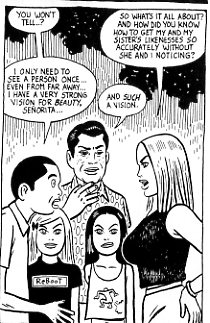
In that sense, there’s something queasily apropos about Humberto’s statues of all the townspeople sunk beneath the lake. In “Chelo’s Burden,” one of the later stories included in the “Human Diastrophism” Fantagraphics volume, Petra demands to know how Humberto can reproduce people if they haven’t sat for him, and he says he can instantly size people up. “I have a very strong vision for beauty, Senora” he explains, while his coconspirator Augustin agrees and checks out Petra’s chest. Basically, Humberto’s artistic process involves a facile empathy in the interest of creating a world of collectible, “beautiful” fetish objects. It’s condescending…and not the less so because Hernandez is also (perhaps self-reflexively) condescending to Humberto.

Continue reading

On Exhibit: The Vorticists’ “Mad Modernity”

Nasher Art Museum at Duke University
Durham, NC
Through January 11

Peggy Guggenheim Collection
Venice, Italy
25 January – 15 May 2011

Tate Britain
London, UK
Tuesday 14 June – Sunday 4 September 2011

“What is Vorticism? Well, like Futurism, and Imagisme, and Cubism, essentially it is nonsense. But it is more important than these other fantastic, artistic, and literary movements because it is their sure conclusion. It is important not because it is the latest, but because it is the last phase of the ridiculous rebellion which has given the world the “Portrait of a Nude Descending the Stairs” and the writings of Gertrude Stein. It is the reduction ad absurdum of mad modernity.”

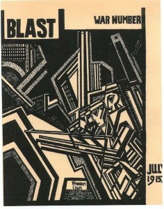
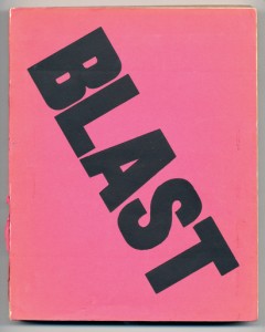
When The New York Times published this dismissal of “modernity” in August of 1914, only a couple of months had passed since the Vorticists had published their manifesto in the first volume of their magazine Blast. Earlier that year, Dora Marsden had established her journal The Egoist, Vorticist leader Wyndham Lewis had broken with the Bloomsbury artists and established the Rebel Art Center, and the Vorticist poet laureate Ezra Pound had published his anthology “Des Imagistes.” “Mad Modernity” was in full swing (despite that little matter of an assassination).

On the same day that the Times “blasted” Vorticism, they also published a glowing review of a show of American art in Paris featuring work by the figurative painters Ernest Lawson, Bryson Burroughs, and Harry Lachman, as well as the sculptor Cecil Howard. From the vantage point of New York, then conservative and academic, all the European modernisms were madness — the same madness.

Throughout 1914, however, Pound and Lewis were at great pains to emphasize that Vorticism was not the same. In June, they publicly rejected Marinetti’s attempts to co-opt them as a sub-movement of Italian Futurism, despite having previously taken advantage of his high profile for a fundraiser for the Rebel Art Center. Blast 1 is littered with aggressive criticism and rejections of all the modernisms, in an effort to publicly situate Vorticism as a uniquely advanced synthesis. In the introduction to the excellent exhibition catalog for the exhibit reviewed here, Philip Rylands describes it as the “most advanced, the most sharply characterized of the London-based avant-gardes,” including the Bloomsbury movement that fostered Virginia Woolf.

This is even clear from the first time the term “Vorticist” appeared, in a 1914 advertisement for the upcoming Blast 1, printed in the literary magazine The Spectator:

The Manifesto of the Vorticists. The English Parallel Movement to Cubism and Expressionism. Imagism in poetry. Death blow to Impressionism and Futurism, and all the refuse of naïf science.

The Exhibit

The exhibit of Vorticist art currently on display at the Nasher Museum of Art at Duke University, curated by the Nasher in cooperation with the Guggenheim in New York, is the first exhibition of Vorticist art in the United States since Pound mounted his own exhibition at the Penguin Club in New York in 1917. For that reason alone, it is worth attending.

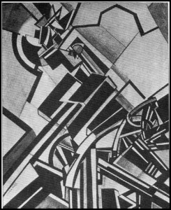
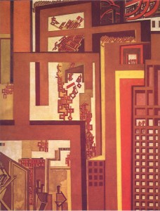
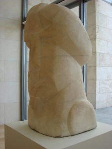
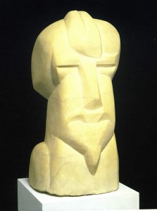
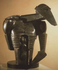
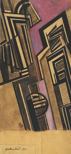
The exhibit is organized in five parts: A display of major works, including Gaudier-Brezska’s Hieratic Head of Ezra Pound (below), Wyndham Lewis’ The Crowd (right), and Jacob Epstein’s Torso in Metal from Rock Drill (below, third), begins the exhibit. That is followed by “re-creations” of the three exhibitions, including Pound’s at the Penguin, held between 1913 and 1917 when Vorticism was a current avant-garde, and a section devoted to the movement’s magazine Blast.

“Re-creation” is a strong word, as many of the originally exhibited artworks are lost – but the curators attempted to gather as many works from the original exhibitions as possible. Of particular note are the paintings by Helen Saunders, which were believed lost but turned up in boxes at Roosevelt University in Chicago, and the vortographs of photographer Alvin Langdon Coburn.

The impact of seeing all these works collected together – as opposed to the usual one-off buried in a room of “minor modernisms” – is significant. In this context, the aesthetic consistency among the movement’s practitioners, their debts to Jacob Epstein and to both Cubism and Futurist painting, and the inspiration they found in the urban landscapes of Northern English cities and English industrialism, all become readily visible.

The section focusing on Blast doesn’t make nearly the same impact. That section and the opening display of “major works” are both haunted by the spectres of literature and philosophy – particularly Pound, who coined the term Vorticism, and Wyndham Lewis, who was as much a novelist and essayist as a painter. Their mutual “friend” T.E. Hulme – in scare quotes because that friendship was characterized by competition and melodrama, which led to Hulme’s exclusion from Blast 1 – was almost singlehandledly responsible for Vorticism’s philosophical orientation, culled from his translation of Bergson and his friendship with the Expressionist philosopher Wilhelm Worringer. Add in Pound’s influential friendships with the feminist anarcho-individualist Marsden and the writer T.S. Eliot (who was also published in Blast), and it’s indisputable that Vorticism was as much a literary, philosophical, political, and social movement as it was a visual aesthetic one. (There was even Vorticist music, eventually.)

The Nasher exhibit emphasizes Blast as a material object, however, displaying original copies of both volumes in long cases, with framed original drawings for the magazine hanging above the cases. Although the physicality of this presentation gives a geeky thrill, Blast was never intended to be enclosed within a display case (to the exhibitors credit, a new facsimile edition of Blast 1 was developed just prior to the exhibit and is available in the gift shop or here).

There is no Vulgarity in Revolt

The manifestos of “mad modernism” depended on mechanical reproduction and fed off the vibrancy of their artistic activism. The avant-garde was here set against both aestheticism and academicism, as Lewis’ stated directly in Blast:

To make the rich of the community shed their education skin, to destroy politeness, standardization and academic, that is civilized, vision, is the task we have set ourselves.

To believe that it is necessary for or conducive to art to “improve” life, for instance, make architecture, dress, ornament, in “better taste,” is absurd.

The Latins are at present, for instance, in their ‘discovery’ of sport, their Futuristic gush over machines, aeroplanes, etc., the most romantic and sentimental ‘moderns’ to be found. It is only the second-rate people in France or Italy who are thorough revolutionaries. In England, on the other hand, there is no vulgarity in revolt. Or rather, there is no revolt, it is the normal state. … the nearest thing in England to a great traditional French artist is a great revolutionary English one.

The spirit in these quotes from the preface and manifesto, not to mention its influence on the experience of the visual art works and literature reproduced in the subsequent pages, is lost when the book is put in a case. Blast-as-exhibit can only suggest it; experiencing the historical materiality of the book can’t even begin to substitute for reading it – even in non-facsimile reproduction.

Likewise, the materiality of the traditional exhibit space doesn’t even evoke, let alone “recreate” the rebellious, radical spirit and context of the wartime exhibitions. The Penguin Club is a case in point: the Club had been founded shortly before the 1917 Vorticist Exhibition by Walter Kuhn, one of the progenitors of the Association of American Painters and Sculptors, who put on the influential 1913 Armory Show that introduced Duchamp, and Hopper, and Kandinsky, and the post-Impressionists – among many others – to American audiences. The club was a gathering place for modernist artists rebelling against the constraints of academic art, including Man Ray, Francis Picabia, and Joseph Stella. The club held exhibitions, put on costume parties and satirical theatrical productions, offered classes by its members to its members, and encouraged criticism, discussion, and debate. The sedate blue and cream walls of the exhibition don’t begin to capture the frenetic environs from which Vorticism emerged and in which it perpetuated itself. Mad Modernism indeed.

Which is to say – by all means you really must go to the exhibit if you are anywhere near Durham, Venice, or London. Read the wall tags, admire the materiality of the art, and marvel at the lost-but-now-am-found paintings. But be sure to flip through the facsimile edition of Blast and the superb exhibition catalog, too. Otherwise you’ll have seen Vorticist art, but missed what makes it Vorticist.