Comics>Cartooning

Because it kicks ass, I’m reprinting and highlighting Caro’s comment from this post.

To Darryl’s point: for me, “divorcing comics from its cultural history” isn’t about being embarrassed about comics’ history so much as it is recognizing that “comics history” is neither sufficient cultural context for already existing comics nor necessary cultural context for yet-to-be-created ones.

The idea that comics history is both necessary and sufficient — I could put in jargony terms and say that it feels like a caving in to historical determinism. But it’s really more that it gives me no way in.

What L. describes — she says that about creators, but I feel that as a critic too. On the whole, very few comics keep me awake at night the way literature and criticism and theory and Godard films and conceptual art do — not because those things are better than comics-history-inspired comics, but because those are the things I like, and they’re having a different conversation than comics has historically been having.

I pay attention because occasionally, a comic comes along that really intervenes in the stuff I care about (like Feuchtenberger, or the stuff Jason just linked to!) and on the occasions when that has happened, it’s been so extraordinarily worthwhile that it’s worth keeping an eye out.

But for many things, it’s hard for me to muster the enthusiasm to do a real piece of criticism, because the book just isn’t doing anything to keep me awake. No matter how cool the tricks with comics history gets, no matter how nuanced the conversation, it’s just never going to keep me awake, because I’m interested in DIFFERENT histories — pop art, experimental fiction, 20th century theories of language and representation, artistic constructions of subjectivity. I think it’s wrong to say that comics can’t become part of those histories, now, even though they’ve historically not been. (Or, to return to the jargon, how can we expect the dialectic to work without antithesis?)

I absolutely don’t mean that comics-history-inspired comics aren’t doing very interesting things with that history. I don’t mean they shouldn’t exist, or that they’re “less” in any way than other comics. It’s just that, for me, who has no history with comics, comics history can’t on its own provide a foundation for challenging, provocative, mind-changing art, so for comics to challenge me, provoke me, and change my mind, I need there to be SOME comics that deprioritize the specific history of comics in order to engage more actively with those other histories.

That’s why the strength of the term “divorce” feels right to me. Comics’ relationship to their own history often feels like a marriage where one partner’s potential is being really held back in order to protect or build up the ego of the other partner. And I like comics better than I like comics history, so I say “girlfriend, leave!” Comics > cartooning.

Blog Versus Professor: Aline Kominsky-Crumb is Authentic, Too

How useful is Charles Hatfield’s notion of “ironic authentication” for understanding the autobiographies of women cartoonists?

I ask that question provocatively, but sincerely. The concept is worked out in the comics of male cartoonists: Hatfield first offers a compelling account of Harvey Pekar’s American Splendor, claiming it as the origin point of a comics tradition of realist-naturalist autobiography (which he just calls realist). He then opposes this naturalism to the fantasy mode typically associated with “mainstream” comics, outlining the transformative impact Pekar’s naturalism had on the scope of the “comic book hero.” He next tackles the far more theoretically ambivalent territory of autobiographical subjectivity, beginning by emphasizing the ways in which comics resonate and amplify autobiography’s inability (identified and emphasized by Autobiography Studies in literature) to escape the inherently fictive attributes of narrative subjectivity: “comics pose an immediate and obvious challenge to the idea of non-fiction.” Dan Clowes and the heightened formalist self-awareness in Just Another Day is read first, for insight into how the unavoidable fictitiousness of cartoon selves “distills and mocks Pekar’s ethic of fidelity to mundane truths,” then linked to R. Crumb’s The Many Faces of R. Crumb in order to assert that the seemingly unanchored “fictitiousness” of Clowes’ perspective actually is a “truthful” representation of the plasticity of identity. This elegant and theoretically savvy series of readings culminates in an examination of Gilbert Hernandez’s parodic “My Love Book,” which “teases the reader with a disjointed series of confessional vignettes, between which his visual personae shift so radically that we can confirm their common identity only through the repetition of certain motifs of in dialog and action” and which ends with an ironic suicide that “adverts to the limitations of autobiography” and “muddies its own assertion of truth.”

Continue reading

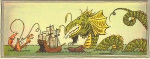
Here Be Lovely Monsters: Alexis Frederick-Frost’s Voyage

A couple of categories dominate mini-comics at SPX: the quick-and-dirty ones with simple drawings and simple or no text, usually photocopied, and the visual-artifacts-with-really-nice-art ones, which are beautifully drawn and decently- to well-printed, but often with “stories” that are rarely more than journal entries or slice-of-the-mundane or just random patter – hat racks for the high-quality art.

Exceptions to the hat rack problem are most often found in wordless mini-comics. The best example in my stash is Alexis Frederick-Frost’s simple but gorgeous “Voyage.” (I originally didn’t think this comic had a prose name: it’s not on the comic and I didn’t immediately locate it on his blog; I’ve been calling it “The Here Be Monsters Mini-Comic.” I was a little disappointed to discover that it did have a title!)

Continue reading

Frank Kermode: 1919-2010

I was thinking about Frank Kermode in the days before I learned, belatedly, from the eulogies printed in the London Review of Books, that he had died. I was trying to reconcile his opinion – oft shared by older college English professors during my undergraduate years – that reading was much more important than writing, with something James Sturm said at SPX: that to be psychologically healthy, you have to create as much media as you take in. Both seem intuitively wise, yet at odds, since nobody who read as much as Kermode could possibly write as much too and yet the breadth and seriousness of Kermode’s reading is surely the kernel of his writing and his contribution to literary study.

Kermode, like most male critics of his generation, tended to articulate a conservative response to the “politicization” of the humanities academy in the 1960s-70s and after. His values, he said, were those of the Enlightenment: disinterestedness, orderly thought, the search for wisdom and perspective. And yet his perspective, and his wisdom, were not all that divergent in their details from the insights of the early- to mid-century philosophy that informs so much of capital-T Theory. He wasn’t particularly conservative politically except in terms of academic politics, and his appreciation for Continental philosophy allowed him to read, and critique, the academic practice of Theory seriously when others of his generation could not. His own writing, especially 1990’s Poetry, Narrative, History deals with issues of narrative structure closely related to those of French narratology. 1965’s The Sense of an Ending prefigures social-science’s notion of a “risk society,” which has been treated frequently by Zizek .

But ever invested in the centrality of reading literature for sense, Kermode somewhat blames the academy’s politicization for society’s loss of sanity:

Continue reading

Too Much is Never Enough: Morris Lapidus’ Postmodern Curves

HU’s been preoccupied with architecture this week. In yesterday’s post, Suat noted that “the building shorn of its façade has long been favored by cartoonists in search of a structure which best encapsulates the comics reading experience in a physically possible form: the rooms and walls acting like panels and borders…” But it’s worth noting that the gridded interior which resonates most efficiently with the conventional comics form is a historically situated architectural shape: the rectangular multi-story urban dwelling, industrial tenement house or modernist skyscraper.

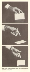
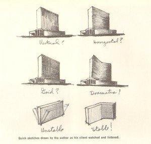
When architect Morris Lapidus was designing the 50-story Americana hotel in New York City in 1960, he needed to save his client the half-a-million dollars it would take to stabilize the high building against wind pressure. Lapidus’ solution was to bend the building so it would stand by itself, without support. First he illustrated the concept for his client using a calling card:

And then through illustrative drawings:

Basically, Morris Lapidus knew the limitations of a straight line. In the 1930s, living in New York and working as a merchandiser, he was already getting customers’ attention through curvilinear ornamental devices that an editor at Pencilpoint magazine described as “bean poles, cheese holes, and woggles.” [Woggles were amoeba-like shapes.] By the early-50s, during his rise to prominence in Miami Beach as the go-to architect for luxurious exotica, these features had become a signature style.

Lapidus himself defended the curves as natural — ”People don’t move in straight lines like an army — they meander. So, my plans meander” — but his protégé, Deborah Desilets, captures the more subjective experience of eschewing linearity: ”Mr. Lapidus knows how to give emotions physical form,” she said. ”His space swirls you; it prompts you to move; it’s an interactive architecture.”

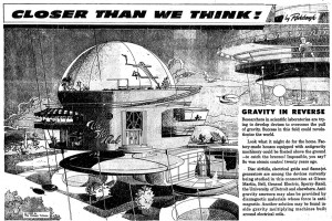
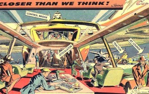
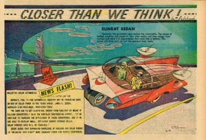
Around the same time as Lapidus was swirling the glitterati through his Miami hotels, The Chicago Tribune was publishing a single-panel “comic strip” by Arthur Radebaugh called “Closer than We Think”, which traded on the same curvilinear futurist aesthetic.

Although explicitly futuristic, both Lapidus and Radebaugh stand in marked contrast to the stark modernism of the International Style and European futurism of the early to mid-century. Theirs is a decadent, utopian futurism, apolitical, indulgent, ultimately more pop psychology and marketing than technology and science. Contrast with the futurism of Metropolis or Marinetti: these spaces are futuristic environments for an affluent bourgeoisie, professional men and women, with an expectation of technological luxury (an expectation not unrelated to our current economic malaise). This is a characteristically American futurism, indicative of “The American Century” and redolant with the capitalist fantasies that propelled America’s mid-century economy as well as American’s mid-century style.

And that’s where Deborah Desilets has a point: those decadent curves really are more immersive, emotional, and interactive than their more starkly linear cousins. This is the fantasy formation that makes it possible for marketing to mask commodification. Decadent futurism feels so postmodern not just because it foregrounds non-linearity as the avant garde would have it, but because it puts that non-linearity in the service of a fluid, imaginative fantasy — an unanchored, forward-looking fantasy of possibilities rather than the nostalgic one of history and memory that’s more characteristic of modernism. It’s that futuristic fantasy that is characteristically postmodern, in contrast with modernism’s fascinations with history, autobiography, and the contours of the past.

Not that a curvy, luxurious, decadent aesthetic is inherently bad or even inherently capitalist; in pre-modernist art, it was certainly put to far more bohemian ends. And non-linearity certainly isn’t associated with capitalist success in literature — it’s remained avant-garde despite 30 years of experiments with it. But in visual culture, decadence has lost those bohemian connotations and become pretty thoroughly bourgeois. That narrowing of signification needs to be challenged.

By the most fully postmodern standards, comics with a few exceptions tend to be quite linear: narrative storytelling through panels, even at its most flexible, is essentially a medium of vectors and lines. Sometimes in comics conversations and criticism there’s a sense that the form of comics – that sequential narrative storytelling through panels – is somehow transhistorical, that it can be endlessly manipulated internally to speak to and resonate with many and any aesthetic paradigms. But that isn’t true for any other artistic form, so it’s probably not true for comics either. Sequential narrative-through-panels is an architecture, and architecture is as historically situated as anything else.

Doubly Good

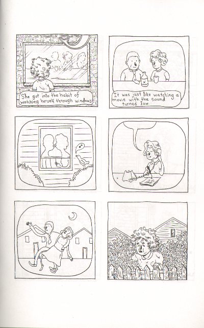
There’s a moment in Lilli Carré’s minicomic “The Thing about Madeline” where you really get that you’re reading a real story and not another installment in the Saga of the Mundane. It’s a little later than the point where that story actually begins: not where Madeline meets her doppelganger/self for the first time – that’s just a plot twist – but when Madeline the First gets “into the habit of watching herself through windows”:

Robert Stanley Martin correctly identified this moment as the place where the story’s main narrative idea slips from metaphor into dramatic irony, as the doppelganger is able to find the happiness in her life that Madeline could not. His review is so spot on I’m just going to link to it rather than trying to cover those aspects of the narrative myself.

But those panels also mark the place where the visuals take over doing that metaphorical work that the narrative leaves behind: the images of double Madeline continue to manifest the theme of alienation from oneself and one’s life while the plot (and facial expressions) hold up the ironic narrative.

What’s particularly beautiful and satisfying about this is not just that the visuals effortlessly carry significations that would become increasingly labored in prose. It’s also that the comic itself is now doubled right along with Madeline: the themes of alienation and happiness continue side-by-side formally in the same way that Alienated Madeline and her Happy Doppelganger populate the narrative. What this allows, then, is two separate story arcs: a literal one about Madeline and the Doppelganger, and a sustained metaphorical one about the relationship between alienation and happiness. Toward the end of the book, when Happy Madeline is visited by her own Alienated Doppelganger, the scenes from the beginning are recast – on a second read or in retrospect, it’s possible to see Happy Doppelganger and Happy Madeline as the same “character.” In that reading, self-alienation is always lurking and, as Robert points out, the easy moralizing criticisms of Alienated Madeline are much harder to make. The powers of circumstance and perspective get attention in a way they could not if the story had stayed more personal, eschewing that metaphorical strand.

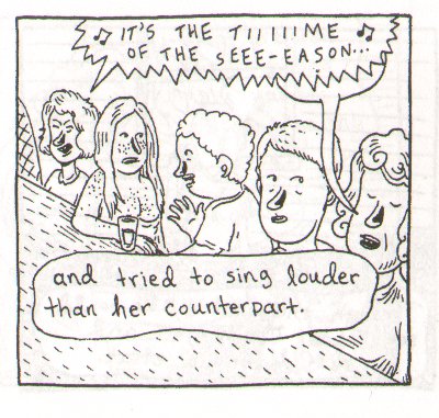
Carré’s work always balances very deftly on the line between ironic detachment and literary self-awareness, both traditional dramatic irony as well as the more formalist kind. Her characters often have these very distinctive noses that are a mashup of Mary Poppins and Raggedy Ann, and they alone are sufficient to make her drawing style immediately recognizable. In the case of The Thing about Madeline, this stylistic quirk works as support for the formal edifice: they mark the characters as “drawn,” and the effect of this signature is to anchor those characters to the visual plane of the comic. They restrict the universality of the characters and contribute to our sense of detachment from them.

That signature nose is absent from Carré’s most recent animated film, Head Garden, one of the selections for the 2010 SPX Animation Showcase.

Head Garden from Lilli Carré on Vimeo.

Instead, the face carries the metaphor, more directly. The facial features are less “cartoony” and more influenced by “art” faces like the ones discussed here and in comments. For me, the loss of this creative “signature” lets the animation breathe and allows the critical, slighly neurotic self-awareness of ironic detachment to mutate into the genuine double entendre that marks the best literary characterizations. The physical marker of style is less overt, but there is no loss of metaphorical sophistication (relatively at least; the animation’s metaphors are less ambitious than the mini-comic’s). The characters have become less “self-conscious”, although less well-developed in this less narrative piece, and I think because of this, the seams between the form and its significance are better hidden. I don’t think that’s just an effect of the film as opposed to comics. Identification with these characters is less detached even in still frames, despite the much more distant narrative characterization.

It seems to be a one-off, though; Nine Ways to Disappear maintains the signature style, as do Carré’s previous animations. (The nose is put to exceptional effect in What Hits the Moon; watch the way it sustains the character’s identity as her face ages around it.) But I think the comparison illustrates some of the limitations of too much “handwriting”: after awhile, it begins to feel like deliberate self-citation. Unless the handwriting is used in some meaningful way, it can interfere with other effects. Head Garden is still discernably Lilli Carré, but in the absence of that distinctively marked facial feature, her graceful but slightly awkward lines — like the talented too-tall girl in ballet class — get to take center stage. I hope to see a sustained story from her in the style of Head Garden sometime soon.

=========================================================

This review is based on the black-and-white mini-comic version of The Thing about Madeline. More information on the SPX Animation Showcase is available here.

Oddbox Bookshelf: Ivan Bilibin’s Russian Folktales

For all but the most enthusiastic student of historical ballet (and for fans of Alan Moore), a passing mention of the Ballets Russes calls to mind the riotous 1913 premiere of Stravinsky’s Rite of Spring. Expecting classical ballet, with its tutus and fairy tale settings, the Parisian audience was caught off guard and put off their dinners by the intensely punctuated rhythm of the score; Vaslav Nijinsky’s aggressive, distorted choreography; and the brightly colored primitivist imagery of the costumes and set design.

I was taught, as a student of that aforementioned historical ballet, to interpret this aesthetic first as an effect of Nijinsky’s own mental illness and second as neonationlist entertainment targeted at the population of expatriate Russian aristocratic patrons. Both are surely true to some extent, but I was also taught to associate that neonationalism with the merchant-class Slavophilism of its original exponent, V.V. Stasov, who in the 1870s zealously opposed Western culture and idealized ancient Russia which he saw as ethnically and aesthetically pure. For Stasov, Russia belonged to the East, and the imagery of the neo-Russian aesthetic was fundamentally Asian.

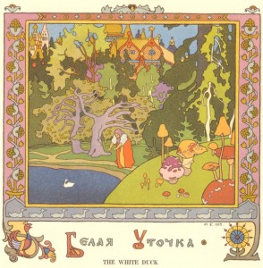
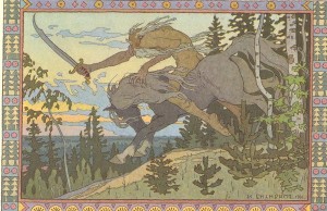
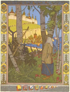
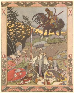
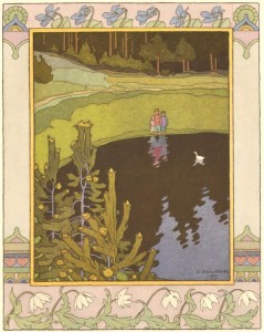
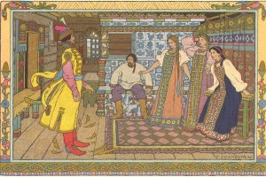
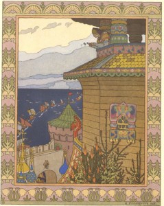
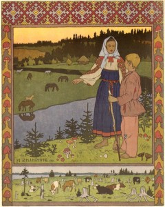
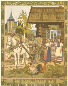
It is difficult to look at the illustrations of painter Ivan Bilibin and not see Western influences, although his affection for Japanese woodblocks is apparent.

Russian realism and the landscapes of the Peredvizhniki (particularly Levitsky) are certainly predecessors, but the aesthetic of Beardsley and Art Nouveau are palpable.

I was clearly mistaught to see so much of Stasov’s influence on the neo-Russism of the Ballets Russes. Stasov and Diaghilev, it turns out, were fierce antagonists. I think this error is an effect of oversimplification: neo-Russism did start with Stasov and was transformed by later visual artists to incorporate Western aesthetics. But dance history is closer to music history than it is to art history, and Stasov, tied to Rimsky-Korsakov and Tchaikovsky, is more important to nationalism in Russian music.

The incursion of art nouveau aesthetics likely dates to around 1894, when Princess Maria Tenisheva established an art collective on her estate, Talashkino, as part of a movement to revitalize nationalist art and preserve peasant arts and crafts culture. Aristocratic. pro-Western, and directly influenced by the English Arts and Crafts movement, Tenisheva established workshops to teach and preserve Russian and Slavic peasant techniques for manufacturing furniture, embroidering goods and making other crafts. She also set up an art school, elistist and intellectual but set against the Russian academy (which still favored the merchant-class aesthetic of the Peredvizhniki), that encouraged artists to study and depict Russian history and folklore. The style developed in these schools resembled art nouveau much more closely than any indigenous Russian folk art.

The estate became a meeting ground for a diverse group of artists and intellectuals, all of whom, including Ivan Bilibin, figured into Diaghilev’s theatrical enterprises. Beginning in 1889, Bilibin studied at Talashkino under Ilya Repin, at that time the most famous living Russian Realist, and in 1899, Tenisheva helped underwrite the journal mir iskusstva, co-edited by Diaghilev, which was the first magazine to publish the drawings of Aubrey Beardsley in Russia. In 1908, Bilibin designed the costumes for Diaghilev’s production of Mussorsgy’s Boris Gudonov.

In addition to his stage designs for Diaghilev, Bilibin is best known for illustrating Russian folktales, including famous depictions of Pushkin’s stories. In 1904, Bilibin published an essay in mir iskusstva called “Folk Arts and Crafts in the North of Russia” followed by a monograph on the same subject, based on his personal travels and investigations in the two previous years. During those travels he became interested in architecture, and continued to explore themes of folk art and architecture throughout his career. He died in 1943 during the Siege of Leningrad.

My scans of these drawings come from English translations made in the 1970s of a series of books of folktales commissioned by the Russian Department of State Documents between 1901 and 1903. There’s quite a bit of information about Bilibin online and in books and magazines — he is mentioned at least in passing in all the books I have on Diaghilev and a Google search pulls up many discussions of his art and some biography (see below) — but I haven’t been able to find anything enlightening about my editions: translated and printed in the USSR in 1976-1977, a time of detente, by Moscow-based Progress Publishing. The name of the publisher suggests proto-Glasnost, but for the time being I still have no idea why they were created or to whom they were marketed/distributed. It doesn’t stop me from enjoying them, though!

A excellent essay on Bilibin’s visual technique as well as a biography is available here.

More scans are available here.