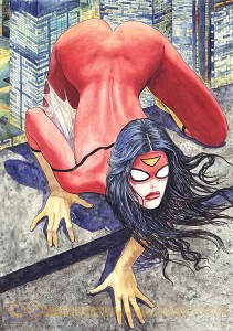
 So everyone is no doubt aware of the Milo Manara Spider-Woman variant cover art controversy that occurred a couple of weeks ago. Marvel’s commission of the cover, and its subsequent reaction to the backlash, was sadly typical of a mainstream comics industry that seems to want to embrace its large and growing female readership yet seems utterly incompetent when it comes to actually doing so.
Now, I don’t want to talk about Manara’s Spider-Woman cover art for any of the standard and by now familiar reasons. I don’t mean to suggest that the issues relating to the depiction of females in comics raised by the incident are not worth attending to – quite the contrary. But one public comment regarding the incident got me thinking about a different issue.
On September 2, Kelly Sue DeConnick – the current writer of Captain Marvel – made the following statement in an interview when asked about her take on the cover:
“The thing I think to bear in mind is Jess is not a real person – her feelings are not hurt by that cover.” (full video interview here)
Now, this is certainly true.
 But we shouldn’t forget certain claims are objectively (even if only fictionally) true of a fictional character (e.g. Jessica is a superhero) and other claims are objectively (again, even if only fictionally) false of fictional characters (e.g. Jessica lives on the moon), regardless of the fact that the character is question doesn’t actually exist. In particular, the production and publication of Manara’s cover now makes it fictionally the case that Jessica (at least once) poised herself atop a building, in a body-paint version of her costume, ‘presenting’ herself (in the biological sense of the term) to anyone in the city who might want a look. Regardless of how we might want to re-construe or reinterpret the art, this is what it in fact depicts.
Of course, as DeConnick notes, Jessica’s feelings aren’t hurt by this – not even fictionally. She isn’t fictionally aware that an artist decided that she would expose herself this way. On the other hand, she now just is the sort of (fictional) character that – perhaps in a single moment of questionable judgment – is willing to engage in some rather extreme exhibitionistic behavior. In short, the incident depicted on the cover is now part of how we understand what sort of person Jessica is.
Given this, we can meaningfully ask: Did the Manara cover (fictionally) harm Spider-Woman? And I think the answer here is uncontroversially “yes”. Whatever Jessica’s motivations for engaging in the behavior depicted in Manara’s art, this contribution to Spider-Woman’s narrative seems to be a negative contribution to her character – a representation of vice, not virtue.
The more important question to ask, however, is perhaps this: Independently of the other kinds of harm undeniably caused by the cover (and well-covered elsewhere), should Manara feel bad for producing this image because it (fictionally) harms Spider-Woman (or should Marvel feel bad for commissioning the image, or should we feel bad for consuming it)? Have we (i.e. Marvel, or Manara, or readers, or some combination of the three) done something morally wrong by adding this incident to the story of Jessica’s life? In short, should we care that we have done something objectively (albeit fictionally) harmful to a fictional character? Is there any sense in which we have moral responsibilities to fictional characters at all?
Of course, characters are harmed via depicting them doing non-virtuous things (making them non-virtuous characters) all the time – we call them villains or antagonists, and we need them for at least some sorts of story. But here the fictional harm done to Spider-Woman was not done in the service of any identifiable narrative needs. It was done for no reason at all, except presumably titillation. So unlike the case of villains, there is no story-related reason to alter Spider-Woman’s character in this negative manner.
So, was Spider-Woman harmed in the making of this cover?
Note: I have simplified a number of issues in the above in order to facilitate my main question:
- The narrative content of cover art does not always straightforwardly depict events that we are meant to take to have actually occurred in the narrative contained within the comic – cover art can play all sorts of other commercial or aesthetic roles in addition to straightforward storytelling (see my previous post here).
- I have assumed that unsolicited exhibitionism is, all else being equal, morally bad (since, for example, it might harm those exposed to it against their wishes).
If one is unwilling to grant me the simplification in 1, or refuses to grant 2 for the sake of argument (since the questions I am trying to raise is a larger one about the moral properties of fiction), then feel free to imagine a relevantly similar depiction of a until-now (mostly) heroic fictional character engaging in morally unacceptable sexual behavior for no reason other than, perhaps, the sexual gratification of the reader, and where that incident is depicted in the main body of the narrative.

