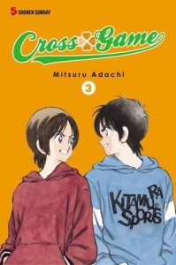
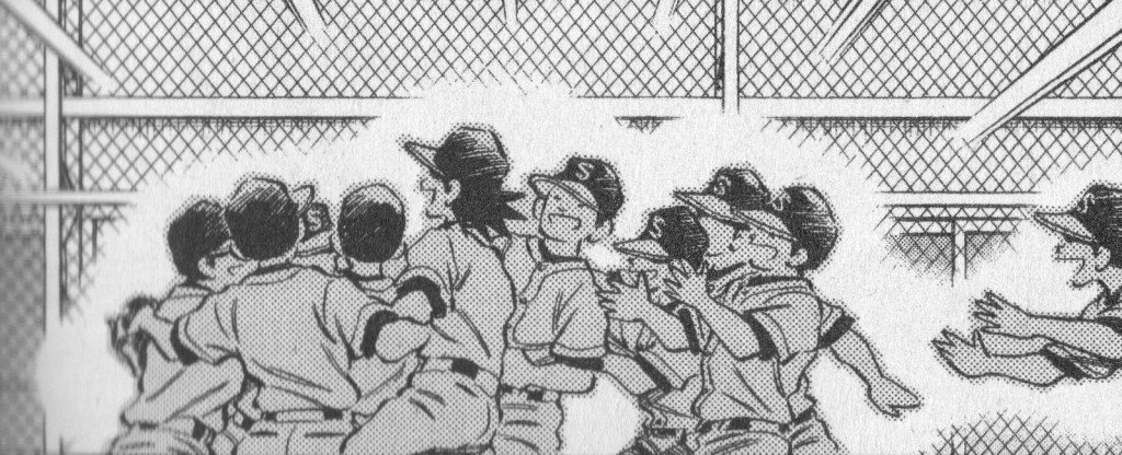
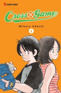
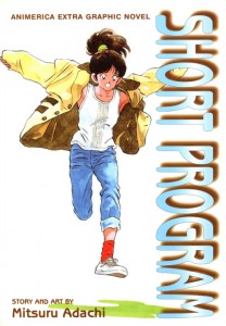
An earlier version of this essay was posted on May 26, 2011, at The Panelists, a now-defunct group website, at the invitation of Derik Badman. It was conceived as part of a multi-site commentary project, the “Manga Moveable Feast,” devoted at that time to the baseball series Cross Game, created by Mitsuru Adachi.
A million thanks to Andrew White for his invaluable technical assistance.
***
Say there was a manga studio.
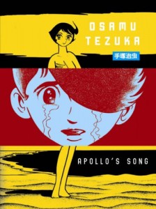
Writer-on-manga Ryan Holmberg recently identified Shinji Nagashima — albeit by the artist’s own assertion — as the first mangaka to utilize the Production (“Pro”) moniker to denote the operation of a studio: Musashino Manga Production, founded in the late ’50s. Nagashima had previously served as an assistant to postwar comics godhead Osamu Tezuka, and would subsequently work for Golgo 13 creator Takao Saito at his Saito Production, the early years of which Holmberg depicts as a transition from the on-page interaction of several artists retaining some individuality of line to the smoothed-out servitude of multitudinous studio hands pursuing a uniform visual goal. Comparisons to modern corporate function were present and pertinent, though Saito was also wont to invoke the filmmaking process, with himself as director – indeed, Holmberg cites Tezuka’s own fascination with American film as influential on a tendency to initially just pretend that he operated a studio, even while drawing many of his early works essentially by himself.
Of course, anyone who’s seen the excellent 1985 television documentary included with Helen McCarthy’s The Art of Osamu Tezuka: God of Manga knows that Tezuka did eventually command a studio of very tired manga assistants, despite retaining a great aptitude for drawing pages, even while in transit, say, from his small hotel workroom to an airport. He would be dead in four years, at the age of 60.
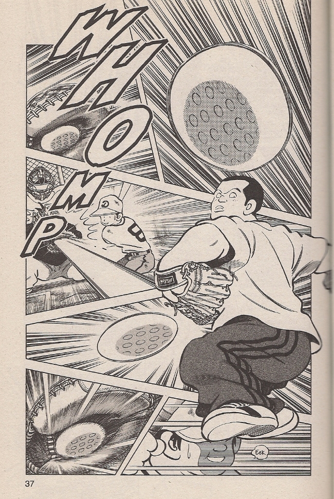
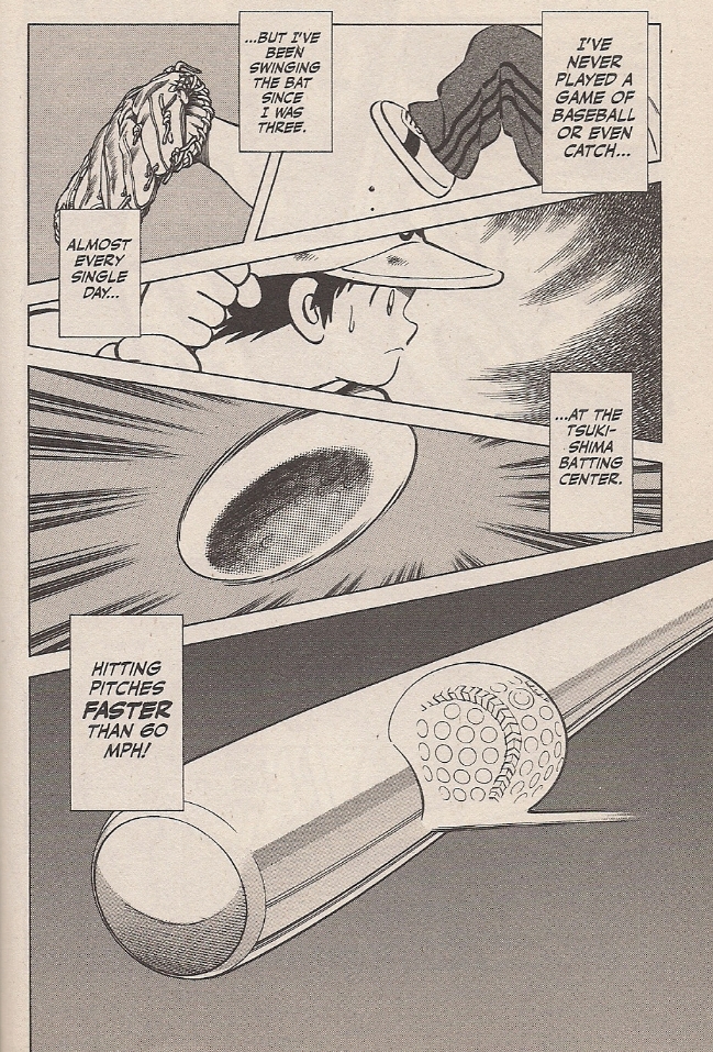
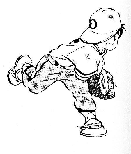
Also a sexagenarian at the moment is Mitsuru Adachi, creator of Cross Game — serialized in Big Three manga publisher Shogakukan’s Weekly Shonen Sunday, 2005-10 — and namesake of the above-cited Adachi Pro. Diligent reader that you are, I needn’t tell you that Cross Game is both a baseball-themed sports manga and a humorous character drama set among young people. The ‘baseball’ parts make for better images.
Likewise, though, you’re aware that the speed-lined sports action pictured above is not the essence of Adachi’s comics, though he is nonetheless adept at the stuff; I like how the tense, intent figure to the right dominates the page so as to actually upset the act of reading, his limbs barging into adjoining panels so that they function less as sequence than collage, balls and rays and all manner of expressive fury exploding from his form while the rest of the space depicts time-displaced moments of accordant havoc.
That’s all pretty great, but this is a bit more Adachi’s style:
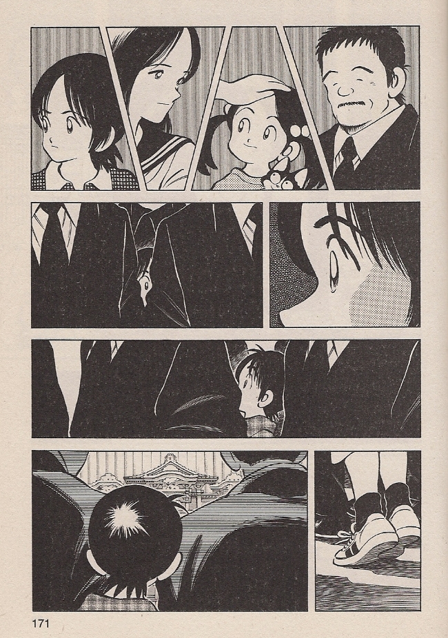
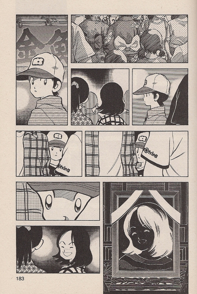
A young girl has drowned unexpectedly. The top tier depicts her immediate family, supporting characters all, their personae summarized deftly through expression and body language. Below, series protagonist Ko, at this point only in fifth grade, searches through a forest of proper adult attire to understand what’s going on: that his dear close friend is gone for good.
One chapter later:
For much of the series up until this point (note the pg. 183), Ko has been depicted as a traditionally callow shonen, undisciplined but unarguably full of guts and determination and raw sporting talent. Now, faced with a serious tragedy, Adachi suddenly and effectively shows how he is also a child, only very slowly comprehending the permanence of death. With expert subtlety, Adachi reprises a visual motif from the previous chapter’s memorial service, again catching Ko peering through adult bodies, mistaking a nearby girl for his friend. It is made plain that she is not coming back, and by this I mean it’s made plain to us; it takes a few more pages for Ko himself to understand what he must do, but narratively, subconsciously, Adachi reveals the hard cosmic facts, through pure cartooning.
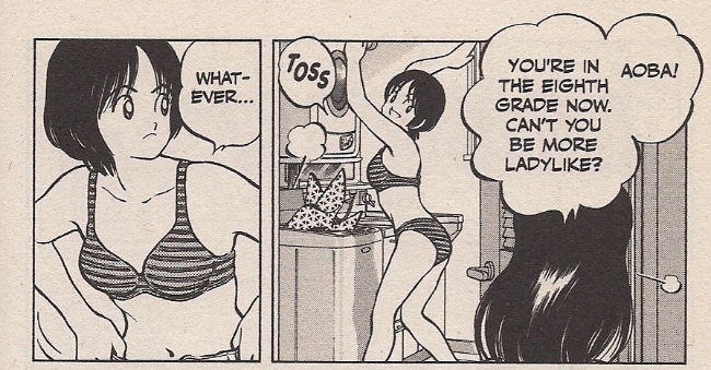
That’s nice, huh? I liked that. Here’s another protagonist, the dead girl’s sister:
Ha ha, yes, it’s shonen manga: time to focus on the eighth grade panties. And, I know, I know – this is one page, out of context. Adachi has, in fact, set up an entire ongoing theme of curious sexuality for his now-teenaged cast, introducing Older Ko’s less childlike disposition by having him gaze wide-eyed upon schoolgirl thighs from a few escalator steps down. Later there’s a scene where tomboyish Aoba whips a dirty shirt off right in front of him, and, weeell, that’s kind of the issue here, because that would be an entirely separate laundry scene, just one chapter away from the one pictured above, presented with no especial character insight behind it. Then *another* chapter’s title page shows the girl posing in cutoffs and a sports bra, joined two chapters later by a critical panty flash. Again, it’s all basically apropos for the overheated atmosphere of boy-girl interactions at a certain age, but after a while it gets to feel like restatement to the point of inadvertently revealing something else.
My guess? Industry. Adachi is an entertainer, having worked skillfully for a variety of ‘mainstream’ manga publications — generally from Shogakukan — since 1970. He’s worked in shonen, shojo and seinen forums, with Cross Game specifically positioned in a magazine meant to appeal (though not exclusively cater) to male readers around Ko’s age. In this context, underdressed images of a likewise-aged female peer make some economic sense; notorious lolicon progenitor Hideo Azuma, in his autobiographical Disappearance Diary, depicts himself ordered by a Shogakukan editor to insert fan service nudity into his own Weekly Shonen Sunday work circa 1969, roughly around the time Adachi was honing his skills as a studio assistant.
But we don’t need history to sense the finger of industry upon the aesthetic pulse. After all, this is a speculative comment.
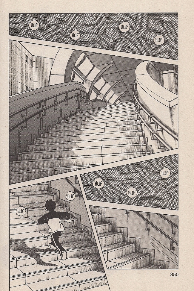
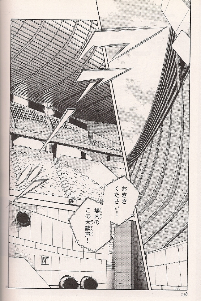
I like this page a lot. The curling stairs bordered by small hits of first-person sensation — crosshatching as the insides of your eyelids — ably convey the disorienting sensation of running unto exhaustion. It reminds me a bit of an establishing image of looming, intimidating competition architecture from Adachi’s Rough, a 1987-89 swimming saga:
That is a damn scary stadium. And yet, I don’t think I’m alone in looking at pages like these and thinking “well, they’re good, but are they the creator’s pages?” Which is to say, aren’t essentially photographic backgrounds like these generally the province of a studio assistant? Is that even an important distinction to make?
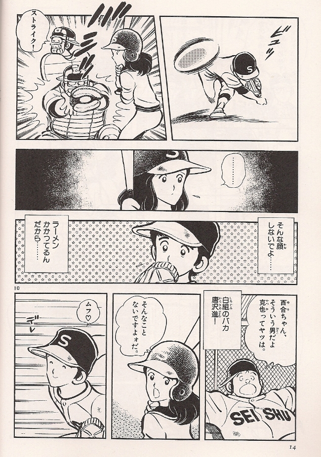
A few years ago, Derik Badman observed that Adachi’s series tend to share common traits, including similar-looking characters. I’d go a bit further and term Adachi’s entire style as remarkably consistent over the past three decades. Here’s a page from Nine, serialized 1978-80, the baseball manga by which the artist made his solo longform debut:
All of the Japanese-language images I’m posting come from a 2010 Shogakukan sampler released in honor of Adachi’s 40th anniversary as a professional mangaka. Admittedly, I think some effort was made to have the art appear more consistent, in that his first eight professional years are omitted entirely and the sample from Nine lacks the ’70s brushiness of some other pages from the series. Still, you can see how the character designs are only slightly thinner and sprightlier.
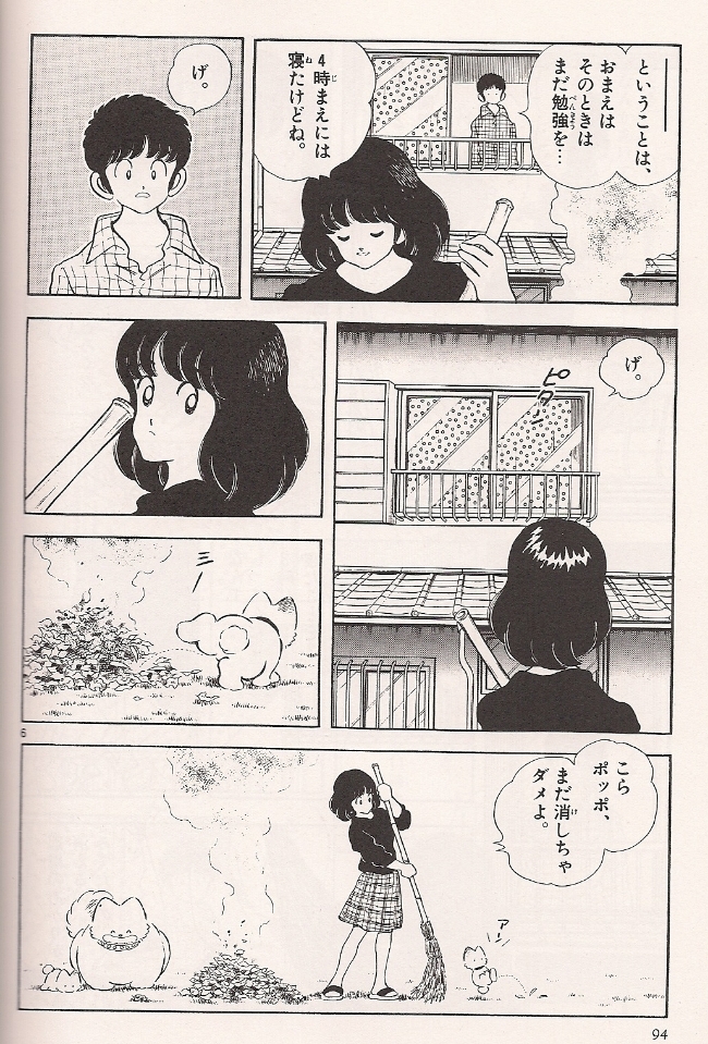
Now let’s try another baseball series, Adachi’s 1981-86 megahit Touch:
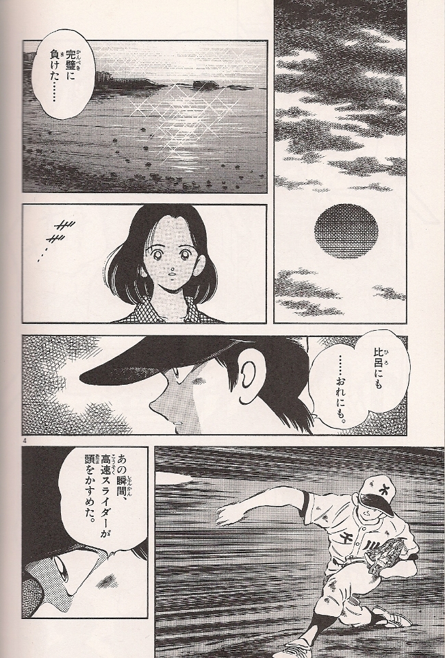
And hell, we might as well throw in the mighty H2, 1992-99:
Again, there is some variation in the character drawings, which are typically the sole province of the series’ creator, even on deadline-tight, assistant-stuffed weekly series like these three, all of them Shonen Sunday. But the crucial difference to me — and I readily admit this isn’t entirely discernible from the small samples I’ve provided, in that the true Adachi experience, to my mind, demands heroic consumption — is how both of the latter pages draw considerably on either blankets of empty space sitting behind the character art or (in H2) photographic-style images lacking any character art whatsoever. This approach is absolutely essential to Adachi’s art.
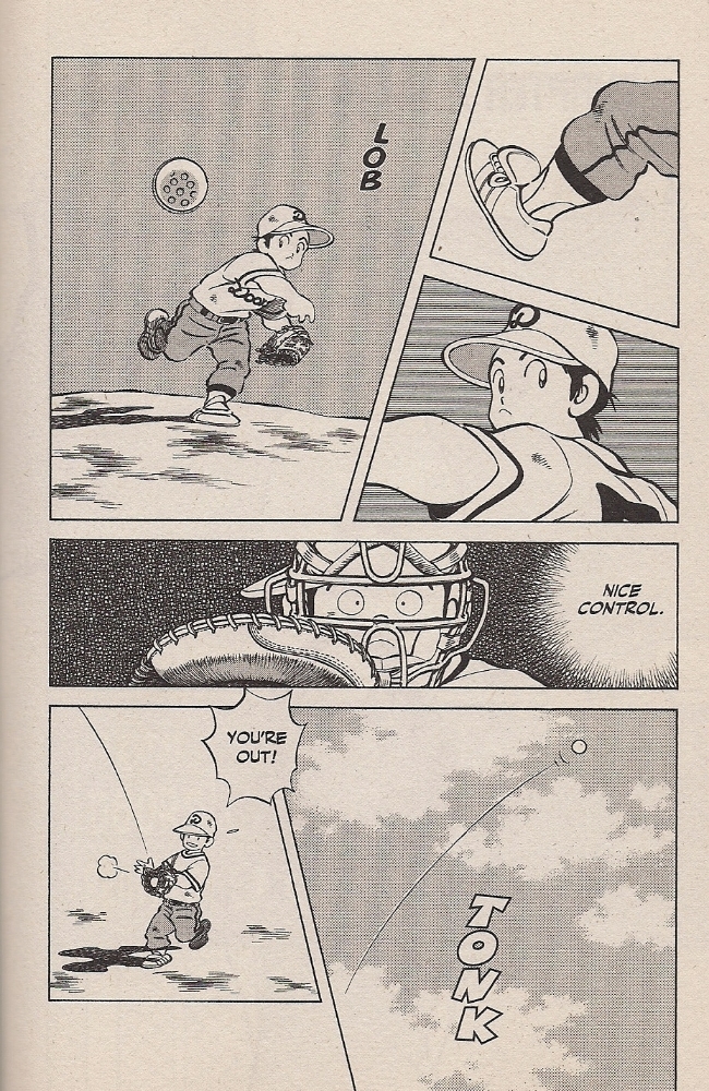
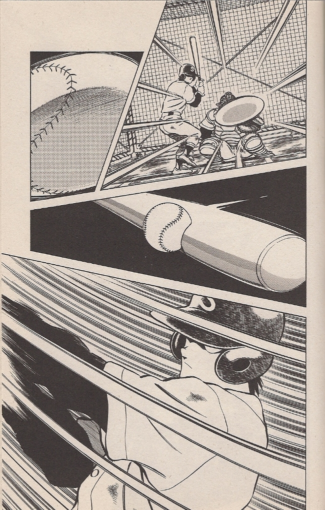
Getting back to Cross Game, let’s take a series of pages, in sequence.
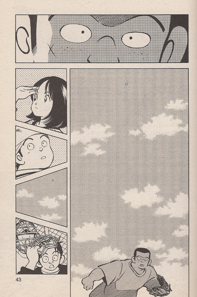
Typically paced windup action, concluding with a startling snap from the distorted speedball in panel #4 to eerie stillness in panel #5, like a bullet paused ripping through an apple. It doesn’t appear to be a photo-drawn image, but it stands in stark contrast to the cartoon stylization just above. It is the point of impact drafted into service as a wholesale shift in tone.
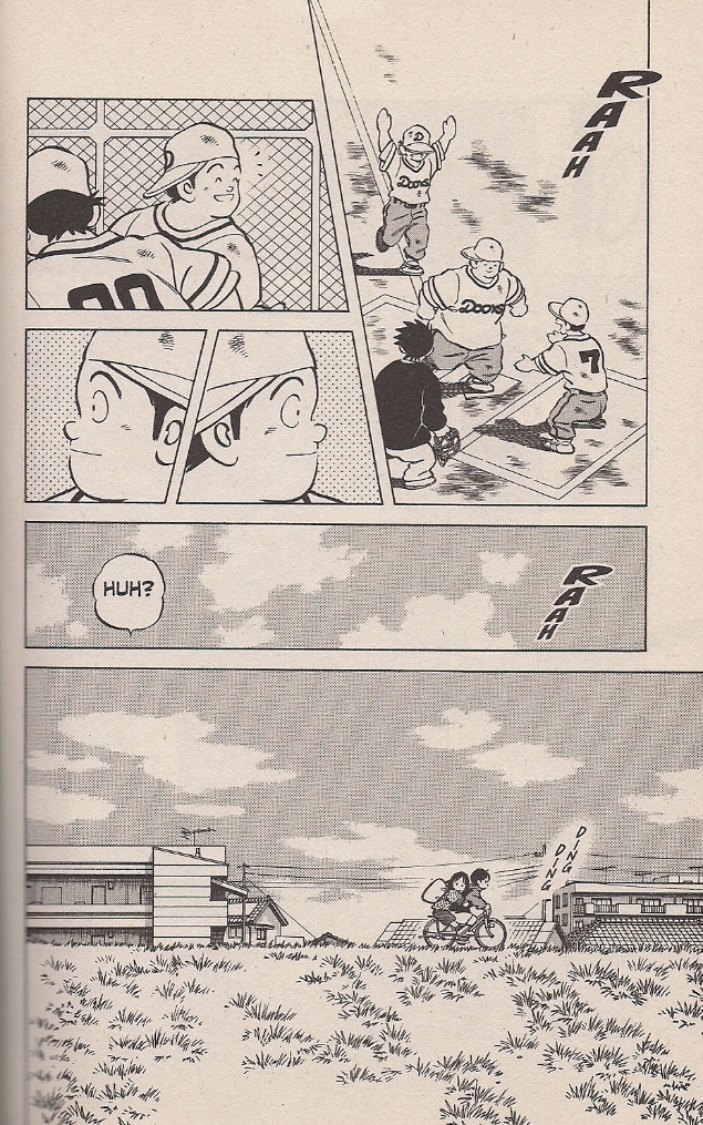
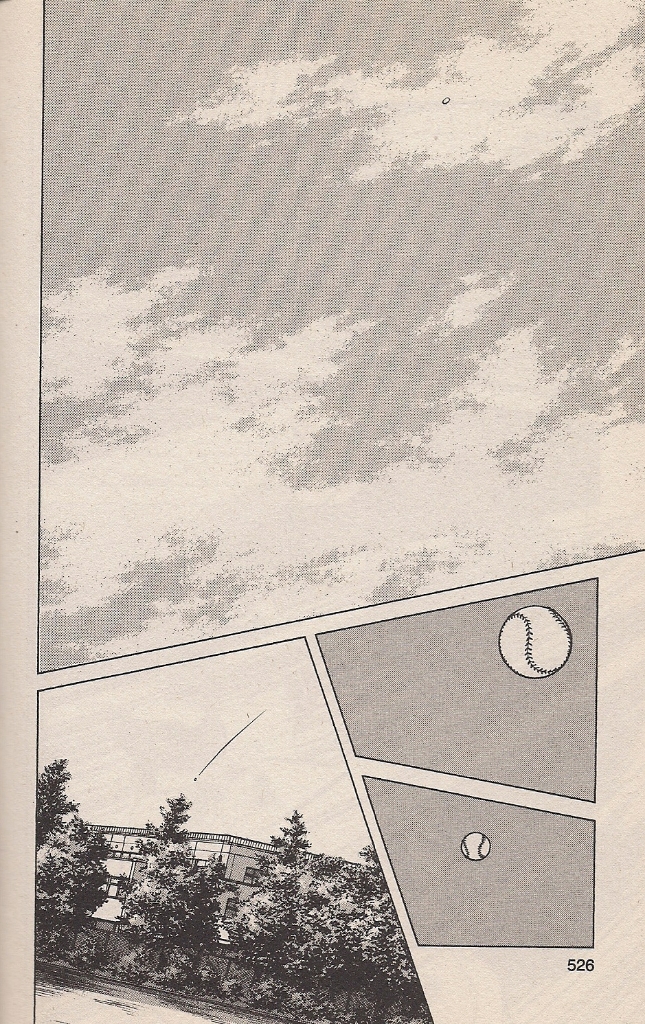
We hear nothing, but the character up top can see it happen. Considerable speed is conveyed by the panel directly below, showing the ball very far away, while the character from panel #1 has hardly moved. Indeed, his arm has yet to relax from the pitch. There is meaning to everything. At the far left, characters look around, actively, bringing us back to mobile action.
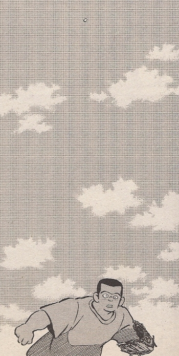
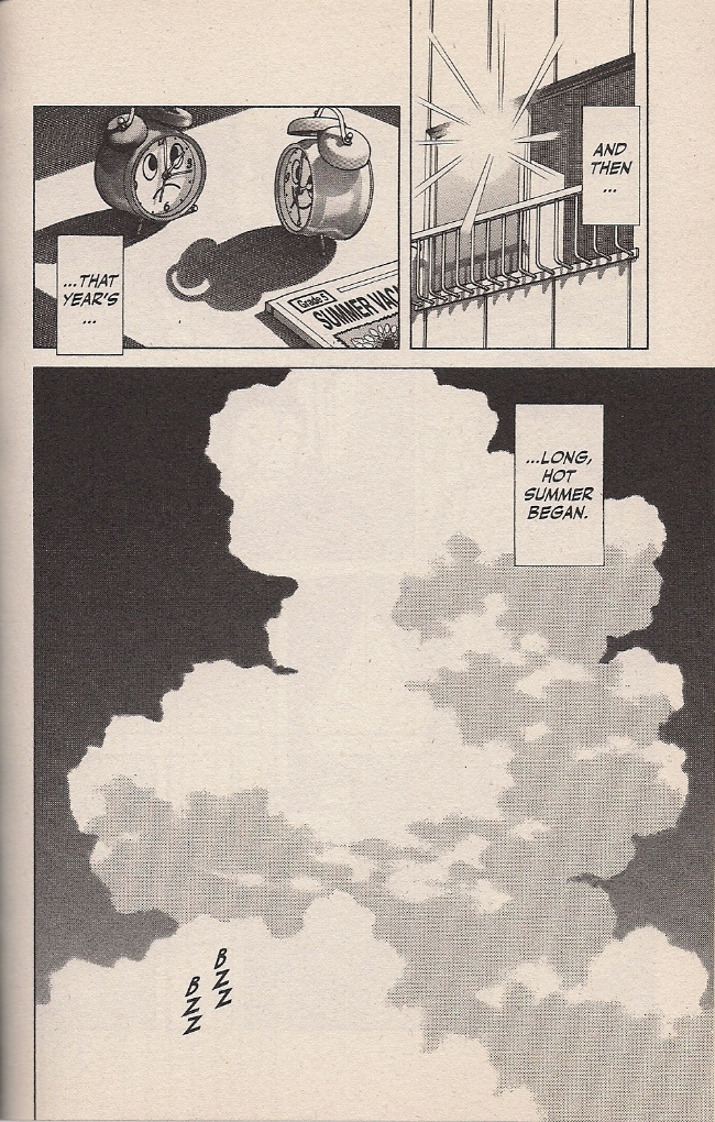
Then, halfway through the third page, the image of the sky repeats to again suggest tremendous speed, this time in a joking manner, as Ko and his not-long-for-this-world sweetheart escape the celebration.
Truth be told, though, I see that big sky as representative of a second kind of speed.
They never do scan well, those minute patterns of screentone. Probably digital. The last time I wrote about Adachi, Andrew White, cartoonist and Adachi expert, suggested that the artist’s ‘extraneous’ panels — the sky, nature, laundry, etc. — are “at least in part motivated by practical concerns,” which is to say that space on every page can thus be easily delegated to studio assistants, who would need only training at mechanical tasks to complete their work. This certainly fits in with my understanding of the mechanics of weekly manga production; logically, a man over the age of 50 simply does not produce 17 thick volumes of comics in under five years without considerable backup.
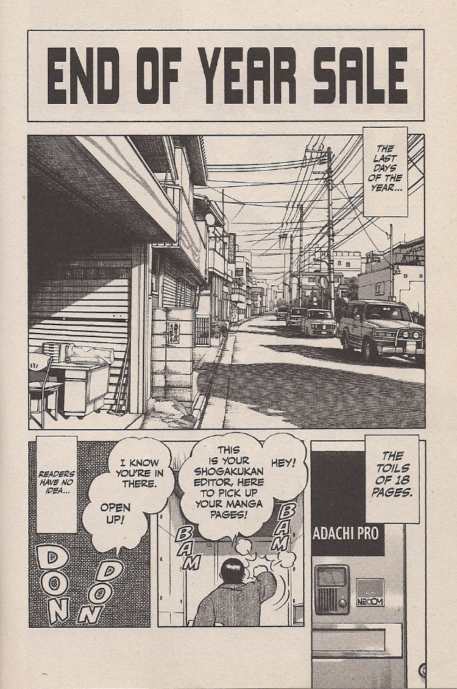
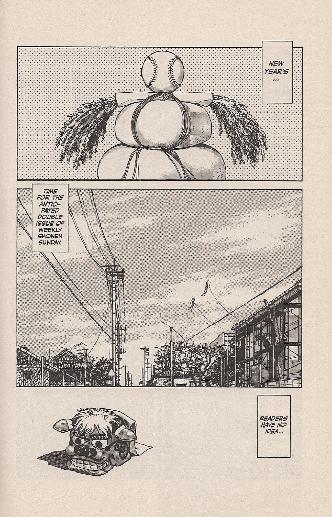
Let’s return to Adachi Pro. I won’t make you scroll up.
What are we really looking at?
Panel #1 is all letters; I don’t have an untranslated edition handy, but I presume the original was nothing but Japanese characters. Panel #2 is urban scenery, very likely copied from photo reference. Panel #3 is the same, perhaps taken from a shot of the handsome Adachi Pro studio door. Panel #4 is the only area of the page to depict a character, helpfully shown from behind, so as to require nothing but a basic outline of a human form. Panel #5 is a classic: ultra-tight cross-hatching, or maybe a digital pattern or tone, upon which sound effects are plastered. The rest of the page is narrative captions and dialogue bubbles.
In other words, this page — depicting the mad rush of weekly manga serialization — is set up in a way that it could potentially be composed entirely by studio hands, insofar as every piece of it represents some mechanical task that can potentially be delegated so as to allow the artist’s attentions to focus elsewhere. I’m not privy to Adachi’s intent, of course, but it seems in keeping with his sense of humor to keep his own hands largely off the page while complaining about how little time he has to finish his pages. ‘Readers have no idea’ indeed!
This leads the thoughtful (or obsessive-compulsive) critic into a bog of attribution. Why, then, should a page ever be deemed the work of ‘Mitsuru Adachi’ and not ‘miscellaneous Adachi Pro employees,’ when it is realistically more the labor of the latter than the former? I understand, of course, Takao Saito’s analogy of the industrial comics artist-as-movie director, but I think something more fundamental is at work in my American mindset.
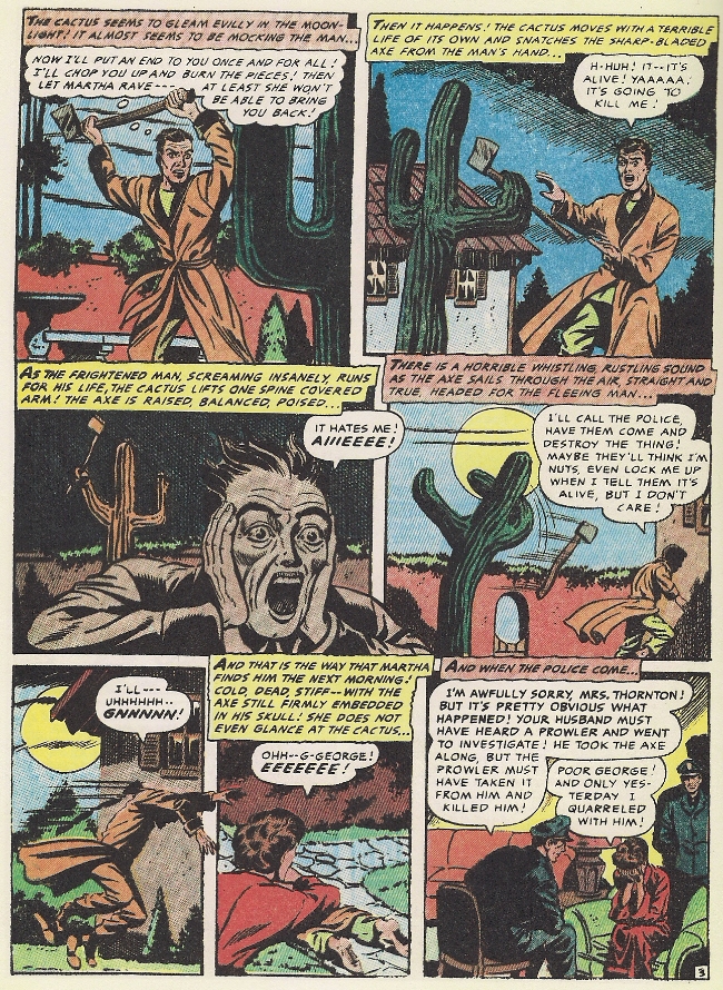
Here is a page from Green Horror, a 1954 horror comic about an axe-throwing cactus that’s in love with its owner. Needless to say, it’s been beloved by generations, panel #3 is probably the apex of the comics medium (“It hates me! AIIIEEEE!”) and the cactus would definitely make for a great baseball pitcher. The story has most recently been presented in lovingly restored form in the Fantagraphics collection Four Color Fear: Forgotten Horror Comics of the 1950s. The editor, Greg Sadowski, has made sure to properly credit the tale to the “Iger studio,” a comics packager of the day, although he and Editorial Consultant John Benson do at least attribute the plot direction (and potentially the script entire) to Ruth Roche, the studio’s script editor.
It’s important to do this, to clarify the roles involved, because the history of North American comics is one of exploitation, of publishers refusing artists benefits, among them sometimes the credit for their labor, and holding perpetual ownership over their creations – indeed, per the work for hire concept, annihilating them as the legal author. As a result, the abuses of the past weigh heavily on the minds of practitioners and critics. The notion of “creator’s rights,” then, became inseparable from the idea for credit. Pencillers are credited, inkers and credited, colorists are credited – arguments rage over credits in billion-dollar superhero movies. Only the most inexperienced of studio hands go without credit, as do friends helping an artist out on a deadline. Moreover, artist substitutions in long-running work-for-hire American comic books do not involve anybody hewing to a foundational visual approach; it is a wholesale substitution of one style for another, because every hand on the page deserves its own spotlight. Pity the historical standing of the damned editor who had Jack Kirby’s Superman heads replaced!
Adachi is more enduringly popular than the biggest of the pop comics artists from North America, though there’s probably been many dozens of hands on his pages. But also, his development for what’s now approaching half a century has been free of the particular abuses that mark the development of American comic books. An editor can’t hire somebody to replace all of his character heads, because he is fundamentally in control. An editor can only reject him and his project. We might suggest a comparison to a popular singer, surrounded with producers, session musicians, stylists, backup singers and other entities orbiting him.
Or, you know – movie directors, corporate heads. Baseball players.
I will now expand on a suggestion made by Sean Michael Robinson at this very website: that baseball analogizes to making comics.
It’s hard to escape the idea that when Adachi is writing about baseball, he’s also writing about making comics – about the thrill of watching one’s self improve, of pushing, of hitting a barrier only to break through to the challenge previously unseen. Aiming for the top. The sweet satisfaction of an aptitude well-developed, of a lifetime of skill coming to bear on a single moment.
A team, though, eight around a star, a draw: the protagonist. Skill and drive and guts and control and rock-ribbed American-style individualism can take you far, but in some games you need a potentially motley assortment of teammates to cover the field. If Adachi’s comic is stocked with self-reference, then it’s fitting that baseball itself matches up with the process by which the comic is made.
More importantly, though, this deployment of assistance on a breakneck weekly comics schedule has formed the very heart of Adachi’s work on Cross Game, and maybe his art entire. Chapters are typically more like vignettes, tracking a certain incident or revealing some character trait seemingly without concern for suspenseful plotting. It’s a very straightforward story, yes, sentimental and at times distractingly silly, and never especially far away from the genre tropes that inevitably guide the eye of the die-hard populist, if only to know from where to veer away at the right moment. That doesn’t really matter, not to my reading, because Adachi’s art moves so well, pulling the reader gracefully through waves of dialogue and ‘silence,’ interaction and environment, drawings and photographs, intimacy and enormity.
David Welsh is right: the mono no aware all but wafts up from any given spread in a fine mist. The interplay of self-evidently handmade character drawings are so often juxtaposed against realist, photographic, miscellaneous certainty, that it becomes by accident a procedural self-reference: a showcase for the delicacy of humanness before greater and older things. From this, the early chapters of Cross Game, when the characters are little, becomes a striking thing indeed on a second reading, because Adachi so blatantly foreshadows the death of his tiny heroine from the constant interjection of looming skies and big bodies of water – time becoming threatening, the world something that swallows you up exquisitely, horrible and lovely. Summer hits like a mushroom cloud.
In this way, Adachi has fused pragmatism and aesthetics into something unique, a comics art that seems to belong in the hazardous environment of weekly serialization. Is this the key to his longevity? Eh, that’s probably got something to do with characters, plot, romance, sports – you know.
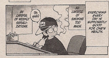
But to me it’s the unity that attracts. Not the Adachi talking on the page, but communicating through it. Yes! In spite of all the transparencies I’ve so dubiously divined, I do hear Adachi himself in Cross Game, a singular presence speaking from the work of many like an MVP hoisting himself up to the podium. He says Osamu Tezuka is dead, and one day I’ll be the same. If my baseball players look alike, it’s only from being young to grow old. This art will outlive us all, and this architecture is bigger than me, but I know its ins and outs. He’s a pro, Adachi. He’s not doing this for his health.

