Hooded Polyp: Earthy Anecdotes

In Caro’s recent post she argues that Asterios Polyp fails to deliver a kind of literary complexity.

The result is the reiteration – on the level of performance if not assertion – of a hierarchical division between “the literary” and the “graphical”: a dichotomy that is aggressive and dismissive in precisely the same way as Asterios’ treatment of Hana. It is completely uninformed about how literary fiction works. It creates a destructive incoherence at the center of the book.

I’ve probably bashed Asterios Polyp enough for one lifetime at this point. But I thought it might be interesting to look at a couple of examples of works that I think demonstrate the kind of literariness Caro is looking for.

I’ve been rereading Wallace Stevens recently, and I’m quite taken with this poem, the first in his first collection:

Earthy Anecdote
Every time the bucks went clattering
Over Oklahoma
A firecat bristled in the way.

Wherever they went,
They went clattering,
Until they swerved
In a swift, circular line
To the right,
Because of the firecat.

Or until they swerved
In a swift, circular line
To the left,
Because of the firecat.

The bucks clattered.
The firecat went leaping,
To the right, to the left,
And
Bristled in the way.

Later, the firecat closed his bright eyes
And slept.

As with a lot of Stevens’ poetry, nobody seems all that certain what the fuck this means. I’ve seen various efforts to parse it as some sort of allegory (the firecat means “change” was one particularly painful example.) But none of them are very convincing. Even the relation of title to poem seems maddeningly obscure. How is this earthy? Is there some sort of bizarre sexual double entendre known only to Stevens? That seems fairly unlikely — and yet, no other explanation presents itself.

The confusion here is, I think, on one hand simply a result of looking too deeply, or of coming at the poem from the wrong perspective. A lot of Stevens’ writing seems to me to be inspired not by abstruse epistemological theories or Romanticism, but by children’s poetry. “Earthy Anecdote” makes most sense if read not as allegory or complicated symbol, but as nonsense verse. Dr. Seuss’ battling tweetle beetles aren’t symbols of the futility of martial endeavor. They’re just goofy fun for kids. Similarly, the clattering bucks and the firecat are entertaining images. It’s fun to say “bucks went clattering over Oklahoma.” (Go ahead, try it. I’ll wait.)

At the same time…Stevens was also, and undoubtedly, inspired by abstruse epistemology and Romanticism. And he was writing verse for adults, not kids. Starting his first volume of poetry off with a bit of extravagant silliness is a fairly dramatic line in the sand — even if the line is curved. It’s a certain kind of statement; an elliptical declaration of love for the earthy, clattering bucks rushing about in glorious, purposeless panic — metaphors in frantic search for a meaning. In that vein, perhaps you can see the firecat as Stevens himself, leaping here and there to goad his images (and perhaps his readers) into a lather, before closing his bright eyes in self-satisfied pleasure. Or, alternately, Stevens might be the bucks, thrashing this way and that in an effort to avoid a meaning which is always leaping to thwart them — and which, in lazy triumph, curls around the poem at the end despite every horse’s best efforts.

None of these explanations are “right”, I don’t think. Rather, the point of the poem is the pleasurable possibilities of the point of the poem. That’s how the modernist puzzle works; the poem is playing with its own interpretation. Form and content (buck and firecat?) aren’t separated, or even separable; the content of the poem is its own metaphors. The reader doesn’t so much understand the poem, as shuttle about inside it. It’s a joke where the punchline is that the form of the joke is the punchline.

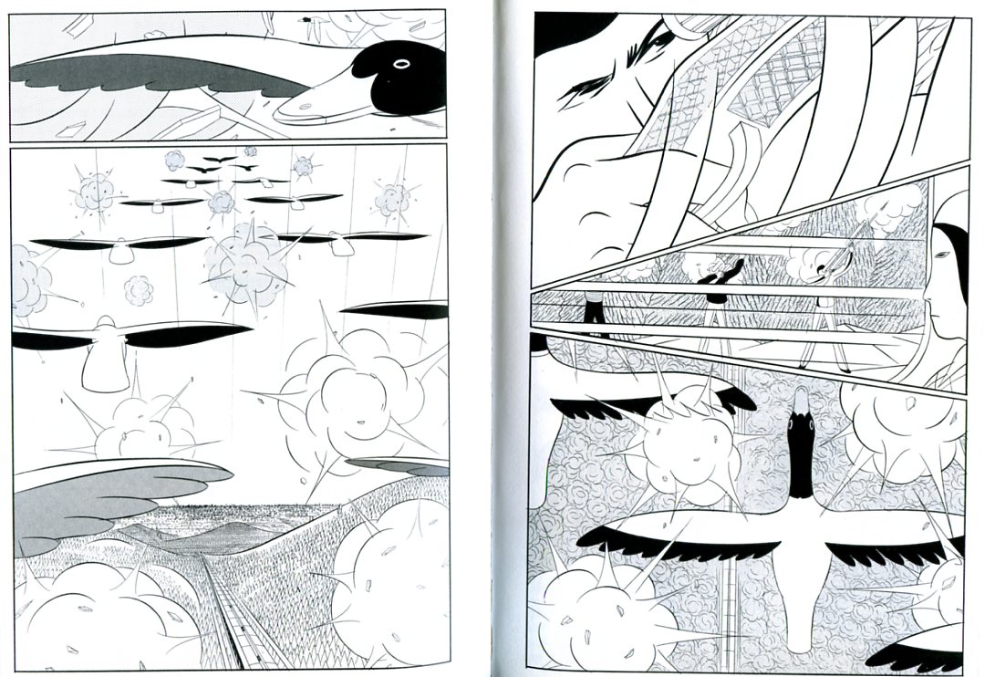
There are not a ton of comics that play these kinds of shell games with meaning, form, and content. But one example that does spring to mind for me is Yuichi Yokoyama’s Travel. In my review on Comixology I wrote:

Yokoyama had wrong-footed me. I was looking for realism, and so I found the epistemological uncertainty frustrating. But the book isn’t realism — or not exactly. It’s pomo; Yokoyama’s tongue is in his cheek the entire time. Take the scene of ducks flying over the plane as hunters shoot at them. The footnote points out that the hunters all miss, and indeed, you can see the ducks traveling in a perfect V, not even disturbed by the shells exploding in pristine, regimented bursts all around them. The demands of narrative (somebody shoots, somebody hits) are sacrificed, with a wink, to the exigencies of layout. It’s as if the hunters and the ducks are not adversaries at all, but part of some single great mechanism, controlled by one guiding hand. As, of course, they are.

In Travel, as in Stevens, the sleight-of-hand manipulation of the tropes of the medium, the formal elements of the work, are themselves the content. As a result, modernist works like this are like two facing mirrors; absolutely flat surfaces leading into infinite depths.

I’m not saying that this is the only kind of worthwhile art by any means. I don’t want all art to be playful modernist puzzles anymore than I want all art to be slasher films or shojo. Still, Stevens and Yokoyama are great, and I wouldn’t at all mind seeing more comics that followed in their hoofprints.

Hooded Polyp: Parallax Review

Following links from Noah’s kickoff post through Matthias’ earlier essay on Asterios Polyp and on into the plethora of reviews gives a tour de force of puzzle-book annotation: Hellenistic references, astronomy, symmetry, architecture and fine art, the metaphorical/symbolic use of color and styles of linework, the yin-yang, and so forth. All of this clever, creative, and well-executed formalism works in the service of the book’s themes, which, the critics tell us, are myriad permutations on emotional naturalism and the limitations of duality – pretty much every duality you can think of.

What this emphasis on parsing the puzzle pieces and tracking the themes all adds up to is another tour-de-force: this time of modernist reading. Matthias sums up it up when he asserts, beautifully and certainly accurately, that the “graphic representation happens on a narrative level above that directly experienced by the characters, directing the reader’s understanding of their inner lives and states of mind.”

I’m going to pick on Matthias here, kindly I hope, because I found his essay to be far and away the most sophisticated and compelling articulation of this approach to interpreting Asterios Polyp — but it’s an approach that I find neither sophisticated nor compelling. With attribution to Bart Beaty (although Doug Wolk also makes the point), Matthias describes all this meaning-rich formalism as a “delayed Modernism,” and to some extent it is – particularly the Joycean puzzle-box elements and the self-conscious effort to push and expand the ways the form can make meaning. But for whatever motivation, this Modernism is small in a way that the more timely Modernisms of the early- to mid-20th century were not: it is primarily a modernism of technique rather than a modernism of ideas. Pound’s dictum of “Make it new!” finds its manifestation here not in new ideas about the world, but in new ways of representing and documenting old ideas about the world using the comics medium. Taking on the project of modernism 75 years after its time has passed is art in the defensive mode: starting from the assumption that comics has something to prove rather than something to offer.

I want to posit for the sake of argument that Asterios Polyp is in fact not a work of Modernist fiction that yields its greatest insights and makes its strongest contribution through this puzzle-box formalist reading but that it is a work of Postmodernist fiction that yields equally well to readings of its “deep structure.” This is, I think, somewhat inaccurate: Mazzucchelli clearly intended all those clever references and allusions and manipulations of formal elements, and it is unarguable that they form the most impressive and coherent texture of meaning in the book.

But there is content in the form overall: it’s apparent when we redirect the attention we’ve been paying to Asterios and Hana as archetypes of gendered characters and instead abstract them into archetypes of cultural genealogy and influence: the Hellenistic and the Japanese. The book works passably well – although it is difficult to knit all the elements in – as an allegory for the gradual shift of Western culture (particularly art culture) away from rigid Hellenism to incorporate the more fluid and holistic perspective of the East. Read diachronically, it is a representation of the history of this evolution across the 20th century; read synchronically, it depicts their aggregated and therefore simultaneous presense in contemporary art and culture. (This reading accounts for all those niggling elements that felt anachronistic, but renders many of the specifics of the formalism irrelevant.)

I’m going to pick on Matthias again – I think this is extremely literary. But I want to take a fairly passioned exception to the assumptions about literary meaning – and even to the definition of “literary” – implicit in sentences like this one: “A textbook example for the literary crowd if one is needed — and it might well be — that graphic novels are not, actually, novels with pictures in them.”

There are two obvious ways to respond to the contempt for the “literary crowd” that drips from this sentence. The first is to point out that any literary-minded person who has been paying attention to graphic novels enough to have an opinion at all by now should be fully aware of this fact. The second is to point out that the main reason why a literary-minded person who is paying attention would agree with the statement “graphic novels are not, actually, novels with pictures in them” is that graphic novels are not, yet, consistently rising to the level where a literary person would grant the appellation “novel.” (Asterios Polyp indeed comes closer than most.)

For “literary” people, “literary” entirely stopped denoting “tightly constructed narrative story” sometime between Joyce and Coover. The deconstruction of that idea, of the very concept of narrative coherence as a “literary” attribute, was the project and product of literary Modernism. Statements like these miss that entirely:

Furthermore, the centrality of autobiography as a genre to the development of the European comic book is almost by default primarily a literary achievement. And, almost without exception, the artists who have found greater audiences – the Satrapis, the Sfars and the Trondheims – work within relatively traditional visual idioms and privilege their storytelling over graphic experiments.

“The point being, firstly, that most of the visual innovators of the last couple of decades have primarily explored the already existing visual tropes and strategies of narrative cartooning, rather than go beyond them, and secondly, that they have predominantly done so in service of a tightly constructed, “literary” narrative.

Both the quotes and my stock responses reproduce a contrived and unnecessary distinction — even a hostility — between the literary and the visual. Both ignore the extent to which that binary – that particular binary – is not only just as false as any of the binaries in Asterios Polyp, but specifically, and inherently, and inescapably false in comics more than in any other medium. Claiming that comics are a visual medium and not also a literary one is not only misunderstanding what literature is after Modernism, it is using as the model for “art comics” a “formalism” more like what literature espoused before Modernism.

And that is the great failure of both this book and its critics: this subject matter and medium in the hands of our greatest literary figures would not be just a meditation on history or emotional naturalism or the limitations of binaries; it would be a performative enactment of the ways in which comics defies the binary between literary fiction and visual art. Cartooning by definition deconstructs its “constitutive binary logic.”

The formalist instantiation of that deconstruction is the great opportunity for “metafiction” that is missed here.

As Noah rightly pointed out, this book pays disproportionate attention to one side of the binary, the “visual.” Neither Mazzucchelli nor his reviewers learned the book’s lesson – at least not as anything more than an aphorism. The result is the reiteration – on the level of performance if not assertion – of a hierarchical division between “the literary” and the “graphical”: a dichotomy that is aggressive and dismissive in precisely the same way as Asterios’ treatment of Hana. It is completely uninformed about how literary fiction works. It creates a destructive incoherence at the center of the book.

The “delayed Modernist” project in comics, especially insofar as it describes a formal project focused on making the medium’s visual components more fully saturated with meaningfulness, arrogantly rejects – against the spirit of Modernism – any exploration of the ways in which the experiments in prose conducted in literary modernism and postmodernism are applicable to the graphic form. This disciplinary prioritization of the visual is not delayed Modernism. It is delayed Enlightenment. But comics were always already postmodern. So this is also nostalgia, in academic’s clothing.

Comics rightly should stimulate conversation between the best of literary post/Modernism and the best of visual post/Modernism, with the aim of generating increasingly subtle and sophisticated hybrids and an increasingly subtle and sophisticated understanding of the possibilities and internal logics of those hybrids. For whatever reason – be it the technical demands of drawing, the training of art school, or just plain imaginative disposition – the dominant trend is to privilege and prioritise the “visual” over the “literary” – a category which critics and cartoonists seem incapable of understanding as anything other than a synonym for “well-wrought prose storytelling.” I hope comics won’t have to lose an eye before you figure out how stupid that is.

Note: updated for clarification June 6 1:20pm.

Update by Noah: You can read the entire Asterios Polyp roundtable here.

Update by Noah 6/20/10: This comments thread was damaged in a blog outage. I have manually restored the damage, but time stamps are off and one or two comments may be out of order. Please let me know in comments if you notice errors.

Talking Polyps

I thought we’d take a pause in the middle of our Asterios Polyp roundtable to highlight some of the points that have come up in comments.

Craig Fischer had a fascinating comment on Mazzucchelli’s use of word balloons:

You can see how appealing and effective Mazzucchelli’s word balloons are by comparing them to the balloons in most contemporary mainstream comics, which look ugly to me: resolutely rectangular, filled with text that looks like it was generated by computer.

Mainstream creators have struggled with personalizing captions, especially when the text moves across panels and the speaker is unseen in the second panel.

Kurt Busiek will sometimes write one panel where a character says something like, “If we can’t stop that dinosaur…” This panel is then followed by another that (1.) visually eliminates the speaker (showing, say, only the rampaging dinosaur); but (2.) continues his/her speech (“…we’re all DEAD!”) in a caption.

Alert readers realize that the words in the second-panel represents the character continuing to talk. But Busiek and his collaborators have tried to insert other cues to eliminate any ambiguity about who’s speaking. One solution: characters are assigned different colors, and their captions are always in that color.

When Busiek wrote THE AVENGERS, he sometimes included the logo of the speaking character at the beginning of the caption box. For instance, a little shield appeared at the beginning of the caption if Captain America was talking but was unseen.

All of this really cluttered up the visuals, though–sometimes you’d have five different logos and colors for the captions littering a single page–and was nowhere nearly as elegant as the balloons in ASTERIOS POLYP.

Suat compares Asterios Polyp and Born Again (scroll down in comments for my response.)

What’s also interesting is that Born Again is filled with hoary cliches: damsel in distress, betrayal and redemption, the hero’s “rebirth” etc. Exactly the kind of thing which Noah decries in his review of AP. How many times have we seen the noir hero pull himself up from the gutter? (Darwyn Cooke’s Parker must be the most recent example/adaptation in comics)

And yet Born Again seems less tiresome in that respect when compared with AP which is similarly choked with cliches (or archetypes, whichever way you want to look at it). Does genre work at a different level than work of more serious intent? Does it appeal to some subconscious craving particularly in the male mind? I imagine that some of Born Again’s success must be put down to its pacing and the detailing of emotions(the later of which is lacking in AP possibly by choice). But is it only that extra twist of lemon in the plotting and the characterization?

Sidenote: You can actually see some of the dry brush work mentioned by Derik (re: the rocks in AP) in Born Again. I presume it became an even greater aspect of his art following his sojourn in Japan. Born Again would appear to be a steep learning curve for Mazzucchelli – you can see him improving as an artist right up to the final issue.

Robert Stanley Martin provides a choice Mazzucchelli quote

Here’s Mazzucchelli’s account of his collaboration with Miller on Born Again, from TCJ #194:

Frank was writing full scripts, but we were also discussing the stories. In fact, it was Frank’s idea to list our credits on the book as just reading “by Frank Miller and David Mazzucchelli,” not broken up into writer/artist/whatever. He asked me if that would be okay with me, because he didn’t want there to be any confusion. And as far as I was concerned it was perfectly acceptable, because the way we were working, there were ideas going back and forth where it would have been difficult to draw a clear line of demarcation–this came from one person, this came from the other person. Frank had the ideas for the stories, and he would call me up and we’d talk about it. And we’d hash it out and I’d have ideas of my own: “Well, what if this happens? And how about if we show it this way?” or whatever. And then he’d write a full script and then we’d have another long discussion about the script and then I’d draw from that. In fact, as I recall, everything that happens in the first three issues or so Frank initially wanted to put into the first issue. But because of discussions we had, we ended up expanding that, so that it was much slower, more densely packed.

And Daniel BT highlights the fact that the roundtable has been awfully cranky.

Anyways, one thing that bothers me about all this reviewing about Asterios Polyp is that nobody seems to ENJOY the comic. Rather than point out the innovations in the drawings, they’d rather point out how superficial the story is, how one-dimensional the characters are, and how unlikeable the main character is. I don’t like Woody Allen that much either, but I prefer Asterios better, since he’s not as neurotic, even when the spotlight keeps shining on him.

Lot’s more chatter in comments, and three more reviews to go (by Caroline Small, Robert Stanley Martin, and Matthias Wivel) before the roundtable winds down.

Rocks fall, everybody dies: Asterios Polyp

This comic made me cranky.  I thoroughly enjoyed the art, which has a clean open feeling and lovely line work, and thought the story was sweet and rather sad, if a bit rote, and then….

I read the ending. 

‘Rocks fall, everybody dies’ is a phrase sometimes used in manga circles to describe a long running manga that the artist, for some reason (usually boredom) hates and cannot figure out how to end.  So they put the characters somewhere, dump a bunch of boulders on them, and there’s your insta ending. 

This comic took a story about small character changes and growth and slammed a big artistic fist down on it.  I’m sure I’m supposed to think Deep and Meaningful thoughts about why it’s an asteriod and whether Asterios is related to asteroid and whether personal changes have any effect compared to outside forces, but the story is not strong enough.  I don’t care anymore.  The artist took a boring subject that was drawn beautifully and poured a big can of paint on it (or insert your artistic edginess metaphor here).  I no longer care because the weird ending just made the whole story immaterial. I’m sure someone, somewhere, could make it an interesting artistic statement, but this is not that comic. 

And yeah, I appreciated, vaguely, the double layers everywhere.  The man with confidence who dreams but never creates, the woman who builds but has no confidence, the two forms of design, the car, all of it, but I don’t care anymore.  Not in a hateful way, but just in a bored way.  Ah well.
_______________
Update by Noah: The whole Asterios Polyp roundtable is here.

Hooded Polyp: Born Again Again

“How much more basic can you get? I made up a superhero and named him ‘Power.’”—David Mazzucchelli describing the cartoons he drew as a child, from his Comics Journal #194 interview (1997).

How should we evaluate David Mazzucchelli’s career?

His work tends to fall neatly into three chronological periods. The first is his superhero period (1984-89), when Mazzucchelli was an artist for Marvel and DC, making splashes collaborating with Frank Miller on the Daredevil: Born Again (Daredevil #227-233, 1985-6) and Batman: Year One (Batman #404-407, 1986-7) story arcs. There were also a few single issues that Mazzucchelli drew during this period, such as a story written by Ann Nocenti (and starring Angel of the X-Men) in Marvel Fanfare #40 (1988).

The second period includes Mazzucchelli’s shift into art-comix with the three self-published issues of Rubber Blanket (1991-93), along with short pieces for anthologies like Snake Eyes, Drawn and Quarterly and Zero Zero, and his adaptation of Paul Auster’s novel City of Glass with Paul Karasik (1994). This second period ends around 2000, as his stories stopped appearing in anthology comics. Since then, Mazzucchelli has focused on his job as a teacher at the School of Visual Arts while laboring steadily on Asterios Polyp, which represents to me an achievement auspicious enough to herald a new period in his career, devoted to the self-contained, available-in-mainstream bookstores, graphic novel mode of publishing. He’s come a long way from floppies to hardcovers, from Marvel to Pantheon.

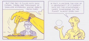
A danger of dissecting an artist’s career into discrete periods, though, is that we risk losing sight of the themes and tropes which remain consistent across individual works. This risk is especially great with Mazzucchelli because Daredevil is so different, at least on the surface, from Asterios Polyp. Polyp, however, includes at least one specific reference to Mazzucchelli’s previous comics. In “Chapter Seven,” the unlabeled chapter that begins with a portrait of a mosquito (and why doesn’t this book have page numbers?), Asterios and Stiff visit a diner and talk with a man named Steven “Spotty” Drizzle. As Derik points out, we’ve seen Mr. Drizzle before; he’s the main character in “Near Miss,” a tale in Rubber Blanket #1 (1991) that begins with Steven abandoning his family and bourgeois lifestyle because of his panic that a meteorite could crash into the earth and kill off the human race. In his cameo in Polyp, Steven remains terrified of asteroids, and Asterios responds with a not-so-reassuring scientific mini-lecture.

Whipped into a frenzy by Asterios, Steven runs out of the diner and the book, never to return. There’s much to be said about the importance of asteroids in Polyp (again, read Derik), but I’m intrigued by Mazzucchelli’s re-use of a previous character. Is Mazzucchelli establishing continuity (a Mazzucchelli-verse) between his Rubber Blanket stories and Polyp? Is it possible (and useful) to chart similarities between Mazzucchelli’s Daredevil and Batman runs and his later alt-comic books? In an attempt to answer these questions, I re-read as much of Mazzucchelli’s comics as I could (I’ve never found an affordable copy of Rubber Blanket #2 [1992], though I did dig up X-Factor #16 [1987]) and found at least a couple of elements tying Mazzucchelli’s career together.

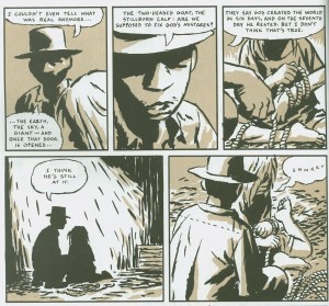
Mazzucchelli is interested in graphic representations of greater-than-human power. The longest story in Rubber Blanket #3 (1993) is “Big Man,” designed by Mazzucchelli as a tribute to Jack Kirby. “Big Man” begins as the eponymous character—impossibly tall and broad, like Kirby’s Hulk—washes up on a beach, his arms and legs tied to a wooden raft. Big Man is discovered in this state by the citizens of a small farming community, who drive him to a barn, feed him, and give him chores to do like planting trees, building fences and digging ditches. Big Man shows his true Hulk-like strength, however, when he single-handedly lifts a tractor off a trapped farmer. There’s a terrific sequence on page 39 showing Big Man pitching the tractor to one side, and then flashing a goofy smile (drawn as a close-up) at the awestruck farmers at the scene of the emergency. Then comes a splash page of Big Man from the farmers’ point of view.

Mazzucchelli’s expressionism is at full throttle here: representational forms are abstracted into thick brush strokes of ink—look at those clouds slashing across the sky—and Big Man has the spot-black weight and solidity of an allegorical figure from a Lynd Ward woodcut novel. (Mazzucchelli isn’t aping Kirby’s style, but he’s emulating Kirby by emphasizing a character’s power, even when s/he is standing still.) The low angle of the splash’s composition underlines Big Man’s looming stature, displaying him as massive enough to block out the sun with his left shoulder. For the rest of the story, a farmer named Peter struggles to understand Big Man’s superhuman power, and concludes that such power could only be conferred by a God committed to the ongoing creation of new and wondrous beings.

Polyp opens with its own version of supernatural agency, a lightning bolt that strikes Asterios’ apartment building. On the book’s third page, a splash captures the lightning blasting down from the sky, from a position close to the clouds. The low-angle portrait of Big Man is through human eyes peering up at a giant, but Polyp’s high-angle lightning splash seems almost from the point of view of God looking down at the rain and the city, and taking aim.

Four pages later, the power of the lightning bolt is revealed in another splash, as Asterios’ bedroom is bathed in white light and his television short-circuits. Asterios was watching an old videotape of a romantic dinner between himself and his ex-wife Hana, but the bolt erases those memories, and lights Asterios’ apartment building on fire, leaving him homeless and rootless. The forces of nature reassert themselves at Polyp’s conclusion, as Asterios and Hana reunite right before a meteorite flies into the atmosphere, on a path to kill them both. This meteor is Mazzucchelli’s most powerful symbol of greater-than-human power so far: its path of destruction is revealed in an epic double-page spread that abruptly shifts the reader from the micro-scale of Hana and Asterios’ tentative reconciliation to the macro-scale of an impending Velikovskian disaster, a shift that returns us to Kirby-land.

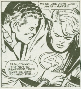
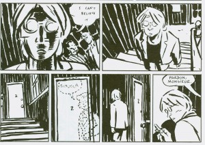
To be sure, Mazzucchelli’s stories are littered with “ants” who are victims of natural disasters, random crime, or just bad luck. Capricious violence is a convention of the noir genre, so it’s no surprise that the Miller/Mazzucchelli noir-flavored Daredevils and Batmans have high body counts, but this is sometimes true of Mazzucchelli’s alt-comix as well. In “Rates of Exchange” (Drawn and Quarterly volume 2, number 2 [1994]), a listless expatriate named Anthony lands in a cheap Parisian hotel, where he makes friends with some of the hotel’s guests. One of the more enigmatic guests is a middle-aged woman who passes Anthony in the hallway, always with a cheery smile and a “Bonjour”—until she is strangled to death by her husband. Anthony, stunned by the news, still imagines her presence in the hallway.

The broken lines that signify the murdered woman remind us of the ultimate senseless death in all of Mazzucchelli’s oeuvre, that of Ignazio, Asterios’ twin brother, who was found dead in the womb during their shared C-section. Ignazio is Mazzucchelli’s cri de coeur against chaos, against unfairness, against all those cosmic forces that operate beyond our comprehension. In the real world, children die for no good reason, but in Polyp, they can at least narrate the stories of their living siblings, and accompany them, like ghosts or shadows, though the vicissitudes of their lives.

Another element common to the various periods of Mazzucchelli’s career is his use of plotlines where a central protagonist is brought low, and remakes himself, better than before, after hitting bottom. In Daredevil: Born Again, the Kingpin finds out Daredevil’s secret identity as lawyer Matt Murdock, and secretly dismantles Matt’s domestic life. Thanks to the Kingpin’s machinations, Matt loses his home in a bank foreclosure, and has all his assets frozen by an IRS audit.

Soon after, he is unjustly disbarred for perjury. Daredevil becomes “a lost man, thrashing,” who finally suffers a mental breakdown after the Kingpin recklessly bombs his foreclosed brownstone. (Issue #228 opens with Matt sleeping in a tight fetal position on the bed of a scummy hotel room; #229 opens with him sleeping in a still-tighter fetal position in a dark alleyway, surrounded by winos.) Finally, he staggers back to his childhood neighborhood of Hell’s Kitchen, where he is nursed back to health by a nun (who, improbably and melodramatically, turns out to be his long-lost mother!) and builds a new life. He takes a job as a line cook at a neighborhood mission, he forgives and falls in love again with a traitorous junkie ex-girlfriend, and he resumes his identity as Daredevil to stop a Kingpin-hired super-soldier named Nuke from reducing Hell’s Kitchen to rubble. (Yes, Born Again is an uneasy mix of noiresque verisimilitude and superhero antics.) The story essentially reboots Daredevil as a more humble, more authentic champion of the ‘hood.

There are numerous similarities between Matt and Asterios, and between Born Again and Polyp, and maybe the best way to cover these similarities is with a list.

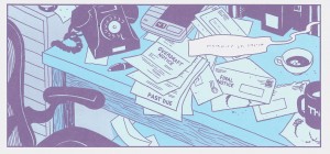
  • Both stories open with their main characters in states of disarray and disillusion visually represented by bad news in the mail. Matt gets the foreclosure and audit notices, and on page 6 of Polyp, even before we see Asterios, Mazzucchelli prepares us for trouble by showing us a pile of “past due” bills on his desk.

  • Both Matt and Asterios are “blown out” of their upscale living quarters, and both tumble into homelessness and purposelessness after these catastrophes.
  • As Matt and Asterios bottom out, they meet kind strangers who give them support they need. Matt’s savior is Sister Maggie, the nun—though Miller indicates that Maggie knows that she’s Matt’s mother, and that’s one of her motivations for helping him. (She’s a stranger to Matt only for a brief time, until he practices one of his Daredevil tricks—listening to a person’s heartbeat—to discover who she is.) Asterios’ generous strangers are the surrogate family (Stiff, Ursula, Jackson, Gerry, Mañana) he cobbles together in the small town of Apogee.
  • Both Matt and Asterios shed their prestigious careers; when they restructure their lives, they opt for menial jobs instead. Matt goes from high-flying lawyer to mission chef, while Asterios abandons his position as a professor of architecture. Near the beginning of Polyp, we see Asterios interact with several students—mostly through snotty comments like “There are just two things you need to fix here: the interior and the exterior”—but he leaves academia behind when he rides the bus to an arbitrary destination, meets Stiff, and trains himself to be a car mechanic.
  • Both reunite with lost loves: Matt with Karen Page, Asterios with Hana.
  • Both Born Again and Polyp include religious symbolism. Both Matt and Asterios are Job surrogates (though both are more flawed than Job when their misfortunes begin to occur). Catholicism, in the forms of Sister Maggie, crosses, and the ironic juxtaposition of heroism and a devil figure, permeates Born Again, while mythology is shot through every inch of Polyp, perhaps most notably in Mazzucchelli’s wordless retelling of the Orpheus/Eurydice story with Asterios, Hana, and Willy Ilium (love that name!) as Pluto.
  • Loss of vision affects Matt and Asterios. Blindness is, of course, an essential part of Daredevil’s origin. His abilities as a crime fighter came from a radioactive isotope that destroyed his eyes but ramped up his other senses. Miller and Mazzucchelli remind us of Daredevil’s blindness by retelling his origin in issue #229 in a unique way: they use pages dominated by rows of vertical black panels and free floating word balloons to render us as blind, and as dependent on hearing, as Matt.

  • Poor Asterios is seemingly fated to suffer eye trauma. On page twenty of Polyp, Mazzucchelli writes that Asterios’ immigrant father had a name that “an exasperated Ellis Island official” cut in half to make “Polyp.” His initial longer name is “Polyphemus,” the monstrous son of the Greek god of the sea, Poseidon, and also the Cyclops who is blinded by Odysseus’ men in the Odyssey. True to his namesake, and akin to Daredevil’s own “injury motif,” Asterios loses an eye before the conclusion of his own book.

I’m not sure what to think about the similarities I’ve charted among Mazzucchelli’s diverse books; I can’t figure out if he consciously based elements of Polyp on Born Again or not. (The story points I list above aren’t exactly original with Mazzucchelli.) I can talk about the effect these connections have on me as a reader, though, and on reflection I am disappointed to see “power” remain a major concern for Mazzucchelli, because after reading superhero comics for 40 years, I’m tired of impossibly strong golems and crackling lightning bolts. I care much more about Hana and Asterios than I do about some Armageddon-inducing meteorite, so for me the ending of Polyp seems to privilege “power” and “fate”—two key concepts of the superhero genre—over Hana and Asterios’ relationship.

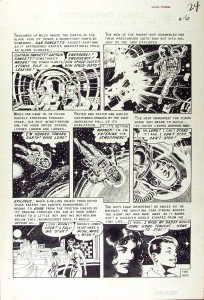
In the last four pages of Polyp, Stiff, Ursula and their son Jackson sit in the treehouse Asterios helped to build, and they see a “shooting star” streak across the sky, almost certainly the meteor poised to decimate Hana’s house. Ursula encourages Jackson to “make a wish” on the star. This scene is a sideways reference to an earlier comics story, one not drawn or written by Mazzucchelli. In Weird Fantasy #13 (1952), Al Feldstein and Bill Gaines wrote and Wally Wood drew a science fiction story called “Home to Stay,” about the sorrow a boy feels when his astronaut father is always away on space missions. (The tale shamelessly plagiarizes two Ray Bradbury stories, “Kaleidoscope” and “The Rocket Man,” and Bradbury himself wrote a letter to Gaines pointing the theft out. Improbably, that led to EC’s comic-book adaptations of other Bradbury stories.) Here’s the twist ending to “Home to Stay,” purloined from this website:

A child’s innocent wish juxtaposed with the death of a friend: Polyp ends with the same dramatic irony as “Home to Stay,” and feels to me more like a witty (but shallow) EC allusion than a poignant moment. Genre trumps emotion. I wish Polyp had ended with Hana and Asterios sitting on the couch, not speaking and their hands almost–but not quite–touching.
____________
Update by Noah: You can read the entire Asterios Polyp roundtable here.

Hooded Polyp – Superficial Pleasures

I’ll get the obvious out of the way: Asterios Polyp is a trite, boring story with vapid characters. I more or less agreed with Noah’s assessment, so I won’t repeat what’s already been typed. And yet I was impressed by Mazzucchelli’s artistic skill, which Derik Badman discussed in some detail here. Because I’d rather not focus on the things I hate during my three day weekend, I’m going to emphasize the positive and talk about three of my favorite pages from the book.

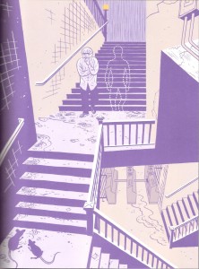
1.

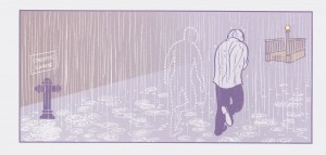
The first thing any reader will notice is the extensive use of purple. Derik interpreted purple to be the color of (false) duality, given that purple is a mix of blue (the color for Asterios) and red (or pink, the color for Hana). Asterios’ obsession with duality was at the root of his sorrows, so it makes sense that purple would be the dominant color at the lowest point in his life (right after his apartment was destroyed).

But purple also works on a literal level: it’s a dark color that nicely substitutes for black in a very noir scene. The rain in the background, the rats in the foreground, even the little details like the cracks in the walls emphasize the bleak state of the protagonist. And while the stairway clearly leads to a subway terminal, the stairs turn at off-kilter angles (reminiscent of early 20th century German expressionism). As Asterios descends into the subway (the beginning of his literal journey) he’s also descending into a strange, unknown existence, the opposite of his orderly life. Is the art heavy-handed? Hell yes, but in this brief scene the art provides the emotional depth (or at least the illusion of it) that’s lacking in the script.

I feel obliged to also note the dotted-outline “ghost.” When I first read the page, the ghost was an interesting visual mystery, especially with regards to how it’s confident posture contrasted with the miserable state of Asterios. And I’ll just leave it there, because I don’t really want to talk about the dead twin subplot.

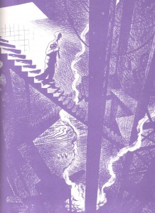
2.


The entire Orpheus sequence is gorgeous, but this is my favorite page. It has many of the same qualities that I appreciated in the previous image: the use of purple, the noir-ish tones, expressionistic stairways. I also like the idea that Hades is defined by contemporary preconceptions. An ancient Greek would see the underworld as a cave, but a modern man imagines subways and sewers.

Mazzucchelli also makes great use of light sources and diminishing illumination. Light, or its absence, is a frequently overlooked element in comics. In most mainstream comics art, panels are either uniformly bright or dark, and few artists put much thought into the sources of light. But in this page, the light is clearly coming from the surface world that Asterios is leaving. This light source only illuminates so far, so most of the descent is partially obscured in smoke and shadows. It’s an evocative page even without the mythological allusion.

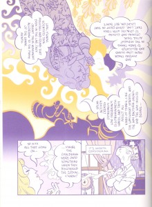
3.


Mazzucchelli is not the first artist to rotate imagery and word balloons, but he does it with an unusually creative design. I especially like how each version of Ursula serves as a locus where patterns emerge or break. The full body Ursula at the top-left is the source of the floral pattern that disappears into the solar rays, and she cools off and extinguishes the fiery pattern that forms from the center-yellow Ursula. The latter Ursula seems to arise out of the solar pattern on the right side of the page and yet her face also serves as that pattern’s end-point. And the purple Ursula face in the lower middle abruptly ends the fiery pattern with a yellow outline atop a purple background, but this color fades rapidly as the reader transitions to the subsequent panels near the bottom of the page.

In addition to being lovely designs, the three Ursulas and the different patterns divide the image into smaller portions and subtly limit the readers’ gaze as they rotate through the word balloons. Thus, they serve as substitutes for gutters and panel frames. While the rotation of the image may be initially disorienting, there are plenty of visual clues that ensure that readers can easily follow along.

And when examined as a whole, the top image looks like an album cover from the 1960’s, which squares with Ursula’s hippie monologue. Of course, none of this is particularly deep on either an emotional or intellectual level, but it’s attractive and fun to look at.

So there you have it. I had three nice things to say about Asterios Polyp. I am overflowing with positivity.


_______________
Update by Noah: You can read the whole Asterios Polyp roundtable here.

Hooded Polyp: Rampant Formalism

I tend to be a careless reader on first reading a book. I’m distracted. I’m too interested in just getting through. I’m testing the waters too much: do I like this, will I like this? For this reason, I’m a big rereader. I try not to review anything on only one read. Better with two or three reads, then I have a sense of the book as a whole, the overarching picture, and I can start looking at the details and putting together the pieces. If I can’t make it through a second time, then I know I shouldn’t be writing about the work. I can make it twice through most books. Three times, though, four times, those are the ones that go a little further, where there are always new connections to make between the words, the pictures, and the ideas.

I read Asterios Polyp very quickly when I first got it. I had picked it up at MoCCA last year and had a train ride through New Jersey to spend reading. I read it again a week or so later. And only a couple months later did I actual write something on the book, sticking to a discussion of the book’s ending (an interpretation, I have stuck to, after my most recent rereadings).

Picking up the book again in anticipation of this roundtable, I found myself a little reluctant. There was a point between then (first reading) and now where I started thinking about the story at the heart of the book. The basic story of Asterios Polyp (both the character and the book) is rather banal. Middle aged man is at a low point in his life and takes a life changing journey that causes him to realize his mistakes and reunite with a loved one. Damn, that sounds real lame, like dozens of popular “indie” films and no doubt hundreds of midlist novels written by middle aged professors.

But, what story isn’t, in some way, a familiar tale. Someone’s always trying to break the plots down into a list (Polti’s Thirty-six Dramatic Situations) or a handy quip (John Gardner: “There are only two plots in all of literature, someone goes on a journey, or a stranger comes to town” [I can’t find the source for this…]) It’s not the base story that really matters, we’ve seen them dozens of times, it’s the execution, it’s the layers piled on top (or hidden underneath), it’s the art and the artifice. It comes down to the author/artist.

And where David Mazzucchelli really shines is in the formal invention he brings to the comic. He’s taken this story and added layers of complexity and formal ingenuity. I’ve read the book a handful of times now, and paged through reading various sequences a few more. I keep finding more elements to attract my attention and stimulate my creativity. Everything feels constructed and purposeful, which some may dislike (I feel like I’ve read complaints in that vein), but to me it breaks me out of thinking “this is real” and allows me to engage on a less mimetic level. I don’t want to think of these characters and events as real. A big part of the enjoyment for me is taking note of how Mazzucchelli uses elements of comics to varying effects, an enjoyment that is no doubt affected by my interest in expanding my work on my own comics. Asterios Polyp often feels very insider-y, despite it not being about a cartoonist.

I’m not one to make larger arguments about theme (I’ll leave that to some of my co-roundtable mates), I’m more of a formalist. I love looking at how comics work and how individual artists make comics work differently. So, in that vein, here are five elements of the work I noticed as I reread it this time around. Some are more developed than others, but maybe the less developed ones can at least spark some discussion in the comments.

1. Balloons and Text

Word balloons are often overlooked in comics, despite being one of those quintessentially iconic images that scream “comics.” Artists tend to vary balloons only slightly: larger or smaller, smooth (speech) or scalloped (thought) or spiky (shouting), ellipse or rectangle. And from one character to the next, artists tend to maintain their style. Hergé uses his rectangles with the cut out corners, Ware seems to stick with rounded rectangles, most use the classic oval balloon (such an inefficient use of space for displaying words). Dave Sim is a master of word balloons, added aural and emotional inflection through the shapes, sizes, and placement of his balloons (not even getting into his use of the text itself), but these moments are for the heightened moments: the shouting, the worry, the whispers, the frantic internal dialogue (lots of internal dialogue in Cerebus). The normal everyday talking is still shown in fairly plain balloons.

I remember early in my comics reading career, being surprised at the way Todd Klein used different types of word balloons for some of the characters in Sandman (I’ll credit Klein, but the idea could have come from Gaiman or one of the artists). Each of the Endless seemed have their own way of speaking: Dream with his black balloons with the wavy white border, Delirium with her rainbow hued balloons, Despair with a more craggy bordered balloon (see early on in the “Seasons of Mist” storyline for an example with them all together). These variations are an overt way to give those special characters their voices, so to speak.
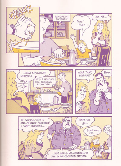
Note different shaped balloons.

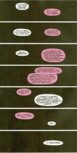
Mazzucchelli takes it to another level. Pretty much every character in Asterios Polyp (even minor ones) has his or her own balloon shape. Asterios’s are rectangular with hard edges. Hana’s are like teardrops. Stiffly’s are wavy. Ursula’s are like a large, smoothed out scallop edge. Their son, Jackson, has balloons that are kind of mixing of the two, a larger more wavy scallop (see image above). On one page we see balloons from Hana’s off-panel mother, and they have a distinctive shape: hard edged and chaotic with overlapping corners and oddly sharp angled tails. Even the word balloons coming out of the television that Asterios is watching in the first scene take on slightly distorted shapes of the characters in the video (Asterios and Hana).
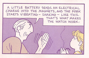
Word balloons like narrative captions.

I don’t think it’s a coincidence that Asterios’s rectangular balloons can take on the appearance of the traditional rectangular narrative captions at the top of panels. Asterios is so often pontificating that his words often act like narration. This is rather explicit in the scene where he is explaining his magnetic watch to Jackson. His rectangular balloons fill the top of the panel, just like a caption would.

One unusual one I only noticed on after starting this post, is the balloon that shouts “Hey” after Asterios as he skips under the subway turnstyle. The balloon and lettering takes on the same style and shape as the MTA logo used on the NYC Metrocards. In a similar way, slightly different lettering is used for many of these characters: all caps, normal caps, italic, bold, large, small, and different font faces. Together the combinations give a visual voice to the characters in a way that I don’t recall having ever seen done in such a consistent and extensive way.

I don’t see Mazzucchelli doing this in the book, but his consistency with the balloons and their varied shapes/fonts is such that the reader could identify the speaker without seeing the character. I’d find this type of vocal recognition quite helpful in some manga I’ve read where balloons are often used without tails or without any characters in the panel to mark the speaker.

Let me offer one important thematic use of the word balloons. Throughout the dream sequences, Asterios’s dead twin brother Ignazio speaks with a scalloped balloon that is quite reminiscent of a thought balloon. Towards the end of the book, just before Asterios wakes up in the hospital, he dreams about Ignazio. Asterios finds him at the garage, working on a car. Ignazio starts talking, reusing many of the words from his narration about Asterios at the beginning of the book. He is talking in the first person as if he had lived Asterios’s life, and slowly his word balloons transform, morphing from a round scalloped shape into the sharp rectangles of Asterios’s balloons (see image below).
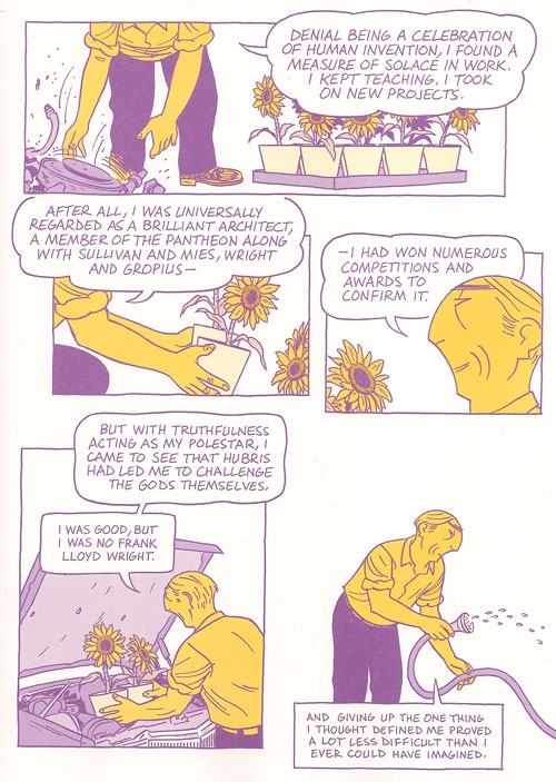
Word balloons transform.

This scene is an important moment in the book, one I neglected to realize the significance of before I noticed this use of the word balloons. Ignazio, with his thought balloon like speech, is just Asterios’s obsession with duality taking on life. And here, at the end of the book, Asterios has his epiphany. Ignazio transforms back into Asterios, the pompous Asterios of the past, and Asterios kills him.

2. A Bit on the Colors

Mazzucchelli’s color work in Rubber Blanket was a revelation of sorts to me about the power of a limited color palette using transparency to create blends (I wrote a bit about that previously). Asterios Polyp at first seems like it’s using a similarly harshly restricted color palette. When I read it, I try to pick out the colors, to count the shades. I never really succeed in figuring out how many colors there are, it always seems to be more than I first think.

But, there is a limit on the number of hues used at any one time, and Mazzuchelli makes great use of these variations and shifts in palette. The purple and yellow of Asterios’s journey in the present presents itself early on in the book, but only after the strike of lightning seems to steal all the blue. The blue and pink are the colors of the past, taking the clichéd blue=boys pink=girls and making it a powerful visual cue to the relationship between Asterios and Hana. In a sense these palettes play into the duality tension that fills the book. The purple/yellow palette are complements, opposites on the color wheel, yet they are more than just two colors. There are the shades of both. There is the fact that purple itself is a mixing of blue and red. The duality is surface, and it dissolves with attention.

Various hues also take prominence to create shifts in the narrative. Dreams are suffused with yellow. Flashbacks (see Asterios remembering his father as he rides the bus holding his lighter) are suffused with blue. In a way, this use of color is a variation on the classic trope of the altered panel border to indicate flashbacks or dream sequences.
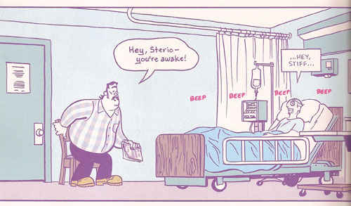
Greenish tones enter.

The color I noticed this past read is green. After the dominance of purple, blue, yellow, and pink, green sneaks in late in the story. When Asterios wakes up in the hospital after getting hit by the drunk in the bar (and after the dream sequence I mentioned above), some of the blues take on a greenish hue (see image above). The greenish blue seems to become more bluish green over the course of a few pages until Asterios is in his solar-powered car leaving town, and a bright green interstate sign jumps forward at the very top of the page. This green sign is in itself a sign that a fuller color palette has arrived. We can easily connect this expanding palette with Asterios’s new perspective and all the commentary in the book about perspective and “coloring” the way we experience life.

It must be telling in some way that Hana, in her final scene appears wearing a green shirt. In a way, the couple have almost switched colors in this scene. Asterios wears a pinkish purple shirt, while Hana wears bluish green pants. A final color shift to represent their reconciliation.

3. Back to that Ending

Asterios Polyp is both a comedy and a tragedy, in my reading. It ends with marriage (reconciliation) and death (I continue to read the asteroid as about to strike the house where Hana and Asterios sit). Furthering the idea that once you start looking for those dualities they are everywhere, but the two poles never seem to stay clearly separated.

4. Brushwork

When I saw Mazzucchelli at MoCCA when the book made it’s debut, he was drawing Asterios’s head with a compass as he did in the book. Much of the comic has a similar precise line and flat, sharp color fields. But there are moments of looser brushwork that has an almost dry brush appearance. Only a few of these tiny moments pepper the book. I’m at a loss to explain this tiny stylistic shift spread out across the book. Perhaps they have no explanation other than being the best way to portray the image in question. These moments catch my attention and are quite lovely in themselves.

It starts with the storm clouds and lightning strikes and ends with the asteroid hurtling towards Hana’s house. But in between are these two moments that are almost polar opposites in their placement of the Asterios/Hana relationship. First:
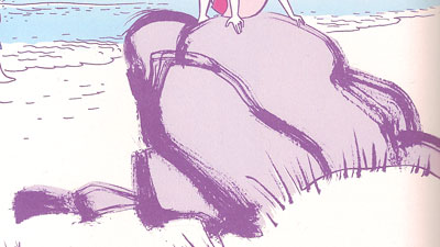
The large rock Hana sits on at the beach when they find the Swiss Army knife. (Sidenote: In the MoCCA Mazzucchelli show that was up, they had the original art for this page, including the second version of this rock that he drew on a separate paper and edited (Photoshopped, one assumes) into the page over the original one.) This image is accompanied by narration concerning their marriage.
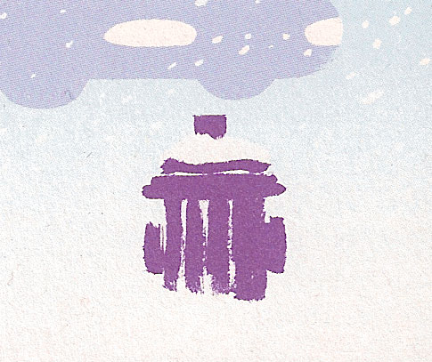
Walking home from the composer’s apartment, later in the story, just before their relationship really breaks, this snow covered fire hydrant sits in the lower corner of a panel.

Could these perhaps be another case of the coloring of perception? Tiny moments of grace in another wise cut and dried world. A tiny nod towards paying more attention (as Hana has it) to the world around us. Each of these images are nature based, a softness against the hard edges of Asterios’s architecture.

5. Large Panels of Rooms

Mazzucchelli uses a lot of large panels (usually about two-thirds of the page) to show us interiors. From our first view of Asterios’s apartment to him shivering on the couch of Hana’s house after his long snowy walk, these large panel rooms set scenes, expose psychology, and position relationships. Many of these panels show the rooms from the same point of view, in particular, we see Asterios’s living room a number of times through the course of the book.

Perhaps the most effective use of these large rooms is Asterios sitting on a bed with a blister on his foot. His static position is placed onto two separate bedrooms at two different times, his repeated phrase bringing on a torrent of memories (and one of the best scenes in the book, in my opinion).

So there you have it. A few thoughts on the book.

Having written all of this before reading Noah’s post from yesterday, should I be chagrined to have fallen into the traps of “what I’m supposed to do with the book”? Oddly, I agree with Noah about the characters and the story, the thing is, I just “so don’t care.” I’ll get my pleasures from other parts of the book.

This is the second post in a roundtable on Asterios Polyp. Regular Utilitarian, Richard Cook will weigh in tomorrow, with other Utilitarians and guests posting through next Monday. You can read all the posts in the roundtable on this page.