Draw Better! Put Your Eyes Out!

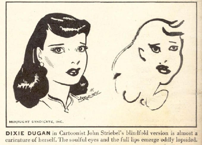
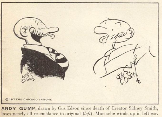
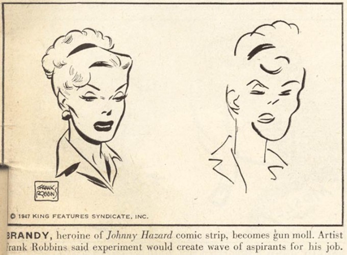
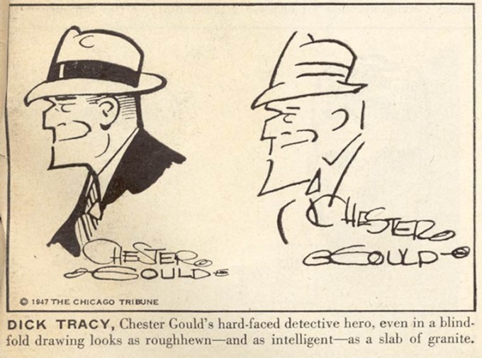
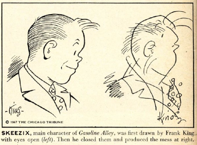
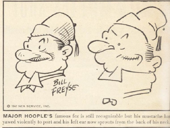
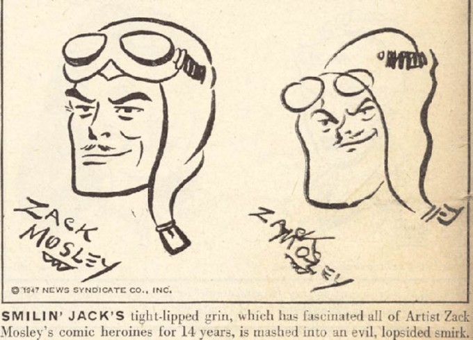
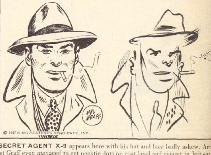
In 1947, Life Magazine asked a bunch of famous cartoonists to draw their famous characters blindfolded. The result? Hilarious hi-jinks, of course…and something that looked an awful lot like high art.
 

illustrators-40s-1-680x489


illustrators-40s-2-680x492

 
That’s not exactly how Life presented the exercise. The editors instead emphasized the wacky wrongness of the characters; the anatomical, inconsistencies. Dixie Dugan is “almost a caricature of herself”, the eyes and “full lips” appearing “lopsided”. Gus Edson’s Andy Gump “loses nearly all resemblance to the original” and his moustache ends up by his ear. Suddenly, these folks who can draw can’t draw, and that’s funny.

Half a century further down the road of deskilling though, it doesn’t look all that funny. Rather, the drift off-brand is validating. Striebel’s tight, eyes-open illustration of Dixie Dugan looks like bland advertising boilerplate; the blindfolded version, with the loose, gestural strokes and the varied line-weights, has a lot more energy — a highbrow modernist sketch emphasizing individualistic brio rather than a commercial hack job. Similarly, Edson’s perfected Gump looks fusty and antiquated in its slick cartoonishness, while the stick figure outline looks like the work of someone who’s seen Fort Thunder, and knows the joys of messiness.

You could argue that this exercise exposes the shallowness of high art pretensions and the idiocy of contemporary art. “Look, my kid could do that,and with his eyes closed no less!” Or you could say that it reveals the dullness of the cartoonists, whose drab workmanlike images need a shot of modern art practice to give them life.

Less polemically, though you could instead see the exercise as an object lesson (with illustrations) of why deskilling has become so central to contemporary art, and to highbrow/lowbrow distinctions. Comic strips emphasize professional finish, reproducibility, and iconic characters — the point is a recognizable, consistent product, which obscures the contribution of the artist, so that (for example) Gus Edson can replace Sidney Smith, and the Gump remains the same.
 

illustrators-40s-3-680x499


illustrators-40s-4-680x503
 
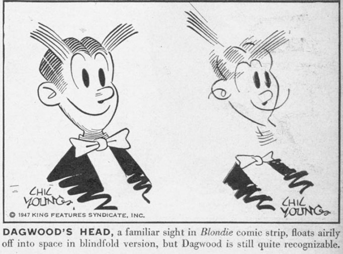
But with eyes closed, the artists are no longer able to be professional. The practiced memes fracture and come apart; literally in the case of Chic Young’s Dagwood, whose head leaves his body. Imperfection equals idiosyncrasy. To draw the same thing over and over perfectly is to be a drone, an assembly line worker. To be an artist, you have to be less sure; the marks have to be placed, not out of habit, but from individual inspiration. Dagwood’s perfect collar disintegrates, and what’s left behind are pen strokes as pen strokes. By closing his eyes, the artist reveals his hand.
 

illustrators-40s-5-680x505

illustrators-40s-6-680x502

 
The fact that, in the blink of an eye, Frank King can move from cartoon to cubism is a reminder that the low-art/high-art divide is both more arbitrary, and less wide, than either side likes to admit. Once we recognize that, the juxtaposition can allow us to perceive some of the pleasurable oddness and wrongness in the original drawings — the weird way Dick Tracy’s mouth seems to curve up his cheek and head towards his nose, or those tufts of hair making a bid for freedom on Skeeziks’s brow. And it also lets us think about the cute, iconic professionalism behind modernist semi-abstraction, in which the artist’s tics become their own marketing meme.
 

illustrators-40s-7-680x511

illustrators-40s-10-680x490

 
Thisexercise also demonstrated, though, how absolute the high art/low art divide can be. Life’s editors were familiar with Picasso I’m sure; Boing Boing’s bloggers (which who reprinted the piece) have seen modern art. Yet the genre assumptions are a barrier, or a blindfold, to seeing what’s happening on the page and/or screen in front of their eyes. For Life (and for the artists themselves), the blindfolded cartoonists are still cartoonists; the drawings with eyes covered are mistakes, or failed attempts, or entertainingly silly errors. Deskilling is seen as a bug, rather than a feature; the drawings are comics that don’t look like comics, rather than something else which looks like itself.
 

illustrators-40s-8-680x500

 
I’ve mentioned before Carl Freedman’s point that genre precedes art — by which he means that preconceptions about genre determine what we see as art, and what we see when we see art. Are those images above bad comics? Or are they succesfully deskilled high art? Part of what’s especially enjoyable about them is that they’re both and neither. If genre determines what we see as art, then art that messes with genre can cross up the way we see — like looking with our eyes uncovered, or with a blindfold on.
 

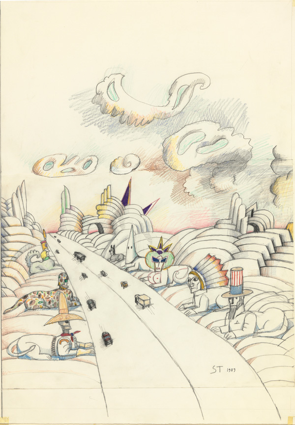
LasVegas-600

Saul Steinberg, “Las Vegas”


Comics versus The Deskillers

Americans have many expectations when they head to an art museum. One is to look at modern and contemporary art, fetishistically exhibited, that they believe their child could do. This ritual would not be complete without their mentioning, even declaring, this opinion to other visitors. This performance persists for a number of reasons. It’s validated through repetition, especially by people who are unsure of how to react to modern art. This reaction is also funny, (I guess,) and so it rounds out the total emotional experience of the visit. Finally, the development of ‘deskilling,’ one of art history’s most central narratives, is not well understood. When taking painting classes in prep school, a supposed bastion of precocious academics, the teacher explained, “They got to paint that way because they had gotten really good at painting realistically,” citing Pablo Picasso’s Blue Period as evidence of a sort of regulating Royal Academy in the sky.

Deskilling isn’t well understood in the comics world either, and sometimes painfully ignored by those who jockey for comics’ acceptance by the art world. It is also notably absent from Bart Beatty’s slyly neutral account of comics-art relations, Comics Versus Art, (which Noah Berlatsky and I have previously reviewed.) Yet deskilling might present the largest obstacle to comics’ admission into the gallery.

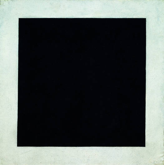
Black Square

Kazimir Malevich, Black Square, 1923– not quite monochromatic


Deskilling is hard to pin down. A monochromatic canvas, a bicycle wheel, and a running locomotive dangling above a museum entrance are all valid examples, (and works of art, for those skeptical.) The first eschews the use of painterly skill or representation, the second the use of any artistic manipulation whatsoever, and the third was made by an artist who only ordered the work’s creation– and hired skilled engineers to suspend a purchased train for him. The painting could be Kazimir Malevich’s or Aleksandr Rodenchko’s– each believed to have reached the ‘zero of painting,’ or ‘the end of painting,’ respectively. The bicycle wheel is better known as a type of “readymade,” a prefabricated object that functions as an artwork in a gallery context. It is obviously Marcel Duchamp’s, who is equally famous for his upturned urinal, Fountain.  Finally, its tempting to argue that the final piece, Train by Jeff Koons, involves a lot of skill– look at how much skill it takes to dangle a steam engine over a busy thoroughfare, or to make a steam engine in the first place! And how scary it feels to stand under it. However, the engineers aren’t credited and their contribution is merely an execution of the real work of conceiving the piece. Also, Koon’s showcasing of his factory of art-laborers, often young artists themselves, plays into his identity as a provocateur.

Deskilling partially arose in protest to the institution of art, although the institution of art quickly swallowed the movement through its acceptance, and profiting, from these subversive works. Deskilling also thrived with the expressionists, who wished to tap into more primeval, deeper consciousnesses through savage colors and distorted, deliberately ‘primitive’ or ‘childlike’ representation. Others used deskilling to push the boundaries of art as far as they could go. As championed by critic Clement Greenberg, abstraction rejected representation and technique outright, in pursuit of the truth of painting– making deliberately flat, optical, and material surfaces. Pop-artists who rejected Greenberg’s conclusions also worked in a deskilled style, by incorporating cultural “readymades,” low-brow art, in their factory-like practices. Commenting on the automatization and deskilling in the industrial sphere,  minimalist artists employed artisans to assemble their works, and were concerned more with the physical presence of the work than with the craftsmanship of the pieces. The development of Conceptualism might have delivered the most resounding blow. Sol LeWitt’s “Paragraphs on Conceptual Art” states, “In conceptual art the idea or concept is the most important aspect of the work…the idea becomes a machine that makes the art.” He expands on this in “Sentences on Conceptual Art,”

32. Banal ideas cannot be rescued by beautiful execution.

33. It is difficult to bungle a good idea.

34. When an artist learns his craft too well he makes slick art.

sollewitt

While painterly craft, naturalistic representation and artistic craftsmanship are occasionally resuscitated, it is often by conservative reactionaries, during periods of massive spending, by wealthy collectors who prefer these qualities, (despite what is believed about the taste of the very rich.) This is not always the case, especially concerning feminist artists who seek to restore attention to the human body– abstraction, conceptualism, minimalism and the like derive their power from their disembodiment, which for better or for worse is conflated with male rationality. As traced in Noah’s piece here, comics and art have been locked in a similar, gender-flipping battle for some time. And deskilling isn’t always masculine– the Dadaists subverted gender and sexual tropes through collage, a revolutionary new medium at the time.

Have there been parallel deskilling events in comics history? Cartoons could be taken as a deskilled form of naturalistic drawing, yet caricature isn’t historically understood this way. During WWII, newspaper strips’ decrease in scale encouraged minimalistic, less virtuosic drawing, as epitomized by Charles Schultz’s Peanuts comics.  But this was less a philosophical/artistic choice than a necessary adaptation under pressure. Self-publishing and the internet have allowed artists with less artistic skill to release work, occasionally to fantastic success. Alternative publishers like Picturebox champion artists with deliberately ‘amateur’ styles, which conceptually contribute to the entire meaning of the work, and are not considered limitations.  Interestingly, these comics marry two different deskilling trends, expressionism and conceptualism, through  an often problematized narrative. Alternative publishers have also fostered the cult of the outside-artist. In the art world, outside-artists are fascinating, eerie case studies, somewhat pitied but revered as autodidacts and prophets. In the comics world, extended isolation is a given factor of comics making, and few institutions exist to reward or educate cartoonists. The outside-artist is a heroic model.

Yet for most of its history, comics were an industrial and institutional product, not a commentary, nor a protest of institutions. Rather than problematize authorship, the comics community struggles to recognize the work of artists who were exploited by publishers. Past and present masters are identified by their the craftmanship, demonstrated through draftsmanship, composition, technical ability, interplay with text and narrative, and understanding of the human figure and setting, all mediated through deliberate, auteristic style. This perspective is difficult to reconcile with the narrative of contemporary art, and isolates comics from the ‘mantle of history’ draped over the shoulders of the deskillers.

Comics have a place in an art museum. It’s just the same place devoted to other crafts, like furniture and silverware. “Note the single penstroke that articulates the supple line of Superman’s (c) cape, evidence of great technique…”

Back in high school, it wasn’t surprising that a history teacher provided better insight into deskilling than the art-teacher, busy convincing students to take their still-lives seriously . A few college-level art-history classes later, a trip to MoMA felt like a stroll through the natural history museum of the industrial West, full of emotional/philosophical artefacts of various cafe cultures and art-heroes. The comics world isn’t alone in de-valuing deskilling. Museums have to construct celebrity-artists to anchor the meaning of these works, which seem facile or clumsy or laughable at face value. The most successful art heroes are those whose legends are married to an iconic (and decorative) style– Vincent Van Gogh tragically, Picasso and Andy Warhol with much posturing and self-awareness, and Jackson Pollock somewhere in-between. Roy Lichtenstein’s life may be less memorable, but the cartoon punchiness of his work more than makes up for it– the populist attraction of the comics he ironicized became the best insurance for the durability of his appeal.