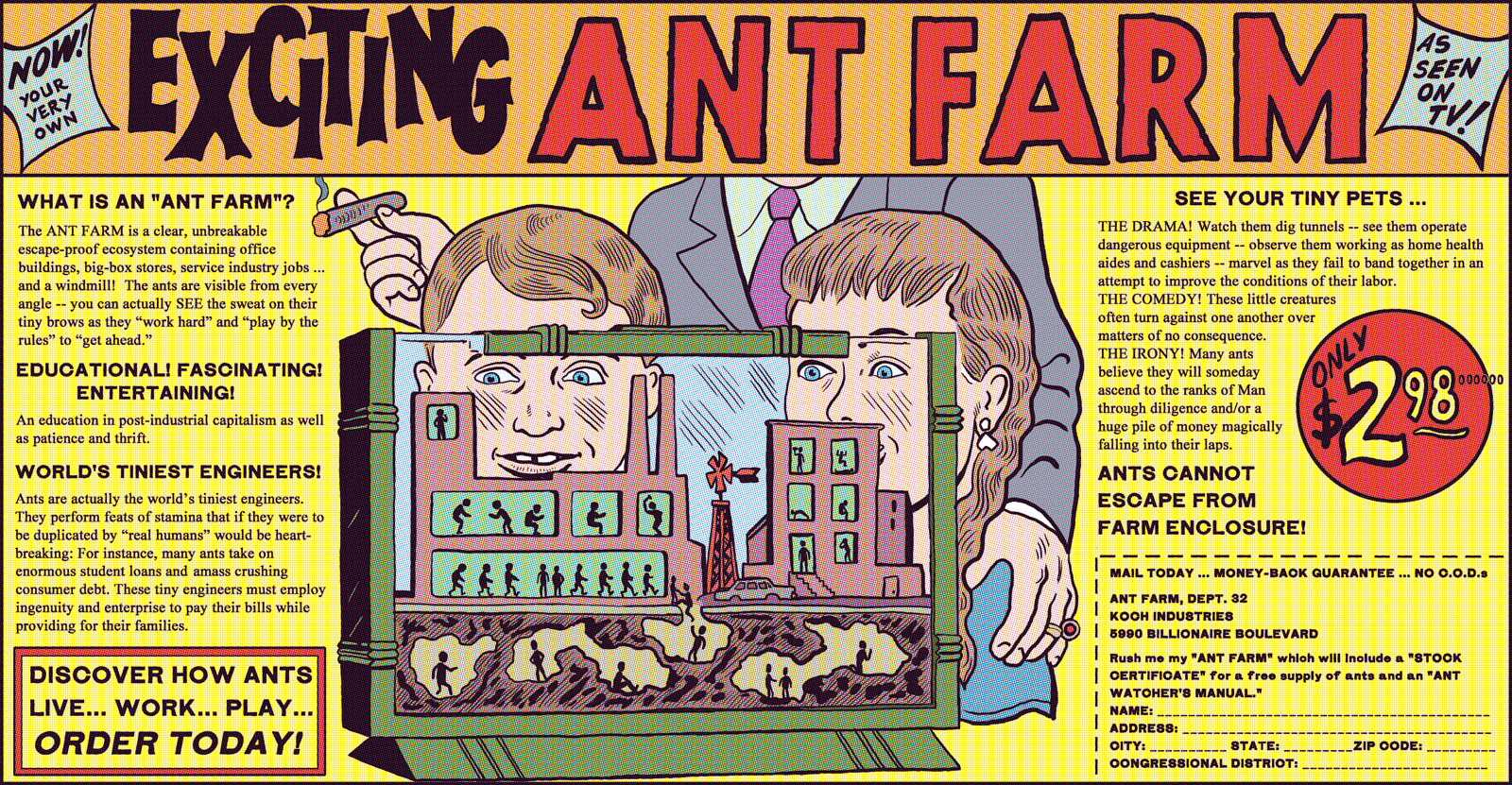
Just under a year ago, I started a new gig that I was cautiously excited about: creating editorial comics for the Week in Review section of The New York Times. David Rees was going to write them and I was going to draw them. This seemed like an ideal partnership; David (creator of the satiric comic Get Your War On) has a great skill for walking the fine line between irony and sincerity, and is extremely funny as well. We both wanted to try to do new things with the political strip format, and bring metahumor to the Times.
Already, though, things were not as we’d been promised. The Times had approached David and then myself in April of 2013. After approving us, they told us their master plan: Brian McFadden, the resident comic artist, would be replaced by myself and David alternating with Lisa Hanawalt. This would be a part of the exciting revitalization of the Week in Review section. To that end, they told us to wait while their redesign proceeded.
By September, the redesign seemed to be finished; but the editor in charge decided that something as exciting as this new comic rotation couldn’t be unveiled in a dull month like September. Better to wait until… January! when it could be announced to the world with the appropriate fanfare and excitement.
So we waited seven months in all. And on January 20th, David & I created our first strip for the Times… which was printed with no fanfare or announcement or anything; we were simply dumped into an alternating slot with McFadden, because by then Lisa was simply too busy (drawing Bojack Horseman). The brilliant strategy of waiting all that time had backfired, because in fact it was pointlessly stupid.
Then there was the money. The New York Times– get this- refused to come up from the fee for one artist, which we were to split. We finally got them to come up a little, but only a little. These strips are done in a very short time period- basically between Wednesday night and Friday morning, and I stayed up all night for a couple fo them. We were going to be making very little money, but still, it was an opportunity to do good work, maybe make some statements on serious issues and have them be seen by people. And the Times still stands for something in peoples’s minds, some kind of editorial quality.
Of course, it didn’t work out at all; their nitpicking, antiquated style of editing got more oppressive until they were killing entire strips. And it’s quite clear they were refusing to print them because they didn’t understand them. It was like being edited by hobbits.
The first few went through fairly smoothly; David pays close attention to the news, and the art director mentioned approvingly that she was glad he was tackling issues that the paper wasn’t covering otherwise. The one thing that bothered me was: we would present the script, the editors would make corrections, I’d create a finish. Then, after I’d handed it in, I’d get back a complete different set of corrections, mostly concerned with their antiquated style guide. The Times puts periods in “IRS,” for instance, even though the IRS themselves do not. They also changed the wording of Donald Rumsfeld’s letter to the IRS when we quoted it directly; that seemed wrong to me. And that they couldn’t do all the corrections at once, before I’d done the work, felt to me like laziness and a lack of coordination which ended with me doing unnecessary work at the last minute.
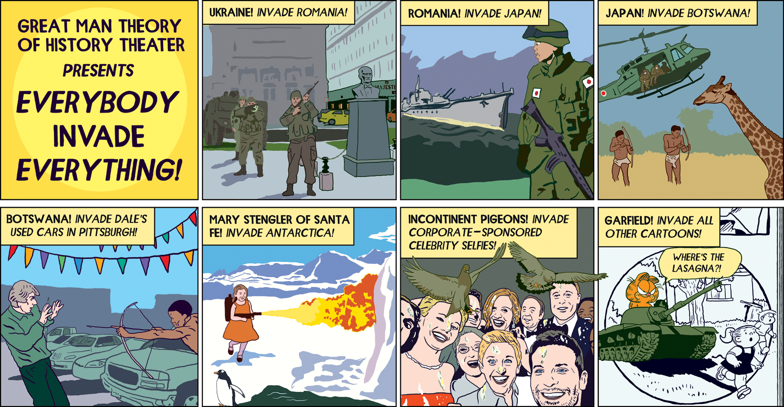
They did start reading the script more closely, though, after our fifth strip. The script mentioned the cartoon character Garfield and tribesmen in native costume in Botswana, so I was less than sympathetic when they were surprised when the art was turned in. “We have to check with our lawyers if we can use Garfield,” the AD said, and “the tribesmen in Botswana are making people uncomfortable.” Soon came the word that the lawyer had said Garfield was okay (luckily they had asked one who understood the first amendment). I hope they would also drop the tribesmen issue, but no. They insisted I make it a different country, and have them fully clothed. I thought about it for maybe five seconds, and then I said something I’d learned to say after a lot of bad experiences with illustrations and comics that turned out mediocre because of meddling editors who thought they were smarter at what I do then I am. I said “I’m not comfortable with that.” And they… backed down. Okay, we’ll print it the way it is.
I thought we’d won a small, but important victory. Of course, I was kidding myself. Two strips went by and then it was Easter; David wrote a script parodying floral bouquet ads. It showed several extravagant bouquets before showing a basket with twigs in it, suggesting that maybe the real spirit of Jesus would be served by saving the money spent on bouquets and giving it to a homeless shelter. It was David at his best: sharp, moral, funny & brilliant. (I’ve done a rough of it to show you here).
They hated it. “The editor is asking why are we making fun of religion” came the reply. I couldn’t believe this, and still can’t; it’s the response of someone who can’t read. David was doing the opposite of making fun of religion; he was in fact underlining one of its central tenets, the concept of charity. He felt really strongly about it, and even managed to talk with one fo the editors to make his case. But no amount of arguing would dissuade them. We had to come up with another strip in a hurry.
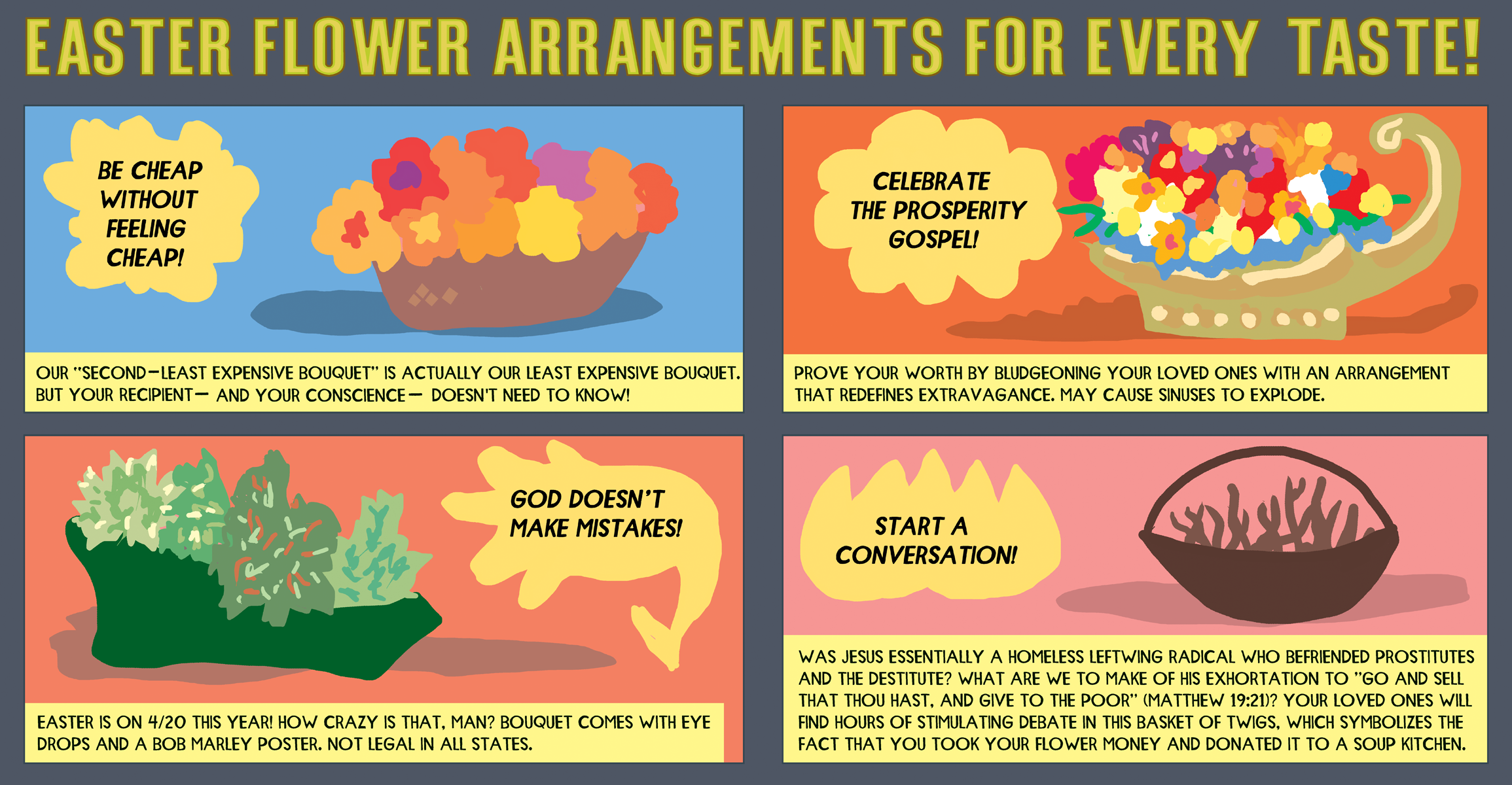
A sketched-out version of the unpublished strip.
The next strip went through with no difficulty, and then David wrote a strip about male bullying online. That week, the hashtag #yesallwomen had taken over Twitter, following a misogynist’s killing spree in California. The reaction to this was a torrent of abuse from men and boys towards women- and this was before Gamergate, which really took it to another level. As always, David’s strip on the subject was right on. His script had a pair of baby-men (wearing diapers) talking about trolling and threatening women online. I was excited, because I knew this was one that would attract attention, and make a point that deserved to be made. Incredibly, the Times wouldn’t touch it. “So I floated this by the editors, and they all feel that this news story is just too sensitive to be prodded at in a humorous way,” was the way the substitute AD put it.
This was when I had had enough. Too sensitive to be prodded at in a humorous way? Why had they hired us? What did they think we were supposed to be doing? David was busy at that point doing his TV series for National Geographic, so I told the AD that I was not happy with the Times‘s behavior, that we would not be giving them a substitute strip for that week, and then I created a rough version of the strip from David’s script and put it online, with a full explanation of how the Times wouldn’t print it. It got more attention than anything else we’d done for them.
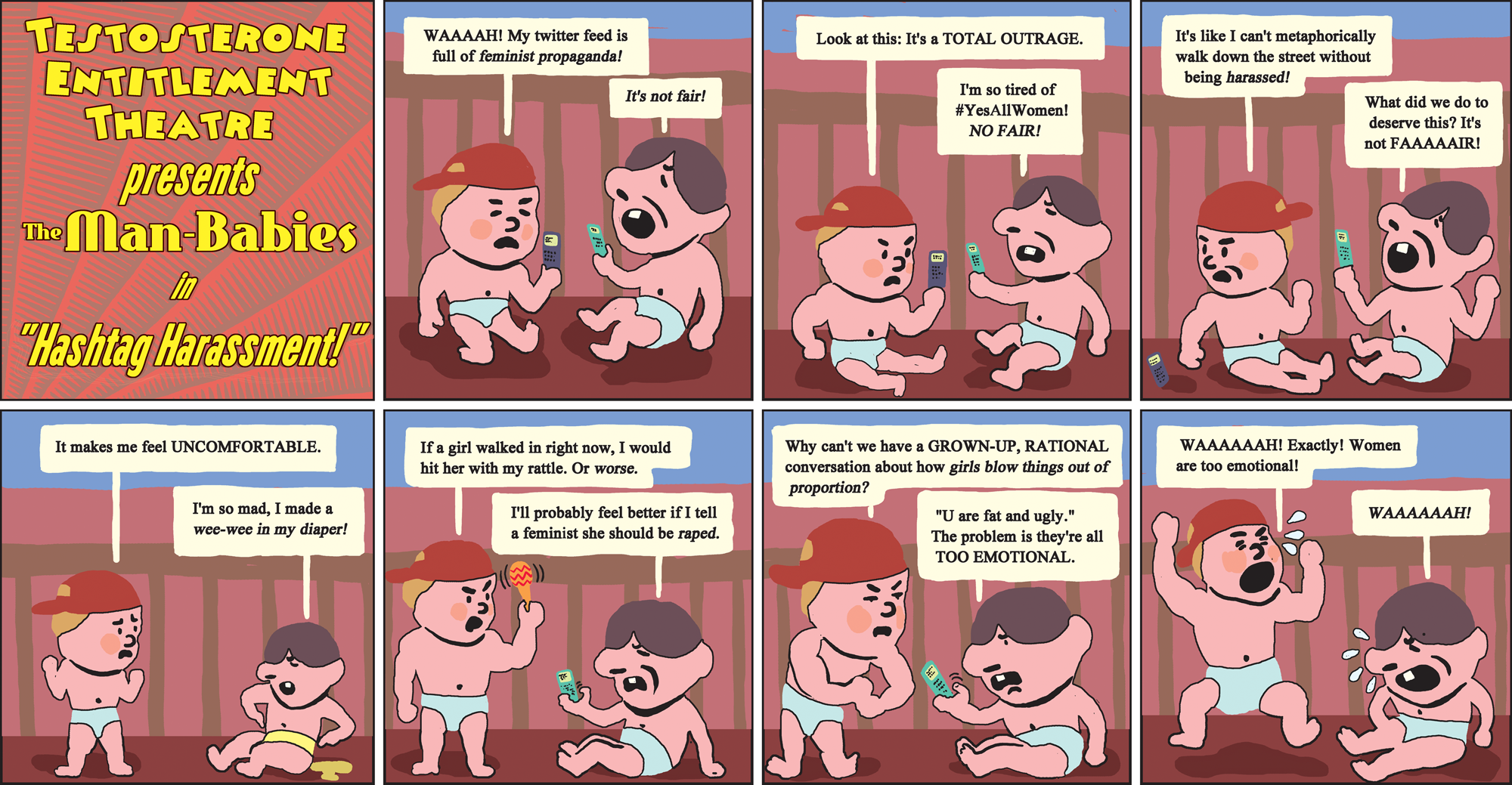
A sketched-out version of the unpublished strip.
We did one more strip after that and then, big surprise, they fired us. But once the Times had made it clear that we were not allowed to offend anyone, or handle any but the safest material, it was all over for us anyway. For me, as a cartoonist, it was another depressing reminder of how bad things have gotten in the print world for people who do what I do. David had a TV show. Lisa had a TV show. I was working in print and I felt like a real loser for it.
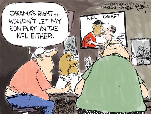
I couldn’t help but think of all this again this week as the images from Paris appeared online. Cartoonists had given their lives for the freedom of speech their work represented. It still means something over there. A lot of media attention has been paid lately to the case of American football generally and the National Football League in particular. Recently, the NFL drafted its first openly gay man into its ranks, causing a great deal of celebration in some quarters and a high degree of consternation in others. As a fan of (American) football, I am interested in this story because of what it says about the social implications for individual players, team camaraderie, and the fans, too. I am thinking about this because I try to be mindful about and supportive of efforts to eliminate discrimination and promote equality regarding race and ethnicity; regarding sexual orientation; regarding gender; and regarding socioeconomic class. Since I currently live in Sweden, I don’t see all the news (infotainment) about current events in the U.S., so what I have seen of the Michael Sam story I have found through websites that I visit on occasion. I saw stories on my BBC phone app; on Queerty.com and Advocate.com; and on other random links I saw on Facebook. What I did not see, though, in any instance, was editorial cartoons about this event, so I went hunting for them. Using a Google search, I found a few cartoons, some of which focused on Michael Sam’s race and others on his sexual orientation. I include below some randomly chosen cartoons depicting some facet of the Michael Sam case. Does the cartoonist in each instance focus more on representations of race, more on representations of sexual orientation, or some combination of both? Bok (bokbluster.com/creators.com) The first cartoon borrows President Obama’s earlier discourse regarding the NFL and the incidence of concussions and traumatic brain injury. Bok makes a connection between working class men, beer drinkers, and anti-gay prejudice. (Because of the perspective, we don’t see the butt crack, but we know it’s there and it is revealed.) The image on the television screen is of two men kissing. What is not clear is how the characters in the panel would react to the fact that it is apparently two men of different racial identities kissing. Since it is set in a ‘sports bar’ (pictures of hockey and baseball on the wall), readers might assume that it is a bold statement this man makes about not having a son play in the NFL. In her 2009 article published in Visual Communication, Elisabeth El Refaie writes about visual literacies and the processes that readers use to understand political cartoons. Her essay is a pilot study exploring how readers make sense out of the visual and verbal elements in a panel. In her analysis, El Refaie explores five questions regarding the ‘multiliteracies’ required to understanding these cartoons: “How do readers: (a) establish the real-world referents of a cartoon; (b) impose a narrative on the cartoon image; (c) interpret the facial expressions of the depicted participants; (d) understanding text-image relations; and (e) establish metaphorical connections between the fictional scene of the cartoon and a political argument?” (p. 190). What interests me about the range of cartoons shown above is how few of them rely on metaphorical representations to communicate their messages. Most of them are relatively literal scenes: representations of people having conversations about Michael Sam, or Michael Sam himself having a conversation about his future. Research on editorial and political cartoons discusses the tendency for artists to make their commentary using metaphor: combining two very different domains for the reader to interpret. (For more on cognitive metaphor in cartoons, see Bounegru & Forceville 2011; El Refaie 2003; among others.) In my very limited search for cartoons about Michael Sam, I found just a very small number that relied on metaphor to communicate the meaning. Here is an example: It is no surprise, of course, that cartoonists would choose to highlight certain aspects over others. The intersections of race and of sexual orientation in this particular situation—professional sports in the U.S.—are a virtual minefield. Is it safer for cartoonists to create a more literal representation than it is to create a metaphorical representation? Is it simply too difficult to navigate the issues metaphorically? Understanding political cartoons is a complex act of reading that draws on multiple types of literacies and relies on a vast array of knowledge and cultural discourses. Likewise, creating cartoons demands that artists focus on some aspects of an issue or story and leave out other aspects. I ask readers of Pencil Panel Page and Hooded Utilitarian to provide their own examples of cartoons regarding Michael Sam or regarding similar situations. How do race and sexual orientation function in the commentary of political cartoons? This first ran at Comixology. One of the more infamous art frauds of the last twenty years or so is Andres Serrano’s “Piss Christ.” Like most people, probably, I heard about “Piss Christ” before I saw it. From news accounts, I thought it was a plastic crucifix stuck in a jar of the artist’s urine. Jesse Helms hated it, and I had to admit that it seemed like he might have a point. It was easy to assume that Serrano was a trouble-making, glory-seeking hack, whose work was defensible only on the most extreme free-speech grounds. He seemed like a charlatan, substituting a gimmick, pretension, and contempt for genius. I did actually see the piece in person many years later —a definite moment of “doh!” “Piss Christ” isn’t actually a plastic crucifix in urine, but a photograph of a plastic crucifix in urine. And the photograph is beautiful — the blurry cross shines with yellows, oranges and reds as mysterious bubbling currents swirl around it. Looking at the image without any background information, there’s no question that it is religious; an evocation of the mystery of Christ, who seems to be falling through space, cast aside and yet radiant. If you didn’t have the title, you wouldn’t even know the liquid was urine. The thing is that, as the crown of thorns itself suggests, mocking Christ is itself scriptural. The Passion is about degradation and defilement. Christ is mocked, brutalized, humiliated — and then redeemed. The sacred can’t exist without the profane; you need the leaking bodily fluids and the rotting husk if you are to have the transubstantiation. Christ must be reduced to the lowest of the low, to an abject thing, to a place where the body is everything, before the body can become nothing at all. If urine squicks you out, it’s worth remembering that Christ embraced the lepers. And as for Jesse Helms…given his stance on AIDS, he would have been much less likely to hug a leper than to piss on one. Not to be too hard on Helms who is, after all, not the only sinner in the room. If Christianity urges its followers to sympathize with the tortured, it is also quite aware that most people are a good bit more comfortable identifying with the torturer. “Piss Christ” may be sneering at Christ, but it is also, and certainly, sneering at those who profess to follow him. Helms accused Serrano of “taunting the American people,” which is about right. He was, specifically, taunting them for being crassly commercial, spiritual hypocrites — for being sinners. And as long as there are sinners, Christ will be defiled. Nobody wants to be called a Christ-killer, and it’s little wonder that Serrano’s work has…er… pissed people off. An outraged Helms declared that Serrano “is not an artist. He is a jerk.” While I appreciate the charming forthrightness, I think the sentiment is maybe a little limiting. Why can’t you be an artist and a jerk? Indeed, there are a lot of artists who make their living by being jerks. They’re called political cartoonists. Like Serrano, they use a combination of words, images and instantly recognizable symbols to make moral points, and like Serrano, they do it in a way designed to irritate as many people as possible. From “Piss Christ” to the Danish Mohammad cartoons just isn’t that big a step (as I am not the first to note: for instance, the ever-helpful Wikipedia even provides a link from the first to the second.) “Piss Christ” is different in some ways from most editorial cartoons, of course. For one thing, the way it juxtaposes image and text is a lot more thoughtful than you’re likely to see sitting above the op-eds. Most editorial cartoons are visual one-liners with notes — that’s the Democratic Party; this is the Republican party; they don’t like each other! Ha ha. Serrano, on the other hand, uses words to change the way you see the image, and to alter what it’s saying to you. The distance between religious and sacrilegious turns around the title — and it’s not just one turn either. As in any good editorial cartoon, the message is definitely “fuck you,” but who is being fucked with and why is both ambivalent and mysterious. Even the aesthetics of the piece are translated back into a legible text; “Piss Christ” is actually about its own beauty, and about the way that beauty is ironicized by, or transcends, the title. The point here isn’t “Editorial cartoons should be more like ‘Piss Christ!” For one thing, Jesse Helms is safely dead, and I don’t particularly want him rising from his grave to wreak vengeance. But it does seem to me that dismissing large swaths of the visual arts tradition as irrelevant fakery is an unfortunate and impoverishing road to take. If comics creators are interested in the interaction between words and images, then Andres Serrano surely has something to say to them. Andrew Sullivan, forehead creased by his duties as guardian of Iran, stole a laugh because of this Oliphant effort. And it’s not bad. The point is clear and the drawing has Oliphant’s usual superiority: the kid’s wide little butt and drooping shirt, the languid dog, the set of the kid’s foot. For once the little squidgett figure in the corner makes a comment that caps the joke instead of derailing it. On the other hand, we’ve all heard about how bloggers are trifling stay-at-homes pretending to mess into the great affairs of the world. Why unearth the joke again? My guess is that Sullivan is being a good sport after a round of gibes like the one found in the first sentence of this post. The idea is clear: Obama isn’t keeping his promises and he’s getting high and mighty. A very simple point. Yet the cartoon makes no sense. Oliphant bounces his point off the fact that Obama now has a dog and dogs leave shit around the place. So?
I would vote for something like this, if you want recent inscrutability. I have no idea what he’s trying to say here (bigots live in New Hampshire, even if they do legalize gay marriage?); the point seems to be a funny drawing of a grizzled hillbilly type in a wedding dress. And I agree, that’s funny, but there’s little point. … But the drawings are as good as ever … look at Obama running some guys over with a steamroller, or these hideous human-headed vultures, or the big ass on the banks. And I can even follow what he’s trying to say with those. It’s when he tries to do some actual humor that he usually loses me. This one (which does have some charmingly simple depictions of its characters) seems to be saying that Rush Limbaugh is a hypocrite because he won’t gay-marry Dick Cheney. That’s silly. And here’s another bit of slang that recalls the “Texas tea” thing from a few weeks ago; apparently Oliphant isn’t aware of the term “rugmuncher”, but that’s what I thought of when I saw that one. This one makes sense, which is a letdown, of course. No pointing and giggling. Looking at this, you’d think it was Cuba that had the embargo on the US, not the other way around. But what a deft way of drawing Obama: the moment is so winning. We see again Oliphant’s gift for fantasy based on characters from the news. (Previous Oliphant installment here.) UPDATE: Matthew, my leg man in Oliphanting, points me to the latest: 1) Cheney the torturer and 2) the epicene cowboys of Texas secession. And, yeah, those are two freaky cartoons. The Cheney cartoon takes a big, simple point (Cheney’s a nasty guy who defends torture), lobs in some clutter to put you off balance (the long legend on Cheney’s apron, the Prussian gentleman standing by in his helmet), then sneaks in for the kill with a final touch that is tiny, unobtrusive, complicated and inexplicable. Who is that little guy on a bicycle? Why is he tearing off for the distance? Why does the bike have training wheels and why do the training wheels look so much like legs and feet? Why does the man’s head look like three knuckles? Why is he so blase about torture and, finally, why are we hearing from him? Traditionally, an editorial cartoon will show someone in the news saying something that the cartoonist has put in the person’s mouth, and then there may be some little figure piping up with the cartoonist’s personal wry commentary on the situation. Here we have a third party, a man with a three-knuckled head and a special bike, and he’s popping up to say what he thinks too. Damn, it’s weird, and yet it takes up so little space. It’s a dab of condensed insanity. Matthew says maybe the little guy is Obama: thus the training wheels and, I guess, the three-knuckled head (big ears). My guess, if it’s anyone we know, is Bush. Bush was always working out and Oliphant drew him with big ears. Oh, the hell with it. All right, the epicene cowboys of secession. Here’s how I figure Oliphant’s logic chain: Texas wants its federal money like anyone else, so therefore this secession talk is bullshit; the secession talk takes place at tea party rallies or in front of crowds who might turn up at tea party rallies; the British drink tea and are very courtly about asking each other if they want one lump or two; therefore, to express the posturing hollowness of the secession talk, one portrays the Texans as mincing little Percys with tea cups in their hands. One gets the horrible feeling that Oliphant actually thought his way toward this conclusion. The deranged vision didn’t come to him in a flash; he put on his thinking cap and worked with lunatic clarity to reach his goal. UPDATE 2: Now Sam and the sharks, again because Matthew brought it up. Clear point, a bit simple but intelligible, and nothing actively weird in the drawing to throw you off. Matthew mentions how well O draws the sharks, and it’s true. He also draws a lot of them. This brings up a big point about Oliphant. He is so much better at drawing than most of his colleagues that his facility gets him into visual trouble. In the old days, when he was at the top of his game, he created images with a density of detail and complexity of composition that allowed them to take over the reader’s eye. Now he doesn’t manage his detail, he just lets it roll out from his pen, and composition be damned. The problem isn’t too bad in this latest. But Uncle Sam does get a bit lost among all those sharks; the overall situation takes a few extra seconds to register because Sam, who is its center, has to be tracked down by the reader’s eye. The Cheney cartoon suffers a lot more; even without the little mystery man on the bicycle, the picture is a mess of one thing after another.
_______
________
For all HU posts on
Posted in Blog, Featured, Satire and Charlie Hebdo Roundtable, Top Featured
|
Tagged censorship, David Rees, editorial cartoons, Get Your War On, Michael Kupperman, New York Times, NYT, Satire and Charlie Hebdo Roundtable
Editorial Cartoons: Is Michael Sam gay? or is he black?
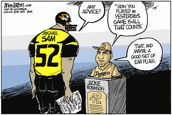
Drew Litton (http://www.drewlitton.com/)
This cartoon draws on the historical significance of racial integration in baseball (an interesting sports cross-over). Litton uses visual cues to communicate Michael Sam’s race, but he uses linguistic cues to communicate Sam’s sexual orientation (the newspaper in his hand). Robinson is pictured wearing his Dodgers uniform (the team he joined) but Sam is wearing his Missouri uniform (not yet having been drafted by the St. Louis Rams).
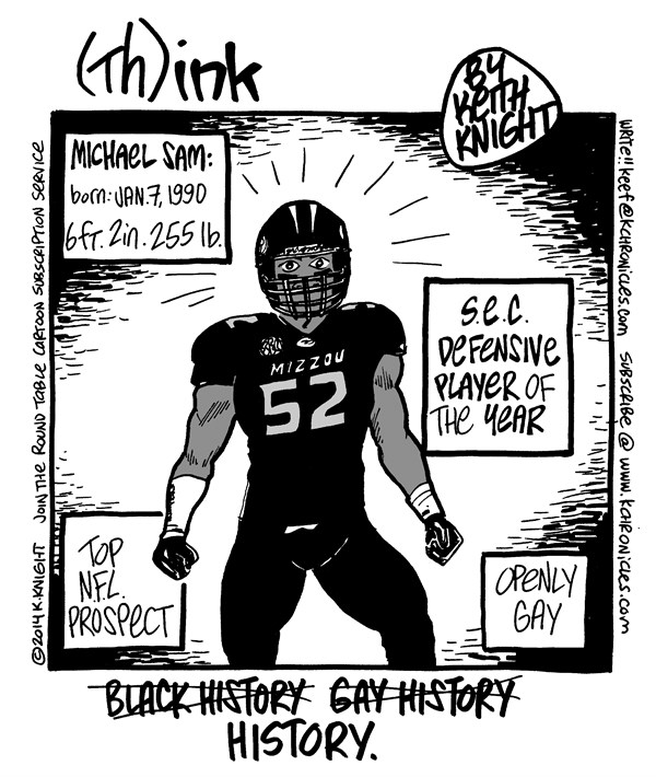
Keith Knight (www.cagle.com)
Knight’s technique relies much more on linguistic cues to communicate his thoughts about Michael Sam. It may be that Knight uses Sam’s stats rhetorically to establish the rationale for the caption, which shows the linguistic struggle over how to name the importance of this event. Knight decides that it is neither Black History nor Gay History but History.
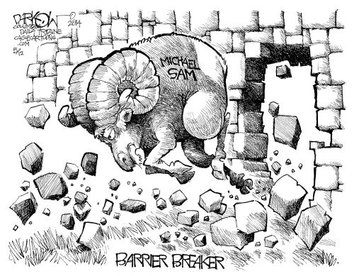
John Darkow (columbiatribune.com)
Readers familiar with the story will know that Michael Sam was drafted by the St. Louis Rams. This cartoon by Darkow communicates a similar message to the cartoon by Keith Knight (above), that race and sexual orientation should somehow be subsumed in the general meaning of the cartoon and that the ‘simple’ fact of the draft should be highlighted. One major difference is that the Darkow comic relies on metaphor and the Knight comic is a more literal representation. In fact, ‘Barrier Breaker’ is drawn in such a way that it erases all mention of sexual orientation and it erases all mention of race. The metaphor of a ram breaking through a wall is clear to the reader only if the reader already knows the discourses that play a role in the Michael Sam case. (Under other circumstances we would need to consider underlying or implicit prejudicial messages: the jokes that could be told about a gay man joining a team called the Rams; the jokes that could be made about a black man being represented by a ram.)Snark Is Thicker Than Urine
________
Comics has something of a chip on its shoulder about visual art — a kind of forthright working-nerd philistinism. The snooty, pasty theory-spouting degenerate sticks a flag in a cow turd and gets the grant and the girl while the hard-working illustrator who’s got pen technique like Durer gets a condescending pat on the head and relegation to a cultural backwater. Not only does the emperor have no clothes, but he is actually getting paid to paint his ugly genitals purple.
But, of course, viewers do have the title, as well as the background information, all of which rather changes things. Placing Christ in a jar of your own urine is an act of deliberate sacrilege. Serrano is pissing on God; humiliating him and mocking his humiliation. If you’re a Christian, it’s literally Satanic; Serrano might as well just affix the crown of thorns himself while sneeringly declaring “Hail, King of the Jews!”Oliphant Watch: Those damn bloggers
Oliphant Watch: Careful There, Obama!
Oliphant Watch: The Pig Busts In
Oliphant Watch: Obama and Castro

