 Comics are both a substantial art form and a commercial industry. Thus, it is not surprising that the cover of a comic can play multiple roles. The cover is usually the first (and sometimes only) part of the work seen by consumers before purchase. Nevertheless, covers are not purely merchandising: A cover is also a part of the work of art proper, and thus should (or, at the very least, legitimately can) be taken into consideration when interpreting, evaluating, and decoding the narrative contained in that work. Given that comic book covers are often created by someone distinct from the artists who craft the narrative portion of the comic found between the covers, interesting questions arise with regard to how the content of the cover art influences our interpretation of the work as a whole.
Two questions arise immediately:
- What role should the content of the cover art play in our interpretation of the comic as a whole when the cover seems to conflict with the narrative found inside the comic?
- What role should the content of the cover art play in our interpretation of the comic as a whole when the cover references other comics (or other pictorial art)?
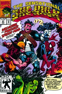
 Of course, sometimes the cover of a comic is just a playful exercise in metafiction, with broken fourth walls and other types of silliness that usually (although not always) are meant to have no real bearing on our understanding of the story contained inside the comic. Such is likely the right reading of this She-Hulk cover (although,given that the She-Hulk often engages in metafictional strategies within the narrative proper, the right reading of this example is likely more complex). But in other cases, things are more involved. Let’s look at two sorts of example. The most obvious sort of case is where the content of the cover can outright contradict the the content of the interior pages. This can happen in three ways, all three of which are illustrated by Adam Hughes’ cover for Fairest #3.
- The narrative content of the cover can conflict with the narrative found in the interior pages: Hughes Fairest cover depicts the Snow Queen playfully writing the word “Fairest” on the frosted window. But this contradicts the interior content in two ways: It is unlikely that the character in question is the sort to do anything playfully, and there are no panes in the windows of her castle as depicted in the interior pages.
- The appearance of characters on the covers can conflict with their appearance within the interior pages: On the same cover, the Snow Queen is depicted with pink skin, but within the interior pages she is consistently drawn with bluish-white skin.
- The cover art can incorporate the title of the comic into the art itself (thereby implying that the characters have metafictional knowledge of the title of the comic in which they appear, and thus have knowledge that they are fictional characters). The Snow Queen’s inscription of “Fairest” on the window functions this way, while there is no indication within the interior pages that there is any sort of metafictional fourth wall breakage.
Given these sorts of conflict between cover and interior content, we are (or at the very least, I am) left wondering exactly how the content of this cover is meant to fit into an overall interpretation and assessment of the narrative. Is the Snow Queen playful, or not? Does she have blue/white skin, or pink skin? Does she know she is fictional?
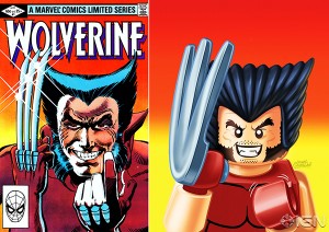
 Another sort of question arises when cover artists reference other (typically iconic or important) comic covers. A particularly interesting example of this phenomenon arose with the LEGO minifig covers that appeared on Marvel comics as part of a tie-in with the Marvel Superhero LEGO sets and videogame. These covers raise interesting questions about the appearance of characters: Are we meant to imagine that Wolverine (the canonical Marvel character) temporarily looked like a LEGO minifig? Or that he could have? In short, if the cover is a legitimate part of the work as a whole, and thus provide some information regarding the appearance of the characters, exactly what information should we take from this cover?
There are other questions that arise from this sort of cover, however. The LEGO Wolverine cover references the iconic cover to the first issue of the seminal Wolverine limited series. Is this merely to be taken to be an homage? Or should we interpret the narrative within the pages of the most recent issue with the older limited series especially in mind? These questions are raised, but seem to be left unanswered, by the cover art itself.
So, how should we interpret covers in mainstream superhero comics?
