Queen Kong vs. Ms. Jones

eerie 81


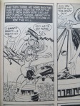
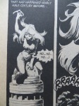
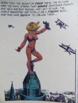
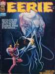
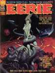
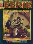
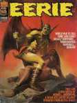
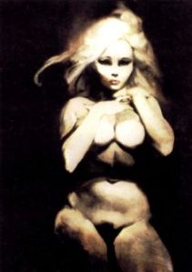
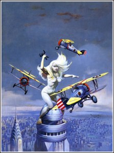
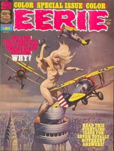
I don’t know what Warren Publishing had in mind when they commissioned Frank Frazetta’s “Queen Kong” in 1971, but Eerie devoted an entire issue to the image in in 1977.  The cover of No. 81 declares: “SHE’S BIG! SHE’S BEAUTIFUL! SHE’S ATOP THE EMPIRE STATE BUILDING! WHY? READ THIS STARTLING ISSUE FOR SEVEN TOTALLY DIFFERENT ANSWERS!”

Each of the 5-10 page comics offers an explanation for Frazetta’s giant naked woman:

a) breast enlargement injections gone terribly wrong

b) espionage at the 2090 Worlds Fair

c) King Kong blood transfusion

d) “physiological freak”

e) lab-grown mutant engineered to terraform alien planets for colonization

f) giant robot suit

g) Little New York populated by tiny, human-imitating aliens

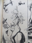
Explaining the ape in her fist proved even harder, but Queen Kong’s size isn’t her most fantastical quality. It’s her breasts, because a) perfect circles are only possible in space, and b) no nipples. The issue’s other artists offered their Frazetta imitations:
IMG_1294   IMG_1289   IMG_1290

IMG_1288   IMG_1293   

IMG_1291   IMG_1292

The first tale, “Goodbye, Bambi Boone,” I remember best, perhaps because the artistic style was so familiar. Carmine Infantino and Dick Giordano were renown artists at DC in the 70s, and both had just contributed to the 1976 DC-Marvel team-up, Superman vs The Amazing Spider-Man. The two heroes also battle atop the Empire State Building.

SupermanvsSpider-Man1976

My copy was supposed to be signed by the two companies’ top editors, but it arrived with only Stan Lee’s faux-scribble on the cover because DC had just dethroned Infantino. He went from DC publisher to Warren freelancer. Giordano would become editor a few years later, but meanwhile both were earning extra paychecks by drawing naked women on skyscrapers.

Infantino pencilled writer Bill DuBay’s “The Bride of Congo: The Untold Story,” the most comically subversive of the seven stories. Like Peter Jackson in his 2005 King Kong remake, DuBay depicts a Fay Wray deeply in love with her giant ape, and the two even elope and raise a family. Louise Jones and David Micheline give their Queen Kong a happy ending too, sending the colonizing starships away so the narrator’s genetically engineered mutant sister can live a peaceful life alone with her little monkey friends.

And that’s it for Queen Kong survivors. Roger McKenzie’s is just a machine operated by a thug for power and profit–which is as close to feminist allegory as Eerie gets. The rest of the writing staff murder their heroines, some more misogynistically than others. Cary Bates’ teary-eyed manager replaces biplane blanks with real bullets because his beloved actress was dying anyway. Bruce Jones’ mother-exploding freak dies unloved and alone after growing so large she displaces the Earth from its orbit. But Nicola Cuti’s finale is the worst of the batch–a tale of a money-obsessed “Golden Girl” whom aliens kill and then erect as a gold-embalmed statue of liberty.

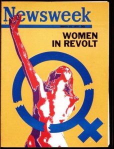
The stories strip Frazetta’s painting of any quasi-feminist edge by punishing its female hero-victim for her uppityiness. But Eerie and Ms. weren’t the only 70s magazines with nakedly revolting women on their covers. Newsweek began the trend in 1971, the year before Frazetta painted “Queen Kong.”

women-in-revolt-march-23-1970

“Women in Revolt” triggered the first female class action suit when 46 Newsweek employees sued for sex discrimination the day the issue hit newsstands. The magazine allowed no women on its writing staff. A second suit followed in 1972, but this time the owner of the parent company, Katherine Graham, stepped in. Graham was friends with Gloria Steinem and the giant Wonder Woman who appeared on the cover of Ms the same year. Newsweek agreed that by 1976 a third of its reporters would be women, including a senior editor.

James Warren, the king sitting atop Eerie‘s 1977 masthead, made no such agreement. Of the sixteen writers and artists in No. 81, Senior Editor Louise “Weezie” Jones is the lone woman–Gloria Steinem was long gone. Jones entered comics in 1971 as the model for Bernie Wrightson’s cover for House of Secrets No. 92, edited by her first husband, artist Jeff Jones. She is fully clothed and only somewhat imperiled since hero and threat are ambiguously merged into the monstrous first appearance of Swamp Thing.

houseofsecrets92cover

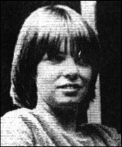
According to the Eerie bio page, she “worked in advertising/promotion before moving to Warren, where the thirty-year-old editor scripts an occasional story. She lives in Manhattan with her daughter.” “I was willing to work in any kind of publishing,” she told CBR. “One of my friends said there was an opening at a comic book company that paid more than the job I had!”

Jones (originally Alexander, later Simonson) was hired in 1974. She described the process of scaling the Warren skyscraper to Bleeding Cool: “I essentially twisted James Warren’s arm into giving me the line of books as an editor. . . . Warren said to me ‘Girls can’t do superhero comics.’. . . I just kind of rolled my eyes and said, Look, I will edit the line for six months on my Assistant Editor salary . . . So of course I did it and then he made me the editor of the line, then he made me a Vice President.”

In 1980, Jim Shooter hired Jones for Marvel, where she edited The Uncanny X-Men and New Mutants and created the supervillain Apocalypse (featured in the latest X-Men film). Marvel in the early 80s was still a “boys club,” she said, but “I was always kind of one of the guys.” Her pay was “as good as the guys around me,” she said, “as far as I knew.” Ultimately, she concluded, “gender doesn’t come into play if [your work is] good enough.”

After moving to DC in the 90s she was instrumental in the Death of Superman and the Reign of the Supermen story arcs, but aside from Red Sonja, she never worked on superheroines: “I had generally avoided doing female characters and being put on female character books — in part because I felt it was a great way to get stereotyped as a person who does female characters, and that’s all you do. . . . I kind of regretted that I hadn’t gone more in that direction when I was younger, because it was so much fun. But you do what you do.”

In Jones’ Eerie story “Starchild,” the mutated giant Janey does her job too, builds a city on a suitable planet for Earth’s growing multitude. But after a week of biblically hard work, she finds “acceptance” and “friendship”: “‘Cause y’see, Janey’d never had friends before. And those tittering monkey-things filled a gap in her childlike heart she never knew existed. . . . And for the first time in her prearranged life, she had fun. . . ”

weezie jonesWeezie

“Starchild” offers Frazetta’s Queen Kong a happy ending, but unlike “The Bride of Congo,” the revolting giantess escapes even the fetters of marriage to live as a nurturing and playful God to the “monkey-things” of her adopted planet. Unlike King Kong, she is not a monster but the narrator’s secretly beloved sister. Her telling, however, receives only five pages, and so is the shortest of the issue’s tales. It is also fifth in sequence, denied the privileged positions of opening, closing, or colored middle story–all of which feature Queen Kong’s cathartic and/or admonitory deaths. “Starchild” is the best in the book.

“I think the women who make it in superhero comics don’t make it because they’re as good as the guys,” said Jones, “they make it because they’re better than the guys.”

 King-Kong-1933-king-kong-2814496-2400-1891

My Favorite Childhood Softporn

eerie 81

It’s 1977, so I’m eleven, older if the magazine I found in one of my cousins’ bedrooms wasn’t his most recent newsstand purchase. The cover price is $1.50.  I paid $8 after pulling it from a vendor’s long box at the Roanoke Comicon. Frank Frazetta painted it in 1971 for Warren Publishing’s planned POW!, a magazine that was never published. I don’t know what his fee was, but Warren must have paid it, since they used it six years later for Eerie.

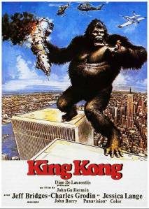
The timing is no mystery. No. 81 is cover-dated February, so it was on newsstands after the Christmas release of King Kong. My father probably took me to see the remake that same month. I was annoyed that the promotional poster featured King Kong straddling the twin towers, while in the movie he has to take a running leap. The poster hung on my bedroom wall for years. It’s also on the Eerie back cover.

Kingkong1976

 
I was a Frazetta fan in middle school and high school, but I doubt I recognized the artist as a sixth grader. “Queen Kong,” like most of his other artwork, is about titillation. It’s a picture of a giant naked woman. Warren Publishing used it on the cover to sell copies of the issue to heterosexual males. My eleven-year-old self felt it too–but I was puzzled by the nonchalant placement of the magazine on my cousin’s bed, his bedroom door left wide open. Where was the Catholic shame? I apparently still felt enough residual embarrassment that, after giving into nostalgic urges, I did not share my new purchase with my fourteen-year-old son on our drive home from Roanoke.

And yet if you’re going to indulge in softporn, it’s not the worst choice. Type a Google search, and you’ll find Caroline Liddell includes “Queen Kong” on her Pinterest page “Images of Powerful Women,” explaining: “The male fear of what happens when women refuse to behave according to expected gender stereotypes–they run amok! It’s a wonder we all haven’t climbed up the Empire State building, swatting away annoying little gnat like buzzing planes since the vote made us all too big for our britches!!”

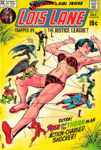
Maybe Frazetta was influenced by Dick Giordana’s Gulliver-esque cover art for the July 1971 issue of Lois Lane.
 

loislane111

 
Those are actualy tiny Justice League clones tying her down, but the effect is the same. Gloria Steinem, a former assistant at Warren’s Help! magazine, also featured a Kong-sized Wonder Woman on a 1972 Ms. cover:
 

ms_shadow

But not even a titillated eleven-year-old could mistake Eerie for second-wave feminism. Look over the previous year of covers, and all of the women are damsels in distress incapable of saving themselves from the monster of the month.

eerie 77eerie 76eerie 7160-1

Rape is a thinly-coated subtext.

62-163-1eerie 80

Frazetta, one of Warren’s most employed cover artists, was a big fan of women-in-peril. Each sprawls uselessly on the ground while a muscular hero battles to protect her. In terms of composition, the women are foreground, the heroes are central, and the on-coming threats are furthest from the viewer. In order to be heroic, the hero must be smaller than the threat, and so the woman crouches to give him comparative stature.  The pose is inherently absurd, but the repetition is comic.

47_land_terrorfrank_frazetta_themoonmenfrank_frazetta_thesonoftarzan

Frank Frazetta - Battlefield Earth 2images

But Frazetta was okay with women-in-peril minus the heroes too. That sometimes requires her to take a more active position, occasionally substituting twirling hair for the missing hero’s combat gestures. Sometimes Frazetta even reverses angles.

wolfpackdownloadmini-Escape_on_Venus_frank_frazetta

frank_frazetta_kingkongfrank_frazetta_attheearthscore

When not in peril, Frazetta women fall into typical good girl and bad girl poses, the eroticism unmitigated by other action. Rather than presenting their backs, they face the viewer, though only a seductress offers direct eye contact.

Frazetta_Girl_Bathingfrank-frazetta-egyptian_queenfrazetta_sketch-016

0030acb423a39aa5b536ede8a5534a2efrank-frazetta-02

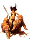
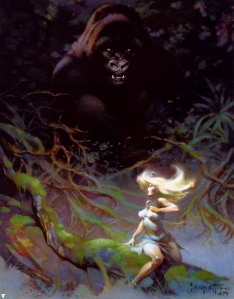
Though all of Frazetta’s women are sexualized, and many are imperiled, not all are powerless–or their power is not always exclusively sexual. Erase the heroes, and the threatening animals can become an extension of the woman’s power.

frank_frazetta_luanaFRAZETTA_img_07

frank_frazetta_savagepellucidarfrank_frazetta_004-thumb-400x324-2057

Although the body of a Frazetta woman is too idealized to be monstrous in itself, she can command other larger and more monstrous bodies.

54-frank_frazetta32012-09-12_230547 The Sea-Witch

Frank Frazetta-ArosFrank-Frazetta158

Which is why “Queen Kong” is unique. When not climbing the Empire State Building, Frazetta’s Fay Wray is just another seductress or imperiled-woman-sans-hero.

0030acb423a39aa5b536ede8a5534a2e frank_frazetta_kingkong

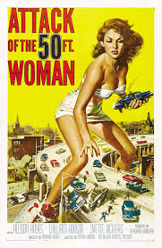
But Queen Kong is the monster herself. She follows the gender-flipping impulse of Attack of the 50 Foot Woman, the 1958  knock-off of The Amazing Colossal Man. Although previews warned that actress Allison Hayes, “once a beautifully voluptuous woman,” would become “the Most Grotesque Monstrosity of All,” Hayes appears no different after her transformation. It is simply the sight of a giant woman (even an initially unconscious one) that produces Horror, Shock, Frenzy, and Devastation!

50 foot woman

Queen Kong is beautiful and revolting too. Since all Frazetta women are first and foremost sexual objects, her body remains proportionally unchanged, but the context establishes her monstrous size. Her twirling hair isn’t emblematic of her gendered helplessness anymore. It is an extension of her combat pose, a nearer equivalent to a hero’s bow or sword.  And though the foregrounded biplane is nearly her size, she is larger than the threats circling her–and so compositionally larger than Frazetta’s typical heroes.

Queen Kong embodies what Carol J. Clover terms “the female victim-hero,” that gender-disrupting monstrosity born from Stephen King’s 1974 Carrie and first embodied by Sissy Spacek in the 1976 film adaptation–both still popular when Eerie No. 81 shipped. We’re happy when Carrie kills all those high school bullies–just like we rooted for Kong against those pesky biplanes.

carrie

Provided, of course, the sympathetic monster knows when to die. “Monster” shares its etymology with “warn” and “demonstrate,” and a giant woman usurping King Kong’s crowning spectacle is a warning against and a demonstration of 70s gender revolution. Frazetta doesn’t paint her corpse after its plummet, but her death is implied. Queen Kong’s beautiful revolt must fail. Even a titillated eleven-year-old reading softporn comics on his cousin’s bed understood that.

queen kong

Don’t hide your candle under a bushel, Mr. Frazetta. (NSFW)

“The internet is a toilet.” …..Plumb away!
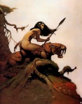
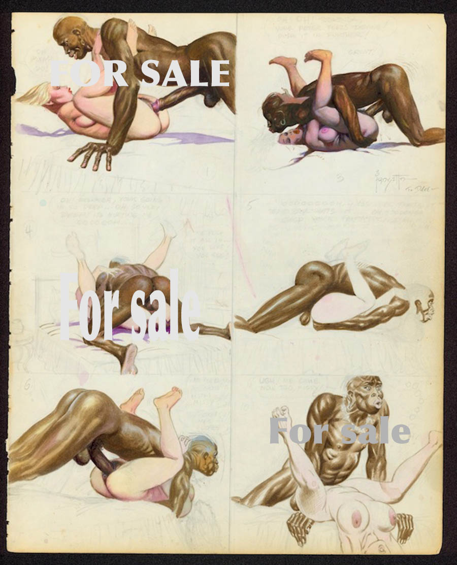
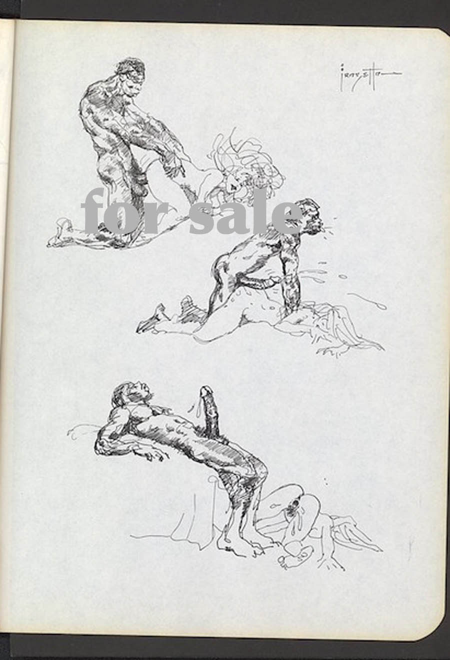
Background: There’s a hugely anticipated Frazetta auction due in early December 2015. Some nudie art could not be included in the printed catalog (and online) on the advice of the auction company and its lawyers. The chattering classes were rife with rumors and speculation. What could possibly be so disgusting that it could be auctioned but not included in the printed catalog? Surely nothing as pathetic as cunnilingus, female ejaculation, or facials. So perhaps bestiality or necrophilia? Don’t those horrible Europeans also sell Crepax doggy art? What’s wrong with that? As it turns out, it was nothing quite so gross, just a “simple” case of white slavery (+/- rape).
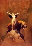
I wanted to preserve these on HU since the site is periodically interested in such things. I mean both Frazetta and the obvious.(The below is NSFW, if you hadn’t figured that out already.)


____


b

b2

b3

The “For Sale” signs were added by Roy Lichtenstein and Edward Ruscha in 1998.

Here’s the description from the blog that first published these images (link is temporary):

“Frank has always had a strong interest, a fetish of sorts, in black sexual stereotypes. Why would he spend so much time extolling the virtue of black sexuality if he disliked blacks? Makes no sense. What is his intent? The joy and delight inherent in sex. One must see the totality of these stories to appreciate fully their intent and idiosyncratic approach. He has other erotic art dealing with just whites, no blacks. A superficial and prosaic understanding is really worthless in appreciating this material.”

I don’t think this statement needs to be dismantled in any sustained fashion except to say that if you think Thomas Jefferson must have liked blacks because he had sex with Sally Hemings, then this art is for you.

My first thought when I saw these newly revealed images was why people needed to see them to realize that Frazetta had real problems with Africans (and perhaps blacks in general). The white slavery/inter-racial trope is a small corner of the porn world and usually presented in the spirit of fun and games; a fetish which Frazetta would no doubt have approved and appreciated. These new images, on the other hand, bring to mind Robert Crumb’s “When the Niggers take over America,” a work which has been interpreted with diminishing amounts of charity in recent years.

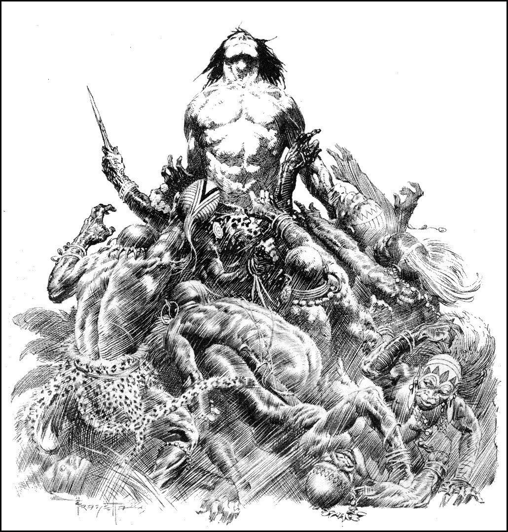
The illustration below, for example, is widely considered one of Frazetta’s greatest pen and ink works.

Frazetta Tarzan

There is nothing subtle about the content here which makes its wide acceptance altogether more distasteful. The Frazetta “porn” is a shameful business which we can all collectively shake ours heads at but the same worldview was ladled out  generously in much of his oeuvre.

The Tarzan of the comics (let’s forget about Burroughs for the moment) was, of course, deeply invested in white supremacy and purity; with the great apes afforded an even greater status than the Africans who appeared in them periodically. Hal Foster certainly couldn’t escape the siren (and, yes, racist) call at the core of the Tarzan narrative when he famously drew the character in the newspapers back in the 30s.

His acolytes like Frazetta could be seen trafficking in similar imagery in the pages of Thun’da towards the latter half of the 20th century. Russ Heath in the story, “Yellow Heat,” is yet another famous exemplar of this trend in adventure and horror comics. If there is any desire to heap praise on the laughable civil rights comics of the EC line, then one can look no further than these comics for their counter examples.

The standard defense for these images is that Africans “really” were that way—in that they really sharpened their teeth and really ate people. And, yes, were generally crowd surfed by white people (metaphorically speaking of course). Presumably, the images on display in Frazetta’s porn stash will be diagnosed as an acute insight into black sexuality or at the very least a liberating moment of self-revelation and self-parody; a plumbing of the very depths of the human soul. On this last point, at least, I think we can all find some space for agreement.

__________

Update: In comments, Frazetta’s images above have been compared to the tradition of Asian erotic temple art of which the most famous example must be the reliefs at Khajuraho. I guess there are worse ways to insult the Indians.

Khajuraho

What’s Funny About This Picture?

8714cd173c2c993440ac9f51379d5ea6

 
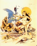
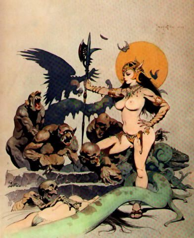
I was seven the first time I saw this illustration. I’d never heard of Frank Frazetta, but forty years later I still recognize the style.  I assumed it was an Eerie or Creepy cover, but flipping through online databases and comic-con long boxes unearthed nothing. My memory had added a throne, so my description to vendors didn’t help either.

I knew it was early 70s because I’d seen it during a family vacation in Cape May, NJ. We went multiple years, but stayed only once in the Sea Mist Hotel–on the second or third floor, the right side, in what seemed like an improbably large open space.
 

sea mist cape may nj

 
An adult cousin–I don’t know which of my father’s nephews–was suddenly staying with us too. He’d arrived on a motorcycle and slept in a sleeping bag in his underwear on the floor. I slept in my briefs, but with pajamas over top, so his relative nakedness confused me, a change in the rules.

The magazine was his. It confused me too. It was sitting on a large table, more or less chin height, as I studied the cover at what must have been a distance of inches. It didn’t occur to me to open it or to pick it up. Though there was nothing taboo in its placement, no sudden parental shuffling of papers, I felt something transgressive. The breasts presumably. I’d seen my mother naked, but this was different, another shifting of known rules.

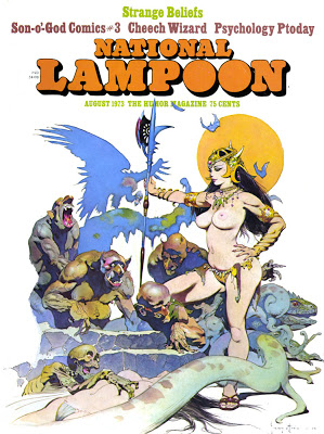
This was 1973, only months before my parents’ separation. I turned seven in June. Frazetta penned “72” next to his signature, but the magazine logo hides it. I had no idea he’d illustrated a National Lampoon until the cover popped up on my laptop during a recent Google search. No. 41, August, so on stands in July when my cousin grabbed his copy on the way to a beach getaway.

National Lampoon Ghoul Queen August 1973 Strange Beliefs 41

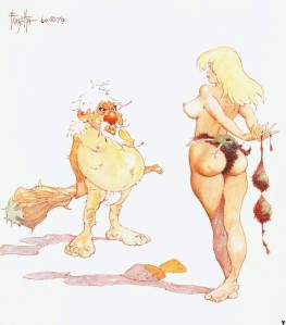
I’m still not sure what it’s doing on the front of “The Humor Magazine.” Frazetta drew the occasional Playboy-esque cartoon,

frank_frazetta_eve

but “Ghoul Queen” is closer to the distortions of his fantasy style. Still, the ghouls are more comic than menacing,

Ghoul Queen (2) Ghoul Queen (3)

and their queen’s hip-to-waist ratio exceeds even Frazetta’s usual idealized proportions.

Ghoul Queen (2)

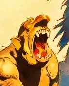
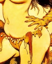
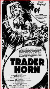
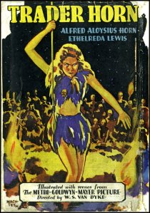
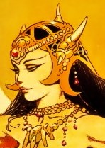
An editor’s note claims he drew it for a previous “Tits ‘n’ Lizards” issue, but that’s just an example of the magazine’s “Humor.” Looking at the cover now, I’m still confused. Female nudity aside, the image seems to be about race. A white woman reigns over her dark-skinned minions. This could be the White Goddess and her African worshipers in 1931’s Trader Horn.

THorn2 trader horn

Instead of Aryan curls, Frazetta endows his goddess Asian overtones–or is that just make-up? This bejeweled yet rag-wearing Queen must spend a lot of time plucking her eyebrows.

crop5

Despite all the abundant white flesh glowing in front of them, the ghouls’ eyes are averted. The Queen is displayed for the viewer only. The image dramatizes the Mississippi racial rules that Emmett Till violated in 1955.  A white woman’s body is always taboo to dark-skinned males, no matter how outlandishly posed.

Sculptor Tim Bruckner also suggests a homoerotic dimension to Frazetta’s sex fantasy: “having to decide what some of the ghoul pairs were doing behind her was something best left to the imagination.”

Ghoul Queen (2)  Ghoul Queen (4)

Are those expressions of monstrous pleasure? Are the obscured arms of the rear figures directed toward their crotches? Do the splayed fingers and curved wrists of the foregrounded hands denote submission? Does the apparent orgy explain their disinterest in the Queen’s body, or is this how dark males control their desire for white female flesh? And why the hell did Frazetta draw an extra left hand groping around her hip?

Ghoul Queen (3)

I see other anatomical issues (her face is too small, her breasts too round), but I’m more concerned with the ones I can’t see. Like her right leg. The pose suggests that the knee is bent so that the right calf is vertical, like so:

gq2_1 (2)

Except that space is occupied by a ghoul. The Queen’s leg isn’t hidden by his back–their bodies overlap as if collaged from separate planes. The two images don’t belong together. Maybe that’s why the ghouls aren’t ogling their queen, and why her gaze skirts past them too. It would also explain the floating hand. Frazetta was revising. The 3-D impossibility is further augmented by the two-dimensions of the image. It’s a painting, so obviously two-dimensional, but Frazetta emphasizes that fact by not filling the entire canvas. The sky behind the figures and the ground in front of them are the same continuous, unpainted space. He even flattens the vulture so its outlined body is almost as undifferentiated as the moon.

Ghoul Queen (4) Ghoul Queen (2)

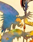
None of this struck my seven-year-old imagination. After an anxious glance at the Queen’s towering authority, my eyes dropped to the discordant subplot at the bottom of the page. The snake offers a range of mysteries (is it attached to the lizard’s head? what are those snail-like appendages?), but I was busy contemplating the two other figures.

crop2

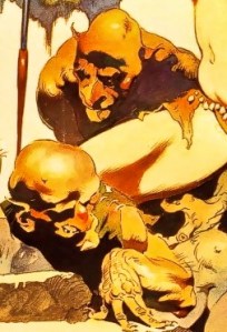
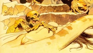
I’m tempted to say this is the moment I first realized I was straight. But I didn’t realize anything. I just sensed something inexplicable. When I rediscovered the image online, I wasn’t sure it was the same–where was the throne?–until my eyes dropped to the skeleton’s hand again. I could feel it as if looking at a photograph of my younger self and remembering the sensations of the frozen moment. The dark-skinned ghouls and their domineering queen had nothing to do with me, but that skinless skeleton hungrily pawing an unconscious woman’s body, that’s who I identified with. That was me.

It’s not the cover image to my sexuality I would choose. It merges incompatible desires–is the skeleton’s mouth wide with arousal, or is he (“he”) anticipating a juicy meal? Either way, he’s a predator. Though not, apparently, a hunter. The woman is a discarded scrap, literally below the interest of the queen and her ghouls. Even the snake-lizard stares off indifferently as the woman’s face is obscured by its Freudian body. I understood her then and now to be unconscious, though she might as easily be dead. Perhaps her erect nipples signify living prey.

So my first inkling of sexuality was triggered by a fantastical representation of date rape. The girl’s been roofied. It’s a dire contrast to the Ghoul Queen–a woman commanding a gang of four grotesque but muscular males who have the physical ability to overpower her but instead bend and crawl at her feet (while possibly having anal intercourse). She is the painting’s largest figure, the tallest, spanning nearly the height of the frame, her figure embodying unchallenged authority. If not for the voyeuristic nudity, you might call her image feminist.

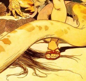
But then there’s the roofied girl, a depiction of abject weakness, the pose reducing her to a faceless and defenseless torso. The Queen’s power is positioned over this lower image, appears somehow predicated on it. While her impersonal eyes assess her ghouls, her imperial foot pins the unconscious girl’s hair. She is literally standing on her.

crop3

There’s a range of unstated narrative possibilities–does the Queen maintain power by sacrificing her Caucasian sisters to the dark horde? are only skinless and so racially unidentifiable ghouls allowed to fondle white flesh?–but the pose says enough. The girl is the Queen’s victim, not the other monsters’.

Why was my skeleton hand drawn to the unconscious girl’s breasts, but not the Queen’s? They’re smaller, so less intimidating? The Queen is equally exposed, but wholly in control of the fact. I can ogle her, but only because she seems to permit it, her chin angled invitingly away. But at any moment, those eyes could turn and gaze back at me. Did my seven-year-old bones inch across the roofied girl’s ribs because she has no eyes to see me? Did my memory fabricate a throne because a seated Queen is less horrifying?

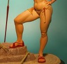
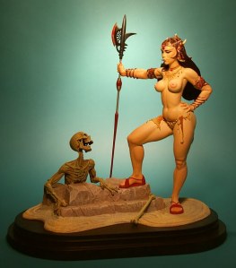
Apparently Tim Bruckner was uncomfortable with these questions too. When he adapted “Ghoul Queen” into a 3-D miniature, he altered more than two dimensions. “It was important to pare down the composition to its essentials,” he said.

GQ2_1

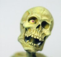
Non-essentials include ghoulish racism, slithering homophobia, and date-rape misogyny. But the skeleton remains–though not the nature of its now non-predatory hunger. “There’s nothing coy or retiring about a Frazetta woman,” explained Bruckner. “Even simply standing with a pike, her hand on her hip, being admired by one of the undead, she announces her presence with every sensuous curve of her body.” Bruckner literally turns my skull’s desire toward a stance of female power.

GQpage4 (2)

But I still wouldn’t choose the revised Ghoul Queen for my cover art. National Lampoon dubbed their issue “Strange Beliefs,” a better title for the painting too, though I doubt the editors knew they were lampooning American sex and racial norms. They presumably didn’t know they were lampooning me.

8714cd173c2c993440ac9f51379d5ea6

Frazetta’s Barnyard Comics

HU alum Tom Crippen (who wrote with us in our blogspot days) sent us this piece. It’s good to have you back here, Tom!
____________________________

by Tom Crippen

Frank Frazetta (1928-2010) is probably the world’s best-known illustrator of fantasy adventure. He hit it big during the 1960s when his covers played a key part in the paperback boom that did so much for Conan the Barbarian and the works of Edgar Rice Burroughs. He stayed big all through the decades that followed. If you’re a dumb kid, or if any inch of you is a dumb kid, his paintings will overwhelm you. They’re like Led Zeppelin, premarital sex, or getting a driver’s license and driving fast enough to risk spinal injury. They’re as intense as psychedelic art but located at the other end of experience, the one where nothing matters but the juices flowing through your body. Look at them and your mind gets blotted out: there you are, hypnotized by muscle on muscle, shadow on shadow, detail on detail, and by the snakelike power that twists through his composition, because behind the whallop lies a superior degree of art.

Continue reading