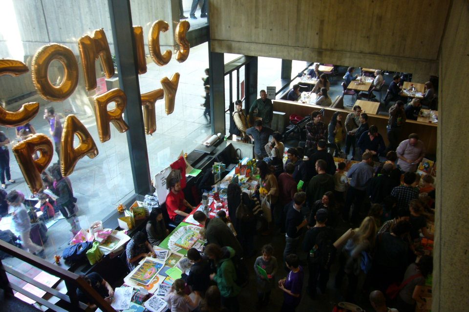
Amidst the chaos of New York Comic Con weekend, Desert Island held a kids-oriented, indie comics event at the Whitney Museum of American Art. The children of New York’s young well-to-do families perused colorful booklets and questioned the authors about their work, while collecting pages of a screen-printed (and laboriously produced) ‘coloring-book.’ Occasional bursts of doodled sex or vomit made it through the content filter and into a child’s hands, restoring an earnestly subversive-ness to the art experience.
Courtesy of John Meijas
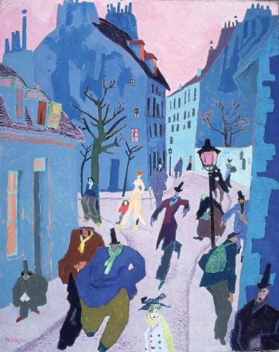
The event tied into the last day of a remarkable retrospective of the work of Lyonel Feininger, subtitled “At the Edge of the World.” Feininger is celebrated in Germany, where he spent most of his artistic career. However, he was born, died, and identified himself as an American—and juggled both an American and German national identities during both world wars. He is best known for a crucial misinterpretation of cubism, developing a romantic, conservative style while the art-world grew more abstract, nihilistic and fragmented. Feininger was successful—he was embraced by the Expressionists, and taught at the Bauhaus. I expect that every major museum of modern art has a Feininger in its collection, but his ‘Prismism’ proved more curious than influential. The Whitney’s resurrection of Feininger didn’t so much revoke previous dismissals as shift the focus away from Prismism to other facets of his work.
In addition to his paintings, “At the Edge of the World” showcased Feininger’s cartoons, photographs, prints, music and wooden carvings. Yet its obvious that Feininger didn’t consider these works as seriously. In a bid to restore Feininger as a relevant artist, the Whitney told a story that Feininger wouldn’t have told about himself. I’m also not sure it’s a story the art-world would have told until recently. The Whitney uses his cartoons and carvings to validate the rosy nostalgism of Feininger’s painting, yet the paintings justify the presence of the cartoons and carvings in the museum. The event is structured like a biographical wunderkammer—a cabinet of curiosities, a history museum. And comics, long eschewed and appropriated by fine-art, are represented on world-class gallery walls and showcased through a series of tie-in events, like talks featuring Art Spiegelman, Gary Panter and Chris Ware, and “Zine Festival.”
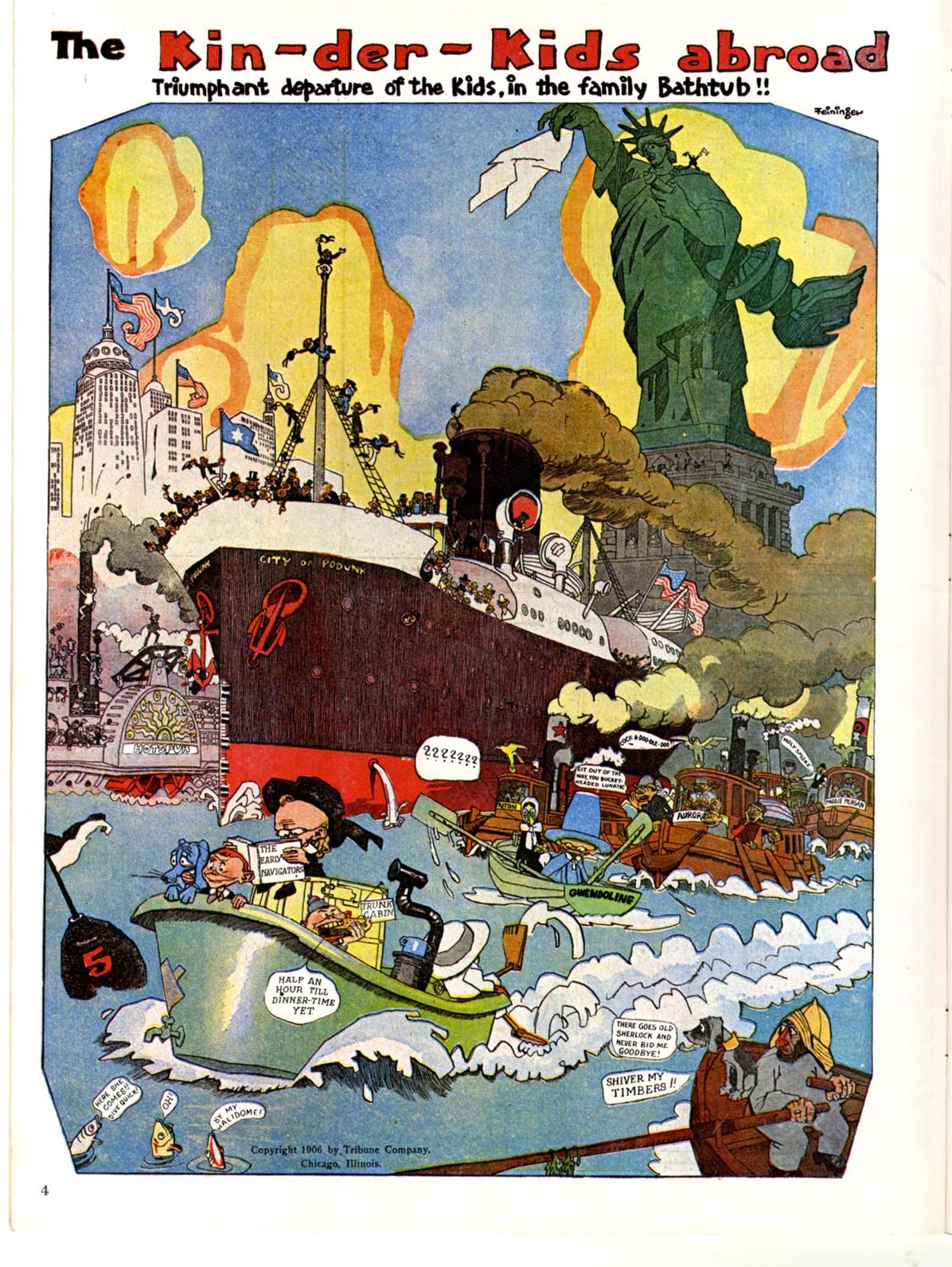
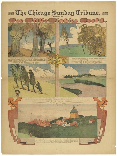
The day I visited, the show was packed with the families from “Zine Festival” downstairs. Young volunteers guided kids through a comics-making workshop in the retrospective’s chain of galleries, re-contextualizing the entire show, for a single day, in terms of Feininger’s cartooning. Feininger is celebrated in the comics world for his brief but mesmerizing turn with the Chicago Sunday Tribune at the turn of the century. The playful, eerie power of “Wee Willie Winkie’s World” and “The Kin-der-Kids” carries over into the best of his canvasses. His early paintings greatly resemble his comics, and later Disney concept art to boot.
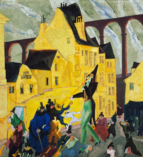
“Carnival in Arcueil”, Courtesy of Art Institute of Chicago
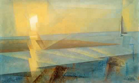
Yet Feininger never returned to making comics after less than a year with the Tribune, (the grueling work-load partly to blame,) and after discovering cubism, grew disinterested with cartooning and weeded its influence from his work. The best of his late-career cityscapes capture the anthropomorphic zaniness of his beginnings, but are drained of their dark charm.
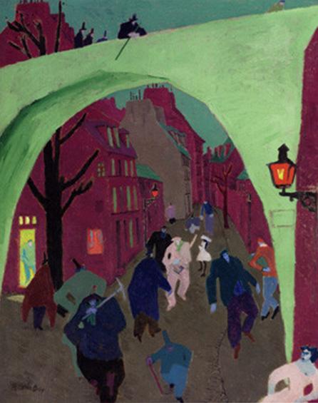
“The Green Bridge
It’s not revolutionary to order a retrospective through a chronological chain of galleries. What was strange was to feature his earliest work in by far the largest and most dramatic room, and run his mature paintings through narrower, middle galleries. Feininger’s career also didn’t come full-circle, but the last gallery spills back into the first like a bout of wishful thinking, allowing attendees to begin and end the retrospective with Feininger’s village paintings. Only the comics gallery is located outside of this artistic trajectory, in the architectural equivalent of a backstory— after passing the first few examples of his provincial scenes, visitors ‘step back’ from the room to learn what Feininger did before painting, and then continue on. This sidelining was necessary to protect the newsprint from light exposure, but downplays the importance of cartooning in his artistic development. His comics were presented more like a period of proto-artistry than the origin of his career.
From a fine-art perspective, this made sense—comics brings its own historic and media-specific baggage that the show wasn’t equipped to address. The Whitney limited the tangent of their inclusion through the size of the room, and limited the think-work of curating them by simply ‘rehanging’ the selections from the “Masters of American Comics,” show and catalogue, a wonder of outside-comics PR that ensured the pages’ inclusion at all. The showcasing of the broadsheets demonstrated their cultural relevance, sophistication, and artistic qualities— yet not suitable as the ‘first’ room of the show, and first period of his career.
While they are not showcased as his first true ‘artwork,’ Feininger’s comics were central to the curator’s strategy to salvage Feininger as a relevant artist. The inclusion of his Sunday pages and wooden toys, long considered low-brow and craft media, shifted the focus of his repertoire from his half-cubist ‘Prismist’ paintings to the brilliance of his caricatures, and his complicated understanding of nostalgia.
The brightly painted, provincial wooden village dubbed “The City at the Edge of the World” was set up in a large, illuminated case halfway through the show, which attendees circumnambulated in a dark room. Unlike the comics room, it was unavoidable when walking from one side of the show to the other. The attendee behavior became a spectacle in its own right, people gasping and pressing their faces and hands up against the glass—a little like kids at a toyshop window. It would have been nice to have seen similar dramatic touches applied to the dim comics gallery, and might have inspired visitors to have viewed it with the same wonder. It would have been strange if they had used a sibling comic-shop model to have played on the nostalgism of the carvings and Feininger’s work—or even placed them in the same ‘fun’ room. I don’t mean to say that the gushes of attention ‘The City’ received were unmerited. It’s unfair to say that the carvings stole the show, as they provided its title in the first place, and were literally its centerpiece.
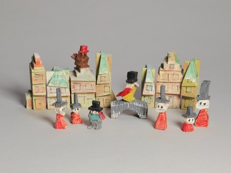
Courtesy of Art Institute of Chicago
“The City at the Edge of the World” is a lovely and touching work, complete with a humble back-story. Feininger carved it with few pretensions for his children. Feininger’s nostalgic and reactionary longings in his paintings sometimes feel a little inappropriate, like an oblivious friend at a delicate social gathering. Compared with the war-time anxieties his Expressionist or Cubist contemporaries expressed through their work, Feininger’s concerns feel a little rude, or beside the point. Feininger refused to depict his times, painting mid-nineteenth century villagers, light-showered gothic cathedrals and seascapes. Just as a funeral is a social venue for certain behaviors and meditations, painting was (is?) a social venue for aesthetic and philosophical confrontation, which Bauhaus and Die Brucke membership aside, Feininger only halfway participated in. (He actively participated in ‘painting as a decorative or nostalgic activity.’ This tradition of painting is alive and well today.)
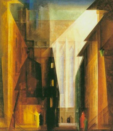
“Church of the Minorities II’
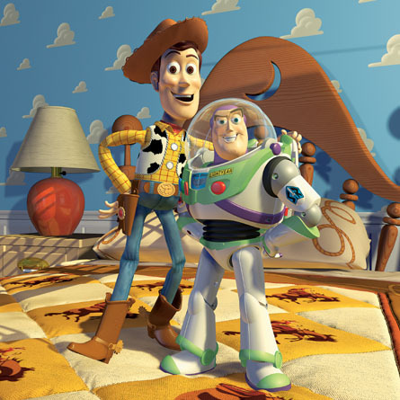
Toy-making has never been a venue for the kind of anxious explorations that Feininger refused to paint. Personal and cultural understandings of ‘toy’ also sync nicely with Feininger’s nostalgic and reactionary focus. ‘The City’ feels spontaneous but conceptually well-developed. When displayed in a museum as culturally relevant, artistically sophisticated works, his toys articulate a self-aware kind of nostalagizing and provincial romanticism. Feininger was whittling away during the rise of industrial and commercial toy production, when the tradition of carving risked being pushed off ‘the Edge of the World.’ While Feininger never intended the carvings to be showcased in a major art museum, they poignantly ask the viewer to simultaneously fantasize about childhood and eras past, and think about how these nostalgias are inextricably linked. It reminds me of another, wildly successful and honest assessment of the impulse to nostalagize.
And in a fatigued art world, obsessed with the auctioning off and display of increasingly obscure works by name-brand hero-artists, I think this ‘honesty about nostalgia’ is incredibly refreshing. The art-world is giving in to nostalgia as well. Without a seductive history behind a work of art, people are innately drawn to the figurative and the narrative, just as babies intuitively like to look at faces. If no one knows the direction to go from post-modernism, why not go the route of romanticism and human connection? It’s strongly connected to what people are fundamentally, universally interested in.
Feininger is an exceptionally good figure drawer and rampant anthropomorphizer. More than that, he is a brilliant cartoonist–his nostalgia feels more sinister than secure. He captures the eerie feeling of twilight, the bigness of a small town — feelings lost growing up, and misremembered with a rosy lens. The key to Feininger’s vision is found in his ‘Wee Willie Winkie’s World’ pages. Feininger has an startling memory for the specific breed of unassignable, atmospheric darkness that accompanied childhood.
Right now, Feininger is an apt candidate for resurrection. The figurative focus of his early, village paintings compliments the art world’s nostalgic longings and interest in characters, but in a way that complicates them. The carvings make his subject matter honest, while the comics showcase what is exceptional about his brand of nostalagizing. And the retrospective format is already a character based show: a historic museum, a biography, and often a little kitschy. Finally, the comics room was underdeveloped, but is a testament that the value of Art, cynically expressed as an auction value, depends more on the stories of success and rarity and mystery that surround an object, rather than what kind of object it is. Comics and toys make a lot of money at the block too.
From the comics perspective, his Sunday Pages came off really well, even given the necessarily dim and appendixical room . Attendees discussed them in small groups, and spent a significant amount of time reading through them.
There’s a curatorial urban legend that states that people only spend around seven seconds observing a piece—the number increases or decreases based on how easy the piece is to analyze and look at. Additionally, a wall can be an uninviting space for comics browsing (I’m thinking of the tediously unimaginative R. Crumb’s Genesis show.) However, comics have an advantage in that people know how to read them. Visitors spent a minute or two on each one, and once presented with the ‘punch’ of its ending, stepped back, thought, and “hmphed” at it. Or laughed. Or discussed it with their friend.
Isolated in their side-gallery, the comics raised questions that the show wasn’t willing to answer—they were truthfully a respectfully included, unexpanded footnote. Viewers might have wondered if most comics were this large and beautiful in 1906. Or, how long have comics existed? If visitors didn’t trace the dates on the labels, it would have been hard to figure out when he had drawn these pages, and what their relationship to his painting was. While I was standing over a group of kids drawing comics underneath one painting, a woman walked over to address the volunteer. “Excuse me,” she said, “I was looking at the comics over there, and was interested in knowing when the speech bubble was invented.” Without missing a beat, the volunteer replied, “I think it was invented by Marvel Comics.”

